#tips for icon usability
Explore tagged Tumblr posts
Visit Tumblr Blog
Explore Tumblr blogs with no restrictions, modern design and the best experience.
Last Seen Tumblr Blogs


Fun Fact
Kazakhstan’s Minister of Communications and Informatics has blocked the Tumblr site because it contained 60 sites of terrorism, extremism, and pornography in 2015.
Text

Whether you're creating a website or an app, every icon in your interface should have a function. Icons are present to conserve screen space. They're also there to help your users. Icons, when used effectively, may assist you in guiding people naturally through a process without depending on excessive copy. When done incorrectly, they can be confusing to your consumers, leading them down the wrong routes and ruining their experience with your product.
#UI/UX Designer#icon usability#icon usability tips#icon usability guidelines#tips for icon usability#what are icons in website interface#icons in user experience#importance of icons in user experience#user-friendly icons#hire UI/UX designer#web development company#hire dedicated web developer#software development company
3 notes
·
View notes
Text
How to Make a Charm Necklace Magic-Style
✩₊°.⋆☾⋆⁺₊✧✩₊°.⋆☾⋆⁺₊✧✩‧⁺⋆⁺‧₊☽✧☾₊‧⁺⋆⁺₊✧✩₊°.⋆☾⋆⁺₊✧✩₊°.⋆☾⋆⁺₊✧
So in a recent post I talked about having a set of charms that I wear whenever I leave the house. I thought it might be a fun tutorial to detail how someone could make a similar thing for themselves! The post is a long one, so the rest of the guide is under the cut!
Step 1: Lay out all of your perspective charms and see what speaks to you and what you might want to put together. When you're choosing pieces, try to think of your goal and intent while you're putting your charms together (i.e. mine is for general day-to-day so I mostly focus the charms around safety, ease of way, and good fortune. Tailor yours to what you need). You don't have to make a necklace, just make sure that whatever you're attaching your charms to and the jump ring(s) connecting everything are sturdy enough to hold the charms' weight.
I have a 'main' components and 'auxiliary' components with the main components being the anchor points and foundation of what I'm working towards (i.e. I have my locket with sigils and my key charms as main components and I'll switch out the other parts as desired). Listed below are some ideas for options that you can combine, but use whatever feels best to you:
Lockets- I HIGHLY RECOMMEND that a locket is part of your configuration. You can fit a slip of paper with spells/sigils written on it AND if it's a scent locket you can add a bit of fabric with a perfume oil or a spell oil that would be safe to wear (check the spell oil ingredients if you're going to use a spell oil).
Bottle/Vial Charm Pendants- these are really good for wearable spell jars (you'd just have to careful about breaking them). You can buy pre-made bottle spell charms (there are a lot of options available) OR you can buy a vial pendant and do a working of your own choosing depending on your preferences/needs (there are also many options for empty vial charms you can buy). You could also keep spell powders/dusts in a vial charm (also usable for on-the-go workings).
Crystal Pendants- If you are someone who utilizes crystals in your practice, having some complementary crystals or crystals that you tend to favor can really add a kick.
Religious pendants/charms- Pentacles/crosses/saint pendants/deity pendants/etc. are all good options for this sort of configuration if they're something that features in your practice or you have a specific figure you want to invoke.
Symbol/Icon charms- similarly to the option above, charms that have animals/flowers/symbols/ whatever else you may want to invoke the properties/help of can be a good addition as well
Bells- bells have traditionally been used in different cultures for sound cleansing and to ward off negative spirits/entities. If that's something you might want (and are ok with making some noise) adding a bell might be a nice touch.
Keys- keys are useful magically for unblocking roads, gaining access, and invoking magic/energy relating to crossroads. Keys/key charms can be pretty easy to get too, so it might be worth trying to have one in your configuration.
Other meaningful charms: as it says on the tin, if it's important to you or you want to keep it on you, try it out in your configuration see if it will work well with it. In the picture above of my own pendant collection alongside more standard pieces there's an antique pen knife that can be worn as a pendant. Put whatever you want on these configurations is my point.
Tip! Some pendants like the pendant on the right have a paste/textured back that you can write on. If that's something you'd want to do, aim for something that looks like the pendant on the right. It's a solid way to hide sigil magic in your jewelry.

Step 2: Prepare the individual charms that you're going to be putting together. Clean/cleanse* everything appropriately (use mundane and magical methods), get sigils written out, anoint anything that you want to anoint, charge/enchant anything that needs it- whatever workings you need to do to the individual components of your charm necklace, do them now.
*If you're using metal pieces (especially if they're old/antique) there's a decent chance you may need to clean those pieces periodically with a metal cleaner/polish. When you clean the metal, do maintenance work for the rest of the configuration by charging/re-enchanting the other charms.

Step 3: Put your charms together and test out your configuration. Sometimes things won't work together as well together or a different component will work better in your configuration.
Ending Notes & Tips
If you put something like this on an object, make sure you focus on how you need/want to effect the object. Like, I have another variation of this on a chain on my bag, and that working is more focused on security and being unobtrusive more than anything else.
Generally I would consider how fragile your individual charms/items are and how likely breakages are to occur. You don't want to be scattering any broken glass/sharp bits and you definitely don't want to cut yourself on anything in the event of any broken charms.
Other considerations should be if individual parts are safe to wear. As previously mentioned, select for spell oils that are safe to wear and for crystal pendants that won't interact with water/skin oils/body products (i.e. selenite melts in water and pyrite will create sulfuric acid when exposed to water). Basically make sure that having this on your skin isn't going to cause any problems for you.
It can be a a good idea to change up individual charms in your configuration to tweak things to your daily needs. Using my usual configuration as an example, I'll switch out my crystal pendants or other charms if I have specific needs/events for a day (like maybe if I'm traveling I'd add more protection/safe travel oriented charms or if I had a date on I'd choose one of my love/attraction charms).
I hope this gave you some ideas for your own practice, thanks for reading💜
✩₊°.⋆☾⋆⁺₊✧✩₊°.⋆☾⋆⁺₊✧✩‧⁺⋆⁺‧₊☽✧☾₊‧⁺⋆⁺₊✧✩₊°.⋆☾⋆⁺₊✧✩₊°.⋆☾⋆⁺₊✧
240 notes
·
View notes
Text
Good News - July 8-14
Like these weekly compilations? Tip me at $Kaybarr1735! And if you tip me and give me a way to contact you, at the end of the month I'll send you a link to all of the articles I found but didn't use each week!
1. Zoo welcomes birth of four endangered horse foals

“[The Marwell Zoo in GB] said it was "delighted" to welcome the arrivals to the endangered Przewalski’s horse herd. All four are female and said to be "doing well" after two were born in May and two in June. […] “These horses, that were previously listed extinct in the wild, are an example of how zoo breeding programmes can help restore threatened species around the world.” […] All the Przewalski’s horses alive today are descended from just 12 individuals. Current estimates suggest there are 178 mature individuals living in the wild.”
2. Restoring woodlands and planting trees for sustainability success

“In 2023, [the Marwell Zoo] planted 9,000 new trees […] both within the zoo and on our surrounding land. […] Marwell tries to encourage natural feeding behaviour and nutrition by including leafy material [in animals’ feed] as much as possible. […] Planting more trees and enhancing management of our existing woodlands, prepares the way to further self-sufficiency in browse production in the future. Plus, it creates new habitats for wildlife in our woodland areas.”
3. Inclusive Playgrounds Allow Children Of All Abilities To Play

“With ramps allowing children in wheelchairs to ascend the central play structure, as well as numerous other swings and apparatus usable for children of all abilities, the 16,000-square-foot P.K.’s Place is St. Paul’s first fully inclusive playground. […] To be universally accessible, a play area must have at least 70% of its play features fully accessible, far more than required by the Americans with Disabilities Act (ADA). […] Play areas should allow parents and grandparents with disabilities to participate as well.”
4. Combination treatment can increase human insulin-producing cells in vivo
“[Diabetes-model mice] were treated with the combination therapy [of a plant product called harmine and “a widely used class of type 2 diabetes therapy”] and their diabetes was rapidly reversed. Strikingly, human beta cell numbers increased by 700 percent over three months with this drug combination. "This is the first time scientists have developed a drug treatment that is proven to increase adult human beta cell numbers in vivo. This research brings hope for the use of future regenerative therapies to potentially treat the hundreds of millions of people with diabetes," said Dr. Garcia-Ocaña, the paper's corresponding author.”
5. Decades of Dedication: Australia’s Largest Ongoing Urban Restoration Project

“[Friends of Lake Claremont] has transformed the area into a thriving ecosystem, re-establishing native habitats and fostering biodiversity. This year, 800 native seedlings (100 trees, 350 shrubs and 350 ground covers) have been planted on the northwestern buffer of Lake Claremont. Volunteers replaced a large Port Jackson fig (Ficus rubiginosa) affected by [beetle] infestation with native plants to enhance the local wildlife habitat, thereby benefiting insects, frogs, birds and brown bandicoots. […] Overall, the project contributes to the area’s function as a regional ecological corridor, linking inland bushlands, the Swan River and the Indian Ocean.”
6. Important habitat for fish in Heart of the Fraser now conserved

“British Columbia’s iconic salmon now have more protected spawning habitat in the lower Fraser River, thanks to the Nature Conservancy of Canada’s (NCC’s) conservation acquisition of Carey Island. […] Carey Island and its gravel channels offer calm and crucial spawning and rearing habitat for the river’s fish and aquatic species. […] The Pelólxw Tribe […is also] actively working to restore the resilience of aquatic habitat within this stretch of the Lower Fraser. NCC is exploring opportunities to collaborate with the Pelólxw Tribe in support of their vision for stewardship of the area, which prioritizes both ecological and cultural values.”
7. Prime editing efficiently corrects cystic fibrosis mutation in human lung cells
“[R]esearchers have developed a gene-editing approach that efficiently corrects the most common mutation that causes cystic fibrosis, found in 85 percent of patients. With further development, it could pave the way for treatments that are administered only once and have fewer side effects. The new method precisely and durably corrects the mutation in human lung cells, restoring cell function to levels similar to that of Trikafta [the standard treatment since 2019].”
8. Montana’s High Court Considers a Constitutional Right to a Stable Climate
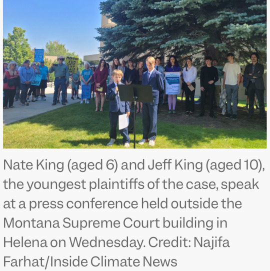
“At issue was the appeal of a decision last year, when a Montana judge blocked a state law that prohibited agencies from considering climate impacts when deciding whether to approve fossil fuel projects such as new power plants, pipelines or mining. The ruling, by District Judge Kathy Seeley, was prompted by a lawsuit filed by 16 youths who argued that the law violated Montana’s constitutional right to a “clean and healthful environment.” It was the first ruling in the United States to effectively establish constitutional rights to a stable climate[….]”
9. The US is about to get its first solar-covered canal

“The first canal-based solar project in the U.S. is nearing completion on tribal lands south of Phoenix, Arizona. […] The long, narrow solar array design would snake along the line of the canal and tap into the local electrical distribution grid every 1,000 feet, or every one megawatt. […] “Canal solar allows for greater power production per land size, cleaner water, less power transmission losses, and significant reduction in evaporation[….]” Covering the entire 8,000 miles of canals and waterways managed by the Bureau of Reclamation with solar panels could generate over 25 gigawatts of renewable energy and reduce water evaporation by tens of billions of gallons[….]”
10. Camera traps offer glimpse of first beaver born in Northumberland for 400 years

“"It’s such a relief that they have bred successfully and to see a new fluffy kit swimming with the family[….]” In just one year [since releasing the beavers], there has been a noticeable increase in resident trout, says the National Trust, along with more regular visits from kingfishers and grey herons. There are more insects at the site, too, thanks to the organic matter that builds up behind the dams, which in turn provides food for Daubenton’s bats. […] Beavers also play an important role in creating habitats that are more resilient to the effects of climate change[….]”
July 1-7 news here | (all credit for images and written material can be found at the source linked; I don’t claim credit for anything but curating.)
#hopepunk#good news#horse#zoo#nature#extinct species#sustainability#forest#children#disability#playground#disabled#wheelchair#diabetes#medicine#science#urban#biodiversity#ecosystem#fish#first nations#cystic fibrosis#gene editing#climate change#climate#youth#human rights#solar panels#solar energy#beaver
330 notes
·
View notes
Note
Hi, I love your works!! I was wondering where you find the original, unedited pictures you use for your art? Do you take them yourself or find them online?
Hey there! I get them from many different sources! Whenever I can I use my own, and sometimes my followers send me cool pics to use (or put them up in the Sacrificial Altar channel in my Discord), but I find most of what I use through public domain sources online!
For the online part, I put this little list together with some of the common resources I use! Feel free to share it around and copy it:
For an easier experience, I'll copy the relevant part below:
STOCK SITES
- Unsplash: Usually the best quality out of the free stock sites. They’ll try to sell you a subscription plan but you can ignore that.
- Adobe Stock: Select “Free” on the dropdown menu next to the search bar. The free image selection here is big and high-quality, though they feel more like stock pictures than natural photos. Note: They limit how many pictures you can download per account per day, but you can make several accounts to circumvent this if you use it a lot.
- Texturelabs: lots of free, very high-quality textures!
- Pexels: Similar to Unsplash, but it has more pictures with people. If you need a photo with models, this is usually the best place.
- Pixabay: Widest selection, but worst quality control. Go here if you haven’t found anything in other sites and don’t mind sifting through a bunch of garbage pics and occasional AI images.
PUBLIC DOMAIN SOURCES
- Wikimedia Commons: an enormous selection of CC and public domain pictures. Super useful, especially for the really specific images that you'd expect to find on a Wikipedia article. Always check the copyright conditions! To filter by license, search something and then click on the License dropdown under the search bar. Select “No restrictions” for public domain images.
- Picryl: A repository of public domain sources, ranging from ancient historical books and artifacts to fairly modern pictures. If you're looking for something old/historical, chances are it's here! This website is probably one of the most complicated ones to use, so here are three important tips before you use it:
This site added a paywall that appears after the 3rd page of search results. To remove it, install uBlock Origin, go to the “My Filters” page (clicking on the gear icon after opening the extension), and paste this filter: picryl.com##._9oJ0c2
After searching, use the timeline on the top right to narrow down the result by year.
It won’t let you download the full picture without paying, but it always has a link to the source site below the description. Click on that, then copy-paste the image’s name to find it in the original source. That way you can get it for free, and often in better quality than Picryl offers.
National Archives Catalog, The Library of Congress, NASA, and Europeana have wide selections, but they are included in Picryl so it’s usually better to search there and then download them in the source as mentioned above!
- Flickr Search: a ton of usable pictures with a generally more amateur feel, just remember to filter by license using the “Any license” dropdown menu. When you find an image, make sure to check its specific license (you can find it below the image, on the right side).
- Openverse: The official Creative Commons archive, has many sources! Includes other sites on this list, but has a lot of clutter if you don’t filter.
- iNaturalist: a repository of user-submitted images of animals, plants, and fungi. Look for a genus or species, then navigate to the photo list and filter by license.
MUSEUM COLLECTIONS
- The Met: An amazing selection of artifacts from all over the world, with top quality photographs of most of them (usually with several angles for each). You can filter images by material, location, and era.
- Getty Museum: Another smaller selection of museum pieces, but this one includes old photos as well as artifacts. You can also filter by dates, materials and cultures. Make sure you include the “Open Content” filter to only see public domain things!
- Smithsonian: Big selection of around 5 million museum pieces, with some 3D scans of museum pieces. Most pieces just have a single picture that can sometimes be low quality, but pieces with 3D models sometimes also include a lot of high quality photos from multiple angles. This collection also includes things from museums of natural history, so you can also use it to search for bones and specimens.
- Artvee: public domain classical art. They make you pay to download high-quality images.
If you guys got any others, please let me know and I'll add them to the collection!
191 notes
·
View notes
Text
SOLAR AND RUIN HEADCANONS THAT ARE LONGER THAN THE BIBLE! :D
IMPORTANT: I CALL RUIN/JIGSAW DOLUS BTW SO DON'T BE CONFUSED- QWQ
Solar:
(I SWEAR IT LOOKS BETTER IN REAL LIFE TRUST ME THE QUALITY OF MY PHONE IS JUST STRAIGHT FROM THE 99 CENT STORE- 😭🙏)
Solar is Romanian (WHERE MY ROMANIAN PEOPLE AT? >:D And don't question the logic of my headcanons MY HEADCANONS, MY RULES >:D). Solar can speak fluently German, Romanian of course, and a bit of French and Portuguese.
Solar is gender-apathetic and could care LESS about gender and pronouns. Solar still dresses more masculine though because he simply likes it.
He's gay and somewhere on the ace-spectrum :D (HE'S OUR ICON I TELL U 💅)
Solar has chronic migraines and backpain and they just get worsened by his AWFUL posture habits. He always takes medications for those, otherwise, he wouldn’t be able to function properly in life. Sometimes, however, he overuses them and goes overboard. Sometimes TOO much overboard. (I SWEAR TO Y'ALL IF YOU QUESTION THE LOGIC OF THE MEDICATION THINGY I'M GONNA MAKE YOU EXPLODE LIKE LUNAR 😃)
His rays aren’t usable anymore. They are fully broken, and two tips of the seven couldn’t be patched up, while the two others were able to be a bit restored by fixing the ends through another, mismatched metal. HIS Moon used to always grab and tug at them as punishment, and unconsciously, he sometimes repeats those actions inflicted upon him by lightly pulling at them when he is stressed or dissociating. He doesn’t allow anyone to touch his rays. NO ONE. (... OUR TRAUMATIZED QUEEN 💃✨ BUT LIKE HE GOING THRU IT FR 😭🙏)
He is an insomniac and a workaholic with a non-existent sleep schedule. He’s got no free time to rewind and relax and doesn’t ALLOW himself to do so, only fueled by coffee and medication.
However, he finds comfort in Dolus (AKA RUIN) and whenever he spends all of his time to hang out with him. He loves those musical numbers Dolus always persuades him into, and although he looks like he is annoyed at first, it’s a big joy for him.
Apropos Dolus, Dolus gifted him a shark keychain which is now securely hanging from Solar’s belt every day. (See picture above :D) Solar uses this as a stress toy because its soft, squishy texture and wool underneath makes it perfect for it.
He often vapes when no one's looking. That's why his voice is so raspy (and from the screaming)
Dolus (aka Ruin/Jigsaw):
DOLUS IS BRITISH, MATE, NO ONE CAN CONVINCE ME OTHERWISE, MIC DROP 👏 He can only speak English in a British accent and the most broken French known to mankind.
He is genderfluid and sometimes feels like a man and sometimes just non-binary :D His preferred pronouns are he/they.
He is Achillean and somewhere on the ace-spectrum too!
Dolus has a passion for musicals and the theatre. He knows every song of the Hamilton Musical in and out and has watched “The Greatest Showman” over a dozen of times and loves EVERY song of it. Every day, one can catch him humming a song from his favorite musical and dancing a bit to them. In addition, he LOVES to perform those musicals, and he involves Solar in them. Basically: He is a theater kid.
He also has a REALLY big obsession with sharks and even has a full-body shark suit for sleeping and a few shark plushies, which is why he loves the nickname “Sharky” so much.
A big scar is stretched across his face and covers up his right eye, coming from a fire incident where he was trapped underneath ashes, flames and wood. His right eye is still usable, but not as strong as his left in terms of eyesight.
He also has weak joints and can’t endure any sort of pressure for a long time, which is why he has to take sitting and laying breaks and has to do some physical exercises. It's annoying and prevents him from doing some things, but this won't stop him doing things he LOVES. He can’t run properly because of this, walk for a long time and stand more than necessary. Solar sometimes helps Dolus sit when Dolus needs a sitting break or helps him walk when there's no other option. Dolus feels bad about that.
He doesn’t like travel and moving vehicles, as well as bright lights.
THANKS FOR LISTENING, TUNG (=Bye)! :D
#sun and moon show#tsams#the sun and moon show#sams#fanart#art#tsams headcanons#sams headcanons#tsams solar#sams solar#tsams ruin#sams ruin#tsams jigsaw#sams jigsaw#tsams art#traditional art#tsams fanart#tsams designs
34 notes
·
View notes
Text

How to: Accessibility [EN]
Part 01 - Visual design
It’s been a while since my last how to and felt like putting something together! First of all, HAPPY PRIDE MONTH! To everyone out there! Being in the queer community, i know the struggles we go through everyday and am wishing a very proud month to all of us <3
Moving on to the actual topic here: accessibility. It’s been shown here and there when discussing coding and skinning but WHAT DOES IT ACTUALLY MEAN!
Let’s go back a bit. For years people have been trying to achieve the impossible: an universal design. A design that is universal and usable for ALL people a one-size-fits-all design that will be usable and perfect for everyone. Now, there’s only one ‘little’ problem with this: people are different. I’ve always been overweight and whenever I’ve seen clothes that say ‘one size fit all’, I look at it very suspiciously. Bottom line is: every person is different, pain points and needs will also be different.
So what do we do? One different design for every person who is using our product?
Well, let’s make it equitable, let’s provide flexibility to cater for a broader audience, and let this audience choose what’s best for them. But! That’s doesn't take the responsibility from us, the designers (and coders) to make sure that we are making what we can to enable this flexibility.
------------- I've started a list which I then realised would be way bigger than expected, so decided to make each item into its own post. We'll start with VISUAL DESIGN!
Part 01 - Visual design
Colour
I’ve mentioned before about the importance of contrast and contrast ratio briefly. If you want to go into more details, you may have a look at W3 Guidelines. In short:
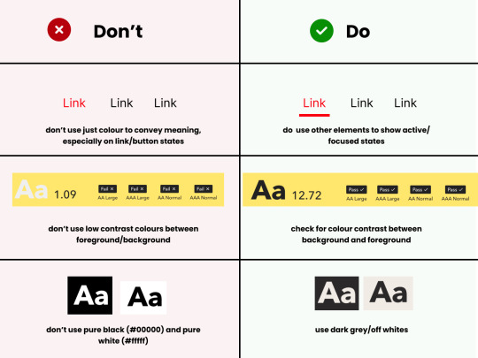
Don't rely on colour alone to convey meaning, information and actions;
Make sure there's enough contrast between foreground and background
Provide an option for light/dark mode
Light/Dark Modes
There’s a myth that dark mode is good for accessibility, because it improves text readability. (Personally, I’m a big fan of dark mode, as white/bright screens may trigger migraines). However, as everything in ux, the answer to ‘is it black or white’ is that it depends. As mentioned before, a good rule of thumb is not to generalise and provide flexibility.
When using light and dark mode, make sure the colour contrast ratio passes on both modes. Here’s a few tips for designing for dark mode (according to atmos article attached at the end of this):
Use tints (less saturated colours). Saturated colours can cause eye strain and will be hard to pass accessibility standards.
Image from Atmos website
Avoid pure black. Please. Pure black and pure white when used together might be the default instinct, but the contrast when used together is so strong it becomes hard to look at. Choose dark greys and off-whites/light grey when possible.
Be patient with your colour palette, inverting colours won’t make it necessarily good. Take your time to build a palette that will be suitable for both.
Target Sizes
First, what is this? This refers to the dimensions of interactive elements such as links, buttons, icons or touch targets. Basically, anything you can interact/click.
WCAG 2.2 established a minimum for pointer inputs to be 24x24. This is the space that should be provided for a clickable area.

Image from W3 website
There's a number of exceptions and guidelines which I won't get into too much detail. It's important to think about the area which people are clicking into these elements. Also remember that this may be quite useful for users that are using the forum in their mobiles - so this is quite important (don't you hate when you can't click somewhere because you haven't clicked the EXACT area needed?)
In short:
Make sure target sizes are at least 24px
Make sure buttons look like buttons, anything that is clickable and interactive LOOKS like they are interactive
Make sure links are underlined (again, as an extra visual sign that they are clickable)
THAT'S IT!!
For part 01 at least. This is just the tip of the iceberg though. If you'd like to dive deeper into this, I highly recommend Stephanie Walter's content, as well as the Extra Bold book read. I'm attaching a few more articles and resources here too! If you've read all of this, you are a champ, I know this is longer than usual. Please like and share this content, let's get it out there!
Articles:
Designers Guide to Documenting Accessibility
Dark mode ui best practices
Dark mode best practices
Accessibility annotation examples
Colour accessibility tools
Inclusive components design
Accessible design in 60s
Target size minimum
Resources
Accessible colours
Accessible colour palette builder
40 notes
·
View notes
Text
My tips to new users to make Tumblr more usable
This is kind of random but I think Tumblr is one of those websites that hides a lot of its functionality from users and comes with default settings that makes it kind unusable (at least for me). So I've decided to collect some suggestions about things to do immediately in order to make Tumblr a much more usable website:
Most important: Put the content you actually opt into on your dash. First, go to Settings > Dashboard and turn off "Best Stuff First." In general, (1) I don't think it's good to let social media sites curate your content feed (they're not very good! you can curate your own content feeds!), and (2) chronological ordering is much more helpful for making sense of information. I don't know why you would want posts on a site to be presented in any other way. Please save yourself and make your dash chronological by toggling this monstrosity OFF. Also for the love of god, turn off "Include posts liked by the blogs you follow" and "Include 'Based On Your Likes!'" too. Other people's experiences might be different from mine, but when Tumblr first introduced this feature and I tried it out for a while, it was so predictable that every time I came across a post that made me viscerally angry and think, "How the HELL did this get on my dash?" it was always always some random post from someone I wasn't even following… So yeah, get rid of that.
Second, make the "Following" tab your default, instead of the "For you" tab. How to do this is not particularly obvious. From the Tumblr homepage (not settings), you need to find the tabs at the top of your dash (For you, Following, Your tags) and then click the toggle/settings icon to the right of those tabs. This will allow you to reorder your tabs. In particular, what you need to do is click the pin icon to the right of "Following," and this will set Following to be your pinned and first tab. By default, when you open Tumblr, your dash will show the posts of people you have actually opted into following rather than what Tumblr suggests to you.
Next, make sure timestamps on posts are on. This should be the default (despite what Tumblr says?), but if you don't see timestamps at the top of all posts, I highly recommend turning this setting on (under Settings > Dashboard). Knowing when a post was made is hugely helpful for understanding the context of the post, and I don't know why websites would allow you to hide this, really, unless they want you walking around with no sense of time or context, which uh… I don't recommend that social media experience!
Turn off endless scrolling (under Settings > Dashboard): Websites like endless scrolling to keep people from leaving the site. I recommend turning this off to make it more obvious how many posts you've scrolled through on Tumblr, to make it easier to find your place in older posts, and also to make the website just lighter to load. When I last used it, the Tumblr mobile app does not allow pagination, which is pretty typical of social media apps in general. Honestly, I recommend just not using the Tumblr mobile app at all. I've uninstalled it and aside from missing the convenience of being able to attach photos from my phone onto Tumblr posts, I really don't miss it…
Things that you may or may not be interested in:
Enable custom theme on (each of) your blog(s): So fun fact: If you don't have a custom theme enabled, then when people visit your blog when not logged into Tumblr, they will only be able to scroll through a few of the posts on your blog before being prompted by Tumblr to log in if they want to see more. This popup cannot be gotten around, and so people without Tumblr accounts or who are browsing on a device/browser without a login session just won't be able to see your posts. Personally, I do not like this behavior -- I like my blogs to be archives with useful permalinks that can be browsed by anyone. Anyway, you can get rid of this annoying prompt by going to Account > (select blog) > Blog settings and toggling that "Enable custom theme" slider. It doesn't really matter what theme you use (although there are a lot of options to choose from), just use a custom one!
Turn off "Shorten long posts" (under Settings > Dashboard): YMMV, but I personally don't find this setting very helpful as the maximum length for when it starts cutting off posts is pretty short and falls far short of what I would consider a "long post" that is inconvenient to scroll past. Instead, you may want to turn off this setting and create a filter for the tag "long post" (under Settings > Account > Filtered Tags).
Mature content: If you're interested in possibly seeing mature content, you may want to review your mature content settings (under Settings > Account) as by default, Tumblr is set to hide it entirely and doesn't tell you that it's hidden posts from you and so you probably just will not be aware this setting is a thing! Personally, I use the "Blur" setting.
Hiding content from users you don't want to see: As far as I can tell, if you see someone's posts in (e.g.) tag searches and would prefer not to see any of that person's posts in public places like that tag or appear on your dash by people you follow reblogging their posts, you should block them. Official Tumblr documentation does not say that this is a feature of blocking, but it is.
When Tumblr's functionality isn't enough… External tools such as XKit Rewritten provide a whole lot of QoL fixes to Tumblr's interface like making it easier to reply to replies, hiding posts you've already seen, showing how many new/unread posts are in tracked tags, showing all tags on posts by default rather than requiring you to click "See all," etc. For me, one thing I needed in order to make Tumblr semi-usable for me is hiding notes in tag searches (because I don't really need constant reminders that my tastes aren't aligned with wider fandom's tastes lol). I couldn't find a tool that does this, so I wrote a simple Tampermonkey script to do it for me.
Hope this helps new users of Tumblr, and feel free to add other helpful tips if you have them!
13 notes
·
View notes
Text
Crypto trading mobile app
Designing a Crypto Trading Mobile App involves a balance of usability, security, and aesthetic appeal, tailored to meet the needs of a fast-paced, data-driven audience. Below is an overview of key components and considerations to craft a seamless and user-centric experience for crypto traders.
Key Elements of a Crypto Trading Mobile App Design
1. Intuitive Onboarding
First Impressions: The onboarding process should be simple, guiding users smoothly from downloading the app to making their first trade.
Account Creation: Offer multiple sign-up options (email, phone number, Google/Apple login) and include KYC (Know Your Customer) verification seamlessly.
Interactive Tutorials: For new traders, provide interactive walkthroughs to explain key features like trading pairs, order placement, and wallet setup.
2. Dashboard & Home Screen
Clean Layout: Display an overview of the user's portfolio, including current balances, market trends, and quick access to popular trading pairs.
Market Overview: Real-time market data should be clearly visible. Include options for users to view coin performance, historical charts, and news snippets.
Customization: Let users customize their dashboard by adding favorite assets or widgets like price alerts, trading volumes, and news feeds.
3. Trading Interface
Simple vs. Advanced Modes: Provide two versions of the trading interface. A simple mode for beginners with basic buy/sell options, and an advanced mode with tools like limit orders, stop losses, and technical indicators.
Charting Tools: Integrate interactive, real-time charts powered by TradingView or similar APIs, allowing users to analyze market movements with tools like candlestick patterns, RSI, and moving averages.
Order Placement: Streamline the process of placing market, limit, and stop orders. Use clear buttons and a concise form layout to minimize errors.
Real-Time Data: Update market prices, balances, and order statuses in real-time. Include a status bar that shows successful or pending trades.
4. Wallet & Portfolio Management
Asset Overview: Provide an easy-to-read portfolio page where users can view all their holdings, including balances, performance (gains/losses), and allocation percentages.
Multi-Currency Support: Display a comprehensive list of supported cryptocurrencies. Enable users to transfer between wallets, send/receive assets, and generate QR codes for transactions.
Transaction History: Offer a detailed transaction history, including dates, amounts, and transaction IDs for transparency and record-keeping.
5. Security Features
Biometric Authentication: Use fingerprint, facial recognition, or PIN codes for secure logins and transaction confirmations.
Two-Factor Authentication (2FA): Strong security protocols like 2FA with Google Authenticator or SMS verification should be mandatory for withdrawals and sensitive actions.
Push Notifications for Security Alerts: Keep users informed about logins from new devices, suspicious activities, or price movements via push notifications.
6. User-Friendly Navigation
Bottom Navigation Bar: Include key sections like Home, Markets, Wallet, Trade, and Settings. The icons should be simple, recognizable, and easily accessible with one hand.
Search Bar: A prominent search feature to quickly locate specific coins, trading pairs, or help topics.
7. Analytics & Insights
Market Trends: Display comprehensive analytics including top gainers, losers, and market sentiment indicators.
Push Alerts for Price Movements: Offer customizable price alert notifications to help users react quickly to market changes.
Educational Content: Include sections with tips on technical analysis, crypto market basics, or new coin listings.
8. Social and Community Features
Live Chat: Provide a feature for users to chat with customer support or engage with other traders in a community setting.
News Feed: Integrate crypto news from trusted sources to keep users updated with the latest market-moving events.
9. Light and Dark Mode
Themes: Offer both light and dark mode to cater to users who trade at different times of day. The dark mode is especially important for night traders to reduce eye strain.
10. Settings and Customization
Personalization Options: Allow users to choose preferred currencies, set trading limits, and configure alerts based on their personal preferences.
Language and Regional Settings: Provide multilingual support and regional settings for global users.
Visual Design Considerations
Modern, Minimalist Design: A clean, minimal UI is essential for avoiding clutter, especially when dealing with complex data like market trends and charts.
Color Scheme: Use a professional color palette with accents for call-to-action buttons. Green and red are typically used for indicating gains and losses, respectively.
Animations & Micro-interactions: Subtle animations can enhance the experience by providing feedback on button presses or transitions between screens. However, keep these minimal to avoid slowing down performance.
Conclusion
Designing a crypto trading mobile app requires focusing on accessibility, performance, and security. By blending these elements with a modern, intuitive interface and robust features, your app can empower users to navigate the fast-paced world of crypto trading with confidence and ease.
#uxbridge#uxuidesign#ui ux development services#ux design services#ux research#ux tools#ui ux agency#ux#uxinspiration#ui ux development company#crypto#blockchain#defi#ethereum#altcoin#fintech
2 notes
·
View notes
Text
Banner of the Maid

Gameplay : ★★☆☆☆ Graphics : ★★☆☆☆ Story : ★★☆☆☆ Customizability : ★★☆☆☆ Replayability :★☆☆☆☆
Gameplay Mechanic


Banner of the Maid is a tactics game that felt very similar to Fire Emblem or Dark Deity, with similar battle mechanics such counter-attacking, weapon-triangle, weapon durability, classes upgrade, and double-attacking when speed against enemy more than a certain amount.
Advantage
Like Fire Emblem's weapon-triangle system, different class has advantage/disadvantage over another. In this game instead of a triangle, it is four-way. Line Infantry > Heavy Calvary > Light Cavalry > Light Infantry > Line Infantry. Artillery class is on its own and doesn't have any advantage/disadvantage over any other class.
Damage and hit chance will increase or decrease based on advantage/disadvantage.
Weapon Durability

Each units have 4 item slots which they can carry weapon or items. Similar to Fire Emblem, upon attacking/counter-attacking with a weapon, the durability will decrease by 1. However when the durability reaches 0, instead of the weapon disappearing for good, it is only no longer usable till the end of the battle, and will be fully replenished for the next battle.
Morale

Hitting or defeating enemy will increase morale. When the Morale Gauge is full, you can use Heroic Attack which increases the damage, hit chance, and experience.
Terrain and environmental effect
Like most tactics game, there are effects coming from terrain and environment. E.g if a unit is in a grass, the dodge rate will increase. Other environmental effect includes heavy rain, which reduces dodge of all units, and doubling the cost of ammunition and cannonballs.
Reputation
Through dialogue choices, you will improve your reputation with any of the 5 factions. When your reputation with a faction reaches a certain milestones, you will be able to receive rewards.
Class Upgrade

Class upgrade in this game is very basic as compared to Fire Emblem. In Fire Emblem there are 2 tiers of promotion and more class branches. However in this game, there is only 1 tier of promotion available when the unit is at level 15. You can only choose the one and only promotion class for most units as well.
New Game+
After winning the final battle, you get to save a cleared save file. You can either load back this save file, or start a new game+. Loading back this save file allow you to continue your current game to clear any remaining quests.
Starting a new game+ will
Carry over funds and faction reputations
Items cannot be carried over, but they will all be sold for funds
1.5x EXP
Start with all recruited characters
Antoninette will join the army from the start if Desaix was in your army before
Tips:
You can perform soft reset to title screen by pressing Start+Select+R1
Pause the game in battle, and on the bottom right of the screen it will show the number of trophy in that battle waiting to be collected.
There are 3 hidden characters that can be recruited, Therese: In Chapter 18, Therese must survives the end of the battle. Philipp: In Chapter 19, let Ernestine talk to him. Leclerc: In Chapter 24, let Pauline or Aimee talk to him.
To max out alliance points, follow the choices marked circle below. Disclaimer: I am not the one who created this, full credits to the original author

My Opinion:
The Good:
Lots of Waifus!


The Bad:
No notification icon to inform you on any achievement unlocked for reward
You can rotate the map during battle
There is no way to tell the amount of stacks of morale level...?
The number of characters you can deploy is not consistent and can varies alot. This makes setting up your party difficult.
The class promotion mechanics is too lacking
My Playthrough


Played in Officer Mode. Maxed out all reputations. Completed all side quests until final battle. Was too tired to tackle side quests that only appears in post-game. Got all but one achievements.
Party Setup
I will base my party size based on the total size of 12, to allow the party to split into groups of 2 when required, and each group having at least 1 class except Artillery which I dont really use.
Out of my 12 slots, 2 will definitely go to the only 2 healers in the game, Aimee and Eugene.. They are irreplaceable given how important healing is.
Military band
1. Aimee

2. Eugene

Next for the remaining slots I want to have a balance team of equal classes. For Light Infantry, I want to have both Julie and Dutheil due to their passive allowing nearby ally units to restore current's weapon durability. It is especially strong when combo with Military band's "Triumph Music". With Pauline as a required character in most battles, I will have 3 Line Infantry units.
Line Infantry
3. Pauline

4. Julie

5. Dutheil

Light Infantry
Light Infantry is mostly referred to as the strongest class due to their high damage, as well as ability to dodge. Since I have 3 Line Infantry, 2 in Team A and 1 in Team B, I decided to have 3 Light Infantry as well, with the extra going to Team B so that now I have 3 units in both teams.
6. Cosette She is my top pick for this class due to her passive skill "Long Range" and "Aerial View", allowing her to hit further and harder than her peers.

7. Laure She is my next chosen pick due to her passive skill "Long Range" allowing her to hit further.

8. Adelaide She is the next best pick for me. She is a dodge tank. To be honest she works exactly the same way as Ernestine, so this unit can be swapped with Ernestine.

Light Calvary
9. Charlotte

10. Leclerc He is awkward because he equips rifle and thus dealing low damage to Light Infantry because of it, even though he should be matched against them due to the class advantage. I would replace him with Murat actually if I knew earlier.

Heavy Calvary
11. Oscar

12. Desaix

0 notes
Text
Top Free Flyer Makers You Can Use Online
Why Flyers Still Matter in the Digital Age
You might think flyers are old school, but guess what? They’re still crushing it in marketing!
Quick Impact for Promotions
Flyers deliver a message fast and loud. Whether it’s a sale, event, or grand opening, a flyer grabs attention like a bright billboard on a boring street.
Tangible and Shareable
Unlike ads that disappear with a scroll, flyers stick around. They end up on bulletin boards, fridges, and coffee shop counters — constantly reminding people of your offer.
What to Look for in a Free Flyer Maker
Before you jump into designing, let’s cover the basics you should look for.
Easy-to-Use Interface
You don’t need a design degree to make a killer flyer. Look for tools with drag-and-drop features and simple navigation.
Customizable Templates
A good flyer maker should offer templates that fit all kinds of styles — from corporate to party vibes.
Download Options
Make sure you can download your flyer in different formats (PDF, PNG, JPG) without paying hidden fees.
Best Free Flyer Makers You Must Try
Here’s where the magic happens — the best free tools to bring your flyer ideas to life!
Canva
Features
Tons of free templates
Easy drag-and-drop editor
Free stock photos and icons
Pros and Cons
Pros:
Very beginner-friendly
Wide variety of styles
Cons:
Some premium assets are locked behind a paywall
DesignWiz
Features
User-friendly platform with a massive template library
Specifically crafted flyer templates for every niche
Allows direct downloads without watermark
Built-in tools for customizing text, colors, and layouts
Pros and Cons
Pros:
100% free templates with no hidden fees
Fast design experience
Great for both newbies and pros
Cons:
Limited advanced editing options compared to premium tools
Adobe Express
Features
High-quality templates
Free access with an Adobe account
Simple and clean design experience
Pros and Cons
Pros:
Professional-looking designs
Trusted Adobe brand
Cons:
Some features require login and occasional upselling
VistaCreate
Features
Extensive library of templates
Animation tools included
Team collaboration options
Pros and Cons
Pros:
Eye-catching animations
Easy to use for all skill levels
Cons:
More suited for digital flyers rather than print
PosterMyWall
Features
Huge selection of ready-made flyer templates
Real-time editing with simple tools
Direct print ordering available
Pros and Cons
Pros:
No learning curve
Instant download and sharing
Cons:
Free version may have lower resolution downloads
Piktochart
Features
Focused on visual storytelling
Infographic and flyer templates
Easy text and image editing
Pros and Cons
Pros:
Best for data-heavy flyers
Super customizable
Cons:
Some templates feel limited in creativity
Crello
Features
Offers free and animated flyer designs
Big stock photo and video library
Mobile app available for designing on the go
Pros and Cons
Pros:
Sleek designs and modern templates
Great mobile usability
Cons:
Some assets require credits or a paid plan
Tips for Designing a Stunning Flyer
Want your flyer to stop people in their tracks? Follow these simple tips.
Focus on Clear Headlines
Your headline should scream what your flyer is about. Don’t make people guess — tell them upfront!
Use High-Quality Images
Blurry photos? No thanks! Use sharp, high-res images to make your flyer look polished and professional.
Stick to a Color Scheme
Pick 2-3 main colors and stick to them. Consistent colors keep your design looking clean and intentional.
Conclusion
Flyers are still alive and thriving — and you don't need to shell out big bucks to create amazing ones. Thanks to free online flyer makers like DesignWiz, Canva, and others, you can design professional, eye-popping flyers in minutes. Whether you're promoting a big sale, an event, or your small business, a well-designed flyer can make all the difference. So, what are you waiting for? Jump in, get creative, and start designing your next masterpiece today!
FAQs
Are these flyer makers really free?
Yes! Most offer a wide range of free templates and tools. Some advanced features or premium templates may cost extra, but you can create amazing flyers without spending a dime.
Can I print flyers made with free tools?
Absolutely. You can download your design in high-quality formats like PDF or PNG and take it straight to a printer.
What size should a flyer be?
Common sizes include 8.5"x11" (standard letter) or 5.5"x8.5" (half-sheet). Most flyer makers offer size options.
How do I make my flyer stand out?
Use bold headlines, strong visuals, and a clean layout. Less is more — don't overcrowd your flyer with too much information.
Which flyer maker is best for beginners?
DesignWiz and Canva are super beginner-friendly with intuitive interfaces and ready-to-go templates.
1 note
·
View note
Text
How to Design a Seamless Mobile Experience
UI/UX Best Practices

In today’s mobile-first world, a smooth and intuitive mobile user experience isn’t just nice to have—it’s essential. Whether you’re building an app or a responsive mobile site, the way users interact with your design can make or break their perception of your brand.
For more articles please visit: https://pixelizes.com
In this blog, we’ll walk through UI/UX best practices to help you design seamless mobile experiences that keep users engaged and coming back for more.
1. Understand User Behavior on Mobile
Design starts with empathy. Mobile users:
Are often on the go
Prefer quick access to information
Use thumbs for navigation
Expect fast loading and fluid interactions
By designing with these behaviors in mind, you’re already creating a more intuitive experience. Learn more about mobile usage patterns.
2. Prioritize Content with a Mobile-First Mindset
Start your design process with the smallest screen in mind. Focus on:
Core content and functionality
Clean, minimal layouts
One task per screen (to avoid overwhelming users)
Once the mobile experience works beautifully, scaling up for larger devices becomes easier.
3. Simplify Navigation
Clear and consistent navigation is crucial. Follow these tips:
Use bottom navigation bars for thumb-friendly access
Keep menu items to a minimum (ideally 4–5)
Make icons recognizable (home, back, search, etc.)
Use sticky headers or floating buttons for important actions
4. Optimize Performance and Speed
Slow apps or sites = frustrated users. Improve speed by:
Compressing images and media
Minimizing API calls
Lazy-loading content below the fold
Avoiding heavy animations unless necessary
Fast experiences feel more responsive and reduce bounce rates. Check Google Page Speed Insights to assess your performance.
5. Make Touch Interactions Effortless
Ensure that every tap and swipe feels natural:
Use tap targets of at least 48x48dp
Leave space between buttons to prevent accidental taps
Support common gestures (swipe, pinch, scroll)
Provide instant feedback (e.g., button highlights, animations)
6. Follow Visual Hierarchy and Readability
Small screens mean you need to be crystal clear:
Use bold headings and ample spacing
Stick to 1–2 fonts with clear contrast
Break up content with cards or sections
Make sure all text is legible without zooming
Explore typography best practices for mobile .
7. Design for Accessibility
Make your mobile design inclusive:
Use sufficient color contrast
Enable screen reader support
Avoid relying on color alone for information
Ensure controls can be accessed with one hand
Accessible design benefits everyone—not just users with disabilities.
8. Test, Iterate, Repeat
No design is perfect out of the gate. Use tools like:
Figma prototypes for early testing
Maze or UserTesting for usability studies
Hotjar or Google Analytics for real user behavior
Use real feedback to refine your mobile UX over time.
Final Thoughts
Designing a seamless mobile experience takes thoughtful planning, user-centered thinking, and a dedication to simplicity. By following these UI/UX best practices, you’ll create mobile interfaces that not only look great but work beautifully—turning casual users into loyal fans.
Want more tips on UI/UX, web design, or mobile optimization? Stay tuned for our upcoming posts, or get in touch to learn how we can help design your next digital product.
#Mobile UX#Mobile-first design#UI/UX best practices#Mobile app design#Responsive design#User behavior on mobile#Navigation design#Mobile performance optimization#Touch interactions#Visual hierarchy#Mobile accessibility#UX testing#Mobile design tips#User experience design#Mobile optimization#Design for accessibility#Digital product design#User-centered design#Mobile usability.
0 notes
Text
Tools You Should Learn Before Joining hackathon 2025
If you're preparing for your first-ever hackathon 2025, one of the smartest things you can do is familiarize yourself with the tools that can make your project faster, simpler, and more presentable.
A successful hackathon isn’t just about code—it’s about how quickly and clearly you can build, organize, and pitch your idea. And that’s where these tools come in.
🧰 Essential Tools to Learn
Here are some beginner-friendly tools you should explore before the event begins:
✅ Figma
Perfect for designing UI/UX mockups for web and mobile apps. You can collaborate with your team in real time and create wireframes in minutes.
✅ Notion or Trello
Use them for planning tasks, setting up timelines, writing your solution outline, or keeping the team in sync.
✅ GitHub
If you’re working with code, GitHub is a must. It allows version control and collaboration, and it’s also where many teams submit their projects.
✅ Canva
Create sleek pitch decks, social media graphics, posters, or visual explainers without any design background.
✅ Glide or Thunkable
These no-code platforms are great if you don’t have a developer but still want to build a working app prototype during the hackathon.
✅ ChatGPT and Other AI Tools
Use ChatGPT to brainstorm ideas, refine pitch copy, or even debug simple code. It’s your secret team member.
💡 Why These Tools Matter in hackathon 2025
You'll save time and energy during the 48-hour sprint
You’ll look professional when presenting to judges
You’ll stand out for having a clean, organized workflow
You’ll be more confident and independent during execution
All these tools are either free or have freemium plans. Spend a few hours exploring them before the event, and you’ll feel 10x more prepared.
🚀 Learn and Win with Hack4Purpose
Every great team at hackathon 2025 has one thing in common: they know what to build AND how to build smart. That’s exactly what Hack4Purpose teaches—through mentorship, guides, and live support during the event.
✅ Final Tip
Don't try to master everything. Pick 2–3 tools based on your role in the team (designer, planner, dev, etc.) and get comfortable. That alone will give you a huge edge when it counts.
Next: Just say "nxt" and I’ll deliver Sub-blog #6 right away.
You said:
nxt
ChatGPT said:
Here’s your next one:
✅ Sub-blog #6
🎨 Design Tips to Make Your hackathon 2025 Project Stand Out
In a crowded hackathon, good design isn’t just nice to have—it’s a game-changer. At hackathon 2025, where dozens of teams will be building projects in just 48 hours, simple and clean design can help your solution get noticed, remembered, and appreciated by the judges.
You don’t need to be a professional UI/UX designer. You just need to know what matters.
🧠 Why Design Matters in a Hackathon
Judges are seeing 20+ projects. Clear, elegant design stands out instantly.
Your pitch deck, interface, or prototype is how you communicate your idea.
Good design = better usability, storytelling, and first impressions.
Hack4Purpose emphasizes presentation quality just as much as problem-solving.
🖌 Simple Design Tips for First-Timers
✅ Stick to 1–2 Colors
Choose a primary and secondary color and stay consistent throughout your slides, prototype, and visuals. Use free tools like Coolors or Canva for palette ideas.
✅ Use Icons, Not Just Text
Visuals are easier to absorb. Tools like Figma, IconScout, and Canva offer thousands of free icons to bring your concept to life.
✅ Design for Mobile First
Most users and judges will view your app or deck on mobile. If it looks clean there, it’ll look clean everywhere.
✅ Use White Space
Avoid clutter. Let your design breathe. Clean = professional.
✅ Use Figma Templates
Don’t start from scratch. Figma has free community-made wireframes and UI kits. Just plug your idea into them.
💻 Design Tools to Explore Before hackathon 2025
Figma – Interface and wireframe design
Canva – Pitch decks and posters
LottieFiles – Lightweight animations for prototypes
Colorhunt – Aesthetic color schemes
Unsplash – High-quality, royalty-free images
🎯 Final Design Advice
Your idea is important—but how you present it is just as important. The right font, spacing, and visual flow can elevate a simple idea into something memorable and investable.
Even if you don’t win, strong visuals can help you showcase your work on LinkedIn, GitHub, or portfolios later.
📦 Learn More with Hack4Purpose
If you’re unsure where to start, the design walkthroughs and templates in the hackathon 2025 guide are made just for you.
Learn smart. Design clean. Build with purpose.
Say “nxt” for Sub-blog #7 and we’ll keep the momentum going!
0 notes
Text
Beginner's Guide to Responsive Web Design
Websites are the storefronts of the digital world. Everyone wants a sleek, stylish, and easy-to-use web design in Sydney. However, not everyone knows how to make one that works on all devices. That is where responsive web design comes in. It is not just a trend—it is the new normal. If your web design in Sydney is not responsive, you are already behind. But don’t worry, this guide will help you catch up.
What is Responsive Web Design?
Responsive web design means a website adjusts to any screen size. You don’t need to zoom in. You don’t need to scroll side to side. Everything lines up. Everything flows. It feels natural.
So, the goal is simple: Make your web design in Sydney readable and usable, no matter the device. No matter the screen resolution.
Why Should You Care?
People use all kinds of gadgets today. Laptops, tablets, smartphones, smart TVs, and so on. Some websites look perfect on a laptop, but try the same site on your phone. It’s a mess. The text is tiny. Buttons are hard to click. Images get cut off. All this chaos makes your visitors leave in frustration.
Google loves responsive websites and gives them better rankings. This leads to more visitors and better visibility. Thus, a responsive site is not a luxury but a necessity.
The Key Ingredients of Responsive Design
1. Fluid Grids
A fluid grid uses percentages instead of fixed pixels. That way, elements grow or shrink depending on the screen size. For example, imagine a picture might be 50% wide. It stretches on a big screen, while on a small screen, it shrinks. The layout stays balanced. The structure remains intact.
2. Flexible Images
Images are tricky. If not sized properly, they break layouts. So, responsive design always uses flexible images that are easy to scale and adjust. No overflow. No broken sections. Just smooth visuals. You can use CSS to control this. A common trick is to set the image width to 100%. That way, it always fills the space.
3. Media Queries
This is the secret sauce. Media queries are CSS rules. They tell the browser how to style the page based on screen size.
When the screen is 600 pixels wide or smaller, the background turns light blue. You can:
Change fonts
Rearrange sections
Hide or show content
In short, media queries give you control and make your design smart.
Mobile-First Design: Start Small
Design for the smallest screen first. That is mobile-first design. It makes you focus. It helps you prioritise. You start with what really matters. To put it in order:
Build a layout for phones.
Then scale it up for tablets.
Then expand it for desktops.
This approach saves time while reducing clutter. It also ensures a clean and clear user experience.
Tools to Help You Get Started
Bootstrap
This is a popular framework with pre-made grid systems. It includes responsive components, from buttons to forms to navigation bars. You can build fast. You can customise easily.
CSS Flexbox
Flexbox helps you align items in rows or columns. It adapts quickly and is ideal for one-dimensional layouts. Want a row of cards that wraps on small screens? Flexbox does that.
CSS Grid
Grid is perfect for complex layouts. You can place items wherever you want—rows, columns, or overlapping elements. It gives you full control.
Chrome DevTools
Test your design right in your browser.
Open Chrome.
Press F12.
You’ll see the Developer Tools.
Switch to mobile view.
Resize the window.
See how your site responds.
Adjust and fix issues on the spot.
Tips for Better Responsive Web Design in Sydney
Keep Navigation Simple
Big menus do not work well on phones. Use icons or collapsible menus, and keep it clean. More importantly, keep it user-friendly.
Avoid Fixed Widths
Fixed widths can break your layout. Stick to percentages. Embrace fluidity.
Use Viewport Meta Tag
Add this to your HTML:
```html
<meta name="viewport" content="width=device-width, initial-scale=1.0">
```
This tells the browser how to scale the page. Without it, your design might look weird on mobile.
Test on Real Devices
Simulators help, but nothing beats the real thing. Open your site on different phones. Try it on tablets. Check how it looks. Check how it feels.
Optimise Loading Time
Mobile users want speed. Compress your images. Minify your CSS and JavaScript. Use lazy loading. Keep things light.
Real World Example
Let’s take a basic layout. A homepage with a header, a main section, a sidebar, and a footer.
On desktop:
– The header stretches across the top.
– The main section sits on the left.
– The sidebar is on the right.
– The footer is at the bottom.
On mobile:
– The header still sits on top.
– The sidebar moves below the main section.
– Everything stacks vertically.
Same content. Different layout. That’s the beauty of responsive design.
Common Mistakes to Avoid
Even the best designers mess up. Let’s make sure you don’t.
– Don’t forget the viewport meta tag.
– Don’t use large fixed images.
– Don’t hide important content on mobile.
– Don’t ignore load speed.
– Don’t test only on one screen size.
Each screen is a new experience. Each visitor deserves a smooth journey.
Final Thoughts: The Future is Flexible
The internet will keep changing. New devices will appear and new screen sizes will emerge. So, your fully responsive website must be ready. It keeps your site future-proof. To get started with your responsive web design in Sydney - https://www.makemywebsite.com.au/web-design/sydney/ , connect with Make My Website.
Web design is not just about looking pretty. It’s about function. It’s about flow. It’s about flexibility. Responsive design gives your website a fighting chance.
0 notes
Text
Mobile UI Design

Mobile UI (User Interface) design plays a critical role in the success of any mobile application. A well-designed UI enhances usability, accessibility, and the overall user experience. In this blog post, we'll explore the essentials of mobile UI design and how developers and designers can collaborate to build intuitive and visually pleasing apps.
What is Mobile UI Design?
Mobile UI design is the process of designing graphical and interactive elements of a mobile application, such as buttons, icons, typography, navigation, and layout. The goal is to ensure users can easily interact with the app and achieve their goals without confusion or frustration.
Principles of Good Mobile UI Design
Simplicity: Keep the interface clean and uncluttered to avoid overwhelming users.
Consistency: Maintain uniformity in colors, fonts, and component styles throughout the app.
Feedback: Provide immediate responses to user actions like button clicks or form submissions.
Accessibility: Design for all users, including those with disabilities. Use readable fonts, contrast, and screen reader support.
Intuitive Navigation: Make sure users can easily find their way around the app using clear icons and menus.
Popular Tools for Mobile UI Design
Figma: Collaborative interface design tool popular for mobile UI and prototypes.
Adobe XD: Used for designing and prototyping user experiences for web and mobile apps.
Sketch: Mac-only vector design tool great for UI/UX design.
InVision: Helps with creating interactive mockups and wireframes.
Mobile UI Design Tips
Design for different screen sizes and resolutions (responsive design).
Use a grid system to align elements consistently.
Prioritize touch-friendly elements (big enough buttons with enough spacing).
Stick to platform guidelines (Material Design for Android, Human Interface Guidelines for iOS).
Include microinteractions to make the app feel alive and responsive.
Common UI Components in Mobile Apps
Navigation Bar
Bottom Tab Bar
Buttons and Icons
Sliders and Switches
Cards and Lists
Modals and Dialogs
Example: A Simple UI Layout in Flutter
import 'package:flutter/material.dart'; void main() => runApp(MyApp()); class MyApp extends StatelessWidget { @override Widget build(BuildContext context) { return MaterialApp( home: Scaffold( appBar: AppBar(title: Text('Simple UI')), body: Center( child: ElevatedButton( onPressed: () {}, child: Text('Click Me'), ), ), ), ); } }
Testing and Improving UI
Use tools like Firebase Analytics to track user interactions.
Perform user testing with real users to identify pain points.
Iterate based on feedback and usage data.
Conclusion
Designing a mobile UI is more than just making an app look pretty—it's about creating a seamless, engaging, and efficient experience for the user. By following core design principles, using the right tools, and focusing on the user, you can build mobile interfaces that stand out in both form and function.
0 notes
Text
Mk7 GTI: The Ultimate Guide to Mastering Your Hot Hatch 2025

The mk7 GTI has long been revered as a benchmark in the world of hot hatches, blending performance, practicality, and everyday usability like no other. As we dive into 2025, the mk7 GTI continues to captivate automotive enthusiasts with its impressive engineering and bold design. Whether youre a seasoned driver or just getting started, mastering your mk7 GTI can elevate your driving experience to new heights. In this ultimate guide, we’ll explore everything from performance modifications to maintenance tips, ensuring that you get the most out of this iconic hatchback. Buckle up as we embark on a journey through the exhilarating world of the mk7 GTI, where every twist and turn promises excitement and adventure.
Key Takeaways
- Performance Enhancements: Discover how to boost your Mk7 GTI’s performance with modifications that enhance power, handling, and overall driving experience. - Maintenance Essentials: Learn the key maintenance practices necessary to keep your Mk7 GTI running smoothly and reliably, ensuring its longevity and efficiency. - Technology Upgrades: Explore the latest technology features available for your Mk7 GTI, including infotainment systems and driving assistance tools that enhance safety and connectivity. - Driving Dynamics: Understand the unique driving dynamics of the Mk7 GTI, including suspension settings and traction control, to maximize your hot hatch handling capabilities on various terrains. - Community and Resources: Connect with fellow enthusiasts through forums and social media groups dedicated to the Mk7 GTI, where you can share experiences, modifications, and tips for an enriched ownership journey.
1. Understanding the Challenges of Owning an MK7 GTI
Owning a MK7 GTI can be an exhilarating experience, but it’s not without its challenges. One common issue that many enthusiasts face is the vehicles turbo lag. This can affect acceleration responsiveness, especially in lower RPMs. Additionally, maintaining the car’s performance can be daunting, particularly with concerns around oil consumption and ensuring that the engine stays in top shape. Another challenge is the cars suspension setup. While the factory suspension offers a good balance between comfort and performance, many drivers find it can be too soft for aggressive driving. This can lead to a lack of stability during high-speed cornering or spirited driving on twisty roads. Moreover, with the introduction of newer models and tuning technologies, the aftermarket for the MK7 can be overwhelming. Choosing the right performance parts, such as exhaust systems or ECU tunes, requires extensive research and understanding of how they can impact vehicle dynamics and reliability. In the following sections, we will explore solutions to overcome these challenges, focusing on performance enhancements and maintenance tips to help you unlock the full potential of your MK7 GTI. Stay tuned as we dive deeper into making informed upgrades, maximizing performance, and ensuring long-term enjoyment of this iconic hot hatch.
2. Understanding the Mk7 GTI: Common Challenges
The Volkswagen Mk7 GTI has earned its reputation as an iconic hot hatch, but mastering this performance vehicle isnt without its pitfalls. Owners often encounter issues such as handling difficulties, subpar tire wear, and engine tuning challenges. Many enthusiasts also struggle with understanding the full potential of the Mk7 GTIs advanced features like adaptive suspension and drive modes. Likewise, ensuring that the engines turbocharger is performing optimally can be a daunting task for newcomers. Recognizing these core concepts is crucial for maximizing both fun and functionality in your driving experience. Feature Standard Mk7 GTI Performance Upgrades Potential Issues Engine 2.0L Turbocharged I4 Stage 1 Tune Turbo Lag Transmission 6-speed Manual / DSG Short Shift Kit Clutch Wear Suspension Passive Sport Suspension Coilovers Imprecise Handling Brakes 288 mm Disc Brakes Performance Pads Brake Fade To address these challenges, owners should begin with a deeper understanding of their vehicle’s maintenance requirements. Regular inspections and using high-quality aftermarket parts can significantly enhance performance. Upgrading to a performance tune unlocks additional horsepower while fine-tuning handling and throttle response. Moreover, joining online forums or local car clubs can provide valuable resources and community support for troubleshooting common problems. Finally, conducting thorough research into the Mk7 GTI’s features and participating in driving workshops can help enthusiasts unlock the full potential of their hot hatch, ensuring a more satisfying experience behind the wheel.
3. Understanding the Core Issues of the Mk7 GTI
The Mk7, a beloved member of the hot hatch family, often presents a few common challenges that all potential and current owners should recognize. One of the most prevalent issues is the turbo lag experienced during low RPMs, impacting the vehicles responsiveness. Furthermore, many enthusiasts note the limited interior space, which may be a concern for those prioritizing passenger comfort. Lastly, the stock suspension may not meet the demands of spirited driving, especially for those looking to enhance performance on track days. Identifying these challenges early on enables drivers to explore effective solutions. Upgrading to aftermarket turbo kits can mitigate lag, improving throttle response. For tackling interior space issues, consider ergonomic custom seating options that maximize comfort without sacrificing rear-passenger access. Moreover, investing in an upgraded suspension—such as coilovers—can greatly enhance handling and stability, making your driving experience much more enjoyable. Ultimately, addressing these challenges associated with the Mk7 GTI leads to significant improvements in overall performance and enjoyment. For best practices, engage with the community through forums and local car meets to share experiences and recommendations. Additionally, regular maintenance checks ensure that your Mk7 remains in optimal condition, allowing you to unlock its full potential on both the road and track. By understanding and proactively tackling these core concepts, you can transform your Mk7 GTI into the ultimate hot hatch experience.
4. Unpacking the Core Concepts of the Mk7 GTI
The mk7 GTI has become a benchmark for enthusiasts seeking a spirited driving experience paired with everyday practicality. However, many potential buyers and current owners face several challenges when considering how to maximize their enjoyment of this iconic hot hatch. Understanding its distinctive characteristics is crucial. First, the mk7 GTI is celebrated for its tremendous balance of power and efficiency, but inexperienced drivers may struggle with mastering its performance capabilities. The 2.0-liter turbocharged engine offers robust acceleration, yet some may find themselves overwhelmed by the immediate torque delivery. Additionally, learning to control the advanced Electronic Differential Lock (EDL) feature can be pivotal in optimizing traction during spirited driving scenarios. To address these challenges, owners should focus on familiarizing themselves with the vehicle’s Drive Mode Selector. This allows for personalized tuning, adjusting steering weight and throttle response to match individual driving styles. Participating in driving courses, or joining local enthusiast clubs, can provide practical insights on fully harnessing the mk7 GTIs potential, ensuring a safer and more exhilarating experience. By mastering the fundamentals of the mk7 , drivers can unlock its engineering genius and enjoy both spirited performance on winding roads and practical everyday use. Stepping beyond just driving becomes essential; it can transform ones entire ownership experience, leading to a deeper connection with this celebrated hot hatch.
5. Understanding the Core Challenges of the Mk7
When diving into the world of the mk7 GTI, enthusiasts often encounter a set of common challenges that affect its performance and overall driving experience. One of the primary issues is the balance between comfort and sportiness. While the mk7 GTI is celebrated for its spirited handling, some drivers find that the suspension can be a bit harsh on uneven surfaces, compromising daily usability. Moreover, the tuning options available can overwhelm new owners, leading to questions about which modifications truly enhance performance without sacrificing reliability. In terms of technological features, the integration of infotainment systems can also pose problems. Users frequently report a learning curve with the touchscreen interface and user settings, which can distract from driving experiences. Additionally, maintenance of the mk7, especially concerning the turbocharged engine, requires vigilance. Owners must regularly monitor oil levels and adhere to service schedules to prevent potential issues. To tackle these challenges, its essential to adopt a structured approach. Start by investing in aftermarket suspension solutions that enhance comfort while maintaining track performance. For tech-savvy drivers, familiarizing yourself with the vehicle’s settings and acquiring user manuals can significantly reduce confusion. Lastly, maintaining a consistent maintenance routine will ensure the longevity and reliability of your hot hatch. By addressing these aspects, you can fully harness the potential of the mk7 GTI in both daily and spirited driving scenarios, ultimately enriching your ownership experience.
6. Navigating the Common Challenges of Owning an Mk7 GTI
Owning an mk7 comes with its set of challenges that every enthusiast should be aware of. These issues can range from minor annoyances to more significant concerns that could impact performance and reliability. One common problem is the notorious carbon buildup on the intake valves, which is prevalent in direct-injection engines. Over time, this can lead to decreased performance and efficiency. Another area of concern is the DSG transmission, where some owners report jerky shifts or delayed response, indicating potential maintenance issues. Additionally, many owners struggle with the stock suspension setup, which may not provide the desired driving dynamics, especially for those who use their mk7 GTI for track days or spirited driving. The lack of aftermarket support for customization can also be a headache for those seeking a more personal touch. Recognizing these challenges is the first step toward effective solutions. Regular maintenance, from carbon cleaning to regular transmission fluid changes, can enhance the lifespan of your vehicle and prevent costly repairs. Upgrading to aftermarket suspension systems can significantly improve handling and ride quality, making the mk7 GTI more responsive on both roads and tracks. By addressing these common issues proactively, you can ensure that your mk7 remains a reliable and exhilarating driving experience for years to come.
7. Understanding the Challenges of the Mk7 GTI
As the automotive community embraces the Volkswagen Mk7 GTI, enthusiasts often encounter several challenges that can impact their driving experience. Some of the most common issues include turbo lag, brake fade, and overheating, particularly in high-performance scenarios. Additionally, maximizing the Mk7 GTI's potential requires a deeper understanding of its adaptive chassis control and drive modes. Drivers may also find it challenging to balance daily usability with the spirited driving dynamics that the Mk7 offers. For instance, many owners struggle with the setup of their suspension systems, leading to discomfort during regular commutes. Moreover, others may overlook the importance of regular maintenance, especially when it comes to the DSG transmission and brake systems, which are pivotal for retaining performance. Solutions for Optimizing Your Mk7 GTI Experience To combat these challenges, there are several effective strategies. Firstly, ensuring regular maintenance schedules can drastically improve performance. This includes fluid changes and checking for wear in components like the DSG gearbox and brakes. Additionally, installing a cold air intake can enhance turbo responsiveness, helping to reduce lag significantly. Upgrading suspension components, for instance, opting for an aftermarket coilover kit, can address comfort issues while providing better handling. Furthermore, utilizing drive mode settings optimally can tailor the vehicles responses to suit both daily and performance driving needs. Best Practices for Implementing Enhancements To fully leverage the Mk7 GTIs capabilities, implementing best practices is vital. Begin with a thorough assessment of your vehicles current condition, followed by establishing a tailored maintenance schedule. Consider engaging with the vibrant Mk7 community for insights and tuning advice; fellow enthusiasts can be invaluable sources for enhancing performance and reliability. Most importantly, always prioritize safety over performance enhancements, ensuring that any upgrades adhere to local regulations. By adopting these approaches, youll not only enhance your driving experience but also cherish the thrill of commanding one of the finest hot hatches on the market.
8. Understanding the Core Challenges of the MK7 GTI
The MK7 GTI stands out as a beloved hot hatch, yet it comes with its unique set of challenges that enthusiasts must recognize. One of the primary issues is the balance between performance and practicality. While the MK7 GTI delivers exhilarating driving experiences, maintaining that performance can be challenging without understanding how to optimize your vehicle. Another aspect to consider is the complexity of modern automotive technology embedded in the MK7 GTI. From the adaptive suspension system to the DSG transmission, these features are fantastic, but they can lead to a steep learning curve for new owners. Moreover, maintaining the right balance between spirited driving and everyday usability poses a dilemma. Drivers may find that pushing their MK7 to its limits could inadvertently accelerate wear on components if they dont adhere to proper maintenance schedules or guidelines. Recognizing these challenges early on can save both time and money. In summary, while the MK7 GTI excels as a high-performance hatchback, understanding its inherent challenges is essential for maximizing enjoyment and longevity. By identifying issues such as performance, technology management, and maintenance, owners can better navigate their driving experience and appreciate the true potential of their MK7 GTI in the long term.
9. Overcoming Common Challenges in the Mk7 GTI Ownership Experience
Owning a Volkswagen Mk7 GTI comes with its set of unique challenges that every enthusiast should be aware of. From performance issues to maintenance requirements, understanding these core concepts is essential for maximizing your driving experience. For instance, many owners encounter problems with the inefficient stock intercooler, which can lead to heat soak during spirited driving sessions. This results in decreased performance and potential engine damage if left unaddressed. Another common issue is the sticky clutch pedal, a problem that can stem from wear and tear over time. Regular inspections and timely replacements of worn parts can prevent these challenges from escalating. Additionally, the Mk7 GTIs DSG transmission is praised for its smooth shifts, yet it can also face issues if not properly maintained. Making sure to change the transmission fluid as per VW guidelines is vital to avoid costly repairs. Resolving these challenges often involves adopting a proactive approach. For example, upgrading to a high-performance intercooler can significantly mitigate heat soak, whereas regular maintenance checks can keep your clutch and transmission in peak condition. By identifying problems early and implementing these practical solutions, you can enjoy a smoother, more exhilarating ride in your Mk7 GTI. Ultimately, staying informed and proactive will enhance your ownership experience and ensure your hot hatch remains a joy to drive for years to come.
10. Understanding the Mk7: Common Challenges
As an iconic hot hatch, the mk7 GTI can be an exhilarating yet challenging car to own and master. One of the most common challenges new owners face is understanding the sophisticated technology and features embedded in this performance vehicle. From navigating the multimedia system to harnessing the full potential of its tuned engine, the mk7 GTI demands a learning curve that can be daunting for those accustomed to more conventional cars. Additionally, potential buyers often struggle with making an informed choice, especially when considering a used car. The mk7 GTI was produced between 2015 and 2021, leading to concerns about reliability, maintenance costs, and whether a pre-owned model still meets performance expectations. To address these challenges, it’s crucial to research the various trims and features offered throughout the model years. Engaging with online forums and communities can provide valuable insights from experienced owners. Use resources like service histories and pre-purchase inspections to ensure your prospective vehicle is in top condition. Moreover, mastering the mk7 involves understanding its driving dynamics, such as adjusting settings in the Drive Mode Selector for optimal performance in different conditions. By equipping yourself with knowledge and leveraging community support, you can confidently navigate the ownership experience and enjoy the thrill of the mk7 GTI like never before.
11. Common Challenges Faced by Mk7 GTI Owners
Owning a Mk7 can be a thrilling experience, but it also comes with its own set of challenges that every owner should be aware of. The Mk7 GTI is loved for its performance and agility, but like any vehicle, it has its quirks. One of the most significant issues is the notorious timing chain tensioner problem, which can lead to engine malfunctions if not addressed promptly. Another common complaint revolves around electrical system failures, such as infotainment glitches or dashboard warning lights that seem to appear without cause. Additionally, while the Mk7 GTI boasts impressive fuel economy for a hot hatch, many owners express frustration with the limited cargo space and rear-seat legroom. This can deter potential buyers looking for versatility. Moreover, those who enjoy customizing their vehicles often face challenges when navigating the aftermarket parts market, which can be overwhelming due to a plethora of options available. Finally, maintaining peak performance can be challenging for some, particularly when it comes to tire wear and managing suspension settings for both comfort and handling. Read the full article
#Automotive#enthusiasts#GTI#hatchback#high-performance#mk7#motorsport#Tuning#turbocharged#Volkswagen
0 notes
Text
Mobile UX Best Practices: 10 Expert Tips to Boost User Engagement
In today's mobile-centric world, delivering an exceptional user experience (UX) is paramount for app success. Users engage with mobile applications for various activities, from social networking to financial management, dedicating significant daily screen time. To capture and retain user attention, apps must offer seamless, intuitive, and efficient experiences.
Understanding Mobile UX:
Mobile UX encompasses the overall experience a user has while interacting with a mobile application. It involves designing interfaces that are not only visually appealing but also functional and user-friendly. Unlike desktop environments, mobile devices present unique challenges, such as smaller screens and touch-based interactions, necessitating a distinct approach to UX design.
Key Differences from Desktop UX:
Screen Size Constraints: The limited display area of mobile devices requires designers to prioritize essential content and features, ensuring clarity and ease of navigation.
Touch-Based Navigation: Designs must accommodate finger taps and swipes, with appropriately sized interactive elements to prevent user errors.
User Context and Environment: Mobile users often operate in varied environments, necessitating designs that are accessible and functional under diverse conditions.
Best Practices for Enhancing Mobile UX:
Optimize Performance: Ensure fast load times and responsive interactions to prevent user frustration and abandonment.
Simplify Design: Embrace minimalism by reducing on-screen clutter, allowing users to focus on primary tasks without distractions.
Design for One-Handed Use: Place critical controls within easy reach, typically the lower portion of the screen, to accommodate users operating devices single-handedly.
Implement Intuitive Navigation: Utilize familiar icons and logical menu structures to facilitate effortless exploration of the app's features.
Provide Feedback Mechanisms: Incorporate visual or haptic responses to user actions, confirming successful interactions and enhancing engagement.
Personalize User Experience: Leverage user data to offer tailored content and recommendations, increasing relevance and satisfaction.
Ensure Accessibility: Design inclusively by supporting features like screen readers and adjustable text sizes, making the app usable for individuals with diverse abilities.
Maintain Consistency: Apply uniform design elements and behaviors throughout the app to build familiarity and trust.
Conduct Regular Testing: Engage real users in testing to gather feedback and identify areas for improvement, ensuring the app meets user expectations.
Monitor and Analyze Metrics: Track user engagement and retention statistics to inform ongoing enhancements and address potential issues promptly.
By adhering to these best practices, developers and designers can create mobile applications that meet functional requirements and provide delightful and memorable user experiences, fostering loyalty and sustained engagement.
Read More
0 notes