#topaz tutorial
Explore tagged Tumblr posts
Visit Tumblr Blog
Explore Tumblr blogs with no restrictions, modern design and the best experience.
Last Seen Tumblr Blogs


Fun Fact
US Tumblr user growth rate is estimated to slow down to 4.1%.
Note
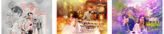
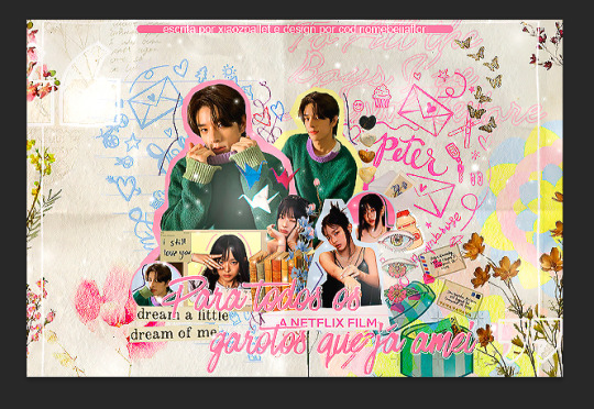
ensina a finalização da chanbaek "no blueberries" pfvv
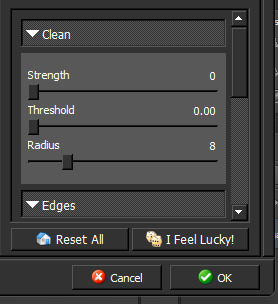
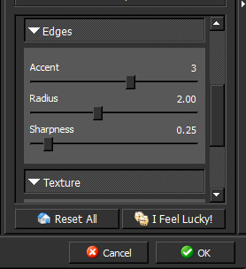
Aproveitar que eu ainda tô com o PS aberto, hihi ♡ Você vai precisar ter o Topaz Labs instalado no seu Photoshop, eu uso o Topaz Clean 3.
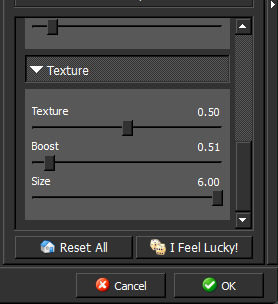
Essas são as configurações:
Depois eu fui em Filtro > Tornar Nítido > Máscara de Nitidez Usei essa configuração:

E depois apliquei >a mesma< configuração do Topaz Clean.
Resultado final:
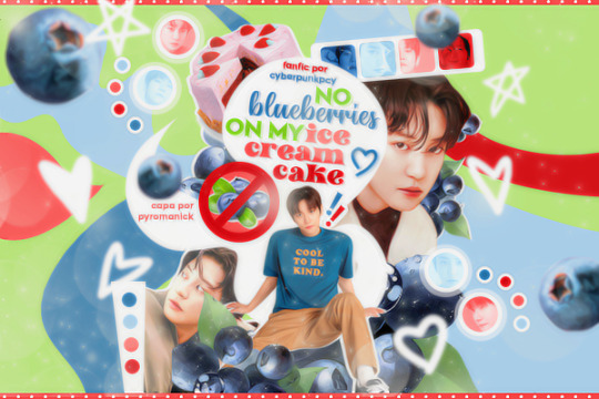
Não sei, eu quis testar algo diferente e saiu isso! Fico feliz que tenha gostado a ponto de ter se interessado, espero ter ajudado ♡
16 notes
·
View notes
Text


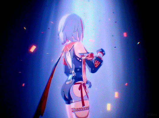
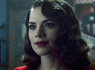
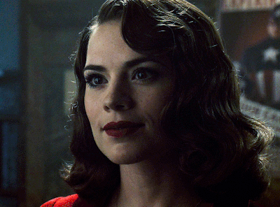
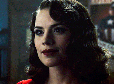
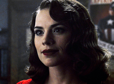
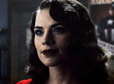
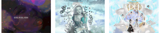
Here comes Topaz
#hsredit#honkaiedit#honkai star rail#topaz#trailer: expert tutorial#1.4 jolted awake from a winter dream#tw: flashing gif#*yd#honkai: star rail
112 notes
·
View notes
Text
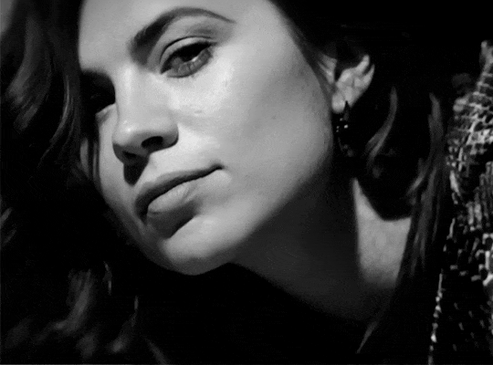
Como fazer o efeito topaz, sem o topaz.
1- Abra sua foto. 2- Clique com o botão direito do mouse e depois em “Layer from background”, depois em Ok. Assim, ela vai virar uma camada. 3- Duplique a camada (ctrl+J) 4- Selecione a camada copiada (Layer 0 Copy) e faça ela ficar invisível (clicando naquele olhinho do lado) Depois selecione a Layer 0.

5- Agora, vamos usar o smart sharpen. Filter > Sharpen > Smart Sharpen e configure assim.

A imagem vai ficar horrivel, mas nós ainda vamos arrumar isso. 6- Agora selecione a camada copiada (Layer 0 Copy) e faça ela ficar visível. 7- Nós iremos aplicar o blur (Filter > Blur > Gaussian Blur) use de 1 a 3, se não, não fica legal. 8- Agora é só colocar o quanto de opacidade você quiser (na Layer 0 Copy). 9- Prontinho! agora é só juntar as layers, e é por sua conta. =) Se foi útil dê like =)
0 notes
Text
Topaz Photo AI vs. Topaz Gigapixel AI: Ein Vergleich der KI-Werkzeuge für Bildbearbeitung
Die Bildbearbeitung hat sich in den letzten Jahren stark weiterentwickelt, vor allem durch den Einsatz von Künstlicher Intelligenz. Topaz Labs, bekannt für innovative Softwarelösungen, bietet mit Topaz Photo AI und Topaz Gigapixel AI zwei leistungsstarke Tools, die Fotografen und Kreative unterstützen. Doch welche Software ist die richtige für dich? Wir werfen einen Blick auf die Unterschiede und…
0 notes
Text
how I edit my sims ts3/ts4 screenshots (day-time edition)
A helpful? guide for editing screenshots during the day (this is not so easy for me as i prefer taking screens at night but my sims can't always be in the dark so let us all struggle together ok? ok.) this tut is done in procreate on the iPad.

Before taking screenshots:
Help yourself as much as you can in-game, utilise in-game lighting as shadows/lighting is created for you
Understand good/bad composition and add variety by using different angles to make scenes look interesting
I take LOTS of photos just to end up with 1 or 2 good ones

step 1: i would use liquify to smooth out any sharp edges or paint over them

step 2: create new layer, blending mode "multiply" use the colour picker on the area you want to add shadows to, use the selection tool to draw the shadow. you can either colour fill or just shade into the area with the brush. If you colour fill you can then erase lines that are too harsh or use the smudge tool to soften them.


step 3: do this same step but for the clothing. remember shadows are not usually completly black so i use shades of blue to shade her clothes and then shades of green for the tree.


step 4: create new layer, blending mode: overlay. outline the left side of the sim this is to make the light source more prominant. as natural light is not usually just white, i picked a slight orange tint.

step 5: add more lighting to enhance the effect. *create new layer* blending mode: add, and do the same thing as step 4 but with this layer i'll add more lighting to the parts that will be affected most by the light

step 6: i edit the hair. you can look here for my in depth hair tutorial
step 7: add lighting effects *create new layer* blending mode: add. i used the default procreate brushes 'flare' and 'glimmer' [found in luminace] to immitate light rays

step 8: merge all layers, *duplicate layer* add bloom effect and change opacity and erase parts where bloom is too strong.

step 9: merge again, then go into photshop and colour grade using 'camera raw filter' then 'smart sharpen', use 'topaz labs' effect then done!

if you have any questions feel free to direct them to my inbox & u can check out other tutorials here
201 notes
·
View notes
Text

COLORING + SHARPENING TUTORIAL
someone asked for a coloring tutorial and my sharpening settings, so here it is! there are also a few tips to achieve more HQ gifs. :)
tutorial under the cut!
FOR HIGH-QUALITY GIFS
FILE SIZES
it doesn’t matter what your sharpening settings are if the file you’re using to gif is too low quality, so i tend to look for the best that i can get when downloading stuff.
usually, movies (+2h) look better if they’re 5GB or more, while an episode (40 min/1h) can look good with even 1GB. the minimum definition i try to find is 1080p, but i gif with 2160p (4k) when available. unfortunately, not every computer can handle 4k, but don’t worry, you can gif with 1080p files just fine if they are big enough. contrary to popular belief, size does matter! which means sometimes a bigger 1080p file is better than a smaller 2160p one, for example.
SCREENCAPPING METHOD
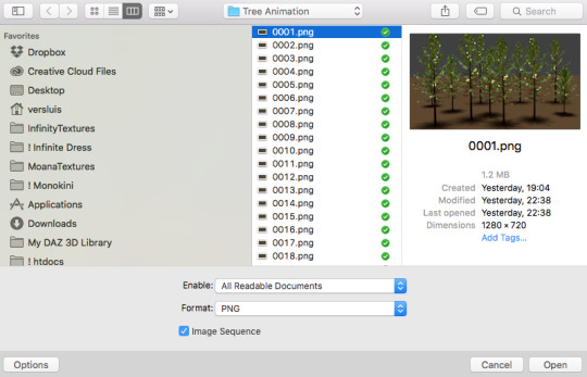
this can too influence the quality of your gifs. as a gifmaker, i’ve tried it all: video frames to layers, directly opening video clips, loading files into stack, and i’ve finally settled down with opening screencaps as an image sequence. with bigger files, it doesn’t matter much what technique you use, but i’ve noticed with smaller files you can do wonders if you screencap (either by loading files into stack or opening as an image sequence) instead of using video clips. for example, this gif’s original video file was only 4GB (so smaller than i’ve usually go for), if you can believe it!
here’s a tutorial for setting up and screencapping with MPV, the media player i use to screencap. again, you can keep using video clips for bigger files, but you’ll find this useful when dealing with dire causes. i don't file loads into stack, though, like the video does. i open as an image sequence (open > screencap folder > select any image > click the image sequence button). just select OK for the speed. this will open your screencaps as a video clip (blue bar) in timeline mode (i'm a timeline gifmaker, i don't know about you). you will need this action pack to convert the clip into frames if you're a frames gifmaker. i suggest you convert them into frames even if you're a timeline gifmaker, just convert them into a timeline again at the end. that way you can delete the screencaps right away, otherwise you will delete the screencaps and get a static image as a "gif".
ATTENTION if you’re a Mac Sonoma user, MPV won’t be an option for you unless you downgrade your system. that is, if you have an Intel chip. if you have M1 Max chip (or even a better one), here’s a fix for MPV you can try while keeping that MacOS, because nowadays MPV is skipping frames in its latest build. or you can use MPlayer instead for less hassle. here are two tutorials for setting and using MPlayer. Windows users are fine, you can use MPV without trouble.
FOR EVEN MORE QUALITY
ADD NOISE
here’s a tutorial for adding noise as a way to achieve more HQ gifs if your original material is too low quality.
REDUCE NOISE WITH CAMERA RAW
instead of adding noise, you can reduce it, especially if your gif is very noisy as it is.
the path is filter > camera raw > detail > nose reduction. i do this before sharpening, but only my video file isn't great to begin with. because it’s a smart filter, you can reduce or increase its opacity by clicking the bars next to its name in the layers panel.
TOPAZ AI
i use Topaz Photo AI to increase the quality of my screencaps when i need to. it’s paid software, but there are… ways to find it for free, usually on t0rrent websites. if someone’s interested, i can make a tutorial solely about it in the future.
SHARPENING SETTINGS
here are my sharpening settings (filter > sharpen > smart sharpen). i sharpen things twice: 500% 0.4px + 10% 10px. here's an action for it, for more convenience. here's a tutorial on how to use Photoshop actions. for animated stuff, i use this action pack.

COLORING
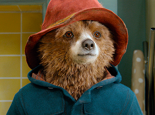
here’s the gif i'm gonna use as a base. it’s already sharpened like the way i always do it.

LIGHTNING THE SHOTS
half of the secret of a good coloring is good lightning. i always useCurves (layers > new adjustment layer > curves) and Brightness & Contrast (layers > new adjustment layer > brightness & contrast). the settings depend on the scene you’re giffing, but i always try make my gifs bright and with high contrast to make the colors pop.
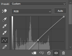
CURVES
besides lighting your scene, the Curves adjustment layer has four automatic options that will color-correct it for you. it’s not always perfect and it doesn’t mean you won’t need to do further coloring, but it’s a great start. it’s a lifesaver for most ridiculously yellow scenes. look at the difference! this gif uses the 3rd automatic option (the screenshot below isn't mine btw so that's why the fourth option is the chosen one), from top to bottom. what automatic option you need to choose depends on the gif.

sometimes i like to tweak my Curves layer. not everybody does that, it’s not that necessary and if you’re not careful, it can screw your gif up. to modify your layer by hand, you will need to click and drag points of that straight line in the position you desire. this is the concept behind it:

basically, the lower part of the line handles the shadows, while the upper part handles the highlights of the image. if you pull a highlight point up, the image’s highlights will be brighter. if you pull it down, it will make them darker. same thing for the shadow points. you should play with it to get a grasp of it, that’s what i did when i first started giffing.
BRIGHTNESS & CONTRAST
then i added a bit of brightness and contrast.

CHANNEL MIXER
the scene looked a bit too yellow, so i used the Channel Mixer (layer > new adjustment layer > channel mixer) adjustment layer. here’s a tutorial of how it works. not every scene needs the Channel Mixer layer though, i mostly use it to remove heavy overall tints. in this particular case, the Curves layer got rid of most of the yellow, but i wanted the gif to be just a bit more blue so the Channel Mixer tweaks are very minimal.

SELECTIVE COLOR
now, this adjustment layer i always use: Selective Color (layer > new adjustment layer > selective color). this is THE adjustment layer to me, alongside the Curves one. this is how it works:

ie, you can separately edit a color this way, giving it tints. for this gif, i wanted to make the colors more vibrant. to achieve that, i edited the selected colors this way:
for the reds, i added even more red in them by moving the first slider to the right, making the color more vibrant. for his hat to have a more warm tint, i added yellow to the reds (third slider, moving it to the right). finally, to make the reds stronger, i moved the last slider to the right (more black).
for the yellows, i made them brighter by adding white to them, thus making the tile wall and Paddington more bright as well.
for the cyans and the blues, i just added the maximum (+100) of black that i could.
i wanted for Paddington's nose to be brighter, so i added more white to the whites.
lastly, i added depth to the blacks by increasing their own blackness.
you should always play with the Selective Colors sliders for a bit, before deciding what you want or need. with time, you will automatically know what to change to correct the color grading. it all takes practice!
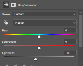
HUE/SATURATION
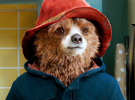
i don’t know if you noticed, but there are some green spots on the blue wall behind Paddington. to correct that, i added a Hue/Saturation adjustment layer (layer > new adjustment layer > hue/saturation) and made the saturation of the greens 0%, making that unwanted green disappear from the background.

while the green spots on the wall are specific for this gif, i use hue/saturation a lot to tweak, well, hue and saturation. sometimes someone’s skin is too yellow, i made it redder by tweaking the reds and the yellows, or vice-versa. the hue bar follows the rainbow bar, so the maximum settings (+100 and -100) give the selected color to change its hue to something more red or pink (the rainbow extremities). changing hue can give pretty whacky results, like turning someone’s skin tone to green, so you will need to play with it to get the hang of it. you can also tweak the opacity of your hue/saturation layer to further improve your gif’s coloring. i didn’t do it in this case, the opacity is still 100%. the reds and the blues had their saturation increased to make them pop just a bit more, without affecting the other colors.
COLOR BALANCE
the highlights of the gif still had a green tint to it due to the automatic correction of the Curves layer, so i used Color Balance. this is how it works: instead of giving specific colors some tints, you can give them to the shadows, highlights, and mid-tones. if your shadows are too blue, you counterbalance them with the opposite color, yellow. same thing with the cyan-red and magenta-green pairings. in my case, i added a bit of magenta.


B&W GRADIENT MAP
now, if this gif was a dish, it’s time for the salt and pepper. i always add a Gradient Map (layer > new adjustment layer > gradient map) (black to white gradient) with the Soft Light blending mode, thus giving my shadows more depth without messing with the mid-tones and highlights. it also doesn’t “deep fry” (you know those memes?) the gif too much by adding even more contrast. usually, the opacity of the layer is between 30% to 70%, it all depends on the gif. it always does wonders, though!
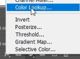
COLOR FILTER
finally, i like to add Color Filters (layer > new adjustment layer > color filter) to my gifs. it’s very handy when giving different scenes for the same minimalistic set because it makes them kind of match despite having completely different colors. in this gif’s case, i added a “deep blue” filter, opacity 50% density 25. you can change the density and the opacity of the layer for further editing, again, it all depends on the gif.

VIBRANCE
if i feel like it, i add a vibrance layer (layer > new adjustment layer > vibrance) to make the colors pop. this can ruin your coloring sometimes, especially when regarding skin color, so be careful. i didn't do it in this gif because i felt i didn't need it.
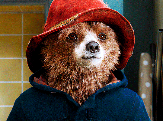
TA-DA! 🥳
AN OTHER EXAMPLE
the color grading of the original scene it’s pretty good as it is, to be honest. let’s see a worse scenario, a VERY yellow one:
no channel mixer this time because the automatic curves option dealt with the yellowness, but you can see it made the gif too green. i needed to correct that with the following adjustment layers:
curves (automatic option) (gif 2) >> same curves layer (tweaks) (gif 3) >> brightness & contrast (gif 4) >> hue/saturation (tweaked cyan+blue+green) >> selective color >> color balance (gif 5) >> b&w gradient map >> (sepia) filter >> vibrance (gif 6)
i added a hue/saturation layer to remove the blues & greens before my selective color layer because i thought that was more urgent than tweaking the tint of all colors. color balance (gif 4) was the real hero here, though, by removing the green tint. the selective color layer was meant to make the red pop more than anything else, because the rest looked pretty good, especially her skin tone (despite the green tint). you can notice that tweaking the curves layer (small gif 3) also helped A LOT with the green problem.
tl;dr 😵💫😵💫😵💫
here's a list of my go-to's while coloring and lightning gifs. it's not a rule, just a guide. there are gifs in which i don't use all these adjustment layers, or use them in a different order. it all depends!
1. curves (automatic option + tweaks) 2. brightness & contrast 3. channel mixer 4. selective color 5. hue/saturation 6. color balance 7. b&w gradient map 8. color filter 9. vibrance
i'll suggest that you study each adjustment layer listed for more info, either with other Tumblr tutorials or YouTube ones. the YouTube ones focus on images, but you can translate what they teach to gif making very easily. you can ask me to further explain any adjustment layer, too! i was brief to keep this short (which i kinda failed lol).
feel free to ask me for clarification or something else about gifmaking wise, i always like to help. ❤️
#*#*tutorials#gifmaker tag#resources#resource: tutorials#ps help#uservivaldi#tuserjen#userrin#userelio#useralien#userzaynab#userchibi#userbuckleys#usertj#userbess#tuserlucie#useraljoscha#userdavid#usershreyu#usernolan#userhallie#userisaiah#tusergio#tusergeo#userjesslynn
796 notes
·
View notes
Text
SAHSRAU IDEA
WARNING:Religious themes, cult themes, semi existencisl crisis, Boothill leaks(backstory)
Now listen ever since Boothill leaks dropped of his backstory i hated the IPC, and then i went on to learn more about them and damn. If Sahsr were real theyd be dead by now.
Like i take my hatred seriously, i just started Topaz's quest and i was nitpicking the most humbling options and the ones that were most pessimistic towards IPC, i decided to not pull ANY IPC CHARACTER, Topaz, Aventurine, Jade, Im not pulling any of them, f the shield and f the treasure, and my love for Boothill is visible, hes the reason i redownloaded (i was still very much in the tutorial part) and kept the game this time, and while my saving could have been bigger(i got a bit greedy on standard pulls) their at 110 with no pity on both character and weapon banner, i am getting that mf
And thew self aware lenses the Astral express is debating, the IPC arent perfect, yes, but they have friends there, they DID help places, but their grace refused to have anything even remotely positive towards them, should they...cut off all ties? If it pleases their grace maybe, and they cant deny how valid your concerns are, they are bad people, they have disapointed their grace, in fact youd be happy if they got wiped wouldnt you? No, youd want them alive. To torture them, and then... For their last breath will serve as a suficient offering
The IPC meanwhile are sweating bullets, some of them are aware of how rotten they are, some genuanly believe they are good, Topaz unfortunatly falls into the second category, she and Numpy are reaching high and low for only the best treasure for your offerings, pleading, begging you to forgive their actions, and maybe you could, if she felt and never looked back, burning away what was left, Aventurine's hands better off being choped off, its vibrating from panic, hes pacing back and forth, chewing on his glowes, can he even leave if he wanted to? who would he turn to? what would he do then? He may have been blessed by Mama Fengu but you... You are anything else, he doesnt like the IPC either but he knows that if you could, youd travel back in time and give him the coldest responses, and death threats behind that beautiful, safe screen. Jade, Miss Jade, Powerful and in control Jade, knew she was the most screwed from the three, it was no secret, what she did to Aventurine, her slaves, they held their usual expressions but she knew they were smilling on the inside, awaiting your rescuse from her hands, she knows turning over a new lief wasnt an option, youd just laugh at the idea she could reddem what she did, all she can do is call Diamond and seek a solution, what else is there
Boothill, Ive never seen him happier, he cant wait for hes release, for you to come pick him up, get him a brand new gun, give him all those thingamagics to make him stronger, to better make you happy, you care so much about him, hes your favorite, he hopes youll be happy w ith his trial and still choose him, hell do his best there! Oh he can already hear and see it all when the prophecy comes true, for when that stupid, cage breaks.... The wedding bells... The little rascals.... He already has a few names planned! Isnt he so great?
#sahsrau#honkai star rail#hsr boothill#boothill x reader#boothill#the IPC#Sahsrau boothill#yandere hsr#yandere boothill
434 notes
·
View notes
Text
Self-use Sims 3 CC Tutorials List
Here is a list of tutorials from which I learn to convert/create sims 3 cc in a few months (and as a poor English speaker). I think it might help someone who also wants to try making things for sims 3 but doesn't know where to start, though it's been 15 years from the game release and even Inzoi is coming hahah.
The list covers objects, clothes, hairs and eyes. I know there're lots of tutorials not listed here, that's because I haven't tried them in my projects by hand. But The list will be updated with new things I learn. Most tutorials are in English. Thanks to all these creators for sharing their precious knowledge!
Sorry for the miserable format, cuz I wrote them in Patreon and paste here. You can also read it there, free of course.
Where I find tutorials
sims 3 tutorial hub
ts3 creators cave and its discord
Mod the sims tutorial wiki and the forum
pis3update tutorials tag
General
CC basic concepts by nightosphere (for clothes, most knowledge is shared with objects)
Tools
TSRW guide by apple (for objects, most knowledge is shared with clothes)
Blender
shortcut by Blender Guru
beginner tutorial for version 2.5, 2.8, 3.0, 4.0
3.5入门教程 (youtube / bilibili)
设置切换语言快捷键 change language shortcut settings
图片取色器网站
Mesh ToolKit with Seam Fixer for all ages
Topaz gigapixel AI guide / higher quality texture
Texture
Nicer bake / bake in blender 2.78
Bake in blender 2.93
Make normal map
small size blank texture
Reasons for black blocks on baked image
Adjust texture color without losing quality
Object
clone obejcts with S3OC
4t3
Functional Objects
Functional bed
TSRW setting
Combining Textures for Objects with Multiple Textures
Add normal map to objects
Introduction to slot categories
Add slots in TSRW
Edit in-door shadow or occluders in TSRW / Talks about 3 kinds of in-game shadow by Pocci
Clothes
4t3 by nightosphere
Reduce polycount / fix seams, holes, shadows or normals
Bone reference rule
Avoid milkshape workflow / adjust bone assignment and morphs in blender
Manually fix bone in blender
Convert between ages/body meshes
TSRW check list
Fix long clothes clip with body
Fix holes on morphs (easier in blender)
Extrude collars
Create texture in PS
Avoid TSRW workflow / CTU tutorial
Hairs
Avoid milkshape and TSRW workflow / delete backfaces / handmade morphs / DABOOBS guide
Keys pointing to in-game blank textures to save file size (for DABOOBS not TSRW)
Reduce polycount
4t3
Fix weird seam lines on hairs from s4s
Fix pigtail issue
Eyes
Convert contacts to default eyes
244 notes
·
View notes
Text
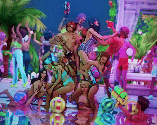
Tutorial: How I edit my pics (Photoshop)
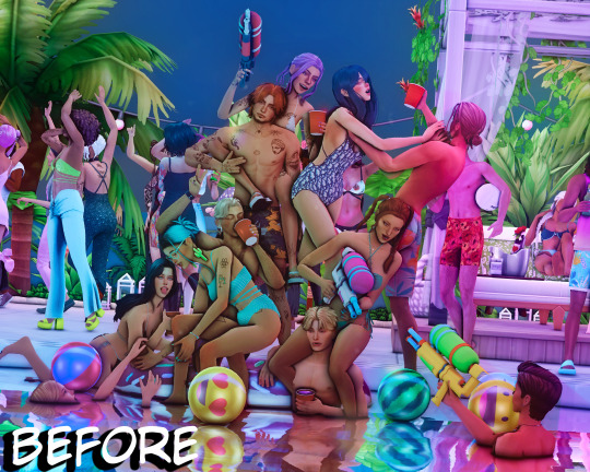
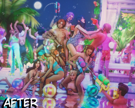
A not so helpful guide by me~
(orig. post)
For the beginning: I use my own Reshade and use only Photoshop to edit. (for videos I use Premiere Pro/After Effects)
Ingame: I use SRWE with the profile 3840x2400 to get it already in a better qualitity. For this pic I also used ReLight.
In Photoshop:
I start with using Topaz Clean with these Settings:
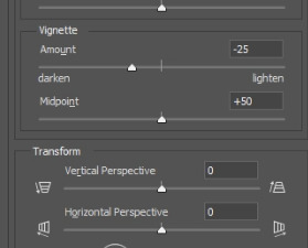
Next I make a Vignette ("Filter"-> "Lens Correction") with these Settings:
After that, I start making a bloom you can use this tutorial for that: https://www.youtube.com/watch?v=aMxnXfN7ZDg
Before and After
Now I put a filmic grain on it . For that I go on "Edit" and click on "Fill"
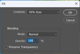
you want it to look like that
The pic will turn gray but thats normal!:)
Now I convert it into a smart object by right clicking on the layer.

Next I change the layer to "Overlay"
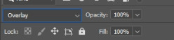
I continue with going to "Filter" and click on "Noise" -> "Add Noise"
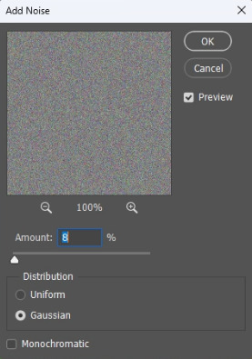
The window will look like that. I like to put the Amount to 8 but that's all preference:)
That's it for the filmic grain. (I made it into an Action so it's faster)
My next step is to put a Curve to make the pic a bit more moody.
I don't put too much though lol, it also changes depening on the pic.
After that, I put a Color Lookup to change the color a bit.
For that I click on the little half moon bottom right.
I like to use on of the first 2 Kodak LUTs (Kodak 5205 or Kodak 5218)

I put the Fill of that layer around 40% to make it less strong.
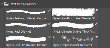
Next I draw hair! (still a noob at it...) I use this Brush "Kyle's Real Oil Round Flex Wet" that comes with Photoshop:

Before and After
For the next step I use 2 Hue/Saturation Layers also on the little halfmoon bottom right.
With that I draw Shadows and Highlights!

For Highlights For Shadows
After that, I click Ctrl+I to invert the Layers and start drawing on the mask layer.

Before and After
The pic is in an area with lots of colored lights, it would naturally reflect on the Sims, so I put some pinkish and blueish colors on highlights like this:

Now to the effects to make it look more fun!
3 of the Sims are using water guns and they splash with it ofc! So I added some water splashes with a brush and put a slight motion blur on it.

and since it's a lot of people, water splashes everywhere. Because of that, in some areas I added some water splashing effects (Photoshop Brush) that are making it look like there is movement.
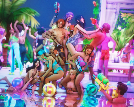
looks way more alive now right?
It still felt a bit "empty" though, so I decided to put a picture of a moon in the sky and added some bubbles (Photoshop Brush) around.
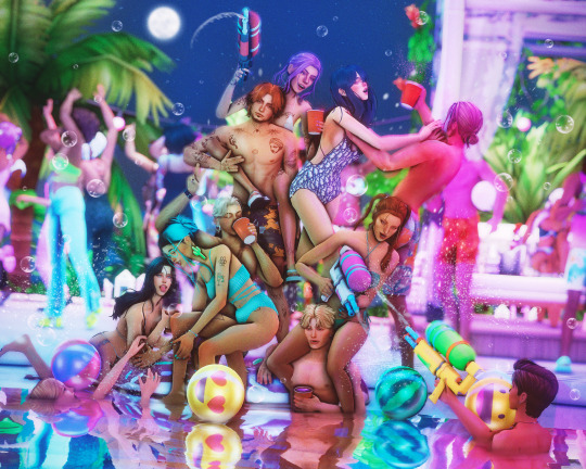
fun fun
Now I put a light leak overlay I found on the internet over the pic.
I put the Fill of that Layer on really low though, so it has a “soft“ effect.
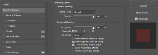
At the end, I made a chromatic aberration (color distortion)
For that I make a Layer copy of the pic and double click the new copy layer and a menu should open.
Under channels uncheck G and B. After that close the window and just resize the Layer a bit.
And that's it! Hope it was helpful somehow:)
154 notes
·
View notes
Text

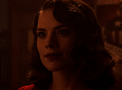
A quick method to deal with blurry action shots that have Hannibal's quintessential dim lighting + green color grading combo.
Here's the example I'll be using:

Don't get me wrong, I love the look of Hannibal, but the average person doesn't scroll tumblr with their screen brightness on max. Plus, night light filters and blue light glasses add even more yellow to an already heavily filtered show. If you want people to see your gif clearly, you have to edit it at least a little. Especially for extreme shots like this lol.
What I use: macOS 15.1.1 Elmedia Player 8.18 dupeGuru 4.3.1 Topaz Photo AI 3.2.0 Photoshop 25.11.0 LuLu 2.6.3 (optional, but it's nice to block outgoing connections from pirated programs)
Step One: Take Screenshots
Open your video file (1080p preferred) in Elmedia Player and navigate to the first frame of your gif. Hit "Playback > Record a Series of Screenshots" and let it run until you have all the frames you want. Unfortunately for mac users, we have a problem where a lot of duplicate screenshots are taken (like every third screenshot is a duplicate... it's so annoying). To save time later, I use dupeGuru to clean out as many duplicates as I can.
Open dupeGuru and add whatever folder you saved your screenshots to.

Scan the folder, then hit "Mark > Mark All" (you can see here that the program only caught one duplicate, which means more work later. it's not a perfect program -_-)

Hit "Actions > Send Marked to Recycle Bin..." to remove the duplicates from the folder

Step Two: Denoise
At this stage the screenshots are so dark that the noise isn't obvious, but it'll be more noticeable after brightening and sharpening. Here's the difference this step makes later:

Upload all your screenshots to Topaz Photo AI and add a Denoise layer. I normally go with the automatic settings.

Hit "Select All," "Apply > Current Settings," then export all your images. This can take a while depending on how many images you have.

Step Three: Create Frame Animation in Photoshop
If you've read any other gif-making tutorials this part should be familiar, so I'm gonna skim over it.
"File > Scripts > Load Files into Stack"
"Browse..." and select your Topaz output files
"Sort by Name" so they load in the correct order
"Ok"
Once all the layers have loaded, hit "Create Frame Animation" in the Timeline window
Under the Timeline window options menu, hit "Make Frames from Layers," then "Reverse Frames"
This is probably when you want to go through frame-by-frame and delete any remaining duplicates. It's very annoying to have to redo this step if you want to go back and edit your crop size later. (Not that I would know... 🤡)
Step Four: Crop + Resize
Crop, then "Image > Image Size" to adjust the width of your gif. You'll most likely want to use one of the common tumblr image dimensions:
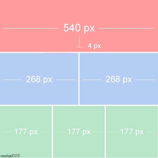
Keep in mind that tumblr's gif size limit is 10 MB. But it's honestly best to keep it under 9.5 MB if you want the gif to load smoothly. A 540x540 px gif can have 40-60 frames while a smaller gif can be longer.
Make sure to add +2 px to whichever width you choose (so 542 px, 270 px, etc), since we'll be adjusting the canvas size later to get rid of transparent border anomalies.
Step Five: Color
The more common order of operations is to sharpen before coloring, but for dark scenes like this, it's kinda silly to sharpen when you can barely see what you're doing, so I like to color first.
Select all your frame layers and make a new group, just to keep them separate from your adjustment layers.
I always start by testing out the Auto Color Correction Options in a Curves adjustment layer. To access them, opt + click on the Auto button. This opens a window with four options.
I like to use a combination of "Enhance Per Channel Contrast" and "Find Dark & Light Colors," though either option can be used to adjust color balance. The important part is selecting "Snap Neutral Midtones" and picking a midtone that brings your gif as close as possible to the desired color balance.

If changing the midtone doesn't affect the color balance, brighten the gif first and try again.
For this gif, "Enhance Per Channel Contrast" removed the bulk of the green filter:

It's still pretty dark, so I brightened up the gif with some more Curves layers:

There's still a lot of purple/blue in Dolarhyde's black leather jacket, so I added another Curves layer and used "Find Dark & Light Colors" to improve the blackpoint:

Now we can up the contrast a little:

Nice! Good enough to move onto sharpening!
SIDE NOTE: The reason I use these Color Correction Options is because simply brightening leaves you with purple/blue shadows and sickly green over-exposed highlights that take ages to color correct. You can see the difference here:

(If you've ever wondered why so many Hannibal gifs have blue shadows, this is why.)
Step Six: Sharpen
This is where you'll want to start implementing actions, which are pre-recorded series of adjustments that you can perform with the click of a button. I mainly use three actions (download here, open the Actions window in PS, open the Action options menu, and click "Load Actions...").
The "frame animation to smart object" action converts the gif to a video timeline so we can apply smart filters.
The "legacy sharpening + high pass" action applies my standard sharpening filters. Not every gif will need the high pass filter, so feel free to change its opacity or delete it altogether. You can also tweak the smart sharpen filters by right clicking them and selecting "Edit Smart Filter..."

3. Once you're happy with the sharpness, the "convert to frame timeline" action turns the gif back into a frame animation. I use a 0.05 s frame delay for most gifs (equivalent to 20 fps; 24 fps is standard for tv/movies). I normally use 0.07-0.08 seconds for action shots, so the gif doesn't whip around so fast. Over 0.1 seconds, it starts to look like stop motion, so I try to avoid that.
Step Seven: Final Adjustments
This is where I fine-tune the colors, mostly using Hue/Saturation layers.
If I use a Color Balance layer, I only make very small adjustments and try to counterbalance them in the other tonal ranges (e.i. adjustments to the Highlights spill over to the Midtones, so I make the opposite adjustments to the Midtones to fix it). But most of the time, I'd rather play around with Curves or Hue/Saturation to fix stuff like that.
Hue/Saturation gives you more control by allowing you to select the exact color range you want to affect. For this gif, I used Hue/Saturation to get rid of the purple introduced around the highlights in Will's hair by the high pass filter.
The eyedropper tool allows you to select the exact color you want to include in the range. Then you can move the bars around until all the colors you don't want to affect are excluded.

Once you have your range selected, you can bring the saturation all the way down and set it to whatever lightness you prefer:

I also reduced cyan's saturation so that Will's shirt wouldn't look quite so blue.

[You could do a lot more to make the colors prettier... but there are other tutorials online for that. 😅]
Step Eight: Export
Once you're happy with your final product, go to "File > Export > Save for Web (Legacy)..."
These are my settings:

You can use Diffusion instead of Pattern if you want. Diffusion is probably better for mobile gif compression, but I like the way Pattern looks on desktop, especially for gifs with smooth gradients. It's a personal preference thing.
Hit "Save..." and you're all done!

This isn't gonna win any gif-making awards, but at least you can see what's happening and the colors don't look wonky. And for Hannibal, I call that a win! 🥲👍
61 notes
·
View notes
Note
Hi hi, hello! Suas capas são incríveis e vc é uma grande inspiração pra mim colega capista. Eu gostaria de perguntar qual app vc usa para fazer as suas capinhas. Estou fazendo capinhas mais simples a alguns meses usando o PicsArt, mas gostaria de evoluir ainda mais e o fazer usando um app mais popular para capistas como o ibis. Você poderia dar algumas dicas para essa capista iniciante e tão sonhadora?
Olá, muito obrigadaaa! <3 Eu edito pelo photoshop CS6, uma versão mais antiga do photoshop cc. Eu não acho que sou a melhor pessoa pra te dar dicas, porque útilma vez que editei no celular foi lá em 2014 😭 Masss eu tentei juntar umas dicas bem úteis ❤️

Algumas dicas para capistas, em geral
Fontes, fontes, fontes: Uma das primeiras coisas que eu faço é escrever o título e separar um lugarzinho pra ele, porque antes eu sempre fazia a capa e quando eu ia ver, cadê o lugar do texto? Uma fonte bonita é muito importante, viu, e pode até te dar um pouquinho de inspiração a mais.
💕 As que eu mais uso são:
Capa 1: A Gentle Touch Capa 2: Slowly Lovely Sans e Lie to me Capa 3: Rocket Clouds
Capa 1: Linux Libertine Capa 2: Slowly Lovely Sans Capa 3: Carilos Regular e Starmony Extra: Big log
Também dá pra usar elas pelo Ibis Paint, eu acho que a fonte que a gente usa influencia muito o resultado final.
Imagens e materiais com uma boa qualidade: É uma dica velhinha, mas é útil demais. Eu geralmente pego as imagens que eu uso no Pinterest e os materiais no DeviantArt, por lá tem muita coisa útil mesmo: textura, png, efeitos. Eu vivo olhando o Deviant Art da @trancyzp, pois ela posta e curte muita coisa boa navh (só clicar). Contas muito legais por lá: coloursource, kthjkdrama, noirpsds (Esses são os que eu mais tô baixando conteúdo ultimamente).
Uma boa finalização! Eu não posso ajudar muito com essa, porque quando eu editava no celular era lá no Photoshop Touch ☠️, não tinha finalização ainda. Mas muita gente incrível fez tutorial, viu! A finalização é uma das partes mais importantes e uma das mais legais também. Separei dois tutoriais muito bons: Finalização Ibis Paint por @sharkissm Clique aqui Finalização Ibis Paint e outros por @maluyoongi Clique aqui.
Uma dica extra minha: Tem algo que eu uso absolutamente em todas minhas capas, pois eu amo usar demais e na minha cabeça é perfeito. Esse algo é a "textura do png", só que eu uso ela com uma opacidade entre 18% e 26% e mais ou menos assim:
Agora umas dicas teóricas ☝️
Não entre em 1 milhão de projetos/blogs como eu fiz quando comecei, é muito legal, mas em excesso atrapalha muito.
É uma dica meio boba, mas eu meio que desenho num caderno o que eu imagino na capa antes de começar, anoto minhas ideias, tipo: onde isso vai ficar? e aquilo?
Veja tutoriais no YouTube, a maioria dos capistas (incluindo eu) aprendeu tudo o que sabe de lá. Não precisa ser tutorial exclusivamente de capas, de outros tipos de edições também vai te ajudar a evoluir! Esse aqui, por exemplo, é de capa pro Amino, mas achei muito interessante. Esse também ó. Eu via muito tutorial de capa de Amino e me ajudou bastante a aprender vários truques. Esse aqui é pra Layout de Twitter. Eu tentei achar um tutorial muito bom que eu usava, mas acho que foi excluído :(
E tem um pessoal que faz um tipo de iluminação perfeita por lá, mas eu nunca consegui fazer nem nada parecido 😭 > Eu < recomendo você começar fazendo estilos mais leves, texturalizadas, tipo assim. Eu comecei com texturalizadas, olha:


Não desista, não desanime, não se compare Eu acho que todo capista um dia consegue achar o seu estilo próprio de editar! Eu vou até mostrar como eu comecei a editar, só não vale rir ☠️ (vale sim)
E tinha outras perólas, mas eu perdi a senha do meu falecido Facebook 😭 E é isso! Eu não edito pelo celular, mas tentei ajudar de alguma forma e eu espero, de verdade, que pelo menos uma dica dessas seja útil pra você <3 Qualquer coisa, você pode me chamar no chat que eu posso até aplicar um topaz ou um 3d nas suas capinhas pelo computador, pra dar uma qualidade melhor viuu! eu tenho certeza que você é um* capista super talentos* já! Boa sorte na sua jornada ❤️
55 notes
·
View notes
Note
como você finaliza suas capas? elas são lindas 💕
MEU DEUS, MEU SONHO UMA ASK DESSA!
Vamos lá, vou ensinar só uma vez. Faça suas anotações... Vou usar uma capa recente minha como exemplo.
Essa é ela sem finalização, sem filtro. Somente com os elementos da capa, ou seja, os pngs, as texturas, psd, etcc. A primeira coisa que eu faço é unir todos esses elementos em grupos. Exceto o psd, o psd coloring fica acima da capa.

Depois que eu as transformo em um grupo. Eu aperto CTRL+J e o grupo é copiado. Eu faço isso por que, se caso, eu precisar alterar algo na capa, o trabalho não será perdido. E nesse modo, eu já salvo ela em psd e jpeg.


E agora, o que se faz com o grupo copiado? Tempos duas opções, mesclar o grupo ou converter para filtros inteligentes. Eu prefiro converter para filtros inteligentes. Mas faça da maneira que preferir.

AGORA VAMOS COMEÇAR A COLOCAR OS FILTROS
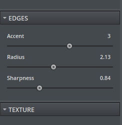
O primeiro filtro que eu uso é o da nitidez. Sendo mais específica, a Aplicação Inteligente de Nitidez. Abaixo colocarei as minhas configurações. Muita atenção nessa hora, pois eu sempre seleciono remover desfoque de movimento. Acredito que dá um tchan especial na capa.


O próximo filtro que eu uso é o toques de tinta. Você deve estar se perguntando qual a função dele, não é? Ele ajuda com um pouco mais de nitidez e dá destaque nas arestas da capinha. Mas cuidado para não pesar a mão. Eu uso essa configuração aí de baixo, e apenas ela faz uma grande diferença.


Olha como ela já está ficando...
O toque final é o topaz clean. Ele dá um pouquinho de trabalho para instalar (futuramente posso disponibilizar um tutorial ensinando) . Mas ele vale todo o esforço. Abaixo minha configuração. Eu salvei essa configuração perfeita para sempre que eu precisar.


Vamos conferir o resultado final??

25 notes
·
View notes
Text
━━ ★ TUTORIAL: FINALIZAÇÃO DE CAPA
E ai, xuxus! tão numa boa?
Já faz um tempinho que estou devendo uma resposta para uma ask que recebi no começo do ano a qual um(a) de vocês me perguntava como eu finalizava as minhas capas. Infelizmente, ao tentar fazer esse tutorial com a minha última arte postada, acabei deletando a ask sem querer, então não consigo mais responder por lá. Para quem a enviou para mim: desculpe pela demora xuxu!! tô até envergonhada por ter demorado tanto tempo assim para te responder... muito obrigada pelo carinho e por ter me acompanhado desde a era gaonsu!! ♡
Antes de tudo, gostaria de dar todos os créditos para @mercuryport, @maluyoongi e @kodalindissima. Sempre que termino de editar as capas, tenho o costume de mesclar as infos das finalizações disponibilizadas em seus sites, as medidas não são minhas, então a cada passo do tutorial estarei indicando de quem são cada informação passada.
OPCIONAL:

Essa parte é opcional, pois dependendo da capa o posterizar não combina muito, mas como nessa eu o usei, achei melhor colocar aqui.
Quando escolho por usar, sempre utilizo esse efeito antes de começar a finalização, pois se aplicar depois sinto que a qualidade da imagem não fica boa. Na maioria das vezes aplico o posterizar sob a camada do coloring ou sob a camada do mapa degradê, que costumo a usar mais do que colorings.
Para aplicar o posterizar basta clicar naquele iconizinho lá embaixo, onde coloquei um quadradinho vermelho, e ele irá aparecer dentre as opções disponíveis. Ao clicar nela, irá abrir uma aba onde estará escrito "níveis", os números que uso ali dependem muito de capa para capa, mas sempre vario entre 12, 13 e raramente 14. Para essa arte em especifico, no entanto, eu ajustei o nível para 17.
créditos do coloring usado: @colour-source
1. topaz: salve a capa em png e abra o arquivo. Ao fazer isso, vá em "filtro" na parte superior do photoshop e selecione "topaz labs" dentre as opções que irão aparecer. Lembrando que é necessário ter o Topaz Clean 3 plugado no photoshop para conseguir usar essa opção.

Normalmente costumo usar muito as medidas que a @maluyoongi me passou, assim como nessa capa, mas tenho outras duas medidas salvas no meu "PRESETS" que pertencem a @kodalindissima e @mercuryport. Dependendo da capa e das necessidades dela, intercalo entre essas três medidas.
Antes de divulgar essas medidas, solicitei a autorização da @maluyoongi para estar repassando para vocês. Não estou mostrando as demais salvas pois, diferentemente da Malu, não conheço as(os) capistas mencionadas(os) em particular, apenas as suas artes, então não acho justo sair divulgando sem uma autorização, ainda mais quando já estão disponíveis em seus perfis.
2. aplicação de nitidez: medidas dos passos seguintes disponíveis no perfil da @kodalindissima.

Após aplicar o topaz, sigo a aplicação de nitidez da @kodalindissima que está disponível nesse post (link) no perfil dela. As medidas que usei para essa primeira aplicação de nitidez estão no passo 3 do post dela. Não estarei divulgando explicitamente as medidas aqui pois não solicitei a autorização dela, então acho mais justo encaminhar vocês para o post dela.
3. ruído: para aplicar o ruído vá em filtro > ruído > adicionar ruído.

Assim como o posterizar, a intensidade do ruído vai depender muito das qualidades das fotos que você usou para montar a capa. Muitas vezes, quando as fotos escolhidas não tem uma qualidade muito boa, é sempre bom usar o ruído numa intensidade menor, para não deixar a imagem com um aspecto ruim. No entanto, se as fotos são de uma qualidade melhor, dá para ousar um pouco mais no ruído. Ainda assim eu nunca passo do 3%.
Geralmente eu uso a intensidade mencionada no passo 3 da @kodalindissima (link), mas quando a qualidade das imagens que eu escolho não estão muito boas, eu uso a intensidade do ruído mencionada no post (link) @mercuryport.
4. outra aplicação de nitidez: depois que eu já apliquei o topaz, nitidez e o ruído, aplico mais um pouco de nitidez. A intensidade e o raio dessa segunda aplicação está disponível no passo 5 do post da @kodalindissima.
Depois de aplicar essa segunda nitidez, sigo a risca o restante do tutorial dela. Ou seja, a partir do passo 5 do post dela, eu não mesclo com outro tutorial, sigo a risca as instruções dela. E, no final, o resultado final fica assim:
Eu sou péssima para explicar as coisas, mas espero ter conseguido passar tudo certinho para vocês. Sei que talvez fique meio confuso de entender, porque terão que ficar navegando de um post para outro, mas como não pedi autorização para as capistas para disponibilizar explicitamente as medidas, então não achei justo simplesmente colocar aqui. Uma dica, que inclusive a @kodalindissima, ensina no tutorial dela, é salvar essa finalização em uma action para vocês não precisarem ficar navegando de post em post o tempo todo para finalizar a capa de vocês.
obrigada pelo carinho!!♡
espero ter conseguido ajudar.
78 notes
·
View notes
Note
You've made me download Adobe Photoshop just to learn how to make gifs. It's Tumblrs like yours that push me to lean into my creativity, really.
How do you make you gifs so smooth? Do you have advice for beginners?
hiiii omg this is so sweet of u to say 😭 thank you kindly!! honestly, making gifs can feel a bit intimidating when ur just starting, but I promise it gets easier with practice.
my process isn’t really anything fancy it’s just the same stuff most gifmakers do. when I first started, I followed a ton of tutorials, so I’ll link some of my favorites below! (i still refer to them 'til this day)
GIFMAKING FOR BEGINNERS by hayaosmiyazaki
GIFMAKING 101: A COMPREHENSIVE GUIDE by redbelles
HOW TO: MAKE HIGH-QUALITY GIFS by cal-kestis
GIF TIPS AND TRICKS by lildohnut
LOW QUALITY VIDEO ➜ “HD” GIFS TUTORIAL by hellboys
one trick I think helps my gifs look smoother is adjusting the framerate of the video before I start making gifs. I use handbrake for that. rly makes a huge difference sometimes!
UPSCALING LOW QUALITY FOOTAGE by sugurugetos
as for sharpening, I use kylo’s sharpen action and tweak it depending on the vid. I also use gaussian blur if the gif gets too sharp and I want it to have that softer look. or topaz denoise sometimes if the video is too grainy.
for coloring, I usually color each gif from the scratch as I make it, but these coloring tutorials were a game changer for me!
HOW TO FIX ORANGE-WASHED CHARACTERS by aubrey-plaza
THE BEGINNER'S GUIDE TO CHANNEL MIXER by aubrey-plaza
GIF COLORING TUTORIAL by maziekeen
always use videos that are 1080p or higher for giffing! lower res vids tend to compress badly and ur gifs might come out grainy/blurry. also here's a guide to tumblr's dimension so they show up right~
I use 4K Video Downloader and Jdownloader to grab stuff off yt, then mpv for screencapping (x) (x)
aand lately I’ve been seeing ppl use vapoursynth for gifmaking so I'm trying to learn that too.
that’s pretty much it!! sorry if it’s just a bunch of links, but they explained things better than I ever could. so I hope they help!!
14 notes
·
View notes
Note
Hey there! I literally just stumbled upon your tumblr, and I think you just gained a new fan lol. I love your sims, their stories, and your style of gameplay! I'm also going to be binging a bit on your youtube (lol.)
I do have one question though: your screenshots are so sharp and clear. Is that just how your game looks? Or is it something you do to the photos after? Hopefully that question makes sense.
Thank you!
hi anon! :)
oh my, you are so kind, thank you so much for this sweet message! I really appreciate it, and I hope you enjoy my youtube vids :) <3.
your question totally makes sense! so my game itself doesn't look that sharp and clear, it's mostly from editing my screenshots! I use an action in a photo editing program called gimp. the action is called topaz clean, and it makes your images much clearer. I installed it a really long time ago following this tutorial !
13 notes
·
View notes
Text
TOPAZ AI TUTORIAL
i was asked to do a tutorial for Topaz AI (a software that enhances screencaps), so here it is! :)
[tutorial under the cut]
i’m going to gif a 720p YouTube video from 12 years ago as an example. it’s the bottom of the barrel when it comes to image quality, but in the end, you won’t believe it was once so shitty. here’s the gif, without any editing:
THE APPLICATION
Topaz AI is a paid software for image enhancement. you can download it for free, but your images will have watermarks. here's a random link that has nothing to do with this tutorial.
you can use Topaz AI as a Photoshop plugin or use the software separately. i will explain both methods in this tutorial.
USING SEPARATELY
it’s the way i do it because it’s more computer-friendly, the plugin can take a toll on your PC, especially when you’re dealing with a lot of screencaps.
you first take screencaps as you normally would (if you don’t, here’s a tutorial on how to do it). open Topaz AI and select all the images. wait a while for the software to do its thing.

on the left, there is your screencap untouched. on the right, is your edited version. if you click the edited screencap and hold, Topaz will show you the original, that way you can compare the versions even better than just looking at them side by side.
Topaz AI will automatically recognize faces, if any, and enhance them. this can be toggled off, by disabling the “recovering faces” option in the right panel. it’s always on for me, though. you can tweak this feature by clicking on its name, the same thing for the others.
Topaz AI will also automatically upscale your screencaps if they’re too small (less than 4k). it will upscale them to achieve said 4k (in this gif’s case, the original 1280x720 screencaps became 4621x2599). i suggest that you let the app upscale those images, giving you more gif size flexibility. you can change into whatever size you want if you want something less heavy to store. don’t worry though, even these “4k screencaps” are very light megabytes-wise, so you won’t need a supercomputer. it might take a while to render all your screencaps, though, if you’re on a lower-end computer. (the folder with the edited screencaps ended up being 1GB, but that’s because it contains 123 screencaps, which is a lot of screencaps for 4k giffing).
two options won’t be automatically selected, Remove Noise and Sharpening, you will need to enable them to use them. rarely i don’t use Remove Noise, as is the best tool to remove pixelization. the Sharpening option depends on the gif, sometimes your gif will end up too over-sharpened (because of Topaz’s sharpening and later your own). that said, i used the Sharpening option on this gif.
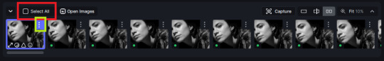
next, select all images by clicking the “select all” button. you will notice that one of the screencaps’s thumbnails (in my case, the first one) will have small icons the others don’t have. this is the screencap you enhanced. you will need to click the dots menu, select “apply”, and then click “apply current settings to selected images”. this way, every screencap will have the same settings. if you don’t do this step, you will end up with one edited screencap and the rest will remain untouched!

all things done, click “save X images”. in the next panel, you can select where to save your new screencaps and how you want to name them. i always choose to add a topaz- prefix so i know what files i’m dealing with while giffing.
just a note: if your way of uploading screencaps to Photoshop is through image sequence, you will need to change the names of your new screencaps so PS can perceive that as a sequence (screencap1, screencap2, etc). you can do that by selecting all the screencaps in your folder, then selecting to rename just one of them and the rest will receive numbers at the end, from first to last. you don’t need to rename them one by one.
here’s the first gif again, without any editing:
without Topaz enhancement but with sharpening:

without sharpening, only the Topaz enhancement:

with Topaz enhancement and sharpening:
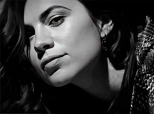
her skin is so smooth that it is a bit unrealistic. i could have edited that while tweaking the “Recovering Faces” option and/or the “Remove Noise” option, but i prefer to add noise (filter > noise > add noise) when necessary. this way, i don’t risk not enhancing the quality of the screencaps enough.

i added +3 of noise, making the gif look more natural. it’s a subtle difference, but i thought it necessary one in this case. you can continue to edit your gif as your heart desires.
VOILA! 🥳
AS A PHOTOSHOP PLUGIN
if you have Topaz AI installed on your computer, Photoshop will recognize it. you will find it in filter > Topaz Labs > Topaz AI. while in timeline mode, select the filter. the same Topaz AI window will pop up and you can tweak things the same way you do when you use the software separately. by using the plugin, you don’t need to upload your edited screencaps or use screencaps at all, a video clip (turned into a Smart Layer, that is) will suffice. the downside is that for every little thing you do, Topaz AI will recalculate stuff, so you practically can’t do anything without facing a waiting screen. a solution for that is to edit your gif in shitty quality as you would edit an HD one and at the very end, you enable Topaz AI. or just separately edit the screencaps following the first method.
this is it! it's a very simple software to use. the only downside is that it can take a while to render all screencaps, even with a stronger computer, but nothing too ridiculous.
any questions, feel free to contact me! :)
#*#alielook#usershreyu#userlaro#userchibi#tusernath#usersanshou#userbunneis#userzil#tuserlou#jokerous#usersnat#userdavid#userbuckleys#userbarrow#gif tutorial#completeresources#ps help#resources#*tutorials
267 notes
·
View notes