#typeface no 9
Text
I've noticed that most of the horror lit I've read doesn't really scare me. Like, from the shitty teen horror novels about demons and schools for troubled girls I picked up in the teen section at the library once I turned 13 to the fucking Shining. Which is immensely disappointing.
But, I have noticed that when it's "something" that it does scare me. A matter of undefined and something and someone and the unknown. Danny's friend Tony in the Shining freaked me out. The rest of the book was ok, sorta fun even, but not scary. But there was such a nebulousness about Tony, like he's something for sure, but I couldn't tell if he was malevolent or not. The hedge animals weren't shit. But when Tony was calling out Daannnyyyyy, Daaaaannnyyyyy, it got me. I thought he was the scariest part of the book.
And not to mention (sorry) the last bit of the first Twilight book where there's "something" there. Something or someone, the details are a little hazy. But I remember being surprised at it because it scared me. It got my brain going. Something there but no way to find out what it is,, delicious.
Also in this category, though not a book, is the one episode of Cowboy Bebop, where the characters investigate a ghost signal sent from decades before the show takes place (something like that. pretty sure it's ep 14). I loved that one, it creeped me tf out.
Probably connected to this situation is the whole "something in the water" thing. It's something and it's doing something, but what is it, on both counts? Something about it scratches my brain. Something something corporate horror. I love it.
Not required reading for this post but additional rambling down here:
Technically, you can usually get me w a good jumpscare, ie that one scene in The Rise of Skywalker in the fallen death star where Rey's .... pointy toothed scary clone hallucination pops out. Also successful scares include the ghosts in Crimson Peak. But it's like I grew out of the scare effect as I got older. I remember not being able to sleep after reading the story in Scary Stories to Tell in the Dark, where some kid finds a random toe sticking out of the ground and the family eats it for dinner and the thing that it belongs to comes back at night and goes like "wheres my toeeeee". I was 7-8. It was also around that age, maybe a little younger, when I watched the first Harry Potter movie, which was very scary to me.
When I read Misery, which I'd heard was one of the scariest books folks had ever read, it was very.. unscary. I'm sure if I got my hands on Stephen King as a younger person that stuff would have absolutely fucked with me. But apparently that horror format doesn't do it for me, anymore. Probably a good thing I didn't read any of his stuff before my late teens, though, because I'm not sure how that would have affected my perception of/experiences with the portrayal of sex, violence, fatphobia, misogyny, etc. Finally, I am in a place where I can read the most proclaimed horror of all time without worrying I won't get into heaven, but I am also in a place where it's just not scary to me. Like what a damn ripoff. Did I just have too many experiences where I feared for my very soul and thought I was tainted and that context just.. nulled horror lit to me? Like did my brain just go like, yeah that's nice and all but I've seen worse? I mean, probably not, but jeez. I'd really love to read a good scary book. But I have not yet found one. My suspension of disbelief is broken, yall.
I mean, back to the Shining, moving hedge animals would be absolutely terrifying irl! Like what a legitimately scary situation to be in, honestly. I'd have to go to therapy for that. Animals made out of bushes around a playground moving when you aren't looking, chasing you, and it's so absurd and freaky and I'm sure it would have you questioning your sanity. Are you really seeing what you're seeing? Like, what the hell. And that's tame in comparison to the other events of the book. Wendy and Danny 100% needed thousands of dollars of therapy after getting out of that hotel. But unfortunately I was fine almost the entire time (thanks Tony).
It is what it is. Back to my fear of somethings, I guess.
0 notes
Text
i just spent 10min transcribing the character teaser for myself in case i have time to words while at work. in english and then also another view of the cn for comparison. im fine im fine im totally fine. i am Normal about these four (<- this is a bold faced lie)
#enigma rambles#dont mind me absolutely still DYING even…9? hours later#beet salad polycule#someone appreciate the quote from the teaser and the pun i added on top with the bold typeface#better yet someone come yell about they four! them!!! with me#thank goodness for maintenance downtime tonight lets see if i can crank out a fic in a couple hours again :’D
4 notes
·
View notes
Text

As a thank you for so many new followers, here's a brand new edition of my editing resources masterposts ✨ (you can find the previous editions here). Make sure you like or reblog the posts below if they’re from other blogs to support their creators! A friendly reminder that some of these are free for personal use only, so be sure to read the information attached to each resource to verify how they can be used.
Textures & Things:
Collage Kits from @cruellesummer that I find myself using basically every single day
Taylor Swift Wax Seals from @breakbleheavens that I also use literally every day
Rookie Magazine Collage Kits (1, 2, 3, 4, 5, 6, 7, 8, 9, 10)
Scribble Textures & Cross-Outs (1, 2, 3)
GIF Overlays (1, 2, 3)
Film Grain & Noise Textures (1, 2, 3)
Paper Textures (1, 2, 3, 4, 5, 6, 7, 8)
PNG Overlays (Paper, Flowers, Clouds, Stickers, Lips, Vintage Paper, Misc. Symbols)
Halftone, Scan Line, & VHS Noise Textures (1, 2, 3, 4)
VHS Tape Textures by @cellphonehippie
Misc. Texture Packs (1, 2, 3, 4, 5, 6, 7, 8)
Photoshop Effects (Halftone Text Effect, Chrome Effect, Glitch Effect, Ink Edge Effect, Photo Morph Effect)
Fonts:
Badass Fonts (free fonts designed by womxn 🤍)
Open Foundry Fonts
Free Faces
Uncut Free Typefaces
Some Google Fonts I Like: Instrument Serif, DM Sans, EB Garamond, Forum, Pirata One, Imbue, Amarante
Some Adobe Fonts I Like: New Spirit, Ambroise, Filmotype Yukon, Typeka, Big Caslon CC (TTPD Font!)
Some Pangram Pangram Fonts I Like: Editorial Old, Neue World Collection, Eiko, PP Playground
Fonts In The Wild (font-finding resource)
Tutorials & Resources:
Comprehensive Rotoscoping Tutorial (Photoshop + After Effects, great for beginners!) by @antoniosvivaldi
Rotoscoping & Masking Tutorial (After Effects) by @usergif
Texture Tutorial for GIFs by @antoniosvivaldi
Color Control PSD by @evansyhelp (to enhance, isolate, or lighten specific colors)
Cardigan Music Video PSD by @felicitysmoak
Picspam Tutorial by @kvtnisseverdeen
Moving GIF Overlay Tutorial by @rhaenyratargaryns
GIF Overlay Tutorial (+ downloadable overlays!) by @idsb
Icon & Header Tutorial by @breakbleheavens
GIF Blending Tutorial by @jakeperalta
Split GIF Tutorial by @mithrandirl
Guide to Coloring Yellow-Tinted Shots by @ajusnice
Slow Motion After Effects Tutorial (useful for GIFs!)
Gradient Map Tutorial by me!
Misc:
How to Make Your Own Textures by @sweettasteofbitter
How to Report Tumblr Reposts of Your Work by @fatenumberfor
Tips for Accessible Typography
406 notes
·
View notes
Text
On June 19, 1865, Union troops arrived in Galveston, Texas, and Major General Gordon Granger announced the end of the Civil War and that the enslaved people in the town were free. This was the last area in the South to receive the orders that slavery was abolished, and this announcement came over 2.5 years after President Abraham Lincoln issued the Emancipation Proclamation. What has become known as Juneteenth is now a federal holiday since 2021 and it is a symbolic date representing the African American struggle for freedom and equality in the United States and is also a celebration of family and community.
You might ask, what is important about Juneteenth to California history? Slavery was a major topic discussed at the California Constitutional Convention in September 1849. While California did enter the Union on September 9, 1850 as a “free state” as part of Congress’ Compromise of 1850, slavery did exist in California and there were certainly protections under the law that were not awarded to all people. Many enslaved people were brought to California during the Gold Rush.
Early Black civil rights leaders in Sacramento in the 1850s, such as Daniel Blue, Jeremiah B. Sanderson, William Yates, Charles Hackett, and Joseph Smallwood confronted political challenges and sought further representation in California in a time when a Person of Color could not testify against a white person in court. Early California newspapers were full of accounts of enslaved people paying for their freedom, testimonies by anti-slavery and civil rights activists, and stories covering plaintiffs suing for freedom. Elements of slavery continued in California through the Civil War.
The Emancipation Proclamation, General Granger’s announcement, and the 13th, 14th, and 15th Amendments to the U.S. Constitution after the Civil War did not solve issues of freedom and equality. The struggle of civil rights continued through the 20th Century and the extension of those rights to all people continues to this day.
For today, Jared letterpress printed “JUNETEENTH” in 30 line pica wood type. The typeface is French Clarendon and the type was made by the Hamilton Wood Type Company in the late 1880s. This was printed with yellow, red, and green ink using our Washington hand press, which was made in 1852.
#juneteenth#museum#sacramento#history#letterpress#printing#art#asmr#printmaking#old sacramento#oddly satisfying
616 notes
·
View notes
Text


NEW YEAR, NEW FONTS #USERGIFNYNF
TYPOGRAPHY CHALLENGE ・ JAN 8-12
Let's kick off 2024 with a new challenge... all about typography! If typography has ever made you feel stuck, we hope this challenge helps you break out of your comfort zone, discover new fonts, and try new styles! This event is open to gifmakers from all fandoms and will run from January 8-12, featuring 5 prompts:
DAY 1 (1/8): LAYER STYLES
↳ Use any combination of blending options (screen, hard light, difference, etc.) and/or layer effects (bevel, shadow, glow, gradient overlay, etc.).
DAY 2 (1/9): ONLY ONE
↳ Refine your choices and use ONLY ONE font throughout your entire set.
DAY 3 (1/10): PERFECT PAIRS
↳ Use a different font pairing per gif. Check out our font pairing recs!
DAY 4 (1/11): THREE TYPEFACES
↳ Use 1 Serif + 1 Sans Serif + 1 Script typeface in your set.
DAY 5 (1/12): FAVORITE FONT(S)
↳ Show off your favorite font(s) any way you want!
Rules for how to participate below the cut:

Reblog this post and follow @usergif
Create a gifset using the prompts provided above
Tag #usergifNYNF so we can reblog your creations!
Caption your post with:
@usergif new year, new fonts: day # - prompt
description
[fonts used: font name (source)]*
*Optional: We encourage including font names and their sources in your caption so others can find them [e.g. Blastimo Sans (dafont.com)]. After all, this challenge is about discovering new fonts and typography styles! You can also put this in a "read more" after your main caption or put a link in part of your caption that redirects to an internal Tumblr link (e.g. a page on your blog that lists fonts used). We don't recommend linking to external sites as doing this too many times in one post can affect the visibility of your post.
Questions about the event? Send us an ask here. We’ll tag all event answers with #usergifNYNF.ask. Need inspo? Check our RESOURCE DIRECTORY for typography tutorials or look through some of our members' font recs!
We also want to take this moment to thank you all for helping us reach over 10k followers! We hope this blog can continue to be a source of help and inspiration for gif effects, and we can’t wait to see what you create for this challenge! 🪄

Fonts used:
Gif 1, in order of appearance: Traveling Typewriter*, Bassy*, Buy More*, Germanica [Plain Germanica]*, Doky*, Magic Retro*, GIN Grotesk [Gin Rounded] (befonts.com), Random House*, Lostar*, Amberla*, Schizoid Personality* (* = dafont.com)
Gif 2: Karla (Google Fonts), Buffalo Script (dafontfree.io)
#usergifNYNF#userace#usershreyu#userelio#alielook#userhella#uservivaldi#usertreena#tuserabbie#userhanyi#tusererika#userbecca#uservalentina#useraish#larlies#usercats#userabs#tusermona#userpickles#*usergif
381 notes
·
View notes
Text
read more of the good omens book. i am in love with crowley. go away.
I'M DONE WITH THE SECTION WEDNESDAY AND GOD DEAR GOD AND SATAN AND EVERYONE IN BETWEEN I AM SO FUCKING IN LOVE WITH CROWLEY IT HURTS.
This is exactly why I was petrified of the bloody book. It's going to make the brainrot irredeemably deep. Entire bodyrot, in fact. Even Tommy (yes I named my haematoma Tommy, and he's trans, so he's a he/himatoma) will succumb to the rot.
THE LINE: "RIGHT," MUMBLED CROWLEY, SUDDENLY FEELING VERY ALONE. IT IS MY ROMAN EMPIRE. IT HURTS ME EVERY DAY SINCE I FIRST READ IT, WHICH WAS WHEN I GOT THE BOOK LIKE A MONTH AGO. I OPENED IT AT A RANDOM SECTION AND READ THAT AND PROMPTLY SHUT THE BOOK AND PROCEEDED TO CRY. THAT WAS THE MOMENT I BEGAN TO FEAR THE BOOK.
Aziraphale, you silly, silly, adorable little prissy motherfucker. What a bastard.
Sister Mary Loquacious making up her mind to have an orgasm gives a whole new subtext to my thirst for her during the rewatch of episode one.
RIGHT MUMBLED CROWLEY SUDDENLY FEELING VERY ALONE.
OW.
DOG IS THE BEST THE CUTEST EVER. EVEN WHEN HE WAS BIG AND HELLHOUNDY. HIS CONFUSION AT TURNING SMALL BUT THEN IT BEING OVERRIDDEN BY HIS LOVE FOR ADAM. IT JUST. AWWWWW.
Anathema carries a foot-long bread knife with her. Queen shit.
THE FACT THAT THEY GOT SHOT BY PAINTBALLS AND IMMEDIATELY CROWLEY THINKS HE'S DEAD AND STARTS WORRYING ABOUT PAPERWORK. ALL THAT CLUES HIM IN IS THAT THE BLOOD IS YELLOW. AND THEN HE TASTES IT TO CHECK IF IT'S PAINT WTF CROWLEY.
Warlock's birthday party omg. Aziraphale looking at Crowley desperately for help and Crowley pointedly refusing to meet his gaze because he's cringing from second-hand embarrassment and staring out of the window. I read that bit when I got out of the X-ray for Tommy and it made me smile on a very shit day.
Right mumbled Crowley suddenly feeling very alone.
Okay but ngl Crowley was entirely right? He turned the paintball guns to real guns, but the humans continued to shoot each other even after they realised the switch. Not his fault.
Oh Lord, heal this bike. So it was from the book, too.
Aziraphale being like let's get the fuck outta here before the police come coz I'll morally have to assist them with enquiries is so babygirl of him for real. You little bastard, you.
"A CAR BELONGING TO TWO CONSENTING REPAIRMEN" ah yes "THOSE TWO GAY RANDOS IN THE BENTLEY ARE DEFINITELY HAVING SEX"
I love Aziraphale. Crowley makes a man faint from fear and Aziraphale isn't all that pissed because he's salty about the man ruining his expensive shirt. Oh, Aziraphale.
So attracted to War in an awful way. It makes so much sense how attractive in an awful way she is.
Pouring one out for Mr and Mrs Threlfall of 9, The Elms, Paignton.
"Right," mumbled Crowley, suddenly feeling very alone.
Slightly desperate italics is a phrase I didn't know I needed in my life but during my inevitable next war with fucking typefaces, I will definitely use. Fuck I had design work to do for my mum. AH WELL, CROWLEY, CROWLEY, CROWLEY.
In response to watch out for that pedestrian, Crowley says It's on the street, it knows the risks it's taking! Crowley supports it/its pronouns, pass it on.
Where do you live my dear? Aziraphale oozed. OOZED. OMG.
RIGHT, CROWLEY MUMBLED, SUDDENLY FEELING VERY ALONE.
Everyday, my-homoerotic-tension-and-love-hate-relationship-with-my-copy-of-this-book's a-getting stronger... WHY MUST THAT LINE HURT ME SO MUCH.
#good omens mascot#weirdly specific but ok#asmi#maggots#good omens#good omens fandom#crowley#aziraphale#neil gaiman#terry pratchett#lgbtqia#good omens book#good omens brainrot#the nice and accurate prophecies of agnes nutter
198 notes
·
View notes
Text


some blinkies and stamps i made! :D f2u just please credit me!
(first one is dog park dissidents lyrics)
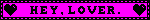
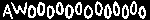
[ID: 1. a black and hot pink blinkie that says, "i'm a bad bad bad bad dog," in block letters. the colors invert every frame and the "dog" frame has rotating bones on either end and the letters are only an outline. 2. a scrolling rainbow gradient blinkie. 3. a magenta blinkie that says "hey, lover." in capitalized serif typeface. it has a black border and flashing hearts on either end. 4. a blinkie that says, "hot pink," in block letters with hearts on both ends. it flashes in different shades of pink. 5. a blinkie that says "I heart Boys" (using a drawn heart) with the mars/male symbol on either end. it alternates between hot pink on white and white on blue. 6. a blinkie made to look like a text bubble in which the words, "oh my god neil cicierega" appear, followed by a heart eyes emoji. 7. a blinkie in the TF2 achievement colors with the TF2 logo on either end upon which, "team fortress 2," appears word by word, letter by letter, then, "TF2," flashes 3 times. 8. a blinkie that says, "awooooooooooooo," in all caps white text on a black background. the letters bob up and down in alternating order. 9. a 99x56 stamp featuring a brown wolf in front of a night sky, with the text, "Awoo..." 9. a 99x56 stamp with a dark rainbow gradient background that says, "sparkle," in white all caps with a pink and black sparkledog with a rainbow mohawk beside it. 10. a 99x56 stamp that says, "werewolf," in bloodstained white letters above a set of white fangs on a dark red splatter background. /end ID]
#chaos!!#blinkies#aesthetic#blinkie#webcore#tw flashing#scene#old web#lovecore#rainbowcore#scenecore#dA stamps#99x56 stamp#deviantart stamps#my art#dog park dissidents#neil cicierega#tf2#pink#pink aesthetic#magenta#magenta aesthetic#hot pink#hot pink aesthetic#fuchsia#fuchsia aesthetic#bright colors#eyestrain#werewolf#sparkledog
1K notes
·
View notes
Text
Problem with Discord's new (and old) font(s) and its treatment of non-Latin text
Before getting into it, I'm gonna say that I'm not going to criticize its aesthetics or "readability". These feedbacks are rarely helpful from the designer's perspective especially coming from people who don't know much about what goes into designing a typeface, and because readability is really, really subjective.
I was happy to hear that discord was changing its font, especially when I found out that they are adding support for Vietnamese. Previously, discord used Whitney, a humanist sans serif font with Latin, Greek, and Cyrillic support. Unfortunately, Whitney doesn't support all Latin characters in Unicode, and crucially it doesn't support Vietnamese characters.
Text font not supporting a script is usually not a problem, the fallback font will take care of it for you. The problem occurs when there's partial support. Vietnamese uses Latin, but it also has a ton of precomposed vowels with diacritics. This is what Vietnamese looks like on my phone, where the font change hasn't taken effect yet:
here's the same text with unsupported characters highlighted in red:
It might not look that weird because the fallback font on my phone happened to be somewhat similar in style to Whitney, but depending on the device it may be completely unreadable. I submitted a feedback a while ago asking them to address this issue
This is why when I heard that discord was changing its font to add Vietnamese characters, I was excited. This is what the same text looks like in gg sans.
All characters harmonious!
However, after receiving the update I was disappointed because the new font now no longer supports Greek and Cyrillic. This alone is not really a big problem, because Greek, Cyrillic and Latin characters rarely occur in the same word. Although it is disappointing that they are no longer harmonious, it's not that big of a problem. The problem though, is that they decided to include Δ, Ω, μ, π (capital delta, capital omega, lowercase mu, and lowercase pi) into the font.
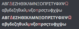
Depending on the device and rendering settings, it might look like it fits well with the fallback font, being almost unnoticeable, or so noticeable that it's hard to read. These four glyphs are often included in typefaces that only support Latin as they are often included in Latin lettersets because of their use in mathematics and science, so I thought it was simply an odd oversight.
Then I found out about this:
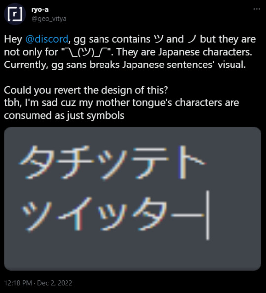
(As of 2022/12/3 9:22 pm UTC+9 I couldn't recreate this. It may be because of css setting or because they've already fixed it. I'm hoping it is the latter)
They decided to include katakana characters to be only used in the shrug emoticon.
I was massively disappointed when I heard this news because it means they did not care at all about global accessibility when making the new font. I was under the impression that they were doing it at least partially to address this issue. I was under the impression that maybe they've heard us complain and complain about the font only having partial support for Vietnamese. Maybe they've realized the core problem. But no, it's clear that they still don't know what the problem is.
Maybe I should have realized it sooner. Did you know, Discord limits the amount of diacritics that can be attached to a single character, even though in a lot of non-Latin writing systems diacritics are crucial because they represent vowels, consonant clusters, et cetera?
Moreover, did you know that Discord has a limit on how many diacritics you can have in a single message? This means if you have a copy pasta in abugida writing systems such as Devanagari, Thai, Khmer, Lao, Bengali, Burmese, et cetera, the vowel diacritics are just going to disappear after a while, rendering the text unreadable?

Affected portion underlined in red. I assume these are done to prevent zalgo, which really shouldn't be done by Discord itself, not to mention that typical "zalgo" diacritics are usually IPA diacritics with actual use, which can often stack in a zalgo-like fashion.
Did you know that Discord enforces strict text line height, even though some writing systems need more horizontal space than latin to be legible? Anything outside of the bounds are cut off and rendered invisible.
Anyway, do you remember when I said I wasn't going to talk about aesthetics and readability? I kind of lied. I am going to talk about them.
A lot of people seem to be saying that the new font is bad and that it's significantly less readable than the previous font. I have doubts about whether this is actually because of the font itself or because they're simply not used to it yet. My guess would be the latter. However, that doesn't mean the solution is to make these people shut up and wait till they get used to it.
There is no universal solution for readability and legibility. The truth is that different people have different needs, and this is no different when it comes to typefaces. Ideally, discord should provide an option to change fonts. Many platforms do. They've been refusing to implement it because, I dunno, brand image?
There is also a bigger problem with how UI designers design in general. They only design around Latin in mind, even though different writing systems use space differently. Many Brahmic scripts use ligatures and diacritics stacking above or below the main character. If you care about non-Latin scripts not appearing illegible, make it so that UI elements can accommodate for that, or something.
I'm bad at writing conclusions, so there you have it. Me rambling about a thing that I care about that apparently everyone else should too.
421 notes
·
View notes
Text
things i’ve heard english majors say pt. 16
-I need to print out my plot outlines single-sided because flipping them is driving me nuts, why can’t I shut the fuck up and write anything less than 42 chapters plus a 9 character pov epilogue
-I don’t think I could ever be drunk enough to write a YA novel
-I can’t ghost him, a character based on him is half of the story that I’m writing
-me having to check if I’ve already used to word “immortally” in every nonfiction essay I’ve ever written
-“it’s living too much outside the poem” just say its too vague or too ambiguous, you slut
-mmm, the “always” kind of love. Tasty.
-his father used to hit him and his favorite authors are all 19th century Russian men–of course he’s not a virgin
-nothing like bad movies that make me want to write
-my face would look a lot more panicked if I was doing math right now
-discussing serif typeface until i start internally bleeding
-oh she said enjambment, she said utilizing white space
-oh it ends with a period. That's a choice.
-nothing more confusing than walking onto the bus on Thirsty Thursday while listening to the Downton Abbey theme
-if anyone in the communications building sees me half bent over, clutching my head with both hands and slightly shaking, no you didn’t and this is actually pretty normal behavior
-it was “best friend’s younger brother” but now it’s “my best friend’s younger bitchass playboy cousin who left me on delivered for 8 days and who I met exactly once and now I’m living near him because we hate the country we come from.” It’s called diversity.
-I’m writing my poli sci essay
Sick, I’m writing the epilogue for book 3 when I haven’t finished book 1 or properly plotted book 2
-literally no inconvenience is too small for me to lose my mind over
-I don’t want to change the world, that sounds like a lot of work. But if I write something that inspires someone with a lot more initiative to change the world for me, that would be real great
#still tagging this as shit i've heard high schoolers say#college#college humor#college memes#college problems#college life#student life#student humor#student memes#student problems#school humor#school memes#English majors#writing#writing prompts#creative writing#studyblr#gen z#gen z life#gen z problems
546 notes
·
View notes
Photo
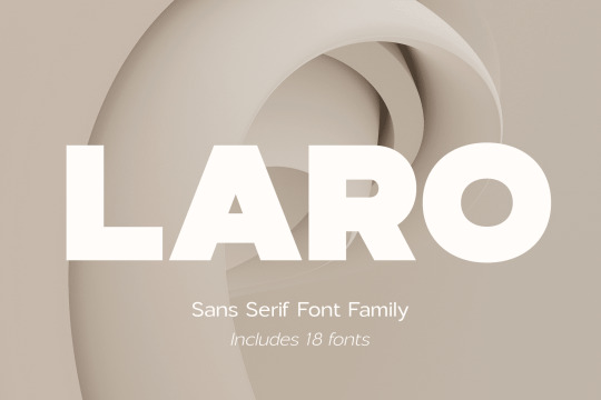
Three Amazing Fonts Under $10!
Laro Sans Serif Font Family ($9)
Laro Font Family is a modern sans serif font that includes nine weights from thin to black, and nine weights in italic style. This multipurpose font captures a massive range and is ideal for design and project creation. The Laro font can be implemented into a variety of projects and always looks stylish and modern.
✹ Buy Laro Now
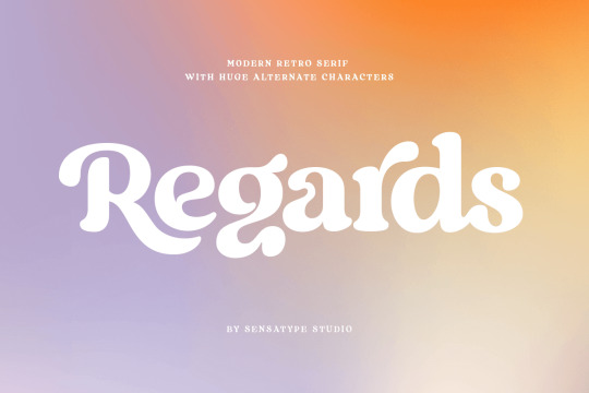
Regards, Modern Retro Serif Typeface ($9)
Regards is a well-balanced modern retro font with a fancy and playful touch. This versatile typeface comes with 100+ alternates that you can combine to get curves and beautiful shapes easily. Regards is perfect for branding projects, logos, wedding designs, social media posts, advertisements, product packaging, product designs, label, packaging, and more!
✹ Buy Regards Now
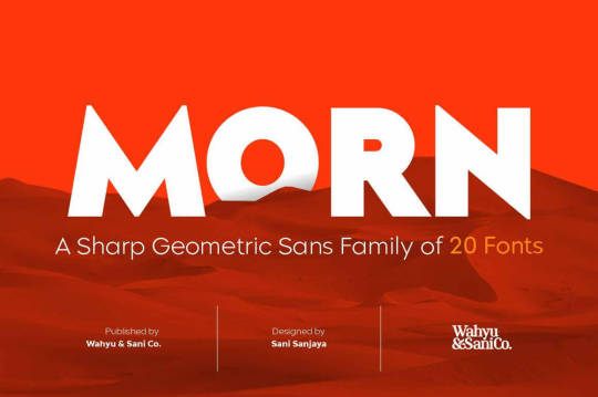
Morn, Geometric Sans Font Family of 20 Fonts ($9)
Morn is a sharp geometric sans font with roman proportions. Every character's essence stems from a rectangle (square), a circle, and a triangle, which require little adjustments to make them appear optically equivalent.
✹ Buy Morn Now for $9
#thedsgnblog#design#graphicdesign#typography#branding#font family#fonts#fontbundle#typeface#typefamily#design deals#mighty deals
174 notes
·
View notes
Text


Love Potion №9 was my test phrase for spacing the numero (№) character when working on my new font, and I thought it be fun to turn the phrase into a little scean
I wanted to produce a very period label design, so the graphic on the label is from a 1890s print foundry sample book, and was sold as a block of movable type. I redrew it in affinity designer, although the original had flowers, and Ive turned them into thorns.
the spider webs were made quickly with geonodes, I got the "vertical" strands just as I wanted them, but struggled with the cross strands, and ended up making them randomly, which is why they have kinda a chaotic look. Its okay for old cobwebs, but I would have preferred something more ordered.
the font is available here;
#3d art#blender3d#gothic#vintage#victorian#potions#typeface#typography#font#graphic design#affinitydesigner
5 notes
·
View notes
Text
A Voice through Type

The typeface is the voice of a text—so they say. But what kind of voice? On closer inspection we are mostly talking about well-behaved ones. For corporate logos they need to have enough general appeal to appease the largest possible audience. For most articles they are more comparable to ambience in order to serve the message. Wouldn’t it be fun to take this statement more literal and apply it to (fictional) people? Giving the textual representation of speech a visual indicator regarding the character of the speaker and the quirks of their voice. Sounds fun—at least as an experiment.
(Reading time ~9 mins)

A limit to our fun
A few limitation beforehand. What I propose here is not a method. It is more like a thought-process that I hope can help to decide on a typeface representation of a character. Voices are wonderfully complex. We change our voice depending on speaking context or emotion. Picking various fonts or designing a super-family that would feel cohesive while also being meaningfully different for each situation would be super cool, but also very overwhelming. We are talking more of a proof of concept here. So I focus more on a general representation. Broad strokes often are a good thing when we are talking about details of details (the thing letters are in the context of a page or screen). I’m also gonna brush over the intricacies of characterization of people. To keep it simple let’s say we work mainly with a adjective-based framework that can be extended by whatever association comes to our mind in regard to the character.
It’s not a rigid system but a fun experiment after all. Talking about fun: The limit to our fun isn’t the sky, but legibility and readability—to a degree. Namely how well the letters are decipherable and how easy it is to read the text based on the merits of the chosen font. If we pick something very out there and expressive we might jeopardize the legibility. Same goes for readability. If the font causes discontent in the reader, they might hate it when the character speaks. On the other end: Maybe that is exactly what you want. Another way to circumvent these issues would be to limit the expressive font to the speakers name. The actual dialog could then be set in a more general font. The name would then function as a kind of logo that by proxy colors the words of the speaker. But it would also introduce a form of abstraction, as the typographic voice wouldn’t be as immediately connected to the words. Also, you are missing out on a lot of cool glyphs with this method. As a time-saving alternative it is still interesting.
The establishment
Now to the actual task at hand: Drawing a connection between typeface and characterization. In essence this process comes down to dealing with readers expectations. That doesn’t mean you need to meet all these expectations. I’m operating under the assumption that typographic connections are somewhat arbitrary. Arbitrary in this case doesn’t mean random. Readers’ associations can be wildly different, based on their personal experiences and preferences. A blackletter font can look edgy-cool to one person, to someone else it might look traditionalistic. One person might find Helvetica timeless, someone else might find it overstayed its welcome. A Font that looks exciting to one viewer, someone else might find pretentious. As designers we can’t look into other peoples’ heads. But we can make an educated guess.
Because even though everyone is an island, no one actually is an island. Our associations with typefaces are based in a common learned visual language that is shaped by the context in which we see fonts used. For example for the longest time Apple used lightweight sans serif typefaces to promote their technical gadgets. This resulted in the association of light sans with luxury. On the opposite site the usage of Comic Sans by many small businesses resulted in an association by the wider public with affordability. Futura still can be associated to futurism and space-travel because of “2001: A space Odyssey.” 1 Blackletter fonts are perceived either iffy due to the appropriation for nazi propaganda or traditionalistic due to the usage in traditional restaurant signage (at least in Germany). Typographic associations are of course subject to change. This can come in the form of trends or simply new use-cases.2 To use Blackletter as an example again: The young folks (that definitely doesn’t make me sound old) first association with this letter type is more likely to be with urban street wear.

For our purpose established associations can serve as shorthand. Similar to the way stereotypes are used for writing characters. When we use typography tropes in such way, the shorthand should not be the end-goal. Just as a stereotype in character writing is not the end-goal for characterization but a “conversation opener.” The more interesting character—typography connections come from subverting expectations or building onto them.
Spiky means angry

Another well to draw from are haptic and kinetic associations. A letter with spiky features will probably evoke the haptic feedback of touching a spiky object. In contrast, a font with very round features will cause associations with smooth and round surfaces just by proximity. A light typeface can be perceived as flimsy or as filigreed. Bold letters can be associated with heaviness. A font with a wide letterform can be perceived as steady and immovable. Oblique weights often imply a form of movement. For our little experiment we could use these associations to refer to unique features in a character’s appearance or personal traits.
A final aspect to consider when associating typefaces with characters is the “well-it-just-looks-cool” aspect. As with most things in design picking something you like because you think it looks cool, is a valid reason. One could argue that what looks cool to a designer is not just personal preference but (also) the result of research and exposure to different designs. To pick something that looks cool in this case is also a good way to create new typographic associations. So that is an added bonus.
While all these aspects are important when considering font associations, more often than not typographic nuances go right over most readers heads. 3 This means on the one hand to be blunt with your choices. Tiny letter details that you consider important to convey a characters personality are likely to get overlooked. If not due to the text size than because typographic nuance is often not perceivable to laypeople. The latter aspect could also be considered freeing, as you can try a lot of type shenanigans that go under the radar.
Words into actions
Enough overthinking. Time to put these concepts into action. For that we need a volunteer. May I propose we go with everyone’s favorite android songstress Hatsune Miku.
Hatsune Miku is a fictional character that was created for the software synthesizer ›Vocaloid‹ in 2007. The software is able to not only interpret notes with different pitch and velocity but also with vocals—hence the name. The sound is based on the voice actress Saki Fujita’s voice. The resulting sound is a very distinct robotic, and high-pitched voice, fitting for idol pop music. The software found a wide-spread following—which can in large parts be attributed to the iconic character design by Kei Garō. The concept for the character was that of a singer-diva android in a future where all songs are lost and need to be reinterpreted. As the character started to gain a life of its own through a large fan community and motion-captured life concerts with her as a hologram, the character is a bit more of a Japanese idol than a diva.
Hatsune was imagined as an android—a machine build in the image of humans. Considering this, references to the digital would be out of place, as she is meant to exist in the physical world of the future. Existing typefaces associated with technological progress have a tendency to look dated. Dated, in the sense that you can tell what idea of future shaped its design (think for example of ›Eurostyle‹). Going the “2001” route—using Futura as a shorthand for futurism—wouldn’t fit due to its mechanical construction principle. A more contemporary mix-style of geometric and grotesque sans could fit the “machine-imitating-a-human“ theme. Than again, to me this seems a bit too sterile, considering Miku’s implied extroverted-ness. Therefore I think focusing on this aspect is more promising.
The typographic style that caries the most diva-ness for me is the modernist serif form principle (Didot). It is often used in the context of high fashion, where it communicates carries an air of aloof-ness, quality and beauty. Typefaces in the modernist style emphasize verticality, and feature constructed shapes, as well as extreme stroke contrasts.

I want to draw a connection between the constructed letter shapes and the artificial construction of an android like Miku and her singing voice. I think the modernist form principle transports this better than geometric type, as it is less streamlined in its construction and allows for more decorative elements. Also the high contrasts read to me as eccentric and therefore fitting well with the diva aspect. Because androids are modeled after humans but are still distinct from them, I think it could be cool to add a detail that implies human behavior was imitated but in a wrong way. I thought mirroring the shadow axis of the “o” in a transitional serif type could be a nice nod in that direction. That will put the font more in the category of transitional Serif instead of modern, but that’s fine. I like the transitional Serifs more anyway. Also I want to add prominent ball terminals—just to be extra.


In case I would look for a font—not make one from scratch—I would need to make more compromises. But working with existing fonts also creates other association possibilities. Like, seeing some feature in a font and come up with an association afterwards.
Anyway, this process like I said is very biased and subjective. But, I still think it is a fun way to approach typeface selection. I’m also sure there is a certain applicability outside of characterization of fictional people. Why not use this thinking process to pick fonts for a logo?
——————————————————
Notes:
Funnily enough “2001” doesn’t get nearly as much flag for its rather literary connection to its title font than “Avatar.”
Speaking of trends: Type Campus’ Whitepaper “The 2022 Type Trends Lookbook” and “The 2023 Type Trends Lookbook“ do a very good job outlining recent font trends and putting them in the contemporary and historic societal context.
Jeanne-Louis Moys was able to show in her survey that far more important were how the text was spaced, what weight was applied, or if the text was set in cursive font. Jeanne-Louis Moys. (2011). Typographic Voice: Researching Readers’ interpretations. (p. 14–15). In: Technical paper 6, Simplification Centre. simplificationcentre.org.uk/ressources/technical-papers (accessed April 2022).
#type design#typeface#grafikdesign#graphic design#schriftgestaltung#custom type#hatsune miku#vocaloid hatsung#graphic design essay#essay#custom letters#typedesign
5 notes
·
View notes
Text
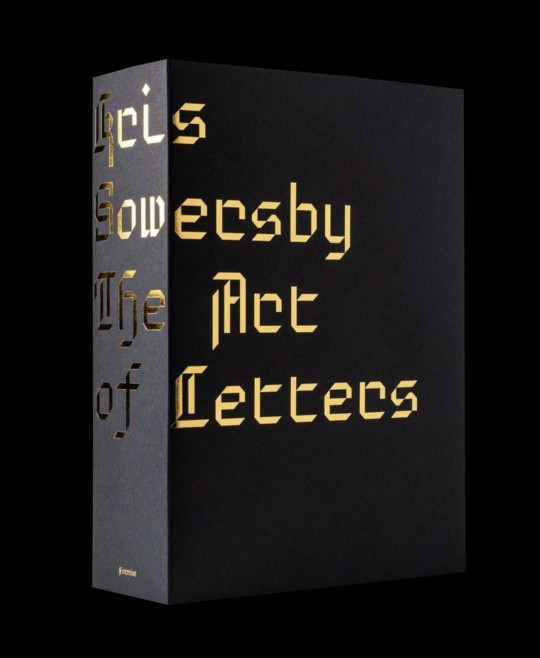
Kris Sowersby: The Art of Letters is a visual feast of letterforms celebrating one of the world’s leading type designers. The 800 page publication examines Sowersby’s letter drawing practice while considering the characters as independent works of art, exploring their interconnections of function and style. It champions the absurd beauty involved in creating multiple expressions of predetermined alphabets through nuance and theory.
While a typeface is a well considered set of many elements, if one removes the context of language systems and alphabets, each character may be viewed as a singular abstract drawing, as art in their own right. As presented in this book, it allows us to re-see, or to see for the first time, their individual form and function.
As Sowersby expresses, “There is no definitive form of the alphabet. The alphabet is a concept made concrete through countless written and designed letterforms; the alphabet is not defined by a single typeface but expressed through all of them. There’s sets of rules, largely unwritten rules, of how a typeface is put together, about relationships between letterforms and between styles”.
Printed one per page in black on cream paper, the publication features over 750 large character illustrations selected from Klim typefaces including Calibre, Domaine, Founders Grotesk, Heldane, National, Signifier, Söhne and Untitled.
The volume features an essay—"What We Read When We See"—by graphic designer, writer and educator Paul McNeil and a foreword by Formist publisher and designer Mark Gowing.
Kris Sowersby: The Art of Letters is finished with black-edged pages and the dust jacket features gold foil-stamped custom typography. Sowersby and Gowing collaborated on a custom typeface used to typeset the book. Inspired by the rich history of rotunda typefaces, its use is exclusive to the publication.
Edited by Mark Gowing and Dave Foster
Designed by Formist
Published by Formist Editions, 2021
Paperback, 800 pages, b&w and color images, 6 × 7.9 inches
ISBN: 978-0-64-859634-9
11 notes
·
View notes
Text

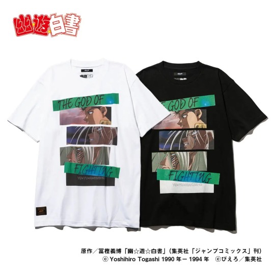
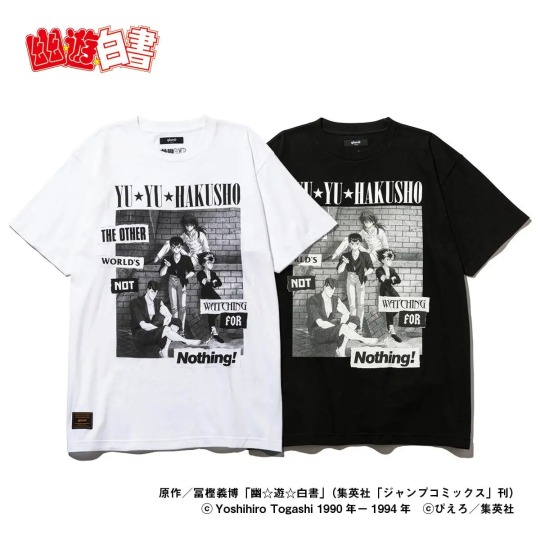
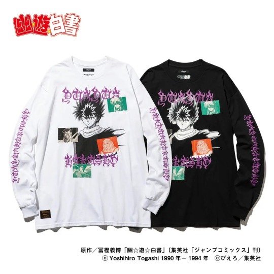
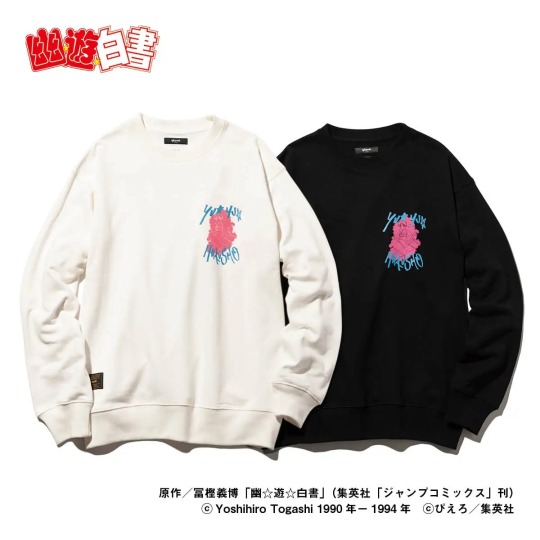
Yu Yu Hakusho x Glamb Collaboration Collection
The japanese fashion brand "Glamb" (operated by Laugh Valley Co., Ltd.) is releasing with Bandai a Yu Yu Hakusho collab. The brand proposes elegant rock fashion under the brand concept of "Grunge for Luxury".
I think glamb clothes are a little expensive, but they sure look amazing, specially Youko Kurama's shirt.
Reservations: from December 27, 2022 to January 11, 2023, on Premium Bandai (available for international shipping)
Official Site: Glamb
Ship: around early March 2023
Line Up: 9 items that express the charm of Yu Yu Hakusho, which has not faded away in the 30 years since it was first broadcast, are available in four sizes (S, M, L, XL)
Yusuke & Raizen T
Price: ¥8,470
Material: 100% cotton
Available in 2 colors and 4 unisex sizes, Yusuke & Raizen T-shirt captures the bloodline of Yusuke Urameshi in a dramatic composition. The three image cuts, arranged like a storyboard, from the top to bottom are: Yusuke, Yusuke awakened as a mazoku, and Yusuke's father, Raizen. There's also the english text of Raizen's alias, "God of Fighting" (Toshin) printed on it.
YU☆YU☆HAKUSHO T
Price: ¥8,470
Material: 100% cotton
Available in 2 colors and 4 unisex sizes, the YU☆YU☆HAKUSHO T-shirt features the four main characters, and the American catchphrase "The Other World's Not Watching For Nothing!".
Kuwabara Long Sleeves T
Price: ¥13,200
Material: 100% cotton
Available in 2 colors and 4 unisex sizes, the Kuwabara T-shirt captures Kazuma Kuwabara's heroic appearance in a long sleeve tee. On the back, there's Kuwabara in the combat uniform he wore in the finals of the Dark Tournament. The Chinese characters "Health First" (健康第一) from his uniform are printed on the chest and arms of the T-shirt in an original font that resembles his spirit sword.

Toguro Otouto Long Sleeves T
Price: ¥13,200
Material: 100% cotton
Available in 2 colors and 4 unisex sizes, the Younger Toguro T-shirt expresses the powerful enemy Toguro in a rock culture style. The front of the tee features Younger Toguro at his 100% of 100%, a figure that has had a tremendous impact on everyone who has seen it. To further emphasize the power of this design, a composition reminiscent of a metal T and grotesque lettering give it a hard-core appearance.

Hiei Long Sleeves T
Price: ¥16,500
Material: 100% cotton
Available in two colors and four unisex sizes, the Hiei T-shirt depicts Hiei's motifs in a contemporary interpretation. On the front, Hiei is overlaid with a patchwork of characters related to him, such as Yukina, Mukuro, Shigure, and Rui. The logo of the work in an original typeface combines a gothic font and a flame design.
Botan Sweat
Price: ¥19,250
Material: 100% cotton
Available in 2 colors and 4 unisex sizes, Botan Sweat is an on-trend sweatshirt featuring Botan, the Spirit World guide. The use of retro-pop colors evokes emotions from the era when the work was created. The back is decorated with the red and white confetti that appears in the opening of the anime, a finish that revives the charm of Yu Yu Hakusho.

Kokuryuha JKT
Price: ¥38,500
Material: 100% polyester (lining: 100% cotton)
Available in 2 colors and 4 unisex sizes, the Kokuryuha JKT is a short blouson based on Hiei's special technique, the "Jaou Ensatsu Kokuryuuha". The distinctive lettering and composition are inspired by vintage Vietnamese war jackets, giving it a tough appearance. On the back, along with the English sentence "There's no turning back now, I have forgotten how to wrap it up again", a famous Hiei's quote, there's the seal method (ijutaihou) seen on Hiei's right arm into its design. The impressive scene from the original story, in which the bandages are untied to release the black dragon, has been sublimated into street fashion.

Kurama Hoodie
Price: ¥23,650 yen
Material: 100% cotton
Available in two colors and four unisex sizes, the Kurama hoodie incorporates a battle scene of Kurama into a hoodie, with the image of Kurama unleashing the "Rose Whip" on the back. The roses and whips are arranged in a laurel-like pattern to create a heroic mood.

Youko Kurama SH
Price: ¥24,200
Material: 100% polyester
Available in two colors and four unisex sizes, the Youko Kurama shirt features motifs of Youko scattered on an open-collared shirt. The two lines on either side of the front, reminiscent of a Cuban shirt, are represented by Kurama's "Rose Whip". The horizontal lines crossing at the bottom of the shirt are inspired by the "Fuka Enbujin". In addition, the mysterious plants of the Demon World and the figure of Youko on the chest adds a street-like tone.

84 notes
·
View notes
Text

Fantasy-Themed Thematic Typeface
Created with Adobe Illustrator from original sketch
11/9/2023
Please credit if reposting
11 notes
·
View notes
Note
Metalheart and acid design. For the kink thing uhhhhh. Slime bc I feel like its polarizing
“Metalheart (also known as Depthcore or Trendwhore) is a Cyberpunk aesthetic that was prevalent from roughly 1998 to 2004, during the Y2K Futurism Era. It was characterized by deformed abstract shapes and futuristic fonts on blurry backgrounds.”


this aesthetic is kind of like if “blue” by eiffel 65 and “in the end” by linkin park had a baby. 7/10
“Acid Design is a graphic design aesthetic heavily associated with Rave culture, particularly influenced by Acid House and New Beat music. This style is primarily present in EDM cover arts, flyers, music clubs, and other trendy brands, among other scenes. The style of this aesthetic is characterized by its dystopian style and trippy imagery, including motifs like Psychedelic art, distorted patterns and typefaces, smiley faces, wireframe objects, world maps and globes, technology and geometric shapes.”


this fucks severely. i feel like stoners in the 90s went wild for this. 9/10
slime: i think i understand the appeal of why people would be into this (wet, viscous fluid) but it grosses me out. 1/10
2 notes
·
View notes
Last Seen Blogs

shawarmafranchisehydrabad
Absolute Shawarma Franchise in Hydrabad
lilybug-02
A Random Piece Of Bread

zaharay
Untitled

japanlog
JapanLog

romanceriders
Romance Riders