#vertical carousel bootstrap
Explore tagged Tumblr posts
Visit Tumblr Blog
Explore Tumblr blogs with no restrictions, modern design and the best experience.
Last Seen Tumblr Blogs


Fun Fact
Users from the US are the majority of Tumblr visitors.
Text

Bootstrap Vertical Carousel
#bootstrap vertical carousel#vertical carousel bootstrap#html css#learn to code#css#frontenddevelopment#webdesign#html#css3#divinectorweb#code#web design#bootstrap slider
4 notes
·
View notes
Text
Top 25 Tools, Libraries, and Resources for Web Development

Today, the visual appeal and usability of a website take precedence over its development intricacies. Prioritizing a user-friendly and resilient front end is crucial. Thankfully, an array of plugins and frameworks exist in the market, simplifying development processes. These tools offer easy integration and negate the need for in-depth knowledge of specific technologies, ultimately saving valuable time.

ullpage.js: Enables creation of fullscreen scrolling websites and landscape sliders, ideal for One-Pagers.
Owl Carousel: A favorite slider plugin for creating simple sliders with easy integration.
jQuery custom content scroller: Allows customization of scrollbars with vertical and horizontal options, along with different themes.
matchHeight.js: Useful for equalizing heights of columns or floating boxes, especially when using flexboxes.
fancyBox: Popular for image popups with mobile-friendly features and quick setup.
Highcharts: Offers interactive chart creation for various purposes like stocks, timelines, and maps.
Animsition: Provides CSS animated page transitions for smoother reloading experiences.
TwentyTwenty: Allows comparison of two images with a draggable slider, responsive across devices.
Wow.js: Adds cool animations for page scrolling effects.
Dragdealer.js: Enables 2D dragging and tapping functionalities for mouse and touch interactions.
Select2: Replaces select boxes with a customizable jQuery plugin offering features like searching, tagging, and more.
CSS libraries / Design stuff
Animate.css: A CSS animation library.
Flat UI Colors: Offers a selection of trendy colors.
Material Design Lite: Google’s material design framework.
Materialui.co: Provides resources for material design.
Colorrrs: Generates random colors.
CSSpin: Offers a variety of CSS spinners.
Font Awesome: Provides a wide range of icons.
Bootstrap: A popular open-source toolkit for web development.
Foundation: Responsive front-end frameworks for designing websites, apps, and emails.
Interested in delving deeper into these valuable tools and resources for web development? Explore further details and insights by visiting our blog post at: Read more at — https://nitsantech.com/blog/25-useful-tools-libraries-and-resources-for-web-developer
0 notes
Text
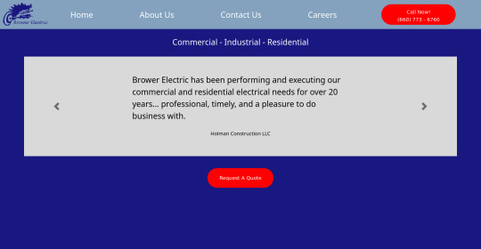
Brower Electric - Commit #2 - carousel
This commit, I built the testimonial carousel, added a new hamburger menu, added a Quote button, and fixed some previous errors.
The HTML:
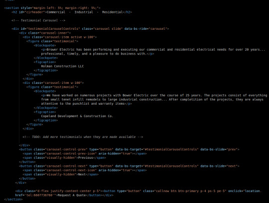
First, we will keep most body elements in a <section> with a small margin on either side. Then, we make a simple header.
After this, I adjusted a bootstrap carousel to have consistent size and to rotate through quotes. Notice that the typical d-block classes are missing, that's because I overrode that in my stylesheet where I rebuilt it using flexboxes so everything is centered and nicer in terms of responsiveness. No <img> tags to be seen here either, those are replaced with the <figures> that contain our quotes.
At the bottom, before the </section> tag, you will see a div that holds a button. This is our Request A Quote button, built just like the other button on the page and using Bootstrap flexbox classes to center it.
I also fixed some validation issues. First, there were extra "s in some tags. The buttons also had <a> tags which I discovered is an issue. They now use onclick="location.href='tel{insertnumberhere.}'"
The CSS:
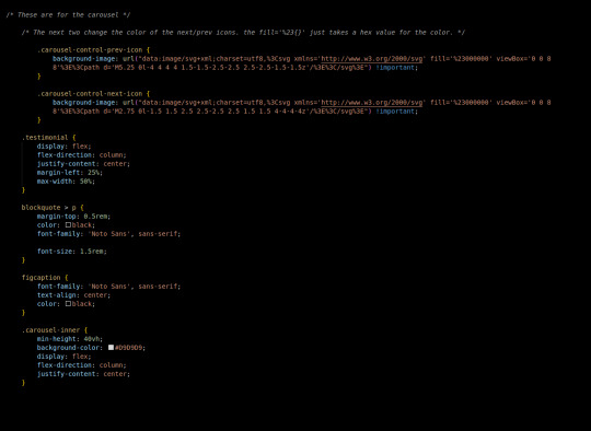
First in the css we added this commit, I changed the carousel background images. There's a hex value you can change in the background image element to accomplish this.
carousel-inner is a flex container, centering its element vertically in the middle, then testimonial is also a container doing this same thing. This keeps our text in the center of the carousel, no matter what text we use.
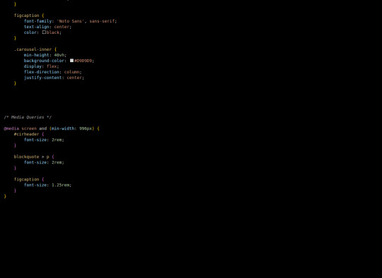
Finally, our media queries change font sizes to be more appealing and responsive on desktop (remember, we built mobile-first.)
The most exciting challenge I encountered writing this part was grinding through the carousel and using the flex-boxes to rebuild it. I definitely feel like it helped me build on my understanding of positioning a lot, which I know is important.
Next, we will use a Bootstrap 5 Grid to build the information tree.
4 notes
·
View notes
Link
Cartmarket – Electronics, Organics, Shoes, Glasses, Tools, Fashion & Affiliates WooCommerce Theme is our answer to new trends in full resolution designs. Clean, smart, robust and flexible multi-demo & electronics store WordPress WooCommerce theme with vertical and horizontal menu variants – ideal for any type of eCommerce Shop. This theme is brought to you by the same team that developed Electro – Electronics Store WooCommerce Theme, MediaCenter – Electronics Store WooCommerce Theme, Pizzaro – Fast Food & Restaurant WooCommerce Theme and MyBag – Single Product WooCommerce Theme.
Statistics says that much more potential customers are browsing websites in 1920px wide resolution now. In that way using old 1170 or even 980 grid system only, we are losing so much space we could use to show more products on for the user.
Cartmarket – Electronics, Organics, Shoes, Glasses, Tools, Fashion & Affiliates WooCommerce Theme, concept idea is to use as much space in very clean and user-friendly way to show lot of products in various ways.
You can find 7 different shop demos, 8 different Home Page styles, 2 Landing Pages and lot of shop pages to choose your favourite. Any content from each single Homepage or shop page can be transferred into another one very easily.
The design is well suited for Electronics Store, organics stores, retail stores, shoes store, garden tools store, glass store, vendor based marketplaces using plugins like Dokan, WC Vendors or WC Marketplace and affiliate websites using plugins like Prosociate or WooZone. It is built and comes bundled with most of the advanced features available in most popular eCommerce websites like amazon, flipkart, snapdeal, walmart, alibaba, aliexpress, souq, jadopado etc. So if you are an amazon affiliate or want a multi-vendor marketplace for your niche market or a store owner, this theme is for you.
The theme is built on top of Underscores framework. The code is lean and extensible. This will allow developers to easily add functionality to your side via child theme and/or custom plugin(s).
It features deep integration with WooCommerce core plus several of the most popular extensions:
King Composer
Visual Composer ( not included with the theme )
Slider Revolution
YITH WooCommerce Wishlist
YITH WooCompare
Dokan – Multivendor Marketplace
WC Vendors – Multi-vendor plugin for WooCommerce
WC Marketplace
WooZone
WCFM Marketplace – WooCommerce Multivendor Marketplace
Cartmarket – Frequently Asked Questions
I have a silly ( or basic or simple ) question related to Cartmarket, Can …
Please don’t worry about asking any type of questions related to our theme. We are happy to answer them all. Please reach us from the support tab.
How do I update the theme ?
We release updates on need basis. You can check our changelog to see our release history. Please use Themeatlas plugin (included in the theme) to update the theme. We have documented the steps to update the theme here : Updating a Themeatlas Theme
Can I trial your theme before purchase ?
We strongly recommend you to trial our theme before purchase and ask as many as questions you may have before purchase. Please request a trial along with any plugins you wish to test the theme with and we’ll setup a trial for you.
More questions answered here : FAQ
Trial & Dummy Data
If you’d like to try out the theme before purchasing, please email our support and we’ll setup a trial website for you.
Also a word about the Dummy Data. Once you import the dummy data provided with the download package, you will get a website.
This is with placeholders and default WooCommerce products. If you are looking for dummy data similar to demo, please email our support and we’ll provide you with our dummy data.
Please note that the demo has lot of images and it would take sometime to import all images. You need to have higher PHP execution time. However you can simply skip the images if you don’t want images. If your importer stops in the middle it is more like due to execution time out. In that case you will simply have to re-import it again ( don’t worry it will not duplicate ).
Cartmarket Extensions
To take your stores to the next level we have bundled this theme with the Cartmarket Extensions plugin which provides advanced features like :
Advanced Live Search
Youtube like Page loader
Advanced Vertical Menu
Megamenu Dropdown
Products Carousel
Products Carousel Tabs
Products Carousel Tabs with featured product
Products Isotope
Products Tab
Products Card Carousl with Gallery
Deals Carousel with countdown timer
Products Cards Carousel
Product Deals
Products categories filter
Products categories carousel
Advanced Reviews
Accessories Management
Advanced Product Specifications
Store Directory
Cartmarket Features
GENERAL
Easy One click Installation and Setup
Free Updates and one-to-one support
Comes with importable dummy data
Built on Bootstrap 4
Cross-browser compatible
Built with SASS – All SASS files included
7 Shop Demos
8 Different types of home pages
2 Different types of Landing pages
Responsive Megamenu
Supports various post formats and post thumbnails feature.
Includes 17 widgets
WPML Compatible
Youtube like page loader
WOOCOMMERCE FEATURES
Advanced Products Live Search
3 Different layouts for Single Product Pages.
Advanced Reviews
Advanced Specifications tab
Accessories for Products like in amazon
Catalog Mode available.
Shop Page Jumbotron.
Wishlist and Compare from YITH
Brands Carousel
Products Carousel
Ability to display products in 2, 3, 4, 5, 6, 7 and 8 columns
Custom Product Comparison page.
BLOG OPTIONS
3 Different types of layout : Classic, List View, Grid View
Choose from Right Sidebar, Left Sidebar or Full-width layouts
Enable placeholder images
OTHER CUSTOMIZATION OPTIONS
Integrated with Google Fonts
Can choose from FontAwesome icons
Integrated with Social Media
Can paste custom CSS easily.
Import/Export customization options
Demo Pages
Shop Demos
Bright Eye
Bow Market
Garden Deals
Organic Deals
Sports Market
NewLook Market
Home & Landing Pages
Home v1
Home v2
Home v3
Home v4
Home v5
Home v6
Home v7
Home v8
Landing v1
Landing v2
Shop Pages
Categories
Categories 7 Column
Shop Grid 5 Column Extended
Shop Grid 5 Column
Shop Grid 6 Column
Shop Grid 7 Column
Shop Listing Large
Shop Listing
Shop Listing Small with Product Sidebar
Shop Listing with Product Sidebar
Shop Right Sidebar
Shop Full Width
Shop List View Small
Single Product Pages
Single Product Extended
Single Product Fullwidth
Single Product Sidebar
WooCommerce Pages
Shop
Cart
Checkout
My Account
Track your Order
Wishlist
Compare
Blog Pages
Blog v1
Blog v2
Blog v3
Blog Full Width
Single Blog Post
Other Pages
About Us
Contact v1
Contact v2
FAQ
Store Directory
Terms and Conditions
404
Refund Policy We strongly recommend you to trial our theme before purchase and ask as many as questions you may have before purchase. Being a digital product there is a stringent refund policy. Please read about our refund policy here.
1 note
·
View note
Text
Bootstrap Tutorial
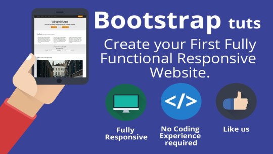
Bootstrap Tutorial
Bootstrap Tutorial Bootstrap - Overview Bootstrap - Environment Setup Bootstrap - Grid System Bootstrap - CSS Overview Bootstrap - Typography Bootstrap - Code Bootstrap - Tables Bootstrap - Forms Bootstrap - Buttons Bootstrap - Images Bootstrap - Helper Classes Bootstrap - Responsive utilities Bootstrap - Glyphicons Bootstrap - Dropdowns Bootstrap - Button Groups Bootstrap - Button Dropdowns Bootstrap - Input Groups Bootstrap - Navigation Elements Bootstrap - Navbar Bootstrap - Breadcrumb Bootstrap - Pagination Bootstrap - Labels Bootstrap - Badges Bootstrap - Jumbotron Bootstrap - Page Header Bootstrap - Thumbnails Bootstrap - Alerts Bootstrap - Progress Bars Bootstrap - Media Object Bootstrap - List Group Bootstrap - Panels Bootstrap - Wells Bootstrap - Plugins Overview Bootstrap - Transition Plugin Bootstrap - Modal Plugin Bootstrap - Dropdown Plugin Bootstrap - Dropdown Plugin Bootstrap - Scroll spy Plugin Bootstrap - Tab Plugin Bootstrap - Tool tip Plug-in Bootstrap - Popover Plugin Bootstrap - Alert Plugin Bootstrap - Button Plugin Bootstrap - Collapse Plugin Bootstrap - Carousel Plugin Bootstrap - Affix Plugin Bootstrap - Grid Demo Bootstrap - Table Demo Bootstrap - Form Demo Bootstrap - Buttons Demo Bootstrap - Images Demo Bootstrap - Responsive Demo Bootstrap - Navigation Demo Bootstrap - Blog Demo Bootstrap - Material Design Demo Bootstrap - Slider Demo Bootstrap - Time line Demo Bootstrap - Alert Demo Bootstrap - Admin Interface Demo Bootstrap Tutorial Twitter Bootstrap is the most popular front end framework in the recent time. It is sleek, intuitive Bootstrap - Overview What is Twitter Bootstrap?Bootstrap is a sleek, intuitive, and powerful, mobile first front-end fram Bootstrap - Environment Setup Try it Option OnlineYou really do not need to set up your own environment to start learning Bootstra Bootstrap - Grid System In this chapter we shall discuss the Bootstrap Grid System.What is a Grid?As put by wikepedia −In gr Bootstrap - CSS Overview This chapter provides an overview of the key pieces of Bootstrap's infrastructure, including Bootstr Bootstrap - Typography Bootstrap uses Helvetica Neue, Helvetica, Arial, and sans-serif in its default font stack. Using typ Bootstrap - Code Bootstrap allows you to display code with two different key ways −The first is the tag. Bootstrap - Tables Bootstrap provides a clean layout for building tables. Some of the table elements supported by Boots Bootstrap - Forms In this chapter, we will study how to create forms with ease using Bootstrap. Bootstrap makes it eas Bootstrap - Buttons This chapter covers the use age of Bootstrap button with examples. Anything that is given a class of Bootstrap - Images This chapter covers the Bootstrap support for images. Bootstrap provides three classes that can be u Bootstrap - Helper Classes This chapter discusses some of the helper classes in Bootstrap that might come in handy.Close iconUs Bootstrap - Responsive utilities Bootstrap provides some handful helper classes, for faster mobile-friendly development. These can be Bootstrap - Glyphicons This chapter will discuss about Glyphicons, its use and some examples. Bootstrap bundles 200 glyphs Bootstrap - Dropdowns This chapter will highlight about Bootstrap dropdown menus. Dropdown menus are toggleable, contextua Bootstrap - Button Groups Button groups allow multiple buttons to be stacked together on a single line. This is useful when yo Bootstrap - Button Dropdowns This chapter will discuss about how to add dropdown menu to buttons using Bootstrap classes. To add Bootstrap - Input Groups This chapter explains about one more feature Bootstrap supports, the Input Groups. Input groups are Bootstrap - Navigation Elements Bootstrap provides a few different options for styling navigation elements. All of them share the sa Bootstrap - Navbar The navbar is one of the prominent features of Bootstrap sites. Navbars are responsive 'meta' compon Bootstrap - Breadcrumb Breadcrumbs are a great way to show hierarchy-based information for a site. In the case of blogs, br Bootstrap - Pagination This chapter discusses about the pagination feature that Bootstrap supports. Pagination, an unordere Bootstrap - Labels This chapter covers Bootstrap labels. Labels are great for offering counts, tips, or other markup fo Bootstrap - Badges This chapter will discuss about Bootstrap badges. Badges are similar to labels; the primary differen Bootstrap - Jumbotron This chapter will discuss one more feature that Bootstrap supports, the Jumbotron. As the name sugge Bootstrap - Page Header The page header is a nice little feature to add appropriate spacing around the headings on a page. T Bootstrap - Thumbnails This chapter discusses about Bootstrap thumbnails. A lot of sites need a way to lay out images, vide Bootstrap - Alerts This chapter will discuss about alerts and the classes Bootstrap provides for alerts. Alerts provide Bootstrap - Progress Bars This chapter discusses about Bootstrap progress bars. The purpose of progress bars is to show that a Bootstrap - Media Object This chapter discusses about Media object. These are abstract object styles for building various typ Bootstrap - List Group The purpose of list group component is to render complex and customized content in lists. To get a b Bootstrap - Panels This chapter will discuss about Bootstrap panels. Panel components are used when you want to put you Bootstrap - Wells A well is a container in that causes the content to appear sunken or an inset effect on Bootstrap - Plugins Overview The components discussed in the previous chapters under Layout Components are just the beg Bootstrap - Transition Plugin The transition plugin provides a simple transition effects.If you want to include this plugin functi Bootstrap - Modal Plugin A modal is a child window that is layered over its parent window. Typically, the purpose is to displ Bootstrap - Dropdown Plugin Using Dropdown plugin you can add dropdown menus to any components like navbars, tabs, pills and but Bootstrap - Dropdown Plugin Using Dropdown plugin you can add dropdown menus to any components like navbars, tabs, pills and but Bootstrap - Scroll spy Plugin The Scroll spy (auto updating nav) plugin allows you to target sections of the page based on the scr Bootstrap - Tab Plugin Tabs were introduced in the chapter Bootstrap Navigation Elements. By combining a few data attr Bootstrap - Tool tip Plug-in Tooltips are useful when you need to describe a link. The plugin was inspired by jQuery.tipsy&n Bootstrap - Popover Plugin The popover is similar to tooltip, offering an extended view complete with a heading. For the popove Bootstrap - Alert Plugin Alert messages are mostly used to display information such as warning or confirmation messages to th Bootstrap - Button Plugin Buttons were explained in chapter Bootstrap Buttons. With this plugin you can add in some inter Bootstrap - Collapse Plugin The collapse plugin makes it easy to make collapsing divisions of the page. Whether you use it to bu Bootstrap - Carousel Plugin The Bootstrap carousel is a flexible, responsive way to add a slider to your site. In addition to be Bootstrap - Affix Plugin The affix plugin allows a to become affixed to a location on the page. You can also togg Bootstrap - Grid Demo What is a Grid?In graphic design, a grid is a structure (usually two-dimensional) made up of a serie Bootstrap - Table Demo Bootstrap provides a clean layout for building tables. Some of the table elements supported by Boots Bootstrap - Form Demo Form LayoutBootstrap provides you with following types of form layouts −Vertical (default) formIn-li Bootstrap - Buttons Demo Bootstrap provides some options to style buttons, which are summarized in the following table −Class Bootstrap - Images Demo Bootstrap provides three classes that can be used to apply some simple styles to images −.img-rounde Bootstrap - Responsive Demo Bootstrap provides some handful helper classes, for faster mobile-friendly development. These can be Bootstrap - Navigation Demo Bootstrap provides a few different options for styling navigation elements. All of them share the sa Bootstrap - Blog Demo Bootstrap provides a few different options for styling Blog's. Some of blog elements are as Comment Bootstrap - Material Design Demo What is a Material DesignMaterial design is a comprehensive guide for visual, motion, and interactio Bootstrap - Slider Demo Bootstrap provides a few different options for styling Navigation slider. Some of examples are as sh Bootstrap - Time line Demo Bootstrap provides a few different options for styling Time line.Some of example as shown below −Exa Bootstrap - Alert Demo Alerts provide a way to style messages to the user. They provide contextual feedback messages for ty Bootstrap - Admin Interface Demo Bootstrap provides a few different options for styling admin interface. Some of admin interfaces as Bootstrap - Ajax Demo Ajax is used to communicate with web pages and web servers. Some of examples which are based on ajax Bootstrap - Tabbed Slider Demo Bootstrap provides a few different options for slider. Tabbed slider as shown below −ExampleDescript Bootstrap - Caption Demo Bootstrap provides a few different options for captions. Thumbnail Caption Hover Effect as shown bel Bootstrap - Map Demo Bootstrap provides a few different options for map. sample example of map is as shown below −Example Bootstrap - Calendar Demo Bootstrap provides a few different options for calendars. sample example of calendar is as shown bel Bootstrap - Social Icons Demo Bootstrap provides a few different options for Social icons. sample examples of Social icons are as Bootstrap - Icons Demo Bootstrap provides a few different options for icons as fonts. sample examples of icons are as shown Bootstrap - Featured Demo Bootstrap provides a few different options for styling Bootstrap Elements.Some of bootstrap elements Bootstrap - Questions and Answers Bootstrap Questions and Answers has been designed with a special intention of helping students Bootstrap - Useful Resources The following resources contain additional information on Bootstrap. Please use them to get more in- Discuss Bootstrap Twitter Bootstrap is the most popular front end framework in the recent time. It is sleek, intuitive
Read the full article
1 note
·
View note
Photo

Download Shifto - Rental Listings Bootstrap HTML Template on themeforest
Description Shifto - Rental Listings Bootstrap HTML Template :
Download Shifto - Rental Listings Bootstrap HTML Template. The Theme releases on Saturday 6th March 2021 By The Author SPRUKO on Themeforest. It’s uses for best real estate listing websites,classified ads website template,classifieds website template,directory html template,directory listing html template,directory template,list rental,real estate bootstrap template,real estate html templates,real estate listing,rent,rental listing template,rental listings,rental website template,top rental websites. Theme Title: Shifto - Rental Listings Bootstrap HTML Template Category: site-templates Price: $29 Author: SPRUKO Published Date: Saturday 6th March 2021 04:53:19 PM More Info / DownloadDemo
Shifto – Bootstrap Responsive Rent real estate listing premium Html Template. This rental property website template Includes 180+ HTML Pages & 40+ jquery css Plugins. Multipurpose Use pre built bootstrap 4 html framework with using scss & css. We have designed this real estate rental bootstrap directory template fully responsive Left menu & Horizontal menu premium quality html template. This premium rent html template is fully responsive design. You can customize easy way. Customize html5 elements using scss to css in any type of bootstrap rental listings directory website templates.
this rent classifieds website template clean and professional html5 gulp SCSS & CSS design. This is simple rent real estate listing html template design comes with several modern jQuery plugins included, awesome cool colors, multiple styles, charts and custom Tables and calendar and many more plugins Included. We have included multipurpose elements for developer use any type of multipurpose use listing template.
This is fully responsive real estate rental bootstrap template Included Advanced html elements ui kit like Date picker, Time Picker, Auto suggestions, Full Calendar, Data tables, Pricing Tables,Select2, Message Chat, Sweet Alerts, This html template scss template is Fully 100% premium quality rent html template . This html5 responsive template is very simple bootstrap directory html template. We have designed using cool colors styles for using html ,css, scss, Jquery. After Purchased you get All HTML, SCSS, CSS and JS Files.
It has super clean and simple scss html template design, you can easy to customizable this bootstrap ui kit template design HTML components and widgets and jQuery Plugins. This is rent template premium quality design bootstrap template comes with a awesome unique latest fresh creative premium template. This Rent html template design also we can ensure easily html customize use scss in html any type of rental website template.
It is a fully responsive for all type of devices works on all major web browsers based on support bootstrap.
Once you Purchase this rent template you will be enabled to get free download of all future updates.
This html rent template comes with a awesome unique design also we can ensure easily html design elements & customize any type of real estate listing website.
Adding to all this enjoy a lifetime FREE Download updates!
Template Features
• 10 Different rent Listing Home Pages • 10 Color styles • 180+ HTML Pages • 2 Types of menus (Left Menu & Horizontal ) • 10 Types of Headers • 4 Type of Footers • Bootstrap 4 Responsive Framework • Well Commented Code • 24 * 7 Professional Company Support • Regular Updates • 45+ Plugins • 10 Types of Icons • Maps List • Vertical Scrollbar • Select2 • Different Styles of Listing Pages • Different Styles of Details Pages • Multiple Blog Pages • Owl-carousel • Form Elements • Form Advanced Elements • Data Tables • Typography Page • Lock screen Page • Error Page • Under Construction Page • Cookies • E-commerce Image gallery • User Profile • Easy to customize • Google Fonts • More Widgets • Invoice Page • Pricing Tables • Very Easy to Create your Own Site • Neat, clean and simple design • W3C Validated
What do you get?
• All HTML files. • SCSS Files. • CSS Files. • JS Files
IMPORTANT NOTE :
Note : Images and Demo Sidebar Switcher used in this demo for reference purpose only, Final Purchase product consists of dummy blank does not contain any picture. if any queries related to this please email us [email protected]
Support :
Feel free to contact us any time. We have a dedicated team to provide you the best support. If you want any queries please contact live chat or email:


More Info / DownloadDemo #Shifto #Rental #Listings #Bootstrap #HTML #Template
#All_Theme_amp_Template#best_real_estate_listing_websites#classified_ads_website_template#classifieds_website_template#directory_html_template#directory_listing_html_template#directory_template#list_rental#New_releases#real_estate_bootstrap_template#real_estate_html_templates#real_estate_listing#rent#rental_listing_template#rental_listings#rental_website_template#site-templates#site-templates_new_release#Theme_amp_Template_new_release#top_rental_websites
0 notes
Text
[100% OFF] Bootstrap 5 - Crie Sites de Forma Ágil e Moderna (2021)
[100% OFF] Bootstrap 5 – Crie Sites de Forma Ágil e Moderna (2021)
What you Will learn ? Criar Layout do Zero com Bootstrap Desenvolvedor o FrontEnd de forma ágil Os Principais Recursos do Bootstrap 5 Instalar o Bootstrap 5 Criar SlideShows (carousel) Sites Responsives Entender o sistema de Grid Alinhamento de Colunas (vertical e horizontal) Classes de imagens Recursos Visuais de Formulários Botões e Links do Bootstrap Criar Menus DropDpwn Criar Caixas de Alert…

View On WordPress
0 notes
Text

Bootstrap Vertical Carousel
#bootstrap vertical carousel#bootstrap tutorial#html css#divinector#css#frontenddevelopment#html#css3#webdesign#bootstrap snippets#vertical slider#responsive web design#learn to code
0 notes
Photo

24 Best jQuery Image Sliders
Add a full-featured and easy-to-implement jQuery image slider to your website to help you keep the attention of your website traffic.
CodeCanyon offers some of the best jQuery image sliders available on the web for a one-time low payment.
Slider Revolution is one of the best selling jQuery image sliders available on CodeCanyon.
Images are an integral part of any website and should be displayed in a visually appealing way on your website. CodeCanyon will allow you to integrate a beautiful looking jQuery image slider into your website and allow you to visually display your business products, services, and promotions.
The Best jQuery Image Sliders on CodeCanyon
Discover CodeCanyon's massive library of the best jQuery image sliders ever created. With a cheap one-time payment, you can purchase these JavaScript image sliders and have them installed on your website in no time.
Here are a few of the best-selling jQuery image sliders available on CodeCanyon for 2020.
Check out some of the best selling jQuery Image Sliders available on CodeCanyon.
The jQuery image sliders give you the ability to display your business's images in the best way possible. These sliders are feature-rich and are completely customizable so you can fit them to your website's specific theme. Here are a few features that you can expect from these jQuery image sliders.
fully responsive
smooth transitions
lazy load images
parallax effect
Give your users the website experience they deserve. Add one of CodeCanyon's high-quality jQuery image sliders to your website and let your images shine.
Top 20 jQuery Image Sliders (From CodeCanyon for 2020
1. RoyalSlider
Having a touch-friendly and responsive slider for your website is more important now than ever before, and RoyalSlider is both.
Developed with HTML5 and CSS3 best practices, it's a solid choice.
Here are a few of the other royally cool features:
SEO optimized
highly configurable
over 10 starter templates
includes fallbacks for CSS3 transitions
and more
I think the best feature is the modular architecture that gives devs the option to exclude what they don't need from the main JS file, keeping things as lean as possible.
The RoyalSlider is a solid JavaScript slider that should be a nice addition to any web dev's toolbox.
2. Slider Revolution
It's not easy to be "revolutionary" in the slider space. There are only so many options you can make available when it comes to sliders, but the Slider Revolution does a great job trying.
When it comes to jQuery sliders, this one delivers on just about everything you'll want.
The list of features for this slider is long, so I'll just hit the high points:
parallax effects and custom animations
SEO optimized and lazy loading options
add unlimited layers and slides with link options
includes "ready to use" styles and is highly customizable
and much more
The ability to drop in an image, video player embed, and social media source makes Slider Revolution one of the most flexible and customizable options you'll find.
3. LayerSlider
The name doesn't do this jQuery slider justice. Its 200+ 2D and 3D slide transitions will turn some heads.
Some of the notable features include:
skin design PSD template included
13 skins and 3 navigation types
add a fixed image over the slider
SEO friendly and lazy load images
hardware-accelerated CSS3 transitions with jQuery fallback
and more
Like the previous slider, you can drop in just about any content—even HTML5 self-hosted multimedia content.
The LayerSlider brings a lot of action to the slider space and is downright handsome.
4. Rama
This jQuery Slider Plugin animates your image and text slides with transition effects with over 21 different transition effects. The plugin is easy to install and will give your website a fresh new look.
Here are a few notable features for this slider:
unlimited amount of texts, images, and animation combinations
3+1 frames, wallpaper, and icon options
auto thumbnail creation
easy installation
5. All In One Slider Responsive jQuery Slider Plugin
Every slider comes to market with its own unique perspective and provides a solution to whatever slider niche is being targeted.
But not this one.
The All In One Slider Responsive jQuery Slider Plugin is, well, all in one.
I think most web devs and designers have a go-to solution, but at the same time are always on the lookout for something new.
This just might be that something new as it includes:
banner rotator
thumbnails banner
banner with playlist
content slider
carousel
And all of these slider styles include most—if not all—of the features needed in a jQuery slider.
Will the All In One Slider Responsive jQuery Slider Plugin be your all-in-one slider solution?
6. Slice
This responsive jQuery Slider and carousel plugin provides fully functional vertical sliders and carousels in addition to the classic horizontal layouts. All customization options can be set directly in HTML and the plugin comes with 5 pre-styled themes.
Here are a few more features that you can expect with Slice:
parallax effect block
100+ customizable options
10+ ready-to-use examples
lazy and smart image load
Don't miss out on this powerful jQuery image slider. Add it to your website today!
7. Slidea
Slidea brings a powerful and lightweight multipurpose content slider that will instantly make your website more competitive. The simple but effective design gives you and your viewers complete control over the slider.
This jQuery image slider has has the following features:
premade templates
compatible with any front-end framework
autoplay
50+ animation presets
8. jQuery Easing Slider
jQuery Easing Slider gives you the ability to create smooth animations between your images. The sleek and modern design will give your website a fresh new look.
Here are a few notable features for this jQuery image slider.
fixed and responsive layouts
compatible with all major browsers
customizable image size and position
easily customizable HTML and CSS
Download the Easing Slider today!
9. Kreatura Slider Plugin for jQuery
Looking for a slider that is easy to install, has plenty of animation effects, and ready to use templates? Kreatura is the perfect plugin for you then. The responsive design, effects such as parallax, and SEO friendly design make this an incredibly powerful slider.
Here is what users are saying about this jQuery image slider:
"Slider of very good quality that works perfectly." — nac6
10. jQuery Slider Zoom In/Out Effect
This is one of those jQuery sliders that makes you visit the demo before you start reading about the features because you want to know what the "zoom in/out effect" even means.
Think screensaver.
While the effect is fairly slight, the zoom effect in a slider adds a nice touch in a web full of static image sliders.
This slick slider's features include:
CSS3 layer transitions
exit animation parameters for layers
fixed, full width, and fullscreen options
CSS and HTML formatted animated text
and more
While most sliders try to deliver many effects in one package, the jQuery Slider Zoom In/Out Effect slider delivers the Ken Burns effect and delivers it well.
11. Transition Slider
Transition Slider is a unique and innovative slider plugin with stunning looking animations. There is no coding required and the plugin is easy to install. The slider is fully customizable and can be fit to your specific website's theme. Create a simple responsive animated hero block, responsive video background, block with animated layers and animated background, or responsive animated banner with this plugin.
Here is what Fle9ma has to say about this jQuery image slider:
"The slider really enabled me to bring the website to life in a modern and interactive way. And support is simply outstanding. Really worth the money!"
12. Slim Before-After Image Comparison Slider
This jQuery image slider couldn't be easier to install. Simply add one line of CSS and include the plugin javascript file to your documents and that is it! If you are in need of a basic but fully functional image slider then this is your go-to plugin.
Here are a few notable features for this jQuery image slider:
lightweight and simple design
mobile ready (touch-enabled)
customizable via CSS
bootstrap compatible
RTL Support
13. Master Slider jQuery Slider Plugin with Visual Builder
The Master Slider jQuery Slider Plugin with Visual Builder makes building a slider a snap—without sacrificing good looks.
This premium image and content slider offers some really nice hardware-accelerated transitions that will surely catch your eye.
Features include:
smart preloading
built for both mobile and desktop
over 80 ready-to-use sample sliders
masked layer transitions, layer actions, and overlay layers
and more
Master Slider jQuery Slider Plugin with Visual Builder is fully customizable, SEO friendly, and also supports videos. And of course, it comes with a visual builder to make creating sliders easy.
14. HOHOR
HOHOR isn't specifically an image slider but it is still worth a mention in this list. HOHOR is a gallery plugin that can be used as a slider plugin. You can feature as many images as you would like on a web page in masonry and grid formats and have them displayed in different sizes.
Here are a few other key features for this plugin:
dark and light version
fully responsive
easy to customize
clean and modern design
masonry and grid version
15. Advanced Bootstrap Carousel Plugin
This Bootstrap carousel and slider plugin comes with over 138 pre-made layouts. Simply install the plugin and choose one of the eye-catching templates and you will be ready to display it on your website.
Here are a few of the features of this plugin:
hero carousel features
full-width slider
cover flow slider
parallax effect
multiple items carousel
16. jQuery Banner Rotator
The jQuery Banner Rotator slider is a straightforward solution. It's simple without sacrificing essentials.
It includes:
tooltips and text descriptions
thumbnail and component viewing options
timer and delay options on a global or per-slider basis
multiple transitions for all slides or different transitions for each one
While the jQuery Banner Rotator is basic compared to other jQuery sliders, it should not be overlooked if you want a simple, clean interface.
17. Slider Evolution
Start a slider revolution with Slider Evolution! Now you can easily create JavaScript sliders with some of the best effects.
With Slider Evolution, you can create an unlimited number of sliders, each with customized settings, to be placed anywhere on your website.
18. UnoSlider
If your slider isn't touch-enabled and responsive, you're not doing it right.
The UnoSlider does it right.
This slider finds its sweet spot between simple and feature-rich.
Features include:
easily themeable
12 pre-built themes
40 present transitions
IE6+ support (because it's still out there!)
and more
The feature set leans more towards design and style, making the UnoSlider a great content slider for a well-designed website.
19. Parallax Slider
The Parallax Slider works like the jQuery Responsive OneByOne Slider Plugin, allowing you to animate each layer separately within a particular slide.
You can do this with multiple slides, or even just one slide, adding some compelling parallax animation to your website.
This comes with four different types of sliders, all offering the same animated, parallax effect.
Like many other jQuery sliders, it also includes:
full customization
touchscreen support
fully responsive layout
unlimited layers
autoplay, loop, size, and timer parameters
Animated layers are not limited to text and images either. You can also include YouTube, Vimeo, and HTML5 video.
The Parallax Slider is another fine example of how Flash-like effects can be executed better than Flash—and be supported across all devices.
5 Free jQuery Image Sliders for Download in 2020
If you are looking for the highest quality jQuery image sliders available, then the premium sliders available on CodeCanyon have you covered. The sliders on CodeCanyon have the most comprehensive set of features available and will give you the greatest level of control over the image sliders.
However, if you are on a budget, you might not be able to afford to purchase these premium jQuery image sliders. That is why I've collected a list of five of the best free jQuery image sliders available on the web.
1. bxSlider
bxSlider is a simple and easy-to-install jQuery image slider that has all the basic features. Just download the zip file, copy the code to your website, and you are ready to go.
2. Owl Carousel 2
This free jQuery image slider has over 60 customizable options. It is also fully responsive and has touch and drag support.
3. ajSlider
ajSlider is a jQuery slideshow plugin that can be used as the main banner for your webpages or as an image gallery. With the plugin, you can enable and disable the automatic slideshow action, specify the colors for the slider bullets, and much more.
4. Jssor jQuery Slider
This jQuery image slider comes with a free and paid version. The free version offers many of the customization features offered in the paid slider and will be suitable for any basic image slider needs.
5. Turntable.js
Turntable.js is a responsive JQuery slider that will let you rotate through a list of images as your mouse sweeps across a container. Just download the .js file, add copy and paste the code onto your website and the slider will be ready to use.
Discover More Great jQuery Image Sliders
The jQuery image sliders mentioned in this article are some of the best available on CodeCanyon. However, some of the jQuery sliders may not have the specific functions that you are looking for.
If you are looking for a different type of jQuery slider or are needing are looking to add even more types of sliders to your website, then feel free to browse the articles below for more high-quality jQuery image slider suggestions.
JavaScript
15 Best jQuery Image Galleries
Monty Shokeen
HTML5
10 Best Responsive HTML5 Sliders for Images and Text... and 3 Free Options
Nona Blackman
jQuery
Best jQuery Flipbook Plugins Compared (Free and Paid)
Esther Vaati
Add a jQuery Image Slider Plugin To Your Website Today!
Images are an integral part of any website. They add interest and excitement to your website that text simply cannot.
To get the most out of your images on your website, you will need to display them in a visually-appealing and interactive way.
CodeCanyon offers some of the most advanced jQuery image slider plugins on the web that will take your website to the next level. Whether you are looking for an image slider that is fully responsive, has eye-catching transition effects, or uses a lightweight design, CodeCanyon will have an image slider for you.
In addition to all the jquery image slider plugins available, there are also thousands of other plugins on CodeCanyon that can help you improve your website. Have a look through this large collection of plugins and you will find all types of plugins including SEO, online store, marketing, and audio player plugins.
by Daniel Strongin via Envato Tuts+ Code https://ift.tt/3aC67o9
0 notes
Text
300+ TOP BOOTSTRAP Objective Questions and Answers
BOOTSTRAP Multiple Choice Questions :-
1. Which of the following is correct about Bootstrap Grid System? A. Predefined grid classes like .row and .col-xs-4 are available for quickly making grid layouts. LESS mixins can also be used for more semantic layouts. B. Columns create gutters (gaps between column content) via padding. That padding is offset in rows for the first and the last column via negative margin on .rows. C. Grid columns are created by specifying the number of twelve available columns you wish to span. For example, three equal columns would use three .col-xs-4. D. All of the above. 2. Which of the following class applies the hover color to a particular row or cell of a table? A. active B. success C. warning D. danger 3. Which of the following bootstrap style of button indicates caution should be taken with this action? A. btn-warning B. btn-danger C. btn-link D. btn-info 4. Which of the following bootstrap style helps to combine sets of into a for more complex components? A. btn-group B. btn-toolbar C. btn-group-lg D. btn-group-vertical 5. Which of the following bootstrap styles are used to create a vertical pills navigation? A. nav, .nav-tabs B. nav, .nav-pills C. nav, .nav-pills, .nav-stacked D. nav, .nav-tabs, .nav-justified 6. Which of the following bootstrap style can be used to to get different size items of .pagination? A. lg, .sm B. pagination-lg, .pagination-sm C. menu-lg, .menu-sm D. None of the above. 7. Which of the following is correct about Bootstrap jumbotron? A. This component can optionally increase the size of headings and add a lot of margin for landing page content. B. To use the Jumbotron: Create a container with the class of .jumbotron. C. Both of the above. D. None of the above. 8. Which of the following is correct about bootstrap media objects? A. These are abstract object styles for building various types of components (like blog comments, Tweets, etc.) that feature a left-aligned or right-aligned image alongside the textual content. B. The goal of the media object is to make the code for developing these blocks of information drastically shorter. C. Both of the above. D. None of the above. Explanation Both of the above options are correct. 9. Which of the following is correct about data-remote Data attribute of Modal Plugin? A. It specifies static for a backdrop, if you don’t want the modal to be closed when the user clicks outside of the modal. B. It closes the modal when escape key is pressed; set to false to disable. C. It shows the modal when initialized. D. Using the jQuery .load method, injects content into the modal body. If anhref with a valid URL is added, it will load that content. 10. Which of the following is correct about data-trigger Data attribute of popover Plugin? a) Sets the default title value if the title attribute isn’t present. b) Defines how the popover is triggered. c) Defines default content value if data-content attribute isn’t present d) Delays showing and hiding the popover in ms.

BOOTSTRAP MCQs 11.Which class indicates a dropdown menu? a) .dropdown-list b) .select c) .dropdown 12. A standard navigation tab is created with: a) b) c) d) 13. A standard navigation bar is created with: a. b. c. d. 14. Which class is used to create a black navigation bar? a. .navbar-default b. .navbar-black c. .navbar-dark d. .navbar-inverse 15. Which plugin is used to cycle through elements, like a slideshow? a. orbit b. slideshow c. scrollspy d. carousel 16. Which plugin is used to create a modal window? a. modal b. window c. dialog Box d. popup 17. Which plugin is used to create a tooltip? a. popup b. tooltip c. modal d. dialog Box 18. Ques. Bootstrap’s grid system allows up to a. 6 columns across the page b. 12 columns across the page c. columns across the page d. columns across the page 19. Default size of H5 bootstrap heading a. 14px b. 16px c. 18px d. 20px 20. The .container-fluid class provides a. Fixed width container b. Table format c. To create a Form d. Full width container 21. Which one is the bootstrap JS CDN url a. Read the full article
0 notes
Link

Leo Theme is delighted to release a multi-purposed and multi-homepage theme named Leo Buxinh Prestashop Them – the first PS theme in version 1.7.3.1. Leo Buxinh Responsive PS theme for Fashion store or shoes store is a clean & minimal multi-homepage theme with 5 different homepages, creative & modern design, powerful built-in functions, associated with smooth animation to bring users with more choices and the most satisfied experience.
All of the 5 homepages are supported with advanced techniques like HTML5, CSS 3, Bootstrap 3.x, and strong modules like Ap Page Builder module, Leo Slideshow module, Leo Feature module, Leo Blog module, etc. However, each of the homepage has its own outstanding features that can be suitable for your marketing campaigns at different time.
If the full-width layout associated with impressive Leo Slideshow module that allows images and video to bring web-visitor more intuitive look is the highlight of Home 1, Home 2 impresses the viewer by its sophisticated and neat layout, you can instantly update your blog and Instagram posts in homepage, keep up date with your clients.
Moreover, Home 3 focuses on shop topic with images combined with html text to help you easily convey your shop’s message to your clients. Specially, we support with Google map to track your clients to shop and increase the reliance to your clients. In additional, Home 4 is newfangled with vertical menu, which makes it possible for web-browsers to navigate easily. Interestingly, the Slideshow video together with product carousel to display your products in a more vivid and intuitive way. Whereas, what is striking most about Home 5 is on the traditional but still sophisticate angle.
Last but not least, beside the built-in functions of default Prestashop, at this version 1.7.3.0, we have made a big change in Product detail page. We have created 7 different and unique layout styles for product detail page. This is thanks to the improvement of Ap Page Builder module, hope to bring the greatest utilities for Prestashop user.
0 notes
Text
Haltico - Mega Store Prestashop Theme (Shopping)
Haltico – Responsive Prestashop theme is flexible and smart design, which will excellently fits for stores selling Digital, Electronics, Phones, Cameras and Computers Stores. It has full compatibility with major browsers, supports all devices, user-friendly and fine-looking!
Haltico theme comes with a lot of advanced and useful features that would bring incredible success to your e-commerce business. Vertical & Horizontal Megamenu contains a lot of categories arranged logically in many columns. Large image slider show latest promotions and certain products. This theme is designed with many featured categories and their thumbnail images through List Categories module. Category Tab Slider and Product Tabs Slider show the tab for selected products, categories, which can be designed in list/grid view. Products Slider (featured, new, sale, bestseller and recommended products) display product carousel slider in a neat way. Beside that, Daily Deal module help you easily show timer countdown for multiple products. Blog, Testimonial will always be the best choices to provide more informations and trust for your customer. Finally, Ajax Add to Cart helps to add products directly to shopping cart and Ajax Quick View allows to view detail product in the popup window without going to product page.
Haltico is a great starting point for you! We wish you have a great experience and this Prestashop Digital theme will help you choose the most suitable one for your website!
Haltico’s Full Features & Extenstion List
Clean, modern design can be used for any type of website
Built with Bootstrap 4 and CSS3
4 Different Layouts
Flexible layout format comes with various styles.
Retina & Fully Responsive
Works like a charm on any devices, any resolutions.
Cross Browser Compatibility
Chrome, Safari, Mozilla Firefox, IE 8+, Opera 9+
Font Awesome icons fully integrated.
Quick View
You can view product details in the popup
Ajax Add to Cart
You can add products to cart without leaving current page.
Ajax layered navigation, Ajax Toolbar
Filter products by price, product options, product attributes,...
Help your customer find the product quickly
Grid / List view
Allow to display your items in either list or grid view
Cloud Zoom
Show a Product image Zoom when clicking on product in detail-page.
Set Layout for each page
Easy define column left or column right for each page in admin panel.
Delivered with source Adobe .PSD files
Blog Extension
Xpert Blog with category, article, tag, comment etc…
14+ New extensions by Posthemes
Megamenu Customer
Vertical Megamenu Customer
Category Tab Slider
List Categories
Special Products module
Daily deal module
New Products
Featured Products module
Recommended products
Products Tab Slider
Customer Testimonials
Search products by category
Brand Logo
Custom Slideshow
Advanced Typography Options!
Using Google Fonts!
Graphics Used
Many thanks for these great images to:
Flickr
Patterns
Goodfon, Freedigitalphotos
Note: All images are just used for preview purpose only and NOT included in the final purchase files.
Theme Support
Our support team guarantees to respond you within 24-72 working hours from Monday to Friday. You can send us email to [email protected]. We will process tickets and respond you to in the queue order.
from ThemeForest new eCommerce items https://ift.tt/2MpYFn3 via IFTTT https://goo.gl/QR4OrJ
0 notes
Link
A Website Designing Company helps you register your presence on the Internet. It acts as your online identity and introduces your business to people.
You can use a website to increase the visibility of your business and give them an introduction of what you offer. Click To Tweet
It is important to own a website and most businesses have their websites on the Internet, but it isn’t enough if it doesn’t reach out to your audience at the right time.
As technology is evolving each day and becoming more accessible people are switching to different devices to access the Internet, ranging from small screen mobile phones to huge screen televisions. Mobiles, tablets and smartwatches are gaining popularity as people can access the Internet over them, even while on the go. To ensure your customers can access your website 24/7 through any of these devices you need to optimize it.
The websites built for desktops if used on mobile phones face issues like: tiny fonts which cannot be read easily, panning and zooming is required to view sections clearly, slow speed due to high loading time,difficulty in accessing links or tabs. These issues may lead to an unpleasant user experience resulting in increased bounce back rates.
Even mobile phones from different brands come in different sizes, configurations and resolutions, so there’s isn’t a format that can be used perfectly on every device.The solution is to create a responsive website, which is mobile friendly and all content on it is appropriately sized. A responsive website is one in which all your web page content including text, images, multimedia and videos adjusts itself to optimally fit the screen of any device. It ensures an optimum viewing experience for viewers regardless of the device they are using.
Building websites for multiple devices with varied capabilities, screen sizes and interaction modes needs basic knowledge of HTML/CSS and analytics of user behavior to create a mobile friendly HTML website. A responsive web design adapts your website layout to your user’s viewing environment by using fluid, proportion-based grids, flexible images and media queries.
Listed below are the steps to create a mobile friendly HTML website:
Use HTML:
Flash is an obsolete technology as it’s not good for SEO and mobile devices do not support it. It slows down the loading speed of your webpages, so using HTML is a more compatible option.
Incorporate the fluid grid concept:
Switch to fluid grid layout to size page elements in relative units like percentages, instead of adaptive grids that use absolute units like pixels or points. The adaptive grids require manual adjustment of widths and heights in different view ports. Using a fluid grid in its place is beneficial as they flow naturally within the dimensions of the parent container and require less adjustments for different devices.
Set the viewport meta tag:
Browsers in smartphones are designed to scale the traditional websites to fit into the device’s screen, which shrinks the size of all content on the website and makes it difficult to access.
Use the following in the HTML for each web page:
<meta name=”viewport” content=”width=device-width, initial-scale=1″>
The viewport meta tag instructs the browser to use the actual device width to control the page’s dimensions and scaling.
Use the width Property:
Set the CSS width property to 100% this will help the image to scale up and down easily, this makes the images flexible.
It can be used as follows:
<imgsrc=”img.jpg” style=”width:100%;”>
An image may even scale up to a size larger than the original size of the image, which can be controlled by setting the max-width property to 100%. This prevents the image from being displayed beyond its containing element.
To control follow the syntax as below:
<imgsrc=”img.jpg” style=”max-width:100%;height:auto;”>
Set the HTML picture element: You can set the HTML picture element to display different images for different browser window sizes. The displayed images change depending on the browser width, while still maintaining the required relevance to the content.
An example would be as follows:
<picture>
<source srcset=”img_small.jpg” media=”(max-width: 600px)”>
<source srcset=”img_big.jpg” media=”(max-width: 1500px)”>
<source srcset=”img.jpg”>
<imgsrc=”img_small.jpg” alt=”img”>
</picture>
Set the viewport width:
Setup a responsive text size by setting the “vw” unit to 1% of the viewport. The text resizes itselfby following the size of the browser window.
It can be used as given below:
<h1 style=”font-size:10vw”>text</h1>
The first site that featured a layout with adaptive browser viewport width was audi.com
Use Media Queries:
In addition to resizing text and images, you also need to use media queries in responsive web pages. Media queries allow you to define different styles for different browser sizes. An example is the elements that display horizontally on large screens are stacked vertically on small screens.
<style>
.left, .right {
float: left;
width: 20%; /* The width is 20%, by default */
}
.main {
float: left;
width: 60%; /* The width is 60%, by default */
}
/* Use media query to add a breakpoint at 800px: */
@media screen and (max-width: 800px) {
.left, .main, .right {
width: 100%; /* The width is 100%, when viewport is 800px or smaller */
}
}
</style>
You’ll need to configure it for all devices currently in use by your audience.
Use Bootstrap:
Bootstrap is a popular framework that uses HTML, CSS, JavaScript and jQuery to make responsive web pages. It is a pre-built system which makes it easier for you to address all possible combinations while creating a responsive web design. You can use it to create a Jumbotron, styleyour navigational menu, attaching some glyph icons, use a grid system and creating a slideshow using Carousel.
Make important information accessible:
Analyze user behavior to shortlist most sought information on your website and change its placing to make it easy to find on their mobile homepage.
Increase the size of buttons:
Enlarge the size of buttons to ease clicking through them. Smaller buttons are easy to click on computers but accessing them through fingertips is tough, so use large sized buttons to enhance user experience.
A Mobile Friendly website has become more important as mobile traffic now accounts for more than half of total internet traffic.People access websites from different devices, and Google stresses on the importance of responsive web design and usability of a website when assigning ranking in search engine result pages.
Creating a mobile friendly website will help you improve your website’s Google ranking as well. The necessary factor for a responsive web design is uniform content, design and performance across all devices.Although websites are being built with responsive designs, one ongoing challenge is that some banner advertisements and videos are not fluid, this needs to be addressed to boost responsiveness.
Responsive web design is also considered a cost-effective alternative to mobile applications. It saves extra effort and expenditure required to create an app as it has the ability to house all the code in a single website. Users also find it beneficial as they don’t need to install application for every business they wish to deal with.
Realizing the benefits and importance of mobile-responsive web designs developers are continuously testing better ways to implement it.
The post How To Create A Mobile Friendly HTML Website? appeared first on Digital Ideas.
via Digital Ideas
0 notes
Photo
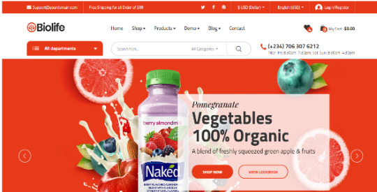
Download Biolife - Organic HTML5 Template, Vegetable, Supplement, Food and Fruit Store on Codecanyon
Description Biolife - Organic HTML5 Template, Vegetable, Supplement, Food and Fruit Store :
Download Biolife - Organic HTML5 Template, Vegetable, Supplement, Food and Fruit Store. The theme releases on Monday 1st March 2021 By The author udokaezepue on Codecanyon. It’s makes use of with biolife,clear,ecommerce,trend,flat design,versatile,meals,kute,trendy,multi-choices,natural,procuring,retailer. Item Title: Biolife - Organic HTML5 Template, Vegetable, Supplement, Food and Fruit Store Category: html5 Price: $30 Author: udokaezepue Published Date: Monday 1st March 2021 09:51:27 PM More Info / DownloadDemo
Biolife is an natural HTML5 template or E-commerce store. made for multipurpose use. It may be use for vegetable on-line retailer, meals retailer, fruit retailer, dietary supplements retailer, medication retailer and so on. The design framework is implausible and straightforward to make use of or edit. You don’t even want to take a look at it twice, simply buy it and take pleasure in. Note: To navigate by way of different hyperlinks, make use of Demo drop down hyperlink
Outline options:
More than 30 HTML Pages
Fully Responsive (Tested on Multiple Devices)
Full Width Layout
Shop Design
Working Ajax Contact Form
Multi-options for Home Page
Inner Pages: Category Style 1, Category Style 2, Category Style 3, Product 1(Left column), Product 2(Fullwidth), Product 3(Right Column) Order, Checkout, Login, About, Contact, Wishlist, Compare, Blog, Blog Detail, 404 Page
Blog Pages
fastened header/Menu
Mega Top Menu
Pixel Perfect Design
Mega Vertical Menu
User Friendly Code
Clean Markup
Creative Design
Cross Browser Support
Bootstrap 4*..
Used Font Awesome Icon
Google Font
Google Map
Fast Page Loading
Amazing Megamenu
Easy To Customize
Smooth Animation
search engine marketing Optimized
Banners Slideshow
Brand Showcase
Hot Categories
Special Product Groups
Services
Carousel : Best Sellers, On Sales, New Products, Latest Deals, Deals of The Day, Related Products, Testimonials, Categories, Filter Section, Banners, Slideshow,...
jQuery Enhanced
Cross browser compatibility together with Chrome, Firefox, Edge, Operamini, Safari and so on.
More Info / DownloadDemo #Biolife #Organic #HTML5 #Template #Vegetable #Supplement #Food #Fruit #Store
#All_Code_amp_plugin#biolife#clean#Code_amp_plugin_Rising_stars#ecommerce#fashion#flat_design#flexible#food#HTML5_Rising_stars#HTML5_templates#kute#modern#multi-options#organic#Rising_stars#shopping#store
0 notes
Text
Webster - Responsive Multi-purpose HTML5 Template
New Post has been published on https://babesgobananas.com/webster-responsive-multi-purpose-html5-template/
Webster - Responsive Multi-purpose HTML5 Template
HTML website is an economic alternative to consider while building a website from the scratch which can be expensive option for smaller businesses to afford. Webster is one of the responsive and multipurpose HTML5 templates that comes jam-packed with 70+ homepage layouts, 540+ stunning template variations, 50+ shortcode with 600+ reusable UI components and bingo, the free premium plugins.
The bootstrap 4 based template has all the necessary building blocks and pre-built components in place that allow businesses to craft a full-fledged website that thrive the users with elegant designs and fantastic layout without having low-level programming knowledge. It’s all viable with the minimum time and dollar investment. It’s a huge saving.
The lightweight template, which enables engineering the customer-oriented websites that perform to the notch. In the template, at the bottom of the HTML file, only a few scripts get loaded when they are needed due to which the plugins get loaded on the page dynamically, thereby alleviating the need to add the plugins manually. For instance, when you want to use the owl carousel on the home page, then the owl-carousel.min.js file will get loaded dynamically without needing to call it explicitly. On a concluding note, when no plugin is needed, no plugin will get loaded.
The Webster HTML5 template has a well-structured code, eye-catchy layouts and responsive mega menu, which makes it perfect for building various genres of the custom websites such as Corporate, Business, Portfolio, Creative, Marketing agency, Blog, Magazine, Agency, App Landing, E-commerce, Specialty Pages, Personal Portfolio/CV, Portfolio dark, Portfolio light, Portfolio parallax, Band, Cafe, Law, Construction, Bitcoin, Crypto Currency, Juice, Burger, Skateboard, Spa, Barber, Consulting, Gym, Interior Design, Conference, Movie Release, Christmas Landing Page, Fish, Plumber, Book Landing Page, Pizza, Hotel, job Board, listing Directory, wedding card, Product Landing Page, Christmas Coming soon page and One Page site. Besides, the HTML5 responsive template’s building tools and features offer a great length of flexibility, which can be tailored to make the website meet the business-specific needs.
Webster Features:
Based on Bootstrap 4 100% customizable Fully responsive Premium plugins included Google fonts Masonry grid layouts Lightbox galleries Pricing tables SEO optimized Google maps Snizzy maps Mega menu Google search result page Carousel (control with data attributes) Animated typer js Countdown Developer friendly & well commented code Boxed, wide and frame layout option Ajax contact form MailChimp integrated 15+ Widgets Instagram and fliker feeds On load models Retina ready Sticky header and Footer Video background and popup 530+ templates 11 Multi demo with inner pages 60+ HomePages 50 Shortcode 600+ Reusable component 35+ Portfolio pages 30+ blog pages 50+ charts 15+ E-commerce pages 80+ revolution slider hero templates 30+ Sign up and sign in pages 20+ Pre-loaders 30+ header and footer options 20+ Specialty pages 10+ About pages 10+ Service pages Stunning support Lifetime free updates
Notes:
This is a pure HTML5 template, not a WordPress or any other CMS theme
Images and video used in the demo are not included in the Downloaded Package. However, you may purchase it separately. All credits are included in the documentation. We provide placeholder images with recommended image size mentioned on it.
Premium plugins like Revolution Slider included in the template are full featured and work properly right out of the box. New versions will be included in the upcoming updates after compatibility tests. For more information please read Envato Bundled Plugins policy
Webster comes with a detailed documentation. If you have any further questions Contact us We’ll be glad to help you!
Have a pre-purchase question? Need clarification? or any suggestion Feel free to Contact us.
Video tutorials:
How to use different Team Style?
How to use tab and different tab Style?
How to use Accordion and different Accordion Style?
How to use different Carousel setting?
CHANGELOG
Version 4.0 [22 November 18]
Webster 4.0 update is focused on SASS, RTL and Builder beta version compatibility. Added: SASS Files Added: RTL files
Version 3.7 [21 April 18]
Webster 3.7 update is focused on 9 Categories new inner pages and new features. Added: Marketing category homepage with 12 detailed inner page templates Added: Bitcoin: 5 inner page templates Added: Barber: 6 inner page templates Added: Cafe: 4 inner page templates Added: Conference: 4 inner page templates Added: Interior-design: 5 inner page templates Added: Skateboard: 6 inner page templates Added: Spa: 5 inner page templates Added: Tattoo: 5 inner page templates Added: Top bar dark class Added: Sticky sidebar page Added: event-calendar.html template
Version 3.5.1 – 16 April 18
Fixed: Mega menu 2 column responsive offset issue.
Version 3.5 – 14 April 18
Webster 3.5 update is focused on new inner pages and 2 new features. Added: Google custom search Added: Sticky sidebar (check on page-left-sidebar.html) Added: Construction all inner page added - about.html - blog.html - contact.html - projects.html - service.html - team.html Added: Medical all inner page added - about.html - appointment.html - blog.html - contact.html - doctors.html - schedule.html - service.html Fixed: One-page left menu responsive issue.
Version 3.4 – 27 March 18
Webster 3.4 update is focused on new Home pages. We have added 3 new home pages in this update. Added: New Homepage job Board Added: New Homepage listing Directory Added: New Homepage wedding card Added: Menu active color dynamically(Now don't need to add 'active' class manually on all page)
Version 3.3.1 – 08 March 18
Fixed- Minor bug fixes
Version 3.3 – 08 March 18
Webster 3.3 update is focused on new Home page and inner page. We have added 3 new home pages and 3 new inner pages in this update. Added: New Homepage Tattoo Added: New Homepage Spa Added: New Homepage barber Added: process-02 Page Layout Added: Portfolio-single Page Layout Added: case-study Page Layout Fixed: Mega menu item hover shake issue
Version 3.2 – 24 February 18
Webster 3.2 update is focused on new inner pages. We have added 14 new pages in this update. Added: service-05 Page Layout Added: service-06 Page Layout Added: service-04 Page Layout Added: service-07 Page Layout Added: service-detail Page Layout Added: service-detail-01 Page Layout Added: contact-04 Page Layout Added: contact-05 Page Layout Added: testimonials Page Layout Added: search-result Page Layout Added: search-no-result Page Layout Added: cookie Page Layout Added: invoice Page Layout Added: icons Page Layout Added: counter small option
Version 3.0.1 – 15 February 18
Added: Dark overly page title Added: Blank page Updated: animate.css to Latest Version Updated: Bootstrap-datatables plugin to Latest Version Updated: Bootstrap-datetimepicker plugin to Latest Version Updated: isotope plugin to Latest Version Updated: masonry plugin to Latest Version Updated: nicescroll plugin to Latest Version Updated: slick plugin to Latest Version Updated: Calander design update Fixed: Color skins issue Fixed: Minor Responsive issue Fixed: Tab active color issue Fixed: Action box vertical middle issue Fixed: Fancy Newsletter button issue in safari Fixed: revslider-portfolio-viewer.html page border issue
Version 3.0 – 13 February 18
Added: Bootstrap 4 Components Added: 82 Revolution Slider Hero Templates Added: Medical, juice and pizza Homepage slider added in webster revolution slider exported file Added: 82 Revolution Slider Hero Templates added with exported file Added: Popper.js Updated: Bootstrap 3.3.7 to v4.0.0 Stable Updated: jQuery 1.12.4 to v3.3.1 Updated: Revolution slider 5.4.5.2 to 5.4.6.3 Updated: “.progress-bar” code clases change to “.skill-bar” (As bootsrap 4 added .progress-bar class) Updated: One page menu code. Now you can change mega menu and one page with only 1 class. Updated: All shortcode with “.border” class name update with “.shortcode-name-border” (As bootsrap 4 added .border class) Updated: Search code: added button tag Updated: Action box code for responsive UI Updated: Home 8 banner video set in loop Updated: shop-shopping-cart page Updated: Documentation Updated: Code/formatting improvements and fixes in bootsrap 4 affected classed Improved: Set equal height to most of the boxes for better responsive UI Fixed: Revolution slider went black after few minutes Fixed: Background image shakes on scroll (Mozilla Firefox) in one-page-portfolio-parallax Fixed: GYM Revolution slider font issue Fixed: Many CSS errors fixed based on W3c Validator Removed: All border radius 50% (change it to 3px border radius)
Version 2.8.1 – 22 January 18
Fixed: Input style in chart-financial template Fixed: Template color issue Improved: Registration form time and date selection
Version 2.8 – 20 January 18
Added: 50+ Chart pages Templates Added: New Homepage Bitcoin Added: New Homepage Skateboard Added: New Homepage Burger Added: New Homepage Juice Added: data-autospeed to control carousel speed Added: data-smartspeed to control carousel smart speed Fixed: Owl carousel arrow vertical align Update: Improved documentation for One-page menu, Logo height setting, change raindrops color and new carousel control data
Version 2.5 – 13 January 18
Added: New Homepage Hotel Added: New Homepage Fish Added: New Homepage Book landing Added: New Homepage Pizza Added: New Homepage Product Added: New Homepage Plumber Added: Tab nav border top, left and right option Added: Team hover-2, Team Dark, Team Round shadow, Team Round small and Team Round small shadow Fixed: Light header sticky blinking issue Fixed: Tab nav border bottom spacing issue
Version 2.0 – 06 January 18
Added: New Homepage Shop Modern Added: New Homepage Shop Creative Added: New Homepage Shop Minimal Added: New Homepage Shop Classic Added: New Homepage Shop Simple Added: New Homepage Blog Added: New Homepage Blog 02 Added: New Homepage Blog Boxed Added: New Homepage Blog Fashion Added: New Homepage Blog Video Added: New Homepage Magazine Added: New Homepage Magazine 02 Added: New Homepage Magazine 03 Added: no-radius class for accordion Added: New title style (used on magazine page) Update: Minor code/formatting improvements and fixes
If you are looking the old changelog for Webster Please check our documentation to see full changelog. Our updates do not stop here. Many more new amazing features are surely coming soon in future updates.
Source
0 notes
Text

Vertical Carousel Bootstrap
#bootstrap tutorial#bootstrap vertical carousel#vertical carousel#vertical slider#learn to code#code#frontend#divinector
3 notes
·
View notes