#yes i love them too much
Text
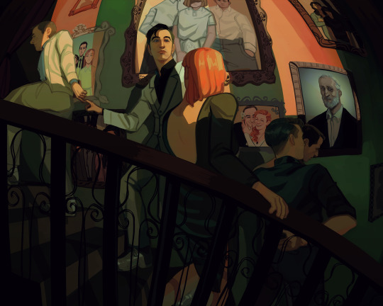
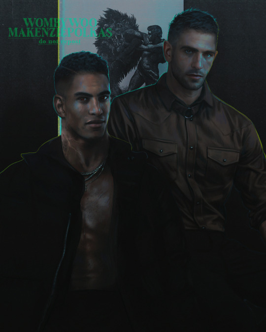
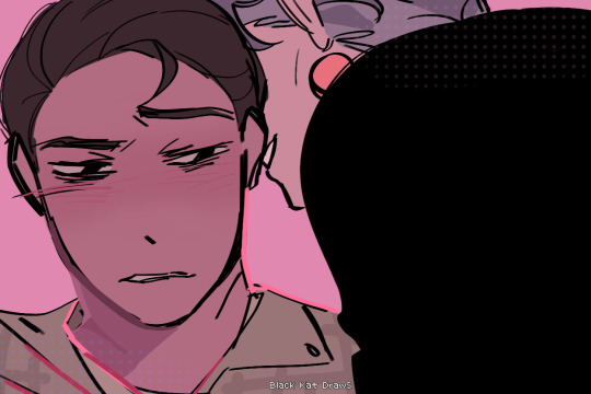
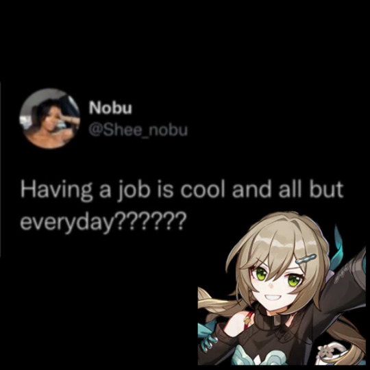
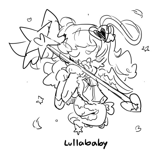
One wedding and three funerals
Background paintings under the cut
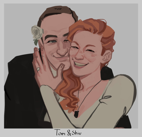
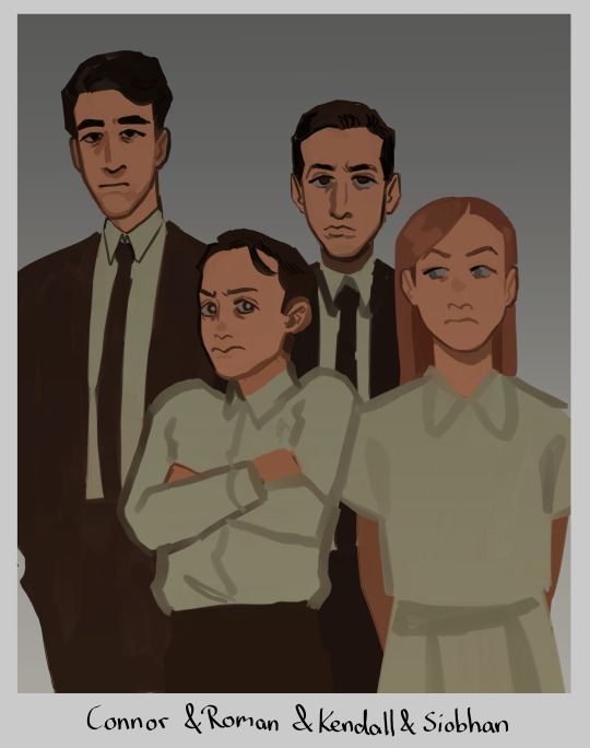
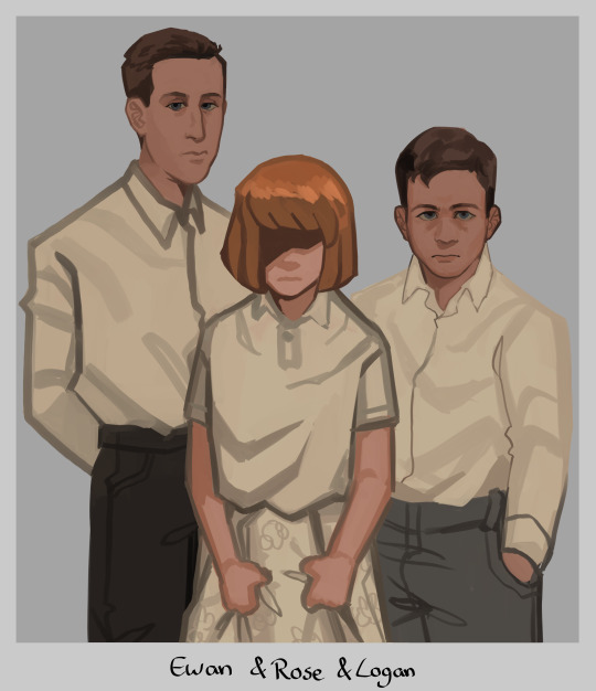
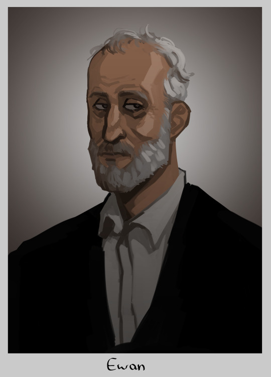
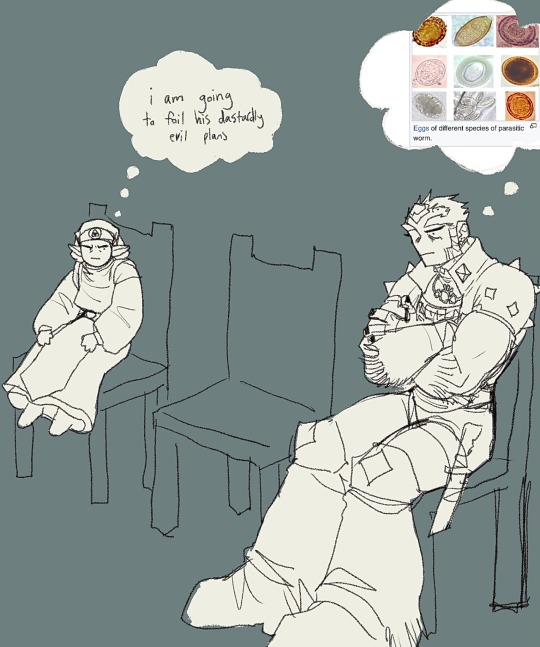
#tomgreg#succession#tom wambsgans#greg hirsch#shiv roy#roman roy#kendall roy#yeah no im not tagging everyone thats too much#this is me going 'how much implications themes and symbolism can i fit in one painting'#yes i gave rose shivs haircolor. if we ever find out how she looks like and its not like this im just gonna pass away i guess#but yeah i hope yall connect the dots#i put waaay too much thought and work into this. i was googling pictures of all the actors as kids just for reference (sigh)#honestly kinda wanted to make tom and greg link pinkies as like. a pinkie promise. but that was too hard to draw in this angle#at least not without obstructing the view of the ring which is important to see so ya#my fave is actually the tomshiv wedding pic i went off with that. i love them... they should have run away to become sheep farmers fr fr#anyway im so glad im done with this UGH!! finally i can draw smth else without being like oh noooo i need to finish this#i see a lot of you wondering why there is no portrait of logan but one of ewan#it's bc the placement of the painting represent their standing. logans portray would not hang next to the stairs#his present portrait hangs at the end of it. all the way up at the top. alone and withering away#basically the picture you see underneath ewan to the right? its where toms parents would be. the right side of the wall is tom and gregs#and the left one is the roy siblings theirs. since they grew up rich rich. and tom and greg didn't#but ya thats why ewan hangs here and logan does not :)
14K notes
·
View notes
Text


´´ You already know that i´m interested. ´´
#ugh please he was so down already are you kidding T_T#i love him#i love them#yes i will die on this hill#i was rooting for buddie for so long#but i don't know if i want buddie if it will cost me them#cause i love bucktommy way too much right now#bucktommy#911 abc#911 on abc#911 show#evan buckley#tommy kinard#buck x tommy#tommy x buck#firefly#tevan#kinkley#tommybuck#911 buck#911 tommy#911edit#911 gifs#my gifs#gifpost#lou ferrigno jr#oliver stark
698 notes
·
View notes
Text
v+q 🖤
#my art#ocs#original character#vincent#quinn#quinncent#<--yes that's the tag deal with it#what if hot vampire and sad boy bf...#I spent all week thinkin bout them and now you have to put up with it 😤#anyway they're in the military because I hate myself and have too much knowledge due to cod exposure#a special forces unit sanctioned to deal with supernatural BS ✨#vince is a former pilot and quinnie has visions or whatever...#and eventually they fall in ~love~#if people are interested I can continue exploring this thang...
410 notes
·
View notes
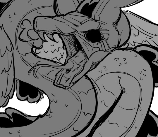
Text


themthemthemthemthemthemthem-
#more of those lil requests i asked for a bit ago#the christmas one was so so fun i was delighted to finally draw ms. beagle being a total wingman for her son#and i got to draw howdy in a turtleneck again which is. one of my favorite things#i imagine that ms beagle will spend the whole evening trying to get howdy & barn under the mistletoe at the same time#oh my fucking god that would make a cute fic. adding a new section to my Thinkings doc#yes wally will be passed the fuck out in the corner after drinking too much spiked eggnog#jk he doesnt sleep#anyway hggggasncjasnclkask theyre soooooooooo ehehehehe yeah....#i love drawing them Cozy so ty person for the excuse#love drawing characters comfy in bed together... i can live through them...#scribble salad#laughingstock#barnaby x howdy#howdy x barnaby#sometimes im sad. then i think about Them in a domestic setting and im cured
827 notes
·
View notes
Text
why Aurora's art is genius
It's break for me, and I've been meaning to sit down and read the Aurora webcomic (https://comicaurora.com/, @comicaurora on Tumblr) for quite a bit. So I did that over the last few days.
And… y'know. I can't actually say "I should've read this earlier," because otherwise I would've been up at 2:30-3am when I had responsibilities in the morning and I couldn't have properly enjoyed it, but. Holy shit guys THIS COMIC.
I intended to just do a generalized "hello this is all the things I love about this story," and I wrote a paragraph or two about art style. …and then another. And another. And I realized I needed to actually reference things so I would stop being too vague. I was reading the comic on my tablet or phone, because I wanted to stay curled up in my chair, but I type at a big monitor and so I saw more details… aaaaaand it turned into its own giant-ass post.
SO. Enjoy a few thousand words of me nerding out about this insanely cool art style and how fucking gorgeous this comic is? (There are screenshots, I promise it isn't just a wall of text.) In my defense, I just spent two semesters in graphic design classes focusing on the Adobe Suite, so… I get to be a nerd about pretty things…???
All positive feedback btw! No downers here. <3
---
I cannot emphasize enough how much I love the beautiful, simple stylistic method of drawing characters and figures. It is absolutely stunning and effortless and utterly graceful—it is so hard to capture the sheer beauty and fluidity of the human form in such a fashion. Even a simple outline of a character feels dynamic! It's gorgeous!
Though I do have a love-hate relationship with this, because my artistic side looks at that lovely simplicity, goes "I CAN DO THAT!" and then I sit down and go to the paper and realize that no, in fact, I cannot do that yet, because that simplicity is born of a hell of a lot of practice and understanding of bodies and actually is really hard to do. It's a very developed style that only looks simple because the artist knows what they're doing. The human body is hard to pull off, and this comic does so beautifully and makes it look effortless.
Also: line weight line weight line weight. It's especially important in simplified shapes and figures like this, and hoo boy is it used excellently. It's especially apparent the newer the pages get—I love watching that improvement over time—but with simpler figures and lines, you get nice light lines to emphasize both smaller details, like in the draping of clothing and the curls of hair—which, hello, yes—and thicker lines to emphasize bigger and more important details and silhouettes. It's the sort of thing that's essential to most illustrations, but I wanted to make a note of it because it's so vital to this art style.
THE USE OF LAYER BLENDING MODES OH MY GODS. (...uhhh, apologies to the people who don't know what that means, it's a digital art program thing? This article explains it for beginners.)
Bear with me, I just finished my second Photoshop course, I spent months and months working on projects with this shit so I see the genius use of Screen and/or its siblings (of which there are many—if I say "Screen" here, assume I mean the entire umbrella of Screen blending modes and possibly Overlay) and go nuts, but seriously it's so clever and also fucking gorgeous:
Firstly: the use of screened-on sound effect words over an action? A "CRACK" written over a branch and then put on Screen in glowy green so that it's subtle enough that it doesn't disrupt the visual flow, but still sticks out enough to make itself heard? Little "scritches" that are transparent where they're laid on without outlines to emphasize the sound without disrupting the underlying image? FUCK YES. I haven't seen this done literally anywhere else—granted, I haven't read a massive amount of comics, but I've read enough—and it is so clever and I adore it. Examples:


Secondly: The beautiful lighting effects. The curling leaves, all the magic, the various glowing eyes, the fog, the way it's all so vividly colored but doesn't burn your eyeballs out—a balance that's way harder to achieve than you'd think—and the soft glows around them, eeeee it's so pretty so pretty SO PRETTY. Not sure if some of these are Outer/Inner Glow/Shadow layer effects or if it's entirely hand-drawn, but major kudos either way; I can see the beautiful use of blending modes and I SALUTE YOUR GENIUS.
I keep looking at some of this stuff and go "is that a layer effect or is it done by hand?" Because you can make some similar things with the Satin layer effect in Photoshop (I don't know if other programs have this? I'm gonna have to find out since I won't have access to PS for much longer ;-;) that resembles some of the swirly inner bits on some of the lit effects, but I'm not sure if it is that or not. Or you could mask over textures? There's... many ways to do it.
If done by hand: oh my gods the patience, how. If done with layer effects: really clever work that knows how to stop said effects from looking wonky, because ugh those things get temperamental. If done with a layer of texture that's been masked over: very, very good masking work. No matter the method, pretty shimmers and swirly bits inside the bigger pretty swirls!
Next: The way color contrast is used! I will never be over the glowy green-on-black Primordial Life vibes when Alinua gets dropped into that… unconscious space?? with Life, for example, and the sharp contrast of vines and crack and branches and leaves against pitch black is just visually stunning. The way the roots sink into the ground and the three-dimensional sensation of it is particularly badass here:

Friggin. How does this imply depth like that. HOW. IT'S SO FREAKING COOL.
A huge point here is also color language and use! Everybody has their own particular shade, generally matching their eyes, magic, and personality, and I adore how this is used to make it clear who's talking or who's doing an action. That was especially apparent to me with Dainix and Falst in the caves—their colors are both fairly warm, but quite distinct, and I love how this clarifies who's doing what in panels with a lot of action from both of them. There is a particular bit that stuck out to me, so I dug up the panels (see this page and the following one https://comicaurora.com/aurora/1-20-30/):

(Gods it looks even prettier now that I put it against a plain background. Also, appreciation to Falst for managing a bridal-carry midair, damn.)
The way that their colors MERGE here! And the immense attention to detail in doing so—Dainix is higher up than Falst is in the first panel, so Dainix's orange fades into Falst's orange at the base. The next panel has gold up top and orange on bottom; we can't really tell in that panel where each of them are, but that's carried over to the next panel—

—where we now see that Falst's position is raised above Dainix's due to the way he's carrying him. (Points for continuity!) And, of course, we see the little "huffs" flowing from orange to yellow over their heads (where Dainix's head is higher than Falst's) to merge the sound of their breathing, which is absurdly clever because it emphasizes to the viewer how we hear two sets of huffing overlaying each other, not one. Absolutely brilliant.
(A few other notes of appreciation to that panel: beautiful glows around them, the sparks, the jagged silhouette of the spider legs, the lovely colors that have no right to make the area around a spider corpse that pretty, the excellent texturing on the cave walls plus perspective, the way Falst's movements imply Dainix's hefty weight, the natural posing of the characters, their on-point expressions that convey exactly how fuckin terrifying everything is right now, the slight glows to their eyes, and also they're just handsome boys <3)
Next up: Rain!!!! So well done! It's subtle enough that it never ever disrupts the impact of the focal point, but evident enough you can tell! And more importantly: THE MIST OFF THE CHARACTERS. Rain does this irl, it has that little vapor that comes off you and makes that little misty effect that plays with lighting, it's so cool-looking and here it's used to such pretty effect!
One of the panel captions says something about it blurring out all the injuries on the characters but like THAT AIN'T TOO BIG OF A PROBLEM when it gets across the environmental vibes, and also that'd be how it would look in real life too so like… outside viewer's angle is the same as the characters', mostly? my point is: that's the environment!!! that's the vibes, that's the feel! It gets it across and it does so in the most pretty way possible!
And another thing re: rain, the use of it to establish perspective, particularly in panels like this—

—where we can tell we're looking down at Tynan due to the perspective on the rain and where it's pointing. Excellent. (Also, kudos for looking down and emphasizing how Tynan's losing his advantage—lovely use of visual storytelling.)
Additionally, the misting here:

We see it most heavily in the leftmost panel, where it's quite foggy as you would expect in a rainstorm, especially in an environment with a lot of heat, but it's also lightly powdered on in the following two panels and tends to follow light sources, which makes complete sense given how light bounces off particles in the air.
A major point of strength in these too is a thorough understanding of lighting, like rim lighting, the various hues and shades, and an intricate understanding of how light bounces off surfaces even when they're in shadow (we'll see a faint glow in spots where characters are half in shadow, but that's how it would work in real life, because of how light bounces around).
Bringing some of these points together: the fluidity of the lines in magic, and the way simple glowing lines are used to emphasize motion and the magic itself, is deeply clever. I'm basically pulling at random from panels and there's definitely even better examples, but here's one (see this page https://comicaurora.com/aurora/1-16-33/):

First panel, listed in numbers because these build on each other:
The tension of the lines in Tess's magic here. This works on a couple levels: first, the way she's holding her fists, as if she's pulling a rope taut.
The way there's one primary line, emphasizing the rope feeling, accompanied by smaller ones.
The additional lines starbursting around her hands, to indicate the energy crackling in her hands and how she's doing a good bit more than just holding it. (That combined with the fists suggests some tension to the magic, too.) Also the variations in brightness, a feature you'll find in actual lightning. :D Additional kudos for how the lightning sparks and breaks off the metal of the sword.
A handful of miscellaneous notes on the second panel:
The reflection of the flames in Erin's typically dark blue eyes (which bears a remarkable resemblance to Dainix, incidentally—almost a thematic sort of parallel given Erin's using the same magic Dainix specializes in?)
The flowing of fabric in the wind and associated variation in the lineart
The way Erin's tattoos interact with the fire he's pulling to his hand
The way the rain overlays some of the fainter areas of fire (attention! to! detail! hell yeah!)
I could go on. I won't because this is a lot of writing already.
Third panel gets paragraphs, not bullets:
Erin's giant-ass "FWOOM" of fire there, and the way the outline of the word is puffy-edged and gradated to feel almost three-dimensional, plus once again using Screen or a variation on it so that the stars show up in the background. All this against that stunning plume of fire, which ripples and sparks so gorgeously, and the ending "om" of the onomatopoeia is emphasized incredibly brightly against that, adding to the punch of it and making the plume feel even brighter.
Also, once again, rain helping establish perspective, especially in how it's very angular in the left side of the panel and then slowly becomes more like a point to the right to indicate it's falling directly down on the viewer. Add in the bright, beautiful glow effects, fainter but no less important black lines beneath them to emphasize the sky and smoke and the like, and the stunningly beautiful lighting and gradated glows surrounding Erin plus the lightning jagging up at him from below, and you get one hell of an impactful panel right there. (And there is definitely more in there I could break down, this is just a lot already.)
And in general: The colors in this? Incredible. The blues and purples and oranges and golds compliment so well, and it's all so rich.
Like, seriously, just throughout the whole comic, the use of gradients, blending modes, color balance and hues, all the things, all the things, it makes for the most beautiful effects and glows and such a rich environment. There's a very distinct style to this comic in its simplified backgrounds (which I recognize are done partly because it's way easier and also backgrounds are so time-consuming dear gods but lemme say this) and vivid, smoothly drawn characters; the simplicity lets them come to the front and gives room for those beautiful, richly saturated focal points, letting the stylized designs of the magic and characters shine. The use of distinct silhouettes is insanely good. Honestly, complex backgrounds might run the risk of making everything too visually busy in this case. It's just, augh, so GORGEOUS.
Another bit, take a look at this page (https://comicaurora.com/aurora/1-15-28/):

It's not quite as evident here as it is in the next page, but this one does some other fun things so I'm grabbing it. Points:
Once again, using different colors to represent different character actions. The "WHAM" of Kendal hitting the ground is caused by Dainix's force, so it's orange (and kudos for doubling the word over to add a shake effect). But we see blue layered underneath, which could be an environmental choice, but might also be because it's Kendal, whose color is blue.
And speaking off, take a look at the right-most panel on top, where Kendal grabs the spear: his motion is, again, illustrated in bright blue, versus the atmospheric screened-on orange lines that point toward him around the whole panel (I'm sure these have a name, I think they might be more of a manga thing though and the only experience I have in manga is reading a bit of Fullmetal Alchemist). Those lines emphasize the weight of the spear being shoved at him, and their color tells us Dainix is responsible for it.
One of my all-time favorite effects in this comic is the way cracks manifest across Dainix's body to represent when he starts to lose control; it is utterly gorgeous and wonderfully thematic. These are more evident in the page before and after this one, but you get a decent idea here. I love the way they glow softly, the way the fire juuuust flickers through at the start and then becomes more evident over time, and the cracks feel so realistic, like his skin is made of pottery. Additional points for how fire begins to creep into his hair.
A small detail that's generally consistent across the comic, but which I want to make note of here because you can see it pretty well: Kendal's eyes glow about the same as the jewel in his sword, mirroring his connection to said sword and calling back to how the jewel became Vash's eye temporarily and thus was once Kendal's eye. You can always see this connection (though there might be some spots where this also changes in a symbolic manner; I went through it quickly on the first time around, so I'll pay more attention when I inevitably reread this), where Kendal's always got that little shine of blue in his eyes the same as the jewel. It's a beautiful visual parallel that encourages the reader to subconsciously link them together, especially since the lines used to illustrate character movements typically mirror their eye color. It's an extension of Kendal.
Did I mention how ABSOLUTELY BEAUTIFUL the colors in this are?
Also, the mythological/legend-type scenes are illustrated in familiar style often used for that type of story, a simple and heavily symbolic two-dimensional cave-painting-like look. They are absolutely beautiful on many levels, employing simple, lovely gradients, slightly rougher and thicker lineart that is nonetheless smoothly beautiful, and working with clear silhouettes (a major strength of this art style, but also a strength in the comic overall). But in particular, I wanted to call attention to a particular thing (see this page https://comicaurora.com/aurora/1-12-4/):

The flowing symbolic lineart surrounding each character. This is actually quite consistent across characters—see also Life's typical lines and how they curl:

What's particularly interesting here is how these symbols are often similar, but not the same. Vash's lines are always smooth, clean curls, often playing off each other and echoing one another like ripples in a pond. You'd think they'd look too similar to Life's—but they don't. Life's curl like vines, and they remain connected; where one curve might echo another but exist entirely detached from each other in Vash's, Life's lines still remain wound together, because vines are continuous and don't float around. :P
Tahraim's are less continuous, often breaking up with significantly smaller bits and pieces floating around like—of course—sparks, and come to sharper points. These are also constants: we see the vines repeated over and over in Alinua's dreams of Life, and the echoing ripples of Vash are consistent wherever we encounter him. Kendal's dream of the ghost citizens of the city of Vash in the last few chapters is filled with these rippling, echoing patterns, to beautiful effect (https://comicaurora.com/aurora/1-20-14/):

They ripple and spiral, often in long, sinuous curves, with smooth elegance. It reminds me a great deal of images of space and sine waves and the like. This establishes a definite feel to these different characters and their magic. And the thing is, that's not something that had to be done—the colors are good at emphasizing who's who. But it was done, and it adds a whole other dimension to the story. Whenever you're in a deity's domain, you know whose it is no matter the color.
Regarding that shape language, I wanted to make another note, too—Vash is sometimes described as chaotic and doing what he likes, which is interesting to me, because smooth, elegant curves and the color blue aren't generally associated with chaos. So while Vash might behave like that on the surface, I'm guessing he's got a lot more going on underneath; he's probably much more intentional in his actions than you'd think at a glance, and he is certainly quite caring with his city. The other thing is that this suits Kendal perfectly. He's a paragon character; he is kind, virtuous, and self-sacrificing, and often we see him aiming to calm others and keep them safe. Blue is such a good color for him. There is… probably more to this, but I'm not deep enough in yet to say.
And here's the thing: I'm only scratching the surface. There is so much more here I'm not covering (color palettes! outfits! character design! environment! the deities! so much more!) and a lot more I can't cover, because I don't have the experience; this is me as a hobbyist artist who happened to take a couple design classes because I wanted to. The art style to this comic is so clever and creative and beautiful, though, I just had to go off about it. <3
...brownie points for getting all the way down here? Have a cookie.
#aurora comic#aurora webcomic#comicaurora#art analysis#...I hope those are the right tags???#new fandom new tagging practices to learn ig#much thanks for something to read while I try to rest my wrists. carpal tunnel BAD. (ignore that I wrote this I've got braces ok it's fine)#anyway! I HAVE. MANY MORE THOUGHTS. ON THE STORY ITSELF. THIS LOVELY STORY#also a collection of reactions to a chunk of the comic before I hit the point where I was too busy reading to write anything down#idk how to format those tho#...yeet them into one post...???#eh I usually don't go off this much these days but this seems like a smaller tight-knit fandom so... might as well help build it?#and I have a little more time thanks to break so#oh yes also shoutout to my insanely awesome professor for teaching me all the technical stuff from this he is LOVELY#made an incredibly complex program into something comprehensible <3#synapse talks
746 notes
·
View notes
Photo
and then they smooch!
#yes hello I cant get these two out of my head#from stede and ed to steve and eddie#look at me go#anyways i love them a lot and felt the need to draw smth#spent way too much time on this#stranger things#stranger things 4#stranger things fanart#eddie munson#eddie munson and steve harrington#steve harrington#eddie munson fanart#steve harrington fanart#steddie#steddie fanart#my art#digital art
9K notes
·
View notes
Text
I have a lot of leftover drawings in my gallery. [Blank Scripts AU]
[Content Warning: Images below contain Gore, Death, and Disturbing/Uncomfortable Imagery]
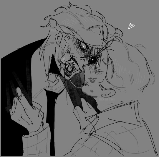
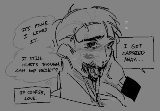
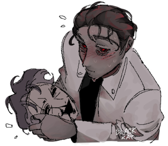
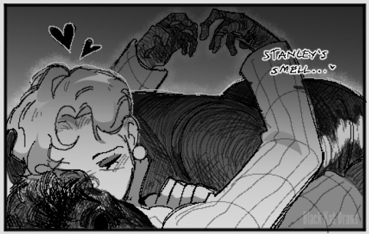
I find it a bit cute knowing they start out as crazy and then slowly settle into something calmer and relatively healthier after learning to adapt to each other's lust-turned-love. [Stanley did it first but hey :3]
#tsp blank scripts au#they love each other [genuinely] theyd rather die if theyre to go without each other by this point#hhmmm I hope the last few images arent too damning#These two go through a lot during the progression of their relationship#and I wanted to showcase that yknow?#theyre demented but theyre just perfect for each other kind of way#lovingly tearing each other apart and rebuilding each other to do it over and over again#repeating this dull process of endings over and over and finding ways to keep themselves entertained#this place was never even meant to be fun#but now that theyve gotten entangled with each other#they cant help but want to play around#even if its just for a little bit?#work can continue later right?#they love each other a little bit too much they actually need to be put in a separate cage#like a spider and a praying mantis#is it painful? yes. is it fun? also yes. do they like doing it only to each other and nobody else? YES.#their psych is genuinely so fun to explore and dissect#I had a lot of fun making these despite how deranged they look#something about them.... it drives both to do things they would never even consider doing to anybody else... but towards each other#you know what i mean? or am i just yapping nonsense again.#horror#the stanley parable#the stanley parable ultra deluxe#tsp#tspud#tsp au#tsp narrator#narrator tsp#stanley tsp#tsp stanley
337 notes
·
View notes
Text
new dad Bakugou who’s going back to work full time almost a full year after his daughter his born and he now has to grapple with the fact that….goddamn, he’s spoiled the shit outta her.
well, he doesn’t think it was spoiling her. in actuality, he just created a routine with her, gave her every bit of his attention, held her when she cried, scolded her (yes just at eight months) whenever she’d babble for more puffs even though she’s had enough already. it wasn’t spoiling, it wasn’t. he vowed to never be that dad, to raise a snot nosed brat, one similar to himself.
but here he is, on a Tuesday morning three weeks after her first birthday. he’s standing halfway between the front door and the living room in full uniform, with his still sleepy baby and her even sleepier mama. she’s gripping his neck like he promised to abandon her, wailing and crying so loud and dramatically, that you can’t help but chuckle at her antics and how he wavers ever so slightly.
“You promised you’d go back to work,” you scold him gently, rubbing at your daughters quivering back when she whines again the moment he acts like he’s gonna pull her off. Bakugou frowns at you, and you shrug, smoothing her unruly blond curls away from her sticky forehead.
“But you guys need me.” He pouts, eyebrows downturned as he pulls her away enough to wipe at her wet face. she blubbers again, whimpering out a small dadaaaa noooo, that absolutely breaks his heart.
“And so does the world.” You smile at him, gently pulling your daughter away from the matching glassy red eyes who watch her go. “We’ll be fine, my love. Promise.”
Bakugou looks unconvinced, especially since your daughter reaches for him with another cry of his name. you don’t say anything when he sniffles discreetly, quickly reaching down to the coffee table to snatch up his utility belt that he dropped when she waddled out of her room in tears. he snaps it on wordlessly, and you go to turn to the kitchen when he wraps you both up in his arms.
“Love you,” he whispers against your forehead before pecking it, leaning down to kiss your lips next, and then your daughter’s fat little cheeks. He whispers another love you to her, and wipes away at her rosy cheeks when she pouts at him.
“Rub you.” your daughter pouts, the both of you freezing in shock.
“Oh my god,” you whisper, grinning. “She said I love you back!” Bakugou matches your grin, laughing under his breath as he presses another torrent of kisses all of her face. for the first time since she’s opened her eyes today, she laughs, loud and joyous and familiar. he thinks that maybe going back in today won’t be so bad after all. not if this is what he’ll be coming home to.
#I have been tormented with dad bkg thoughts again I fear#he’s too loveable for his own good#but also the thought of bkg becoming a dad and vowing he’d be this certain way#but then his kid comes out and he’s like. yes. values. parenting skills. life lessons. discipline and love.#and then all of it goes out the window when they just look at him#and they look so much like him and they’re just so cute and annoying and. now he’s brought them everything they’ve ever wanted LOL#also I love toddlers who speak like non conventionally/stereotypically#like my youngest niece turns all of her consonants to ‘h’ for 2 syllable words#and it’s so funny bc everything sounds like ‘huh hah huhh’#but she’s also VERY clear when she wants to be lol she just gets excited sometimes and forgets to enunciate#okay rambling sorry but I love babies LOL#—new treat in the streets! 🍫#bakugou treats! 🍬#dad bkg
554 notes
·
View notes
Text
TW // Suicidal behavior/tendencies
The ASL brothers deal with suicidal tendencies constantly in different ways and I find it so interesting how little the three of them value their lives for completely different reasons.
Ace is obvious from the very beginning. He has been constantly told that he shouldn't have existed. That he should die. That he is not worthy of living. His whole identity was a secret from the rest of the world because if they knew, they would want him dead. But he knows already that people want him dead, so, whatever. He can't take love from others. And it is not he is actively trying to kill himself but he doesn't value his life at all. At least not until he meets Sabo and Luffy. And he still doesn't value his life much, but he realizes there are people who want him alive. And it is hard for him to believe it, but they do. Ace's journey is a tragedy because he keeps asking himself if he should be alive, constantly fighting against it because he genuinely thinks he shouldn't have existed, and then dying in the arms of his little brother and thanking him for loving him. And he dies because he is too proud and stubborn and it was just obvious that his recklessness would end up killing him somehow. It was not a conscious action but-- Ace knew he was dying that day. Which is extremely sad because he realized he wanted to live seconds before he was killed.
Sabo is just too focused on saving the world. He puts the greater good before him constantly because he quite literally has never known any better. He joined the revs with no memories and no purpose and only hatred for the ones with power. He was raised with love and friends there but-- There is only so much you can do in a place where they teach kids specific ideals and what they should do. And Sabo is happy there and more than glad to be of service, but he doesn't value his life at all. He constantly puts himself in danger, ever since he was a kid, to fight for others. And not even others as 'specific people' but just society and his ideals as a whole. Like he would rather die and kill if that spreads the revolution around. He genuinely doesn't care about dying if he is able to help the cause. I mean-- I think it does change when he meets Luffy again (he is canonically still reckless af okay this is self-indulgent) and realizes he can't let his brother lose him again. But still, he keeps on not valuing his life at all and acting without thinking things through.
Luffy is quite obvious, isn't it? It's not that he doesn't value his life, but he values his life around others. He is a person whose core need is to be with people. He was left alone at a very young age. Dragon left him with Garp and Garp, aside from being an awful role model, wasn't even there much and left the kid alone. The only role model he had was Shanks and he was going away constantly too. Uta basically disappeared from his life out of the blue without explanation. So when he finds Sabo and Ace it is normal that he gets heavily attached to them right away. When he is kidnapped and tortured he doesn't say a word about their treasure because he doesn't want to get in between their dream which-- Is another story. He values people's dreams even above his own life too. But there is also this layer of "If I break the promise of not telling people they will not want me" and it is just-- Pretty fucking sad. Like. Luffy's need to be around people and not lose the ones he loves comes from abandonment issues. Plain and crystal clear. He puts his life in danger constantly to not lose people and when he is alone he doesn't see any reason to keep going. He always finds something, of course, but being alone for him is quite obviously worse than death and he has had those types of thoughts/tendencies before. That is why I love the Baron Omatsuri movie so damn much. It is basically this whole thing.
Ace and Sabo are pretty similar when it comes to not valuing their lives and acting recklessly, but Ace is more on the 'I should not be alive' side of suicidal thoughts and Sabo is more on the 'I don't care if I die' side of self-destructive tendencies. While Luffy is on the 'There is no point in living if I am alone' side of abandonment issues.
I don't mean to go anywhere with this, btw. I just find it interesting how the three of them value their lives so little and end up forming a little family together. They found comfort and love in each other and I think their damaging tendencies keep existing because they are not together anymore. Like. Genuinely. In a Modern AU where the three of them are together their mental health would be so much better because of being next to each other. Ace would struggle with his self-worth but would be constantly reminded every day that he is loved, Sabo would overwork himself but they'd keep him from it being actually damaging, and Luffy would just not be alone at all.
#i could make a proper analysis? yes. but i don't want to so you have this mess#i think they deserve to live and be happy but the three of them are too mentally ill#they make me ill#i am too tired and i need to sleep but i love them so much it's insane#one piece#monkey d. luffy#revolutionary sabo#portgas d. ace#asl brothers
209 notes
·
View notes
Text


I might've gone overboard with these I made so many
#i made these yesterday but forgot to post them until it was late#and then i only posted it on insta bc i was too tired to crosspost properly#anyway. woe textposts be upon ye#qingque#sampo koski#serval landau#clara#unrelated but i love her so fucking much. my actual child#dan heng#natasha#asta#herta#caelua#trailblazer#honkai star rail#hsr#textposts
779 notes
·
View notes
Text
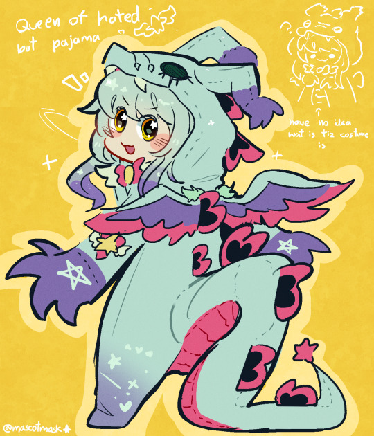
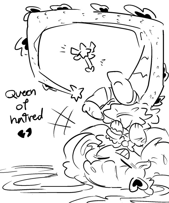
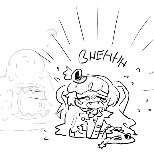
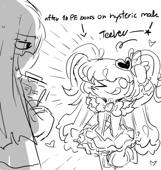
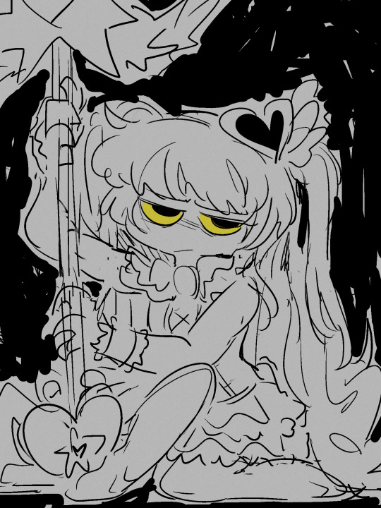


Queenie scrunchies
#queen of hatred#project moon#lobotomy corporation#yes these are old im bring them from my side twt acc mostly#my art#my doodles#ahhh if im comfortable confidence to post not so-so color messy doodle to my main enough people would know I LOVE MY DAUGHTER SO MUCH#and her other siblings too!! but i dont want to post them right now bc i think i might color those#just know im a big mother fan of abno magical girl gang#queenieeeee :plending emoji:
980 notes
·
View notes
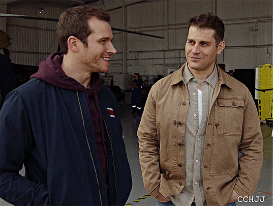
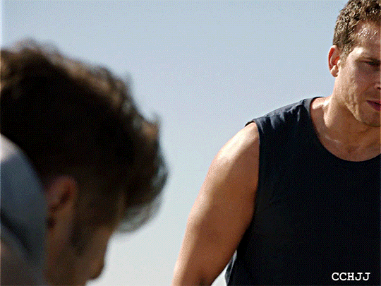
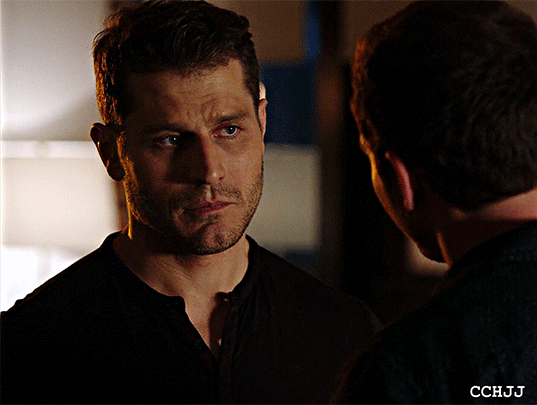
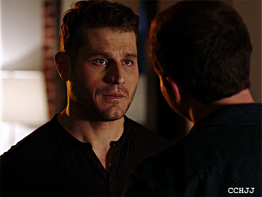
Note
ashy i fucking love u for all the gifs ur making of the irl stuff, it makes me so happy
stop i might just start sobbing, have a cute zed and tango gif that i haven't posted yet as a massive thank you,
#im just happy that even though gifs are very much a dying piece of media on most platforms you all eat them up like some yummy meal#like yes tumblr may be the gif website but trust me they're slowly dying over here too#(speaking from a former spn gif maker)#((<- rare ashy lore just dropped. shocking i know))#i just REALLY love making gifs. it tickles my editor brain on a different level somehow#anyways thank you so much for the ask. truly made me smile like an idiot#.asks#.gif
172 notes
·
View notes
Text
was thinking the other day about how parasites are ganondorf’s solution for so many things. now cant unsee him being a massive nerd about parasites
#parasites cw#trypophobia#ocarina of time#tloz#ganondorf#zelda#nabooru#morpha#barinade#gohma#this makes less sense if u haven’t seen my tweet barrage but yeah oot ganondorf & his silly giant parasites. i love them#yes i know morpha isnt technically a parasite but still#it IS an insanely huge single-called organism tho. which must be why its ‘water’ isnt normal water lol#just the fluid surrounding its nucleus#i think he would have an interest in funny creatures like that especially if they’re distinctly nonhuman#but him being interested in parasites specifically makes sense to me#the idea of a comparatively tiny & insignificant being infiltrating a much larger one. and then wreaking utter havoc on it#while sustaining itself in the process#i think he would be really into slime molds too…..let him be a weird nerd…..
1K notes
·
View notes
Text
Thinking about clones either makes me:
Super giddy and happy
Absolutely and utterly devastated and broken hearted, full on sobbing on the floor, shaking and trembling
Horny as fuck
#i think about them a healthy amout#yes totally#sometimes i wake up and have a thought and its like “holy fuck its too early for this”#actually not funny the grip they have on me rn#it's almost concerning#but i love them so much#please scream about clones to me please#star wars#tcw#the clone wars#the bad batch#tbb#clones#tagging with my favorite clones because i can#captain rex#wrecker#kix#jesse#fives
909 notes
·
View notes
Text

lighting & color practice with the Fluffy Fruits <3
#apologies if this is low quality! i scribbled them Small!#they make me insaaaaane Insaaaaane~#me @ howdy: why is your waist so small? so that other men can hold it???#the answer is Yes#listen listen okay LISTEN-#yknow whenever i draw laughingstock#it feels like im just knocking two barbies together. full speed. little pieces of plastic are flying everywhere#AND ITS SO FUN <3#they are in looooooove in love in love#yk in my mind theyre That Couple that never leaves the honeymoon phase#they delight in each other's company too much....#In. My. Mind.#laughingstock#scribble salad#howdy x barnaby#barnaby x howdy#GAHHHHHH RAH RAH RAH THESE FUCKIN SILLY LITTLE PUPPETS THAT WILL NEVER BE CANON#AGH AGH AGH#you see getting into wh is good for me bc its bringing me down several pegs#i Needed to get obsessed with a rarepair.#i got too greedy w/ pairings like timkon and sasunaru and aziracrow and nandermo etc etc#which all have at the very least Lots Of Subtext and Basis and Creations To Enjoy#this is good for me. im in my corner having a good somewhat solitary time#me and the like. two other laughingstock artists are parallel playing thankyew <3#anyway laughingstock makes for a Good Warmup#scribble a few of these and im ready to work on Big Stuff! comms and the like!#they provide such a service to me emotionally and artistically <3#they make the 'tism go Waaahhhhhh!!!!
526 notes
·
View notes
Text
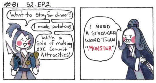
Truth and revenge is best served cold.
[First] Prev <–-> Next
#poorly drawn mdzs#mdzs#xue yang#song lan#This comic was another 'almost cut' one but I previously cut out xue yang bartering (threatening) for potatoes so I felt it was justified#episode 2 is so sad and miserable. I am going to do my best by making it a little funny.#Xue yang really committed fully to this new life of his! Don't threated him by trying to ruin it!#I love how he takes the blame here too. Yes he purposefully set up events to cause a divide between them#Yes he attacked SL because it would hurt XXC the most#but hey: that only hurt because he loved SL so much (in whatever form they have)#and SL hurt XXC in turn by sending him away#Xue Yang set it up but Song Lan dealt a blow on his own#XY is still the *most* at fault here but contrasting this with how strongly he justifies his actions to XXC later is very interesting to me#also he did NOT have to villain monologue about all the stuff he made xxc do. He could have just shut up about it#but nah he needs to cause hurt because HE'S so hurt and can't make other people understand him in any other way.
551 notes
·
View notes
Last Seen Blogs

evilwizardlyways
laundry and taxes with you

lost-in-video-game-land
Lost in Video Game Land
ashhh-14
Starlight
antarcticlemonade
Praise Satan

duskwren
I’ve Been Here Too Long