#you get some grids and gradients at best
Text
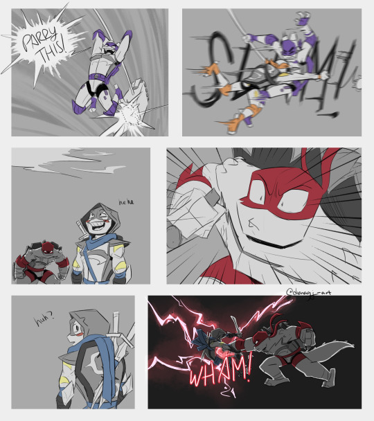

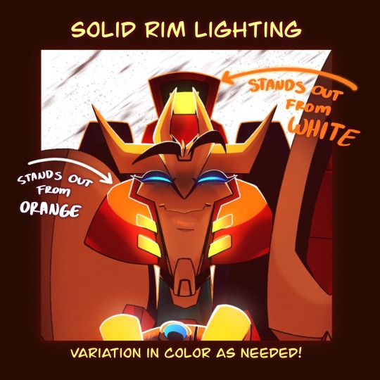
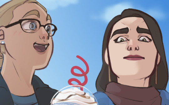
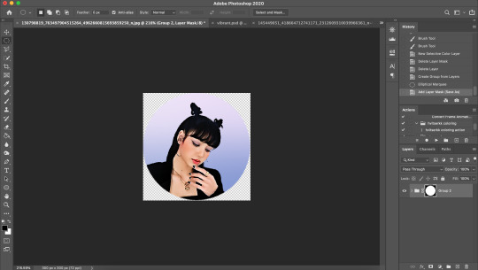
What's this? is Raph with a steel chair!
prev / next
#still so funny to me that i'm geting away with making this comic with 0 backgrounds most of the time#you get some grids and gradients at best#unfortunely i do have to make some bgs for the next pages but i'm mostly screenshoting the series and tracing a few stuff and just#bullshiting my way around it#anyways the fight is done (is gonna be a bit longer on the writen form of the chapter tho)#and we are not so far from this chapter ending! finaly!#rottmnt fanart#rottmnt separated au#separated leo au#separated leo au comic#rise leo#rise raph#rise donnie#rise mikey#rise draxum#dg art#dg comics
3K notes
·
View notes
Note
the way you use shapes in your art is absolutely phenomenal... is there any particular way you approach shape design? or do you just go off of intuition?
Thank you lovely anon for your kind words! I do everything on a wing and a prayer but I’ll share my process with you!
Initially I just try to get everything down in blobs. I don’t use references so this is all a terrible, freehand mess, but at this point I am prioritising colours and placement and not thinking too hard about the final design. Here are my initial sketches for this stage:
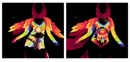
Now it is time to think about the shapes. To avoid tears I use a grid - here I’m using an isometric one. You can think of geometric motifs in terms of shapes being pieced together, in much the same way a quilter would. (If you have procreate there are two lovely grid overlays that give you nice straight lines if you turn on drawing assist.)
Here is what things look like with the overlay and after fixing into place; you can see I did this in two parts in the drawing process after randomly changing my mind about the colours.
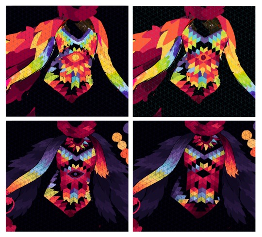
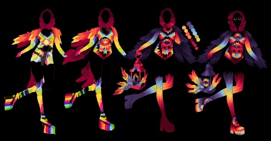
Now I’ve got everything neatly in place I can turn off the grid to add detail or move things about - all I’ve done here is curved some of the straight edges and added some gradient detail. Here is the overall process all together:
I hope this helps but please do let me know if you need further clarification! Also bear in mind that pre-2017 I did all this in photoshop on an intuos 3 without grids by coping and pasting the shape tool (I categorically do not recommend this method.) If anyone else has any questions, I’ll try my best to help whoever who needs it. 💖
155 notes
·
View notes
Note
Howdy! I’ve been following you for 2 or 3 years (started on Instagram then moved here) and your art is always so crisp and clean. Have any secrets to share on how to post pieces at such high quality? I use procreate too but you’ve seemed to mastered it.
THATS SO LONG OMG HIIII ty ty for all the support 😭🙏💕💕 you must be one of the OGs!
and oh boy what a compliment haha, I’ve definitely learned a thing of two over the years but I swear I am still learning new tricks everyday 😵💫😵💫😵💫
happy to help 😤💪✨first and foremost, I think the most important part of getting your art to look less pixelated boils down to what canvas size you’re using! I do my best to finish my canvases off at 1400x1400 at the very minimum! The larger it is, the more smooth the piece looks—but as of course the larger it is, the less layers you’re able to add :/ I do wish procreate allowed for a greater range but oh well, do your best to keep those layers organized so you can mash em down later✨
I almost always start off each piece using the built-in Screen Size canvas option when starting a new piece (I don’t even toggle with the DPI, which if I remember correctly, is just set to 150 for that canvas) and then I adjust the sizing as needed
here’s a few finishing touches I like to give my pieces to make them look more crisp!

Another thing to note! Take advantage of the noise brush and the noise effect Procreate has! (Noise effect is found under the Magic Wand tool and I believe that the brush lives originally in the pre-set Materials brush pack) Just a bit of noise added to your background can often help the characters stand out from it as well 👍✨
Also! I’ve recently started shading things like the soft curves of muscle or rounded parts of metal using the noise brush to erase to make things look more blended/add some variation to my cel shading
There’s still tons of things I want to try out on procreate as well! I think that for as cheap of an app as it is, there’s a lot of potential to be unlocked and it’s just a matter of finding the right people to show you some tricks
I’ll link a few tiktoks as well that could help out or just add some fun tricks to the art process oml they’re sm better at explaining/showing than I ever could!!
Double Compliments coloring
Art Window Effect
Procreate Gradient Maps in Action
Procreate Perspective Grids
#I’m still working on collecting tons of tutorials from tiktok and one day I wanna make a big ol link post#SPREAD THE KNOWLEDGE 😤💪✨✨#I hope some of this helps!! haha noise effects/brush are my best friends I swear#asks#tutorial#helpful
143 notes
·
View notes
Note
☕️ as the livery watch reporter...2014 liveries (which ones are ur fave, which ones don't do it for you, etc)
Deliberately waited until we'd had dinner so I could devote the appropriate amount of time to this (yelling about liveries my beloved!!)
Under a read more bc I'm about to get so chatty (please note: we are not including the rather hideous car noses we were cursed to endure in 2014, just the paint!)
Caterham

Fun fact about British Racing Green: there isn't an exact hue for it, which is why the green Caterham used is much more brighter and more yellow leaning than the emerald green Aston Martin currently use.
Anyway, this is so pretty. It's glossy, the green looks utterly stunning and the splashes of white are really sleek and give it a slightly more modern feel than if it was all over green.
8/10
Ferrari
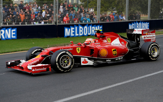
Ferrari's just look better in glossy paint. Please end the deluge of matte liveries I beg.
The shade of red is literally perfect and I don't really mind the black section at the back, the thin white lines bordering it definitely help make it look less jarring.
Si ragazzi, 9/10
Force India
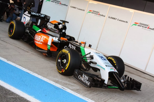
Pre-BWT sponsorship, Force India liveries always leaned heavily into the colours of the Indian flag, though 2014 was the first year they incorporated a lot of black into the livery.
Which honestly? It slaps. The orange being on the sidepods still keeps the livery looking really bright despite all the black on the engine cover. I am torn on the block of white on the nose cone, but I think without it the car would feel a bit too dark, so for that it's fine.
7/10
Lotus
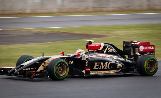
Oh, if this didn't have the splashes of red and used a proper metallic gold instead of the flat beige colour, it would be the best livery on the grid. Alas, it loses points for those two reasons. BUT the glossy finish is still stunning to thank goodness we have that.
7/10
Marussia

Much like the 2023 and 2024 Haas liveries, the red, white and black combination does look really good. Maybe not ground breaking, but it's far from being offensive on the eyes. I like the use of the warmer orangey red just to add a bit of brightness (and to make it look different from the Ferrari). It's a very solid effort.
7/10
McLaren
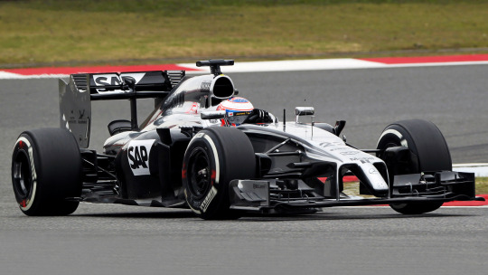
Every day I thank the racing gods that McLaren went back to their roots with the papaya orange livery bc their one for 2014 was very meh.
This year was McLaren's last year with Mercedes engines, hence why they kept the silver chrome, but their sponsorship deal with Vodafone had ended at the end of the 2013 season, which is why it doesn't look as iconic. The black sidepods are quite jarring and make the car look really dark and dull.
Definitely not their best, 4/10
Mercedes

As a friend said to me some time ago, Mercedes are all the better for making the switch to having mostly black on their car. The metallic finish Mercedes used on their cars from 2010-2019 and 2022 was really odd in that it didn't look properly metallic despite very obviously looking silver (contrary to my above spiel on McLaren, all over chrome silver with the Petronas teal accents would look so, so good.)
And speaking of the Petronas teal, there's not enough of it here even though I love how the shading on the sidepods was done (as much as I think the accents on the wheel rims are incredibly fun). The blob of black on the engine cover also feels like an after thought, especially with the gradient at the front and sharp line at the back.
6.5/10
Red Bull

Now this is the superior RBR livery. It's glossy, we have the really nice dark metallic blue instead of the navy créme, and the purple Infiniti accents are so very pretty (I'm not so sure on the stripes on the side however).
I deliberately chose a night race picture to show off the metallic sheen and glossy finish. I am on my knees begging RBR to go back to using this livery.
8/10
Sauber

This is... sadly very corporate. Like Mercedes, the metallic finish on the Sauber just looks off (though, it's better than if it were a flat grey) and I wish there was more white on this to brighten it up. The shade of grey used almost blends into the tarmac, which isn't great.
3/10
Toro Rosso
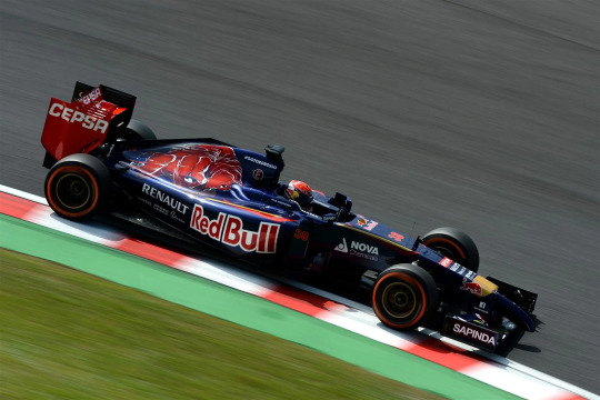
As much as I hold a special place in my heart for the Toro Rosso drinks can livery circa 2017-2019, I still have such vivid memories of the gorgeously detailed Red Bull on the engine cover. Even though the Toro Rosso liveries were just a darker version of the main RBR livery (navy, dark red and gold in place of the more primary blue, red and yellow) I actually prefer the STR version.
Unlike the Lotus livery, the gold is metallic instead of créme, and the navy is also a gorgeous metallic (which ensures that it doesn't look flat, which is my main beef with the post-2016 RBR livery).
I just want to make sure that everyone looks at the bull on the engine cover again, IT'S SO DETAILLED!!!
9/10
Williams
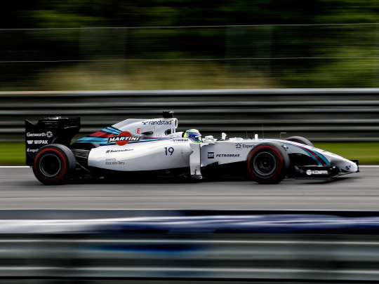
No notes. One of the F1 liveries of all time. I genuinely almost bought a Williams shirt that year bc the team kit looked stunning too with the Martini stripes (and honestly I have been debating whether or not I should try to find one on ebay). The Williams Martini livery is proof that it is possible to make a predominantly white car sexy as hell (and it's also glossy!!!)
If James Vowles ever manages to bring this livery back he can have my hand in marriage no questions asked.
10/10
send me a ☕️ and a topic and i’ll talk about how i feel about it
#this was such a fun dive down memory lane#thank you synthy!!!!!#asks#vampire-on-main#synth tag#Formula 1#Livery Watch#2014#Livery Watch 2014
5 notes
·
View notes
Note
i like your website! it looks very nice
especially the gradient colored text!! you used a separate font to make it more legible
whenever i try to do something like that, it always becomes really hard to read... maybe i should learn some basic web design?
my website looks like this and it took two days of fiddling with css
Thank you! The biggest thing with making text legible is making sure there is enough contrast between the text color and the background or make the text big enough that it’s legible even if there isn’t that much contrast. The best guide on color contrast that I know of is the Mozilla docs! If you scroll down to the solution part there it has many tools to check text contrast.
Since your website has a warm bright canvas background darker colors and gradients would work better and end up being more legible.
If you’re looking to learn more about web development and especially CSS I strongly recommend Kevin Powell on YouTube! His videos on flexbox and grid are very helpful in understanding those new browser features and making responsive websites (websites that look great on any screen size). For example, I used grid for the nickname table and for my projects so that on desktop those elements would be wider and shorter while on mobile they’d get narrower and taller.
I love your site too, especially the canvas theme with the green branch/orange leaves and the clever span box to show your favorite color complete with a title tag featuring the hex code!
To be clear my site took me at least 20 hours of fiddling and development to make. Feel free to look at the site code (and my commit history) on GitHub!
6 notes
·
View notes
Text
NeonArt Photo Editor & Effects
NeonArt photo editor offers you the best photo editing experience with dozens of neon effects and neon spirals. Your amazing pictures will grab all the attention with neon sketch art. Get ready for the new generation pics art experience with the shiny grime stickers and stylish text. Face tune and retouch selfies just in one tap, then add motion and astonishing picture effects. Picture editing is so easy and fun with NeonArt. When you are done with picture editing, collage your beautiful pics with the pic collage maker using the glowing photo grids. Magic photo editor brings fun to your photos with the gradient neon line art. Combine stunning sketch art with the cool drip effects. Try stylish glowing sketch and grime stickers, then share your artwork on Instagram, Facebook, Snapchat, Twitter, VK and Tik Tok to get many likes :).
🎨 Aesthetic Picture Editor:
NeonArt picture editor has all the picture editing tools to create fabulous artworks. No crop is needed to share your brilliant pic on social media. Combine neon effects with retro filters for pictures :) . Try neon sketch art in many different glowing colors. Explore astonishing drip effect and create a cyberpunk background from a neon background to make your pic stand out :) .
✨ Neon Photo Effects and Spirals:
Let your pictures glow in the dark with neon photo effects :) . Emoji backgrounds and colorful picture frames are here for you to create marvellous pictures. Surprising AI spiral editor has vast amount of neon spirals to bring motion to your pics. There are even some epic spirals available made of emojis and flowers. Use beautiful geometric spirals like circles or triangles to create digital art :) . Finalize magic photo editing with cool neon frame for pictures.
😎 Background Changer:
Remove background in one tap and add a pretty neon background easily :) . You can find yourself in a street full of lights in one tap thanks to the neon backgrounds. Many glowing background designs and cyber punk photo collages available for you.
💖 Neon Stickers and Text:
To personalize your pics use some image stickers and celebrate special days like birthdays. Also there are loads of cute animal stickers, pick one and change it’s size easily. There are dozens of glowing text templates, also you can type whatever you like and change it’s style and color to personalize your photos. Magic cyber punk photo editor pro has all the features you need.
🤳 Selfie Camera Effects:
NeonArt comes up with a magnificent selfie camera. Snap selfie and add camera effects in one tap :). Selfie camera finds the best light for you and smoothens your face automatically. Enjoy the live selfie camera effects and cyber-punk filters for pictures now! Dripping effect is perfect for selfies. Try bewildering drip effects and bring out your inner drip artist. Neon photo editor will bring you a brand-new image.
🎉 Pic Collage Maker and Photo Grids:
Using the photo filters and editing tools like AI spirals and sketch art you‘ll have dozens of pretty selfies :) . NeonArt photo collage maker helps you to montage you pictures to prepare memes. Shiny photo grids, image layouts and cyberpunk frames will make your picture collaging experience super fun and easy. Photo collage maker has photo layouts for all tastes, create breath taking photo collage and funny memes just in seconds. Don’t forget to explore neon stickers and cyber-punk effect for the unforgettable photo collage experience.
NeonArt photo editor pro is best photo editing app with neon blend effects and awesome filters for pictures. Edit like a pro and combine drip effects with the glowing spirals to create cyber punk theme. You’ll love the gradient neon line art with hand drawn sketch designs. Finally use pic collage maker to montage pics in one special post. You don’t need any other photo editing app, once you have Neon photo editor. Share your artwork on Instagram, Facebook, Snapchat, Twitter, VK and TikTok to get many likes :)
Read the full article
0 notes
Text
6 Awesome Websites To Find Color Pallets For Your Next Coding Project
What's the best way to find a color palette for your next coding project? Well, here are six awesome tools that will help you do just that!
colorscouts
ColorScouts is a great website to check out if you're looking for the best color palettes. The site has a large selection of colors that can be used for coding projects, design projects, and web development projects.
A pallet is a set of colors that are used together in a design or project. The color palette can be as simple as one or two colors, or it can be complex and include hundreds of different shades. Color palettes are used in many areas including interior design, fashion, and advertising.
ColourLovers
ColourLovers is a design community where users can share and find color palettes. It's home to over 10 million user-created palettes. The site also offers a number of tools for designers, including the Color Wheel, which allows you to experiment with different colors in order to find complementary colors; and the Color Picker, which lets you choose from a wide variety of colors in RGB, HEX and CMYK formats.
You can browse through other users' palettes or create your own by selecting colors from photos on your computer or using the Color Picker tool that comes pre-installed in most creative software like Adobe Photoshop or Illustrator (to open it click Window > Color). Once your palette is ready, share it on ColourLovers so others can use it too!
Coolors
Coolors is a website that lets you search for color palettes based on the colors in an image. You can upload an image or simply drag one into their search bar and Coolors will find its dominant colors. Once you’ve done this, you can hit “Done” and voila! The palette below contains all the colors of your image in a neat little grid.
Coolors also lets you search for color palettes based on a color wheel, which is useful if you already have some ideas about what kind of look or mood you want to create with your site or app. The only downside is that it doesn't give as many options as some other websites like Color Hunt do (more on that later). That said, Coolors' simplicity makes it easy to use even if someone who isn't too familiar with coding wants to get started creating their own palette right away.
Adobe Color CC
Adobe Color CC is a color scheme generator for web and print design. It's a great tool to use when you need to create color schemes for your website. The website offers beautiful palettes from the most popular websites and brands, so it’s easy to find inspiration from their favorite sites.
Adobe Color CC also has tools that allow you to customize the colors in your palette by adjusting the brightness, saturation, or warmth of each shade. There's even an option to add shadows or highlights so that all of your colors are balanced together as one cohesive unit!
Color Hunt
Color Hunt is a website that allows you to search for color palettes based on your keywords, or upload your own. The site has a fun, minimalist design and makes it easy to find the perfect palette.
You can filter through different types of palettes such as gradients, monochromes, or triadic color schemes. You can also set the number of colors in your palette so that you don't get overwhelmed with too many options at once!
If you want to make sure that none of the colors are clashing with each other - just click on "show only compatible" and voila!
ColRD
ColRD is a community for sharing and discovering color palettes. You can use it to find inspiration for your next design project, or simply browse the palettes other people have uploaded to the site. colrd’s interface is simple and easy to use, making it an ideal resource for finding color palettes if you don’t have much coding experience.
The site also allows users to upload their own palettes, which is a great way to get started if you want to create your own library of colors that can be used in future projects.
Conclusion
There are so many places you can find color pallets, but these websites are my personal favorites. They have a lot of different types of pallets to choose from and some have really cool features like the ability to make your own pallet or share one with others. I hope this list helps you find inspiration when designing your next website!
1 note
·
View note
Text
Web Design Trends You Didn’t Know About
The world of web design and the best web designers in Melbourne is constantly evolving. As technology advances, so do the trends. What was popular two years ago may no longer be relevant today, and it can be challenging to keep up with all the new developments. But don’t worry! We’re here to help you with some top and best web design trends you should know about.

1. Inclusive Design
However, at its core, “inclusion” is a principle that appeals to every designer—making every effort to be inclusive where inclusion was not previously present. Unfortunately, it is a buzzword in politics that gets used widely. It is a concept far from unfamiliar in today’s individualised global market.
The best web designers in Melbourne say every stage of the website design process gets impacted by inclusive design. To accommodate a range of ideas, experiences, and circumstances, you must choose your brand’s visual language with extra attention, strategy, and the website’s target audience.
Pictures and graphics of practical uses have started to emerge more regularly on non-gender fronts to give entertaining diversity.
2. Scrollytelling
An increasingly common technique for using a computer interface to tell a complex tale is scrollytelling. By providing consumers with exciting stuff right at their fingertips, these visual effects aim to fascinate them. The term “narrative visualisation” also applies to scrollytelling, the chronological sequencing of visible components to tell a story to visitors.
Websites now let you explore and regulate their flow in a personalised way by realising that each user is unique and delivering messaging in exciting ways, much like the option of reading a book at your speed.
3. Horizontal Scrolling
In contrast to the well-known and straightforward vertical navigation, the best web designers in Melbourne say side scroll style might result in stunning interactions between texts and visuals.
It is especially true for websites that provide portfolios, catalogues, maps, and similar items. Finding projects, seeing cities, and visiting online galleries are all made much more exciting and easier through sideways navigation. The websites created with this feature serve as a stunning example of how, when done correctly, horizontal scrolling can enhance a website’s attractiveness, entertainment, and memorability.
4. Brutalist Typography
If you are the kind (pun intended) to be down with anything bolder, you must consider this trend because of its roughness and domination. It makes a website stand out even when employing a small number of design components.
It is possible to see brutalist typography as a response to optimism and simplicity of contemporary web design in Melbourne. It showcases an aesthetic that stands in contrast to a more refined modern norm.
A website’s urban feel may get achieved by using typography to create a dynamic grid as building blocks for segments, sections, headers, and paragraphs.
5. Typography Animation
Kinetic Typography, continually developing with new techniques, is a lovely complement to the preceding trend. These days, the best web designers in Melbourne often employ this technique in various ways. Character animation used to be the go-to method for expressing a tale, but today typography is in every other game.
Moving text may direct the user’s eyes through a page, grab their attention, set the tone, emphasise critical passages, and more. But in actuality, the trend of typography animation has been present since animated opening titles started to take the place of static ones in feature films in the 1960s.
6. Contrast Colours
A website with neon collars makes it challenging to be impartial. Colour is fundamental for focusing the user’s attention and evoking emotion. This style, typically intended for a specific demographic, has evolved into a colourful, eye-catching web design in Melbourne that features gradients, neon on black, subterranean acid forms, and brilliant contrast.
7. Grid
One of the essential tools for a designer is a grid. It offers our work form and organisation. In a sea of time-consuming competition, moving off-centre to emphasise a part can help your website stand out.
Today, the best web designers in Melbourne choose the concept of off-grid without thinking much. It’s getting simpler and simpler to use a site builder to create even the most bizarre layout you had an idea for in the middle of the night. Best of all, it’s already programmed, which makes the process much simpler.
8. Dynamic Illustrations
According to the best web designers in Melbourne, static illustrations have become less common in favour of dynamic illustrations that change based on user interactions. It gives websites a more interactive feel, provides visual interest, and helps draw users in. With vibrant illustrations, designers have more freedom to create something unique that fits their site’s theme and style.
In a Nutshell,
The world of web design is constantly changing—and this year is no exception! Web design Sydney trends have been one of the main features because websites draw a major amount of traffic. From dynamic illustrations to bold colours & vibrant typography, these trends will help make your website stand out from the competition while giving it an edge regarding usability and engagement with visitors. If you’re looking for some techniques to freshen up your website this year, look no further than these trends! Not only will they help keep your website looking modern, but they’ll also give you an advantage in performance and user experience. So, consider hiring the expert for the best web design trends.
#web design brisbane#website design brisbane#web development brisbane#web design company brisbane#ecommerce web design brisbane#wordpress web design brisbane#affordable website design brisbane#custom web design brisbane#cheap website design brisbane#web design agency brisbane#website design Sydney#web design Sydney#web design agency in Sydney#best web design company Sydney#affordable web design Sydney#custom web design Sydney#website design agency Sydney#web design company Sydney#web design agency Sydney#web development Sydney#web design geelong#web design geelong agency australia#Web Design Company Geelong
0 notes
Text
Download 3D Coat crack (serial key) latest version RJ8!

💾 ►►► DOWNLOAD FILE 🔥🔥🔥
It allows you to create detailed three-dimensional models. Users will be able to overlay textures in high resolution on them. Moreover, you can apply a lot of visual effects. The latest version is free from here. On our site, you have the opportunity to download the 3D Coat key absolutely free. Activating 3D Coat allows you to use the program without any restrictions. On the off chance that you wish, you can discover rehearses on the Internet. This mode allows you to draw a texture map on the 3D model itself, you can do this with multiple layers and draw displacement maps. If you wish, you can find lessons on the Internet. Developers especially tried on textures. In this program, all operations with textures are well implemented and thought out. Moreover, the best software for the architecture to create the 3D image for their users and best for those who wanna create cartoons is best. Therefore, the result is a high-quality 3D model. The pixel drawing tool allows you to accurately and accurately paint the 3D model. The program provides a wide range of possibilities for the pixel-by-pixel rendering of models and creating realistic textures, worked out to the smallest detail. There is also integration with other similar applications, such as Photoshop, 3Ds Max, Modo, etc. If necessary, then while working with the object, any image or gradient fill can be used as the background. Of the pluses, 3D Coat Crack Key Mac is worth noting as the tool responsible for rendering with smoothing, the softness of the shadow, and depth. Clients will truly have to apply surfaces on them in huge norm and apply a mix of remarkable portrayals. The program is shareware. On our website page, you get the chance to download the 3D Coat key totally free. Beginning 3D Coat licenses you to utilize the program with no limitations. Pixel painting. Mindmanager Crack. This program can be called hiding. This mode awards you to make a surface guide on a 3D model. This should be possible with different layers. Since this program is an expert 3D plans chief, it is regarded with a totally dissected interface. A huge fragment of it is incorporated by a window for assisting three-dimensional things, around which there are menus and sheets that allow convenience and steady to the instruments and parts of the program. Download 3D Coat Crack Key in English for 64 bit systems using the torrent link at the end of the program description. Detailed texturing of volume models with division into several layers. Digital modeling 3D Coat sculpting. Autotopology changing the grid while maintaining the shape of the object. Providing control through 3D manipulators. Setting, editing, management of layer channels display, color correction, saturation, depth, contrast, etc. You may also like Stellar Data Recovery Crack. The finished image can be immediately sent to the community. AirMyPC Crack. As well as interaction with other software specializing in computer graphics. This program is proposed for competent clients, at any rate, the inquisitive adolescent can also sort out the entirety of the complexities after some time. It is worth considering that this software product requires users to have certain knowledge and skills in the areas of modeling, designing, texturing, painting, sculpting, etc. Tipard Video Converter Ultimate Crack. After a thirty-day trial period, the program goes into the so-called free mode and can continue to work with significantly limited functionality. Any effects applied to each layer separately. Optionally, you can enable or disable the ability to edit. The realism of three-dimensional models created in the program is achieved thanks to advanced tools and technologies. The program allows you to fully customize the interface to your needs and supports the Multilanguage. The pixel painting instrument licenses you to paint the 3D model as unquestionably and unequivocally as could be viewed as normal. Of the benefits, 3D Coat Latest Version With Patch is critical the contraption responsible for passing on against accomplice, affectability of shadow, and importance. In the event that huge, while working with an article, you can utilize any picture or inclination fill as a foundation. Download Save2pc Ultimate Pro Crack. This mode allows you to create a texture map on a 3D model. This can be done with multiple layers. Digital sculpting: This system allows you to create sculptures without any restrictions. It resembles clay modeling. Retopologization: A set of tools allows you to change the grid of the object to save the form. Mapping: This tool allows you to create a scan for a 3D model. Thanks to this, you can rotate to move the object. Compatible with Photoshop. A wide selection of models for editing. A large set of editing tools. Support for English. New features or layers are added in the new version. The Sculpt layer is added in the latest version but you can only use it in editing. All Minor Bugs are Improved. Processor 1. Direct 9.
1 note
·
View note
Text
Web Designing Trends not only because it matters but also because it seems to come with endless possibilities and ceaselessly experiments with new techniques in 2022. It is essential to look and focus on grids and gradients that matters.
The whole internet is interconnected with one other and with the website trends they follow. And through this, companies align their goals, priorities, and update their algorithms and features by search engines.
In this year of 2022, web design will be all about innovations, intuitiveness, and clarity of use. To stand out, your website needs to deliver the messages with crystal-clear clarity, full of information, and stimuli.
However, it is essential to incorporate the latest and trending new website design as it guarantees your website to look updated, modern, and also leave a reliable impression on your client's eye.
So, are you also after the website design trends 2022? To be with the trend, you need a website that is rich with content and visuals. Therefore, here we have listed a few trending web designs that will dominate 2022 along with few tips to implement it successfully.
Before we start with the trending web designs, let's have a look at some of the basic points you need to keep your eye on before you start with your website designing.
Things to keep in mind while building a website
As per the current era, we all know that the internet is taking overall control of everyone's life with new technology. As it presents the world with growing opportunities, no business can run without a website. So, keep certain points in mind to cope up with the new website design trends.
1. Domain Name
Be very selective as names are harder to come by great values. Keep it short and simple with excess to one keyword to get yourself found easily.
2. Layout and Color
Always try to keep the layout of the website more attractive as it counts as a first impression from your client. Choose the colour that suits the business environment and feels like a neat layout as always preferred.
3. Easy Navigation
Try to be a good navigator that provides the user a chance to navigate from one page to another. Making easy navigation would allow your user to have a better website experience.
Apart from this, many other points to consider during web design trends are:
Have one language per page
Hosting
Purpose and Technology
Mobile friendly interface
Top Web Designing Trends 2022
Now, as 2022 is about to end, it's time to guess top Web Designing Trends. Mix and match your judgment and find out one of the best designs for your personal and business style. Let’s see the trending summarized web designs.
1. 3D Digital Artwork
https://wannathis.one/kukla-kit
Thanks to massive technological advancement for most enticing web design trends in recent years. To keep the visitors longer on your website, try to develop 3D artwork as it looks more fun, creative, and engaging.
The 3D modelling programs are more accessible and using it more often will result in a more futuristic and energetic website personality ever. 3D images can present the product from various angles and perspectives. Although, 3D elements are quite heavy to load but can do wonders by sinking your website’s SEO efforts.
2. Minimalism
https://www.sophie-dkf.com/
When it comes to website design, Minimalism is like the blast as it is a classic web design trend for many years. To keep your website simple and classic one is considered to be one of the top-notch website design trends 2022.
The minimalist menu would eliminate and take away many of the difficulties by engaging the visitors in finding certain information. Unless you are not clear with your brand’s message to deliver to your site, you cannot keep your site minimal and effective.
To grab minimalism effectively, ditching a heavy paragraph for a high-quality image to convey your message through text or video would be a more enticing and straightforward manner.
3. Bold and Oversized Typography
https://www.bolden.nl/
Typography is a great way to tell a specific story of your brand in a truly trendy way. The main aim of the web designers here is to provide a pleasurable user experience. The bold typography is an eye-catching moment for the visitors as it looks great on any screen size.
The best way to stand out among all is to use your headlines for enhanced effectivity and maintaining the structure of overall pages. As it is a part of the trend, many web designers go for full-screen images or videos to deliver a message plainly and effectively. Go for an affordable web designer in Kerala if you want your website to come across engaging visitors and find more registrations.
4. Dark Mode
https://korczak.life/
The dark mode is so hot and trending right now among all the website trends. It does not only look modern but it is also easy to make any colour and design element pop on screen.
Dark mode has its multiple benefits as it offers a more elegant and sleek work environment that positively affects your battery life, eyes, and energy consumption. If you want to design a website or you are a web designer, you must know about the dark mode and how to design it as it is the most trending among all. If not that, then you can contact any among many affordable web designers in Kerala.
5. Solid and Bright Color
http://species-in-pieces.com/
If you think that minimalism is not your cup of tea, then the other outstanding trend you have is solid and bright colours. In isometric web design, a bright colour theme would be a step forward. The use of bright and unique colours grabs the attention of visitors and it can deliver your never forgotten message with the use of website design trends 2022.
Best tip - Place a photo with a few short lines of text making it easy for the site visitors to have chunks of information at once. Also, cover your squares in various shades to present your composition in a more intriguing manner.
Web Designing Trends in 2022: Conclusion
Web designers who aim to design an eye-catching website must look for the above-mentioned 3D effects, bright colours, typography, and dark mode to extend the moment beyond with the clear experience indicators of websites.
If you are a businessman and looking for a designer, then we have the best affordable web designers in Kerala that would allow you to meet all your needs with ease. So, prefer the one you like through us.
Thus, with this, all the website design trends 2022 are on the go embracing futurism like never before. I hope these trends have given you ideas to work with your websites like never before.
0 notes
Note
Do you have any tips for coloring/shading? I always love how your colors look cause they're really nicely saturated but still well balanced
oh boy do I have some very strong opinions about color lmao
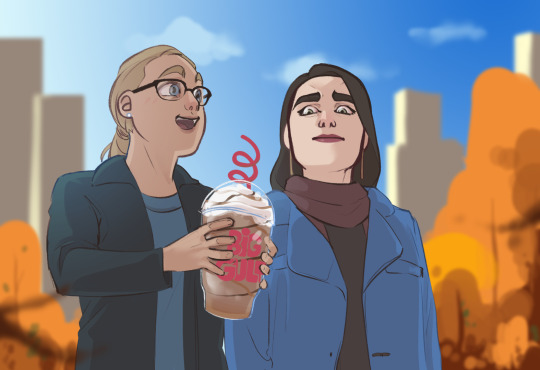
First, I’m morally obligated to mention that there are 8 million ways to approach digital color, so these are really just the Thots going through my head when I’m working on a given thing. For the sake of this rant, I’m gonna use this scribble of Kara and Lena from last fall, because it’s simple enough that I can easily illustrate some key points.
Most of the ideas I’ve outlined are about shorthand techniques that can easily and quickly use color to your advantage when you’re trying to sell the environment your characters are in. I’m not a painter, and painting is absurdly difficult, but we can use digital software to our advantage and consider how a painter would approach when lighting a figure/object/environment. Too many shortcuts are >:( but a few quick and simple habits can go a long way in finishing and posting a quick drawing you don’t want to spend hours rendering.
1. Pure black almost never exists in nature, and similarly, you will almost never need it.

Most illustration aims to “sell” a perceivable, believable space. While this is not everyone’s goal, most of what I draw is finished with an at least semiconscious goal of appearing touchable. Pure black is a guaranteed way to take away from that, because we almost never see it in nature. The darkest point in this particular drawing is Lena’s (terrified, dead) eyes, and it is only about 80% black and has some red/orange in it to help unify with the rest of the darks in the piece.
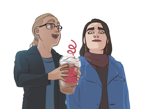
Here, locking my drawing layer and scribbling in some browns, blues, and even whites goes a long way to mesh the figures with their environment, especially because the background is lineless.

Here’s what this same drawing looks like with pure black lines. I would argue that this version does a disservice to the steps I’ve taken to light the figures, and it’s flattening the brightly lit outdoor space I’m trying to imply. There’s a whole additional essay about how lines play into this as well, so that’s a pretentious argument for another day.
2. Local color will rarely reach above 50% saturation.

Here’s the drawing with all the lighting work I’ve done removed (barring a few highlights I’m too lazy to turn off). In illustration, “local color” is referring to the color of a given object at the most neutral lighting possible.
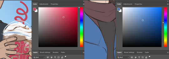
The most heavily saturated element here is the artificial red on Kara’s cup, which makes sense! Printed logos, light up colored signs, things that are generally hard-sided and man-made will be more saturated. The next most saturated object here, and the only other local color exceeding 50% is Lena’s coat.
The rest of the clothing, skin, and hair falls between 10% and 35%. A neutral base gives you a lot of room to work with when you start lighting. It’s easier to go richer in digital than it is to accurately reel your colors in. Like any other kind of contrast, saturation can be used to pop points of interest, and if your entire canvas is TURBO SATURATED, none of it actually is. Also you’re hurting my eyes.
3. Natural light is cool, artificial is warm.
As humans, we spend 99% of our time either seeing the world lit by the sun, or by a lightbulb. Light from the sun is cool and generally diffused because it has passed through our atmosphere. Interior lighting tends to be warm and direct, casting clear shadows that come from a very specific light source.
Even if we remove the background, you would probably assume that Kara and Lena are outside based on the light temperature. Blue and orange are opposites on the color wheel, so an orange-tinted shadow (warm) will by effect make all the lighter colors look blue-ish (cool)! Pretty much all the shadows on these figures are just a faint orange Multiply layer. You’ll also notice a faint blue gradient over Kara’s shoulder to emphasize the approximate point where the sun is in the sky.
In short, cooler light and warmer shadow will imply that the setting is outdoors. Warmer light and cooler shadow will imply that the setting is indoors. It’s a fast and easy way to communicate character location.
4. Skin is weird.
If I’m just slapping some flat colors down and don’t plan to do much painting, facial features and skin have a lot of complex undertones, so if I don’t want to get into too much detail, a splash of red on the nose and around the eyes, a bit of color on the lips, translucent ears, can all go a long way to making flesh look more like flesh and less like barbie plastic.
5. Atmospheric perspective is much more important than grid (1/2/3 point) perspective.
This is relevant to color because color is the best way to easily portray atmosphere and the passage of space. Especially when your setting is outdoors, objects’ colors should become cooler and less saturated as they recede in space. The closer an object is to the camera, the more contrast you’re going to see in hue (position on the rainbow), saturation (richness of the color), and value (light vs dark).
#don't invite me to talk about art because I will wax poetic like an asshole for thousands of words#and there will be nothing you can do to stop me#mine#Anonymous
399 notes
·
View notes
Note
I absolutely LOVE your Jyn painting!! I was hoping it was okay for me to bother you about art tips because I was struggling with palettes with mixed colors for realistic portraits and you make it look so effortless (affectionate) and flawless. Would you ever consider recording your process or providing wip images of the general steps you take (like sketching, base color(s), and then like tips for building on it)? Thank you so much for sharing your art it is absolutely gorgeous 😭😭🥺
Thank you so much!! It’s absolutely not a bother at all <3 I am not great at explaining, so I’m sorry if I blabber on/say things that are obvious!! I also have a tutorial here, that’s a bit more organized, plus its another limited palette!
Just fyi, I use the app Procreate on the ipad!
Time lapse
Sketch

Here’s a wip image of very early on! I use at least a basic grid system for all of my longer portraits, I just have a dreadful fear of getting facial features wrong. And grids/reference photos are absolutely not cheating. I see some of those takes sometimes, it makes me cringe. There are piles and piles of the greatest artists of all time using both of these, there’s nothing wrong with us using them either!
Color Composition

I start out by blocking out the face and clothes on separate layers and making clipping masks for them, then just picking all the colors I have and mixing them together. Right now I just want to see what the options are! When I’m laying out where I want things to go, it’s helpful to keep in mind general color principles. Cooler colors work great for shadows, they sit back further from warmer ones. So I already know I want the blues for the shadow, now I just have to figure out where to put all the warm colors. I tried a couple different looks (reddish vs yellowy orange on the face for example!), and picked my favorite. You don’t have to exactly stick to it! I couldn’t find a spot I really liked for the red orange until about halfway through.
Rendering

So I am so bad at explaining things, I repainted a section of her cheek to try to illustrate my render process! I start out by laying down sections of color with the flat brush, trying to get a nice gradient from dark to light. Then, I use a combination of the oil brush and smudge tool to blend those sections together. If you don’t use Procreate, I think any brush with intense blending with a nice texture would work just as well!
Thank you for reading! <3 I want to say that I don’t think my way is the best/only way to do this, and I’m still figuring these out as well! ^.^
139 notes
·
View notes
Note
ADVICE FOR ADVICE. If you have any cake/tube watercolours. Always make sure that you make swatch guides and tests before using them for the first time. Gradient from least to most water, medium water amount cross colour grid to see how they layer when dry, and some attempts at gradienting.
Have two water glasses, one for brush clean up another for water to add to the colours. I dint have two water glasses, but i do have an aquabrush that has its own water tank.
Most tube watercolours you can let dry on your pallete and they will re-wet easily. But do read the labels to make sure the watercolours arent secret liars.
I have tube colours but never use them because im a cake colours supermacist. You can generally leave water colours on your paletes to reuse them, if it's plastic it may stain a smidge, if its ceramic it will stay unstained. Staining is only a problem if you're mixing the colours on your pallete.
But always go, brush into water, then colour, then pallete, to make sure what sort of consistency you have, then on the paper. If you mix water colours on the pallete, its big brain to have a scrap paper to test what colour you just mixed.
Natural brushes are way better at absorbing water than synthetic. If you accidentally put too much water on the paper you can just, pick it up by gently touch it with a dry natural brush.
Another water thing. Get masking tape, put it all around your paper before adding water. Then add water. Should dry mostly straight depending on paper. In sketchbooks its less of a problem because the sketchbooks have hard surfaces and so they, kinda flatten the papers over time if you pile them up.
Whitenights has good quality watercolours at a cheaper price than some other good quality watercolour suppliers.
Now, how to use them on paper? No idea. I usually use them to add quick light colour to my sketches. (Somewhat consistent use of water and colour, just colour in the shapes like i would with pencil but way faster. Add layers as needed depending on how strong/multicoloured i desire the figure/surroundings to be) I also know how to draw landscapes with lots of water. (Do the paper prep with masking tape, just cover the paper with a layer of just water, then with a higher consistency of colour on a brush colour in nature shapes. When drier you can add in details that require sharp non fuzzy lines.)
You can put water colours on ink, or do ink over water colours. But before puting it on ink, make sure it dries, and that you before hand do a test to see if water makes it smudge or not. Most water colours i used so far, if you use them over a pencil sketch, its a smidge hard to, erase the sketch after wards.
You are the best anon
Anyway thank you so much for all the advice!! The two water cups especially is an excellent idea (I have a couple of brushes with water containers too but I use a regular brush for the wash backgrounds)
I've been doing most of my watercolor work in multimedia sketchbooks but I also appreciate the masking tape advice bc I'm sure once I get good enough at it I'll want to move onto things I can gift to people <3
6 notes
·
View notes
Note
hola! cómo le haces para que tus icons te salgan en buena calidad?
Hi! I apologize but I cannot speak Spanish, so I am going to have to translate your ask through Google Translate. Which I know isn’t the best method, I’m sorry!
According to Google Translate, you’re saying “wave! How do you make your icons come out in good quality?”
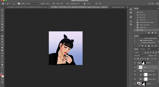
Hopefully, that is close enough to what you’re saying and if so, first off, thank you for saying they are good quality! Secondly, I’ll walk you through my icon making process. It’s actually very simple and fast (at least IMO lol I can make an icon in like 5 minutes but I also use PS for a living so I’m pretty used to the program)
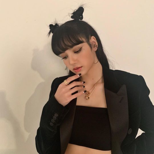
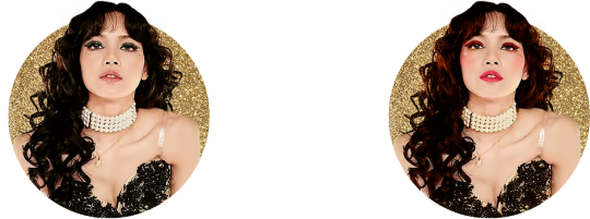
I’ll show you how to go from this random image from Lisa’s Instagram:
to this icon

FULL TUTORIAL UNDER THE CUT
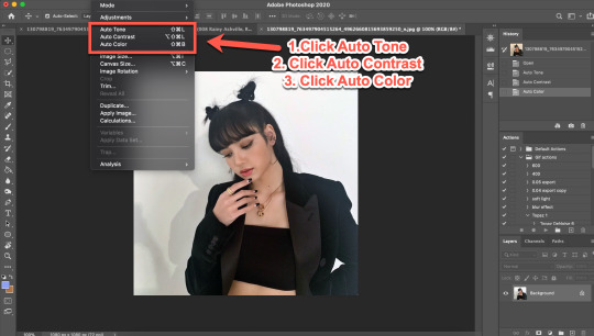
First off, open Photoshop and drop in your image (I have Adobe Cloud PS 2020)
Then I want to clean up the colors of the image, because the image is too yellow, and was clearly taken in bad lighting.
1. Click Auto Tone
2. Click Auto Contrast
3. Click Auto Color
That should help give the image a much nicer, natural color, as shown below:
4. Select the Selection Tool
5. Click Select Subject
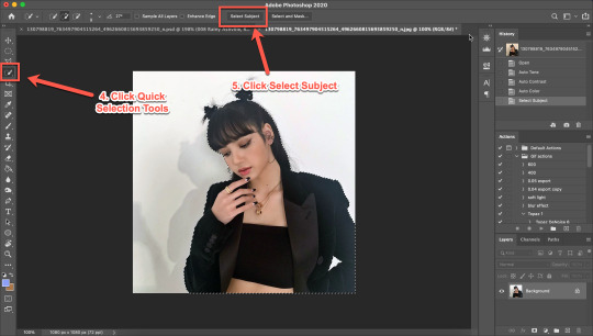
6. Click Add Mask
7. Double-click your mask to edit
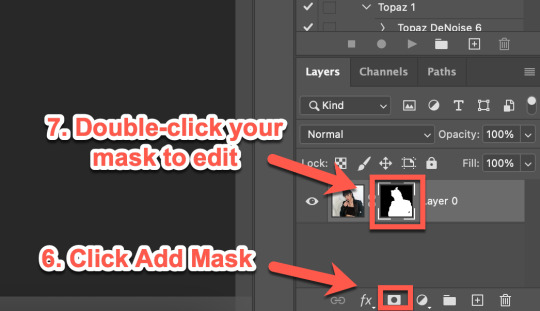
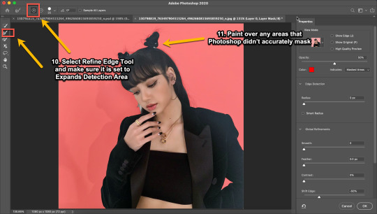
8. Click View, then select Overlay V (this will help you see where you need to clean up your image)
9. Adjust settings to the image (This part really just depends on your image. Generally, I always set the Shift Edge to -50%, as it helps take away any white fuzziness around the image. Smooth obviously smooths the edges, Contrast helps sharpen them, and Feather...feathers them....just don’t use Feather okay?)

10. Select Refine Edge Tool and make sure it is set to Expands Detection Area (aka the + symbol lol)
11. Paint over any areas that Photoshop didn’t accurately mask
12. Select your mask again
13. Select your Paint Brush tool (make sure it is set to Hardness 100 and an appropriate size for your image)
14. Set your Foreground and Background colors to White and Black (Just click the little black and white boxes above them)
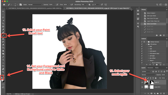
15. Using your paintbrush tool paint in (or out) details you need (In this case I just need to paint her face back in, so I use the brush tool set to white and paint where the pixels are distorted)
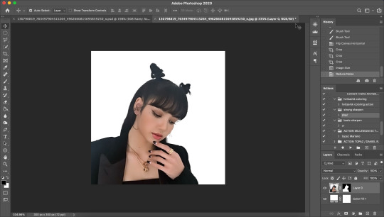
Now she is ready to be cropped and edited.
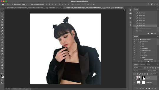
16. Flip/crop/adjust the image as desired (My best tip is to use the crop tool and put the focus of the image in the center of the grid)
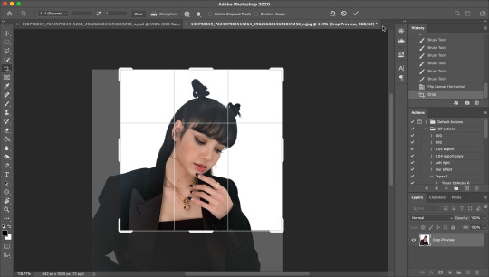
Here’s the final cropped image:
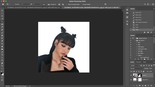
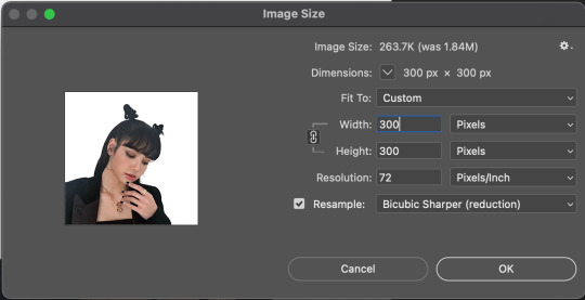
17. Click Image>Image Size
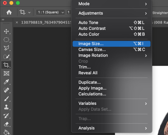
18. Set the Image Width to 300 Pixels, check Resample, and set to Bicubic Sharper (Reduction) and click OK
19. In your Layer Panel, select your Image, NOT your mask (nothing will happen if you edit your mask lol)
20. Click Filter>Noise>Reduce Noise...
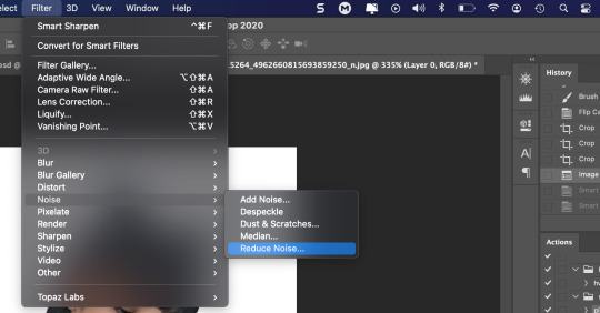
21. Adjust to the following settings (or whatever you prefer to get the image looking smooth) Click OK
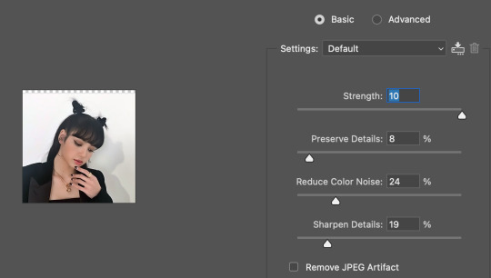
Now my image is smooth and free from noise and grain, but I want her to be more in focus.
22. Click Filter>Sharpen>Smart Sharpen
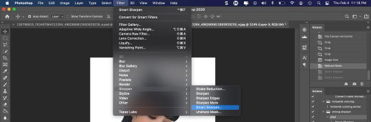
23. Use the following settings
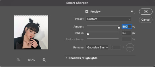
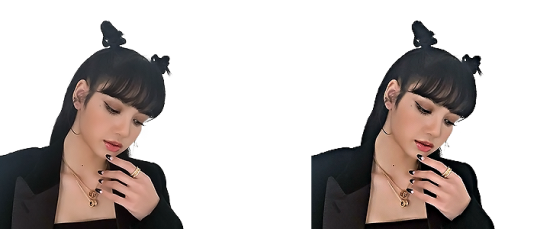
This is a basic sharpen that many editors use for gifs, edits, icons, etc, and you can just stop there for the sharpening step if you want, but I prefer my icons sharper, so I click Filter>Sharpen>Smart Sharpen again and this time, I use these settings:
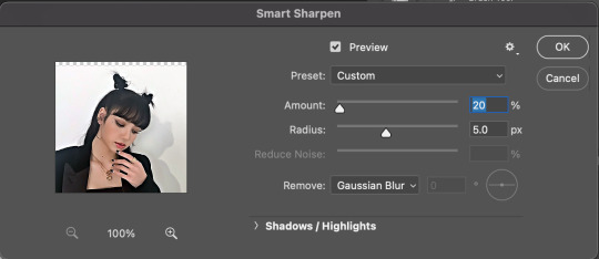
You can see the differences below. The left side has just the basic sharpen, and the one on the right has both sharpens (you can clearly see the difference)
Once you’ve sharpened as desired, we’re ready to finally get to the fun and colorful part!
24. Add a gradient bg below your image (There are tons of free ones you can download from Tumblr or Google, or you can just make your own with the a gradient layer)
This next step is optional as not all images need it, but for this image, I need to do some badly needed image adjustments
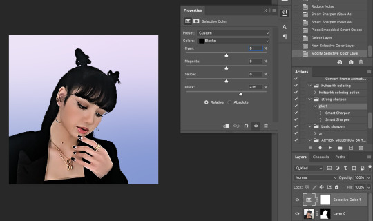
First I click the adjustment layer on my layer panel and click Selective Layer

Then I set the colors to Blacks and drag the Black to +35 to darken up the blacks on the image and give it a nicer contrast (selective colors are great, mess around with them as much as you want until you find a look you like!)
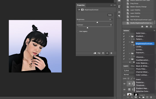
Then I make a Brightness/Contrast layer and adjust to what I feel works best for the image
26. Create a folder (if you did the above step, select the layers and then click the folder icon, it’ll just put them in the folder)
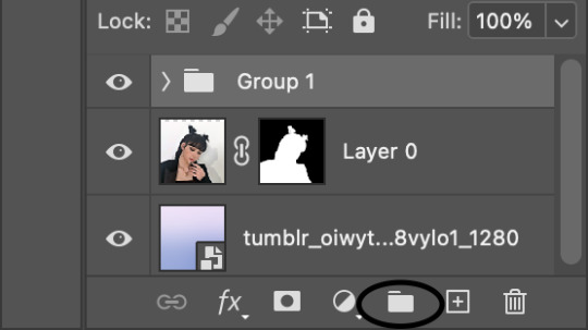
27. Holding down the alt key on Windows (or the Option key on Mac) click and drag your mask to the group layer. Now you have a folder that you can put PSDs and adjustment layers in without affecting your gradient background
28. Drag your PSD of choice. I am using this amazing PSD that is perfect for pale photos. I set the PSD to 50% opacity and it looks like this
Now, I could stop here, but I’m extra so I want to doctor up her face a little.
29. Above your PSD folder, create a new layer and set it soft light
30. Select your brush tool again, and pick a color that will work for enhancing an area of the photo. Then paint over that area.
Lisa is already pretty pale here, so I won't paint over her skin with a nice peach color like I do sometimes in darker photos. But I will add a nice pink flush to her cheeks and her lips.
Then I will use a lilac purple to paint over her eyeshadow. This brings an element of the background onto her face.
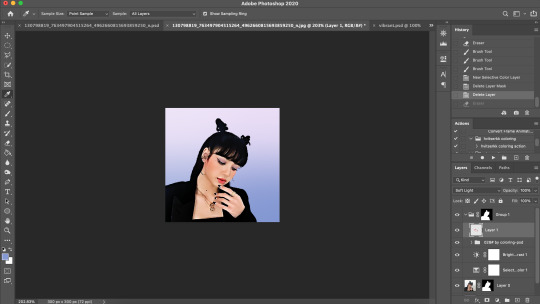
There’s not a lot that needs to be added to this particular photo, but here’s an example of another icon without and with soft light painted layers:
The left has no soft light painted layers, the right does. You may be thinking it looks too gaudy, but icons are tiny! Adding strong colors will help painted areas stand out. However, this is a completely optional step of course :)
31. Back to our current icon. Select all your layers, and click the folder icon again to place them all in a folder
32. Select your Elliptical Marquee tool and make a circle over your image
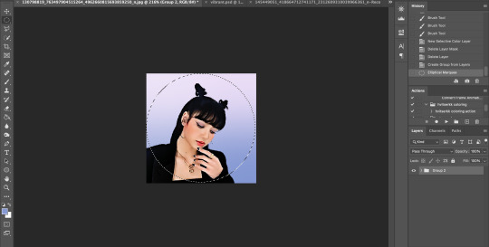
33. Click your mask button in the layers panel, and tada! You can now save out your icon and put it to use
Here is the completed icon:
If you got this far, thank you for reading, and let me know if you have any questions!
#ggnet#kgirlsquad#blackpinknet#idolady#femaleidols#lisa manoban#photoshop tutorial#icon tutorial#photoshop#tutorial#icon#icons#if this type of post doesn't belong in any of the group tags just let me know and i will remove the tag#wasnt sure if tutorials counted lol#Anon#ask
100 notes
·
View notes
Text
Tips To Improve The Icon Design Styles
When it comes to designing icons, there are a few things to keep in mind. One is that icon design should be simple and straightforward, making it easy for users to recognize and understand. Additionally, the well-crafted icons have style and precision. For example, an icy background suits better than a gradient Background for an ice cream cone.
Another thing to keep in mind when designing icons is the use of typeface. While some may prefer the modern fonts used in iOS apps or games, others may prefer older fonts or even a classical font if they are looking for an iconic look. Always experiment with different typefaces and see what works best for your brand or product! Let’s have a look at a few tips and tricks you can use to improve the icon design styles.
What are icons and what are they used for?
When you first heard of icons in design, you might have wondered what are icons and what are they used for? Let me answer that here. let’s get started and know all about icons.
The icon is an image representing an application or specifies a type of entity and even any concept. It is a hypertext link to a page that represents the topic of that page. Lexical is the programming language for the same.
In other words, an icon is a type of graphical representation or sign that depicts an item, activity, concept, or idea. Icons often easily get recognized. They also offer a visual representation of something specific.
Icons are often used in the context of computer interfaces and graphical user interfaces (GUIs). It symbolizes various apps, files, functions, or features. They function as visual shortcuts, allowing users to easily recognize and access certain activities or material. For example, a trash bin icon is frequently used to depict the activity of removing files, but a printer icon denotes the print function.
Designing icons:
Designing icons can be very creative. But are the designs so effective that they can be used? The icons must be not only different but must also have all the standards that can make them user-friendly.

These factors can be used while designing icons:
1. Grid :
A grid is a set of horizontal and vertical lines that are layered over the canvas or bounding box of an icon. It functions as a structural framework for arranging and aligning the icon’s numerous parts. Grids help the developer specify the content. It has some dimensions which on the following can help the designer to create and enhance their icon.
There is a total of 24*24 Grid. The icon is placed within 20*20 dimensions. There is a padding of 2*2. This is the overall layout. The specific grid system and its arrangement may vary based on the user’s preferences and the project’s needs.
2. Consistency:
In icon design, the “Consistency” element refers to the conscious attempt to preserve a uniform visual style, structure, and meaning across a group of icons. Consistency is important because it guarantees that the icons in a set or system operate well together. It also ensures that icons are easily recognized and understood by users.
Consistency improves user experience by making icons easy to comprehend and interact with. It promotes familiarity, decreases cognitive burden, and establishes a consistent visual identity. When icons within a set or system have consistent visual qualities and transmit consistent meanings, users may readily recognize and comprehend them.
For example, icons with different strokes have a very inconsistent appearance. To avoid this, the lines must be equal and consistent from all aspects. This will have a better visual than the inconsistence one.
3. Clarity:
Just imagine an icon with multiple elements. Are these types of icons easy to use? The answer is no. Multiple elements in a single icon make it overcrowded and not even visually good appearing. In fact, the icon must have only those elements which are associated to that with minimum elements and simple design.
So, the “Clarity” component in icon design refers to a symbol’s capacity to clearly and efficiently express its intended message or purpose to the user. Clarity is critical since icons frequently act as visual signals or symbols. Their function should be obvious at a glance.
Designers may ensure that icons are obvious, easy to understand, and successfully communicate their intended purpose to users. Icons can do this by concentrating on simplicity, unique silhouette, consistent visual language, metaphoric representation, scalability, and user feedback. Clear svg icons increase user experience, minimize cognitive burden, and improve program and interface usability.
Click here to read more.
2 notes
·
View notes
Text
Leading 3 Instagram Photo Editing And Enhancing Application of 2021
Kicksta Instagram - Being propelled into difficult times handling your photo modifying on Instagram has been a common trouble for a number of account holders. This social media platform is your one stop destination to add selfies, develop image libraries, as well as share them on other social media networks including Facebook and Twitter. All you require to do is to get the ideal photo editing and enhancing tool/app to organize your images. Adhering to are leading 3 Instagram Picture Editing and enhancing Application that have actually become extensively prominent in the past couple of months.
1. Square FX
Cropping can be a genuine trouble for numerous pictures while uploading and fitting them on the square frame on Instagram. The Square FX app can be utilized to stop cropping, refit or resize the photos according to selection as well as requirement. You can do a variety of features with the Square FX app consisting of:
Changing frameworks, designs or colors
Instant image choice and placing on the structures to avoid cropping
Save photos in the image collection
Perform operates consisting of flipping, rotating or scaling photos
Select a background from a series of alternatives including gradient, shade and also pattern to cause amazing appearance and effects
The brand-new variation comes with a bug fixing attribute
Upgrade to the premium solutions to appreciate added functions of the app
The iTunes account holders can download this app free to utilize the fundamental functions. This app is constructed for iphone gadgets.
2. VSCO Cam + VSCO Grid
The VSCO Cam + VSCO Grid are offered for bulk of the iOS and also Android 4.0 version empowered devices. This minimalist system is suitable for developing, posting and also showing the digital photography skills. The VSCO is the most beautiful system that enables the combination and also interaction in between the professional photographers and also the interested takers. In a world where photos share more than texts, you can barely locate a system that enables the power of sharing to the digital photographers from around the world. VSCO Webcam + VSCO Grid attributes and also facilities are:
Instead of Instagram filters use the VSCO predetermined photo-filters
Shade edit the pictures for an improved look prior to submitting on Instagram
Compatible for using on iOS and Android based devices
Be familiar with about one of the most tremendously talented professional photographers from around the world with VSCO journals
Discover the gallery of images and also choose your favorite ones
A great deal many included devices and also presets are readily available on the VSCO Cam Shop
3. Snapseed
Snapseed application is mostly created for the iOS platform to carry out a number of functions with your images on Apple devices. Here are some important functions of this application:
Tweak all your pictures on the iPhone and also iPad
Edit your pictures to transform the contrasts, brightness, intensity and also saturation utilizing the loupe device
Present a retro design to your images making use of the expert black and white filters
Aside from Instagram, this app allows you to share a photo or a selfie on other sites consisting of Facebook, Flickr, Twitter, and so on
. The tags are very essential to be affixed to all your images on the social media sites accounts consisting of Instagram. Whether it is your organization profile or an individual social sharing account, you would certainly always wish to affix details of the photos. Your brand name and also line of product gains made best use of client action via them. The hashtags on the other hand are essential for the optimum visibility of your Instagram profile on the internet search engine. The Instagram image modifying applications allow you to carry out these tasks conveniently.
2 notes
·
View notes
Last Seen Blogs
witchsloom
Witch's Loom
woldiary
Warrior of Light Diary

gadgetnations
Gadget Nations
stereotapestry
Stereotapestry

iqvsq
IQVSQ