
aftongkier
Afton G. Kier
Hey y'all, I'm Afton G. Kier, and I make videos on YouTube, most popularly about the Magnus Archives. I'm also working on some very interesting stuff at the moment (this is always true to some extent), so stay tuned for whatever I've got in store next. Good night, Tumblr people!
27 posts
Don't wanna be here? Send us removal request.
Last Seen Blogs


Note
Which TMA fear god is your favorite and least favorite?:3
Fun Fact! I've answered this question, and several others, before in my Q&A video, which can be found below.
youtube
The actual answer to this question starts at 20:07, but, as a TLDW:
Favourite goes to the Web. I love its unique role in TMA's narrative, I'm a big fan of spiders and web imagery (hell, I use quite a bit for the channel itself), and and the theme of manipulation and loss of control is both fascinating and terrifying.
Least favourite, then, is the Corruption. As a lover of bugs and someone with a surprisingly deep understanding of disease (I actually wanted to go into microbiology for quite a while there), I just don't find it all that frightening. I also think the Corruption just doesn't have that many stand-out episodes and, as soon as Prentiss is dealt with, never really plays a major role in the main narrative again.
Thank you for asking!
#magnuspod#the magnus archives#tma#the magnus pod#tma entities#tma the web#tma the corruption#the web#the corruption#I'll never miss a chance to promote old videos#Even if I don't like the art all that much
5 notes
·
View notes
Text
In honour of this post and Alex saying he could kick the corruption. Here is a complete correct list of what entities I could kick, from most kickable to least kickable:
1. Flesh
2. Web
3. Hunt
4. Slaughter (kicking is kinda part of the description innit)
5. Corruption
6. Stranger
7. Eye (most the avatars are tiny ass twinks anyway)
8. Burried (you could maybe punch your way out of the grave?)
9. Dark (not kickable, but you can get a flash light)
None kickable
10. Desolation
11. Spiral
12. Lonely
13. Vast
14. End
#gonna have to disagree with number ten#I could kick the fuck out of candle wax#magnus archives#magnuspod
31 notes
·
View notes
Text
What would the salary of a Bonzo be? How much money do you think he makes?
Is he now the breadwinner of the Nigel Dickerson household?
"mr. bonzo is one of our externals" I'm sorry, is that bitch getting PAID?
5K notes
·
View notes
Text
Here's how Agnes Montague can still win- * gets shot *
195 notes
·
View notes
Text
The Magnus Archives:
The horrors are lurking, they are scheming and you will find yourself firmly in their grasp only when you can no longer hope to escape
The Magnus Protocol:
The horrors are here to beat yo ass, they will stab you and then call the police on themselves, try not to get eaten by a building ✌
#mr bonzo's on his way to fuck you up#seriously though#monster hitmen?#paramilitary involvement?#the horrors are ready for war#magnuspod#tmagp#tmp#magnus protocol#the magnus protocol
4K notes
·
View notes
Text
youtube
Today is a very special day, podcast side of Tumblr.
In about half an hour, the Magnus Protocol will be releasing to the public, which is very exciting. To celebrate, I decided to make a video going over my pre-series theories, throwing everything at the wall in hopes of getting a prediction to stick.
Originally, this was meant to be a full breakdown of TMA, but that project wound up being a lot longer than I expected. It doesn't mean it isn't coming, just that I couldn't get it done for today.
The art for this video features everyone's favourite Magnus ARG character, Mr. Bonzo, the jaundiced Mr. Blobby rip off with a slightly menacing aura. I knew I wanted to do something specifically related to Protocol, but I didn't want to do any of the main characters without hearing their voices and getting to know them, so I instead opted for Bonzoland's unsettling mascot, partly because he's a fan favourite and partly because I love doing monster design.
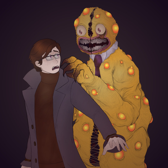
Bonzo obviously already had a design, which I did my best to stay true to, though I also make some changes. The most notable change is probably the teeth, which are much more broken down than in the original. I figured that a terrible creature like this would probably have teeth made of plate or ceramic, so I chipped away at them in the areas where they would most often be used, being the incisors and molars in a human. Of course, Bonzo has a few extra teeth, but that's alright.
The art did have to be rushed a bit, since I literally finished it around 3:00 this morning, so it's not quite as detailed as I would like, but I think that's alright. When I inevitably do my follow up AFTER listening to the premier, maybe I'll go back and give Bonzo the superior shading he deserves.
One of my favourite details about Mr. Bonzo is the fact that you can see little red eyes poking out from inside of the suit, with what looks like most of a face inside of the head, so I had to include that in my version. If you look closely, you can spot the eyes hiding in Bonzo. I did try to make my Bonzo a bit bulkier overall, with a smaller head relative to his body and defined neck, which I think moves him away from theme park mascots a bit, but into the realm of bulky animatronics or muscly monsters, which are their own form of uncanny valley.
Also, it's semi-unintentional, but I made his spots glow. Because I can.
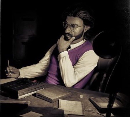
This piece is also the first time I've publically shown off my new persona design. I've been holding on to the redesign for a few months now, but I figured this was as good a time as any to shadow drop it. Afton himself looks mostly the same, save for a hair update which makes it longer, but the biggest change is in his clothes, moving from a burgundy coat and green tee to a lavender coat and rust turtleneck. I've also bulked up the glasses a bit and finally found a way to get semi-accurate hair colours. Chestnut hair is hard to draw.
With all of that out of the way, I think that just leaves us to prepare for the release of Protocol. I've been dodging spoilers for months at this point, so I'm glad to finally get a glimpse into this new world. Will my predictions be right? Probably not. I can always hope, though. Regardless, thank you for reading, and good night, Tumblr people!
#tma#the magnus pod#magnuspod#the magnus institute#magnus#the magnus protocol#tmagp#tmp#tma fanart#tma podcast#tma spoilers#magnus archives#the magnus archives fanart#tma art#the magnus archives#tmagp fanart#tmagp premiere#tmagp theory#bonzo#mr bonzo#bonzoland#I loved drawing Mr Bonzo#really a highlight of my day#I hope I made him suitably unsettling#sona art#technically#also happy new year#I know I'm late#Youtube
26 notes
·
View notes
Note
I love your channel and art!
Thank you! I'm glad I can make videos you've enjoyed, and I hope to continue doing so into 2024 and beyond. Specifically, I have some big projects planned for this new year and, as my most popular series by far has come to a close, it seems that these new beginnings will have plenty of room to develop.
We just hit 1.75k subscribers on YouTube, which is really exciting. Our community is growing very quickly, and I love to see that people want to see more from me. In order to help with that goal, I want to do something a bit special. You can consider it a celebration of 1.75k, a returning of appreciation, or just a way to balance out the information I put out on Twitter, YouTube Community Posts, and Tumblr, but I thought it might be nice to give y'all a sneak peak at the next video's art piece.
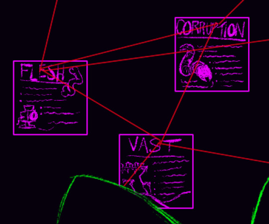
It's just one part of a much bigger drawing, obviously, and all of it is still in the sketching phase, but, if you've enjoyed the videos and the art so far, I think you're going to want to stay tuned for this next one! The Magnus fans in the audience (which, lets be honest, are most of y'all. I doubt very many people are around to watch me play Cult of the Lamb or something XD) in particular should get excited.
Anyways, I'm glad you've enjoyed my content, and I hope you're excited for what's coming in the new year. Good night, Tumblr people!
#youtube#sketch#digital art#in progress#art#tma art#uh oh#looks like I gave away that the next video is TMA related#which I already said in the End Explained video#and on Twitter#but now y'all know too#anyways#magnuspod#the magnus archives#the magnus archive fanart#the vast#the vast tma#the flesh#the flesh tma#the corruption#the corruption tma
8 notes
·
View notes
Text
A hilarious watch. It's honestly sort of frightening how many of these line up.
youtube
After FOUR months in the making, I offer to the TMA fandom the silliest of Christmas gifts. The horror fiction podcast community has seriously changed my life for the better, and I have made so many lifelong friends because of it.
This video was born from a surprising lack of SpongeBob meme compilations for this fandom, and was, frankly, somerhing i wasnt certain I could pull off, as I have zero-video editing knowledge. I hope you're all able to get a laugh out of it, even if it's not perfect. And I would greatly appreciate y'all spreading it around! I would love as many people as possible in the fandom to see their gift!
Merry Christmas and happy holidays!
@jonnywaistcoat If you would like something silly too--
11 notes
·
View notes
Text
youtube
Hello again, podcast side of Tumblr.
Entities Explained has officially come to a close with the final episode explaining the End. If you didn't know, Entities Explained has been a series where I, over the course of the last year and change, have explained each of the Fears from hit horror anthology podcast The Magnus Archives. This is the longest episode of the series, but I think it's totally worth watching.
Also, this video contains a major announcement: I am currently working on a MASSIVE video explaining The Magnus Archives in as much detail as I possibly can. Hopefully, it'll be a great refresher course before Protocol, and trying to get it done in a month won't absolutely destroy me.
For the art, I decided to draw the moment from Oliver Banks' statement in MAG 121: Far Away where he and the rest of the crew on a research vessel are destroyed by falling satellite pieces. I wanted the whole piece to be very dark and to have this slightly dusty feel to it, which I think I succeeded at.
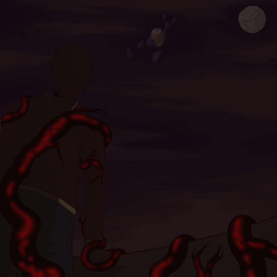
I went back and forth a lot on what to dress Banks in, but, in the end (pun intended), I went with something a bit more casual, since he is mostly just hanging around a shipping vessel. If I ever drew him as The Coroner, I'd probably go with something more formal (full black suit with a wilted red flower on the lapel?), but this felt fitting. I also wanted to give him a rain coat because, hey, I imagine it gets pretty rainy out there.
Unfortunately, Banks' design doesn't get to shine through too much in this piece, since his back is to the audience but, for one, I think that's sort of fitting for his themes, and, two, it makes the composition, at least in my mind, a bit more interesting.
The falling satellite was something I experimented around with a lot. Using reference pictures of real satellites, I tried to get something that felt small, but also like it could do some serious damage. The motion blur was a late addition, but I can't say I don't like it.
The moon was always going to be an important part of this piece, but it was during the sketching phase that I realised I could make it into a bit of a stylised skull, which is just a subtle enough detail to be fun. The angular clouds were originally meant to cut through it, but I settled on it being in full view instead, which I think looks much better.
Finally, there's the veins themselves. I actually went with less of them than I originally planned because I think it felt less repetitive, but I'm really happy with the way they turned out. My one addition was adding a pop of colour to this very drab and grey piece (which could, now that I think about it, be seen as a parallel to the desaturated people in Banks' dreams) in the form of the red flowing through the veins. This is technically only described as happening when Banks saw Gertrude Robinson in his dreams, but I figured, if there was another time for it, it was in the moment that he was truly in the grasp of Terminus. I also, honestly, just think it looks better.
That wraps up Entities Explained, so I hope y'all have enjoyed this series while it lasted. I'm not going to stop Magnus content, as I have plenty of ideas already and I'm sure Protocol will only bring more, but I am interested to see where my content goes from here. If you've read this far, thank you so much for listening to my ramblings and, if you celebrate, enjoy your holidays. Good night, Tumblr people!
#youtube#magnuspod#the magnus archives#the magnus pod#tma#the magnus institute#magnus#the magnus archives fanart#the magnus protocol#tma art#tma entities#tma spoilers#tma fanart#tma the end#the end#terminus#the coming end that waits for us all and cannot be ignored#oliver banks#the coroner#antonio blake#this series is over#wow#that's weird to think about#anyways#enjoy the episode#existential terror for your holidays
26 notes
·
View notes
Note
Just wanted to say you're my favorite YouTuber and your art is really great!!:)
First of all, thank you!
I'm always glad to see that people get enjoyment from my content, because it's a big part of why I do it. The other part is the goblins tapping inside of my skull who threaten to break out if I don't share their information.
As for my art, I actually use my channel specifically to practice my art. Going back through early videos or, hell, just watching through the past year on Entities Explained, you can see massive shifts as I try to find a style I like and experiment with other ways of doing things. Art is also all about practice, so having to make art for all of my videos forces me to practice at least once a month XD
5 notes
·
View notes
Text
youtube
Howdy, podcast side of Tumblr.
I forgot to share this here, but on the 30th (yes, I cut the deadline that close) I uploaded an explanation of the Extinction from hit horror anthology podcast The Magnus Archives as part of my ongoing series analysing the Entities one at a time. For this, the penultimate episode, I wound up going way further into detail than I expected, resulting in the video analysing the least significant Entity being the longest in the series. Whoops.
As always, here's a breakdown of the art, for the curious. Although he isn't an avatar of the Extinction (in fact, he seems to be actively fighting against it in most of his appearances), it felt wrong not to do Adelard Dekker for this piece. I really wanted to play around with colour and contrast in this one, and I think it turned out pretty nice.

I dressed Dekker himself in a grey suit with silver accents, because I wanted him to feel very ordinary. Dekker is one of the most human characters in TMA, never seeming to fall to any Entity despite interacting with them very frequently. More than that, he's about as close as TMA gets to a true hero, being at least a comparatively strong force for good. Silver, then, I chose both because it compliments his suit very nicely and because it has mythological and traditional precedent, especially in European folklore, as a deterrent for evil or the supernatural. One of Dekker's most interesting traits is his persistent faith, which I knew I had to include somehow, so I gave him a silver necklace with a cross on the end. It's simple, but it works. The only pop of colour in his otherwise monochrome dress is the tie around his neck, which I've coloured green to show his connection to the Extinction. I know I needed at least a bit of colour, and a neon, toxic green is the colour I associate with the Extinction, so I used a darkened, desaturated form of it for his necktie. I always pictured Dekker as a slender, angular man, which I've conveyed in his face and body. I wanted to give him hair that stood up a lot into short points, and while I considered making them a bit rounder, in the end, the pointed tips just stuck. Finally, there's the glowing green in his eyes, which is, of course, another allusion to the Extinction. Not to imply that he's being guided or influenced by it, simply that he sees it. He was the first to catalogue it, and, admittedly, they do stand out quite nicely against the shadows over him.
In the background, I knew I wanted a skyline with a mushroom cloud behind it, but, as I was working, I decided to make the buildings different references to Extinction episodes. Before I get to that, though, I have to talk about the colour scheme, which is mostly pale green. This was both, again, because the Extinction's colour, in my mind, is green, and because it contrasted nicely against the reds and oranges of the blast. Starting at the leftmost building, it references MAG 144: Decrypted, with numbers running down the side and an antenna on top to send out its encoded message. The next one over is a reference to MAG 175: Epoch, being a massive, Empire State-esque building with abandoned boxes and detritus scattered on its landings, alongside a few more... "living" manifestations. There are only five statements which are the MOST likely Extinction appearances, so, for symmetry, I had to pick an extra statement to throw in. This wound up being MAG 65: Binary, since it's a fan favourite and plenty of people theorise that it actually was related to the Extinction. To get the idea across, I put a few distorted faces on large screens, though I do regret not lightening the entire building up a bit. Across the empty space, we find a reference to MAG 156: Reflection, designed to mimic a large carnival sign and featuring tall windows with thin creatures in them. The windows could have been a bit smaller, but I worried that they would seem too similar to the next building. Speak of which, that brings us to the MAG 134: Time of Revelation reference, being an apartment building in a French architectural style (I don't recall which one at the moment, but I know it was a specific one) filled with figures in the windows, some of whom are half melted into walls or floors. Finally, the last building is a reference to MAG 149: Concrete Jungle, with a rounded roof to mimic the circular shabonos of the Yanomami people and a large, concrete serpent for... obvious reasons.
I think that about covers it. If you've read this far, I hope you enjoyed, and get yourselves ready for the final episode of Entities Explained dropping later this month. With that, all I have left to say is good night, Tumblr people!
#youtube#magnuspod#the magnus archives#the magnus institute#the magnus pod#the magnus protocol#tma#magnus#tma fanart#the magnus archives fanart#tma art#tma podcast#tma spoilers#tma entities#the extinction#tma the extinction#extinction#the terrible change#the future without us#the world is always ending#adelard dekker#mag 134#mag 144#mag 149#mag 156#mag 175#mag 5#mag 65#mg 84#mag 114
38 notes
·
View notes
Photo
This is so awesome. Love to see references to the earliest episodes of the series. The golden heart in particular is really cool but, honestly, I think all of these are amazing.


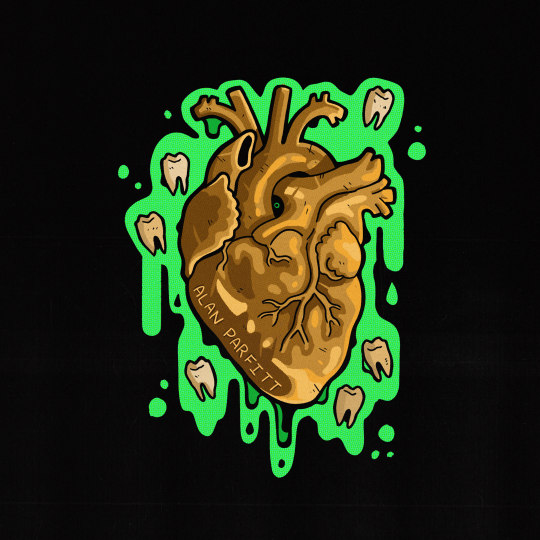

Parts 1 - 7 of my Magnus Archives episodic design series
#i need to do a tma relisten again#tma art#tma fanart#tma spoilers#tma#tma podcast#magnus archives#magnuspod#the magnus archives#the magnus archive fanart#the magnus pod
3K notes
·
View notes
Text
youtube
Hello again, podcast side of Tumblr.
I'm back with a new video about The Magnus Archives, specifically going over my viewers' hot takes about the series. I talk about TMA a LOT, so I figured it might be nice to give other people an opportunity to talk about it. Also, controversial opinions are always fun.
As for the art, I did a lot of monster design in October as a fun way to get back into a genre of art I hadn't covered in a while, and this is an expansion of that idea. The character pictured here is an omen of death, inspired by Banshees, Will o' the Wisps, and la Llorona, which I haven't actually given a proper name to, so if y'all have any ideas, feel free to share them.
As for the background, I went with a bit of swampy atmosphere, with dark green water and trees barely visible in the dark. Given that the character is composed almost entirely of black smoke or fog, having her spread out over the water felt right. I also have a lifelong fear of water, so it felt like the right place to put a depiction of Death.
I'll do a bigger post at some point explaining all of the detail work that went into the character, probably along with some concept sketches or something. Did notice that I forgot a detail, though, while going back over the speedpaint in the finished video, which would have served to make her a little more solid looking.
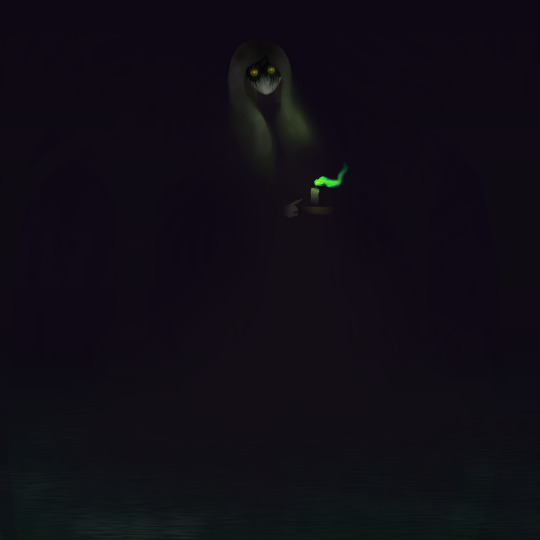
Anyways, that's the hot takes video! I'll be trying to finish the Malevolent script soon so that we can have that video, though the latest episode HAS given me a new scene to draw. Feel free to let me know what you think of the video or the art and, as always, good night, Tumblr people!
#magnuspod#the magnus archives#the magnus pod#tma#magnus#the magnus archives fanart#horror podcast#horror art#creepy art#scary art#hot take#unpopular opinion#community engagement#halloween special#well not really#all saints day special#there we go#some of y'all's opinions about TMA scare me more than the podcast itself#controversial opinion#youtube#still don't know how to tumblr#Youtube
4 notes
·
View notes
Text
youtube
Guess who's back with another video, podcast side of Tumblr?
As some of you might know, I have a series on YouTube where I talk about the Entities of the Magnus Archives, and this month we touched on the Buried. We are almost a year and 13 episodes into this project, and it just keeps getting better, so I hope y'all choose to check out this episode.
Just like last time, I'll also post the art from this episode, which is of Hezekiah Wakely taking a well deserved nap. Once again, I tried to do something different with this one, which I really liked the results of. It uses a little bit thinner, more blended linework, a lot more shading, and some fun anatomy work. From a colour standpoint, I obviously wanted to use a lot of earthy tones, and green felt like a good supplement to make Hezekiah stand out against the background. I also made sure to include the split thread from the coffin bell, 'cause that felt right. Hope y'all like this one, and that you're ready for the next video!

With that, we're done for this week, so keep your eyes peeled for the next upload and good night, Tumblr people!
#youtube#magnuspod#the magnus archives#the magnus institute#the magnus pod#the magnus protocol#tma#magnus#tma fanart#the magnus archives fanart#tma art#tma podcast#tma spoilers#tma entities#the buried#the buried tma#the centre tma#too close I cannot breathe#forever deep below creation#hezekiah wakely#mag 152#do you think Hezekiah eventually got his nap#yeah i still don't know how tumblr works
32 notes
·
View notes
Text
Okay, but, like… what if it's a picture of Bella as a child? If she was a similar age to Arthur or even younger, it would mean that photography had been well popularised by that point, and, especially for someone with as much money as Daniel, I wouldn't be surprised if there were several childhood photos taken of her. Just imagine that for a minute. If Harlan really wants to go for a gut punch, he's got an easy option here.
Random thought about Malevolent episode 36:
I would be so mortified if the little girl in the photo they found in Daniel's studio end up not being Faroe.
I can imagine Arthur carrying it like something precious, or even risking himself for the photograph, just for it to be a picture of someone else.
(I know it being a picture of Faroe, like John assumed, make the most sense, but the alternative is deliciously cruel.)
#malevolent#malevolent podcast#malevolent spoilers#malevolent part 36#arthur lester#faroe lester#faroe malevolent#okay but just like imagine it#it would be terrible wouldn't it#just absolutely awful#I love it#malevolent theory
119 notes
·
View notes
Note
On the one hand, totally agree, the Magnus Archives doesn't need canon designs and, if there's something you don't like, you can always just ignore it. On the other, I had never considered purple vest Jon and now I am. I AM considering. I am strongly considering and it is in my brain and oh dear now I want to redesign my Jon.
Hi Jonny, if you don't mind I have a question about the TMA TTRPG! So I noticed that on the player's guide there's this guy, who my friends and I assumed is probably Jon. If it is him, is this a canon design, or more like some of the non-canon stuff that's in the merch?
So, I hope you don't mind if i use this ask to go a bit off on one. I'm not specifically dragging you (I'm actualy glad you asked, as I've thinking about posting on the topic), but all the discussion around the RPG art and how "official" or "canon" it might be is, to my mind, slightly silly.
First up, is it "official" art? I mean, yeah, its art for the officially licenced Magnus Archives RPG. This means Monte Cook Games have commissioned someone to do a beatiful illustration broadly based on some aspect, episode or character from the podcast and it goes in the book. But that's kinda all it means. "Official" is a legal distinction, not an artistic one. The fact that it's in an official product doesn't make it any less one artist's cool interpretation of a character that has only been vaguely described in audio.
Second, is it Jonathan Sims the Archivist? I mean, it's probably based on the idea of him, but it's certainly not set in stone. When we were first discussing art with MCG, we advised that character pictures be more vibes-based and not explicitly tied to specific people (ie. a portrait inspired by Tim wouldn't be captioned "This is Tim" and wouldn't be placed opposite a profile for Tim Stoker, archival assistant.) This was mainly because we wanted the artists to have plenty of freedom to interpret and not feel too tied down by the need to know everything about the podcast. But, to be frank, it was also because we know that there are a few fans out there that are kinda Not Chill about what they've personally decided these characters look like and can get a bit defensive over depictions that differ.
It strikes me as particularly strange to be having this discussion about art that's for a roleplying game book. Something that's explicitly and solely designed to give you the ability to play in your version of the Magnus universe. The idea that this is the thing where we'd for some reason try to immutably establish unchangable appearances for these characters would be pretty funny if some folks weren't taking it so seriously. Similarly ridiculous is the idea we could reasonably have said to MCG "We'd love for you to make a huge beautiful RPG book of our setting... Just make sure you don't depict any of the iconic characters or events from it!"
But... is it "canon"? Now, to my mind, this highlights a real weakness in a lot of fandom thinking around "canon", which is that it generally has no idea what to do with adaptations. All adaptation is interpretation, and relies on taking a work and letting new creatives (and sometimes the same ones) have a different take on it. Are the appearances of the Fellowship of the Ring in the LOTR movies "canon"? How much, if at all, does that matter? Neil Gaiman's book Neverwhere was originaly a 90s BBC series made with a budget of 50 pence; is anyone who makes fanart of Mr Croup that doesn't look like the actor Hywel Bennet breaking canon? What about the novel that describes the character differently? Or the officially licenced Neverwhere comic where he looks like neither of them? Which is his "canon appearance"?
Canon is an inherently messy concept, and while it is useful for a creative team trying to keep continuity and consistency within a creative work, for thinking about anything beyond that it tends to be more hinderance than help.
Anyway, all this is to say that the above picture and all the others in the RPG are exactly as canon as every other picture you've ever seen of the Archivist.
#magnuspod#the magnus archives#the magnus institute#the magnus pod#jonathan sims#jon sims#the archivist#PURPLE VEST JON PURPLE VEST JON
3K notes
·
View notes
Text
youtube
Hello again, podcast side of Tumblr.
This time around, I did a video on Ethics Town, a relatively new cosmic horror podcast about a British valley town where nothing is quite as it seems. Right now Ethics Town is a terribly underrated series, so this video is both my analysis of it, and also my attempt at getting more people to listen to it.
Anyways, yeah, watch the video if you want, or not, it's up to you I guess. If you want to, though, I really do suggest you take the less than four hours and actually listen to the podcast, it's well worth your time.
SPOILERS FOR ETHICS TOWN SEASON ONE BEYOND THIS POINT. CONTINUE READING AT YOUR OWN RISK.
/ / / / / / / / / /
As with the last post, I also want to share the art from the video. For the first one, I wanted to do something that captured the feel of the Ethics Town logo, which is all black and white and red, so I stuck with a pretty monochromatic colour palette here. The image depicts the Mayor of Ethics, Ian Jacobs, moving the wrapped body of Natascha Flynn to make space for a nearby factory's planned expansions. It was one of two scenes I considered, and I think this was the much better option. The skyline in the background, while not perfect, is meant to mimic the same skyline seen on the Mayor's hat in the logo. The other weird detail here is that everything was done linelessly, which was very weird for me, because I thought it created an interesting look.
Oh, also, yes, I did give Ian a ponytail.
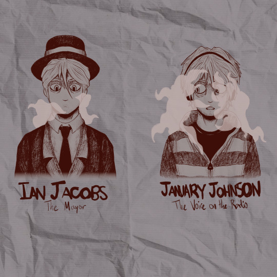
The other art piece is a sketch of Ian Jacobs and January Johnson, because I wanted to experiment with how much I could push their designs before they stopped looking like the same person. I also wanted to have their outfits at least be a little similar, so both of them have outer coverings closed around the middle of the chest around a shirt beneath, and both Ian and January have black headware. I considered giving January a white band on his headphones, but it just wound up getting lost. Another notable difference is in the hair, which I imagined here as blonde, probably in a more platinum direction, though you can't tell that very well from the greyscale. Ian's hair is pulled back in the aforementioned ponytail while it's left loose when he's acting as January. January also has a little more stubble, and his eye bags sag a little more. Finally, even though I only really had two colours to work with, I wanted to try expanding on how he acts within each role using the clothing. January's clothes are lighter, thanks in big part to the grey and white striped hoodie, which is designed to make him seem more emotionally truthful than he actually is. Underneath that light tone, though, is a plain black tee, which ties him to the darker colour scheme of Ian and also hints at the fact that, below his friendly and approachable personality hides the dark secret that he is, in fact, the Mayor who has been making such terrible decisions. Going back to the sweatshirt, the grey and white striping is also slightly reminiscent of the stripes on prison jumpsuits, which is a way of representing his feeling of being trapped into bad decisions and being ensnared by Ethics and his secret role as Mayor. Speaking of the Mayor, Ian is a lot simpler. I considered giving him a big, slightly cartoon-y MAYOR sash, but I wound up preferring how he looks without it. Generally, I tried to keep his wardrobe darker and more formal, and, of course, I had to include the fancy hat we see on the logo of Ethics Town. I also reduced the amount of vape cloud around him for two reasons. First, the in-story reason, is that Ian has accepted who he is and the role he plays in the "narrative" of Ethics, so I imagine he's a bit less stressed. It also works really well metaphorically, though, because he's not disguised anymore. When we see Ian at the end of "The Identity Issue," the mask is fully off. Artemis knows exactly who he is, which means that his identity doesn't have to be clouded by as much smoke. Oh, also, it's a cosmic horror podcast, so if I didn't put something tentacle-esque around the main antagonist, there would be problems.
And I think that about covers it. I had a lot of fun listening to the podcast and making the video, and I hope it can bring joy to y'all as well. Catch y'all next time around for The Buried Explained!
#Ethics Town#Ethics Town Podcast#Ethics Town Spoilers#fiction podcast#podcast recs#horror podcast#audio drama#cosmic horror#podcast recommendations#podcast#oh also art i guess#philosophy#morality#ethics#youtube#youtube video#Ian Jacobs is one of the best written characters in fiction#January Johnson#Yeah still don't know how to use Tumblr#Also I forgot about a detail but I asked them if it was intentional on Twitter and apparently it was so yeah Ian is derived from Janus/Ianu#Youtube
23 notes
·
View notes