
Statistics
We looked inside some of the posts by graphicfrank and here's what we found interesting.
Average Info
Notes Per Post
37
Likes Per Post
33
Reblog Per Post
4
Reply Per Post
0
Time Between Posts
4 days
Number of Posts By Type
Photo
12
Video
4
Last Seen Tumblr Blogs


Fun Fact
The most popular pages on Tumblr are about Minecraft, GIFs, and David J. Peterson.
Photo
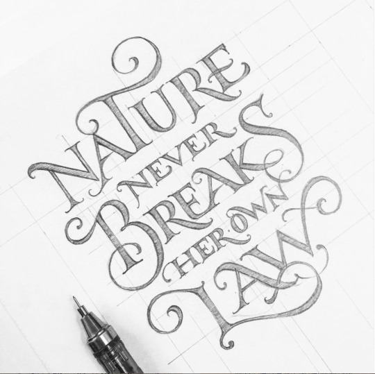
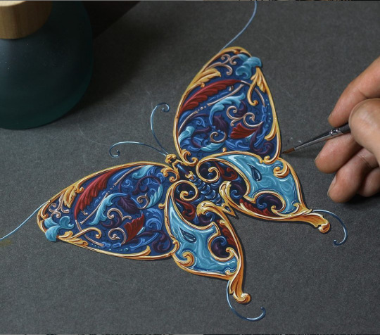
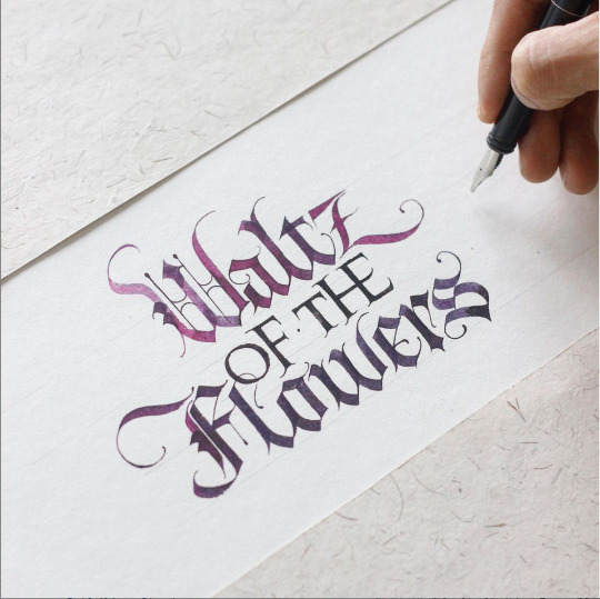
Influence Archive - Post #16
I find a lot my influences and inspiration from art. Especially, from fancy lettering known as calligraphy and ornamental paintings/drawing. It is fascinating to see how effortless master calligraphers make the craft look. I find myself appreciating every little detail in the embellishments and the letters form. The flow of the letters and symmetry of the composition gives the viewer’s eye a satisfying feel and ease. I also enjoy the clean look and how all the details and shadow make the work feel it’s popping from the page.
All the calligraphy and ornamental above was done by artist Tri Shiba, who also teaches calligraphy as well.
Follow Tri on Instagram.
Check out their website.
0 notes
Video
tumblr
Influence Archive - Post #15
Unknown is a typeface created by Lukas Haider and Alexander Raffl. To promote and showoff the typeface they create a website for it in Cargo. Cargo is an interface the allows you to build websites, similar to Weebly, Squarespace or Wix. This website has an interesting introduction page that pulls the user in and leads to exploring more of website. The website also does a good job in showing the type in use with a type tester, displaying the type and its different forms and showing off the type on objects, products, other designs. This allows the user to become more interested in the typeface encouraging the user to download the typeface for their own use.
Check out the Cargo website.
Check out Cargo.
0 notes
Photo
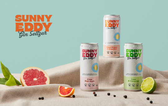
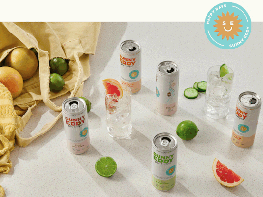

Influence Archive - Post #14
This next project was done by Squad Ink Studio, who are based in Australia. They design this seltzer brand called Sunny Eddy Gin Seltzer. This project includes a brand strategy, brand identity, packaging, e-commerce and extra content. I gravitate toward this project because of its fun, bright, summer time vibe and brand. Seltzer can be viewed as a refreshing alcoholic drink and what better time to refresh than in the summer. This brand creation brings out the fun times with a smile and has a clear target audience of people in their twenties.
Check out more about of this project here.
View Squad Ink Studio’s website.
View Squad Ink Studio’s Instagram.
#drink#summer#fun#achohol#packaging#design#posters#colors#branding#identity#brand strategy#e-commerce#seltzer
1 note
·
View note
Video
tumblr
Influence Archive - Post #13
This next post is about sharing a unique user interface/experience. This website is an interactive exhibition called In Pieces. The exhibition sheds light on 30 endanger species, which are represented by 30 pieces of geometric shapes. This interactive website allows the user to view each species as the 30 pieces create a depiction of that species. Information includes the species origins, their threat to survival, statistics and ways to help lend a hand. This interface gives a unique look into endanger animals and their need for survival.
Check out the website.
0 notes
Photo
Influence Archive - Post #12
For post number 12, I wanted to show off more lettering. This lettering was done by designer Ana Moreno Chavez, who is know for her amazing hand lettering skills. Her lettering has a lot of personality, originality and comes off very fun and whimsical. This image is just one of her amazing works. She also teaches a course in lettering that can be found on her website.
More can be found on her instagram.
Visit her website.
Check out her behance.
0 notes
Photo

Influence Archive - Post #11
It’s time for some inspirational weird type and this is weird. This experimental poster was done by Steffen Wagner, who is designer based in Berlin. He focuses on corporate design, branding, typography and art. Can you make out what the type means or says. The key is to know is to follow the form.
Follow Steffen on his instagram.
Check out his website.
0 notes
Photo
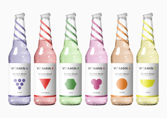
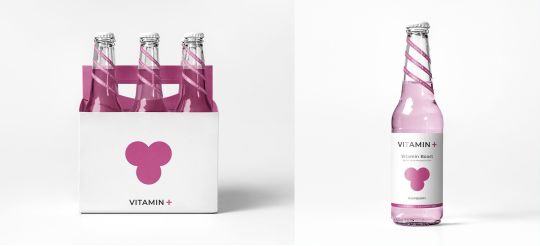
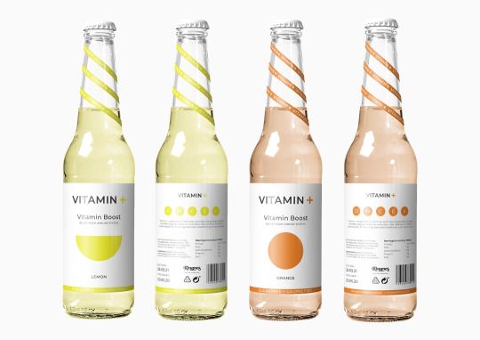
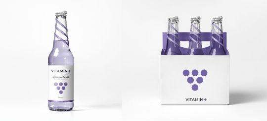
Influence Archive - Post #10
For my 10th post I wanted to show off this vitamin water packaging that took a very abstract approach by using organic and geometric shapes to effectively communicate the favor of each bottle. This minimal approach was able to use a pastel color palette to communicate a refreshing and beneficial feel for the brand. By taking the 3D form of fruit and simplify them down to flat 2D shapes with the addition of a pastel color and white space successful communicate the product’s content and quality of fresh nutritious water. Another element that makes this packaging success is the consistency in composition and layout giving all the products cohesion in the brand.
View this project here on the createid website
View on Pinterest here
0 notes
Photo


Influence Archive - Post #9
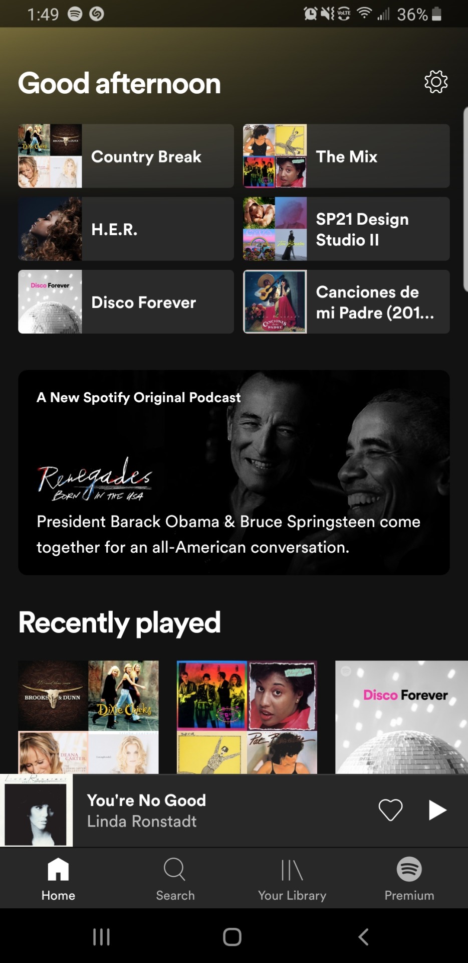
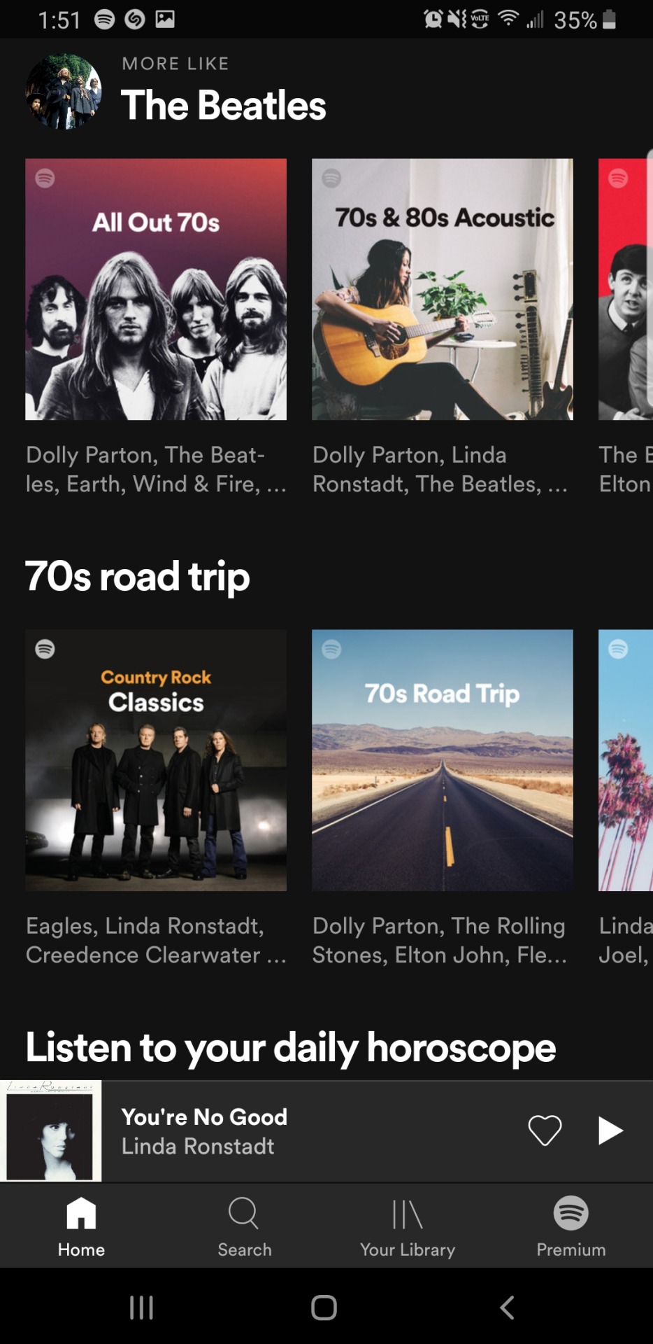
Spotify is one of the most successful apps in the world that offer an emotionally positive UX/UI design experience. With a music app that analyzes the songs you listen and then tailors different playlists that are made for your liking makes a user feel good that something is made just for them. The app gives you different options of music to chose from in an organized way and even tells the user good morning or good afternoon. A big part of why this app gives off positive UX/UI design experience is because of the unique customization it offers to its users.
1 note
·
View note
Photo

Influence Archive - Post #8
I was scrolling through Pinterest toady and saw beauty on my feed. So I thought it would be a good idea to post it to the influence archive collection. This design work shows a good use of hand lettering and composition. The way the letters flow and interact with each other attract the view’s eye and gives off a sense of that hand crafted feel.
0 notes
Video
tumblr
Influence Archive - Post #7
This influential post focuses on a commercial brand and their use of user experience design. Bellroy is a wallet company that has re-engineer the standard wallet and they used it to better what life is and what it looks like. This e-commerce website, showcases their wallets and bags and the materials used to make their products giving the user a sense of who the company is as a brand and what they are about. Bellroy shows their customers how they are different displaying videos of their slimline, compact wallets. This kind of user experience design showcases the different features of the products allowing the user influence their decision on making a purchase.
Check out they website here
View one of their wallets here
0 notes
Photo

Influence Archive - Post #6
For the next post I wanted to talk about chicken. Pacifically, KFC and their ad addressing all the different knock-offs that have attempted to reach the same level of success. In this ad campaign, KFC calls out those different local chicken shops that try to copy them as a reminder to their audience who the real king of fried chicken is.
0 notes
Photo


Influence Archive - Post #5
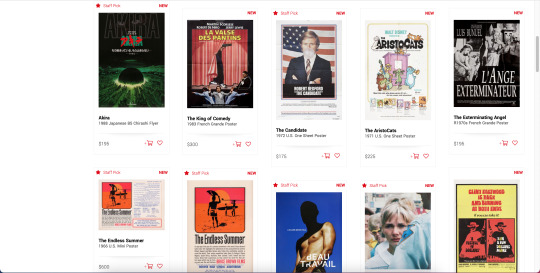
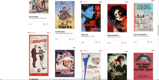
This post is all about showcasing a graphic design/art collection or archive. This archive is special because it is comprised of movie posters and art. Not only can you view these posters in appreciation, but you have the option to purchase them. Acting as both an archive and a e-commerce website, Posteritati has been one of the best sellers of vintage and contemporary movie art since 1996. They have art from the silent era to modern classics featuring a diverse collection of movie memorabilia from over 30 different countries.
Check out their new page here
Check out their new additions here
0 notes
Video
tumblr
Influence Archive - Post #4
For my fourth post I wanted to show off a website called Rouser lab. Rouser is an activist organization led by experts from the creative, entertainment and environmental. They are really big on promoting the power of creativity to solve our biggest challenges. When on the website you see a bubble floating in the screen and as you scroll the bubble get bigger and bigger until it burst at the bottom of the page. This interaction of a bursting bubble adds to the messaging of thinking outside of the box and getting outside of your bubble. Having these playful interactive elements elevates the user’s experience and appeal to the website. It also gives the user visuals that attract them to information and the call to action.
Visit their website here.
This website was designed by Ed. Studio. Check them out here.
0 notes
Photo
Influence Archive - Post #3
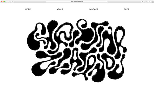
This next post is all about type and web design. On the home page of Christina Zlatanou’s website, a graphic designer from Greece she uses this custom type as a way to intrigue and attract people her site. Even thought it is not very legible, it acts as a testament to her design style. This kind of type treatment gives the viewer a sense to her brand identity as a designer, which makes for a good introduction to her personal website. For it not being super legible, you are still able to make out that the type spells out her name, which is a unique way of introducing yourself.
Follow Christina on Instagram
Check out her Behance
1 note
·
View note
Photo

Influence Archive - Post #2
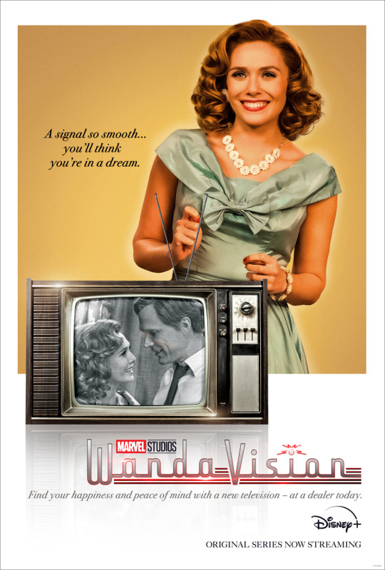
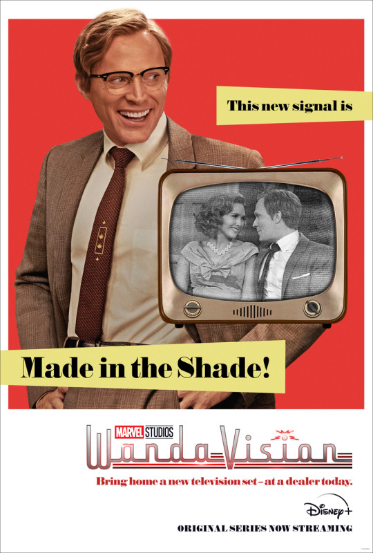
After the two episode premiere of Marvel Studios' first original series, WandaVision on January 15, two retro style posters were released reflecting the time period the sitcom takes place in. When the third episode premiered on January 22 another poster was released, reflecting the new decade in the sitcom. Each poster showcases vintage televisions, that play an important role in the series. So far the series has gone through the 50s, the 60s and the 70s and the posters have stayed consistent in composition, content and messaging. With every decade something new is learned and revealed.
Everything may seem happy and fun at first, but something weird is definitely going on. A new episode aires every Friday, only Disney Plus.
Learn more about the posters below.
Episode 1 & 2 Posters
Episode 3 Poster
Also check out the new poster that was released after episode four, showcasing all the main characters.
32 notes
·
View notes
Photo

Influence Archive - Post #1
This is a poster created by Abram Games, who is a British graphic designer. Games was successfully able to use colors, shapes and repetition to depict a tiger. He was able to take the physical form of a tiger and created an abstract version of it, that still communicates what that animal is and where that animal be seen. Created back in the 1970s Games was able to combine form and content in playful that gave influence to abstract and geometric design. I find this poster to be influential because it shows how design can visually communicate information in the most simplest way.
You can learn more about Abram Game and his work at
https://www.abramgames.com
2 notes
·
View notes