#manga tutorial
Text
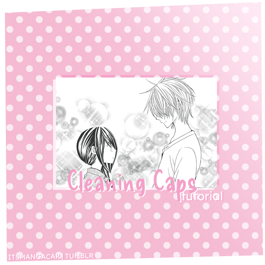
A manga caps cleaning tutorial. requested by @noctemys
Program: photoshop cc2019 but could work on any older or newer versions.
i’ve been working on this and a hard time choosing which cap should i work on, i decided to write it using an easy one to work on and writing the tutorial on, but you could work this one even in more challanging caps to clean! i’ll show examples of different difficulty at the end of this tutorial. i’m still a work on a process when it comes to cleaning caps!
*tip: always try to use a high quality files! i personally like to work on the official files if they’re available. they make a huge difference as seen between this old and newcleaned cap!
step.1
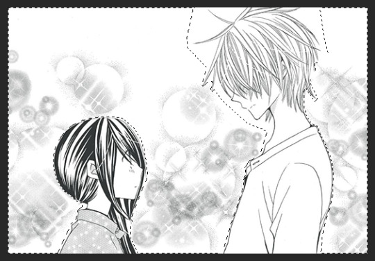
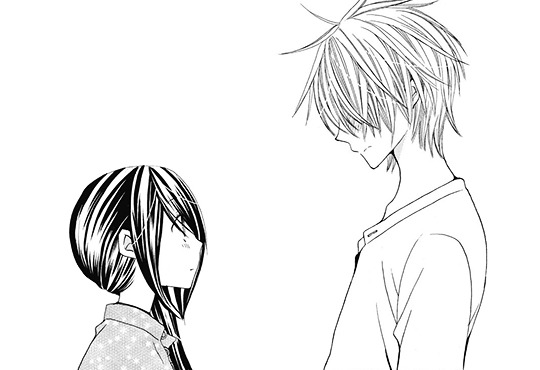
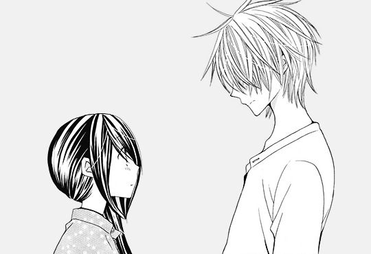
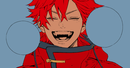
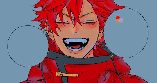
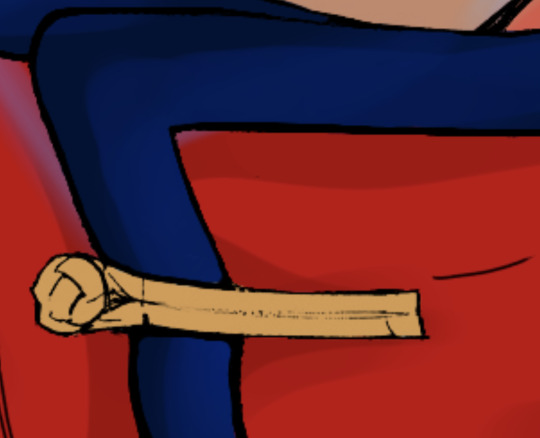
first step is choosing a cap of your choice and crop the panel that you like. mine is from Special A by minami maki.

step.2
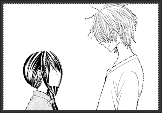
zoom in the cap, i usually go with x800! then using the lasso tool i select all the area i would like to erase and clean! this step could take a long time with some caps that have overlaying background effect with the characters. you could also use the pen tool or the magnet tool, whichever feel more comfortable using.
step.3
once you finish selecting the whole area you want to clean, with a white color fill the layer with white color!

step.4
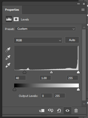
some caps do need to up the contrast in them just like this one, i usually use the levels to increase the blacks and whites by ticking the black point to the left to increase the blackness and the white to the right until i like the result i get. for this one as it leans more to the grey than black i only needed to increase the blackness.
step.5
some caps aren’t truly in black/white so i just add a gradient black and white!
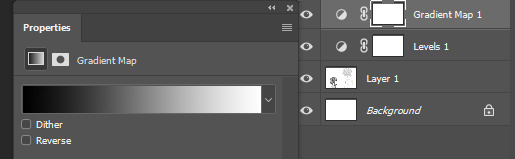
step.6
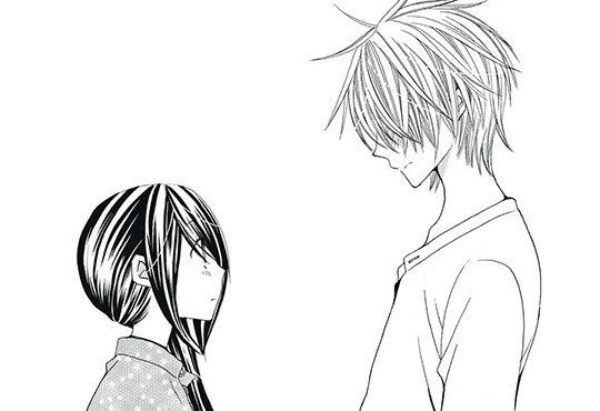
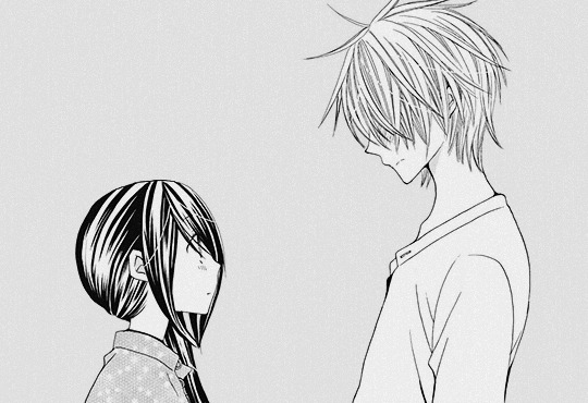
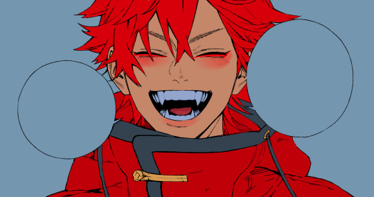
add a new colorfill layer and fill it with #f1f1f1 and set it to multiply. and delete the mask!!!

step.7
this step could be the last step or will need an extra step to make. and in this case we’ll need the extra step use magic wand tool select the background that i just cleaned you’ll notice the selection will include parts of both hikari’s hair and kei’s face.
step.8
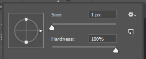
after deselecting, with a round brush with a grey shade color - my choice is shade is #373737 -, i would zoom in the cap again and notice where the gaps that’s causing the selecting mess is. and while in the cap layers i would redraw those tiny parts… sometimes the gaps are big and there’ll be many gaps.. you could either redraw by the mouse directly if the missing parts are small and tiny or use the pen tool to do that!
step.9
using the magic wand again select the area you want and select the colorfill layer click the mask icon from the layers box and you’re all set!
step.9 - optional-
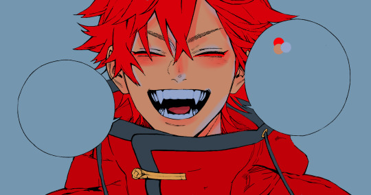
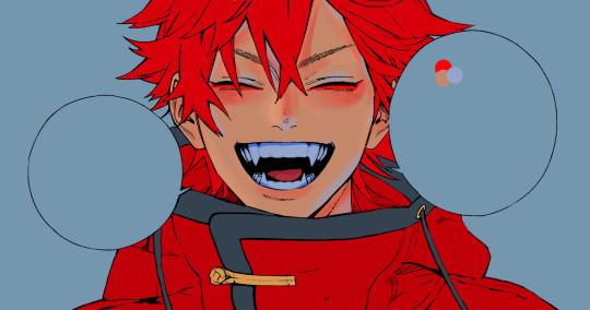
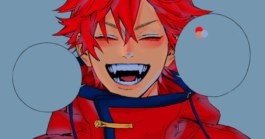
a last step i’ve been adding lately to my manga caps edits is adding this texture at the top of layers and lowering its opacity to 8% for a nice little touch!
the final layer box will look like this.
other cleaned caps before and after:
before→ after | before → after | before→ after| before → after
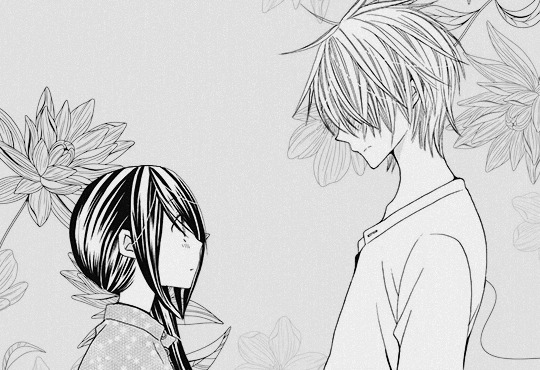
you could add any background you like at the end for a different ending result
#manga#manga cleaning#manga tutorial#ps tutorial#tutorial#photoshop tutorial#photoshop#ps resources#itsmangacap
29 notes
·
View notes
Text
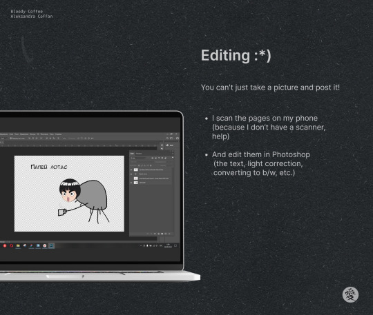
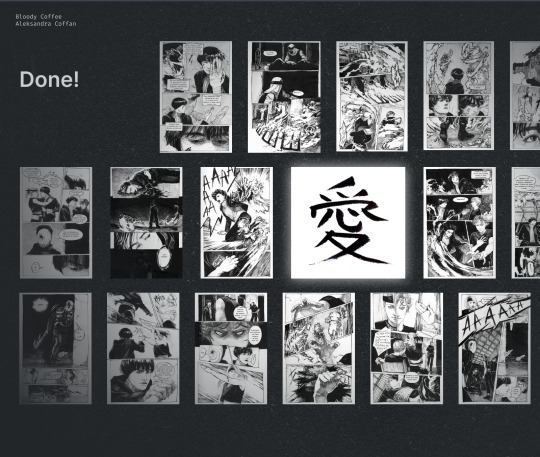
How is Bloody Coffee created? ☕🩸
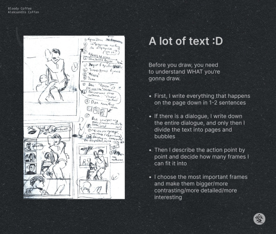
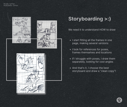
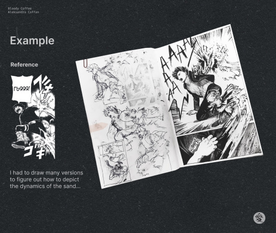
We made a small tutorial on how to draw a comic, you can save and use it too! 💋

#naruto#fanart#naruto fanart#gaalee#manga#manga tutorial#comic tutorial#some of the sketches are from ch 2#😏😏😏#hope its useful#love you!
64 notes
·
View notes
Text

She's back to destroy the organization...!!
#my captain o7#i watched a tutorial abt blurs can you tell? xcmvnbcx#she has so many cool pics i couldnt decide which to start with#so i'll definitely do something again for her <3#claymore#miria#phantom miria#mp#anime poster#manga poster#poster design#manga edit
199 notes
·
View notes
Text
emotional hands...
🕊️ from the reference archive on HATOKING.com 🕊️

HatoKing? More like Hand-o King, but not, like, because of hand jobs 'cause she makes tons of hand drawing reference material! (I use these all the time in my own drawing.)
Made by the guy who created Hatoful Boyfriend, the pigeon dating sim. (The bio is in Japanese so I'm unclear on whether they made it are just a huge fan.)*
*edit to add: confirmed by @fluffyheretic: HatoMoa is the creator of Hatoful Boyfriend (a lady-king and I should have referred to as "she")
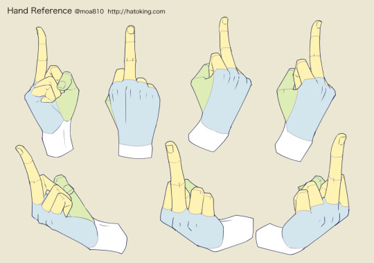
how rude...
↓ more 🕊️HATOKING🕊️ reference for hands ↓

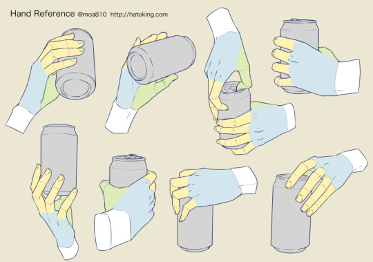
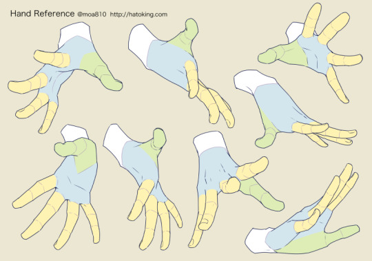

just a few arbitrarily chosen examples— GO to the original site!
🕊️ALL HAIL the HATOKING🕊️
Pigeon King of Drawn Hand Gestures!
#hand#hands#how to draw a hand#how to draw hands#hatoking#hatoful boyfriend#drawing reference#drawing#tutorial#drawing tutorial#hand drawings#drawing hands#art reference#pose reference#hand gestures#hand gesture#how to draw manga#how to draw#manga#hand position#illustration#art#illustrator#reference materials#draw#dove#pigeon
1K notes
·
View notes
Text
Tutorial: Manga Banners
Basic Manga Text Change/Coloring/GIF creation in PS
Hey, so as promised making a very basic tutorial for making banner gifs in photoshop for fics/drabbles/layouts, etc.
I'm going to keep things super simple here for beginners.
END RESULTS↴

(NOTE: This gif I made will be used for an unreleased story of mine so please don't use this exact gif/images but you are free to follow the tutorial to create your own).
All I ask is if you find this helpful to REBLOG! :)
No need to credit me.
For this tutorial you will need ↴
Photoshop
At least 2 manga panel images (non-transparent*)
Optional: Manga fonts. I mostly use CC Wild words (speech bubbles) & Manga Temple (narrator boxes)
Basic knowledge of photoshop layout/where tools are.
*this tutorial is essentially the same if working with transparency but if you do work with transparency you will need to have knowledge of clipping masks which i do not cover here.
Tutorial ↴
(optional) Prepwork: so i didn't think to include this do this but you are going to need to crop and resize your image. make sure the width is either 540 or 1080px. This is the recommended width for pictures in tumblr. Height can be what you want it to be. This is done image > image size (make sure the link-chain is pressed for aspect ratio)
Step 1
This is what you want your setup to look similar to. Delete locked background layer.

Steps 2 & 3
Make a new layer. It might be helpful for beginners to re-name all their layers so instead of "Layer 2" you might name this ⇢ "White fill layer or Text cover up". (doubletap layer name to change it).
Use rectangular marquee to select text you want to change. If you are just replacing a word or two you dont need to white out everything. But you could choose to cover up all if you wish. I just wanted to remove "senpai".

Steps 4 & 5
Use Paint Bucket Tool to fill in selection area with white (make sure the new layer you made is selected when you do this).
Select Text Tool. There is no need to make a new layer as once you are done typing it will become a text layer. I used CC Wild Words bold font for this for emphasis. If you do multiple lines of text use a new text layer for each line.

Step 6 - Optional Step - Highly recommended if you did multiple lines of text.
Rasterize Type by right clicking the layer. This is an optional step. I tend to do it out of habit and rasterizing lets you use the move tool to give you exact px distances between other rasterized elements but nothing we are doing requires this tbh and if you do decide to do it you can't go back and edit text.
If you did multiple text layers you cause space them out evenly using the move tool (zoom into 200%-400% if necessary to get exact pixel distances). Tip: Manga text is centered in the bubble and leaves a good distance away from the edge.
When you are done ctrl/cmd to select all text layers then right click and merge the layers. This is so incase you have to move the text layer for whatever reason they are all on one layer now, evenly spaced and you won't accidentally mess that up.

Step 7
Create an exposure layer (half filled in circle in layer bar for menu). This is important as it can lighten/darken image to make the colors we will add later pop by playing with the sliders for each setting.

Step 8
Apply exposure settings. On the right-hand side there will be 3 slider bars. The screenshot shows my settings but your settings will vary depending on the image. The one that gives the biggest benefit for manga is Gamma Correction which affects the midtones to make them lighter/darker and adds better contrast to the image so it doesn't look as muddy, often in black and white images it is easy for midtones to look muddy. Offset affects mid to dark tones of an image. Exposure affects midtones to highlights to make brighter or darker, overall use this the least.
TIP: If you want to make an image brighter or darker you usually want this to apply equally to the overall image so then you would create a brightness/contrast layer instead. most manga images skew muddy and need a midtone and dark adjustment rather than highlights. the better the manga scan images the less adjustments you will need.

Step 9 - Optional
Apply a gradient map (half filled in circle in layer bar for menu). This is optional. a Gradient map adds gradient but preserves the shading in the image so essentially adds a gradient to the shading. I do this in black and white. But if you are happy with how it came out in the exposure phase you don't need to.

Step 10 & 11 -
Apply a gradient (half filled in circle in layer bar for menu). So when you add a gradient there are a ton of preset color combos you can use or you can create your own. I think this one is a preset but can't remember. I like a diagonal gradient from light to dark depending on where the light source on the image is but it is completely up to you. I tend to set the gradient angles near these 4 settings: -145, -45, 45, 145 depending on what corner I want the lighter part in.
One thing to note is brighter colors work better with a darker background. Lighter backgrounds can get washed out. One you add this as you can see it will be solid color.
*note* once this layer is applied any edits such as moving text, etc. around you want to do to the lower layers beneath it click the "eye" button to hide the gradient (same for the map) or there's a good chance it will move the gradient layers around and not the layer you want.
Change layer blending mode. By default it's set to "normal". You can play around with these. Depending on the effect you want and whether the image has darker or lighter colors will decide the blending mode. My typical blending modes are screen, overlay, hard light, vivid light or pin light. You can duplicate this gradient layer and play around with multiple settings and opacities to create something you like.

Step 12 - Optional
Add a Brightness/Contrast layer (half filled in circle in layer bar for menu). Brightness/Contrast on this step will look wildly different than if you added it right after the exposure step. It's not necessary but if you want more overall contrast or brightness then you can add it.
You can see my settings below on the sliders on the right-hand side.

Step 13
Create new layer for highlights. (also good check point to see how your layers are organized).

Step 14
Select the brush tool and ensure brush settings are a soft round brush with a hardness of 0% for the highlight effect. (if you click the brush image you can see my settings better)


Step 15
Select the dropper tool and pick a color from the gradient image. I usually pick the darkest colors available as it will have the best dodge effect for highlights. Since this is pink/redish I only have one highlight color but if you were doing a green/blue gradient you would pick the darkest from both. (ignore the purple here its not being used)


Step 16
Create highlights with brush tool. Do a few tests placements randomly around the image for positioning and then swap the blend mode to either color dodge or linear dodge. I usually do color dodge. You will get awesome highlights like below. You can play with the sizing of the brushes and opacity to decrease the effect.

Step 17 & 18
Export as PNG. Do this even if you want to make a gif as I always recommend a clean canvas for gif making. If you want to be done here and don't want a gif thats fine too. File > Export > Quick Export as PNG (do not save as jpeg/gif you will lose image quality).
Repeat for second image. You don't need to open a new file unless it helps you to not get confused. You can just make a new layer and paste your new image into that layer (if you just right click copy the file in the window/finder folder you can directly paste it into a layer in PS) and use the transform tool to resize. However you can totally just open the image in PS. The benefit of same canvas is you save yourself some time as you can just duplicate gradient layers/adjustment layers and move them. But this is kinda more advanced so if you aren't comfortable with photoshop just make a new image.

Step 18-19
Create new file/open one of the PNG in PS (more advanced can just create new layer, select image, then copy > copy merged and paste on new file for each. Otherwise open one file, create a new layer then copy the other file. The bottom later will be the first image in the gif.
Create Frame Animation on the timeline window. (if the timeline window does not appear then window > timeline) *note* if this is your first time working with the window it may be set to "create video timeline", if that's the case create it then from the frame menu (in step 23 theres an example of where this is) select "convert to frame animation".
If done correctly your setup should look like the below with two images. One for each layer and one for each frame.
MAKE SURE PROPAGATE FRAME ONE BOX IS CHECKED IN THE LAYERS WINDOW.
lmao, not to be dramatic but this ensures most effects you would add to frame 1 (which corresponds to layer 1) is applied to all frames. I'm not too sure its super vital for this super basic gif I'm showing you but its better to get in the habit of always having it checked. otherwise it will fuck you over later down the line in my next tutorial where I show how to add frames to gifs.

Step 20
Select both layers, then select both frames (ctrl/cmd) and finally select tween from the timeline window. It is the multi-faded dot option on the bar below.

Step 21
Add Frames to Tween. Tween is the fading effect adding more frames is the longer the fading effect is. I added 20 for this step, you can play around and add more or less.
Once you do that you can see 20 new frames being added onto the timeline. This will not automatically add new layers, this is fine. Frames and layers don't need to be a 1-to-1. (Another reason why propagate frame 1 needs to be checked as you can still adjust those layerless frames by adjusting frame 1's layer)

Step 22
Adding delays. Automatically the delay on every frame is at zero. But especially if you have text you want people to be able to read that so you need to add in a delay. Your delays can be in increments of 1/10th of a second. I add a 1 second delay to the first frame only.

Step 23
Select and Copy the first frame and then select the last frame and Paste. A paste window will appear in this case we want to paste after selection. I circled where the menu for frames are. (sorry used a different gif as an example so ignore everything but the circled menu)


Step 24
Adding additional delays. I add a 1 second delay to the last two frames.

Step 25
Add more Tween I added 5 frames this time as we want the transition to be much quicker to reset the image. You can see frame 23 in the previous step are now frame 28.
You can add more images in than 2 and follow these steps to add tweening.

DONE! Now to save.
Step 26
Export your gif. File > Export > Save for Web (Legacy) and the screen below should pop up. Here are the settings I use for gifs. You can play around with it but I really wouldn't lol. (again ignore image size, this is from a different gif) it will also tell you how big in file weight your gif is. This isn't something you have to worry about for something simple but the bigger the image size and the more transitions/images you use the more frames you will have. Reducing image size (make sure chain link is on like in the below) will take off more sizing then removing frames will and I would recommend that. But tumblr allows 10MB MAX per gif so just something to keep in mind.

Let me know how this was! If you have questions just drop me an ask. ❤
#✩𝓀𝒾𝓏𝓏𝒶𝓉•𝔱𝔲𝔱𝔬𝔯𝔦𝔞𝔩𝔰#✩𝓀𝒾𝓏𝓏𝒶𝓉•𝕘𝕗𝕩#gfx#fic banners#tutorials#resources#photoshop tutorial#manga edit#edits#fan fic writing#fic writing#anime edits#manga edits
75 notes
·
View notes
Text
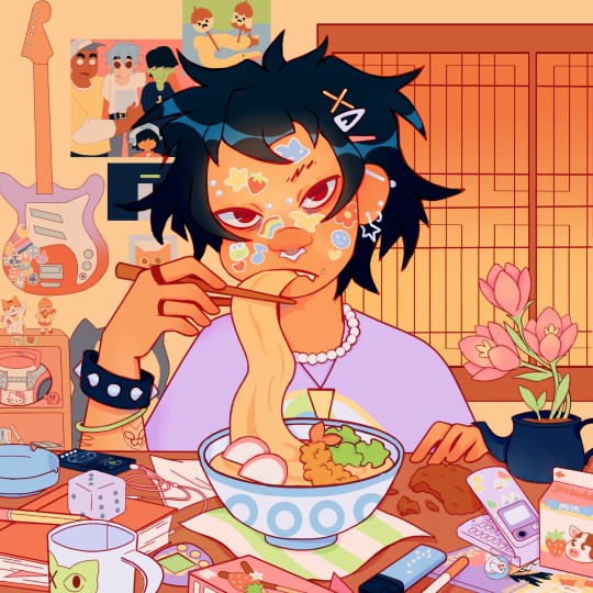
🍜🫤
#gorillaz#my art#artists on tumblr#noodle guitarist from gorillaz#fanart#aesthetic#do they look like noodles idk i cant draw them#this is what watching one 1 colouring tutorial video does to a mf#lile the original one sucked SOO BAD i didn't know where i was going with the colours but thank god youtube exists 🩷 and artists on youtube#not that this js perfect but the original one was atrocious lemme tell you ..... i understand why i stopped drawing for so long now#i hated my art lol#because i didn't study enoughhh but now that im learning its better 🩷#anyway idk#digital art#illustration#beginner artist#artwork#noodle gorillaz#i drew her so many times shes my blorbo#lgbt#she is bi ! bicon !#hidden snorlax big plushie hehe#and adventure time posterrr#and and sailor moon snoopy tamagotchi doraemon miffy things ... plus nana akira manga but kinda too hidden#OH AND those sanrio characters i forgot the name tho#and kirby#tiny murdoc 2d and russel 😺#y2k aesthetic
139 notes
·
View notes
Text


I desire churros and to focus on actual work but fate is a cruel mistress. Therefore, some stuff I gathered from reading one too many manwha
#my art#art study#art tutorial#oc stuff#I’m queue this#manga art study#manwha art study#I need to make some procreate brushes for some of the detail stuff#art tips
531 notes
·
View notes
Text
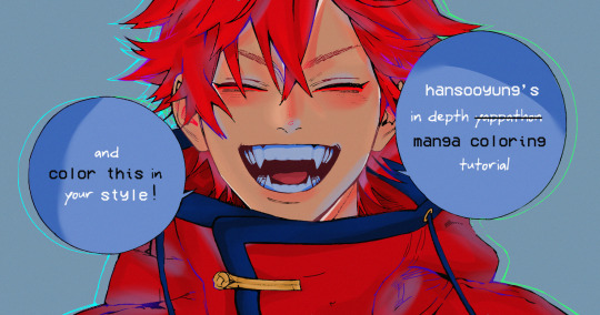
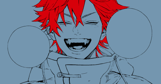
hansooyung's coloring tutorial & ctiys: alma time! 🍒
hello everyone! though i've been meaning to for a while, i've finally gotten around to making my first manga coloring tutorial! i'll be going over cleaning panels and screentones, choosing base colors, and finally shading and lighting.
this will also be a color this in your style challenge, so if you're willing, feel free to post your colored panel and tag me in it!! i'd love to see all the results :)
find details under the cut! 🦋
DISCLAIMERS:
this is just how i personally color! i know for a fact that some of my other friends follow other methods and have such beautiful colorings <33
for colors specifically, i play around a LOT. if you don't like your color scheme for the time being, mess around with it! i don't use psds since i like to mess around by hand with color palettes, but maybe i'll look into it for the future.
i explain a lot just bear with me gang 🙏
TECHNICAL STUFF:
software: ibis paint x (on iphone). i use ibis since it is FREE for all phones and it worked on my chromebook as well.
while this tutorial is made for ibis paint x, everything works on other softwares except the brushes, which i've provided alternatives for below.
brushes: i will be using dip pen (hard) which is automatically included with ibis, and two other brushes i made myself which you can find here and here. for more brushes, @/bkdkdh was incredibly helpful and posted her awesome set here!
for other softwares, you can use similar brushes. dip pen (hard) can just be the default brush, while wet edges is just the default brush on lowered opacity (and more of a rectangle/marker shape?). watercolor pencil is a watercolor brush in the rectangle/marker shape as well. if you can't get the shape, you can always smudge your lines into shape as well, so don't fret too much! a bunch of people only use one brush for coloring everything (which is insane to me, personally, they are so talented!)
fun fact: the first brush listed that i made was originally called "aki tao watercolor smooth" 👍
ok here we go guys!!
STEP ONE: CLEANING THE PANEL
i think of this part as setting up the panel for coloring! usually it's pretty exhausting cuz it's all b&w but it's all worth it i swear. the panel i'll be coloring is this beautiful one of alma from chapter 2:
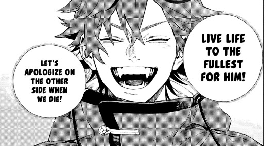
imgur link here (x)
a lot of people redraw their lines to avoid screentones, which is extremely helpful. however, i work on a phone and my fingers are not steady even with the stabilizer turned all the way up T~T. i do it this way, but a different (possibly easier) way may work for you!!!
your first step will be to remove all the white, giving us a transparent background to work with. THIS IS THE NUMBER ONE REASON WHY I USE IBIS PAINT X.
when you upload the image to ibis, a popup comes asking if you would like to "extract line drawing". this creates a lineart of your image. click yes, and your work is like 90% done.
if you're not on ibis, you can redraw your panel, put lineart layer on screen, etc. or you can just extract line drawing from ibis and upload to software of your choice
for those of you not on ibis, i've included the line drawing here (x) if it looks black, don't worry and set your background to white.
omg i was not kidding when i said i explained a lot. ok now onto the three main steps of cleaning the panel:
cleaning background
removing screentones
repainting black lines
for cleaning the background, we're going to clear off all the extraneous stuff. this includes the text in the speech bubble, the gradient screentones behind alma, and the panel line on the left side. just use your eraser tool and go crazy! (i forgot to save the panel at this point of the coloring OTL)
for removing screentones, we're going to remove all those "dots" that mangakas use for shading. these are used to show value for b&w art, but since we're coloring we don't need them—a lot of people have really cool ways of incorporating screentones in their colorings though, and it looks amazing! i used it on nana's hand in my bnha coloring.
remove the screentones from alma's hair and jacket with your eraser tool. this will take time, but it's worth it in the end!
for portions with a bunch of lines, you can create A NEW LAYER and redraw some of the lines. that way, you can erase indiscriminately from the original layer but the lines you drew are still there. again, like i said, my hand is really shaky so i don't do it a lot, but it's extremely helpful for smaller parts where i have control! i used this on alma's jacket, and here's a screenshot of the process:

(i made his jacket purple so i could distinguish between layers easily).
it should look like this when you're done:
for the final step of cleaning, i like to erase all the things colored black (the collar and strings of the jacket, along with the back part of his hair). that way, i can color them in with dark colors and it adds to the whole look of the coloring.
i've circled the parts i'm going to erase below:

and it should look like this when you're done!
ok everyone cheer we're ready to color now!!!!
STEP TWO: BASE COLORS
CROWD CHEERS ok lets go!
this part is the most important to me, because it sets the tone for the whole coloring. i like to use three-four main colors in my colorings, and it's usually background, skintone, hair, and the secret fourth color. the secret fourth color is usually whatever color fits the character's vibe, or if the character's color is the bg, it'll be an accent color.
for example, with my nagi coloring, i used white for the hair, i had my skintone, i had blue as the main coloring vibe (as nagi's color), and black as the accent color.
for alma, i chose his main color to be red! it's the color of his hair and his jacket, so i wanted it to be vibrant and stand out. since blue contrasts red, i went for a greyish-blue shade for the background. (i went for grey rather than solely blue because then it would clash rather than complement).
disclaimer please please please take your device off night mode warm mode f.lux whatever you have. this has screwed me over more times than you may think :(
i like to make my vibrant colors closer to the right end of the color square. for alma's hair, i chose this color:

i dragged it down from the corner a bit but kept the saturation since his hair is kind of dark. we can use vibrant colors to shade it though, so don't worry!
here's his hair and the background together:
now from here, play around with skintones until you find one that matches the hair!
i usually drag around the wheel to the orange-red intersection, and have it on the lighter, more saturated side. here's the color i chose for alma's skintone.
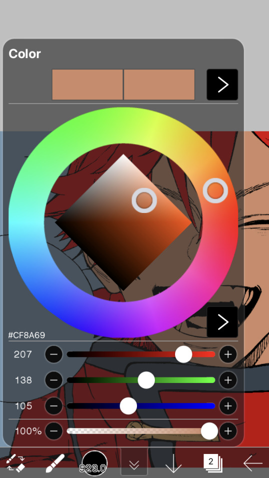
i thought his original skintone looked a bit too orange, so i pulled the saturation back a little bit (moved closer to the left side of the square).
after that, color in his jacket with a bit darker red than hair, choose a gold color for the accents on his jacket, and color in the black parts with a grey-ish color (we will change that later).
here's the base colors!
if it looks a bit bright, don't worry! we can change that with shading. or you might just have to. accept the light.
STEP THREE: SHADING AND LIGHTING
wooo we made it!!!!!!! ok now i lied, we have a bit more of base colors to go. on a layer above the skin, color in your teeth and tongue. for pieces that have a more red feel (like this one), i like to make the teeth and the shading a more vibrant blue color. (for blue pieces, i make it a purple!).
IMPORTANT NOTE: ALL SHADING AND ALL COLORS SHOULD BE DONE ON NEW, CLIPPED LAYER.

i'll then go in and do some light shading with my wet edges brush. i'll use a darker color for hard shadows and then a lighter, more vibrant color to accentuate it.
next up we have blush! a lot of people do this in very different ways but i like to do it directly under the eyes, in a vibrant red shade. make a new layer above the skin and clip it on. color pick alma's hair and drag it to the most saturated shade (red corner). then using the watercolor pencil brush, lower the opacity of the brush and drag a line under the eyes on both sides.
make sure to erase the portion of blush that goes above the eyeline. i also added some lips for alma as you can see, and then added a red line under the eyes! this was back to the regular dip pen (hard) brush on 100% opacity. it may take a few tries to get your blush to the way you want it, so don't worry too much.
now we can start our actual shading!
i break this part up into three steps: skin shading, blue shading, and light shading (highlights?)
for all of them, think about where the light is falling and how it will look on alma.
quick interlude about brushes: i use the watercolor pencil brush for softer, bouncy looks (like blush and noses) and i use the wet edges brush for more hard lines in shading.
again, make a new layer above the skin and clip it on. (i like to have it below the blush, so it doesn't cover it). for skin shading, i take the vibrant red and lower the opacity of the wet edges brush by a significant amount (specifics don't really matter, as long as you're happy with it). i'll trace his neck, from the shadow of his face, shadows of his hair falling on his face, ears, and nose. (for the nose i used the watercolor pencil brush for a softer look).

this is what i have once i'm done!
next we have skin shading part two, where we basically make a new layer on top of our first shading, lower the opacity further, and trace outside whatever we just did to blend it in more.

i used the watercolor pencil brush since it's more softer shading meant for blending! i also added it around the eyebrows for depth.
next up we have our blue shading! this is a technique that i learned from @/bkdkdh's colorings, but adding blue as a shadow really adds to the whole coloring. using the watercolor pencil brush, select a light-ish blue shade (a bit more saturated than background color) and use it to shadow a few more areas than your skin shading. i always make sure to hit the underside of the nose, cuz i think it adds depth!
finally, to wrap up our skin shading we have our lights. i use an orange-ish yellow color, which i set pretty light to not blend into the skin. using the watercolor pencil brush, i'll basically highlight any areas opposite to where the blue was, and highlight different parts. i always highlight one side of the nose as well.
i erased the line around the nose since we now have shading there, and added a darker shade to the teeth since i felt it wasn't shaded enough.
now onto the hair!!! (guys we're almost done bear with me, skin and hair are the two main things and then you can half-ass the clothes)
color pick alma's hair color, then drag the red a bit further down to get a darker yet still saturated color. here's mine:

then, using the wet edges brush, draw lines of shadow wherever clumps of his hair fall or overlap with each other. you can have the opacity set to whatever level you want, i just went with around 90. just try to follow the natural lines and patterns of the original line drawing, and everything should work out fine.

here's how mine looks! then, just like we did for skin shading, place a layer on top and lower the opacity to around 50%. place some more shading to blend it in. you can also shade more parts with this shade for some softer shading. i actually forgot to take a screenshot of this step but you'll see it in the next one!
for our (almost) last part of hair shading, take a layer and place it below both of your shading layers. this is going to be our highlight layer! you can see it below, labeled 49%.

remember how we set alma's hair a bit darker from the corner color? now select that corner color and draw highlights in the center of each hair clump.

lightly visible but it's there!
now here i skipped around a bit bc i was having fun and forgot i was doing a tutorial, but repeat the shading (not highlighting) steps with darker colors for alma's jacket. you should have your base layer, a dark shading, and a softer shading for blending.
we're almost there guys!!!
for the pretty much final step of shading, select a light blue color and do some blue shading with the watercolor pencil brush opposite to wherever your darker shading falls (just like we did on the face). make sure to do it to both your hair and your jacket! here's mine:
now for the black portions, we're going to color the whole thing in a dark blue color. just alpha lock your layer and make a big stroke of dark blue, almost black. for our black shading, we're actually going to go lighter.
select a lighter (but still dark) color and place highlights on the base layer, then take an even more vibrant, lighter blue and place it on the very outside for highlights. a better example of this would be nagi's legs in his blue lock uniform here. then, choose a shade to apply shading to the gold accents on alma's jacket and we're done!
CROWD CHEERS!!!!!
STEP FOUR: FINISHING TOUCHES
we made it guys!!!! for finishing touches, i'll usually do background effects or text or that kind of stuff.
step one is coloring your lines. you can add a new layer and clip it to your lineart, or simply alpha lock your lineart and color directly on top. for hair i like to add vibrant blue/purple lines, along with a few red ones. for skin lines i try to do dark brownish purples, but leaving some black is good too bc it adds flavor!
i colored in the text boxes and added shadows using the wet edge feature, then added some text. for the glitch effect, i duplicated the lineart, dragged the layer below all of my colors (including speech bubbles) and then used the glitch effect with height full from ibis. if you don't have ibis, you can look into features on your software, or you can also just drag your lineart layer a bit to either side and color it in. i also applied just the tiniest bit of noise on top of everything
and there we go!!!!! we made it to the end :)
if you've read all the way til here, thank you so much! if you decide to color this panel of alma (or any other panels!) don't be afraid to post them and tag me for a color this in your style type of thing! (you can also put it in my tracked tag, #user.roy) i'd love to see everyone's works :)
here's the full timelapse: (it stalls for a bit at some times but hey we can't have everything)
#roy colors#tutorials#manga coloring tutorial#useraki#usergojoana#usermica#usernikiforova#tagging some friends <3#alma#gokurakugai
77 notes
·
View notes
Text


It pains me when I see artists uploading process videos and they're painstakingly doing flats by hand with the brush tool. So here's my wrist/time saving method!
The number of pixels you want to expand by will vary based on the thickness/texture of your lineart (I usually do 2-4). Unfortunately this trick doesn't work well with very thin lineart.
For Part 2, you can also lock the bottom layer and use the paintbrush tool to add color in the corners if that's a look you prefer.
#art tutorial#lineart#flat colors#tutorial#i dont think this is necessary in manga studio because the fill tool works differently from what i remember but its a life saver in ps#ignore how ugly this is the info is the important part lol
50 notes
·
View notes
Text
SHOGUN RAIDEN EI! This is my fan art for the character of the game Genshin Impact, Shogun Raiden. I first drew it in Photoshop and then finished it in the Infinite Painter program.


#artists on tumblr#video games#illustration#design#small artist#art blog#my artwork#procreate#procreate art#illustrative art#digital artist#2d art#my art#anime and manga#anime#genshin impact#genshin fanart#fanart#raiden#raiden ei#drawing#digital illustration#digital drawing#digital art#art of tumblr#doodle#sketch#tutorial#anime art
24 notes
·
View notes
Text

✩ CARRD INSPO by LOVJBINI // © owner
like or reblog if you useㅤෆㅤ2024.
✎﹏ please, put “ © owner – tutorial by @lovjbini ” in the description if you use our tutorial!
CLICK HERE FOR TUTORIAL
#lovjbini#carrd#carrd.co#carrd co#carrd inspo#carrd tutorial#carrd template#carrd layout#carrd tutorials#carrd templates#carrd layouts#carrd theme#carrd themes#carrd design#carrd designs#carrd stuff#aesthetic#simple#website#white#wonyologist#laptop#computer#desktop#anime#anime and manga#manga#bungou stray dogs
45 notes
·
View notes
Text
#needle felting#diy#kawaii#needlecraft#embroidery#ducks#miniature#fieltro#felt#anime#ilustración#manga#tutorial#illustration
100 notes
·
View notes
Text
Made some fanart for Elixiers, Remedies and Redemption by @adel-memes!! First one‘s a little thing based on the very first moment of the fic because I love the mental image. My rendition of it not so much but that‘s my skill issue.

And this one‘s some lineart practice (that you can‘t see in the final product because of the background :/) with different versions because I was playing around with the opacity of the shading and unsure what colour the gratitude crystal should glow in


#lunavagans#four swords#four swords manga#four swords shadow#shadow link#not gonna tell you to go read it rn because i dont like when im told that#but i can recommend it#very cute slice of life fix it i love it a lot#definitely couldve out some more details into the shading with the latter#but then it never wouldve gotten anywhere#im in my ‘put advice from five minute drawing tutorials from yt into practice‘ era#and i think its paying off??#also self-compliment because those are necessary sometimes:#fuck i can do hands well
27 notes
·
View notes
Text
Levi Ackerman Eye Drawing
#artwork#art#artists on tumblr#my art#illustration#drawings#art process#art study#anime#anime and manga#anime art#anime fanart#manga#manga art#free!#attack on titan#eye drawing#drawing#sketch#drawing tutorial#art tutorial#art tips#art help#fanart#levi ackerman#levi aot#aot official art#captain levi
20 notes
·
View notes
Note
HII I LOVE UR BLOG SM ITS SO PRETTY😭❤️
I wanted to ask how you make your cute PNGs with no bg and the animated thin lines???
They’re so cute (T T)
Hi nonnie, thank you that's honestly so sweet of you!!! Sorry for the delay, I got a little busy and tried to see if there are any free sites you can use to make these. Before I get to the tutorials tho I’d like you to know that you can totally request animated dividers from me lol (I’ve taken a couple before here!) just send me a few hex codes / theme colors + bg / transition colors (optional) <33
Anywhoooo I use photoshop for everything but the tutorials below the cut have free-to-use friendly options (I believe!!) ++ I made a separate post for the animated thin lines because tumblr only lets me upload one video per post!!

Tutorial on how I make my banners <3

⟢ ┈ for this tutorial, you can use Photoshop (Paid) or GIMP (Free)
GIMP was my 'training ground' for photoshop lol and the tutorial is pretty much the same for both editors.
I use the wand tool to remove plain / obvious BGs and the pen tool to remove any stubborn parts that the wand tool can't detect (some people prefer masking but this is just how I like to do it)
++ YouTube tutorials are pretty much available for both tools, and unfortunately I don't think there's any way around learning how to use them + the pen tool might be a little tough to get the hang of at first, but you'll get there!
FYI, I tried to use a few 'free bg remover' sites and they don't really do the trick for me :c Canva Pro has one bg remover tool but I haven't tested it out for myself!
Here's a quick little vid lol, I used my darling Eliza as an example + it's sped up to 4x!! Tip: You may add a green (or any vibrant color) layer at the bottom just so you can clearly spot any "strays" (also, my apologies just bc this is a very rough clean up pffft)
After 'cleaning up' I like to color panels with my signature colors <33 I usually just add a color overlay (double click / right click the layer + select ‘blending options’) and play around with blend modes
FYI, some people use Picsart to color their banners but tbch, I played around with it once before and I really just have no patience for the tool I'm sorry ;-;

I'm using Vivid Light @ 50% opacity for this example (it's also more or less what I used for the one on my pinned)

The rest is really just about layering + framing!! (if you're happy with the colors of your panel, you can absolutely do everything else on Canva Free)
For my banners, I almost always use this heart shape I got off google:

For the heart layer itself, I set 'Fill' @ 0% and use the outer glow feature in blending options so it looks something like this: (it looks transparent now but it becomes more vibrant when uploaded)

Then I put my 'cleaned' PNGs inside the heart, crop / remove borders (using the wand tool!!!), add sparkles (totally randomly placed lol) or other brushes, add a BG if I want, and that's it! All that's left is to export as PNG <33
BUUUUT AT THE END OF THE DAY If cleaning up panels / images is too much work (I know it is lol), you can always try to look for 'transparent [keyword]’ (e.g., transparent manga) images / panels here on tumblr or on pinterest. Most of them are free to use anyway + recolored too!! That way you can edit them more liberally on sites like Canva (Free) that more or less have similar options.
#nani?!#nonnie chan ♡#!edits#banners#banner tutorial#theme resources#transparent png#manga panel#png#aesthetics
22 notes
·
View notes
Text
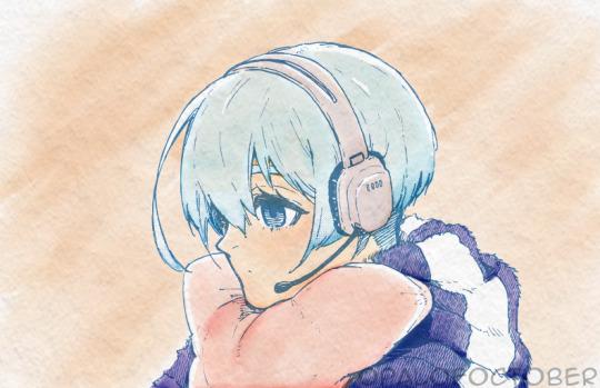
hiori in watercolor
#bllk#manga coloring#blue lock#bllkedit#bluelockedit#bllk hiori#hiori yo#fyeahanimanga#graphics-net#sportsanimedaily#fyeahsportsanime#anisource#autodesk sketchbook#opalofoctoberedits#i think calling the coloring style a watercolor is a VERY generous label#i just wanted to see if i could follow the tutorial i reblogged the other day#regardless i will be experimenting in this style in the future bc i really like it
89 notes
·
View notes
Last Seen Blogs

kkun17970
无标题
impossibleobservationkryptonite
What's going on here?

kkcinstitute
KKC Share Market Institute

number1-twmovie1080p
男兒王~年夏天線上看| 最新電影| 小鴨影音|

steddie-fic-recs
i haven't read fanfiction in 5 years