Statistics
We looked inside some of the posts by pyrorptrs and here's what we found interesting.
Average Info
Notes Per Post
102K
Likes Per Post
57K
Reblog Per Post
45K
Reply Per Post
146
Time Between Posts
1 month
Number of Posts By Type
Text
17
Last Seen Tumblr Blogs


Fun Fact
28.6 is the average number of monthly visits per US mobile user.

Text


Potami- @pyrorptrs
Hermes- @orchidhues
Frilled-Neck Slugcat- crow_does_art (artfight)
Nacho Cheese- neonyellowhazardsign (artfight)
Quill- @hotapplekai
Stella- @bluukio
Crossroads- Zipperpillar (artfight)
7 notes
·
View notes
Text


Oh, I can force Tumblr to look at my OC, I just remembered! Yay! I want to force people to look at my OC right now!
This is Amyra the Dreamweaver Dragon! (OC for the Spyro Reignited Series) She shepherds Dreamy Sheep, who are shorn to make special wool that THEN is made into special pajamas. Helps those who wear it sleep even better at night.
She is in a OC x Canon ship with Nestor the Artisan Dragon because he's very attractive and they would look very attractive together. But... I only ever drew them together once. Whoops. :) Lol. :)
306 notes
·
View notes
Text

Commission for @blazetbw-art ,
thank you very much for commissioning me!
73 notes
·
View notes
Text


COMMISSIONS OPEN!
Rules and FAQ
If anyone is interested and wants more information, DM or email me!
60 notes
·
View notes
Text
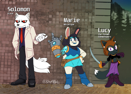
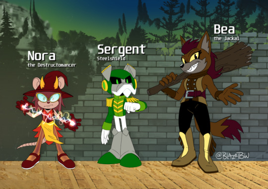
Did up some Sonic designs for a friend of mine's Sonic-based Pathfinder campaign for fun~
I'm not in on the campaign, but I wanted to tackle the text descriptions for fun since that's more or less all they had. Beyond that I had free reign to do whatever.
Info below the cut.
1st pic, left to right:
Solomon Black - Species: Fox (I attempted to lean more Tibetan in shape / expression) - Class: Scientist
Marie Méchanique - Species: Cyberbunny* (she was just a bunny until she lost the arm) - Class: Fighter
Lucy the Formerly Daemonsworn - Species: Fox - Class: Dual Swashbuckler & Rogue - I am told she has been freakishly powerful, at the time a full 2 levels ahead of her crew.
2nd pic, left to right:
Nora the Destructomancer - Species: Rat - Class: Witch* (who later got her horns)
Sergent Steelshield - Species: Dog Robian (he got his free will back) - Class: Fighter Bea the Jackal - Species: Jackal - Class: Barbarian
12 notes
·
View notes
Text
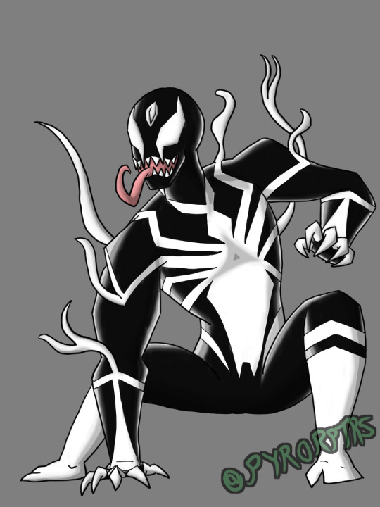
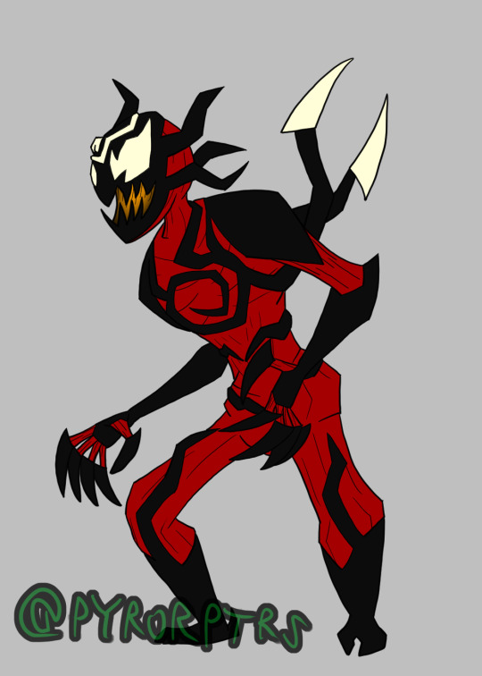
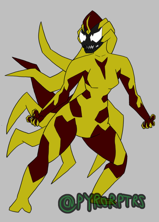
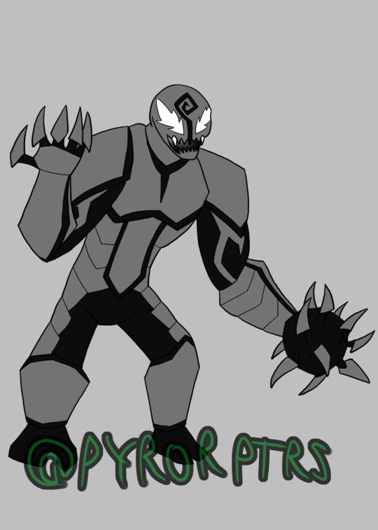
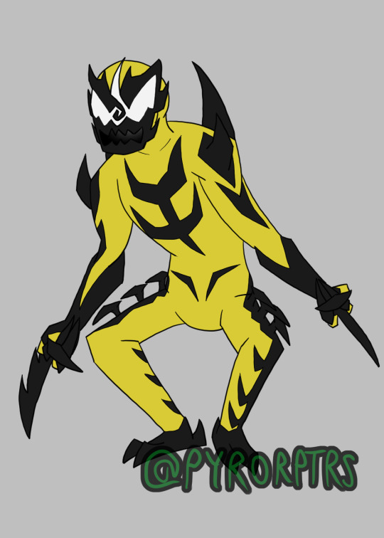
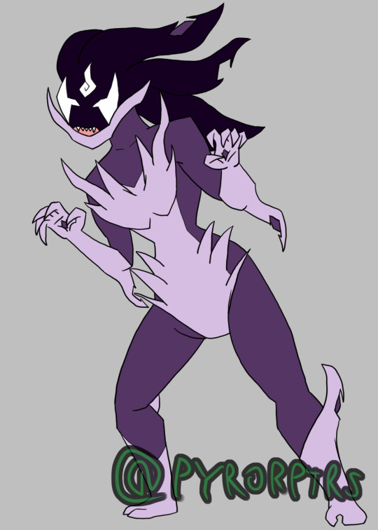
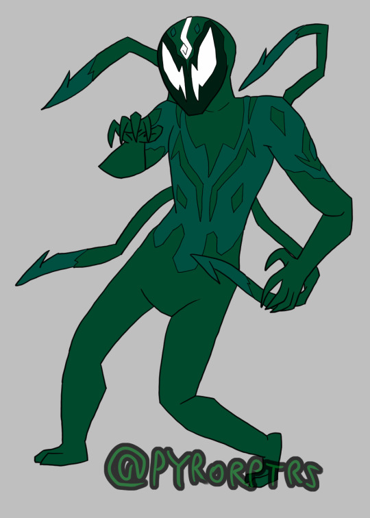
Symbiote Redesigns
Did redesigns of the first bunch of Symbiote characters from the 90's. Overall I tried to vary up their looks to make them look a bit more unique from one another beyond color and I tried to incorporate some more modern symbiote lore with the little swirls on their foreheads. In the comics; Symbiotes get their face covered by a swirl pattern when under the thrall of Knull and I wanted to make a reference to that while also making a joking jab at the concept of the Third Eye: the idea being that most people seek out to gain a third eye to become enlightened or get closer to God, while with the Knull swirl blocking the spot where it's supposed to be ironically does bring their respective host closer to A god while also robbing them of parts of themselves.
<b>Venom</b> - I did do a Symbiote Suit Spider-man beforehand, so Venom is obviously based heavily off of that design with some aspects exaggerated. The Spider is obviously exaggerated compared to the Spidey version with the legs stretching out throughout the body and the fangs wrapping around the neck, the idea being that it shows how attached Venom has become to Eddie Brock. The other white parts are also derived from some Spidey's OG suit. Finally the swirl on Venom's head is the most closed compared to the others to show that while Knull's influence has a way in, it currently isn't directly affecting him.
<b>Carnage</b> - Had the most fun with Carnage, but that's mostly because I have a very specific idea of how he should look. Firstly I tried to make him lanky and scrawny since I think that actually amps up his intimidation, the idea being that if you initially underestimate him because of his size compared to Venom, it makes it more surprising when you find out he's actually stronger. I tried to really incorporate the swirls not only into his head (with it being the most open compared to the others), but also having one wrap around and stretch out into other details on his chest. I also tried to make his fingers more blade-like to reference his tendency to make weapons more often than Venom. finally I added additional lines to his red bits to make it look more like exposed Muscle.
<b>Scream</b> - Probably the most recognizable Symbiote out of the Life Foundation batch. Not much to say with her since I really like her og design, so it's more of a restyle. Obviously I incorporated the swirl into her head like the others, but I also tried to make the breaks in the yellow part of her coloring more angular to make her easier to redraw in the future.
<b>Riot</b> - Riot was probably the most boring out of the Life Foundation Symbiotes, just being Venom but grey with different shaped eyes, so I tried to make a few changes here and there to help him stand out more. Outside of the swirl, which I tried to incorporate into his mouth, and emphasizing his different eye shapes, I also tried to give him a more armored look to reference his original role as a sort of super guard for the Life foundation. I also tried to reference the originals preference towards blunt weapongs by having one of his hands shapeshifted into a mace.
<b>Phage</b> - Phage was one of the harder ones to do since he doesn't have a lot of unique details, and his tendencies to use bladed weapons, make him a bit too similar to carnage. Outside of the swirl, I tried to make the Blades more of an actual part of his design by having a notably large one on each hand where the the middle and ring fingers would usually be. I also turned the black shading into more of an actual black patterning on the Symbiote itself.
<b>Agony</b> - I tried to combine both Agony's original comic look and the brief version we saw during Absolute Carnage. Adding the Lavender color from the latter while using the former as a primary base for the design.
<b>Lasher</b> - Like Scream, I really like Lasher's original design, so he was more of a restyle than a straight up redesign. obviously added the swirl and tried to keep the colors, but I also tried to come up with a different pattern for his main color to poke through the teal on his torso.
#marvel comics#venom symbiote#Venom#Carnage#Scream#Riot#Phage#Agony#Lasher#Symbiote#symbiote suit#carnage symbiote
13 notes
·
View notes
Text
Emmie's mute, but she's got some pretty expressive horns.
...hey where did you get that one
1K notes
·
View notes
Text
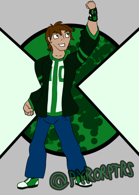
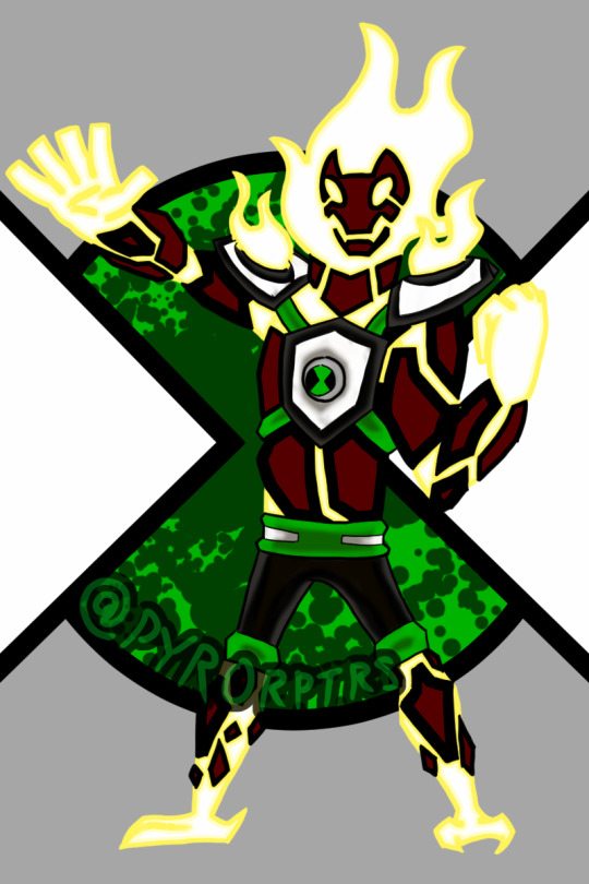
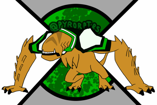
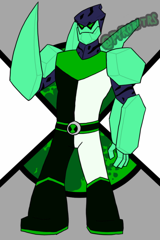
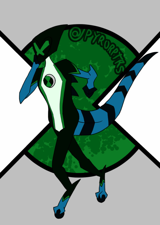
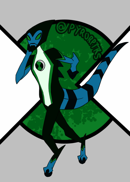
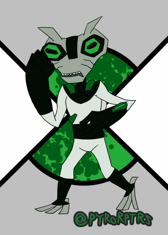
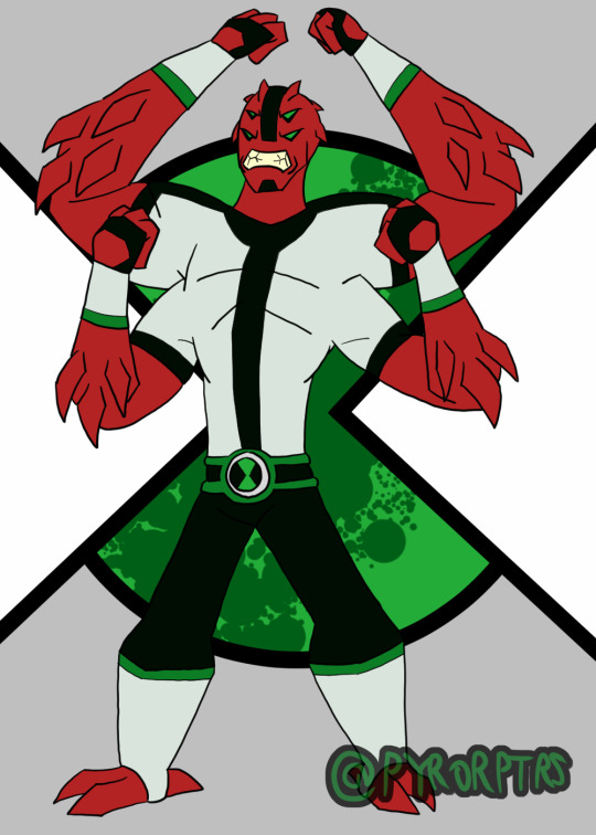
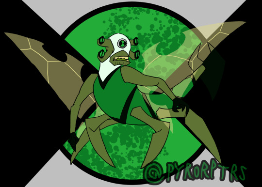
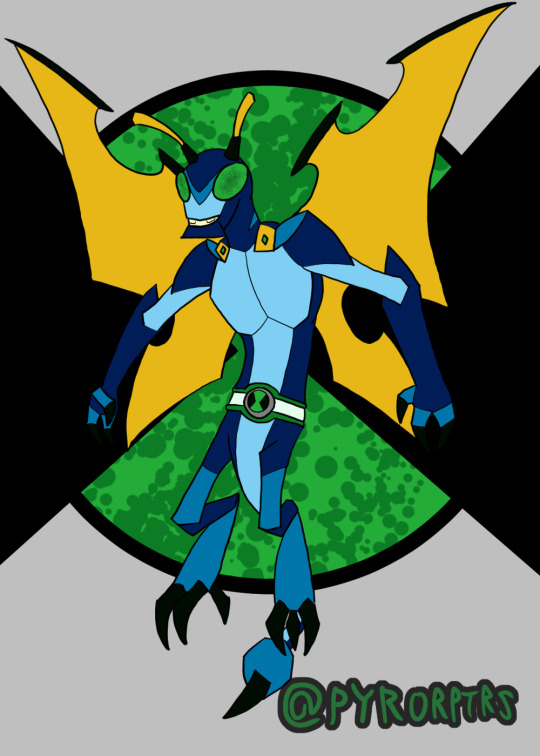
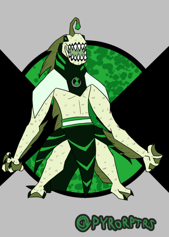
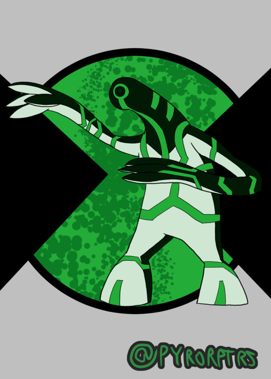
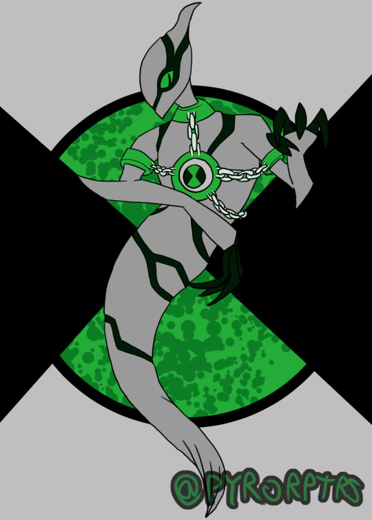
Ben 10 Redesigns Playlist 1
Did redesigns of Ben's first 10 aliens awhile back.
I think Ben 10 designs as a whole work best when you have a specific color scheme to work with, so I tried to incorporate green as the primary with a greenish shade of black and white as the secondary's and highlights. I also made it a rule that unless the alien has some way to properly incorporate the omnitrix into the body, they need some sort of suit or device on them to house the badge
Ben - Honestly doing a design for Ben is kinda hard to do, most of the better takes you can do were done by the original canon and the fandom at large have pretty much filled out the rest. I think the soccer shirt with stripe down the middle is probably the most iconic part of his design, so I tried to incorporate that with his undershirt while messing with the colors. Took some inspiration from both the jackets he wore in the past for his hoodie. Coming up with an Omnitrix design was probably the hardest bit, I'm not a fan of when it looks like a normal watch, but addign too much detailing it can make it a pain to redraw, so I tried finding something simplistic but still kinda techy..
Heatblast - In terms of overall design I tried leaning towards Omniverse, but I also wanted to lean a bit into the 10,000 design from the OG series with the shoulder pauldrons. The reason why I gave him shoulder pads is that I like both the ideas that the aliens grow with ben and that they're the "peak of their species"; which isn't necessarily a good thing. so the shoulder pads act like kind of like "braces" for the shoulder pauldrons since the flames burn more intensely than on other Pyronites.
Wildmutt - Went with a mix of his OG and OV looks with a bit of 10,000 influence to make him look older. I feel his shoulder pad is kind of iconic to his design, so I tried to incorporate it and a similar one on his right shoulder into his suit. I also used the collar idea from OV to round out his suit, with the rest extending over his back since Wildmutt tended to be used as a mount a lot. Finally the stripes and tail are nods to his 10,000 design.
Diamondad - I honestly feel a bit bad for anyone that has to do a design for Diamondhead, because he has such a solid look. Nonetheless I tried to come up with a decent look for him. His OG split outfit look is easy his best suit design, so I wanted to use that as a primary inspiration, but I also liked the the collar that the reboot version had, so I wanted to call back to that. I also liked the earth look he sported in UAF and wanted to take some inspiration from that as well.
XLR8 - Similar deal to Diamondhead, XLR8 just has a solid design, so really was more about adding a couple personal tweaks here and there for personal taste. Did add the back spikes from the reboot version though
Greymatter - I always thought his suits looked like hazmat suits so I wanted to lean into that with his redesign, making it look a bit more techy. I also added some of those falangy thingies other older Galvans tend to have in order to make him look a bit older too.
Fourarms - Another case where the OG design was just so good that it's hard really do another take to it that doesn't amount to personal preference. I obviously used the OG look as a base for the suit and face (mostly because I didn't like the ponytail on UAF or the Goatee on OV), but I also added a belt and bracers on his arms on the arms to spice things up. Finally made his spikes more prominent to make him look a bit older.
Stinkfly - I'll bring up the second design I did in a minute, but for the more classic Stinkfly I leaned toward OV in terms of general proportions and colors, but I also wanted to call back to his OG design with his head being a different color from the rest of his suit.
Slopfly - Obviously this is based primarily off of the design from the reboot, which I have mixed feelings about. Didn't like the almost exclusively humanoid look, so I tried to make him look much more insectoid with more prominent Dragonfly aspects and a bit of Hornet thrown in too. Lore wise, I like to think of his as being from the same planet, but an evolutionary offshoot; think of it like the difference of an ant vs a bee. Overall I tried to make them different, despite basically being the same character. My idea is that classic stinkfly is a bit hardier and can use his claws and stingers more offensively, while "slopfly" as I call him is a bit weaker, but can more effectively use his slime.
Ripjaws - I liked the way OV handled him and wanted to push that more monstrous look a bit further. In terms of his suit, I wanted to add a rebreather so he doesn't immediately start to suffocate, but still kept that weakness.
Upgrade - I lean very hard into Classic as far as my fav designs for him go and wanted to keep that sort of feeling. So I tried to keep his general body shape that same sort of gloppy look he used to sport before OV bulked him up. I also tried to keep the high contrast color he used to sport since I feel it helped his circuitry pattern stand out more.
Ghostfreak -Honestly both easy and hard to come up with a ghostfreak design; their are good aspects in every design, but something also holding them back. I did ultimately lean more toward OV in terms of the overall look, but I also tried to streamline some bits and included the claws from his unskinned form
#ben 10#heatblast#wildmutt#Diamondhead#xlr8#Greymatter#Fourarms#Stinkfly#Slopfly#Ripjaws#Upgrade#Ghostfreak#redesigns
7 notes
·
View notes
Text
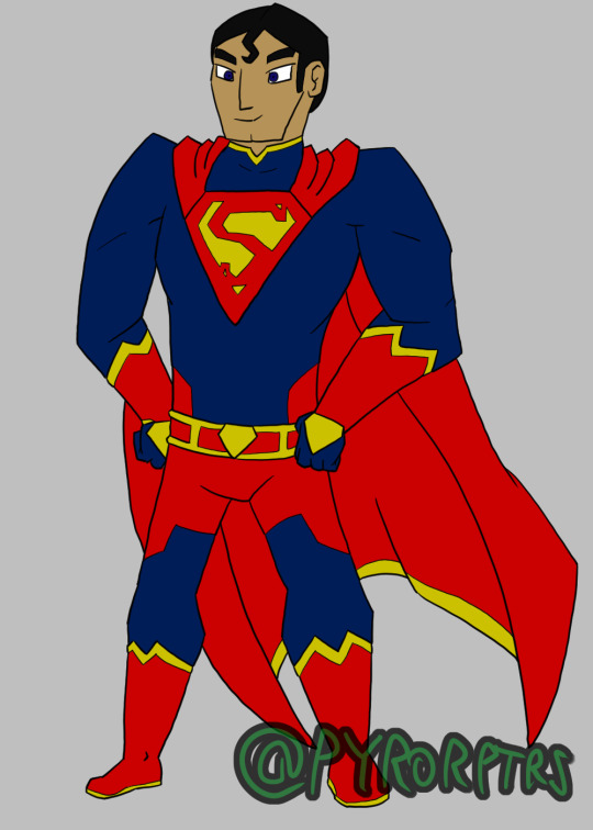
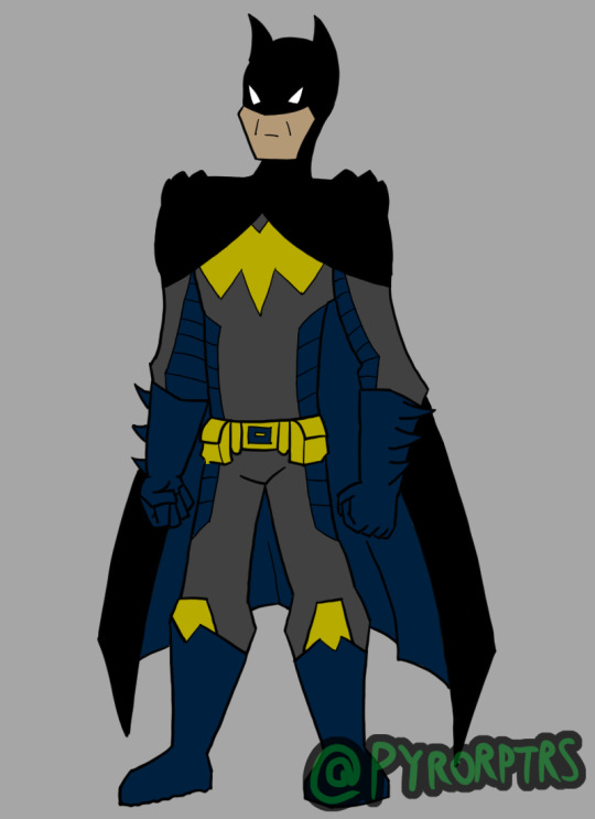
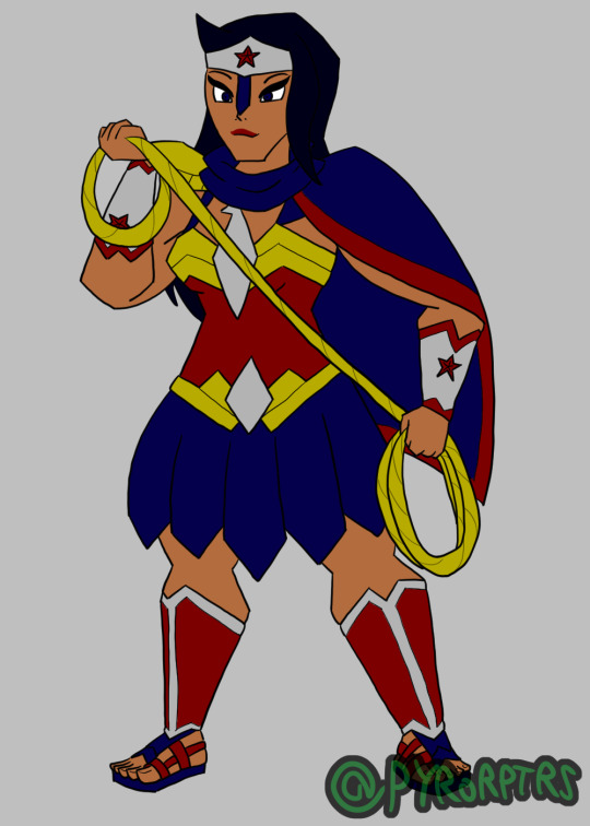
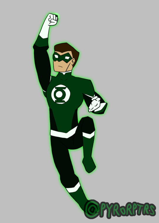
<h1>Justice League Redesigns</h1>
My takes on initial Justice League designs, specifically the founding members!
Superman - Did my initial drawing of this design a year or so ago, so my memories on why I used certain aspects might be a bit fuzzy. Not a fan of how the New 52 and DCEU had been limiting Supes suit down to just a blue suit, a red cape, and maybe a belt, so I wanted to incorporate more of a classic look to him. So I added red trimming to the "shirt" to help give him a more bulked up look and made the usually trunks more of a pattern on the pants. I also gave him proper gloves since it seems weird that an investigative reporter wouldn't consider leaving fingerprints behind a bit of a problem (especially since a good chunk of his villains are super intelligent). I wanted to incorporated his cape into his symbol since it always seems odd to me when it's just drawn on top of his shoulders. I also tried to incorporate the diamond shape of his symbol on other parts of his suit like on the back of his gloves and his belt buckle. Yellow seems to kind of come and go in his pallet, so I figured if I was going to use it, so I tried to incorporate it as a more regular detailing throughout the suit, further color blocking his gloves, boots, and belt.
Batman - While Batman's colors tend to lean more into Greys and Blacks with maybe some yellow for detailing, I do like the darker Blue he used to sport in the comics and wanted to incorporate it while keep the later; so I used it not only for his gloves and boots and to line his cape, but I also gave him some extra padding on his costume that can double as storage for extra gadgets or to store evidence. I made his bat-symbol notably large and yellow since canonically it's typically reinforced to act as a false bullseye for grunts and tried to keep it somewhat squared off to standout from other bat-family members. Finally I tried to make his utility belt kinda boxy and bulky since it's usually a focus on a lot of his designs.
Wonder Woman - Took inspiration from a few different sources for my take on a Wonder Woman. I took a lot of inspiration from the DCEU version for the basic shape of the outfit, particularly the bracers/aegis, her sandles and grieves, the skirt, and how I shaped out her top. Gave her shoulder pads like the DCSHG version and tried to incorporate a bit of that blue hue into her hair. I also like the cape/shaw thing that the Arkhamverse version had and tried doing something similar. finally I tried to make her tiara a bit more armored to lean even more into her warrior princess look (plus I don't think she's used it as a weapon since the Super Friends days). I also tried to give her more of a tan to lean into her greek heritage.
Green Lantern 1 - Every JL needs a Lantern and since Hal Jordan is usually the first I figured I'd get him out of the way. Not much to say, mostly went with his more classic look, but updating it a bit to spread the white in his costume out a bit more.
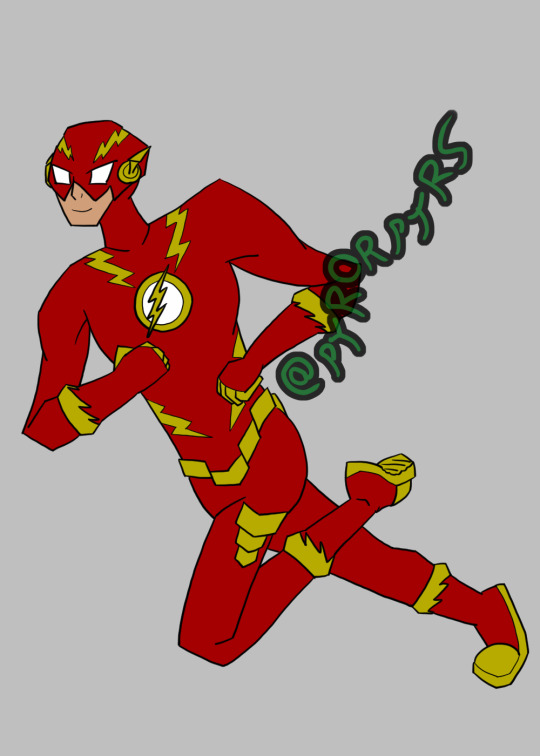
Flash - Tried to add and change a few details on my take of a Barry Allen Flash, so that I can do a couple takes on Wally West versions when/if I get to him. kept that classic lightning lining on his boots and gloves and tried to incorporate another lightning pattern on his chest and helmet. I also tried to keep his boots and gloves predominantly red to further separate him from the classic Wally Flash suit, but still included some yellow bits to help highlight his hands and feet. I did try to make his cowl look like it's made of a harder material, but tried to avoid making it look TOO much like a helmet. I also added made the ear-dealies simple straight lines since I think it works better for Barry. finally I made the belt made out of simple rectangular shapes offset to get that lightning look without having it be actually lightning and also included them on his sides as pockets for proteins bars and such
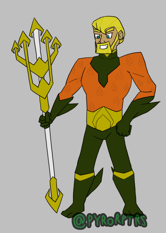
Aquaman - I leaned heavily into taking inspiration from the BtBatB version of Aquaman for my take since I hate how hard a lot of other creators try to make him "cool". though since the Aquaman movie represented the orange part as "armor" I did also try to lean into that as well.
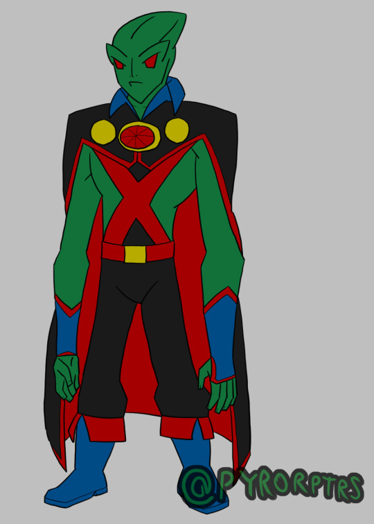
Martian Manhunter - Like Wonder Woman I took a lot of inspiration from all over the place for Martian Manhunter. I tried to take some DCAU inspiration for his face, Took some influence from the modern comics and Injustice for his general costume plus the symbol, I also tried to elongate his head like some of the mid-2000's-mid-2010's animated movies. I did also try to keep some of his classic blue mixed in with the black so it doesn't get as boring as it can get in some interpretations. finally I tried to make him a bit more gangly in terms of proportions to lean into his alien origins a bit more.
#justice league#superman#clark kent#batman#bruce wayne#wonder woman#diana prince#diana of themyscira#green lantern#hal jordan#the flash#flash#barry allen#aquaman#arthur curry#martian manhunter#jhon jhonzz#dc comics#dc universe#dc fanart
20 notes
·
View notes
Text
#King Laverneous Rage#Rex#King#Laverneous#Rage#tyrannosaurus#Victor#frilled shark#Shark#Kingdom of Rage#KoR#buzz lightyear of star command#Zurg#evil emperor zurg
6 notes
·
View notes
Text
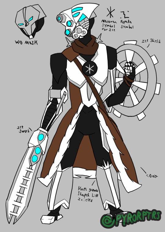
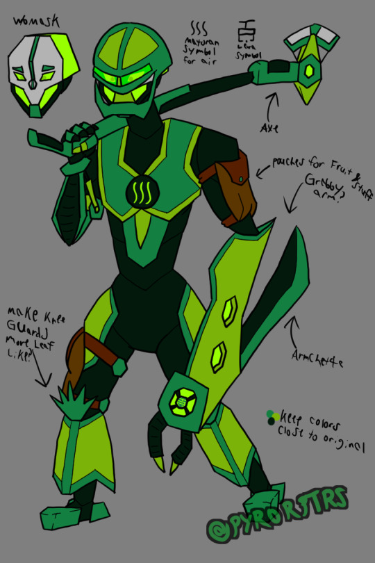
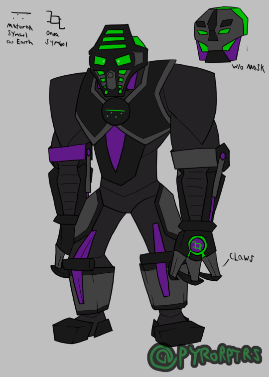
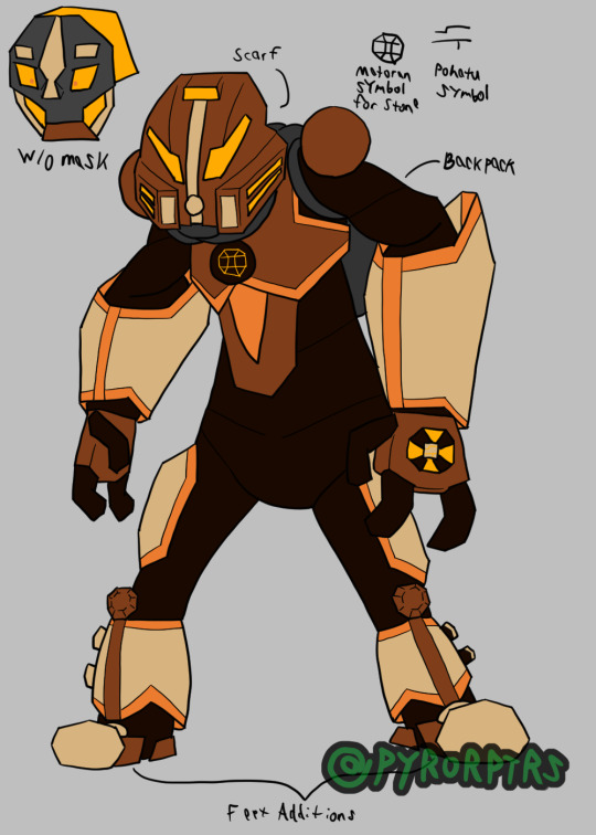
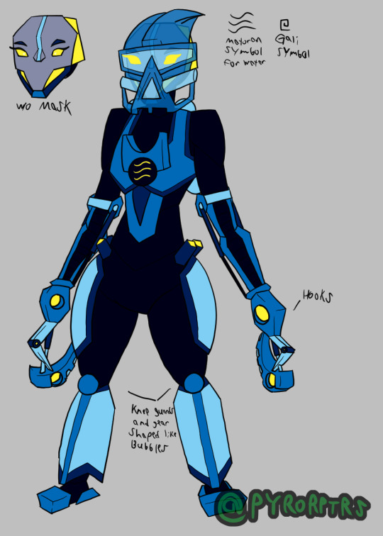
Awhile back I did my own redesign of the Toa Mata from Bionicle. Mostly just trying to find a way to draw them without having to keep the toys permanently on hand for reference and a bit more streamlined to make them easier to draw in general. As far as universal details go, I gave them a segmented body template to lean into the biomechanical aspect of them, I also tried to find a consistent way to draw some of the more common limbs they had. I also tried to play with the gears on the back by giving each of them something unique and tried to give them unique kneeguards. I also tried to incorporate the orbs they had their chest by incorporating their elements matoran symbols into them
Tahu - Tahu served as kind of the template for the others, so he's probably the most standard out of them. I wanted to stick primarily with his original colors so made the bright red and orange the most prominent colors on him, but I also used the dark red he sported later as an accent color for more color blocking. His sword is based more on the Bionicle Heroes interpretation of it, though I may change that if I ever redraw this design. His left arm was never really stated to be anything, so I tried to purpose it as a sort of Aegis; it still matches his more aggressive personality, but also gives it a more utility. I also modeled his back gear after exhaust pipes to relate towards his element. Though it probably won't be seen that much, I did try to define his head too, making it kinda broad; specifically basing the heads off a combination of the originals, the glatorian heads from the end of the original line, and the heads from the reboot.
Kopaka - Since Toa of Ice tend to stick around cold places, I incorporated a bit of a coat into his armor for insulation. His sword also draws some inspiration from the Heroes version, but it also still works like his toy. His left arm was a bit awkward so I limited the armor to mostly just his bicep, I also tried to make the shield look like a snowflake on top of the radar dish look it obviously was piece wise. Kopaka was also one of the few toa consistently depicted is hauling around the McGuffins for whatever saga they're directly involved in, so I gave him a satchel to call back to that. His back gear is directly modeled after a snowflake like his shield, but a bit more obviously. I also tried to make his kneeguards resemble icicles. I tried to give his head a sharper look to call back to his cold and distant personality.
Lewa - Tried to make Lewa look a bit more lanky compared to the others since he's supposed to be the resident tree swinger. His axe leans more towards the original, but I still tried to incorporate aspects of the heroes version for fun. I tried to make his left arm a big grabby arm since most people turn it into a gun or something, but BlazeTBW thought it looked like a machete so I incorporated a fold-our arm blade to help him cut up vines and foliage as he swings around. His kneeguards are supposed to look like palm leaves but I'm not satisfied with how they turned out. I also gave him a few pouches since I figured he's want to keep a few snacks on hand or maybe even swipe a souvenir here and there.
Onua - Tried to make Onua look pretty broad since he's supposed to be strong even without his mask buffing him. Unfortunately his monochromatic color scheme can make things hard to color block, so I threw in some purple from his G2 version in order to help highlight some parts of his body. obviously made his claws his actual hands. I also did something a bit different with his legs sinw his original toy had them flipped around to bulk them, so I tried leaning into that while also making it look like a heavy duty hinge. I also tried to make his head particularly broad too.
Pohatu - Pohatu was pretty different from the original toa in that his torso was flipped around to make him more bottom heavy, so I tried to call back to that with his body shape. I also took inspiration from the toys arms to make them bigger than the others. I did include the two orbs on his shoulders, but recolored them to make them different from the chest one and included the extra pins on the leg. Since Toa of Stone live in the dessert I gave him a scarf to wrap around his head for sandstorms and gave him a decently sized backpack since he's also been happy to regale his own adventures (so it works for holding souvenirs). His kneeguards are based on boulders. I also inlcluded the orange his Phnatoka version sported to highlight parts of his armor
Gali - Obviously Gali's body is mostly just a female version of the standard one I came up with. I did call back to the pins her original toy had in her hips and I incorporated the mata hand into the chest orb I try to include on all of them. Her hooks are intended to slip onto her hands more-so than replace them. Her back-gear and kneeguards are also based on a bunch of bubbles. finally I incorporated her Mistaka colors as a highlight to add more color blocking.
#Bionicle#Toa#Mata#Tahu#Fire#Kopaka#Ice#Lewa#Air#Onua#Earth#Pohatu#Stone#Gali#Water#Hau#Akaku#Miru#Pakari#Kakama#Kaukau
49 notes
·
View notes


Text

Made a basic lil' ref for me gremlin, "The Syphon" or Sy for short.
16 notes
·
View notes
Text
39K notes
·
View notes