
sugar Sometimes | PT/ENG | Communication & Graphic Design | Draws Rarely | Hello! ❤️💛
Don't wanna be here? Send us removal request.
Statistics
We looked inside some of the posts by sugarbydesign and here's what we found interesting.
Average Info
Notes Per Post
115
Likes Per Post
75
Reblog Per Post
40
Reply Per Post
0
Time Between Posts
28 days
Number of Posts By Type
Text
17
Last Seen Tumblr Blogs


Fun Fact
Tumblr Inc. is using 66 technologies for its website.
Text
Links!
#pinned#will probably add more detail to this eventually#as well as change appearances on that card. still working on it
0 notes
Text


youtube
Durante os primeiros meses de 2023, estive à procura de emprego. Algumas candidaturas pediam “exercícios” para avaliar a aptidão do candidato. No caso da IRIS, foi-me pedido para desenvolver uma apresentação de cinco slides sobre o grupo. Como era uma apresentação pequena, achei que iria beneficiar de transições e animações discretas. A informação apresentada e imagens utilizadas foram levantadas do website. Baseei também a aparência da apresentação no mesmo, para que a comunicação visual fosse coesa.
During the first few months of 2023, I was looking for a job. Some applications asked for "exercises" to assess the candidate's aptitude. In the case of IRIS, I was asked to develop a five-slide presentation about the group. As it was a short presentation, I thought it would benefit from discreet transitions and animations. The information presented and images used were taken from the website. I also based the look of the presentation on it, so that the visual communication was cohesive.
* IRIS. Thank you for calling me back, though I had already found work somewhere else.
* "Aerosol of my Love" Kevin MacLeod (incompetech.com) Licensed under Creative Commons: By Attribution 4.0 License http://creativecommons.org/licenses/by/4.0/
THANK YOU FOR VIEWING
#2023#march 2023#powerpoint#(<- not really but i dont remember)#design#presentation#presentation design#iris#graphic design#Youtube
1 note
·
View note
Text
On update 0.121i, launched in December 25th of 2023 by Nabisae, my wallpaper was added - it is #504.
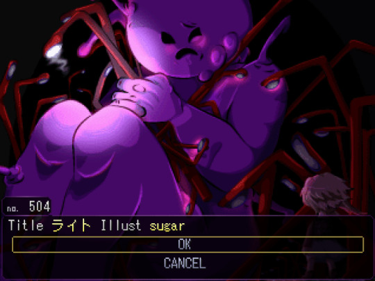
You can obtain it by finding this character inside Dream Pool. Thank you, and have a nice dream!
Streetlight Thief from Yume 2kki. I stumbled onto this room on accident way back then, and finally got around to finishing this! I also submitted it to be in the game, but who knows.
I used pixel/smooth contrast between The Guy and the rest, but it's only viewable here, since the resizing would either anti-aliase it or aliase it, but not both. it's fine. I'm not bitter.
THANK YOU FOR VIEWING
52 notes
·
View notes
Text


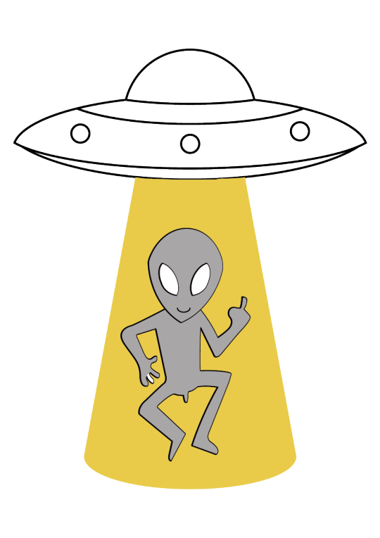

Há uns anos atrás encontrei esta t-shirt a vender na feira, sem saber de onde veio ou quem a fez. Agora que a mesma está nas últimas, decidi recriar o desenho estampado (para o estampar noutra t-shirt, claro). Há três versões: a “original”, com erros de impressão (true original) e com cores extra. As diferenças principais entre esta recriação e a original são a forma da luz do OVNI e as proporções do aliene. Como tecnicamente o desenho não é meu estão à vontade de fazer o que quiserem com estas imagens.
A few years ago I found this t-shirt selling at a market, without knowing where it came from or who created it. Now that the same t-shirt is on its last legs, I decided to recreate the drawing on it (to put on another t-shirt, of course). There are three versions: the “original”, printing errors (true original) and with extra colors. The main differences between this recreation and the original are the UFO’s beam shape and the alien proportions. Since this technically isn’t my drawing you’re free to do whatever with these images.
* Draw on September 8th, 2022.
* Thank you to the guy who sold me this for 3,50€.
THANK YOU FOR VIEWING
#illustration#2022#september 2022#illustrator#alien#middle finger#transparent#artists on tumblr#graphic design#t shirt#vector
5 notes
·
View notes
Text


A minha mãe usou a mesma capa de argolas durante o seu percurso escolar, decorando-a com recortes de celebridades de revistas, e guardou-a até o ano passado. Porque não lhe dava mais uso decidiu que a ia pôr ao lixo e, porque eu gostei da dedicação a este “projeto” decidi fotografar a capa para preservação, prática (de fotografia) e apresentação básica de produto. Quis ter a certeza que todos os recortes eram visíveis. As fotos foram tiradas e editadas em setembro de 2022.
My mom has used the same binder through her school years, decorating it with magazine cut outs of celebrities, and kept it stored away until last year. Because she saw no use to it anymore she went to through it away and, because i admired the dedication to this “project” I photographed it for preservation, (photo) practice and basic product display. I wanted to make sure all the cut outs were visible. Photos taken and edited in September 2022.
* Thank you to my mom for lending me her binder. Despite her wanting to throw it out, it’s still around due to sentimental value.
THANK YOU FOR VIEWING
#photography#photoshop#canon eos 1300d#september 2022#2022#practice#binder#90s#celebrity#cut outs#handmade#product
1 note
·
View note
Text
Ninguém nasce ensinado: experienciar a diferença como ação construtiva do design de comunicação
THANK YOU FOR VIEWING
#tumblr already treats me badly bc of my long posts (doesn't let me edit them after posting) so in this particular case its better like this)#sources: trust me bro#link#behance#ria.ua#dissertation#masters degree#graphic design#awareness campaign#autism#actually autistic#illustration#illustrator#digital#photoshop#indesign#thesis#2020#2021#university
3 notes
·
View notes
Text
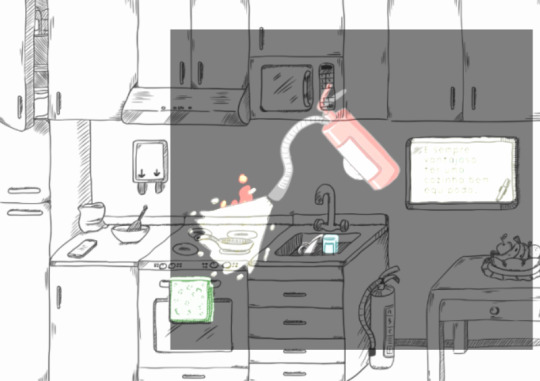
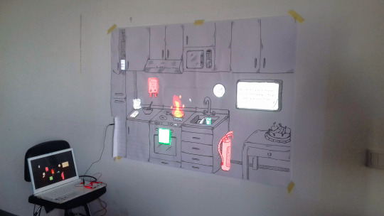
Combate a Incêndio | Programming, Interaction Design
youtube
Este foi um projeto de programação básica em Processing e Arduino (mais tarde trocado pelo Makey Makey para facilitar testes), com ainda vídeo mapping, ilustração e animação. Consiste num exercício de combate a incêndio caseiro, com um caso de incêndio de óleo. Todo o exercício foi inspirado no meu treino de bombeiro voluntário. O projeto tem duas componentes principais. No cenário da cozinha. os objetos interativos encontram-se assinalados com tinta condutora elétrica, escondida atrás da ilustração. Pintam-se caminhos com a tinta que se ligam aos cabos do hardware, permitindo a interação. Na projeção encontra-se o programa em si; temos o incêndio em fase inicial e os vários objetos que podemos utilizar iluminados. Quando um objeto é escolhido a animação (que inclui efeitos sonoros) prossegue e explica se foi uma boa ou má decisão. Apesar de o exercício nunca terminar, existe uma fase em que usar o objeto errado piora o fogo e limita as opções disponíveis. Este projeto foi desenvolvido entre os últimos meses de 2019 e janeiro de 2020.
This was a project about basic programming in Processing and Arduino (later exchanged for Makey Makey for faster testing), as well as video mapping, illustration and animation. It consists in a fire fighting exercise inspired from my time as a volunteer firefighter. The project has two main components: In the kitchen set, the interactive objects are signaled with conductive ink, hidden behind the main illustration. Paths are painted with the ink that connect to the cables of the hardware, allowing the interaction. In the projection, we find the actual program; the fire in an initial phase and the various objects that can be used are highlighted. When an object is chosen the animation (that includes sound effects) progresses and explains if it was a good or a bad decision. Despite the exercise never ending, there is a phase where using the wrong object makes the fire worse and limits the options available. This project was developed between the last quarter of 2019 and January of 2020.
* Video can also be seen on Behance here.
* Thank you to teachers Mário Vairinhos and Vasco Branco.
THANK YOU FOR VIEWING
#video#programming#program#firefighting#2019#2020#processing#arduino#makey makey#illustration#digital#illustrator#premiere pro#animation#exercise#university#Youtube
1 note
·
View note
Text
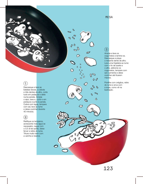
Creme de Batata-doce com Salteado de Cogumelos (Sweet Potato Cream with Sauteed Mushrooms)
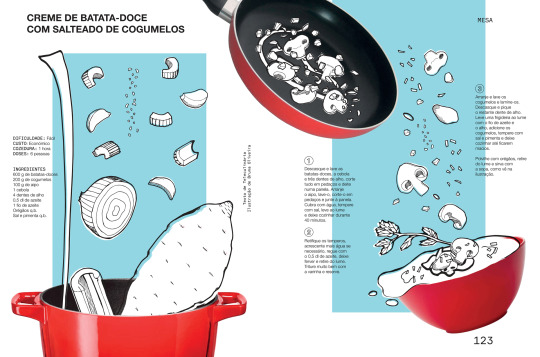
Neste exercício foi nos pedido para ilustrar uma receita para uma revista à nossa escolha e todo o design tinha de ser em concordância com as estéticas da revista escolhida. Escolhi “A nossa PRIMA”, da Visão. Os ingredientes foram desenhados tradicionalmente e depois vetorizados. Inspirado pela secção de moda da PRIMA, as cores principais são fornecidas pelo fundo e pelos utensílios. Este projeto foi desenhado no último semestre de 2019.
In this exercise we had to illustrate a recipe for a magazine of our choosing, and the full design had to be in agreement with the rest of the magazine’s aesthetics. I chose Visão’s “A nossa PRIMA”. The ingredients were drawn traditionally and then vectorized. Inspired by the fashion section of PRIMA, the main colors are provided by the background and by the utensils. This project was drawn in the last quarter of 2019.
Separated Pages

* Recipe from Teleculinária.
* Thank you to teacher Joana Quental.
THANK YOU FOR VIEWING
#artists on tumblr#designers on tumblr#graphic design#illustration#mixed media#collage#2019#food#recipe#illustrator#photoshop#digital#traditional#prima#a nossa prima#visão
5 notes
·
View notes
Text
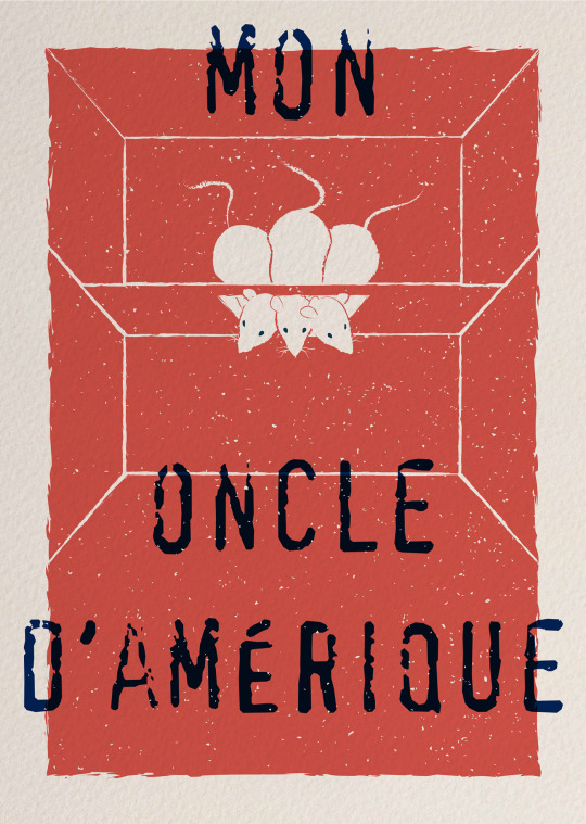
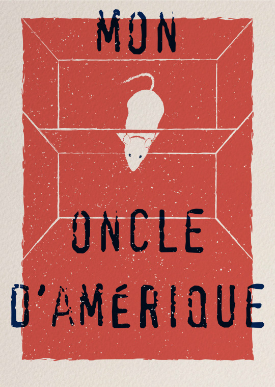
Affiche Mon oncle d’Amérique | Illustration, Poster
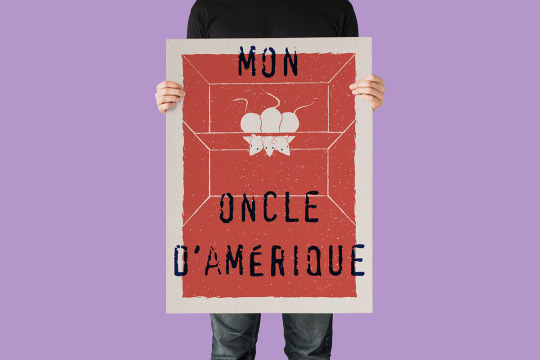
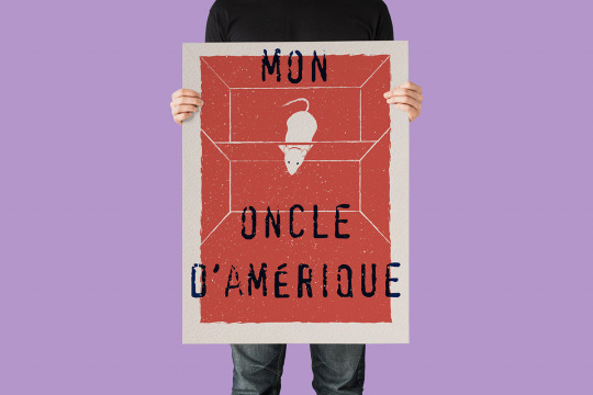
Dois cartazes para promover o filme francês de Alain Resnais e Jean Gruault, de 1980. Por ser um filme antigo, as características de impressão serigráfica e desgaste foram imitadas na estética. Foram desenhados nos últimos meses de 2018. No primeiro cartaz, os três ratos de laboratório tentam passar pelo arco da sua caixa ao mesmo tempo, representando as três personagens principais na sua luta por dominância da sua própria vida, a serem observadas pelo narrador. O segundo cartaz contém apenas um rato, mais leal às imagens do filme e a representar, em geral, as decisões críticas que mudaram o rumo da vida das personagens.
Two posters to promote the french 1980 movie by Alain Resnais and Jean Gruault. Because it’s an old movie, details of screen printing and wear & tear were mimicked in the posters’ aesthetic. They were drawn in the last months of 2018. In the first one, three lab rats try to pass the arch of their box at the same time, representing the fight for dominance of their own lives, while being observed by the narrator. The second poster only has one rat, more loyal to the movie’s imagery and representing, in general, the life changing, critical decisions of the characters.
* Thank you to teachers Álvaro Sousa and Francisco Providência.
* Grain textures by Spoon Graphics.
* Mockup by Dribble Graphics.
THANK YOU FOR VIEWING
#Mon oncle d’Amérique#illustration#illustrator#artists on tumblr#designers on tumblr#graphic design#2018#poster#digital
1 note
·
View note
Text
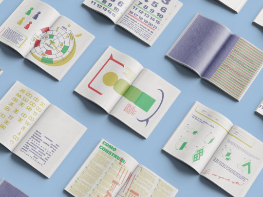
Portfolio (2015-2018) | Editorial Design

Este é o portefólio que criei na conclusão da Licenciatura de Design. Melhorei-o mais tarde e utilizei-o para candidatar-me ao Mestrado de Design da mesma universidade. É importante destacar que este portefólio encontra-se só em Português, tem páginas intermédias mais pequenas sempre que necessário e inclui a primeira edição deste projeto. Censurei contactos antigos.
This is the portfolio I created when I was finishing my Bachelors Degree in Design. I later on improved on it and used it to apply to a Masters in Design at the same university. Of note is that is in Portuguese only, has smaller pages in between whatever I deemed appropriate, and includes the first version of this project. Old contact information has been censored.
Page Spreads


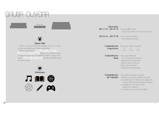

* Thank you to Soraia Tavares for taking the cover photo.
* Font Champagne and Limousines was designed by Lauren Thompson.
* Mockups by Pune Design and Zippy Pixels. Currently, the mockup used for Íntimo is unknown.
THANK YOU FOR VIEWING
#yes!!! i'm still bad at photos!!#one of the few books i printed and got to keep so i wanted to show it ig#2015#2016#2017#2018#portfolio#graphic design#editorial design#designers on tumblr#indesign#illustrator#photoshop#photo
3 notes
·
View notes
Text
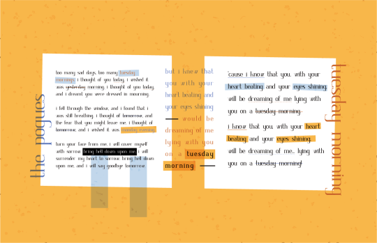
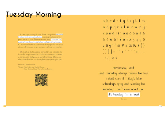
Made a new graphic of this font for my portfolio, since I didn't particularly care about the last one.
The project
#2023#march 2023#designers on tumblr#typography#graphic design#tuesday morning#university#the pogues#illustrator#fontstruct#font#serif
5 notes
·
View notes
Text
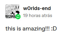
@w0rlds-end Thank you! 😊!
ABOUT THIS POST
#w0rlds-end#w0rlds end#reply#talk#I didn't want to reblog that long post just to say thank you 😔 also what's up with all those typos at the start my spellcheck missed#tumblr doesn't let me edit long posts half the time so i was lucky this time around it let me fix that at least. and add two more images
1 note
·
View note
Text
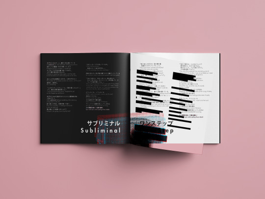
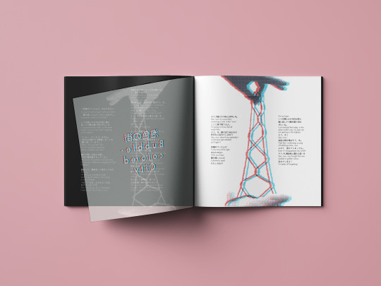
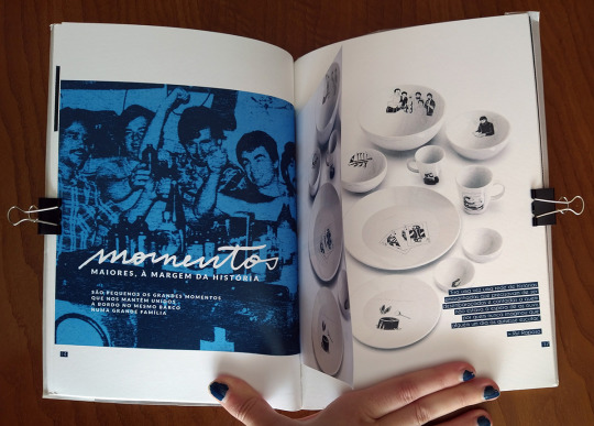
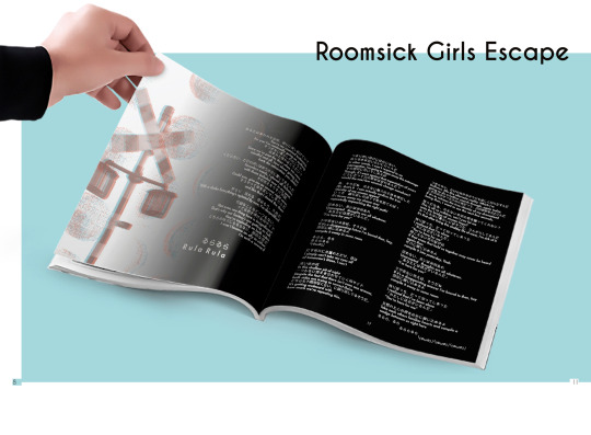
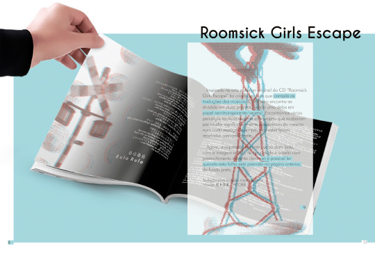
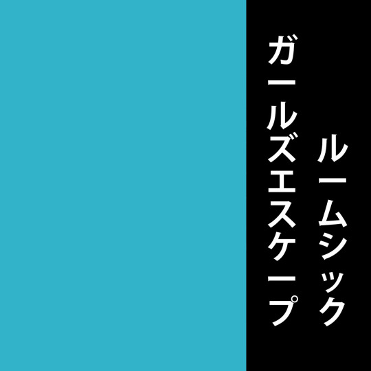
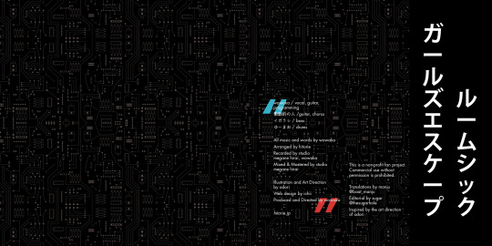
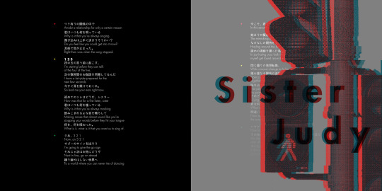
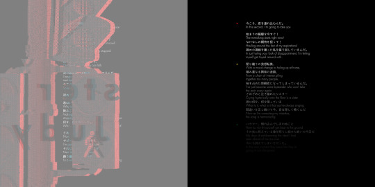
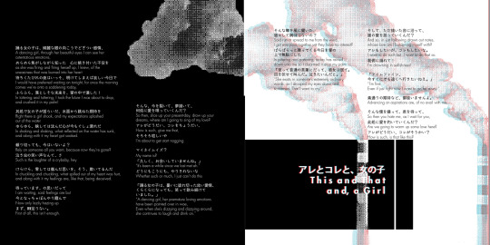
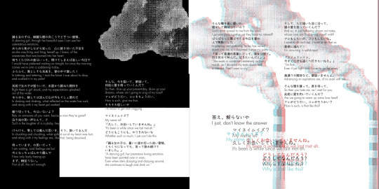
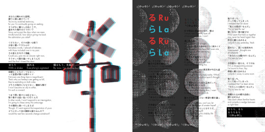
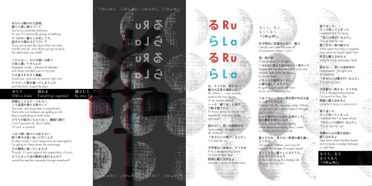
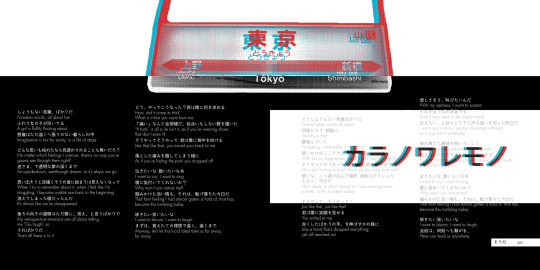
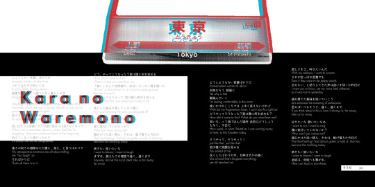
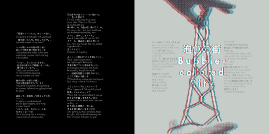
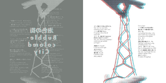
Este é um projeto gráfico e editorial de um livro de letras de música do álbum ルームシックガールズエスケープ / Roomsick Girls Escape, da banda ヒトリエ/ / HITORIE, para a Manju. Ela traduz as letras, posts de blogue, anúncios etc. da banda para inglês e tinha planeado agrupar estas traduções num livro. Ofereci-me para o fazer por ela como um exercício. A estética foi maioritariamente inspirada pela capa e booklet do álbum, com alguma influência vinda também dos vídeos de música.
This is a graphic editorial project of a fan made lyric book for ヒトリエ / HITORIE's first album, ルームシックガールズエスケープ / Roomsick Girls Escape, for Manju. She frequently translates their song lyrics, blogposts, announcements, etc. into English and had planned to put together the translations of it into a small book, so, for practice, I offered to do it myself. The visuals of it are inspired mostly by the album's cover and lyric booklet, separating the objects of the illustration into each page. Some inspiration was also taken from the music videos.
Book Pages


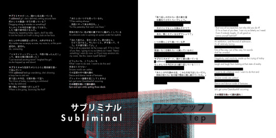
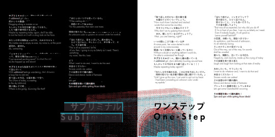

Na altura não tinha tempo nem confiança para criar uma ilustração para a capa, portanto ainda é possível que eu volte a este projeto (esta é a segunda edição). A encadernação era originalmente termal, mas como não se concretizou esse é outro aspeto sujeito a revisão. O livro enviado para a Manju foi cosido à mão por mim e, como as páginas não tinham sido preparadas para tal, o papel sofreu um pequeno desgaste.
At the time I was not confident nor had the time to do a proper illustration for the cover, but I’d like to return to this project one day and do so (currently, this is the second edition). I had also prepared the cover to undergo termal binding, but wasn’t possible at the time, therefore it is another aspect of the book subject to updating. The book that was shipped to Manju was, instead, hand sewn by me; the pages were not properly prepared for the process and suffered minor tearing.
* The video of the printed copy can be seen here.
* Thank you to Manju for the ongoing translations, and several others for reviewing the book before its final version.
THANK YOU FOR VIEWING
#hitorie#roomsick girls escape#ヒトリエ#ルームシックガールズエスケープ#music#lyric book#graphic design#editorial design#manju#2019#september 2019#indesign#illustrator#design
15 notes
·
View notes
Text
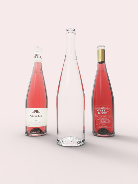

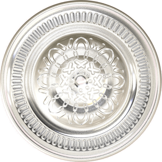

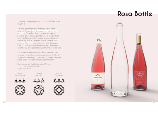
Esta é a nossa apresentação para o concurso Glassberries Design Awards de 2018. A proposta era a criação de uma garrafa de vinho, para qualquer vinho. A ROSA foi a nossa resposta, uma garrafa para vinho rosé que combina silhuetas de duas garrafa distintas -flauta e cantil- e contém ainda uma rosácea no exterior da picadura, cujo padrão é dependente da marca a utilizar a garrafa. O módulo desse padrão aparece ainda no pescoço do produto. Havia ainda uma proposta de packaging que, devido à nossa inscrição tardia e uma confusão de comunicação, não foi desenvolvida até o fim.
Our submission for the Glassberries Design Awards contest 2018. The prompt was to create a wine bottle for any kind of wine. Our answer to this was ROSA, a bottle for rosé wine, combining two distinct shapes of bottles -the flute and the canister- and having a rosacea pattern on the bottom of the bottle, its shape depending on brand. A sample of the pattern also appears on the neck. There was also a prompt for a corrugated box, however, due to the late sign up and a communication mishap, there was not much thought behind it.
* A video of the 76 finalists can be viewed here.
* This was a group project, in collaboration with Filipa Pereira.
* Thank you to teachers José Leite, Luís Ferreira, Miguel Palmeiro, Renata Azeres and Rui Costa.
THANK YOU FOR VIEWING
#2018#product design#3d modeling#3d render#glassberries#Glassberries Design Awards#wine#rosé wine#bottle#keyshot#solidworks#illustrator#glass#contest#design#group project
5 notes
·
View notes
Text


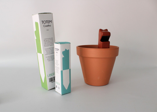
Packaging

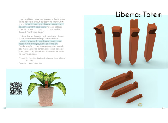
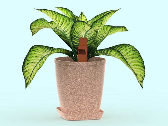
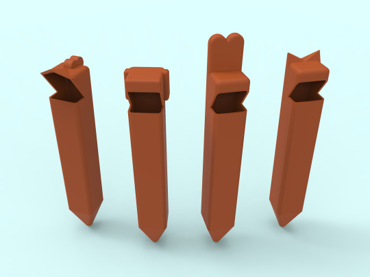
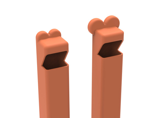
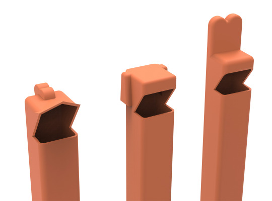
O TOTEM é uma solução para rega de longo prazo, assumindo a forma de um bebedouro feito de argila vermelha, cada uma com uma cabeça de animal adorável. É produzido sob a marca fictícia LIBERTA. A estaca deve ser enterrada na terra do e um vaso e “alimentada” com água; a argila permitirá a expulsão da água uniforme a longo prazo, para a planta beber. O conceito deste produto é baseado na ação capilar, que o material do produto naturalmente poroso permite. Existem várias cabeças de animais e tamanhos disponíveis.
TOTEM is a long term watering plant solution, taking the shape of a water feeder made of red clay with a cute animal head on top. It’s manufactured under the fictional brand LIBERTA. The stake is meant to be buried in the dirt of a potted plant and “fed” water; the clay will allow the water to release over a long period of time at an even pace, for the plant to drink. The concept of this product is based on capillary action, which the naturally porous material allows. There are many animal heads and sizes available.
Low-fi mock-up
O objetivo deste projeto foi o de preparar-nos (estudantes) para o lado financeiro do design, bem como aprendermos sobre crowdfunding. Devido às datas de entrega não nos foi possível criar um protótipo funcional com o material desejado. Escolhemos criar maquetes que demonstrassem a variedade de tamanhos e formas do produto.
The objective of this project was to prepare us (students) for the financial side of creating something new, as well as crowdfunding. Due to time constraints we could not create a functional prototype in the desired material, opting to creating prototypes that would show the variety in shape and sizes of the product.
Kickstarter mock-up
* Kickstarter page archive. Due to the website’s various popups, the archive cannot be viewed properly.
* Photo taken by Soraia Tavares.
* One Euro 3D model was created by Joerg Schmit.
* Potted plants 3D models were created by edson-lopes and pazurenko.
* Font Champagne and Limousines was designed by Lauren Thompson.
* This was a group project, in collaboration with Filipa Pereira and Mário Silva.
* Thank you to teachers Ana Segadães, José Leite, Luís Ferreira, Miguel Palmeiro and Rui Costa.
THANK YOU FOR VIEWING
#2018#product design#graphic design#packaging#kickstarter#liberta#totem#illustrator#premiere#brand#watering can#clay#design#group project
3 notes
·
View notes
Text
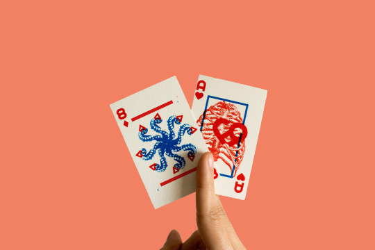
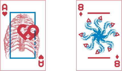
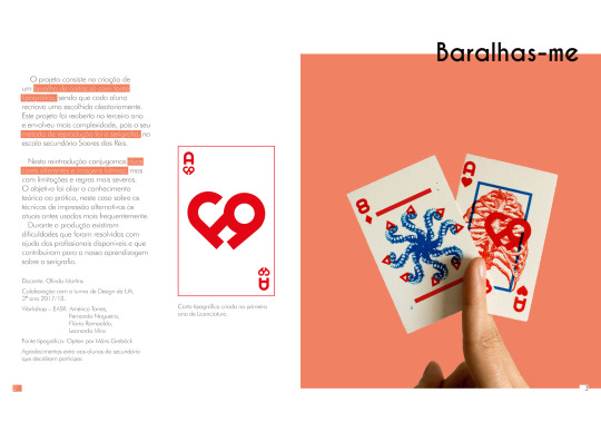
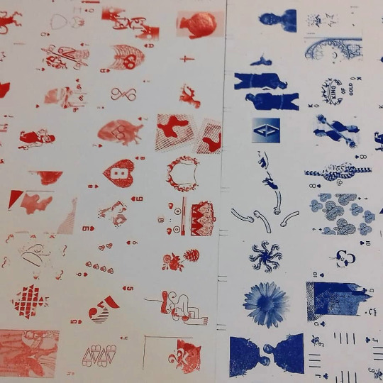
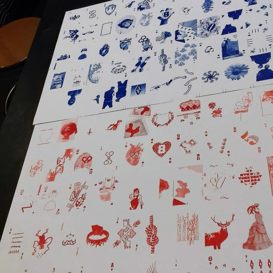
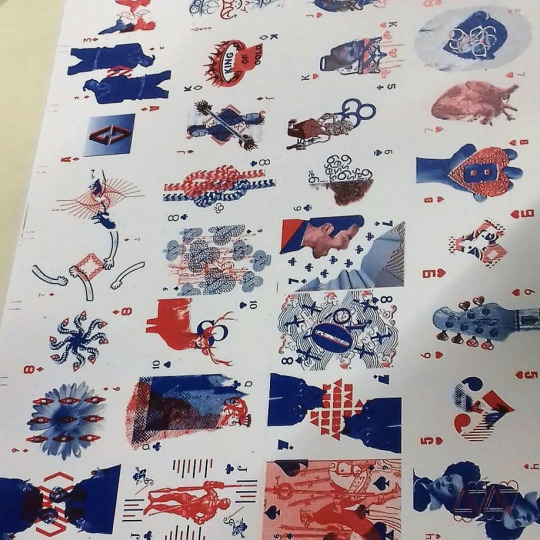
Um projeto de turma em que cada estudante desenha uma (ou mais) carta de baralho de jogo para impressão serigr��fica. É uma extensão de um projeto semelhante de há dois anos atrás em cada estudante recria uma carta apenas com tipografia. Desta vez pudemos utilizar duas cores e imagens. Para além destas cartas também ajudei com a montagem dos fotolitos. O projeto foi desenvolvido durante os últimos meses de 2017.
A class project where each student would design a card (or more) to later screen print as a full deck, based on a similar project from two years ago where each student would have to create a playing card using only typography. This time, we could use images and two different colors. Outside of creating these two cards, I also helped setting up the screens for printing. This project was developed during the last months of 2017.
Making of the full deck

Ace of Hearts - 1º Phase
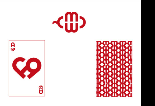

A minha carta do meu primeiro universitário, bem como o padrão das costas que também tínhamos de desenhar na altura. Esta carta foi criada no ano letivo de 2015/2016.
My card from the first year of university, along with a patterned back each student had to make at the time. This one was designed in 2015/2016.
* Thank you to teacher Olinda Martins and the screen printing workshop leaders in EASR, Américo Torres, Fernando Nogueira, Flávio Romoaldo and Leonardo Mira.
* Font Optien was designed by Måns Grebäck.
THANK YOU FOR VIEWING
#graphic design#screen printing#deck of cards#playing cards#2015#2016#2017#photography#illustrator#photoshop#im sad i dont have better photos of the process but i was so tired by then i wasnt thinking that id need them later#digital illustration#bmp#design
10 notes
·
View notes
Text
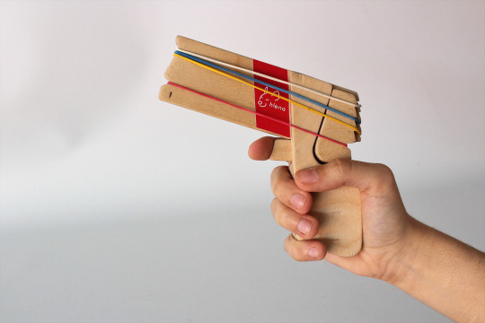
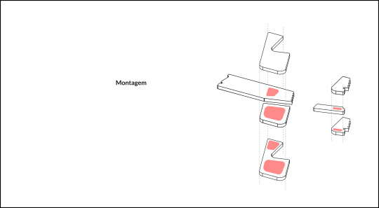
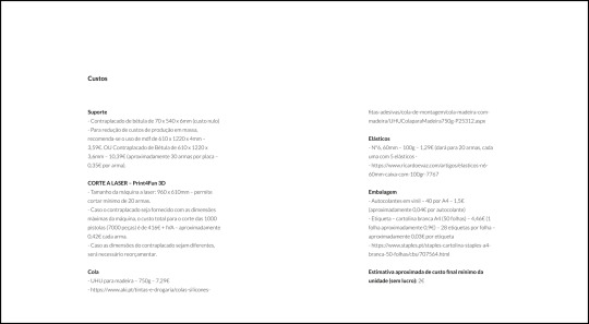
Este projeto, que foi desenvolvido nos últimos meses de 2017, baseou-se na reciclagem (“remix”) de materiais que fábricas não podiam utilizar e descartavam, com a intenção de produzir algo novo. O nosso grupo criou a Hiena (estilizado como h!ena), uma marca/companhia fictícia que manufatura brinquedos tradicionais. Os materiais utilizados para os brinquedos aqui foram pontas de aço, polidas no interior e suavizadas nos cantos para que pudessem ser remodeladas em caleidoscópios (não corra ao usá-los!) e tábuas partidas de madeira MDF, reformadas em peças que compõe uma pistola de elásticos.
This project, developed in the late months of 2017, was based around recycling (“remixing”) materials that factories can’t use anymore and discard, and create something new out of it. Our group created Hiena (stylized as h!ena), a fictional brand/company that manufactures traditional toys. The materials used for the toy here were discarded steel ends, polished on the inside and softened on the edges so they could be refurbished as kaleidoscopes (don’t run while using them!), and broken down MDF wood, refurbished into parts for a rubber band gun.
Toys
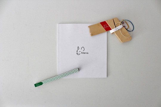
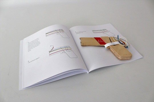
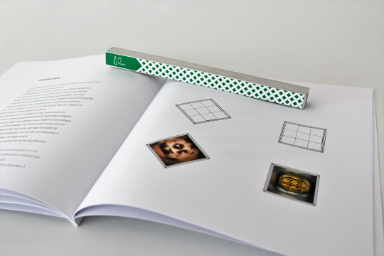
Pages from the booklet
* Photos taken by Soraia Tavares.
* This was a group project, in collaboration with Beatriz Marto and Filipa Pereira.
* Thank you to teachers Alexandre Kumagai, José Leite, Luís Ferreira, Paulo Neves and Rui Costa.
THANK YOU FOR VIEWING
#product design#graphic design#editorial design#university#2017#h!ena#remix#illustrator#indesign#toy design#hiena#group project#design
4 notes
·
View notes