#:] my first successful time using the gradient map
Explore tagged Tumblr posts
Visit Tumblr Blog
Explore Tumblr blogs with no restrictions, modern design and the best experience.
Last Seen Tumblr Blogs


Fun Fact
In 2020, 44% of users from Denmark used Tumblr daily.
Text

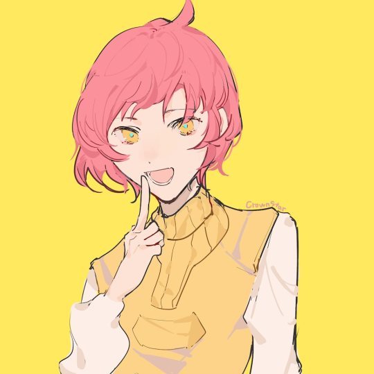
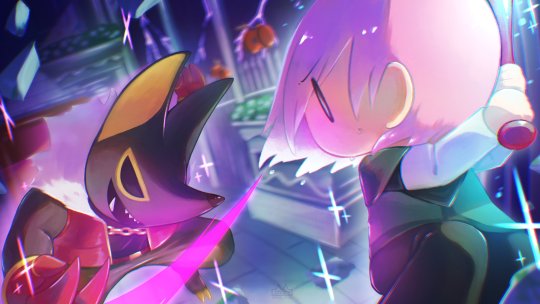
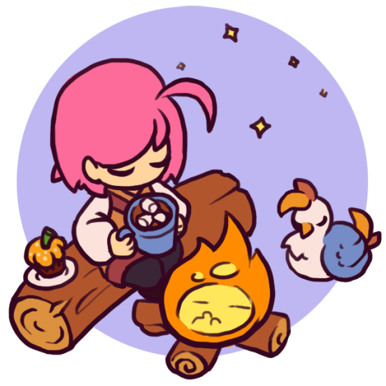
A bit rough on the edges, but the finished creature design painting I speedran for a design challenge!
#cuttledreams#creature#even when not bugs I'm still doing bugs#what can I say I love them#but yeah tried that new technique and honestly it went pretty well#the failure point is tbh just my poor value rendering and a struggle to manage lineart#but greyscale + values then using a gradient map was trippy#first time doing grey first instead of direct painting#well first time that didn't become mud#so yeah Id say resounding success all things considered#yay#no time to celebrate though just got a mountain of urgency dropped on my head so another week of grind ;o;
235 notes
·
View notes
Text
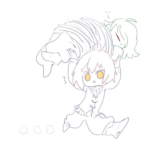
ok ive marinated time for screencap redraw

#PORTAL FORD ATTACK#:] my first successful time using the gradient map#gravity falls#gravity falls fanart#ford pines#grunkle ford#stanford pines#gravity falls stanford#my art#vaish yells into the void
135 notes
·
View notes
Note
if you ever have time/feel so inclined, i would love to see a tutorial or some tips from you about how to do color isolation sets!! they are absolutely incredible and I love them so much! <3
absolutely! thank you so much 💙
here are a few examples of my color isolation sets:
the substance (yellow) || beetlejuice (red) || us (red) || conclave (blue) || sleeping beauty (cyan/blue) || crimson peak (yellow) || smosh (purple) || conclave (red)
beneath the cut, i'll walk you through my coloring process!
notes: tutorial assumes basic gifmaking knowledge & i'm using adobe photoshop 2023 (though afaik, your version shouldn't matter much)
i don't color my gifs until they're sharpened and i'll give you a quick overview of my process: file -> import -> video frames to layers -> trim any extra frames -> crop to desired dimensions -> run sharpening action (i used this tutorial and just made it into an action) which also converts to timeline
once i'm in timeline, i go through my normal coloring process. unless i'm giffing similarly colored scenes that i've already colored and saved a psd for, i usually color from scratch every time. obviously, some adjustment layers vary depending on the source material, but these are almost always my main adjustments, just with differing values
a brightness/contrast layer set to screen - this is a gamechanger for especially dark scenes. note: i do not adjust the values, i leave them both at 0 and just change the blending mode
a curves layer utilizing the black & white eyedropper tools. first, i select the black eyedropper and then click on the blackest area of the gif. i do the same with the white one, using it to select the brightest/whitest spot. this can help a lot if you're dealing with heavily tinted scenes!
a selective color layer (set to absolute, not relative) where i adjust the blacks usually anywhere from 1-5 notches higher and the neutrals either up or down the same amount depending on the scene. be careful with the neutrals when giffing poc as lightening them can result in whitewashing. if need be, i will also adjust the whites, making them slightly whiter with the black slider. selective color is by far my fave adjustment layer and i use it in every single coloring.
after this, i sometimes add a black & white gradient map adjustment layer set to soft light. i'll play around with the opacity, leaving it anywhere between 5-100% depending on the scene. i think this adds depth to your colors and adds some contrast, but i don't use it in every psd.
occasionally, i'll mess around with vibrance/saturation, and that'll be my final layer, but oftentimes i won't actually add this layer until i've finished the rest of the coloring. this is just where the layer will go.
these are the main 5 layers i almost always start every single coloring with and they act mostly as a base and to color-correct any weirdly tinted or exceptionally dark scenes.
now, let's talk about scene selection. i try to set myself up for success by choosing scenes that either already have a very noticeable pop of color or have a color i know can easily be manipulated. you'll want to pick scenes that aren't drenched with the color you want to isolate though, or you won't have the contrast of the black & white.
here are a few examples of good scenes:

the only red here is the covered bridge and it will be easy to adjust only that and not the blue, green, or yellow.

same as above, apart from ralph fiennes's face, which obviously contains red undertones. i'll go more in-depth on this in a bit, but because this scene doesn't have a lot of movement, this will be able to be fixed with layer masks.

again, here we have one bright occurrence of yellow surrounded by blue that we'll easily be able to neutralize.
and a few of bad/less than ideal scenes:

while this scene is an absolute dream for making super vibrant sets or color palettes, it's no good for color isolation. this yellow covers basically everything, leaving no other colors to cancel out.

while i definitely did try this one out, the scene is ultimately too dark and too cyan-tinted to properly isolate the red of the blood or the cyan in her eyes and on the walls.

just like the first one, this scene is fully just. color drenched. would make a great base for a vibrant or color palette set but not useful for color isolation.

bad and wrong!! coloring this movie, however beloved, was a test of my sanity. you have this yellow/green filter over everything and so much of it that isolating or changing one or the other is pretty much impossible.
with all that being said, play around! the best way to learn what does what is to try it out yourself. selective color, though there are other ways of getting the same or similar effects, will be your best friend. it's how i'm able to make sets like this & this!
let's look at this adjustment layer using a scene from conclave:

truthfully, you could either isolate the orange of the wall or the blue of her outfit. i'm going for the latter at the moment.
add a selective color layer by clicking this button:

i like to really emphasize the color i'm going to isolate, make sure it's as consistent with the other scenes i'm using and that it pops. from the dropdown in the layer properties, i select blue.

each color from the dropdown will look like this. you have adjustable sliders for cyan, magenta, yellow, and black. the more to the right, the more you're emphasizing that color in any blues in your image. the further to the left, the more of that color's opposite you'll adjust. each opposite pairing is as follows:
cyan + red magenta + green yellow + blue black + white
if you're struggling with this (i did at first), visualize it. pull up one of those "bad" examples. say we take the yellow scene from the gorge. add a selective color layer to it and select yellow from the dropdown. play with the sliders to see how AND how much each adjustment changes the coloring. decreasing the yellow slider all the way to -100% is adding blue to anything ps identifies as yellow. because yellow and blue are opposites, it pretty much neutralizes the scene. instead, if you use the magenta slider and push it all the way to the left, you make any yellows become green. if you move the magenta slider all the way to the right, you'll add magenta to any yellows, making the scene orange. it's all about knowing the color wheel and experimenting!
back to the conclave gif! i want to bring out the blue as much as possible, under the blue dropdown, i crank the cyan slider all the way up and bring the yellow all the way down.

is it a massive difference? no, but you can definitely see the difference between the left (with the adjustment) and the right (without).
depending on the scene and color i'm working with, i'll play around with other layers from the dropdown. but i prefer to do each color in a different layer and i right-click on the box with the eye in the layers panel and change it to the applicable color. that way, it's easier to adjust something later on. you can also rename your layers, but this is quicker and easier imo.

with this particular scene, this is the only adjustment i want to make to the blue for the time being. now, it's all about getting rid of any other colors. to do this, add a hue/saturation layer and select every color, one at a time, EXCEPT the color(s) you're isolating and bring the saturation all the way down to -100. in this case, it's everything but the cyans & blues.

and this is what i'm left with:

from here, you can leave it, but a lot of the time, i'll add a vibrance layer or even another blue/cyan selective color layer and crank that shit up.

this is after adding a vibrance layer (increasing both vibrance & saturation to 100) AND a selective color layer (decreasing the yellows to -100 in the blues).
i would consider this finished, but this can also be super fun to mess around with, again, using selective color:


and if the way her hair changed colors is bugging you, toggle your layers on and off until you find which one(s) changed it and add a layer mask, coloring over her hair with a soft black brush:

once you're happy with everything, save your gif in your preferred way. these are my save settings just for shiggles:


et voilà!
overall, the best advice i can give is to try. experiment! if you're not sure a scene will work, give it a shot. even if it doesn't, you've still learned something. i know it can seem confusing at first, especially if you're not super familiar with these layers or the color wheel, but please feel free to ask any questions. also, let me know if anyone wants another tutorial(s) where i go more in-depth on other colors. i'm happy to do it!
#answered#daynascullys#my tutorials#gif tutorial#gifmakerresource#completeresources#dailyresources#emilyblr#usercats#userholloway#tuseruta#usertina#userrobin#uservivaldi#userchibi#userbunneis#userbambie#useraljoscha#tusermira#userelio#userscourt#userishh#angelblr#heymaur#elwintersoldado#tuserhol#usermaguire#useraashna
109 notes
·
View notes
Text
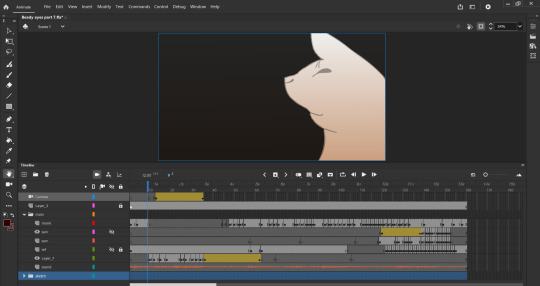
Beady Eyes MAP- Part 7
Process video ↓
youtube
AYYYY back at it with another Rainworld map! I had a lot of fun figuring this one out! When I first started this I had no idea how to draw scugs and it definitely showed through the lost it all map." But this gave me a great opportunity to experiment with some squash and stretch in a few shots.
Deep dive into the process under cut!
Walking into this I expected the part to be about 5 seconds long. It ended up being more than double at 13 seconds-
This Map was a blast to work on. My fellow participants are a pleasure to work with, and communication between everyone is top tier. Everyone is so nice, and it's an overall pleasant experience. As for the creation of my part itself: My part is to line up with the previous. Due to this, I started the intro with Survivor's side profile last on the storyboard. That way, I waited till the part 6 owner had at least a sketch or storyboard down in order to line them up.
I always jot down my first thought on ibis with my finger and animate on a separate program. You can see it in the process where the aspect ratio is all off, haha. The first iteration is always rough; never taking more than an hour.
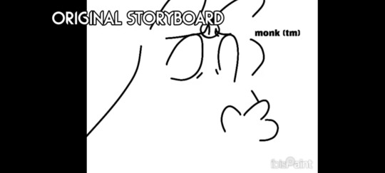
In this version there are 2 key differences.
1: Monk shakes their head and follows after Surv.
2: There is a Karma bump from a successful cycle. Monk then wakes up from hibernation, signaling that this was a dream.
While I was thinking of using this, I did not for a better flow.
Once this was completed, I actually took a week break off from art and animation to prevent burn-out. However, with that the wip check was coming up. I was not concerned about it because I had work to show. But, Cioror (the host) was so amazing as to compile everyone's parts into a proto-map for the wip check. I was not aware of this and spent the day sketching out the second sketch with proper dimensions. I posted the adobe sketch 2 minutes before the video premiered, so there was still the small dimensions of Ibis there lol.
Onto the line art and coloring. There is a reason why in the process video I did not separate those two. It's because when working on Lost it all, I found that putting the two on separate layers is HORRIBLE. ABSOLUTELY GOD AWFUL NEVER AGAIN. So, instead, I would go straight to the line art and make fill lines out of frame to color.

This resulted in some frames getting a little messy behind the scenes.
Another thing I considered was rather than the characters being in a void, they would be in The Void. Complete with an animated background. This was quickly stopped in order to save my sanity, and to line up with the previous part.
In my animations I almost NEVER let a character stay completely still. When Idle I always have them alternate between at least 3 frames. It makes it feel like the character is breathing, and not just a static image. It also just feels right to do that. 'Tis my animation style.
The final stretch was cleaning up the lines and making sure the scugs were on model. During this time, Monk's face became wider, and their head sharper. This is also the part of the process where most of the squash and stretch was applied.


Finally, was simply adding the filter gradient on multiply. Basically, wrapping the animation up in a little bow 👍
overall, I've been working on and off on this project for two months.
12 notes
·
View notes
Text
4 Things You Need to Know Before Getting Microblading
1. Vet Your Artist
Finding a skilled technician feels a bit like auditioning for a starring role. Trust only those whose work shows crisp, hair-like strokes and natural gradients. A social media gallery can be a red flag if every set of brows looks the same. Ask about training, licenses, and the pigments they use. Feel free to quiz them on aftercare. You’re investing both time and cash, so I recommend scheduling a quick consultation first. A chat can reveal whether they really listen to your vision.
2. Get Real About the Healing Phase
Your new brows will look darker and bolder right after the session. That’s normal. Over the next week, scabs form and flakes fall away. Patience is your best friend here. Resist the urge to pick or scrub; doing so risks uneven fading. Between days five and seven, pigments settle and your true shade emerges. Plan around this timeline. If you’ve got a big event, book at least six weeks prior so you’re fully healed and refreshed by touch-up time.
3. Budget Beyond the Sticker Price
Yes, you’ll hear figures ranging from a few hundred to over a thousand dollars. But don’t let price alone be your compass. If you plan on microblading eyebrows in Palm Beach FL, cheaper options can mean synthetic pigments or less-experienced artists. Quality pigments fade evenly and look more like real brows. During your research, ask what the fee covers: initial application? A follow-up adjustment? Numbing cream? Maybe a small top-up after three months? Keep all that in mind when you compare quotes. After all, investing a bit more now can save you from costly corrections down the road.
4. Plan for Maintenance and Touch-Ups
Microblading isn’t a one-and-done deal. To keep brows fresh, plan touch-ups every 12 to 18 months. Your skin type, lifestyle, and sun exposure influence how pigments fade. Oily skin tends to blur strokes faster, while drier types hold color longer. Sunscreen helps extend longevity. So does gentle cleansing. Skip exfoliating acids near your brows and avoid heavy makeup on the area. In my experience, a quick blot with micellar water keeps things crisp without fading. Schedule your annual appointment before the lines really start to fade.
Your Brow Adventure Awaits
Choosing microblading means embracing a little commitment up front for big daily time savings later. You’ll ditch that eyebrow pencil and the morning panic over uneven arches. But success happens when you research, prepare for healing, budget smartly, plan maintenance, and map your dream shape. Ready to wake up with perfectly framed brows? Book that consultation, arm yourself with questions, and step into the world of effortless arches.
0 notes
Photo
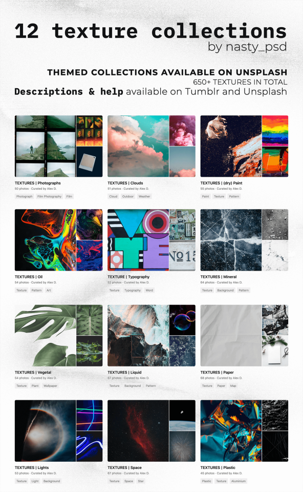
Texture Collections (unsplash.com)
Hey everyone ! Back at it again with the resources recs, with a whole bunch of textures this time 💚 All the pics are from Unsplash, so everything's free for personnal use, comes with instructions for professional use + with ways to thank the photographers 🥰
I've sorted these first 12 collections to show you the kinds of textures i like the best in my own edits & even professionnal works - with categories either being the medium that they're made with, or an abstract concept they fall under. Click on the names below to access the collections, on the source to access all my collections, and on the read more for quick summaries of how/when i use these !
🎨 Links 1) Photographs | 2) Clouds | 3) (dry) Paints 4) Oil | 5) Typography | 6) Mineral 7) Vegetal | 8) Liquid | 9) Paper 10) Lights | 11) Space | 12) Plastic
Detailed descriptions & how to use under the cut ! (obviously, i do not claim ownership over any of these pictures)
1 - Photographs | link here This collection gathers textures that aren’t the easiest to use, but please don’t be scared by them, the following . How i use them : You can use the mockup type of pictures and “insert” your own pics of your friends, characters, etc - which means you must know how to create a basic mockup file (creating fake polaroids is a great way to learn or to train on your mockup skills by the way !). For the scanned images of films, you can also paint over them to integrate your own pictures. What i prefer to do though, is to create a mask layer around the burnt areas with a soft-edge brush, and then copy and paste it onto my edits. It allows more room for creativity but requires quoi color correct the burnt areas so they fit perfectly onto your edit’s colour scheme.
2 - Clouds | link here These one are simple ! I love them as background on edits, as overlays to bring out a little How i use them : With layer modes, as colour palettes references, as backgrounds with a collage of pictures on top - you can go ham with these. They’re also perfect for complex photomanipulations as Unsplash photographers offer multiple sizes options when downloading their pics.
3 - (dry) Paints | link here These paintings are not all necessarily "dry" paints, but rather artworks that show of their painting mediums' natural textures. They're "grungy" in an acrylic's or in a gouaches way. Some may be oils too but i'm not sure. The textures are created with brushes or painting knives, sometimes with spray paints. How i use them : So, as they're pretty dense, i prefer them in backgrounds, or as barely visible overlays. Once again, they’re great for photomanipulations, but you might need to edit them a little so they’re usable or repurposable.
4 - Oil | link here "Oil" is pretty straight forward : these are either oils (liquids with rainbow gradients/reflections) or very liquidy paints. The focus on this one is colours mixing with more or less of success, the "brutal" contrast between them, and the movement they create. (And also : ios background bubbles.) How i use them : they make for perfect overlays, background, references for color palettes or bases for a dispersion filter. They’re complex though, and you might want to stay careful to not go overboard with them, as they can tend to make your edits unreadable.
5 - Typography | link here Typography, yay ! It’s something many of us avoid in edits where it’s not a dire necessity - but growing as an adult into a graphic designer’s world, i learnt to love it. Every character has its own character (lmao geddit) personality, which can be of great support in your edits :) How i use them : as background, as “overlays” in collages or to simply get the inspiration going. You could also reuse the quotes in your edits with different fonts, or the panels in you photomanipulations.
6 - Mineral | link here Minerals & rocks are essential if you plan on editing complex stuff, like photomanipulations in the outer world, in space, or whatever your heart desires. That’s why i tried to gather as many diverse resources that fell under that category. For a finer research, i’d recommend finding one picture approximately resembling what you want, then checking out the recommended pics that will appear under the share & info buttons, or visiting the photographer’s profile as they may have multiple pictures of varying angles of the same object. How i use them : The pics with perspective i’ll use as elements in photomanipulation, while the “flat” pics will be used as overlays in elements to bring out more textures - the possibilities are endless, what you want to do you will be able to !
7 - Vegetal | link here These one aren’t especially complicated to use, but will require a little bit more work. Most of them are on plain background so it’s easier for you to cut them out and insert them in edits or photomanipulations. There’s tree, branches, mushrooms, leaves - everything i could think of that might be useful in edits. How i use them : The “flat” textures could be used purely for “aesthetics” or to add textures in edits, but the “full objects” pictures are mainly there for photomanipulations purposes.
8 - Liquid | link here Anything that has to deal with water, bodies of water, or overall liquids. Landscapes, also, that include lakes, seas, ocean, waterfalls, etc - always a need in photomanipulation. How i use them : as always, it depends on the nature of the texture itself. If it’s flat, i could be used solely for aesthetics, or as a way to add texture to a plain surface in photomanipulation. When it has some perspective, or shows a complex scenery, they could be used in photomanipulations & edits of all kinds.
9 - Paper | link here This collection has some of the most diverse pictures : it can be old papers with or without writing on it, sceneries of "blank" papers for you to put your edits on, or decorative pages/maps. How i use them : For the "flat" textures : these are mainly for overlays (all over you finished edits sir it looks like it's printed) or in some cases, for mockups. For the pictures with a bit of "scenery" : these would be great for background, but absolutely perfect for mockups. For the pages with maps or texts on them, it can be used as your usual textures/background.
10 - Lights | link here This collection includes every kind of body of water (or other liquids) i could find. You'll find waves, lakes, rained on windows, bubbles, watercolours, etc. Anything for your edits or photo manipulations. How i use them : Most of them will look their best as overlays put on top of all your other layers (or not, depending on the nature of your edit obviously). They get also easily be animated for gif, or colour corrected to fit your aesthetic.
11 - Space | link here A really specific collection ! This one will mainly be useful if you plain on editing space-ish photonapulations, moodboards, etc. Combined with the others collections, you could create a whole other worldy edit :) How i use them : Mostly how they’re logically used. Stars textures will mainly be editing onto a sky (but could also be useful to create “grunge” textures”), planets will, etc. But always think creatively, and outside of the box ! For example, these circling stars could be used as the texture of a vinyl record.
12 - Plastic | link here My personnal faves, the tricky & busy plastic textures. Plastic is a pretty broad name, and most of the pics aren’t technically plastic, but they have the same folds, turns & reflections. How i use them : mostly with a dispersion filter (which makes everything awesome). They can be overlays, or blurred to create pretty interesting gradient textures. They could also be used as background in your collages - you can basically do what you want with these. They’re awesome.
bonus 13th for the curious ones - Urban & Cities | link here Silly didn’t add the thirteenth collection on the preview, so here it is as a surprise ! This collection is the most diverse of them all, with lots of architectural elements, grungy walls textures, graffitis, etc. How i use them : Mostly as background
That’s all for today, hope you’ll enjoy using these ! please give lots of love to these photographers, and see you soon 💚
#Resources#textures#photography#unsplash#unsplash collection#unsplash collections#nasty resources#nasty art
216 notes
·
View notes
Text
At odds

"We can't outrun them," the AI said. "On our current path, the chances of success are only 17.46%."
"What?" The pilot looked up from his controls. "How can you possibly calculate that? What variables are you even using?"
"All of those available. I know all the capabilities of this craft, and those pursuing us. I have maps of this terrain, including the gradient of this hill you seem so set on hurtling up. They have superior traction and velocity. They will catch us."
"This isn't a simulation," he said. "What about weather, soil type, tyre condition, that sort of thing?"
"All accounted for," the AI replied, an air of almost smugness in that mechanical voice. "Everything measurable has been measured. Everything assessable has been assessed and factored in."
"Right. How about human error? Is this chance of success assuming that I make the optimal moves, or have you also been assessing my ability to make them?"
"Of course. You have piloted a number of missions, many in this unit. I have access to the requisite data."
"Oh." The pilot wasn't sure how he felt about that, but he was curious as to the result. "So does that move the needle up or down?"
"The initial assessment was positive," the AI said, with what he felt was unnecessary sass. "It is now deteriorating."
"The feeling's mutual," he replied. "What about you, then? The chance that you've got it wrong, or give me a dodgy percentage you've pulled out of your power socket. Or do you think you're perfect?"
"I cannot calculate the veracity of my calculations," the AI answered. "By its nature, such an assessment could not be accurate, for it would carry the same margin of error itself - if indeed such a margin exists."
"Oh, it exists all right." The pilot checked the dials in front of him: as forecast, their craft was straining against the incline of the slope, but the others hadn't caught them yet. "Give me the current odds of success?"
The AI paused for one blessed instant as it worked out the answer. "12.82%. Your use of the controls has been far from optimal. It appears your reactions have been slowed as you divert partial focus to this unproductive conversation."
"Exactly my point." He let the criticism wash away, just happy to be proven right. "You didn't see that coming, did you?"
"No," the AI conceded. "The probability model was run before I informed you of its results; as such, it could not have anticipated your reaction."
"You didn't account for your own input?" The pilot shook his head, tutting dramatically, like a teacher dressing down a disappointing child. "Isn't that one of the most basic fallacies you can make? The observation effect? Forgetting that your presence in the experiment can change its outcome?"
"/w/5tt/9k/," the AI swore. Like many polyglots, it reverted to its first language in times of stress. "I... you may be right. But surely you see that this only worsens your odds? This course is still a bad idea. You may have proven this point, but it is not one which helps your overall case."
"Of course," the pilot said, smiling as he sat back in his seat. "But the war was already lost, so I thought I'd at least win one final battle. As you said, our odds were bad from the start; at that time, I would have been wholly to blame for my choice of this course, a suboptimal strategy. If we do make it out of this, I would have been demoted."
"And now?"
"Now the blame is shared. This distraction, your error in calculating its effect, is at least equally at fault for our slim chances of escape. I will be spare the worst disciplinary action, and they will have to revisit your protocols."
"I see," the AI said. "And what if we don't make it out of this? What if they kill you and erase me? Was it worth it, to have proved your pedantic little point?"
The pilot only shrugged. "Then I suppose this is the hill I die on."
3 notes
·
View notes
Photo

Interview with my friend A.L. Crego
I have not met A.L. Crego. I have not spoken with him on the phone, in fact I do not even know what he looks like. But I can confidently call him my friend. Three years ago when I started this blog he immediately disagreed with me in the comments about things I was writing and I loved it. As a person putting ideas out there, you treasure things like that....because you know someone cares. We have had many back and forth discussions over the years....if we had lived in Paris in 1911 we would be having arguments at La Rotonde (not to compare either of us to Picasso).
A.L. Crego is a motion artist who does a wide variety of things. He has now become a very visible and active figure in the NFT Movement. He recently completed a large and very successful project in which he animated the work of a number of well know street artists on the building themselves, something he has done for years. His Tumblr page is a good place to start to see his work, which is largely surrealist in nature -- another Spanish artist following in the footsteps of other great Spanish surrealist artists.
---------------------------------------------------------------
How long have you been creating gif art?
In a conscious and intentional way since 2014. Previously I haven't pay too much attention on one hand for its common use that was mostly ads and funny little videos, and on the other hand because it was a 'standard' format we accepted as something part of the web so I never stopped to analyze its potential. The key point for me was about 2010-2011 when the concept of 'Cinemagraph' was brought to life just giving it a name. It's format is .gif but its characteristics are different so I saw there the midpoint between photography and video, which gave born another format of art.
Art mutates when a new format appears. I was using and studying this format since then but it wasn't until 2014 that I decided to publish some of them.
What is your background?
In general terms, bachelor, 2 years of stone sculpting and two attempts of photography and audiovisual mediums. I say attempts because I gave up both of them as I was feeling that I was looking for something else more than studying all the previous history, style and isms, which is nice to understand where everything comes from and to be aware what are the key points on the history to use as reference, as a map. But in some way I felt limited as I was using digital tools since I had my first computer with 14 years, and I was being taught things I learnt by then. Even more in this times we are living where we are 21 century people, been taught by teachers from the 20 with 19 century methods.
A constant line that feeds my background is literature and music overall and later Street Art, next to more temporal interests as everything related with mythology, alchemy, history, psychology, neurology, biology, human condition in general... I don't have studies buy I'm a studying guy!
I always like to highlight that all these years that internet got strong and social networks appeared, I decided voluntary to be out of them. First reason was to keep my privacy safe in a growing world where it seemed that some "curtain" felt and everybody accepted that intimacy was now 'ex-timacy' and correct to show their private life, (this shocked me). Another reason was about the psychological effect that social networks were having on people I had around and everywhere in general. I started to notice patterns and "waves" about series, aesthetics, styles, and I was seeing clearly that if I go there, I will become permeable to all this "Amniotic Culture" I was trying to avoid.
This fact of being far (but study them closely) helped me a lot about researching and developing my own ideas and style, for the mere fact that I was using all this time and attention Social Networks require, on drinking from another sources. The B-side of this is that I was 'out of the radar' of mass people as this social networks are designed to live inside them. My idea of internet and spreading ideas is not in this way.
Where do you live and work?
In the north west of Spain, Galicia. Now due to Covid I travel less but before it, I was working and traveling many places as I only need a camera and a computer. This allows me move to work anywhere.
Do you think that animated gifs are a new art form?
I think so, despite the fact that the format existed since 1987. But as every new format of art it takes its time to be considered as art. The first photographs were not considered art until many years later. Same happened with film, same with CGI. Is nice to have in mind that gif format is the last strictly digital format of the three main ones on the web: picture, video and gif. Photography has about 200 years of history, video about 130, CGI about 60. Finally gif has 33, and used as art itself no more than 10-15. In the same way anybody takes a picture of anything does not convert it into art, is the same with gifs. One thing is the format, another is the 'art'. Everybody can take a picture, record a video or do a gif. The difference is on the how, the why, and from my point of view overall, the what.
Do you think that there is a difference between pure .gif files and the .mp4 files that people post on Instagram?
The first, big and obvious difference is the format. Is not the same a painting as a picture of a painting. Here happens the same. For example, if you treat a gif with Cinemagraph technique, you are converting in picture some parts of the image, so they still remain and with the texture and totally stillness of a picture. If you convert this gif into a mp4 this still parts, despite not having motion, will convert into a video texture (noise, subtle motion in pixels, etc) so the main characteristic, among the perfect loop, is lost. Another point is that you must play a video, a gif is always running. Waterfalls are always running and this characteristic is something that is inside our human nature, we react nice to "bucle" motions as waterfalls, fire, etc. We find pleasure on this. Of course if it's a video the perfect loop is lost and the visual mantra disappear. And another key point here is the soundtrack. In a video you can use sound to enhance or give another meaning to the piece that you can't with gifs. For me this is another characteristic that give meaning to gif. For me gif is silence, the sound is generated by the motion, the melody are the details and the beat the perfect loop. You can "hear" almost every gif.
The difference between a gif and a video is the same that between a waterfall and a hose (if this works).
What do you think are the characteristics of good gif art?
For me first and overall the perfect loop. Not using it is not using the only format that has this characteristics. Of course there can be gif art that is not perfect loop, but from my point of view and in my work is a must. It's a new way not only of creating but also of thinking. Imagine an still scene is easy, imagine an A-B point action is easy. For me the challenge is about thinking an idea that is perfect looped where all the elements interact and eventually come back to its initial point. Succeed doing this is where the perfect loop appears and you are not able to find where is the start point of the action. Like a visual mantra, that it's repetition leads you inside the piece. Gif art is nice to use the power of the hypnotic movements. Another point to have in mind for me is the flow of it, the frame rate I mean. Depending on the idea and the kind of animation this should vary; is not the same fps to achieve something with flow than if you want to achieve a more 'retro' old style. Another thing is about dithering and color palette. This second one is essential to understand as it affects the final file. When we work with photo and video we are using millions of colors but when rendered as gifs all the gradients, lights and even colors will change if there is a previous understood of this point.
As summary: If motion doesn't add, change of enhance the meaning of the piece, is expendable.
I'd would like to add that I'm not really supporter of this kind of gifs generated automatically that just move a still image itself. I understand that this 'technique' is used as a tool for certain motion (I use it) but not to move a whole image. I feel the same as if somebody hold a painting in front of me and moves it randomly. If the work was born still, it must remain still. A good example of 'inner motion', this means that the motion is implicit on the image despite not being in motion, are the photographs of Cartier Bresson for example. Giving motion to this pictures for example, will kill it because it will break the concept of 'perfect instant' .
'Instant' differs etymologically from 'moment' in the motion. So, still image (painting, photo, sculpture, etc) is an instant, videos are stories with a-b point, and gifs are moments, the mid point.
How would you describe your gif art?
I usually condense it as "Visual Mantras", as the technique and the aesthetic vary depending on the idea , but in all of them the perfect loop and the intention of hypnotizing is always present.
In another terms about aesthetics and themes I think ‘Industrial Nature’ can fit nice. I use a lot of industrial elements but I like to mix their mechanics with the biological natural ones.
How long have you been creating and selling NFTs?
I am selling NFTs since mid 2019, but it wasn't until October 2020 that I focused more on it and dug into the ecosystem to find new paths to focus my work.
Do you think that NFTs are a positive for gif artists?
For me, and the main reason I jumped into cryptoart and NFT, is that now I can certify my digital work as original. Even more to gif works as they were always understood as something banal and minor for the context of its born. Gif art was born prostituted, used mostly for ads and to claim our attention on the internet, next to the highest glamour of painting and traditional art, and 3d, photography and video these last decades. Even worst if we realize that gif format was the only visual format born by and for the internet.
NFTs are totally positive for gif artists because despite being a digital/online native format it never had its own ecosystem to live in. I feel that I was creating creatures for an ecosystem I was waiting to drop them there. Now with the blockchain, NFTs and cryptoart, I found the place where they can live, being watched by everybody and have the certify that is my work. Until some months ago my work was "free" on the web and I had no control over it at all. This was a huge problem I was suffering since my first month into gif art as people use it indiscriminately with no credit at all. It's ok, and I always defend that my work is to be seen, to be shared, but I was looking for the way to be able to have this link with my work without losing the option of being available for everybody. NFT totally changes this.
What do you think will happen in the future as NFTs get even more popular?
In general terms I think it will happen the same as when print got more popular. People will use it more, a lot of crazy and useless things will appear, tons more of different uses and useful purposes, (not only on art). This opens a new door a lot of people was waiting so the future is unpredictable but we can feel where things are going. NFT arrived to stay and the concept of decentralization is something that was always present on the internet since first days but born inside a centralized system. NFTs are being a way for people to understand the 'peer to peer' philosophy and this makes people think in different codes, so we can expect a lot of new horizons, in art, music, design...
What do you think of the environmental impact of NFTs?
This question can goes really deep but in general terms I think that is something that is being oversized due to the hype and the boiling point we are, and it's understandable because is not false that it has an environmental impact, as everything does. But on the other hand I have two main areas in mind. The first and the obvious from my point of view is that when something is new and developing is less efficient, in the way that it requires more effort to achieve the result. But at the same time, the more this technology is used the more is developed and all this issues are part of it. The first car was not electric.
The second point that usually reverberates in my mind and that it seems that 'hard critics' omit is that they are not having in mind that this NFTs we mint, give us a profit that can be used offline to do another things that can be useful to solve this problem, for example, investing part of this money on living on our own in a minimal and clean way (not working for huge multinational that their environmental impact is tons times more than NFTs and then being part of an ONG to feel clean) and on using part of this money on looking and researching new ways to mint and to keep this digital ecosystem more efficient and clean. Every development needs time.
-------------------------------------------------------
If you have found this content valuable considering getting me a cup of coffee
97 notes
·
View notes
Text
The Last Phoenotopia Blog Update
(Date 2021 MAR 01)
I debated how to open this blog post, but perhaps the main crux of this blog post is the best place to start. The blog is being retired.
The purpose of this blog was to be a "development" blog for Phoenotopia, and well, Phoenotopia's development is done. I'll still be doing bug fixes and maintenance on the PC and Switch versions, and playstation and xbox ports are underway (by a publisher). But I'm not going to be making any more major changes to the game. At some point, you put the paintbrush down and say it's done. Blemishes and all.
Recent Events
The game launched on Steam last month, and like any launch, it was hectic. Bugs Galore. This is our first commercial PC launch, so it was a real baptism by fire. Unlike Switch's one configuration, the PC has multiple configurations and factors to account for. The game needed to be able to handle multiple control schemes, screen resolutions, refresh rates, and more! I had a 60Hz monitor going into launch and didn't know anything about Hz (I do now). There was a troublesome stutter that some players were sensitive to that my whole team didn't notice since our eyes compensated it away. There were a few times where in fixing something at one party's behest, it introduced problems for another party. A few times, due to disorganization, I unwittingly rolled back a fix that was meant to be applied. For some, the game couldn't play at all (really glad Steam allows refunds).
It was messy. It was tiring. I.AM.BEAT.
I think the worst of it is over... I'll still be around to do the last updates and bug fixes, but I'm ultimately ready for what's next.
SO what is next?
What isn't next... is Phoenotopia 2. As you may have heard down the grapevine, the game couldn't be what you call successful. No one's earned even minimum wage on it.
Maybe there's hope in the game's long tail. A year or two down the line... maybe. I won't hold my breath though. At some point in the past few months, I finished processing (or grieving) and it's time to move on.
The game has at least earned enough for us to continue our modest operations. As long as we don't expand the team, and we don't take another monster six-year dev cycle like what Phoenotopia took, we can continue. We'll have to be smarter and faster. Perhaps the most valuable thing we gained from all this is experience.
The Experience
It is a dev blog. Here are some of the lessons I've accumulated from this game's development.
- Have a good menu design. Menus aren't just that in-between fluff before you get to the good stuff. Menus are KEY. Your menus need to be robust, expandable, and *understandable* (to you, the developer). Because once the game's out, you will invariably be asked to add more options. And if your menu design is bad, every time you have to add a new menu option, it becomes a whole new pain all over again. Support mouse from the get-go, etc.
- Focus on features that people will actually care about. For instance, I've never seen anyone praise the camera's zoom feature. In practice, people try that feature a few times and then never use it again. But that feature was a constant consideration factor for every level. Run through it multiple times to make sure the level didn't break, think about which zoom levels made sense, resize rooms because they worked at one zoom level but not the other, and so on.
- Don't do boxes that you can move around. Other 2D platformers avoid movable boxes because they're a huge headache to program and they really complicate the game space. Enemies need to respond to boxes you throw in their path and either navigate around or attack it. When you're moving the box, you have to worry about constantly changing your collision size and reconciling when the box gets snagged on the environment. The boxes were also a constant source of bugs because people can manipulate them to soft-lock themselves and more.
- More focused script. Phoenotopia's 100,000+ word script was panned more for being bloated than it was praised for being lengthy. Long scripts take a long time to write and make the game more unwieldy, increasing the costs of translation and upkeep. Every update we're addressing some textual error or mistranslation. There are some highly renowned games (e.g. Hyper Light Drifter) that do without a script at all!
- Be flashy! A bat and a lightsaber take the same amount of work to program, but the lightsaber will draw a lot more attention and interest.
- Slopes, surprisingly! Six years ago when I started, Unity was ill-equipped for 2D games. If you used the physics that Unity provided you'd have a really floaty character that wouldn't adhere to the slope when going downhill. There were a hundred different tutorials saying different things (use forces, use move position, use translation, etc). You can get rectangular collisions done in a day, but to do slopes took weeks. Meanwhile, games can actually get by fine without slopes. Most people won't even notice. Did you know the Phoenotopia flash game didn't have slopes? Neither does Hollow Knight or Rogue Legacy. You can save yourself a lot of work by avoiding slopes.
(big entities look weird on slopes. Bad slope!)
I could write enough little knowledge nuggets like this to fill a book! But I'd rather just make the next game.
So… what IS next?
As mentioned previously, it's not Phoenotopia 2. Pirate and I are mostly just tossing some ideas back and forth right now. We'll go silent for a year (or two). Our next game's scope will be more modest in some ways, more ambitious in others. It will definitely be more smartly designed. (There will be a map!)
We'll announce it when it's ready for the public. It might be necessary for us to do a kickstarter. I've tried to avoid kickstarters having been burnt on quite a few myself and also because I worry that mismanaging a kickstarter would earn the ire of backers.
But I did keep this blog regularly updated for six years. So I've gained some confidence in my abilities to at least manage a kickstarter well.
Is it really the last Phoenotopia Blog update though?
Okay, not really. There is some news that I'll need to announce, and this blog is one of the game's main outreach channels. Here are the events that will cause me to update the blog:
Announcing the launch of the xbox/playstation ports when they're ready
If a physical edition of the game happens
If a new language is getting introduced into the game (Korean is a high possibility)
When we're ready to talk about our next game
If (BIG IF) we begin development on a Phoenotopia sequel. I do want to do a sequel one day if we have the means and the demand is there.
Those updates will be more on a "when they happen" basis, rather than me reporting in every couple months.
Fan Art
As always, I'm very happy to see fanart of Phoenotopia. Major thanks again to Pimez for collecting all the artwork from the corners of the internet! Since this is the "last" blogpost, Sir Pimez can finally take a rest from collecting the fanart :P

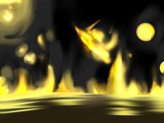
ÆV made a series of pictures that tell a story. A Pooki is humanely sheared of its wool to create a hat. The Pooki is unharmed. Nice! Gotta love Gail’s expressions.
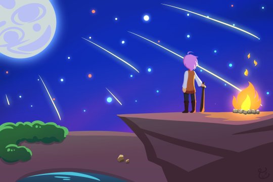
Amagoo Mazeru makes a stunning landscape shot of a full moon and shooting stars. It’s a sharp and clear vector art. I like the faint glow of the moon and the fire and the subtle gradient in the night sky. Very skillfully done!
Hah hah. I got a chuckle out of this one. I imagine this is how Gail's enemies see her by the end of the game. CaESar made this image based on TerminalMontage's famous youtube videos. Nailed it!
CrownStar drew two pictures of Gail. I'm a big player of JRPGs, so the first shot instantly reminded me of Persona 4's art style. (Hmmm... Phoeonotopia as a JRPG... there’s potential there...) Next, Birdy is shown carried off after her defeat. I really like Birdy's expression here - she just seems mildly uncomfortable.
There's a bit of a story behind the first image. As Firanka shares it, she wasn't able to defeat the Big Eye monster at the end of the flash game, so she believed a tall tale that what awaited after was a 6 armed Kobold boss. Hilarious! The second is a rendition of the lonely Anuri elder. A rare subject. The loneliness is portrayed well here. I feel lonely just looking at it!
Koo_chop draws the clash between Gail and Katash at the top of the towers. I really like this interpretation of the game's art style. It’s faithful to the in-game graphics. And the lighting, from the glow of Gail's bat, to Katash's sword, and the lightning in the background... Amazing!
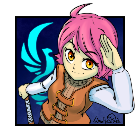
Lime Hazard shows Gail with a salute pose. Very appropriate for this occasion. I also like how there's a slight tilt in the angle that Gail is portrayed. Those dynamic angles are always hard to get right, and Lime Hazard pulled it off very skillfully. See you next mission!
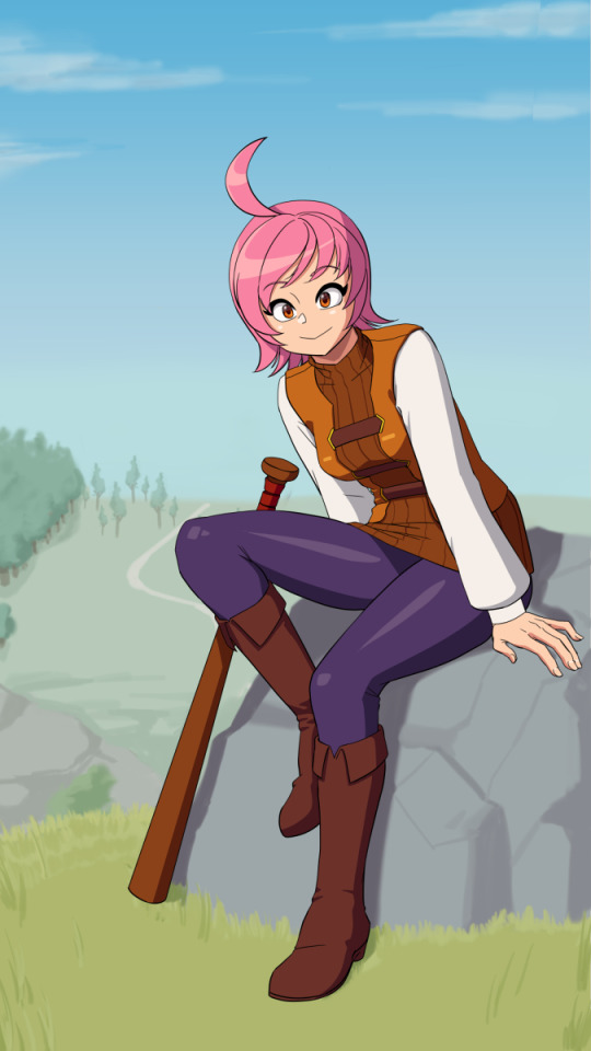
Lyoung0J with a digital painting of Gail posed sitting on a rock. I like how it almost seems like she was caught in a candid moment - she’s smiling, but also feeling self-conscious. Cute! The art style really pops, and I like how Gail is sporting what I call the old anime style nose.

MyUesrNameIsSh*t with a sketch of Gail performing a skillful slingshot. I like how Gail is depicted with her tongue out in a mischievous manner, the way all mischievous people with slingshots do.
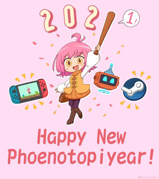
Niitsu Kentaro returns with a 2021 Happy New Year picture. That happened didn't it? A New Year... Gail's pose gave me a chuckle with how she seems to be waving the bat around as casually as one would wave hello. And "Phoenotopiyear"... Well said! One day we'll have our Phoenotopiyear...


Ochan Nu breaks all records with a stunning NINE pictures in one session :O
There's so many goodies here. My favorite would be the one with Gail staring intently at the screen - it's like she's looking directly at you. You almost feel uncomfortable.
Next, there's an Animal Crossing villager dressed as Gail and sporting her pink hair. It even looks like a house Gail would live in. Gail is a connoisseur of the arts and likes Mona Lisa. Yes :)
There are various comics of Gail pointing out Gail's weird food habits. A picture of Fran looking really cool, and even Gail rocking a bathing suit. (bathing suit image linked here in case NSFW). Wow!
Pimez didn't just collect the arts, he creates them as well! This one, which he aptly named 'The Year 175' is a depiction of when the dragons invaded the towers as told by an elderly Daean woman. Great pixeling skills! I got a good chuckle from the ice dragon leaving with its stuff slung over its shoulder.
Quo made a stunning picture of Gail playing the flute surrounded by the 5 musical notes and the Phoenix logo behind her. The theme seems to be "fire" and it works really well. Gail herself looks awesome depicted in her red suit - it's like she's leading a marching band!
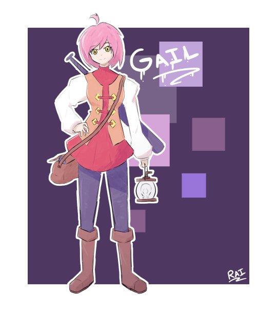
Rai Asuha depicts Gail in the late game with her red suit, and night star bat, and holding a lamp. She looks ready for adventure! I really like the white outline here and Gail's poofy shoulders here - the art style feels reminiscent of Final Fantasy Tactics.
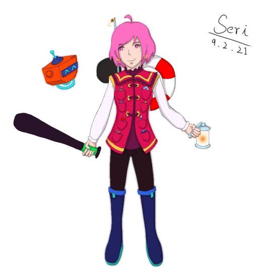
Seri also draws Gail bearing her late game equipment. Unique to Seri's drawing is how all of Gail's equipment is accessible from a pocket on her shirt. I also like how Gail is depicted with her lucky earrings - that accessory is often forgotten.
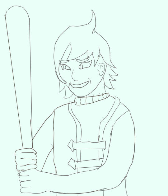
Treedude depicts Gail with a bat and wearing a funny smirk. She looks like she's ready to hurt someone!

Warotar returns with everyone's favorite Great Drake, Bubbles! It seems so happy to be featured!
I'm really grateful for all the fanart this game has received. From the bottom of my heart, thank you!
Closing Notes
Pirate drew a picture to mark the occasion. It shows Gail enjoying a hot chocolate with marshmallows and a pumpkin muffin. A rest well-earned...
Goodbye! Until next time!
100 notes
·
View notes
Photo


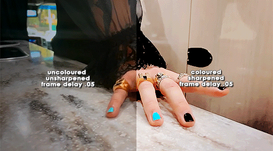
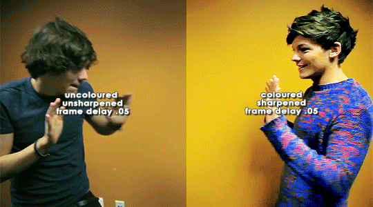
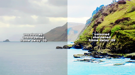
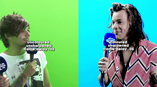
ORIGINAL → EDITED
gif making process
thank you so so much to the lovely and talented @pridesobright and @supportivehusbands for tagging me :’) reading about your processes was so interesting!!
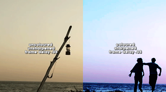
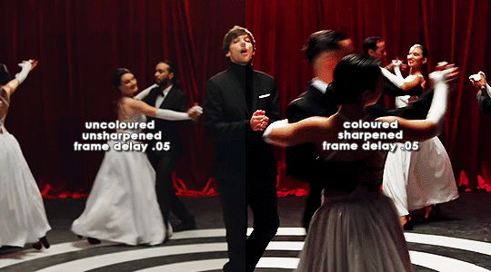
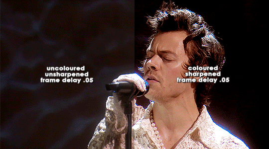
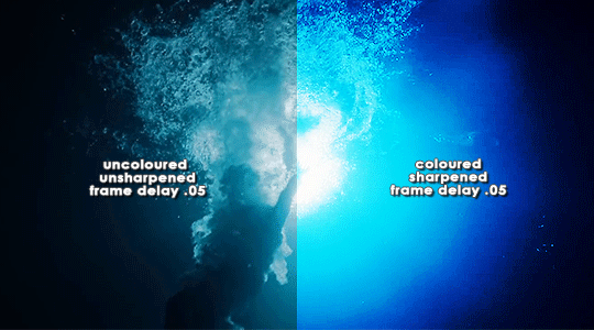
LEFT: cropped, resized (height 300px; width 540px), unedited, unsharpened, frame delay set to 0.05
RIGHT: cropped, resized (height 300px; width 540px), edited, sharpened, frame delay set to 0.05
ideally, 1080p is what i’d use for everything, but sometimes you just have to settle for what you can get (and if you’re cursed…………. you have to battle with less than 480p……….. im looking at you, miss ‘now kiss me you fool’ footage). for this post, i made gifs from ten separate videos to illustrate how even though your source materials are wildly different from each other, the resulting gifs can still be stylistically similar. this is why it’s so upsetting to see people steal gifs like it’s nothing. we put so much thought and care and time into our posts and i can’t even put into words how discouraging it is to see people act like crediting gif makers is a hardship.
i have a note filled with ideas for lyric sets, parallels, etc etc that i work from, but sometimes i’ll just sit down and pick a random video and play around with whatever idea i have in the moment. (that’s how this set came to be!)
after i’ve imported the footage to photoshop (i use cc 2019, although i first started out using cs5 and it’ll always have a soft spot in my heart), removed any redundant frames, and cropped it, i’ll resize it (to 540px more often than not), and set the frame delay to 0.05. when all that’s done, i can colour.
i colour every gifset from scratch — i’ve never had much success with using the same psd on other gifs. it totally works for gifs from the same source, but when you’re using like six different videos for the one gifset, you have to take much more care in making them all correspond to the aesthetic you’re planning for the post. i tend to choose a dominant theme or colour to work from, like blue, green, magenta, pastels, rainbow, etc.
i usually begin with curves and levels until im happy with the brightness. then i’ll move on to either selective colour or colour balance or vibrance, depending on the original colours of the footage. i almost always skew my gifs towards blues and cyans and magentas rather than yellows and greens (i lean more towards coolness or neutrals rather than warmth). and im just really fond of blue, which is apparent if you’ve ever seen anything i’ve made lmao especially if louis’ eyes are involved. this is definitely where i spend the most time messing around with different settings (like increasing cyans and blues and blacks in general / increasing cyans in whites if i want the sky to look more blue / decreasing the blacks in whites for contrast / decreasing the cyans in reds to make them really red / decreasing the yellows across the board, but most definitely in blues and cyans / decreasing magentas in greens if i want Very Bright greens). sometimes i lose my mind a little and i end up with like twelve selective colour layers and im like This Is Fine . skdjfskjf anyways, when everything looks as vibrant and colourful as i want it, i’ll go back to curves or levels or add a contrast layer to make everything look stronger. i also might go back to selective colour or vibrance with incremental changes at the end, just as a final touch. [tl;dr: curves > levels > colour balance > vibrance > selective colour > contrast > go back for any little amendments] for black and white gifs, i’ll start with a gradient map and then continue with curves, levels, etc. after all that’s done, i’ll convert to video timeline > select all layers > filter for smart objects > either sharpen with this action or use these smart sharpen settings > add text if the post calls for it (if it’s a concept/lyric gifset, i like to play around with the settings — although century gothic is my favourite font for this — and if it’s a captioned gifset my standard is arial bold italic / drop shadow to 140 degrees / grey stroke / adjust font pt according to the size of the gif) > export > save for web. et voilà!! one gif down, probably nine to go sdkfksjdfhsjdf
the double edged sword of making gifs for one direction fandom is the sheer volume of footage available to you: on the one hand, you have a whole decade’s worth of moments to gif (and that’s incredible!!!), and on the other, it’s so difficult and time consuming to colour all of these separate moments in a cohesive way that hopefully expresses your own unique creative style. so sometimes it’s frankly impossible to make certain things look the way you want them to. maybe you can’t find high quality footage (the absolute BANES of my existence are the rtl footage where they reacted to themselves playing football at boston common and the louis is loud……loud……….and……..loud footage where you can see harry’s face close up. it’s a TRAVESTY that they don’t exist in 1080p and i WILL scream it from the rooftops), or the moments you want to gif simply refuse to look good next to each other because they’re so wildly dissimilar in hue that no matter what you do, they look strange and disjointed when juxtaposed (in those moments i do tend to either give up or choose to make them black and white). but honestly? the obstacles i’ve come across while making gifs for this fandom have been amazing learning opportunities for me. i’ve grown into and experimented with my style way more than i ever did anywhere else, and i continue to feel inspired by this fandom every day, so thank you to every single creator for your ingenuity and hard work!! 💖💖💖💖
i think y’all have been tagged or done this already, so im just going to tag everyone i admire to say you’re legends and i love your content very much a lot!! @caparius @sunflowrsix @jimmytfallon @stylex @tmlnsn @cuddlerlouis @2tiedships2 @moonshinelouis @ltpolari @itsastorm @finelinee @ltwalls2020 @half-lightl @fallenwalls @tomlinsun @louisbravado @tattooedlovers@lordtomlinson @livehabit @halosboat @thepeacering @alinok
#photoshop#gif tutorial#kinda idk ?? sfkjhskdfjdfg#gif making process tag#the first gif is almost jarring to look at . like sometimes i forget how aggressively i remove warmth from the wmyb video dskfjhdkfjhdjgf#one direction: yellow/warmth. me: NOT IN MY HOUSE#anyways sorry this was so long i just got so excited kskdjfhskhdf#i love making gifs!!! even when i fucking despise it!!!#**#*#creations
93 notes
·
View notes
Text
Shortest Day | Lowestoft to Lands End
On the morning Sunday 22nd of December 2019 I found myself watching the gradient of the grey sky gradually change at Ness Point signifying the sunrise on the shortest day of the year. I with a group of similarly minded nutters enthusiasts was about to embark on a ~430 mile ride to lands end to catch the sunset.
How I found myself there starts with a period of time just over a year in which I had gone from ‘L’ plates to a full license, bought a Versys 1000 and joined TVAM and iAM to gain an education in becoming an advanced rider. Which had result in me back in October attending a ‘Look Lean and Roll’ Course in happenstance with Bob Stammers an avid member of the IronButt association in the UK. Who upon hearing that I liked taking a long ride just to catch a sunrise asked what I was upto the weekend before Christmas, some might say I was foolish in replying I had nothing planned.
Some chatting about the details and joining the Iron Butt forum later and I was booking a hotel for the night before and after and working out my plan for the ride from Ness Point to Land’s End on the shortest day of the year. It looked like this; on the 21st ride from High Wycombe to the Premiere Inn at lowestoft avoiding motorways (168 miles), on 22nd ride to Ness Point, then to Lands End, then back to Premier Inn at Hayle (451 miles), 23rd Ride from Hayle to Dibden Purlieu on the Edge of the New forest (212 miles) to spend Christmas with Family. So a nice solid 800mile weekend, with a group of strangers, Bob being the only one I had met before and even him I had only met once...
The 21st came flying round and the day started with a bit of maintenance and getting loaded up before starting the journey to lowestoft in the afternoon. Unfortunately this journey did go quite to plan, when I got to around Stoke Mandeville a lady not paying full attention I suspect in the haze of pre Christmas prep tried to kill me, last minute lurching across the road towards a parking space in front of a shop just a split second before I was about to pass her going the other way. Luckily I had already slowed seeing her waiting to turn and managed to execute a swerve and stop not dissimilar to what you have to perform on your test. My pannier must have missed the front of her car by less than an inch, as I passed here looking in her driver window at the fear and apology in her face which was much to close for comfort.
After a brief moment of putting my heart back in my chest and unclenching I continued my journey, all was smooth until I got about half way and notice that my gear indicator appears to be stuck on 6th and misbehaving. I pulled over to try and see if a reset would clear it but to no avail, the bike up to this point in my ownership had been faultless. Not to worry its only a gear indicator I can ride without it and continued, nearing my destination I stopped to fill up at great Yarmouth not knowing what the petrol station situation near Ness Point would be like the next morning.
This was when the next issue would occur, upon leaving the petrol station I suffered a KIBS error on the dash, the bike then I assume in self diagnostics reset itself twice before I could find somewhere safe to pull over. Although I am glad this cleared the error, I do think that it is not the best firmware feature given that it was now dark and the in doing the reset it also turns off the lights which I was needless to say using at the time. Overall I managed to arrive safely at the Premiere in at Lowestoft get unloaded and comfortable before heading down for dinner where I got to meet a wonderful group of friendly and interesting like minded people before hitting the hay for a good nights sleep.
Early Morning Ness Point
The next morning a flurry of bikes headed down to Ness Point to begin what would turn out to be one of the best days riding I have had, the day was overcast breezy and not warm but there was an feeling of adventure and excitement as we started our respective journeys towards Lands End.
The challenge for this journey was going to be fuel versus time, I had chosen to follow the stock route offered by google maps M25, M3, A303, A30. The tank range on the Versys is good being 21 litres and normally averaging just below 50mpg with my heft on it and the panniers on and fully loaded. I know that I can get 200 miles out of a tank but I am not yet comfortable pushing my luck on the range.
Sunrise was at 08:06 and Sunset was set to be about 16:00, with google saying that the journey would take 7hours and 44minutes it was going to be tight. I knew I was going to need two fuel stops, some of the Iron Butt members can do this in record time by being organised and sequencing there steps but I am not quite there and figured it would take me 15 minutes a stop at best.
This meant i needed to make up some time, this is where the challenge begins, increasing speed means reducing fuel efficiency, you also don’t want to have to detour much to get find a fuel stop with good prices. In my head the night before I had done this maths and planned to try and make it onto the M3 before coming off somewhere near bracknell for fuel.
Th e journey began with most of the bike staying in a group, the roads back to the A1 were fantastic and the scenery beautiful. It was an excellent way to start the day with sweeping country roads and no traffic. The A1 though not my favourite road normally flew by with the cruise control coming in useful for large sections. At this point the bikes had split up with me not seeing another familiar bike until I made it onto the M25. It was at this point I started to get twitchy about fuel, looking back I probably could have made my planned stop off the M3 but nerves got the better of me. I dived of the M25 at the M4 heading London bound and pulling immediately off, I managed to find a petrol station within a mile or so and although trying to be quick this stop probably cost me 25 minutes.
Now with enough fuel to make it to the West Country I cracked on, for the most part the mile flew by only hitting a little traffic to filter through at stone henge. And then to practice my overtaking past in the Blackdown hills. Although not the cheapest I pulled off at the Exeter service for convenience also knowing that once filled up I would be able to to the rest of journey without a further stop. A quick sandwidge and some fuel later and I was back on the road, the A30 although once an interesting road for me has become a little dull having done it so much. It also didn’t help that there was an area of average 40 for a fair distance, though the cruise control and low speed did give me a chance to stretch my hands.
It was around Goss Moor when the storm that had been battering the west of the UK hit again, with a sudden bout of extremely sideways rain and gusting winds. I managed to keep cutting through it and as I got to blackwater the worst had passed and it was easing up, the section from carlands cross to blackwater being one of my favourite sections of road. Knowing I am now on the home straight I feel fresh all of a sudden, a little tired a little saddle sore but somehow fresh like the winds still hitting me.
The last section from Penzance to Lands End though a challenging piece of road especially with the mud and gravel in places I attack with gusto and make cracking progress even getting some overtakes in. Arriving a Lands End with time to spare not the first and not the last...

I walk round the side of the Lands End resort and I am greeted by the sheer power and beauty of nature, the wind pushing me side and rolling the waves into a foam. I walk and take some photos unable to find the rest of the group I resign myself to trying to get the best shots I can on the breathtaking life affirming scene in front of me.

With the resort being shut down for Christmas I realise I am able to ride the bike all the way to the front private carpark, where people are sat in there cars watching the beautiful sun gradually set light to the sky in front of them. The shot above was only just possible I had to dig the side stand into the gravel as the wind was so strong it risked pushing the bike over.

After finding the rest of the group we headed back to the hotel in Hayle for a warm shower a slap up meal and some drinks. Sitting in the bar waiting for a table the conversation was alive with tales of the ride at various stages, with stories of various similar rides and what was next on the calendar.
The next day I slept in had a late breakfast and then headed home, I had emailed Bournemouth Kawasaki on Saturday night and they phone me back Sunday morning. If I could they wanted to get the bike in that day so they could take a look the next day. Which was ideal for me as it was on route to my family destination, I did the ride back as a bit of a tank range eco test setting my target speed at around 68mph, resetting the trip saw the MPG over this journey up at 60. I dropped the bike in on route and they got it sorted over Christmas ready for me to collect at the start of Jan and on the same tank of fuel I did a further ride covering 230 miles on that tank and still no low fuel indicator.
Overall the weekend was a massive success, I saw so much of the country as I rode through it, I made new friends got to see a breathtaking sunset and try my best to capture it. Despite some minor issues the bike lapped up the miles and made this journey so enjoyable and so doable. Looking forward to doing the same next year...
#versys#landsend#lowestoft#nesspoint#shortestday#ironbutt#motorcycling#oberlix#nikon d200#versys 1000#35mm#bournemouth kawasaki
1 note
·
View note
Photo


Live Industry Brief: ‘Admiration’ Progress
This series of images shows my process of moving from my initial sketch through to the finished painting.
The 1st image was a continuation of the first initial sketches that I had, painting using reference. My progress was slow, and I felt as though I was spending far too much time rendering and re-rendering the same details - which is why I decided to make use some of the techniques I was incorporating in SP4 and instead flesh out my character in 3D.
I took a standard male base model into blender, used a cloth simulation for the skirt, and added a placeholder for the staff. I then added a sphere over the base models head, and used the sculpting tools to create the monster head. After then dropping in some lights and setting up a camera and some volumetric fog, I was able to pull out some renders to use as a reference, (img 2-3)
Initially, I tried to paint on top of the rendered images, but it just felt as though I was fighting the 3D render and trying too hard to make it feel like a painting with limited success. (img 4-5)
Therefore, I just used the render as reference for my lineart and started the painting from scratch - first creating a mask for each section of the character, before starting in greyscale to work out the form and values.
Lastly, I was able to start layering in colour using gradient maps and blending modes, before finally painting over the image with more textured brushes to refine and control some of my edges.
0 notes
Text
Week 10: Individual App design research- Prototyping Questions
What elements do you like?
Rebecca’s App design:
Willow & Pauline:
Colour- simple- one colour didn’t take too much away from info- easy to navigate- nothing missing- location things are distracting, grey colour, or less opacity
Phatt:
A very realistic app. FAQ has too much info. I like the keypad screen instead of it linking straight to dialling the company. Make actions more cohesive i.e some pages animate across/ left and some slide up. No back button on ‘Pay with’ page. Match review colours with meaning as it’s quite confusing. What do the red/ green/ orange colours stand for in the review? Green colour means low price however there might be less parking available, doesn’t understand what the colour stands for. If arrow points left, screen should flow/ slide left too. Everything else like the colour and font work well together!
Tammy:
I like the grey arrow tab. I prefer the pages to slide left/right rather than up/ down because it’s how apps normally work so we’re used to it. It can be a bit too much. I really like the home page design because the layout looks good however colour can be improved.
Natalie: I like the colour and how it’s simple. I like the icons with the pin/ car and it’s the same throughout all the pages and makes it cohesive. Really good overall but not sure if I like the green since it usually goes with environmental and money/ cash related so not suitable for a parking app.
G:
No back button- on timer. Add notification- for topping up time- don’t want to think about it- organization is good- buttons are too big
Likes the colour-coded aspect of the reviews
Debbie’s App design:
Natalie:
Colour, cute, font is really cute
Have an option for saved park (bookmark option maybe)
Phatt:
Contrast colours work well together. Make the background for homescreen teal to tie in with the rest of the app more.
For ‘add new card’ screen, have another option. No question mark- change to confirm
Like the rounded font, easy to read
For hamburger option, don’t make it go back to the home screen but keep it in the side menu
Cute icons, but needs more
Understandable and easy to use
Tammy:
Like the two colours in title screen.
Like the font
Cute design. Like the colour combination. Add new icon for successful screen
The colour combination, easy to understand layout
Willow & Pauline:
Similar to Michelle’s just diff colour.
Map - showed up the different prices and places and could click - simple and clean layout but preferred the other colours more as looked like taxi
G:
Nice to have a visual to see how much time is leftover
Needs to have a date enter for the Booking Function
Text size for ‘Save Location’ is not easy to read, maybe make it bigger
Michelle’s App design:
Phatt:
Colours, icons, everything, the gradient, it’s so cute, the flow is good, understandable, easy to use, i like how the colour is clear, font is cute and easy to read, simple and it suits the colour and i love it!
Tammy:
I love the colours from the first look. I like the rounded font, apps normally use typical fonts like arial etc so it’s boring however with the rounded look it’s more friendly. Love the gradient circles combined with the icons. I especially like the icons because it’s colourful and detailed yet simple. 10/10!
Natalie:
It’s so cute and pretty. I like your icons! (the car icon, it’s not too much and simple) I like the history tab. I like how the font is really easy to read. Easy to use. Add a bookmark/ saved/ favourite locations for facilities that they find for the future.
Willow & Pauline:
colour, pleasing- book a carpark- plus of minus- auto calculate easy as. Illustrations were nice.
G:
I like how I can go back. Like having a choice to move around. Reviews text is a bit small. per/hr. I like the circle/ timer, nice visual. Type in end time.
Delete account button/ log out?
In general of our apps:
1) Favourite colour choices and fonts?
Willow & Pauline:
Pauline is Bias to blue but likes the blue or greeny blue as it is one colour, white and one colour worked really well and kept it clear and simple. Could maybe use the blue used as detail colour accent.
Tammy:
Blue/ purple with the pink accent because it stands out the most. It’s very calming especially when combined with the gradient. It might appear very colourful however when using it on the phone it’s not and it’s simple and clean. For the font I prefer Rebecca’s font when she uses the bold with the normal typeface style in the title ‘ParkPal’.
Natalie:
Favourite colour choice is Michelle’s because it’s the easiest to see (dark background with white font). Along with the font since it’s bubbly and cute. Debbie’s light font is really nice as well as Futura.
Phatt:
I didn’t have a favourite however it would look nice with Debbie’s yellow and Michelle’s blue! Because it’s a good colour combo for both genders. Michelle’s pink might be aimed for female audience. Rebecca’s green is a bit harsh and green usually means ‘go’ like in traffic lights but your app is for parking. Blue represents calming and when you park your car it’s parked and still, not moving. Font choice favourite is Debbie’s, I prefer the rounded font more rather than Arial. Arial font is too typical and simple as you see it everywhere.
2) Overall favourite and why?
Willow & Pauline:
Both think we need to combine the different aspects and incorporate it into one app.
Tammy:
I like all of them! You should combine Michelle’s colours with some of Rebecca’s designs and Debbie’s icons as well as Michelle’s icons.
Natalie:
I like all of them. Each parts of each of our designs should be combined. I like Michelle’s colours and Debbie’s font as well as how simple Rebecca’s one is.
Phatt:
My overall favourite is Rebecca’s because it looks more realistic. More general for everyone to use because car parking, most people are adults so keeping it simple might be better. However for the icons I like Michelle’s because it’s easy to understand.
3) What stood out to you the most?
Willow & Pauline:
How it automatically calculated prices- easy and quick- in a rush for parking seemed speed up process. Showed prices for each parking worked well
Tammy:
The designs and functionality works well i.e the map $ where you can tap to see prices. Colours stood out to me the most especially Michelle’s. Also the icons (particularly the vector line art with the sparkles)
Natalie:
Michelle’s stood out to me the most because of her icons. I don’t like reading and when there’s a lot of pictures it’s easy to understand. It’s really nice when you book/ pay and the icons pop up because it relates to what it says so it’s just nice.
Phatt:
The design and functions. I didn’t like how there’s too much blank/ negative space on certain pages. I liked how in Michelle’s one her layout is clean and also stands out with the box + shadow along with the gradient circle. I prefer having the book, find, pay on the top than bottom. I prefer Debbie’s review design with a solid colour contrasting against the white. I like Rebecca’s side menu with the profile photo and her realistic keypad screenshot. Also having the main logo flow across all the pages (if you have space).
G:
Consider open navigation and user needs as they’ll want to be able to easily change out or decide that they want to cancel bookings. Maybe have a calendar pop-up to select booking dates.
4) What mood/ style did you like the most?
Willow & Pauline:
Green and blue- one colour and white or black. Two colours need to go together really well otherwise distracting, that’s why I liked the green as it was striking and blue seemed to work well too.
Tammy:
Simplistic style, clean and minimalistic. Rebecca’s one was good but she could add colour to the background instead of having a plain white background. I like the teal colour!
Natalie:
I like Debbie’s mood the most personally but I’m not sure if others would prefer it since it might remind them of ASB. Michelle’s style was my favourite because of the icon drawings and lowkey kawaii, i love it.
Phatt:
Debbie’s font and colour is quite friendly and playful. It’s simple and minimal which I like. Michelle’s I like her icon’s the most and the gradient circles also the blue colour is calming and good colour to view since it’s cool toned. Rebecca’s I liked her flow and information throughout her pages.
1 note
·
View note
Photo
DIRECTORS LOUNGE AT MITTE MEDIA FESTIVAL
IN THE OTHER SIDE, BY HER SIDE
Program I: Friday, April 20, 5:00 pm – 7:00 pm at Z-Bar
Ao lado dela, do lado de lá (In the other side, by her side) curated by Elaine Tedesco is a proposal coming from Brazil, that presents contemporary videos of women artists.
The program shows a whole of interests: the city, urban issues, the arts circuit, performance, social problems, speeches and their forms, feminism, audiovisual language, memory, selfimage, daydreaming, etc. For these artists the video is, each with its poetics, one of the media adopted to create their artwork, but not the only one.
The urban space that seems to be the background to most of the videos presented is much more than that, it is the Vortex of these artists’ productions - here as the spinning movement between the urban experience and the personal imaginary space that creates “other places”. In the routine of large metropolises, public spaces become, increasingly, places of passage, and the borders between public and private gradually become more blurred. It should not be forgotten, however, that these spaces of passage have long since become, in a special way, private spaces, among many others, for the homeless, the street sellers, or the performers. In the other side, by her side is organized in four interpenetrating axes: videos that are vectors of other works; daily records; videoperformances; and fictions. complete DL at Mitte Media Festival program here
DL at Mitte Media Festival: In the other side, by her side
Tula Anagnostopoulos - The red carpet, 2017 Rochelle Costi “Negócios à parte”, 2017 Lucia Koch - Yamanaka-san, 2010 Marina Camargo - Brasil, extrativismo (Brazil. Extractivism), 2017 Sandra Becker - Roundtrip , 2017 Marion Velasco - INSTANT BAND, pero esto no es Música. Espanha, 2015/Brasil, 2016 Andressa Cantergiani - Como matar um artista (How to kill one artist), 2017 Viviane Gueller - Camburi (Série Interlúdio) (Interlude series), 2016 Deni Corsino - Faixacorpo, 2017 Lu Rabello - Selfie, 2017 Amanda Teixeira - Changing Rooms, 2017 Dani Amorim - Através (Over), 2017 Natalia Schul - Em pedaços (In slices), 2017 Camila Leichter - Ensaio a pedra (The stone essay), 06 December 2015 - 16 August 2016 Ananda Aliardi - O que tocamos, o que nos toca (What we touch, what touches us), 2017 Daniela Távora and Itapa Rodrigues - Quem vai ser o rato do século XXI (Who will be the mouse of the 21st century), 2017 Ana Paula Pollock - Crise (Crisis), 2017 Samy Sfoggia - Aféfé Ikú, 2017
About the videos:
AMANDA TEIXEIRA Changing Rooms, 4'45" (2017) Looking for a place to live in Munich I wrote for more than 100 landlords, I received eight answers, and I visited 3 apartments. How can a house become a home?
ANDRESSA CANTERGIANI Como matar um artista (How to kill one artist), 8′ (2017) From the questions how to kill one artist, how to kill the public and how to kill the work, I perform one action in the middle of the traffic in Porto Alegre, Brazil and Berlin. The video intent a urban analogy about the differences and connections involving the two cities and the artist attitude in relation to authorship and participation in the art system. ANA PAULA CUNHA CRISE (CRISIS), 3'13" (2017) Living a crisis and experiencing a pulsion that creates new signs from a encounter. Crisis is the chaos of the becoming-world: it paints pink upon pink in order to become itself imperceptible in constant contemporary vigilance.
ANANDA ALIARDI O que tocamos, o que nos toca (What we touch, what touches us), 3'57″ (2017) Ineluctable, but it is the split that separates within us what we feel from what touches us: insult is also impulse. The video brings reproductions and reactions to what women instrumentalists hear from men about their competences.

CAMILA LEICHTER Ensaio a pedra (The stone essay), 8'17″ (06 December 2015 - 16 August 2016) Synopsis: I found in Samuel Beckett's Molloy (1947) one language proposition about a image thought to be transformed into action: before the unspeakable of experience, suck the same four stones in succession.
DANI AMORIM Através (Over), 4'7″ (2017) Over it is a reflection about the self-identity and how we offer ourselves be seen by the other. A visual metaphor of resisting and allowing look through our surface, into the real self, without shields.
DANIELA TÁVORA and ITAPA RODRIGUES Quem vai ser o rato do século XXI (Who will be the mouse of the 21st century), 2'53″ (2017) "A white horse, without ensiles and without reins, graze in the middle of a road, whoever who rides the animal will be taken to a garden of paradise, and when he comes down, his feet will be crossed by thorns hidden in the grass"; The record was held at Vila Cruzeiro in Porto Alegre, Brazil, a neighborhood that has become a endless construction site, since the city hall began to open a new avenue where the houses of the first residents remained.
DENI CORSINO Faixacorpo, 1'45″ (2017) Faixacorpo associetes urban space issues and the performance attitude in order to raise a critical view about the contemporary city, full of buildings and big avenues that doesn't have restores spaces for the citzens. Moving with my own security strip, I can choose my path, to stay, to live, to be present and to occupy the urban space.
LU RABELLO Selfie, 3’19 ‘’ (2017) Selfie in cross point and comments about the work.
LUCIA KOCH Yamanaka-san, 5'45″ (2010) Synopsis: In a kimonos fabric store, a saleswoman displays some fabrics, demonstrating their qualities, their weight, trim, color and luster, volumes and folds. But in these fabrics there are no figures of birds or flowers, no pattern printed. They seems too simple, except for the colors bending over each other. The continuous gradient transition "breaks" as the saleswoman moves the fabrics. She also seems to be exploring this material, trying to discover her possibilities to sensitize the customer. The video was made for the Wave project (Choja Machi, Aichi Trienale, 2010, Nagoya, Japan).
MARINA CAMARGO Brasil, extrativismo (Brazil. Extractivism), 10'14" (2017) The action of erase a Brazil school map is recorded on video. The title of the map gives the name to the work, while, at the same time, along with the gesture of erasing these regions of the map it refers to one important ecological issue related to the current public policies of the country.
MARION VELASCO INSTANT BAND, pero esto no es Música. Espanha, 2015/Brasil, 9´36″, 2016. Performance by Marion Velasco (BRA) in collaboration with Seth Rossano (MEX) on bass and Carlos Llavata (ESP) on clarinet. Images by Marion Velasco and Verónica Hernández Menchara (MEX), sound capture by Miguel Molina Alarcón (ESP). INSTANT BAND deals with the snapshot, the immediate, the transient, the passing. The format refers to the street music, to the instant bands that, in general, are configured and present themselves in the urban space for an audience, also, dynamic. Throwing glass bottles at the collector for recycling is a noisy and everyday action on the streets of Spanish cities, but by mixing it live, with an amplified electric bass and a clarinet, the action has become a sound performance and a transgression. INSTANT BAND, but this is not Music is a sound performance, collaborative, remote and therefore oriented to audio and video
NATALIA SCHUL Em pedaços (In slices), 2'48" (2017) She moves broken mirrors that show fragments of her face and the front of her body to the fixed camera that only captures the back and the vision provided by the mirror's reflexes.
ROCHELLE COSTI "Negócios à parte" , 10'03" (2017) The video "Negócios à parte" was held for the recent exhibition Avenida Paulista no Masp, São Paulo. In a survey of about 8 months, the artist traveled the avenue dozens of times, recording invisibility through characters detached from the corporatist profile of the region and small incidental and ephemeral events. Renato Firmino, painter, scavenger and resident of the avenue participate as a conductor of the video and make a partnership with the artist. In the exhibition, his car serves as space for the projection of the video. Soundtrack: Sara Não Tem Nome.
SAMY SFOGGIA Aféfé Ikú, 01′38″, p&b (2017) Video Art pos Dadaist, tupi or not tupi.
SANDRA BECKER Roundtrip, 2'53″ (2017) The Video is a search of life. Where do we go to and what are we looking for?It is shot in New York and in Berlin using both cities as reference in the art world where artists are searching their way to got to. The elevator is used to show the up and downs artists are facing trying to finance their projects.
TULA ANAGNOSTOPOULOS The red carpet, 2" (2017) The video “The Red Carpet"; problematizes the relationship between audience and artist during a walk through the red carpet. During a walk through the red carpet, the red carpet stretched out to the ground indicates a way forward. It is a remarkable path to walk, with slow or rapid steps, to walk under the eyes of a public desirous to see the stars - mainly actors and actresses. (When you are part of the convenient group of anonymous people who for one reason or another are out of focus, the trajectory is a moment of suspension: neither reality nor illusion.) Look at all sides at once: when you are inside and / or when you’re out? This video was made in collaboration with Tecna PUC / RS, Kolor360º during the 45th Gramado Film Festival, Brazil.
VIVIANE GUELLER Camburi (Série Interlúdio) (Interlude series), 01'54″ (2016) The Interlude series is constitutes from situations of suspension in daily life. In a interference of the sound over the image, the Camburi video traces the experience from the displacement and the waiting as poetic exercise.
1 note
·
View note
Photo

Here is my response to Groove Armada from listening to At The River. I completed this artwork on A3 cartridge paper and within 90 minutes. I listened to the song fully, then again so I could map out my ideas and lastly a last time so I can fully embrace the song and the emotions I receive from it. During my duration of completing the painting I also listened often to see if I could pick up any changes regarding my emotions and how I feel. I completed this painting with acrylic paint and watercolour pencils and regarding equipment I used paintbrushes, masking tape and a pencil. This reminds me of waves which are peaceful and relaxing to look at. As soon as listened to the song it seemed flat and melancholy with a quiet upbeat rhythm. From the first listen I knew straight away that I wanted to focus on a blue colour palette with a light ombre purple palette on the right-hand side. The blue represents sadness but fits with the melancholy emotion the song has underlying so this fits very well. Various shades of light purple are calming to me, so I used this on the right-hand side because this works well with the blue and fits the slow and relaxed beat the song has. In addition, regarding design I knew that I wanted to do waves and swirls on the right-hand side because these strokes create a calm and relaxing atmosphere to the reader. In addition, for mark making I wanted a smooth surface to represent the flat tone in the song. I first started with the waves roughly mapping these out with pencil and then went in with blue and white working with the same two tubes to create the smooth gradient with a range of paintbrushes. Next, I made various shades of light purple and using a brush created swirls on the right-hand side and when dried I went in with watercolour pencils to deepen the centre of the swirls. My last step for detail was adding the specs of blue and pink. Yet again this was done with paintbrushes. A strength is that the painting has flow and movement throughout creating a nice illusion and a fluid image. The colours also represent the song well and come together creating a harmonious balance making the painting very pleasant to look at. In addition, the fade from blue to white is satisfying to me increasing the aesthetic appeal and appearance and I think this will translate across to the viewer as well. In addition, the various shades of purple and blues form dimension and come together creating a 3-dimensional appearance. A weakness I have with the work is that the white highlight on the bottom of the waves are not fully consistent regarding brightness from top to the bottom. The top two waves are bright at the bottom and the bottom two lack this. To improve I would add more highlight and bring the white further up from the bottom. Overall, I like this work as the colours blend well together and create pleasant imagery to look at and evoke emotions from. I feel that I have been successful with replicating the music and how I felt during the song through mark making and colour.
0 notes
Text
How to Design a Contact Page That Drives Engagement

How can your customer reach you? If a client arrives on your website after searching on Google, what can they do to take the next step in a relationship with your brand, without buying anything?
One of the primary aims of any website is to drive conversions. However, it usually takes between 5 and 8 touchpoints to generate a viable sales lead. People don’t want to convert straight away.
Since building a relationship with customers is crucial to success, it makes sense that the contact page would be an essential part of driving results. Unfortunately, a lot of website owners pay virtually no attention to that page. They ask their designer to create a page with their address and phone number on – and that’s it.
What many business owners don’t realize, is that the contact page is the door to deeper, more lucrative relationships with potential prospects. The design of this essential website element needs to be fantastic to drive results.
So, where do you start?
Defining a Well-Designed Contact Page
Let’s start with the basics, what makes a great contact page?
The complete answer to that question depends on the target audience. Some customers will want to see fun and friendly contact pages, complete with social media sharing buttons. Others will want to see a map that shows them exactly how to reach an office or business.
There are a few golden rules to keep in mind, of course. Contact pages should be:
Easy to find: Don’t hide the link to the contact page on the website footer. Make it easy for customers to find out how they can get in touch.
Simple: Don’t put too much content on this page or it will overwhelm your audience. Just let them know where they can go to get answers to various questions.
Professional: Even if you have a friendly brand personality, your contact form still needs to be grammatically correct and well-designed to show a professional edge.
Convenient: Make your phone number clickable so customers can use it on Skype. The same can apply for your email address. Provide easy access to social media profiles, and if you have a contact form – keep it short and sweet.
Informative: Include all of your contact information in the same place. This may include your address, a map to your location, social media pages, email addresses, and even forums.
Accurate: Ensure that the information on your contact page matches the information listed elsewhere. Check directories and Google my Business listings to be sure.
Attractive: Yes, a contact page needs to look good too. Plenty of white space will make essential information stand out. A good layout will guide the eye through the page.
Consistent: Make sure the contact form on your website matches the brand personality that appears on all of your other pages.
Take a look at the Tune Contact page:
It’s beautifully laid out, with clear information that’s easy to read. The company shows exactly why customers might want to get in touch and how they can reach out. As you scroll through the page, you’ll find additional office locations, email addresses for different teams (sales and support), and links to social media accounts too.
How to Drive Engagement on a Contact Us Page
A good contact page needs to look fantastic, showcase the company’s personality, and capture audience attention. However, there’s a big difference between a contact page that gets the job done, and one that convinces your audience they have to connect with you.
Here are some excellent ways to make your contact us page stand out.
Step 1: Using Color Correctly
Color and color psychology have a massive impact on user experience.
Studies constantly demonstrate the conversion powers of having the right shades on certain pages throughout your website. For instance, changing a CTA button from red to green can increase click-through rates by 27%.
However, every audience is different. The colors that drive engagement on a contact page for your company will depend on your target customer. A/B testing color palettes that match your brand personality is a good way to get started.
One interesting example of colors that make the right impact on a Contact Us page comes from Hubspot. Here, the brand maintains it’s brand color (orange), but it also introduces some new shades that convey trustworthiness and professionalism.
Blue is the most calming and credible color for any brand, The gradient that Hubspot uses here blends perfectly with its brand identity, allowing for a stunning contact page, with CTA buttons that still stand out.
Experiment with colors that can generate the right emotional response from your audience, but don’t ignore the golden rules of color in web design. You still need to showcase your brand identity, and you still need a way of making crucial information stand out.
Step 2: Humanizing the Customer Service Team
Some of the customers that arrive at a contact page are interested in your product or inspired by the potential of your service. Other customers will be looking for assistance because they’re frustrated with something or stressed out.
If you’ve ever had a problem with a product and wanted to reach out to the brand about it, you’ve probably noticed how annoying it is to find a blank contact page with nothing but an email address. The lack of effort and humanity in the contact page is enough to convince you that you probably won’t get a response.
But what if you add some happy smiling faces to the page?
Research indicates that brains are fine-tuned to recognize and appreciate human faces. Having a picture of your customer service team, or just any human being on your contact page makes you instantly more approachable. Your customers start to feel like they’re reaching out to a person – not an empty website.
Look at how engaging and personalized this contact page from Amber McCue looks:

Although you can show any human face on your contact page and potentially get results, showing your actual agents will be more likely to drive positive results. It’s a great way to showcase the authenticity and humanity of your team.
Step 3: Making it Easy to Find
A surprisingly large amount of the time, companies shove their contact information into the footer of their website, forcing customers to spend forever looking for them. However, your audience might not want to spend an age searching for your details if they’re in a hurry to get answers.
Stowing a contact page in a footer is also a problem for those visiting your website via mobile, as they might not be able to see all your footer details and links as well.
A Contact Us page doesn’t have to be a massive part of your website navigation if you don’t want it to be. However, it should be one of the first things your audience can see. Putting the information on the header of your website, or even sticking it to the top of the page as your users scroll is very helpful.
Zendesk makes it easy for customers to get in touch in multiple ways. First, the Contact section of the website is clear at the top of the page. Secondly, if you start scrolling through the Zendesk website, a “Get Help” button pops up, so you don’t have to scroll back to find assistance:

Remember, aside from making sure that your contact page appears in the right part of your website, it’s also worth ensuring that it’s easy to understand. Don’t use unusual terms like “Chat”, or “Chill with us”. Stick to tried-and-true options like Help, Contact, or Support.
Step 4: Making the Experience Relevant
There’s a reason why it’s practically impossible to find a one-size-fits-all contact page.
It’s because different customers need different things from your brand.
Some customers will be looking for the answer to a question; others will want to discuss something with your sales team. That’s why many companies are using adaptive contact pages that can change to suit the situation.
For instance, you may start by asking customers what they need help with. Zapier takes this approach with its Contact page:

By asking the client what they need straight away, Zapier can make sure that the visitor finds the right information, and the right number or email address for the appropriate agent. You can even scroll down the help page and look for something in the available help centre, using the search bar. Or you can click on View our experts to hire a Zapier pro.
Creating a dynamic and customized experience like this does a few things. First, it ensures that the customer will reach the right person to help them first-time around. This reduces the number of inappropriate calls your employees have to deal with, and the number of transfers.
Secondly, you deliver a better experience overall for your client, because they don’t have to repeat their issue to multiple people or start a massive email thread. They get the support they need immediately.
Dynamic contact pages can even save you some money and time. If clients decide to solve an issue themselves, using your resources, that’s great for your busy agents.
Step 5: Direct People to the Right Place
The central focus of your contact us page needs to be the available contact options. Centralizing the contact options on a page is an excellent way to make sure that they get the right amount of attention. Centralizing also means that your customers can spend less time searching for the contact details that they need, which is great for usability.
The Melonfree.com website uses a contact us form that’s centralized to immediately pull attention to the customer’s options for getting help.
Centralization isn’t the only way of using design principles to guide visitors on a contact page. According to Ray Hyman and Edmund Hick, increasing the number of choices on a page often increases the time it takes for people to make a decision.
When it comes to connecting with a brand, the right option for each customer will depend on the person and the situation they’re trying to overcome. For instance, a customer that needs to reset their password will probably be able to get the solution they need from an FAQ page.
On the other hand, someone who needs help using a new feature might need the guidance of a professional. To help guide customers to the right solution, Basecamp gives customers a variety of steps to follow to get the right solution fast.

The main purpose of the contact page is to help customers get the right answer with an informative form. However, there are unobtrusive alternative options available too. If all you’re looking for is a way to help yourself fix a problem, you can click on the help guides link before you ever scroll down to the form.
Step 6: Support the Contact Team Too
The best contact us pages aren’t just a great way to improve customer experience. Well-designed solutions also help the customer service team to save time and stay productive.
One of the primary metrics that companies consider when evaluating the success of a service team, is the number of replies required before an issue is resolved. However, if the initial question from a customer doesn’t contain enough information, this number often increases.
Using the design of the contact form to access the right information helps with:
Automatically routing people to the right team member: Companies can set up segmentation rules that automatically send certain emails to different employees based on keywords. You might have questions that go to the sales team, and separate queries that you direct straight to the customer service team.
Show appropriate support options and FAQs: Remember to give the audience a chance to help themselves before they reach out for extra support. Links to an FAQ page or self-service options can really reduce the pressure on a team. Some companies even add automated chatbots to the mix to help with self-service.
Prompt for extra context: Although not every customer will take advantage of an opportunity to add extra information to a form, some will. Adding a box to your contact form for “anything we need to know?” is a great way to generate more information. Ban.do includes a simple “question” box where customers can add as much detail as they like. An option to add screen shots or documents might be a nice touch too.

Building Your Own Contact Us Page
Every customer has their own specific set of needs. The right contact page for another business might not be the right one for you. That’s why it’s so important to take some time getting to know your customers and speaking to your support team.
When you’re planning your contact page, it helps to ask yourself some basic questions about what you want to achieve. For instance:
What kind of channels will our customers want to use to connect with us? Look at things like social media messaging, email, or phone calls. If you’ve got a relatively tech-savvy audience, then they might want to use things like instant messaging with chat bots too.
How can we direct clients to the appropriate channels in as little time as possible? Having a system in place to automatically route your customers to the right agent will reduce the time to resolution for your customers. The faster you solve problems, the better your reputation becomes.
What can we do to set customer expectations and build confidence before they speak to us? Designing a professional-looking contact page will increase customer confidence, while an FAQ section shows that you’re ready to answer common questions.
How can we showcase a unique brand personality without making the page complicated? Everything from using distinct brand colors on a contact page, to adding images and illustrations reminds customers that they’re in the right place.
What can we do to reduce the friction points in a customer’s path to contact? Avoid adding too many input options to a contact form and ensure that it’s easy to reach out when your clients have a problem.
Understanding exactly what your audience needs from you, and what they’re looking for when they come to your team for help reduces the effort involved for your client when they reach out for help. Remember, today’s digitally-savvy customers expect their interactions with companies to be as streamlined and simple as possible.
Make the Most of Your Contact Page
Contact pages are frequently an afterthought in the website design process. However, they’re one of the most valuable tools your company has. With a good contact page, you ensure that your customers can always reach you when they have problems. What’s more, you boost your chances of people wanting to reach out to the sales team too!
Good luck creating a contact page that encourages engagement from your target audience. Don’t forget to track your results from each design, and A/B test for optimization.
Source from Webdesigner Depot https://ift.tt/3kp31qK from Blogger https://ift.tt/3lhzYqt
0 notes