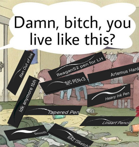
#1. set my brush to 3px size
Text
digital art is so fun until i look up a tutorial and they're like: "multiply" "lock your layer" "blend brush" "fill layer" "clip" "set to normal"
#i don't. know anything abt the actual program i'm using. my process is literally.#1. set my brush to 3px size#2. sketch out the pose#3. on the same layer (usually. sometimes a new over it) start adding clothes and character details like facial expression hair etc#4. colour block in a layer underneath by colouring in all the edges of the lines and then using the fill tool to fill the big space#5. on a layer over everything. add extra lines in contrasting colours to make details and shapes stand out better on clothes n stuff#6. (new step!) using a lighter and a darker colour on a low opacity. try to put some consistent lights and shadows on everything.#(this is on a layer between the colours and the lines)#7. (new step 2!) take your new big wide sketchy brush and block out a vague background#i'm trying to learn how to do lights and shadows but i'm not. like comprehending. hrg.#also i want to fuck with perspective more but i don't know how to make that work either lol#look art was so easy when all i was doing was realistic graphite portraits. i just look at the picture of a face i was meant to draw.#then draw it#i got access to as many colours i want but at what cost-
5 notes
·
View notes
Note
What brushes do you use in csp?? Ive been trying to find a good lineart brush thats gives me similar results to yours and im just having no luck
Imma be real with you boss I don't even know how to answer that question anymore LMAO
There's a post on my patreon (which, my bad, I thought was public but is locked for $1 apologies) called "brushes masterpost" where I list a bunch of brushes I tend to circle back to BUT that post is already outdated. I switch lineart brushes so often that ANY information about what brush I'm using becomes obsolete real quick so I hate answering this question 🫠
I can say that even if I linked the brushes I'm using, the chances of them looking the same to you are slim since my brush effects depend not just on the original brush, but on a bunch of edits to its settings, system pressure settings (the same brushes look different to me on a laptop and an iPad for instance) and resolution (a lot of the brushes I use look crispy because I work on low resolutions, but would look completely different if instead of using them at 3px size I used them at 10px like a normal person).
I can also maybe just advise that if you're struggling with finding a brush you like, don't be afraid to download a bunch of different ones (assuming you've got something like the CSP asset store) and spend some time redrawing the same things to see which one tickles your brain! And also don't be afraid to mess around with the settings to see what they do - while of course saving duplicates if you don't want to lose the original one. I find that really understanding what the main settings do is a lot better in the long run to customise your ideal brush than just trying out stuff other artists use directly.
My current lineart brush is a customised version of the brush "sketchy pen" from this pack
276 notes
·
View notes
Note
What canvas size, settings, brush size, and brush textures do you normally use?👀 Tell me all your secrets🥰
My default canvas size is usually 2000x2000px or 3000x3000px! Brush size varies a ton depending on what brush I’m using - I’ve been using this pencil brush lately for both sketching & final lineart, & it’s usually set around 1-3px with 0.1 or 0.2 particle size. I mainly use lasso+fill for flats and default airbrush for shading, and I use a lot of overlays for things like fabric textures. I’m also a big fan of borderline transparent(usually <15% opacity) gradient maps & noise brushes/overlays.
Here’s some of my most used/favorite brushes & textures
Color noise texture
Textured diagonal
Vintage gradients
Knit cloth texture
Body hair brushes
Antique decorative brushes
Vitiligo/roan/foliage texture brush
Merle brush
Scar brush
Dust brush
Mottled faded edge brush
Horse dapples brush
Dog nose brush
Pearls brush
I have a handful of other brushes I use too(namely the silky blender I use for hair/fabric creases & my metal texture brush that I use for basically everything) but those files were shared rather than sent as links, so I honestly couldn’t even begin to tell you where they’re from. Same goes with my favorite freckles brush - I dragged that one over from photoshop and I have no idea where I originally got it from.
#bo.txt#thank you!#if you want the metal brush or silky blender or freckle brush I’ll happily share the files#just fyi that dust brush is god tier for any kind of weathering or yucky shading you need to do#merle brush works great for bruises with a very small particle setting#pearls brush is great for dog tag chains#I slap that knit cloth texture on EVERYTHING im not even joking#also slap those colored noise overlays on everything
6 notes
·
View notes
Note
Bruh how are u so good at putting ur ocs into wakfu screenshot?! Cause dang that is good
(yooo congrats on being my first question )
I get asked this lot, and i’m never quite sure what to say lol. The way I learned how to draw in the first place was by copying the wakfu art style, so the influence is inseparable from my art. I guess 11 year old me set myself on the right path, because i’m still going at it with wakfu art and (apparently) doing great.
Anything other than that is just looking for specific traits of the art style then trying to replicate it in screenshots. The first one i ever did, I used an edited copy of Yugo’s figure as a base. Taking screenshots and just drawing your characters over is a totally valid way to do it (and honestly much quicker), as long as everything is credited properly.
Best i can do is some tips before i get the motivation to drop a real tutorial
Big, stompy feet! Chunky forearms! Wide hands! (s3 looks much slimmer, though)
Faces have huge eyesAlso, most characters don’t have long chins
very subtle airbrush over shadowed areas, and for light (try to make it blend as much as possible, it should barely even be visible. like 5%-9% opacity)
Colored lineart! make a clipping layer then add your colors overtop (try to make it look like there’s no difference between lines and colors), then lower the opacity to around 10-15%
When adding shadows, use the base color on multiply
to get it to blend better with the environment, color pick prominent background colors and cover your character with them. lower opacity to the 0%-10% range (whatever suits the scene), and mess around with layer settings
Something I like to do to make it go better with the image quality is to merge my character into a single layer, then duplicate it twice. take 1 layer, then sharpen it to hell and back. take the other, and blur it until you can barely see the lineart. set both of the layers to around 0%-5% opacity, and it’ll look a bit more low-quality!
If you happen to use clip studio paint, i’ve found that a 3px brush on an average screenshot from fancaps.net is the same size as the show’s lineart
i hope that makes sense!! Other than that, the only thing else I can say is 1. use TONs of references using characters that are built similarly to yours, or have a feature that’s similar enough to yours, and 2. practice! It gets MUCH easier with time.
(VERY sorry for how long this is, i got a bit excited oTL)
#wakfu#wakfu season 3#wakfu season 4#wakfu oc#wakfu eliatrope#fanart#tutorial#wakfu tutorial#screenshot edit
13 notes
·
View notes
Photo

⌜˓ ˑ ⋆ 𝚂𝙸𝙴𝙽𝙾𝙵𝚁𝙿𝙷'𝚂 𝚃𝚄𝚃𝙾𝚁𝙸𝙰𝙻 ➤ CUTTING A PNG IN PHOTOSHOP ˔ʾ⌟
i was asked how i cut out my pngs in photoshop, which i often use in my graphics. luckily, cutting out pngs is very easy and only requires photoshop and a tad bit of patience and practice. below the cut you will find a detailed tutorial on how i cut out my pngs !! if you found this useful, please give this post a like or reblog. my askbox is always open to questions if something isn’t clear or you are struggling with something !! good luck, darlings !! xoxo
alright, before we can start cutting, the very first thing you need to do ( and i guess is needless to say -- but i’ll do it anyways ) is find a picture you would like to cut out, save it to your computer and open it in photoshop. once this is done, we are good to go !!
STEP 1 : when your picture is open in photoshop, increase the scale ( i usually set it at 350px, but this usually depends on the size of your picture ). simply make sure that the zoom is strong enough so you can see everything in detail. this is definitely important if you are cutting out a picture of a person with very unruly hair or hair that sticks out a lot. the bigger the zoom, the more precise you can cut.
STEP 2 : once your picture is zoomed in, select the erase tool.

STEP 3 : once you’ve selected the eraser tool, you’ll have to pick which eraser to use. in order to erase the background and make it transparant, you first have to select the middle eraser ( the background one ). then, simply erase a small part somewhere random in the background ( you should see the checkered background in that spot, then you know you’re good ). if you don’t do this and immediately go to step four, then you’ll remove the background but it won’t be transparant -- it’ll be white.
STEP 4 : now, select the first eraser tool. this one you will be using from now on, to cut out the picture.
TIP : if the image you want to cut someone from is very plain, f.ex. a one colour background, then you can opt to use the last eraser tool. then you just have to click the background and it should all disappear. but this will only work if the background is one and the same colour and if the contrast between the background and the person is big enough.

STEP 5 : now we have to adjust the eraser settings before we can start cutting out. in order to do this, click the small arrow ( see circle on picture below ). a drop down box will appear.
STEP 6 & 7 : in order to get a clean, detailed cut, you don’t want the eraser to be too big. usually, my eraser tool is set at 3px. but again, this depends on how big your zoom is. it’s possible that you’ll have to set it even smaller if you want to cut out hair or something of the sort. now the only thing left is select the plain white, clear cut eraser ( number 7 on picture below ).

STEP 8 : and now you can finally start cutting out the person on your picture !! this part is pretty self-explanatory -- just begin to erase the background, closely around the person, following their frame. don’t worry if it doesn’t go smoothly from the get-go, often, you need some practice to get it done quickly and smoothly.

STEP 9 and 10 : once the entire frame has been traced, you can make the brush size a bit bigger again ( step 10 ) and make the transparant trail around the body wider and wider ( step 11 ). when it is wide enough, zoom out again to 100% ( step 9 ) and now you can use a big brush to erase the remaining of the background quick and easily.

and this is how you cut out a person from a picture !! this is the end result, which you have to save to your computer as a png !! if something isn’t clear or you have more questions, feel free to let me know, dear. don’t forget that practice makes perfect -- you usually don’t have a very steady hand from the get-go. but it’ll come, trust me. hopefully this tutorial has helped you out. one more thing, i apologise for the dutch settings of my photoshop -- i hope this hasn’t made things confusing !! xoxo

116 notes
·
View notes
Photo


UNEDITED VS. EDITED GIFS
tagged by @stcny ♥
I love doing these, so picked some different gifs this time! :)
Note: The left column is already sharpened and the frame rate is slowed (I don't have the unsharpened ones anymore), but otherwise unedited.
As previously stated, I start all of my editing with an exposure layer and then a brightness/contrast layer, then I do all of my other adjustments in between these layers
1. Selective Color + Painted Background ⇢ This one basically uses a similar technique to the one I described here, but instead of painting the whole background, I was able to do the bulk of the work by repeating a white selective color layer with all sliders set to -100 six times to get the background as bright white as possible. Then I added an additional white selective color layer and adjusted the sliders until it looked the shade of blue I wanted. Then, I color-matched the blue color and painted over what was left of the trees, around Ruth!Doctor's shoulder, and the few random spots near her head. All that was left to cover was around her hair and in ear earrings. This required going frame by frame and painting on a new layer for each frame to account for the movement. There’s still a spot visible around her neck if you look closely because I was too impatient to cover that lol. Finally, I added a levels layer to brighten a bit more while maintaining contrast and a vibrance layer. It is a bit time consuming, but I love the end result! :)
2. Gradient Map + Text ⇢ For this one, before starting the coloring process, I color-matched the background color and covered the text using the rectangular marquee tool. Then (skipping the exposure/brightness this time), I created a white selective color layer and set all of the sliders to -100 to make the background bright white. Next, I added a yellow and black gradient map. Then, I added the “AGENT 13” text, and finally a texture on top set to soft light and a low opacity.
3. Selective Color + Painted Texture ⇢ In addition to exposure and brightness, I added a levels layer to darken the background around Carol. Then to adjust the coloring, I used a bunch of selective color layers, mainly focusing on brightening the reds, yellows, and blues. Then, I added a black selective color layer and set the bottom slider to 100 to tone the background and make it a deeper black. Then, I added a vibrance layer. Now comes the fun, yet time consuming part — adding stars! I used the basic round brush at 1px, 3px, and 4px for varying sizes. Then I added more stars on a second layer with the opacity lowered for added depth.
4. Selective Color ⇢ After the basic exposure and brightness layers, I used selective color layers to bring out the cyan in the background and the yellow in Thor's hair. I also added a levels layer to brighten it a bit more and a vibrance layer.
12 notes
·
View notes
Text
color icon tutorial
ok i’m not super great at making icons but an anon requested a tutorial for my icons so i will post my process! it’s good for beginners i think (even tho i have been making these icons this way since 2016 lol)
you’ll need:
Photoshop CS5 or higher (I have CS5 which is quite old, I know, but I pirated it many years ago oops)
relatively hq pics to make icons out of
a psd (if you need some, tumblr.com/tagged/psd is what i periodically check for some).
an action (preferably sharpening action, since that is what i use)
a texture if you want
you, yourself, and you, and i guess this tutorial
i’m going to be making this as a beginner’s tutorial so it’s gonna go about as in-depth as one can be! it’s gonna include a lot so feel free to skip a lot of it if you are already pretty well-versed in photoshop or icon-making.
ITS SO LONG IM SO SORRY IT IS SO VERY IN-DEPTH I’VE EXPLAINED EVERY POSSIBLE THING I COULD’VE
but also if you have any questions at all, please let me know. i love teaching people stuff.
example of the icons that i make:

Hi hello welcome
Ok, so first open up Photoshop. I am using CS5.
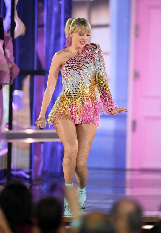
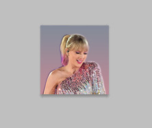
You will need hq pics of whatever you plan to icon. I do 99% Taylor Swift, so I use taylorpictures.net for all my icon needs. Make sure they are of semi-decent quality, they don’t have to be amazing since we will be shrinking them down to a very small size so much of the quality is gonna disappear anyway but like, make sure you can at least tell the subject from the background distinctly (you’ll see why later).
This is the picture I am using for this tutorial (and will post icons separately):
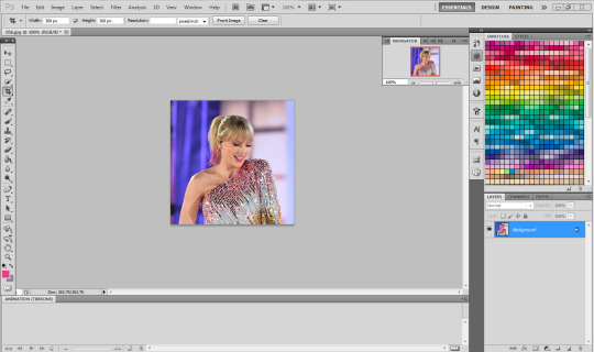
Open this in ps (File > Open > the picture)
Ok so now it’s the actual tutorial lol
1. Crop the image
We are not going to crop it to 100x100! Select the Crop tool and set the dimensions to 300 px x 300 px--MAKE SURE THAT YOU TYPE IN PX AFTER YOU TYPE IN 300, OR ELSE IT WILL CONVERT TO CM AND THAT WILL NOT WORK FOR THIS!
Next, crop the picture you want as much as you want--as long as you get what you want in the icon. For these kinds of icons, you just want to focus on one item--like Taylor, for example--instead of multiple (not Taylor and her backup dancers since this isn’t what my icons look like and you won’t be able to do that very well on a beginner level). Crop that to a 300x300 px size and click the check mark on the top bar to finalize it.

If your pic is hq enough--meaning a larger picture--it will probably look super small. That’s ok, it’s just proportional to the old picture. Go to the right side bar and select the Navigation tool.
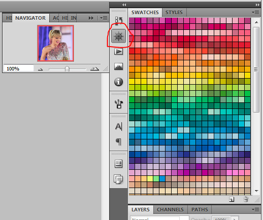
If that tool isn’t there, you will just have to go to Window and select Navigator, and it will bring that up for you.
See where it says 100% in the picture right there? It will likely say something like 25% or whatever if you just cropped it, so change it to 100% which will bring it to full size.
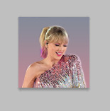
Cool! now it should look like this:
2. Use the Quick Selection Tool

Go to the left sidebar on Photoshop. Depending on which PS you have, it might look different. This is what mine looks like. Regardless, the icon should look relatively the same I believe across all Photoshop versions. If it’s not there, you might want to left click and hold down on some of the icons and see if it is an alternative option (it should be there already--but it is grouped with the Magic Wand Tool just in case).
This tool has three options in the top bar: free select, add, and subtract. Start with the middle option: add.

This will allow you to choose which parts of the picture you want to select to cut out for your icon. You can change the selection brush size, but I always keep it at 3px because it keeps it really precise.
Drag your mouse over the area of the image that you want included in your icon. This tool will automatically choose parts of the image that are similar--for example, Taylor’s blonde hair will like all be selected around the same time, but the pink/blue background will not be, since it can tell that those are starkly different colors and thus two different objects in the picture. It should have a crawling ants moving line around the areas of the picture you want to select. If you go outside of what you want included in your icon, that’s ok! That’s why the subtract option is there. Just select that--to the right of the Add option--and go over what you do NOT want in your icon to get rid of it using the Subtract tool. You might have to go back and forth between those tools in order to get exactly what you want in the final product.
I can’t show you my final outline for Quick Selection since it goes away when I screenshot, but after you’re sure you got what you want in your moving ants line, it’s time to finalize it.
Remember, this tool effectively cuts out the selected portion of the picture from its background.
3. Refine Edge
On the top bar, click the big rectangle button that says Refine Edge. It will bring up a window that looks sort of like this, but I have settings adjusted the way I like:
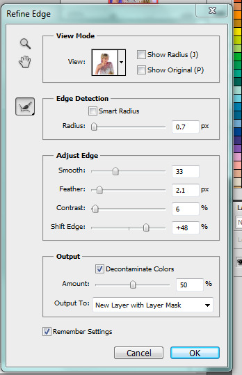
You can change these settings any way you’d like, but I generally stick with this. It’s also okay to mess around with them and see how you feel. If you don’t want to do that, you can just use my settings and edit anything you don’t like later.
Click OK to cut.

This has pretty much removed the background from the picture and only left what we cut out and a transparent background (hence the checkered background--that is space that doesn’t actually exist). You can also see some shadow from the background around her arms and hair, which we can delete out later very easily. That is a result of the settings from Refine Edge, which is why some people choose to lower the Feather bar so that it doesn’t include as much shadow--which is good for many pictures since a lot of these are straight cuts, but this can occasionally cut out part of the icon you want to keep or make it look weird since you want just a little space to mess up when it comes to the Quick Selection Tool.
Bonus step if you want a selective colored icon:
Some people like really vibrant icons that include re-coloring. I’m not very good at it, but what I do (and it sometimes turns out well--this is typically the way people do it, though they are less sloppy than I am) is select a color from the Swatches at the right that is similar to the one that they want to paint over. For example, if I wanted to make Taylor’s hair more yellow/gold and vibrant, I will choose a yellow. Select the Paintbrush tool. On the top bar, the Opacity will likely be set to 100%, which will basically color right over the picture and look weird. Set the opacity to something very light--mine is 20%--and paint over the part that you want to color. Make sure you do this in one stroke--if you paint over her hair with 20% opacity once, let go of the mouse, then go over it again, it’s gonna start building up and becoming more opaque!
You can also completely recolor a picture this way, like if you wanted Taylor to have entirely pink hair, you can use this same method but choose the pink you want instead of a similar yellow. This can be very difficult and tedious, so I don’t typically selective color my icons, though occasionally I do because I love those icons with obnoxiously vibrant colors.
4. Open texture/create new background.
Ok, so I do both of these things depending on the background I want. I have some textures saved such as this that I use for icons:

I didn’t make it--it’s pre-made by another artist on tumblr from whom I downloaded their texture pack. You can make backgrounds like these too, but I’m not very good at them.
SO you can either File > Open one of these pre-made backgrounds/textures, or you can make your own.
In order to do that, you can do File > New and change the settings to width: 100 pixels and height: 100 pixels. Under Background Contents, choose White. That’s very important! You don’t want transparent, it doesn’t help us. That brings up a new window on Photoshop next to the picture we’ve just cut out, just a small white square. You can paint that whatever color you’d like. Use the Paint Bucket tool and choose a color from the Swatches section on the right. This will make the background completely one color. However, if you want a gradient, you can do this several ways, but I do it like this:

Click that, go to Gradient, and mess around with the Gradient options and see how you like the background. Here’s one I made, for example:

Boom! Background for icon. I will use this since I made it for this tutorial so yeah it might not look amazing but here we are.
IF YOU USED THE TEXTURE I JUST POSTED OR YOU KNOW THE TEXTURE YOU ARE USING IS NOT 100x100--THE ONE I POSTED BUT DID NOT MAKE IS 200x200--THEN YOU NEED TO RESIZE IT TO 100x100.
You can do this by going to Image > Image Size and changing the 200 pixels x 200 pixels (or whatever is there) to 100 x 100.
5. Duplicate layer
Now it is time to combine these two images we’ve created. Go back to the original picture we worked on--mine is Taylor at the BBMAs--and go to the right sidebar. You should have two copies of this image now: Background and Background Copy. Background Copy is the cut out picture we are using for the icon. Right click on Background Copy and select Duplicate Layer...
This will bring up a window that asks what you wanna do with this layer.

Select the dropdown under Destination. Currently, the Document selected is the image we are already on (my Taylor pic was saved under 056.jpg) but we want to click the dropdown and select the pic that we are using for the background. In my case, it’s titled Untitled-1 since I didn’t change the name. Yours probably is too. Select whatever your background image is saved as and click OK.
Now go to the background image or texture that you just selected--your cutout should be there, but you can probably juuuust barely see it! That’s because your picture is about 3 times bigger than your background.
6. Resize layer
Use the Select tool--the very top icon on the left sidebar--and make sure Show Transform Controls is selected on the top bar. If it’s not, you’ll know--because you won’t be able to resize the image.

The square you are seeing (that isn’t the picture) is the layer we just duplicated onto the background, aka the icon. You’ll want to hold Shift and select the bottom right part of the image to resize to whatever you would like visible in the icon--it could be the entirety of the picture we cut out, or just part of it, if you realize you like how only part of it looks. Either way, you need to hold Shift while you do this, or else the image will NOT stay proportional, and it’ll look all wonky. Hold Shift the entire time you are resizing. This is what mine looks like:
You can see I both resized it and moved it a little to the right--you can use the Select tool to move it, but that might move it way too much since it does it incrementally, you can just use the arrows on your keyboard and move it by pixels which takes longer but is way more precise.
You can still see the shadows from the background on the icon, so select the Eraser tool (if the shadows bother you or you don’t like how it looks) and zoom waaay in. You want to be careful with the Eraser tool! (Also make sure Background Copy is still selected so you don’t accidentally erase the background. If you just have Background Copy selected while you erase, it will only erase whatever is part of that layer, it won’t bother the background).
While zoomed in, erase the pixels that are obviously discolored from the rest of the image. You can zoom in and out to check how you like it as it progresses.
Here is mine after I used the eraser tool on any parts of the image I thought were bad! It should lay on the background naturally.
Now that we’ve figured that out...
7. Sharpen/action
Now is the time to apply an action! Please sharpen your icons. You want them to look good on your blog or others blogs, and in order to do that, you need to sharpen them.
If you already have actions uploaded, cool! If you don’t know how, well, I sure am going very in-depth here so you’re in luck.
Download an action from any photoshop resource (or tumblr.com/tagged/photoshop-action is where I look occasionally). You will have to load them onto your Photoshop now. Click the button that looks like a movie Play icon on the right sidebar. This will bring up the Action list. Photoshop likely has pre-made actions for you, but we don’t use those because I never taught myself how to use those so maybe you can use them, I don’t know. I just use ones I download from Tumblr.
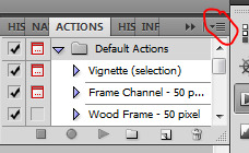
Click that little dropdown menu and click Load Actions...
This should bring up a file opener and you can select the action that you downloaded for this icon. It will download it into Photoshop and will now always be there--you don’t have to load actions every single time you want to use them. If you load them once, they should be there for the rest of forever.
Scroll down to find that action and select it. Now, make sure you still have Background Copy selected. I don’t care about applying an action to the background, just the copy, which is still our image that we cut out. Click the Play button on the Action list--pictured above on the very bottom of the screenshot, next to the Circle and the Folder icon. This will apply the action to the background copy. (Hint: if the Play button isn’t available, it’s probably because your action is in a folder. Click the dropdown of the folder and click the first thing under it--that should be the action and it will apply it).

There it is with the action applied! It’s muuuuch sharper--perhaps a little too sharp, but that’s ok, it won’t look bad on people’s blogs.
8. Add a PSD
To apply a PSD, File > Open and choose the PSD you want to use. I listed above where I find most of my PSDs, just download one you like. You can choose 100 different ones and try it out if you want. I use the same one for everything, by @toxicpsds (I believe it’s #6). This should open a third window with the PSD over a sample image (thanks to the artist!). You just have to select the PSD layer--not the image with it--and Duplicate Layer and put it on the image that we have produced thus far. It is the same process as when we took our cutout and put it on the background. (The PSD is probably under a group--mine says Group 1--so just select the group in its entirety--shift-click it if you need to).

You can tell the background is also lighter. If you don’t want the color of the background affected by the PSD, select Background Copy and the PSD together, right click on one of them, and select Merge Layers. This will put the cutout and the PSD in the same layer, which should take the PSD off of the background and revert it back to the color we had before. However, I really like what the PSD did to the background, so I will keep it this way.
I am finished now with my icon!
9. Save it for Web
To save the icon to be able to post on Tumblr, go to File > Save for Web & Devices, which will bring up a window like this. It might look a little different since I have my settings a certain way, but whatever.
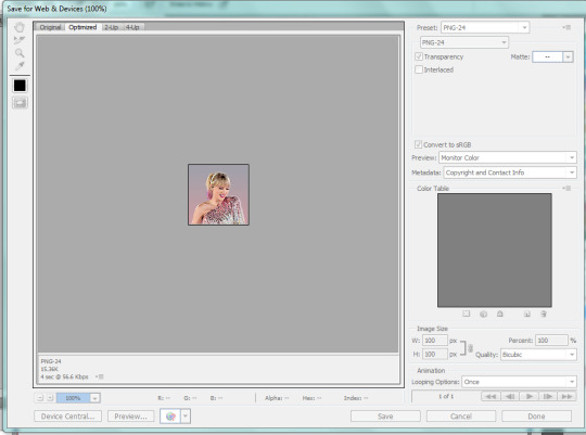
(Sorry this looks weird here, it’s just what happens when I screenshot. I’m not a tech wizard).
Your pre-saved things might look different, but make sure you are saving a a PNG-24 for the best quality. Just make your settings look like this, basically, then click Save.

There she is! All done!
If you have any questions, let me know! I tried to be really specific, but I’m not sure what level people are on Photoshop (probably better than I am) so just ask if I need to clarify anything!
60 notes
·
View notes
Note
not to be annoying but did you make your header picture of louis ?? if so could you do a tutorial for that too? i suck at photoshop lol but i wanna make stuff thank you!!
definitely not annoying!! i feel honoured that u want my advice sdfghsjgs
anyway this ones longer and i go into more info on actually cutting a figure out of an image the proper way or how i do it normally but im gonna use the pic in my icon again just bc its faster
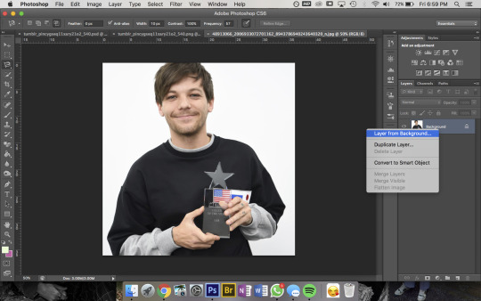
so get ur sister up and make sure shes a normal layer not the bg layer by right-clicking on it bc otherwise you’ll go through all sorts of hell
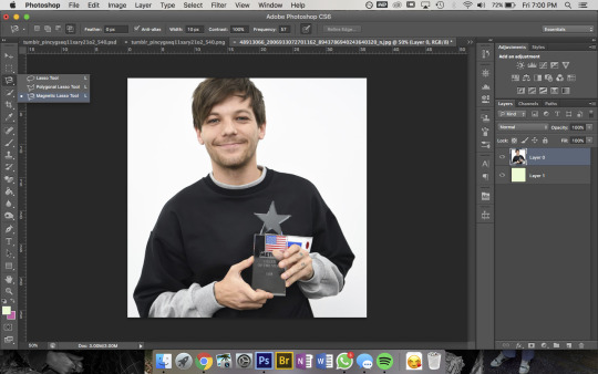
then u wanna use the magnetic lasso tool that i highlighted to remove the background

then to use this u kinda just click on the pic and trace around the area you want to select and the computer will try to automatically latch onto whatever you’re outlining. you can also click somewhere to set a point manually- its obvi based on colour values so thats why its way easier for me to do this image than the one in my actual header. im pretty sure i spent a good hour or more doing this piece by piece with that so i recommend doing it on simple backgrounds or being prepared to be one patient motherfucker

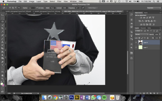
then i use the quick selection tool to add/remove any bits that the computer missed- eg. at the top of the pic you can see not all of louis’ hair is selected so i went and added that, then had to remove some bits near his jumper etc etc. this part was Very Extensive with my current header
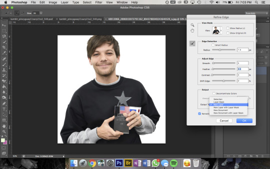
then when sis is looking all pretty u wanna right-click -> Refine Edge and that little box will pop up- thats the settings i had for this pic but it was a really large file so you’ll normally have the radius at abt 2-3px not 7. also if you’re doing a pic where the hair is Super Fluffy then you’re gonna want to focus on the feathering (third slider bar) a lot more
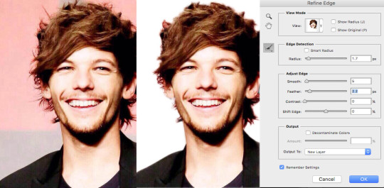
eg. these are my settings when i was doing JUST his hair in this pic. obvi mess around with it yourself to figure out what works for you but a lot of the time i do his hair seperate to the rest of the image bc otherwise its unbearable to look at
anyway make sure you set the output to a new layer itll make a new layer with the selection w/ a transparent bg and itll leave the original layer too
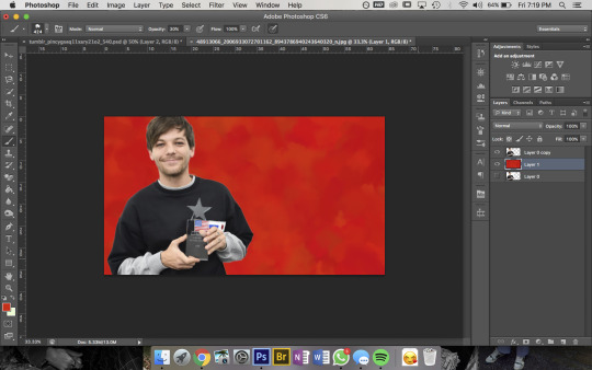
now the fun bit- i picked the colour i want the bg to be and filled it with that solid colour then using this brush pack from deviantart (just click download in the top right corner and it should automatically go into photoshop once u open the downloaded file) i used Texture Brush #2 in the preset size to colour over the top of the bg. that brush changes colour/shape slightly as you draw so thats how i got the mottled kind of effect
then bc im here for the aesthetic i made a new layer on top and used a slightly different shade of red & a smaller brush size to colour a bit around louis to add some ~dimension~
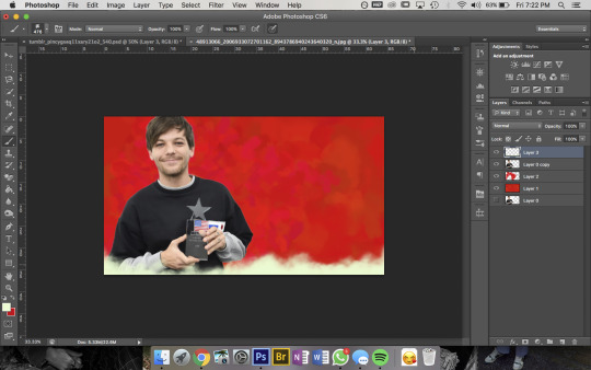
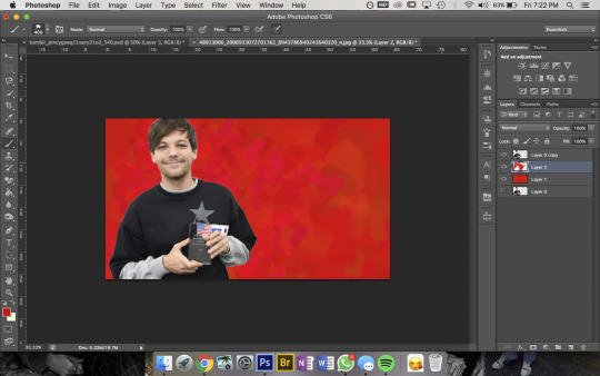
then pick a colour you want for the bottom bit and for this bit i use a mix between Cloud Brush #1 and #2 from the same brush pack. at first you wanna go over the very bottom with 100% opacity to make sure it’ll blend into your blog background
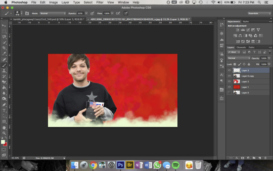
then go over again at a lower opacity to blend it up a bit and just mess around until you think it looks good and sis thats it done!!!
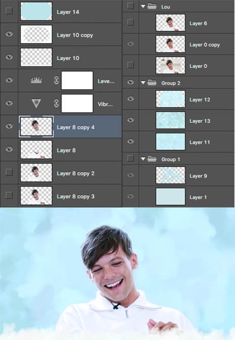
but because im overly thorough here are my layers for my current header file
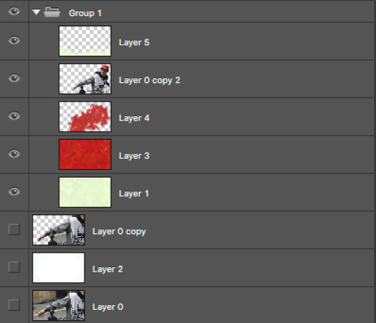
and these are for my last header- here you can see that i cut his head out seperate to his body, did a bunch of layers and experimenting for the background and also am a total layer hoarder who doesn’t know when to let go 😬
#i hope this is helpful and makes sense nonny!#and sorry if the pics dont match the text at any points ive had to fuck with it so much so tungl will let me post it all#but ur defo not annoying and if u want further clarification on anything feel free to ask#also if anyone uhhh wants an icon or header made or smthn pls hit me up im always looking for reasons to mess around on photoshop i love tha#that bitch#ask#anon
9 notes
·
View notes
Photo

♡ The Pen Tool - Photoshop ♡
The pen tool took me a long time to learn, it just takes a lot of practice and patience :) This tutorial is not extremely in depth but should help you get started with the pen tool. Keep reading to go to the tutorial.

Step 1. Start with your sim cutout [ tutorial ] on top of a background of your choice. Create a new blank layer using the icon on the bottom of the layers window. Make sure that new layer is between your sim and background.

Step 2. Now you need to decide what the stroke of your lines will be. Click on the brush tool and change the settings. I set mine to 3px, with a hardness of 100% and I set the color to white #ffffff.

Step 3. Next click on the pen tool and go to the top bar to make sure that “paths” and “pen tool” are selected.

Step 4. Now click to add points to make any shape, zig-zag, whatever you want! If you do not like where you placed a point, use undo to go back a step.

Step 5. Now right click on the line you just created and choose Stroke Path...

Step 6. Make sure the Tool you are using is Brush - this is why we set it up beforehand :) Click OK. Then press ENTER to set the stroke. If you want to create more shapes, create another layer and repeat the process.

Step 7. To make a curved line we are going to create another new layer but this time put it at the top.

Step 8. Click on the pen tool again with the same settings as before. This time when I go to make my second point I am going to click and DRAG upwards to start to create a curve.

Step 9. Continue the process of clicking and dragging until you have something similar to this. It might take a couple of tries! Once again, right click and choose to Stroke Path with the Brush Tool. Click ENTER to set the path.

Step 10. To erase some parts of the stroke we are going to create a layer mask by clicking the icon in the bottom of the layers window. Next select the Polygon Lasso Tool.

Step 11. Next use the lasso tool to select EVERY OTHER part of the stroke covering your sim. I usually make sure I start with the face so it isn’t covered. Once you have made a selection, make sure the layer MASK is selected (shown on the right) and choose the paint bucket tool. Fill in this selection with black #000000 and that selection will disappear. Do this for any other parts you would like to erase.

EXTRA: If you want the stroke to glow double click the layer and choose an outer glow with similar settings:
Blend Mode: Normal
Spread: 11%
Size: 16px
942 notes
·
View notes
Photo

A new snapshot from http://sagesacre/2020/06/17/garden-path-refresh/
Garden Path Refresh
.fusion-image-before-after-13 .fusion-image-before-after-handle border-color:#ffffff;.fusion-image-before-after-13 .fusion-image-before-after-left-arrow border-right-color:#ffffff;.fusion-image-before-after-13 .fusion-image-before-after-right-arrow border-left-color:#ffffff;.fusion-image-before-after-13 .fusion-image-before-after-handle::after background:#ffffff;box-shadow: 0 3px 0 #ffffff, 0 0 12px rgba(51,51,51,.5);.fusion-image-before-after-13 .fusion-image-before-after-handle::before background:#ffffff;box-shadow: 0 3px 0 #ffffff, 0 0 12px rgba(51,51,51,.5);.fusion-image-before-after-13 .fusion-image-before-after-handle background:rgba(255,255,255,0);.fusion-image-before-after-13 .fusion-image-before-after-before-label:before,.fusion-image-before-after-13 .fusion-image-before-after-after-label:beforefont-size:13px;.fusion-image-before-after-13 .fusion-image-before-after-before-label:before,.fusion-image-before-after-13 .fusion-image-before-after-after-label:beforecolor:#ffffff;background:rgba(255,255,255,0.15);
A few days ago I shared a photo of the tropical garden taken from the deck at the back of the house (aka my “outdoor office”).
When I snapped the shot, my focus was on how green and lush everything was. But after staring at the same view for a while, it started looking less lush and more shaggy and overgrown. And the wood path was just kind of this dirt-colored “meh” thing lying on the ground drab and uninteresting. Eventually (okay, maybe 24 hours), I became obsessed cleaning up the jungle and doing something about that dirty, boring wood walkway. It wasn’t just a path after all, it was a transition from the public to the private spaces of the acre.
Now, the old me would’ve been making plans haul this old thing out, back up a lumber truck and build a whole new walk. But the new me is on a budget and must consult with his wife on any project that can’t be done with what I already own, or costs more than I can find in the couch cushions.
Coincidentally, I was rooting around in the garage a couple of weeks ago and found a big can of “gunstock red” stain left over from some long-forgotten project.
Front patio benches and table after a fresh coat of stain
The benches and table on the front patio had needed a little reviving, so I re-stained them with it.
Despite some early concerns, they ended up looking pretty good.
I still had about half a can of stain and I could buy disposable chipboard brushes for couch money, so I figured I’d give the path a facelift.
A couple days of plant trimming and power washing, followed by a couple days to stain and dry the path, and I’ve got a whole new walkway that’s not just a way to get through the garden, but now adds color and contrast to it as well.
Check out these before and after shots. (Click the image for a larger view).
Looking West
The view from the deck at the back of the house faces west toward the bananas and guava.
Looking North
The path leads from the front patio and barbecue area through the passion fruit and turns right just beyond the cannas and bananas.
Looking South
From the north gate near the edge of the deck you see the path where it turns and disappears under the passion fruit.
PROJECT NOTES
The Stain — I used an oil-based wood finish stain (the type for furniture) rather than a deck stain. I prefer that kind of stain for both indoor and outdoor applications because I think they do a better job of highlighting the richness of wood grain (deck and water-based stains seem like thin, chalky paint to me) as well as maintaining their color, bug and water resistance longer. You can usually pick up a quart (1 liter) for under $10 at your local home improvement or hardware store.
Stain Application — I use disposable chipboard/economy brushes for application. Weather-exposed wood is rough and has lots of cracks and splinters that will snag and tear cloth or sponge brushes. A 3-inch (8cm) economy brush does a far better job at application and will only cost you $2 or so. And there’s nothing to clean up at the end. Just dispose of the brush properly.
Drying Time — One of the disadvantages to oil-based stains is the longer dry time. Even those that say they dry in 2 hours, really need 24 – 48 to really set color deep before they can get wet. Make sure there’s no rain in your forecast for a few days after application so the wood fully absorbs the stain.
Total Cost — Re-staining old wood is an inexpensive way to bring it new life. I spent about $5 on brushes and $7.50 on an additional quart of stain when I ran low near the end of the project, so the whole project cost me $12.50 — easily within my couch money budget and definitely worth the investment.
0 notes
Note
was it different to learn on cs5 cause thats what i'm using as well. but yes please! i'd love a new tutorial if you dont mind :3 i miss your blog
alrighty here we go:
(another) quick and simple doodle tutorial
since i deleted my other blog like an idiot im making another tutorial :) ill be doing the tutorial under the cut since i dont think this blog will be deleted any time soon! heres one of my old examples
what you’ll need:
photoshop (i used cs5 since it’s the easiest and least confusing imo but you can use any other one!)
nice pictures (i use pinterest)
heres the example if you want to follow along!
1. open photoshop and edit your picture! crop it, sharpen it, add a psd, etc. i dont have any psds at the moment so i won’t be adding one. once you’re done go to file > save for web and devices and save as a .png. then, reopen your image and you can close the old one
2. go to window > animation to make sure your animation bar is open. click “duplicate“ to make more frames for your gif. i normally used 3-5 so ill be using 3 since its simpler. then, change “once” to “forever”.

3. go over to the right hand side where it says “layers”. right click the layer and click “duplicate layer” so you have as many layers as you do frames. in my case, i should have 3 layers.
4. select your first layer, and hide all other layers, then be sure to select your first frame. your layers tab and animation bar should look like this: (*i moved my animation bar so it might look weird)

5. doodle on your image! i normally use the brush tool (8th one from the top on the left hand side) with a size of 1-3px. change the color of your brush on the right hand side. i always use white since it looks the best imo but you can use whatever! you can draw whatever you want :) heres what mine looks like right now even though it did it in a hurry

6. this step is important! click your next frame. then, click your next layer, unhide it, and hide your previous one. it should look like this

then, doodle again on your image! repeat this step until you have doodled on all layers.
7. go to your animation bar and click your first layer, then shift+click on your last layer to select all of them. click where is says “0 sec”. go to “other” to change your frame speed. i normally do 0.35 but you can do whatever you think looks the best!

*** click play to make sure your gif looks right. sometimes my layers will become unhidden or hidden so go back to step 6 and make sure all layers are with their coordinating frames!!!!
8. go to file > save for web and devices. make sure you're saving it as a gif, make sure your image size is right, and make sure its set to “forever” :) here’s how mine turned out. i just realized i forgot to sharpen it in the beginning but oh well

i hope this helped :) shoot me an ask if you need any help since i might have missed something and dont feel like proofreading it
190 notes
·
View notes
Photo


Keep on reading to learn how to do this pretty constellation effect.
Things you need:
GIMP
Fractal Brushes (move this to your brushes folder)
Probably time cuz this might be time consuming depending on how intricate you want it to be
1. Open up your image. Make a new black layer and lower the opacity to 50%.


2. Make a new transparent layer and name it “Dots”. Grab your hard circular brush and put it to 1-3px. You would want the dot to be rather visible relative to the picture. So, the size of the dot will vary depending on how big your photo is.

Now, just click on random places around the person/object. Just spam as many dots as you can. You would want to put more dots near detail areas such as the eyes.

He looks like he’s going to do motion capture. XD I think that’s enough dots for now. We’ll add some more later on if we have to.
3. Make a new layer and name it “Lines”. Now, pick the softest circular brush. Change the brush dynamics to “Basic Dynamics”.

Now, pick any dot and just make a dot over it while holding on your Shift key. Then, move your mouse to the next adjacent dot and click on it.


Now, go back to the first dot, and make another line from there to a new point.

Keep on doing this until each dot at least has about 4-5 lines branching out.

4. Next, we are going to do more adjustments. I’m going to put more dots on his eyes so we can outline his pupils. I’ll add some more around his nose and mouth as well.

Now, continue joining the dots on your lines layer.
5. Make a new layer called “Outline”. Turn your circular brush to a hard one and increase the size by a bit. Then, click on your path tool and make a curve to outline the object. Pick “Stroke Selection” and then make sure this is checked:


5. I think now you’re ready to turn off your original image layer and bring up the black layer to 100%.

Now, here comes the cool part! We’re going to make our constellation look more 3D, like you could see through the person.
6. Make a new layer and name it “Back lines”. Basically on this layer, I’m going to be making random points and also joining them together, similar to what we were doing before. But before you do that, just decrease the size of your paintbrush a bit (make sure it’s set to the softest one again).

Then, lower the opacity of that layer to make it look like they’re further away from the camera.

7. Make a new layer called “Extra” and now we’re going to add more details. You’re almost going to make a web like effect near the concentrated areas and the edges that have the bright outline.
Basically, I’m just taking my cursor and drawing jagged lines. It doesn’t have to be perfect so you don’t have to hold down your Shift key to make it straight. Just go crazy during this part!


8. Use your fractal brushes and just stamp them along the edge of the subject.

9. The last step is to just add a couple more points outside of the person and join it with the ones that are ‘in’ the person.

And that’s about it!

You can also duplicate your line layer to make it a bit brighter.

Feel free to request for more tutorials. And do tag me so I can see your creations! <3
100 notes
·
View notes
Note
Where do you find the doodle brushes you use on your icons?
Honestly, I don’t use any special brushes. I typically do my doodles myself, but I will sometimes use doodle packs (all of which can be found here). Aside from those, I normally create my own doodles and my brush settings usually are the normal brushes included in photoshop with 100% hardness and 1-3px for the size.
1 note
·
View note
Text
How I Made: The Morning Star
1. Sketch the concept
The initial sketch of the lion’s head was done after researching the best possible pose. The sketch was created using a 2px hard brush, added on top of a neutral grey background.
2. Colour thumbnail
The concept began with a base doodle in a small (400 x 400px) document. I worked at this size because it helped me to block out the basic form and establish initial colours.
3. Refine the image
I resized the thumbnail sketch to around 3000 x 3000px, so I had enough definition to work in detail. I started by applying a medium soft 10px brush, creating the eyes and base detail.
4. Clean shapes
I then applied a small hard 4px brush and a medium soft 6px brush, working in the details and defining areas of fur. I established light and shade on the face then used Smudge (K) to soften my strokes.
5. Tweak colours
I applied Curves and Color Balance adjustments to tweak colour and contrast. Using the Liquify filter I tweaked the eyes and front of the face, then I painted in some braids with a 10px hard brush.
6. Going HD
Using a small (1-3px) hard brush, I zoomed in to 400% and worked on hair detail, eyes, tears and nose lights. The necklaces were made in Zbrush and stock images of feathers were added as well.
7. Cloudy backdrop
Stock photography was used to create a cloudy backdrop. A small (2px) hard brush was applied to create the stars and particles that surround the lion. I used a large 30px soft brush, with Opacity set at 10%, in order to add colour to layers set to the Overlay blend mode.
8. Final touches
A Color Balance adjustment layer brought the image together. Rectangular selections were added to new Linear Dodge (Add) layers, filled with a light blue colour and then treated with horizontal Motion Blur – thus creating lens flares.
1 note
·
View note
Photo

♡MAKING CC IN PHOTOSHOP♡
I finally decided to make a CC tutorial. However, after finishing the screenshots I realized why I have been avoiding this. It’s a VERY LONG tutorial and it’s definitely not the easiest! If you are trying to make CC, please do not get discouraged. Keep trying and practicing, none of my cc works out the first or even fifth time! (This tutorial does not talk about meshing!) Keep reading for the tutorial.

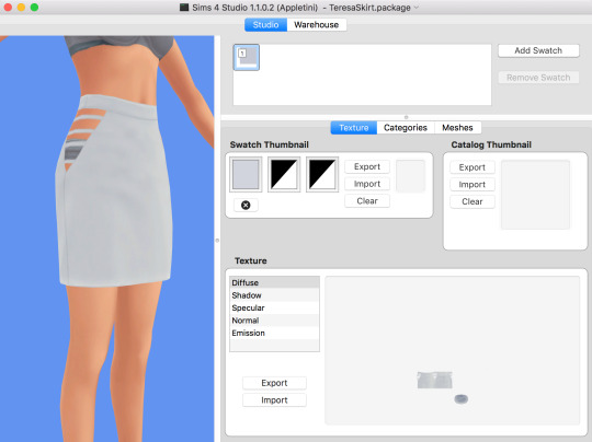
Step 1. Open up Sims4Studio and choose Create CAS standalone. Yours may look different if you are on PC (I use MAC).

Step 2. Choose a piece of clothing you would like to work with. I am choosing this skirt because I like the mesh and it’s white so it can be recolored easier. If the clothing is not white, try this photoshop tutorial to make it white.

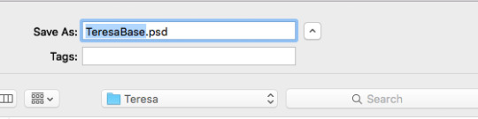
Step 3. I named this TeresaSkirt inside a folder I created called Teresa and clicked save.
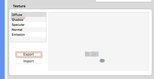
Step 4. Once the display opens, click on diffuse and choose export.

Step 5. I saved this as TeresaBase and clicked save. This is what will open in photoshop.

Step 6. Once I open this in photoshop, I am going to duplicate the layer so I can make the skirt high waisted.

Step 7. On the duplicated layer I am going to select the top half of the skirt with the rectangle selection tool.

Step 8. Next I am going to take the move tool and move this selection up.
Step 9. Before I go any further, I am going to save this photoshop file, do this often while making your file to make sure you don’t lose any progress. I saved it as TeresaBase.psd.

Step 10. Now let’s save it so we can see how it looks in sims4studio. Normally I would save as a .dds file but I will save as a .png just to see how it looks. I always save as test.png, I use this same file to test throughout my cc making.

Step 11. Go back to S4Studio and click on Diffuse and then import. Choose the test.png file. This looks like the height I want. If it wasn’t I could go back and adjust as needed.

Step 12. Back in photoshop I would like to clean up the line between the bottom and top layer. So I click on the erase tool and choose a brush at the size 91px with a hardness of 0. I click on the top layer and erase just at the bottom of the layer so now they look blended together.

Step 13. Next I will go to Layer>>Merge Layers to merge both layers into one.

Step 14. Now to clean up some of the repeated shadows. Since I duplicated the skirt to make it higher, some of the shadows can look weird since they are exactly the same. So I am going to take the Clone Tool, with a brush size of 37 px and a hardness of 0. I also set the Opacity to 85%.
Basically the clone tool will duplicate anything you choose. On a Mac I hold down Option (ALT) and a little Target comes up. I click on the area I want to clone. That is now my source, I now click anywhere, not holding any buttons and I will start to paint over other areas. You may have to play with this tool a little bit to get the hang of it.

Step 15. You can see above the before and after. In the second screenshot the shadows are more varied.

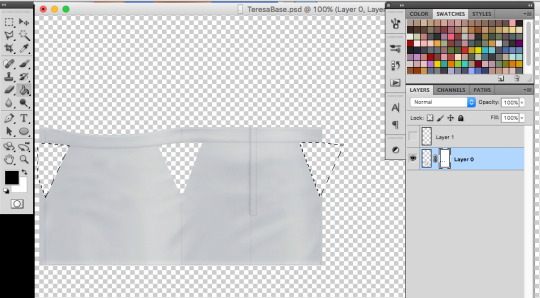
Step 16. Next I am going to create a layer mask to cutout some of the skirt by clicking the “Add Layer Mask” icon.

Step 17. Then take the Polygon Lasso tool to select an area to cutout. I am cutting out part of the hip.

Step 18. Next take the Paint Bucket Tool and make sure the MASK is selected in the layers window. Anything black will be removed and anything white will remain, so I will fill in the selection with black. (Tip: If the mask is selected it will only let you use black or white) Now that selection is gone.

Step 19. Now we need to make sure we still have the selection so that we can duplicate for the other hip. Hold Command and click on the little mask thumbnail. This will select the mask. (It might still be selected from before)

Step 20. Now make a new layer by clicking the new layer icon from the bottom of the layers window. Choose any color and fill in the selection on this new layer using the paint bucket.
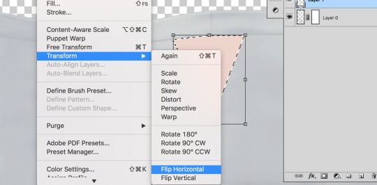
Step 21. Then go to Edit>Transform>Flip Horizontal. This will flip the shape we just made.
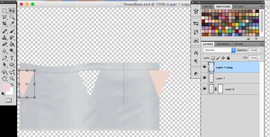
Step 22. Now I am going to duplicate the layer by right clicking the layer and choosing duplicate. I need to because half of the hip is on the far left and the other is on the far right. Now I am going to move each shape to where I want the skirt to be cutout using the Move Tool.

Step 23. I save really quick as test.png again to make sure the shapes met up where I wanted to, looks good! If I needed to adjust I could.
Step 24. This next part a little tricky. I want to add these new shapes to my mask. So first merge the two shape layers into one by clicking merge down on the top shape. Then I will select the shapes by holding Command and clicking the top layer thumbnail in the layers window. The shapes should be selected. I clicked on the little eyeball so I couldn’t see the pink anymore, just the selection. Then I will click on the MASK and fill in the selections I made just with black to cutout the skirt. Delete the top layer with the shapes.

Step 25. Now let’s add some darker edges to those cutouts. Command+click on the MASK thumbnail to select the mask. Then create a new layer, and go to Select>>Inverse. Fill in the selections with any color. I just chose grey.

Step 26. Set the fill to 0%, this will hide the layer but we are going to add a stroke. Go to “fx” at the bottom of the layers window and choose stroke.

Step 27. I chose a stroke of 1px, position is outside and I chose a medium grey. This will just create a little darker edge on those cutouts.
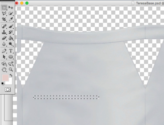
Step 28. Now I am going to add some stripes across the cutouts. Go back to the skirt layer and grab a long thin selection with the Rectangle Selection Tool.

Step 29. Copy and paste this selection onto a new layer and drag it to the bottom, under the skirt layer. Then I am going to go to Edit>>Transform>>Warp. I just chose Arch from the presets on the top bar. I set the bend to 12% so it wasn’t just straight across.

Step 30. I duplicated this layer 3 more times to make more stripes. I moved each one to where I thought it looked best using the move tool. I then held down SHIFT and selected all of the stripe layers and right clicked and chose Merge layers to merge all of the stripes together.
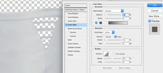
Step 31. I don’t want these to just be solid gray so I added a smaller inner glow. Double click the layer or click “fx” and choose Inner Glow. I set the Blend mode to Multiply, Opacity is at 12%, Choke is 15% and size is 3px. Adjust these until it looks good!
I then duplicated this layer twice (one for the left and one for the right) and added them to the other cutout sections as well. I had to save as test.png a couple of times to check and make sure the stripes lined up. I then went to layer>>merge visible.

Step 32. Once everything was merged, I deleted and sections I didn’t really need. Save this as teresabase.psd for recoloring later.

Step 33. To create a shadow we are going to add a white background by making a new layer, filling it with white and then moving it to the bottom.

Step 34. Now click on the skirt layer and click on “fx” and then choose color overlay. Change the color to white (#ffffff) so the whole skirt is white. Then also choose outer glow. I set the glow to Blend mode: normal, Opacity: 24%, Noise: 0%, the color is #333333, Spread: 5%, Size 4px. Click OK.

Step 35. Save this as a shadow.dds file, I downloaded a MAC .dds plugin from here. MAKE SURE YOU CHECK MIPMAP.
Step 36. Save all of your recolors as .dds files as well (make sure mipmap is checked)
Go back into S4Studio
-- I saved a white.dds file so I imported that into diffuse (this will be my white swatch)
-- I uploaded my shadow.dds into Shadow.
-- For specular, I just click on make blank.
-- For normal use this .dds file to import into normal.
-- Leave the Emission alone
Also if you want to import a thumbnail you can use this template: THUMBNAIL TEMPLATE. Make sure the thumbnail is on the first swatch.
You obviously might not have a screenshot yet for the thumbnail, but you can always go back into S4studio and add it later once you have tested the cc.

Step 37. Before you save, go into categories and uncheck Allow for Random.
Once you add all of your swatches you can save and test in game!
A lot of CC making is testing, redoing, trying something else, and failing and trying again so just keep at it!!
#my tutorials#photoshop tutorial#sims 4 tutorial#ts4 tutorial#longest tutorial ever#im sorry#cc tutorial#sims cc tutorial
763 notes
·
View notes
Text
28 Things to Do With Too Many Tomatoes
New Post has been published on https://womanshealthwithmegan.com/28-things-to-do-with-too-many-tomatoes
28 Things to Do With Too Many Tomatoes
It’s tomato season! And, I don’t know about you, but my garden’s been working overtime this season. Talk about too much of a good thing!
Yes, come late-August and September, many gardeners end up with a dozen or two heirloom tomatoes ripening on their kitchen counter, with dozens more cherry, San Marzano, Brandywine, Yellow Pear, and countless other tomato varieties ripening on the vine.
You hate to waste these beauties, but you can’t help wondering…
“What the heck am I gonna do with all these tomatoes?”
Too many tomatoes. Not a bad problem to have, actually. But it can be daunting to find ideas on how to use them all.
Here are 28 ways to use all those extra tomatoes from your garden
While they’re at their peak freshness, no less!
1. Eat them whole
Really! Vine ripened tomatoes are delicious all on their own. You can take a big bite out of one like an apple, or do what my mom always does: slice the tomato into thick slices and sprinkle with salt. Yum!
2. Fresh salsa
I love Mexican food. When it’s served with fresh salsa I really can’t resist. There’s something about the fresh ingredients in uncooked salsa that makes it such a treat for the summer. Here are a few recipes to try:
Fermented Salsa
Peach and Tomato Salsa
Fresh Summer Salsa with Cucumber
3. Cooked salsa
Though fresh salsa is my favorite, it’s only available in the summer, and I like salsa all year round. Canning your own salsa is a great way to have quality salsa through the winter. Check out these recipes:
Canning Homemade Salsa
Home Canned Salsa
4. Too many tomatoes? Use them as a skin cleanser
Did you know you could clean your face with a tomato? YES, it’s true! (Check out this line of tomato facial products :)) The acids in tomato juice are great for softening and cleaning skin, while the lycopene helps eliminate free radicals.
For oily skin: mix equal parts fresh tomato juice and aloe vera juice.
For dry skin: use a ratio of 1 part tomato juice to 2 parts aloe vera juice.
Rub a tablespoon of this mixture into your face and rinse with warm water.
5. Sunburn relief
Tomatoes are also wonderful at soothing sunburn. If your sunburn is recent and not blistering or peeling, rubbing a slice of tomato on it can lessen the redness. According to this study, eating tomatoes can increase your skin’s natural sun protection. One more reason to eat those beauties!
6. Make your own pasta sauce
Here’s a great homemade pasta sauce recipe you can make using fresh tomatoes. The recipe calls for five pounds of fresh tomatoes, perfect for when you have too many tomatoes!
7. Tomato sandwiches
I could care less about including yucky winter tomatoes on my sandwiches, but when I’ve got too many tomatoes ripening in the summer, I can’t get enough. Add tomatoes to any sandwich for a burst of flavor, or simply slather some mayo and tomato slices between two pieces of fresh baked bread. Yum!
Try this Heirloom Tomato Sandwich for a yummy treat (hint: it uses avocado!).
8. Tomato soup
And what goes great with sandwiches? Soup of course! Homemade tomato soup is full of lycopene, which has been shown to fight chronic diseases and increase the body’s natural sun protection.
Homemade Tomato Soup is simple, healthy and easy to freeze or can.
9. BLT’s
This is one of my favorite ways to use up too many tomatoes. I like making a classic BLT, but there are some really interesting ways of dressing up a BLT that are worth a try.
Consider adding:
Avocado
Cheese
A fried egg
Fresh greens
Onion
Or just turn your BLT into a BLT grilled cheese (and dip it in your homemade tomato soup!).
10. Tomato juice
If you have too many tomatoes, making tomato juice is a great way to use them up. You can use tomato juice in soups, to add flavor to meat, to deodorize a stinky refrigerator, or to make a kick butt Bloody Mary.
How to Make Tomato Juice
11. Tomato paste
Tomato paste is one of the best sources of lycopene around. It can be used in many dishes and freezes really well, making it an MVP of tomato products.
Pro tip: freeze some tomato paste in ice cube trays or can it in extra-small canning jars.
How to Make Tomato Paste
12. Grilled bruschetta
Bruschetta is a really easy and tasty way to use too many tomatoes. Plus, when you’re grilling them, you don’t have to heat up the kitchen.
Cut a crusty baguette into slices and toast them on the grill. Then brush with garlic butter or oil. Top with slices of tomato and fresh mozzarella or get adventurous and experiment with additional toppings such as mushrooms, fresh chopped herbs, gorgonzola, zucchini, or prosciutto.
13. Fried green tomatoes
Sometimes tomatoes fall off the vine, or a frost is expected before they ripen. What would you do with too many tomatoes when they’re unripened besides fry them?
How to fry green tomatoes:
Start with slices of green tomato and dip them in an egg bath.
Coat with batter of choice. Being dairy and gluten free, I use a mixture of cornmeal and another gluten free flour.
You could also add buttermilk to the egg mixture for an added level of taste.
Fry the tomatoes in your choice of oil (at roughly 375 degrees) until golden and crispy.
Enjoy!
14. Tomato ketchup
Ketchup is an American summer staple, but the store bought kind often includes yucky ingredients like high fructose corn syrup. Making your own ketchup is a great way to use those extra tomatoes while keeping your family’s food as clean as possible. Since homemade ketchup uses a lot of them, you’ll never have too many tomatoes again!
Homemade Ketchup Recipes
15. Homemade spaghetti sauce
Spaghetti is a great fall back meal when things get busy. It only takes a few minutes to prepare if you already have canned or jarred sauce on hand.
Set aside an afternoon to prepare and can some pasta sauce, and you’ll have quick and nutritious meals available through the winter.
Crock-pot Marinara
Home Canned Spaghetti Sauce
16. Homemade pizza sauce
Another quick meal, homemade pizza is a crowd pleaser and pretty simple when you have sauce already on hand. If you make a big batch you can freeze or can enough to last through the winter.
Homemade Pizza Sauce (for the freezer)
17. Grill ‘em
Grilled tomatoes are a fun and easy snack for when you have too many tomatoes.
Start with firm tomatoes and slice them in half horizontally
Brush with olive oil.
Grill until grill marks form.
Flip and repeat.
Top with salt.
Enjoy!
18. Marinate ’em
Marinated tomatoes are wonderful and really easy to make. Simply add halved cherry tomatoes, fresh herbs, salt, pepper, and garlic to a jar of olive oil and vinegar and let them sit for several hours or overnight.
19. Freeze ’em
Of course you can freeze cooked tomatoes, but have you ever considered freezing raw tomatoes? You can! It’s a great way to preserve them when you have too many tomatoes. If you are planning on using them for a sauce or stew later, freezing whole raw tomatoes is a fine way to preserve them without putting the work in up front to cook them.
20. Can ’em
Whole, halved, or diced, canning is a great way to preserve tomatoes that doesn’t require electricity to keep (like freezing does). Check out these recipes for canning tomatoes:
Canning Tomatoes
21. Stuffed tomatoes
Another great way to use too many tomatoes but be sure to use sturdy ones.
Slice them in half horizontally and scoop out the inside.
Fill with your choice of filling (breadcrumbs, cheese, spinach, mushrooms, rice and quinoa are some possibilities)
Bake at 400 degrees for 20-30 minutes.
22. Tri-colored tomato salad
One of my favorite things about growing produce in the backyard is the variety of tastes and colors. When you have a lot of different colored tomatoes, why not make a tri-colored tomato salad? Chop tomatoes to bite sized pieces and toss with fresh basil, mozzarella, olive oil and balsamic vinegar.
23. Sun dried tomatoes
I’m always amazed at how expensive sun dried tomatoes are at the grocery store, especially when I know I can make them at home for almost nothing. Sun dried tomatoes are great in pasta dishes, hummus, pesto, or omelets. When you dry them there’s no such thing as too many tomatoes! Try this recipe for making sundried tomatoes at home:
Easiest Sun Dried tomatoes
24. Tomato and fruit
Since technically tomatoes are a fruit, why not add them to your fruit salad? Here are a few fun recipes that use fruit and tomatoes:
Fruit Salad with Tomato
Tomato Fruit Gazpacho
Tomato and Fruit Soup
25. Shakshukah
I had never heard of Shakshukah before, but now I’m sure it will be my new favorite dish.
I’m always looking for ways to use our abundance of fresh eggs and too many tomatoes, and this looks like just the recipe:
Shakshukah AKA Mediterranean Sunshine
26. Tomato basil garlic butter
What’s great about making flavored butter is that you can easily freeze it for another time. So you can make large batches and have it available all winter. Find the recipe here:
Tomato Basil Garlic Butter
.embed-pin
margin: 0.5rem 0 2.4rem 2.4rem;
padding-right:3px;
float:right;
@media only screen and (max-width: 460px)
.embed-pin
margin: 2.4rem 0;
padding-right:0;
float:none;
text-align: center;
27. Barter or sell them
If you have more tomatoes than you can eat, can, freeze, or dry, why not sell them at a farmer’s market or barter with a friend for something different?
28. Give them away
When all else fails and you still have way too many tomatoes, give them away. It shouldn’t be too difficult to find someone willing to take extra tomatoes off your hands, and it will be a relief to know they aren’t going to waste. You may even be able to donate fresh tomatoes to a local food pantry.
Want an EPIC tomato cookbook?
Click here to see my favorite!
What do YOU do with too many tomatoes?
What do you like to do with your extra garden tomatoes? Share with us in the comments below!
Enjoy this post?It would mean so much to me if you comment or share…
31 Comments
2,595 Shares
Share Pin Tweet Email Text
The post 28 Things to Do With Too Many Tomatoes appeared first on Mama Natural.
Read more: mamanatural.com
0 notes
Last Seen Blogs

technolly
TECHNOLLY

faiyazpatel88-blog
Untitled

valera050671
Untitled

jokes-plastic-surgery-blog
Plastic Surgery Jokes

kanae2324
Kanae