#Adobe Text Pro
Explore tagged Tumblr posts
Visit Tumblr Blog
Explore Tumblr blogs with no restrictions, modern design and the best experience.
Last Seen Tumblr Blogs


Fun Fact
Tumblr was attacked by a cross-site scripting worm deployed by the Internet troll group GNAA on Dec 3, 2012.
Text

The unenlightened masses,
They cannot make the judgement call.
Give up free will forever,
Their voices won't be heard at all!
#invader zim#dib membrane#zim#iz#zade#/text from Collective Consciousness (mgr ost)#/pro tip if you are going to edit your traditional artwork then use proper software for it.#/I am personally just insane and did that in sai but for the love of god use photoshop or smthing.#/upd actually no do not use photoshop fuck adobe.#/or just pirate photoshop I always had the mindset that adobe does NOT deserve your money.
112 notes
·
View notes
Text

Is it? Is it fucking rich, Richard?
#this is an experimental gif btw! of a funny moment i kept rewinding because of the way JAW says FUCKING RICH lol#wanted to try text not sure how to feel about it yet#that said: adobe caslon pro italic is simply That Girl!!!!#carmy berzatto#the bear fx#*edit
60 notes
·
View notes
Video
youtube
Dynamic Text Animations in Adobe Premiere Pro
0 notes
Text

YouTube -- https://youtu.be/2L7k9rEwqdk?si=8MwYT6YLNHN3ysHP
In this video, we will learn how to set up 3-point lighting in Maya. 3-point lighting is a standard lighting technique used in film, television, and video production. It involves using three light sources to create a well-lit and balanced scene. We will start by discussing the three types of light sources used in 3-point lighting: the key light, the fill light, and the back light. We will then learn how to position these lights in the scene to create the desired effect. Finally, we will take a look at some of the different ways to adjust the intensity and color of the light sources to achieve the desired look.
"Whether you're a beginner or an experienced artist, our platform has something for you. Learn Animation, VFX, motion graphics, or game design today!"
Motionplex - https://motionplex.in/
Video Editing in Adobe Premiere Pro – From Beginner to Pro (Hindi) : https://motionplex.in/courses/video-e...
Follow Motionplex
Facebook: https://www.facebook.com/Motionplex?m...
#adobe premiere pro#game design#video editing#game development#maya animation#3d modling#3d animation#3d model#3d art#blender 3d#3d render#3d#animation#blender#vfx animation#vfx#vfx course#graphic design#design#text post
1 note
·
View note
Note
how do you go about captioning other peoples' videos? i mean this logistically; like does penny for example just trust you with her youtube account for the sake of writing subtitles into the videos? or is another thing happening
(asking bc i'm impressed by the quality of your subtitles and want to get into making subs for other peoples' videos as a Thing)
Caption files can be generated in any software that supports it. YouTube has an in-house caption editor that gets the job done but it's not very user-friendly. Newer versions of Adobe Premiere Pro and other editing suites have features that let you write and export a caption track (usually in .csv, or .vtt format) that contains the text, timings, and formatting. There are lots of options out there!
All you need in order to write captions for someone else is one such software and the final draft of a video, that way you can line everything up to the exact timing. Doesn't hurt to brush up on proper captioning etiquette too!
@sophie-baybey usually does the captions for Penny and she uses Premiere's caption editor. Personally I use subtitle-horse.com which is browser-based and does just about everything you'll need in the free version.
Since I tend to edit the highlight videos, captioning them is pretty straightforward when I do it - but we also have a production group chat when we need Penny or myself to clarify something that's hard to hear or a reference we don't get etc. I tend to send Sophie the isolated speech as a separate audio file just in case the audio balancing makes certain portions hard to parse. Like any collaborative project, communication between team members is key!
109 notes
·
View notes
Text
The Rock and The River - Pi (Rhea)
by @rhea314


guys!!! this book! one of my most favourite to make, a teeny little quarto guy.
some stats if you will.
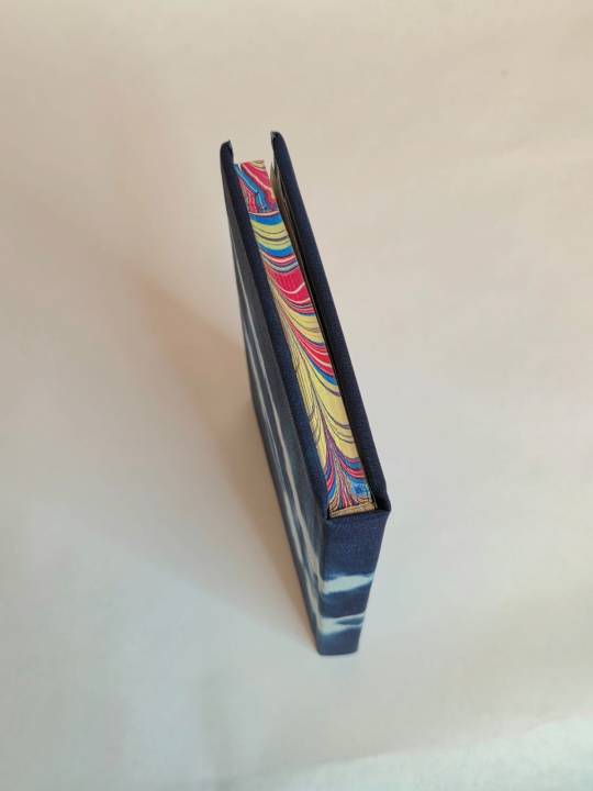
17441 words// 123 pages
Body text: Adobe Jensen Pro 10 point
Accents: Beon, EB Garamond
so my buddy @zhalfirin-binds is a professional who made us all real parchment leather books when we met in January last year. the parchment book is my precious and is hiding in my drybox as we speak. personal pride meant that i had to pull out all the stops because i was EXCEEDINGLY LATE to give her a book. i had intended to do 2, but as you can tell with my usual bookbinding habits, i usually only finish 1 by the skin of my teeth.
some time back, i had arranged to do a marbling class when @celestial-sphere-press visited me, so i decided i would get some marbled edges done.
well guess who's boo boo the fool huh - i DID NOT plan my colour combinations properly nor did i know exactly which text blocks got marbled because there was a massive time and drying crunch as IT TOOK SO DAMN LONG TO DRY and i only brought a limited number of dipping boards (basically 1 set in A5/legal quarto/A6 each). thankfully the two books meant for Zhal got dipped and looked pretty good.
The con was, i was left with the inexplicable horror of 'why the hell did i use so much yellow???'
it worked out in the end. in this fic, chihiro ends up working at a bar, and though it never explicitly mentions bar lights, i tend to associate bar lights as neon red, blue and yellow lighting, which fits?? is probably why i reached for the yellow in the first place.
the problem with using so much yellow was IT IS SO HARD TO MATCH MARBLED EDGES GUYS. i was crying the entire time. my whole collection of marbled paper? CLASHES. my collection of duo bookcloth? not going to work, especially with the two tones. chiyogami??? also a no go. you can guess why i sat on this textblock for so long.
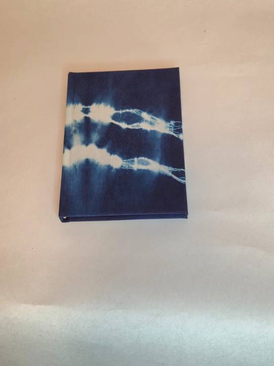
then a stroke of luck - des and i wanted to go for an aizome (indigo dyeing) experience when i visited japan. des said, "let's go all out and buy some silk cloth to dye, like half a yard to share." Silk was bought. Silk was dipped. the actual technique is called shibori (i had a little giggle cause at the renegade retreat i got mildly confused as shibari also involves tying things). Silk is fantastic and has great texture, and wow did it turn out nice.
In this fic, Haku becomes an atmospheric river, and i thought that deep indigo blue was a perfect match for how their satellite images look, and did my best to create the streakiness you get from the clouds onto tie dye cloth.
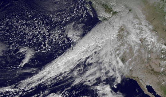
Image from https://www.wunderground.com/cat6/Cat-1-Cat-5-Scale-Atmospheric-Rivers
Cloth is backed with heatnbond, and endbands were done in white, off white and pale gold. i didn't want to distract too much from all the other colours and patterns going on. endpapers were also a blue chiyogami, which didn't stand out much against all the blues - absolutely my fault because i stuck the endpapers on before i had actually made the bookcloth.
by the end i refused to title it, because why fuck it up at the last step (this happens to me a lot, as you can tell). otherwise, minimal hiccups and i was so happy to give this book to Zhal! it turned out so good!
we both had a good laugh at the end of the renegade retreat as i almost ended up kidnapping this book back home when we were packing up - Zhal had to remind me it was HER book now.
@zhalfirin-binds i hope you love this ridiculous book, which is half as ridiculous as ME :D
A big thank you to @rhea314 for writing this amazing fic and allowing transformative works off her writing.
#bookbinding#fanbinding#ficbinding#my books#renegade bindery#renegade bookbinding guild#fic binding#spirited away#ogino chihiro#haku#Sen to Chihiro no Kamikakushi#aizome#dyed silk#shibori
73 notes
·
View notes
Text


CPSD #0002 // breeze
this is a fully customizable character template / promo graphic for photoshop. everything is already organized and masked out to make it easily customizable. however, a small amount of photoshop knowledge will be required as there is a lot going on for this one.
FEATURES
a fully customizable graphic, all text and shapes are live objects for you to change the colours easily.
a custom psd colouring.
four different background options from 6 custom made colourful textures, a stripe PSD in 5 colours, a grid PSD + just a flat colour background.
REQUIRES
adobe photoshop.
the following font from google: be vietnam pro.
RULES
do not copy or steal this template
do not use this for commercial uses or to resell
you do not have to credit me if you buy it, but i'd love to see what you do with it so feel free to tag me
price: $3 CAD please like or reblog!
// PAYHIP //
#cpsd#rp template#rp psd#character psd#rph#rpt#psd template#paid cpsd#my cpsd#the way i finished this weeks ago and just forgot to live for awhile
82 notes
·
View notes
Text

HOW TO: Make an iPhone Layout + Downloadable Template
Hi! I've gotten a few messages asking for a tutorial on my iPhone gifsets — but instead of only doing a tutorial (that would probably be triple the length this one already is), I decided to turn my layout into a template with all the bits and bobs! In the "tutorial" under the cut, I'll share everything you'll need, a free template download, and quickly go over how to use this template. :)
Disclaimer: This template uses Video Timeline and this tutorial assumes you have a basic to intermediate understanding of Photoshop.

PHASE 1: THE ASSETS
1.1 – Download fonts. These are the fonts used for all assets I've included in my template: – SF Pro or SF Pro Display (Regular, Medium, Bold): Either version works, they look nearly identical. You can download directly from https://developer.apple.com/fonts/ or easily find it via Google – Bebas Neue: Free on Google Fonts, Adobe Fonts, and dafont – Times New Roman (Bold): Should be a default font in Photoshop

Make sure to download and install any of the fonts you don't already have before opening my template. That way, once you open the template file, all the settings (font size, weight, spacing, color, opacity, etc.) are as intended.
1.2 – Download my template. Before you use my template, all I ask is that you don't claim or redistribute it as your own and that you give me proper credit in the caption of your post. Making these iPhone gifsets takes me a longgg time and turning this layout into a template took several hours too.
DOWNLOAD TEMPLATE VIA KO-FI ← This template is completely free to download (just enter $0), but if you feel inclined to tip me, I appreciate you! 💖
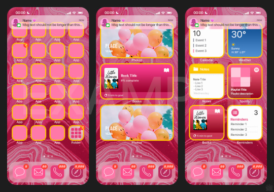

BTW this template also includes some of my frequently used icons!
NOTE: If, for some reason, you open the template and see the pop-up shown below, click "NO" — otherwise, the fonts will be all messed up:
And if you see this triangle with an exclamation point by a text layer, don't double-click it — it'll mess up the font as well:

PHASE 2: THE GIFS
I'm just going to briefly go over gif sizes and my recommendations. Also, keep in mind when grabbing your scenes, you'll want all of these gifs to be the same amount of frames.
2.1 – Background Gif: 540 x 540 px. I recommend this size so you have a good amount of visibility for the gif behind the iPhone wallpaper. I also recommend making this black and white (or in my case, black and white with a slight blue tint — idk I just like the way it looks) so the wallpaper coloring can stand out.
2.2 – Wallpaper Gif: 230 (w) x 500 (h) px. Keep in mind the very narrow dimensions of the wallpaper! And also keep in mind that you'll have a bunch of apps and widgets covering the image. I try to use wide shots (or layer my clips into looking like wide shots). Also, keep in mind your color scheme for your set and your character's aesthetic! I tend to focus on one or two colors for the wallpaper.
I usually position the wallpaper to the side with 20px bumpers, so there's lots of space to see the background:
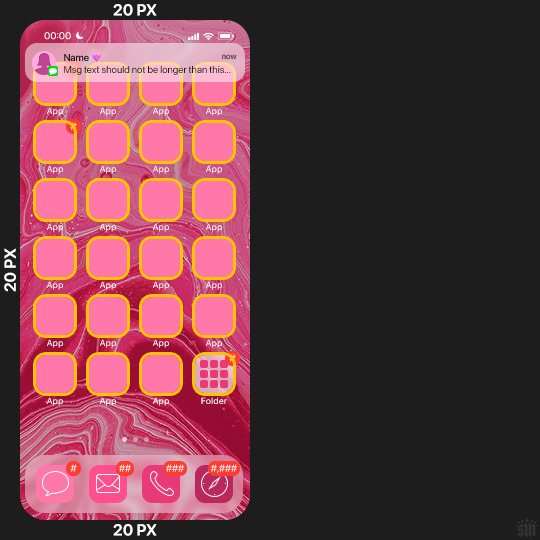
2.3 – Large Photo Widget Gif: 201 (w) x 96 (h) px.
2.4 – Small Photo Widget Gif: 94 x 94 px.
PHASE 3: THE TEMPLATE – "IPHONE" FOLDER
In this section, I'll try to quickly walk you through how to use this template and some bits that may require extra instructions. I'll be going through each folder from top to bottom.
3.1 – Status Bar. Time, Service, and WiFi are pretty self-explanatory. In the Battery folder, you can use the shape tool to adjust the shape layers labeled "Fill (Adjustable Shape!)" to customize the battery level.
3.2 – Message Notification. Again, these are pretty self-explanatory. I've already masked the circle for the contact photo, so you can simply import any photo and use the transform tool to shrink it down. The circle is 24x24 px. If you don't want to use a photo, there's another folder called Default Initials.
If your message text can't fit the text box, the message should end with ellipses which is how iOS caps off long texts.
3.3 – Blurred Banner (IMPORTANT) This folder is easy to miss because there's only one placeholder layer in there. On iPhones, the area behind a banner notification and the dock get blurred (including the wallpaper and any apps).
What to do: Make a duplicate of the apps in Row 1 and/or widgets that intersect the message banner, convert them all into one smart object, apply a Gaussian Blur filter (Radius: 3.0 pixels) on the smart object, and move the smart object into this masked folder!
(There's another masked folder in the Wallpaper folder for the dock which I'll go over in that section.)
3.4 – Apps Turn off the yellow guide if you don't need it to keep things aligned and turn off layers you don't need by clicking the eye icon. Replace the "App" placeholder text with your app name, change the color or gradient of the square to compliment your color scheme, and add your custom app icon overlay!
If you can't find an app icon you need from the ones I provided, flaticon.com is a great resource. Also, if you can only find the filled version of an icon, check out this tutorial for how to make any text or shape into an outline.
Also, each app folder has 4 notification bubble options (1-4 digits). Again, you can toggle these on and off as you need!
3.5 – Big Widgets I like using these when my wallpaper has A LOT of negative space to fill. I included the Photos and Books widgets in my template, but there are lots of widgets available on iPhones. You can check some of the other ones I've done here, or if you have an iPhone, simply try adding some widgets to your phone!
There are also widgets bigger than these, but they would take up half of the phone screen which is why I don't use them for these edits.
3.6 – Small Widgets The only thing I'll say about these — because they're pretty straight forward — is there are a lot more weather themes than I included in my template. Also, if you set your character's phone to evening, the weather widget will show a dark background (sometimes with stars), so keep that in mind.
Speaking of, I've included Light Modes and Dark Modes for, I think, every applicable widget.
3.7 – Page Dots These barely perceptible dots indicate that your character has more pages of apps than shown in your gifset (so if an anon tries to come at you, you can just say "it's on the next page of apps" /j /lh)
3.8 – Dock Again, the dock has notification bubble options and I've included the default app designs, custom filled designs, and custom outlined designs for iMessage, Phone, Email, and Safari (there's also a FaceTime alternative if that's how your character rolls). These are usually the apps people keep in their Dock, but this is fully customizable too. So, if your character is, like, super obsessed with Candy Crush or something and needs it in thumb's reach — you can put it in the dock.
3.9 – Wallpaper This whole folder is masked already to a 230x500 px rounded rectangle.
Inside, you'll find another "Blurred Portion" folder for the area behind the message banner notification and the dock.
What to do: Duplicate your gif layer and place it in this folder, remove any sharpening filters, and apply a Gaussian Blur filter (Radius: 3.0 px). Be sure to add any coloring/adjustment layers ABOVE this folder and your original sharpened gif layer.
PHASE 4: EXPORT
We made it!
I hope this template makes it super easy for you to recreate this layout! If you decide to try it out, feel free to tag me with #usernik.
If you notice anything wonky about the template, kindly let me know so I can fix it! And if you have any questions about how to use this template, please don't hesitate to send me a message! I just ask that you try to be specific in your question so I'm able to answer you the best I can!
#gif tutorial#completeresources#userpickles#usersmia#userabs#usertreena#alielook#userkosmos#usershreyu#userzaynab#tuserabbie#useryoshi#usersalty#tuserlucie#usernanda#userelio#userhella#usercats#gfx*#resource*
967 notes
·
View notes
Text
Bound: The complete lyrics of Taylor Swift


I sure hope my niece isn't on tumblr…
She is turning 17 this month, and while I know she reads fic, I don't know if she'd really appreciate a bound copy of Crimson Rivers. I do know she loves Taylor Swift, though. I've seen plenty of lyric books floating around that people have bound, so I thought this would be a fun idea. (Bonus: it's another book I can show friends and family!)
However, not being a Swiftie myself (I think she's a lovely and talented woman, I have nothing against her, I have several of her songs on exercise playlists, but my taste runs more to 90s britpop) I had a lot of questions.
Do I include all of her lyrics? From all the way back?
What's up with these "from the vault" songs? Do I include them?
What's the deal with the re-releases?
Do I include Christmas songs?
Why on earth did she have to write SO MANY SONGS?
Fortunately, I have friends who were able to answer these questions for me.
Yes, all the way back
Yes, include them
I don't know, but there's a new album cover for them
No (a completely arbitrary decision, but related to the next point)
This book could have been over 500 pages. I was trying to reduce the page count as much as I could without sacrificing readability or content. But as it is, it's 462 pages and a few more would have been fine, but what's done is done. Anyway, as to why she is so prolific, I have no idea, but I am impressed.
Thank GOD I found a google doc on reddit with all of the lyrics. I think if I'd had to copy and paste from somewhere, my niece would be getting a copy of Crimson Rivers instead.
The cover was foiled with my Silhouette, and I was so pleased with how it came out. I used this tutorial on Instagram for my settings. But I couldn't do that with the spine, because lining it up would have been impossible. So I stenciled that on. And a friend advised me to use the cat charms on the ribbon.
Details: Bookcloth: Brillianta in this gorgeous pink Title on cover and spine: Beloved Sans and Beloved Script Body text: Adobe Garamond Pro
151 notes
·
View notes
Text
Kill, Repeat by Elquist
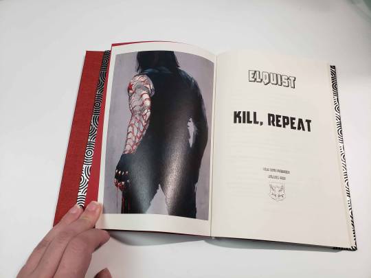


Kill, Repeat by Elquist
The finest in Hydra Trash Party storytelling. (This one's in German)
Title illustration by Stereowire (formerly at stereowire.tumblr.com)
Summary
Der Soldat hebt den linken Fuß und trocknet ihn, lässt das Handtuch fallen und wartet darauf, dass einer der beiden Männer, die ihn mit dem Schlauch abgespritzt haben, ihm etwas anzuziehen gibt, weil sie das werden. Die Kacheln glänzen vor Nässe. Seine Haut fühlt sich rau an, seine Zehen und Knie sind bläulich. Er zittert. Er denkt an nichts. Sein Kopf ist leer, und es ist gut.
The soldier lifts his left foot and dries it, lets the hand towel fall and waits to see whether one of the men who shot him with the hose gives him something to put on. The tiles shine with water. His skin feels raw, his toes and knees are bluish. He shivers. He thinks about nothing. His head is empty, and it's good.
Bind details
Title: Antilles
Text: Adobe Garamond Pro
Binding: Because the fic only ended up 2 signatures long, I used (ironically enough) the German stiffened paper binding method (Steifbroschur), which is versatile and quick. The boards are acid-free mat boards from my frame shop offcut stash.
Fanbinding project #113 by ArmoredSuperHeavy/Dead Dove Publishing, completed December 2024.
38 notes
·
View notes
Text
everyone suggesting alternatives for Photoshop is inevitably not actually using most of the Photoshop functionality, which to be fair is probably the vast majority of the potential Photoshop userbase.
the reason Photoshop has been industry standard for 30 years is that it does almost everything and has almost always done almost everything. it has had a few weird slow adoptions, for example it didn't support basic live mirroring while drawing until the 2010s (ish). it didn't have recovery saves or auto saving until about then. it's never been the absolute last word in real media synthesis, that was Corel Painter for years and now I think CSP is probably the king. illustrator is better at vectors. etc. but Photoshop can do all of those things well enough to prepare a professional grade, print-ready artwork from RAW file to layout to text to retouching to total from-scratch illustration, in one step, with layer and channel separation, multiple types of masking, adjustment layers, lossless file object placement, vector text transformation including all standard print layout tools like kerning, like spacing, comprehensive font support, and both true font variation and faux transformation like fake bold and fake italic. and clients and print workflows are expecting PSD files and file preparation for this reason. Krita, as an example of a popular program suggested as an "alternative to Photoshop" which I have used for hundreds of hours to do professional and personal work, is great for drawing but has a completely unusable text engine, you can't make a webcomic with speech bubbles easily and quickly in Krita. it was like pulling teeth even trying to put "BABY SLUT" on my Lethal Company skin with Krita. but you can lay out an entire magazine in Photoshop in an afternoon, and people do (print preparation is whole other topic I'm not saying vogue is prepared solely in Photoshop, it isn't, I'm saying you CAN do it in Photoshop)
I have never paid for an Adobe product, I am not pro Photoshop, I am pro getting my work done. I would absolutely love for there to be an actual Photoshop alternative, but there isn't. there are individual alternatives for individual features of Photoshop, and if you are working in a limited professional scope or you just want a drawing program or just want to make your webcomic or just want to do pixel art then one or two programs will replace Photoshop for you. everyone who, like me, has to do RAW editing, fashion retouching, print and web layout, pure digital illustration, vector illustration, text and graphic design, and all the rest of the crap I have to do in a format that's accepted by publishers and the rest of the various workflow destinations it's just not realistic. which is why it's great that Photoshop is completely trivial to pirate at any stage of its development you care to install,including versions prior to the introduction of the AI crap, the cloud crap, and the rest of the crap no one serious is actually using unless their manager is forcing them to
135 notes
·
View notes
Note
That National Geographic leather binding for Yellowstone is fucking Gorgeous!!! (Pardon my Language)
How long have you been binding, and what would you recommend to someone who wants to try it for themselves?
hello and thank you so much!! I worked really hard on that one (and no pardon needed haha)!
I started binding in February of 2021, which means in a few months I'll have reached 4 years. It's been an awesome journey!!
If you'd like to try it for yourself, I'd recommenda few things!
1) You can 100% try out the basics with near free or cheap materials. People typeset in Word or Google Docs or Pages. You can print on printer paper & use regular sewing thread & scavenge board from old books or notebook backs or do a limp leather binding & use no boards at all. You can make paper pamphlets. Any comments I make following this are about my preferences for best results. The most expensive part that cannot be avoided is printing. On the other hand expenses can wildly escalate if you're committing to it; once you are doing leather it becomes somewhat unavoidably expensive.
2) Check out some tutorials from SeaLemon or DAS Bookbinding on YouTube for the physical construction. SeaLemon is really clear for a beginner starting out, but then I'd move to DAS for better technique (DAS also has a beginner series though). I watched DAS Bookbinding videos for three weeks straight before I was able to start, & while that doesn't maybe work out for everyone I do think it gave me a pretty strong basis of understanding for structural techniques. DAS is *really* good at explaining why he thinks you should do something. The structure of the NatGeo bind is basically DAS's video on a rounded & backed bradel binding (but with leather & sewn on recessed cords). There is some good stuff on Tiktok/IG, but watch short-form videos/reels with caution. They move a little fast and I've seen a couple give instructions that can result in structural flaws (not that this is unique to the form, cross-referencing on instructions from any source is a good practice). They are good for if you're looking for a specific technique (particularly modern decorative ones, like cricut use, edge gilding, HTV application). There are also published books you can buy or maybe request through your library, such as Hollander's Introduction to Bookbinding. Renegade Bookbinding Guild runs a whole bunch of technique-specific in-house zoom classes annually.
3) Look to other fanbinders for tutorials on how to format the text (this is because most pro bookbinders do not do both text design & book creation! it's a pretty unique feature of fanbinding). @renegadeguild has some publically provided resources on our website here and more typesetting tutorials for a whole host of softwares (Affinity Publisher is my choice - one time purchase, fuck you very much Adobe InDesign) located in the discord server. Anyone 18+ can join the Discord. The NatGeo inspired book (text & dust jacket) was created in Affinity Publisher.
4) Join a community of fanbinders! It's really lovely. The space has exploded & there are tons of people to be friends with, trade tips, & cheer each other on. I'm part of @renegadeguild and we do a whole bunch of events throughout the year, and we have an in-person retreat every other year. I've met with over 20 different renegaders so far, in three different countries, and it's been such a blast. Definitely the community helps keep up the motivation. Renegade isn't the only community out there though! There's groups more rooted in IG/tiktok circles that have their own discords, plus a number of FB groups. I do think most people who are comfortable on tumblr enjoy Renegade's vibe.
5) While I learned most of what I do online, some things really benefit from in-person learning. If you want to do leather binding I would really recommend trying to take an in-person class. I did two attempts at a leather binding on my own before I decided to hold off until I'd had at least one in-person class. Leather binding can be extremely frustrating, especially when you can easily end up with a book that looks worse than a cloth binding at your same skill level but for double the cost. Imo this is mostly because the leather specific skills like paring, warp management, and assessing a random piece of leather for bookbinding suitability are all pretty tactile experiences, all of which are difficult to assess through a screen and can result in an unpleasantly bulky/stiff/shapeless book if ignored. For example- while this book of mine is a pretty popular post, I don't enjoy holding it and reading it, especially in contrast to the NatGeo bind. Part of this was the material I chose; part was not being able to adhere to the instructions quite well enough; part was just not knowing enough about what I was doing; part is they're different constructions. This might just be a me thing though; I'm sure others have had success with online only tutorials for leather.
6) I'm not going to get into specific tools bc that could be a whole post, but some things are necessary (printer access), some things are necessary depending on style, some things are "makes life easier but only drop the money if it's stopping you from making books out of frustration", some things are just technique-specific tools. Examples - sewing frames are often brought up but are never necessary unless sewing on cords; cricuts & cutting machines are commonly used in fanbinding circles but I don't have one (& don't intend to atm).
7) Don't be shy to offer the author a copy!! Like other fan activities, fanbinding is part of our fandom community ecosystem. Your fanbinding is in communication with the author's story. Giving a bind to the author is a great way of keeping the ecosystem going. I tend to think of binds as a combo of comment, fic rec, and fan art inspired by the fic.
8) Paper grain sounds stupid but it IS IMPORTANT! My personal hierarchy of give-a-fuck for grain: Board grain, spine card grain, endpaper grain, cover paper grain, text block grain, book cloth grain. The only thing I personally sometimes ignore is book cloth grain; but many people will not worry too much about text block paper grain.
Gonna stop there for now. If you've got specific questions or want elaboration, feel free to ask. As with all things, YMMV, this is my own opinions/experience and may not apply in all cases. There's a whole lot of different techniques out there, and it's hard to ever say something is wrong, per se - but I think it's important to understand if a method has an outcome you may want to avoid. Prioritize your goals & adapt for them - what's your goal? Longevity, readability, aesthetics? You might make different choices depending on them. My choices influence the techniques I chose to focus on, the tools I buy, and thus the final aesthetic of my binds.
32 notes
·
View notes
Text

hi! me again! with another template, because we started talking about how the arcanist lookbook was such a banger concept with insane graphics, unique info and animations but they got rid of them. so ofc I ended up making the still lookbook into a template for OCs
you can get the PSD file here!
and thank you so much to the arcanistsanctum blog for providing the lookbooks, this template was based using Oliver Fog!
read below for more info!
there's a hidden layer that has some guidelines from me if you don't know what the general gist of this template is, just turn on the visibility to read it!
there's only three fonts you need for this: adobe gurmukhi, adam warren pro and luminari. you can find them around online 🏴☠️
the format of the item text varies--the text and titles can be moved around. you're free to play around with it! check out different arcanist lookbooks in the blog linked above!
you don't have to change the "20th century" section, that stays the same for every character regardless of their era--it's alluding to UTTU Magazine's release, not the character's respective time
#reverse 1999#reverse: 1999#reverse 1999 templates#reverse 1999 oc#purinsu sheets#pavia continues to be my beloved guinea pig
44 notes
·
View notes
Text
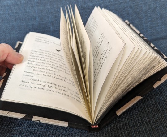
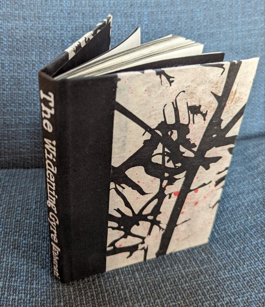

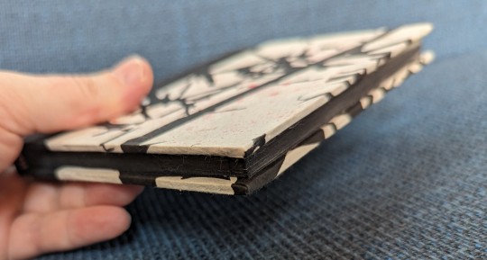


Another fanbind--still just my own fic, so I can experiment without worrying about doing poor service to someone else's work--and both my first quarto and my first quarterbind. This is still one of my favorite creations from my Watchmen era: The Widening Gyre, a really genuinely spooky ghost story with an extremely ambiguous ending. Only about 13,000 words, so a good small book.
Technical details below.
Text block is Adobe Garamond Pro on France French Parchtone in fleece white. Page headers are Traveling Typewriter and title page is Special Elite. Bird wingdings are from the font Birds of a Feather.
Endpages are just plain black Canson. Page edges trimmed with the chisel method and painted with Daler Rowney FW Pearlescent black acrylic ink. Headbands are premade, sorry, still not in that deep yet.
Spine in some generic black book cloth, covers in a natural fiber art paper I found at the local Guiry's, spattered with some red watercolor paint. Spine lettering done by hand with a Faber Castell pitt artist pen in white.
A lot of experimenting this time, really happy with the result.
#fanbinding#fanbind#fanfic#fanfiction#bookbinding#watchmen#ghost stories#book binding#fan binding#hand binding#binding fanfiction#book stuff
35 notes
·
View notes
Text
📣 clip studio paint is having a 60% off sale from now until june 23rd 11:59pm pst (deadline is actually june 24 1am pst but whatever)
that means perpetual v4.0 is $23.40 and ex is $180.60. updates from 3.0->4.0 is pro->pro 17.49 and ex->ex 50.39
question and answer segment ⬇
is clip studio paint good i do not like adobe so i use this instead of photoshop. i like it and i like drawing in it
whats the difference between pro and ex ex doesn't have the 24 frames animation limit that pro has and it also has a lot more comic page and comic printing features. if you dont do multi-page comics or animation just get pro
should i buy now? i think if you wait until november or december for their last sale of the year you can get 5.0 also. so if you dont really need it now you could just wait i guess
is upgrading to csp 4.0 worth it compared to the csp version im using right now??? look at the features comparison list here and see if there is anything that strikes your fancy. features that i cared for off the top of my head: 2.0 added liquify across multiple layers, align/distribute tools, and proper word wrap for text. 3.0 added better mesh transformation controls, made timelapse more efficient, and webp import/export support (lol). 4.0 added better snapping and you can now select multiple brushes at once in the menu to move or delete them (HUGE)
how do i upgrade to 4.0 from 2.0. or 1.0 youd have to upgrade twice, once up to 3.0 and then again to 4.0, so honestly id just buy a new license. you should buy a new license if you have 1.0 regardless so you can continue to have access to 1.0 imo cuz thats the only one that doesnt have the online checks
aw does it still have the online checks yes but its not every day. its like, either every 3 days or 14 days, something like that. they changed it from being every 24 hours after everyone got mad when 2.0 came out
im a time traveller from the future. the 4.1 feature update in october or whatever added something lifechanging incredible why cant i use it! perpetual license only gives you up to 4.0 features. which includes 4.0 and 3.2, 3.1, 3.0 etc etc. you dont get 4.1 or 4.2 stuff. you have to wait for 5.0 perpetual for those. if youre impatient you can pay 11 dollars for an update pass that lasts 1 year and is functionally the same as a 1 year subscription. the update pass is only available if u have perpetual license and never goes on sale so its always 11 dollars which is coincidentally about the same price as an on-sale 1 year sub.
i use ipad tablet or android phone perpetual license is only for desktops. mobile devices can only have subscription. 1 year sub is on sale for $10.79 though (its usually $27)
#pivstuff#clip studio paint#i miss the more esoteric shit i could do in photoshop but eh. c'est la vie
6 notes
·
View notes
Note
How would I check for a pdf being accessible?
That's actually not as easy a question to answer as you might think.
The cheapest way I can think of to do this is to go through it with a free screen reader like NVDA (or VoiceOver if you're using an apple device, because its basically free for you at that point).
Now, you can also check to see if a PDF is accessible without a screen reader, but you're probably going to need Acrobat Pro. This is also something you are likely going to need if you want to make an inaccessible PDF accessible.
Unlike Microsoft Word or something like that, PDF doesn't do a lot of the accessibility work for you, at least not right off the bat. A lot more things have to be done (or at least verified) manually. However, this also means you have more flexibility. There are ways to make certain things screen reader accessible (e.g., tables with merged cells) that are impossible to make accessible in a program that does more of the work for you, such as Microsoft Word. PDF usually make less conventional reading orders possible too, when that's relevant to the content.
Create and verify PDF accessibility (Acrobat Pro) is a good place to start if you have access to Acrobat Pro.
Section 508 Guide Tagging PDF’s in Adobe Acrobat Pro is also another great resource that covers a lot of common tagging structures.
Of course, screen reader accessibility is not all there is to it. You want to make sure you check for other areas too, such as ensuring all text has the appropriate color contrast ratio with its background. You also want to make sure you're not using color alone to convey meaning.
59 notes
·
View notes