#Comics Process
Explore tagged Tumblr posts
Visit Tumblr Blog
Explore Tumblr blogs with no restrictions, modern design and the best experience.
Last Seen Tumblr Blogs


Fun Fact
Tumblr.com is the 103rd most visited website in the world.
Text
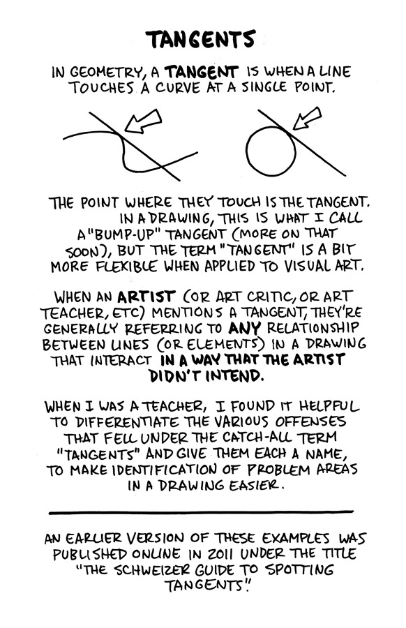
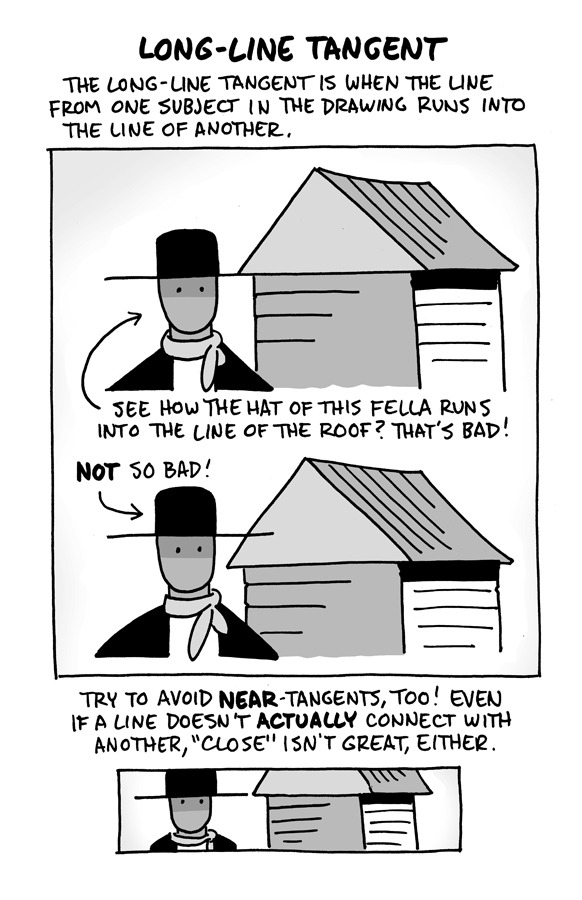
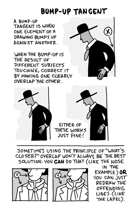
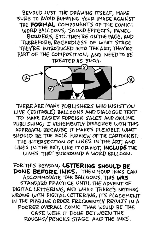
Hello, friends!
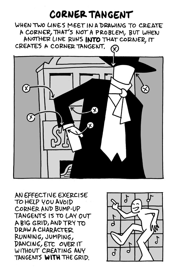
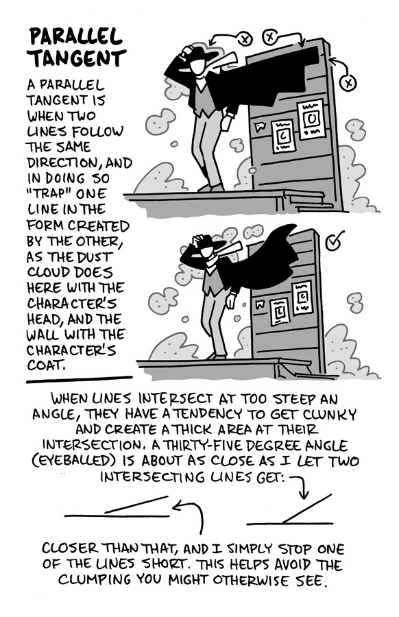
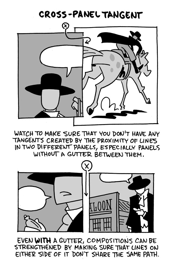
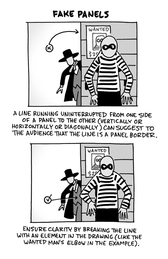
I reworked the ol' "Schweizer Guide to Spotting Tangents" lecture from my comics-teaching days, figured I'd share it here. If you want a free, printable PDF for yourself or to share (especially if you're an educator), you can find it at the bottom of this same lesson on my website.
-Chris
13K notes
·
View notes
Text
got back to working on my comic in acrylics, which was a very ambitious and time consuming decision
NEVER AGAIN but im committed now and have to see it through
71 notes
·
View notes
Text


FIVE WEEKS LEFT until TAZGN6 is out in the world (7/16/24)! I'm back with another process post for a page from early in the book.
layouts are the very first thing I draw! this is where I'm thinking about page and panel breakdowns, whether we need additional beats to help with pacing, and where the text will go. You can see that in my very rough balloons! nobody else usually gets to see this, so enjoy the sneak peek at the messy first stage. as long as I can understand it, it's all good.
thumbnails- at this point the overall page composition is locked in & I'm working on strengthening the overall poses/gestures. You can see I decided to open up the panel for magnus getting a spell refresh and that merle's pose changed to account for more text elements.
pencils- here's where I start thinking more about likenesses & detail! I'm still tweaking some sizes to make sure there's enough room for text… but you can see I pretty much copied magnus over from thumbnails. Sometimes it just works!
inks- at the inking stage I'm thinking about using line weights to emphasize depth/ important elements and strengthen the overall composition, as well as making small fixes to sell expressions and flesh out outfit details.
And finally, colors- I use color much more as a way to heighten tone/ establish emotion than to be literal about local colors! In this case, going monochrome for magnus helped sell that something magical was happening AND helped his exhausted face stand out a little bit better.
and that's it! the pages go off to the letterer after pencils are locked, but I keep the rough text layer visible at every stage as I'm working so I make sure to leave enough room for all text elements.
TAZGN6 will be out in under 5 weeks, on 7/16! There's still time to submit your preorder receipt and get a keychain from First Second (US/Can)! I'm not involved with the preorder giveaway, but First Second on insta/twt should be able to help with that.
102 notes
·
View notes
Text
Note to Self: Panel Numbers — Or, How Saga uses panels to keep pacing and engagement
Note: I tried to pick pages that aren’t plot heavy so minimal spoilers ahead
Something that always stuck out to me about Saga was how readable the entire wild story is. The creators Brian K. Vaughan and Fiona Staples aimed to make a story that could only be told as a comic. The bloody, heart-breaking, and often times sweet story is exactly that: something untranslatable. Ships are skulls, large mechanical hooves and characters can be humanoid ferrets, mostly regular religious ferrets, infant planet super predators, fish people, and robot humanoids who have no mouth and yet can still breastfeed
It is a wild story and despite some recent story directions choices that kind of making me lose interest in keeping up with the most recent volumes, it still is the single most readable comic I have ever encountered
My theory is that this readability is achieved largely artistically through limiting panel length, prudent use of word balloons, and dynamic panel placement. This creates short snappy pages which average to about 4.16 panels per page

(Apologizes to the person sitting next to me on the flight who watched me go through ten volumes of Saga in light-speed to count panels. Only took about three hours 😀 )
One Panel Pages (splash pages):


Two Panel Pages:

Three Panel Pages:

Four Panel Pages:

Five Panel Pages:

Six Panel Page:

Seven+ Panel Page:

#note to self#Just saw the phrase “Saga goes woke” and took 9000 points of psychic damage#saga#comics process#saga comic#mathematical analysis of comics so it makes more (?) sense#comic recommendations#making comics#graphic novel#comics#comic panels#panels#how to understand comics
43 notes
·
View notes
Text

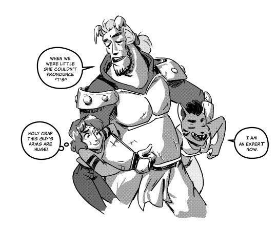
Beast World! 12/19!
#jules jourdain#circuit breaker#titans beast world#central city#comics process#coloring is my worst enemy
103 notes
·
View notes
Text

Her name is Rain. original character from my own manga project 🌊🐍
#artists on tumblr#oc artwork#oc#from my manga project#manga art#comics#comics process#original character
46 notes
·
View notes
Text

Just passed 54 pages of pencils and I am here to say I LOVE DRAWING EXPRESSIONS okay that's it
22 notes
·
View notes
Text
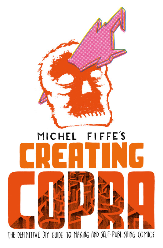


Proud to announce CREATING COPRA: the Definitive DIY Guide to Making & Self-Publishing Comics. This book covers everything from inspiration to final production. Practical, idealistic, and everything in between. Pre-Orders are up, so reserve your copy now!
26 notes
·
View notes
Text
comics comics !! woof bark
12 notes
·
View notes
Text
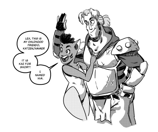
(Lex has a crush on all her friends)
Yaaay! Figured out a new halftone technique that’s really easy and uses like one layer.
#ohthatseanart #lexanddandre #comics #halftone #process
#ohthatseanart#lex and dandre#comics process#black and white#halftone#manga#cat girl#lgbt#webcomics#my arts#artists on tumblr#sean pendleton#comics#art
10 notes
·
View notes
Text
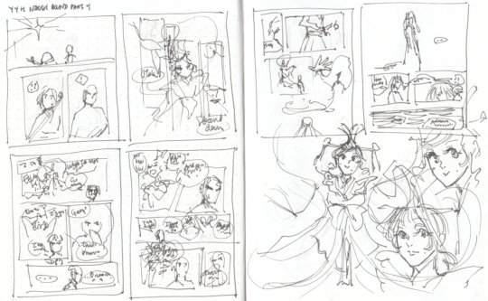

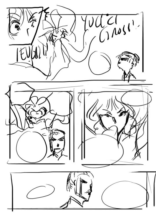
This is the behind the scenes work-in-progress overview for fight / flight part 4! (part of the YYH North Bound prequel project)
I finally got around to scanning the thumbnails for this part! I remembered to do this mainly because part 5 (which is also the final part of this story in the North Bound series!) will be posted here soon.
Because it's been so long since I worked on part 4, I don't have as much to say compared to previous behind the scenes posts. Basically time heals all wounds (or at least these ones) and thus I forgot all the details of my screaming/crying/complaining, hahaha. That and possibly because this part was "only" 6 pages.
More character design commentary and part 4 page sketches below the cut!
Character design commentary and more sketches
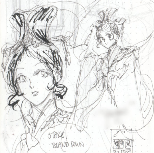
For part 4, I had designed a new character who didn't already exist in Yu Yu Hakusho.
The second drawing above (with the Chinese characters, just my calligraphy practice on the same page) was actually from pretty far back, I was thinking about her (and her dialogue) for a while. You can see I was playing a lot with the design of her face, how old she might look, and how I might distinguish her from other female characters and Spirit World guides, especially with the stylizing of her eyes.
Outfit-wise I don't think she's that unique as far as classical sky maiden-type designs go, but I do enjoy drawing her hair. I gave her a beauty mark at the last second while inking the comic.
Here are all of the page sketches - without the text, followed by more commentary.


Comparing my thumbnails to my sketches, there wasn't much change.
The "Otake, stand down" tennyo descending page got adjusted a bit with a close up of her lips for her dialogue. I still feel a bit ambivalent about the composition, whether I should have positioned her higher, but I like the feeling of descent and the fluttering of her hagoromo.
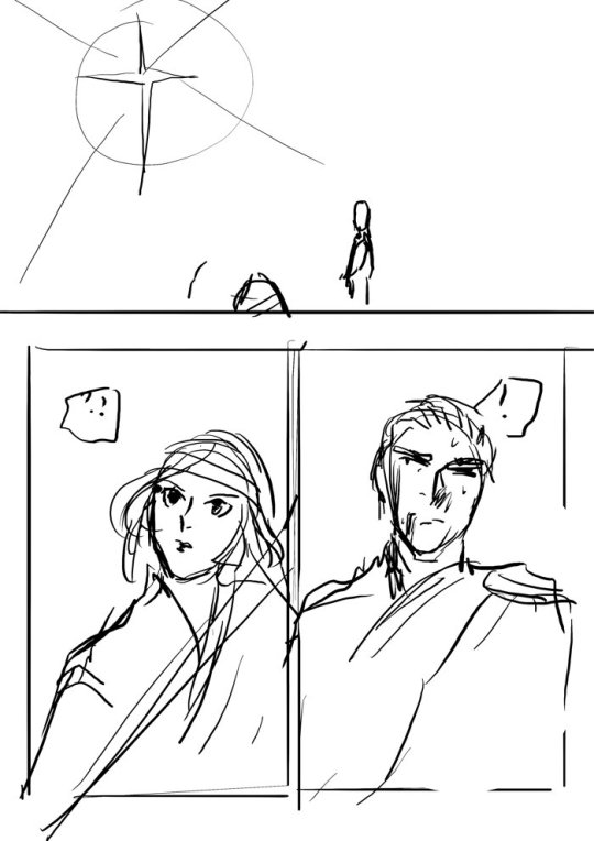
Second last page, second panel after Otake says "hmph" - I took so long working on this that the doodle in my page sketch was undecipherable to me, and I was at a complete loss as to what on earth I had been intending. Fortunately, my script at this part said "sheathes his sword" which saved me. Though, if I had bothered going back to look at my thumbnails, I would have realized my thumbnail of this action was ten times clearer than my page sketch.
Other comments:
First page, large panel with the sparkle of the tennyo appearing - I had a heck of a time with the forest background on this one. Blob blob blob it seems serviceable enough. Like I've said before, my environments are mostly rough vibes, haha.
"EUGH YUCK GROSS" page - I had a lot of fun with the tennyo's expressions, and I really like how Otake's face turned out in the last panel. Drawing annoyed people with bloody faces is fun!
Last two pages: I was very proud of how Tomoe turned out on these two pages, her looking up poses. I also was pleased with the forest in the last panel. More vibes!
#yu yu hakusho#hokushin#tomoe ozen#wip#sketches#thumbnails#comics#fancomic#making art#making comics#comics process#yyh north bound#art by maiji/mary huang#tennyo#japanese mythology
8 notes
·
View notes
Text

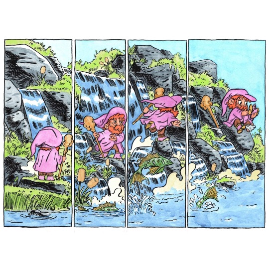
so I did 2 version of this comic idea, both in watercolor but I really like the one with the slightly greener water.
Ive been sorta a perfectionist with my art and since I started dealing with my personal mental health issues I feel so much more relaxed when making art, able to think through it, and willing to redo it if need be. (also my partner has helped a lot too) So much more fun than before 😵 where I would bang my head against something and make decisions impulsively and abandon projects altogether!
#gnome art#gnomes#comics process#making comics#watercolor and ink#ink and watercolor#watercolor comic#gnome comic#sequential art#visual storytelling#line art#fantasy art#illustration#inking
10 notes
·
View notes
Text
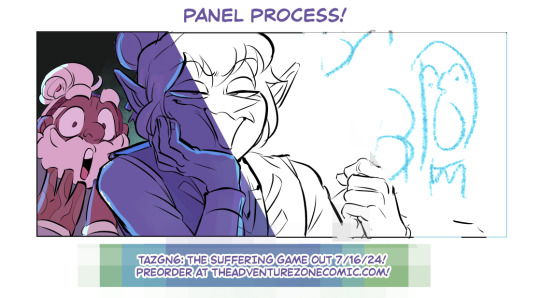

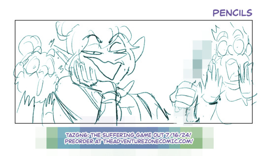
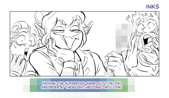
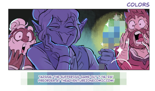
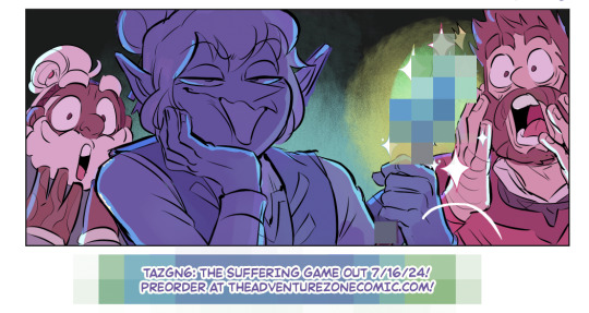
We're somehow down to 8 weeks left until TAZGN6: The Suffering Game is out in the world, so I wanted to share a little process writeup! I'll probably share a couple more peeks at some of the panels where the layouts were especially fun as we get closer to the date itself. There's still time to submit your preorder receipt to get an acrylic keychain from First Second!
Layout: This is basically my first VERY TINY pass through the entire book! Each page is about 1" tall, so this panel would've been about 1/4". Nobody else usually sees these drawings, so this is a very special horrible little treat!
Pencils: I'm skipping over thumbnails, since I ended up reusing the bulk of them to pencils- but the entire team reviews the whole book at both the thumbnail and pencil stages, which is why I separate them out. This is where I'm trying to get the big gestures and expressions in (again, so the team can review them!); inking is for locking in details and using line weight to convey volume info.
Inks: I ink in clip studio using a couple different brushes; what's important to me is having some good line weight variation with pressure! I try to have the stability aid turned down as low as possible.
Colors: Fun! I care more about colors as a way to convey emotion or tone than """accurate""" local color, so these often get silly. It's comics!! Have fun with it!!
WHY IS IT PIXELATED/ WHY DOES IT LOOK LIKE THAT: To hide a small silly spoiler! I can neither confirm nor deny any guesses. It looks goofy as all hell but we're just gonna have to lean into it.
85 notes
·
View notes
Text
Abduction💚

#old sketch#sketch#sketchbook#sketchbookdrawing#sketchblog#traditional art#illustration#female illustrators#artists on tumblr#illustrators on tumblr#comic#original comic#fan comic#mini comic#web comic#comicart#comic book art#comics process
2 notes
·
View notes
Text

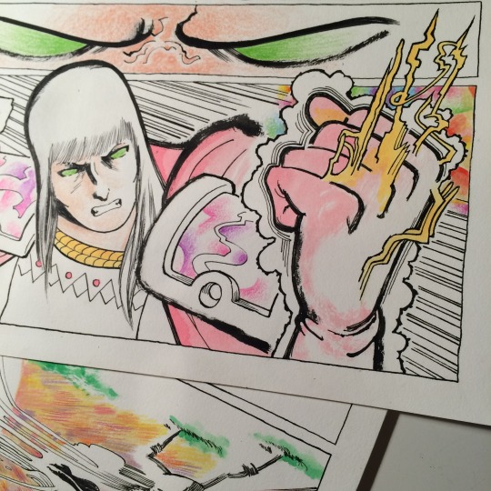
Inking all the fun bits first 🔠✨
Central City Beast World issue is gonna be a real hoot 'n' a holler... 🤠💚⚡✨
#jules jourdain#circuit breaker#titans beast world#beast world central city#comics process#lettering
24 notes
·
View notes