#comics tutorials
Explore tagged Tumblr posts
Visit Tumblr Blog
Explore Tumblr blogs with no restrictions, modern design and the best experience.
Last Seen Tumblr Blogs


Fun Fact
Tumblr has 16.74 million mobile monthly users in the US.
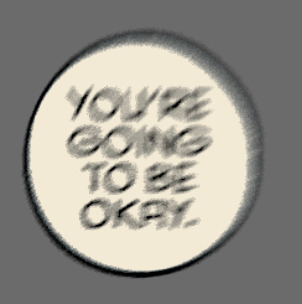
Text
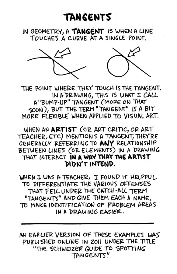
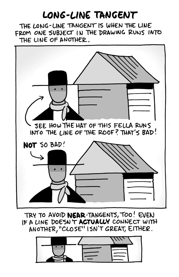
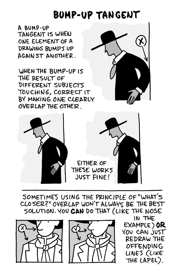
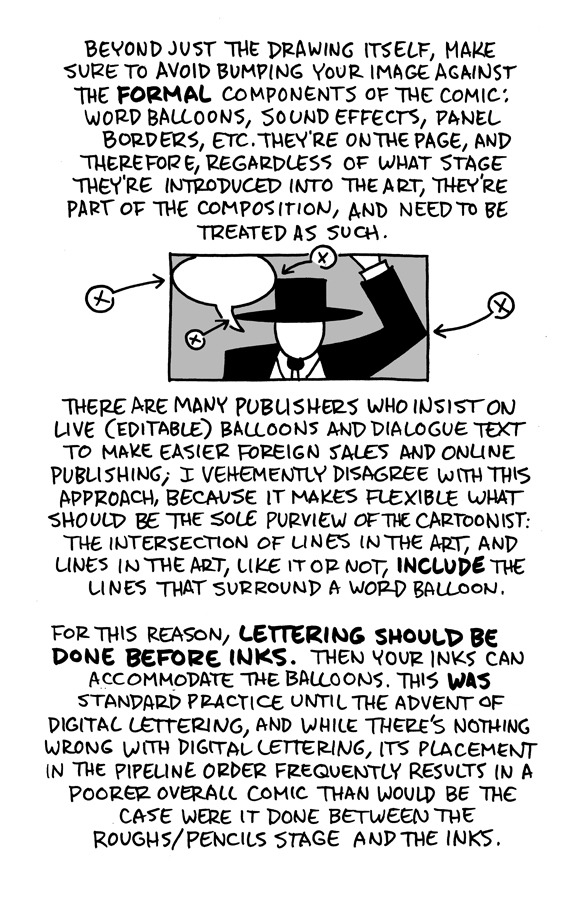
Hello, friends!
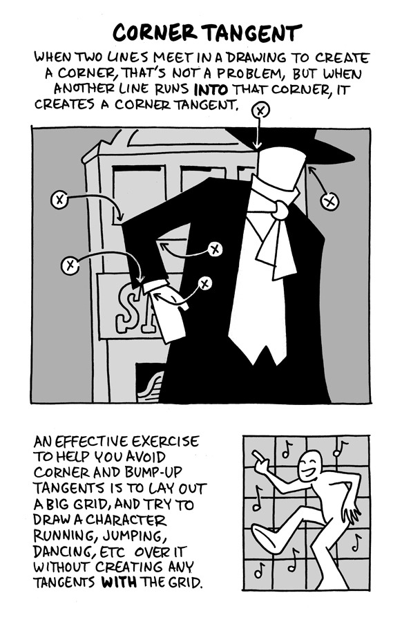
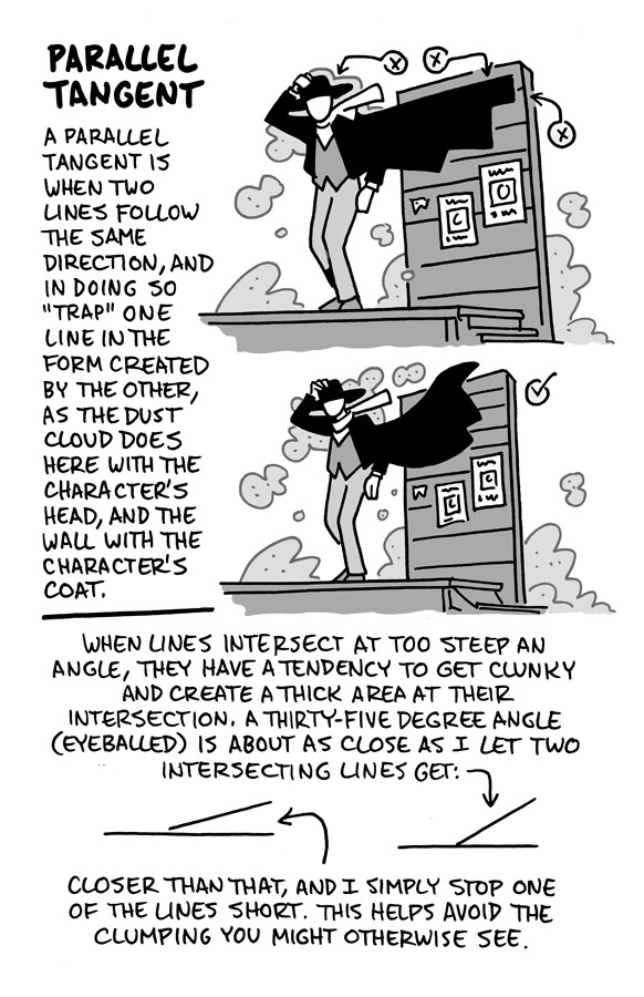
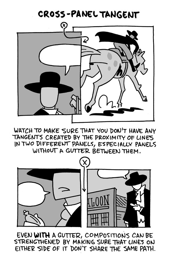
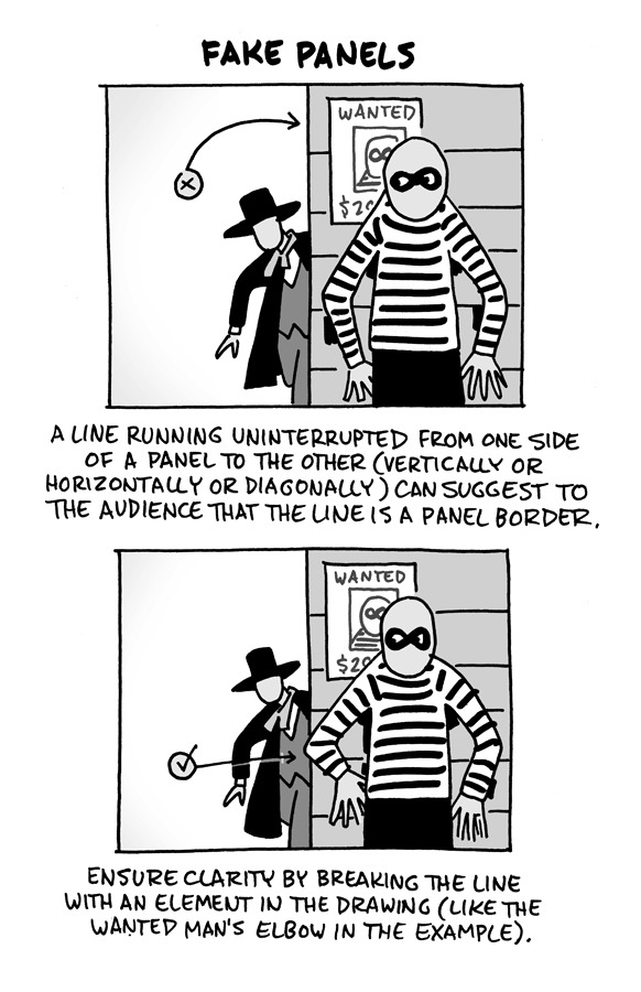
I reworked the ol' "Schweizer Guide to Spotting Tangents" lecture from my comics-teaching days, figured I'd share it here. If you want a free, printable PDF for yourself or to share (especially if you're an educator), you can find it at the bottom of this same lesson on my website.
-Chris
12K notes
·
View notes
Note
i wanna start making comics but like. i dont really know how??? are there any tips that you could give me perhaps?
hi!
i've been working on trying to compile a list of resources for people (@aangsfrogs--i didn't forget!) who want to make comics for a long time. It would consist of some of my personal tips and a lot of links to other people's PDFs and youtubes. But that's...a hefty project, so if you had any specific questions for the meantime, my askbox is open!
But, for just beginning, here would be my tips:
Read comics. Read manga and webcomics and cartoons and medical comics. There is so much out there, and reading is such a big way to learn. If you see something you like, take a moment to think about why you like it. Are the expressions or colors appealing? Did it make you feel a certain emotion? Analyze what the artist may have done to get across what they did. (Is it the camera angle? the style they chose to draw in? the paneling? the pacing? the color? etc.) Doing this over time will help you recognize the tools available for telling stories through this medium, and you'll be able to put them in your own work.
Try to think about what you want to make comics about. What moves you? What topics interest you? What ideas or tropes do you love in media or think about often? What do you hate and wish was done better? What characters are you drawn to, or what characters do you want to create? (What about them compels you?) I find it's hard to create an idea out of thin air, but if you start writing down random ideas you have, you'll start thinking about them, and over time, you'll have a bank of things to pull from when you want to create.
Lastly, anatomical skill or knowledge of color does not a comic make! You don't have to know much to begin, and there aren't rules. Just start drawing what is meaningful to you!
This is just cursory and doesn't get into super specifics like paneling or scripts or plotting or colors or thumbnailing or....etc, but I'll try to expand my list of resources and get that out! And, hmu if you have any specific questions on topics!
happy drawing~
Book list under readmore:
Scott McCloud's Understanding Comics and his Making Comics. These books are taught in like, every comic class ever. While not my complete favorite, they do a good job of showing some history and fundamentals, and how easy it is to make comics even if you don't have a lot of drawing experience.
99 Ways to Tell a Story: Exercises in Style by Matt Madden: Really good if you don't know how to start analyzing comics. (Also it's just a fun visual exercise.) It shows the same short story done in 99 different styles with different emphasis on different moods and points of view.
The PreHistory of The Far Side: A 10th Anniversary Exhibit by Gary Larson and The Calvin and Hobbes: Tenth Anniversary Book by Bill Watterson: Two great books with work from my two favorite cartoonists. They both have writings from the author about getting ideas, developing stories, and being a comic artist.
Uncanny Bodies: Superhero Comics and Disability, edited by Scott T. Smith and José Alaniz and Black Comics: Politics of Race and Representation, edited by Sheena C. Howard and Ronald L. Jackson II: These two aren't really about making comics, but they are great collections of analysis about old and new comics alike.
By no means a complete list, but some good ones that I can think of off the top of my head.
There's also the book Webtoon School: Everything you need to know about webtoon creation and story writing. To be honest, I didn't read this completely through because it was a bit more fundamental than I was expecting, but it gives a good cursory look of how to write comics if you're just starting out! It covers some history, how to write stories and arcs, etc.
Also, look to your favorite writers! A lot of webtoon/webcomic artists do tutorials or youtube videos. for instance, velnxi has this great tutorial up I really suggest looking at here.
#how to make comics#mytutorials#comics tutorials#asks#i also want to do a post on how to analyze comics#because analysis is often talked about in english or writing classes#but most dont talk about how to analyze a comic which i think can be a bit different#if people would be interested in that lmk#can yall tell i almost went to school to teach comics lmao. i love talking about this stuff
53 notes
·
View notes
Text

It's in the eye of the beholder
#comic#birds#my art#I've had this idea for a while#after a lecture that talked about how traits we consider cute are traits found in babies#I feel like birds would have a very different definition of cute from us#anyway after making the bird tutorial I feel the pressure to draw perfect bird anatomy#but tbh I still just wing it a lot of the time!!#hehe “wing it”
64K notes
·
View notes
Note
I’m obsessed with the Lackadaisy comics way of shading/colouring! Could you please give a tutorial of how you do that and what brushes you use?
Here's a sample I used for the Lackadaisy Essentials art book. About 98% of the time, I'm not using specialized brushes - just basic soft and hard-round brushes, with various opacities.


Digital scan of the establishing shot pencil drawing - I added some some grid lines on top to double check the 1-point perspective. I didn’t include the characters here because I knew I’d be using the art as a background for more than one panel in the comic.
Initial lighting pass - This was done almost entirely by burning shadow directly into the pencil art scan. This way, I preserve a lot of my pencil lines (rather than painting over them) and the grain of the paper remains in play. This helps retain a sort of aged, natural media look despite the largely digital nature of it.
Contrast and brightness adjustments - Here I hand-painted more minute details into the rug, decor and fixtures with small diameter round brushes. I drew a wallpaper pattern on a separate canvas, then applied it as an overlay layer here too. And, of course, the characters arrived as raw pencils on new layers.
Character compositing and color wash - I didn't want to go fully monochrome with the colors, but I also didn't want to treat this like a full color digital painting. Instead, I opted for something resembling a warm-to- cool wash, achieved with a color layer on top of the grayscale base. Young Mordecai and Rose were toned to match the scene with a combination of burning, dodging and painting.
Lighting effects and atmosphere - Overlay layers can be used to push warm values into a much more saturated, vibrant place than a color layer alone can manage, and that's what I did here to create the streaming sunlight. I used a screen layer to include overexposure on bright colored elements as well. Floating dust motes in the light were added for atmosphere, and I polished the characters up with their own color and overlay layers to match the scene.
There's another, older process breakdown here on the Lackadaisy web site too, if you want more information.
1K notes
·
View notes
Text
Moon and Kinkajou kill a man part two

part 1
#art#wings of fire#wof moonwatcher#wof kinkajou#dragons#comics#dragon#artists on tumblr#part 1 is on this hashtag ->#moon and kinkajou kill a man#i dont know how to use tumblr sorry#is there like a tutorial
3K notes
·
View notes
Text
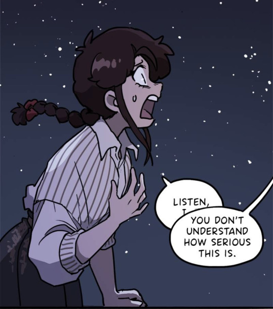
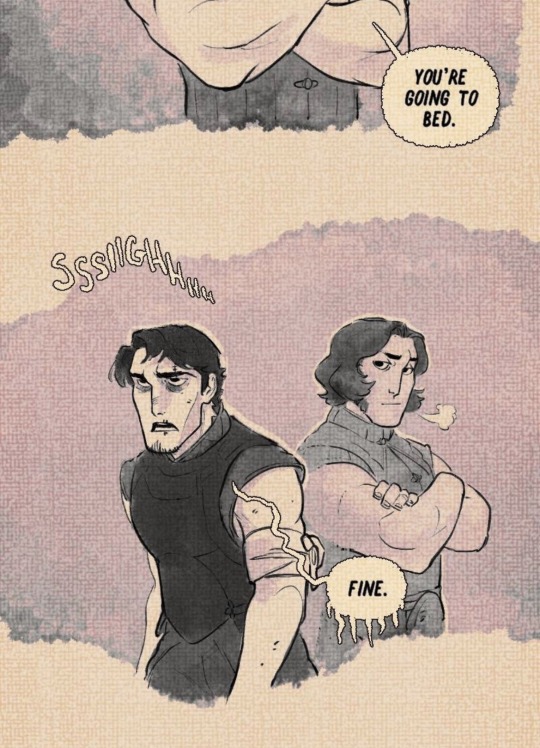
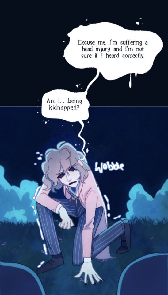
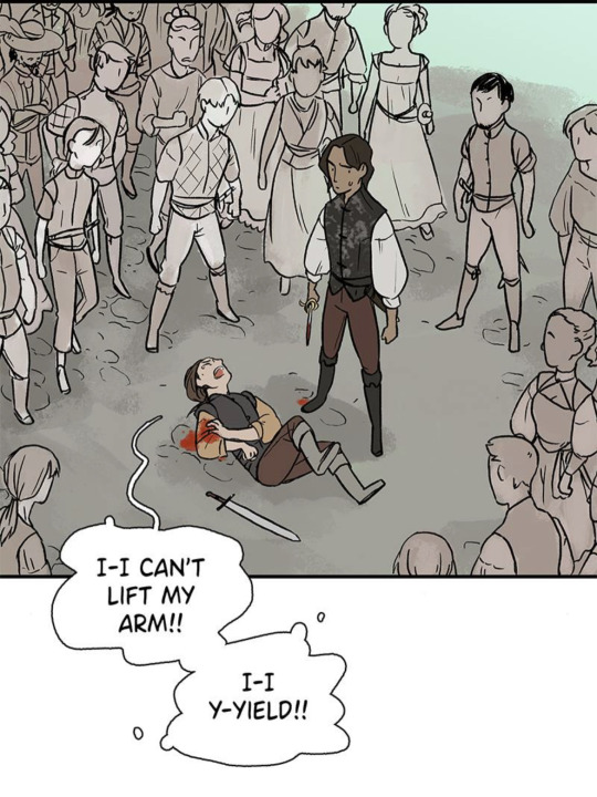
Note to Self - Speaking without Words with Word Balloons
Word gallons are for more than just words. They can be used to emphasis and even add emotions and to a scene
Feeling dizzy? About to pass out?
A lilting playful swirl (Time and Time Again by Deo I)

The white and black of the text has been replaced with a sinister black and the words are off tilter (Sword Interval by Benjamin Fleuter)
The voice is coming from a place deeper and more unsettling and the text is uneven and handwritten
A dismissive comment literally (metaphorically) stabs someone (Marionetta by Míriam Bonastre Tur)
Being interrupted before finishing what is being said
A withering and icy reply (The Secrets of Soulford by the Quincil)
Wobbly uncertain bubbles that even break apart in some parts from dizziness (The Blind Prince by cozycroww)
Pain almost appears to be breaking the usually round bubble into uneven and broken balloons. The little smaller balloons around it are reminiscent of sweat or tears (Heir’s Game by suspu)
#comics#art reference#note to self#comic tutorial#art tips#the secrets of soulford#time and time again#marionetta#comic recommendations#comic recs#the blind prince#heir’s game#Webtoon#webtoon tutorial#webtoon recommendation
6K notes
·
View notes
Text
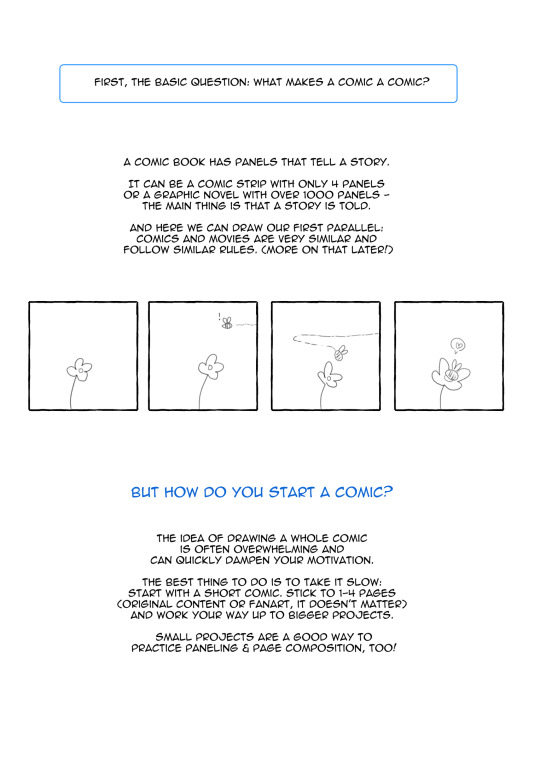
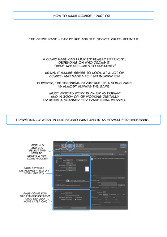
⭐ How to Draw Comics - a helpful guide for beginners by spicymotte is a 20-page booklet on how to make comics, even if you have never touched this subject before! My guide for comic newbies is now available on itch.io!
502 notes
·
View notes
Text
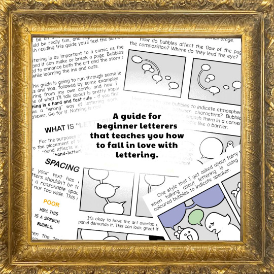
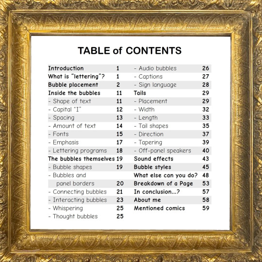
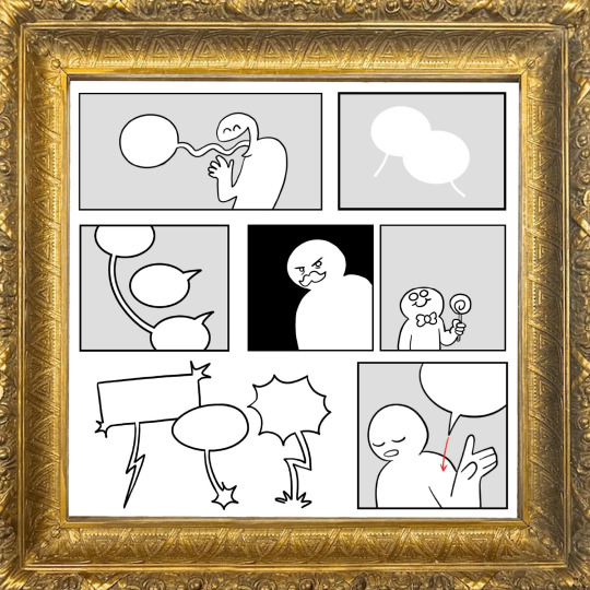
Do you struggle to letter your comics? Do you find it boring?
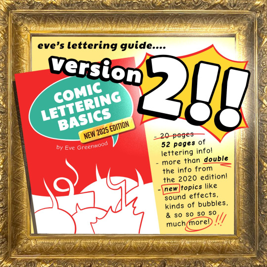
My guide Comic Lettering Basics is for anyone who wants to start learning how to improve their lettering! Originally released in 2020, it just got a HUGE update!
🗨️ PDF: evegwood.itch.io/comic-lettering-2025 🗯️ Print: ko-fi.com/s/21074651ce
What's inside? 54 pages of tips, advice, and info about (almost) all aspects of lettering, with plenty of examples from myself and other creators. The PDF is only $3/£2.50, and the print copy is $6.20/£5!
448 notes
·
View notes
Note
wow your comics are stunning! the vanco especially is so effortlessly beautiful and well structured. Do you have a tutorial on how you make comics? Your panel work and composition is especially great, would love to know more about the process
THANK YOUUU. I am not really good with tutorials, hah. My comic process is also very much "I want to do this NOW!" and then I do it. I don't do any script, I sketch full sized thumbnails and write the "kind like this" versions of the dialogue into the thumbnails (or I won't and after I'll be like hmm I wonder what I wanted to do here).
Here's the steps of my latest little comic:
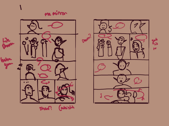
These are my thumbnails. My main goal when I start a page is to do a simple 1. Establish where we are 2. Establish who are there
I am not good with establishing shots tbh. They kill me every time. With fancomics it's easier because I don't even have to show The Last Drop because of course these idiots would be there :D

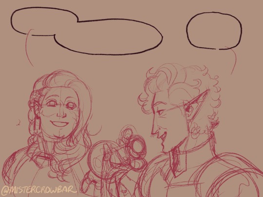
After the rough idea I do the actual sketch that I will use to help me do lineart. Just very simple and usually the characters are just their most important features. Sometimes you can barely recognize them.

Here's the final one just for comparison.
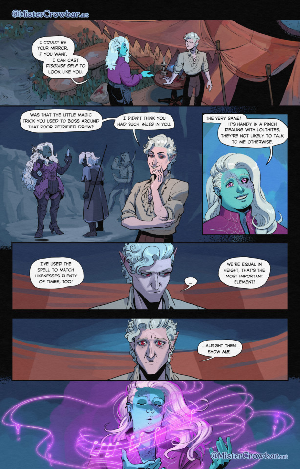
With the bigger comic I posted yesterday, I just love making movement that carries through the panels. When I know I have to add lots of dialogue to explain things, I'll make the characters do something at the same time

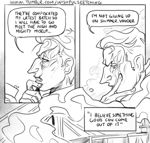
I just wanted to make this casual/domestic moment of bitching about life while Vander is being caring and Silco accepts it.
With composition and panel work, idk, it usually comes down to what mood I want/what I want to show (expressions usually) OR. What I don't want to show :D When you want to be lazy, you will become creative! And nobody will know!
I am very fond of breaking the panels to kinda showcase change, I guess. I do it a lot. With like the effect of the next panel entering the previous one or with speech bubbles.
With this one I had to come up with ways to transition to all the scenes within the "memory" and it was pretty fun yet also made me anxious because I also had to keep the pace up.
I draw quick and I am pretty confident with my control over my lines, so I don't really have any tips for lineart. One thing I do wanna say is that you have to learn to let go. I want to fix so much from the headcanon comic I did. I won't. It's not bad, it's just not perfect. It wouldn't be perfect even if I would fix it.
#answering stuff#talking about stuff#comic#thank youuu for the ask#not really a tutorial just me talking about my comic idk
471 notes
·
View notes
Text


A rough process for my warm ups, as best I can explain! If you give it a try, I'd love to see!
363 notes
·
View notes
Note
What advice would you give to someone who wants to start draw comics?
Read comics. Try to absorb the layouts and lettering - there’s so many ways to tackle it! Also even in published comics you’ll see that the art is messy and scrungly and you can take that as permission to be messy and scrungly too.
Comics are about efficiency and Good Enough. If you try to make each panel a masterpiece you’ll be there forever. Reasons why I mostly do simple pencil comics.
Start small. Do a scene or gag comic at a time. Get a feel for the medium and all the steps you have. If there’s a step you hate, find a way to emphasize the steps you love. EG I hate laying down flat colours but love shading, so I make my page form comics painterly greyscale with a gradient map to spruce them up.
Thumbnail!!!!! Figure out your page or panel layout before you start pencils. It can just be chicken scratch and sticken figures but it will help make sure there’s a clean line of action carrying the viewer from panel to panel and that your lettering fits.
don’t skimp on lettering. you can have beautiful artwork but if your dialogue is time new roman on half transparent ellipses or somehow unreadable it’s gonna drag everything else down. Blambot is a great source for free and affordable comic fonts and even has guides from an industry pro.
There are a huge bajillion elements to making comics but once you’ve made like, literally 100 pages you’ll start just intrinsically knowing things like the 180 rule, how to place a speech bubble when the first speaker is on the right, and that you can draw one nice background and then have gradient colour blocks carry you through most of the page/scene. And then you’ll still keep learning. Always learning!
LOTS of example stuff under the cut, mostly for lettering and layouts:
thumbnails vs finished page. The detail is just enough to remind me who goes where. You can see I mostly played with the last part of the scene, going from three panels in one row to making each panel an entire row across three rows. Panels on the same row have less “time” between them as the eyes skips from one to the other faster, whereas there’s a little more gap skipping back to a new row (think resetting a line on a typewriter). Here, the first thumbnail may have fit the artwork more neatly, but I wanted to give Astarion more time to deliberate his decision.
You can also see that I changed the top panel from a close up on Aldiirn to a wider shot showing both. This sets the scene, and the rest of it uses simple/abstract backgrounds until the final panel, which makes a nice bookend while making the overall load easier. One good environment panel will carry you for a while, but don't leave your characters in the void for too long.
Make a script before you start layouts but don’t be shocked if you need to cut things out to have them fit a page. Less is more, generally. This also goes for visual elements - what's most important to the scene? What's just extraneous detail you find fun but is creating clutter?
For the 4-panel comics I don’t put time into thumbnails unless it’s a difficult panel, but I always put the lettering and speech bubbles down first so they have enough room and nothing important gets covered. If you do this much you’re a step ahead imo.
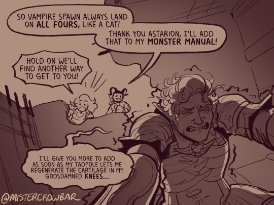
This one I’m working on now and there’s a lot going on with four characters speaking to each other! It’s important to keep a clear line going for the dialogue. Astarion’s first line has the top left corner and clearly starts the conversation. The tail of the bubble carries over to where he whispers to Aldiirn, and we pick up Aldiirn’s lines. The rock wall on the right then draws the eye down to Shadowheart and Gale’s bubble at the bottom. I don’t think the tails on the bottom bubbles are 100% ideal, but it’s Good Enough.
There’s also slightly different points in time going on in this panel, because the art is static but it’s a long convo going on. Gale’s signature finger isn’t in response to Astarion whispering, but to his answer to Aldiirn that comes after. Think of how time works in your panels, especially when you got a big one because size = time.

You can use all sorts of things to direct the eye across a comic page, but I find the strongest things are the bubbles & tails and where characters are looking. Here, Gale’s “stop by” line breaks the panel line to help draw the viewer to him in the last panel, since otherwise the eye was likely to end up at Aldiirn.
I generally like bubbles to be tucked into their panels, either fully inside or up at the edges like “my condolences.” It looks neater than when bubbles are willy nilly over the edges which I see as a sign of poor planning. And! it means when you do break panel lines it can be more meaningful.
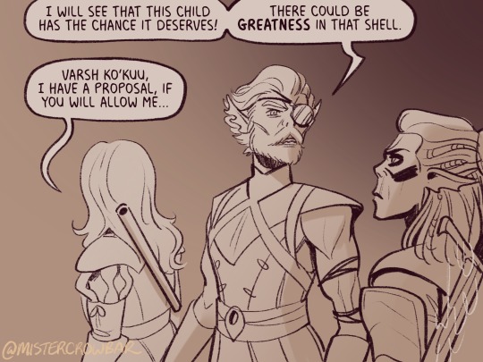
the 180 rule is a film/stage thing for composition to avoid confusing the audience, but the simplest way to put it is: if a character is on the left side of the scene, they should stay there until the action or whatever moves them. You can see here that Aldiirn is always on the right facing left, even when the camera is a bit behind him or a bit behind Gale. the 180 line is the front of Aldiirn’s tent, and the camera never crosses it in a way that would put Gale on the right.
I find it distracting when a conversation is happening in comic and a character breaks the 180 for no particular reason, though are times I’ve done it because a panel worked much better that way. The book Framed Ink has some great guides on composition and how to change the 180 line.
You can also see in the above comic that it’s arranged so that Gale’s always the first speaker in the panels he appears so there’s no criss cross bubble tails. Buuuut what if the first speaker is unavoidably on the right?
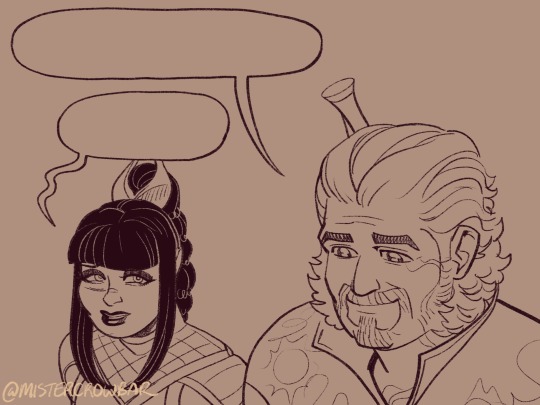
Stack the speech bubbles. You want the first speech bubble CLEARLY and undeniably the closest to the top left corner and then other speakers can go below.
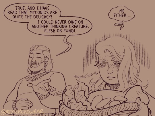
the middle example above also has some examples of playing with the speech bubbles. Wyll’s “square-y round-y” bubble is the standard, the boxy ellipse. The tail has a slight, lanquid curve. He;s comfortable teasing the poor vampire. Aldiirn’s bubble is pointy! the tail straight! with urgency! And Astarion’s bubble and tail are burbling and grumbling through gritted teeth and pain. Varsh Ko’kuu, even though he’s speaking with a standard shaped bubble, has a sharp point in the tail that speaks to his assertiveness in protecting the egg. And Shadowheart has some hesitation with that wiggly tail.
Either hand drawing or using vector shapes for bubbles is fine, but I recommend staying away from true ellipses because they look static. Square-y round-y is where it’s at. Just make sure there’s enough space between text and edge of the bubble, usually enough to fit a capital H or W, but you can play with that spacing too.
The second panel here breaks the “first bubble goes top-left corner” rule, so it’s ambiguous if Gale or Aldiirn speaks first. However! In this case everyone is giving their responses in a jumble to Rath, so order matters less. I’m pretty sure every rule I’ve mentioned has a time and place to break it, but it’s still important to learn the basics first.
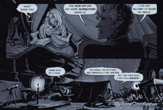
Key thing about comics typefaces: the capital I will have bars and the lower case will not. The barred I is used for I, as in, “I am not inclined to share” where the unbarred is used everywhere else.
When choosing a font, I recommend grabbing one that has Regular, Italic, and Bold/Bold Italic typefaces. I use Milk Moustache for my 4-panel comics because it’s very casual and similar weight to my own handwriting, but it doesn’t have an italic typeface and that drives me nuts sometimes. For the most flexibility, choose a font that has lower case AND uppercase type faces. I stick to upper case 90% of the time but lower case adds more options, like Aldiirn’s “really?” being so small due to his stressed state.
There are some official guides on what should be bold or italic in dialogues but they don’t matter as much unless you’re working for a big publisher with a style standard. Italics for thinking and whispering are common. I go with my gut, like Astarion’s speech is so dramatic I use italics and bold liberally, whereas for most others I may or may not just choose a key word to bold.
I think some programs will let you make text to fit a bubble instead of a square box, but tbh I just spend a lot of time manually making the text fit nicely in that bubble shape.
259 notes
·
View notes
Text
'Dead Poets Society' gang
Headcanon that these four drop poetry and literature quotes on their conversations unprompted.
Jason 'English-major-I-only-visit-the-manor-for-the-library' Todd-Wayne
Damian 'I-master-liberal-arts-unlike-you-plebs-PHD-holder' al Ghul-Wayne
Cassandra 'I-learn-English-thru-Shakespeare-as-god-intended' Cain-Wayne
Duke 'only-title-holder-of-vigilante-poet-and-will-cuss-you-just-as-poetically' Thomas-(future) Wayne
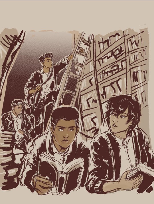
#My background is ass#I promise to practice but omg i am losing motivation coz its too ugly#started putting some on coloring that i started being happy about it#But my background is level toddler i hate it#the patience and discipline to make my lines straight and clean is nonexistent gdi...why did past me choose library gdi#Just writing some Duke in my fics and this image of them all just made me wanna do art...Duke is a poet and writes stories u kno?#Duke is not a wayne yet...and is not dead yet...but with how comics goes then its just a matter of time lol#They're all in school here...Cass and Jason are college watching over their juniors in high school#everyone use cardigans but Jason like his leather so no thanks lol#Duke and Cass in outsiders are cute#jason todd#dc comics#damian wayne#fanart#robin#cassandra cain#duke thomas#inking & background study#Damian is now 14!!!! He's getting old...he's like a baby yesterday omg#I need to stop obsessing over this so i posted a WIP so i can continue writing my fic!!! argh#Im gonna watch youtube tutorials again on drawing bookshelves coz i cannot do this without guidance
643 notes
·
View notes
Text
I adore the implications that Stone's steamed Austrian goat milk lattes suck ass so I chose to believe that Stone stuck around because Robotnik is the only human on earth that likes his dog shit coffee
#agent stone#stobotnik#dr robotnik#The implications being karen in the comics going “this tastes like cottage cheese”#and the “tutorial” where intern stone spat the latte he just made
215 notes
·
View notes
Text
got a few requests to show timelapses and my process so here's one for this drawing. not the smoothest example but probably the most realistic in terms of how a drawing goes
well time to explain this
first i do a value block-in in which i lay out the composition with 3 values- light, mid, dark. knew i wanted the bg to be lighter and the characters to be darker and the scribble was just to confirm it will look alright (1). i usually don't do a sketch unless i'm not confident in something - and in this case i changed dick's pose 3 or 4 times and none of them really worked. so gave up on guessing and did a sketch to check a new pose. also did a wash of bg color that sets the pallette (2). then i block in colors. decided to change bruce's pose too during this stage bc i drew bruce in the same pose last drawing and didn't want a repeat (3)


then i render and detail. that's most of the drawing process. i'll usually come to a point when i have to pull my work from procreate to photoshop to do lighting and color touchups + effects. stuff like level adjustments, color balance, blurring things.
image on the left was the procreate export. and then the final image on right


and that's it. the line between stages are blurry but it keeps everything flexible for a long time (like changing bruce's cape up to the last moment of the timelapse). if i need to show my work to someone, i'd lock in on the stages
all in all, this took about 15 hours pretty sure 2 hours of that was messing around with their poses sdjkfldj
293 notes
·
View notes
Text

This is part of a comic I'm doing, but I think it worked well enough to deserve a post all by itself~ :D:D:D (drawing Azula is very fun :D)
#Got avatar on the brain atm#:D:D:D#azula#avatar the last airbender#atla fanart#atla#wanted to try out some more 'realistic' stuff#like actually doing skin rendering and all that#I like how this turned out#so I guess it worked!#:D#(followed a tutorial instead of just winging it-)#Ye.#im gonna add text for the comic#which goes something like#'Oh look who finally decided to show up'#>:D#princess azula#>:D>:D>:D
151 notes
·
View notes