#Complementary
Explore tagged Tumblr posts
Visit Tumblr Blog
Explore Tumblr blogs with no restrictions, modern design and the best experience.
Last Seen Tumblr Blogs


Fun Fact
Tumblr.com rank in the US is 25.
Text

“Bamboo and Bricks”
Digital Painting, Made in Procreate
2048x2387px
#bamboo#brick#bricks#walls#decor#exterior#green#complementary#akadoodles#digital painting#silly art#digital oil painting#digital art#procreate oil#realism#digital artist#artists on tumblr#art
60 notes
·
View notes
Text
The Nightly News by Jonathan Hickman sure is a comic book
23 notes
·
View notes
Text
mike has many little freckles and will has a few big freckles ☹️
#complementary#really high n thinking ab byler visuals#byler#will byers#mike wheeler#stranger things
224 notes
·
View notes
Text

#yin_yang#阴阳#concept#pinyin#taoism#yīnyáng#forces#http://aabon35.blogspot.com ⚫��� http://arubio28814.blogspot.com#complementary#x#tiktokersleaks#ai#literally#interconnected#chinese#tiktoklive#ia#dark#bright#universe#geminis#philosophy#interior#tiktok#opposite
27 notes
·
View notes
Text
I was thinking the other day, and listening to these songs - comparing and contrasting the death themes of two of the most iconic characters from two of the most iconic franchises, and how their themes reflect the themes of the franchises themselves.
Vader's (which starts at 42 seconds in)
And Spock's
John Williams did a masterful job with Vader's theme. It gives us tragedy, introspection, a warning against falling to the dark side ... a feeling of longing - a longing for peace, and a pale reflection of his his earlier themes (notice the descending scale in the back, bringing the power of the Imperial March down to its very lowest - letting us see behind the mask musically as well as physically)
James Horner worked just as brilliantly on Spock's death theme, which denotes a peace that already exists - a certainty of thought and knowledge that transcends one's own desires, because there are greater things than oneself and they are worth dying for (with ascending scales in the back, giving it a hopeful, almost uplifting feeling. Though there's still a soft tragedy there - I would even say gentle - as Kirk says goodbye)
It would be impossible to really talk about their themes without mentioning the one that they share, and that is sacrifice. Though both of them come at it from different angles, they are ultimately giving their lives for the ones that they love.
We know as an audience that Spock would give up his life for any innocent, but that does nothing to diminish the gravity and the import of his sacrifice. He cared for his crew just as he cared for Kirk and McCoy, and we don't begrudge him the love that he feels for them any more than we begrudge them their reactions.
On the opposite end we have Vader, who wouldn't have sacrificed himself for anyone but Luke, which is part of what makes the breaking of Palpatine's shackles so immensely satisfying to watch. Luke succeeded where no one else did, correct that Anakin Skywalker was still alive, and - somewhere deep down - was still a Jedi.
And then their funeral themes
Vader's is the Force theme, which is the through-line for the whole saga
A reminder that we're all connected and that death isn't the end
Vs Spock's Amazing Grace, which reflects gratitude for life, and hope for the future
And it ends with an echo of his earlier death theme, just in case you weren't already crying
Even the lighting of the scenes kind of complement each other. Vader's is all dark but for the fire, the flames of his pyre licking the black of his suit and illuminating the look of longing/loss on Luke's face
And Spock's is all dark but for the Enterprise (and any shots done in the ship, ofc, all of his mourning family and friends) as his body is launched to the planet, which turns just enough to show the star behind it
Anyway.
Just some thoughts I was having as I listened.
#also contrast Vader's death theme with Anakin's theme from TPM#and cry over the tragedy#character study#star wars#star trek#spock#darth vader#anakin skywalker#music#john williams#james horner#study#complementary#themes
13 notes
·
View notes
Text
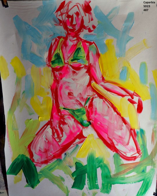
move your colors
translateds from a @caparbia colaboration
28 notes
·
View notes
Text

complementary
#© victor s. brigola#brigola#complementary#square#yellow#blue#light blue#dark blue#wall#symmetry#architecture#fuji xt5
3 notes
·
View notes
Text
Though different as light and shadow, the twins fought well as a team.
"DragonLance Chronicles: Dragons of Autumn Twilight" - Margaret Weis and Tracy Hickman
#book quote#dragonlance chronicles#dragons of autumn twilight#margaret weis#tracy hickman#caramon majere#raistlin majere#brothers#siblings#twins#light and shadow#differences#complementary#fighting#battle#teamwork
9 notes
·
View notes
Text
Cover art for "Complementary"!

Complementary...
My first ever NottPott fic, actually. I still love that fic, absolutely adore. So I made cover art! Yes, after like... a month? Don't know, don't care!
#nottpott#fanfic#cover art#harry potter fanfiction#Harry potter fic#my fic#Complementary#theodore nott#theo nott#harry potter
3 notes
·
View notes
Text
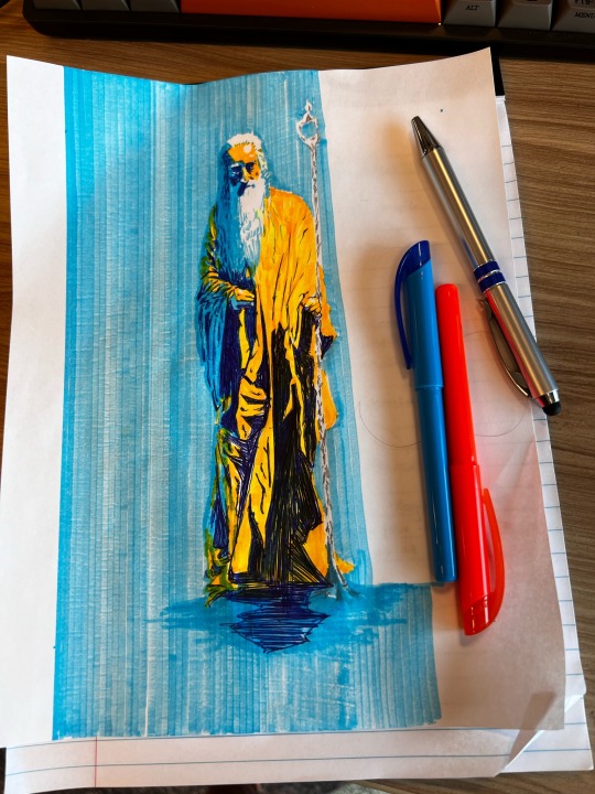
I left my tablet at home so that I wouldn’t draw at work 👍
#art#my art#traditional#wizard#highlighter#two tone#dichromatic#diochrome#? is that a word#orange and blue#complementary colors#complementary#sketch#sketches#scribble#silvascribbles#silvascribble#ink#ballpoint#pen#highlighters#old man#pinterest reference
13 notes
·
View notes
Text
Number joy & Pattern love
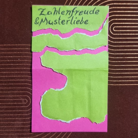
Quick collage and lettering [2023/12/12]
#knottys art#art#pattern love#number joy#words#colors#shapes#collage#green#pink#green and pink#complementary colors#complementary#ripped paper#ripped paper collage#quick art#lettering#joy#love#appreciation
14 notes
·
View notes
Text

All we are saying is give peace a chance. (John Lennon)
#everywhere#indifference#sinister#phobia#opportunity#flutter#aleatory#complementary#uneducated#war#peace#lennon
13 notes
·
View notes
Text


24x24” final oil paintings
#oil painting#oils#oil pant#finally done#finals week#art school#art#painting#monochrome#complementary
2 notes
·
View notes
Text
maybe we will be people doing laundry and taxes together in the next life, maybe we will be sakura flowers on the same tree in the next life, maybe we will be the sun and the moon in the next life, maybe we will be two perpendicular lines in the next life, maybe we will be deers frolicking in a meadow in the next life, maybe we will be connected weeping willows in the next life, maybe we will be two swans in the next life, maybe we will be dragonflies at a pond in the next life, maybe we will be a lotus and a lily pad on water in the next life, maybe we will be seahorses hiding in seagrass and mangroves in the next life, maybe we will be trees that have branches touching in the next life, maybe we will be blue and orange in the next life, maybe we will be coffee mugs on the same table in the next life, maybe we will be books made out of the same paper in the next life, maybe we will be pomegranates from the same garden in the next life, maybe we will be similar shades of lipstick in the next life, maybe we will be cheese and win in the same refrigerator in the next life, maybe we will be a lemon and lime in a bowl in the next life, maybe we will be poems in the same journal in the next life, maybe we will be orchids in the same vase in the next life, maybe we will be sugar and spice in the next life, maybe we will be thunder and lightning in the next life, maybe we will be silver and gold in the next life, maybe we will be chairs with identical designs in the next life, maybe we will be two cats sleeping in the same bed in the next life, maybe we will be bread and butter on the same counter in the next life, maybe we will be milk and cookies in the next life, maybe we will be moss and algae in the next life, maybe we will be songs in the French and Spanish in the next life, maybe we will be-
maybe we will be keychains on the same key ring in the next life
#in the next life#in another life#prose#excerpts#expressionism#art#fragments#complementary#positive version#maybe we will be#barcoques add-on#barcoques original
56K notes
·
View notes
Text
Child Modeling CHILD MODELING cHiLd MoDeLiNg
Identification Card & social media gravitation ->Adult Child, HOLY shiet streetless or is it more. Today, it's more mature good looking my aged girl with bleached blond hair.
0 notes
Photo
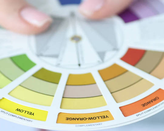
How to Find Complementary Colors The easiest way to identify complementary colors is by using a color wheel. Each color has an opposite hue that enhances its visual impact. For example, red and green, blue and orange, or purple and yellow create striking contrasts. When selecting table settings like placemats or tablecloths, pairing these hues can create a dynamic and eye-catching effect. Purple Complementary Colors Purple pairs beautifully with yellow, creating a regal and elegant feel. A deep purple tablecloth with soft yellow napkins can bring a luxurious ambiance to your dining table. Adding gold accents can further enhance the richness of this color combination. Pairing different textures like velvet and silk can make the setting even more sophisticated. Complementary Colors To Blue Blue and orange make a vibrant pair. If you’re using a navy blue tablecloth, consider adding burnt-orange napkins for a sophisticated yet lively dining experience. Using different shades of blue, from sky blue to deep navy, can add variety to the arrangement. Orange-hued centerpieces or candles can further highlight this color scheme. Yellow Complementary Colors Yellow pairs with purple to create a bold yet balanced look. A mustard yellow table runner with lavender napkins can create a warm and inviting table setup. Adding white or neutral tones can soften the contrast while maintaining its vibrancy. You can also experiment with gold details to enhance the elegance of the combination. Know About: Who Wears Crop Tops to the Office? Complementary Colors To Red Red’s complement is green. A deep red table setting with olive green napkins brings a festive and rich appearance, perfect for holiday gatherings. Using floral or botanical patterns in these colors can add a natural and fresh touch. Incorporating gold or bronze cutlery can further elevate the luxurious feel. Pink Complementary Colors Pink and green create a fresh and modern contrast. Pairing soft pink table linens with sage green placemats can give a spring-like, airy feel to your dining space. Adding floral elements in similar tones can enhance the overall aesthetic. You can also mix pastel and vibrant shades to create a layered look. Orange Complementary Colors Orange complements blue, making it a great choice for bold and lively decor. A terracotta-hued tablecloth with sky-blue napkins will make your dining setup feel energetic and inviting. Including metallic accents like copper or bronze can add warmth to the combination. Softening the contrast with neutral tones can create a more balanced look. Maroon Complementary Colors Maroon pairs well with teal for a sophisticated yet striking contrast. A maroon table runner with teal placemats can add a touch of elegance to any dinner table. Adding dark wood elements can further enhance the richness of the setup. Playing with different patterns within the same color scheme can add an artistic flair. Black Complementary Colors Black pairs well with white and other high-contrast colors. A black tablecloth with white napkins and gold placemats adds a classic and chic look. Incorporating textures like lace or satin can add depth and interest. A pop of color, like red or emerald green, can provide a dramatic effect. Complementary Colors To Green Green is complemented by soft pink. A pastel green table setting with blush pink napkins creates a serene and calming atmosphere. Adding wooden elements can enhance the earthy feel of this combination. Soft lighting can further amplify the gentle and relaxing mood. Lavender Complementary Colors Lavender’s complement is pale yellow. A lavender tablecloth with buttery yellow placemats creates a delicate and soothing color combination. Incorporating floral arrangements in these colors can add a natural and fresh touch. Pairing with silver or white accents can maintain the softness of the look. Read Related: Styling Your Home with Autumn Color Palette What is Split Complementary Colors? A split complementary color scheme involves one base color and two adjacent colors from the complement’s side. This approach creates a balanced yet vibrant look. If you’re using a blue tablecloth, consider adding orange-yellow and orange-red napkins for a more harmonious and engaging table setting. This method is a great way to incorporate more color variety while maintaining contrast. It also provides flexibility in mixing and matching different elements in your decor. Read On: How to Clean Jewelry - Tips and Tricks How Do Complementary Colors Affect Each Other? Complementary colors enhance each other’s brightness, creating a lively and dynamic effect. This is why a red table runner over a green tablecloth looks more vivid. The same principle applies to home decor; combining opposite hues can make a space feel more energetic or sophisticated, depending on the shades you choose. Using them in different textures, such as matte and glossy finishes, can add even more visual interest. Proper lighting can also affect how these colors interact, influencing the mood of the space. What Are the Double Complementary Colors? Double complementary colors involve two sets of complementary pairs. For example, blue and orange paired with yellow and purple create a high-contrast, vibrant setting. This approach is perfect for layering colors in your dining setup—such as using blue placemats, orange napkins, yellow candles, and a purple floral centerpiece. It offers more variety and depth in your design. Mixing different textures and patterns within these colors can further enhance the visual appeal. How to Shade with Complementary Colors? Shading with complementary colors involves using tints and tones to create depth. For instance, a light blue tablecloth can be complemented with deep orange placemats. Mixing different intensities of complementary colors prevents overpowering contrasts and ensures a balanced look. You can also use gradient effects to make the transition between colors smoother. Layering light and dark shades can add dimension and character to your decor. Using complementary colors in home decor and table settings can transform an ordinary space into a visually stunning masterpiece. Don’t be afraid to mix textures and patterns to add more depth. Personalizing your decor with complementary colors can make your setup feel unique and stylish. Source link
0 notes