#Design Systems
Explore tagged Tumblr posts
Visit Tumblr Blog
Explore Tumblr blogs with no restrictions, modern design and the best experience.
Last Seen Tumblr Blogs


Fun Fact
Tumblr was created by web developers David Karp and Marco Arment.
Text
🚀 Just built a complete SaaS UI/UX from wireframe to code using AI + Penpot — in under 12 hours. No fluff. Just speed, strategy, and smart design. From prompt-based layouts to full exportable code, this is what next-gen digital strategy looks like. Welcome to the era of design bursts ⚡️ #innovation #technology #productivity #digitalmarketing #creativity #future #branding #marketing #startups #entrepreneurship #advertisingandmarketing #socialmedia #personalbranding #careers #personaldevelopment #sustainability #ui #ux #uiux
#AI design#AI UX tools#design systems#Digital Transformation#no-code tools#Penpot#SaaS UI#ux strategy#wireframe automation
0 notes
Text

Explore the Essentials of UI/UX Design for Engaging Experiences
Understand the fundamentals of user interface and user experience design, including wireframes, prototyping, and human-centered design approaches to build intuitive digital products. Visit Attitude Academy Yamuna Vihar: https://maps.app.goo.gl/gw9oKCnXDXjcz4hF7 Uttam Nagar: https://maps.app.goo.gl/iZoQT5zE3MYEyRmQ7 Yamuna Vihar: +91 9654382235 Uttam Nagar: +91 9205122267 Visit Website: https://www.attitudetallyacademy.com Email: [email protected]
#ui ux design#user interface#user experience#wireframing#prototyping#design systems#interaction design#digital products#design tools#usability
0 notes
Text
IxDA Pittsburgh Perseveres
In the evening of December 20th, 2005, a very small group of Interaction Designers met at Caribou Coffee in the Southside Works. That meetup was the first of many, and the group quickly formalized as IxDA Pittsburgh. That makes this year, 2025, the twentieth anniversary of our organization.
I wasn’t sure we were going to make it. Since the pandemic, I’ve had a harder time getting new volunteers, so my planning committee was dwindling. Fortunately, I had an uptick after publishing an announcement about our anniversary, and we have a number of events in the works.
Coming up next, we’re featuring Brad Frost, author of Atomic Design, and his brother Ian Frost. They’ll be talking about design tokens. Check it out, if you’re in the area.
0 notes
Text
Organizing Design System Component Patterns With CSS Cascade Layers
New Post has been published on https://thedigitalinsider.com/organizing-design-system-component-patterns-with-css-cascade-layers/
Organizing Design System Component Patterns With CSS Cascade Layers
I’m trying to come up with ways to make components more customizable, more efficient, and easier to use and understand, and I want to describe a pattern I’ve been leaning into using CSS Cascade Layers.
I enjoy organizing code and find cascade layers a fantastic way to organize code explicitly as the cascade looks at it. The neat part is, that as much as it helps with “top-level” organization, cascade layers can be nested, which allows us to author more precise styles based on the cascade.
The only downside here is your imagination, nothing stops us from over-engineering CSS. And to be clear, you may very well consider what I’m about to show you as a form of over-engineering. I think I’ve found a balance though, keeping things simple yet organized, and I’d like to share my findings.
The anatomy of a CSS component pattern
Let’s explore a pattern for writing components in CSS using a button as an example. Buttons are one of the more popular components found in just about every component library. There’s good reason for that popularity because buttons can be used for a variety of use cases, including:
performing actions, like opening a drawer,
navigating to different sections of the UI, and
holding some form of state, such as focus or hover.
And buttons come in several different flavors of markup, like <button>, input[type="button"], and <a class="button">. There are even more ways to make buttons than that, if you can believe it.
On top of that, different buttons perform different functions and are often styled accordingly so that a button for one type of action is distinguished from another. Buttons also respond to state changes, such as when they are hovered, active, and focused. If you have ever written CSS with the BEM syntax, we can sort of think along those lines within the context of cascade layers.
.button .button-primary .button-secondary .button-warning /* etc. */
Okay, now, let’s write some code. Specifically, let’s create a few different types of buttons. We’ll start with a .button class that we can set on any element that we want to be styled as, well, a button! We already know that buttons come in different flavors of markup, so a generic .button class is the most reusable and extensible way to select one or all of them.
.button /* Styles common to all buttons */
Using a cascade layer
This is where we can insert our very first cascade layer! Remember, the reason we want a cascade layer in the first place is that it allows us to set the CSS Cascade’s reading order when evaluating our styles. We can tell CSS to evaluate one layer first, followed by another layer, then another — all according to the order we want. This is an incredible feature that grants us superpower control over which styles “win” when applied by the browser.
We’ll call this layer components because, well, buttons are a type of component. What I like about this naming is that it is generic enough to support other components in the future as we decide to expand our design system. It scales with us while maintaining a nice separation of concerns with other styles we write down the road that maybe aren’t specific to components.
/* Components top-level layer */ @layer components .button /* Styles common to all buttons */
Nesting cascade layers
Here is where things get a little weird. Did you know you can nest cascade layers inside classes? That’s totally a thing. So, check this out, we can introduce a new layer inside the .button class that’s already inside its own layer. Here’s what I mean:
/* Components top-level layer */ @layer components .button /* Component elements layer */ @layer elements /* Styles */
This is how the browser interprets that layer within a layer at the end of the day:
@layer components @layer elements .button /* button styles... */
This isn’t a post just on nesting styles, so I’ll just say that your mileage may vary when you do it. Check out Andy Bell’s recent article about using caution with nested styles.
Structuring styles
So far, we’ve established a .button class inside of a cascade layer that’s designed to hold any type of component in our design system. Inside that .button is another cascade layer, this one for selecting the different types of buttons we might encounter in the markup. We talked earlier about buttons being <button>, <input>, or <a> and this is how we can individually select style each type.
We can use the :is() pseudo-selector function as that is akin to saying, “If this .button is an <a> element, then apply these styles.”
/* Components top-level layer */ @layer components .button /* Component elements layer */ @layer elements /* styles common to all buttons */ &:is(a) /* <a> specific styles */ &:is(button) /* <button> specific styles */ /* etc. */
Defining default button styles
I’m going to fill in our code with the common styles that apply to all buttons. These styles sit at the top of the elements layer so that they are applied to any and all buttons, regardless of the markup. Consider them default button styles, so to speak.
/* Components top-level layer */ @layer components .button /* Component elements layer */ @layer elements background-color: darkslateblue; border: 0; color: white; cursor: pointer; display: grid; font-size: 1rem; font-family: inherit; line-height: 1; margin: 0; padding-block: 0.65rem; padding-inline: 1rem; place-content: center; width: fit-content;
Defining button state styles
What should our default buttons do when they are hovered, clicked, or in focus? These are the different states that the button might take when the user interacts with them, and we need to style those accordingly.
I’m going to create a new cascade sub-layer directly under the elements sub-layer called, creatively, states:
/* Components top-level layer */ @layer components .button /* Component elements layer */ @layer elements /* Styles common to all buttons */ /* Component states layer */ @layer states /* Styles for specific button states */
Pause and reflect here. What states should we target? What do we want to change for each of these states?
Some states may share similar property changes, such as :hover and :focus having the same background color. Luckily, CSS gives us the tools we need to tackle such problems, using the :where() function to group property changes based on the state. Why :where() instead of :is()? :where() comes with zero specificity, meaning it’s a lot easier to override than :is(), which takes the specificity of the element with the highest specificity score in its arguments. Maintaining low specificity is a virtue when it comes to writing scalable, maintainable CSS.
/* Component states layer */ @layer states &:where(:hover, :focus-visible) /* button hover and focus state styles */
But how do we update the button’s styles in a meaningful way? What I mean by that is how do we make sure that the button looks like it’s hovered or in focus? We could just slap a new background color on it, but ideally, the color should be related to the background-color set in the elements layer.
So, let’s refactor things a bit. Earlier, I set the .button element’s background-color to darkslateblue. I want to reuse that color, so it behooves us to make that into a CSS variable so we can update it once and have it apply everywhere. Relying on variables is yet another virtue of writing scalable and maintainable CSS.
I’ll create a new variable called --button-background-color that is initially set to darkslateblue and then set it on the default button styles:
/* Component elements layer */ @layer elements --button-background-color: darkslateblue; background-color: var(--button-background-color); border: 0; color: white; cursor: pointer; display: grid; font-size: 1rem; font-family: inherit; line-height: 1; margin: 0; padding-block: 0.65rem; padding-inline: 1rem; place-content: center; width: fit-content;
Now that we have a color stored in a variable, we can set that same variable on the button’s hovered and focused states in our other layer, using the relatively new color-mix() function to convert darkslateblue to a lighter color when the button is hovered or in focus.
Back to our states layer! We’ll first mix the color in a new CSS variable called --state-background-color:
/* Component states layer */ @layer states &:where(:hover, :focus-visible) /* custom property only used in state */ --state-background-color: color-mix( in srgb, var(--button-background-color), white 10% );
We can then apply that color as the background color by updating the background-color property.
/* Component states layer */ @layer states &:where(:hover, :focus-visible) /* custom property only used in state */ --state-background-color: color-mix( in srgb, var(--button-background-color), white 10% ); /* applying the state background-color */ background-color: var(--state-background-color);
Defining modified button styles
Along with elements and states layers, you may be looking for some sort of variation in your components, such as modifiers. That’s because not all buttons are going to look like your default button. You might want one with a green background color for the user to confirm a decision. Or perhaps you want a red one to indicate danger when clicked. So, we can take our existing default button styles and modify them for those specific use cases
If we think about the order of the cascade — always flowing from top to bottom — we don’t want the modified styles to affect the styles in the states layer we just made. So, let’s add a new modifiers layer in between elements and states:
/* Components top-level layer */ @layer components { .button /* Component elements layer */ @layer elements /* etc. */ /* Component modifiers layer */ @layer modifiers /* new layer! */ /* Component states layer */ @layer states /* etc. */
Similar to how we handled states, we can now update the --button-background-color variable for each button modifier. We could modify the styles further, of course, but we’re keeping things fairly straightforward to demonstrate how this system works.
We’ll create a new class that modifies the background-color of the default button from darkslateblue to darkgreen. Again, we can rely on the :is() selector because we want the added specificity in this case. That way, we override the default button style with the modifier class. We’ll call this class .success (green is a “successful” color) and feed it to :is():
/* Component modifiers layer */ @layer modifiers &:is(.success) --button-background-color: darkgreen;
If we add the .success class to one of our buttons, it becomes darkgreen instead darkslateblue which is exactly what we want. And since we already do some color-mix()-ing in the states layer, we’ll automatically inherit those hover and focus styles, meaning darkgreen is lightened in those states.
/* Components top-level layer */ @layer components { .button /* Component elements layer */ @layer elements --button-background-color: darkslateblue; background-color: var(--button-background-color); /* etc. */ /* Component modifiers layer */ @layer modifiers &:is(.success) --button-background-color: darkgreen; /* Component states layer */ @layer states &:where(:hover, :focus) --state-background-color: color-mix( in srgb, var(--button-background-color), white 10% ); background-color: var(--state-background-color);
Putting it all together
We can refactor any CSS property we need to modify into a CSS custom property, which gives us a lot of room for customization.
/* Components top-level layer */ @layer components .button /* Component elements layer */ @layer elements --button-background-color: darkslateblue; --button-border-width: 1px; --button-border-style: solid; --button-border-color: transparent; --button-border-radius: 0.65rem; --button-text-color: white; --button-padding-inline: 1rem; --button-padding-block: 0.65rem; background-color: var(--button-background-color); border: var(--button-border-width) var(--button-border-style) var(--button-border-color); border-radius: var(--button-border-radius); color: var(--button-text-color); cursor: pointer; display: grid; font-size: 1rem; font-family: inherit; line-height: 1; margin: 0; padding-block: var(--button-padding-block); padding-inline: var(--button-padding-inline); place-content: center; width: fit-content; /* Component modifiers layer */ @layer modifiers &:is(.success) --button-background-color: darkgreen; &:is(.ghost) --button-background-color: transparent; --button-text-color: black; --button-border-color: darkslategray; --button-border-width: 3px; /* Component states layer */ @layer states &:where(:hover, :focus) --state-background-color: color-mix( in srgb, var(--button-background-color), white 10% ); background-color: var(--state-background-color);
P.S. Look closer at that demo and check out how I’m adjusting the button’s background using light-dark() — then go read Sara Joy’s “Come to the light-dark() Side” for a thorough rundown of how that works!
What do you think? Is this something you would use to organize your styles? I can see how creating a system of cascade layers could be overkill for a small project with few components. But even a little toe-dipping into things like we just did illustrates how much power we have when it comes to managing — and even taming — the CSS Cascade. Buttons are deceptively complex but we saw how few styles it takes to handle everything from the default styles to writing the styles for their states and modified versions.
#ADD#amp#Anatomy#Article#Articles#author#background#bem#border-radius#browser#buttons#cascade#cascade layers#change#classes#code#Color#content#course#CSS#Dark#Design#design systems#display#engineering#focus#form#functions#Future#Grants
1 note
·
View note
Text


swap au designs for fun. Im making an animation w these two
Also weddingforest i heart doomed yuri

#cookie run#cookie run kingdom#cookie run fanart#cookie run kingdom fanart#crk#crk fanart#cr fanart#shadow milk cookie#pure vanilla cookie#wedding cake cookie#black forest cookie#shadowvanilla#pureshadow#weddingforest#The weddingforest and the shadowvanilla ones look like parallels lmao oops#i did the shadowvanilla one at like 5am in the morning i had to get the toxic yaoi out of my system#sage of truth#truthless recluse#i mean kinda#these designs are mostly based off them#truthlessage
9K notes
·
View notes
Text
Custom Illustrations and Icons
Custom illustrations and icons are vital tools in graphic design, enhancing branding, communication, and user engagement. They provide a unique visual identity that distinguishes a brand from competitors and helps convey messages effectively.
Feather Softwares specializes in Custom Illustrations and Icons, helping businesses attract more customers through creative designs. Our approach focuses on creating engaging content that boosts sales and provides valuable information to customers.
1,Our experienced team offers a strategic combination of IT and marketing expertise to help you achieve your business goals. We help you drive results and achieve success. Connect with us today!
2, If you're aiming to enhance your brand's impact, Feather Softwares offers high-quality instructional content that positions you as an industry leader. Additionally, we improve your online visibility through SEO strategies, making it easier for customers to discover your business.
For Business Enquiries- https://formfacade.com/sm/xvjfh3dk
For Course Enquiries - https://formfacade.com/sm/RD0FNS_ut

#Visual Design#Prototyping#Design Systems#Layout Design#iconography#digital marketing for ecommerce#seo#marketing#digital marketing#graphic design#big data#online visibility#web design#ecommerce#5g network
0 notes
Text
Is fate something you can earn?
#character design#character art#digital illustration#character designer#digital art#ocs#haven't drawn my pookies in a while and ive missed them#new years resolution is to draw more ocs!#anyways. me when the chosen one meets the second choice#only they fall in love but the chosen one decides not to participate in the system#yet the second choice swears loyalty to it at all costs#and so the tragedy begins
9K notes
·
View notes
Text


had to make a mini zine for class so I made a scum villain hanbok series!
bonus, all the pages together and the full bingge piece because i like it


#drip fed this to twt so they saw it first#i really want to print these and maybe hand them out to scummies at anyc :3 tehe#feel free to ask about any of the designs!#svsss#luo binghe#bingqiu#shen qingqiu#mobei jun#shang qinghua#moshang#liu mingyan#sha hualing#mingling#liu qingge#luo bingge#scum villains self saving system
3K notes
·
View notes
Text
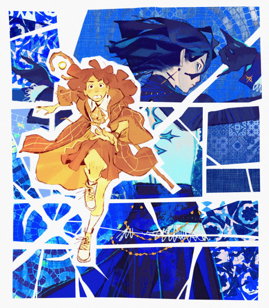
that one 12 yr old in your neighbourhood thats way cooler than you
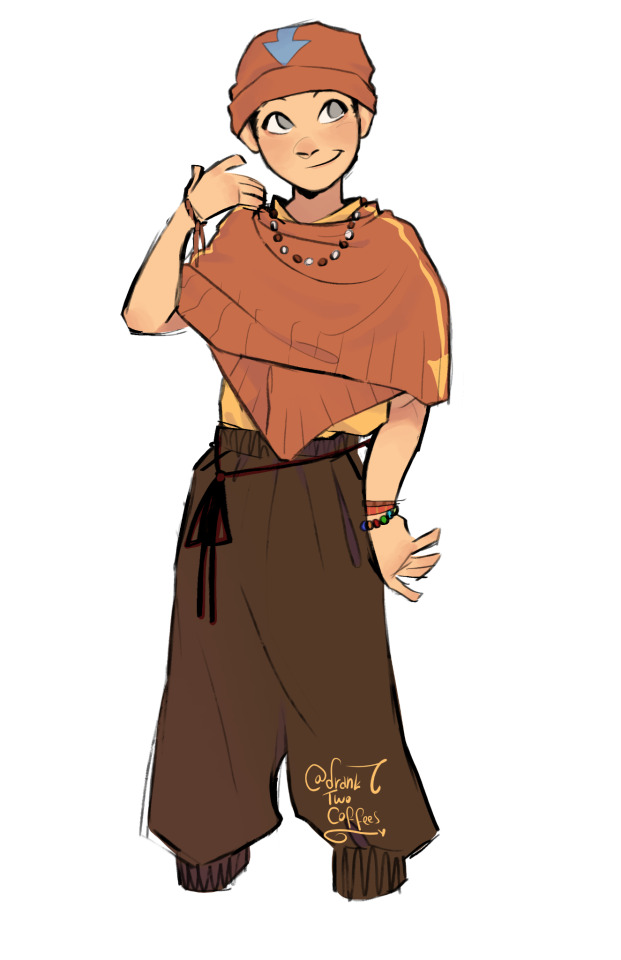
im not immune to beanie aang propaganda
#atla#avatar the last airbender#atla aang#modern au#im still working on these designs#i dont do modern aus#but like#the idea of a mha x atla au has taken two different forms in my mind#and the brainrot is real and i need to get it out of my system so i can get back to college work
4K notes
·
View notes
Text
going through the hades 2 stuff and im sorry but i just have to ramble a second because look at Hephaestus
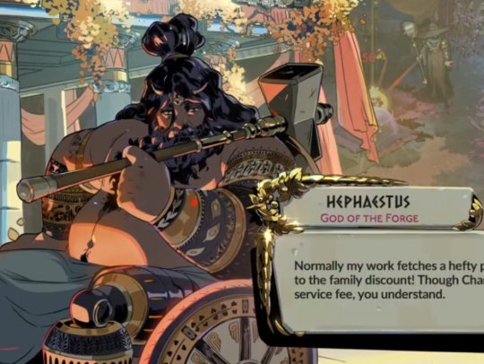
he's not just a wheelchair user but also an amputee. an above knee amputee. wheelchair users are already next to nonexistant in video games but amputees exist in this really...disheartening? spot where they're pretty much just reduced to "person with a cybernetic limb" - it's always just somewhere from "just a cool visual design" to flat out "superpower". I can't think of a video game amputee that is actually disabled by their limb differences - I'm all for futuristic worlds where prosthetics and other disability aids are far advanced from what they are now, but that's not really what's implied by these designs. They're just... Cool designs that in no way reflect on the real-world experience of being an amputee.
Look at Hephaestus, though. Look at that prosthetic. Whilst stylised it very much looks like it functions like common mechanical knees - knee bends when thigh is lifted, knee straightens when thigh is lowered. He's a wheelchair user as well as a prosthetic user - every prosthetic user I know is also a wheelchair user as a prosthetic is not usable in every occasion and also cause exhaustion and pain if used constantly.
Whilst we can't see much of his wheelchair the position he's sat in and the wheels very much evoke active wheelchair to me - this carries on to very specifically the thickness of his arms. Whilst a lot of Hades designs are muscular Hephaestus has very noticeably thick arms - which makes sense, as active wheelchairs require a lot of arm strength.
Just overall this design is making me want to cry - he's not just an actual wheelchair user in a video game, he's a realistic depiction of an amputee, a disability usually brushed over in order to give a character a fun design quirk and nothing else. He's fat and he's hot and he's a realistic depiction of an above knee amputee. Oh my god. Oh my god?
#axel grinds on#hades 2#hephaestus hades#sorry i need to get this out of my system im going to eat my ELBOWS#i am not an amputee myself#but my dad is an above knee amputee and i know many amputees through him#and i just need to point out. this design. this DESIGN#greatest hits
21K notes
·
View notes
Text
Post cancelled look at my new oc instead

haha ahaahaha aah ah aaaaahh
#mm mm mmmmm yummy cigarettes#doodles#my art#illustration#character design#sfw furry#LOL LMFAO#I AM RIGGING THE SYSTEM#FUCK YOU#yaoi#artists on tumblr#MUAHAHAHA
9K notes
·
View notes
Text
Explore the Essentials of UI/UX Design for Engaging Experiences

Understand the fundamentals of user interface and user experience design, including wireframes, prototyping, and human-centered design approaches to build intuitive digital products. Visit Attitude Academy Yamuna Vihar: https://maps.app.goo.gl/gw9oKCnXDXjcz4hF7 Uttam Nagar: https://maps.app.goo.gl/iZoQT5zE3MYEyRmQ7 Yamuna Vihar: +91 9654382235 Uttam Nagar: +91 9205122267 Visit Website: https://www.attitudetallyacademy.com Email: [email protected]
#ui ux design#user interface#user experience#wireframing#prototyping#design systems#interaction design#digital products#design tools#usability
0 notes
Text
What’s Replacing Who Now?
With the abundance of low-code/no-code development platforms and generative AI capable of understanding and writing code, are we entering an age in which designers will dominate the software industry, rather than developers? Let’s ask ChatGPT.
The rise of low-code/no-code platforms and generative AI certainly democratizes software development by allowing people with less technical expertise to create applications. However, it's unlikely that designers will entirely dominate the software industry at the expense of developers. While these tools empower designers to create functional prototypes and even basic applications, there are still significant complexities involved in software development that require deep technical knowledge and problem-solving skills. Developers are needed to build and maintain robust, scalable, and efficient software systems, especially for complex and mission-critical applications. Moreover, design and development are complementary disciplines. Good design enhances user experience and usability, but it needs to be implemented effectively through code. Developers play a crucial role in translating design concepts into functional software, ensuring that it meets performance, security, and scalability requirements. Instead of viewing this shift as a displacement of developers by designers, it's more accurate to see it as an evolution of the software development landscape. These tools empower cross-functional collaboration between designers and developers, enabling them to work together more efficiently to create better software solutions. In this evolving landscape, both designers and developers bring unique skills and perspectives to the table, contributing to the success of software projects.
I like that answer. There’s so much more to the development process than just writing code, and it takes a diverse team to solve the problems that the software is intended to address. Drag & drop app building won’t make developers any less relevant than design systems make designers. As has always been the case, we must learn to effectively use the tools and technology available to remain relevant.
0 notes
Text

@dyed-indigo you're feeding my liufang brain, I had to draw the #s
#artists on tumblr#art#mxtx#svsss#mxtx novels#scumbag system#scumbag self saving system#mxtx svsss#actual svsss designs for once#shen qingqiu#liu qingge#mu qingfang#liufang#skit#comic#chibi#sy has homophobia in his eyes#shen yuan#shenanigans
3K notes
·
View notes