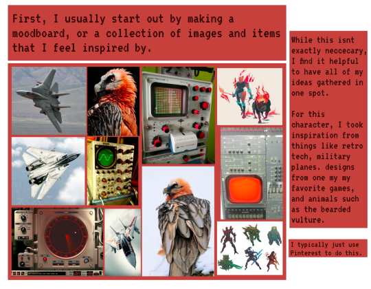
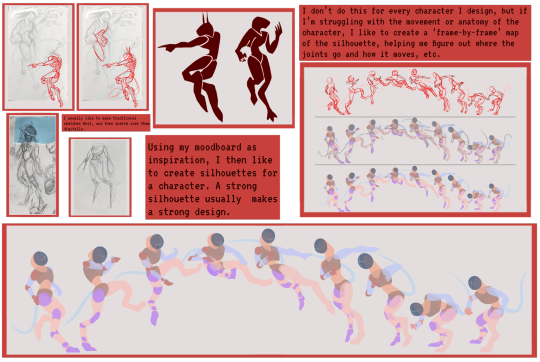
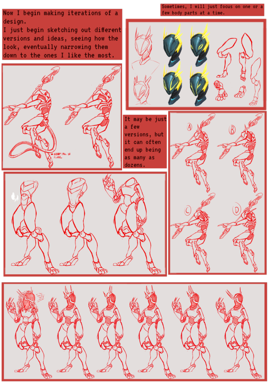
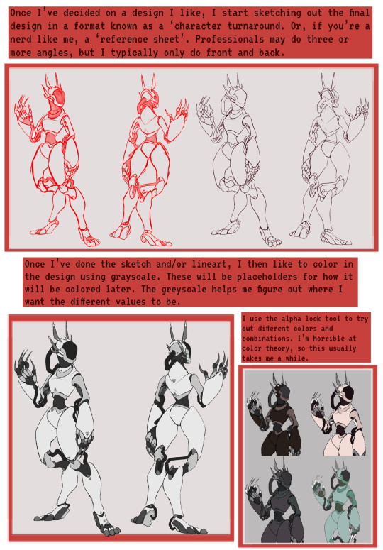
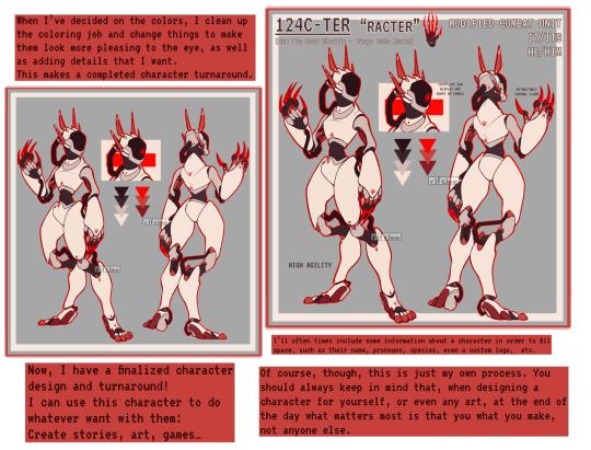
#Design process
Explore tagged Tumblr posts
Visit Tumblr Blog
Explore Tumblr blogs with no restrictions, modern design and the best experience.
Last Seen Tumblr Blogs


Fun Fact
Tumblr was attacked by a cross-site scripting worm deployed by the Internet troll group GNAA on Dec 3, 2012.
Text
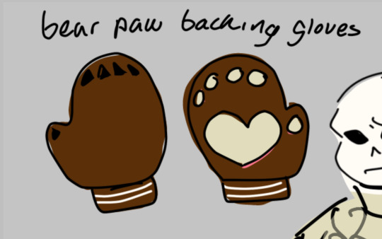
me: Hm, I have an idea for a textured stitch pattern I could use on a sock. A nice, basic sock with some texture, yep.
me: The beginning of the round makes a jog in my repeating texture, which annoys me. I could add a narrow vertical stripe, just a couple of stitches, ribbing maybe, to make the break in the pattern look like an intentional design feature. It's still pretty simple, though.
me: Actually this vertical stripe should be a little wider, more of a decorative panel, so I can put some cable-y things on it.
me: Now I need to decide how to end the textured section, and make a transition into plain stockinette for the foot.
me: plain stockinette is boring, I think it needs a little border just before the toe.
an outside observer, looking at my nearly-finished sock: This looks like it was constructed by Gian Lorenzo Bernini to be installed in the Vatican.
#knitting#socks#design process#that escalated...slowly#on further consideration the texture is maybe not that simple after all#I do not know if I'm capable of turning this into a proper pattern#does anyone want to try test-knitting a complicated sock?
744 notes
·
View notes
Text


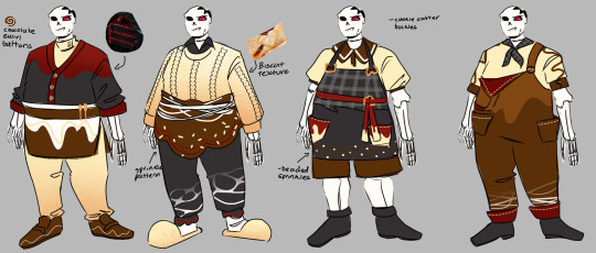


Chocolate themed horror sans!
This was a fun design idea I cooked up @erineas for valentines- and uh it’s past that now- but I’m still gonna post this!
The top image is the final design along with his store- and than the design process/ variations in order of creation
I don’t think he’d actually wear his current outfits when he’s working at his store but instead wears it when he’s baking at home for his special valentines ;)
I tried to mix the horror and chocolate theme by making some of the patterns look like red jam/blood but uh that was pretty hard- I defiantly struggled with his shoes the most- still not super satisfied with them but meh- how often do I draw shoes anyways
#art#myart#my art#digtal art#digtalart#undertale#undertaleau#sans#undertale au#horror#horror sans#axe#horrortale#design#design process#valentines#valentines au#okay now I gotta figure out a nickname#chocolate horror#heart melt horror#mmmmmmm
249 notes
·
View notes
Text
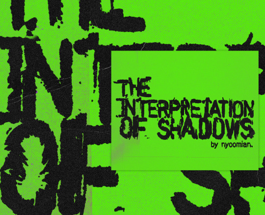


the design process for the interpretation of shadow's logo. it may not look like it but it took awhile to get the final design HAHAHA
thank u nyoomiz @nyoomian for trusting me with ur child
first time posting my graphic design art on my digi art accs 🤗 I'll try to post more process pics in the future
#the interpretation of shadows#tios#logo#logo design#design process#webtoon logo#daph is imposter actually
136 notes
·
View notes
Text
Xaposting older drawings


Sketches:


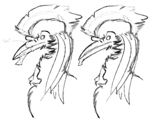
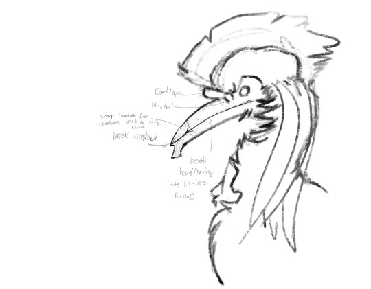
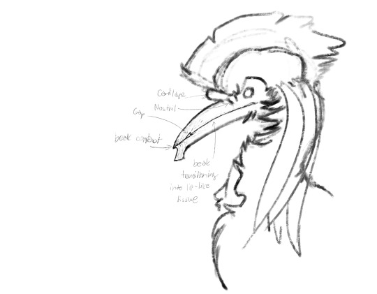
Beak brainstorm ↑

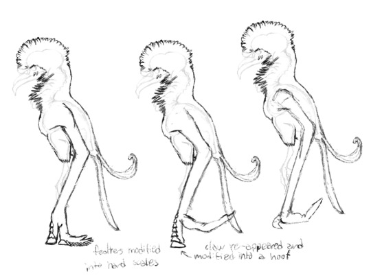
Wing brainstorm ↑
#speculative evolution#spec bio#artists on tumblr#spec evo#digital art#creature design#worldbuilding#speculative fiction#artwork#scifi worldbuilding#animal design#character design#design process#drawing sketch#sketches#sketch#digital drawing#drawing#creature#creature art#corvid#corvid art#bird art#worldbuilding project#speculative worldbuilding#brainstorming#original species#originalcharacter#original fiction#speculative biology
121 notes
·
View notes
Text
Finished up this project for one of my finals-
Riftiee’s (Unprofessional) Guide To Character Design!
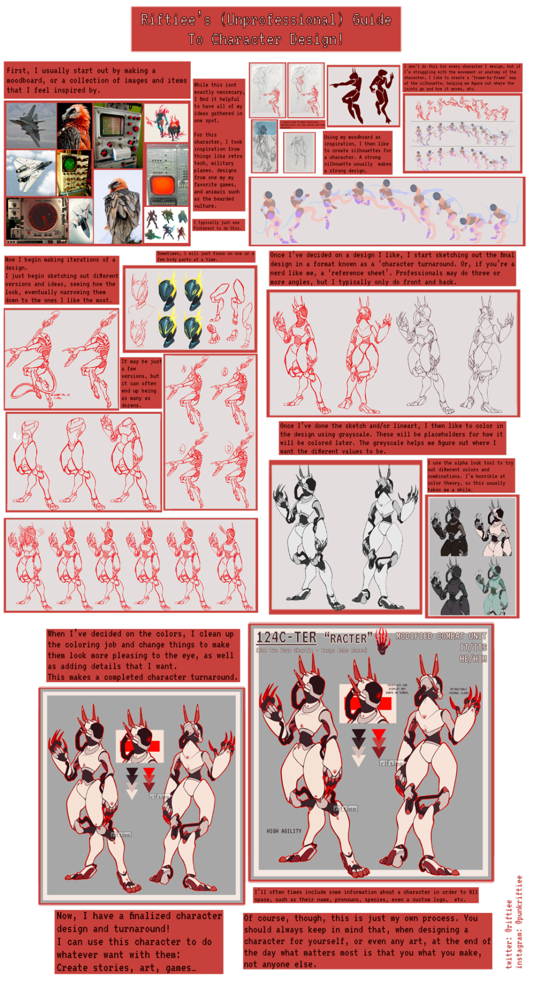
Individual parts:
#art#digital art#oc#my ocs#oc art#character design#oc design#art tutorial#art help#robot design#robot#art process#design process#character designer#digital artist#art guide#procreate#riftiee#riftiee character#my oc
305 notes
·
View notes
Text
Red King Design Notes
I got a single request to explain Red King's design, so I'm going feral! This will have notes based on AU lore (events), 'lore' (character relationships), and things I noticed in the show! (This one is for you, @daikon-dimes <3)

Let's start from the top and move down!
Red King's horns!
Firstly, her "Proud Horns"! The color is a deep-red version of DBK's old horn color, and the shape is based on Princess Iron Fan's bull-horn hairstyle!


And then her "Transportation Horns". These are a slightly darker color than the Proud Horns and their shape is based on PIF's hair and also vaguely based on DBK's horns.

That actually brings us to...
Bangs like Mama and Red King's tiara!
Okay, horn lore:
Red King had eaten a monk and then took a killer fucking nap—like she CONKED OUT—and she woke up with big ol bull horns (magical power expression* has to go somewhere, and she's not really using it or feeling anything right then) and she was like "oh, dude, what the fuck", and then freaks out because she can't balance herself anymore
After being freaked out for a while, she demanded that the nearest bull clone get her a mirror.
She looks at herself in the mirror (she's learned how to balance at this point, good for her), she touches her horns, and she goes,
"Heh. Like Mother's hair."

And, even though she and her mother are in the middle of essentially a Cold War, she finds her mother's old tiara and puts her hair around her horns like her mom's… decorative hairstyle? whatever we'd call that. like the way her mom serves massive cunt 25/8—because she loves her mom more than anything else. (No matter how much of a raging ******* PIF is being. God, why is she like that sometimes???)
(The Eternal Fire design has sidebangs that are reminiscent of PIF's but more silky and flowy.)
Bull Fam Huadian and Bindi

The Eternal Slumber design has a huadian (a form of traditional Chinese ornamental forehead makeup, which is located between the eyebrows and sometimes on the cheeks, the temples, and the dimples) shaped like the Demon Bull family crest instead of the traditional flower petals. This is because of the idea that Red Son's "red dot" is a huadian, which I've seen floating around quite a bit, but I'm 99% sure it's a bindi.
It's in the right spot for a bindi and the wrong spot for a huadian, it looks like a bindi and doesn't look like a huadian—it's a bindi. I don't know if this is still going on (people thinking it's a huadian/saying it's a huadian/drawing it as a huadian), but it's a bindi. It's a bindi guys.

(Because of Red Son's tendency for overly expressive downturned eyebrows and the inconsistency of hand-drawn animation, it's hard to tell, but the "red dot" is seemingly intended to be slightly above and between his eyebrows, not high above on his forehead. You can tell on screenshots where it's on his forehead that it's in the wrong spot, it's actually really fun.)
Also, the people on the wiki call it a "forehead dot" and I'm so...
Anyway, in her Eternal Fire design, Red King's bindi returns! This is because her time with MK has "reignited her inferno", and she is returning to herself! With her bindi! Welcome back, pookie bear!!!

and on the note of her "reigniting her inferno", her Eternal Fire design has the same eyebrow makeup as the Red Son minifig!

Her Samadhi Ring
In the Red King AU, Red Son is allowed to keep his/her ring of Samadhi for a number of reasons. Importantly, DBK and PIF let Red Son their ring because it is their power—Red Son was born with the Samadhi Fire, and it's an expression of their power. They are a family obsessed with power for a good while, so in the Red King AU, DBK and PIF felt it cruel to strip their only child of their power and of the remainder of it. The thought also was that, as the creator of the fire, Red Son would have the most incentive to keep the ring safe. They'd certainly never lose it, like some people.

(Fun fact, this means that DBK's nose ring is the other way around like it was in his younger years. That's just a really silly detail, but like... they match <3)
Red King's Hair Highlights (and Their Relation to Red Son’s Magic Expression and the Samadhi Fire)

(By the way, the Eternal Slumber design has more chaotic shines because her hair isn't brushed, and the Eternal Fire design has more uniform/put-together shines because her hair is being taken care of.)
Red King has shiny hair, and that's not just to look cool. To explain why, I had to make a giant post about the LEGO Monkie Kid Magic System. I go in-depth about Red Son at the end of that post, but I'll give a TLDR here:
Red Son has a wholly unique form of expressing magic among demons, gods, dragons, descendants, reincarnations, and everything in-between (the in-between being Red Son himself, MK, Wukong, and Macaque [Red Son is half-god, half-demon; MK was intended to be a mystic monkey but got his genetics messed with; Wukong and Macaque are mystic monkeys outside of any of the 10 species, they just need to be noted here [Their magic is completely conventional, they're just crazy strong]). His body, and specifically his hair, is directly connected to his magic in a way that's different from other characters for reasons we can only speculate.
Because Red King is stronger than Red Son (and has a link to the Samadhi Fire), she has many large hair highlights! Generally, they're condensed into one or two large shapes, but smaller highlights around a large shape are also acceptable. :]
Outfits

Eternal Slumber wears zhong yi (middle clothes), a longer version of Red Son's robe from season 3, and Red Son's sandals from season 3. (I call those house shoes but the model sheet says sandals.)
Zhong yi were worn under normal clothing in Hanfu, and often worn to bed. Some posts about zhong yi: 1, 2, 3. Because Red King is... well... sleeping often but in a regal way, she wears zhong yi instead of modern sleepwear. Her robe is also longer to evoke the fact that it is a robe and she is a king.

Eternal Fire wears a sleeveless version of Red Son's coat with a gold trim. This gold trim is actually because of something on Red Son's page on the Monkie Kid Wiki! Okay, so, I'm so autistic that part of my LMK Special Interest (it's been 4 years, so this is officially a special interest) actually extends to the Wiki... and on Red Son's Wiki page, there is something so fun!!

On Red Son's Minifigure–show comparison, the screenshot used to compare contains a coloring error! Red Son's collar is actually his skin tone! And I LOVE THAT. NOBODY TELL THEM. IF YOU ARE A WIKI EDITOR AND YOU'RE READING THIS, DON'T FIX IT!!!
I love coloring errors and I love mistakes. Not only is there the original coloring error (the mark of a human being; someone worked on this scene and they made a mistake and now we can see it and see them! It's as if their memory is saying hello, and that's why I love coloring errors), but someone else missed it, and now it has been used to represent this character's design as a whole (a SECOND human being!! Hello!! You've been here, and you didn't catch something, and now I'll always remember you were here!).
And that's why I don't want it to be fixed. I know it should be fixed, and I know the Wiki is a source of knowledge, but I also just... love people so much... and I decided to remember the coloring error by giving Red King's coat a gold trim. <3 (I was going to keep it to the collar like the coloring error, but it didn't look good.)
Other notes:
She's wearing armbands like she did when she was a baby because the Eternal Fire design is her "returning to herself."
The ballroom gloves are just sexy like that. Make MK go Looney Tunes. (And the wristbands are for the same purpose.)
S H A N T S
Uhhh that's it! Thank you!! <3 <3 <3 <3!!
#design notes#design process#sav rambles#sav art#sav doodle#lmk#red son#lmk au art#demon bull family#dbf#Red King of Eternal Slumber#Red King of Eternal Fire#Red King AU#lmk au#also#MK#qi xiaotian#he's here#spicynoodles#spicynoodleshipping
151 notes
·
View notes
Text
I FUCKING HATE THIS TWAT I HAD AN ENTIRE OTHER FUCKING DESIGN SCRAPPED BECAUSE IT WASNT HERMES AND WAS JUST SOME BIRD BITCH WHY WAS HE SUCH A STRUGGLE HE'S LIKE THE ZENDAYA OF EPIC WHERE NO ONE CAN CAPTURE HIM RIGHT


Anyways: Learning from my mistakes with the first rendition design that I’m gatekeeping (I can be persuaded to show it off) (you have to pry it off my cold dead body): I gave him a less twisty pose, making him easier to read. He’s also flitting over the ground.
Originally he was only going to have the poncho, a golden winged helmet and a scarf but that looked like shit. Removing the scarf and helm, I replaced them with: Cut out harem pants, a cap, satchel, and little jewellery. My clone forced me to add the staff, which was needed. I also added wheat to his cap because of his mom.
My clone recommended the use of purple but I didn't know how to incorporate it so I just made him in his entirety, purple! The orange is a call back to his old design. The dark tones remind me of the underworld and how he guides the souls.
I went through too many variations of greens for his poncho. It was either too bright or blended in with his skin. The triangle pattern was pitched by Saxon/My twin/Design shareholder (I’m calling you that now).

Also, I kind of based him off of Weird Al. No idea why, just had the urge.
#my art#art#fanart#epic the musical#character designs#design process#hermes#epic hermes#greek mythology#greek myth#greek god#greek gods#I was told he looks like a mexican#I agree :3
127 notes
·
View notes
Text


the evolution of Helen in Lions & Men! The first drawing is from September 27, 2023 & the last is from September 28, 2024
#lions & men: the musical#greek myth retellings#cyborg art#character art#cyborg au#original art#incorrect iliad#helen of troy#digital artist#art growth#character design#design process
57 notes
·
View notes
Text


Character design I did for our game "Sons of Odin".
33 notes
·
View notes
Text
Since today is Leo's birthday, I want to point out something about his design.


Leo the liopleurodon is a scrapped character of what became Goodbye Volcano High, a game about teen gay dinos. The designs of the main cast went through several iterations and changes, as the art director explained in a twitter thread she made (wich can be read on thumblr with image descriptions here).


Earlier designs looked slightly more "animalistic", with longer beaks/muzzles/wathever, but it was eventually decided it looked awkward on most angles, so they were made shorter.
Leo was cut BEFORE this change took place, wich is why all the art of him have a notably long beak. Had he made it to the final phase, he would most likely get a shorter beak.
And he kind of DID get a final design recently. The cooperative behind the game, KO_OP, has been doing a charity fundraiser in wich they offer art in exchange of donations to families in Palestine and Lebanon. Among the artists involved is the aforementioned art director, and among the requests she got one of them (by the guy who made the GVH mod for Vampire Survivors btw) is of none other than Leo, and look:

Notice the shorter beak? This is the closest to an official canon Leo for now. I like to think he is still in the game, just offscreen. Or better yet, he's the one holding the camera!
#goodbye volcano high#leo gvh#liopleurodon#behind the scenes#character creation#character art#character designer#anthro#dinosaurs#furry#scalie#design process#gvh
27 notes
·
View notes
Text
This is the way I design Greek gods
For the main gods I look into what they represent, like the animals, plants, and concepts.
I look into the myths and develop a character in my mind.
Then I take that character and make them in a way to convey how I perceive them.
Like Lemos would have more sharp edges to convey her dangerous nature.
Then I’d add elements from their animals, plants, and whatever else, and give them clothes that fit their character to me.
Like maybe Hera would have a veil like @irunaki’s design
And I have a defining trait for the gods in that they have the spiked Greek crown or Roman Corona
Then there’s the titans, you know the gods before the gods.
I have a similar design process to the gods because they’re still gods too
General design trait is that they’re big like 10-15 ft tall, also the gods are like 8-10ft.
Finally the primordials I go for a more lovecrafrian design because they’re more vague or large concepts like darkness or the Earth
And Chaos is literally just the universe
Also I add inspiration from other fiction if I think it fits the god, like my Ares is REALLY inspired by Warhammer 40k because in the far future there is only war
#artists on tumblr#design process#greek tumblr#greek story#ancient greek mythology#greek god#greek myth#ancient greek#greek gods#greek mythology#greek myth art#greek pantheon#epic the musical#funny art#fan art#greek art#original art#traditional art#my art#digital art#artwork#art#illustrators on tumblr#traditional illustration#illustration#digital illustration#illustrator#memes#meme#funny memes
34 notes
·
View notes
Note
i found you get this a lot but i still wanted to ask specifically one of your characters (+ a few of your illustrations) really resembles till lindemann, is he any inspiration or just coincidence?
I want to add, your work is infatuating I'd be shocked if you say you do this just as a hobby. Your work looks that as of a professional editorial artist. I love it, just found you yesterday immediately became an inspiration to me.
Hello, thanks for the question!
I'm not really sure, which character did you have in mind, but I gonna take a wild guess and assume it was one of these two, since they get compared to Till quite a lot, and talk a little about their design:

So my first guess, Kaíl was created in 2018 and the inspiration behind his design was actually Lavrenty Beria and one of TotesFleisch's OCs mixed together(here you can see my old art ↓); that time I wasn't into Rammstein at all, I doubt I even knew how "Du hast" actually sounds like apart from memes, so I was really mad when everybody suddenly started telling me he looks like Till Lindemann🤣 So yeah this one is a total coincidence

Igor, man in red & white tho was intentionally designed to resemble Till;
He had different face structure in the start, but the first concept sketch of Igor depicted him wearing face paint designed after Kaíl (I'll show that later), and I realized - there's no way ppl not gonna compare him to Till, bc obviously old man looking like Kaíl is a fucking carte blanche for Rammstein fans to flood my comments 🤣
This look was good, but his actual face was so bland and literally giving nothing compared to the face paint ↓
And then I decided yk what - let's just make him look like Till in general, ppl were gonna compare them anyway, but at least they would be corret this time, so I took some inspo from Till's "Любимый город" era (I only took the face from the front and general vibe, all the clothes & stuff were designed by myself) ↓


Fun fact: despite having Till as an inspo the important part of Igor's design is that his hair might look like a slick back, but they actually are short and little spiky, to resemble some of my favorite European musicians who's music was influenced by POC 's music, cause that's pretty much what Igor's music was like ↓


And about other illustrations - man, I don't know, probably not, I think I just might have some similar looking ideas or something, cause I got into Rammstein/Lindemann music really late when my taste & art ideas were pretty much already formed, and in their music videos and other stuff I saw something really close to what I already had in my head, so yeah, if that's not about that one fish man design, that's probably is a coincidence 😄
Hope my answer cleared something
And thanks, my art isn't really just a hobby like yeah I treat it like a hobby now cause I don't really know how to make big money of my art yet, but I actually have an art teacher diploma so yeah technically you're right, I am a professional artist ☺️
#artists on tumblr#art#my art#character art#oc#character design#design#design process#till lindemann#rammstein#david bowie#sting#achim reichel#german music#british music#original story#original character#original
21 notes
·
View notes
Text
Intershock Sketch Pt. 5
A/N: Just a little into the journey on how I made Intershock! Final design is under the cut.
⋆ ˚。⋆୨🍋୧⋆ ˚。⋆


He was originally supposed to be a girl with the name Intercom but I didn't really like it. So I studied some other transformers designs and people's art to be able to draw what I saw in my head.


It was how I envisioned it now but could be just a little better, with some more details and with more elements of his alt mode. This is also where I changed him into a boy and came up with the name Intershock.


Now it looked a lot better from where I first started and it needed colors with a nicer drawing to really bring it all together..
-ˋˏ✄┈┈┈┈┈┈┈┈┈┈┈┈┈┈┈┈┈┈┈┈┈


..And here's what came out of all of that! Hope you enjoyed the process of what he is now!! ^^
⋆ ˚。⋆୨🍋୧⋆ ˚。⋆
#artists on tumblr#digital art#oc#oc art#digital drawing#transformers#transformers oc#design process#concept art#concept design#biohazardouslemon#my oc art#original art#original design#original character#art concept#tf intershock#transformers art#artwork#art#my art#oc artwork#oc design#oc concept#oc artist#digital artist#traditional drawing#traditional art#traditional sketch#sketch
20 notes
·
View notes
Text

Her name is Party Favor 🎉
Pinkie Pie and RainbowDash inspired + color pallete on pinterest
• Runs a cute small party supply shop
• Prepares lil party bags
• Organizes parties occasionally
• Travels a lot
• Ex dream/goal was to become a wonder-bolt before she got her cutiemark as a filly
• Hopes to have a bigger shop for more space for her supplies and ideas that she’d like to create!
#procreate#mlp art#mlp oc#mlp oc art#mlp fanart#mlp fandom#mlp fim#mlp friendship is magic#mlp#mlp g4#mlp au#character designer#mlp design#oc design#sketches#illustration#oc shit#art#SabiWabi#concept design#digital art#mlp sketch#design process#pinkie pie
63 notes
·
View notes
Text
Some Yuo Yowa house ideas
All of them have a circular floor plan

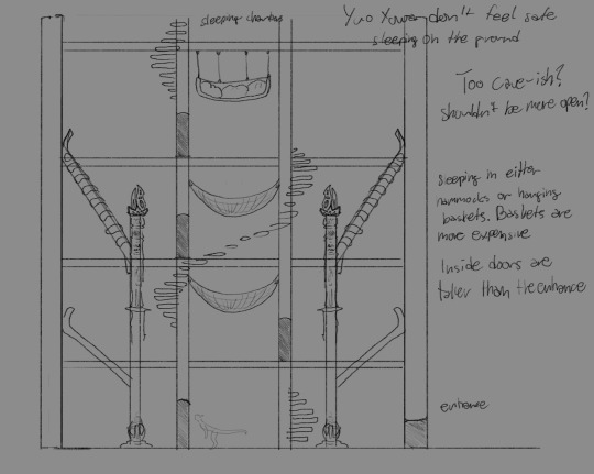
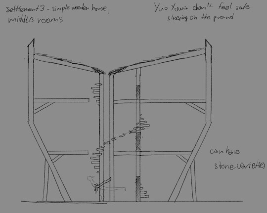
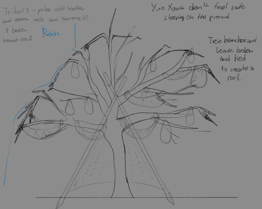
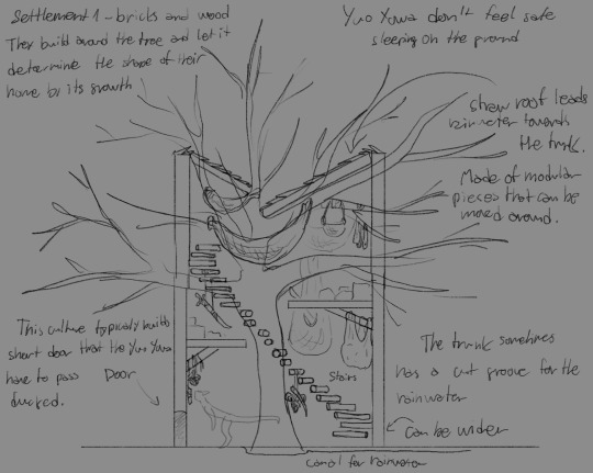
Distribution:
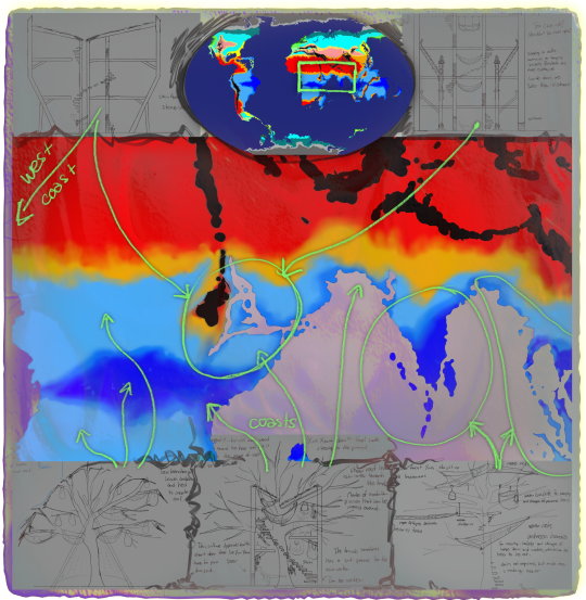
And some sketches from last year that I decided to expand upon:
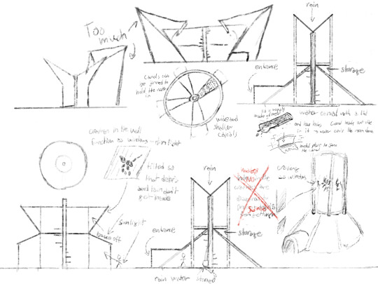
Enjoy my very comprehensible notes.
The houses don’t have typical windows, but instead they have ornamental carvings in the walls (as seen on the older sketches) that let only some sun/moonlight in, and also create light pattens on the inner walls of the houses. Yuo Yowa prefer dim light and during this timeline don’t spend too much time inside. Yuo Yowa are somewhat arboreal, they fing comfort in sleeping above the floor and climb effortlessly, thanks to their claws they can even scale wooden walls, so in more densly populated areas with thieves the walls can be sloped to prevent unwanted climbers from breaking in from the top.
These would be the houses one would see around during the time Maia and Owen for example, were alive. During this time, the very first civilizations have already appeared, but the majority of the planet are hunters/hunter gatherers.

Left to right: Owen, Kob, Maia. Last pic credit: Miininit
#spec bio#artists on tumblr#spec evo#digital art#worldbuilding#speculative fiction#artwork#scifi worldbuilding#design process#speculative worldbuilding#ocart#original species#originalcharacter#original fiction#original art#speculative biology#speculative design#digital artist#concept art#my art#art#oc art#worldbuilding project#architectdesign#digital drawing#drawing sketch#sketches#creature design#artist on tumblr#sophont
36 notes
·
View notes
Text
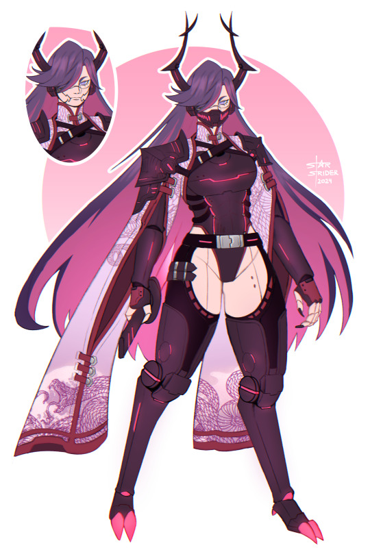
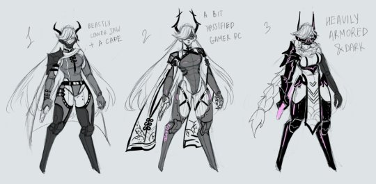
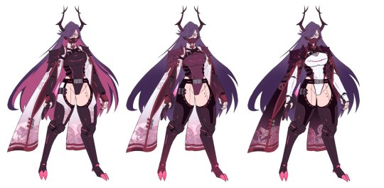
character design commission
vgen | patreon | kofi
#som.jpg#oc#character design#original character#monster girl#fantasy#cyberpunk#android#android oc#robot oc#robot girl#design process
65 notes
·
View notes