#design notes
Text


Some notes (aka yapping) on why these two look the way they do in standverse, enjoy
#jjba#standverse#gold experience#ger#stand design#gold experience requiem#design notes#fandmade design#redesign#note these arent supposed to be redesigns like im 'fixing' the og or smthn this is just me adding my own personal flair or making them easi#r to draw for myself
1K notes
·
View notes
Photo
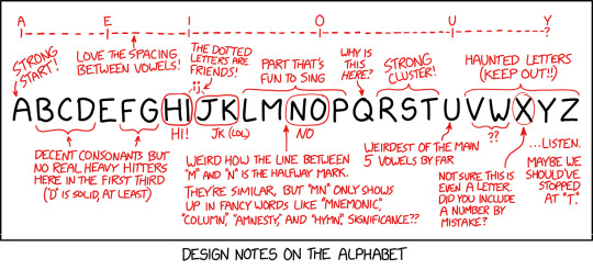
Listen, you're very cute, but if you rearrange the alphabet to put U and I together it will RUIN the spacing!
Alphabet Notes [Explained]
3K notes
·
View notes
Note
Hello! Just want to say that I absolutely adore your designs for Jon, Edward, and Jervis! They're so detailed and extra. I love them sm. Up in the top two favorite designs. My favorite is definitely Jervis. Which is funny, because in just about every version he's my least favorite of the three. His design is just so fun and goofy and him. It's amazing. They all are.
Anyways that's it. Byeeee<33
Oh? Do you now? Well I’m glad you think so because now you’re getting
Design Notes — Riddler | Scarecrow | Hatter
I drafted up some rogue designs last year, actually. They’ve mostly evolved from those. Content warning for horrific old art.
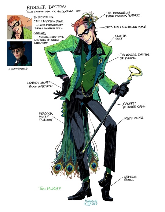


The McGriddler — Ah, a grown man with the strength of a baby! I’ve actually had this… horrendous peacock concept in my brain since 2022, back when my Riddler design was a dirty blonde/brunette. I hated him. He had the costume, but not the flair. Not to mention the generic facial structure.
Luckily, New Riddler is now an ostentatiously dressed vain attention whore! Highly fashionable, extensive wardrobe (def designing more outfits for him) and a possible mid-life crisis arc where he just wears a bathrobe and wifebeater for a month straight.
And listen, I’m not much of a writer, but there are notes on his personality.

Not great ones, though.
And rather than his ambiguous forensics/science job, he now works in I.T. Or rather, worked in I.T. (fired for patronising tech support customers)
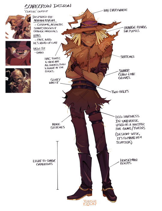

For Jon — He’s always had black eyes with orange ringed pupils (initially blue) from the fear toxins. Drafted him up in high school because I was coping.
I’ve always intended to give him multiple costume designs. With narrative purposes. He redesigns himself. Ofc he couldn’t be satisfied with one thing, no, he has winter, summer, Witch Doctor, stealth etc. costumes on the way.
The initial design was trying to do too much — Patches, stitches, belt straps, arm warmers, utility belts, boots. Clutter. (Does NOT help that I can hardly decipher my old sketches.)
So, we just remove the overtly slutty components from the main design—

—And put them in a seperate campier Scarecrow design that I use as a Halloween-sona.
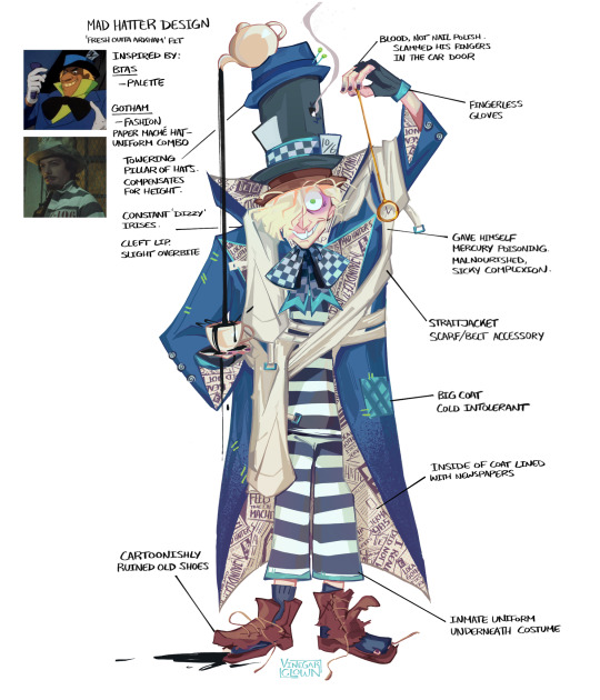
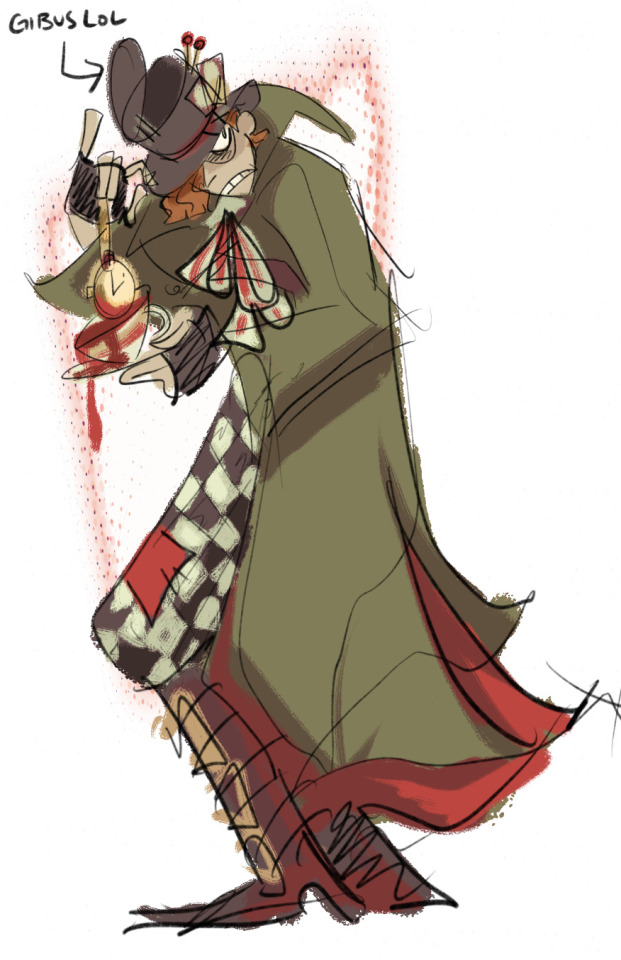

Silly Crazy Zonka Wonka — I think I was looking at pics of the Depp Hatter for the old design, which. May explain some things.
Acute observation! They look nothing alike. So I’ve kept absolutely nothing from the initial design except for the choppy wavy hairstyle.
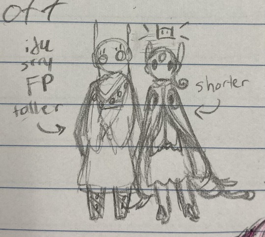
Completely different colour scheme. Subbed out the TF2 Ghastly Gibus for the Towering Pillar of Hats. (Because ofc The Hatter would have something from the funny Hat FPS, no?) Shorter. Feebler. Every sickness on the planet. Congratulations! Mercury poisoning.
The initial concept for the redesign was to have a sort of reversible coat with his Arkham outfit on one side, and Rogue outfit on the other. You can see I just opted for him to wear a combination of both.
#vclownverse#I fucking hate my riddler if you couldn’t tell#design notes#character design#batman#the riddler#edward nygma#scarecrow#jonathan crane#jervis tetch#mad hatter#digital illustration#creaman#batman rogue redesign#batman rogues#old art#vinegarclown#fanart#creaman-answer-sheet.pdf#gamer scarecrow
305 notes
·
View notes
Text
moonmoon puppet design notes
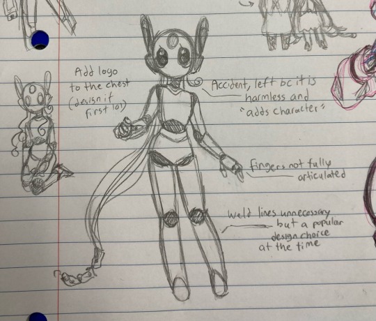
wanted her to look kinda doll-like but still robot-y too idk. also the logo idea is bc i like to imagine certain political factions (houses) had design trends they favored and liked to show off their work
I like to imagine moon and sigs were made around the same time but they had different designers so they look different
(rather than generation trends I like to think of puppet designs as a more individualized form of artistic expression by their creators)
and srry fp idk what im doing with you i should base your outfit on some kinda moth too but i have no ideas aside from "fp has more jewelry bc he was designed to be more of a deific, respected figure than a friendly doll-like one"
though their body types are also just mostly based on myself and my irl younger sibling because that is FUN and they remind me of fp a lot
(they have not killed me dont worry,)
#looks to the moon#rain world#rain world fanart#iterator puppet#design notes#egg doodles#lttm#fp#rambled eggs#luna rw hc tag
75 notes
·
View notes
Photo

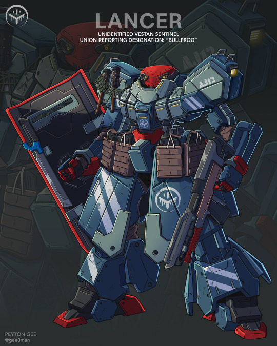
Things are shit lately but it's almost christmas so fuck it. My #LancerRPG GMS Everest for their upcoming supplement Solstice Rain. I've always loved all manner of grunts in #mecha and don't know if they realized how much I relished the opportunity.
[G] Type Everests are built to easily swap equipment in record time, affording them a great deal of tactical flexibility. [G] Types were deployed by Union forces during Operation Solstice Rain where their rapid deployment avoided a worst case scenario for the city of Nov Elysia.
I had a lot of fun drawing from all of my favorite sources to design a quintessential Lancer grunt mech. For my interepretation of the GMS Everest, I wanted to design something that felt solid, but not rugged, if that makes sense to anyone but me. To compare to other works, I thought of designs like Gundam's GM and Jegan lineages, or certain designs from the Armored Core and Front Mission franchises. Designs that felt true to the essence of the mech as a military machine.
I do want to be clear, I don't intend for my interpretation of the GMS Everest to be the "canon" depiction, nor should it invalidate the many fantastic renditions of it I've seen from Lancer's fanbase. I hope my [G] Type Everest will contribute to the fabric of Lancer as a whole though, and that some of you will think of mine when you imagine it on the table.
755 notes
·
View notes
Note
What’s with the little patches of green and purple on Ditzy? At first I thought it was a tie, but no that’s part of her design. None of the other Pegasi have this detail, their feathers seem to match their color palette. So why Ditzy?
(Genuinely asking btw, sorry if I sound rude! 😅)
Not rude at all! It’s a bit of pigeon fluff! If you notice gray pigeons have a band of green and purple shiny feathers around their neck/chest area, some Pegasi have special traits - if you look at Dinky, who has tail feathers, she has white tips (the color comes from her father). Sky Chime has white striping on her tail feathers and a few white speckles on her chest feathers and while Sunny Rays doesn’t have specific markings her chest is fluffy and if she stays on the sun too long she gets feather freckles.
It’s just a fun way to make them more bird like - and it gives me the nickname Blueblood calls Ditzy - Pidge (aka Pigeon).
63 notes
·
View notes
Text

peegee
99 notes
·
View notes
Text
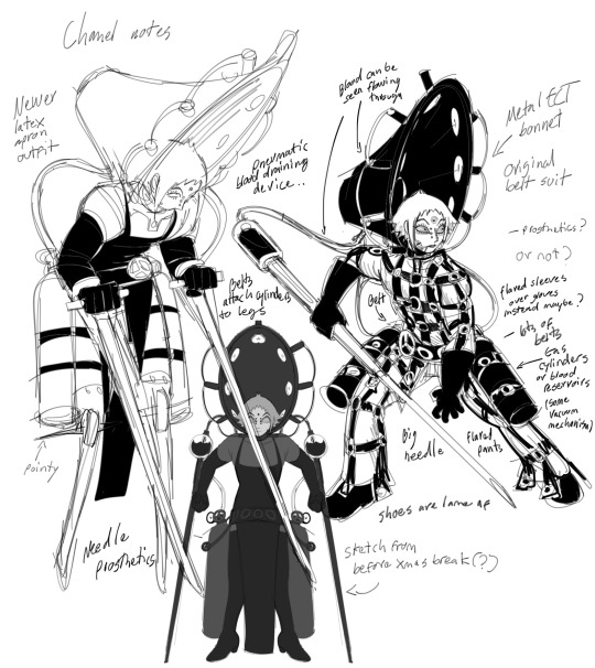
Chanel
#oc#character design#original character#digital sketch#design concept#concept art#character concept#concept design#character notes#design notes#sketch page#my oc#oc art#horror design#art#carboncopycomic
25 notes
·
View notes
Text
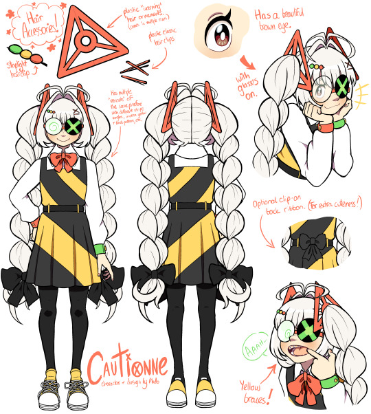
Cautionne Design Notes - Official turnaround.
Yup - I decided to make a full turnaround for Cautionne!
I'm participating in Art Fight this year, so I hope this turnaround can help my fellow participants...
#cautionne#malviolence#oc#original character#art fight#madoart#REUPLOADING BC I MADE A MISTAKE W THE PREV TURNAROUND......... I AM BOOBOO THE FOOL#design notes
56 notes
·
View notes
Note
I love your intern design! Where did you get the inspiration for them?
asks that make me finish my intern ref immediately so I can ramble about the design notes (half joking)

sorry if it's a little hard to read HDSHDHSHD my breakfast started to hit me really hard but. I was thinking the other day about how I ended up making the intern how they are and managed to end up with this, more or less.
Looking back on it it's probably really obvious where I got the inspiration for the intern's design but! I don't care because I really do love them. I think that their personality is also rather distinct compared to dante's (though I haven't played canto 5 of limbus) and the fact that they're like. Definitively a robot that gained sentience is a very specific trait. I think a lot about the intern.......
Speaking of. The monitor in the middle/bottom right I realize definitely inspired the monitor shape... it took me a while to realize it!! But since I noticed it I've been really fond of drawing that boxy monitor...
#rhythm doctor#the intern#design notes#intern rhythm doctor#talkin talkin#i love them......#answered asks
24 notes
·
View notes
Text


Primal (Expanded?) Palkia WIP, headshot.
It was supposed to be a few temporary lines. Then temporary flats then shade... Colour might be redone, but I'm liking how most of the draft is looking so far. Feedback and comments would greatly be appreciated!
( ^ω^) / Design notes under the cut.
I feel like Palkia incorporating more curls in its design makes sense to balance the straight and amorphous lines of Dialga and Giratina, respectively. So to mirror Origin Giratina's gundam mask, I gave Palks two boar like tusk (they're meant to unfold too but I forgor when drawing the open mouth), with the original upper fangs hidden in this angle. To make the dorsal sail stand out more, I gave them a curved negative space (ehhehe) to make the silhouette more distinctive. The sail extends past the muzzle into a pompadour like horn that curves upwards and behind, to mirror Dialga's backwards facing crest and Giratina's sidewards crests. The lower jaw is now closer to Giratina's altered form's, but more balloned out. If I could make Palkia a psychic type and not water, I would. Yet, I also like the general shape here being like a gorging whale or tuna fish. The lateral pink pattern was going to be pointed as per the Game Freaks Palkia, but I found the... uhhh... " > " converged lines to be more interesting. As they are in this illustration, it mearly looks like an extension of the jaw, so I probably need to expand the negative space there more. As I said before, the colour is just temporary for now, and any further feedback would be greatly appreciated!
Thanks so much for reading! (~▽~@)♪♪♪

#wip#pokemon#palkia#my art#gif#sinnoh#primal palkia#expanded palkia#pokemon redesign#fakemon#creation trio#pokemon pearl#pokemon shining pearl#pla#pokemon legends arceus#hisui#pokemon gen 4#pokemon dppt#digital art#character design#creature design#monster design#pokémon#pokeblr#my design#design#design notes#pokemon design#spear pillar#pokemon of myth
16 notes
·
View notes
Text

yippee fairy clothing construction
#my art#god what do i even tag this as#like it’s technically kirby but it’s also just like. design notes on fairies.#design notes#clothing construction#yeah that’ll do.
21 notes
·
View notes
Text
Me: One of the little details I love about Saki’s design is the lip gloss. The other girls don't have that sheen and tint on their lips because the make up is an attempt to look more mature so people can take her seriously and not treat her like a child. Saki looks older than she is because she wants to look older than she is.
My brain: What about the professor?
Me: Stress got to him
#Sorry prof i dont know why you look like that at 50ish yrs old#He stayed in the sun too long and thats why he got a hat#Is it the beard?!#If asian don't raisin what happen to you?!#Why am my bullying akiharu? he doesnt deserve this#Disrespecting the elderly#Oh but WHAT IF#He has the same reason as saki#Nobody's taken him seriously since he was a child#Not even other science dudes#So he has no choice but to look like a wizened old man#(Pls dont actually take this seriously)#digimon survive#saki kimishima#akiharu minase#Design notes#She also has more prominent eyelashes#Had to look up if lip gloss is considered make up#It is
12 notes
·
View notes
Text


Some species tidbits and notes on Lampyrions, Spark L's species! Love developing these funky bug martians. :)
More written info under the read more!


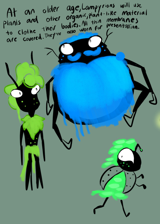

#MW OC's#Spark L#Character Design#Design Notes#Character Notes#Monkey Wrench OC#I'm actually headed on a trip as I post this so I won't be able to make or post new artsy stuff these next few days#Queuing some reblogs and posts in the meantime!#Spark L's species is the one I desperately wanted to explore the most. I think I have the most written out for them#I just. Bugs. Lights. Moss. I think they're neat :)#edit: sobbing. Mobile messed up the picture order and read more
6 notes
·
View notes
Text
inkfish hands
this is my second post detailing how and why i depict different inkling + octoling features, the first one on octoling suckers can be found here.
splatoon inkfish, in all their generally humanoid glory, have fairly humanoid hands as well. we all know this.
while differences between inkling and octoling hands can be somewhat small and inconsistent (with the player model hands looking almost identical), octoling fingertips tend to be pointier and are more likely to be a different color.
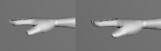
(These are screenshots of the hands of ripped playable inkling (left) and octoling (right) models from splatoon 3. while there does seem to be a slight difference, it's very subtle)
while frye shows that inklings can also have colored fingertips, it's definitely more commonly seen in octolings, as every fully humanoid named octoling that's been depicted both in-game and in outside lore like the splatbands has had them. excluding agent 8, as their model is just the playable octoling model, which seems to be a bit of an exception in general when it comes to octolings (i'll probably make a more in depth post about this at some point).
so that's the background on these design differences, generally. they're honestly not that extreme, but it's something the fandom has understandably latched onto to a certain extent.
one of the most common way for fans to interpret the pointy vs round fingertips is to give octolings something analogous to claws, sometimes giving inklings retractable ones so they don't have to miss out on the fun (completely understandable). often the real life dentification of squid suckers is brought up in relation to these claws and used as design inspiration, which is really cool.
the thing is... sucker dentification is only something that shows up in squid, yet octolings are the ones with the pointy fingertips. this is something that has been addressed in other posts talking about this whole thing- it's not something that's being necessarily ignored- but it's something that has, in general, made me less keen on giving octolings any sort of dentification or claws.
whats my answer to the pointy octoling fingertips, then? cirri!
what are cirri, you may ask? they're small appendages found on either side of each sucker on a cirrate octopus. while they can look somewhat sharp in some conditions, they're entirely made out of flesh, and act kind of like smaller "sub" tentacles. a lot like fingers, really.
it should be noted that i do not think octolings are cirrate octopuses, as cirrate octopuses do not have ink sacs or chromatophors- both pretty important for octolings. the shape of octoling ears are inspired by the fins of cirrate octopuses, though, so i think borrowing more inspiration from them isn't necessarily something particularly out there. it's certainly something closer on the evolutionary tree than sucker dentification, and is something that is generally more "octopus-like."

these are my designs for the hands. the suckers on octoling hands act as a way to create a palm-like shape, the tip of the original tentacle tip acting as the middle finger while the rest of the fingers are comprised of cirri.
in contrast, the inkling hands have the benefit of the base tentacle being quite stumpy, flaring out into a club-like shape to form the palm while irregularly spaced suckers act as fingers. note that the tentacle that makes up the inkling's arm isn't a true tentacle- it's instead analogous to one of a squid's eight arms, as shown in this diagram.

the true tentacles are found in the "hair" of an inkling, and maybe sometime i'll make a post about that too.
the dentification of the inkling finger suckers contain no hooks, as those are usually found on a squid's true tentacles. they are, instead, more like the teeth rings found in the suckers on their arms. i'm not sure if the hooks are always found on the true tentacles, but i feel like the rings are a really neat way to preserve the rounded shape of the fingers while also giving them dentification.
as one final note- these differences were decided on for design reasons more than anything else. considering that non-cirrate octopuses do not have cirri and the fact that the arms that became the arms in an inkling's humanoid form don't have a club shape to them at all, i'm honestly not sure if either method for creating a handlike shape would be particularly more likely for either. the difference is more to retain the octopus and squid vibes octolings and inklings have- which is why i suspect octolings have pointy fingertips to begin with. compared to squids, octopuses have more pointy tips to their limbs, and so octolings have pointier fingers.
#design notes#meta#my art#it's in there.#xeno octoling#xeno inkling#splatoon#inkling#octoling#this post was a lot harder to write than i expected tbh. it was a bit hard to figure out how i should approach it
78 notes
·
View notes
Photo
Continuing the Solstice Rain #mecha art done for Lancer RPG. Before it was identified, Union boots on the ground called the Vestan armored bruiser that led their formations the Bullfrog. A combo of its shield and leg mounted hover jets make it a nasty close range bully.
The Bullfrog belongs to the Vestan Sovereignty, an antagonistic faction in the Solstice rain supplement. They’re a familiar story. An authoritarian nation on the verge of loosening up only for the militant reactionaries to tighten their grip again. Union’s arrival on Cressidium serves as the perfect catalyst to reignite old dreams of conquest.
Every GM needs its Zaku to be locked in eternal struggle with. I imagine in universe, armchair generals and rivet counters will argue about the respective qualities of the [G] Type Everest and Bullfrog during the Cressidium conflict for years to come.
I designed the Bullfrog in concert with my Everest variant. Whereas I looked at Gundam and Armored Core for the [G] Type, I prayed at the altar of Kazuhisa Kondo for the Bullfrog. I have always wanted to design a Kondo-inspired absolute unit.
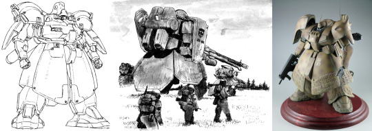
Giant armored skirt and shoulders to give it a brutish, imposing physical profile. These types of chunky forms give it both a sense of mass but also reflect the Vestan’s desire to punish and impose its will on others. It’s not merely enough to occupy the space, it must make everyone around it uncomfortable and vulnerable. Again, a bully.
556 notes
·
View notes
Last Seen Blogs
icecoldfresa
₊˚⊹♡
guardian-of-us
Loving Destiny Babies
mashioca
Lolita_RORI

bangtanboysaus
bts aus
thirddoctor
We may laugh together yet