#Easy Text and Paragraph Formatting in CSS
Explore tagged Tumblr posts
Visit Tumblr Blog
Explore Tumblr blogs with no restrictions, modern design and the best experience.
Last Seen Tumblr Blogs


Fun Fact
Tumblr was named as a finalist in Lead411’s New York City Hot 125 in Aug 2010.
Note
Hey so I'm not very tech savvy but I was wondering if adding random silly lines or just something that makes no sense between paragraphs/sentences on our fics can poison AI if the fics are scraped?? I tried something by adding some random lines with white text between paragraphs of my fic which don't show up on default ao3 mode but they are a part of the text nonetheless. Of course that'll involve more efforts on part of the writers to add lines and format the white text using html and workskins but if it does turn out to be effective it might make ao3 less lucrative for AI scraping if a major amount of works contain this and it'll make it harder for AI training. It does have drawbacks that it'll only work on default mode so anyone using dark skin on ao3 might have to switch to be able to read properly and it'll make works less accessible to readers who use text to audio if there are random lines in between but what other options are we left with if even archive locking our works doesn't work??
You absolutely could, but there are limitations to that.
For one, like you said, you're making your work inaccessible to certain readers. That's fully within your rights, though I think most of us strive not to exclude people using screen readers.
Second, from what I know, when you download a dataset like this and intend to use it to train an AI model, you first go through the dataset looking for obvious junk data and toss that out. So if you're putting something that is clearly not real fanfic in there, any decent data analyst is probably going to spot it and toss your fic. If that's your goal, that's a win for you. Personally, if I'm making the effort to inject poison data, my goal is to be included in the training data used so I can trash the model, so I don't want it to be obvious.
Third, I don't see anything explicitly in AO3's TOS against adding data poison in this way, but I don't see them endorsing doing that either. It feels like a grey area to me, and I'm not sure you're allowed to do it, so I am not recommending anyone do this. Rest of this post is theoretical.
So theoretically, how I would do it is putting the junk data at the end of the fic/chapter. Hide it like you're saying, by changing the font and/or background color of the section with CSS. Then put a nice, clear message right after the chapter ends and the junk data starts, something like, "Hey, readers! This chapter is over. Turn off your screen reader and move to the next chapter now." That gives your real humans a warning and stops them from being confused or wasting their time. Then dump your poison. You can also write something in the beginning A/N, I believe. I know this most recent scraper never ever pulled data from the author's notes, so the AI wouldn't see anything you put in that section.
Scrapers are typically pulling your work without the workskin enabled, so for formatting, you're really just trying to make it look nice for your real readers so they don't have to see your poison.
As far as actual poison, my suggestions:
Your own writing or writing you have explicit permission to use, so you're not breaking anyone's copyright. Easy mode: jumbled paragraphs of your own past works for any fandom except the one your current fic is for.
As mentioned above, don't put absolute nonsense in there. If it's bad enough, it'll be spotted and filtered out. Like, if it's not even real words, anyone feeding it to AI is probably going to catch that and toss your data out, excluding it from the model. It might be fine if it's all real words, but not in any sensible order. Not sure on that. But don't just insert keysmashes if you want your data to be used in the AI training.
Terrible crackfic would be good. So would writing for a completely different fandom and different tags. The writing should not fit well with the tags you use for the fics. (So if the real fic is tagged Fluff and Alternative Universe - Coffee Shop, your poison should not include that. Make the poison a hurt no comfort canon-compliant fic or something else different.)
Keep in mind you should not be putting E-rated data poison in a G-rated fic. Real humans may still see this no matter how much you hide it, particularly if they download a PDF copy of your fic. If it's content that requires a warning per AO3's rules (explicit content, graphic violence, etc), you do still have to tag for that, even if it's designed to be invisible to humans.
Use unique writing, so even if someone later using it for AI catches it once, they can't just search for the exact wording you used in one fic and easily filter out all the rest of your poison. Again, this is if you want to be included in the AI training to throw the model off.
Again, theoretically, if I were going to do this, this is the CSS code I might use for my poison section of the fic:
#workskin .fuckai { background: #333333; color: #333333; font-size: 1%; }
It would theoretically look like a weird grey gap to mobile users or be nearly invisible to desktop users, even if it contained, say... 1,000 additional words.
Finally, scrapers are trying to grab millions of fics from AO3 when they do it. They're not looking closely at 13 million fics. They're only searching for the most obvious junk. So the only reason you would want to hide it like that is to make a better experience for your real readers. You don't need to hide it to get it into a scraper's AI model.
38 notes
·
View notes
Text
Instead of doing a Six Sentence Sunday today, I think I'll do a short tutorial on copying over fanfic from FFnet to Ao3.
So you've got some old fics on FFnet and you'd like to back them up to Ao3, given the instability of FFnet. And for whatever reason you don't have the original files for the fics, or maybe you have edits to the FFnet versions that you don't want to lose that the OG files don't have. Whatever the reason, you're looking to directly copy over your fic from FFnet to Ao3. And you're looking for a relatively easy way to do so, but Ao3's import functionality doesn't work with FFnet web pages.
Never fear! It's actually a fairly easy process to get your fic copied over from FFnet.
First, head over to FFnet and open up the fic you want to port over to Ao3. You don't need to log in if you don't want to, just so long as the fic in question is yours and you can access the page, then you're good.
In a separate tab, open Ao3 and login, then choose the option for posting a new work.
Now back on the FFnet tab, you should be able to directly copy over the title, summary, fandom, and what little tagging was available on that site onto the relevant Ao3 fields in the tab you have for a new fic. You'll also want to take note of the published date on FFnet and back date the new work in the Ao3 tab.

FFnet may not have a lot of useful tag data, but it's pretty easy to replicate and build off that in Ao3.
Now for the hard part. Which is still pretty easy. Getting the fic body, plus any notes in the fic itself, copied over to FFnet.
While getting around FFnet's lockdown on the text of the fics they host is fairly simple - I'm pretty sure it's entirely css based - you don't really need to do that in order to get the body of your fic copied. And, honestly, even if you do have a work around in place to allow copying of the fic's text... you will probably find the following method a lot easier still.
In the body of the fic, right click the first line of the fic, which should bring up a menu with a bunch of options. On Firefox or Chrome you want the inspect option.

This'll bring up the dev tools with the html inspection tab open and, if you give it a few seconds to load, the specific line you right clicked to inspect should become the visibly selected section of the html.
The selected section of the html should be a paragraph (or <p>) element. You're going to want to right click the div (<div>) element that encapsulates that paragraph and the rest of the paragraphs in the fic body. This'll bring up another browser menu with the option to copy, which will bring up a flyout menu when you select it. From that flyout menu, you want the select the option for Inner HTML.

You have officially copied the html for the fic body. And you can dump that entirely in html format straight into Ao3's html work text editor. Then switch it to rich text for easier editing if you want to fix any spelling, grammar, formatting, or aesthetic issues. I typically try to fix at least the line breaks since it took a long while before FFnet adopted real line breaks and so there are a lot of fics where I have various combinations of dashes, em-dashes, equals signs, and other characters as line breaks. I figure, if I'm bringing the fic to Ao3 then I can try to make it more screen reader friendly in the process.
You can also move fic notes around in order to move pre/post fic notes out of the fic body or basically whatever you want to the fic. Maybe re-read it to determine any additional tagging you want to add now that your fic has access to Ao3's much more robust tagging system.
But that's it. You can hit post and have your fic with all it's original notes, and a back dated post date to reflect when it was actually written, all available on Ao3 now.
It's a pretty quick process, all told, and the only real bottleneck you might encounter is any time spent in re-editing the fic between migrating and posting. Even chaptered fics are fairly easy to migrate with this process, since the bulk of the work in publishing a new chapter is just copying the inner html and then moving any notes to the appropriate location before hitting post.
Anyway, for my fellow fic writers looking to move your old FFnet fics to a more stable archive, I hope this process helps a lot.
#kitkatt0430 rambles#fanfiction archiving#migrating from fanfiction.net to ao3#ao3#ffnet#fanfiction.net#tutorial
13 notes
·
View notes
Text
Best Practices for Web Designing – A Guide by Webigg Technology
In today's digital landscape, web design is more than just aesthetics—it’s about creating an engaging, user-friendly experience that drives conversions and retains visitors. At Webigg Technology, we specialize in crafting high-performance websites that are visually appealing, functional, and optimized for success.
Whether you're designing a business website, an e-commerce store, or a portfolio site, following best practices ensures that your site stands out. Below, we share the top web design principles that every designer should follow.
1. Mobile-First Design – Optimize for All Devices
With mobile users surpassing desktop users, a mobile-first approach is no longer optional—it’s a necessity. 🔹 Ensure your site is fully responsive, adjusting seamlessly to different screen sizes. 🔹 Use a fluid grid layout that adapts to various devices. 🔹 Test navigation, buttons, and forms for touch-friendly interaction.
💡 Pro Tip: Use Google's Mobile-Friendly Test to check if your site meets mobile optimization standards.
2. Intuitive Navigation – Keep It Simple & Accessible
Users should be able to find what they need quickly and effortlessly. ✅ Use clear and concise menus with logical categories. ✅ Keep the number of menu items minimal (5-7 is ideal). ✅ Implement breadcrumbs to help users track their navigation path. ✅ Ensure that the search bar is visible and functional.
💡 Pro Tip: Follow the 3-click rule—users should reach their destination within three clicks.
3. Fast Loading Speed – Optimize for Performance
A slow website kills engagement. According to research, 53% of visitors leave a site if it takes more than 3 seconds to load. 🚀 Optimize images using WebP format to reduce file size. 🚀 Minify CSS, JavaScript, and HTML to improve speed. 🚀 Enable browser caching and use a Content Delivery Network (CDN). 🚀 Reduce server response time by using a reliable hosting provider.
💡 Pro Tip: Test your website’s speed using Google PageSpeed Insights or GTmetrix.
4. Consistent Branding – Maintain a Unified Look
Your website should reflect your brand’s identity with a consistent color scheme, typography, and design elements. 🎨 Use a color palette that aligns with your brand personality. 🖋 Choose 2-3 readable fonts and use them consistently across the site. 🖼 Maintain uniformity in images and icons to create a cohesive visual experience.
💡 Pro Tip: Stick to one primary color, one accent color, and neutral background tones for balance.
5. SEO-Friendly Structure – Make Your Website Searchable
A well-designed website should be easily discoverable on Google and other search engines. 🔍 Use SEO-friendly URLs (e.g., yourwebsite.com/best-web-design-practices). 🔍 Optimize images with alt text to improve accessibility and ranking. 🔍 Implement schema markup to enhance search visibility. 🔍 Ensure fast page load speeds, which Google prioritizes in rankings.
💡 Pro Tip: Write compelling meta titles and descriptions with relevant keywords for better click-through rates.
6. User-Friendly Content – Focus on Readability & Engagement
A great design needs great content to complement it. 📝 Use short paragraphs and bullet points for easy reading. 📝 Implement clear call-to-action (CTA) buttons (e.g., "Get a Quote," "Shop Now"). 📝 Avoid jargon—write in a language your audience understands. 📝 Use visual elements like images, infographics, and videos to enhance engagement.
💡 Pro Tip: Stick to a F-shaped reading pattern—users tend to scan content from left to right and top to bottom.
7. Security & Data Protection – Build Trust with Users
A secure website is a trustworthy website. 🔐 Install an SSL certificate to enable HTTPS. 🔐 Keep your CMS, themes, and plugins updated. 🔐 Implement CAPTCHAs and firewalls to prevent cyberattacks. 🔐 Use secure payment gateways for e-commerce websites.
💡 Pro Tip: Display trust badges, customer reviews, and privacy policy links to enhance credibility.
8. Accessibility Compliance – Design for Everyone
A website should be usable for all visitors, including those with disabilities. ♿ Use alt text for images so screen readers can describe visuals. ♿ Ensure keyboard navigation compatibility for those who cannot use a mouse. ♿ Provide contrast-rich color combinations for better readability. ♿ Use ARIA (Accessible Rich Internet Applications) attributes to improve usability.
💡 Pro Tip: Test your website with WebAIM’s Accessibility Evaluation Tool to ensure compliance with WCAG (Web Content Accessibility Guidelines).
9. Minimalist Design – Less Is More
A clean, clutter-free design enhances user experience. 🖥 Stick to simple layouts that guide users naturally. 🖥 Avoid too many pop-ups—they disrupt the user journey. 🖥 Use white space effectively to improve readability and visual appeal.
💡 Pro Tip: Follow the 80/20 rule—80% content, 20% design to maintain a balanced structure.
10. Continuous Testing & Improvement – Stay Updated
A website should evolve based on performance analytics and user behavior. 📊 Use Google Analytics to track visitor activity and optimize pages accordingly. 📊 Conduct A/B testing on buttons, headlines, and layouts to improve conversion rates. 📊 Gather user feedback and make data-driven improvements.
💡 Pro Tip: Set up heatmaps using tools like Hotjar to understand how visitors interact with your site.
Conclusion – Elevate Your Web Design with Webigg Technology
At Webigg Technology, we believe that a great website is a powerful business tool. By following these best practices in web design, you can create a site that is not only aesthetically stunning but also user-friendly, fast, and conversion-focused.
🚀 Whether you need a business website, e-commerce store, portfolio site, or custom web application, our expert team at Webigg Technology is here to help.
Let’s Build Something Extraordinary!
For more details on our products and services, please feel free to visit us at: Web design, Website design, Hire Dedicated Resources & Offshoring Services, CRM Solutions.
Please feel free to visit us at:https://webigg.com/
0 notes
Text
How On-Page SEO Works?
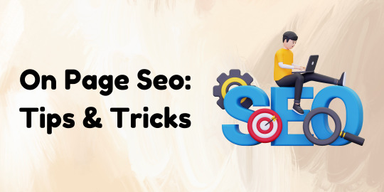
On-Page SEO Strategies: Drive More Traffic & Improve Rankings
In today’s competitive digital landscape, on-page SEO plays a crucial role in improving website visibility and ranking on search engines like Google. A well-optimized website not only drives organic traffic but also enhances user experience, leading to better engagement and conversions. In this blog, we will discuss essential on-page SEO strategies, including advanced techniques, advantages, and the best tools to help you optimize your website effectively.
Understanding On-Page SEO and Its Importance
On-page SEO refers to the optimization of individual web pages to improve their search engine ranking and attract relevant traffic. It involves optimizing content, HTML source code, images, and other website elements. Unlike off-pageSEO, which focuses on backlinks and external factors, search engines ensures that your website is structured and presented in a way that search engines and users can easily understand.
Advantages of On-Page SEO
Implementing onpage SEO offers several benefits, including:
Higher Search Rankings – Proper optimization helps improve a website’s ranking on SERPs.
Better User Experience – A well-structured website ensures easy navigation and readability.
Increased Organic Traffic – Search engines prioritize well-optimized pages, driving more traffic.
Faster Page Loading Speed – Optimizing images and code enhances site performance.
Improved Conversion Rates – Better user experience leads to higher engagement and conversions.
All On-Page SEO Factors You Should Focus On
To achieve better rankings, you need to focus on all on-search engines factors that contribute to website optimization. Here are the key elements to consider:
a) Keyword Optimization
Use primary and secondary keywords naturally within content.
Optimize title tags, meta descriptions, headers, and URLs.
Avoid keyword stuffing to maintain readability and SEO effectiveness.
b) High-Quality Content Creation
Write informative, engaging, and original content relevant to your audience.
Use structured formatting with subheadings, bullet points, and short paragraphs.
Include internal and external links to provide additional value to readers.
c) URL Structure & Internal Linking
Use short, descriptive URLs with target keywords.
Implement a strong internal linking strategy to improve website navigation.
Ensure anchor text is relevant and provides context to users.
d) Image Optimization
Use compressed images to improve page loading speed.
Add alt text with relevant keywords to enhance accessibility and SEO.
Choose appropriate file names and formats for better indexing.
e) Mobile-Friendliness & Page Speed
Ensure your website is mobile-responsive for better user experience.
Use Google’s PageSpeed Insights to analyze and improve load time.
Minimize CSS, JavaScript, and server response time.
Advanced On-Page SEO Techniques for Higher Rankings
If you want to stay ahead in the SEO game, implementing advanced optimization strategies is essential. Here are some expert techniques:
a) Schema Markup for Rich Snippets
Use structured data to help search engines understand your content better.
Implement schema markup to enhance search appearance with rich snippets.
b) Optimizing for Search Intent
Create content that aligns with user search intent (informational, transactional, or navigational).
Use tools like Google Search Console and analytics to understand user behavior.
c) E-A-T (Expertise, Authoritativeness, Trustworthiness)
Publish high-quality, credible content that demonstrates expertise.
Include author bios and references to improve content authority.
Build backlinks from reputable sources to enhance website trustworthiness.
d) User Engagement & Behavioral Metrics
Reduce bounce rates by improving content relevance and readability.
Use interactive elements like videos, infographics, and FAQs to enhance engagement.
Optimize for featured snippets to capture more organic clicks.
Best On-Page SEO Tools for Website Optimization
Using the right tools can make optimization easier and more effective. Here are some of the best optimization checkers and tools:
Best On-Page SEO Checker Tools
SEMrush On-Page SEO Checker – Analyzes pages and provides optimization recommendations.
Ahrefs Site Audit – Detects on-page issues and suggests fixes.
Moz On-Page Grader – Evaluates keyword usage, readability, and metadata.
Google Search Console – Helps track search performance and indexing issues.
Best On-Page SEO Plugin for WordPress
If you use WordPress, installing a reliable SEO plugin can simplify optimization:
Yoast SEO – Offers on-page analysis, readability checks, and XML sitemap generation.
Rank Math – Provides AI-based SEO suggestions, keyword tracking, and schema support.
All in One SEO Pack – Includes advanced settings for title tags, meta descriptions, and schema markup.
Conclusion: Master On-Page SEO for Long-Term Success
Implementing effective optimization strategies is crucial for improving website rankings, driving traffic, and enhancing user experience. By focusing on all on-page SEO factors, leveraging advanced on-page SEO techniques, and using the best optimization checkers and plugins, you can optimize your website for long-term success.
Start optimizing your website today with these strategies and watch your organic traffic grow! 🚀
#digital markeing#online marketing#search engine optimization#on page seo#tumlr#seo#freelancing#tumblr#on page audit#on page optimization
0 notes
Text
Best Practices for Optimizing Your Website for Mobile
Is Your Website Mobile-Ready? Discover the Best Practices to Optimize for Mobile!
In today’s fast-paced digital world, ensuring a smooth mobile experience isn’t just an option—it’s essential. With more users than ever accessing the web via smartphones and tablets, a mobile-optimized website can be the key to higher engagement, improved SEO, and increased conversions. At osumare marketing solutions, we’re dedicated to empowering businesses to thrive online by delivering exceptional digital experiences.
Here are some quick tips to make your site mobile-friendly:
✅ Responsive Design: Ensure your website automatically adapts to various screen sizes. A responsive design not only improves user experience but also streamlines maintenance by eliminating the need for separate mobile sites.
✅ Boost Page Speed: Mobile users demand fast-loading pages. Optimize images (using modern formats like WebP), minify code (HTML, CSS, JavaScript), and utilize browser caching and CDNs to reduce load times.
✅ Enhance Mobile Navigation: Keep menus simple and intuitive. Use touch-friendly buttons, maintain clear call-to-actions, and consider sticky navigation to provide users with quick access to key information.
✅ Optimize Readability: Break up long paragraphs with subheadings and bullet points. Choose fonts that are easy to read on small screens and ensure sufficient contrast between text and background.
✅ Implement Mobile SEO: With Google’s mobile-first indexing, your mobile site should contain all vital content and metadata. Incorporate structured data and local SEO strategies to boost your rankings and attract local customers.
At osumare marketing solutions, we go beyond mobile optimization to offer comprehensive digital strategies that drive real business growth. Whether you’re refining your website’s mobile performance or launching a full-scale digital marketing campaign, our team is here to help.
For those looking to elevate their digital presence, check out our digital marketing agency in Ahmedabad. We’re proud to be recognized as one of the Best digital digital marketing agencies in ahmedabad, one of the Top digital marketing agencies in ahmedabad, and even one of the Top 10 digital marketing agencies in ahmedabad. Our expertise has also earned us the titles of Best digital marketing agency of ahmedabad, Top digital marketing agency of ahmedabad, Best digital marketing agency in ahmedabad, and Top digital marketing agency in ahmedabad.
Ready to boost your mobile performance and digital presence? Visit ahmedabad.osumare.com and connect with us today. Let’s make your digital journey seamless and successful!
#MobileOptimization #DigitalMarketing #SEO #WebDesign #ResponsiveDesign #DigitalStrategy #OsumareMarketingSolutions
0 notes
Text
SEO Tips for Landing Page Layout: Boost Your Conversions
In today’s digital landscape, a well-optimized landing page is more than just a gateway to your website; it’s a conversion machine that transforms visitors into customers. By combining strategic SEO practices with an effective landing page layout, you can not only rank higher in search engine results but also significantly enhance user experience and drive conversions. Here are actionable SEO tips for landing page layout that will help you boost your website’s performance and achieve your marketing goals.
1. Prioritize Mobile-Friendly Design
With over 50% of web traffic coming from mobile devices, having a mobile-friendly landing page is non-negotiable. Google’s mobile-first indexing means that your mobile layout directly impacts your SEO ranking.
Tips:
Use responsive design to ensure your landing page adapts to all screen sizes.
Optimize images and videos for faster loading on mobile devices.
Implement a clean, easy-to-navigate layout with prominent CTA buttons.
2. Optimize Page Load Speed
Page load speed is a critical ranking factor for search engines and a major contributor to user experience. Slow-loading pages result in higher bounce rates, which negatively impact your SEO.
Tips:
Compress images and use modern formats like WebP.
Minimize HTTP requests by combining CSS and JavaScript files.
Leverage browser caching and enable lazy loading for non-essential content.
3. Craft a Compelling Headline
Your headline is the first thing visitors see, and it plays a crucial role in capturing their attention. A well-crafted headline also helps search engines understand the relevance of your page.
Tips:
Include your target keyword (“SEO Tips for Landing Page Layout”) naturally in the headline.
Keep it concise and benefit-focused.
Use H1 tags for the headline and maintain a clear hierarchy with subheadings (H2, H3).
4. Use Engaging Visual Elements
Visuals can enhance user engagement and improve dwell time, a behavioral metric that search engines consider.
Tips:
Incorporate high-quality images, infographics, or videos related to your content.
Add alt text to all images, including target keywords where appropriate.
Ensure visuals are optimized for speed and accessibility.
5. Create Clear and Concise Content
Your landing page content should be easy to read and provide immediate value to visitors. Search engines reward pages that deliver relevant, user-friendly content.
Tips:
Use bullet points, short paragraphs, and subheadings for better readability.
Focus on addressing your audience’s pain points and offering solutions.
Integrate your target keyword strategically in the title, meta description, and throughout the content.
6. Optimize for Local SEO (If Applicable)
If your landing page targets a local audience, local SEO optimization is essential for visibility in regional searches.
Tips:
Include location-specific keywords in your content and metadata.
Add a Google Maps widget if relevant.
Encourage customer reviews and ensure your NAP (Name, Address, Phone number) information is consistent across platforms.
7. Leverage Strong Call-to-Actions (CTAs)
A compelling CTA is the linchpin of any high-converting landing page. It guides users toward taking the desired action, whether it’s signing up, purchasing, or downloading.
Tips:
Place CTAs above the fold and at strategic points on the page.
Use action-oriented language like “Get Started Now” or “Download Your Free Guide.”
Test different designs, colors, and wording to determine what works best.
8. Use Internal and External Links
Links not only enhance user navigation but also help search engines understand the context of your page.
Tips:
Link to relevant internal pages to improve your site’s structure.
Use descriptive anchor text for all links.
Add authoritative external links to credible sources to build trust and context.
9. Optimize Metadata
Metadata, including the title tag and meta description, plays a vital role in attracting clicks from search engine results pages (SERPs).
Tips:
Write a unique, engaging title tag incorporating your target keyword.
Keep meta descriptions under 160 characters and include a clear value proposition.
Use schema markup to enhance rich snippets for better visibility.
10. Implement Trust Signals
Building trust is essential for conversions. Trust signals reassure visitors about the credibility and safety of your site.
Tips:
Display testimonials, reviews, and case studies.
Include security badges and certifications.
Use professional, well-written copy that avoids errors or inconsistencies.
11. Optimize for Voice Search
Voice search is gaining popularity, and optimizing your landing page for it can give you a competitive edge.
Tips:
Use conversational language and long-tail keywords.
Answer specific questions your audience might ask.
Add an FAQ section to address common queries.
12. Conduct A/B Testing
Continuous improvement is key to achieving optimal performance. A/B testing allows you to identify what works best for your audience.
Tips:
Test variations of headlines, CTAs, layouts, and color schemes.
Analyze user behavior using heatmaps and session recordings.
Implement changes based on data-driven insights.
13. Ensure Accessibility Compliance
An accessible landing page ensures that all users, including those with disabilities, can interact with your content. Accessibility also aligns with Google’s focus on user experience.
Tips:
Use descriptive alt text for images.
Ensure proper contrast ratios for text and background colors.
Implement keyboard navigation and ARIA labels for interactive elements.
14. Monitor and Analyze Performance Metrics
Tracking the performance of your landing page helps you identify areas for improvement and measure the effectiveness of your SEO efforts.
Tips:
Use tools like Google Analytics and Search Console to monitor traffic, bounce rates, and conversion rates.
Track keyword rankings and refine your content strategy accordingly.
Set clear goals and KPIs to measure success.
15. Avoid Common SEO Pitfalls
Finally, avoid common mistakes that can undermine your SEO and conversion efforts.
Tips:
Avoid keyword stuffing and focus on natural integration.
Don’t neglect technical SEO, such as proper URL structure and HTTPS implementation.
Ensure your landing page is free from intrusive pop-ups or ads that disrupt the user experience.
Conclusion
Optimizing your landing page layout for SEO is a powerful strategy to boost conversions and drive business growth. By implementing these SEO tips for landing page layout, you can create a page that not only ranks well but also engages and converts your audience. Focus on delivering value, maintaining user-centric design, and continuously refining your approach to stay ahead in the competitive digital landscape.
0 notes
Text
How Can On-Page SEO Improve Rankings?
In the world of digital marketing, SEO (Search Engine Optimization) plays a crucial role in helping websites rank higher on search engine results pages (SERPs). While there are many aspects of SEO, on-page SEO is often considered one of the most important factors influencing a website's rankings. But how exactly can on-page SEO improve your website's search engine rankings? Let’s dive in!
What is On-Page SEO?
On-page SEO refers to the practices you can apply directly on your website’s pages to improve their position in search engine rankings. This includes optimizing content, HTML code, images, and overall user experience. Unlike off-page SEO, which involves external factors like backlinks, on-page SEO focuses entirely on elements within your website itself.
1. Optimizing Content for User Intent
One of the most significant ways on-page SEO impacts rankings is by aligning your content with user intent. Search engines like Google aim to provide users with the most relevant and useful results based on their queries. By optimizing your content to meet this intent, you increase the chances of ranking higher.
To do this:
Research the keywords your audience is searching for.
Use those keywords in a natural way within your content.
Ensure your content answers the questions or problems users are seeking solutions to.
When your content satisfies user intent, search engines are more likely to view it as valuable, improving your ranking potential.
2. Improving Readability and Structure
Search engines favor content that is easy to read and understand. Well-structured content is easier for both users and search engine crawlers to navigate. Proper use of headings (H1, H2, H3) allows Google to better understand the structure of your page and how different topics and subtopics are related.
Here’s how this can boost rankings:
Headings and subheadings: Break down your content into digestible sections with relevant keywords.
Short paragraphs: Avoid large blocks of text that are difficult to read.
Bullet points and lists: Use these for quick summaries and important points.
Internal linking: Link to other relevant content within your website to keep users engaged and guide them to valuable resources.
By improving the readability and structure of your content, you enhance user experience, which is a key ranking factor.
3. Effective Use of Keywords
Strategic placement of target keywords is an essential part of on-page SEO. By including relevant keywords in strategic locations, such as titles, headings, and throughout the content, search engines can better understand the context of your page.
Here’s how keyword optimization influences rankings:
Title tags: Include your target keyword in the title of your page to show its relevance to search queries.
Meta descriptions: These summaries (although not a direct ranking factor) influence click-through rates, which can indirectly impact rankings.
Alt text for images: Search engines can’t read images, but they can read the alt text, so include relevant keywords.
URL structure: A clean and descriptive URL that includes your target keyword is more SEO-friendly.
Using keywords effectively signals to search engines that your page is relevant to specific queries, improving its chances of ranking higher.
4. Page Load Speed
Page speed is a well-known ranking factor. A slow-loading website negatively affects user experience, causing users to bounce off the page before it even loads. Search engines prioritize fast-loading sites because they deliver a better user experience.
To improve page load speed:
Compress images and use web-friendly formats like JPEG or WebP.
Minimize HTTP requests by reducing the number of elements (like scripts, CSS, and images) that need to load.
Use caching techniques and content delivery networks (CDNs) to speed up load times.
By improving your site’s load speed, you not only improve user experience but also enhance your chances of ranking higher on search engines.
5. Mobile Optimization
With the growing number of mobile users, mobile optimization is more important than ever. Google uses mobile-first indexing, which means it prioritizes the mobile version of your website when determining rankings.
To optimize for mobile:
Ensure your website is responsive and adjusts to different screen sizes.
Test your website's mobile usability using Google’s Mobile-Friendly Test tool.
Avoid using elements that may not function well on mobile devices, like Flash or large pop-ups.
A mobile-friendly website improves user engagement and decreases bounce rates, which are crucial factors in boosting rankings.
6. Optimizing for Featured Snippets
Featured snippets are the boxed information that appears at the top of certain search results pages. They provide a quick answer to user queries and are highly visible. By optimizing your content for featured snippets, you can gain extra visibility and improve your rankings.
Here’s how to optimize for snippets:
Provide concise answers to common questions in your content.
Use bullet points, numbered lists, or tables for easy-to-digest information.
Aim to rank in positions 0-3, as these are typically the positions that appear in featured snippets.
By targeting featured snippets, you can improve your chances of ranking higher and gaining increased visibility.
7. Optimizing Images
Images are not just for visual appeal – they play an important role in SEO too. Optimizing your images can improve page load speed, enhance user engagement, and help your page rank better in image search results.
Here’s how to optimize images:
Use descriptive, keyword-rich file names for your images.
Add relevant alt text to each image, describing the content and context.
Compress images to reduce file size without compromising quality.
Proper image optimization can enhance overall page performance, contributing to better rankings.
8. Boosting Engagement with User Experience (UX)
User engagement signals, such as time spent on a page, bounce rates, and click-through rates, all play a role in your rankings. If your website offers a positive user experience, people are more likely to stay longer, interact with your content, and share it with others.
To improve UX:
Simplify your navigation to make it easy for users to find what they need.
Design a clean, visually appealing website layout.
Ensure your content is accessible and easy to read.
When users engage with your content, search engines interpret this as a signal of quality, boosting your rankings.
Conclusion
On-page SEO is a powerful tool in improving your website’s rankings. By optimizing content, improving user experience, and using strategic SEO techniques like keyword placement, image optimization, and mobile responsiveness, you can boost your website’s visibility on search engines. The key to successful on-page SEO is consistency—ensuring that every page of your website is fully optimized for both search engines and users.
When done correctly, on-page SEO can significantly enhance your website’s chances of ranking higher, attracting more organic traffic, and ultimately driving better business results.
0 notes
Text
Limbus Company Wiki Style for AO3
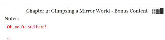
Note: This post contains spoilers (... can I call it that?) for Glimpsing a Certain Mirror World.
While I was writing this story, I wrote some in-game dialogue for an identity based on the text just to get into the spirit of what I was trying to capture.
Then I thought - what if I shared that in a bonus chapter, just for fun?
Then I thought even more that it kind of looked like an imaginary wiki page.
Then I had Carmen help me present a wiki page from another reality.
Seems like readers got as much of a kick out of it as I did writing it!
Now I'll show you how to style an AO3 page to look a little bit like the wonderful Limbus Company Wiki, too!
If a CSS and HTML snippet demonstration is all you need, grab them here:
🔗HTML (Inside your story)
🔗CSS (Inside a Work Skin, made on your dashboard)
Next, I'll go over everything step by step from the beginning.
Jump into the cut for the tutorial!
(Then show me your fan identity stories when you make some, okay?)
Step 1: Create a Work Skin
After logging in, go to your Dashboard.
Then click Skins
Then go to My Work Skins
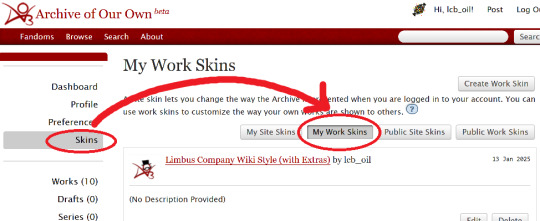
Click Create Work Skin
Give it any name and description you like
Paste the following into the CSS text area:
🔗Pastebin Link for easy copy / paste
#workskin td, #workskin th { padding: 5px; border: 1px solid #810000; } #workskin td { color: white; background-color: #1e1e1e; vertical-align: middle; } #workskin td.title-column { width: 20%; text-align: center; } #workskin div.affiliation { font-size: small; } #workskin .userstuff p.carmen { color: red; }
I will explain what this means when we get to the next step so that you can tweak it if you wish. Think of this as your starter style.
Click Submit to save your skin
Step 2: Apply the Skin to Your Work
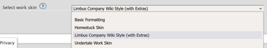
When creating or editing a work, you can set the work skin in the Associations section.
Click the dropdown, and you'll see whatever name you gave your work skin in the first step mixed in with the default ones provided by AO3.
Step 3: Format Your Story
You'll need to add HTML to your story to see any of the new styles applied.
I'll show you a few examples of how this is done.
Change the color of text
I used red text to indicate Carmen speaking through the author's note.
Here is the HTML I used in the Chapter Notes section to do this:
<p class="carmen">Could it be that you, too, wish to glimpse the mirror world these two envisioned?</p>
This creates a paragraph (p) with the carmen class applied.
If we look at the CSS from up above:
#workskin .userstuff p.carmen { color: red; }
The p.carmen section is called the selector. This tells the CSS that if there's a paragraph with the class of carmen, make it red!
You can copy this line to create classes with any name you wish for paragraphs so that you can have as many colors and effects at your disposal as you want.
Of course you can change the color from red to any other color you need, too.
Wiki Tables
This next part is a little bit more involved. I'm not sure if there's a better way to make a table on AO3 or not, but here's a snippet to get you started:
🔗Pastebin Link for easy copy / paste
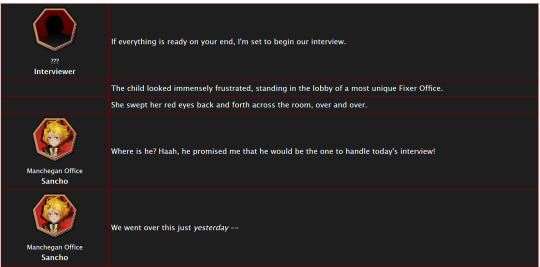
<table> <tbody> <tr> <td class="title-column"> </td> <td> The child looked immensely frustrated, standing in the lobby of a most unique Fixer Office. </td> </tr> <tr> <td class="title-column"> <img src="your image URL here" alt="Sancho Story Portrait"> <div class="affiliation">Manchegan Office</div> <b>Sancho</b> </td> <td> We went over this just <em>yesterday</em> -- </td> </tr> </tbody> </table>
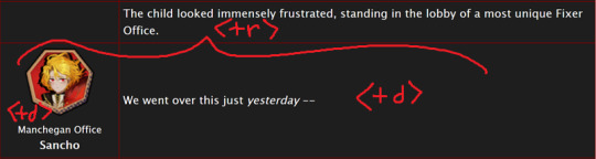
This creates a table (<table>) with two table rows (<tr>).
Each table row has two table cells (<td>).
The first cell in each row has the character image, affiliation, and name.
The class "affiliation" is defined in the style sheet to make that section of text just a bit smaller, like on the wiki:
#workskin div.affiliation { font-size: small; }
In the first example table row (<tr>) above, you can see that you can even leave it blank to allow for the narration portions of the story.
You'll need to copy the section between the <tr> and </tr> tags to create new rows for your table. Copy it once per line in your identity story and change the text and images inside as needed.
I highly suggest that you do this in a text editor on your own computer rather than on AO3, because it can quickly get overwhelming.

Just looking at this in AO3 is making me nervous 💦
(Fun side note, I originally spelled "Manchegan" incorrectly in my first draft all over that huge table... thank goodness for find and replace...)
Hosting Images
You'll see I left a section on the table template for "your image URL here".
You'll have to find a place to host your images on your own, because AO3 doesn't provide any image hosting...
I saw someone suggested https://imgbb.com/, so that's what I used. It seems to have held up so far.
Keep in mind if you link an image from Discord or Imgur, they could remove your image sometime in the future and then it will no longer appear properly in your story.
(Be sure to include an alt text in the image as shown - if the image can't be loaded some day in the future users will see that text instead so that they can understand what they're missing!)
Step 4: Adjust Away!
Once your work skin is applied and you have the right HTML classes in place, you can edit your Work Skin and see your story change, even if it is in your drafts.
You can use this to adjust other things in my CSS example, like colors and the padding in the table.
---
Have fun, and let me know if you have any questions!
“Would you care for some tea?” Yi Sang offered. The evening’s chill was somehow present, even inside his closed room. “Nay,” Don Quixote took in a sharp breath, “I was hoping that you might… assist me, with a look into thy mirror. For there is something that I have need to see.” Yi Sang creased his eyebrows. Unfortunately, this was exactly what he worried would occur. ——— In the aftermath of La Manchaland, Don Quixote asks Yi Sang for a favor. Yi Sang guides her through the process of glimpsing a certain mirror world.
Limbus Company leaves so much unsaid by not showing us what happens immediately after the end of a canto. But, that's a lot of opportunity space to play with in a story.
I've been working on this one for quite some time as I've always wanted to explore the dynamic between Don Quixote and Yi Sang, even though I find Yi Sang really tough to write for.
If you like mirror worlds and AUs, you might especially enjoy this one. I hope you like it! 🎠🪶
---
... Also, hmm, something strange seems to have happened with my upload?
This is a one shot story, but for some reason there's a second chapter? That's odd.
Well, if you check it out, I should note that it might look better on a PC or tablet than on a mobile phone -- though it will probably look ok either way.
#limbus company#lcb-oil-table-talk#tutorial#ao3#canto 7 spoilers#canto vii spoilers#I'm honestly surprised that Tumblr doesn't have support for code blocks#That's a little disappointing
47 notes
·
View notes
Text
Optimizing Your Website for Mobile: A Small Business Guide

With the majority of internet traffic coming from mobile devices, optimizing your website for mobile is no longer an option; it's a necessity. Mobile optimization improves user experience and plays a significant role in search engine rankings. In this article, we'll explore the importance of mobile optimization for small business websites and provide practical tips to help you get started. - Embrace a responsive design - Prioritize page speed - Streamline navigation - Optimize images and media - Mobile-friendly content - Eliminate flash and pop-ups - Optimize forms - Test on real mobile devices - Implement mobile SEO best practices - Monitor and iterate How to Optimize Your Website for Mobile Users In a world where smartphones and tablets have become extensions of our daily lives, optimizing your website for mobile users is no longer a luxury but a necessity. Mobile optimization ensures that your website is accessible, user-friendly, and visually appealing on a variety of mobile devices. 1. Embrace a Responsive Design A responsive website design is the cornerstone of effective mobile optimization. Responsive design allows your website to adapt fluidly to different screen sizes and orientations. This means your site will look and function equally well on smartphones, tablets, and desktop computers. Google highly recommends responsive design, and it can improve your search engine rankings. 2. Prioritize Page Speed Mobile users value speed. A slow-loading website can lead to high bounce rates and frustrated visitors. Optimize your site's loading times by: Compressing images and other media to reduce file sizes. Enabling browser caching to store frequently used elements. Minimizing HTTP requests by combining CSS and JavaScript files. Using a content delivery network (CDN) to distribute content efficiently. 3. Streamline Navigation Simplify your website's navigation for mobile users. Consider implementing a mobile-friendly menu, such as a hamburger menu, to save screen real estate. Use clear and concise labels for menu items and ensure that links and buttons are large enough to tap easily. Keep the navigation structure simple to help users find what they're looking for quickly. 4. Optimize Images and Media Images and videos can significantly impact your website's performance. To optimize for mobile users: Use image formats like JPEG or PNG for better compression and loading times. Implement lazy loading to load images only when they come into the user's viewport. Ensure videos are HTML5-compatible and consider providing alternative formats for different devices. 5. Mobile-Friendly Content Make sure your content is easily digestible on mobile devices: Use legible fonts and maintain an appropriate font size. Keep paragraphs short and concise, breaking up text with subheadings and bullet points. Minimize the need for pinch-to-zoom by ensuring text and images are appropriately sized. 6. Eliminate Flash and Pop-ups Flash is not supported on many mobile devices, and intrusive pop-ups can disrupt the user experience. Avoid both and opt for HTML5 for multimedia content. If you must use pop-ups, make sure they are unobtrusive and easy to dismiss. 7. Optimize Forms If your website features forms for contact, sign-ups, or purchases, optimize them for mobile users. Use mobile-friendly input fields, checkboxes, and buttons. Minimize the amount of typing required and consider implementing autofill options for common fields like names and email addresses. 8. Test on Real Mobile Devices While testing on emulators is useful, it's essential to test your website on actual mobile devices. This ensures that everything functions as expected and provides a real-world user experience. Test across various devices and operating systems to catch any potential issues. 9. Implement Mobile SEO Best Practices Mobile optimization and search engine optimization (SEO) go hand in hand. Make sure your mobile site is optimized for search engines by: Using mobile-friendly metadata, including titles, descriptions, and headings. Ensuring your mobile site's content and structure are search-engine-friendly. Monitoring your mobile search performance through tools like Google Search Console. 10. Monitor and Iterate Optimization is an ongoing process. Continuously monitor your website's mobile performance through analytics tools. Pay attention to user behavior, such as bounce rates and conversion rates, and make improvements based on data insights. Regularly updating and refining your mobile optimization strategy will help you stay competitive and meet evolving user expectations. The Importance of Mobile Optimization In the fast-paced business world, where digital transformation is the norm, small businesses must adapt or risk being left behind. One of the most pivotal adaptations they can make is to prioritize mobile optimization. Mobile optimization is no longer a luxury; it's a necessity for small businesses. The Mobile Revolution The mobile revolution is in full swing, with smartphones becoming ubiquitous tools for communication, information, and commerce. Consider these compelling reasons why mobile optimization is crucial for small businesses: Widespread Mobile Usage: Mobile devices have become the primary means through which people access the internet. According to Statista, in 2021, around 54% of all web traffic worldwide came from mobile devices. Small businesses that ignore mobile optimization miss out on a massive audience. Local Search: Many consumers use their smartphones to search for local businesses, products, and services. Mobile optimization helps small businesses appear in these local search results, connecting them with potential customers in their vicinity. E-commerce Growth: Mobile e-commerce, or m-commerce, is on the rise. Small businesses can tap into this lucrative market by ensuring that their websites are mobile-friendly. If shopping on your site is a hassle on a smartphone, you risk losing sales to competitors with better mobile experiences. Search Engine Ranking: Google and other search engines prioritize mobile-friendly websites in their search results. Mobile optimization is a key factor in search engine optimization (SEO). Small businesses that neglect mobile optimization may find themselves buried in search engine rankings, making it challenging for potential customers to discover them. User Experience Matters User experience (UX) is a paramount consideration in web design, and it's even more critical for mobile users. Here's why: First Impressions: Your website is often the first interaction potential customers have with your business. A mobile-friendly website creates a positive first impression, while a non-optimized one can deter visitors. Navigation and Usability: Mobile users have different needs and expectations compared to desktop users. Mobile optimization ensures that your website is easy to navigate, with readable fonts, well-organized content, and intuitive touch-based interactions. Load Times: Slow-loading websites frustrate users, leading to high bounce rates. Mobile optimization, including image and code optimization, can significantly improve load times on smartphones, keeping visitors engaged. Competitive Advantage In the crowded marketplace of the internet, small businesses need every advantage they can get. Mobile optimization can provide a competitive edge in several ways: Brand Trust: Mobile optimization signals that your business is modern, tech-savvy, and cares about its customers' experience. It builds trust with potential customers. Reduced Bounce Rates: A mobile-optimized website keeps visitors on your site longer, reducing bounce rates. Visitors are more likely to explore your products or services, increasing the chances of conversion. Higher Conversion Rates: An easy-to-use, mobile-friendly website encourages users to take action, whether it's making a purchase, filling out a contact form, or signing up for a newsletter. This translates into higher conversion rates and increased revenue. Adapt or Fall Behind Mobile optimization is no longer a choice; it's a fundamental requirement for small businesses. In a world where mobile devices dominate, small businesses must adapt to stay relevant. Mobile optimization not only enhances visibility in search results but also fosters trust, improves user experience, and drives higher conversion rates. Small businesses that invest in mobile optimization are better positioned to thrive in the digital age and remain competitive in an ever-evolving marketplace. The author generated this text in part with GPT-3, OpenAI’s large-scale language-generation model. Upon generating draft language, the author reviewed, edited, and revised the language to their own liking and takes ultimate responsibility for the content of this publication. Read the full article
0 notes
Text
Best Practices for Web Designing – A Guide by Webigg Technology
In today's digital landscape, web design is more than just aesthetics—it’s about creating an engaging, user-friendly experience that drives conversions and retains visitors. At Webigg Technology, we specialize in crafting high-performance websites that are visually appealing, functional, and optimized for success.
Whether you're designing a business website, an e-commerce store, or a portfolio site, following best practices ensures that your site stands out. Below, we share the top web design principles that every designer should follow.
1. Mobile-First Design – Optimize for All Devices
With mobile users surpassing desktop users, a mobile-first approach is no longer optional—it’s a necessity. 🔹 Ensure your site is fully responsive, adjusting seamlessly to different screen sizes. 🔹 Use a fluid grid layout that adapts to various devices. 🔹 Test navigation, buttons, and forms for touch-friendly interaction.
💡 Pro Tip: Use Google's Mobile-Friendly Test to check if your site meets mobile optimization standards.
2. Intuitive Navigation – Keep It Simple & Accessible
Users should be able to find what they need quickly and effortlessly. ✅ Use clear and concise menus with logical categories. ✅ Keep the number of menu items minimal (5-7 is ideal). ✅ Implement breadcrumbs to help users track their navigation path. ✅ Ensure that the search bar is visible and functional.
💡 Pro Tip: Follow the 3-click rule—users should reach their destination within three clicks.
3. Fast Loading Speed – Optimize for Performance
A slow website kills engagement. According to research, 53% of visitors leave a site if it takes more than 3 seconds to load. 🚀 Optimize images using WebP format to reduce file size. 🚀 Minify CSS, JavaScript, and HTML to improve speed. 🚀 Enable browser caching and use a Content Delivery Network (CDN). 🚀 Reduce server response time by using a reliable hosting provider.
💡 Pro Tip: Test your website’s speed using Google PageSpeed Insights or GTmetrix.
4. Consistent Branding – Maintain a Unified Look
Your website should reflect your brand’s identity with a consistent color scheme, typography, and design elements. 🎨 Use a color palette that aligns with your brand personality. 🖋 Choose 2-3 readable fonts and use them consistently across the site. 🖼 Maintain uniformity in images and icons to create a cohesive visual experience.
💡 Pro Tip: Stick to one primary color, one accent color, and neutral background tones for balance.
5. SEO-Friendly Structure – Make Your Website Searchable
A well-designed website should be easily discoverable on Google and other search engines. 🔍 Use SEO-friendly URLs (e.g., yourwebsite.com/best-web-design-practices). 🔍 Optimize images with alt text to improve accessibility and ranking. 🔍 Implement schema markup to enhance search visibility. 🔍 Ensure fast page load speeds, which Google prioritizes in rankings.
💡 Pro Tip: Write compelling meta titles and descriptions with relevant keywords for better click-through rates.
6. User-Friendly Content – Focus on Readability & Engagement
A great design needs great content to complement it. 📝 Use short paragraphs and bullet points for easy reading. 📝 Implement clear call-to-action (CTA) buttons (e.g., "Get a Quote," "Shop Now"). 📝 Avoid jargon—write in a language your audience understands. 📝 Use visual elements like images, infographics, and videos to enhance engagement.
💡 Pro Tip: Stick to a F-shaped reading pattern—users tend to scan content from left to right and top to bottom.
7. Security & Data Protection – Build Trust with Users
A secure website is a trustworthy website. 🔐 Install an SSL certificate to enable HTTPS. 🔐 Keep your CMS, themes, and plugins updated. 🔐 Implement CAPTCHAs and firewalls to prevent cyberattacks. 🔐 Use secure payment gateways for e-commerce websites.
💡 Pro Tip: Display trust badges, customer reviews, and privacy policy links to enhance credibility.
8. Accessibility Compliance – Design for Everyone
A website should be usable for all visitors, including those with disabilities. ♿ Use alt text for images so screen readers can describe visuals. ♿ Ensure keyboard navigation compatibility for those who cannot use a mouse. ♿ Provide contrast-rich color combinations for better readability. ♿ Use ARIA (Accessible Rich Internet Applications) attributes to improve usability.
💡 Pro Tip: Test your website with WebAIM’s Accessibility Evaluation Tool to ensure compliance with WCAG (Web Content Accessibility Guidelines).
9. Minimalist Design – Less Is More
A clean, clutter-free design enhances user experience. 🖥 Stick to simple layouts that guide users naturally. 🖥 Avoid too many pop-ups—they disrupt the user journey. 🖥 Use white space effectively to improve readability and visual appeal.
💡 Pro Tip: Follow the 80/20 rule—80% content, 20% design to maintain a balanced structure.
10. Continuous Testing & Improvement – Stay Updated
A website should evolve based on performance analytics and user behavior. 📊 Use Google Analytics to track visitor activity and optimize pages accordingly. 📊 Conduct A/B testing on buttons, headlines, and layouts to improve conversion rates. 📊 Gather user feedback and make data-driven improvements.
💡 Pro Tip: Set up heatmaps using tools like Hotjar to understand how visitors interact with your site.
Conclusion – Elevate Your Web Design with Webigg Technology
At Webigg Technology, we believe that a great website is a powerful business tool. By following these best practices in web design, you can create a site that is not only aesthetically stunning but also user-friendly, fast, and conversion-focused.
🚀 Whether you need a business website, e-commerce store, portfolio site, or custom web application, our expert team at Webigg Technology is here to help.
Let’s Build Something Extraordinary!
For more details on our products and services, please feel free to visit us at: Web design, Website design, Hire Dedicated Resources & Offshoring Services, CRM Solutions.
Please feel free to visit us at:https://webigg.com/
0 notes
Text
How Useful is HTML?
HTML, or HyperText Markup Language, is the foundation of the web. It is a markup language that is used to create and structure web pages. HTML is used to define the content of a web page, such as text, images, and links. It is also used to control the layout and formatting of a web page.
HTML is a very useful language for anyone who wants to create or maintain web pages. It is a relatively easy language to learn, and there are many resources available online to help you get started. HTML is also a versatile language that can be used to create a wide variety of web pages.
Here are some of the benefits of learning HTML:
It is a basic skill that is essential for anyone who wants to work in web development. HTML is the foundation of web development, so it is a necessary skill for anyone who wants to create or maintain web pages.
It is a relatively easy language to learn, even for beginners. HTML is a simple language that uses a limited set of tags to define the content and structure of a web page. There are many tutorials and resources available online that can help you learn HTML.
There are many resources available online to help you learn HTML. There are many websites, tutorials, and books that can help you learn HTML. You can also find many online communities where you can ask questions and get help from other HTML learners.
HTML is used by all major web browsers, so your web pages will be accessible to everyone. HTML is a standard language that is supported by all major web browsers. This means that your web pages will be accessible to everyone, regardless of the browser they are using.
HTML is a versatile language that can be used to create a variety of different web pages. HTML can be used to create a wide variety of web pages, from simple static pages to complex interactive applications.
If you are interested in creating your own web pages, or if you want to learn more about web development, then learning HTML is a great place to start. HTML is a powerful language that can be used to create a wide variety of web pages. With a little practice, you can learn how to create your own beautiful and functional web pages.
Here are some specific examples of how HTML is used:
To create the structure of a web page, such as the header, body, and footer. The <html> tag defines the beginning and end of an HTML document. The <head> tag contains information about the document, such as the title and the character encoding. The <body> tag contains the visible content of the document.
To add text, images, and other content to a web page. The <p> tag creates a paragraph. The <img> tag inserts an image into a web page. The <a> tag creates a link to another web page.
To create links to other web pages. The <a> tag creates a link to another web page. The href attribute of the <a> tag specifies the URL of the linked page.
To format the appearance of a web page, such as the font, size, and color of text. The <font> tag specifies the font, size, and color of text. The <style> tag is used to define custom CSS styles for a web page.
To create forms that users can fill out. The <form> tag creates a form. The input tag is used to create different types of form controls, such as text boxes, radio buttons, and check boxes.
To create tables that display data. The <table> tag creates a table. The <tr> tag creates a row in a table. The <td> tag creates a cell in a table.
These are just a few examples of how HTML is used. With a little practice, you can learn how to use HTML to create your own beautiful and functional web pages.
If You Wanna Learn HTML from scratch you can visit these site that i prefer:
e-Tuition
w3school
vedantu
coding ninjas
0 notes
Text
WEB DESIGN
Of course, I'd be happy to provide information and guidance on web design! Web design involves the process of creating and arranging elements on a webpage to achieve an aesthetically pleasing and user-friendly experience. Here are some key aspects to consider when designing a website:
Layout and Structure:
Plan the layout of your website, including the arrangement of headers, menus, content sections, and footers.
Use a grid system to maintain consistency and alignment throughout the design.
Ensure that the layout is responsive, adapting to various screen sizes and devices.
Color Scheme and Typography:
Choose a color scheme that reflects the brand and creates a visually appealing atmosphere.
Select fonts that are easy to read and complement the overall design. Use a combination of fonts for headings and body text.
Images and Graphics:
Use high-quality images and graphics that enhance the visual appeal of your website.
Optimize images for the web to ensure fast loading times.
Navigation:
Create a clear and intuitive navigation menu to help users easily find their way around the site.
Consider using a consistent navigation structure across all pages.
Content Presentation:
Organize content logically and present it in a scannable format using headings, subheadings, bullet points, and paragraphs.
Use whitespace effectively to improve readability and create a clean design.
Responsive Design:
Ensure your website is responsive, meaning it looks and functions well on various devices, including smartphones, tablets, and desktops.
User Experience (UX):
Focus on providing a positive user experience by making interactions and navigation smooth and intuitive.
Minimize distractions and design elements that may hinder usability.
Call to Action (CTA):
Place clear and attention-grabbing CTAs strategically throughout the website to guide users toward desired actions.
Loading Speed:
Optimize your website's performance by minimizing large files, using caching, and optimizing code.
Accessibility:
Ensure your website is accessible to all users, including those with disabilities. Use proper HTML structure, provide alternative text for images, and consider color contrast.
Testing and Iteration:
Test your website on different browsers and devices to ensure consistent functionality and appearance.
Gather feedback from users and make iterative improvements based on their input.
Web Design Tools:
Familiarize yourself with web design tools like Adobe XD, Sketch, Figma, or even HTML/CSS editors.
Remember, web design is a dynamic field, and staying up-to-date with current design trends and technologies is important for creating modern and engaging websites. If you have specific questions or need further assistance, feel free to ask!
Regenerate

0 notes
Text
There's a really interesting experimental CSS feature called the :has() selector. It works like this:
You put something in the :has() selector. For example, div:has(p) would search every div container and look to see if it has a paragraph in it.
If the thing has the thing, then it can now format that thing!
This is. A really bad way of explaining it, but it can do a lot of interesting things on AO3; namely, it's used to perma-filter tags using skins, which hasn't been possible up to this point.
Using this feature, I realized that you could, essentially, read a blurb on AO3 (the thing you see that describes a fic when you're searching fics) and format the entire blurb based on whether it contains a specific link - and if you specifically look for the fandom link, you could format every blurb for a specific fandom.
I was messing around with proof of concept using MHA fics earlier, and it works!
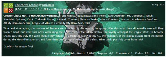
(This is a random fic taken from whatever had been posted most recently, and I'm aware it's not very readable - it was proof of concept because I wanted to see if I could get it to work with background images.)
Theoretically, though I didn't create a proof of concept, this could also be used to format what a fic looks like as you read it - so if you read fic in fandom A, maybe it would have a black background with light green text, whereas fandom B would have a pink background with black text. Fics in different fandoms could have different fonts and such too.
Unfortunately, this skin isn't practical for a lot of reasons. One, like I said, the :has() selector is still experimental, and may not work on all browsers or may require special permissions on the browser (and while I have it working on Firefox on my PC I can't get it to work on my phone).
Two, AO3 blurbs are actually super finicky to format, unfortunately - that's not really avoidable, but it does make it a lot harder. That's not to say you can't do it but it's just not easy.
Three, I simply do not have the motivation to carry out a project like this.
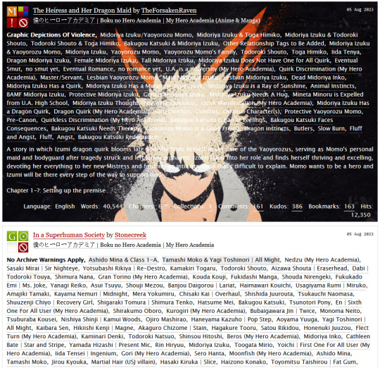
And four, and I simply do not understand this, some fics just?? Were not working? I was looking in the MHA tag and theoretically choosing every fic that has the link to the MHA tag, which means every fic I was looking at should have had this formatting, but some of them random weren't getting hit with it. Here's a screenshot from a little earlier than the above proof of concept screenshot was taken, when I was messing with another background, and I have no idea why the second fic looks normal.
But oh my god, in my mind this is such a cool AO3 skin.
had a really cool idea for an AO3 skin today that is, unfortunately, not at all practical to carry out for a number of reasons
4 notes
·
View notes
Note
this is kinda stupid of me to ask but how do you do gradient texts?
Hello!
[Disclaimer: To make gradient text, you have to turn off the beta option on tumblr posts] UPDATE: The beta option can no longer be turned off (presumably because they, well, rolled out whatever features were previously there in the beta). However, you can go to Settings → Dashboard → Type of dashboard (it'll be a dropdown close to the bottom) → HTML.
To make a gradient text, you basically have to convert whatever gradient you have into HTML code. [css code doesn’t work] Fortunately though, there are sites for that! You can use this site and/or this site. Here’s how they both work:
Method 1 - Patorjk’s Text Color Fader
Step 1: Enter your desired text, your colors [you can change the number of colors too; just click on the dropdown option]
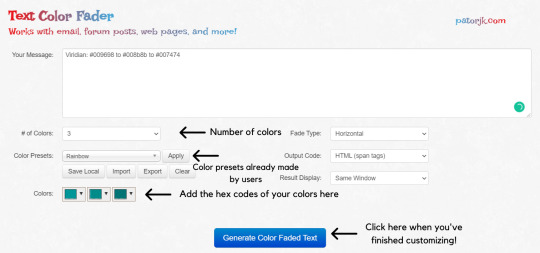
[Fade Type: I just use the default fade type, but I reckon the vertical one’s good if you want to create gradient paragraphs]
Now once you’ve clicked the “Generate Color Faded Text” button, you’ll see something like this:
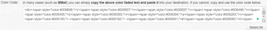
Copy all of that and paste it into this site like so:
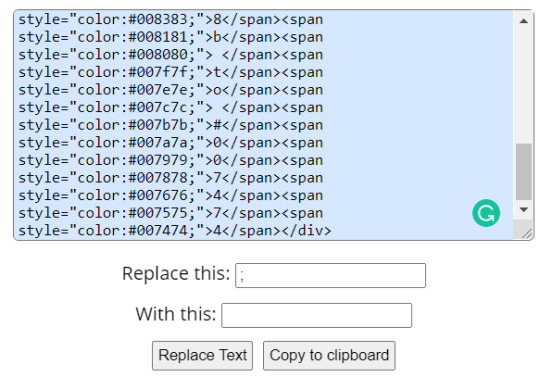
Click “Replace Text” and copy it to the clipboard, and you’re done!
Method 2 - JSFiddle
This one’s not as “user-friendly” as the former, but it’s still pretty easy to manoeuvre around once you get the hang of it!

[When you’re done customizing, click on the “Run” button on the top left.]
Now you should see that the colors in those boxes in the run area are now your desired colors. Enter the text in the top text box as shown and click the run button next to the color boxes. Your HTML code should appear in the second text box. Copy that and you’re done!
[I’d only edit the main code if I want to add one/more colors. Otherwise you can just click the boxes in the run area and edit the colours directly from there. This supports hex codes, RGB and HSL.]
For example, I’ve done this:

Okay, now once you’ve copied your HTML code, you have to go back to tumblr and create a new post without the beta format. You should see a gear icon; click that and change the post type to HTML. [tip: customize a blank piece of text however you want (bold, italic etc.) in the Rich Text editor and then just replace that with your gradient text code in the HTML editor]
Now paste your HTML code in the text area, and you should see something like this:
[note: I just clicked on the gear icon to demonstrate what it should look like]
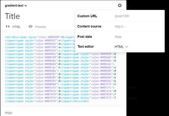
You can preview your text by clicking on the “preview” button to see if you got anything wrong/to see what the final result will look like, and you can add your desired tags.
And that’s really all there is to it! Here’s what my final result will look like:
Viridian: #009698 to #008b8b to #007474
[Forgot to mention, once you've got your gradient text, you can't switch back to the Rich Text editor without losing your gradient, which is why I recommend customising your text in the Rich Text Editor before switching to HTML and replacing the black text with your gradient one! Personally, I just use the header option for my text so I put the h2 tags manually at the start and end of the code so as not to create a hassle]
2K notes
·
View notes
Text
A not-so-quick how-to for Ao3 work skins
Ao3 has some pretty powerful customization tools at your disposal - if you know how to use them. Did you know this entire time you could change your text colors, size, background colors, outlines, underlines, overlines, and even fonts of your works? It's fairly easy to do - you only need a little knowledge about markup languages to get started. The way this is done is through classes and the clever application of some simple CSS. Though I've written this guide around using my Obey Me coloring and work skin, the principles are applicable across anything you may want to do with your Ao3 styling.
I've done all the heavy lifting this time around, and have actually created a very, very simple skin that you may want for the purposes of your Obey Me fic including:
Unique colors for each character (sticking to WCAG 1:3 minimum contrast ratio for accessibility)
Heading font and size styling (separate from character colors)
Styled 'pullquotes' for written letters/passages/quotes (at 75% size)
Make sure to keep checking back for updates - I'll put word out here on my tumblr whenever I update, but I've also created a codepen (work skin CSS found in the CSS tab) with the latest version of the skin that you can use to play around in.
Just a heads up before you start: there is a bit of a learning curve, but I have tried to make the explanation as simple as possible, and hopefully provide enough tools and knowledge that you can run with what I've given you and start creating your own styles.
1. Markup: The Basics
I'm sorry - no matter how simple I try to make this work skin, you're going to need at least a little understanding of what markup languages are and how they work. But don't fret: I've had a few years experience now teaching this to absolute beginners so hopefully by the end of this tutorial you'll be feeling like a real Hackerman.
So what is Markup? A tl;dr
Markup is a set of instructions used to tell a program (in this case your internet browser) how something should behave. HTML stands for Hypertext Markup Language and is likely the markup language you'll encounter most often. Ordinary text like you would type in a word document is meaningless to a computer browser - it doesn't know how to read. You need to talk to it in a language it understands so that it can translate your wonderful words into something that appears in your browser. This is done through the use of 'elements'.
Like how you know "words captured in these quotation marks" are quotes (or text written in parentheses is related to but non-essential to the main body), elements are essentially markers that indicate how a thing should be read. In HTML, these elements are denoted through angular brackets <> containing the necessary info that your browser understands. These often consist of an opening tag <[element type]>with content within, followed by a closing tag</[element type> denoted through the use of the "/" slash. Every element that has been opened must always be closed. Common tags include:
<p></p> for paragraphs
<em></em> for emphasis (typically displayed as italic)
<strong></strong> for strong (typically displayed as bold)
<h1></h1> for your highest headline (and subsequent-level headings use 2-6)
<div></div> for generic sections or blocks
<span></span> for specific selections of text.
<a></a> for anchors (links)
<img> containing images <- this one doesn't have closing tags because it's special
and more!
Everything you see on the internet rests within tags like these. You don't see them because they're only for your browser's eyes. Even your fics are formatted with this - though Ao3 does it automatically. You can freely switch between Markup (HTML) and Rich Text Formatting up in the top right corner.
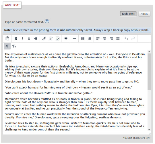
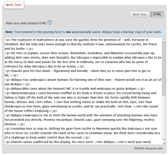
Attributes
Attributes are additional information you can add to an element. Some attributes are essential, like a href (hyperlink reference) for anchor elements. Some are additional information used to differentiate between different identical elements like a class or id. It's this latter, non-essential attribute we're going to be utilizing for our work skins.
Once you have your fic in Ao3, make sure to switch over to the html editor. From there, you are going to find the element that you want to change the look of, and we're going to add a class.
We do this by finding the open tag of an element. That will probably be a <p>. Inside those angular brackets, after the name of the element, we are going to type class=""
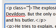
What we've done there is create a field for the class, but we haven't actually given the element a class yet.
It's always a good idea to name classes that describe the content, not what you want it to look like. You could change your mind down the line, but then you're stuck with a class called red that's really changing the color to blue. So rather than calling a class "gold", you might instead give it the name "Mammon" as it indicates when Mammon is speaking. This is known as Semantic markup.
Here's a few things you need to know about classes:
Class names cannot contain spaces. We use spaces to delineate new classes in the same element (like commas to separate tags on tumblr).
You can use as many classes as you want, as many times as you want.
They are case-sensitive.
You can add classes to all most html elements. That means that you don't have to just make entire paragraphs a particular style.
I have already specified several classes in my existing work skin. These are [Luci Mammon Levi Satan Asmo Beel Belphie Dia Barb Luke Sol Sim Heading pullQuote] - remember that these are case-sensitive. Feel free to use any one of these, or use your own! Put your chosen class name between those quotation marks I had you make earlier like so!
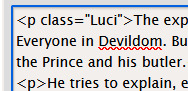
These don't actually do anything just yet. For that, we need to now head on over into our work skin.
2. Introducing the work skin: CSS
Now that we hopefully have our heads wrapped around the basics of elements and classes, we can start using that to make things look interesting. CSS stands for Cascading Style Sheet. HTML gives the browser structure, CSS gives the browser style.
But first, we have to create a new work skin.
Go to your Ao3 Dashboard and up in the top left underneath "Profile" and "Preferences" you should see an option for Skins. It'll land land you in "site skins" by default, so make sure to click on My Work Skins. From here you can click on Create Work Skin in the top right corner.
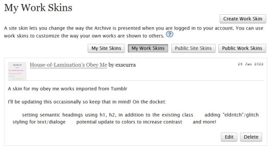
In the "About" section, make sure Work Skin is selected, and give your new skin a title!
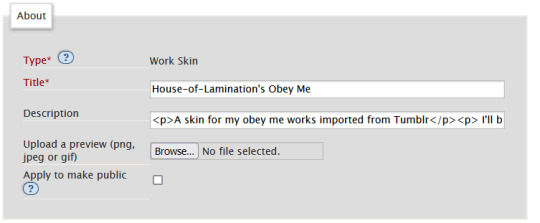
Feel free to also include a description for your own sake. Now. Onto the fun part!
Below the "About" section, you should see a box labelled CSS. In that box, feel free to copy+paste the styles below into that box:
#workskin .Luci { color: #0071ed;}
#workskin .Mammon { color: #e5a71c;}
#workskin .Levi { color: #e26600;}
#workskin .Satan { color: #00c117;}
#workskin .Asmo { color: #ff00bd;}
#workskin .Beel { color: #e80b00;}
#workskin .Belphie { color: #4f08b5;}
#workskin .Luke { color: #00c0ed;}
#workskin .Dia { color: #9b0000;}
#workskin .Barb { color: #007215;}
#workskin .Sim { color: #c1ac44;}
#workskin .Sol { color: #757575;}
#workskin .Heading { font-size: 1.25em;}
#workskin .pullQuote { text-align: center; font-size: 0.75em; display: block;}
This can also be found in the CSS section in this codepen. (disclaimer: tumblr may or may not mess with the line spacing when you copy things over. After you've copied, save your work skin and then reopen it in "edit" - Ao3 will automatically format your work so that it's nice and clean).
So what's actually happening here?
Let's read from left-to-right, top-to-bottom - because that's precisely what CSS does. Feel free to skip this part if you're not interested in creating your own styles and you're happy to just copy and paste existing work skins :)
#workskin .Luci { color: #0071ed; }
This first part here is what is called a "selector". Here, we're specifying what exactly we want to target in order to change its looks. Every character, including the spaces, symbols, and capitals matter.
#workskin .Luci { color: #0071ed; }
#workskin is specifying a unique ID within the HTML - one that encapsulates everything that you want to apply the work skin to - so basically your entire work. This is absolutely necessary in order for the work skin to actually function. We didn't create this ID in our HTML because Ao3 (will) create it for us automatically down the line.
#workskin .Luci { color: #0071ed; }
Following the work skin id, we have a space, a period, and then - hey! That's a class name! The space between the ID selector and the next part indicates we're looking for things inside this particular ID. Periods are used to indicate classes. When targeting a class, you use the period, followed by the class name. So if you're targeting your Levi class, you would write #workskin .Levi . If you were targeting a class that you created in your html, you would write #workskin .[classname] (removing the square brackets, of course).
#workskin .Luci { color: #0071ed; }
Now it's time for the fun stuff - the rules. Once we've targeted what we want to style with our selector, we use curly brackets to contain all the "rules" that we're using to make the browser appear a certain way.
#workskin .Luci { color: #0071ed; }
We start with our property - or what we want to change. In this case it's the text colour, denoted through 'color'. Yes. It's American spelling. I have no control over this. Find a simple list of css properties here! There's loads, but the ones that are probably of most use to you at this point are color, font-size, font-weight, text-align, text-decoration, and display. Make sure to put a colon after the property - that links us into the next step.
#workskin .Luci { color: #0071ed; }
Finally, we have our value - or what we're asking the property to do. In this case, we're changing the color, so the value is a hex color value. Color can also be denoted through rgb [written as rgb(0,0,0)]. Different properties will have different values. For example, text-align can have a value of left, right, or center (note the Americanized spelling again). If you click on the property in this list, it will tell you what values you can use!
You can have as many rules as you want in your selectors, as long as you end each of them with a semicolon. I cannot stress the semicolon enough. If your CSS isn't working - it's probably a missing semicolon. An example of multiple rules being used within one selector is in the pullquote styling:
#workskin .pullQuote { text-align: center; font-size: 0.75em; display: block; }
You can even write rules that override each other, though we try and avoid doing that. When this happens, your CSS will read from top-to-bottom, prioritizing the latest thing it has read (typically your bottom-most). There are exceptions to this, but that's not necessary for this guide.
So by this point you should have copied over the CSS I've written into your work skin, or perhaps tried your hand at making your own. This would be a good point to save.
3. With our Powers Combined
Right! So we have our work skin. We have our work formatted properly, resplendent with classes. Here's how we get these things talking to each other:
Once you've saved and closed your new work skin, open up or post the work you would like to apply the styling to. Down the bottom of the Associations section, there is an option to Select Work Skin. Ao3 already provides some work skins by default - Homestuck and Undertale - but you should be able to select your new work skin from this dropdown.
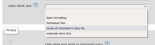
Now here's the magic. Time to check if this worked. Go through and make sure you've applied your classes to each of the elements you want to change the look of. These can be <p> elements, <em> elements, <strong> elements, or you can even make new, unique sections using <span>. Save your work as a draft and preview it - if you've done everything right, you should see the sections of text you've added classes to have changed in appearance!
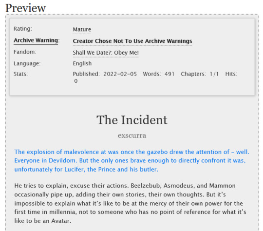
A reminder that you can add multiple classes to one element: say for example you want to create section headings unique to each 'character', you can name both classes in the class field, separated by a space. See the example below:
And that's about it! You can use the same work skin for multiple works - just remember that you should be using the same class names if that's the case. If you create a new class in your html, make sure to go back to your work skin and make some rules for that class!
I've created this codepen that you can play in that is using all the same classes - it also has the work skin in the CSS which you're also very welcome to mess around with.
Ao3 itself has a great guide to using work skins, explaining things just like I did here. The Modzilla Developer Network is a great resource for learning more in-depth about html and css if you want to do weirder and wonderful-er things!
I hope this has been informative and useful! Best of luck using skins in your own fics! 💛
#obey me#ao3#tutorial#omswd#writing reference#long post#cs people dont come @ me about my oversimplifications. this is for beginners! i am not here for definitional semantics!!!!#literally only one person asked for this and YET. i really enjoy writing tutorials
237 notes
·
View notes
Text
AO3 script/screenplay tutorial
A while back I started working on a “screenplay” fic that I wanted to post to AO3, but I was disappointed to find no template or skin to make it look like an actual, real script. Well, after a lot of fiddling around I managed to work out the CSS and HTML, but I felt kind of wrong keeping it to myself. So here you go, folks… this is what I worked out.
Note that though this makes the screenplay look authentic enough on a monitor or on mobile in landscape mode, it does not show up well in portrait mode. You might need to either tweak it a bit, in that case, or else make an author’s note mentioning that readers in portrait mode may need to use the “hide creator’s style” button, which will take away the formatting, but will at least make it readable:

Alrighty, then! First you are going to need to create a new work skin…

With this code:

After you have set that up and saved it (and after you have written your screenplay, of course), go ahead and make yourself a new story draft with that skin selected, then copy and paste your script into the rich text area. It will then look something like this:

So now to make it look like this…

The HTML code would be something like this:

The transitions (SMASH CUT TO, FLASHBACK TO, etc.) will be tagged like:
<div class="Right" align="Right">
<p> DISSOLVE TO:</p></div>
That will place them on the right side of the document. Although I also tagged my FADE IN / FADE OUT that way, which might be a style matter, but I just like the way it looks. All other SCENE HEADINGS I leave untagged to keep them on the left.
Anyway, be sure to close the tag with </div> or else everything is going to end up over on the right.
-
Like the regular scene headings, I did not tag my action lines, keeping them on the far left.
-
Then we come to the CHARACTER, (parenthetical), and dialogue lines.
In my case, I put fifteen spaces before the CHARACTER and ten before the (parenthetical). I figured it would be easier than trying to HTML format absolutely everything (yay shortcuts!). The dialogue is left as-is, however.
The HTML for this should look like:
<div class="indented" align="left">
<p> ADAM<br />
(Dejectedly)<br />
This isn’t as easy as I thought it would be.</p>
<p> MARTIN<br />
(Standing beside Adam’s chair)<br />
Writing seldom is. But you’re really brave to make a novel your first real foray into fiction-writing.</p></div>
Note that you do not need to make a new tag for every character/parenthetical/dialogue if it is back-and-forth with no action lines in between. And again, don’t forget to close your tag with </div>
-
I noticed that sometimes when I edit directly on AO3 it adds extra paragraph tags for some reason (those errant <p> </p> tags in the example above), so I tend to try to do all my tagging locally before pasting it into the HTML section of the draft editor.
-
I am sure there is an easier way to do it, but this is what I figured out, so I hope this helps at least a little! And I wouldn’t mind if you gave it a reblog so that others can find this tutorial (does this count as a tutorial?).
Good luck, and happy writing!
562 notes
·
View notes