#Figma Figure
Text


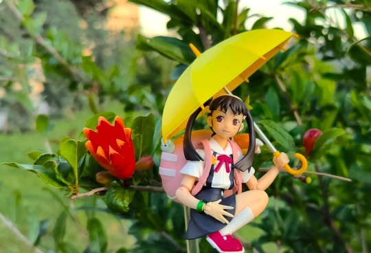
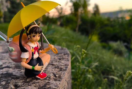
Figma Weiss is nice
#action figures#toyphotography#action figure photography#figma#weiss schnee#rwby weiss#figma figure#rwby
40 notes
·
View notes
Text
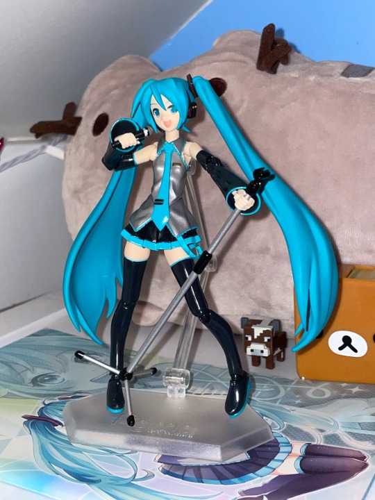
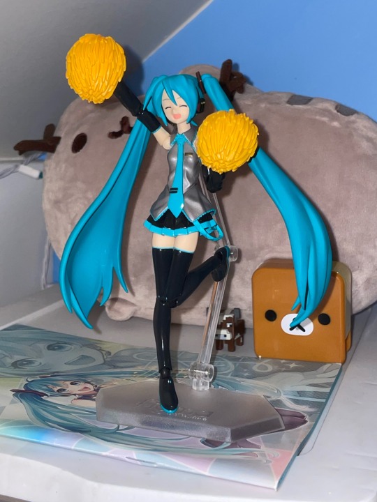
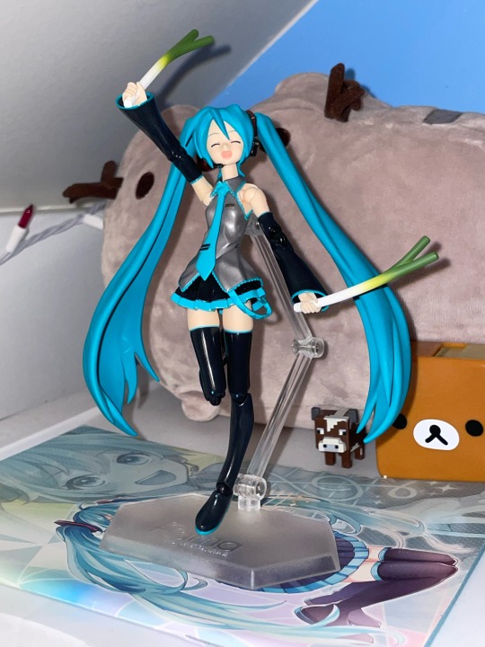
Figure review: Hatsune Miku figma Cheerful ver !!! I got this one along with the nendoroid version(*´ω`*) This is one of my new favourite figures :D I love how poseable it is, and the accessories are super cute as well~♡ It mainly has the same accessories as the nendoroid, but with one less face option and way more hands. I love this figure!!! 10/10
#anime figure#figure collection#figma#figma figure#miku figure#miku#hatsune miku#miku hatsune#vocaloid#vocaloid miku#anime#animecore#otaku#otakucore#kawaii#2000s anime
49 notes
·
View notes
Text
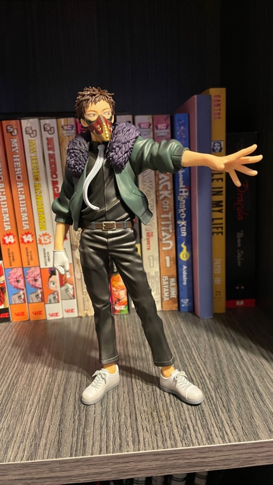
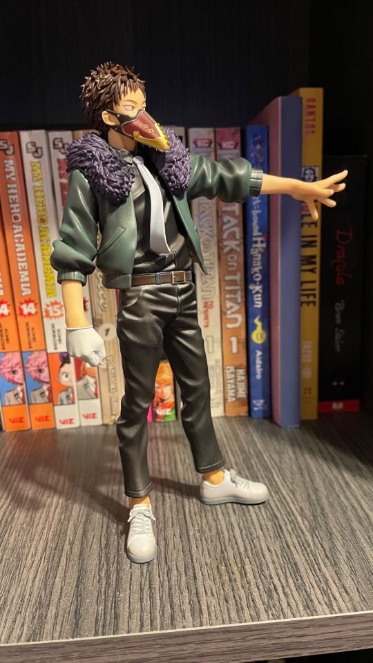
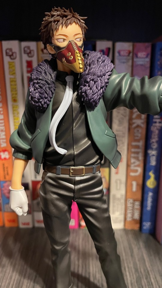
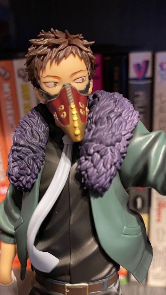
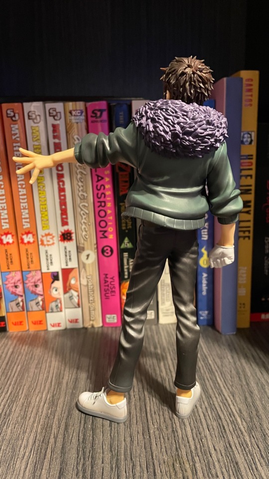
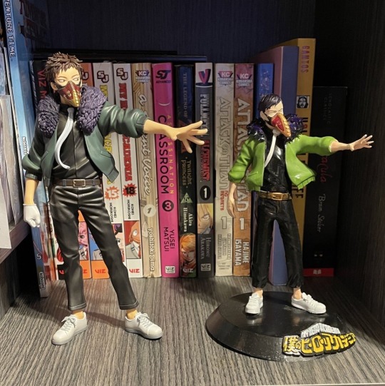
i ordered the newest chisaki figure and he arrived yesterday so I thought this is the perfect way to revive this account. Apparently the Kai in the last picture on the right (which is the first Kai I’ve ever owned) was a blueprint for this most recent Kai. I think someone grabbed the blueprint and was cheaply making 3D printings of him and then hand painting them because only a very select few of them exist. That’s why he looks so low quality compared to this officially produced Kai.
Anyway, as for posting writing, I have a submission from anon that I am now able to work on since my sophomore year of college has ended and I am finally on vacation. Don’t worry anon 🧪 I saw you 😭 and sorry about that. Your brain is very large.
#bnha#bnha overhaul#mha overhaul#asks open#overhaul#治崎廻#bnha chisaki#chisaki#chisaki kai#kai chisaki#mha chisaki#mha#chisakikai#chisaki overhaul#mha kai chisaki#kaichisaki#anime figure#figure collecting#scale figure#figma#figmadesign#figma figure#3d printing#overhaul figure#chisaki kai figure
38 notes
·
View notes
Text
Two sides, same coin

162 notes
·
View notes
Text
Use Your Words 🤖☕️

#Plastic Robots#Robots With Coffee#Toy Photography#Figma#Figma Figure#Legend Of Zelda#LOZ#Skyward Sword#LOZ Skyward Sword#Link#LOZ Link#Skyward Sword Link#Transformers#Transformers Generations#Swerve#MTMTE Swerve#MTMTE#Lost Light#Maccadam
32 notes
·
View notes
Text

I really want figmas of the Squid Sisters like these Off the Hook ones
#I would sell my soul for squid sister figma#i’m mentally unwell#smolldust#smolldust rambles#splatoon#figma#figma figure#off the hook#the squid sisters#squid sisters#callie cuttlefish#marie cuttlefish
22 notes
·
View notes
Text

#tears of the kingdom#totk#legend of zelda#figma figure#link#totk link#loz#tloz#they removed his precious smile 😭
55 notes
·
View notes
Text

madoka !
16 notes
·
View notes
Text
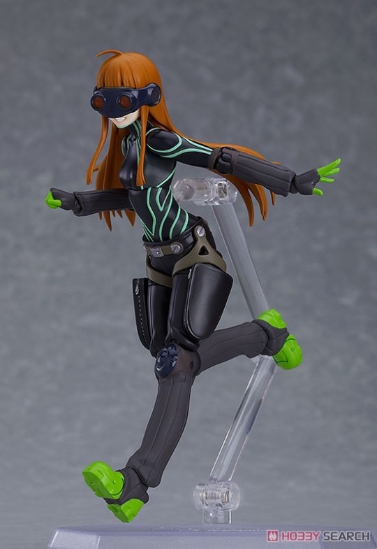


#futaba sakura#sakura futaba#persona 5 royal#persona 5#persona#persona series#figma figure#figma#anime figure#figure#oracle persona 5#persona 5 oracle
120 notes
·
View notes
Text


By Max Factory
59 notes
·
View notes
Text

Every time I lean back in my chair to stretch, I look up at the ceiling and see this
#scared Eren#eren jager#eren yeager#eren jaeger#snk#aot#shingeki no kyojin#attack on titan#figma figure
18 notes
·
View notes
Text
so @caranoelle and i got our hands on akechi and joker figmas at the convention we went to last week

#im still not the best at posing them so we just tried to recreate the handshake from akechi's rank 1#the post it was a last minute add from me LMAO#also fun fact since jokers an older model his proportions are a little bit different from akechi#who just came out like. this past year#so joker's figure is slightly taller than akechi and its kind of hilarious#persona 5#persona 5 royal#shuake#figma figure
54 notes
·
View notes
Text
jsdfoerkrmjngo

hi sorry for not uploading anything but my raidou figma arrived IM SO HAPPY imagine trying to be cinematic with an ipad. not just that an ipad MINI.
#figma autocorrected as sigma#sigma male raidou! so skibidi#figma#figma figure#raidou kuzunoha#smt#shin megami tensei#devil summoner#i forgot i had a tumblr#certified ipad kid
16 notes
·
View notes
Text
processos zzzz / process zzzz
[ br / eng ]
[um pequeno processo criativo/meu primeiro projeto oficial]
lição mágica aprendida hoje: contraste.
˚✧ antiseptic ݁ ੭
BR :
⎯⎯ o processo criativo é a parte mais divertida de um design, as cores, fontes, formas, texturas, tudo é tão bom que me derreto por essa área ♥︎ fico extasiada em como os embasamentos realmente funcionam na prática.
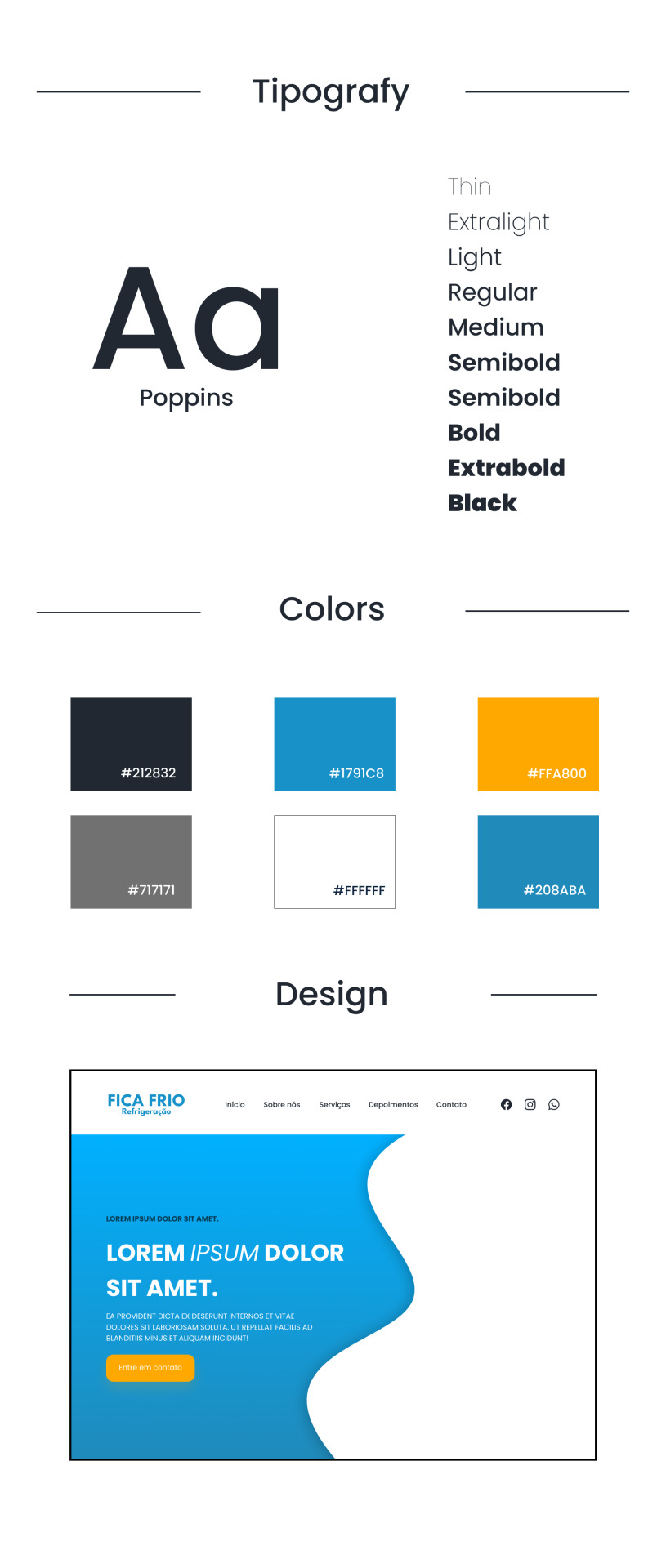
meu PRIMEIRO projeto consistia em fazer um site de refrigeração nas cores azuladas, confesso que odeio não poder encher de símbolos e formas (tirem o figma de mim), mas trabalhar com estilos diferentes me fez refletir como os clientes veem o mundo, então decidi tentar! 𓆩♱𓆪
e o meu primeiro cliente foi meu pai! 🖤

pequenas explicações
é apenas a teoria do que pensei, não é necessário ler~
/⠀ ⠀TIPOGRAFIA ⠀⠀ 〜 ♱
𓏲 pesquisei diversas fontes, precisava de algo que não fosse retangular, mas não fosse tão redondo, apesar do aspecto profissional que eu quis passar. a psicologia por trás da forma redonda é bem simples: círculos são associados a suavidade, absoluto, movimento e facilidade, mas não exagere. nenhuma forma deve ser exagerada, isso causa a impressão de mal feito e afastamento, é necessário equilibrar para uma fórmula bem feita. ⛧
/⠀ ⠀CORES ⠀⠀ 〜 ♱
de fato, essa foi a parte mais fácil. a paleta de cores predominante é o azul, o que traz uma sensação de frieza, frio, gelo, tudo o que queremos, certo? (sim.) por se tratar de uma marca de refrigeração, não escolhi o preto como a cor das fontes, mas sim uma cor acinzentada, fugindo do padrão. o laranja foi escolhida por conta do círculo cromático das cores, ou, a velha teoria das cores.

fonte: sla peguei no google / https://blog.adobe.com/br/publish/2022/03/30/como-usar-o-circulo-cromatico-com-o-adobe-color-super-facil
─ é nítido que o azul e o laranja são cores contrárias, então, por que elas parecem tão harmonicas juntas? porque são cores complementares. um pequeno resumo: as cores complementares são aquelas que dão contraste uma a outra, um exemplo interessante é a rapunzel de enrolados, você percebe que a paleta de cor predominante nela é o roxo e o amarelo, pois são cores que se contrastam, ficando assim de forma harmonica.
,⠀cinza e branco: são cores análogas, estão presentes lado a lado no círculo cromático, o resultado é uma cor básica. (imagine aquele seu amigo que fala, aff isso não é roxo, é violeta! entao, é isso...) (eu sou essa chata, ok?) (voce nao pode falar que rosa choque é igual rosa ou eu irei atrás da sua familia) ☆
/⠀ ⠀CONCLUSÃO, uau ⠀⠀ 〜 ♱
é necessário durante a criação pensar no contraste das cores e dos elementos, as formas arrendondadas precisam ser equilibradas com formas retangulares de forma positiva, elementos que normalmente se dão bem juntos são aqueles que se contrastam, é muito interessante pensar em como é necessário dar atenção aos mínimos detalhes. o contraste é uma das ferramentas mais poderosas do design, se utilizada corretamente.
errr, sobre o site? ele continua na fase de programação, mas caso o post tenha uma repercussão boa, eu trarei ele com seu resultado. obrigada a todos que leram até aqui, um comentário e corações me deixariam muito feliz ♡
dúvidas, sugestões ou críticas? me mande um ask, ele está aberto para qualquer tipo de coisa que tenha surgido durante o post. ♥︎
ENG :
[a small creative process/my first official project]
magical lesson learned today: contrast.
⎯⎯ creative process is the most enjoyable part of design, the colors, fonts, shapes, textures, everything is so good that I melt for this area ♥︎ i am ecstatic about how the foundations really work in practice.
my FIRST project consisted of creating a cooling website in shades of blue, i confess that i hate not being able to fill it with symbols and shapes (take figma away from me), but working with different styles made me reflect on how clients see the world, so I decided to try! 𓆩♱𓆪
and my first client was my dad! 🖤
small explanations
it's just the theory of what I thought, no need to read~
/⠀ ⠀COLORS ⠀⠀ 〜 ♱
indeed, this was the easiest part. the predominant color palette is blue, which brings a sensation of coolness, cold, ice, everything we want, right? (yes.) as it's a cooling brand, I didn't choose black as the font color, but rather a grayish color, deviating from the norm. orange was chosen due to the color wheel theory, or, the old theory of colors.
font: idk, got it from google / https://blog.adobe.com/br/publish/2022/03/30/como-usar-o-circulo-cromatico-com-o-adobe-color-super-facil
─ it's clear that blue and orange are opposite colors, so why do they look so harmonious together? because they are complementary colors. a brief summary: complementary colors are those that contrast with each other, an interesting example is rapunzel from tangled, you notice that the predominant color palette on her is purple and yellow, because they are contrasting colors, thus appearing harmonious.
,⠀gray and white: they are analogous colors, present side by side on the color wheel, resulting in a basic color. (imagine that friend of yours who says, ugh, this isn't purple, it's violet! so, that's it...) (i'm that annoying person, okay?) (you can't say that hot pink is the same as pink or I'll go after your family) ☆
/⠀ ⠀CONCLUSION, wow ⠀⠀ 〜 ♱
it's necessary during creation to think about the contrast of colors and elements, rounded shapes need to be balanced with rectangular shapes positively, elements that usually work well together are those that contrast, it's very interesting to think about how attention to the smallest details is necessary. contrast is one of the most powerful tools in design, if used correctly.
uhh, about the website? it's still in the programming phase, but if the post has a good reception, i'll bring it with its result. thank you to everyone who read this far, a comment and hearts would make me very happy ♡
questions, suggestions, or criticisms? send me an ask, it's open to anything that came up during the post. ♥︎
#designgraphic#design#design ux#design ui#designinspiration#website#web design#art process#colors#theory#disscussion#brasil#english#creative#art#digital art#my art#aesthetic#figma#figmadesign#figma figure
10 notes
·
View notes
Text
Do You Think Chozos Traded With Cybertronians? 🤖☕️


#Plastic Robots#Robots With Coffee#Toy Photography#Figma#Metroid#Metroid Other M#Samus Aran#Transformers#Transformers Generations#Swerve#MTMTE Swerve#Maccadam#Figma Figure
27 notes
·
View notes
Text
30 notes
·
View notes
Last Seen Blogs

icewarriortony
Thriller writer, Polar traveller

berza
beginner moodboard makers

lokissesimagines
Sad Loki

cuik
I Am TALKING

mateo-franco00
Sin título