#Good luck everyone!!!
Text


Fucking hate this game.
-
(also, reminder!!! There is currently a boycott going on towards Disney! TWST is a Disney property, so while I understand the temptation to buy in game money to pull for the characters, make sure to educate yourselves on the current issues going on.)
#twisted wonderland#twst#my art#lily doodles#twst fanart#twst book 7#malleus draconia#azul ashengrotto#idia shroud#twst grim#so excited for book 7 aaaa#i know the basics from the jp fandom but im hype to read for myself#good luck everyone!!!
86 notes
·
View notes
Text


🔥🌸CHARACTER COMMISSION RAFFLE NOW OPEN🌸🔥
ENTER FOR YOUR CHANCE TO WIN!!
🌸One Grand Prize winner + Two second prize winners
🌸Entries $3 each
🌸until Monday Feb 6th at 6:00 PM CST
🌸Check out examples and T&C’s for details
🌸questions welcome! comments/reblogs appreciated 💕
KO-FI LINK
PayPal and Venmo: @rfarrowster
44 notes
·
View notes
Note
Childe banner in half an hour!!! Wish me luck for polar star, best boy deserves his weapon <3<3 and good luck to everyone else pulling, may our dumpster ginger come home 😌 -(invisible) seal anon
oh gosh now that you say that i remember i got asked for a catalyst im so sorry i forgot!!!! heres a quick minute mini childe, i hope he brings all of you childe and/or polar star wanters good luck, sorry for being late!! 🥹

42 notes
·
View notes
Text
i'm going to be pacing around the house trying not to look at spoilers in the next 3 hours
4 notes
·
View notes
Text
In regards to this excellent post, I’d also like to make a post on how I designed my own logo. Zenith’s post gives an excellent breakdown of what elements go into a VTuber logo and things to keep in mind, but not so much how one gets from an idea to a finished logo. So I wanted to share my process, which goes through most of the basic process I learned while studying graphic design in community college.
Before doing anything else, I had to do research. I knew the general style I was going for; I wanted to evoke the y2k aesthetic, or at least somewhere in the late 90s/early 2000s. In particular I wanted to evoke the bright, optimistic aesthetic of certain games I played as a kid (DDR, late 90s to early 2000s Sonic games, Kirby Air Ride, etc.), as well as the Eurobeat music genre, which I’m a big fan of and is part of my overall “theme”.
(Granted, I mostly find myself streaming gothic horror-esque games, but... A bitch can contain multitudes)
So with these ideas in mind, I spent a lot of time looking at y2k graphic design, researching different logos (for example, I looked at some racing logos as well), and eventually I put together an inspiration sheet with logos I wanted to evoke. Not all of these are from the same period, but they have a lot of similar vibes
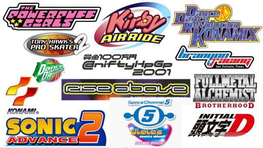
Do you see some of the common elements? Text in dense blocks, lots of bold outlines, often a sense of motion, blobby geometric shapes, sans-serif fonts, bright colors. These were some of the things I wanted to keep in mind for my logo.
With my research done, it was time to design the emblem. I really like motorcycles, and they’re... technically supposed to be part of my theme even though I always forget to post about them... So I wanted my emblem to be a motorcycle helmet. (This also fits in with the eurobeat theme, since racing and driving fast is a common theme of eurobeat lyrics, albeit usually about cars and not motorcycles lol.) I sketched out a few variations on what I had in mind.
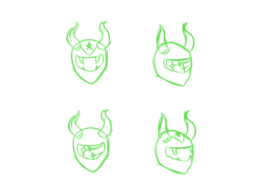
I incorporated my horns into the design, since they’re a big part of yknow, me. I also tried a few different decorative elements; The shooting stars are a motif sometimes seen in y2k graphic design, and the fangs are meant to emphasize the demon thing. As for the triangle stripe with the star, it’s meant to evoke the flag of Puerto Rico, but also has a classic racing flair.
After examining the various options and getting input from my friends and family, I settled on the design on the lower right. Next step was doing the black and white lineart.
This is a really important step. A good logo should, ideally, work in plain black and white. Even if you’re limited to just one color, your logo should be readable; This can be useful for things such as printing, stickers and T-shirts, things like that. Ideally you should be able to slap your logo on anything regardless of technical limitations. Am I, or you, necessarily going to do these things? No, but it’s good to be prepared anyway. You never know! So it’s always good to have a black and white variant of your logo.

This is the design I ended up with. In keeping with the y2k/late 90s/early 2000s style, I used bold lines with heavy weight variation, rounded corners, and a double outline. Now if I were really trying to be professional about it, I would have done it in a vector program rather than Medibang Paint, but I fucking hate vector programs and the only person who needs the files here is me, so I can afford to be sloppy. There’s programs out there that’ll let you vectorize black and white images anyway, so eh.
Next, it was time to add color to the emblem. Again, I had a bunch of different options, so I made several variations and asked for input from my friends and family. (I also put the BW version in the corner for reference.)
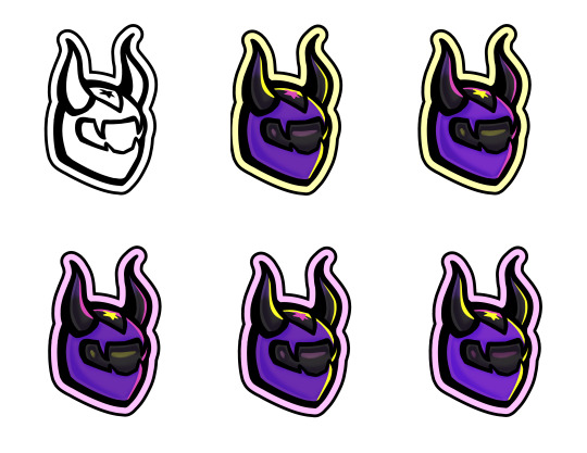
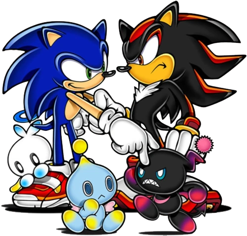
I already had some standard colors I use in my model and my graphics, so it was really just a matter of deciding how to arrange them. By the way, you can really see in the shading just how much inspiration I took from 2000s Sonic the Hedgehog art! Don’t be afraid to take inspiration from things that mean a lot to you, or... Well, inspire you, lol.
Once again, I ended up choosing the last variation as my winning design. With the emblem done, the next step was choosing a font. Zenith’s post already has some great notes on choosing fonts, so I won’t go into too much detail there, but once again I chose several options and asked for input. Getting feedback from others is a really important part of the graphic design process. It helps you to learn what works and what doesn’t, especially when other people may have different backgrounds than you (Is one of your friends colorblind? Does your art effectively convey its message to someone who doesn’t have the same knowledge of design history? Etc).
I actually chose 15 different font options, but for the sake of brevity I’ll just show four of them.
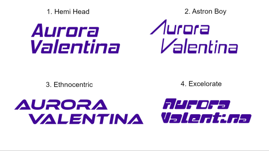
In general it’s good practice to do variants in regular caps, no caps, and all caps, but I didn’t do that because uh... I don’t remember why. Anyway, I largely looked for y2k or racing fonts. Admittedly Excelorate is super cute, but I ended up going with Hemi Head, because it’s nice and readable. I believe it’s a popular font in the Eurobeat world as well? I know Odyssey uses it in her graphics sometimes, at least. In any case, it looks nice, it’s not too generic, and it’s really easy to read.
After choosing both an emblem and a typeface, it was time to combine them both into a logo. Again, I started with black and white, both because it’s useful to have and it’s also just easiest to add color later on.

I spent quite a lot of time fiddling with spacing and such to get it to look neat and tidy. I added a line at the bottom to add balance to an empty space, as well as a sense of motion. To tie it all together, I encapsulated it all in that big chunky outline we’ve seen so much of.
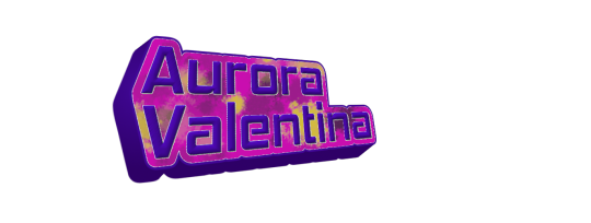
Finally, color. Since I already had a colored version of the emblem, it was pretty easy to build the rest of the logo’s colors from there. I incorporated the purple and pink gradient I’ve used for header text in a lot of my existing graphics, and again I added a fun outline, and... That was it! The logo was finally finished!

Now, I’m not claiming it’s the most perfect logo in the world. I’m sure there’s things to criticize about it, and plenty of people who just won’t find it appealing. But I think it looks alright, and above all else, I hope this breakdown of how I went from square one to a finished logo is helpful to those of you who may be looking to design your own. I encourage you to do other research as well, and again, to check out Zenith’s excellent post on VTuber logos. (It’s worth noting as well that VTuber logos often have a particular look to them that I personally chose not to go for, but Zenith’s tutorial does a good job of explaining how to achieve that look.)
As a bonus, here’s this thing I made while messing around and trying out different techniques that ended up looking hilariously like the iCarly logo, lmao.
#VTuber#ENVTuber#Graphic design#I hope this is helpful idk if it is but I tried anyway#Good luck everyone!!!
2 notes
·
View notes
Text
The squad of all time has arrived on scene.
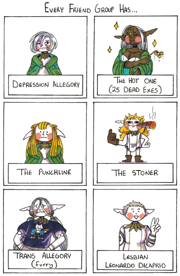
#dungeon meshi#mithrun#Cithis Ofri#Pattadol#Fleki#Lycion#Otta#Happy Canary Debut Day! These guys wont really get to be very present until the next season of Dungeon Meshi#But I can still be excited to see them animated!!!#Shout out to Pattadol - I also tend to occupy 'The Punchline' niche of the friendgroup.#The punchline differs from 'The Jester' who willingly absorbs the jokes. The punchline is often unwillingly the joke.#You are either the one no one likes or the well beloved little-sibiling-esque friend. Good luck figuring out which!#Yes it is canon that Otta is into Women. YES she dates younger women and dumps them when they age.#This isn't a fan made bit. It's real.#Dungeon Meshi has no romance but it does have canonically queer characters.#Shipping is fine and all but it is a running theme in the series than *everyone* who expresses romantic interest in someone -#-finds that love unrequited. Just something to be mindful of to measure your expectations of this series!#Ah! In other housekeeping notes; I'm going to *try* and add Alt Text to my dungeon meshi thurday posts going forwards.#I might not be able to do it day of but I will try to get it done within a week.
10K notes
·
View notes
Text
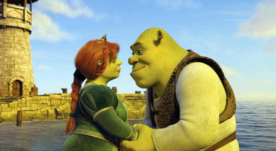

#mf ship bracket#mf ship bracket 2023#round 1#shrek#shrek x fiona#shrek fiona#kylo ren#rey#reylo#star wars#i have a no kissing img policy and the other intimate pic i could find was ? rey being dead 😭#ME SITTING THERE LIKE WHAT DO I DO….?#anyway. ngl this was the funniest one simply cuz i was doing the matchup system and realizing these two would be pit against each other.#sent a genuine shockwave thru my body ngl.#good luck everyone .
77K notes
·
View notes
Text
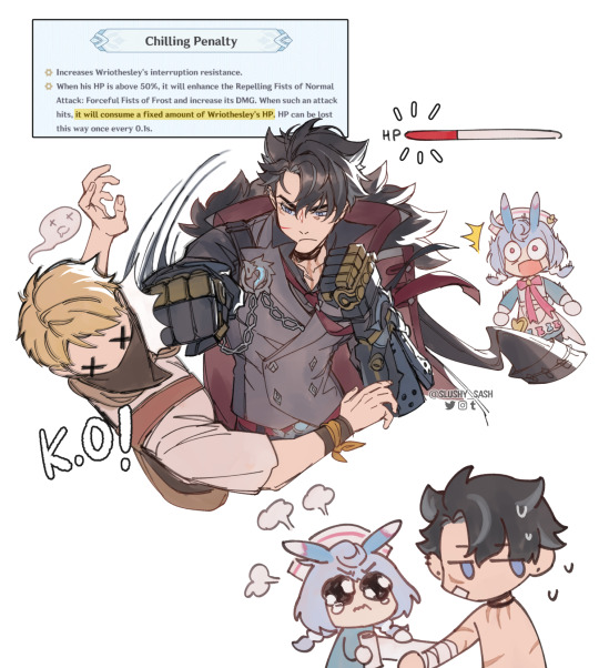
please take care of yourself, your grace!
#knowing sigewinne will most likely be a healer yall KNOW i will put them in a team together#also good luck to everyone pulling for wriothesley!!#pls take care of him for sigewinne's sake#genshin impact#genshin#fontaine#wriothesley#sigewinne#my art
11K notes
·
View notes
Text
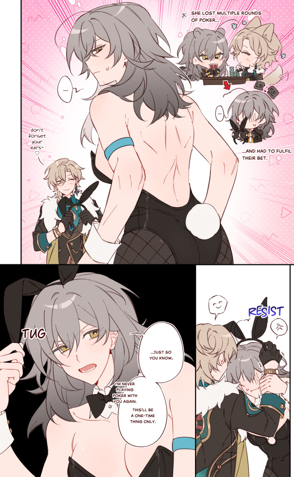

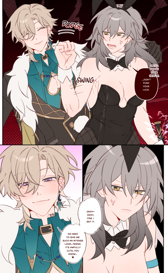
bunny suit
#honkai star rail#my art#mildly annoying aventurine nd wary stelle is my fav dynamic#the idea of someone who usually dgaf (stelle) being so riled up by an annoying mf is so funny to me#so called chill mfs when a real yapper turns up to the party#also good luck to everyone pulling tmr ! hope u all win ur 50/50s
3K notes
·
View notes
Text

Two kinds of ossan
#sketch#Honkai Star Rail#Welt Yang#Imbibitor Lunae#Jing Yuan#Yanqing#I've always wanted to draw Jing Yuan like that#licks elbow#good luck to everyone pulling for Imbebetor Lunae!#Fanart
14K notes
·
View notes
Text
Who is ready for The Grand Festival ?

Hey, wait a minute... who invited this guy?
#splatoon#splatoon 2#octo expansion#commander tartar#splatoon 3#grand festival#grand fest#team past#my art :o]#my magnum opus#going all out with the drip#would've been real funny if The Grand Fest was sponsored by Kamabo Co.#I'm actually Team Present but I really *needed* to draw this#I hope everyone will have a wonderful time with The Grand Fest 🤝 good luck to all who participate 🤝
2K notes
·
View notes
Text


It's only me and you in this cruel world walking radiator
#pokemon#i like the dawn is akari and imagine finishing your adventure and then arceus is like wham bam good luck id be a hater too#the '0' suprise face everyone makes is so cute its like !!! then neutral again#love my cringe fail fire weasel who i keep picking fights with overleveled frenzies with ur doing great buddy#they kept saying youll die out there I DARE YOU SHE WOULD DESTROY YOU ALL#i only just got to the autumn place i love exploring and side quests
1K notes
·
View notes
Text

tiger tiger shenanigans ft. a wild laios
close ups under the cut!

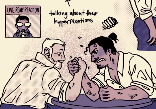


#tiger tiger#tiger tiger comic#ludovica bonnaire#remy bonnaire#jamis arlesi#arno tiger tiger#luck tiger tiger#sausage tiger tiger#honeyfoot tiger tiger#my art#laios dungeon meshi#webcomic fanart#not sure if ludo and laios would be besties or worsties but the conversations would be interesting hehe#also everyone go read this comic right NEOW if u haven’t it is so so good
2K notes
·
View notes
Text
Redraw from a piece last yr once again folks and this time with the noceda siblings!
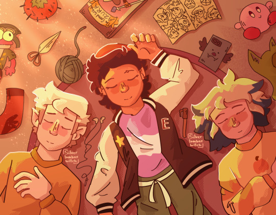
#ALSO FIRST POST OF THE YEARRRR HEYYYAAA#I haven’t drawn since last year#Lololololol#new years resolution is to get better at color theory and get more confident on drawing faces#Maybe even learn a bit of aniamtion#Anyway ways good luck to everyone out there in their future endeavors!#The owl house#toh#luz noceda#hunter#hunter noceda#vee noceda#noceda siblings#art redraw#My art#fanart#silverlombaxwitch
3K notes
·
View notes
Text
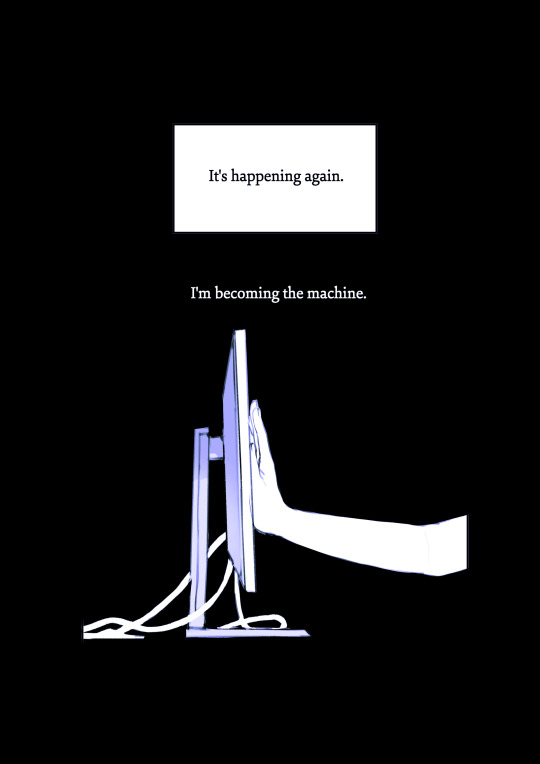
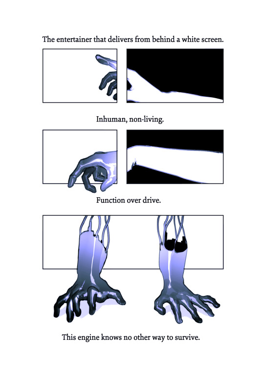
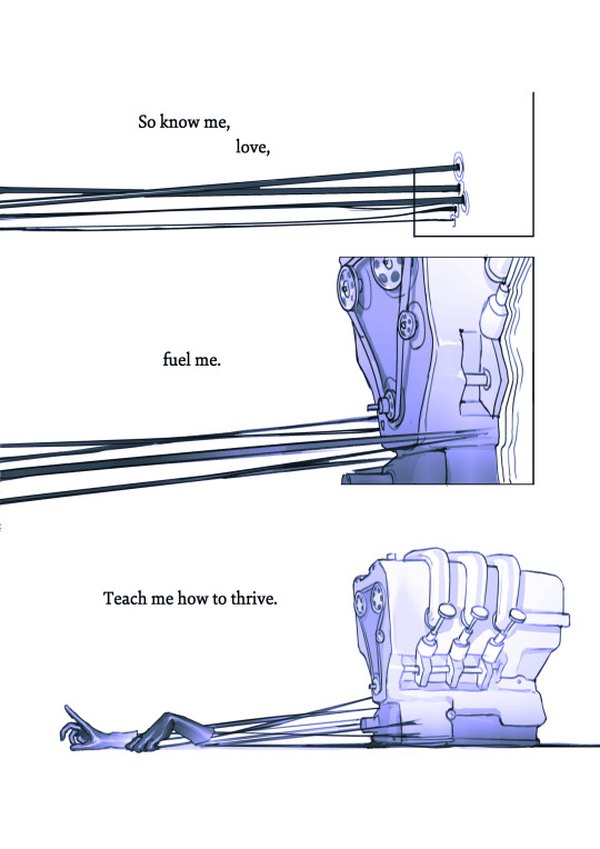
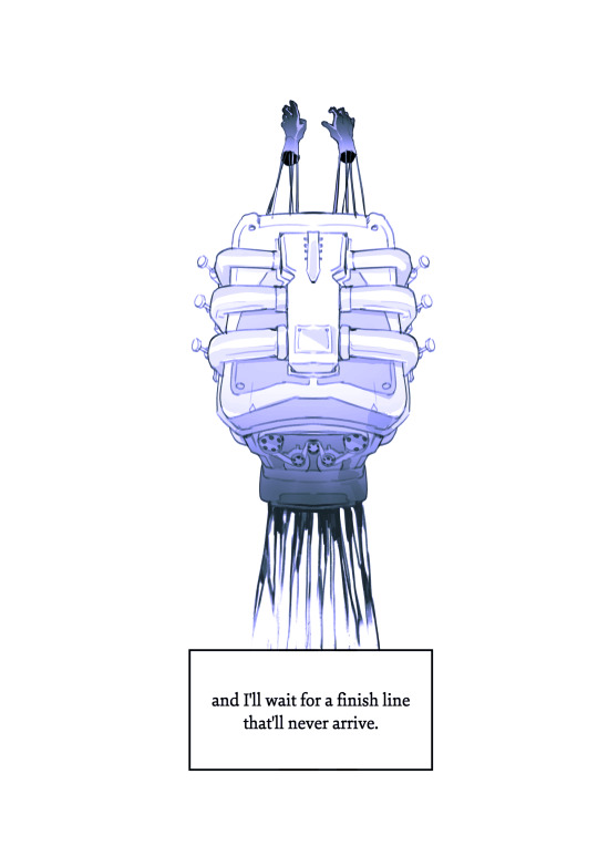
the machine.
a comic about being a 'creator' online.
creative notes:

#in light of recent online 'success' i feel like this may come off as ungrateful#just wanna say that all the comics i make in this series are written about experiences i felt in 2022#which was a rough year personally and creatively#and i very luckily don't feel this way anymore#and this also isnt to shame anyone who DOES feel this way#its easy to start to feel like all you are is a vending machine of art#and like thats all you are to people#theres nothing human to you#it can be a bit of a pit#and on some level this damage is self inflicted but social media really doesnt help that feeling#this wont work for everyone but having friends around you who you can talk to about stuff that ISNT art#going outside for dinner#maybe walking around#its good for when you need that feeling to go away even a bit temporarily#youre a human being#not a mindless content creation machine#and i hope anyone who feels like this now can get to a place where they have a healthier relationship with their own work#good luck to all of you#and thank you for reading#comic art#its 10pm#stillindigo art
14K notes
·
View notes
Text
sillies!!
#spy x family#sxf#damian desmond#anya forger#damianya#my art#fun fact the notebook he's holding was my fav kind of notebook when i was in middle school JSDFKL#my 2 reasons for giving it to him are: its the same color as the sxf volume bgs. and. i really liked it so#i bestowed it upon him w great joy#also THE INTERVIEW WENT WELLLLLL IM IN IM IN AND IM HAPPY ABOUT IT#THANK YOU EVERYONE FOR THE GOOD LUCK WISHES M W A H
2K notes
·
View notes
Last Seen Blogs

753401249
قناة احلام مصرية
day-gone
Rocket

askmanagertoto-blog
Ask The Manager of The Indigo-Go's Band

lucifer-chloe
wow! look at her now.

fathers-figure2
Father's Figure 2