#Haas Type Foundry
Text


Typography Tuesday
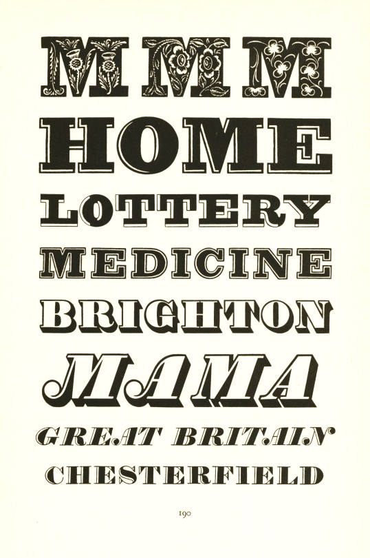
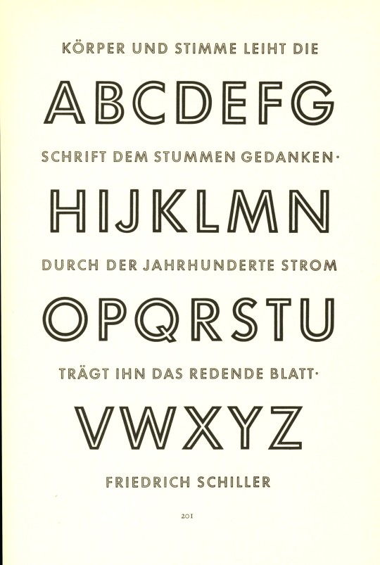
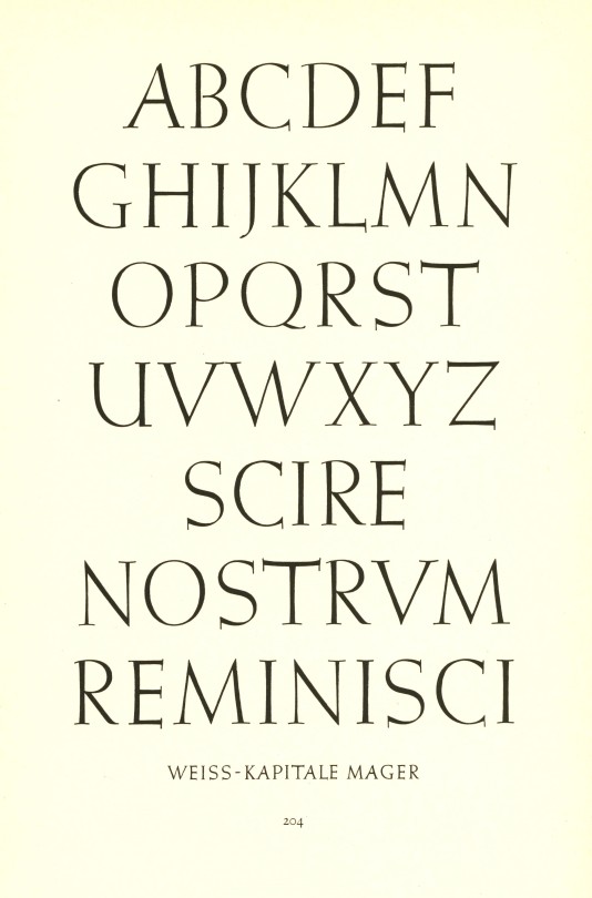
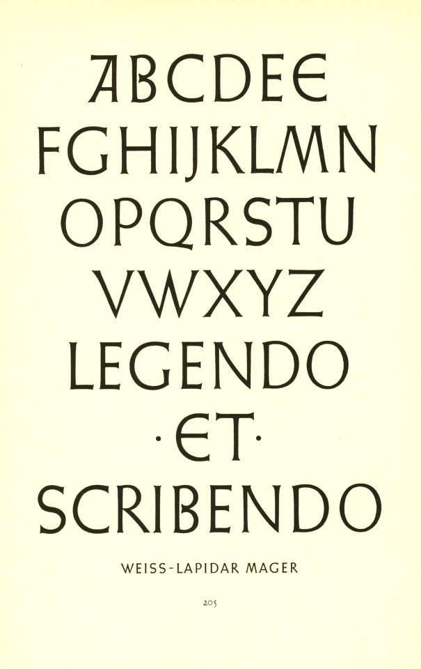
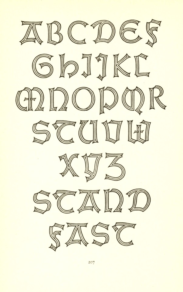
Meisterbuch der Schrift is German-Swiss book and type designer Jan Tschichold's 1952 textbook on historical and contemporary type design published in Ravensburg, Germany by Otto Maier Verlag. From top to bottom:
Type samples from early 19th-century English fashion publications.
Playbill from Stephenson Blake & Co., Sheffield, England.
Futura by German designer Paul Renner, 1927.
Futura Light, also by Renner.
Two sets of capitals by Emil Rudolf Weiss for the Bauer Type Foundry.
A shadowed Weiss Gothic by Emil Rudolf Weiss.
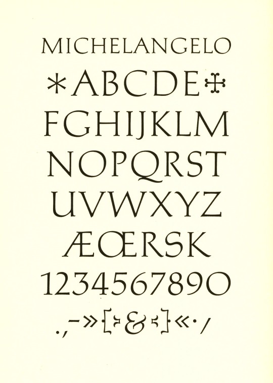
Michelangelo by Hermann Zapf for the Stempel Type Foundry, 1950.
Sistina by Hermann Zapf, also for Stempel, 1951.
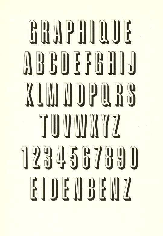
Graphique by Hermann Eidenbenz for the Haas Type Foundry, 1945.
Jan Tschichold (1902-1974) was one of the most noted type and book designers of the 20th century. He is remembered most for his two-year stint with Penguin Books (1947-1949), during which he established Penguin’s characteristic design identity, and for his typefaces Transit (1931), Saskia (1931/1932), Zeus (1931) and Sabon (1966/1967).
View more posts with work by Jan Tschichold.
View more Typography Tuesday posts.
#Typography Tuesday#typetuesday#type designers#Jan Tschichold#Meisterbuch der Schrift#Otto Maier Verlag#type display books#type specimen books#type design#20th century type
41 notes
·
View notes
Text
Helvetica: A Deep Dive into the World’s Most Ubiquitous Typeface
Helvetica, a typeface synonymous with clarity and modernity, reigns supreme in the world of design. Its widespread use, from iconic brand logos to everyday signage, speaks volumes about its enduring appeal and versatility. This blog post will explore the origins, characteristics, and lasting impact of Helvetica, tracing its journey to becoming a global design phenomenon.
Swiss Origins and Design Philosophy
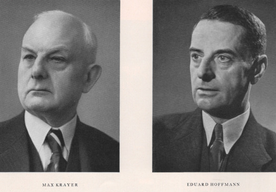
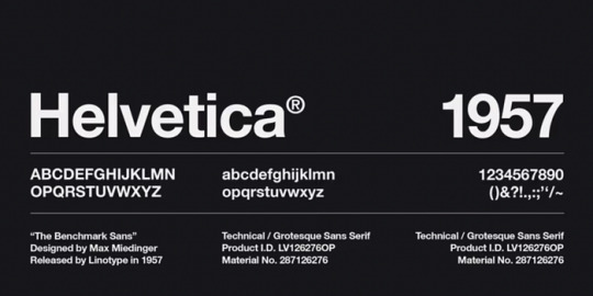
Helvetica emerged from the heart of Swiss graphic design in 1957, born from the collaboration of Max Miedinger and Eduard Hoffmann at the Haas Type Foundry. Switzerland, renowned for its precision and efficiency, provided a fertile ground for this revolutionary typeface to flourish. At its core, Helvetica embodies the principles of the International Typographic Style (also known as Swiss Style), which emphasized cleanliness, readability, and objectivity. This movement embraced the use of grids, sans-serif typefaces, and asymmetrical layouts to create balanced and harmonious designs.
The Making of a Masterpiece: From Neue Haas Grotesk to Helvetica
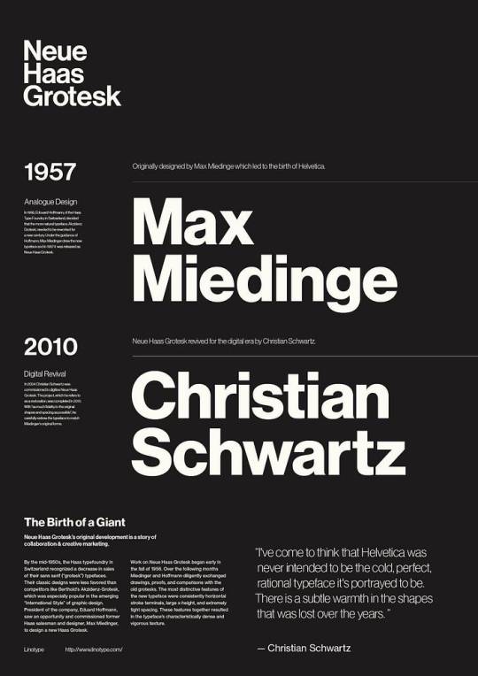
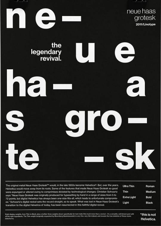
Helvetica’s journey to becoming a global icon involved a series of pivotal moments. Initially christened Neue Haas Grotesk, the typeface was a refined interpretation of the earlier Akzidenz Grotesk typeface. In 1961, Stempel, the parent company of Haas Type Foundry, strategically renamed it Helvetica, meaning “Swiss” in Latin, to broaden its appeal in the international market. This decision proved to be a masterstroke, as Helvetica rapidly gained traction worldwide.
Anatomy of Helvetica: Decoding its Visual Language
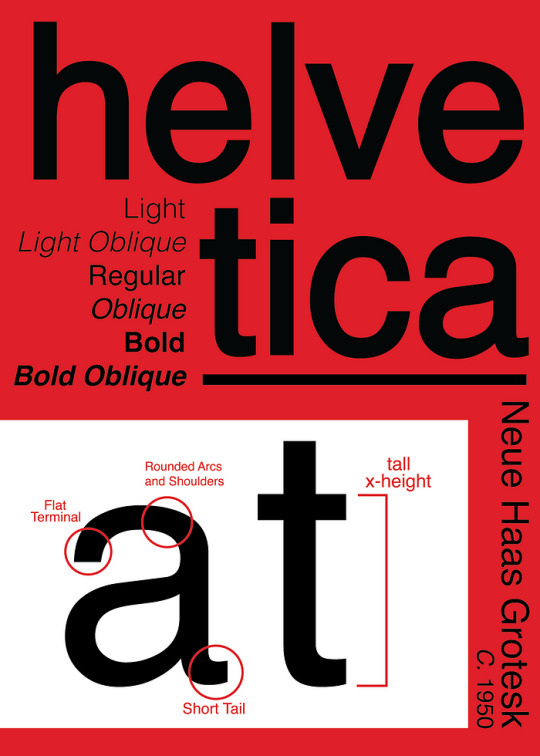
Helvetica’s enduring allure lies in its meticulously crafted letterforms and distinctive characteristics. Its simple, geometric shapes and uniform stroke widths contribute to its exceptional legibility. Key features include:
Minimal stroke contrast: The difference in thickness between the thickest and thinnest parts of a letterform is subtle.
Horizontal and vertical cut-offs: The ends of strokes are cut straight, creating a clean and crisp appearance.
Tight spacing between letters: Letters are set close together, resulting in a compact and unified look.
Large x-height: The height of lowercase letters is relatively large, further enhancing readability.
Closed apertures: The enclosed spaces within letters like ‘a’, ‘e’, and ‘o’ are relatively small.
These carefully considered details work in harmony to create a typeface that is both aesthetically pleasing and incredibly functional.
Helvetica’s Enduring Legacy: A Testament to Timeless Design
Helvetica’s influence on the world of design is undeniable. Its neutrality and versatility have made it a go-to choice for a wide range of applications, from corporate branding to transportation signage. Iconic brands like Knoll, American Airlines, and Panasonic have all harnessed the power of Helvetica to communicate their brand identities effectively. The typeface’s presence extends beyond the corporate world, finding its way into film title sequences (Goodfellas, Split, Alien) and even becoming the official typeface of the New York City subway system. Helvetica’s ability to transcend cultural boundaries and resonate with audiences worldwide is a testament to its timeless appeal. As Wim Crouwel, a renowned typographer, aptly stated, “The meaning is in the content of the text and not in the typeface, and that is why we loved Helvetica very much.”
4 notes
·
View notes
Text
Week 3 Helvetica research
1957 Swiss font designer Max Miedinger collaborated with Eduard Hoffmann to create Helvetica, now one of the world's most popular types. If you don't know what typeface to use, you can use Helvetica.
It was built specifically for the Haas Type Foundry in Münchenstein, Switzerland. Its design is based on the Akzidenz-Grotesk font, and it is known for its clean, uncomplicated, and highly legible form, making it popular in corporate branding, signage, and a wide range of other uses.
One of the real-world case studies on the timeless use of Helvetica is American Airlines. From the late 1960s until 2013, American Airlines’ logo featured Helvetica prominently. The logo was a classic example of Helvetica’s clean, functional use in corporate branding. It consisted of two capital 'A's and a stylised eagle in between, all set in bold Helvetica. Other airlines in the US have to change their typeface for branding due to the change of trends in design or just to fit in more in the modern world but AAL does not have to.
Helvetica's design emphasises neutrality and clarity, with closed apertures and a high x-height, which improves reading. It has been widely utilised for a variety of purposes, including signs for the New York City Subway system and innumerable company logos.
Helvetica has also been altered and developed into several variations and weights, including the release of Neue Helvetica, a revision of the 1983 typeface with a more consistent set of heights and widths.
0 notes
Text
Week 3 SDL: Helvetica movie review
Helvetica was a typeface generated by a desire of having a better legibility,It is a modern and very clear type
Rick poynor - design writerHelvetica comes in 1957 where there is felt to be a need for rational typefaces- which can be applied to all kindas of contemporary info whether it is sign systems etc - presenting it in a legible way.
Win crouwel
loves modernism
Clear, readable, straightforward
Uses grid to create order
Helvetica was neutral - meaning being in the context of the text not the typeface
01:08:06
Munchenstein Switzerland
Haas type foundry- where helvetica was born
wouldn't use helvetica to promote a brand or make it pop - it couldn't quite catch the eye 00:39:23
Just like Malboro’s typeface which can be spotted from miles away 00:41:03
0 notes
Text
Helvetica


rough notes
-”Helvetica is like being asked what you think about off white paint it's just there.” (2.10)
-New york city transit signage Massimo Vignelli 1966 (3.20)
-”its like music its not the notes, its the space you put between the notes that makes the music.” (3.30)
-1950s post war idealism attempt to rebuild which becomes the emergence of swiss style with designers such as Karl Gerstner 1957, Armin Hoffman 1959, Max Huber 1957 were experimenting with modernism design.
-1957 helvetica emerges as there felt need for rational typefaces for things such as signs/cooperate identity and this could be done in a legible way. (8)
-using few typefaces to have clear designs and using grids to have order (10.10)
-Helvetica was neutral and that was liked/prefered by some designers.
-Matthew Carter type designer (14.10) horizontal terminals. Original name of Die Neue Haas Grotesk.
-Eduard Hoffman wanted to make a modern version of german 19th century sans serif to make it clean. This was created by Max Miedinger who created helvetica.
-Alfred Hoffman Former Director of Haas Type Foundry (19.00)
-Mike Parker Director of Typographic Development Mergenthaler Linotype USA 1961-1981
-Helvetica is all about the interrelationship of the negative shape the shapes between and within characters.
-haas was a salesman who traveled around switzerland. (21.30)
-stemple hass controlled by lino type
-Otmar Hoefer Director of Font marketing, Linotype
-Bruno Steinert Former managing Director, Linotype
-stemple suggested the name of helvetia which is the latin name for switzerland.making it the swiss typeface.
-Hermann Zapf Type Designer
-Michael Bierut Graphic designer (25.30)
-Life Magazine 1953 visual bad habits of typeface
-Leslie Savan Media Writer government and cooperations love helvetica because on one hand it makes them seem neutral and efficient and on the other its the smoothness of the letters that makes them come off as more accessible, transparent, and accountable which are the key buzz words which these corporations are looking for. (28)
-Tax forms use helvetica, the EPA (environmental protection agency) use helvetica as they want to look clean and official.
-Jonothan Hoefler and Tobias Frere-Jones helvetica is not limited to one thing it can be used for everything which is why it's become so popular. (29.50)
-Gotham Typeface Tobias Frere-Jones 2002 (32)
-its the ultimate typeface
-Erik Spiekermann Typomaniac typography is an extension of words (35.20)
-Helvetica was good at the time but has now become the default typeface.
Erik Spiekermann - ”its like air you have to use it”
-1970 reaction against bland sameness (45.30)
Paula Scher - graphic designer/painter that works with type. (46) (48.30)
-post modernism designers where wanting to get away from the clean lines and slickness
-life images of type (53.40)
-Massimo Vignelli 60s company Unimark looking and this unified composition. Looking at expressive, subjective, and irrational new way of designing. (54)
-70s psychedelic type
-80s confused by postmodernism against helvetica
-David Carson breaking the system exciting/emotional to do subjective and interpretive designs (56)
-raygun magazine experimental designs
-Don't confuse legibility with communication (58.45)
-rise of grunge typography for roughly 5 years
-typography was broken
-Erwin Brinkers, Marieke Stolk, and Danny van den Dungen
-modernism in subversive modernist movements such as dadaism, futurism, and surrealism they went against something.
David Carson - American graphic designer and Emigr
-Michael C. Place using ordinary everyday things to get an emotional response (1.06.00)
Max Miedinger creator of Helvetica type
-Manuel Krebs and Demetri Bruni they like restrictions influenced by graphic designers like Brody Carson and then later Joseph work 60s swiss structured design and reduced and refined elements (1.11.00)
Questions
Would you use helvetica in your designs?
Helvetica when it was first created was a revolutionary typeface. I don’t find that there is anything particularly exciting about it. However I can acknowledge that when it was first created it was what everybody had wanted/dreamed of due to its sleek legible qualities, hence why it quickly became a universal typeface. This is still a key point in new design today. So it could be useful for designs that require simple clean cut type. I would consider using helvetica for certain designs but I would tend to lean towards a more artistic, striking typefaces depending on the purpose of the design.
Would you use helvetica for one context (type of work/audience) but not another? Why or why not?
I may lean towards using Helvetica for certain purposes e.g advertising if I wanted a familiar, neutral, and legible look that the viewers/audience would already be comfortable with.
1 note
·
View note
Text
Helvetica
“Its inherent qualities are straightforward,”
Simple, clean, unassuming.
“People don’t even think of it as anything except type,”
“This blankness is its power,”
0 notes
Text
Max Miedinger Magazine Process

Born on December 24th, 1910, in Zurich Switzerland, Max Miedinger was a typeface designer best known for the Neue Haas Grotesk typeface in 1957, later renamed Helvetica in 1960. Without prior knowledge of his soon to be successful breakthrough, Miedinger created a revolutionized typeface for Switzerland design of the 20th century that showcased “clarity, legibility and sobriety.” (DNB, 1).
Earlier in his career, Miedinger continued to perfect his skills in typography by doing apprenticeships in various book offices. He then entered Kunstgewerbeschule (Zurich University of Arts). Afterwards, Miedinger gained employment with Haas Type Foundry as a representative. Miedinger worked under Edouard Hoffman to create a new typeface for Haas.
When Miedinger began freelancing and working independently, he went on to design Haas sans serif typeface, which was renamed Helvetica in 1960. Miedinger died on March 8th, 1980, leaving behind a massive legacy for such an iconic typeface that became a groundbreaking landscape for the 20th century.
Here are my completed wireframes:


Work Cited
Albro, Dotty. “Max Miedinger.” Blogspot.com, 2014, dottysresearchjournal.blogspot.com/2014/05/max-miedinger.html.
“Max Miedinger - Font Designer of Helvetica.” Www.linotype.com, www.linotype.com/522/max-miedinger.html.
“Max Miedinger.” MULTIMEDIAMAN, multimediaman.blog/tag/max-miedinger/.
Publisher. “Font Design - Max Miedinger.” Mediengeschichte.dnb.de, mediengeschichte.dnb.de/DBSMZBN/Content/EN/FontDesign/05-miedinger-max-en.html. Accessed 20 Oct. 2023.
“Max Miedinger, the Man.” Cis2.Westerntc.edu, cis2.westerntc.edu/halee/type/the_man.html. Accessed 20 Oct. 2023.
“Max Miedinger.” Wikipedia, 31 Mar. 2020, en.wikipedia.org/wiki/Max_Miedinger.
1 note
·
View note
Text
Max Miedinger

Max Miedinger est un typographe et graphiste Suisse nez en 1910 à Zurich. Certains reconnaissent ce prénom pour l’une de ses créations typographiques : Helvetica. Miedinger étudie et explore plusieurs emplois en lien avec la typographie pour plus tard devenir graphiste indépendant. C’est d’ailleurs en travaillant chez Haas Type Foundry qu’il réalise un son plus grand projet.
La police d’écriture Helvetica, aussi connue sous le nom Neue Haas Grotesk est créée dans le seul but d’être fonctionnelle et simple à utiliser. Je crois qu’il pertinent de s’informer au sujet de cette police car elle est associée au style internationale Suisse, d’ailleurs, Helvetica est la traduction du mot du mot « Suisse » en latin. Elle a une grande signification dans le monde du graphisme puisque c’est une des polices Sans Sérifs les plus utilisées.
0 notes
Photo

Typography Design Choices:
After deliberating for some time about the final typographic choices after some trial and error, I decided to use two font families that were both a grotesque style. The first one which is applied for “a-feature” writings such as main headings and sub-headings is from the font foundry ‘Pangram Pangram’ where I was thankful to get a free trial of the typeface called Radio Grotesk. I only used the regular font but intentionally as I knew I wanted there to be drastic hierarchy amongst my typography, therefore using a bold for main headings felt too heavy. Having the wide difference in point size created enough emphasis for the aesthetic I was aiming to create. After decided the excessively large page numbers wasn’t the right choice, I settled on choosing a 15pt page number as this would make it a little bit significant than having them smaller than 11pt body copy.
Secondly, I used the typeface Neue Haas Grotesk Text Pro in 56 Italic and 55 Roman. I wanted a slightly more simple grotesk style type choice for the text that would smaller as it was important it had legibility. Thus in comparison to the Radio Grotesk I chose which offers more contemporary curves and letter formations, elevating the overall design.
Links:
https://pangrampangram.com/products/radio-grotesk
https://fonts.adobe.com/fonts/neue-haas-grotesk
0 notes
Text


Typography Tuesday
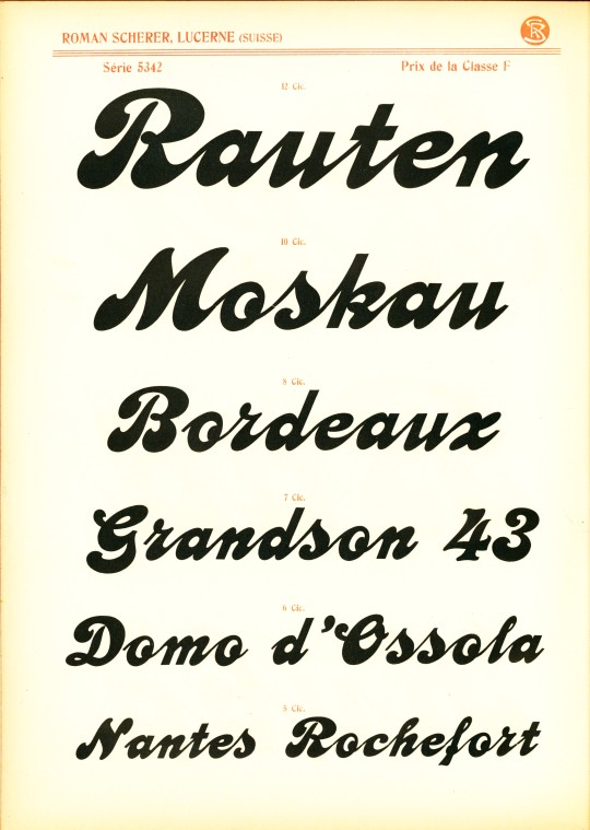
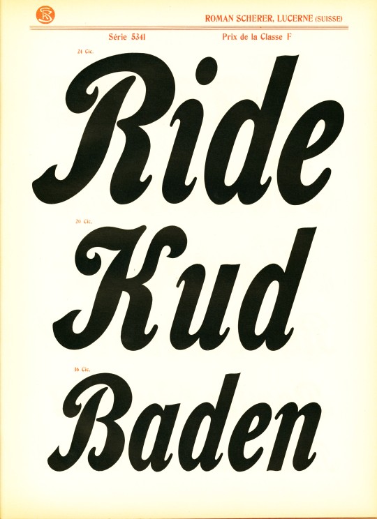
This week we revisit an untitled and undated specimen catalog from the Luzern, Switzerland, wood-type manufacture Roman Scherer (1848-1922), produced ca. 1905. Scherer founded Holztypenfabrik Roman Scherer in Luzern in 1877, designing and manufacturing wood type using wood from local fruit trees. Scherer's company was the first and probably the only Swiss wood-type manufacturer, operating until the late 1970s.
Scherer was born into a Swiss farming family and after leaving school he bounced around various jobs until he became manager at an early age of the Pays’schen Fabrik factory that produced wooden furniture and rifle stocks in Luzern. Here he learned how to manage the manufacture of wood products. So, at the age of 29 he acquired the requisite equipment and established his own business. By the early 20th century, the firm was earning commissions and awards, and Scherer was able to expand. The business remained prosperous after his death, but in the mid-1960s the foundry had to shut down because of the construction of Swiss Autobahn 27, and in 1966 the company was acquired by the Haas Type Foundry and moved to Münchenstein near Basel. Manufacture of wood type slowed and in 1976 production was moved to Gedi-Schriften of the Diller brothers company in Bamberg, Germany. Today, Scherer type catalogs are much sought after.
View a post on Scherer chromatic wood type.
View more posts with wood type.
View our other Typography Tuesday posts.
#Typography Tuesday#typetuesday#wood type#Roman Scherer#Holztypenfabrik Roman Scherer#type display books#type specimen books#specimen books#type specimens#Swiss type#20th century type
27 notes
·
View notes
Text
Univers typeface

Univers typeface series#
Apple used Univers on its laptop keyboards until switching to the VAG Rounded™ typeface in 2007. Univers has been employed in numerous applications including corporate branding, signage, maps, standardized testing and consumer electronics devices. The non-typographer‘s guide to Practical Typeface Selection The final iteration of the family, Univers Next – a complete upgrading of the design – was released in 2010. Frutiger did both.įrutiger has continued to improve and expand the Univers family, working with Linotype designers to add new weights and enlarging the character set to include many languages such as Greek, Cyrillic and Arabic. This could only be accomplished by determining the complete family range as part of the design process or by building the family within a strict modular framework.
Univers typeface series#
Frutiger wanted to create a series of related designs that were absolutely harmonious with each other. Script and brush fonts such as: Brush Script, Mistral, Ruling Script.īlackletter fonts such as: Duc De Berry, Grace, San Marco.Įven fun fonts such as F2F OCRAlexczyk, Linotype Red Babe, Linotype Seven."Ī very important aspect of the Univers family is its modularity. Slab serif fonts such as Egyptienne F, Serifa. Modern-stressed fonts such as: Linotype Centennial, Walbaum. Old style fonts such as: Janson Text, Meridien, Sabon, Wilke. Univers has the uncanny ability to combine well with fonts of many different styles and origins: With its sturdy, clean forms Univers can facilitate an expression of cool elegance and rational competence. The result: Univers Next - available with 59 weights and 4 Linotype Univers Typewriter weights. In 1997, Frutiger and the design staff at Linotype completed a large joint project of completely re-designing and updating the Univers family. Adrian Frutiger continues to do design work with Linotype right up to the present day. Stempel AG/Linotype collection in 1985/1989. The Deberny & Peignot type library was acquired in 1972 by Haas, and the Haas'sche Schriftgiesserei (Haas Type Foundry) was folded into the D. In 1957, the family was released by Deberny & Piegnot, and afterwards, it was produced by Linotype. Starting with his old sketches from his student days at the School for the Applied Arts in Zurich, he created the Univers type family. He wanted to instead make a new font that would, above all, be suitable for the typesetting of longer texts - quite an exciting challenge for a sans-serif font at that time. Adrian Frutiger, the foundry's art director, suggested refraining from adapting an existing alphabet. In 1954 the French type foundry Deberny & Peignot wanted to add a linear sans serif type in several weights to the range of the Lumitype fonts. The clear, objective forms of Univers make this a legible font suitable for almost any typographic need. The family has the advantage of having a variety of weights and styles, which, even when combined, give an impression of steadiness and homogeneity. The font family Univers? is one of the greatest typographic achievements of the second half of the 20th century.
0 notes
Photo

HELVETICA GOES HOLLYWOOD POSTER
Photography: Gary Hustwit
Helvetica Film
7 notes
·
View notes
Photo

Walter Diethelm, Diethelm-Antiqua, Haas'sche Schriftgiesserei, Basel, ca. 1955
(via typoswiss)
#graphic design#typography#diethelm antiqua#geometry#specimen#cover#walter diethelm#haas'sche schriftgiesserei#haas type foundry#1950s
150 notes
·
View notes
Note
Hunter Drones AU.
Don't know how far you are with May Zedong as the next, but if you could consider some of these ideas, I'd really be thankful.
So consider all the following with the thing that every next drone's AI, and their subsequent body, is derived from a baseline that seems to get more corrupted/fragmented and whatnot.
As an initial result, May 'spawns' with one poor or non-functioning eye, whilst the other one is extremely high functioning. The good eye compensates for her lack of proper depth perception by having multiple pupils in the same area where a normal person would have their one. It's basically several really, REALLY, high definition cameras put in a really small space; 24k resolution at minimum! She has an eye sharper sighted than an eagle and can see in infra-red, x-ray, nightvision and contains built-in flash protection among others. The game I Spy is one she's banned from playing.
May's body, whilst still a good deal stronger than an average soldier, is the weakest among the current line-up. All the processing power, materials and anything else relevant usually dedicated to physical combat prowess, has for the most part been put into Ballistic Trajectory Calculations and Recoil Management of any and all firearms. May can, and has, shot the wings of a fly from a mile away.
As for her body shape, popular horny fannon interpretation will probably do just fine. She does tend to conceal herself quite a lot it out of shyness, though. Up to you in any case.
Personality wise, is where I guess the real kinks would start to appear. Just like the others, May's got a less than healthy attraction to/obsession with Jaune. However, she's a bit more voyeuristic I'd say. She very much likes to watch him, and she doesn't even need to be in the same room to do so.
With her ridiculously large caliber and highly customised sniper rifle, accompanied by an assortment of smaller- but no less destructive -firearms, May's ready to be God and smite anyone who would endanger Jaune. No-one shall know what hit them and red mists will become rather frequent.
(DEEP INHALE!)
You little shit! This was basically what I already had planned?!
Haa… I’m not upset, just a little peeved you guess the next part, the May arc if you will.
Well, the idea was introduce the foundry to you, whilst it is repairing her body, making her Penny 2.0. So after that, Jaune would manage to get a new DAI to work. Not that well, but it’s functionality would be between Yang’s and Blake’s level of effectiveness. Which is higher than Ruby, and Penny. And, with that, HDDAI #5: Codname: May Zedong.
The fault in her design would be her only having one functional eye. The result of which she upgrades her right eye to hell, and back to compensate for this. While the rest of her sisters robotic eyes can see up to one klick each, May can see at least three klick with ease. Can take photos/videos like the rest of the in high definition. Her eye can double as a microscope in how precise she can look at something. The rest of the modifications her eye has the rest do as well.
Raw brute strength she would be the ‘weakest’ amongst them. She is still extremely strong as a means to compensate for the heavy weapons she fires, and the recoil of said guns. Just as you said.
As for shooting the wings off a fly. Well maybe with a dart gun if she doesn’t want to blow it all to hell.
Yeah, I will keep the big chested fannon, May. In her chest she has a radar system to help cover her blind spot. It can only cover about half-a-klick however. She has a stronger battery to compensate for this. Hence a bigger chest to store/protect the batteries.
I can come up with a cannon reason for her chest size, fight me!
Her obsession with, Jaune. Yeah pretty much it.
And for her gun. I expect her to walk around with a 20mm Caliber, Anti-material rifle. Along with various other types of firearms.
So yeah, thanks for hitting the nail on the head for contemplating my future plans.
Haaa…
Best start on the Penny in the foundry part…
60 notes
·
View notes
Text
Creative Characters


#025 | Alejandro Paul | Sudtipos
#077 | Daniel Hernandez, Luciano Vergara | Latinotype
#080 | René Bieder | René Bieder
#081 | Maximiliano Sproviero | Lián Types
#098 | Mika Melvas | Mika Melvas
#103 | Cindy Kinash | Cultivated Mind
#108 | Freda Sack & David Quay | The Foundry
#111b | Nicky Laatz | Nicky Laatz
#112b | Veneta Rangelova | DearType
#113 | Martin Majoor | FontFont
#112 | Fernando Diaz, Vicente Lamonaca, Martin Sommaruga | TipoType
#111 | Alisa Nowak | Black Foundry, Indian Type
#110 | Akira Kobayashi | Linotype, Monotype
#109 | Ole Sondergaard & Morten Olsen | Fontpartners
#107 | Richard Starkings, John Roshell | Comicraft
#106 | Nadine Chahine
#105 | Zuzana Licko | Emigré
#104 | Zoran & Nikola Kostic | Kostic Type
#102 | Marconi Lima | TypeFolio
#101 | Jovica Veljovic
#099 | Sabrina Mariela Lopez | Typesenses
#097 | Verena Gerlach
#096 | Ryan Martinson | Yellow Design Studio
#092 | Satya Rajpurohit | Indian Type
#090 | Alejandro Lo Celso | PampaType
#089 | Carlos Fabián Camargo Guerrero | Andinistas
#085 | Måns Grebäc | Aring Typeface
#078 | Mariya Pigoulevskaya, Jonathan Hill | The Northern Block
#072 | Rui Abreu | R-Topography
#067 | Dave Rowland | Schizotype
#066 | Emil Bertell | Fenotype
#062 | Bruno Maag | Dalton Maag
#059 | Emily Conners | Emily Lime
#052 | Erica Jung, Ricardo Marcin | Pintassilgo Prints
#050 | René Bieder | René Bieder
#037 | Laura Worthington | Laura Worthington
#029 | Jos Buivenga | Exljbris
#027 | Robert Leuschke | TypeSETit
#015 | Veronika Burian | Typetogether
#013 | Tomáš Brousil | Suitcase Type
...
#010 | Jim Parkinson | Parkinson Type
#009 | Ronna Penner | Typadelic
#008 | Richard Kegler, Carima El-Behairy | P22
#007 | Akiem Helmling. Sami Kortemäki, Bas Jacobs | Underware
#006 | Ellinor Maria Rapp | Font Garden
#005 | Dino dos Santos | DSType
#004 | Christian Schwartz
#003 | David Berlow | Font Bureau
#002 | Frantisek Storm | Storm Type
#001 | Hans Samuelson | Samuelstype
Even more Foundries: Deberny & Peignot - Haas Type
2 notes
·
View notes
Text
✧ Neue Haas Grotesk
Miedinger finally delivered the Neue Haas Grotesk typeface, which was heavily influenced by Akzidenz Grotesk, in 1957 in a semi-bold cut (“Max Miedinger,” 2021). This was then followed by a lean cut, roman version in 1958 and a bold cut in 1959 (“Font designer – Max Miedinger,” n.d.).
Miedinger created the original hand-drawn letters for the alphabet (Multimediaman, 2013). However, throughout 1957 and 1958, both Miedinger and Hoffmann collaborated back and forth, fine-tuning each character and cut for the new typeface. Once the two men were satisfied with the designs, they created various weights and sizes for the type. The Haas Type Foundry was required to punch cut, engrave, and typecast thousands of individual characters in metal to prepare for launch (Multimediaman, 2013).
Miedinger utilised his connections with the customers of the type foundries by contacting various Swiss graphic designers and advertising representatives. Promotional brochures for the typeface were also created and word spread around at the Graphic 57 Trade Fair in Lausanne, Switzerland (Multimediaman, 2013).
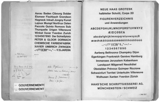
Eduard Hoffmann’s notebook (Designbooth, 2018). On May 7th 1957, he wrote: “All characters: should be OK now”.
0 notes
Last Seen Blogs