#I don't actually have any rules I'm just trying to draw digitally because I don't do it much
Text
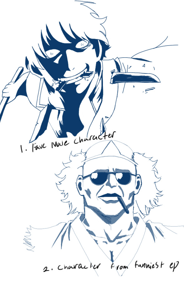
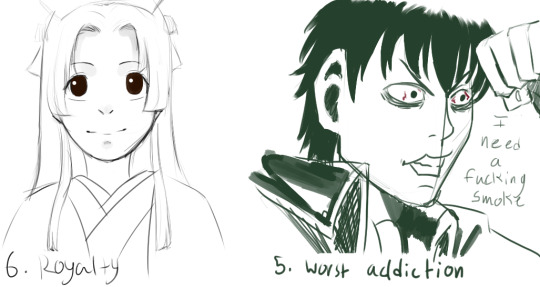
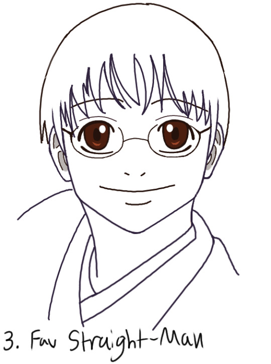


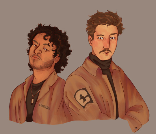
Doing the Gintober prompts to take advantage of the brainrot.
#gintama#I don't actually have any rules I'm just trying to draw digitally because I don't do it much#plus I never draw any fanart despite rlly wanting to#ANYWAY I LOVE WHEN GINTOKI GOES BLACK AND WHITE#AND COMPLETLEY MURDEROUS WITH RAGE#Red Spider and Four Devas arcs my beloved#Also I could not breathe throughout the funeral ep from the moment Hijikata dislocated his shoulder#Objectively it probably isn't the funniest ep but PERSONALLY#most hilarious 20 minutes ever animated#it was one of the first eps I watched and totally hooked me on the show
11 notes
·
View notes
Note
I have a question about your prep for oil painting, or more like when ur practicing. Do you use a specially treated paper to practice with oils (studies, quick thumbnail sketches, etc) before using canvas or do you just sketch ideas, layout on canvas and then under paint? I enjoy the medium a lot but I actually want to sketch and do studies in oil (without much drawing involved) but don’t want to waste canvas. Also hate painting gesso over stuff repeatedly. Is paper something you have tried? Any advise would be appreciated o wise onion painter
Ok, so as for my personal habits, I tend to do "Practices" digitally [I have a tablet and SAI] or sometimes on paper like so: [garlic is pencil on paper, rest are digital]. I do draw thumbnails but they are usually in marker or pencil in my sketchbook, and are little more than like, very stylized symbols representing subjects or different compositional patterns. Most of my painting planning and composition happens via digital photo collages.
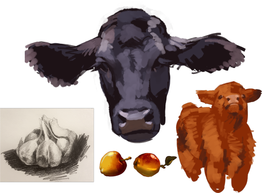
The rest of my very long answer is under the readmore
I'll do colour studies occasionally if I'm feeling particularly anxious about a picture, OR if it has a colour range that I am yet unfamiliar with. I have done a couple colour studies for my current big picture with the cattle, one I did on location so I could have an example of the colours present in the landscape to my eye, and another of a seascape because this cattle picture will be my first significant effort to include the blue colour range into my vocabulary, and also to spend some hours painting clouds to get a feel for them. [for context, when I began with my current method of painting I began only painting white objects against back fabric with a value range from chromatic black to titanium white and then added in new colour ranges one by one once I was fluent in all of the preceding colour ranges]
When it comes to your practice [and I mean "Practice" as in everything you paint overall] I think you might find canvas panels very helpful, as they take up very little space BUT they are still rigid and therefore don't need to be taped to a board or anything. They also come in a really wide variety of sizes and are very affordable. If you enjoy using canvas paper then you should continue what you are doing, but try different kinds of surfaces. Some people prefer to do oil paintings on sheets of copper. There will be a material that suits your style and your personality, you just have to find out what it is. I like belgian linen, but others may prefer gesso'd particle board.
You have several points going on in your question, so I will address them individually:
Not wanting to "Waste Canvas"
Canvas is not a precious commodity. It is a raw material which can be used in the process of painting, therefore, its value lies in the work hours and expertise of the craftsperson who uses it. One of the most common uses of canvas is in art training. So you are not "wasting canvas" by using it for the purpose of learning the skills necessary for painting: that is a perfectly acceptable use for canvas, and all other materials. I'm not "wasting" a pair of hiking boots by walking at the bottom of a mountain, I'm using them, and if I don't use the boots at the bottom of the mountain I will never get to use them at the top.
Putting Gesso over oil paintings
Don't do this. Gesso is a water based paint so it dries much faster than the oil beneath it. If you want to paint over a painting you can either paint over it with a neutral oil colour, OR, just do the new painting over it without the middle stage. Some things to watch out for if you reuse canvas this way: Ridge lines [bits of textured paint from the previous painting sticking up through your new painting might take away from it], oil layers [remember the fat over lean rule when choosing a canvas to paint over. if you have high concentrations of oil, aka fat, on the canvas already, it might be better to choose a different canvas], dryness [try to only paint over pictures that have had a good amount of time to dry.] Basically all of these warnings are to prevent cracking and other conservator problems with your paintings. A good painting can happen to your canvas at any time and it would be a shame to paint something you really like and have it crack later from poor application.
"Without much drawing involved"
Painting is "mass drawing" [shapes not lines] with colour, so you can't really avoid drawing if you want to paint. This doesn't mean you have to use pencil or other dry mediums if you don't want to though, painting a value study [mass drawing] with oil is a very popular technique which many employ. I'd recommend that you look into "imprimatura" and "grisaille", two methods of value painting used for oil.
In conclusion, I don't want to get all "just be yourself" in here, but i'd recommend you research the different techniques and materials available to you and pick the one that has the fewest barriers to your work flow, feels the best to work with, and creates the final product that you want to create. If you were me I would tell you to work on belgian linen stretched canvases and occasional cotton canvas panels, but you may prefer something different so that advice may not be helpful. Keep at it!
169 notes
·
View notes
Note
Hey Crabs! I have a small question! 🦀
How do you make the pictures of your traditional art look so good!?
They are always bright and easy to see! But when I take a photo of my drawings, they always have a blue or yellow tint to them. So how do you make it look the way you do?
(Also, I want to gobble up your art it is so yummy and pretty! Sun and Moon are so precious in your style!) ❤️
Thanks! And I hope you’re having a good day! :D
no prob! there's actually a couple things i do, so here's the tl;dr:
Lighting: i use daylight or light from a neutral white lightbulb
Editing: i use my phone's built-in gallery app to lightly edit the colours so they're clear and as colour-accurate as i can get (from my screens at least)
and i'll go into a little more detail with some examples under the cut
1. Lighting
a habit of mine that i got from my IG days (ugh...) is using daylight whenever possible. daylight just lights up the whole area more evenly and relatively neutrally. this is my set up:
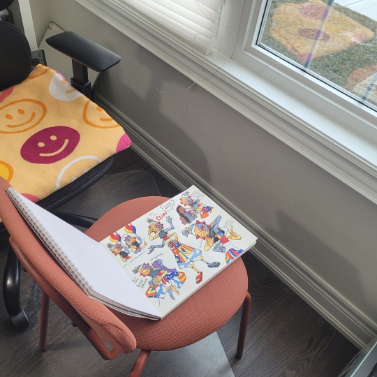
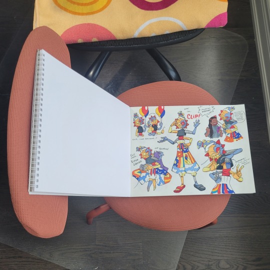
glamourous
basically, i put the artwork near a source of natural light and prop up a reflector (in this case, a blank page from another sketchbook) that helps distribute the light more evenly across the page, so that even the side that is furthest from the light gets some light that bounces off from the reflector. i don't always have a reflector tho, like if i'm only taking a picture of a small drawing and not an entire page, there's no need.
now, if it's dark, then i rely on my desk lamp, which uses a neutral white lightbulb. regular lightbulbs come in different temperatures, from warm to neutral to cool—so that might explain why your photos are coming out with a yellow or blue tint. warm lights are common in houses because they're cozy, while blue lights are common in working areas because, like daylight, they keep us more awake. neutral white is in between the two.
here's an example of my Moon doodle that i did recently under different lights: warm (from my bedside lamp), neutral white (from my work desk), and daylight
(i don't have any cooler lights in the house, so i couldn't quite get the blue tint 😅)
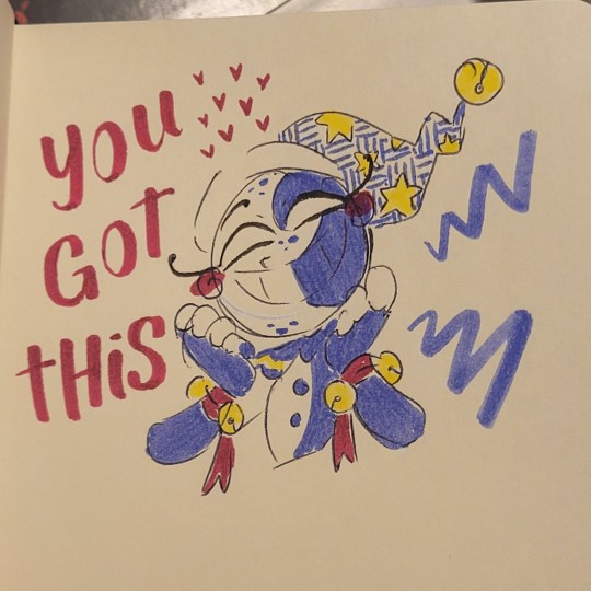
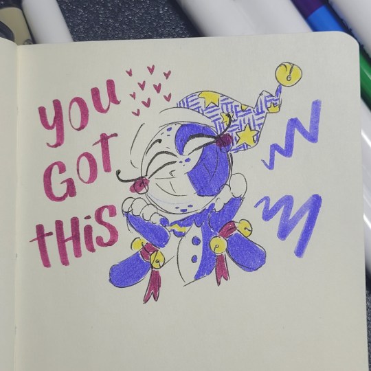
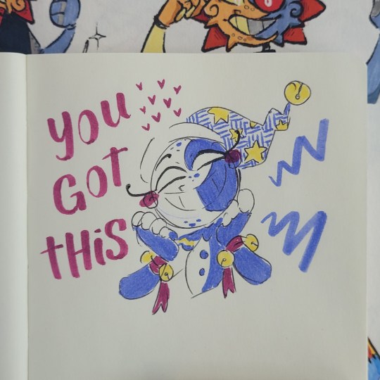
now technically, NONE of these are colour accurate. so i always follow up with some light photo editing
2. Editing
now, i have 2 personal rules when it comes to editing my photos:
1) try to make it as close to the original as possible; and
2) don't spend too long on it
these are just my personal rules because... one) i'm lazy and i don't want to spend too long fixing every thing in my drawings, and two) i feel it is dishonest for me to make dramatic changes to my traditional art and still call it traditional art. whenever i do make digital enhancements (like colouring it digitally) i will tag it so no one would mistake it as purely traditional art. that's just me tho! there are no rules when you're having fun with your art and mixed media art is a thing! so do whatever you find fun and enjoyable.
also, i will try to make it as colour-accurate as possible, but i also recognize that not everyone's screens are calibrated the same way. my phone is set to a "Natural" colour setting, but on my new laptop (which i haven't figured out how to calibrate yet) is vibrant as all heck (like oh my gosh, maybe i need to start tagging everything with bright colours now, because what if someone else's laptop is this insanely vibrant and saturated??) but either way, i try not to spend too long on it because i know i won't be able to accommodate every screen.
anyways, for what i actually DO... i kinda just play around with different settings. if i took the picture under daylight, then there's not too much i adjust, usually it's the warm colours that are desaturated, so i try to make the reds pop more without effecting the blues too much.
or for my doodles, sometimes the doodle on the other side of the page is slightly visible, i'll tweak the lights and shadows and contrast levels until the background is clear enough (as long as it doesn't disturb the doodle i'm taking a photo of)
now, if your photos are coming out too yellow or blue because of your lighting, you can adjust that by tweaking the Temperature setting. here's an example of that warm Moon doodle:


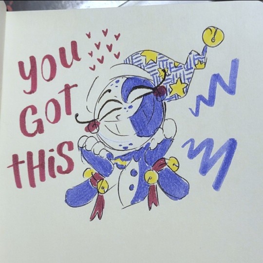
already looking a little better, right? so don't worry if your photos aren't coming out accurate, there are work arounds!
here's the before and after of the Moon doodle by the way:
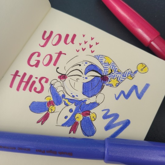
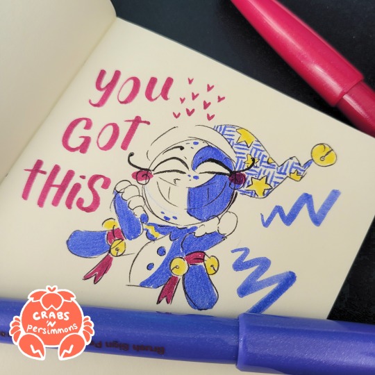
despite having daylight, i still needed to adjust the colours. specifically i needed to brighten up the reds and yellows, and bring back the page's natural yellowness. i also tweaked the Definition setting to make less hazy (sometimes i like the haziness tho, so i'll leave it as is sometimes).
and one other reminder: it doesn't need to be perfect, it just needs to be. a big reason why i keep coming back to traditional art is the fact that i can't control everything. i can't undo lines. i can't move things around. and i can't take the perfect picture. but it doesn't need to be perfect. drawing and sharing my art is supposed to be fun! and i don't want to put any barriers around that, or else it becomes unnecessarily stressful.
all that is to say, try out these tips if you want to, but don't treat them as hard rules and don't focus on trying to achieve perfection. just go have fun!
#ask the crab#sorry this took so long!#i wanted to make sure it was clear#cuz like#i totally understand the struggle of trying to take good pictures of your traditional art#like you worked so hard on a drawing#but then the photo ruins it 😅#so i wanted to share what i know so it might help#there are definitely more in-depth tutorials out there#this is just what i've gathered from some of them plus some advice from a food photographer friend of mine (her stuff is actually legit tho
19 notes
·
View notes
Note
hi tamelee!
I'm here to ask for a little bit of advice if that's okay (: about a month ago I bought a Wacom drawing pad so I could start experimenting with digital art. artists like you here on tumblr have really inspired me to start making art. but I feel kinda.. lost. I've been mostly drawing naruto manga caps and I'm getting better but I guess I don't know where to go from here. coloring and shading scares me lol. I'm using clip studio paint and it's just a little.. intimidating. I feel discouraged, like I won't be able to do it. how did you do it tamelee? did you watch a lot of tutorials, or did you experiment until you figured things out? any advice you'd have for a beginner artist I'd really appreciate.
thank you veryvery much for your time ^^
Hi Nonee! 🧡
Sure!
Oh I think that’s a very good place to start. As well as drawing subjects you like ^^!
Hmm, tbh I’ve just experimented a lot, but I don’t think my way of having done things was the most efficient. You might want to follow tutorials step by step? You can try coloring only with flat colors until you feel a bit more confident with that as well as cell-shading (toon-shading/non-realistic, like in anime) instead of rendering further as that can all be confusing at first. I personally never truly understood shading until I studied cell-shading and made my art a lot more readable. A lot of Anime uses this;
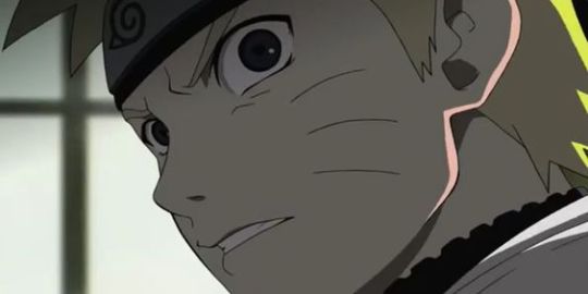
You see how there is a base color, a darker color for shadows and highlights? (Sometimes not even highlights.)
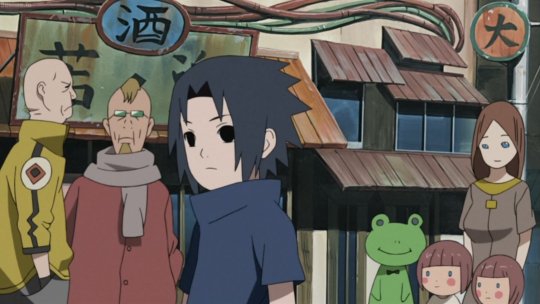
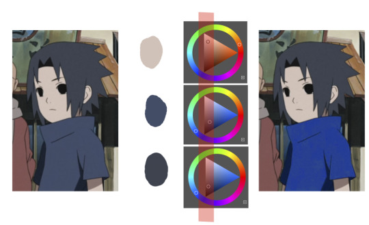
When you start to study it from existing work you’ll start to notice things like color always being in the same area of saturation and when you suddenly have a color that is way more saturated than the other it can look off. (See example.) But this is a guideline, not a rule. In your own art you can especially use saturation and brightness to help aid you to direct a viewer's focus and even tell a story.
I LOVE ‘How to train you dragon’ and ‘Kung Fu Panda’ for this because their coloring is so inspiring and if you truly want to learn from professionals... well those are the type of media to look for of course! I have an entire folder to inspire me just based on those.
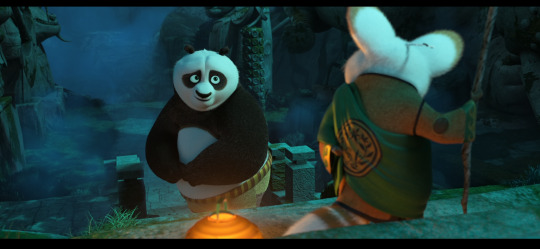
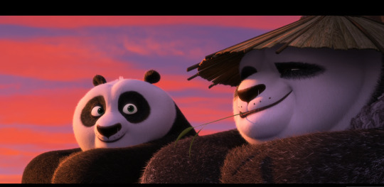
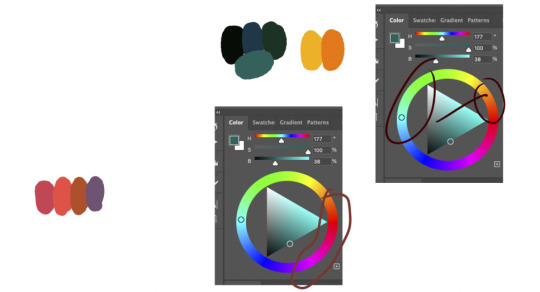
Do you see how calculated those color combo’s are?!?! Here you see both analogous and complementary schemes and it is actually through looking at the things I like that I learned it >< The orangey colors stand out and are bright which helps you to focus on that area whereas the complimentary scheme is used to bring characters together.
If drawing Manga-caps is something you love to do, then maybe for coloring you can study screen-caps from Anime or even other animated films. I’d recommend to take it step by step, though I haven’t really applied it myself, from the video’s I’ve seen and artists I’ve followed it is always advised to have an art-goal that you can work toward. Maybe you first want to focus on lineart and then laying down a base color where the colors are harmonious and next would be cell-shading maybe and then you can start adding another light-source etc- eventually you can decide to create more depth or practice with monochromatic coloring, maybe even greyscale to learn values. But right away that can all sound a bit intimidating doesn't it?
Find things that you like and then maybe you can open them in your program and just study. Find a brush you like, put on some music or a show on the background and for a moment play around with it without needing to create a finished piece. This is also how I learned how things like adjustment layers work or what all the different kinds of tools do. I have to agree with you, CSP is intimidating for me as well >< so this is kinda how I approach it as there are so many add-ons and additions within it but I try to only learn what I need for that moment so I don't overwhelm myself. I definitely try to find video’s that can help me with creating Manga though! ^^ There are plenty!
It'll get easier eventually, you'll learn the program and you start to recognize placements for shadows and you will get a feel for the coloring- no worries 💪 Learning something new will always stay intimidating, every time I open up a new document I feel it too. It's not easy at all, but you kinda have to allow yourself to experiment and even make mistakes because practice is never perfect.
I have some beginner tips written here- I hope any of this is somewhat helpful 🌷🫶
16 notes
·
View notes
Note
Do you have any coloring tips? I'm trying to get better at coloring but it's hard :/ everything looks so out of place and I lose motivation fast
Of course!
By no means am I an expert on this (I still forget to choose a light source 90% of the time) but here's a few things that I do when I'm colouring something digitally. Remember these are all individual to the way I make art so they may not all be applicable to yours and are simply me explaining how I do colours, not a tutorial for all colouring styles.
Buckle up folks, this one's a long one (sorry in advance!!)
Here goes nothing.
Losing motivation is totally normal and okay, take a break if you need it, maybe send it to some friends for some hyping up (art servers full of other artists are great for this!). Colours ain't gonna look perfect first time you try to do them, I never put down a colour that I like first time, it takes some messing around and asking friends for me to get them down.
So don't feel pressured to get them perfect in the beginning, that rarely happens!
Here's a mini explanation of how I do my colours, hope it will help a little :)
1) GET THOSE BASE COLOURS IN!!
It doesn't matter if they're not exactly what you're going for rn, go with roughly the colour you want and start there! Personally, I do big blotches of colour just to get something down on the page as this helps me want to actually finish it. Then you clean up those edges so they're all in their correct spaces.
I've found that working on a neutral mid-tine grey background helps you see the colours best at the start so all of my 'paper' starts off grey when working digitally.
Here's the example I'm going to be using (this is from the ghost files fanart I'm working on)

2) ADJUST THOSE COLOURS!!
So, now you've got those colours down, you can adjust them to be roughly how you want them to look. If you're unsure on what colours look best together, you can either take some time out, find some YouTube channels and learn a little about colour theory... OR you could grab some colour pallettes from online and have a play around with gradient maps or simply placing the colours in yourself. There's no shame in using resources like those, that's literally what they're there for.
I didn't need to do this on this drawing as I was happy with the colour selection. This is because I chose the background colour and simply adjusted the hue and saturation slightly until I got the colours I wanted. This is my general technique for choosing colours as my work tends to be fairly similarly coloured (browns, oranges, reds, yellows with hints of purple)
3) ✨SHADING✨
Right, well done! You've got your base colours in.
...but oh god, what now?? They look so flat and lifeless, what shall you do?!
This, my friend, is where shading comes in. It's both a way of telling the viewers where the light and shadows are, can change the mood of the drawing, can change what we feel about a character or it can just look real pretty but shading and lighting does all sorts of fun things to a drawing.
If your style is more simple and doesn't require shading/has minimal shading: apply this tip to any shading you do have and don't forget the importance of rim lighting in simpler styles.
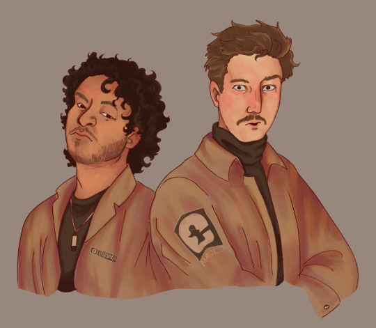
For shading both skin and clothes, I use the original colour, shift it down into a darker shade and on the colour wheel I shift it down too (eg. shading green with blue, red with purple) sometimes you can shift that even further to create similar shading to the one above, where I shaded orange/brown with pinks/purple's.
The principle is the same with highlights but like,,, opposite. Shift everything up, shade browns with yellows, blues with greens, etc.
SIDENOTE ON HOW I COLOUR SKIN:
Okay so, these next two paragraphs are based entirely from what I've learnt during studies and aren't rules, just simply how I do it.
For lighter skin tones, I tend to start from one of the lightest colours and shade darker, like you would if you were working with something like watercolours. This allows you to build up shadows in areas of darkness. Once you've done the shadows, you can then go in and add highlights and lighter sections where necessary.
For darker skin tones, I tend to start at one of the darkest values, as dark skin tends to reflect light differently to light skin. Then I add lighter shades in sections that the light would reflect. You can add shadows too, I tend to add them if the drawing still feels flat after doing the highlights.
3) OVERLAY + MULTIPLY LAYERS ARE YOUR BEST FRIEND
These things are literally lifesavers for me, I love an overlay layer.
I can't really explain what they actually do so I'm not even gonna try, just play around with them. But using a purple/blue multiply layer and erasing where the light hits, that makes the illusion of full shading without the same effort of painting in the shades.
Overlay layers are 100% a 'fuck around and find out' resource, I tend to use red and pink overlay layers as my colours tend to be more desaturated and this helps with brightening them up. However they can also be used to change the genre/mood of the drawing, like this:
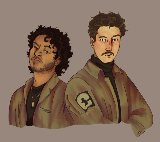
These two drawings are the exact same. There's no difference between them other than an overlay gradient map layer in green or sepia. (These gradient maps are built into clip studio paint, I'm not sure about other programs)
But the whole vibe is completely different. So yeah, fuck around with different colour schemes and overlay layers (the bi flag colours are a great choice for experimenting with overlays as the colours are naturally very harmonious so maybe start there.)
You can also try a noise later for a bit of texture, it's my go-to fix it for any drawing ngl
Uhhhhh, yeah. That was lengthier than I expected, hope it helps even in the slightest. As I said at the top, I am by no means an expert and am still figuring things out myself, so just fuck around and find out.
Bye now!
#artists on tumblr#art#artwork#digital artist#fanart#ghost files#art tutorial#colouring#art tips#deathian answers#digital painting#digital art#colour tutorial
21 notes
·
View notes
Note
Okay I'm sorry to bug you but I'm so stupid. How are you guys making the yumeship things? Like the background and stuff is there a program y'all are using to get it? I've been trying on my phone and I don't know how y'all get them so perfect looking 😭 please explain it like I'm 5. If that's too much work, feel free to ignore this/delete this no hard feelings I'm just incredibly dumb 🥲😅
No worries at all!
I do it on my computer in my drawing software. If you don't have one, you can probably achieve just about everything that needs doing using this free software:
I'll break it down step by step how I made mine below the cut. there are lots of pictues. i hope this makes sense. we'll be recreating my Aether/Ardis one for this tutorial.
here is what we are going to do today
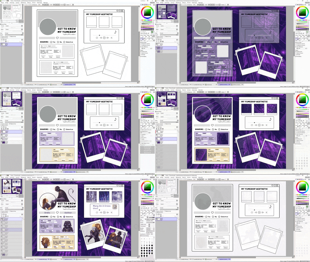
So step 1 is to download the template
I like using the transparent version because I find it easiest to edit for my purposes, but feel free to use the other ones as well if there's one you prefer. you'll just skip the first couple steps of this tutorial. Open it up in your software. I'm using Paint Tool SAI. It should look like this.
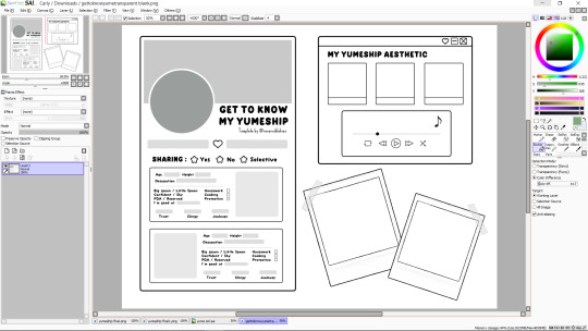
First, I'll drag in the background that I want and put it on a layer underneath the template. It will look something like this (you can also use a flat color, whatever you want)

Now I want to fill in the big boxes so that I can actually read the text, so I'll go back to the template layer and magic wand select the main bit of empty space (blue shows what's selected),
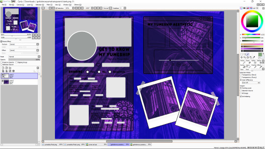
then invert it (there is probably a button for this on your software)
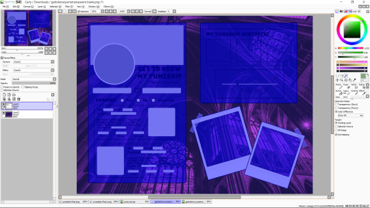
now I'll make another layer under the template and bucket fill what i want to be white

you can color in extra things you want to change the color of on this layer too, or just leave it as-is. I'm going to spruce it up a bit, though.
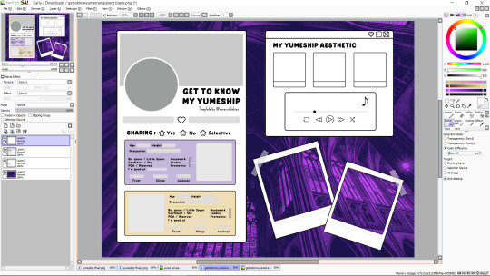
ok great. now i'm going to change the grey text boxes to be white because the light grey clashes with my pastels. this may not be necessary for yours. you can bucket fill those too on the main template, but I'm going to use what's called a clipping layer on SAI, which basically means that it's a layer that only draws on top of things that already exist in the layer under it (this may or may not exist in the software you're using, but do whatever works for you). so i'm going to make a new clipping layer over the template and color white over all the grey parts.
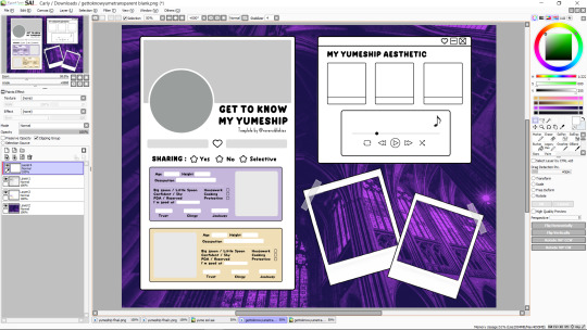
much better. it's time to cut out where we want our pictures to go. I find it easiest to work when I treat all the boxes like picture frames, kinda like how the ones in the bottom right are. there are other ways to do this, but this is my prefered method. so we're going to go to our template layer and magic wand select everywhere we want a picture to go (once again now highlighted in blue)
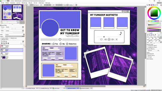
and delete those from both our template layer and our white layer. it should look like this now
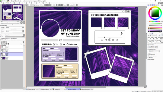
so now all you do is drag in your pictures so that they're underneath your template, erasing any parts that stick out
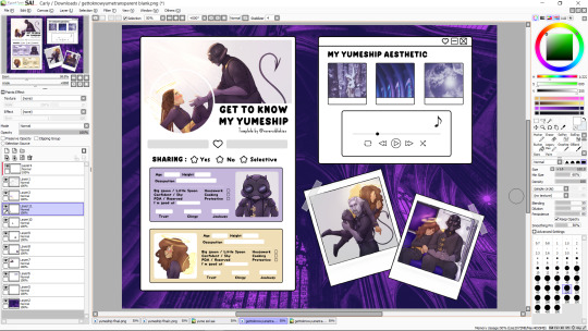
and then you just add text and little rectangles and whatnot! (I added mine in a different program because my art software doesn't have a text feature)
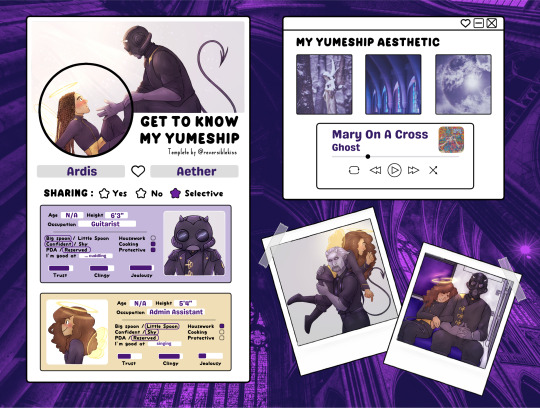
I made a couple other adjustments to mine (black circle around the one photo, getting rid of the line at the bottom of the aesthetic trio) by just editing the template layer.
and that's it! all done! does that make sense? i hope that makes sense. if i skipped over anything vital or if that makes no sense, let me know.
17 notes
·
View notes
Note
how did you learn to draw? Would you recommend any classes or certain resources? do you have any tips, general or hyperspecific or anywhere in between, other than "just practice"?
sorry to bombard you with questions. I'm just a frustrated amateur artist trying desperately to improve, so I'm asking around some of the artists i particularly like.
I learned to draw by bashing my head on my desk for several hours, which means practice (sorry,) and also by staring intently at artists I like, trying to 'steal' how they draw some things
I never followed a class online, so I wouldn't be able to give out recommendations for those, and I haven't actually looked up an art tutorial online in years so I can't remember anything, but here's a few resources/general tips under the cut
RESOURCES
haven't used this myself, but my teachers during the first year at comic school mentioned proko as a good YT channel for beginners
quickposes - useful for gesture drawing, I acc use this one when I feel like I need to draw but dont have any ideas
I know some people use designdoll for poses as well, I never used it myself because I tend to use the csp models for that, but if you don't have csp, I think it's a good alternative
coolors - for color palettes
adorkastock - more poses! I don't check it anymore at this point but it was my first actual 'art landmark' when I was a kid and I needed to find some poses, I could always rely on their photoshoots
I'm not linking any tutorials because, as I said, I haven't looked up any online in 10+ years, but I used to watch a lot of speedpaints as a teen, and it should be fairly easy to find decent tutorials on YT at this point;
GENERAL TIPS
if you have a sketchbook, please don't let the internet make you believe every single page has to be a masterpiece, that attitude is gonna break you
not everything will be a hit piece and thats ok
when shading, avoid pure black
experiment with styles!
when inking, you shouldn't move just your wrist but use your elbow as well! also rotate your canvas, both when doing traditional art and digital
true to traditional and digital art as well - flip the canvas to see the art mirrored and find mistakes (for traditional you can hold up the paper to a source of light and look at it from the back)
use references whenever possible
what works for another artist might not work for you ( re my ink tip: I follow that, but I know a couple mutuals don't do that and their art still slaps and looks clean and crisp)
when drawing a full illustration with a background, work on the background perspective first and THEN add the character,, this should be basic knowledge but my idiot ass actually processed this info only a few years ago
learn how to use perspective grids asap, dont be like me
IF YOU DON'T WANT TO LINE YOU DON'T HAVE TO!!! be free
rule of thirds is always useful to keep in mind
I'm not super good at giving advice because tbh I don't think I'm good enough to give it, but I hope at least one of these things will help you out!
36 notes
·
View notes
Text
Some Donnie Headcannons
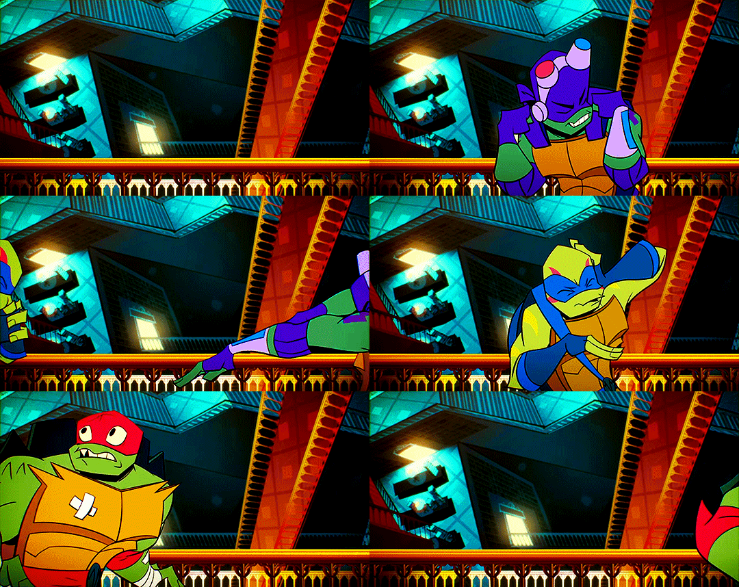
Donnie learned everything by memorizing it in song form. This is because Splinter would put on shows for the each of them so he could just... rest for a little bit. Donnie would always want to put on a science show with song and dance numbers and always loved things like that. (Also, I think the Atomic Lass character was a side character in some of the Jupiter Jim movies and that is probably his favorite of all time...and she probably had song and dance numbers of some sort... maybe... that's the head cannon)
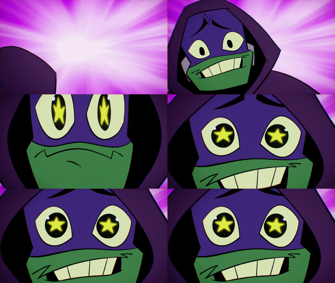
My siblings will sometimes ask me a question as if I'm the encyclopedia. I think the others would do the same to Donnie.
Mikey: Hey Donnie! Do you think I could do a *insert ridiculously difficult skateboard trick*
Donnie: Well, you'd have a 12% chance in perfect conditions, given your center of gravity and your average rate of acceleration... but these are less than optimal conditions Angelo, so my conclusion would be: not reccomend-
Mikey: *proceeds to do it*
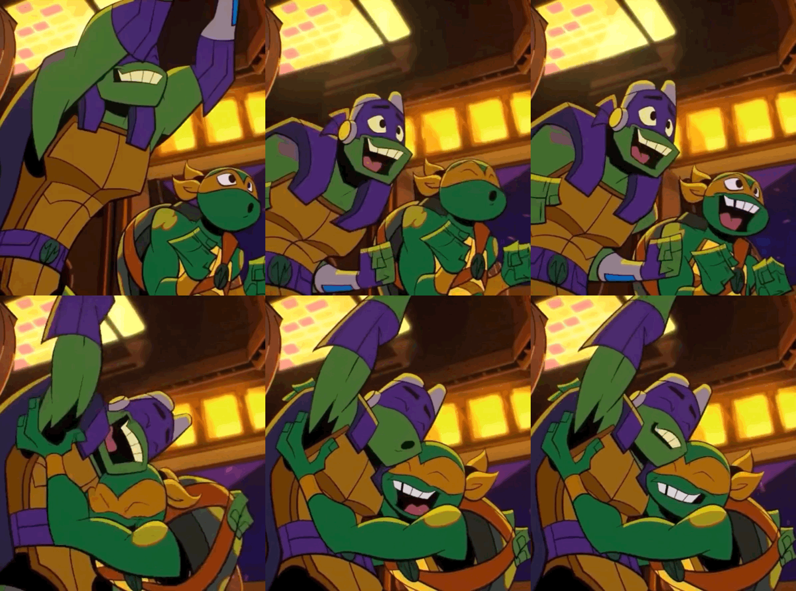
Donnie likes to infodump to Mikey as he's drawing. Mikey specifically - although he will infodump to anyone and everyone - because Mikey is somewhat listening, and it's nice to get thoughts into words without having to worry about criticism or being blatantly ignored.
(Mikey will pop in with random questions about if his art looks right, and sometimes gives Donnie wild suggestions that Donnie takes and runs with.)
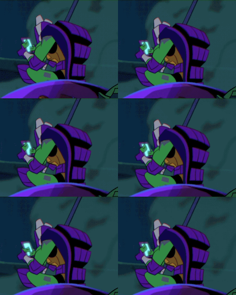
Tried to research the supernatural after discovering the hidden city, that's why he was able to get his goggles to work with the crystal, but he got frustrated after figuring out there aren't much rules with that.
ALSO ALSO: He doesn't like quantum physics, or chemistry (I don't remember any evidence to the contrary) because there are some blockages to what can be known, and he wants all the variables.
And he's so bad at history. Like ridiculously bad. He often has dreams of going to school and being with his 'intellectual peers who can actually have a conversation with me' but he would fail history.
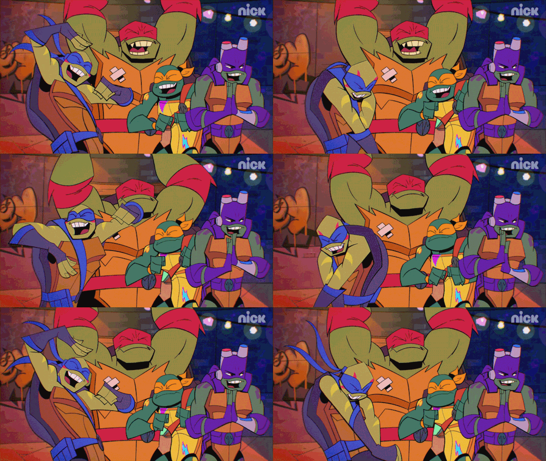
He has made an 'evolving bio' for all of his brothers and his dad, and all of the recordings go into filtering out necessary information to go into digital files for all of them. Definite plot points and concrete evidence to predict their future patterns and any consistent weaknesses.
This is the info he used to make his gifts with.
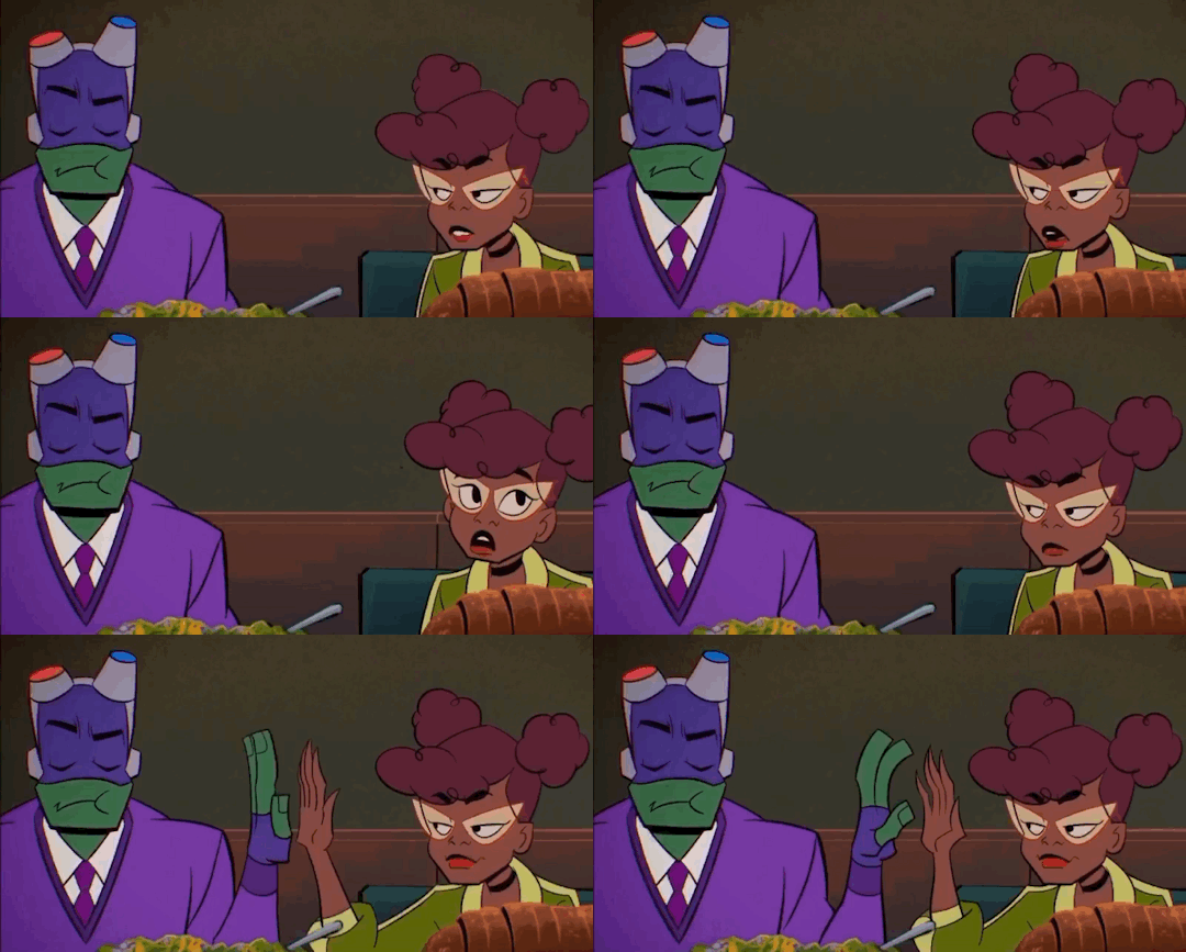
Donnie would sit with April as she explains her homework and how to do it, and he would obsess over finding the information to solve the problem and be useful to her. April never had THAT much motivation to do homework, and Donnie had way more energy re-explaining it than her teachers.
Donnie also loved being right.

Has made simulations trying to model social interactions before they happen so he can figure out how to communicate before the day starts.
(Basically pre-defining the variables he will need to call upon throughout the day so he doesn't get an error message.)
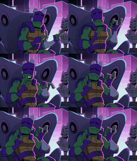
Everything can be explained with science or coding or engineering. Everything.
(He has tried to formulate the science for fashion and dancing... in essence applying science logic to those things.)
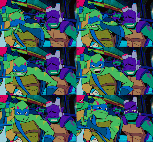
He may deny that he is wrong on the surface, and he will apologize for being wrong - as long as it isn't mystic beings that are replacing him-
But being wrong eats at him.
Donnie, the tech one, the one who is supposed to be smart, the one who has a subset that he is great at. This is his use, this is his value...
and he was wrong.
#rottmnt#rise of the teenage mutant ninja turtles#rise of the tmnt#rottmnt fandom#rise donnie#donatello#teenage mutant ninja turtles#tmnt2018#rise donnatello
10 notes
·
View notes
Text
Meet the Creators - Mochibuni
What username(s) and platform(s) can folx find you on? (Please include links!)
I'm on most platforms as @mochibuni/mochibuniart. These are the ones I'm most active on:
Twitter, Twitch, Deviantart, AO3
(Fun Fact) What is your favorite kind of potato?
Purple! They spike my blood sugar normally and it was hilarious surprising everyone with purple mashed potatoes at Thanksgiving.
How long have you been creating works in fandom spaces? How long have you been active in the SM fandom?
Sailor Moon is my first fandom and I've been active in it since around 1995/96. I've probably been sharing fanart and fic for just as long, much to my dismay when moving fic from ff.net to AO3.
What type(s) of creative works do you usually make? (fanfics, digital art, cosplay)
Digital art with the very occasional fic.
What do you enjoy about creating for the SM fandom?
Everyone gets the in jokes, I don't have to explain why I draw green jackets on screencaps (hi I'm @mamorusgreenjacket).
Are you strictly UsaMamo or do you create for other pairings as well?
I'm actually not a shipper (though I have preferences), the majority of my pairing pieces are gifts or project work.
What inspires you to create works for Usagi and Mamoru?
They best fit the concept of what has inspired me or someone asked for it.
Do you tend to work on multiple projects (WIPs) simultaneously or try to finish one at a time?
First rule about WIPs, we do not discuss how may WIPs! Second rule about WIPs, no really I have to use a management program for my projects and ideas I don't want to forget. ;-;
Do you prefer large projects (chaptered fics, webtoons/zines, highly detailed art) or small projects (one-shots or simple art)?
Simple art and one shots, but I'm pushing myself to do more intricate drawings with backgrounds. I've had this multi-chapter UsaMamo yakuza fic outlined in my drafts for years.
Are there any common themes, situations, tropes, or mediums in your work?
SPARKLES. Also a lot of orange and pink circle backgrounds because I hate drawing backgrounds. :< For fic it's usually comedy and angst centered around a singular idea.
Is there anything you haven’t explored artistically and would like to try?
There are so many traditional arts and craft work I would love to do, but then my home would turn into a craft warehouse.
17 notes
·
View notes
Note
PLEASE forgive me if someone has asked about this before, but how do you start a digital sketchbook? What's a good page goal to reach, in your opinion? Your art rules <3
thank you so much! tbh tho i think that totally depends... mine tend to be 13-ish pages plus cover, but they're BIG vertical digital pages with several irl-pages-worth of sketches crammed in. and there's not really any specific reason why i do it that way! that just happened to be the number i landed on when i put my first one together (and now i don't remember why), and then i just kept them all around the same length for consistency.
most of the time when i see other ppl's digital sketchbooks they're way longer than that, though i'm not sure if maybe most people don't cram as many separate drawings per page as i do? also, if this matters at all: my sketchbooks don't sell well a la carte at all, they're primarily a patreon reward and then i offer them as itchio downloads just in case someone wants to buy them one at a time... once in a blue moon someone buys them that way, but it's rare. so i actually really can't offer any advice on what ppl look for when they're buying digital sketchbooks, or what would make a digital sketchbook sell well — because mine don't, haha!!
but if i had to guess, more pages released less frequently (i.e. collecting up all your art from an entire year) would probably do better for standalone sales. i keep mine short bc then i can release them a little more frequently, again bc mine are geared at patreon.
as for how to start or any other tips — tbh, mine are just a combination of what i'm already doing, both digital and traditional scans! warmups, character design, concept work and doodling, stuff that just normally doesn't get posted. it's rare for me to draw something specifically bc i'm like "oh, i want this to be in the sketchbook pdf" — the only stuff i usually draw bespoke is like, filling in empty spaces after i've puzzle-pieced existing work together. and especially if you're doing stuff for patreon, that's my general advice: try to make as much of your workload stuff you would already be drawing anyway, rather than giving yourself NEW tasks on top of everything else.
my actual technical process is very simple: i have a big old multi-layer document, with folders for each page. (since these are always intended for digital viewing, i make sure the width of the page at 100% zoom is nice and comfy on a computer monitor, to spare ppl a bunch of annoying scrolling side to side; and when i put drawings together on the pages i try to make sure they're sized nicely in the same way, so you can see the entire drawing without having to scroll around it.) every once in a while i go through my digital warmups and copy them over and arrange them nicely on the pages, and the same with scanning in everything i've drawn on paper every week or two; once the pages are filled up i save each folder as a separate page and then stitch it all together into a pdf! nothing fancy.
37 notes
·
View notes
Note
Hello hello, I'm here for the match-ups!
(for male hunter please!)
I'm 163 cm, have black hair, dark brown eyes, and I'm someone that you can call a gremlin, haha. Although people think I'm not so intimidating with my stature and my strength, I can put up a fight and would not hesitate to struggle or even kick someone's shins if need be. I do end up sometimes being a teensy bit snarky on people I dislike, which some people end up teasing me as being a rabid dog (but it's fine haha).
Aside from that, I actually enjoy drawing and writing— a lot! I'm a huge fan of doing digital pieces and drawing hairstyles, so I usually draw some to see how some of them look. I sometimes do have to look up how anatomy works though, because I don't really... Like posing all that much.
Ahem, other than that, for my personality— I'm really nice to a lot of people, even if some probably saw me at first as a recluse. I enjoy having to be there to help others when they feel down or need someone to vent or to listen to, making me the go-to therapist friend in the friend group. Other than that, I'm knowledgeable when it comes to dealing with conflict and especially with other weird things (mostly with DID/OSDD because of experience and research, anxiety and panic attacks and how to deal with it... That sort of thing) that actually helps me out a lot.
There are some drawbacks to it though, with one being that I'm a lot more stubborn and not as smart as people think. I'm not the type to go down without a fight (as evidence of my first paragraph haha), so I usually push through with my stubbornness unless I'm given a good reason not to. It has landed me in some bad situations, but I've learned my lesson ^^;
I am also honest to a fault and have a bad case of malicious compliance, though in certain issues where I can't resolve conflict, I use what I know and become a... Devil's advocate of sorts. I don't like telling others about it, though, but it's fun seeing people find out about it 🤭
I'm not sure if there's anything else I can say about myself, but I hope this suffices, haha. Anyway, I love your blog, and I hope that this entry didn't break any rules in match ups ^^ happy Valentine's day, admin!
HAPPY LATE (for me, at least) VALENTINES!! 💞💞 and tysm it means a lot <3334
i match you with...
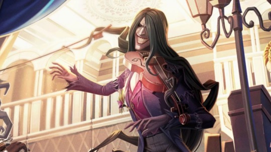
antonio paganini! 🎻
you're short AND feisty? oh he doesn't even know what he's up against
finds it so funny when you try to kick his kneecaps with your full might nd he just scoops you up with his hair like it's nothing
in general he doesn't take your fight-iness(?) and snarkiness(??) seriously most of the time and it's hilarious to him compared how different you two are - short and fighty, tall and calm
if he's feeling extra evil he's going to wrap his hair around your ankle and hold you upside down in the air (not for too long tho he's not THAT mean) for the giggles
DRAWING HAIRSTYLES⁉️⁉️ you've got yourself the perfect muse
like imagine telling him you need to braid bits of his hair for your next piece and he just gently lays his head onto your lap and his locks of hair softly wrap around you ... heaven
anyways would pose for all of your anatomy studies, he even jokingly asks if he needs to take off his shirt (I MEANNNNNN)
generally speaking he makes up for his (sometimes) lack of physical affection by using his hair - wrapping a strand of it around your arm, waist or even fingers
he's too peaceful to even argue with you, each attempted argument will probably end with "whatever you say, amore. i know you have it figured out anyway. you're smarter than you think, lo sai che? "
sometimes he will argue with you for fun tho yk🧐 he enjoys seeing you pull conclusions and arguments out of thin air
since you often have to be a therapist of some sorts he's going to make sure that it doesn't affect you and that you can blow off some steam - feel free to vent to him too, he's a good listener and always ready to provide you with both emotional support and problem-solving ideas
doesn't like giving you life lessons and educating you whenever you mess up, he's not your dad after all and he fucked up a lot of things in his life too :/ just wants you to go with the flow and take every chance you get, if you ever need any kind of support he's gonna be there for you no matter what
#identity v#idv#idv headcanons#identity v headcanons#idv fanfic#idv imagines#idv scenarios#idv x reader#identity v x reader#identity v x you#idv matchups#idv antonio#antonio paganini#antonio idv#identity v antonio#antonio identity v#idv violinist#identity v violinist#violinist idv
30 notes
·
View notes
Note
Hi!
I absolutely adore your Efteling art. How do you capture the Anton Pieck style so well? I've been trying myself but it's quite tricky. Do you have any tips?
Hey! Thank you so much 💙 sorry for the late reply, I haven't been keeping up with this site as much lately;;
Honestly it's been a lot of trial and error before I managed to get the right aesthetic in my art, so I'll try to give some tips, but I do believe one of the most important things is to study the basics of art, colour, light, that sorta stuff, because it'll help you massively when trying to understand how other artists work! (But try to find more professional sources, I feel a lot of tutorials out there try to teach you their own specific steps rather than giving you insight on the progress).
Also don't back down from studying Anton Piecks work from up close, maybe even redrawing elements of it or experimenting with their colour. As long as it isn't all you end up doing and try to find the elements you enjoy most to add to your own thing, that should be fine! (My style is also inspired by other artists styles like Arthur Rackham, Tim Burton and the 20k series and games I've been into).
As for some actual more targeted tips:
- Find brushes that replica watercolour /pencils / ink that you like working with. I like giving my drawings a bit of a rough textured look, because traditional art isn't as clean as digital can be.
- When I just started with the style I liked to replica working traditionally with watercolour in Photoshop, meaning that I started out with light colours and worked my way up to darker tones later (Don't fear big light and dark contrasts tho!). I also work on 1 layer in this style a lot of times. But that's not a requirement;;
- I do my lineart during or after I colour. Usually I just darken my sketch lines, actually.
- Use an overlay with paper texture, although you could probably do without as well. Honestly I'm figuring this part out rn bc the layer I use makes my prints look ugly. Oops.
- Maybe try to do the style with traditional art too! I've done it a few times, limiting your tools and options, and experiencing traditional art does give you a good feel of what it can and can't do.
Like I said, this progress was a trial and error thing for me, so I never really made any ground rules for myself, so I hope these are clear enough and helpful;;
5 notes
·
View notes
Text
I give up, I give up.
I've simply decided that you are either born with this ancient, arcane unlearnable knowledge of how do draw with absolute speed and precision or you're born a talentless, mediocre loser who sucks at everything and cannot make anything above the level of "B+ middle school art student" no matter how many classes you take or what tools you use or how hard you try.
I don't understand it. I'm using the same tips, same tricks, same tools, same software, same default brush as all the pros yet they're somehow able to create beautiful, amazing masterpieces beyond comparison yet all I can make is ugly, shitty MS Paint garbage with soft lines and broken anatomy that wouldn't have even been impressive during the first year of Newgrounds. I was cursed to be born without a natural talent for drawing and now that the industry is dead and indie is the only way to go now I will never be able to live out any of my dreams, because my art sucks and nobody notices or cares about any of my original works and nobody ever will unless I dramatically improve enough to stand toe to toe with the aforementioned experts or somehow acquire huge amounts of money to hire people who actually can draw to do everything for me because I am a talentless, learning-disabled, anxiety-ridden wreck who can't even do the simplest task with any level of adequacy. That's literally the only way, except I live in the middle of nowhere, I was born into a family of nobodies with no artistic background, my job doesn't pay enough to afford a crew and would require me to save up for DECADES if not CENTURIES, and nobody knows who I am and nobody ever will because all my art is terrible and unremarkable and just gets lost in the ocean of the internet run by algorithms that favor corporations or unrealistic expectations for engagement.
I never even wanted to make the next Picasso, I just wanted to make silly little comics and cartoons that make people laugh, but apparently that's not good enough anymore. Now it's go big or go home, and I am the smallest, most insignificant, most incompetent and worthless speck of dust on the entire planet.
It doesn't even make sense. The key to the sharp UPA lines I've so desperately desired for the past 10 years of my art career are an elusive lost art and the closest I've been able to find is just make really fast strokes, but that's impossible. IF MY STROKES ARE TOO FAST THEY'LL JUST BE SLOPPY, ART IS A SLOW PROCESS, HOW AM I SUPPOSED TO MASTER THE ART OF DIGITAL DRAWING WHEN IT GOES AGAINST THE VERY RULES OF ART? Even my traditional art is barely impressive, and I feel like the only reason I've ever made anything even close to presentable with plain old pencils and paper is due to my art instructors holding my hand because I'm incapable of creating anything of remotely high quality on my own. That's why I wanted to join the industry - so that way I could focus on my strengths like writing and designing characters while the rest is handled by a team with expertiese in those fields while the studio provides the finances. BUT NOW I CAN'T. The industry is a shithole that hates creatives with a burning passion and only wants to churn out AI-generated reboot slop meaning indie is now the only way to go, and you can't go indie unless you're a big, famous superstar who can outperform Don Bluth and Richard Williams combined with a massive fanbase who will gladly shower you with money, which I don't have. Even when I did have a fanbase from making fetish garbage in Blender they wouldn't even cough up one measly dollar, and it didn't even matter anyway because they were equally entertained by stolen art. Besides, I can't even draw my own damn characters from different angles or in anything other than the basic A-pose, how am I supposed to instruct other artists how to do it, too?
So that's it, my dream is dead because God or whatever outside force that controls this horrid universe decided I do not deserve the gift of being able to draw amazingly or multitask or living a life of wealth and privilege and I'll never be able to change that because I cannot learn this information no matter what and nobody knows or cares who I am. I know SOME PEOPLE on that other godforsaken hellsite will try and go "WELL IT'S YOU'RE OWN FAULT BECAUSE YOU'RE AN ASSHOLE, HURR DURR". Bitch, you think I wanted this life?! Even when I was nice to you people and earnestly showing off my art and trying my damnedest to get myself out there and asking "Hey, does anybody need a writer????" none of you gave a shit! You know why? Because I suck, and because nobody knows who I am, and because the animation world hates writers unless their name is Dave Capdevielle! An audience for my work simply does not exist and social media's broken algorithms mean I can never, ever find one or realistically maintain that audience due to this obsession on making everything into "content" that exists only to be immediately consumed and generate profits for corrupt CEOs.
My whole goal in life was to go to animation school, get a degree, find some connections, and then join the industry so I could finally live my dream of being an animator. I couldn't even handle four months in online college, and now there's no point in even pursuing it because late-stage capitalism has completely destroyed both college and the industry for all but the most rich and famous. Life is a sick fucking joke.
I should've just killed myself in 2018 when I actually had the chance. Even if it meant never seeing any of my dreams come true it would have at least spared me from watching all my hopes and aspirations for the future crumble in real time and my family could've moved on and found new happiness and meaning in their life. I guess I'll just have to accept the fact that I'm a complete and utter failure as an artist and dedicate the rest of my miserable, obscure existence to working part time for slightly above minimum wage, and even that's not guaranteed. I should've never signed up for that stupid online class. I'd rather still be drawing complete and utter garbage with joy and confidence than mediocre, barely-passable concepts that will never see the light of day while being completely and utterly miserable.
0 notes
Note
GAAHHHH it was really silly of me to ask what music you like. it literally slipped my mind that your url is a vocaloid song. i guess i asked because there are so many vocaloid songs, and so many different vibes and sounds, the vocaloid music one likes could differ greatly from that of another. i *do* listen to vocaloid, surprisingly & embarrassingly sparingly, as i'm a proseka fan. but do rule out your prsk-only mutuals. hmm...to give you a hint, my favorite units are mmj and niigo. i have a project sekai url, but i don't talk about it much nowadays >_> mostly because my ipad—what i play on—is on the fritz, and i plan on saving up to buy a new one so i can both play and draw digitally. it has been so saddening, not being able to do either of those things 。゜゜(´O`) ゜゜。in terms of proseka characters, you give me saki vibes ! she and shiho are my faves from leoni ♪
drop pop candy is such a cute song! and it's clearly very special to you. i remember listening to it for the first time in an undertale animation on youtube. i think my first vocaloid song was triple baka. i also like a wide range of styles, but i, too, love upbeat and energetic songs like you do. i won't right now because in my last ask i recommended you a whole album, but i'll make sure to send over some energetic kpop songs i think you'll like at some point ♡
CHICKEN TENDERS IS CRAZY LOL & it makes for a very funny story, if i do say so myself! the sugar bit is very telling. it's like i can smell and taste them myself just from the way you described it. do you remember what song you were listening to, or has it since slipped your mind? even if your synesthesia is mild, i still think it's cool! does drop pop candy smell like anything to you?
re: your tags I DO THE SAME THING. emojis, kaomojis & emoticons are perfect punctuation ^^ especially in online spaces, i think. i don't use kaomojis a lot in text because they're a hassle to copy and paste, but i love simple emoticons like :3 and ^_^ as well as emojis. also, it's easy to break up separate thoughts into several messages 🌸
+ the game is on !!!!! yay ! i'll be looking out for yellow hearts in my inbox, then. i'm trying to think of hints that don't make my identity obvious LOL. let's seeee...there aren't any dashes in my url & my favorite sanrio character is kuromi.
one last note: you're not the only person who assigned me leafeon via that game :> my friend reblogged with the tag "im breaking molds im shattering expectations . leafeon" which made me laugh a little to myself. everyone else mostly says sylveon!
i'll make sure to drink some water today ૮₍ ´ ꒳ `₎ა you have a nice morning/afternoon/evening yourself . ݁₊ ⊹ . ݁˖ . ݁
♡, sylvie
OOOOOH okay!!! maybe ill make a list of all the hints i have of u some day :3 (maybe ill do it in the tags? idk)
i have been told i give saki vibes lol she was actually my pfp before i made my blog mirabelle themed ☆w☆ i love her a lot!! she's one of my favorite characters from any piece of media ever so i'm glad people compare me to her :D
i do remember what song triggered the chicken tender thing!! it was empurple, the new mafuyu commission. i'm in a bunch of project sekai servers so people were posting it everywhere right after it came out and on my very first listen i was immediately hit with a wave of Very Specific smell. it was super weird!! because up to that point i hadn't really experienced any bouts of synthesasia that weren't subtle enough to just write off as "my brain playing tricks on me" or something similar @-@
drop pop candy smells like cotton candy!! but it doesn't TASTE like cotton candy, it tastes like,,, birthday cake flavoring? i think that's it. kinda hard to tell it's just Really Sweet
yea!!! on discord i usually use server emojis or just send separate messages but you can't do that when replying to an ask so i just use faces :3
the game is afoot!! i'll add those clues to my mental box of em >:D
oo! i was not expecting that someone else would pick leafeon :o guess i am also breaking molds and expectations HAJSGSHSHD
i will have a nice evening!! i hope u do as well :DDD
#askbox on mars!#SORRY THIS JS SO LATE i could explain everything that got in the way but long story short is real life stuff would Not Stop Happening#better late than never?#ANYWAYS so here r my hints for u now >:3#-prsk url with no dashes in it#-mmj and niigo fan#-one of ur three favorite pokemon is sylveon and other people think u have sylveon vibes#-you use emoticons and kaomojis#-fav sanrio character is kuromi#-you like clairo and kpop#-your timezone is mine or earlier than mine (unless tumblr sent me the ask hours after u sent it in which case u could be anywhere)#uhhh i think that's it. but honestly it's more about vibes#i can't be SURE that i'll know u if i see u but i think i will probably
0 notes
Note
you probably get this all the time but your neocities site is so amazing, do you have any advice/resources for people who are new to html/css or just coding in general, i eventually really want to achieve the same sort of perfectly cluttered vibes but I don't know where to start 😵💫 your site is seriously impressive!
aw thank you!!!
main html/css advice would be if you don't know how to do something/something breaks, search it on the internet! w3 schools and stack exchange are your best friends. also like everyone on neocities im gonna point you towards sadgrl, who has a ton of resources for this kind of stuff. my in general coding advice would be to start with a relatively easy language, but imo html is a PERFECT starting point so you're already on the right track.
AS FOR WEBSITE SPECIFIC ADVICE.... I have a few things :)
1. GO INTO IT KNOWING WHAT YOU WANT TO MAKE AND HOW YOU WANT IT TO LOOK!! this saves SO much time and heartache. I spent maybe a good 4 months debating what I wanted my site to look like before I actually started coding, and I'm glad I did. which brings me to my next point..
2. draw out a thumbnail of what you want your site to look like! try drawing a few different ideas too, it'll save you time if you draw them instead of code them in.
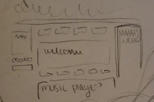
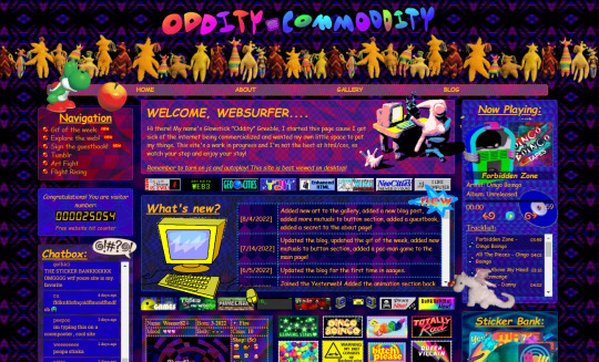
[Image description: A pencil and paper thumbnail for the site on the left, and the finished site on the right. The overall layout is the same for both.]
3. i highly recommend learning how to use iframes if you plan on doing a container-based layout! this is especially useful for graphic heavy sites like mine since it helps cut down on loading times
4. position: absolute and left:...px/top:...px are your besties. this positions a div wherever you want on the page (relative to the dimensions of whatever div its in) and keeps it there. great for positioning images like stickers!
5. this might just be a me thing but REUSE YOUR CSS CLASSES AS MUCH AS POSSIBLE AND CUSTOMIZE THEM WITH HTML... if it's like 1-3 properties difference I don't like to make a new class because after a while the stylesheet gets rather lengthy. my stylesheet on odditycommoddity is so fucking messy because I didn't know i could do this starting out lmao
6. last one and most important imo.... USE AND EXTERNAL CODE EDITOR!!!!!! WHY DOES EVERYONE USE THE NEOCITIES EDITOR IT SUCKS ASS.. check out BRACKETS, it's open source and free and very sexy. if you're on a chrome book check out PHEONIX, which is web-based and by the same people. using an external editor makes it easier to jump between files, and it keeps your site from updating while it's half baked.
in terms of stylization advice/"How To Make Shit Cluttered", treat your web page like a scrapbook! hoard transparent pngs! put them all over your site like stickers! use patterns for the backgrounds instead of solid colors! whenever I make a new page on the site, i think of it as "digital scrapbooking" since it's basically the same thing as doing a physical collage.
some good resources for that would be gifcities, transparentstickers, other people's graphics pages, but you can also find some good stuff in just the "transparent" tag here on Tumblr. the only thing is I would advise against taking an artist's transparents on here + follow usage rules for transparents if theyre there, obviously regular nettiquette applies.
uhh that’s all i can really think of! have fun and good luck webmastering!!

[Image description: A divider gif of a worm wriggling across the screen. End ID]
#SORREY this took me so long i remember seeing it and being like ohoho!! and then writing everything out and being like ok ill add links#later. and then forgot#hope this was helpful at least a little bit!! i have a habit of being disorganized in my advice-giving lol#wormwerds#neocities#magic 8 ball
84 notes
·
View notes
Text
YOUR'S TRULY'S ASTROLOGY EXPERIMENT: THE HARBERE METHOD
Of course I named it after ME, I have the rights 😌📝! I deserve to, I came up with it 🗣️. Just like how Bob Marks named the Marks astro chart after him and George Washington Gale Ferris Jr. named the Ferris wheel after himself because THEY came up with those.
Need explanation for the name? Harmonic + Bere (me) = Harbere! It's like Cranberry. I know, it sounds so good.
The initial not really fleshed out post.
The Harbere method is something I randomly thought of for readings and getting questions answered. You know like when you get tarot readings to get your questions answered by shuffling the cards. There is actually a method for readings/questions in astrology and it's called Horary. Basically, you think of a question and write down the exact time you thought of that question and calculate the chart for it. But I thought, what if I had multiple questions I thought of at the same time, same minute, same second, especially if they're all extremely related?
Now I'm not trying to get hated on by anyone so if you think it's obnoxious and unnecessary for a teen to come up with uhh, this, then just go away silently please. No need to comment anything negative lol. It's just an experiment that so happens to work for me personally so of course I use it. And I wanted to share it so others can experiment with it as well. And see if it is really reliable. You know, how experiments and research works. Trying to make sense and prove a theory.
Now, first off. What's a harmonic chart in astrology? It's when a chart is divided by a number you pick. In theory, it can be any number, infinite, but I haven't seen any sites having that option. There's always a digit limit. Anyways, the numbers mostly used in calculating harmonic charts is from 2 to 12. What about number 1? Well, the 1st harmonic chart is literally just THE normal chart. Remember that. Also, probably the most popular harmonic used is the 9th harmonic chart because it's use for love readings and all. It's not a popular method (in Tropical/Wester astrology anyway, it's always used in Vedic). Harmonic astrology's still a bit under researched and being experimented on and studied by others so you can try interpreting them however you want. If you want to learn more about it and how they can be calculated manually (you don't have to, I'm telling you- it's a long tiring process, thank goodness for computers) just look up "astrology harmonic chart" in google or whatever since that's not really the focus of this post.
It's better to learn and at the very least, know what harmonic charts are since it's a huge part of what this method is.
Now, I just thought, why not try using harmonic charts for readings and questions then? And it's like the tarot cards but instead, I'm gonna use harmonic charts! There's literally an infinite amount of them, too. And now, here's the tutorial:

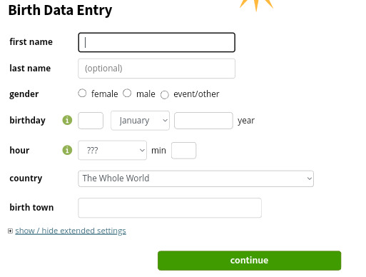
Go to astro.com. Sign up in there if you still haven't already. Choose whatever date and time you want, there's no rules, it can be a random date, an important day, a special day, whatever. The place of reference can also be whatever. It's up to you.
Register your chosen date in the birth data entry and click continue:
Go to extended chart selection under free horoscopes and horoscope drawings & data:
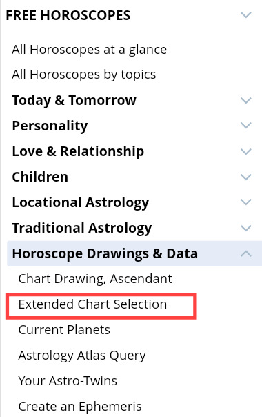
Change "horoscope for" to your chosen date. Then change the chart type to "Harmonic chart (please enter harmonic number in day field). Just scroll down.
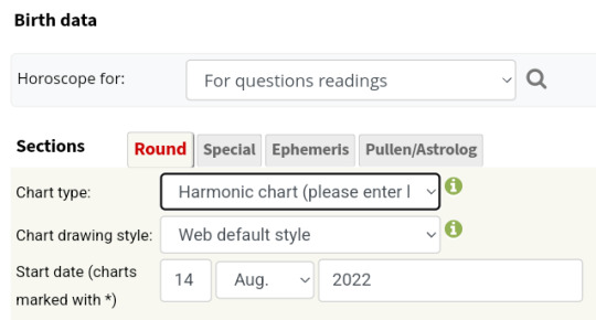

Now go to a number generator site like this. Or just google "number generator" and google's free number generator will appear (image below). Remember to change the min number to 1 and max number to 99999 (or any number below that- but not above 99999).
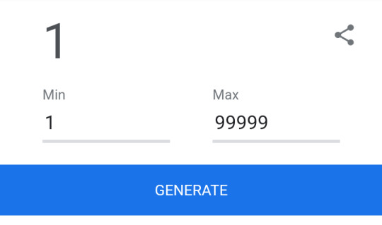
Why is 99999 the limit you ask? Well, in astro.com, the harmonic number is typed in the day field, yeah? Thing is, there's a digit/character limit that can be typed in there. And the limit is 5 digit.
But I said harmonic can be infinite, right? Well, there's no free astrology site that does that. Astro.com is the only one with the highest harmonic number option available. In astro-seek.com, their harmonic chart calculator is only up to 360. So if you really want to pass the 99999 limit, you either buy an astrology software (they're really expensive) or you try calculating them by hand. This is what's available and I don't know about you but 99999 is already a lot.
Anyways, you click generate in the number generator and the number that appears- that's the number you type in the day field in astro.com.
For example, I have a question and my question is- What will happen on my next birthday? 🤔. I use the number generator like I said and the number that appears is... 88478! I type it in the day field and click show the chart.

And voila! Here's the answer to my question, now all I need to do is interpret it duh.

Extra: If your question is serious and complicated and you want more very specifc details or just if you think that the major planets are not enough for your interpretation, you can always add additional objects (asteroids, comets, fixed stars, etc). Right here:
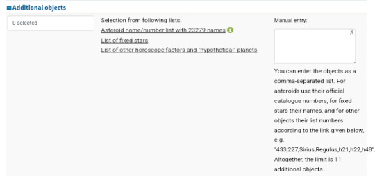
For example, your question has something to do with your future spouse like "What will my future spouse be like?".
You can add Lilith, asteroids like Ceres, Pallas, Vesta, Juno, Eros, Psyche, etc. There's sooo much more. It's all really up to you. Like have fun with this! Go crazy, go stupid. Yaaay!!!!

That is all ☺️, thank you so much for reading 💕. Hope you guys like it, have fun with this lil experiment. Try it out please and let me know when you do, call me haha 🤙🤭. My mind goes wherever sometimes, sorry. Be kind!
It's a good delicious name, I better not see anyone judging it 🤨❤️.
© 2022 BERENICETHEIV. ALL RIGHTS RESERVED.
#astrology#astrology experiment#harmonic chart#harmonic charts#tarot#astrology reading#horary#horary astrology#mama i'm a scientist what can i say#bere.iv.txt
94 notes
·
View notes