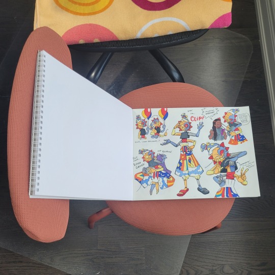
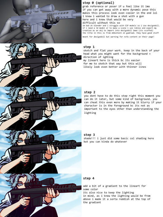
#there are definitely more in-depth tutorials out there
Explore tagged Tumblr posts
Visit Tumblr Blog
Explore Tumblr blogs with no restrictions, modern design and the best experience.
Last Seen Tumblr Blogs


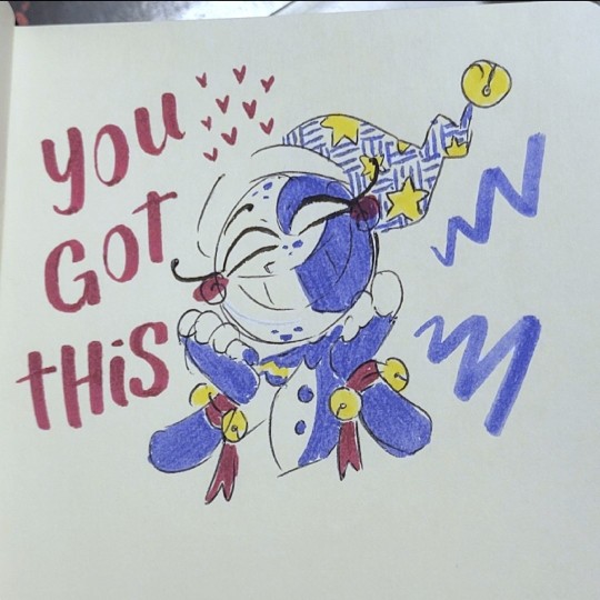
Fun Fact
Post activity is at the highest at 4:00 pm EDT; notes peak at 10:00 pm EDT.
Text
Reblogging to boost and add a few more channels to follow!
Draw Sessions (personal favorite of mine) - Character/Creature/Mech concept artist. Does longer, real time draw-along videos where he breaks down his process for making concepts, thumbnails, and more detailed illustrations. Excellent inspiration and teaching, also has a discord for his community for all artists, but especially for character concept artists, as well as mentoring. Very chill overall and a channel I'm very glad to have found.
Tyler Edlin - SO MUCH. SO much amazing stuff. Oh man. Genuinely covers pretty much anything. Fundamentals, design principles, illustration tutorials, concept art, etc. This channel is an extension of his online school, Brushsauce Academy, so there's also that to check out if you want, but there is such a wide array of amazing resources here.
Artwod - another channel from a professional artist that covers basically everything, from fundamentals, composition, tips in general, tips for concept art, etc. Tons of amazing stuff. Definitely go check him out.
Whyt Manga - Manga/Comics advice from a published POC Manga author. Has tons of tips, guides, and cheap/free resources, and goes very in-depth in his process. Super good.
Jackie Droujko - Professional character designer, worked at Disney -- great tips and critiques/portfolio reviews. Also has some animation stuff.
Color with Kurt - A great comics colorist! Most stuff is, of course, geared towards comics, but great for color theory in general.
Peter Mohrbacher - Ever heard of Gradient Maps? This man's a master at them, and has great resources to use them better. Most of his videos are painting timelapses, but I find them to be very inspiring to watch.
I can probably dig through my subscriptions and find more, but these are some amazing places to start. Highly recommend.
Can't afford art school?
After seeing post like this 👇
And this gem 👇
As well as countless of others from the AI generator community. Just talking about how "inaccessible art" is, I decided why not show how wrong these guys are while also helping anyone who actually wants to learn.
Here is the first one ART TEACHERS! There are plenty online and in places like youtube.
📺Here is my list:
Proko (Free, mostly teaches anatomy and how to draw people. But does have art talks and teaches the basics.)
Marc Brunet (Free but he does have other classes for a cheap price. Use to work for Blizzard and teaches you everything)
Aaron Rutten (free, tips about art, talks about art programs and the best products for digital art)
BoroCG (free, teaches a verity of art mediums from 3D modeling to digital painting. As well as some tips that can be used across styles)
Jesse J. Jones (free, talks about animating)
Jesus Conde (free, teaches digital painting and has classes in Spanish)
Mohammed Agbadi (free, he gives some advice in some videos and talks about art)
Ross Draws (free, he does have other classes for a good price. Mostly teaching character designs and simple backgrounds.)
SamDoesArts (free, gives good advice and critiques)
Drawfee Show (free, they do give some good advice and great inspiration)
The Art of Aaron Blaise ( useful tips for digital art and animation. Was an animator for Disney. Mostly nature art)
Bobby Chiu ( useful tips and interviews with artist who are in the industry or making a living as artist)
Sinix Design (has some tips on drawing people)
Winged canvas (art school for free on a verity of mediums)
Bob Ross (just a good time, learn how to paint, as well as how too relax when doing art. "there are no mistakes only happy accidents", this channel also provides tips from another artist)
Scott Christian Sava (Inspiration and provides tips and advice)
Pikat (art advice and critiques)
Drawbox (a suggested cheap online art school, made of a community of artist)
Skillshare (A cheap learning site that has art classes ranging from traditional to digital. As well as Animation and tutorials on art programs. All under one price, in the USA it's around $34 a month)
Human anatomy for artist (not a video or teacher but the site is full of awesome refs to practice and get better at anatomy)
Second part BOOKS, I have collected some books that have helped me and might help others.
📚Here is my list:
The "how to draw manga" series produced by Graphic-sha. These are for manga artist but they give great advice and information.
"Creating characters with personality" by Tom Bancroft. A great book that can help not just people who draw cartoons but also realistic ones. As it helps you with facial ques and how to make a character interesting.
"Albinus on anatomy" by Robert Beverly Hale and Terence Coyle. Great book to help someone learn basic anatomy.
"Artistic Anatomy" by Dr. Paul Richer and Robert Beverly Hale. A good book if you want to go further in-depth with anatomy.
"Directing the story" by Francis Glebas. A good book if you want to Story board or make comics.
"Animal Anatomy for Artists" by Eliot Goldfinger. A good book for if you want to draw animals or creatures.
"Constructive Anatomy: with almost 500 illustrations" by George B. Bridgman. A great book to help you block out shadows in your figures and see them in a more 3 diamantine way.
"Dynamic Anatomy: Revised and expand" by Burne Hogarth. A book that shows how to block out shapes and easily understand what you are looking out. When it comes to human subjects.
"An Atlas of animal anatomy for artist" by W. Ellenberger and H. Dittrich and H. Baum. This is another good one for people who want to draw animals or creatures.
Etherington Brothers, they make books and have a free blog with art tips.
📝As for Supplies, I recommend starting out cheap, buying Pencils and art paper at dollar tree or 5 below. If you want to go fancy Michaels is always a good place for traditional supplies. They also get in some good sales and discounts. For digital art, I recommend not starting with a screen art drawing tablet as they are usually more expensive.
For the Best art Tablet I recommend either Xp-pen, Bamboo or Huion. Some can range from about 40$ to the thousands.
💻As for art programs here is a list of Free to pay.
Clip Studio paint ( you can choose to pay once or sub and get updates. Galaxy, Windows, macOS, iPad, iPhone, Android, or Chromebook device. )
Procreate ( pay once for $9.99 usd, IPAD & IPHONE ONLY)
Blender (for 3D modules/sculpting, animation and more. Free)
PaintTool SAI (pay but has a 31 day free trail)
Krita (Free)
mypaint (free)
FireAlpaca (free)
Aseprite ($19.99 usd but has a free trail, for pixel art Windows & macOS)
Drawpile (free and for if you want to draw with others)
IbisPaint (free, phone app ONLY)
Medibang (free, IPAD, Android and PC)
NOTE: Some of these can work on almost any computer like Clip and Sai but others will require a bit stronger computer like Blender. Please check their sites for if your computer is compatible.
So do with this information as you will but as you can tell there are ways to learn how to become an artist, without breaking the bank. The only thing that might be stopping YOU from using any of these things, is YOU.
I have made time to learn to draw and many artist have too. Either in-between working two jobs or taking care of your family and a job or regular school and chores. YOU just have to take the time or use some time management, it really doesn't take long to practice for like an hour or less. YOU also don't have to do it every day, just once or three times a week is fine.
Hope this was helpful and have a great day.
"also apologies for any spelling or grammar errors, I have Dyslexia and it makes my brain go XP when it comes to speech or writing"
105K notes
·
View notes
Note
Hey Crabs! I have a small question! 🦀
How do you make the pictures of your traditional art look so good!?
They are always bright and easy to see! But when I take a photo of my drawings, they always have a blue or yellow tint to them. So how do you make it look the way you do?
(Also, I want to gobble up your art it is so yummy and pretty! Sun and Moon are so precious in your style!) ❤️
Thanks! And I hope you’re having a good day! :D
no prob! there's actually a couple things i do, so here's the tl;dr:
Lighting: i use daylight or light from a neutral white lightbulb
Editing: i use my phone's built-in gallery app to lightly edit the colours so they're clear and as colour-accurate as i can get (from my screens at least)
and i'll go into a little more detail with some examples under the cut
1. Lighting
a habit of mine that i got from my IG days (ugh...) is using daylight whenever possible. daylight just lights up the whole area more evenly and relatively neutrally. this is my set up:
glamourous
basically, i put the artwork near a source of natural light and prop up a reflector (in this case, a blank page from another sketchbook) that helps distribute the light more evenly across the page, so that even the side that is furthest from the light gets some light that bounces off from the reflector. i don't always have a reflector tho, like if i'm only taking a picture of a small drawing and not an entire page, there's no need.
now, if it's dark, then i rely on my desk lamp, which uses a neutral white lightbulb. regular lightbulbs come in different temperatures, from warm to neutral to cool—so that might explain why your photos are coming out with a yellow or blue tint. warm lights are common in houses because they're cozy, while blue lights are common in working areas because, like daylight, they keep us more awake. neutral white is in between the two.
here's an example of my Moon doodle that i did recently under different lights: warm (from my bedside lamp), neutral white (from my work desk), and daylight (i don't have any cooler lights in the house, so i couldn't quite get the blue tint 😅)
now technically, NONE of these are colour accurate. so i always follow up with some light photo editing
2. Editing
now, i have 2 personal rules when it comes to editing my photos:
1) try to make it as close to the original as possible; and 2) don't spend too long on it
these are just my personal rules because... one) i'm lazy and i don't want to spend too long fixing every thing in my drawings, and two) i feel it is dishonest for me to make dramatic changes to my traditional art and still call it traditional art. whenever i do make digital enhancements (like colouring it digitally) i will tag it so no one would mistake it as purely traditional art. that's just me tho! there are no rules when you're having fun with your art and mixed media art is a thing! so do whatever you find fun and enjoyable.
also, i will try to make it as colour-accurate as possible, but i also recognize that not everyone's screens are calibrated the same way. my phone is set to a "Natural" colour setting, but on my new laptop (which i haven't figured out how to calibrate yet) is vibrant as all heck (like oh my gosh, maybe i need to start tagging everything with bright colours now, because what if someone else's laptop is this insanely vibrant and saturated??) but either way, i try not to spend too long on it because i know i won't be able to accommodate every screen.
anyways, for what i actually DO... i kinda just play around with different settings. if i took the picture under daylight, then there's not too much i adjust, usually it's the warm colours that are desaturated, so i try to make the reds pop more without effecting the blues too much.
or for my doodles, sometimes the doodle on the other side of the page is slightly visible, i'll tweak the lights and shadows and contrast levels until the background is clear enough (as long as it doesn't disturb the doodle i'm taking a photo of)
now, if your photos are coming out too yellow or blue because of your lighting, you can adjust that by tweaking the Temperature setting. here's an example of that warm Moon doodle:

already looking a little better, right? so don't worry if your photos aren't coming out accurate, there are work arounds!
here's the before and after of the Moon doodle by the way:
despite having daylight, i still needed to adjust the colours. specifically i needed to brighten up the reds and yellows, and bring back the page's natural yellowness. i also tweaked the Definition setting to make less hazy (sometimes i like the haziness tho, so i'll leave it as is sometimes).
and one other reminder: it doesn't need to be perfect, it just needs to be. a big reason why i keep coming back to traditional art is the fact that i can't control everything. i can't undo lines. i can't move things around. and i can't take the perfect picture. but it doesn't need to be perfect. drawing and sharing my art is supposed to be fun! and i don't want to put any barriers around that, or else it becomes unnecessarily stressful.
all that is to say, try out these tips if you want to, but don't treat them as hard rules and don't focus on trying to achieve perfection. just go have fun!
#ask the crab#sorry this took so long!#i wanted to make sure it was clear#cuz like#i totally understand the struggle of trying to take good pictures of your traditional art#like you worked so hard on a drawing#but then the photo ruins it 😅#so i wanted to share what i know so it might help#there are definitely more in-depth tutorials out there#this is just what i've gathered from some of them plus some advice from a food photographer friend of mine (her stuff is actually legit tho
19 notes
·
View notes
Note
Jimbo (Balatro)?


Jimbo has a Ryu Number of 3/does not have a Ryu Number.
(CORRECTION: Per multiple people, a Balatro crossover update for Don't Starve Together may give Jimbo a Ryu Number.)
(explanation below)
I don't have exact numbers, but I believe Jimbo is the character I've gotten the most requests to find a Ryu Number for since starting the blog, so I think this warrants going a bit more in-depth than normal.
First, I'm going to establish that Jimbo himself is a talking card. More specifically, he is both the literal Joker card that gives you a flat +4 Mult and the talking Joker card that gives you the tutorial and quips about the outcome of your run.

He seems to be unique in this regard; no other card in Balatro talks to you in this way, so while it is possible to obtain multiple copies of any Joker in-game, this flourish is a major defining characteristic of specifically Jimbo.
Next, there's the matter of the "Friends of Jimbo" crossover face card variants. As of the time of this post, there have been 6 Friends of Jimbo updates for a total of 24 properties represented by face cards of certain suits.

I would think that a cursory glance at the rules would make this clear, but I'll state it explicitly: these are not valid appearances by any definition of the existing ruleset. The characters are depicted on literal cards. For this blog's purposes, they have no relevance.
This means that Jimbo is essentially the only character in Balatro at the moment, so the game itself cannot be used for any links.
So has Jimbo been in any other games?
I'm aware of two games that reciprocated the Friends of Jimbo crossover with content updates. The first game is Dave the Diver, whose developers took the wild yet undeniably idiosyncratic move of... just straight up implementing Balatro at a smaller scale as a minigame.

It is called Jimbo's Game, and you can get a copy of the plain Joker that Jimbo ostensibly is, but I don't believe Jimbo ever actually speaks at any point in Dave the Diver, which as stated previously is the one characteristic that really makes Jimbo unique, so I'm not inclined to count the Joker card as an eligible Jimbo appearance.
The second game is Cyberpunk 2077, which gives you a small fetch quest to find Joker cards to get some Balatro-themed cosmetics. The questgiver in question is a fellow named... Jim B.

So no dice there either.
While this is it for reciprocal crossovers, there is one additional appearance I'm aware of: Dungeons & Degenerate Gamblers.

Unlike in Dave the Diver, Jimbo does actually talk in this game, so while you can get multiple copies of Jimbo, I'm willing to overlook that as a mechanical trapping of deckbuilders.
As for whether you can go anywhere from Dungeons & Degenerate Gamblers is... fraught. No other cards talk like Jimbo or have any other characteristic that suggests they're more than a simple playing card. The actual characters you go up against in the rounds themselves are a bit complicated. There's a couple of opponents in the later acts that resemble classical monsters, but the theming and titles they're given makes saying that they're the singular classical monster in question a bit more of a leap than I'm comfortable with.


There are also opponents that are pretty undeniable references, but there aren't any that I'm so willing to go out on a limb and say actually are the characters or people they reference.

The Actor, for instance, is clearly based on Picard from TNG, but "Actor" suggests that it's not Picard but Patrick Stewart, and I'm not aware of any eligible Stewart appearances in video games.

(There's also an Alucard, but if he's any specific Alucard, he's Alucard from the Son of Dracula movie, which isn't a lot to work with.)
I'd say the closest thing to a slam dunk in this regard is the titular Rain Man, but unsurprisingly, that doesn't give a lot of options.

So if there is a route for Jimbo as of the time of this post (and you might still believe there is one), it's probably through Dungeons & Degenerate Gamblers, and while it wouldn't be as unambiguous as I'd feel comfortable posting, it would probably be at least defensible.
(The actual takeaway you should have is that the Friends of Jimbo crossovers are emphatically irrelevant to this blog, and if you bring them up I will personally modify your copy of the game to remove every deck except the Abandoned Deck.)
(I know it's a good deck, it's about the principle of the matter.)
535 notes
·
View notes
Note
You should totally do like a how to draw Konig tutorial for one of ur daily sketches
Chibi or not
But u should totally do it
I neeeeeeeeed ur process
-🦥
notes below the cut - additional notes can be found in this post where I give art tips from my experience
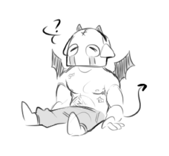
daily König sketch with bonus content♥️‼️post is a little late but it’s due to the info dump below haha, anyways, he’s a little nervous

hi!! thanks for requesting a little “my process” thing - super happy to do one<3
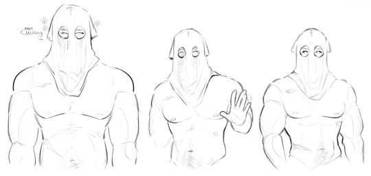
I’ll be using these pieces of him that I’ve done to go over my notes - this is just how I go about drawing him. I’d definitely recommend also going through this post linked above too for additional info because a lot of it carries over!
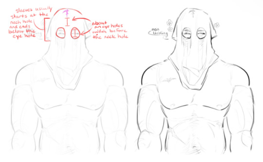
I think the most important thing for me when drawing König is spacing out his hood ratios. I always start out by just drawing where his eyes and eyebrows are, then I draw the cut-outs around them. after that, I start the stitched neckline - that’s usually an eye hole’s width above his actual eyes, it gives a good allusion to where his forehead would be
they aren’t hard and fast rules I follow, more like a silent guideline that can be meddled with depending on the drawing. I usually follow them because, to me, it looks the best with how I draw him. it’s flexible - same with the sleeves, sometimes they end below his eye cut-outs, sometimes I cut them short and they’re higher
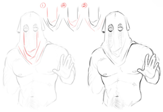
I thought I’d do a step-by-step for the hood folds because just info dumping all at once sounded confusing in my head
I start by just drawing lines down from the corners of his eye cut-outs, then I loosely draw a slanted line to show some bunching of the fabric. the slanted line is usually around where his collarbone would be
best way I can describe figure 2 is drawing folds in a ‘U’ shape. the fabric is falling from his head and ‘pooling’. the ‘U’ shape adds a little depth
miscellaneous little folds around the hem. they follow the way his hood rests, slanting downwards towards the center
if anything, just study how fabric falls and bunches up! a lot of drawing is looking at reference material to figure the ‘why’s and ‘what’s - “why do the folds bunch in certain areas?”, “why is fabric gathering in that area”, “what’s causing the fabric to move like that”, etc
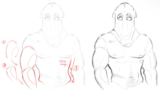
lastly is his body, and as we know, I’m allergic to drawing clothing (read “lazy”). I actually really recommend looking at the post I linked above for this because, in the last figure, I show the Pinterest reference of the man who inspired my König’s body shape (and went into depth on using references)
for arms, in figure 1 and 2, you’ll see me draw an oval inside the bicep and forearm - those are just to add the allusion to muscle mass. if I don’t draw those ovals, to me, it looks a little flat. in figure 3 I go over his waistline because of course I do
I always account for a prominent rib cage line because I personally like drawing a more pronounced rib cage in general. after the ribcage, there’s a slight indent at the waist before it flares back out - that ‘flare out’ is the line for the Adonis belt. again, just personal preference, but I enjoy making the curves a little dramatic so they’re more pronounced and visually appealing to me

I don’t know how helpful that was but I hope I got some information across - uuh, even though I don’t draw his tactical gear and uniform that often the advice I can give is to just look at his model haha. the only gear that gives me a headache is his helmet, but even then I just bs my way through it
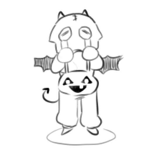
for chibi König I just shrink all his proportions and draw a stupid little t-shirt for his head<3 he doesn’t need to think, he’s just a cute little fella. I draw chibi König the way I would draw a puppy, make him look cute without a thought behind those eyes
for additional reference material here’s the link for my Pinterest - I have an absurd amount of reference material for you to browse through
hopefully this was slightly helpful?? I don’t know, as long as you get something out of this I’m happy
228 notes
·
View notes
Note
hii just wanna say that ur art is so so pretty and so so cute... ^_^ i absolutely love the way u shade and color its so mesmerizing to me
while we're on the topic how do you pick out your colors? especially when theres complicated lighting or effects (affects? idk) if that makes sense.. i love coloring and shading my art but it always finds a way to kick my ass lmaoo
anyways ur work is so awesome and definitely a huge inspiration to me ^_^ have a good day/night whenever ur reading this
THANK YOUUUU!!! you know what. I will not gatekeep any longer and reveal my secrets............... The Secret Is!!!!!!!!!!! um,
its just gradient maps and photoshop camera raw tbh... OBV LIKE. i know color theory a little but more i honestly really rely on post processing more than anything. while im an artist and i love doing art im.... i'm just really good at bullshitting LMAO i'm better at little tricks to get to the finished product than like. being actually knowledgeable and practicing things..... which i should do more. I need to do more studies when i have time.... there's no harm in shortcuts or references or tricks and i've learned to not be ashamed of it!! (obviously, this is not referring to generative image AI or directly tracing/stealing from other creators i need to be clear) end product- creating cool visuals/scenes is what is my passion for art has really come to in the past few years and while it's made me, sadly, a very ambitious perfectionist (the worst combo), it's the most fun i have with art!
anyway. i actually made a bullshitting tutorial for some friends who wanted to know my process for my more quicker art pieces last year and so i will now present it to the public. Behold!!! the fucking thing!!!!

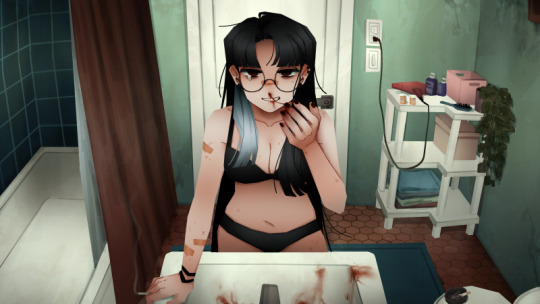
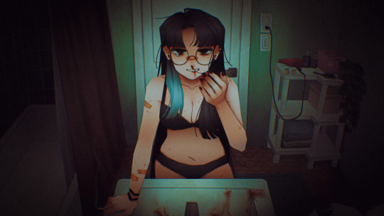
i pulled open some other, more complete pieces so you can see the change from Raw Colors ↓ First Pass Post-Processing (CSP layer effects mainly and adding gradients/vignettes where needed for depth) ↓ Second Pass Post-Processing (Photoshop Camera Raw + back to CSP for finalizations like noise/chromatic aberration) here's the shrimpku print


and for something a little crazy heres the salt wound routine art evolution LOL (this may not be exact, the layers are weird and i did many passes before figuring out what i wanted)


i wish i had more like...... genuine advice or something more substantial to recommend HAHA but i hope this helps in some way at least!!!
62 notes
·
View notes
Note
hi i'm sorry to bother you but do you have any tips on giffing dark indoor scenes? yours always look so good!
hi there! not a bother at all :) i can definitely try to explain the steps i usually take under the cut!
this tutorial will assume that you already know the basic steps of gif-making — if you don't, there are lots of great tutorials floating around on this site that can help you out! :)
here's the gif i'll work with to explain my steps, the bottom being the original and the top being the coloured/brightened version.
before we start, a general tip i recommend keeping in mind: if you want to brighten a dark scene, you'll want to get your hands on the highest quality download you can find. 1080p is decent, but if your laptop can handle 2160p 4k hdr files* without sounding like it's about to explode, that'll get you even better results!
(*colouring hdr 4k files requires a different set of steps — the scene will appear washed-out on photoshop, so you need to make sure that you don't end up whitewashing anyone if you do choose to work with this type of file.)
since most of my downloads are 1080p, i'll use this type of file in this tutorial.
the first step of my gifmaking process with 1080p files is almost always the same no matter what scene i'm giffing. i make a brightness/contrast layer and set the blending mode to screen:
now my gif looks like this:
depending on the scene and how washed out it looks after this layer, i'll play around with the opacity. for this gif, i didn't touch the opacity at all. use your best judgement for this, because every scene is different!
i find that dark indoor scenes are usually tinted in yellow or green. one of my first goals is to try to fix the undertone of this scene before focusing on brightening it any further. i go to colour balance for this, and play around with the midtones, shadows, and highlights.
again, every scene is different, so the amount to which you use colour balance will differ, but for this specific scene, my goal was to neutralize the yellow. i focused particularly on the midtones and shadows of the colour balance layer, moving the scales to the opposite of the reds.
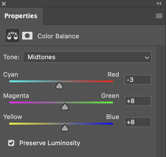
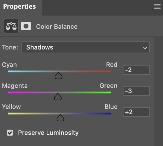
doing so will help with neutralizing the yellow. the only reason i moved the scales towards magenta and blue (therefore making it a bit more red than less) rather than green and yellow in shadows was because i wanted a darker contrast in the blacks. moving them to green and yellow made the overall scene more yellow since there were so many dark spots that shadows affected. (you'll see what i mean when you start experimenting with your own gif — this part of the process really just depends on your preferences!)
our gif might not look that much better yet, but it will soon! our best friend channel mixer is gonna help us out. for an in-depth post about how to use this adjustment layer, i recommend checking out this tutorial.
i'm someone who prefers to make more than one layer for the same adjustment layer for a reason i can't even explain (i just find that it helps me stay more organized). so don't think of this process like i can only use this layer once so i MUST fix it NOW. you can create multiple layers of the same adjustment layer, because every layer on top will affect the ones underneath it.
since my priority is getting rid of the yellow tint, i went to the Blue section of the channel mixer and increased it in all of the scales:
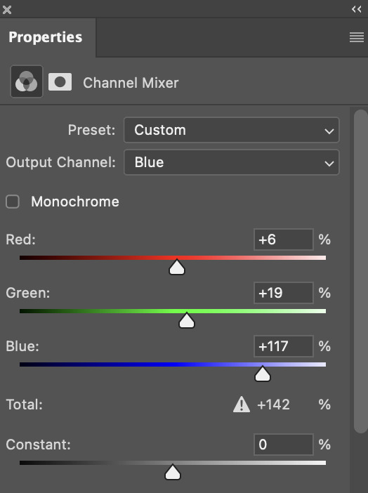
this step alone has helped us out so much, because look at our gif now!
not only does the background look less yellow, but so does izzy's skintone.
now i'm going to focus on trying to brighten the scene even more without destroying the quality. the levels layer can actually help out a lot with this.
the amount to which i move each toggle differs per scene, and i think experimenting depending on your gif works best for this layer.
side note: i prefer not to use the ink droppers on the side because the contrast in the result usually ends up feeling too strong for my preferences, but if you find that this works better for you, then go for it! basically, the first dropper with the black ink should be clicked before you select the darkest part of the scene that you can find, and vice versa for the third dropper with the white ink — click it, and then select the brightest part of your scene.
curves is the next layer that does fantastic work! unlike the levels layer, i do actually use the ink droppers for this. it's the same concept, with the first dropper being used on the darkest part of the scene, and the third dropper on the brightest.
try to think of curves as something that not only further brightens your scene, but also helps with the colour neutralizing process.
i grab the first dropper, then click the darkest parts of the gif that i can see. depending on the undertone of the blacks that you're clicking on, the tint of your gif might actually change significantly. this is why i prefer to click once, then undo the action if i don't like what it gives me. izzy's leather jacket was the sweet spot for this gif.
when i'm satisfied, i make another curves layer and use the third dropper to click the bright/white parts of the scene. for this gif in particular, the lights in the background were a good fit because they carried a yellow undertone — this meant that my curves layer actually helped to further neutralize the yellows in the scene as a whole!
(i manually dragged the curves graph upwards for the third dropper to make it brighter. i don't need to do this if the dropper does this for me automatically, but since the lights were pretty bright, it only changed the tone of the scene and didn't increase the brightness — hence the manual step.)
pat yourself on the back, because this is what our gif looks like now!
this is good, but it's not great — there's still just a bit too much yellow in the scene for my liking (sorry, i'm picky! :P)
i created another channel mixer layer and played with the toggles until i was satisfied:
ta-da! the gif as a whole is much less red/yellow now:
this is when i start fixing the colouring now — namely, his skin tone. selective colour will be your best friend here. i wanted to make his face just a tad brighter and less of a yellow-ish magenta shade, so i focused on the reds and yellows.
then, out of habit, i created another selective colour layer and took out more of the "yellow" in the whites to make them whiter, and increased the black (just by +1, since the contrast is pretty good enough already).
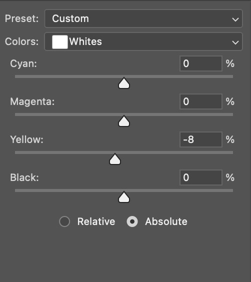
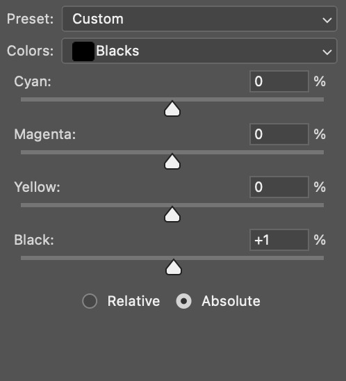
note: i switched to "absolute" for these two colours. basically, relative = less vibrant colour manipulation, and absolute = more vibrant/stronger colour manipulation. i prefer to stick to "relative" for fixing skin-tone since "absolute" can be a bit too strong for that.
our gif looks like this now!

his face looks brighter and much less yellow, so i'm satisfied!
this next step is not mandatory at all — again, i'm just picky and despise yellow-tinted scenes. i personally believe that indoor scenes that are yellow/green tinted make them look more dark than they actually are, so i do my best to get rid of these colours.
i also don't always do this, but for this gif, i just simply went to hue/saturation, selected the yellows from the drop-down menu and decreased its saturation.
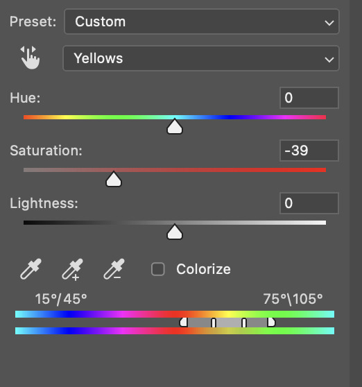
be careful not to do this too much. depending on the quality of your download, this can significantly decrease your gif quality. i tend to worry less about this when i'm working with 2160p files, but again, those files require an entirely different set of steps when it comes to brightening/colouring.
since this was a 1080p file download (and one that was actually less than 1GB, oops, don't do that), i played it safe and decreased it by -39 only.
note: you also want to be cautious of colour-washing skintone when it comes to this step. i find that another selective colour layer can help perfect the skintone in case the yellow drains out of it too much, but skip the hue/saturation step if it's too difficult to work with — better to be safe than sorry.
anyway, this is the final gif!
that's usually what i do when it comes to colouring dark indoor scenes! i hope this tutorial makes sense, and if you have any further questions, don't hesitate to reach out! :)
#tutorial#gif tutorial#resources#completeresources#coloring tutorial#allresources#dailyresources#userraffa#userdean#uservivaldi#alielook#usercats#usermoonchild#usernaureen#userbarrow#userabs#useraish#useralison#userisaiah#*mytutorials#i am so sorry if this is incoherent#it’s so hard to explain things coherently 😫
755 notes
·
View notes
Note
If it is okay to ask, what brushes would you use when it comes to drawing in the Professor Layton Artstyle?
Hi!! if you mean for sprites like these:

then i just use the basic lineart pen that can probably be found on any art program. for csp it's the G-pen and my settings look like this:
i set the pen pressure to a lower range just to have more consistency

if you mean for the box art style like this:

then i still use the G-pen for the lineart, but i use the basic default round brush which can again be found on any art program for the shading, for csp i used this:

more in depth tutorial for the box art style below, i guess?

obviously start with references, i was picturing diabolical box in my mind so i used that as my main inspo but i also had all the other box arts up, was definitely also thinking of last specters art
(note: weirdly the 3ds titles go from soft shading to hard shading? not sure why but i was going for the soft one personally)
anyway, after that i went into compositional thunbnail, sketch, then lineart, fairly basic, i would show you what these looked like but im running out of space for images. the main thing to make it look "layton style" is to have a good grasp of the characters and shapes and how they move which is not something i can teach you in one Tumblr post i have just spent a lot of time staring at layton arts
also for your compositional sketch be sure to include where youre gonna put the logo because i forgot to !!!!!!!!


for the base colours i just used the colours from their official arts, its much easier than trying to figure out how to keep their palletes later
my layers here looked like this (but turned on obviously) the first few are an overlay on battler & co. to make them more orange to fit the tone of the art, and a multiply layer for both descole and beato since theyre more in the background. theres also a black gradient around battler & co. to make the transition into beato less jarring


from there is the lighting, i just used a yellow overlay layer for the light and a greyish brown multiply layer for the shadows

deceptively simple! the whole process probably took me about 1hr and 30 mins maybe
103 notes
·
View notes
Note
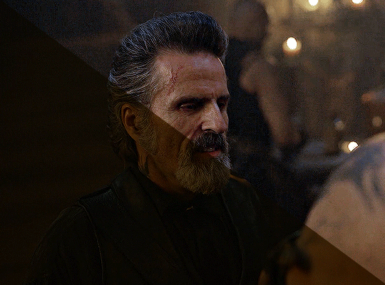
hey!! Those gifset for scrubs looks amazing!!
https://www.tumblr.com/billysjoel/776944203704975360/scrubs-jd-elliot-turk-pscentral-event-36?source=share
would you mind doing a tutorial on how you made the colouring and colour isolation and text effects on the second gif?
hi, thank you so much!! this is the post and i'd be more than happy to make a tutorial for you!

so, i'll start with the coloring:

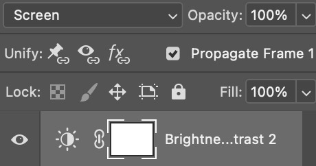
step 1: as with almost every single coloring/psd i make, i start with a blank brightness/contrast layer set to screen. this is especially helpful with really dark scenes! in this case, i left it at 100% opacity, but sometimes i'll decrease it if it blows out the scene.
step 2: curves. i rarely, if ever, manually adjust this layer and instead use the eyedropper tools. click the black eyedropper (1) and then click on the blackest part of the scene and then use the white eyedropper (2) to select the whitest part. in this case, it didn't make a huge difference, but this is a big help with heavily tinted scenes.

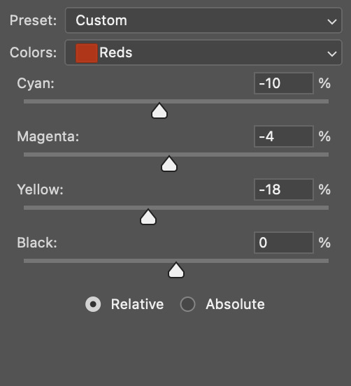
step 3: selective color. my next step is always adjusting the blacks and neutrals (and sometimes whites) in selective color. how much i adjust these totally depends on the scene and messing around with the neutrals can definitely affect the skin tone of people of color, so keep that in mind!


step 4: color balance. this step is usually optional for me, but i found the scene was leaning kind of yellow. again, this will vary dependent on the media you're coloring, so my best advice is to play around with the sliders and see what works!


step 5: gradient map. after this, i added a black & white gradient map set to soft light and reduced the opacity to 25% just to add a bit more contrast and depth to the blacks.
step 6: brightness/contrast. another blank layer set to screen and set the opacity to 15% to brighten things up just a little.
step 7: vibrance +50.
step 8: selective color. adjusting the blacks and neutrals again.


step 9: selective color. my favorite part is just cranking the blues and cyans the FUCK up lmao


step 10: selective color (again) on cyan and blue (again).


step 11: selective color under the reds because elliot's face was looking pretty red.

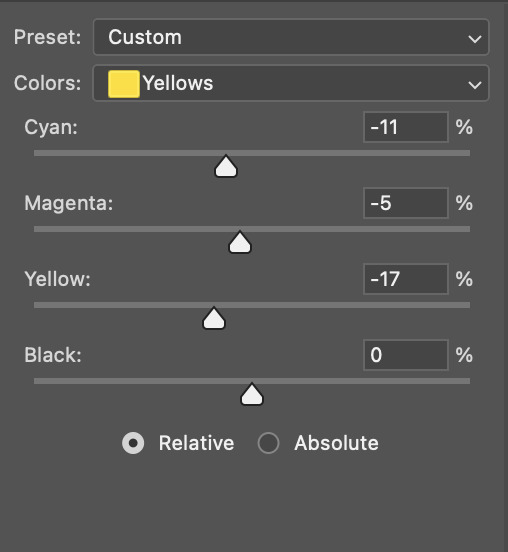
step 12: selective color under the yellows. again, i recommend just playing around to see what slider does what. a little can go a long way!

and that's it for the general coloring that i used for all the gifs in this set. for the next part, you'll either want to be proficient with keyframes or pick a scene where your main character doesn't move much (this will make life so much easier).
step 13: create a new layer (ctrl+shift+n or layer > new > layer). choose the color you want to use and either fill the layer using the paint bucket tool (g) or use a brush (b) to color it all in. you should have something like this now:

step 14: set the layer to color (or another blending mode of your choosing) and apply a layer mask (the 3rd icon across the very bottom).

step 15: with the layer mask selected (as you see above), not the color thumbnail, use a soft black brush and color over your character. this will remove the blue from from whatever areas you color. if you need to "undo" what you've colored, switch to white (x) and that will bring back whatever you color over.
step 16: typography. i've actually done a few tutorials showing how i do my text like this, so check out this one, this one, or this one!
if you have any other questions, please let me know! i'm happy to help however i can!
#answered#Anonymous#my tutorials#gif tutorial#gifmakerresource#completeresources#dailyresources#chaoticresources#coloring tutorial
45 notes
·
View notes
Text
genshin men as types of influencers—part two
part one
cyno has a prank channel, but “prank” is a loosely-defined term. sure, he acts like everything he’s filming are pranks, but are they really? he laughs at them meanwhile the person being pranked ends up more confused than anything else. the ends of the videos include an in-depth explanation as to why the prank is funny and why the audience should be laughing (they’re still not).
dottore has a very bland account dedicated to his research and experiments. this includes hours long, unedited videos of him going through the procedure, and barely explaining anything at all. he doesn’t get a lot of views, except for one random video with millions of views, likes, and comments. it’s definitely not pinned on his channel either.
albedo also has an account dedicated to his experiments, except that his videos are more like tutorials. he’ll explain the procedure, what materials you’ll need, and go through step-by-step on how to set up and complete the experiment. struggling high school and college kids love him, and he even takes his time to respond to some comments.
heizou is the host of a true crime podcast. what started out as him bragging about his escapades turned into biweekly uploads about true crimes around teyvat. sometimes he’ll bring on co-hosts, other times it’ll just be him. heizou knows the ins and outs of the detective side of things, and he’s such a naturally-gifted narrator that he’s swiftly amassed a legion of loyal fans.
tighnari has an account dedicated to nature and the environment. you’ll find several videos of animals, wilderness survival guides, and even a glimpse into his own day in the life. he most certainly has a couple rants about travelers and adventurers getting a little too friendly to hostile animals—he tells his audience to learn from their mistakes, no matter how funny the story may be.
kazuha posts pictures of short videos of his travels over teyvat, and his account is very aesthetically pleasing. he has an overall neutral color scheme and the photos he takes breathe serenity and peace—even if his day-to-day life can sometimes be anything but. he always includes where he’s currently visiting and comments on the county in the caption.
lyney posts card tricks. he is able to captivate his audience with such tricks, even fooling the most keenest of eyes. his shuffling is also impressive; can he split the deck and have the cards arranged in whatever order he wants in under a minute. his audience begs for a tutorial that lyney will never give—a magician never reveals his secrets, after all.
#genshin impact#genshin impact headcanons#genshin impact x reader#genshin headcanons#genshin impact fluff#genshin fluff#genshin imagines#genshin x reader#genshin impact x you#cyno x reader#dottore x reader#albedo x reader#heizou x reader#tighnari x reader#kazuha x reader#lyney x reader#cyno headcanons#dottore headcanons#albedo headcanons#heizou headcanons#tighnari headcanons#kazuha headcanons#lyney headcanons
726 notes
·
View notes
Note
how do you take such nice screenshots?? ur sims always look amazing
hello! :D first of all, thank you so much for the compliment :’)
01. graphics settings SO i have my graphics on high which definitely plays an important role imo :o) here's a screenshot of my settings.

fortunately, my game still runs pretty well even with higher settings :') if you noticed, i have edge smoothing turned off and that's because the reshade i'm currently using needs it to be turned off so that it'll look better lol. but i do recommend you turn it on if you're not using reshade :)
02. lighting mods & reshade presets lighting mod are basically mods that change the game's lighting. here are some i'm currently using and highly recommend!
no blue v2 (i have the gameplay version) - removes the blue tint when taking screenies
no glo v2.1 - removes halo effect on your sims
immersive cas lighting (neutral spotlight) - removes the green/blue backlights in cas
sunblind lighting mod - overhauls the in game lighting and makes it so much more realistic
boho dreams - my favvv preset ever! i did do some tweaking to fit my preferences but tbh i don't know what i did lol i just made a copy of the original preset and messed around with the settings until i like what i see!
03. taking screenshots & depth of field (DoF) i have this camera mod (mts) buckley that gives you more control of the tab mod camera. this makes taking screenshots so much easier as it adds more angles and also the camera doesn't bounce like it usually does :) i like having my screenshots to have blurry backgrounds and i do that by using the DoF shader on reshade! my DoF settings are untouched btw. sometimes i'll mess around with the bokeh and see what i find pretty :)
04. editing i made this tutorial on how i edit my screenshots ages ago, but i pretty much still have the same process :) the only difference is that i play around with the colours now! i honestly have NO idea what i'm doing LMAO but if it looks nice, then i'm happy with it 🙂↕️
and that's basically all the tips i have for you! a good piece of advice would be to experiment with everything. try taking a screenshot from a different angle than you usually do or lookup some editing vids on youtube and try it out! practice makes perfect :)
25 notes
·
View notes
Note
Hi, I was wondering which engine you were using to make your game? Would you say it was beginner friendly and does it require coding?
I’m just curious. 🙂
Hi!
I am using RPG Maker MV to make my game. I would definitely say it is pretty beginner friendly! You can do a whole lot with the engine, too. People have made some absolutely fascinating games. Heck, you can technically even make visual novels using the engine (although Ren'Py is probably better for that, if that's the sort of game you want to make.)
And you can do in-depth coding, but it's not really necessary if you don't want to/don't know how. Since MV has been around for about a decade, there is not only a lot of documentation for it, but also a lot of plug-ins for if you don't want to make all your scripts or code from scratch when you want to do something with the engine other than the basic stuff. (As someone who finds writing scripts very daunting, it is very nice that people basically make whatever plug-ins you might need instead of having to do it yourself.)
Also, while I have not tried the newer version — MZ — I've heard that it has a few more quality of life things added to it, which probably makes it a slightly easier to use engine while still being very similar to MV
I would, however, recommend watching/reading tutorials if you want to get into making games with RPG Maker. Even the basic commands that are provided in the engine can be a bit confusing if you're just starting out. (Although, be warned, the community on the RPG Maker forums can be a bit snobby and rude to newcomers. It's better to see if they have pre-existing threads pertaining to what you need to know rather than making your own. Unless you absolutely cannot find what you're looking for.)
But, if you find the idea of using RPG Maker appealing, I'd say it's a really fun program to use! Just definitely get it on sale (sometimes it goes on sale for up to 95% off. I got it 75% off, though. Just keep an eye on steam, because sales happen frequently!)
#I definitely hope you get into making your own games!#it's a lot of fun#even if it takes a bit of work
18 notes
·
View notes
Note
hi there! recent art school grad here and i was wondering if u have any tips on learning color + approaching backgrounds? even though i learned a lot, i still find myself struggling with these focuses, especially colors as i never had a class that really taught me that. thanks so much 💗 your work is so lovely
First off, congrats on graduating!! Backgrounds and colors have always been the hardest for me lol tbh I still struggle a lot with colors especially, so please take everything I say with a grain of salt!
Using adjustment layers helps me a lot (especially color balance to make things more unified or complementary).
Another thing that I think has REALLY helped me with color overall is actually switching between color and grayscale.
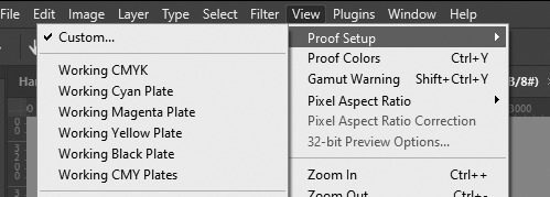
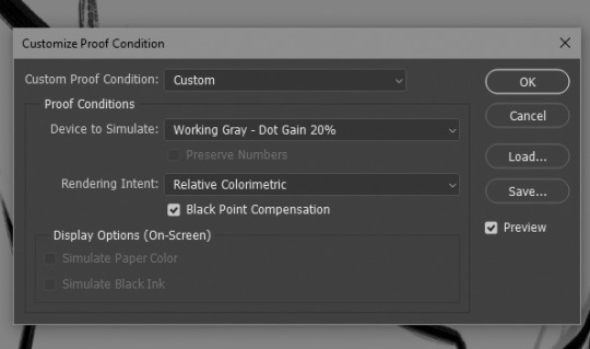
In photoshop I set up a custom proof profile and then am able to switch back and forth by using the hotkey Ctrl + Y. This helps me check my values which, I've found if you have solid values, colors tend to work so much better even if you don't know much about what you're doing lol. Another way to do this is making a solid black layer on top of all your color layers and setting the blending mode to "Color". Then you can toggle that on and off to look at the values.
One last thing I've played with re: colors is finding a reference that has the colors I like and "crystalizing" it and color picking a palette from that.

This can be super helpful if you're having a hard time visualizing or coming up with a color palette!
As for backgrounds, they became a lot easier for me when I started looking at them like their own character. Thinking about the story I'm trying to tell, adding little details that I think would add to that or be fun and fun ways for the character to interact with it.
That and doing value sketches/just a bunch of really quick and sloppy experiments. 9 times out of 10, they don't work out, but sometimes they spark something that turns into something fun and workable!

This has gotten really long for someone that really just bs's their way through every piece, but I will say one thing that was a big game changer for me (in my personal opinion, who knows if other people think so lmao) and it's just incorporating aerial perspective. Making things a bit more blue tinted (or whatever the sky color is) and lighter as they recede into the background. Has made a huge difference for me when it comes to creating depth!

I really don't know if any of this is helpful because to be 100% honest, most of my illustrations are just product of trial and error lol. But practicing and making a lot of really bad scribbles have (I think) helped me the most, so yeah my biggest advice with anything is just look at lots of art, just draw and don't worry if it looks bad because tbh, it probably will at first. But you'll get better!
@tamberella Has a ton of amazing free resources and brushes, so if you haven't checked out their stuff, definitely do so!
@iniro also has some really nice tutorials on color (and other topics) available so I'd also recommend looking at those too!
But yeah, sorry for going on about my hair-brained process, I hope at least some of this was helpful!
42 notes
·
View notes
Text
Gotham Funger AU
For the uninitiated: Fear and Hunger (lovingly called Funger) is a duology of survival horror games featuring a similar world to ours with its own mythology. The name comes from the Fear and Hunger meters in game that, with the body meter will put the horror in surviving. It is infamous due to its difficulty and unfairness, since there’s no tutorial at all and everything can kill you, give you nasty statuses or make you lose limbs. Other claims to fame are its coin flip system that can randomly insta kill you and random generated loot (it resets each playthrough so some runs are wildly different from others depending on luck), a combat system based on chopping the enemies’ limbs (and them chopping yours off, permanently) and the games let’s just say very NSFW and violent nature. A gimmick in the first game is an orgy that heals your body and a cannibalistic feast that restores your hunger meter.
With all this in mind, here’s my idea for a funger game set in Gotham (part 1, plot and setting):
It all begins as Gotham is being evacuated (Arkham Knight style) due to Joker’s threats to gas the entire city with Joker Venom in three days. The main objective is to shut down the different gas production and distribution points across the city and defeating Joker. This is complicated thanks to a variety of Rogues accidentally or purposely blocking the way and causing their fair amount of chaos.
Due to the evacuation the streets are mostly deserted, and as the days pass the get more and more empty. First day morning you may still find some random citicens, from then on, it’s just thugs and jokerized monsters. As the days pass, previous thugs you hadn’t sent to jail get jokerized and jokerized victims get more and more monstruous following these stages:
Smiler (still mostly human, just stronger and “crazier”. They have bloody smiles and other joker features. A variety is the Brawler, bigger in size)
Agent of Chaos (humanoid but definitively no longer human. They’re tall and twisted, with more teeth. Still capable of human speech, they’ll use it to drain your Fear Meter. On a coinflip attack, they can carve a joker smile into their enemies preventing the use of rebreathers and causing damage each time you eat)
Harbinger of Madness (No longer humanoid, several mouths carved into their body, coinflip attack will eat one of your limbs resulting also in a permanent sanity de-buff),
Abomination (only on the third day, just a horrible blob off meat and smiles. It doesn’t do anything but drain your sanity, if you don’t kill it fast enough or have the ability to flee it will completely deplete your sanity meter and the character will begin the jokerization process)
All of the Funger Gods are real and exist in this world (but those that died in previous games are either forgotten or don’t hold real power) Current Gods prancing about would be: Sylvian, Gro-Goroth for the old Gods (Rher, Vinushka and God of the Depths confirmed dead by the end of Termina), All-Mer, The God of Fear and Hunger, Machine God and Sulfur Gods for Ascended Gods (All-Mer should be dying and confirmed dead by the end of the game to reflect how organized religion is dying out in this trying times).
Joker would be considered a servant of Rher, God of madness, but much like Per’kele, his real master is the God of Sulfur. Rher is dead, but madness, destruction and chaos take form in the new God and also his servant. Or at least that’s the general interpretation. Joker is actually a manifestation of the God of Sulfur, that’s why no one knows his origin and seems to be unkillable. His plan is to sacrifice the entirety of Gotham to properly finish his ascension to Godhood on Earth.
Much like in previous games the characters can cause the ascension of a new God to the pantheon: Gotham, Lady of night, cities and Justice. Basically, a Goddess that represents the path of modern cities and gives her favor to the vigilantes that protect them. She’s a good entity for the most part, but not a kind one. She is big cities given form, which means she also stands for all of the filth and depravity found within their streets. To achieve ascension and completely vanquish the Joker a character must become her Dark Knight by raising their affinity to maximum. This path will obviously be easier for Batman, but technically each batfam member could take his place (will discuss in a different part).
From a map perspective I would use the No Man’s Land map as a base. As any Funger player will tell you: the crazier the map, the better. Some areas would be completely inaccessible to make it more manageable. Other parts of the City might be only temporarily inaccessible or only accessible to certain characters. Some of this means may be: Joker or Fear gas (you’ll need a re breather), land mines (you will need a character with gadgeting or mechanic skills to disarm them), locked doors (keys, lockpicking, fighting the door, chainsaws/axes), chains (Bolt cutter, keys), blown up buildings/heights (Grappling gun).
The Bat cave acts a bit like Prehevil Bop and Donovan’s house. It’s quite a ways away, which deters the Bats from depending on it. It holds different pieces of randomly generated gear, a hexen table, ritual circle, a chest, and the Bat computer serving as a bookshelf. There are safe sleeping cots and Alfred will bring you a drink/food as needed. Other semi-safe spaces include: Jason’s safe house, the clock tower and Harley’s (a bar Harley Quinn has taken over)
Different locations may hold different resources like ritual circles, computers, side quests, main plot objective, but also enemies and rogues: Two-Face at City Hall’s Court, Penguin at the Iceberg, Killer Croc in the sewers, Poison Ivy at the Botanical Garden, Scarecrow at Arkham, and Riddler can’t be found physically but you can find riddles all over the place. The bats must balance dealing with all the rogues destroying the city while stopping the bigger threat of Joker. To be able to arrest any enemies you need to clear the GCPD headquarters (They can randomly scape) or for a more permanent solution, clear Arkham Asylum.
Part 2: Rogues
23 notes
·
View notes
Text
In-depth thoughts on The Great Ace Attorney Chronicles as I play it
Adventures case 1: The Adventure of the Great Departure
Obviously a lot of parallels can be drawn with 1-1 (and some with 1-2), which makes it really interesting to see how they contrast, mostly to due to this case being made after the team had 7 games worth of experience under their belt.
The biggest, of course, is the visuals, and I'm not referring to the change from gba sprites to 3D models. The games have advanced to the point that they can fit so much character into the, well, characters. Every single one of Ryunosuke's animations showcase his nervousness and inexperience, and they're all so expressive! And on top of that I even got to see him slowly gain his composure throughout the case! It's just so beautiful. I don't think I've seen this level of quality in the main series, even in Spirit of Justice which was made after this. (Though tbf the bar is not that high.)
Then there's Kazuma, who's role in this case is similar to Mia's dynamic with Phoenix in 1-1 but cranked up to 11. Again, this is mostly a consequence of the writing having improved after so many years, but the advice he gives and the ways in which he helps feel more involved and natural than just telling you to point out the obvious. It gives a much stronger impression of the two working together, that Ryunosuke couldn't have done it without Kazuma, but still ultimately was the one who saved himself in the end.
From a story perspective, this case was very fun and engaging, but from a gameplay perspective, it did drag on for a while. There were so many times I thought the case was over and then it just kept going, one time even hitting me with a "To be continued". Most tutorial cases are short enough that they don't prompt you to save in the middle of them, but this one asked me to save twice. That is just ridiculous. They probably could've cut some of the middle stuff out and come back to the missing coin plot thread sooner. I think that would've helped a lot.
All in all this was a very enjoyable introduction to the game, with a few dangling threads to leave me wanting more. I only got a glimpse of the "multiple witnesses at once" mechanic that was advertised, but it looks promising so far. Definitely a lot of potential there. I'm also looking forward to seeing Susato's personality. I'm assuming she does have one, though I haven't seen it in any of her appearances so far. And I think one part of the ending hinted to Satoru being a recurring character, maybe the detective for all future cases? I'll find out tomorrow.
#ace attorney#the great ace attorney#the great ace attorney chronicles#tgaa#tgaa spoilers#liveblog#sheesh it's almost 2am now#the case really should not have been That long
13 notes
·
View notes
Text
💠Painting Garran Crowe using Genuine Afghan Lapis Lazuli 💠
And the end of a very long story about an idea that sounded good on paper and took way too long to execute.
But execute we did.
So.
Let's jump right in.

What is there to say to the few people that had come along for this journey other than.
It was a lot, oil paint being a territory I haven't touched in a while didn't do me any favours. Textured paint on minis being another and last but not least the drying times and the harsh chemicals certainly made the whole experience more a riddle than it should.
But. It has been done and I am here to present the final results.


Here we are. No confetti to be added, just some details that are still drying one week after being put down.
Clean results, a new background and a lot to speak about for those curious about how painting with lapis was.
💠 Looking Back 💠
This was certainly the definition of bitting more than one can chew.
But stubborn we are. Thus we persisted and came out in one piece on the other side.
Lapis is a rough paint. Genuine lapis and I do not recommend it to anyone unless they are stubborn and have the patience of a saint.
There is texture to it. A lot of it. You don't use this, it uses you and by the end one must learn to play by its rules or get to experience the crushing depths of failure. Alongside a mini that looks crunchy and crusty.
Does it look good?
Absolutely.
Would I do it again?
Absolutely!
Do you have to fight with it to make it look good?
Absolutely...
It was a painful experience where I got to learn so much about oil paints on minis. Historical pigments especially and how to use but mostly how to not use them.
The drying times were abominable, down right criminal. But thats oil paints for me, I knew what I was going into. I knew the price of immortality and I still sold my soul to the old masters and forgotten gods.
Thus now that I got this off my chest I shall turn the mic back to you fellow traveler.
As you can see this challenge has been conquered. And as we sit on this cold, rough and very weird metaphorical mountain peak I shall remind you of the promise I made in the past. About making a tutorial on lapis and how to use that. What you say? Do you want that?
Or am I alone in this. I do not mind the achievement itself is enough for me. I set out to do something and here it is.
Garran, my best boy, my man with his lapis cape. Now. Now after all this time. Here he is and I can't stop staring at him. 🎊🎊🕺🎊🎊
#warhammer#warhammer 40000#warhammer 40k#wh40k#miniature#mini painting#miniature painting#games workshop#grey knights#adeptus astartes#warhammer community#warhammer miniatures#tabletop miniatures#garran crowe#lapis lazuli#painting miniatures#citadel
14 notes
·
View notes
Text

HOW TO SCREENCAP & POST YOUR CAPS : A MOSTLY COMPREHENSIVE GUIDE
i got an ask about this, and it felt like it was too long of an explanation to answer in an ask so i made this guide. i am definitely not the expert (as proven by the fact that my VLC tutorial is two links to better tutorials than i could ever make) , but i hope this is helpful!
TABLE OF CONTENTS - finding stuff to cap - capping 101 - storage
FINDING STUFF TO CAP the less "crime" you do while doing this the better honestly. make someone else do it for you and if you absolutely must sail the seven seas 🏴☠️ for the love of god use a good vpn and anti-virus. the safest way to find downloads is to find pages who post them for you to use - on tumblr that is hdsources ! we love hdsources here - there are also pages on instagram (and apparently the site formerly known as twitter, but i don't use those) who post downloads of stuff. my favorites on insta are megaawrld_ , logolessfiles, djatsscenes, sadisticscenes and elyse.logoless . to get into these pages you do have to have an instagram account, but once you get in you can get links to them posting shows and movies. this is significantly safer than p*racy. the next step if these pages don't have what you want is to get them yourself through other ways. if you have to do that, GET A FUCKING VPN.
CAPPING 101 now that you have something to cap, it's time to actually make screencaps. you're gonna wanna download a program to do that. most people use VLC, i use adapter for the most part but it can be fickle so i'm learning to use VLC too.
adapter doesn't require much in depth so here's a quick tutorial: - have file and drop it into the window (it can read mp4 and mkv files) - select where you want your screencaps to end up, i make a folder for them - select your frame rate (how many images you want to generate per second of video. i tend to do 1, and anything over 5 creates so many pictures that its too much to deal with, but if you're making gifs you want more pictures) - select your file size and image quality.
i could not explain VLC to you if i tried, i am still figuring out how to use it. this tutorial & this tutorial have been very helpful though !
STORAGE
honestly this should have probably come first, but i didn't want to scare people. there are two types of storage, physical and cloud storage. to run a resource blog you need both.
physical storage comes in the form of space on a hard drive. your computer has a limited amount of space and i truly do not suggest keeping every screencap you've ever made on your computer's hard drive. screencaps take up A LOT of space. get an external hard drive and get the beefiest one you can afford. ssds (solid state drives) are fast as fuck. depending on how much content you make (and how much you can afford) get at LEAST 2 tbs but maybe get more. i like this guy cause it's fast and small!
if you just came here to learn how to screencap you can stop here unless you want to learn how to back up your files because that's really what cloud storage is for.
cloud storage is storage that is not on your actual computer. you cannot touch it but it's important if you want to make your screencaps available for other people to use.
i'm a big fan of dropbox, mega, mediafire and if you absolutely must use it google drive. (my preferences are in that order) unfortunately, cloud storage gets really expensive really fast and there's kind of no way to avoid it. compress your files when you upload them so they take up less space in whatever form of cloud storage you do get, and pray.
that's what i got for ya! if you have any questions feel free to send an ask or join my discord server!
15 notes
·
View notes