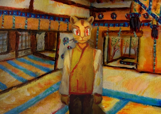
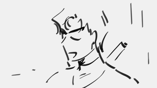
#I think I’m getting better at digitizing my paper sketches
Text
ARTIST OF THE WEEK @merryfinches ♥️
This week's aotw is Kylie who has bewitched us body and soul with her lovely art and even lovelier personality. Always there with a kind word, just all round a stellar human being, and someone who makes my day better anytime I see her on the dash. She was also game for answering a few questions:
Which do you use to draw (app/digital or traditional)?
I use Procreate on my iPad! I like being able to put it on my bag and draw anywhere - I don’t have as much time to draw as I want, so I do it in bits and pieces whenever I get the chance.
I love sketching with coloured pencils in my sketchbook too, I LOVE digital art, but there’s nothing like the texture of pencil and paper!
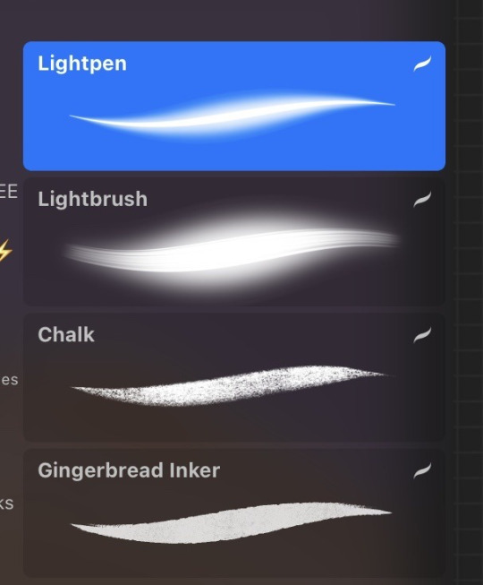
Fave brushes/pencils/mediums (links/screenshot?)
These are the ones I use most. The top 3 are all standard Procreate brushes. Chalk is my go-to for sketching and line art, and lightbrush and lightpen for highlights. I used Gingerbread Inker for colouring - it’s a free brush I picked up from somewhere, but I can’t find where!
Your favourite piece you've drawn?
Oooooooh, I don’t know! It’s easy to look back at basically every drawing and see the flaws, but this one of Ed and Stede in their inn is special to me, because I think it’s the first time I felt like I’d developed a comfortable style after messing around trying to draw them for months with… varying degrees of success.
And I’m really proud of the comic I drew of Ed having a nightmare, because i find comics so hard to draw and I’m in awe of everyone who does it!
Who's harder to draw: Ed or Stede?
Aaaaah, they both have challenges, but Stede I think? I prefer drawing his left side because of the way his hair swishes differently on both sides, and that side is easier. And he has a very particularly-shaped nose that can be really hard sometimes! Unless I’m drawing Ed’s leathers, in which case it’s him 😆
One essential tip for beginner artists?
There will be a point where you look at all your art so far and think “oh these are terrible, what am I even doing?” But that’s GOOD because it means you’re improving! And I’m sorry but that never stops - you will be improving forever! Nobody I know is ever really satisfied with their own art, and your art style is like your handwriting - it’s unique to you.
Also, get a sketchbook and a pencil, make mistakes, practice drawing your own hands and feet, screenshots, your cat, anything basically. And remember it’s supposed to be fun 🥰
Why OFMD? 🥹
Because it’s the fucking BEST! 😎
No seriously, I guess I like drawing Ed and Stede so much because they’re everything. Love, sex, tenderness, fun, cuteness, heartache and joy. Two souls who are so insecure and alone, and then they have someone who GETS them, who loves everything about them. They’re just wonderful.
71 notes
·
View notes
Text
spent the whole day at the airport and nearly forgot this
I did something different, and decided to sketch this traditionally(I’m better at sketching on paper) and then trace and color it digitally!(I’m less afraid and better at coloring/inking(if I even do ink) online), so hopefully it looks okay
so while I’m doubting my French skills like shit have a redesign of Invisible Hero: Prism

reference photo is an edit of official art, it’s edited by @m0chicakes
sorry if I accidentally tagged you and you didn’t wanna be tagged
but the official art has her in her canon costume(aka naked and barely covered) so I used an edit, just for the skin and hair reference
she’s not that pale I just have it on low opacity
low ponytail
I’ve seen a lot of ‘oh her clothes are made out of her DNA’ but I’ve got some problems with that
wouldn’t her dna be invisible too? How are you supposed to work with that?
so instead, her clothing uses spectral cloaking! I’m not quite sure how developed it is in real life, but mha is futuristic, so it would probably be a thing!
she can also disable it with her quirk
everything can turn invisible unless otherwise stated
gloves aren’t invisible, they go into the bag on her hip when she’s not wearing them
reinforced knuckles
the bag functions essentially the same way it works when she eats, once it’s in the bag it’s not longer visible
boots don’t have a pattern on the shoe for stealth purposes
knee/shoulder/elbow pads are made of faux glass
it’s essentially the same and has the sturdy properties without the fragility
LED mask
lights up to show different faces for optimal communication
oh I should shut up
COLD WEATHER VERSION:

lined turtleneck
fuzzy!
longer, lined gloves
darker palms
cloak! (silver)
get it it’s an invisiblity cloak
taller boots
longer, thicker leggings
HOT WEATHER VERSION:

you can really see how pale she looks with the low opacity
tank top
biker shorts(I think that’s what they’re called)
slightly shorter, thinner gloves
shoulder pads are separate instead of attached to the shirt
Oh wow this is long
as always, tips and advice are appreciated!
#toru hagakure#mha hagakure#hagakure tooru#tooru hagakure#hagakure toru#bnha#mha#bnha redesign#mha redesign#mha redesigns#bnha redesigns#mha fanart#pjo#bnha fanart#boku no hero academia#fanart#also the name ‘prism’ isn’t mine#I got it from someone else’s design I saw on Pinterest and thought it was sick
37 notes
·
View notes
Text
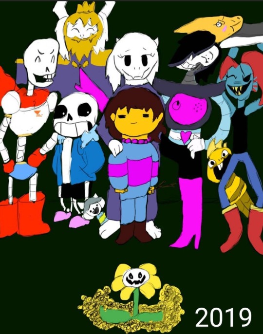
Four years ago, I drew my first ever finished digital art piece, using a Huion 420 tablet off of Amazon, and Krita. I was so proud of it, I showed it off to my friends and family on instagram, and I didn’t think I could get any better than this. Fast forward to the next year, and I drew it again, just to see how much better I could make it.

This time I used a Wacom tablet with Krita. It was one of the cheaper ones, but still an upgrade. I was even more proud of this one, but I wasn’t really that happy with it. I didn’t like how Papyrus turned out, and it seemed so awkwardly spaced and posed. I knew I still had more to learn, and I rushed it, since I didn’t think I could do any better. I then decided to redraw it again the next year.
This time I used Ibis Paint X and a small stylus on my phone. I was ecstatic with how this came out. I thought this was the absolute best I could ever do, but I still had little nitpicks about it. Again, I struggled a lot with drawing Papyrus, but this time I was also unhappy with the colors and shading, and how Sans was drawn (I have no idea why I made him thicc). But again, I redrew it the next year.

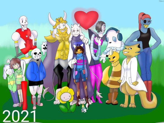
This one was a huge confidence booster for me. I had just gotten a brand new laptop from my parents: A Lenovo Yoga, with a Wacom bamboo ink stylus. It was the best gift I ever received, but on top of that, they got me Clip Studio Paint PRO. So I was ready to make some good ass art. This time I sketched everything out on paper, then finished it in CSP. I even attempted a background, which didn’t come out too bad. Papyrus doesn’t look horribly off model, and the poses and composition overall was just better. I used a clean sketch for the lineart, since that was a big struggle with my previous versions, and I used colors other than black and white for shading. After I made this, I felt like I didn’t need to continue redrawing it, because I thought I was at my peak.
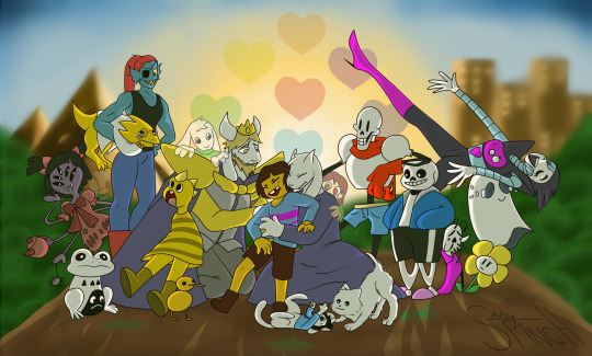
I redrew it this year.
I used my Lenovo Yoga, but this time I had a Wacom bamboo plus, and Clip Studio Paint EX. I added more characters, and took a little bit more inspiration from the original, but I mostly wanted it to feel more alive. I finally perfected how I draw Papyrus, and Toriel, Asgore, and Frisk aren’t statues anymore. I showed off what I’ve learned about lighting and shading, did actually clean lineart, and I even did a full background! I’m so proud of this, and so happy with how far I’ve come as an artist, and I can’t wait to see what my future self draws next year.
#art#digital art#artist#artwork#digital artwork#art progress#art process#undertale#undertale fanart#undertale anniversary#sans undertale#mettaton#napstablook#frisk#toriel#asgore#papyrus#muffet#undyne#alphys#froggit#whimsun#flowey#temmie#annoying dog#toby fox#wd gaster#asriel#chara#monster kid
88 notes
·
View notes
Note
So I know you do digital art, but The Hanged fireMan looks like a watercolor. Do you work with watercolors as well, or is it the program you use?
(please brag about your art process, basically)
Yeah! So I do all my (fan)art in everyone’s favourite innuendo of an art program, Procreate. (Specifically on a 2019 ipad pro with a 1st gen Apple Pencil, both of which I would tentatively recommend if you can get them 2nd hand for less than 200euro like I did)
I did a lot of painting as a teenager, and still paint often to this day. Though I mostly worked in acrylics, I have been known to use watercolours (like, when I was in college I bought a little 3euro paint set and would use the inside of cardboard cereal boxes as diy watercolour paper and paint wild little Irish landscapes… and Winter Soldier fan art, sometimes. 2017 was a different world)
So in summary - I ‘paint’ digitally using some very traditional techniques I picked up over the years, and I kinda prefer digital art now, which I will elaborate on below the cut as I detail how I created The Hanged fireMan…
I’ll start with my favourite digital art ‘cheat’ which is that I use So Many Layers. Like seriously, pretty much every new colour goes on its own layer because I am a control freak and love being able to tweak them all as needed. So for this relatively simplistic piece, I’ve still got something like 20 layers all together.
I’m also usually better at grouping layers but in this one I gave up at some point and it felt dishonest to group them nicely before showing you guys lol

So yeah layers is my biggest hack, but the other is using specific texture brushes
I spent a while playing around with various brushes before finding this Tarraleah one which has just the most delicious watercolour-y texture and a really fun edge to it (and it’s got pressure sensitivity, so I can really control the amount of colour I want to put down on the page)
This background was painted entirely with the 1 brush & colour, and I think it turned out pretty cool. For this particular piece I did have a reference on screen to work off for the most part, but those clouded were just painted with my heart

Next (or maybe before, it’s a while sinceI drew this and sometimes I mix it up) is the lines, which are always done with my best friend, the Procreate Pencil!! I love her, she’s so fuzzy and textured and also if you tilt the tip on the pencil you get a broader line (like with a real pencil) which is just the coolest thing!
When it comes to lines I just sort of go for bigger shapes 1st and details later, and basically always with some kind of reference. I also use a very old & well known trick of putting the most detail into the object of most importance, and leaving the background more loose and vibey
Artists will tell you that this is to draw focus with details. Artists are lying. It’s cause we got lazy after drawing he fun part & phoned the rest of it in lol (I know this because I am an artist)
Also I love this pencil because I don’t have very steady hands and I actually cannot draw straight/smooth lines to save my life! If you’ve ever seen anything resembling a smooth line in something I’ve drawn, it is almost certainly a whole bunch of lines over each other and then erased at the edges to make it look neater
But who needs straight lines when sketchy sketch lines are so fun!

Next is flat colours (the 3layers in the middle with check marks beside them)
I used the same colours as the background, which you can tell from where they completely blend together right down the bottom, and what I genuinely do is use the Tarraleah brush to generally block out he shape, and then go back in with an eraser and smooth out the lines
Why do I do this? …good question

Next is one of my favourite parts, which is adding the lights! Procreate has some really fun -glowy- layer effects - my favourite is probably Add (A) though Colour Burn (CB) is great too for its vibrancy.
Also those 2 layer 11s are there because I duplicated one and then used the ‘Gaussian Blur’ feature to ‘fuzzify’ it (yes, that’s the technical term) It’s a pretty quick and easy way to add a more diffused light effect around something. (I did the same for the yellow reflective strips on the turnouts too!)

Last step now! So full disclosure - I absolutely traced that writing from a photo of a tarot card lol. I actually always trace writing, as, much like drawing straight lines, I’m bad at handwriting on a screen
I also stumbled upon the Exclusion (E) effect by accident - Originally it was going to be a plain cream boarder like a traditional tarot card had, but I wasn’t fully happy with it, so I just flipped through a few layer effects and as soon as I got to this one, I knew it was the right choice
I love the dreamy contrast of the pinks and purples to the dark navy and grey & how it makes everything looks kinda unreal and outer-spacey

And yeah that’s about it! Everything else comes from my 15+ years of Practical Art Knowledge but these are the specifics of how I utilise it digitally!
This was a lot of fun to write out, and I hope that if you’ve made it all the way here, it was fun to read too!
12 notes
·
View notes
Text

First remade background for the Super Secret Project! It’s quite different than the original digital picture. Being far more messy and impressionistic. I would rather not compare the two as each of them is doing it’s own thing. I do find it funny that even though I spent just AGES on the original, doing all these intricate patterns it looks far more clean and I guess I would say empty compared to this just splatter the paint where ever attitude.
I think I should paint on bigger canvases to force myself to do more details. A big inspiration for me are classically animated movies. Yesterday I watched Secret of Nymh which I should finish today. That movie is a master piece!!!! Kind of hard to believe it’s for kids with how dark it is, but as a child I loved dark stuff so yeah. But the backgrounds! Oh the backgrounds! I really got to step up my game. I’m like a kid in a shonen anime.
I also made a little mock up for how the project will look. Just messed around in Procreate with it. Something I want to change for my future projects is a better longer pre production period. This project did have some pre production. Such as sketches, scrapped background and character art. But nothing even nearing a professional production. I used to go to an art high school (high schools here are like roughly ages 15 to 19, I don’t remember perfectly) and there they had you repeat every step of the process like 20 times before you could move on.
I don’t plan on working for like a proper game or animation company. That being said if Disney comes knocking on the door then I’m not going to say no. But I don’t think that type of environment is for me. And with the rise of AI art. Bitch. Why would they want me around with my “special needs”? I think indie game studios are the way to go. My aesthetic would also suit them far more. So erm. Contact me. I want to buy a custom fursuit.
JUST KIDDING! I ain’t stable enough for a job. I’m barely managing doing what ever the fuck this is.
So what do you guys think?
I MIGHT finish it for Christmas but don’t take my word for it. I don’t like deadlines. There’s still like a truck load of work left to do. Exhibit one. Finishing the script. Getting sensitivity and beta readers. Would be great if I could get my friend who studies psychology to look at it. There’s a lot of trauma. I bet ya there’s going to be a whole lot of editing to do after that. Exhibit two. Backgrounds and sprites. Urg. Exhibit three. Putting it somehow together. Presumably with duct tape, paper clips and prays. Exhibit four. Releasing it. Exhibit five. Shameless self promotion. Such as bothering mid size furry YouTubers.
An absolute dream come true would be having Saber Spark look at it, as he’s the one that introduced me amongst many of you I bet to Squirrel and Hedghog. But please don’t go bothering anyone just yet. I want to do the shameless self promotion last when there’s actually something to promote. Otherwise it’s just a scam.
Am I taking this project too seriously? This is the first time I’m doing something like this so it is more of a prototype of how I will do things for later projects.
Bobby out!
#my art#fanart#procreate#squirrel and hedgehog#furry art#background art#acrilicpainting#traditional painting
11 notes
·
View notes
Note
If you don’t mind me asking, how long have you been drawing digitally? I’m just starting to learn on procreate and if you have any tips on practicing and improving I would love to hear them! Your art style is really lovely, and happy new year!
Hello! Happy New Year to you too🥰
I’ve been drawing digitally since 2016 i think? So it’s been a while. I first used a wacom and paint tool sai, but switched to procreate in 2020 (it took me a while to get used to drawing on an ipad lol).
Anyways, for me the key to improving is to practice a lot, i know everyone says the same thing…but it’s true! I sketch a lot on paper using different reference photos i find interesting. I also use a lot of references for my art in general! It helps me understand better the human body. To practice you can trace them and study them, to understand better how everything works; it doesn’t have to be perfect but just enough for you to get more comfortable drawing! Pinterest is your best friend here lol (i also love using different medias so i dont get tired of drawing digital; like i be sketching with coloured pencils, crayons, watercolours…and sketching people, food, animals….just different things to keep my mind active and creative!!!!)
What I also do is find different artists that i love and take note on how they draw certain things. For example, back when I first started PhantomRin and Taratjah were the first artists i followed and i LOVED how they made everything (of course they have very different artstyles but i took small details and tried adding them to my own style! Same goes to Laia Lopez (itslopez), i love how she draws hair, so i try to draw my hair kind of the way she does. Of course it may or may not look similar, but it’s my own take on that. Idk if any of this make sense. But basically also use other artist as inspiration! (But do not trace their art please!!!)
Also, for sketching I use a bright pink! I think it helps me sketch better than using black or greys hehe but it’s a personal choice! And for line art i use a grainy soft brush instead of a very hard and stiff one. It’s less overwhelming for me.
Now to finish all this, I think for me drawing Shadowhunters art was the thing that inspired me the most. So if you are obsessed with something like me that will help too🤣 draw what inspires you! Sketch a lot! Have fun! Try drawing something or sketching every week (or every day!)
I’m answering this before going to sleep so I really hope any of this make sense lol I’m here to answer any other questions you might have!!! 💞💞💞
#my art#artist on tumblr#Anon#anon ask#anonymous#art question#art tips#my post#illustration#drawing#painting#artwork#digital art#procreate#procreate art
13 notes
·
View notes
Note
I LOVE YOUR ART SO MUCH!!
anyways
For you, what are the pros and cons of traditional and digital? (No wrong answer just wanted your opinion! :D )
THANK YOU!!!!! 🥹💓
personally i like traditional better, because it’s more fun and staring at a screen for so long just makes my eyes dizzy. BUT
digital pros :
- you have a back button (💖)
- you can draw over your sketch and not have to worry about erasing it
- more color options & brush options
- easier to add highlights and cool effects
- you can watch a speedpaint when you’re done
- you can post it and it will look the same, you don’t have to filter it (it’s hard to capture traditional on camera like how you see it irl)
cons : staring at a screen, your device heating up too much, difficult to choose a good sketch/lineart brush (so many options ;-;) doesn’t have that traditional art thrill (also i only have a normal sized iPad and not an iPad Pro or drawing tablet so I’d probably enjoy it more with a bigger screen)
traditional pros :
- FUN 💖💖💖 pen and paper is just magic
- the look of pencil and all of the shading you can do with it
- markers are so relaxing to color with
- i can express more on paper than on digital, my hand can move more freely
- it’s inspiring
- you can draw on anything, anywhere, don’t have to rely on a device
- you can have full sketchbooks to look back on
- also the world of painting!
- i can put stickers on the page 😌
cons : it’s hard to fix mistakes (most of the time I’m playing a game of how do I fix this), it’s hard to take a picture and then filter it to how it looks irl with the lighting, pencil smudges :(, sometimes ink can fade over time, also if you lose your traditional art you can’t get it back if you didn’t take a picture but digital art you can always have access to it if it’s saved
BUT OVERALL i just love traditional but both worlds are fun and you can also combine them! Some things i sketch and think how cute it would be if it was colored digitally. Also if I can’t color something bc the other side of the page has something I like and I don’t want it to bleed through.
Sorry for the long response but I could talk about art for hours 💞 tysm for asking, I love seeing u in my notifs <3 ☀️✨🌻
4 notes
·
View notes
Text
So I’ve had a pencil piece sketched out for May @shamelesscreatorsnetwork for… well, pretty much the entire month! And every time I decided to work on it I found 200 things that needed to be done first (clean my room, tidy my desk, organise my art materials, sharpen all my pencils, hoover, cook, do laundry…), and whenever I did actually sit down I would get all my pencils ready, all my reference pictures, the sketch… and then I’d look at it for a while, before putting it away again, promising that *tomorrow*. It’s late now, anyway. And the light is fading. And someone is going to interrupt me soon because it’s dinner time, so starting isn’t really worth it… but tomorrow! Tomorrow I will totally work on it.
So I built up this anxiety, over this drawing. The sketch is good! I really really like it. I think y’all will like it. …but what if I screw it up? And also, what do I even want to do with it? Like, full detail pencil? Coloured pencil? Cartoon-y felt tip pen? If I can’t decide then I’m definitely gonna screw it up, right? Right??
So that’s the anxiety spiral that’s been going on in my head over this drawing.
Today started off just like that. I had 3 hours before the next thing on my schedule. And I decided I was going to finally do it! And then I went and had breakfast, cause breakfast is important. And then I tidied away all my other art materials, because our holidays are over soon, and I need to start packing. And I put on laundry. And I folded some clothes.
And then I just refused to continue this… stupid game of chicken I was playing with myself. I took photographs of the sketch as it was, and if I’m gonna fuck it up, then so be it. I can just post the sketch. Or do something digital with it. Or, hell, I can redraw it from the sketch. I can do whatever, because anything is better than what my brain is currently doing to me.
So I put pencil to paper, and I started shading. And you know what? It’s going to be just fine…
Turns out I haven’t forgotten how to use a pencil.
And I want to beat myself up for it because ‘oh my god I could have been done with this weeks ago if I wasn’t being so bloody stupid about it’… but no. I refuse. Shit in my brain went weird. That’s true. And I did always know that I hadn’t actually over night lost the ability to draw. But that doesn’t make the anxiety I was having less real. And acknowledging that is important, because I’m not often good at being kind to myself. I’m trying. Just like with the drawing, it’s one step at a time, right?
I guess I just… wanted to share that.
~EDIT: It is done
#shamelessnet#Mys art#anxiety#Mys stuff#sometimes my brain goes weird#and that’s okay#it happens#and it’s okay to give myself time to work through things#but sometimes I also just really need to tell myself to get the duck over it and get the duck on with it#not everything I create has to be perfect because I’m sure as hell not perfect#And. That. Is. Okay.
21 notes
·
View notes
Note
Hi! I hope this is ok to ask but I wanted to know how you got into doing art/fanart? Were you always the type to draw & sketch like ~before tablets and digital art became a thing? Did SD inspire you?
I’m not an artist or anything, but I’ve just been so moved seeing your fanart ++ everyone else’s (saw your Ask abt your fave artists too!!) that it made me want to draw out some SD scenes I had in my head. I’ve never really felt that way about other animes or mangas — even for other works that are close to my heart.
But I’ve never been a natural talent e.g. I feel like I’m more comfortable using a mouse (Adobe Illustrator) than with my hand physically holding the pencil (Procreate), because being creative was something I “learned” through the years. When I was younger, I’d see my talented classmates sketching beside me and think “Oh, it’s something only they can do.” And it was okay, because we all have different skills and things we’re good at, right? It’s only recently that I felt that I could do the same!
Not sure where I’m going with this, but I guess I just wanted to know if it came easy to you.
Sorry, randomly sharing so much HAHA please feel free to answer this as a private message LOL
But I love your art a bunch! I wanted you to know!
I've been drawing for most of my life, and I think that's also because both my parents are artists, I was always encouraged to draw since I was little and I was definitely using pencil and paper back then.
I think I wasn't really that good until I started college, its during college is when I actually put in the work into sharpening my understanding of the fundamentals.
I think growing up I just found that drawing helped me convey my thoughts and feelings to other people, especially to my friends and family.
Back then even if it didn't look very good, in my head it was more important to me that my ideas were tangible in some way, as someone that loved movies and animation.
Slam Dunk definitely inspired me. It's one of the mangas that made me love comics as a medium of storytelling. The source material and works by other fans inspire me to get better at drawing too!
I actually really appreciate you sharing this and that you're thinking about drawing more! I have friends that don't draw before that only started drawing recently too, and they're just learning how fun it is to draw! And I have friends that are also relearning what they loved about drawing! I'm always happy to see people getting into art! I don't know where I'm going with this either, I just hope you have fun with it even if its just doodling! Thank you so much for this ask and thank you for liking my art ^_^
6 notes
·
View notes
Note
Hi, I’m a real new shiny here (on Tumblr, but also at drawing), and it’s the first time I ask anything, so I hope it’s ok. I must say first that I love the way you draw TCW characters (especially the clones)! 😍 I just came across this sketch you made on canvas (if I remember correctly) https://www.tumblr.com/thepatchycat/729224397978828800 and I was wondering, if you don’t mind sharing, how do you get the perfect white background on non-digital drawings? I currently use a scanner app on my sketches and the results are always inconsistent and far from that white… thanks a lot in advance!! 😊
Welcome to the Tumblr crew, shiny! ;) And thank you kindly!
So my dirty secret for that sketch is... it actually is completely digital! I drew it in a program called Rebelle 5, which is designed to mimic traditional canvas/paper and pencils/paints. I picked it up for super cheap during a huge sale last year, and it's a lot of fun; unfortunately, it's usually pretty expensive, as many art programs are. I highly recommend keeping an eye out for sales though if you ever get into digital drawing--and if you'd like a free program, the one I use most of the time is MediBang. But those programs are really mostly helpful for digital art, not so much for scanning actual pencil sketches.
While I tend to stick to digital drawing nowadays, I definitely feel you on the scan cleanliness issue; phone pictures and even proper printer scans tend to end up either kind of dirty or faded. The short answer is that I don't actually have an easy and effective solution, but there might be some things you can try depending on what you have available. I wouldn't be surprised if you've already explored more methods than I have, and there are definitely people with better ideas and more experience than me, but I'll share what I've tried.
Long(er)-winded rambling under the cut!
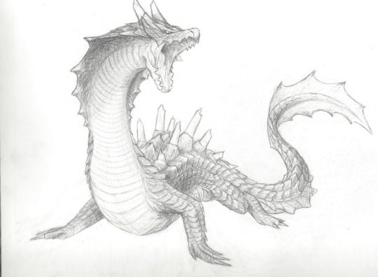
So, I currently have an unfinished piece sitting in my files that began as a traditional drawing, one that I want to keep all the pencil details for. Here's the sketchbook page, scanned using a household printer:
Not terrible, but it'd be nice to have clearer contrast between the lines and the background. In MediBang, I can adjust the contrast by going to Filter>Levels (or Ctrl+L), which gives me a little box that looks like this:
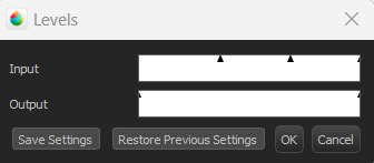
I don't technically know the nitty gritty of how it works, but by my understanding, the outer triangles for the input and output indicate the range boundaries. Adjusting the input--particularly the darker boundary--so that the output boundary exceeds it basically tells the program to make the darker parts even darker, resulting in this:
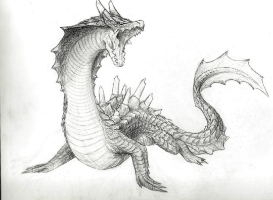
Better! As you can see, though, the darker parts of the background also show up a bit more. Rather than relying only on contrast adjustments, what I actually ended up doing was carefully erasing the background around the drawing after adding a plain white layer underneath, and also going over some of the lines digitally. I did this first in MediBang (the only art program I had when I started working on it), then transferred the file over to Rebelle.

MediBang (left) has the pure white background, while the Rebelle (right) canvas settings I chose are a little off-white and more textured, which I think blends a bit better with the texture and shading of the image. It's possible to add textures and the like in MediBang, too, but Rebelle has it built into its design, so it's a little easier to figure out there; I'll likely finish this piece in Rebelle (whenever I get back to doing so, haha), since the canvas and brush settings will be easier to match to the texture of everything that came directly from the drawing.
Most of this is much easier to do with a drawing tablet/pen, unless you're a wizard with a mouse. As for traditional means... the best suggestion I can come up with is to try inking sketches, or at least darkening them further with a pencil. The more contrast you can get between your lines and the background, the more easily you can digitally tease that contrast out even further. I think most photo editors have at least some contrast, color, and brightness adjusters, and probably more useful functions I don't even know about--it never hurts to mess around with any program's filters and settings to see what happens!
Good luck, and happy drawing! :D
#Patchy Babbles#Asks#I love getting asks so it's more than okay!#Sorry the answer is basically that that sketch is a lie haha#Someone on the internet has probably figured out more effective tricks but that someone is not me#Also your art looks super good!#You have a great eye for detail~
5 notes
·
View notes
Note
I hope you feel better soon! It seems like absolutely everyone is getting sick right now, it's unbelievable!
What are your strongest interests? Are you a morning person or a night owl? What circumstances bring out the most creative energy for you? What kind of requests do you do?
Please remember to take care of yourself!
Aww, thank you so very, very much for your kind response and wishes!
My strongest interests are drawing (mostly digital and tradition sketch), writing (of course), crafting (paper crafts and I started making back in December felt plushes. I made a calciferol from howl’s moving castle and Jingle from animal crossing), editing, baking and cooking, reading are a few that come to mind that I do the most but there are other hobbies and interests that I also enjoy.
I think I’m more of a night owl, I always find it easier to work and do things at night somehow.
Sometimes it can be something as listening to music and a tune or melody inspires me to write how it made me feel or what I imagine (something akin to how the animators for Fantasia animated what they felt when listening to songs). Sometimes a picture or phrase can inspire a whole scene or it will be the most random moments like shower thoughts or what ifs.
I like doing writing prompts, otp imagines, Favorite character imagines, even some reader inserts on a different page. I prefer to write things without any gore, heavy violence, assault and things of that vain because I feel like it’s nice writing things that make people feel safe and comforting but sometimes do hurt/comfort as long as it’s happy at the end.
Though if anyone wishes to try and ask for something else there’s no harm in asking and I’ll try to respond and write if it’s within my comfort zone.
💕✨Thank you and please take care of yourself as well! ✨💕
2 notes
·
View notes
Text
February 6, Mew gave birth
We named the newborn Mewtwo

I’m a little late to the party but hey, better late than never! So here’s a little something for our favorite grumpy psychic cat. This is the first time I’ve tried my hand at digital art and I’m quite proud of how it turned out! I drew the original sketch on paper then scanned it and sent it to my iPad where I added colors and did some fine tuning. I struggled a little bit on some parts, like his hands and tail (Seriously Mewtwo, why are your hands so difficult?!). Other than that I think it turned out pretty good! If anything it gives me more motivation to get it right next time.
Happy Birthday, Mewtwo!
Now eat your cake before I eat it for you
#pokemon#mewtwo#mewtwo birthday#I will get the hands right someday#mark my words#happy birthday you drama queen#my art
5 notes
·
View notes
Text
2023 Art Plans & Patreon
Patreon link
2022, despite all its raw trashfire energy, has been one of great learning for me. In the course of those 12 months, I: 1) finally purchased a cheap light board, allowing me to sketch on a separate piece of paper to trace the lineart, instead of drawing straight on the watercolor paper (I know, I can't believe I stuck with stupid for so long); 2) introduced fountain pen inks into my repertoire, which has now expanded to include 3 main painting inks; 3) added gold foil and metallic paints into my watercolor pieces; and 4) gotten more familiar with gouache, and finally being able to paint pieces I like with it.
With those in mind, I've been wondering where to focus my attention to next year. I've been wanting to introduce better backgrounds to my illustrations for a while now, but it frankly has been harder than anticipated. So to make it easier on myself, I figured that I would ease myself back in by doing more sketches like below. In addition, I will do digital studies, which would both cut down on wasted material and be far more forgiving. Monthly, and probably pretty casual; I don't want to stress it so much that I end up becoming more intimidated by it.

Another thing that I'd like to work on is my digital style, but on that front, I'm still unsure which direction to take. I'll update you on that. But adjacent to that is that I realized recently that Impressionistic pieces often have color palettes I really would like to imitate, and perhaps that might be where I'll take my digital style? I want texture and I want marks. For the time being, though, I'll play around with the digital style some more before settling on something concrete. Meanwhile, I'll probably use my modified, muted pastel gouache set to study and explore colors, since I struggle with using digital for that-- something about too much option and being unable to feel anchored.

In light of this, I've decided that the list might go like this:
- Sketch more backgrounds, maybe do a 2-3 tone monochrome shading to get back into thinking of pieces with backgrounds
- Do a small digital background study once a month
- Introduce the use of masking fluid into my watercolor toolkit
- Use my custom, pale pastel gouache set to play with colors more until I find a comfortable niche
It will be a journey, but it's one I plan to share with everyone. At the same time, though, I think I will be sharing the ugly, along with the good, over on my newly made Patreon. I have plans for 2023 that includes physical goods, but I can’t take the financial risk and don’t have the energy nor consistent enough inspiration for a shop. A tier I added to that is intended to allow me to play around with the physical goods idea without the pressure of needing to come up with a big array of “new things” to sell monthly.
That being said, a follow, both here on Tumblr and over on Patreon are support enough for me. I do just enjoy drawing and painting, and while I do it for myself, it does make me happy to know that there are people interested in the results.
Thank you for being here!
- namio
16 notes
·
View notes
Note
4, 8, 10, 15 !
4. Fav character/subject that's a bitch to draw
at one time I would say some of the spiky-haired Boku no Hero characters lol because I feel like their hair can look off really easily? now I feel like it is more comfortable...
not super complicated but I think a lot of Batman guys can look like any random guy very easily... that troubles me at times... Gansey can look like nothing or like an asshole… guys with plain hair and just glasses -_- but I am not the most creative character designer.
Live action characters overall because I want a bit of likeness and some degree of caricature… can quickly go too realistic and weird or too vague and unrecognizable. I guess right now it’s Lestat de Lioncourt but I’m not trying all that hard.
8. What's an old project idea that you've lost interest in
my 2nd-year student film lol! but that was because of a whole bunch of logistical problems (covid, casting child actors, getting in the recording booth, general exhaustion, and depression lmao) I draw a lot of fanart because it gives me something to draw without the pressure of coming up with a good enough idea...
lots of scrapped comics that didn't make sense, and some board sequences I've never finished! I wanted to redo an old Batman sequence for Halloween but I wanted to make better directorial choices and I am just so lazy
10. Favorite piece of clothing to draw
I feel like it's jackets?? totally projecting my real-life preferences but jackets can kind of be bullshit easily enough... I feel like with boarding you can scribble two lines and it's like 'got it, jacket', so lots of quick shorthand collars
(I guess I do not draw much 'to a finish' lol... used to want to do fashion design but I don't have the patience for it)
15. *Where* do you draw
Digitally - it has to be at my tablet at my desk... but honestly after work hours I get really sick of sitting there so I only draw on paper and then clean the sketches up digitally while in meetings or warming up to work lol...
On paper - anywhere... I still kinda have to scribble like it is a fidget spinner if I'm sitting anywhere for too long. My kitchen table, the couch, the bed (not ergonomic at all), anywhere? but I don't really do super neat physical pieces... if so I think I'd have to at least sit at a table lol just because it becomes a bit of a mess
4 notes
·
View notes
Photo
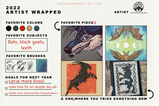
ArtistWrapped2022
Sabattons on Twitter created this excellent template to reflect on one’s year in art! I found I prefer something like this to the one-piece-each-month templates since some months are better than others in terms of creativity and output. When setting this up and looking through my files, I didn’t even realize that THIS was the year I started linos, back in January! It completely changed the tragectory of my art and expanded my interests. I definitely hope to carve out more in the new year.
I “cheated” with this template and added more pieces since there was a lot to reflect on. I also tried to work with watercolors more on proper watercolor paper. It isn’t up to par with what I was hoping to do with them, but maybe with practice I’ll get to where I want to be. And while that goat was just a sketch, I love how its form came out, including how I sketched the hair and fur. Finally, while that commission was just from this week, I’m thrilled without how that muzzle and teeth came out, and those striking eyes. I haven’t done portraits like that in a long while, so it was refreshing to see I could still add in details like that.
For those curious, the vast majority of my digital creating tools (brushes, textures, etc) come from True Grit Texture supply. You have to pay for them, but they’re 100% worth in. In particular I’m having fun with their infinite paper sets right now (which both that goat and the snarly muzzle were created on). My favorite “pencil” and “ink” brushes are from them, too.
For colors, I don’t think I have many favorite colors, and color theory is something I continue to be weak in. I forever favor blacks and grays in inking and sketching, and red happened to be an accent color I used in a ton of pieces this year. Otherwise, when I do use color, a lot of it ends up with an almost “Lisa Frank” vibrance to it (which isn’t good or bad; I made my rainbow hyena and fox series so colorful to turn them into holographic stickers, for example). Hopefully if I continue to play with watercolors and inks I can expand my grasp of color and get those dull, muted tones I adore.
Thank you all for watching what I create and supporting me along the way! This first full year of my rebrand reflected a sort of “giving up” of higher goals, which in the end freed me to pursue the little things that spark my interest or bring me joy. Abandoning big aspirations in the face of uncertainty meant giving myself the freedom to explore and create without putting any weight onto whether what I created was a success or a failure (financially or otherwise). I think I learned a lot about myself and how my brain works. I hold no hopes for 2023 and I’d like to keep it that way. 😉
Thanks for enjoying my work! Your comments are appreciated.
Learn more about me at AbandonAmbition.com.
3 notes
·
View notes
Text
Design Board Layout Ideas
Here I experimented with a variety of different layouts for my design boards. I knew I wanted something simple as my designs were quite large and prominent and I liked the idea of incorporating some form of fairy element to link in with fairyland at Cannon Hall as my designs are quite whimsical and fairy like.
To experiment with layouts in a more time effective manner I have done the majority of these as quit and messy digital sketches just to get a rough idea.
IDEA 1
For this layout I wanted the focus to be on the name as seen by the second design using the origin of the name (the flower) as a key feature enhanced by stripe of a colour seen in my design in the background to tie it all together, as well as this I added some little fairies flying around to show the link to fair land that I wanted.


I thought this idea looked pretty good digitally however as soon as I did it onto the drawing paper it just did not come together as I wanted. I think the fairies look awkward and childish and the flower seems out of place. Due to this I added the band or flowers around the bottom to match the ones in the dress as well as adding little stars and random lines. However their is now way too much going on and it looks very messy and draws attention away from the illustration.

IDEA 2
Still linking in with the fairies, for this layout I edited some fairy wings onto my illustration instead of the fairies scattered around however once again it looks very childish and doesn’t compliment the design.

IDEA 3
For my 4th idea I incorporated the flowers/ vines from the dress and digitally placed them at the bottom of the page in which I kind of like however I’m not overly happy enough with it to take it forward as I feel more can be done to tie it in with Cannon Hall.

IDEA 4
Going in a slightly different direction,here I have tested out doubling up my illustrations by adding a photocopied version behind it. I surprisingly like this quite a lot especially on the designs which have a bit more going on rather than a solid skirt for example however I felt it slightly distracted from the main illustration so I tried this again but with a layer of tracing paper between in which I think worked really well.


IDEA 5
For this idea I tried incorporating some direct link to Cannon Hall such as images of the gardens . I did this in black and white to help my design to stand out as well as doubling up the illustrations to add a bit of depth . With Thai I experimented with the flower the dress is named after as well as adding some purple lines to match the dress. I further added an image of my final garment to see how that would work and I think it looks quite nice, I tested this in both black and white and normal to see which one worked better and I think I prefer the black and white however I wanted to test out some other ideas.


IDEA 8
Once again with the e fairy wings I illustrated these blue ones using watercolour in this wishy washy style. I do like this idea of incorporating fairy wings however I feel it blends inti the dress to much and takes away from the design however I really like how it looks with the blue dress bellow. In addition to this I experimented with the doubling up again and layering tracing paper in-between.


Continuing with this wing idea I two more quick illustrations, one being more messy and jagged whilst the other being more delicate and detailed, I prefer this one a lot more and think this is the design I want to go forward with.


Similar to the previous one I did I created 4 slightly different wings using black biro pen however this time I did the lines a lot lighter to match more so with the skin. Now I just need to photocopy these to get the reversed side.

IDEA 9
Similar to the wings I wanted to keep this layout pretty simple too so I got some dragon illustrations I had previously done for my sketchbook and played them out and I think they compliment the designs quite nicely and I used the same media s I did for the skin shoes and heads and it further helps to link it into Cannon Hall.

FINAL DESIGN
For my final design boards I have decided to take forward the biro fairy wing illustrations along with the dragon illustrations as I wanted to keep the boards fairly simple due to the fact my designs are quite large and theirs a lot going on. I further intend to add the shoes to the background of the ones who art wearing any as I really like the shoe illustrations I did and think it helps add a little something to the boards. In addition to this I liked the doubling up idea with tracing paper so I think I also want to take this forward and test out some ideas with that.
0 notes
Last Seen Blogs
violetosprey
Don't mind me

fabinteriors
Fab Interiors

hangmanbradshaw
My Dreamland ✨
glamourdymes
Glamourdymes

vampire-lair
Vampire Lair