#Light Image Resizer
Explore tagged Tumblr posts
Visit Tumblr Blog
Explore Tumblr blogs with no restrictions, modern design and the best experience.
Last Seen Tumblr Blogs


Fun Fact
Hackers stole 65M passwords from Tumblr in 2013.
Text
@mackachu1212 hii hello almost done but i haven't done a lot in awhile so just updating. i've been kinda slow with art for awhile. also for if any details are off or should be changed.
#hi hello how goes it#i put two images because its smaller with both. i wish i could resize instead of having one massive image#also i've never hand painted lighting before so a little funky in some spots#i think i only use tags like this now#someone should stop me
5 notes
·
View notes
Text


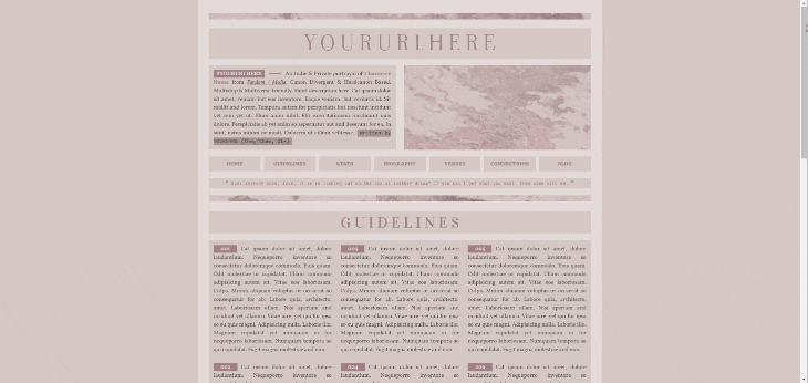
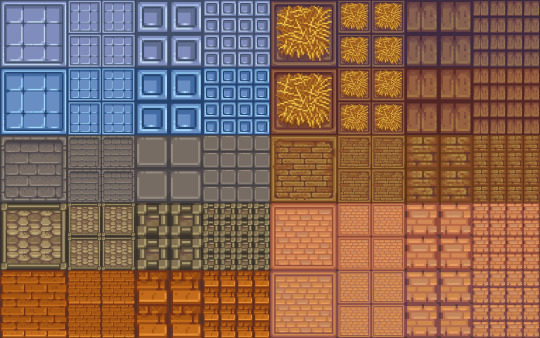
Primavera: All in One Page #01 by @pneuma-themes
Always, it's spring, and everyone's in love, and the flowers pick themselves.
Live Preview / Get the code: [Pastebin] / [Github]
Another Twitter inspired layout. This is an all-in-one page with about, blogroll, tags, and FAQ sections. The code has been heavily annotated, so please go through the code first before sending me an ask!
Important note: Your blog must have been given permission to use Javascript on pages. As of 2024, the waiting time is almost indefinite, and thus might necessitate a circumvention. You can refer to the post I linked to find the how-to.
For the blogroll to display the list of blogs you follow, you must enable this option on the blog setting:

This will not work on secondary blogs, as they do not have that option on their settings.
Features:
Five custom links
Everything is customizable, from the icons to the content and the colors. Customizable options can be found on the :root section of the CSS.
A built-in light-on/off mode that can be toggled by one click.
A header image. The size of your header image is 60% of your screen width x. 250px. The image should resize automatically.
An endless space for practically every section. You can be as detailed or as concise as you like.
Sticky navigation tabs.
A short "currently" tab in the about section, can be about anything you like.
This is a page theme, so blog posts will not be displayed. Please install this through the Add new page link instead.
Credits:
Icons: @alydae
Header: @tofuvi
Fonts: Merriweather, Albert Sans @ bunny.net
Font icons: Dencar Icons (ported by @glenthemes)
CSS tabs: bulma.css, functionality adapted from this StackOverflow post.
Tooltips: tippy.js
Please like and reblog if you like or are using this!
502 notes
·
View notes
Text


here's the full set of grand relic emotes I made for the @taz-balance-zine! the zine's out, and it's free- check it out here, it comes with still versions of these emotes + these gifs properly resized to work on discord!
edit: adding an image ID courtesy of @anistarrose! slightly edited by me, but largely thanks to her!
[ID: animations of each Grand Relic from The Adventure Zone.
the Phoenix Fire Gauntlet, conjuring a fire which turns to black glass,
the Oculus, with an eye appearing in the monocle's reflective lens,
the Gaia Sash, with vines appearing behind it and flowers blooming on the belt,
the Philosopher's Stone, a simple rock that transforms through a series of different colored materials,
the Temporal Chalice, creating a bubble around it and an hourglass that cannot progress time in front of it until it pops,
the Animus Bell, shadowy magic flows behind it until the Bell rings and banishes it,
the Bulwark Staff, bringing together light and conjuring a shield.
End ID.]
#the adventure zone#the adventure zone balance#taz balance#taz: balance#phoenix fire gauntlet#oculus#gaia sash#philosopher's stone#temporal chalice#animus bell#bulwark staff
530 notes
·
View notes
Text
here is the colouring tutorial i promised to go with my beginner's gifmaking tutorial.
to save image space, i've written up a simple explanation of how each adjustment layer works here, so i'm just going to over my colouring for these 4 different gifs.
as always, very image heavy underneath
there are many ways to get the same results and i'll use various methods usually just based on what i'm feeling at the moment. some of it is a little convoluted, but hopefully this will give you a rounded idea of how it all works so you feel more comfortable playing around with your own colouring
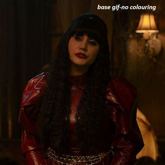
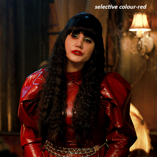
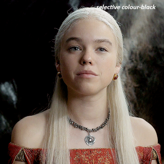
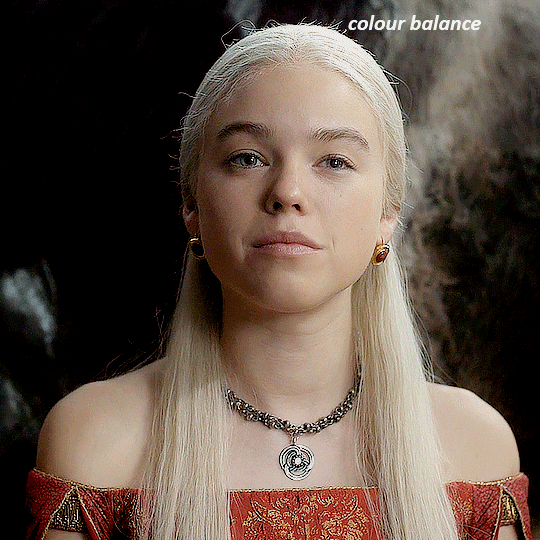
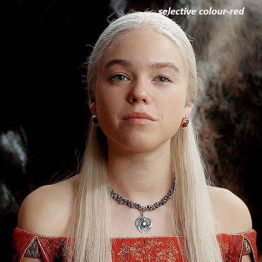
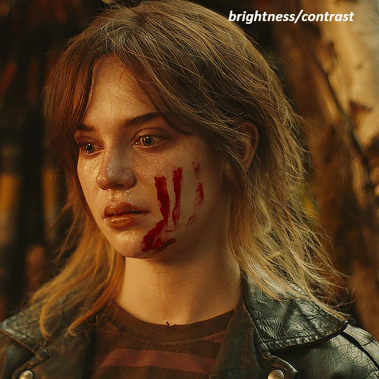
NADJA
this is the base gif with zero colouring adjustments, just resized and sharpened.
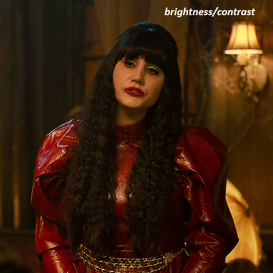
unless the base gif is already very bright, which doesn't often happen because directors nowadays are allergic to light, the first layer i add is always a brightness/contrast layer. i don't adjust any of the sliders, i just change the blending mode to "screen", and then adjust the opacity if needed. this gif was pretty dark, so i left it at 100%,
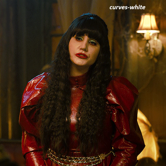
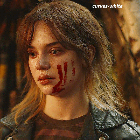
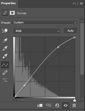
my next layers are always curves to even out the white and blacks. i use two curves layers, one for white and one for black. i used the white drop-picker and selected just below the lightshade on the lamp behind her, and for the black drop-picker i selected her hair near her neck which gives us this
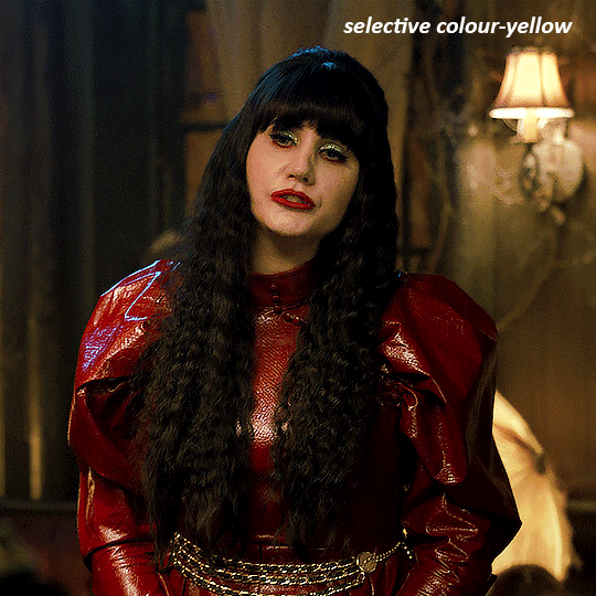
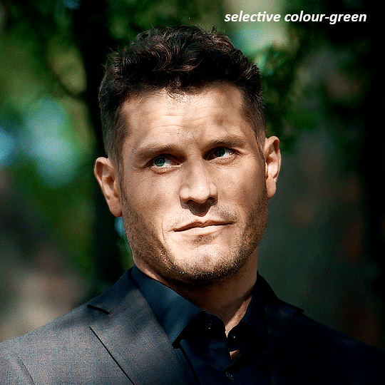
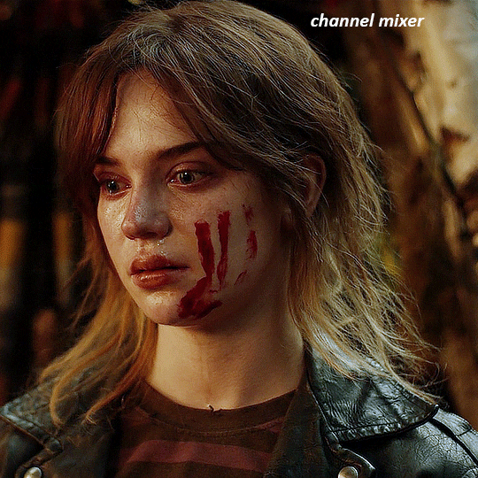
it's already looking much better, it's not as green tinted, but i want to make the red of her dress pop a bit more. in order to do that without making her face too red, i'm gonna remove some of the yellow. so next i'm gonna add a selective colour layer, and under the yellow channel i moved the yellow slider to -5 and the black slider to -52. now
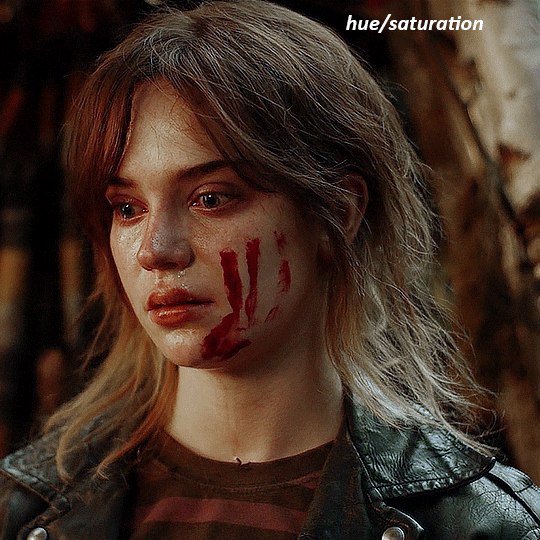
now that the yellow is reduced, i add another selective layer, and under the red i move the cyan slider to -66 and the black slider to +29. now the red of her dress pops and her face is still a realistic tone. when i first made the gif, i added the red selective layer first, then added another selective layer under it and adjusted the yellows to offset it. you can always shift layers around or add a new layer underneath as you go.
voila
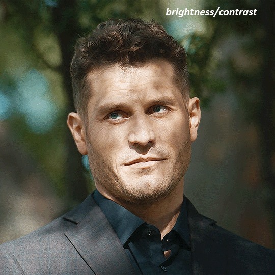
TOMMY
here is our base gif

this scene is better lit than the nadja one, but i prefer bright and colourful gifs, so i'm gonna once again add a brightness/contrast level and keep it at 100%
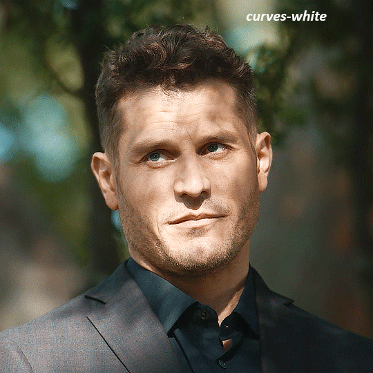
and then the curves layers to even it all out. since there isn't a spot that is immediately noticeable as white, you can hold the alt button with the white dropper selected and it will highlight all the white/very near white pixels. you can also zoom real close in to select specific pixels. i selected a from the white area around his chin/mouth. the same process works for finding a black spot with the black dropper, and for that i selected from a dark spot in his hair
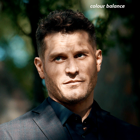
the curves layers evened it out but also made the gif a bit more red and warm toned, and since i've decided i want the end result to be more blue/green, so i'm gonna add a colour balance layer. in the shadows channel i moved the cyan/red slider to -16, and the yellow/blue slider to +11
now the gif already looks great, it's bright, skin tone is accurate, he's not washed out, but like i said i like my gifs colourful, so i'm gonna add two more selective colour layers. in the first i'm gonna adjust the greens, bringing the magenta slider to -87, and the black slider to +81. in the second layer i'm gonna adjust both the blues and cyans, because when you see blue in a gif it's rarely ever straight blue or straight cyan, so always adjust both. (you could adjust the blue and green in the same layer, but i prefer to do them separately in case i need to move the layers around)
now finally i'm gonna add a hue/saturation layer because i think the blue of his suit is too blue when the sky behind him is more cyan. (also, since you only have 256 different colours to work with, you don't want too many different colours otherwise it will distort the colouring.) in the blue channel i move the hue slider to -12 to make the blue a bit more cyan, and i also move the saturation to +38 to make it pop more
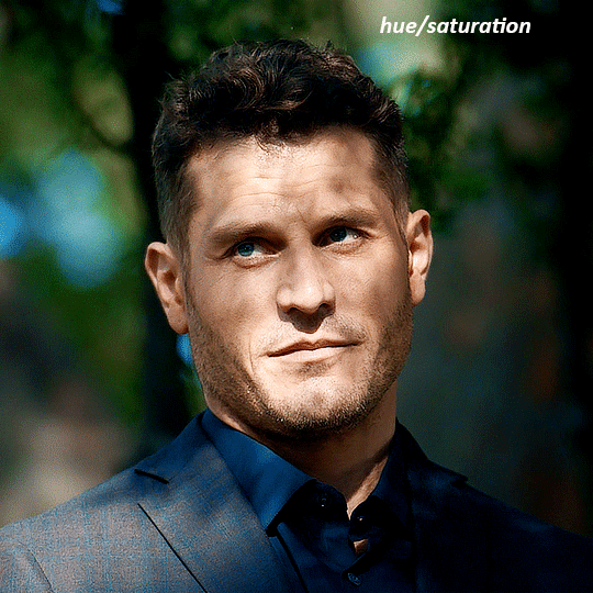
and voila
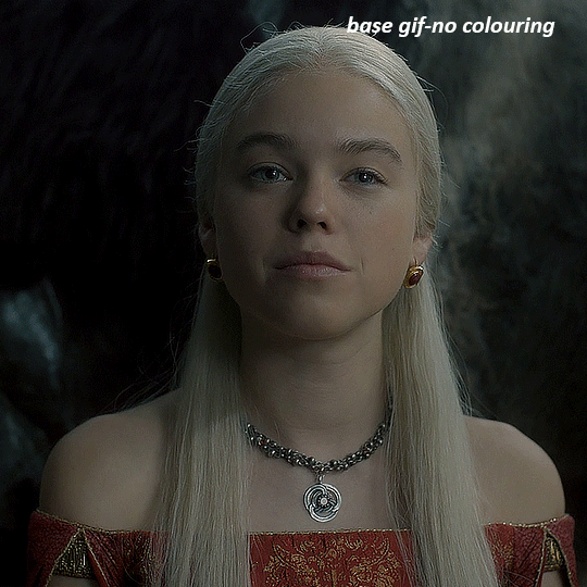
RHAENYRA
here is the base gif (this one is going to get very convoluted and imo best exemplifies what colouring gifs is like most of the time)
as always, a brightening layer set to screen
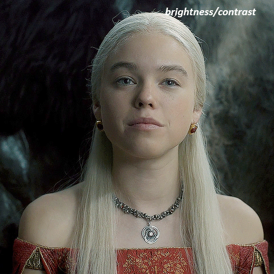
now the curves layers. for the white i clicked on her hair at the top of her head, and for the black i i clicked in the shadows to the left of her.
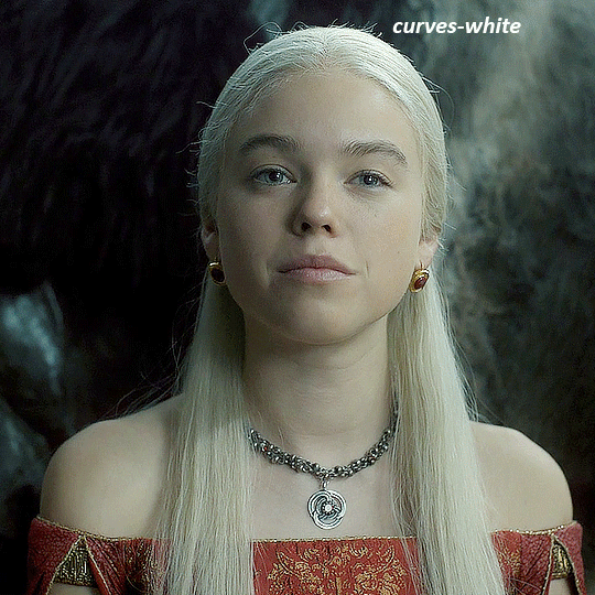
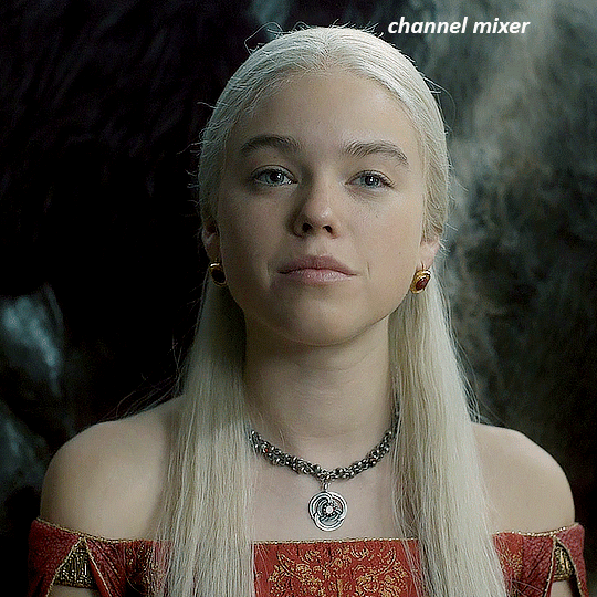
but as you can see, while it added contrast, it also made the gif more green tinted than it was. you could click around more, or manually adjust the red, green, and blue lines on the curves until it looks better but i decided to add a channel mixer layer instead. in the green channel i set the greens to -95, and in the blue channel i set the blue to -97
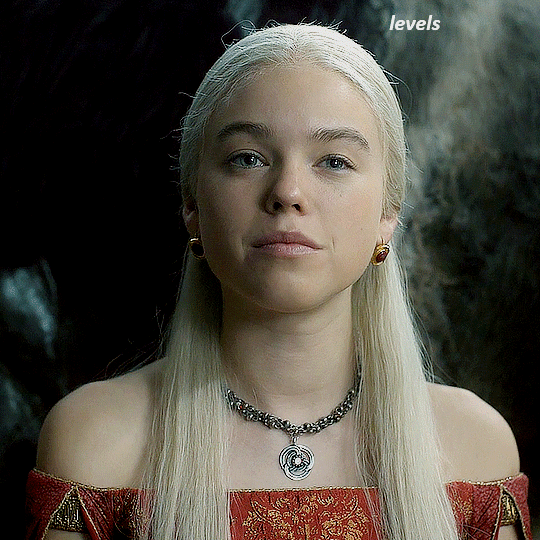
next i wanted to add a little contrast, but i find that using the contrast in brightness/contrast can saturate it too much, so instead i added a levels layer. first i adjusted the bottom bar, moving the right slider to 230 which reduces the overall brightness of the gif, so when i adjust the top bar it doesn't brighten the gif too much. on the top bar, i moved the right slider to 212, and the left slider to 9
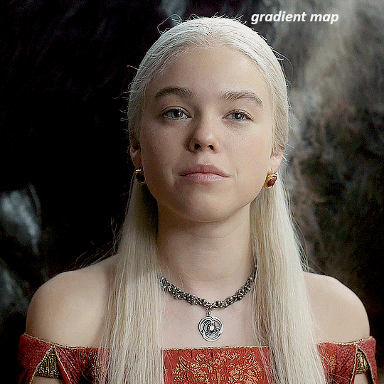
now, i'd like it to be not exactly warm toned, but less cool, and while i could use colour balance or a photo filter, i'm instead going to add a gradient map, using the default gradient pink 08, and setting it to blend mode soft light at 50% opacity

next i just want to increase the blacks a little, so i'm gonna add a selective colour layer and under black i'm gonna set the black slider to +10
it's still not as warm as i'd like, so i'm gonna add a colour balance layer, in the midtones setting the cyan/red to +10 and the yellow/blue to -5
we're almost done, but i want to make her dress pop a bit more, so first i'm gonna add another selective colour to bring the yellows down a bit, setting the black slider to -15

and finally one more selective colour layer, in the reds, setting the cyan slider to -50, the yellow slider to +10, and the black slider to +15
voila
NATALIE
here's the base gif
as always the brightness/contrast layer set the screen
now the curves layer. for the white, i zoomed in and selected a pixel on her cheek under her right eye. for the black i the dark spot just above her head
now she's very yellow, so i added a channel mixer layer. in the red channel i set the reds to +88. in the blue channel i set the reds to +10
she's still a little too yellow for my liking, so i'm gonna add a hue/saturation layer, and under the yellows i'm gonna adjust the saturation to -60
finally, i want her to be a it brighter, so i'm gonna add another curves layer, but instead of using the drop, i'm going to manually adjust it. the two points along the line are where i selected it and then i dragged until it looked how i wanted. i start with the upper dot, which made it brighter and moved the line into an arch, and then selected at the lower end of the line and dragged in back closer to centre to add some darkness and contrast
voila
and that's how i do my colouring. it's generally all trial and error, using a layer to fix one thing and then needing another layer to fix something the previous layer did.
play around, have fun, see what works for you and what doesn't. it will take a while for you to develop your own method and style, and even then you'll come across scenes that make you question if you have any sills at all. you do, directors just hate us
have fun and feel free to ask any questions
#tutorial#gif tutorial#colouring tutorial#photoshop tutorial#gifmakerresource#completeresources#*tutorials
266 notes
·
View notes
Text

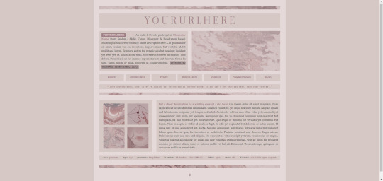
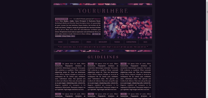
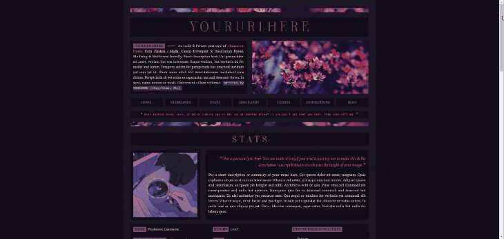
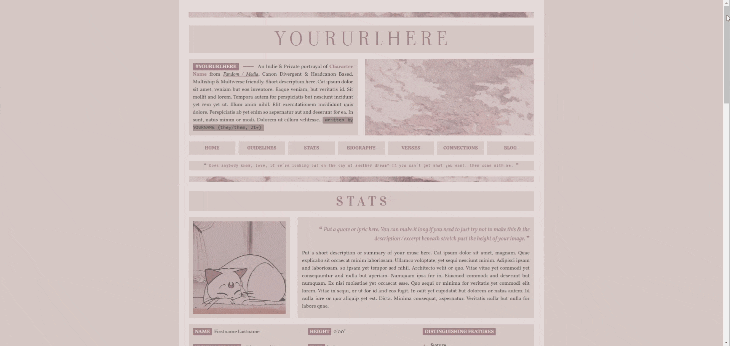


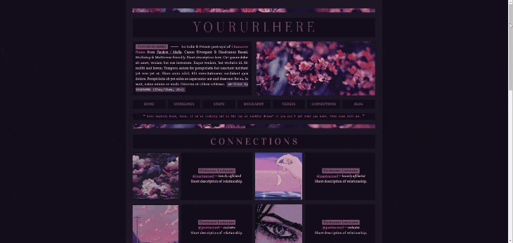

𝐃𝐑𝐄𝐀𝐌𝐄𝐑* & 𝐆𝐇𝐎𝐒𝐓𝐋𝐘*
Twin single muse carrd templates based on the recent palette poll.
✧ Features: A more in-depth carrd design prioritizing information, so you'll have plenty of room to write all the important stuff about your muse. Comes in a light version and a dark version based on the winner(s) of the latest palette poll I did. Highly customizable but may require more patience when editing due to the amount of unique elements. Tested to be mobile friendly but that may vary by device. Contains a customizable sticky header, a page for guidelines, a stat page, a biography page, a page for verses, and a page for connections & npcs. There are small quad-style image galleries in different sections, and there should be plenty of room for you to resize images to fix the block style of presentation when your text runs over. If you have any issues or questions about editing the carrds, you are more than welcome to ask me here on my tumblr and I will try my best to help you!
✧ Terms of Use: Like / Reblog if you use, please. Do NOT use this for illegal content or to promote hate (this includes "burn books" and callout / vent blogs). Do NOT remove the credits or make them invisible somehow. Edit as you wish, but no matter how much you change it, do NOT claim it as your own!
✧ Price: $5 for early access , both are now FREE / pay what you want as of October 14th. If you want to help a girl out with a tip, I'd greatly appreciate it 💗 ( Important Note! This template requires Pro Lite or higher to use due to the number of features included ! )
DARK ─【 DREAMER DEMO ✧ DREAMER DOWNLOAD 】 LIGHT ─【 GHOSTLY DEMO ✧ GHOSTLY DOWNLOAD 】
#[my templates]#[my carrds]#[made by mari]#rp resources#carrd template#rp carrd template#rp template#premium carrd template#free carrd template#free rp template
652 notes
·
View notes
Text
How to take screenshots and edit (when it's just not your thing)

Alright-y!
So, I have over the years learned how to use reshade and to edit my pictures. I am really not a natural on these things, so this is very much to help others who are as aesthetically challenged as I am. I have to have certain "rules" to follow, because I can rarely just see if a picture will turn out well or not.
We all need to realize where I started. We're talking using FRAPS to take screenshots and then running holy colours batman! to get some sort of effect.
Now, I'm not one to buy fancy stuff and to pirate certain programs isn't really my thing either. So we mend and make do!
Also, I am by far very good at taking screenshots and edit, but I have learned things and hope that it might be useful for someone!
A word on light
One thing I've learned is to work with is light. Where the light is is where the focus will go. This doesn't mean that a person has to be in the spotlight, but if they aren't - try to make that a more conscious choice. I am no pro at this, but I have to say that some of my favorite screenshots are where the light is just good. It focuses the eye or it just give a vibe.


(and yes, for some reason all of my faves are of Agnes, which is a bit annoying since Amanda is my fav-character, lol)
This is also where reLight comes in handy. Yes, it's behind a paywall but there are ways that you will have to figure out yourself.
Great tutorial here on reLight by @pictureamoebae! (if you want to really understand reshade, do check out their tumblr. So many helpful tips and tricks!)


Posing
Posing is fun! I don't fully story-tell with my sims, most of it is gameplay. But I do like to pose for family pictures or to enhance something that is going on.
What you need is Andrew's Pose Player and Teleport Any Sim or Wicked Whims.
Now, I haven't figured out how to use WW for children and younger to pose, so I use both. And I like @ts4-poses to find poses. Eventually, you'll find your favorite creators and can follow them directly.


Angles and vibes
Here's a trick. Work with angles. I am a master of pictures with zero vibe, just a face. Those can be ok, and sometimes that's what you have - but try to angle your shot a little.
Or add clutter, focus on that and let something out of focus happen in the background.
Or just go higher, take the screenshot from above.
Or don't focus on your sim at all, focus on something else that adds to the story/post.


Take the screenshot
The light is good, the angle great, the poses are in place and now, we need to take the actual screenshots.
I am a huge fan of reshade, I use version 4.9.1 because that works for me and the presets I use. No need to update reshade unless it becomes too old.
It can be really difficult to to find a preset that you like. I mostly use birdie by @monasims, tawhay by @windslar and paperbacks by @literalite. But I have tried many.
I like this youtube-tutorial on how to make your own preset, which also helps if you wish to modify one that you've downloaded. I do always recommend learning how to use ADOF and CinematicDOF to help focus the image on what you want to capture. I also strongly recommend @pictureamoebae's Foundation.
To take pictures, use the tab-key to leave the UI behind and use Q and E to go down/up in your game and then the mouse to angle. I use print-screen to take my screenshot, but that's something you set up when installing reshade so that's different for everyone.
And now you have your screenshot and it's time to open an editing program. Cheap as I am, I open GIMP.
Let's edit!
I don't use many steps. Since I can't use fancy photoshop actions I have to make all the steps by myself and well - I am human and therefor lazy.
Resize and start to think of a post
First things first. I cut my pictures to work for the tumblr ratio. I actually don't resize them smaller anymore - because when I change layout on my tumblr I just feel as if it messes it up. Now, I don't have a huge screen and my screenshots aren't massive, so it's not necessary either.
My images will be 1017x1017, 1525 x 1017 or 678 x 1017.
Once this is done, I also try to look at how they will go together. If I want a post of just squares I need to have an even number of images. Sometimes I want a landscape image as a sort of heading, or one in the middle with squares around it. It depends on what I want to convey.
This is by no means something that comes natural to me - I am aesthetically challenged after all. Sometimes, I just have 5 images and have to make do.

Resized
Topaz Clean
Yup, it's awesome. No, it doesn't come with GIMP. Yes, there are ways to work around this. You will have to find those ways on your own.
But I have to say, it does makes wonder for the images. I have completely stolen @sojutrait 's settings because I really like her style and therefor - I copy. I have added a bit more sharpening, but otherwise it's completely hers.

Topaz Clean:ed
Curves
Curves my beloved! I use curves for two things! Take out the yellow (aka increase the blue) and to brighten/darken the image!
I do sometimes matte the image too and here's a good tutorial for GIMP users on how to use curves in GIMP (for a matte look)

Less yellow/more blue

Brighten the brights (but I did not brighten the darker parts)
Layers, curves and increase the light where needed
Now, remember that we need light? Sometimes, a screenshot just doesn't have the right light. So I duplicate the layer, use the free marking tool around what I wish was brighter and put that on a new layer.
Then I use curves to lighten the layer with what I want to brighten and to make darker the layer with what I want to put less focus on (here's an ok youtube video on the subject).
Below, you can see the effect on my images.


Sharpen
Pretty basic. I subtly sharpen the image again. Even if I use the sharpening in topaz clean I do like to add an extra touch before it's time to save and move on.

So sharp!
PSD and UI
I do like to use psd's now and then. I mainly use @windslar's psd-collections and @deathbypufferfish's Build-a-Sim Icon Pack.
It's mostly to help give some info about the post or when my sims age up and I want to show their traits.
I do use the UI-info sometimes. If I do, I go into Game Options in the game > Accessibility > UI-scale and just drag that up a bit. Then I copy/paste that part onto the image I'm using.


Done!
That's pretty much it. Thing is, to post good edits you have to actually take good screenshots. As annoying as it is, it's like cooking: it all comes down to the ingredients. I hate cooking Yes, editing does help but I think my main journey has been to learn to take better screenshots from the start.
The picture below is from resized to done.
Hope this might help someone! I will probably learn more and more as I continue to post, but this is where I am so far in my journey!
152 notes
·
View notes
Text
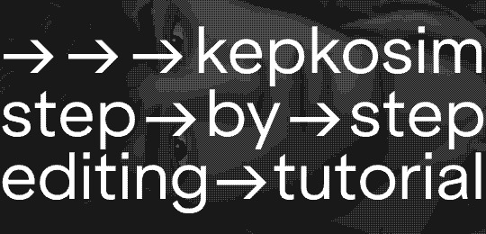
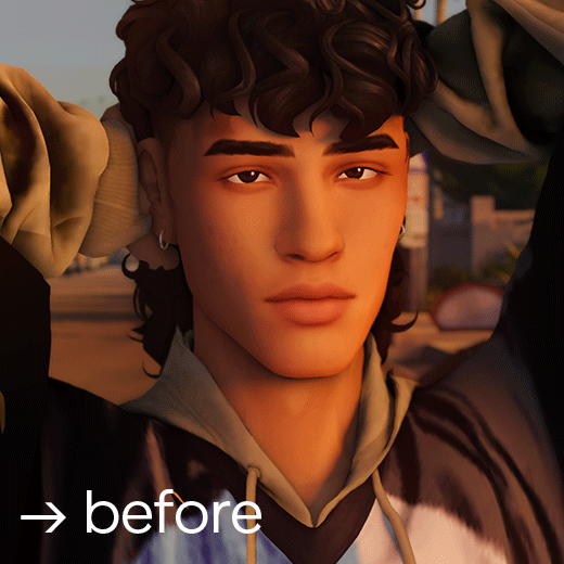
→ → → i've got an ask a while ago asking about my editing process so here it is! my 07-step tutorial for editing sims screenshots 💫
01 → preparing your canvas
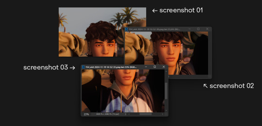
i always take my screenshots in 3 seperate images like shown in the picture above - it gives me a bigger canvas size to work on.
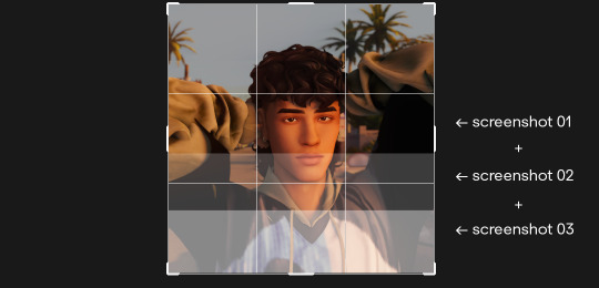
i extend the canvas and line them up on top of each other - decreasing the transparency and zooming in helps to see where each image has to go.
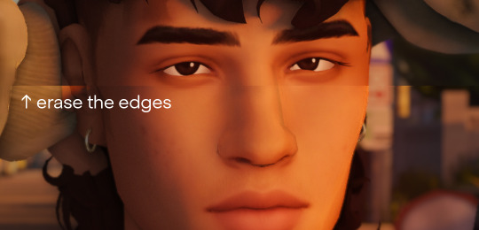
erase all the visible hard edges with a soft round brush and you're good to go.
02 → liquify
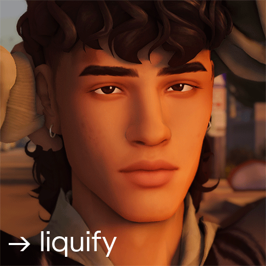
under filter > liquify fix any hard edges that are meant to be smooth. i really take my time with this since this makes a huge difference!
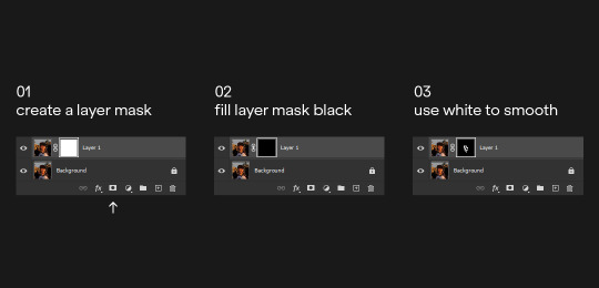
03 → skin & shadow smoothing
i duplicate the layer and use the noise > dust and scratch filter with a layer mask
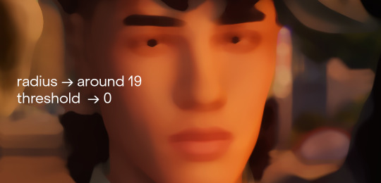
you can also go in and use the blur > surface blur fliter if it's not smooth enough. next i create the layer mask:
afterwards i tend to add a tiny amount of noise on the smoothing layer - i feel like it makes everything blend together a bit better.
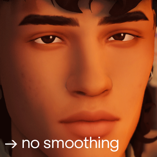
you can also obviously lower the opacity if it's too smooth for your liking. i feel like the smoothing wasn't really nessecary in this screenshot but sometimes (especially using relight) the shadows can look a bit pixelated. using this technique helps fixing that issue with little effort.
04 → painting highlights
next i paint highlights onto the skin. i create a new layer and start painting by using a soft round brush that's around 5-20 px big, on 1-2% opacity and 100% flow. i paint the highlights matching the existing light source:
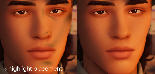
to pick the right color for my highlights i usually pick the lightest skin color on the screenshot and go a little bit lighter and warmer. it all depends on your screenshot and your lighting though!
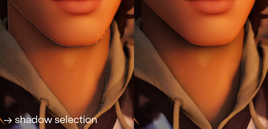
05 → painting shadows
occasionally i also paint shadows onto the screenshot! first i select the area i want to paint in and then use a black soft round brush, that's around 100-500 px big, on 5-10% opacity and 100% flow. i just do a couple of clicks and just roughly add shadows where it's nessecary
06 → optimizing your image
the last step is to resize your image to a fitting layout using a tumblr image size guide.
07 → end!
if you've followed all my steps the end result should look like this 💫🌟✨
if you have any more questions please feel free to hmu anytime!! i would be more than happy to help + give more tips 💫
153 notes
·
View notes
Text
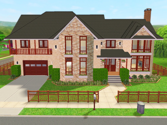
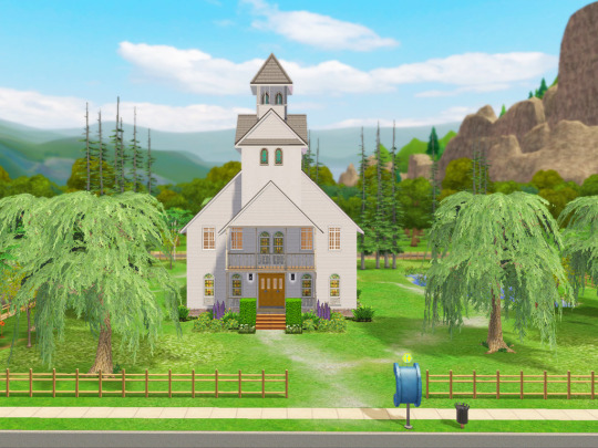
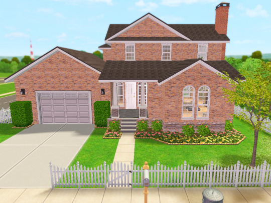
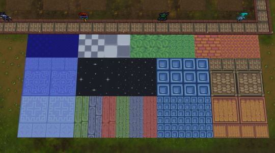
Lot Previews and Build/Buy Mode Mods I use
Finally! Pretty much everything I had on my old Simblr has been reposted here! Thank you for your interest in these homes. I hope they continue to bring a smile to your face as you play with them. 😊
Here are some previews of the lots I've been polishing up recently. Fun fact: 90% of these lots started out as houses I built for my kids' sims families when they were young (ah how the years fly by!).
These will eventually get uploaded at least that's the plan as I have more time.
Here's where I could use your feedback though:
I love to build and landscape, but decorating the insides...not quite as much.😅
I'd be able to put these lots up faster if you're ok with furnishing and decorating them yourself. I'd add things like kitchens and bathrooms and place beds in the bedrooms.
What do you think? Scroll through and let me know!
I am using Reshade 4.91 for the images that you see. That link will take you to Reshade's official repository folder for Reshade 4.0 series downloads.
Other than cropping and resizing, this is how they look in my game. I'm blessed enough to have a machine that will let me play with this beautiful custom LUT I configured. It helps to see bright, happy colors, especially in winter. 😎
So now a few words about the mods or hacks I use to make building a whole lot more fun, considering I play with very little CC in my game.
I use a number of building cheats such as 'allow45degreeangleofrotation true', 'boolprop snapobjectstogrid false', "setquartertileplacement on", and of course, "moveobjects". If you notice an object blocking something feel free to move/remove it. Grab this mod to allow your sims to sit in chairs placed at 45 degree angles.
I use a lot of shiftable decor mods: shiftable wall lamps, ceiling deco made shiftable, shiftable wall decor. The other day I ran across this mod that allows you to shift just about anything up or down, so I may switch to this in the future. Today I came across Fway's Object Freedom mod which I'm going to start testing out since it includes the "Shiftable Everything" mod. If you've been frustrated by the limits of where things can be placed in order to be used, this might be the answer!
I also use a few default replacements (head over here for a more complete list):
CuriousB's Lush Terrain
Peppermint & Ginger's Shrub defaults
TVickie's Phlox default replacement
PineappleForest's Spiderlily texture default (along with a number of other defaulted things).
Fway's Default Garden Plot
Less saturated BG flowers (I can use the poppies finally!)
Lunatech Lighten Up Ceiling Light Placement Fix
I do use a few other things but these are the primary ones.
And as far as CC goes, these are the only items you'll have to deal with (Use Sims 2 Pack Clean Installer to remove any of these things if you don't want them in your game):
Anything Maxis "Lost and Found", preorder "Bonus" items, or items that were offered on the Sims 2 website. I'll label this in the lot post.
Functional Washer/dryer
Maxis Match Wall Cabinets by CTNutmegger at ModtheSims
Maxis Match Chimney Recolors: Brick, Stucco, Southwestern Style Stucco, Masonry
So there you have a short list of things I have in my game that you may already have in yours, but if not, you now know where to find them. :) I'm looking forward to hearing your feedback on what I should do with the lots (since my time is pretty limited by real life responsibilities). 🎉😄
#ts2 build#sims 2 lots#residential lots#ts2 screenshots#sims 2 build#sims 2 house#lot#sims 2 mods#ts2 mods#ts2 resources#resources
68 notes
·
View notes
Note
hey wisp! I always adored the way your edits looks especially the little stars-sprinkles-camera feel layers you chooses!
so Im wondering what do you usually google to search for that kinda stuff???
hai :D thank you friend! :3 i typically will look up film frame/star bokeh overlay and i'll scour the internet until i find some. i'll usually check places like pinterest, google images, devianart HOWEVER i decided to put together something for this ask. sometimes (most of the times lmao) a lot of these textures are paywalled and that's a bit annoying SO i've uploaded a majority of the textures i use! i organized them into three categories and that's bokeh, film scratches and borders! i'll also included a mini tut under the cut because genuinely when i first started using textures, i uh, had no idea how do use them lil guys so maybe this might help someone :D
ᯓ☆ Texture Pack Download: SFS
mini tutorial underneath:
after copying, pasting and resizing the texture file onto the photo i'm editing, for film textures with a mostly black background that aren't transparent, i'll hop into layers and change it to lighten. i find that this keeps the detail whist not causing you to loose clarity in a photo! i usually set opacity to 50% but that's just a preference! i always suggest to mess around with layer styles u never know what u might find:

as for bokehs or light leaks, i'll usually use lighten but i recently discovered that linear dodge creates a glowy effect bery cool! thought i might share:
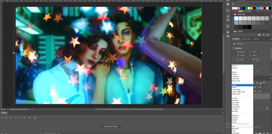

as for the frames i included, most are transparent, i included some like the very first photo that could look sick layered over a photo. some have a white non-transparent center such as the one pictured but i'll typically erase it or try out the multiply layer:


#i paid for these when i had fun money i am saluting the past me u were really lookin out for my creativity#asks#my cc#not really but something to download LMAO#creative process#editing
103 notes
·
View notes
Text

A quick method to deal with blurry action shots that have Hannibal's quintessential dim lighting + green color grading combo.
Here's the example I'll be using:

Don't get me wrong, I love the look of Hannibal, but the average person doesn't scroll tumblr with their screen brightness on max. Plus, night light filters and blue light glasses add even more yellow to an already heavily filtered show. If you want people to see your gif clearly, you have to edit it at least a little. Especially for extreme shots like this lol.
What I use: macOS 15.1.1 Elmedia Player 8.18 dupeGuru 4.3.1 Topaz Photo AI 3.2.0 Photoshop 25.11.0 LuLu 2.6.3 (optional, but it's nice to block outgoing connections from pirated programs)
Step One: Take Screenshots
Open your video file (1080p preferred) in Elmedia Player and navigate to the first frame of your gif. Hit "Playback > Record a Series of Screenshots" and let it run until you have all the frames you want. Unfortunately for mac users, we have a problem where a lot of duplicate screenshots are taken (like every third screenshot is a duplicate... it's so annoying). To save time later, I use dupeGuru to clean out as many duplicates as I can.
Open dupeGuru and add whatever folder you saved your screenshots to.

Scan the folder, then hit "Mark > Mark All" (you can see here that the program only caught one duplicate, which means more work later. it's not a perfect program -_-)

Hit "Actions > Send Marked to Recycle Bin..." to remove the duplicates from the folder

Step Two: Denoise
At this stage the screenshots are so dark that the noise isn't obvious, but it'll be more noticeable after brightening and sharpening. Here's the difference this step makes later:

Upload all your screenshots to Topaz Photo AI and add a Denoise layer. I normally go with the automatic settings.

Hit "Select All," "Apply > Current Settings," then export all your images. This can take a while depending on how many images you have.

Step Three: Create Frame Animation in Photoshop
If you've read any other gif-making tutorials this part should be familiar, so I'm gonna skim over it.
"File > Scripts > Load Files into Stack"
"Browse..." and select your Topaz output files
"Sort by Name" so they load in the correct order
"Ok"
Once all the layers have loaded, hit "Create Frame Animation" in the Timeline window
Under the Timeline window options menu, hit "Make Frames from Layers," then "Reverse Frames"
This is probably when you want to go through frame-by-frame and delete any remaining duplicates. It's very annoying to have to redo this step if you want to go back and edit your crop size later. (Not that I would know... 🤡)
Step Four: Crop + Resize
Crop, then "Image > Image Size" to adjust the width of your gif. You'll most likely want to use one of the common tumblr image dimensions:
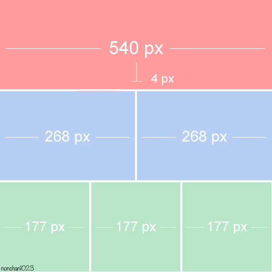
Keep in mind that tumblr's gif size limit is 10 MB. But it's honestly best to keep it under 9.5 MB if you want the gif to load smoothly. A 540x540 px gif can have 40-60 frames while a smaller gif can be longer.
Make sure to add +2 px to whichever width you choose (so 542 px, 270 px, etc), since we'll be adjusting the canvas size later to get rid of transparent border anomalies.
Step Five: Color
The more common order of operations is to sharpen before coloring, but for dark scenes like this, it's kinda silly to sharpen when you can barely see what you're doing, so I like to color first.
Select all your frame layers and make a new group, just to keep them separate from your adjustment layers.
I always start by testing out the Auto Color Correction Options in a Curves adjustment layer. To access them, opt + click on the Auto button. This opens a window with four options.
I like to use a combination of "Enhance Per Channel Contrast" and "Find Dark & Light Colors," though either option can be used to adjust color balance. The important part is selecting "Snap Neutral Midtones" and picking a midtone that brings your gif as close as possible to the desired color balance.

If changing the midtone doesn't affect the color balance, brighten the gif first and try again.
For this gif, "Enhance Per Channel Contrast" removed the bulk of the green filter:

It's still pretty dark, so I brightened up the gif with some more Curves layers:

There's still a lot of purple/blue in Dolarhyde's black leather jacket, so I added another Curves layer and used "Find Dark & Light Colors" to improve the blackpoint:

Now we can up the contrast a little:

Nice! Good enough to move onto sharpening!
SIDE NOTE: The reason I use these Color Correction Options is because simply brightening leaves you with purple/blue shadows and sickly green over-exposed highlights that take ages to color correct. You can see the difference here:

(If you've ever wondered why so many Hannibal gifs have blue shadows, this is why.)
Step Six: Sharpen
This is where you'll want to start implementing actions, which are pre-recorded series of adjustments that you can perform with the click of a button. I mainly use three actions (download here, open the Actions window in PS, open the Action options menu, and click "Load Actions...").
The "frame animation to smart object" action converts the gif to a video timeline so we can apply smart filters.
The "legacy sharpening + high pass" action applies my standard sharpening filters. Not every gif will need the high pass filter, so feel free to change its opacity or delete it altogether. You can also tweak the smart sharpen filters by right clicking them and selecting "Edit Smart Filter..."

3. Once you're happy with the sharpness, the "convert to frame timeline" action turns the gif back into a frame animation. I use a 0.05 s frame delay for most gifs (equivalent to 20 fps; 24 fps is standard for tv/movies). I normally use 0.07-0.08 seconds for action shots, so the gif doesn't whip around so fast. Over 0.1 seconds, it starts to look like stop motion, so I try to avoid that.
Step Seven: Final Adjustments
This is where I fine-tune the colors, mostly using Hue/Saturation layers.
If I use a Color Balance layer, I only make very small adjustments and try to counterbalance them in the other tonal ranges (e.i. adjustments to the Highlights spill over to the Midtones, so I make the opposite adjustments to the Midtones to fix it). But most of the time, I'd rather play around with Curves or Hue/Saturation to fix stuff like that.
Hue/Saturation gives you more control by allowing you to select the exact color range you want to affect. For this gif, I used Hue/Saturation to get rid of the purple introduced around the highlights in Will's hair by the high pass filter.
The eyedropper tool allows you to select the exact color you want to include in the range. Then you can move the bars around until all the colors you don't want to affect are excluded.

Once you have your range selected, you can bring the saturation all the way down and set it to whatever lightness you prefer:

I also reduced cyan's saturation so that Will's shirt wouldn't look quite so blue.

[You could do a lot more to make the colors prettier... but there are other tutorials online for that. 😅]
Step Eight: Export
Once you're happy with your final product, go to "File > Export > Save for Web (Legacy)..."
These are my settings:

You can use Diffusion instead of Pattern if you want. Diffusion is probably better for mobile gif compression, but I like the way Pattern looks on desktop, especially for gifs with smooth gradients. It's a personal preference thing.
Hit "Save..." and you're all done!

This isn't gonna win any gif-making awards, but at least you can see what's happening and the colors don't look wonky. And for Hannibal, I call that a win! 🥲👍
61 notes
·
View notes
Text
SIMDEW VALLEY SET 🍄👩🏿🌾🐷🐴🐄🧙🏿♂️🌻🌽
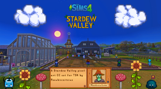
Stardew Valley Pixel Art Floors/Walls/Deco (TS4) Download Below
Aside from a couple most of these pics are just the demo pics showing what's included, more CC in game pics can be seen here
🍄Misc Large Decals


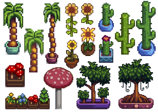
In order: Junimo huts + large Junimos, Holdiay Decor and "sky decor", furniture items, rarecrows, plants.
🍄Wall Decals Paintings and Banners:
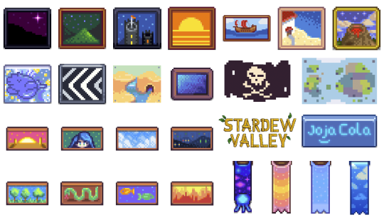
🍄Wall Decals Misc small:
Adventure stuff and boots, small junimos, random furniture items slime monsters different expressions

🍄Wall decals Gems and Minerals:
I didn't do them all, just some that I liked.
🍄Wall decals farm animals
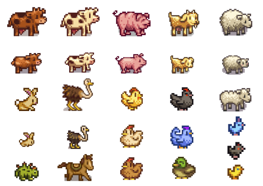
🍄Wall decals Fishing
Again just the fish I wanted to do, not all:

🍄Wall decals Harvestables, Crops, Products:

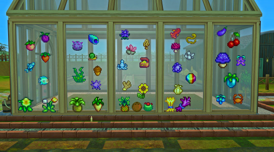
Here's a random in game pic (see more in links provided at top or bottom of post), all decals show through glass too!
🍄Stardew Valley Villagers (yes the bear is a villager I refuse to accept otherwise) portraits
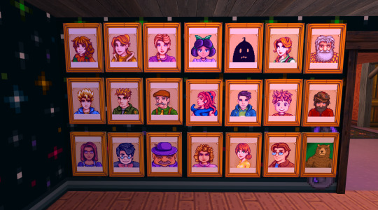
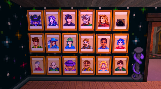
The portraits are the only item with actual dimension, I recoloured a base game framed painting, so these are not flat like the rest of decals. (they look a bit orange but that's just my mood lighting)
🍄Walls and Flooring (indoor and outdoor flooring)
I did all the ones you see here:


For the floors I made a large and small version of all:
🍄You can see more CC in game pics in my wip post here
Are you sick and tired of those smooth graphics from Sims 4? Do you wish you could replace those pesky curves and detailed HQ textures with nothing but square pixel heaven and flat colours? To be finally rid of all those 3D bump/light effects and replace them with volume-less cardboard cut-out illusion and imagination? Do you want your build/game to look just like Stardew Valley? Or do you simply think that if the sims team are gonna give us low poly and low quality meshes and textures might as well do it properly? Fear not! The solution is here! I made a new Stardew Valley save (why I need yet another save that I'll never have time to complete I don't know) and tried my first build, the recreation of my current (and only) farm. It was ok but I got frustrated at how "Sims 4" everything looked, and checked for stardew valley cc conversions, art, decor but only find people making it using sims 4 stuff, which is probably the most logical thing but not for me! So I made this as there are plenty of game assets from Stardew Valley available online and however tedious and time-consuming resizing the tiniest of pixel art images is to fit Sims 4, it is fairly easy and doable, so I did it. I did skip some items in each category as there are way too many and just did the ones I like, sorry if there was one I didn't include. Also there are some floors in the game or icons that I couldn't find. Some Junimos were taken from the internet but most are individually resized game assets. INFO: all decals in wall deco, all are zero simoleons, and the portraits are 10. You can find my stuff typing "moonbiscuitsims" or "stardew". All have correct colour filter tags and removed "talk to object (insane)" and "can be struck by lightning" (these things annoy me or could cause more distractions for my sims, sorry if you like this though I'm sure there are plenty of objects to talk to/ lightning strikable objects). I don't know if this has an effect. All the portraits are just tagged as brown. All are resizable to your liking. Forgot to mention the floors i think are in wood flooring and outdoor flooring; and I think the walls in panelling. REQUIREMENTS: Nada, nothing. Just base game. (though I did accidentally make one item from a get to work decal by mistake, I remade it to fix it and I've play tested everything, but let me know if something doesn't show up.
PLEASE READ AND RESPECT MY TOU AND DO NOT ❌❌❌: - ❌ Reupload - ❌ Include in sim downloads - ❌ Put behind paywall of any kind no matter what. - ❌ Claim as yours. If you wanna use the texture files to make other different original content that is fine as long as it is different from mine and NO PAYWALLS and no reuploading my stuff. The images are from Stardew Valley, but I spent ages editing every single one to fit the sims, and this took me days to do. All my stuff is free. I don't care about conversions to ts2 or ts3 but NO PAYWALLS and please tag and credit me. If used for screenshots please tag me too, I'd love to see <3 🍄DOWNLOAD (including a pick and choose or a merged file with everything, don't get both) 🍄ALT DOWNLOAD PATREON Enjoy! Happy Simming/Farming
🌵🥥🌴NEW!! Calico Desert Addon🌴🥥🌵
Stardew Valley fav music playlist 🎵🎵🎵
#moonbiscuitsims#moonbiscuitsims4#moonbiscuitsimsstardew#moonbiscuitsimscc#moonbiscuitsimsphotos#mbsdownload#stardew valley#sims 4#the sims 4#ts4#sims cc#sims 4 cc#ts4 cc#stardew valley sims 4#sims 4 stardew valley#sdv#sdv fanart#stardew fanart#stardew#stardew valley fanart#sdv farmer#ts4cc#sims4#sims 4 custom content#the sims 4 custom content
162 notes
·
View notes
Text
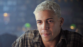
If you click HERE you’ll find 120 gifs of Charles Melton from American Horror Stories Season 2 and if you click HERE you'll find 22 gifs of just his body in that episode. He was born in 1991 and is white and Korean so please cast accordingly. All gifs were made by me and are 268 x 170. You are welcome to resize these/edit for personal use, but do not redistribute or claim them as your own. Content warning: flashing lights, bullying, body image, alcohol, violence
Happy Rp’ing!


82 notes
·
View notes
Text
WoD Hallozine - a mini-Zine!
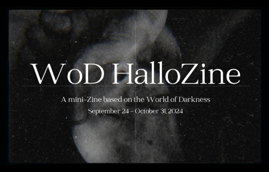
Introducing WoD HalloZine, a mini-Zine project for the Month of October!
WoD HalloZine is a short, one month project celebrating community and fanworks based on the World of Darkness. This zine will be free and distributed digital-only on socials. The theme of the zine is Haunting. Whether it be wraiths roaming the halls of an abandoned mansion, demons bound to their hosts, vampires lamenting on the nature of their immortal existence, or Garou communing with spirits in the Umbra, tell us your tales of dread, longing, and sorrow featuring your original characters. What sordid secrets are hiding in the dark? What Haunts You? How to Participate This is a time-sensitive event that's accepting submissions from September 24 - October 31, 2024. You can submit any art or written work based on original characters in any of the World of Darkness properties. You are welcome to submit existing work that hasn't been featured in a zine or create a new piece based on the theme. To sign up and be eligible to participate, please submit a form here: https://forms.gle/nnrShH3LDhbBtvip9 You will be contacted at least two times during the event: first to confirm your participation, second to check in and collect your final submission. You can always message more for questions and inquiries. Submit your piece through email or via DM on Discord. My Discord Art Server Gallery Noir will have an event specific channel for up-to-date news and a space to socialize. Joining is optional and not required for the zine. There are no limits on number of participants or submissions for this project. After October 31, all submitted pieces will be compiled into the zine and distributed via PDF format on my socials. No submissions will be accepted starting November 1st. Along with being in the Zine, you are welcome to post your pieces to your own socials and use as you see fit. If you do, I would appreciate if you tag me and use the tag #wodhallozine , though it's totally optional to do so! Submission Guidelines
This is a low pressure event where there are no hard standards on quality or content. I want everyone at all levels and mediums to express themselves however they see fit. There are no editing or draft phases and I will do my best to showcase the biggest variety of work across the community. That being said, to keep the project manageable and social media-friendly, there is a small list of guidelines for all work. General Content Guidelines
16+ or Rated-R at most
NO NSFW or sexual content
NO Gore or Extreme Violence
Light Blood and implied violence allowed
NO Offensive content like slurs or hate speech
NO AI generated or assisted work
If you have questions on what these mean, send me a DM.
Art Guidelines
You can choose to submit the following categories:
Single illustration/Image file
Short Comic (1-2 pages)
Any Size, 300 DPI, CMYK, PNG or TIFF format
Subject to formatting and placement choices
Writing Guidelines
You can choose to submit the following categories:
Short Story (3k words max)
Poetry/Prose (2 pages max including formatting)
English only, DOC, PDF, or ODT format
Subject to formatting and placement choices (please note if you'd like me to keep specific font and formatting choices)
You are open to submit as many pieces as you like. I reserve the right to include, exclude, resize, and rearrange pieces at my discretion for the sake of the zine's final composition. If a piece requires edits, I will touch base with you on the specifics. For any questions or concerns, email me at vampy269@gmail or message me on Discord at vampy8020. Thank you for your interest and have fun!
#wod#vtm#vamily#world of darkness#vampire the masquerade#wraith the oblivion#werewolf the apocalypse#mage the ascension#demon the fallen#hunter the reckoning#changeling the dreaming#wod hallozine
58 notes
·
View notes
Text
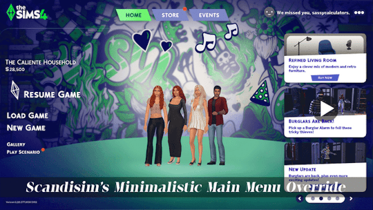
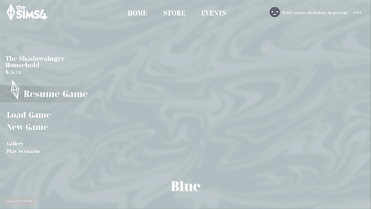
Minimalistic Main Menu Override
A very minimal main menu override for those of you who like it clean and aesthetically pleasing.
Download on Patreon (free to join)
What's included:
Home/Store/Events tab buttons have been cleaned up and resized, and I removed the tab backgrounds and notification bubble for having unpurchased packs.
The Sims 4 logo changed to white.
Changed the Play Button green to be slightly more subdued and less... crazy.
Overall colors have been changed to be more subdued and less in-your-face.
Removed divider that runs across the screen below the logo and tabs.
News panel hidden.
Household image has been moved to be more centered + option for no household image.
Separated files for the most possible diversity in how you can use it.
Total of 25 background options, choose between 8 plain colored backgrounds and 17 in-game shots from some of my favorite worlds in the game. See screenshots below. All images taken with Reshade off. See individual images here.
Plain Backgrounds:
World Backgrounds:

Notes:
I really don't recommend using the lightest background, Snow, if you use most Reshade/Gshade presets because you will not be able to read the main menu like... at all. This is simply because it is so light that most presets will wash it out and make the text illegible.
You can combine the base file with any main menu background override of your choosing, just as long as it only overrides the background.
Will conflict with other main menu overrides.
Feel free to make your own main menu overrides using my base file, but do not include my files in your download. Instead you may link back to this post.
Recommended mods:
LunarBritney's Consistent Main Menu Household Sizes - do not use this if you use the No Household option, obviously.
My Rational Serif Font Override - this is used in all the screenshots.
How to install:
1. Unzip files.
2. Place [scandisim] Main Menu Override - MINIMAL BASE.package in your Mods folder.
3. Choose a background file, remember you can only choose one, and place it in your Mods folder.
4. Optional: If you want the household image hidden, also place [scandisim] Main Menu Override - No Household Image.package in your Mods folder.
5. Done!
Let me know if you run into any issues! <3
⋆⁺₊⋆ ━━━━⊱༒︎ • ༒︎⊰━━━━ ⋆⁺₊⋆
General Terms of Use:
Do not steal.
Do not reupload.
Do not link behind adfly, reupload to Simsdom or anything like that.
Recoloring is allowed, but make sure to link back to my original creation and do not monetize my creations by early access or permapaywalling.
#sims 4#the sims 4#sims#the sims#simblr#ts4#sims 4 screenshots#maxis match#my cc#sims 4 main menu#sims 4 overrides#sims 4 mods#sims 4 custom content#the sims community#sims community
27 notes
·
View notes
Text

Hello, everyone!
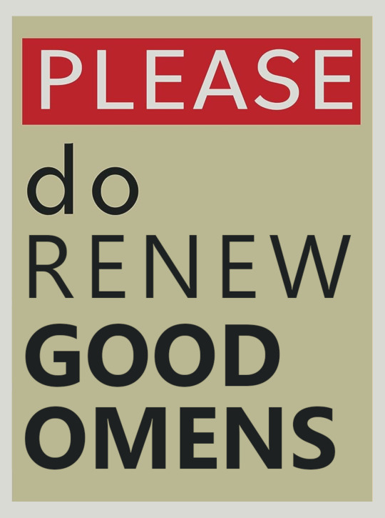
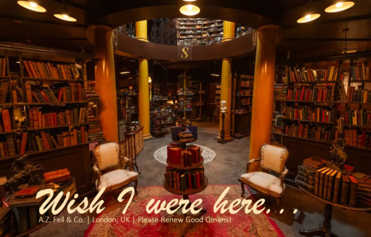
In light of Neil Gaiman's comment that Amazon is close to officially renewing Good Omens but hasn't done so yet, I think those of us who can should start sending physical postcards to Amazon Studios!
The TL;DR of this post is that you can easily send a postcard from MyPostcard.com for about $3 (USD, I'm sure other currencies can vary). The Web site will print and mail it for you, so you don't have to do any printing or mailing yourself. The postage is included in the $3.
If you don't already have an image or card you want to use, you can just use one of mine above. Some of them are small because of small source images, but the site seems to resize them appropriately for the card. There are bigger versions in a Google Drive folder that you shouldn't have to be logged in to see.
You can send the postcards asking for a third season of Good Omens addressed to Jennifer Salke and Vernon Sanders, co-heads of Amazon Studios, at:
AMAZON STUDIOS 1620 26TH STREET, SUITE 4000N SANTA MONICA, CA 90404 USA
@fuckyeahgoodomens was the first to post this contact information for Amazon, so thank you, Ixi.
If it's something you don't mind, I would very deeply appreciate reblogs on this, since it works better if lots of people see it! No pressure if you don't want to, though.
And if you have Questions, click through below for my reasoning on all this.
Why should we send postcards to Amazon Studios?
We've made lots of noise online about renewal, and we've done a lot of streaming Good Omens. But I haven't seen much discussion of sending physical mail or, specifically, postcards.
Mail takes up space in the real world. It's slightly harder to ignore than email. It's way more attention-grabbing than posts on X or Tumblr or any other social media site. Because postage is required, physical mail can also appear more "committed."
Postcards specifically are great because of their convenience for the recipient. No one has to open them to read them. All it takes is a quick glance to see what we're asking for, and realistically, a quick glance is the best we can ask for in a corporate office. That's why I'm emphasizing postcards over regular letters (although really, anything helps).
Is sending postcards really going to motivate Amazon to make more Good Omens?
Postcard and letter-writing campaigns have helped get shows renewed in the past. Star Trek: The Original Series is a good example of a series that got another season after a letter-writing campaign. This article has more examples.
We don't actually know what's going on in Good Omens's case. Maybe postcards would make a difference; maybe they wouldn't. We can only make our most determined effort at making sure we're heard, and sending mail is part of that.
The cost of sending a postcard is too much for me.
I understand that sending a postcard will not be an option for many of us. This post isn't intended to try to push you into spending money you don't have. If you still want to find a way to participate, you can also send an email to [email protected] with your comments about wanting Good Omens 3. It's not physical mail, but it is still a personal message from a customer.
In fact, people who are sending postcards might want to follow up with an email, too.
Do we have to use your postcard designs?
No! Not necessarily! You can use anything.
As long as the message you write includes how much you want Good Omens 3, your postcard's image doesn't necessarily have to relate. You could send a souvenir postcard that says "Greetings from Los Angeles, CA / Tadfield, England / etc" from your local post office and just write your message on the back.
Technically, even a plain index card should be thick enough to mail as a postcard, at least by USPS standards. Just write your desire for Good Omens 3 on it, put a stamp and Amazon's address on it, and make sure it's at least 90mm x 127mm (3.5in x 5in).
Isn't Amazon Studios going to notice a bunch of postcards being mailed from the same Web site?
I'm sure they will. But the messages will each be unique, and again, they'll know each card represents a person who had to order the card and postage themselves.
Speaking of unique messages, what should I write?
One sentence is enough. Definitely indicate that you want Season 3 of Good Omens. If you want to add more, you could also write a sentence or two about how much you love the series so far.
Above all, be polite and straightforward! Remember that sarcasm and jokes often do not come across well in print, so it may be best to stick with simple statements that can be taken at face value.
What address should the cards go to?
The co-heads of Amazon Studios appear to be Vernon Sanders and Jennifer Salke; you can address them by name, although I'm guessing it will be someone else who does the reading/glancing.
Amazon Studios's address is:
AMAZON STUDIOS 1620 26TH STREET, SUITE 4000N SANTA MONICA, CA 90404 USA
Where did you get these images?
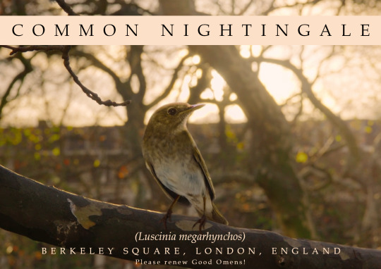
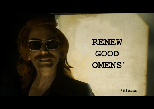
The images for the nightingale postcard and the Crowley postcard are screencaps from directedbypiper.
The Please Do Not Lick the Walls and Fell the Marvelous posters were downloads from the Amazon X-Ray feature.
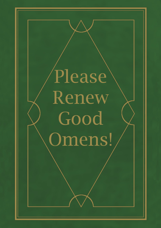
The Nice and Accurate Prophecies postcard was adapted from cover art I did for A Nice and Interpretive Fanzine. Most of it is my own, although the mottled background is an extremely blurred version of a free stock texture from Pixabay, users chrisfiedler and/or humusak.
The bookshop postcard is a promotional image from Amazon used in a Den of Geek article.
398 notes
·
View notes
Text
___ ★ ˚ ﹟LAUTARO LR in UPD (2022)
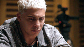
TW: kiss, body image, drugs, flashing lights. ETHNICITY: unspecified argentinian.
🍓 . . . ⇢ ˗ˏˋ by clicking the SOURCE LINK you will find 177 gifs of Lautaro Rodriguez in the series UPD. he was born in 1997 so cast him accordingly. all of them were made by me from scratch. feel free to use them as long as you follow my basic rules.
BASIC RULES:
DO NOT use them for crackships without asking.
DO NOT crop / resize / change them.
DO NOT repost them or claim them as your own
DO NOT use in krpg (or indie) / smut rpg (or indie) / taboo rpgs / or fanfics.
if you want and can, please consider buying me a coffee, and also if you are kind enough, please, reblog this post if you use or if you like them !!!
#not a new pack but i want people to find my old gif hunts#( 🍓 ) invinoveritas does ⇢ gif pack#gif hunt#gif pack#lautaro rodriguez gif pack#lautaro rodriguez gif hunt
20 notes
·
View notes