#LookML
Explore tagged Tumblr posts
Visit Tumblr Blog
Explore Tumblr blogs with no restrictions, modern design and the best experience.
Last Seen Tumblr Blogs


Fun Fact
Tumblr Inc. has $15.1M in annual revenue.
Text
Looker Gemini Launches LookML Assistant And AI Visualization

The field of business intelligence (BI) is changing quickly these days as customers utilize strong, generative AI-driven data analysis tools to extract ever-more value from their own information. Google Cloud is releasing LookML Assistant and Visualization Assistant, two crucial Gemini features in Looker, to enable you create and interact throughout your company with intuitive AI-driven insights, and to assist speed up this change. These developments streamline the organization and distribution of data for analysts and developers while reimagining how they can engage with modeling and visualization tools.
Unveiled at Google Cloud Next, in April, Looker’s Gemini will alter how you derive insights from the most consequential data available to you. You can help everyone in your company by leveraging natural language and Google‘s AI to explore, collaborate, and make decisions more quickly among your team members.
Use the LookML Assistant to write LookML more quickly
Looker’s version-controlled semantic layer, or LookML Assistant for short, serves as an abstraction layer between your data and business users, giving them a dependable and consistent means of accessing and analyzing information. This makes data governance easier to manage and promotes data integrity throughout the company. LookML Assistant streamlines the code-creation process and offers recommendations and direction to help you get started with LookML and expedite your workflow. LookML Assistant can be used to generate measurements, dimension groups, dimensions, and other code recommendations.
Looker’s Gemini offers generative AI powered support to ease your data processing.Using Looker’s Gemini, the Looker IDE’s Help me code screen uses written instructions to produce LookML code suggestions. In your LookML Assistant, Gemini can be used to construct dimensions, dimension groups, and measurements.
To include LookML into your Looker project using Gemini, take the following actions:
You need enable Development Mode on your Looker instance.
Launch the Looker IDE and open your project.
To put LookML into a file, open the LookML view file using the IDE file browser.
Using the side panel selection, choose the Help me code icon.
Click to highlight a line in your LookML view file while the Help me code panel is displayed. Gemini offers relevant options, such Create a dimension or Create a measure, to assist you based on the type of LookML file you are working with and where your cursor is located within the file.
From the Help me code panel, pick one of the following:
Form a group of dimensions.
Construct a dimension
Make a measurement
Other code suggestion: If you’d like to experiment with other LookML elements, you can use this option. Since Gemini is still in its early stages of development, make sure to verify and test all of the output before implementing it.
Use natural language when describing the dimension, dimension group, or measure that you wish to construct in the Help me code panel text section. For assistance, go to the parts on this page that include Sample prompts and Tips for using Gemini in the Looker IDE.
To submit your request to Gemini, click the Submit icon or hit Enter. Gemini will reply with a code recommendation.
With the provided code, the following actions are possible:
To see a preview of the proposed LookML in your file, hover your cursor over the Insert button. Before adding the LookML to the file, you can shift your cursor to a different line to preview it in a different place.
To make manual changes to the proposed LookML, click the Edit button.
To put the LookML into your file at the point where your cursor is, click the put button.
Please select the thumbs up or thumbs down (This response was not what expected) to indicate your opinion on the provided code.
To start anew and input a new Gemini prompt, click the New code proposal link.
In your LookML file, click Save Changes.
Check the LookML by carrying out these actions:
Check the LookML with the LookML Validator.
Take a LookML test in an Explore.
Create bespoke visualizations with natural language
Additionally, by adjusting the underlying JSON code directly, you may fine-tune the look and functionality of your visualizations using Looker’s Chart Config Editor. With the considerable customization possibilities this tool offers beyond the usual visualization settings, you may make charts and graphs that are both more visually appealing and instructive.
With the release of Visualization Assistant in preview today, google cloud extending this capability and making it simpler than ever to add adjustments to Looker’s pre-made visuals. To personalize your visualizations, ask Gemini in Looker using natural language, rather than scouring the docs for the appropriate JSON options.
Create a visualization in Looker Explore and select an out-of-the-box chart type, like a column, bar, or line, to begin using LookML Assistant After that, select the Visualization Assistant button from the options bar for visualization. Looker’s Gemini will inquire as to what you would like customized. When you provide a question or choose one of the pre-written suggestions, Gemini generates the customized code. Apply the parameters and your new visualization will go live if you like what you see.
Looker’s Gemini feature lets you communicate with your data to make it more interactive and expedites daily data engagements.
Read more on Govindhtech.com
#AI#AIVisualization#LookMLAssistant#LookML#Gemini#LookerGemini#GoogleCloud#generativeAI#news#technews#technology#technologynews#technologytrends#govindhtech
0 notes
Text
Data Engineering Concepts, Tools, and Projects
All the associations in the world have large amounts of data. If not worked upon and anatomized, this data does not amount to anything. Data masterminds are the ones. who make this data pure for consideration. Data Engineering can nominate the process of developing, operating, and maintaining software systems that collect, dissect, and store the association’s data. In modern data analytics, data masterminds produce data channels, which are the structure armature.
How to become a data engineer:
While there is no specific degree requirement for data engineering, a bachelor's or master's degree in computer science, software engineering, information systems, or a related field can provide a solid foundation. Courses in databases, programming, data structures, algorithms, and statistics are particularly beneficial. Data engineers should have strong programming skills. Focus on languages commonly used in data engineering, such as Python, SQL, and Scala. Learn the basics of data manipulation, scripting, and querying databases.
Familiarize yourself with various database systems like MySQL, PostgreSQL, and NoSQL databases such as MongoDB or Apache Cassandra.Knowledge of data warehousing concepts, including schema design, indexing, and optimization techniques.
Data engineering tools recommendations:
Data Engineering makes sure to use a variety of languages and tools to negotiate its objects. These tools allow data masterminds to apply tasks like creating channels and algorithms in a much easier as well as effective manner.
1. Amazon Redshift: A widely used cloud data warehouse built by Amazon, Redshift is the go-to choice for many teams and businesses. It is a comprehensive tool that enables the setup and scaling of data warehouses, making it incredibly easy to use.
One of the most popular tools used for businesses purpose is Amazon Redshift, which provides a powerful platform for managing large amounts of data. It allows users to quickly analyze complex datasets, build models that can be used for predictive analytics, and create visualizations that make it easier to interpret results. With its scalability and flexibility, Amazon Redshift has become one of the go-to solutions when it comes to data engineering tasks.
2. Big Query: Just like Redshift, Big Query is a cloud data warehouse fully managed by Google. It's especially favored by companies that have experience with the Google Cloud Platform. BigQuery not only can scale but also has robust machine learning features that make data analysis much easier. 3. Tableau: A powerful BI tool, Tableau is the second most popular one from our survey. It helps extract and gather data stored in multiple locations and comes with an intuitive drag-and-drop interface. Tableau makes data across departments readily available for data engineers and managers to create useful dashboards. 4. Looker: An essential BI software, Looker helps visualize data more effectively. Unlike traditional BI tools, Looker has developed a LookML layer, which is a language for explaining data, aggregates, calculations, and relationships in a SQL database. A spectacle is a newly-released tool that assists in deploying the LookML layer, ensuring non-technical personnel have a much simpler time when utilizing company data.
5. Apache Spark: An open-source unified analytics engine, Apache Spark is excellent for processing large data sets. It also offers great distribution and runs easily alongside other distributed computing programs, making it essential for data mining and machine learning. 6. Airflow: With Airflow, programming, and scheduling can be done quickly and accurately, and users can keep an eye on it through the built-in UI. It is the most used workflow solution, as 25% of data teams reported using it. 7. Apache Hive: Another data warehouse project on Apache Hadoop, Hive simplifies data queries and analysis with its SQL-like interface. This language enables MapReduce tasks to be executed on Hadoop and is mainly used for data summarization, analysis, and query. 8. Segment: An efficient and comprehensive tool, Segment assists in collecting and using data from digital properties. It transforms, sends, and archives customer data, and also makes the entire process much more manageable. 9. Snowflake: This cloud data warehouse has become very popular lately due to its capabilities in storing and computing data. Snowflake’s unique shared data architecture allows for a wide range of applications, making it an ideal choice for large-scale data storage, data engineering, and data science. 10. DBT: A command-line tool that uses SQL to transform data, DBT is the perfect choice for data engineers and analysts. DBT streamlines the entire transformation process and is highly praised by many data engineers.
Data Engineering Projects:
Data engineering is an important process for businesses to understand and utilize to gain insights from their data. It involves designing, constructing, maintaining, and troubleshooting databases to ensure they are running optimally. There are many tools available for data engineers to use in their work such as My SQL, SQL server, oracle RDBMS, Open Refine, TRIFACTA, Data Ladder, Keras, Watson, TensorFlow, etc. Each tool has its strengths and weaknesses so it’s important to research each one thoroughly before making recommendations about which ones should be used for specific tasks or projects.
Smart IoT Infrastructure:
As the IoT continues to develop, the measure of data consumed with high haste is growing at an intimidating rate. It creates challenges for companies regarding storehouses, analysis, and visualization.
Data Ingestion:
Data ingestion is moving data from one or further sources to a target point for further preparation and analysis. This target point is generally a data storehouse, a unique database designed for effective reporting.
Data Quality and Testing:
Understand the importance of data quality and testing in data engineering projects. Learn about techniques and tools to ensure data accuracy and consistency.
Streaming Data:
Familiarize yourself with real-time data processing and streaming frameworks like Apache Kafka and Apache Flink. Develop your problem-solving skills through practical exercises and challenges.
Conclusion:
Data engineers are using these tools for building data systems. My SQL, SQL server and Oracle RDBMS involve collecting, storing, managing, transforming, and analyzing large amounts of data to gain insights. Data engineers are responsible for designing efficient solutions that can handle high volumes of data while ensuring accuracy and reliability. They use a variety of technologies including databases, programming languages, machine learning algorithms, and more to create powerful applications that help businesses make better decisions based on their collected data.
4 notes
·
View notes
Text
Top 10 AI Tools for Embedded Analytics and Reporting (May 2025)
New Post has been published on https://thedigitalinsider.com/top-10-ai-tools-for-embedded-analytics-and-reporting-may-2025/
Top 10 AI Tools for Embedded Analytics and Reporting (May 2025)
Embedded analytics refers to integrating interactive dashboards, reports, and AI-driven data insights directly into applications or workflows. This approach lets users access analytics in context without switching to a separate BI tool. It’s a rapidly growing market – valued around $20 billion in 2024 and projected to reach $75 billion by 2032 (18% CAGR).
Organizations are embracing embedded analytics to empower end-users with real-time information. These trends are fueled by demand for self-service data access and AI features like natural language queries and automated insights, which make analytics more accessible.
Below we review top tools that provide AI-powered embedded analytics and reporting. Each tool includes an overview, key pros and cons, and a breakdown of pricing tiers.
AI Tools for Embedded Analytics and Reporting (Comparison Table)
AI Tool Best For Price Features Explo Turnkey, white-label SaaS dashboards Free internal · embed from $795/mo No-code builder, Explo AI NLQ, SOC 2/HIPAA ThoughtSpot Google-style NL search for data in apps Dev trial free · usage-based quote SpotIQ AI insights, search & Liveboards embed Tableau Embedded Pixel-perfect visuals & broad connectors $12–70/user/mo Pulse AI summaries, drag-drop viz, JS API Power BI Embedded Azure-centric, cost-efficient scaling A1 capacity from ~$735/mo NL Q&A, AutoML visuals, REST/JS SDK Looker Governed metrics & Google Cloud synergy Custom (≈$120k+/yr) LookML model, secure embed SDK, BigQuery native Sisense OEMs needing deep white-label control Starter ≈$10k/yr · Cloud ≈$21k/yr ElastiCube in-chip, NLQ, full REST/JS APIs Qlik Associative, real-time data exploration $200–2,750/mo (capacity-based) Associative engine, Insight Advisor AI, Nebula.js Domo Everywhere Cloud BI with built-in ETL & sharing From ~$3k/mo (quote) 500+ connectors, alerts, credit-based scaling Yellowfin BI Data storytelling & flexible OEM pricing Custom (≈$15k+/yr) Stories, Signals AI alerts, multi-tenant Mode Analytics SQL/Python notebooks to embedded reports Free · Pro ≈$6k/yr Notebooks, API embed, Visual Explorer
(Source: Explo)
Explo is an embedded analytics platform designed for product and engineering teams to quickly add customer-facing dashboards and reports to their apps. It offers a no-code interface for creating interactive charts and supports white-labeled embedding, so the analytics blend into your product’s UI.
Explo focuses on self-service: end-users can explore data and even build ad hoc reports without needing developer intervention. A standout feature is Explo AI, a generative AI capability that lets users ask free-form questions and get back relevant charts automatically.
This makes data exploration as easy as typing a query in natural language. Explo integrates with many databases and is built to scale from startup use cases to enterprise deployments (it’s SOC II, GDPR, and HIPAA compliant for security).
Pros and Cons
Drag-and-drop dashboards—embed in minutes
Generative AI (Explo AI) for NLQ insights
Full white-label + SOC 2 / HIPAA compliance
Young platform; smaller community
Costs rise with large end-user counts
Cloud-only; no on-prem deployment
Pricing: (Monthly subscriptions – USD)
Launch – Free: Internal BI use only; unlimited internal users/dashboards.
Growth – from $795/month: For embedding in apps; includes 3 embedded dashboards, 25 customer accounts.
Pro – from $2,195/month: Advanced embedding; unlimited dashboards, full white-label, scales with usage.
Enterprise – Custom: Custom pricing for large scale deployments; includes priority support, SSO, custom features.
Visit Explo →
ThoughtSpot is an AI-driven analytics platform renowned for its search-based interface. With ThoughtSpot’s embedded analytics, users can type natural language queries (or use voice) to explore data and instantly get visual answers.
This makes analytics accessible to non-technical users – essentially a Google-like experience for your business data. ThoughtSpot’s in-memory engine handles large data volumes, and its AI engine (SpotIQ) automatically finds insights and anomalies.
For embedding, ThoughtSpot provides low-code components and robust REST APIs/SDKs to integrate interactive Liveboards (dashboards) or even just the search bar into applications. It’s popular for customer-facing analytics in apps where end-users need ad-hoc querying ability.
Businesses in retail, finance, and healthcare use ThoughtSpot to let frontline employees and customers ask data questions on the fly. The platform emphasizes ease-of-use and fast deployment, though it also offers enterprise features like row-level security and scalability across cloud data warehouses.
Pros and Cons
Google-style NL search for data
SpotIQ AI auto-surfaces trends
Embeds dashboards, charts, or just the search bar
Enterprise-grade pricing for SMBs
Limited advanced data modeling
Setup needs schema indexing expertise
Pricing: (Tiered, with consumption-based licensing – USD)
Essentials – $1,250/month (billed annually): For larger deployments; increased data capacity and features.
ThoughtSpot Pro: Custom quote. Full embedding capabilities for customer-facing apps (up to ~500 million data rows).
ThoughtSpot Enterprise: Custom quote. Unlimited data scale and enterprise SLA. Includes multi-tenant support, advanced security, etc.
Visit ThoughtSpot →
Tableau (part of Salesforce) is a leading BI platform known for its powerful visualization and dashboarding capabilities. Tableau Embedded Analytics allows organizations to integrate Tableau’s interactive charts and reports into their own applications or websites.
Developers can embed Tableau dashboards via iFrames or using the JavaScript API, enabling rich data visuals and filtering in-app. Tableau’s strength lies in its breadth of out-of-the-box visuals, drag-and-drop ease for creating dashboards, and a large user community.
It also has introduced AI features – for example, in 2024 Salesforce announced Tableau Pulse, which uses generative AI to deliver automated insights and natural language summaries to users. This augments embedded dashboards with proactive explanations.
Tableau works with a wide range of data sources and offers live or in-memory data connectivity, ensuring that embedded content can display up-to-date info. It’s well-suited for both internal embedded use (e.g. within an enterprise portal) and external customer-facing analytics, though licensing cost and infrastructure must be planned accordingly.
Pros and Cons
Market-leading visual library
New “Pulse” AI summaries & NLQ
Broad data connectors + massive community
License cost balloons at scale
Requires Tableau Server/Cloud infrastructure
Styling customization via JS API only
Pricing: (Subscription per user, with role-based tiers – USD)
Creator – $70 per user/month: Full authoring license (data prep, dashboard creation). Needed for developers building embedded dashboards.
Explorer – $35 per user/month: For users who explore and edit limited content. Suitable for internal power users interacting with embedded reports.
Viewer – $12 per user/month: Read-only access to view dashboards. For end viewers of embedded analytics.
Visit Tableau →
Microsoft Power BI is a widely-used BI suite, and Power BI Embedded refers to the Azure service and APIs that let you embed Power BI visuals into custom applications. This is attractive for developers building customer-facing analytics, as it combines Power BI’s robust features (interactive reports, AI visuals, natural language Q&A, etc.) with flexible embedding options.
You can embed full reports or individual tiles, control them via REST API, and apply row-level security for multi-tenant scenarios. Power BI’s strengths include tight integration with the Microsoft ecosystem (Azure, Office 365), strong data modeling (via Power BI Desktop), and growing AI capabilities (e.g. the Q&A visual that allows users to ask questions in plain English).
Pros and Cons
Rich BI + AI visuals (NL Q&A, AutoML)
Azure capacity pricing scales to any user base
Deep Microsoft ecosystem integration
Initial setup can be complex (capacities, RLS)
Devs need Power BI Pro licenses
Some portal features absent in embeds
Pricing: (Azure capacity-based or per-user – USD)
Power BI Pro – $14/user/month: Enables creating and sharing reports. Required for developers and any internal users of embedded content.
Power BI Premium Per User – $24/user/month: Enhanced features (AI, larger datasets) on a per-user basis. Useful if a small number of users need premium capabilities instead of a full capacity.
Power BI Embedded (A SKUs) – From ~$735/month for A1 capacity (3 GB RAM, 1 v-core). Scales up to ~$23,500/month for A6 (100 GB, 32 cores) for high-end needs. Billed hourly via Azure, with scale-out options.
Visit Power BI →
Looker is a modern analytics platform now part of Google Cloud. It is known for its unique data modeling layer, LookML, which lets data teams define business metrics and logic centrally.
For embedded analytics, Looker provides a robust solution: you can embed interactive dashboards or exploratory data tables in applications, leveraging the same Looker backend. One of Looker’s core strengths is consistency – because of LookML, all users (and embedded views) use trusted data definitions, avoiding mismatched metrics.
Looker also excels at integrations: it connects natively to cloud databases (BigQuery, Snowflake, etc.), and because it’s in the Google ecosystem, it integrates with Google Cloud services (permissions, AI/ML via BigQuery, etc.).
Pros and Cons
LookML enforces single source of truth
Secure embed SDK + full theming
Tight BigQuery & Google AI integration
Premium six-figure pricing common
Steep LookML learning curve
Visuals less flashy than Tableau/Power BI
Pricing: (Custom quotes via sales; example figures)
Visit Looker →
Sisense is a full-stack BI and analytics platform with a strong focus on embedded analytics use cases. It enables companies to infuse analytics into their products via flexible APIs or web components, and even allows building custom analytic apps.
Sisense is known for its ElastiCube in-chip memory technology, which can mash up data from multiple sources and deliver fast performance for dashboards. In recent years, Sisense has incorporated AI features (e.g. NLQ, automated insights) to stay competitive.
A key advantage of Sisense is its ability to be fully white-labeled and its OEM-friendly licensing, which is why many SaaS providers choose it to power their in-app analytics. It offers both cloud and on-premises deployment options, catering to different security requirements.
Sisense also provides a range of customization options: you can embed entire dashboards or individual widgets, and use their JavaScript library to deeply customize look and feel. It’s suited for organizations that need an end-to-end solution – from data preparation to visualization – specifically tailored for embedding in external applications.
Pros and Cons
ElastiCube fuses data fast in-memory
White-label OEM-friendly APIs
AI alerts & NLQ for end-users
UI learning curve for new users
Quote-based pricing can be steep
Advanced setup often needs dev resources
Pricing: (Annual license, quote-based – USD)
Starter (Self-Hosted) – Starts around $10,000/year for a small deployment (few users, basic features). This would typically be an on-prem license for internal BI or limited OEM use.
Cloud (SaaS) Starter – ~$21,000/year for ~5 users on Sisense Cloud (cloud hosting carries ~2× premium over self-host).
Growth/Enterprise OEM – Costs scale significantly with usage; mid-range deployments often range $50K-$100K+ per year. Large enterprise deals can reach several hundred thousand or more if there are very high numbers of end-users.
Visit Sisense →
Qlik is a long-time leader in BI, offering Qlik Sense as its modern analytics platform. Qlik’s embedded analytics capabilities allow you to integrate its associative data engine and rich visuals into other applications.
Qlik’s differentiator is its Associative Engine: users can freely explore data associations (making selections across any fields) and the engine instantly updates all charts to reflect those selections, revealing hidden insights.
In an embedded scenario, this means end-users can get powerful interactive exploration, not just static filtered views. Qlik provides APIs (Capability API, Nebula.js library, etc.) to embed charts or even build fully custom analytics experiences on top of its engine. It also supports standard embed via iframes or mashups.
Qlik has incorporated AI as well – the Insight Advisor can generate insights or chart suggestions automatically. For developers, Qlik’s platform is quite robust: you can script data transformations in its load script, use its security rules for multi-tenant setups, and even embed Qlik into mobile apps.
Pros and Cons
Associative engine enables free exploration
Fast in-memory performance for big data
Robust APIs + Insight Advisor AI
Unique scripting → higher learning curve
Enterprise-level pricing
UI can feel dated without theming
Pricing: (USD)
Starter – $200 / month (billed annually): Includes 10 users + 25 GB “data for analysis.” No extra data add-ons available.
Standard – $825 / month: Starts with 25 GB; buy more capacity in 25 GB blocks. Unlimited user access.
Premium – $2,750 / month: Starts with 50 GB, adds AI/ML, public/anonymous access, larger app sizes (10 GB).
Enterprise – Custom quote: Begins at 250 GB; supports larger app sizes (up to 40 GB), multi-region tenants, expanded AI/automation quotas.
Visit Qlik →
Domo is a cloud-first business intelligence platform, and Domo Everywhere is its embedded analytics solution aimed at sharing Domo’s dashboards outside the core Domo environment. With Domo Everywhere, companies can distribute interactive dashboards to customers or partners via embed codes or public links, while still managing everything from the central Domo instance.
Domo is known for its end-to-end capabilities in the cloud – from data integration (500+ connectors, built-in ETL called Magic ETL) to data visualization and even a built-in data science layer.
For embedding, Domo emphasizes ease of use: non-technical users can create dashboards in Domo’s drag-and-drop interface, then simply embed them with minimal coding. It also offers robust governance so you can control what external viewers see.
Pros and Cons
End-to-end cloud BI with 500+ connectors
Simple drag-and-embed workflow
Real-time alerts & collaboration tools
Credit-based pricing tricky to budget
Cloud-only; no on-prem option
Deeper custom UI needs dev work
Pricing: (Subscription, contact Domo for quote – USD)
Basic Embedded Package – roughly $3,000 per month for a limited-user, limited-data scenario. This might include a handful of dashboards and a moderate number of external viewers.
Mid-size Deployment – approximately $20k–$50k per year for mid-sized businesses. This would cover more users and data; e.g., a few hundred external users with regular usage.
Enterprise – $100k+/year for large-scale deployments. Enterprises with thousands of external users or very high data volumes can expect costs in six figures. (Domo often structures enterprise deals as unlimited-user but metered by data/query credits.)
Visit Domo →
Yellowfin is a BI platform that has carved a niche in embedded analytics and data storytelling. It offers a cohesive solution with modules for dashboards, data discovery, automated signals (alerts on changes), and even a unique Story feature for narrative reporting.
For embedding, Yellowfin Embedded Analytics provides OEM partners a flexible licensing model and technical capabilities to integrate Yellowfin content into their applications. Yellowfin’s strength lies in its balanced focus: it’s powerful enough for enterprise BI but also streamlined for embedding, with features like multi-tenant support and white-labeling.
It also has NLP query (natural language querying) and AI-driven insights, aligning with modern trends. A notable feature is Yellowfin’s data storytelling – you can create slide-show style narratives with charts and text, which can be embedded to give end-users contextual analysis, not just raw dashboards.
Yellowfin is often praised for its collaborative features (annotations, discussion threads on charts) which can be beneficial in an embedded context where you want users to engage with the analytics.
Pros and Cons
Built-in Stories & Signals for narratives
OEM pricing adaptable (fixed or revenue-share)
Multi-tenant + full white-label support
Lower brand recognition vs. “big three”
Some UI elements feel legacy
Advanced features require training
Pricing: (Custom – Yellowfin offers flexible models)
Visit Yellowfin →
Mode is a platform geared towards advanced analysts and data scientists, combining BI with notebooks. It’s now part of ThoughtSpot (acquired in 2023) but still offered as a standalone solution.
Mode’s appeal in an embedded context is its flexibility: analysts can use SQL, Python, and R in one environment to craft analyses, then publish interactive visualizations or dashboards that can be embedded into web apps. This means if your application’s analytics require heavy custom analysis or statistical work, Mode is well-suited.
It has a modern HTML5 dashboarding system and recently introduced “Visual Explorer” for drag-and-drop charting, plus AI assist features for query suggestions. Companies often use Mode to build rich, bespoke analytics for their customers – for example, a software company might use Mode to develop a complex report, and then embed that report in their product for each customer with the data filtered appropriately.
Mode supports white-label embedding, and you can control it via their API (to provision users, run queries, etc.). It’s popular with data teams due to the seamless workflow from coding to sharing insights.
Pros and Cons
Unified SQL, Python, R notebooks → dashboards
Strong API for automated embedding
Generous free tier for prototyping
Analyst skills (SQL/Python) required
Fewer NLQ/AI features for end-users
Visualization options less extensive than Tableau
Pricing: (USD)
Studio (Free) – $0 forever for up to 3 users. This includes core SQL/Python/R analytics, private data connections, 10MB query limit, etc. Good for initial development and testing of embedded ideas.
Pro (Business) – Starts around ~$6,000/year (estimated). Mode doesn’t list fixed prices, but third-party sources indicate pro plans in the mid four-figure range annually for small teams.
Enterprise – Custom pricing, typically five-figure annually up to ~$50k for large orgs. Includes all Pro features plus enterprise security (SSO, advanced permissions), custom compute for heavy workloads, and premium support.
Visit Mode →
How to Choose the Right Embedded Analytics Tool
Selecting an embedded analytics solution requires balancing your company’s needs with each tool’s strengths. Start with your use case and audience: Consider who will be using the analytics and their technical level. If you’re embedding dashboards for non-technical business users or customers, a tool with an easy UI could be important. Conversely, if your application demands highly custom analyses or you have a strong data science team, a more flexible code-first tool might be better.
Also evaluate whether you need a fully managed solution (more plug-and-play, e.g. Explo or Domo) or are willing to manage more infrastructure for a potentially more powerful platform (e.g. self-hosting Qlik or Sisense for complete control). The size of your company (and engineering resources) will influence this trade-off – startups often lean towards turnkey cloud services, while larger enterprises might integrate a platform into their existing tech stack.
Integration and scalability are critical factors. Look at how well the tool will integrate with your current systems and future architecture. Finally, weigh pricing and total cost of ownership against your budget and revenue model. Embedded analytics tools vary from per-user pricing to usage-based and fixed OEM licenses. Map out a rough projection of costs for 1 year and 3 years as your user count grows.
FAQs (Embedded Analytics and Reporting)
1. What are the main differences between Tableau and Power BI?
Tableau focuses on advanced visual design, cross-platform deployment (on-prem or any cloud), and a large viz library, but it costs more per user. Power BI is cheaper, tightly integrated with Microsoft 365/Azure, and great for Excel users, though some features require an Azure capacity and Windows-centric stack.
2. How does Sisense handle large datasets compared to other tools?
Sisense’s proprietary ElastiCube “in-chip” engine compresses data in memory, letting a single node serve millions of rows while maintaining fast query response; benchmarks show 500 GB cubes on 128 GB RAM. Competing BI tools often rely on external warehouses or slower in-memory engines for similar workloads.
3. Which embedded analytics tool offers the best customization options?
Sisense and Qlik are stand-outs: both expose full REST/JavaScript APIs, support deep white-labeling, and let dev teams build bespoke visual components or mashups—ideal when you need analytics to look and feel 100 % native in your app.
4. Are there any free alternatives to Tableau and Sisense?
Yes—open-source BI platforms like Apache Superset, Metabase, Redash, and Google’s free Looker Studio deliver dashboarding and basic embedded options at zero cost (self-hosted or SaaS tiers), making them good entry-level substitutes for smaller teams or tight budgets.
#000#2023#2024#2025#250#Accounts#ADD#ai#ai tools#AI-powered#AI/ML#alerts#amp#analyses#Analysis#Analytics#anomalies#Apache#API#APIs#app#applications#approach#apps#architecture#automation#autoML#azure#benchmarks#Best Of
0 notes
Text
Business Intelligence Migration: What to Consider When Migrating to Looker
In the current world of data-driven businesses depend on robust Business Intelligence (BI) tools to make informed choices. Looker is a renowned BI platform is gaining a lot of attention for its user-friendly interface as well as strong analytics capabilities. However, transferring to Looker isn't just about the process of implementing the latest tool. It requires meticulous planning, strategizing and executing. This article will outline the key factors for a smooth migration to Looker to ensure that the business intelligence upgrade is efficient and yields the highest ROI.

Why Migrate to Looker?
Before you begin the process of migration it is important to know the reasons Looker is a top choice for a variety of organizations. Contrary to conventional BI software, Looker is built on an advanced architecture that connects easily with cloud-based data warehouses. Its strengths are:
Easy to Use: Looker's user-friendly interface is accessible for both non-technical and technical users.
Flexible Visualizations that can be customized: it comes with advanced data modeling as well as customizable dashboards.
Real-Time Insights: Using Looker companies can gain access to the most current information to inform their decision-making.
If you are considering upgrading your BI system Moving to Looker could revolutionize the way your team utilizes data.
Key Considerations for Business Intelligence Migration to Looker
1. Define Clear Objectives
Begin by determining the objectives of your move. Do you want greater visualization, speedier understanding, or better collaboration? A clear set of goals can help to plan your strategy and assess the impact of the change.
2. Assess Your Current BI Ecosystem
Conduct a thorough review of your Data pipelines, BI certification courses, software, and the infrastructure. Know how well and weak points of the current configuration to find areas that Looker could fill.
What sources of data are you required to connect?
Which dashboards and reports have to be moved?
This test will ensure that you prioritize the most important components when you are transferring.
3. Data Preparation and Cleaning
Quality of data is essential for every BI software. Before you migrate, make sure your data is tidy precise, well-structured, and accurate. Remove duplicate records, obsolete data, and inconsistencies to avoid problems post-migration.
4. Choose the Right Team
Successful migrations require collaboration from IT and data analysts along with business and data analysts. Designate specific roles, like the project manager, engineer for data and specialists for Looker, to make the process easier.
The Migration Process
1. Plan the Migration Strategy
Choose whether to go with either a gradual approach or a big-bang move:
Phased Approach: Transfer elements like dashboards and data sets slowly, evaluating at each step.
Big-Bang Migration: Convert all processes and data to Looker all at once which is ideal to smaller-scale ecosystems.
2. Set Up Looker
Begin by setting up Looker to match the needs of your business:
Join Looker with your warehouse of data.
Create LookML model (Looker's model language for data) to build modular data structures.
Create access rights for users and permissions for the user.
3. Test and Validate
Testing is a crucial element of the migration process. Test your visualizations, models and reports to make sure they are in line with the outputs from the old BI program. Participate with the end users in the process of testing to get feedback and pinpoint problems early.
4. Train Your Team
Unique features in Looker, such as LookML or real-time information exploration, could require training for users. Create workshops and offer the resources needed to enable your team to make use of Looker efficiently.
5. Go Live
After you've completed the your training and testing, put in place Looker throughout your company. Follow its performance closely throughout the first phase and resolve any issues as quickly as possible.
Challenges in Migrating to Looker
1. Resistance to Change
Some employees may be resistant to adopting an innovative tool. Reduce this resistance by highlighting the advantages of Looker and offering a comprehensive training.
2. Integration Complexities
Making sure that seamless integration is achieved with data sources that are already in place can be a challenge. Collaboration in conjunction with Looker professionals or advisors to overcome technical challenges.
3. Data Security
The security of your data should be considered a top concern. Set up robust access controls and follow the standards for compliance to safeguard sensitive information during data migration.
Benefits of a Successful Migration to Looker
If executed properly, moving to Looker can bring many advantages:
Advanced Data Accessibility: Equip your team to use self-service analytics.
Better Decision-Making: Use real-time information for strategic decisions.
The ability to scale: as your company expands, the cloud-based architecture of Looker can be scaled easily.
Cost Efficiency: Reduce the operational cost by consolidating your BI tools.
Conclusion
The move to Looker certification offers the chance to upgrade your business intelligence platform and equip your workforce with cutting-edge analytics capabilities. But a successful migration requires careful planning, collaboration and implementation. Through addressing any potential problems and following the guidelines, your company can maximize the possibilities of Looker as an BBI tool.
If you are considering an enterprise intelligence upgrade make sure you review your current system as well as train your team and use Looker's strengths in order to ensure success based on data.
0 notes
Text
Top Business Intelligence Tools for 2024
In the rapidly evolving landscape of business intelligence (BI), staying ahead of the competition requires leveraging the most advanced tools available. As organizations seek to gain deeper insights from their data, the demand for powerful and user-friendly BI tools continues to grow. In this article, we will explore the top business intelligence tools for 2024 that are shaping the future of data analytics and decision-making.
1. Microsoft Power BI
Microsoft Power BI remains a frontrunner in the BI landscape, offering a robust suite of tools designed to transform raw data into meaningful insights. With its user-friendly interface, seamless integration with other Microsoft products, and a strong community of users and developers, Power BI is a top choice for businesses of all sizes.
Key Features:
Interactive Dashboards: Create visually compelling dashboards that provide real-time insights.
Natural Language Querying: Users can ask questions in natural language and get instant answers.
AI-Powered Analytics: Leverage AI capabilities to uncover hidden patterns and trends in your data.
Custom Visualizations: Build custom visualizations to meet specific business needs.
2. Tableau
Tableau is renowned for its powerful data visualization capabilities, enabling users to create stunning and interactive visual representations of their data. Tableau’s flexibility and ease of use make it a favorite among data analysts and business users alike.
Key Features:
Drag-and-Drop Interface: Easily create complex visualizations without the need for coding.
Data Blending: Combine data from multiple sources to create comprehensive views.
Real-Time Analytics: Analyze data in real-time for timely decision-making.
Extensive Community and Resources: Benefit from a large community of users and extensive online resources.
3. Qlik Sense
Qlik Sense is a self-service BI tool that empowers users to create their own reports and dashboards. Its associative data model allows users to explore data freely and uncover insights that might be missed with traditional query-based tools.
Key Features:
Associative Data Model: Explore data in any direction without predefined queries.
Self-Service Data Preparation: Users can prepare and load data without needing IT assistance.
Smart Visualizations: Automatically suggest the best visualization based on the data selected.
Scalability: Suitable for both small businesses and large enterprises.
4. SAS Business Intelligence
SAS Business Intelligence provides a comprehensive suite of BI tools that support data mining, predictive analytics, and advanced reporting. Known for its robust analytics capabilities, SAS is ideal for organizations that require deep data analysis and statistical insights.
Key Features:
Advanced Analytics: Perform complex data analysis and predictive modeling.
Integrated Data Management: Seamlessly integrate data from various sources.
Customizable Dashboards: Create personalized dashboards tailored to specific business needs.
Collaboration Tools: Share insights and collaborate with team members easily.
Also Read: Benefits of Real-Time Consumer Data Analysis
5. Looker
Looker, now part of Google Cloud, offers a modern approach to BI with its powerful data exploration and visualization capabilities. Looker’s unique data modeling language, LookML, allows users to define metrics and dimensions that can be reused across the organization.
Key Features:
LookML: Define reusable data models that ensure consistency across reports.
Embedded Analytics: Embed Looker’s analytics into other applications and workflows.
BigQuery Integration: Leverage the power of Google BigQuery for large-scale data analysis.
Collaborative Workspaces: Enable teams to collaborate on data exploration and insights.
6. Domo
Domo is a cloud-based BI platform that offers a wide range of tools for data integration, visualization, and collaboration. Domo’s focus on ease of use and accessibility makes it a popular choice for businesses looking to democratize data across their organization.
Key Features:
Cloud-Based: Access your data and insights from anywhere, at any time.
App Marketplace: Integrate with a variety of apps to extend functionality.
Real-Time Data: Monitor your business with real-time data updates.
Collaboration Features: Share insights and collaborate on data projects with ease.
7. Sisense
Sisense is known for its ability to handle large and complex datasets with ease. Its in-chip technology accelerates data processing and analytics, making it possible to analyze massive amounts of data quickly.
Key Features:
In-Chip Technology: Faster data processing and query performance.
Customizable Dashboards: Create highly customizable and interactive dashboards.
Extensive API Support: Integrate Sisense with other tools and platforms.
Scalable Architecture: Suitable for handling big data and large-scale analytics.
8. SAP BusinessObjects
SAP BusinessObjects offers a comprehensive BI suite that includes tools for reporting, data visualization, and predictive analytics. As part of the SAP ecosystem, it integrates seamlessly with other SAP applications and systems.
Key Features:
Enterprise Reporting: Generate detailed and customizable reports for various business needs.
Predictive Analytics: Utilize advanced analytics to forecast trends and outcomes.
Integration with SAP: Leverage data from other SAP applications and systems.
Role-Based Dashboards: Tailor dashboards to specific user roles and requirements.
9. MicroStrategy
MicroStrategy is a powerful BI tool known for its scalability and enterprise-grade analytics capabilities. It offers a wide range of features, from data discovery and visualization to mobile analytics and hyperintelligence.
Key Features:
HyperIntelligence: Embed insights directly into applications, websites, and devices.
Mobile Analytics: Access and analyze data on the go with mobile apps.
Enterprise Scalability: Handle large volumes of data and support thousands of users.
Advanced Analytics: Perform sophisticated data analysis and predictive modeling.
10. IBM Cognos Analytics
IBM Cognos Analytics combines AI-driven analytics with a user-friendly interface, making it a powerful tool for both business users and data professionals. Its integration with IBM’s Watson AI provides advanced capabilities for data analysis and visualization.
Key Features:
AI-Powered Insights: Leverage AI to uncover hidden insights and trends.
Data Visualization: Create interactive and engaging visualizations.
Natural Language Processing: Use natural language queries to explore data.
Comprehensive Reporting: Generate detailed and actionable reports for various business functions.
Also Read: India Consumer Affluence: A Comprehensive Analysis
Conclusion
In 2024, the landscape of business intelligence tools continues to evolve, driven by advancements in AI, machine learning, and data integration capabilities. The tools highlighted in this article—Microsoft Power BI, Tableau, Qlik Sense, SAS Business Intelligence, Looker, Domo, Sisense, SAP BusinessObjects, MicroStrategy, and IBM Cognos Analytics—represent the forefront of innovation in the BI space. Each of these tools offers unique features and capabilities that can help organizations unlock the full potential of their data, drive strategic decision-making, and maintain a competitive edge in their respective industries.
Choosing the right BI tool depends on specific business needs, data requirements, and user preferences. By carefully evaluating the features and benefits of each tool, businesses can make informed decisions that will enhance their data analytics capabilities and support their growth objectives in the coming year.
0 notes
Text
Offshore Looker Studio Services
Offshore Looker Studio Services offer a comprehensive solution for digital agencies seeking to enhance their data analytics and visualization capabilities. With Looker Studio, you can harness the full potential of Looker's business intelligence platform to create tailored data experiences for your clients.
Our services encompass everything from building and maintaining Looker models to designing interactive dashboards and integrating Looker with your existing tech stack. Our team of experts is proficient in LookML, Looker's modeling language, and can help you transform raw data into valuable insights.
By partnering with us for Looker Studio Services, you can optimize your internal resources and focus on core business activities, knowing that your data analytics needs are in capable hands.
0 notes
Text
SNOWFLAKE LOOKER

Unlocking Data Insights: The Power of Snowflake and Looker
In today’s data-driven landscape, organizations need the right tools to store, analyze, and make sense of massive amounts of information. Two platforms leading the charge are Snowflake, a cloud-based data warehouse, and Looker, a powerful business intelligence and data visualization tool. These technologies form a modern data stack that can revolutionize how companies handle and understand their data.
What is Snowflake?
Snowflake is a cloud data warehouse designed for boundless scalability, speed, and ease of use. Its unique architecture separates storage and compute resources, allowing you to scale each independently based on your needs. Snowflake supports structured and semi-structured data, making it a flexible solution for various use cases. Key advantages include:
Near-Zero Maintenance: Snowflake is a fully managed service, eliminating infrastructure management burdens
Limitless Scalability: Expand storage and compute on-demand, paying only for what you use.
Concurrent Workload Support: Handles analytical queries, data loading, and data science tasks simultaneously without performance degradation.
Data Sharing: Securely share data across accounts, regions, or even different cloud providers
What is Looker?
Looker is a modern business intelligence platform connecting seamlessly to data sources like Snowflake. It empowers users with self-service analytics, intuitive visualizations, and actionable insights. Core features include:
LookML Semantic Layer: A centralized modeling layer that defines data relationships and metrics, ensuring consistency and accuracy across the company.
Interactive Dashboards: Create highly customizable and dynamic dashboards for data exploration.
Embedded Analytics: Integrate insights directly into your applications or workflows.
Collaboration: Easily share analyses and reports, fostering data-driven decision-making.
Why Snowflake + Looker?
The synergy between Snowflake and Looker creates a comprehensive data solution that tackles the challenges of big data analytics. Here’s why this combination is a compelling choice:
Performance at Scale: Looker leverages Snowflake’s scalable computing power, ensuring fast and responsive analysis even on massive datasets.
Data Governance: Looker’s semantic layer (LookML) promotes consistent definitions and calculations, building trust in your data pipelines and the resulting insights.
Democratizing Data: Looker’s intuitive interface enables users across all technical levels to explore data, ask questions, and find answers.
Actionable Insights: Go beyond dashboards and turn data into action with Looker’s scheduled reports, alerts, and workflow integrations.
Use Cases
The Snowflake and Looker integration benefits various industries and use cases; some notable ones include:
Sales Analytics: Track KPIs, funnels, and territory performance for data-informed sales strategies.
Marketing ROI: Measure campaign effectiveness, optimize spend, and attribute results across channels.
Customer Insights: Analyze user behavior and segmentation for improved experiences and products.
Operational Efficiency: Monitor processes, identify bottlenecks, and streamline operations across the business.
The Future of Data Analytics
Snowflake and Looker represent a shift towards flexible, cloud-native, and user-empowering data analytics. As these technologies evolve, they’ll continue streamlining how businesses use data to drive growth and make informed decisions.
youtube
You can find more information about Snowflake in this Snowflake
Conclusion:
Unogeeks is the No.1 IT Training Institute for SAP Training. Anyone Disagree? Please drop in a comment
You can check out our other latest blogs on Snowflake here – Snowflake Blogs
You can check out our Best In Class Snowflake Details here – Snowflake Training
Follow & Connect with us:
———————————-
For Training inquiries:
Call/Whatsapp: +91 73960 33555
Mail us at: [email protected]
Our Website ➜ https://unogeeks.com
Follow us:
Instagram: https://www.instagram.com/unogeeks
Facebook: https://www.facebook.com/UnogeeksSoftwareTrainingInstitute
Twitter: https://twitter.com/unogeeks
0 notes
Text
Mastering Google Looker Data Exploration: Unveiling Insights with Drill-Down Capabilities
Looker Background
In today’s dynamic data landscape, the art of making well-informed decisions has become more crucial than ever. Google Looker, a robust tool designed for data exploration and visualization, empowers users to extract invaluable insights from intricate datasets. At the forefront of its impressive features is the prowess to perform drill-downs, which empowers users to immerse themselves in their data, revealing concealed trends, intricate patterns, and exceptional outliers. This comprehensive guide embarks on an exploration of diverse methodologies to fully harness the potential of drill-downs within Google Looker. By embracing these techniques, you will be equipped to unlock more profound insights and steer astute decision-making. Users can navigate deep into the intricacies of their data through various approaches. Among the most frequent methods of delving further are as follows:
Utilizing the Drill_Fields Parameter for Drill Down
Implementing Drill-Through using Link Parameters
Unlocking Deeper Insights with Drill Fields in Google Looker
The method of utilizing drill fields in Looker stands as one of the most straightforward and essential approaches to gaining a comprehensive understanding of detailed dimensions related to measures. These drill fields function as interactive gateways, providing analysts with a seamless passage from a macroscopic overview to the finer intricacies of data points. Envision it as an elevator, smoothly transporting you through varying levels of insights within the towering skyscraper of your data.
Through a skilful definition of drill fields, analysts empower users to effortlessly navigate the complexities of data hierarchies. This transformative process turns static dashboards into dynamic instruments of exploration. The parameter that comes into play when specifying the fields for examination in a drill-down scenario is the drill fields’ parameter: drill fields: {a, b, c…}. This parameter finds its application in both dimensions and measures. To illustrate, let us delve into an example within a general view LookML setup.
Curious and would like to hear more about this article ?
Contact us at [email protected] or Book time with me to organize a 100%-free, no-obligation call.
Data platr Inc. specializes in data engineering & analytics with pre-built data models for Enterprise Applications like SAP, Oracle EBS, Workday, Salesforce to empower businesses to unlock the full potential of their data. Our pre-built enterprise data engineering models are designed to expedite the development of data pipelines, data transformation, and integration, saving you time and resources.
0 notes
Text
Conversational Analytics Arriving At Gemini In Looker

Google Conversational Analytics
Self-service analytics, when paired with enterprise-scale security and governance and supported by reliable metrics, can avert data anarchy and enable you to promptly comprehend and act upon your data insights. Generative AI has rekindled this promise.
In the midst of this data revolution, Looker is revolutionizing business intelligence (BI) for the AI age by empowering all members of your organization with trusted insights and removing information-related technical barriers that have impeded cooperation and discovery. With the help of its semantic model, complex data can be made simpler with specified business metrics, which is necessary to integrate Gen AI into the enterprise and turn data into reliable measurements.
- Advertisement -
As part of Gemini in Looker, Google Cloud is now ready to offer customers conversational analytics in preview, fulfilling its commitment to providing intelligent AI-powered BI to everyone. This is a significant step forward in its transformation journey.
With the use of Looker’s semantic layer and artificial intelligence (AI), Conversational Analytics, the first Looker data agent, enables users to ask questions of their data in natural language and take action depending on the answers they get. Customers may now use business intelligence without being required to be technical specialists. They can choose which data to inquire about and ask questions about it just like they would ask a colleague, thereby enhancing usability and lowering obstacles to discovery.
Thanks to Google AI’s Gemini in Looker, conversational analytics will enable data analysts to fast find and present answers for informed collaboration by leveraging simple data access, code-free visualization, and report production. With their topic expertise, they can also delve further into queries and examine the answers in-depth for precise precision.
Conversational Analytics not only integrates with Looker’s semantic model but also with BigQuery and Google Sheets, so you can ask questions directly of your data stored in these places and receive prompt, visible responses. After creating a chart or visualization with Conversational Analytics, you can use Looker Studio to further examine it and create and share additional dashboards and reports.
- Advertisement -
The ability to connect all of your data to AI, an agile semantic layer like Looker’s, built-in governance to make sure the right people have access to the right data, and integration with the daily tools and workflows your business depends on are all necessary to fully realize the promise of true conversational analytics across your organization. Data-driven decision-making is completely enabled when consumers aren’t limited to pre-built dashboards or intricate SQL queries. Your whole organization, including business and analyst teams, can communicate with your data and quickly acquire insights. With the use of Gemini’s AI capabilities and LookML as a foundation, Conversational Analytics offers prompt responses, deeper exploration through follow-up inquiries, and AI-powered suggestions for sure, data-driven action.
Beyond insights: Encouraging the workforce as a whole
Not only is conversational analytics a search engine for answers, but it also speeds up the process of taking data-driven action straight out of Looker Studio. By combining insights and actions, conversational analytics enables teams to react swiftly and efficiently to opportunities as well as difficulties. With built-in explanations for results and out-of-the-box connectors for export to Looker Studio reports, Conversational Analytics is specifically tailored to your organization’s workflow. It can manage multi-turn follow-up queries to your data.
Looker is made to provide uniform measurements throughout your company by creating a single source of truth for your data. And thanks to Conversational Analytics, Looker can now comprehend the intention behind a question, construct the right query, and present the findings in a clear and understandable graphic. This saves time and allows a larger audience within your company to participate in data research.
We think this tool will open up new possibilities for innovation and efficiency for companies of all sizes by providing data insights to everyone, regardless of technical proficiency. Also, we believe that Conversational Analytics would greatly enhance self-service data exploration, resulting in quicker insights and better data literacy, increasing the potential for well-informed cooperation and optimized processes.
Your administrator must activate Gemini in Looker before you can begin using Conversational Analytics. At the September 24th Gemini at Work event, you can also register now to find out more about its advancements in AI and business intelligence and see how businesses just like yours are using Google’s generative AIto spur innovation and provide quantifiable outcomes.
Read more on govindhtech.com
#ConversationalAnalyticsArriving#GeminiInLooker#BigQuery#LookML#LookerStudio#GenerativeAI#GoogleCloud#ConversationalAnalytics#GoogleConversationalAnalytics#technology#technews#news#govindhtech
0 notes
Link
LookML A-Z: Google Looker for Developers - https://megacourses.net/100off-lookml-a-z-google-looker-for-developers/
0 notes
Photo
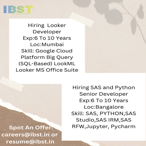
Hiring Looker Developer
Exp:6 To 10 Years
Loc:Mumbai
Skill: Google Cloud Platform Big Query (SQL-Based) LookML Looker MS Office Suite
#ibst #lookerdeveloper #cloudplatform
Hiring SAS and Python Senior Developer
Exp:6 To 10 Years
Loc:Bangalore
Skill: SAS, PYTHON,SAS Studio,SAS IRM,SAS RFW,Jupyter, Pycharm
#ibst #SAS #PythonSeniorDeveloper
0 notes
Text
Top Business Intelligence Tools for 2024
In the rapidly evolving landscape of business intelligence (BI), staying ahead of the competition requires leveraging the most advanced tools available. As organizations seek to gain deeper insights from their data, the demand for powerful and user-friendly BI tools continues to grow. In this article, we will explore the top business intelligence tools for 2024 that are shaping the future of data analytics and decision-making.
1. Microsoft Power BI
Microsoft Power BI remains a frontrunner in the BI landscape, offering a robust suite of tools designed to transform raw data into meaningful insights. With its user-friendly interface, seamless integration with other Microsoft products, and a strong community of users and developers, Power BI is a top choice for businesses of all sizes.
Key Features:
Interactive Dashboards: Create visually compelling dashboards that provide real-time insights.
Natural Language Querying: Users can ask questions in natural language and get instant answers.
AI-Powered Analytics: Leverage AI capabilities to uncover hidden patterns and trends in your data.
Custom Visualizations: Build custom visualizations to meet specific business needs.
2. Tableau
Tableau is renowned for its powerful data visualization capabilities, enabling users to create stunning and interactive visual representations of their data. Tableau’s flexibility and ease of use make it a favorite among data analysts and business users alike.
Key Features:
Drag-and-Drop Interface: Easily create complex visualizations without the need for coding.
Data Blending: Combine data from multiple sources to create comprehensive views.
Real-Time Analytics: Analyze data in real-time for timely decision-making.
Extensive Community and Resources: Benefit from a large community of users and extensive online resources.
3. Qlik Sense
Qlik Sense is a self-service BI tool that empowers users to create their own reports and dashboards. Its associative data model allows users to explore data freely and uncover insights that might be missed with traditional query-based tools.
Key Features:
Associative Data Model: Explore data in any direction without predefined queries.
Self-Service Data Preparation: Users can prepare and load data without needing IT assistance.
Smart Visualizations: Automatically suggest the best visualization based on the data selected.
Scalability: Suitable for both small businesses and large enterprises.
4. SAS Business Intelligence
SAS Business Intelligence provides a comprehensive suite of BI tools that support data mining, predictive analytics, and advanced reporting. Known for its robust analytics capabilities, SAS is ideal for organizations that require deep data analysis and statistical insights.
Key Features:
Advanced Analytics: Perform complex data analysis and predictive modeling.
Integrated Data Management: Seamlessly integrate data from various sources.
Customizable Dashboards: Create personalized dashboards tailored to specific business needs.
Collaboration Tools: Share insights and collaborate with team members easily.
Also Read: Benefits of Real-Time Consumer Data Analysis
5. Looker
Looker, now part of Google Cloud, offers a modern approach to BI with its powerful data exploration and visualization capabilities. Looker’s unique data modeling language, LookML, allows users to define metrics and dimensions that can be reused across the organization.
Key Features:
LookML: Define reusable data models that ensure consistency across reports.
Embedded Analytics: Embed Looker’s analytics into other applications and workflows.
BigQuery Integration: Leverage the power of Google BigQuery for large-scale data analysis.
Collaborative Workspaces: Enable teams to collaborate on data exploration and insights.
6. Domo
Domo is a cloud-based BI platform that offers a wide range of tools for data integration, visualization, and collaboration. Domo’s focus on ease of use and accessibility makes it a popular choice for businesses looking to democratize data across their organization.
Key Features:
Cloud-Based: Access your data and insights from anywhere, at any time.
App Marketplace: Integrate with a variety of apps to extend functionality.
Real-Time Data: Monitor your business with real-time data updates.
Collaboration Features: Share insights and collaborate on data projects with ease.
7. Sisense
Sisense is known for its ability to handle large and complex datasets with ease. Its in-chip technology accelerates data processing and analytics, making it possible to analyze massive amounts of data quickly.
Key Features:
In-Chip Technology: Faster data processing and query performance.
Customizable Dashboards: Create highly customizable and interactive dashboards.
Extensive API Support: Integrate Sisense with other tools and platforms.
Scalable Architecture: Suitable for handling big data and large-scale analytics.
8. SAP BusinessObjects
SAP BusinessObjects offers a comprehensive BI suite that includes tools for reporting, data visualization, and predictive analytics. As part of the SAP ecosystem, it integrates seamlessly with other SAP applications and systems.
Key Features:
Enterprise Reporting: Generate detailed and customizable reports for various business needs.
Predictive Analytics: Utilize advanced analytics to forecast trends and outcomes.
Integration with SAP: Leverage data from other SAP applications and systems.
Role-Based Dashboards: Tailor dashboards to specific user roles and requirements.
9. MicroStrategy
MicroStrategy is a powerful BI tool known for its scalability and enterprise-grade analytics capabilities. It offers a wide range of features, from data discovery and visualization to mobile analytics and hyperintelligence.
Key Features:
HyperIntelligence: Embed insights directly into applications, websites, and devices.
Mobile Analytics: Access and analyze data on the go with mobile apps.
Enterprise Scalability: Handle large volumes of data and support thousands of users.
Advanced Analytics: Perform sophisticated data analysis and predictive modeling.
10. IBM Cognos Analytics
IBM Cognos Analytics combines AI-driven analytics with a user-friendly interface, making it a powerful tool for both business users and data professionals. Its integration with IBM’s Watson AI provides advanced capabilities for data analysis and visualization.
Key Features:
AI-Powered Insights: Leverage AI to uncover hidden insights and trends.
Data Visualization: Create interactive and engaging visualizations.
Natural Language Processing: Use natural language queries to explore data.
Comprehensive Reporting: Generate detailed and actionable reports for various business functions.
Also Read: India Consumer Affluence: A Comprehensive Analysis
Conclusion
In 2024, the landscape of business intelligence tools continues to evolve, driven by advancements in AI, machine learning, and data integration capabilities. The tools highlighted in this article—Microsoft Power BI, Tableau, Qlik Sense, SAS Business Intelligence, Looker, Domo, Sisense, SAP BusinessObjects, MicroStrategy, and IBM Cognos Analytics—represent the forefront of innovation in the BI space. Each of these tools offers unique features and capabilities that can help organizations unlock the full potential of their data, drive strategic decision-making, and maintain a competitive edge in their respective industries.
Choosing the right BI tool depends on specific business needs, data requirements, and user preferences. By carefully evaluating the features and benefits of each tool, businesses can make informed decisions that will enhance their data analytics capabilities and support their growth objectives in the coming year.
0 notes
Text
Looker online training
Maxmunus delivers the best industry-oriented Looker Training course which focuses on the objectives and goals of a learner. This Looker Certification Training Course provides you with in-depth knowledge of the content required for learning Looker which incorporates the concepts such as analytical types, product description, fundamentals of lookup, data modeling, understanding LookML, and creating dashboards for generating different visuals, and advanced concepts of LookML. During this training period, you can get full support and real-time project assistance from experienced professionals. Enroll today at Maxmunus for accepting the new challenges to make the best outcome out of our Looker Online Training Course.The objective of the content offered by this Looker Training Course is to provide trainees with a thorough understanding of Looker. Our Looker Course Content is incorporated with all the latest concepts and keeps you up to date with the present advancements.#lookeronlineprojectsupport #lookeronlinejobsupport #maxmunus #onlinetraining #onlinecertificationcourse #lookercourse #lookertraining #lookeronlinetraining #online #lookeronlinecertification #onlinelearninglooker #datamodeling #lookermlFor more information, kindly contact us.https://youtu.be/fgc1kS2rip8Call or Whatsapp:+91 90368 88688/+9190358 88988Email: [email protected]
0 notes
Text
LookML A-Z: Google Looker for Developers
LookML A-Z: Google Looker for Developers
LookML A-Z: Google Looker for Developers Learn LookML, Google Looker’s modeling language, to get complete control of the visualization process | LookML mastery If YOU are an Electrical Engineer then following quiz is for YOU Enroll Now More Courses

View On WordPress
0 notes
Text
Google Looker Masterclass: Looker & LookML A-Z 2022
Google Looker Masterclass: Looker & LookML A-Z 2022
Google Looker Masterclass: Looker & LookML A-Z 2022 Complete course on Looker (includes LookML) | Looker for both business users as well as developers
View On WordPress
0 notes
Text
Looker Online Training
Maxmunus delivers the best industry-oriented Looker Training course which focuses on the objectives and goals of a learner. This Looker Certification Training Course provides you with in-depth knowledge of the content required for learning Looker which incorporates the concepts such as analytical types, product description, fundamentals of lookup, data modelling, understanding LookML, and creating dashboards for generating different visuals, and advanced concepts of LookML. During this training period, you can get full support and real-time project assistance from experienced professionals. Enroll today at Maxmunus to accept the new challenges to make the best outcome out of our Looker Online Training Course.The objective of the content offered by this Looker Training Course is to provide trainees with a thorough understanding of Looker. Our Looker Course Content incorporates all the latest concepts and keeps you updated with the present advancements.
#lookeronlineprojectsupport #lookeronlinejobsupport #maxmunus #lookeronlinetraining #lookeronlinecertificationcourse #lookercourse #lookertraining #lookeronlinetrainingcourse #online #datamodeling #embededanalystics#selftserviceanalytics #buidingvisulization
For more information, kindly contact us.
https://www.youtube.com/watch?v=fgc1kS2rip8
Call or Whatsapp:+91 90368 88688/+9190358 88988
Email: [email protected]
0 notes