#Make Images Pop in Photoshop
Note
Why reblog machine-generated art?
When I was ten years old I took a photography class where we developed black and white photos by projecting light on papers bathed in chemicals. If we wanted to change something in the image, we had to go through a gradual, arduous process called dodging and burning.
When I was fifteen years old I used photoshop for the first time, and I remember clicking on the clone tool or the blur tool and feeling like I was cheating.
When I was twenty eight I got my first smartphone. The phone could edit photos. A few taps with my thumb were enough to apply filters and change contrast and even spot correct. I was holding in my hand something more powerful than the huge light machines I'd first used to edit images.
When I was thirty six, just a few weeks ago, I took a photo class that used Lightroom Classic and again, it felt like cheating. It made me really understand how much the color profiles of popular web images I'd been seeing for years had been pumped and tweaked and layered with local edits to make something that, to my eyes, didn't much resemble photography. To me, photography is light on paper. It's what you capture in the lens. It's not automatic skin smoothing and a local filter to boost the sky. This reminded me a lot more of the photomanipulations my friend used to make on deviantart; layered things with unnatural colors that put wings on buildings or turned an eye into a swimming pool. It didn't remake the images to that extent, obviously, but it tipped into the uncanny valley. More real than real, more saturated more sharp and more present than the actual world my lens saw. And that was before I found the AI assisted filters and the tool that would identify the whole sky for you, picking pieces of it out from between leaves.
You know, it's funny, when people talk about artists who might lose their jobs to AI they don't talk about the people who have already had to move on from their photo editing work because of technology. You used to be able to get paid for basic photo manipulation, you know? If you were quick with a lasso or skilled with masks you could get a pretty decent chunk of change by pulling subjects out of backgrounds for family holiday cards or isolating the pies on the menu for a mom and pop. Not a lot, but enough to help. But, of course, you can just do that on your phone now. There's no need to pay a human for it, even if they might do a better job or be more considerate toward the aesthetic of an image.
And they certainly don't talk about all the development labs that went away, or the way that you could have trained to be a studio photographer if you wanted to take good photos of your family to hang on the walls and that digital photography allowed in a parade of amateurs who can make dozens of iterations of the same bad photo until they hit on a good one by sheer volume and luck; if you want to be a good photographer everyone can do that why didn't you train for it and spend a long time taking photos on film and being okay with bad photography don't you know that digital photography drove thousands of people out of their jobs.
My dad told me that he plays with AI the other day. He hosts a movie podcast and he puts up thumbnails for the downloads. In the past, he'd just take a screengrab from the film. Now he tells the Bing AI to make him little vignettes. A cowboy running away from a rhino, a dragon arm-wrestling a teddy bear. That kind of thing. Usually based on a joke that was made on the show, or about the subject of the film and an interest of the guest.
People talk about "well AI art doesn't allow people to create things, people were already able to create things, if they wanted to create things they should learn to create things." Not everyone wants to make good art that's creative. Even fewer people want to put the effort into making bad art for something that they aren't passionate about. Some people want filler to go on the cover of their youtube video. My dad isn't going to learn to draw, and as the person who he used to ask to photoshop him as Ant-Man because he certainly couldn't pay anyone for that kind of thing, I think this is a great use case for AI art. This senior citizen isn't going to start cartooning and at two recordings a week with a one-day editing turnaround he doesn't even really have the time for something like a Fiverr commission. This is a great use of AI art, actually.
I also know an artist who is going Hog Fucking Wild creating AI art of their blorbos. They're genuinely an incredibly talented artist who happens to want to see their niche interest represented visually without having to draw it all themself. They're posting the funny and good results to a small circle of mutuals on socials with clear information about the source of the images; they aren't trying to sell any of the images, they're basically using them as inserts for custom memes. Who is harmed by this person saying "i would like to see my blorbo lasciviously eating an ice cream cone in the is this a pigeon meme"?
The way I use machine-generated art, as an artist, is to proof things. Can I get an explosion to look like this. What would a wall of dead computer monitors look like. Would a ballerina leaping over the grand canyon look cool? Sometimes I use AI art to generate copyright free objects that I can snip for a collage. A lot of the time I use it to generate ideas. I start naming random things and seeing what it shows me and I start getting inspired. I can ask CrAIon for pose reference, I can ask it to show me the interior of spaces from a specific angle.
I profoundly dislike the antipathy that tumblr has for AI art. I understand if people don't want their art used in training pools. I understand if people don't want AI trained on their art to mimic their style. You should absolutely use those tools that poison datasets if you don't want your art included in AI training. I think that's an incredibly appropriate action to take as an artist who doesn't want AI learning from your work.
However I'm pretty fucking aggressively opposed to copyright and most of the "solid" arguments against AI art come down to "the AIs viewed and learned from people's copyrighted artwork and therefore AI is theft rather than fair use" and that's a losing argument for me. In. Like. A lot of ways. Primarily because it is saying that not only is copying someone's art theft, it is saying that looking at and learning from someone's art can be defined as theft rather than fair use.
Also because it's just patently untrue.
But that doesn't really answer your question. Why reblog machine-generated art? Because I liked that piece of art.
It was made by a machine that had looked at billions of images - some copyrighted, some not, some new, some old, some interesting, many boring - and guided by a human and I liked it. It was pretty. It communicated something to me. I looked at an image a machine made - an artificial picture, a total construct, something with no intrinsic meaning - and I felt a sense of quiet and loss and nostalgia. I looked at a collection of automatically arranged pixels and tasted salt and smelled the humidity in the air.
I liked it.
I don't think that all AI art is ugly. I don't think that AI art is all soulless (i actually think that 'having soul' is a bizarre descriptor for art and that lacking soul is an equally bizarre criticism). I don't think that AI art is bad for artists. I think the problem that people have with AI art is capitalism and I don't think that's a problem that can really be laid at the feet of people curating an aesthetic AI art blog on tumblr.
Machine learning isn't the fucking problem the problem is massive corporations have been trying hard not to pay artists for as long as massive corporations have existed (isn't that a b-plot in the shape of water? the neighbor who draws ads gets pushed out of his job by product photography? did you know that as recently as ten years ago NewEgg had in-house photographers who would take pictures of the products so users wouldn't have to rely on the manufacturer photos? I want you to guess what killed that job and I'll give you a hint: it wasn't AI)
Am I putting a human out of a job because I reblogged an AI-generated "photo" of curtains waving in the pale green waters of an imaginary beach? Who would have taken this photo of a place that doesn't exist? Who would have painted this hypersurrealistic image? What meaning would it have had if they had painted it or would it have just been for the aesthetic? Would someone have paid for it or would it be like so many of the things that artists on this site have spent dozens of hours on only to get no attention or value for their work?
My worst ratio of hours to notes is an 8-page hand-drawn detailed ink comic about getting assaulted at a concert and the complicated feelings that evoked that took me weeks of daily drawing after work with something like 54 notes after 8 years; should I be offended if something generated from a prompt has more notes than me? What does that actually get the blogger? Clout? I believe someone said that popularity on tumblr gets you one thing and that is yelled at.
What do you get out of this? Are you helping artists right now? You're helping me, and I'm an artist. I've wanted to unload this opinion for a while because I'm sick of the argument that all Real Artists think AI is bullshit. I'm a Real Artist. I've been paid for Real Art. I've been commissioned as an artist.
And I find a hell of a lot of AI art a lot more interesting than I find human-generated corporate art or Thomas Kincaid (but then, I repeat myself).
There are plenty of people who don't like AI art and don't want to interact with it. I am not one of those people. I thought the gay sex cats were funny and looked good and that shitposting is the ideal use of a machine image generation: to make uncopyrightable images to laugh at.
I think that tumblr has decided to take a principled stand against something that most people making the argument don't understand. I think tumblr's loathing for AI has, generally speaking, thrown weight behind a bunch of ideas that I think are going to be incredibly harmful *to artists specifically* in the long run.
Anyway. If you hate AI art and you don't want to interact with people who interact with it, block me.
5K notes
·
View notes
Text
saying let's get married;
domestic and sweet moments during the first year of newly-wed life (f!reader) <3

KUROO — "my wife" this and "my wife" that to the point where all his friends and coworkers are groaning and saying we get it, man! you're married now! his dorky nonfiction books taking up all the space on the nightstand. helping him tame his bed hair when he wakes up and is trying to get ready for work. created a powerpoint presentation where he told you he was going to give you the most epic promotion of a lifetime (the powerpoint was themed to mimic an HR presentation describing new employee benefits and perks, along with what the new position would consist of; the final slide asked "do you accept the position of being tetsurou kuroo's wife? limited time bonus offer includes a diamond ring!")
OSAMU — doesn't know how to fold your clothes properly (it's not weaponized incompetence, he just doesn't understand why your tops have these many strings and components to them). tries out all his new recipes with you as his taste-testing guinea pigs. during your wedding reception, atsumu asked you who was cuter: him or osamu. on your off days from your job, you go to onigiri miya and help him close down the shop. blowing bubbles at him from the soap that foams up when you're washing the dishes. him knowing where you're most ticklish and using it against you every time he asks you for a minor favor.
BOKUTO — asks you about kid names before he even pops the question. wants you to quiz him on your family tree because he so badly wants to impress them when he's meeting them (he then asks for a quiz on your extended family once the wedding date is scheduled). gets excited when he sees those corny tiktoks that claim "these initials are soulmates" and he sees yours and his initials paired together; he'll send you those tiktoks and go "babe, look!!! i told u we were meant to be!!" brings you up any time he can, whether it's in regular conversation with friends, small talk with a cashier, a meet n greet with a fan, or a post-game interview. loves to do push-ups with you on his back.
OIKAWA — makes a vision board at the beginning of the year, except the main image is a horribly photoshopped picture of your head pasted on some stock photo of a bride. he was showing you something on his phone, and the notification from his jeweler announcing that your engagement ring was ready for pick up popped up and he nearly dropped his phone while trying to hurriedly swipe away the notification whilst shielding his screen from you. gets all pouty and wants to be the little spoon; will also start asking you "baaaabe, would you still love me if i was a worm?" saw you in the stands booing his opposing team, and whistled, exclaiming "that's my girl!" panics when he sees strands of his hair on the bathroom floor; proceeds to ask you if you'll still be with him even if he becomes bald. then asks if you'll pay for his hair transplant (as a joke; you never use your card when you're with him).
#haikyuu x reader#haikyuu x you#fluff#domestic fluff#domesticity being one of the purest forms of intimacy#tetsurou kuroo x reader#osamu miya x reader#koutarou bokuto x reader#bokuto x reader#tooru oikawa x reader#oikawa x reader#kuroo x reader#osamu x reader#hq headcanons#haikyuu headcanons
1K notes
·
View notes
Text
4t3 Conversion of Grouped posters by @cosmiccs4 + Recoloring PSD with tutorial
8 non-recolorable presets
1024 textures
Included PSD for retexturing (tutorial how to use under the cut)
113 poly, all LODs
Shiftable
Price - 5§
BGC
Compressed package
TOU, Ko-Fi
DOWNLOAD | ALT | SIMBLR.CC
Tutorial: How to use my PSD for retexturing
You need:
Photoshop with .dds plugin
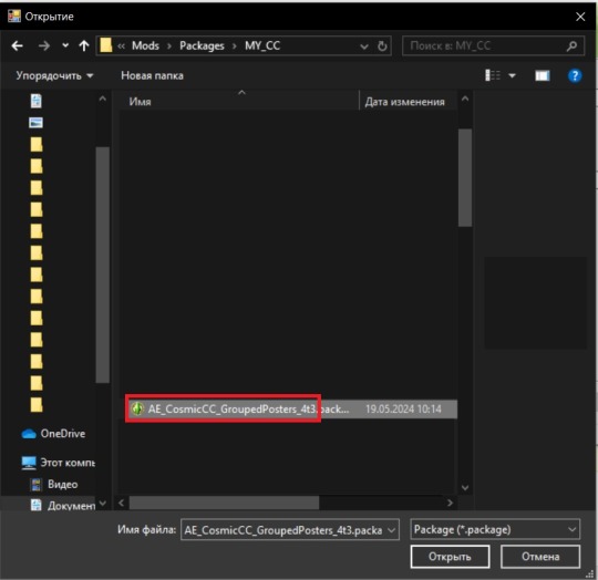
My retexture PSD and package file of posters
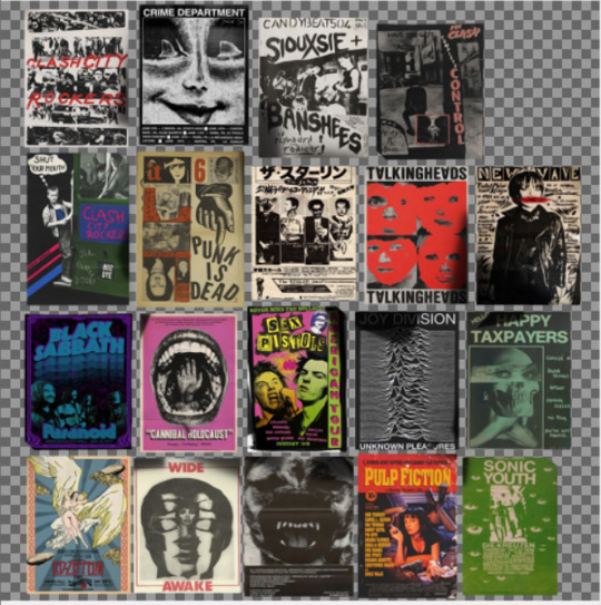
19 pictures to your liking, preferably vertical
TSRW
Sims3Pack Multi Installer and Compressionizer
Step 1: Open my PSD file, open your images:
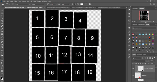
Step 2: Select (Ctrl+A) copy and paste to posters file (Ctrl+C, Ctrl+V) first of your images :
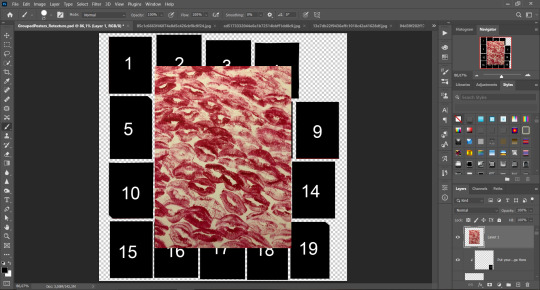
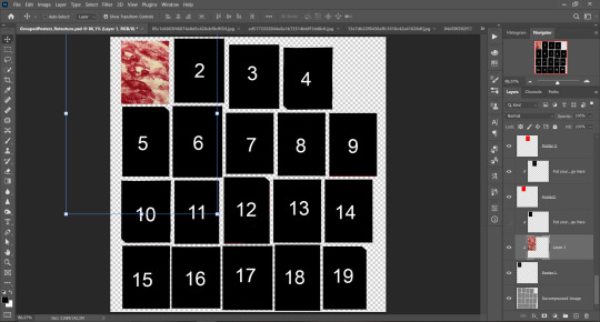
Step 3: Choose where you want to put it, for reference you can use one of the presets:
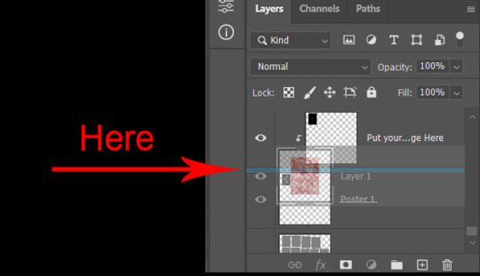
Step 4: After you decided with placement of your image. Move its layer in the Layers tab between "Poster x" and "Put your image here" layers, it will create a clipping mask, which allows the picture to be fit within the poster without cropping. Hide or delete "Put your image here" layer.
Step 5: Use Transform, Free Transform and Move tools to resize the image by your liking:

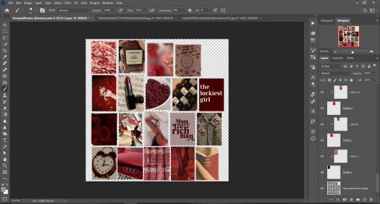
Step 6: Repeat the Step 2-5 with other 18 images:
*vibes are totally random, all images from Pinterest*
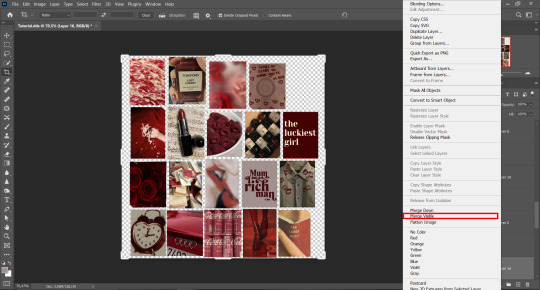
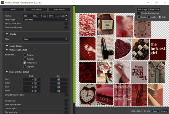
Step 7: After you've done, delete all the "Put your image here" layers, if you didn't it before. Right-click on the Layers tab and press Merge Visible (Shift + Ctrl + E). Now press Save As (Control + Shift + S) and save your image as .DDS with this parameters (2nd picture):
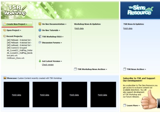
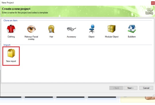
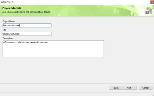
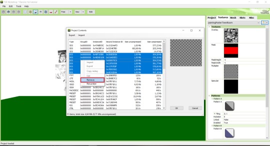
Step 8: Go to TSRW. Press Create New Project > New Import, and select package with my posters. Give for your recolor unique Title and Project name, otherwise it will override original posters:
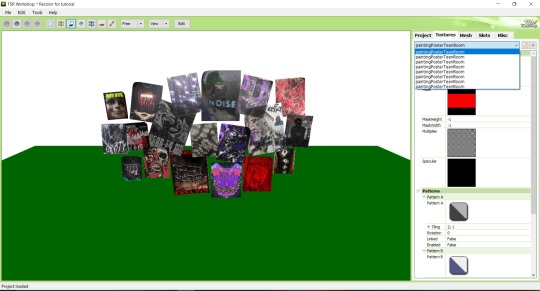
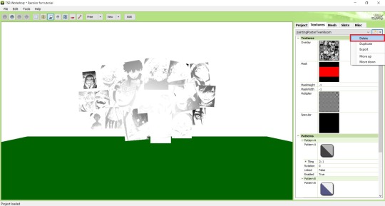
Step 9: In Textures tab go through all the presets except the first one and delete them. Then go to Edit > Project Contents and remove all the textures of removed presets. Its pretty common when someone make retexture of TS3 mesh and leave that unused textures in file, which leads to increasing its size:
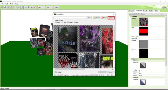
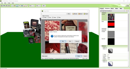
Step 10: Press Edit button next to the Overlay tab. Then press Import button and select your retexture. Press Done and when this pop-up appears, press Yes:
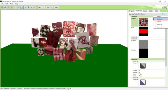
Step 11: If you want to add more presets press Duplicate and reapeat Step 10, but instead, when pop-up about replacing the texture appears, press No.
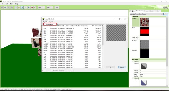
Step 12: After you've done, press File > Export > To Sims3pack or Edit > Project Contents > Export > To .package. If you choose the first method, convert your Sims3pack to Package and in both cases run it through Compressionizer. Test your recolor In-game, make thumbnails (if you want to share it) and have fun!
For those who read this tutorial to the end, click HERE to download this recolor.

@pis3update @xto3conversionsfinds @wanderingsimsfinds @kpccfinds @simfluencer-network @sssvitlanz @simblrcc-site
414 notes
·
View notes
Text
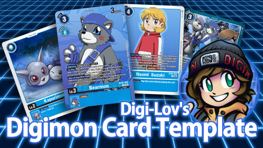
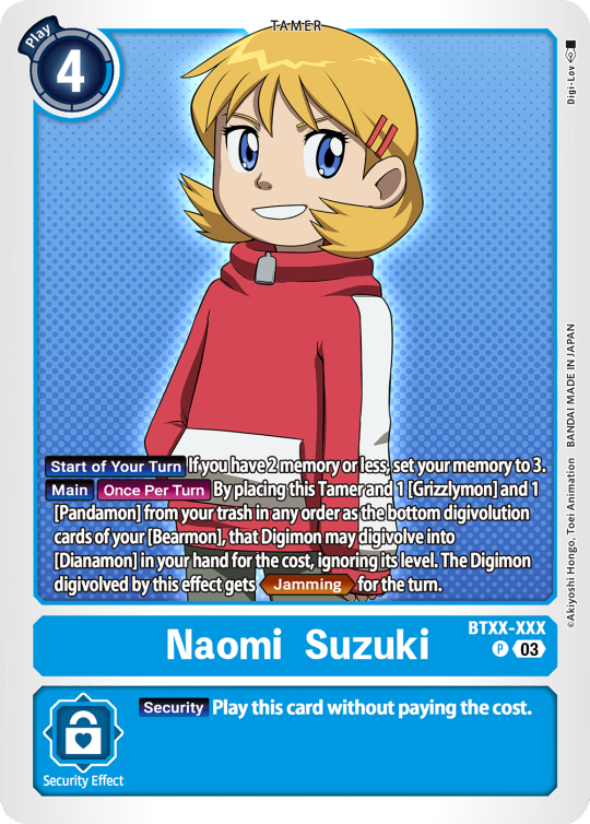
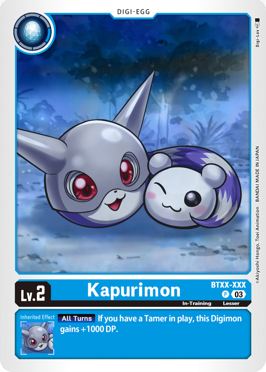
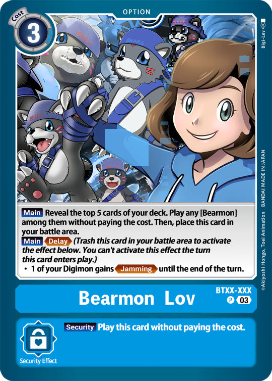
Digimon Card Template->
Hey guys, I finally finished the templates! A few words to read before using, and more words under the cut if you will.
I'd love to see any and all cards you create, so feel free to leave me an ask or DM!
Also if you feel like supporting me a little, feel free to stop by my ko-fi->
First off, all fonts you need for the template are in the "Card Template Fonts" rar file. Remember to install them first before opening the files.
Second, I recommend working with the PSD file in Photoshop, if you can. It has more and easier customization. If you use CSP, do use the CSP files. The PSD Text layers don't work in CSP, as well as certain other settings. I did my best to adapt the file to CSP, and it should work fine!
The Files have "HELP" layers in certain folders, I recommend reading them! Some of the Information I will repeat under the cut.
HAVE FUN! I wanna see lotta cards!
Okay, below the cut I'll leave some notes on how the Digimon cards are designed, as of the num <03> era at least.
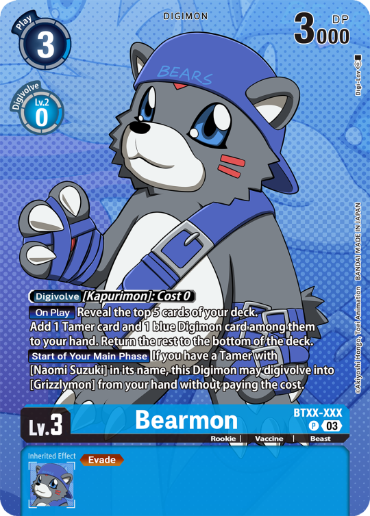
Digimon cards have seven different colors. Red, Blue, Green, Yellow, Black, Purple, and White. White cards are rare and reserved for special Digimon/Tamers, and usually don't interact with other colors.
For easier reading, Yellow and White cards have black text in their colors, instead of the usual white text. On multicolored cards, card including Yellow (or white in theory) have white text with a black outline. (before <03> if Yellow was the first color, the text was black with white outline instead, but they unified it with the update)
The color on the left is considered the first color.
Since the design update, the Card color is displayed in a color wheel around the Play cost. The digivolution cost bubble also recieved a color wheel, as well as the buble being split into the differen colors. Imagining it like a clock, the top color is the first, and then circling clockwise.
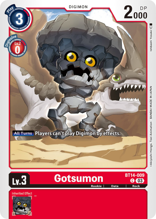
Digi-Egg, or Lv.2 Digimon are always single color.
[tricolored cards have been introduced just recently and super rare. use sparingly]
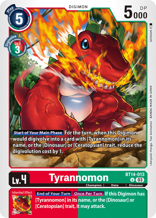

Now to the Effects.
The main effect is in white color with a black outline (also outlines on the keywords), while the Inherited Effect doesn't have outlines (unless it's a Yellow double color). If the Digimon has no Inherited Effect, there will be a small dash in the box.
Only white cards have black text in their main effect.
The effect text will start in the lower bottom of the image, not all the way at the bottom, and go down from there. If the Effect is too long it will move up.
Besides the regular evolution requirements, Digimon may have special "Digivolve" rules in their effect. This can make an evolution from a specific digimon cheaper, allow X Antibody Digimon to evolve from their normal counterparts, serve to overlook color requirements, or to allow evolution from certain traits, etc.
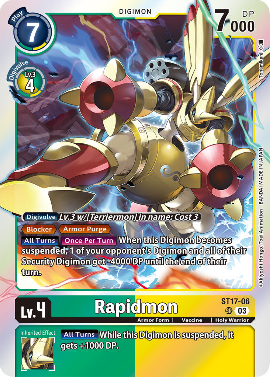
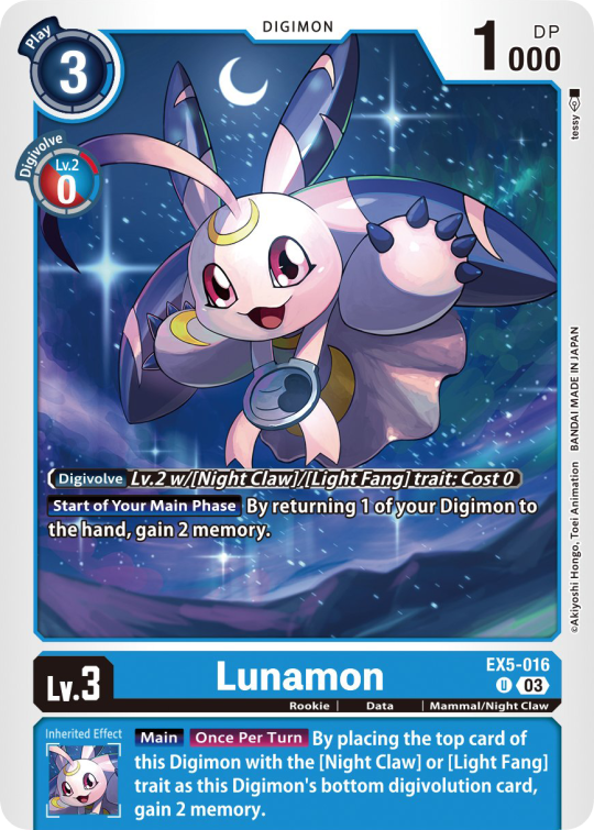
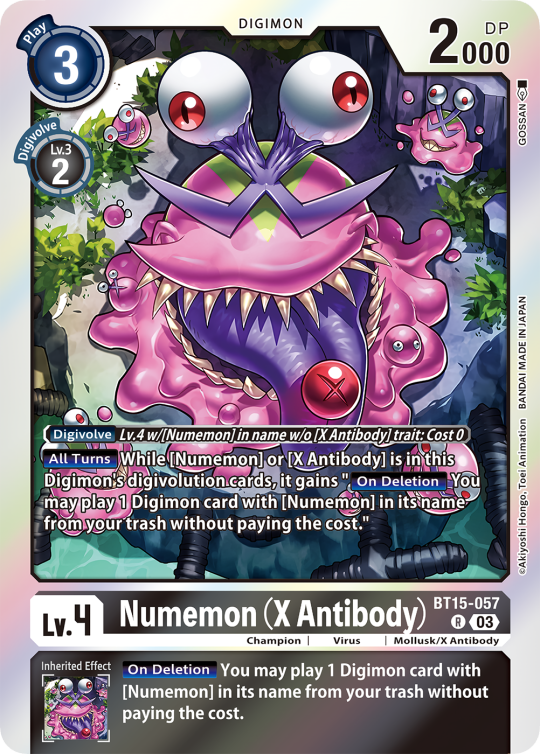
Some Digimon may also have an extra "Rule" in the bottom corner.
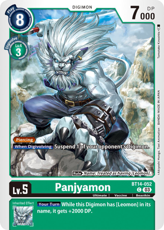
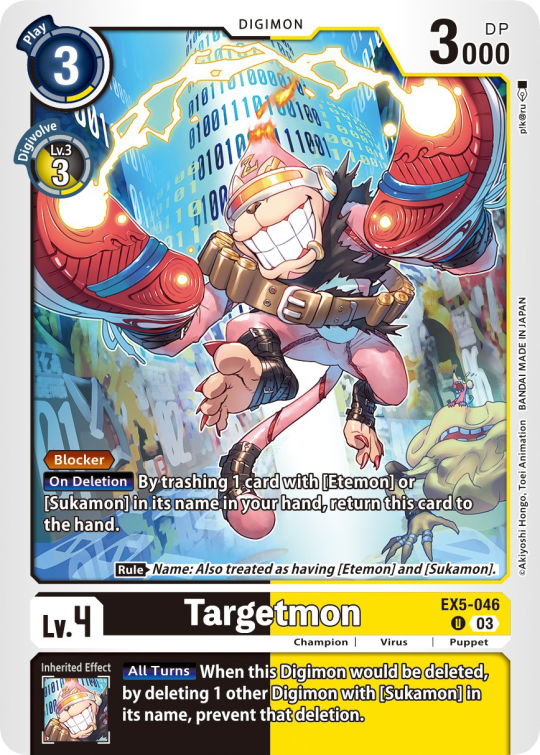
Ace Digimon will always have [Hand][Counter]<Blast Digivolve> effects. So far, they all had no inherited effects.
They also have a significantly cheaper play cost than comparable Digimon, but in turn have the Overflow mechanic. EX6 introduced Blast DNA Digivolution, which specifies the required Digimon by name, and not just Level and color.
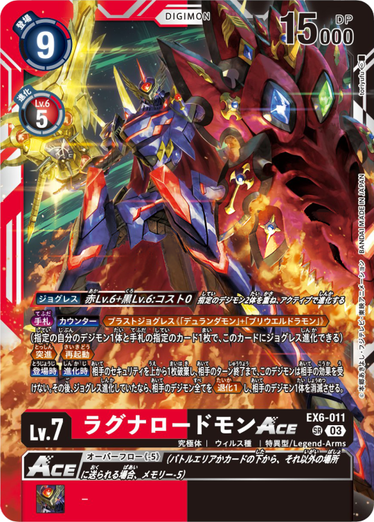
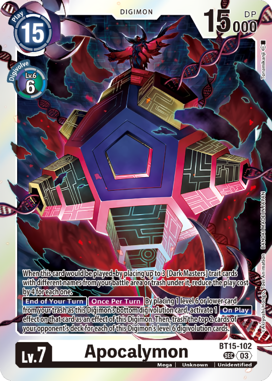
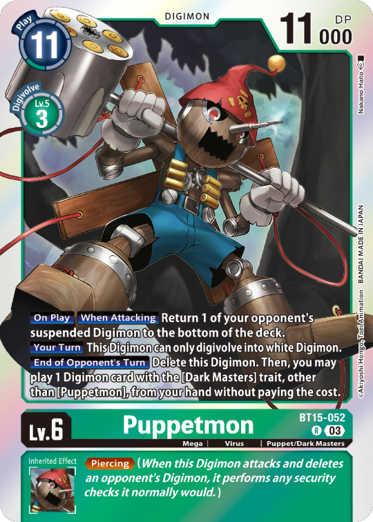
Lv.6 Digimon usually don't have inherited Effects, some might though, if they were made with Lv.7 evolution in mind.
Furthermore Lv.6 Digimon pop out of their frame, even on the normal arts.


Now Tamers originally had neither traits, nor inheritence effects. But certain Tamers now do! Tamers with Mind Link effects, or the kids from Frontier for example, will have Inherited Effects.
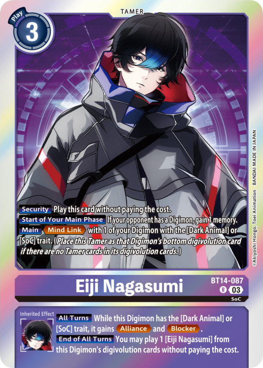
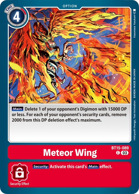
Option cards have a grey backdrop for their effects, and the effect text is black. This black effect text carries over to full/alt arts, regardless of color. The have a (use) cost instead of a play cost.
They can also have traits or rules, but it is rare.

#digimon#digimon tcg#digimon card game#digica#digisafe#デジカ#digimon card#digimon template#template#digi community#digi lov edits
272 notes
·
View notes
Text
what i use:
potplayer for capturing frames
photoshop cs6 (can find it for free here or in other links on the tag)
qbittorrent
torrenting sites (this, this, eventually this)
sharpening action
arial rounded mt bold for subtitles
assuming you know how to torrent, if possible download what you want to gif in 1080p or the highest possible resolution etc etc
frames
open video in potplayer, go to the moment you want to gif and go back a couple frames (10-20) from when you want your gif to start (i usually just spam press D a bunch) (to see which key you have to press to go back on frames, right click > jump (to) > previous frame
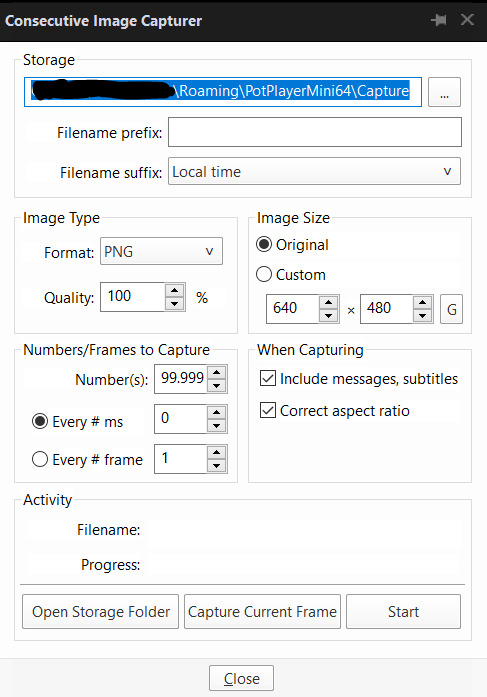
now press CTRL+G or open frame capturing through right click > video > video capture > capture consecutive images...
my settings for capturing frames
(important to turn off subtitles before doing this or they'll be captured on the image too)
the folders i save it to -> i created a bunch of frame folders that i fill up since the way frames load in my photoshop require me to load an entire folder into it. so i capture an entire gifset's frames into one folder and then load up the entire thing
press 'start' on the consecutive image capturer, then start playing the video (best to mute it since the video might start playing slower), wait until the part you want to gif is over and stop the video, press CTRL+G again to stop the capturing
2. photoshop
depending on your photoshop you can either 'load files into stack...', which opens up a folder and you can manually choose which frames you want to load, or 'load multiple dicom files..." (what i have to do), where you select an entire folder to load its contents into photoshop
once you do either of those things, you got this
now click 'create frame animation' on the bottom
now we click on the three bars and 'make frames from layers'
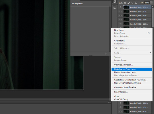
!! if you loaded up frames with 'load frames into stack...' at this point you also have to click 'reverse frames' since they load in reverse order with this method for some reason
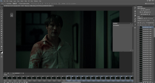
now we got our frames on a timeline and delete anything you dont want in your gif. if you have frames for multiple gifs on the timeline, go to image > duplicate and duplicate for however many gifs you got and delete the unnecessary frames from each one
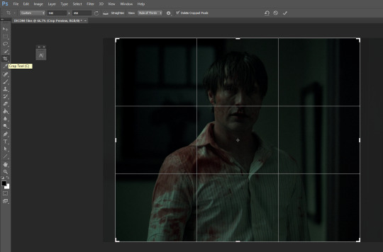
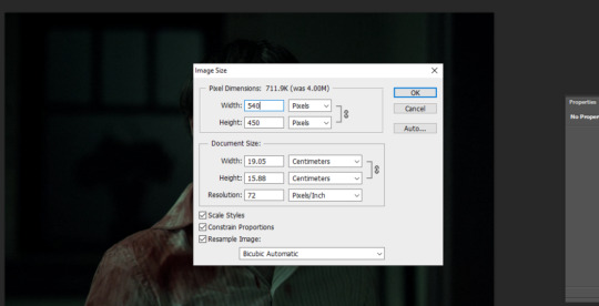
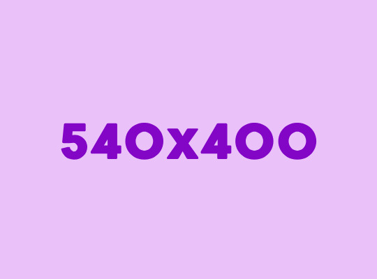
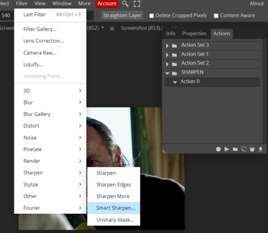
crop tool, type in dimensions up top (in accordance with tumblr's dimension graph, so if you want a wide gif like the one on the top of this post keep it 540px). i usually crop my gifs to between 540x400 and 540x500. once centered on how you want to crop, press enter or double click on the image to crop
press ALT+CTRL+I or go to image > image size... to resize
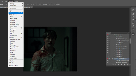
open the actions tab if you don't have it already open, go to 'load actions...' and find where you saved the sharpening action you downloaded from the top of this post
i only use "all in one (sharper)" and "convert to animation (frames)", but unchecked the "canvas size" option on the latter one since we resized the gif ourselves
select 'select all layers current layer' on the action (the other steps we already did) and press play
our gif frames will turn into a group so now go to "convert to animation (frames)" and press play again
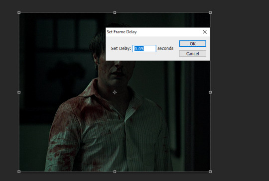
this will pop up at the end, leave it at 0.05 (maybe 0.06 if the gif is going too fast)
if we were to export the gif now it would look like this
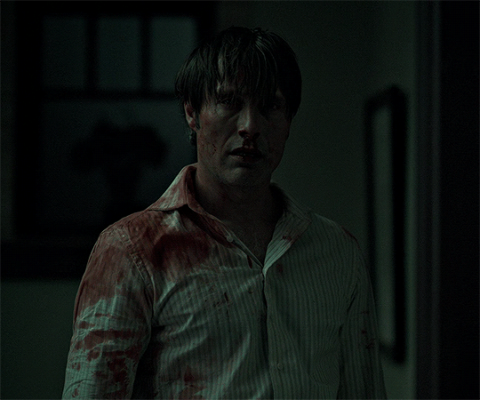
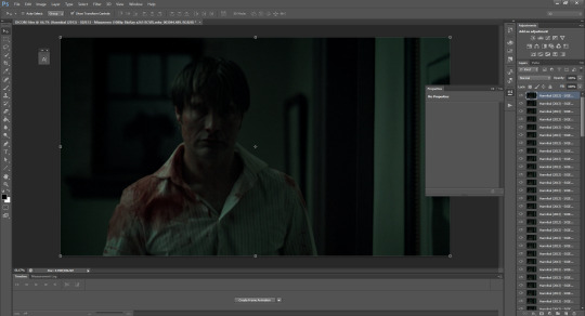
now comes the coloring, which is personal preference. the reason i chose hannibal for this gifset is to show the white balance tool that works great in tinted scenes
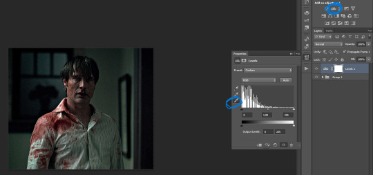
open a 'levels' layer and selected the bottom eyedropper. then click it on a place on the gif that should be white but isn't (i clicked on hannibal's shirt collar). the gif coloring will change accordingly
then pick the top eyedropper and click on anything that should be black but isn't (you can click on multiple places and see how the color changes, keep trying until you find one that looks good)
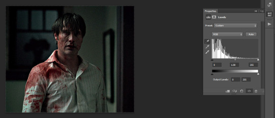
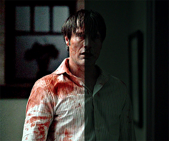
the coloring difference with just those two clicks
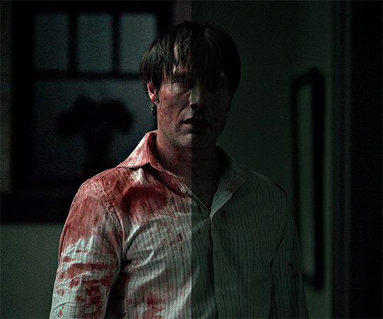
and then the coloring is up to you, i usually just add more levels layers and color balance
here's all of the layers i applied to color this
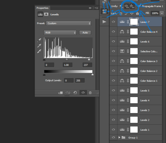
VERY IMPORTANT to get into the habit of selecting those two thingies on each layer you apply (on the subtitle text layer select all three) so that the coloring stays the same on all frames
difference
+ subtitles settings using the text tool
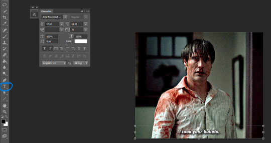
shadow and stroke to make your subtitles readable
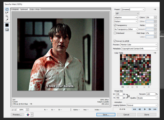
saving the gif. click ALT+SHIFT+CTRL+S or go to file > save for web... here are my settings
that's it
285 notes
·
View notes
Text

HOW TO: Make an iPhone Layout
+ Downloadable Template
Hi! I've gotten a few messages asking for a tutorial on my iPhone gifsets — but instead of only doing a tutorial (that would probably be triple the length this one already is), I decided to turn my layout into a template with all the bits and bobs! In the "tutorial" under the cut, I'll share everything you'll need, a free template download, and quickly go over how to use this template. :)
Disclaimer: This template uses Video Timeline and this tutorial assumes you have a basic to intermediate understanding of Photoshop.

PHASE 1: THE ASSETS
1.1 – Download fonts. These are the fonts used for all assets I've included in my template:
– SF Pro or SF Pro Display (Regular, Medium, Bold): Either version works, they look nearly identical. You can download directly from https://developer.apple.com/fonts/ or easily find it via Google
– Bebas Neue: Free on Google Fonts, Adobe Fonts, and dafont
– Times New Roman (Bold): Should be a default font in Photoshop

Make sure to download and install any of the fonts you don't already have before opening my template. That way, once you open the template file, all the settings (font size, weight, spacing, color, opacity, etc.) are as intended.
1.2 – Download my template.
Before you use my template, all I ask is that you don't claim or redistribute it as your own and that you give me proper credit in the caption of your post. Making these iPhone gifsets takes me a longgg time and turning this layout into a template took several hours too.
DOWNLOAD TEMPLATE VIA KO-FI ← This template is completely free to download (just enter $0), but if you feel inclined to tip me, I appreciate you! 💖
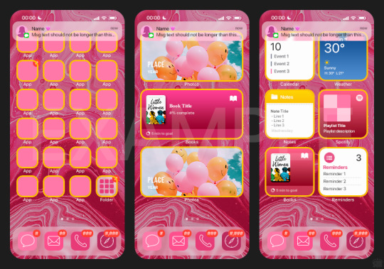
BTW this template also includes some of my frequently used icons!
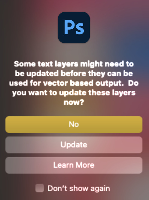
NOTE: If, for some reason, you open the template and see the pop-up shown below, click "NO" — otherwise, the fonts will be all messed up:
And if you see this triangle with an exclamation point by a text layer, don't double-click it — it'll mess up the font as well:

PHASE 2: THE GIFS
I'm just going to briefly go over gif sizes and my recommendations. Also, keep in mind when grabbing your scenes, you'll want all of these gifs to be the same amount of frames.
2.1 – Background Gif: 540 x 540 px.
I recommend this size so you have a good amount of visibility for the gif behind the iPhone wallpaper. I also recommend making this black and white (or in my case, black and white with a slight blue tint — idk I just like the way it looks) so the wallpaper coloring can stand out.
2.2 – Wallpaper Gif: 230 (w) x 500 (h) px.
Keep in mind the very narrow dimensions of the wallpaper! And also keep in mind that you'll have a bunch of apps and widgets covering the image. I try to use wide shots (or layer my clips into looking like wide shots). Also, keep in mind your color scheme for your set and your character's aesthetic! I tend to focus on one or two colors for the wallpaper.
I usually position the wallpaper to the side with 20px bumpers, so there's lots of space to see the background:
2.3 – Large Photo Widget Gif: 201 (w) x 96 (h) px.
2.4 – Small Photo Widget Gif: 94 x 94 px.
PHASE 3: THE TEMPLATE – "IPHONE" FOLDER
In this section, I'll try to quickly walk you through how to use this template and some bits that may require extra instructions. I'll be going through each folder from top to bottom.
3.1 – Status Bar.
Time, Service, and WiFi are pretty self-explanatory. In the Battery folder, you can use the shape tool to adjust the shape layers labeled "Fill (Adjustable Shape!)" to customize the battery level.
3.2 – Message Notification.
Again, these are pretty self-explanatory. I've already masked the circle for the contact photo, so you can simply import any photo and use the transform tool to shrink it down. The circle is 24x24 px. If you don't want to use a photo, there's another folder called Default Initials.
If your message text can't fit the text box, the message should end with ellipses which is how iOS caps off long texts.
3.3 – Blurred Banner (IMPORTANT)
This folder is easy to miss because there's only one placeholder layer in there. On iPhones, the area behind a banner notification and the dock get blurred (including the wallpaper and any apps).
What to do: Make a duplicate of the apps in Row 1 and/or widgets that intersect the message banner, convert them all into one smart object, apply a Gaussian Blur filter (Radius: 3.0 pixels) on the smart object, and move the smart object into this masked folder!
(There's another masked folder in the Wallpaper folder for the dock which I'll go over in that section.)
3.4 – Apps
Turn off the yellow guide if you don't need it to keep things aligned and turn off layers you don't need by clicking the eye icon. Replace the "App" placeholder text with your app name, change the color or gradient of the square to compliment your color scheme, and add your custom app icon overlay!
If you can't find an app icon you need from the ones I provided, flaticon.com is a great resource. Also, if you can only find the filled version of an icon, check out this tutorial for how to make any text or shape into an outline.
Also, each app folder has 4 notification bubble options (1-4 digits). Again, you can toggle these on and off as you need!
3.5 – Big Widgets
I like using these when my wallpaper has A LOT of negative space to fill. I included the Photos and Books widgets in my template, but there are lots of widgets available on iPhones. You can check some of the other ones I've done here, or if you have an iPhone, simply try adding some widgets to your phone!
There are also widgets bigger than these, but they would take up half of the phone screen which is why I don't use them for these edits.
3.6 – Small Widgets
The only thing I'll say about these — because they're pretty straight forward — is there are a lot more weather themes than I included in my template. Also, if you set your character's phone to evening, the weather widget will show a dark background (sometimes with stars), so keep that in mind.
Speaking of, I've included Light Modes and Dark Modes for, I think, every applicable widget.
3.7 – Page Dots
These barely perceptible dots indicate that your character has more pages of apps than shown in your gifset (so if an anon tries to come at you, you can just say "it's on the next page of apps" /j /lh)
3.8 – Dock
Again, the dock has notification bubble options and I've included the default app designs, custom filled designs, and custom outlined designs for iMessage, Phone, Email, and Safari (there's also a FaceTime alternative if that's how your character rolls). These are usually the apps people keep in their Dock, but this is fully customizable too. So, if your character is, like, super obsessed with Candy Crush or something and needs it in thumb's reach — you can put it in the dock.
3.9 – Wallpaper
This whole folder is masked already to a 230x500 px rounded rectangle.
Inside, you'll find another "Blurred Portion" folder for the area behind the message banner notification and the dock.
What to do: Duplicate your gif layer and place it in this folder, remove any sharpening filters, and apply a Gaussian Blur filter (Radius: 3.0 px). Be sure to add any coloring/adjustment layers ABOVE this folder and your original sharpened gif layer.
PHASE 4: EXPORT
We made it!
I hope this template makes it super easy for you to recreate this layout! If you decide to try it out, feel free to tag me with #usernik.
If you notice anything wonky about the template, kindly let me know so I can fix it! And if you have any questions about how to use this template, please don't hesitate to send me a message! I just ask that you try to be specific in your question so I'm able to answer you the best I can!
#gif tutorial#completeresources#userpickles#usersmia#userabs#usertreena#alielook#userkosmos#usershreyu#userzaynab#tuserabbie#useryoshi#usersalty#tuserlucie#usernanda#userelio#userhella#usercats#gfx*#resource*
813 notes
·
View notes
Text
GIFMAKING TUTORIAL: PHOTOPEA (for Windows)
Screencapping
Gif Width/Size Limit/Ezgif
Loading Frames
Cropping and Resizing
Rasterize/Make Frames
Sharpening
Coloring (not detailed. Links to other tutorials included)
Exporting
Obligatory Mentions: @photopeablr ; @miwtual ; @benoitblanc ; @ashleysolsen
Definitely check out these blogs for tips, tutorials and resources, they're a gold mine. Finally I recommend browsing the PHOTOPEA TUTORIAL / PHOTOPEA TUTORIAL GIF tags.
DISCLAIMER: English is not my first language and I'm not an expert on what I'm going to discuss, so if anything's unclear feel free to drop another ask.
1. SCREENCAPPING -> PotPlayer (the one I use) or MVP or KMPlayer
INSTALL PotPlayer (tutorial)
Play your movie/episode and press Ctrl + G. The Consecutive Image Capturer window will pop up. Click Start to capture consecutive frames, Stop when you got what you needed.
Where it says "Image Type -> Format" I recommend picking PNG, for higher quality screencaps.
To access the folder where the screencaps are stored, type %appdata% in windows search, open the PotPlayerMini64 folder (or 32, depending on your system) and then the Capture folder. That's where you'll find your screencaps.
Admittedly MVP is a lot faster but I prefer Potplayer because it generates (at least in my case) higher quality screencaps. MVP kind of alters the hue and it made it harder for me to color my gifs. Still, if you're interested in how to use it, I recommend this tutorial.
As for KMPlayer, every tutorial out there is outdated and I couldn't figure out the new version of the software.
2. GIF WIDTH/HEIGHT, SIZE LIMIT, EZGIF OPTMIZER
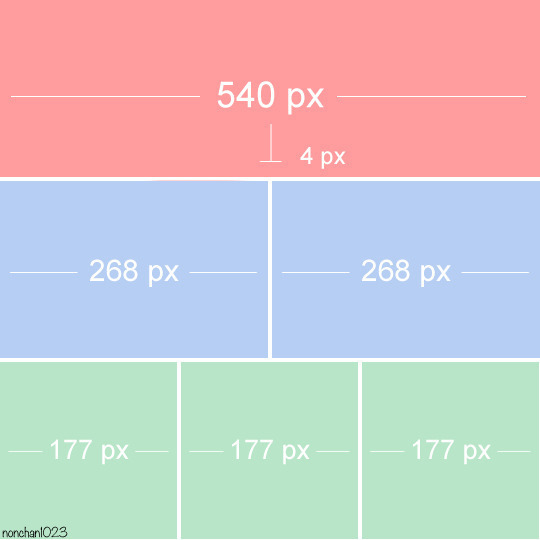
At this point you should already know how big your gifs are going to be. Remember the ideal gif width(s) on tumblr are 540 px / 268 px / 177 px. These specific numbers take into account the 4 px space between the gifs. No restrictions on height. Here are some examples:
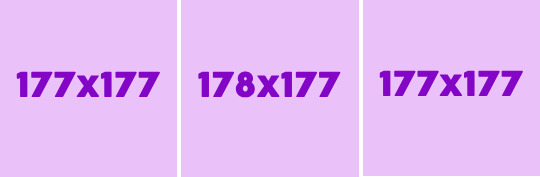
You can play around with the height (177x400, 177x540, 268x200, 268x268, 268x350, 268x400, 540x440, 540x500, 540x540 etc) but if you go over the 10 MB limit you'll either have to make your gifs smaller/delete some frames.
OR you can go on ezgif and optimize your gif, which is usually what I do. The quality might suffer a little, but I'm not really (that) obsessed with how crispy my gifs look, or I'd download photoshop.

Depending on the gif size, you can decrease the compression level. I've never had to go over 35. It's better to start at 5 (minimum) and then go from there until you reach your desired ( <10mb) gif size. Now that I think about it I should have included this passage at the end of the tutorial, I guess I'll just mention it again.
3. LOAD YOUR FRAMES
File -> Open... -> Pick one of your screencaps. The first one, the last one, a random one. Doesn't matter. That's your Background.
File -> Open & Place -> Select all the frames (including the one you already loaded in the previous passage) you need for your gif and load them.
(I recommend creating a specific folder for the screencaps of each gif you're going to make.)
WARNING: When you Place your screencaps make sure the Crop tool is NOT selected, especially if you've already used it and the width/height values have been entered. It will mess things up - I don't know why, could be a bug.
You can either select them all with Ctrl+A or with the method I explained in the ask: "when you want to select more than one frame or all frames at once select the first one, then scroll to the bottom and, while pressing Shift, select the last one. this way ALL your frames will be selected".
WARNING: Depending on how fast your computer is / on your RAM, this process may take a while. My old computer was old and slow af, while my new one can load even a 100 frames relatively fast, all things considered. Even so, I recommend ALWAYS saving your work before loading new frames for a new gif, because photopea might crash unexpectedly. Just save your work as often as you can, even while coloring or before exporting. Trust me, I speak from experience.
Now you can go ahead and delete the Background at the bottom, you won't need it anymore.
4. CROPPING AND RESIZING
Right now your screencaps are still smart objects. Before rasterizing and converting to frames, you need to crop your gif.
Technically you can rasterize/convert to frames and then crop, BUT if you do it in that order photopea will automatically delete the cropped pixels, even if you don't select the "Delete Cropped Pixels" Option. Might be another bug, unclear.
Basically, if you crop your gif and then realize you cropped a little too much to the left or the right, you can go ahead, select the Move Tool (shortcut: V) and, after selecting ALL YOUR FRAMES, move them around on your canvas until you are satisfied. You won't be able to do this if you rasterize first and then crop, the excess pixels will be deleted. I don't know why, I found out by accident lol.
CROPPING
(Cropped pixels: the gray/opaque area outside of the selected area. That area disappears once you press enter and crop, but the pixels are retained, so you can move the frames around and reposition them as you like. In this case I could move the frames to the left and include Silver's figure [curly guy in the foreground] in the crop)
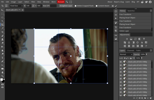
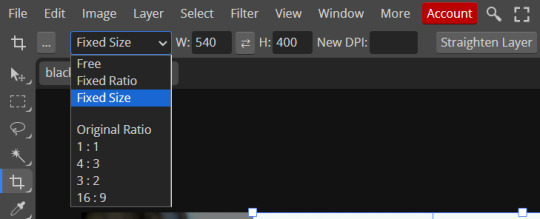
After deleting the Background, you will need to select all your frames (using the Shift key), use the C shortcut on your keyboard to choose the Crop tool. Or you can click on it, whatever's more convenient. Once you do that, a dropdown menu is going to appear. You need to select the "FIXED SIZE" option, as shown in the following screencap.
Once you do that, you can type in your desired width and height. Do not immediately press enter.

Your work area should now look like this. Now you can click on one of the white squares and enlarge the selected area until the edges are lined up. You can then move it around until it covers the area you wish to gif.
WARNING: to move the big rectangle around, you're gonna have to click on a random point of the work area, PREFERABLY not to close to the rectangle itself, or you might accidentally rotate it.
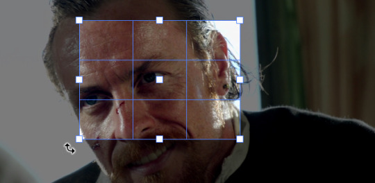
See? When your cursor is close to the selected area it turns into this rotating tool. Move it away until it reverts to your usual cursor, then you can start moving the rectangle. Press Enter when you're satisfied with the area you selected.
RESIZE
This isn't always necessary (pretty much never in my case) - and it's a passage I often forget myself - but it's mentioned in most of the tutorials I came across over the years, so I'd be remiss if I didn't include it in mine. After cropping, you'll want to resize your image.
IMAGE -> Image Size...

This window will pop up. Now, should the values in the Width and Height space be anything other than 540 and 400 (or the values you entered yourself, whatever they might be) you need to correct that. They've always been correct in my case, but again. Had to mention it.
5. RASTERIZE & MAKE FRAMES
Now that your screencaps are cropped, you can go ahead and convert them.
LAYER -> Rasterize (if you skip this passage you won't be able to Sharpen (or use any filter) on your frames at once. You'll have to Sharpen your frames one by one.
Photopea doesn't feature a timeline and it's not a video editor, which makes this passage crucial. When you select all your smart objects and try to apply a filter, the filter will only by applied to ONE frame. Once you rasterize your smart objects and make them into frames, you can select them all and sharpen them at once.
Unfortunately this also means that you won't be able to - I don't know how to explain this properly so bear with me - use all smart filters/use them in the same way a photoshop user can. For example, you can sharpen / remove noise / add noise / unsharp mask... but you can't act on those filters in the same way a photoshop user can.
When you work on smart objects you can change the blend mode - which is critical if you decide to use a filter like High Pass. If you simply apply a high pass filter on photopea you won't be able to change the blend mode and your gif will look like this (following screencaps). Or rather, you will be able to change the blend mode by clicking on the little wheel next to "High pass" (circled in green in the 2nd screencap), but you'll have to apply the filter to each frame manually, one by one.

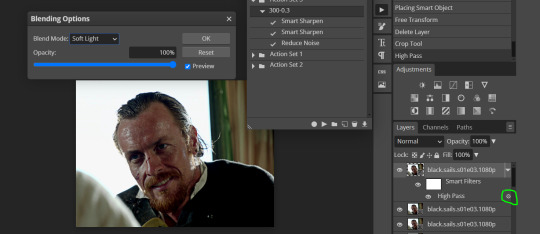
Then you can rasterize/make into frames, but it's extremely time consuming. I did it once or twice when I first started making gifs and it got old pretty soon haha.
Layer -> Animation -> Make frames. This passage will add "_a_" at the beginning of all your frames and it's what allows you to make a (moving) gif. As I said in the ask, if you skip this passage your gif will not move.
6. SHARPENING
Some people prefer to color first and sharpen later, but I found that sharpening filters (more or less) dramatically alter the aspect of your gif and already brighten it a bit (depending on your settings) and you may end up with an excessively bright gif.
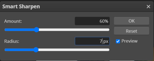
Now, sharpening settings are not necessarily set in stone. The most popular ones are 500/0.4 + 10/10, which I use sometimes. But you may also need to take into account the quality of the files you're working with + the specific tv show you're giffing. I've been using different settings for pretty much every tv show I gif, especially in the last couple months. Some examples:

followed by
OR
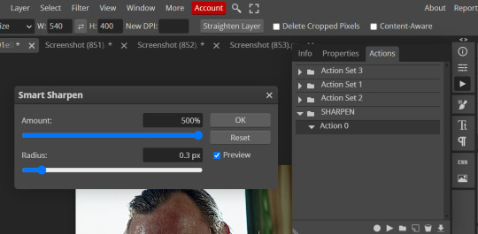
AMOUNT: 500% RADIUS 0.3px
followed by
AMOUNT: 20% (or 10%) RADIUS 10px
You'll just need to experiment and see what works best for your gifs.
Some gifmakers use the UNSHARP MASK filter as well (I think it's pretty popular among photopea users?) but it makes my gifs look extra grainy, makes the borders look super bright and it clashes with my coloring method(s), so I use it rarely and with very moderate settings. Something like this:

Again, depends on the gif and on what you like. I've seen it used with great results by other gifmakers!
REDUCE NOISE
Sometimes - and this is especially the case for dark scenes - your gif may look excessively grainy, depending on how bright you want to make it. Reducing noise can help. Keep it mind, it can also make it worse and mess up the quality. BUT it also reduces the size of your gif. Obviously, the higher the settings, the more quality will suffer.
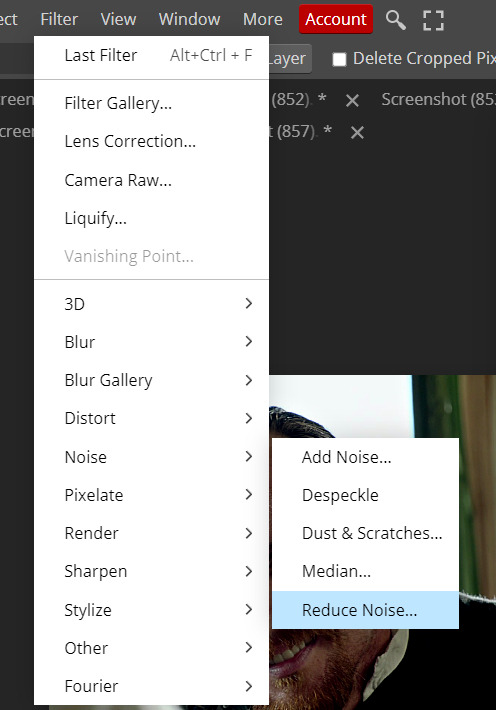

These are my standard settings (either 2/70% or 2/80%). It's almost imperceptible, but it helps with some of the trickier scenes.
ADDING NOISE
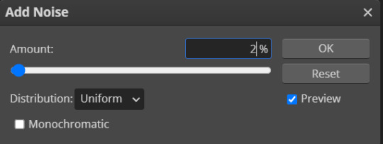
Adding noise (1% or 2% max) can sometimes help with quality (or make it worse, just like reduce noise) but it will make your gif so so so much bigger, and occasionally damage the frames, which means you won't be able to load your gif on tumblr, so I rarely use it.
You'll also want to create ACTIONS which will allow you to sharpen your gifs much faster.
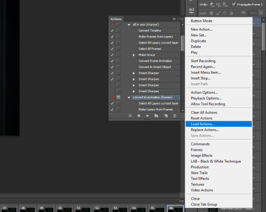
HOW TO CREATE AN ACTION ON PHOTOPEA
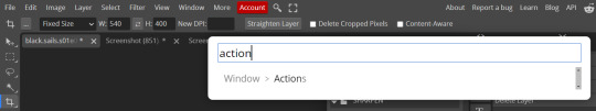
The Action Button (shaped like a Play button as you can see in the following screencaps) may not be there if you're using photopea for the first time. If that's the case click on the magnifiying glass next to "Account" (in red) and type "actions". Press Enter and the button should immediately show up.
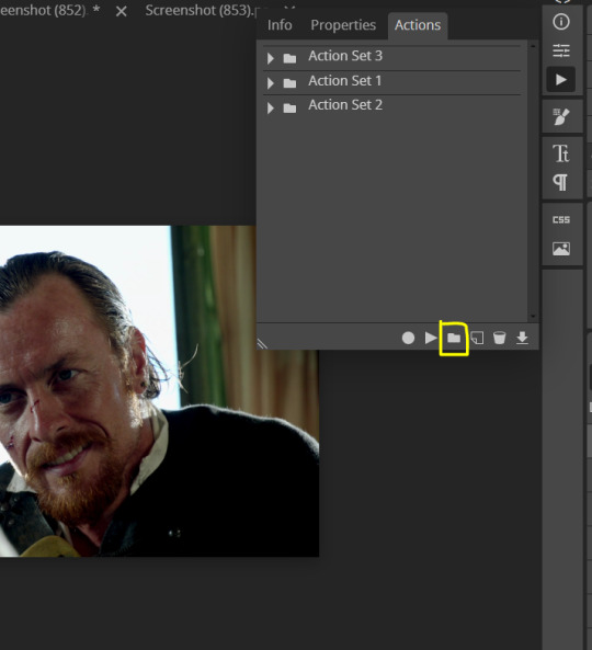
Once you do that, click on the Folder (circled in yellow)
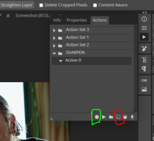
and rename it however you like.

now click on New Action (circled in red). now you can press the Recording button (circled in green)
Now
FILTERS -> Smart Sharpen
and you can enter your values. Then you repeat this passage (WITHOUT pressing rec, WITHOUT pressing new action or anything else, you just open the smart shapen window again) and, if you want, you can sharpen your gif some more (10%, 10px, or anything you want.)
Maybe, before creating an action, experiment with the settings first and see what works best.
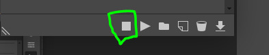
When you're satisfied, you can PRESS STOP (it's the rec button, which is now a square) and you can DOWNLOAD your action (downwards facing arrow, the last button next to the bin. Sorry, forgot to circle it) .
You need to download your action and then upload it on your photopea. When you do, a window will pop up and photopea will ask you whether you wish to load the action every time you open the program. You choose "Okay" and the action will be loaded in the storage.
When you want to sharpen your gif, you select all your frames, then you click on the Play button, and select the Action, NOT the folder, or it won't work.

Actions can also be created to more rapidly crop and convert your frames, but it doesn't always work on photopea (for me at least). The process is exactly the same, except once you start recording you 1) crop your gif as explained in step 4, 2) convert into frames. Then you stop the recording and download the action and upload it. This won't work for the Rasterize step by the way. Just the Animation -> Make Frame step.
7. COLORING
Now you can color your gif. I won't include a coloring tutorial simply because I use a different method for every tv show I gif for. You normally want to begin with a brightness or a curve layer, but sometimes I start with a Channel Mixer layer to immediately get rid of yellow/green filters (there's a tutorial for this particular tool which you will find in the list I mention in the link below)
[Plus I'm not really an authority on this matter as my method is generally... fuck around and find out. Two years of coloring and I still have no idea what I'm doing. 70% of the time.]
Simple Gif Coloring for Beginners -> very detailed + it includes a pretty handy list of tutorials at the bottom.
8. EXPORTING
Now you can export your gif. Some gifmakers export their (sharpened) gifs BEFORE coloring and then load the gifs on photopea to color them. I'm not sure it makes any difference.
FILE -> EXPORT AS -> GIF
(not colored, just sharpened)
As you can see, unlike photoshop the exporting settings are pretty thread bare. The only option available is dither - it sometimes help with color banding - which, and I'm quoting from google for maximum clarity:
"refers to the method of simulating colors not available in the color display system of your computer. A higher dithering percentage creates the appearance of more colors and more detail in an image, but can also increase the file size."
SPEED
When you export your gif, it will play at a very decreased speed (100%). I usually set it at 180/190%, but as for every other tool, you might want to play around a little bit.
GIF SIZE/EZGIF OPTIMIZER (See Step 2)
And that's it.
P.S.: worth repeating
Save your work as often as you can, even while coloring or before exporting.
#photopea#my inbox is open if you have any questions <3#image heavy under the cut#photopeablr#tutorials#gif tutorial#allresources#photopea tutorial#completeresources#gifmaking
207 notes
·
View notes
Note
Hi! I finally got the chance to read Aurora a bit ago. It's a wonderful story--all I was expecting and better! I was particularly amazed and delighted by the artwork and visual mechanics used to tell the story, so I wrote a post to yell about how cool it is and break some of it down. (No criticism, just praise.) I'm mostly a hobbyist, so I'm hoping I've done it justice.
That said: zero pressure to read it or respond to this ask. Normally I wouldn't send it since I tagged, but I know Tumblr's notifs are a mess and things get lost very easily. I've been in both the "one (1) word of praise will feed me for a year" and the "oh gods don't talk about my writing/art because anything that seems Off will break my brain" modes before, and I absolutely don't want to push or make you uncomfortable!
If you are comfortable, however, I wanted to ask about your use of what I'm assuming are Screen and blending modes in sound effect words. (I'm only guessing that's the technique, though, so I could be totally wrong about how it's done! I'm mostly experienced in image manipulation in Photoshop.) Making them semi-transparent over the actions is genius :) What inspired you to do that, and are there specific techniques you use to make it work?
Same questions go for using specific colors to distinguish different characters' words and actions. I really noticed it in the cave sequence with Falst and Dainix, since their colors are so vivid in the dark (ex. Falst's little swats and Dainix's swooping kick at 1.20.9). It lends excellent clarity to busy scenes.
Thanks! Have a lovely day, enjoy your break, and happy holidays <3
You're correct about the technique! "Screen" is the blend mode I use most often for sound effects. I stumbled on it mostly through trial and error - I love how sound effects add depth to a comic panel, but it's very easy for them to obscure the art in a way I find counterproductive, so "Screen" lets me put the sound effect directly over the origin of the sound while still letting it be visible through the word. Early chapters didn't have it as much-
Most of the sound effects in early chapters are just solid colors with reduced opacity if I'm feeling fancy. But I started figuring it out around chapter 8 and 9, because Falst is kind of a sound-effect-heavy guy, especially in his fight scenes.

In order to make sure they don't impede the visibility of the action, I'll often soft-erase the top or bottom half of the SFX to reduce its opacity while still leaving it readable.
I'll usually double that up with an outline on the SFX so it's still readable. This is an especially important consideration if the SFX goes over an area of the background that's very bright or glowing.

Color-coding the speed lines and SFX to the character or force causing them isn't a hard and fast rule, but I like using it (in part because it's a habit from the OSP illustrations, where every character has a single pop of color in their lineart) mostly because it sort of codes every sound to make it clear where it's emanating from, or the general feeling of the sound. Since I normally do character-colors for SFX, something like this stands out more jarringly-

Which it's supposed to, but a big lightning strike doesn't register as anything too worrying because it's just Tess up to her usual shenanigans.

It's also very useful for magic effects, because each form of magic has its own associated palette.


And when I had a very complicated fight scene in a dark environment, I used the texture pattern I'd already made for the monster to color its SFX, so when I Screened them onto the panels they didn't obscure too much while still communicating "this is something else."

Changing the weight, lined-vs-not-lined, and opacity of the SFX words also helps to communicate that not every sound has the same feeling. A strong motion is solid and aggressive, but a crackling, unstable sound is more ephemeral and staticky.

It's definitely been a process of learning as I go - looking back at the earlier chapters I can actually see when I first tried various tricks I now use regularly, like doubling and distorting an SFX to produce the effect of a camera-shaking impact. I haven't really seen any other comics that do it like I do, probably because most other comics follow a more traditional production pipeline where text bubbles and sound effects get locked into the composition early, before the inking stage, because traditional physical comics don't have digital-art layers to play with. Adding sound effects to a page is almost the last thing I do before exporting them, and that only works because digital art and layers allow for a ton of flexibility.
371 notes
·
View notes
Text
Is That Me?

Character: Adrian Chase x Gn!Reader
Type: Fluff
Length: Drabble (500 words)
Summary: All month you have been ranting to your best friend about your celebrity crush and Adrian gets a little jealous. Little does he know that the face is quite familiar.
Trope: established relationship
A/N: Since Peacemaker confirmed that a lot of celebrities exist in the DC universe I thought this was adorable. Also, I saw someone do this with a different celebrity a long time ago so credit to them! Hope this will tie you guys over until I finish the requests since they are taking longer than I thought they would.
"Who is he?" Adrian stood in the doorway of your guy's shared bedroom with folded arms and a concerned look on his face. You looked up from your phone with a confused look.
"Who are you talking about?" You sat up on the bed with your phone in front of you. Adrian sighed heavily
"You know who. The dude you've been talking about non-stop." You couldn't help the smile that broke out on your face. You had been ranting to your best friend over the phone for weeks about this really handsome actor you came across recently because he looked exactly like your boyfriend.
A giggle bubbled up inside you and you started to laugh hard. You couldn't keep hiding the celebrity from Adrian.
"What's so funny?" He frowned at my reply. You almost felt bad but once he realized who it was he would feel much better.
"Are you jealous Adrian?"
"Gonna be honest yes I am a little bit! Who is he?" He came closer to me making me look up at him. Seeing him jealous was honestly really attractive.
"Do you really want to know?" You teased trying to keep pulling a reaction out of him.
"Yes." He whined. You unlocked your phone and typed up the actor you had been obsessing over. You hesitated to show him because the joke was really enjoyable. But you finally flipped over the phone to him and showed him.
At first, he squinted and adjusted his glasses to see the man better. Then his face morphed into confusion and shock.
"Is this me?" He exclaimed scrolling through the images that popped up of him. "He's me but blonde?" He looked so startled.
"No! Freddie Stroma." You giggled. Adrian sat down on the bed absolutely starstruck by the information of him having a look alike.
"Oh my god, I was in Harry Potter." He muttered. You continued to smile and laugh at his reaction. "Are you sure this isn't me? Did you like photoshop my face on some random guy's body?"
"I definitely did not." You watched his face morph into so many emotions. Curiosity, confusion, and some sort of happiness.
"So this whole time you've been obsessing over a guy that looks like me?" He still continued to scroll and look at everything he's done. You nodded a couple of times. "But I'm right here." He shrugged his shoulders. Adrian narrowed his eyes at the screen still flabbergasted by the whole situation.
"But do you have a hot British accent?" you joked.
"Yes. I do now!" He put on a fake voice making you kiss his cheek.
"I just wanted to see how you would react baby." You hummed hugging him from the side. "And now there's an actor that looks like my boyfriend," You repeated to kiss him on his cheek making his face go all warm.
"Please don't say you're going to leave me for actor me." He turned his head and had a look of genuine fear in his eyes for a minute before you cupped them and told him no.
"No honey I'm not going anywhere." He leaned in to capture your lips in a heartfelt kiss that made your heartbeat quicken. You didn't need a celebrity that looked like your boyfriend because you already had him in your arms.
"Are you still jealous?" you joked making him smile.
"Defiantly not because it's me." He smiled like a dork. You were happy to have your love in your life. "I guess I'm an actor now." You shook your head.
"Nah my boyfriend is the badass Vigilante."
#Adrian chase#freddie stroma#peacemaker#adrian chase x reader#freddie stroma x reader#vigilante peacemaker#vigilante x you#vigilante x reader#vigilante#pookie bear alert#i love him sm#hes so cute#adrian chase fanfic
194 notes
·
View notes
Text
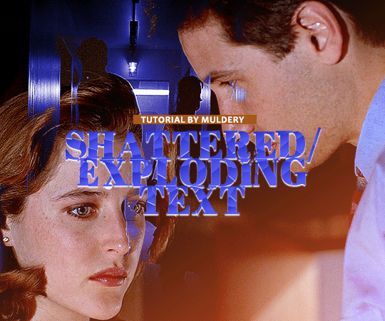
SHATTERED/EXPLODING TEXT tutorial
hiyaa! @krystaljungs asked me for a tutorial on how i made the shattering/exploding animation of the text in this gifset and so i figured i would make it and post it here, like i did with the tutorial for "falling" text.
i must warn you, this one is really tedious and requires a lot of time and patience. honestly maybe there is an easier way to do this but i didn't find any tutorials for when i needed it so i just went off my ps knowledge and did it myself.
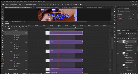
note: you will need photoshop with a timeline!
STEP ONE: create your base gif! be mindful of number of frames in your gif. the number of frames doesn’t really matter here, but if your gif is bigger than 10mb and you have to go back to adjust it all again after you have to delete some layers....you might lose the will to live 😂
STEP TWO: make your text the way you want it to look. this effect is basically the last step of your gif making process. (i will be using the typography from my set as an example as i already have that psd saved)
this is what my typography looks like now.
STEP THREE: now, you will create a new file (with background) and transfer the text you want to "shatter" in it.

here is when things get tedious.......
tip: zoom in the document, it will be easier for you.
select polygonal lasso tool aka this
STEP FOUR: before you start, you need to rasterize type layer. then you will have to "shatter" every letter into smaller pieces. using polygonal lasso tool, select a smaller part of your first letter.

then you will click on that part with the right click of the mouse and selct layer via cut.
now you need to make sure that your new layer is selected and using the move tool move that part of the letter somewhere away.

you will have to do this for every part of the letter and every letter. also move every new layer on top of other layers because they will line up better later like that. then create a new folder with every layer of said layers and rename it after the letter you're shattering. see below. (idk why my screenrecord didn't catch me making layers via cut but you should do that after the use of polygonal lasso tool, as stated above)
note: feel free to şelect parts of other letters as you get one letter, for an even better effect.
this is what i have after "shattering" every letter. the lineup doesn't have to be perfect as you will arrange these parts in your main document. (click on images for full view)

STEP FIVE: go back to your main document and make sure the visibility of your text is turned on.

what you will do now is open the shattered text in the new window and transfer letter by letter (letter folders) to your main document. BUT after you transfer every folder, you need to rasterize EVERY layer and convert it to a smart object. i made an action for this part to make it easier. download here.

(okay i really don't know why my screenrecord doesn't show "pop-up" windows but i was moving the C folder from the document where i shattered the text and then used my action on every layer)
after you transfer the folder to your main document and rasterize and convert to smart object, select the folder and use Free Transform to move it so it aligns with the letter from your complete typography. then you will select each layer and align it with the typography. see below. (click on the gif, i made it bigger so you can see better)

i did this one hastily so the recording wouldn't be too long but i'm hoping you can see what i'm doing.
now, do this for every letter.
after that is done, make the original typography layer invisible, and you should have something like this

STEP SIX: another really tedious part BUT it's time to animate the text.
make your timeline space bigger so it's easier for you to work with it. then select the first layer and click on the arrow next to it (in timeline) so Transform is revealed to you.
now, you don't want the animation to start from the very beginning of the gif, but a bit later so the text is readable before it shatters.
for example, i did mine like this, but that is your personal preference.
note: make sure that all animations start at the same time.
tip: do this for all layers in one folder before you transform them, as it will go faster.
STEP SEVEN: bring the playhead (blue arrow with the red line) to the end of your gif and select one layer in timeline.
now it's time to transform it. use Free Transform (windows shortcut ctrl+T) and drag the part a bit away and rotate it. press enter.

okay ignore the way my text moved upwards, i used the text i used in my edit and i did that animation in the upper part of the gif and i was too lazy to redo the whole animation lmaoo but i hope you can see what i'm doing with the letter C.
do this for every letter. play around with placing and rotation. then save your gif. when you're done, you should have something like this.

again, i was too lazy to redo the whole thing on this new gif so i'm using the one from my gifset i linked in the beginning.
i hope this was understandable and helpful. if you have ANY questions, don't hesitate to shoot me an ask or dm me! i'm always here to help <33
#usergif#completeresources#allresources#gif tutorial#ps help#userkimchi#uservivaldi#userraffa#tusermona#userelio#usercats#tuserheidi#usershreyu#userhallie#userroza#userdean#userisaiah#thingschanged#tusercasey#usertj#userwwz
265 notes
·
View notes
Text
Pulp Covers And How To Paint Them
With the rise of cheap printing in the early twentieth century, mass-marked paperbacks swept the world, each offering lurid thrills for obscenely low prices. Sex, sadism, and incredible violence for as little as ten cents. An easy purchase to slot in between fifty cigarettes a day and enough bourbon slugs to kill a small garden.
Pulp fiction is where some of the greats of American literature cut their teeth, including the big three, Raymond Chandler, Ross MacDonald and Dashiell Hammett. The contents of these stories, both the dizzyingly good and astoundingly terrible, have been absorbed and digested and remixed and regurgitated in nearly every permutation imaginable, fuelling pop culture some one hundred years on. This isn't an essay on that. Nobody likes to open a tutorial and be greeted with a wall of text. The history is for another time.
But it is about how to paint it.
Don't let the pre-amble intimidate you, it's not as hard as it sounds. You will need:
Painting software with some image editing capabilities. You don't need all the bells and whistles of Photoshop, but I wouldn't recommend something like MSPaint, at least not to start with. I'm using Clip Studio Paint.
A really beat-up paper texture. The grungier, the better.
A lightly-textured brush. Here are the specific brushes I use, 99% of which is the well-named rough brush. Try and avoid anything with any impasto elements.
Go to your colour-picking tool and use the 'select from layer' option. Doing all the painting on a single layer is going to make your life easier.
A complete willingness to make mistakes and, instead of erasing, painting over them. It generates much more colour variation and interest! Keep your finger off the E key.
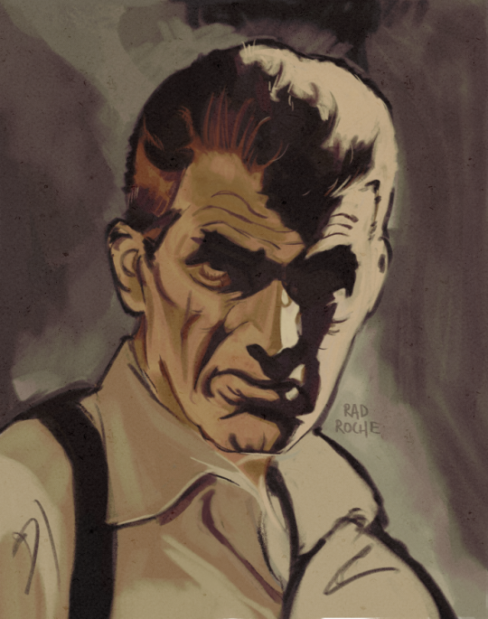
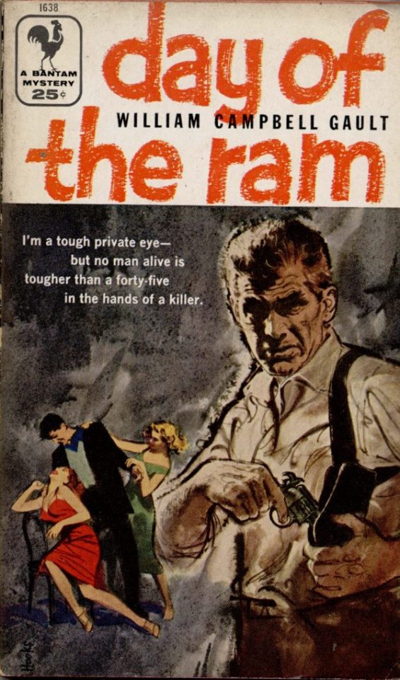
Good reference! That painting is a master copy of Mitchel Hooks' art for Day of the Ram. Find a style you really love and want to learn? Have no clue where to begin? Do direct studies!
Let's not worry about whatever is happening in the background. It's probably fine. Let's get started! Pulp magazine art is a lot more varied than you might first think, so don't agonize over having a style that 'fits' or not. I'm also specifically aiming for something you'd see on the cover after printing, not the initial painting they would use for printing. The stuff I'll show here is a pretty narrow band of it, but here are some general commonalities. This is a painting by Tom Lovell.
Let's dig into this.

The colours are very bright and saturated, but the actual values, the relative lightness and darkness of them, are actually grouped very simply! You can check this by filling a layer full of black, putting it on top and setting its mode to colour. If the value of a painting looks good, you actually get a lot of leeway with colour. But here's what I think is the most important thing to keep in mind.
The darks aren't that dark, and the lights aren't all that light! Covers are paintings reproduced on cheap paper. Anything you wouldn't want to happen in the printing process, you lean into. Value wash-outs, lower contrast, colours getting a weird wash to them, really gritty texturing. So let's get painting! Here's my typical setup.
That bottom folder is the painting itself. The screen layer is the grungy paper texture. To get the effect you want, put it down, invert its colour, then set it to screen. That washes out your painting far, far too much, so to compensate, I put a contrast layer up on top. Fiddle around with the settings, but this is where mine ended up sitting.
Note I'm saying this before even starting the painting: you want to do this as early as possible. This is where the 'select from layer' colour picker comes in handy. You can paint without worrying about the screen or contrast layer. Something not looking right? Enable your value check layer and keep painting. When you turn it off, it'll still be in colour. Here's a timelapse so you can see what that looks like.
And when you check the values...
They're pretty simple! This isn't a be all and end all, but I hope it serves as a decent primer. I want thirty dames on my desk by Monday!
#rochedotpng#art tutorial#art resources#couldn't find a thing online about this style so here's how i do it#pulp#it's how i did the death shroud one more or less
176 notes
·
View notes
Text
So something I realized watching a few videos and reading a few articles is that most of us aren’t angry at the idea of AI in general. Many of us are excited to learn about AI systems that can identify cancer better than doctors, for instance.
What we’re angry about is generative AI being used to destroy the jobs of artists (and I mean all creatives here), who have already been dealing with their work being devalued by modern society.
And I’m not sure how to deal with it. I do remember learning that when photography became a thing, many painters were horrified and terrified of would erase the art of painting. It didn’t obviously, and in fact photography because a whole new art form.
I grew up during the birth of digital art. I distinctly remember the phase digital art went through where many people declared it to not be “real art” and that it was “cheating” etc. I’m sure other millennial artists also remember this transition. But graphic designers pretty quickly adopted digital tools, and websites like DeviantArt popped up, and I don’t think there are too many people nowadays who would say a digital painting isn’t “art”. Still, I do imagine there is a gulf between how some people would view the “artistic merit” of a 3 ft tall oil painting hanging next to a 3 ft tall print of a digital painting, even if the subject and styles were similar. So the worries that digital art would erase physical painting was also proven false. And for the record, I think digital art is 100% art. The merit of digital art is equal to that of physical art.
On the other hand, I can’t say these changes didn’t affect older forms of art. Like, photography did affect the world of painting. I don’t have statistics, but it seems like it probably affected the world of portraiture the most. And I wonder if many of the 20th century art movements were influenced by photography. None of my art history classes touched on that and it’s kinda weird to me. There is definitely something about a Dada or cubism or surrealist painting that transcends beyond what a traditional photo of a landscape or a portrait can do. There is no location in the real world with actual melting clocks or people whose faces show multiple angles at once.
And then there was the digital photograph that changed everything again! Film has become a niche art form.
There were specific kinds of jobs lost due to the digital transition, too. I’m thinking of things like murals being replaced by printed banners, or book covers often being done in photoshop. Oh, and that’s another tool that was faced with fear: Photoshop! There was a fear it would destroy the need for professional photographers because everyone could just fix their own photos. Turns out nope, and in fact people skilled in photography and photo editing are still in demand. And of course there’s the loss of 2D animation in favor of 3D animation, the loss of practical effects for digital, etc.
And you might argue that in some of those cases people can tell corners are being cut and that they won’t stand for it, but Marvel movies still make billions of dollars so…
So I don’t know what’s going to happen with AI art. I am NOT saying “all current artists are stupid and wrong, in the future history students will laugh at how stubborn they were to resist this idea”. AI art is not comparable to photography or digital painting.
With a photograph, you still need to compose the image in the frame, you need to position yourself in the real world, you need to know your equipment, whether you’re using film or digital. You also need to know how to process that photo either in the dark room or in Photoshop. These are skills the average person does not have. You cannot tell an AI “that shot was good but can you increase the contrast?” It’ll just produce a completely new image.
I read an article about an art director who was encountering difficulties as the department tried to incorporate AI. They got back first drafts of art ideas from the people employed to work with the AI, gave critique, and the second round was just completely new images that didn’t include the suggestions… because they couldn’t. AI does not understand color theory. It does not have the ability to take critique. It can’t slightly alter the layout of a design.
And all of that applies to painting too. AI (currently) can’t do what a trained art student can do. It doesn’t know that to create a sense of atmosphere you should make distant objects bluer. It doesn’t know how to use human physiology and psychology to draw a viewer’s eyes across a large painting to reveal a story.
AI also can’t replicate INTENTION - and intentionality is a HUGE part of art. WHY an artist chose those colors, that medium, that composition, those tools, why they chose to display it a certain way, why the composition is like this instead of that - all of that adds meaning to the painting that you can’t get with AI.
(Yes, there is an absolutely valid field of art critique that evaluates a piece of art on its standalone value and the message it conveys without the context of the artist’s intent, but that should be compared to the analysis that DOES include the artist’s intent! That comparison can bring about so much understanding!)
Anyway I’m going to end this post now because it has gotten WAY too long. I focused mostly on painting and photography in this post because those are my particular fields of speciality, but this applies to ALL ART. It applies to music and writing and scripting and acting and composing music and just. Everything. All art.
I don’t think there are any forms of art AI doesn’t threaten. Now granted, AI can’t currently pick up a paint brush. It can’t use a crochet needle. It can’t hold a camera. And maybe there will be some sort of return to physical media in response to AI produced digital art. Or maybe there will be a response in digital art to stylistically distinguish it from AI in a way AI can’t reproduce. I’m not sure what will happen. Maybe some proof the image was digitally painted by a real person, somehow. Or that it’s a real photo, or a real article. I saw someone mention there may end up being labels like “100% human made” like we do for organic food lol. Maybe work in progress videos or photo metadata will become more commonplace as evidence of authenticity.
Anyway, NOW I’m ending this post. Whew.
105 notes
·
View notes
Text

I found these replies very frustrating and fairly ableist. Do people not understand that disabilities and functionality vary wildly from person to person? Just because one person can draw with their teeth or feet doesn't mean others can.
And where is my friend supposed to get this magic eye movement drawing tech from? How is he supposed to afford it? And does the art created from it look like anything? Is it limited to abstraction? What if that isn't the art he wants to make?
Also, asking another artist to draw something for you is called a commission. And it usually costs money.
I have been using the generative AI in Photoshop for a few months now. It is trained on images Adobe owns, so I feel like it is in an ethical gray area. I mostly use it to repair damaged photos, remove objects, or extend boundaries. The images I create are still very much mine. But it has been an incredible accessibility tool for me. I was able to finish work that would have required much more energy than I had.
My friend uses AI like a sketchpad. He can quickly generate ideas and then he develops those into stories and videos and even music. He is doing all kinds of creative tasks that he was previously incapable of. It is just not feasible for him to have an artist on call to sketch every idea that pops into his brain—even if they donated labor to him.
I just think seeing these tools as pure evil is not the best take on all of this. We need them to be ethically trained. We need regulations to make sure they don't destroy creative jobs. But they do have utility and they can be powerful tools for accessibility as well.
These are complicated conversations. I'm not claiming to have all of the answers or know the most moral path we should steer this A.I behemoth towards. But seeing my friend excited about being creative after all of these years really affected me. It confused my feelings about generative A.I. Then I started using similar tools and it just made it so much easier to work on my photography. And that confused my feelings even more.
So...I am confused.
And unsure of how to proceed.
But I do hope people will be willing to at least consider this aspect and have these conversations.
147 notes
·
View notes
Text
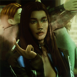
Updated: How I edit my sims 4 screenshots (night-time edition)
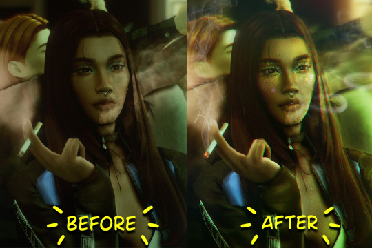
A more detailed editing tut so you can understand my process as it may help you, i edited this relatively quickly and usually spend about 1-2hrs editing something...so let's goo.....
Before taking screenshots:
Help yourself as much as you can in-game, I always make sure there is some sort of light source in my pictures or something interesting that I can add to enhance something already there
Understand good/bad composition and add variety by using different angles
I take LOTS of photos just to end up with 1 or 2 good ones

I'll just be using photoshop for this, but i also like to use the procreate app as i'm more confident w it.
step1: I check if there are any major glitches or hard areas e.g, fingers elbows etc.. that have sharp points and pull them in liquify so they are smooth. Then use curves to change the contrast.
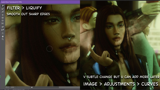
step2: *duplicates image* using the dodge and burn tools (keyboard shortcut: o ) i'll add emphasis to highlights and shadows (be careful with these as the dodge tool can ruin the image if used in excess) *merges image* (i duplicate and merge as i go, utilise using lots of layers so you can go back if you mess up/ want to change the opacity of an effect.)
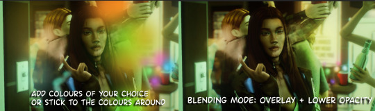
step3: making light sources POP. *new layer* change blending mode to overlay or soft light and choose a colour you like.
step4: *new layer* draw hair strands. i just use a basic round brush in photoshop and change the hardness or i'll use a sharp caligraphy type brush depending on my sims hair type. (i try not to overdo it as i like maxis hair and don't want it to look too realistic)
step5: i would then add a new layer and set the blending mode to multiply to add more shadows, but i don't feel like i need to at this point.
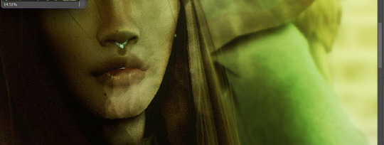
step6: *duplicates image* go to filter > camera raw filter, i change the "light" and "curve" panels, i like green tints in my screenshots especially the night ones. (this is where all the magic happens really so just adjust all the channels to your liking, lightroom is also really good to use)
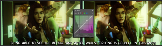
step7: *create new layer* blending mode: screen or linear dodge (add) / makeup and finishing touches! - for this look i'll get stars and glitter pngs off google or unsplash same for the smoke, though if i'm using procreate they have free brushes for that :')

step8: add light leaks as they add some fun dynamic lighting and textures to your screenshots. (i also flip my image horizantally [image > image rotation > flip canvas horizontally] whilst editing as it's like a "fresh pair of eyes" when you've been editing for a while so you can see what looks off)
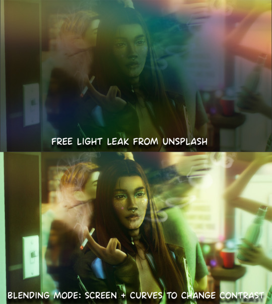
final step: merge all the layers (though i do merge along the way once i'm happy with something) go to filter > sharpen > smart sharpen. I leave it as the default setting.
extra step if u want: for party pics i might add chromic abberation here is a 60 second tutorial on youtube it makes the pic look cool and trippy.
And you're done!! congrats on surviving. if you have any questions please send them in my ask box so others can see and get help too.
155 notes
·
View notes
Text
tutorial contents:
1 ‣ gshade & photoshop actions
2 ‣ template or cropping & colouring
3 ‣ notifs & pop-ups
okay hi! i have a really old editing tutorial from back in january that i've been linking people to, but it's pretty outdated by now. i also keep getting anons asking about the same things, which is fine, but i always have to go searching for the post explaining it, so having it all in one place will be a lot more convenient lol
i use a ☠ copy of photoshop cc 2017 to edit my screenshots, however the majority of everything i'm doing also works on photopea
photopea is an online version of photoshop that's 100% free and works very well! i can't recommend it enough, it's fantastic
first things first, you're going to need some screenshots to edit. for the sake of this tutorial i'll be working with this one of raffy:
in all honesty, gshade will do most of the work for you. of course it's not needed, but i definitely don't think i could live without it! in this screenshot i used sunset n' vinyl by nesurii
when opening the screenshot, the first thing i do is run it through 2 photoshop actions:
butter action by early-grape
smooth sharp (no topaz) by poolbrop
to add actions in photoshop go:
windows > actions > the 4 lines at the upper right corner of the newly opened window > load actions > your downloads folder > open up the .atn files!
if you're using photopea, as far as i'm aware you can't use photoshop actions, but i've found that 'filter > stylize > oil paint' and 'filter > sharpen > smart sharpen' have a very similar effect when using the right settings. try these:
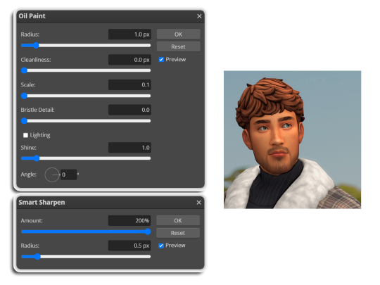
i like these two actions because they smooth everything out nicely, but keep it sharp at the same time! i always run butter before i run smooth sharp, however butter may leave you with 2 layers. make sure to merge these layers before running smooth sharp to achieve the full effect.
here's a before and after (of the photoshop action):
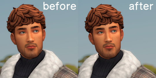
from here you can move on to step 2
before anything else i want to share the template that i use to make editing a lot faster. you don't need to use it but it's definitely made things a lot easier for me! it's a .psd file and will work perfectly in photopea
download (simfileshare)
if you're using the template you can skip right on to the next section, as it's already cropped to the right size and has the colouring folder included. just drag your screenshot into it and resize to fit the height.
if you're not using it, crop your edited screenshot to:
1707 width x 1280 height
then adjust the colours to your liking. it always varies slightly depending on the picture but my regular process for each screenshot would be:
up the saturation by 8%
up the lightness by 3%
up the contrast by 12%
all of this can be done by looking in the 'images > adjustments' tab
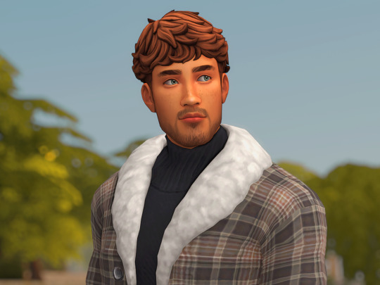
you should end up with something similar to this!
if you want to add a moodlet or social interaction or anything similar, it's all the same process. what you'll need is a screenshot of it straight from the game. i just press the 'c' key to capture them! i'll be working with these two:
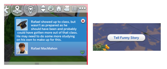
for the blue notification i'm going to select it using the box select tool. try to get it as exact as possible. one you have it selected
for photoshop users:
click on the 'select and mask...' option located at the top
adjust the global refinements at the side as follows:
smooth: 70
feather: 0.0px
contrast: 50%
shift edge: 0%
for photopea users:
go to select > modify > smooth
set it to 15
select 'ok' and press 'ctrl + c' to copy it, then 'ctrl + v' to paste it into your screenshot. adjust the size and position and you should end up with something like this:
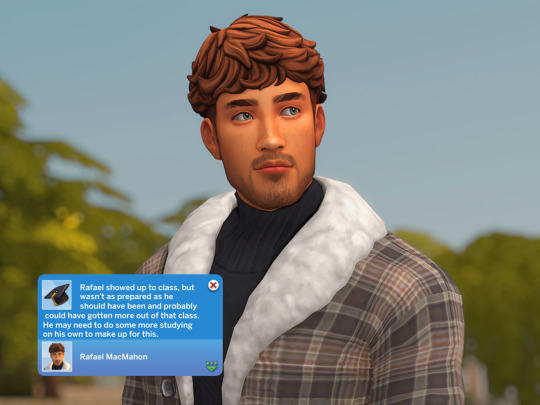
next you want to add the transparent border around the notification. if you're using my editing template, right click on the reference notif in the layers tab and select 'copy layer style' (photopea > 'layer style > copy'). from there you can paste that layer style onto your own notif through the layers tab.
if you're not using the template, here's how to set it up on photoshop:
right click your notification layer and select 'blending options'
under styles, tick the checkboxes for stroke and drop shadow
input these settings:
on photopea, it should be more or less the same. repeat the exact same process with the social menu option, but instead of selecting it with the box select tool, use the magic select tool. in the end you should end out with this!
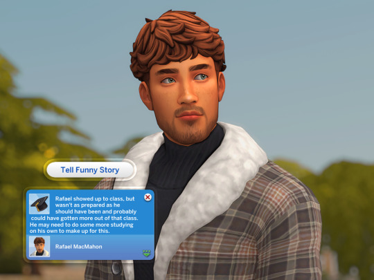
from here you're finished! thanks for reading! go to file and export as png
if you've got questions never hesitate to ask, just make sure to read the faq in my pinned. i might edit this post soon to include the gen intro traits and aspirations bit, but this is all for now. hope it helps, my editing process post has been in need of a revamp for a very long time. i haven't proof-read this so apologies for any mistakes!
#ts4#sims 4#ts4 tutorial#5 anons in my inbox asking the same question after not reading my faq#this ones for you#3 anons in my inbox asking about cas pics#ones coming for you soon#okay maybe not soon but sometime#all my free time has been eaten up#i signed up for extra saturday morning classes and not having a lie in is sucking the life out of me lmao#when i'm busy i just wanna play video games and when i get the chance#to play games i just wanna sleep#its a vicious cycle#i'm currently playing resident evil biohazard tho#enjoying it very very much#i've only got 2 and 3 left to play and i've played every mainstream re game 💪💪#it was a very fun journey! i played them all within this year#long post
1K notes
·
View notes
Text
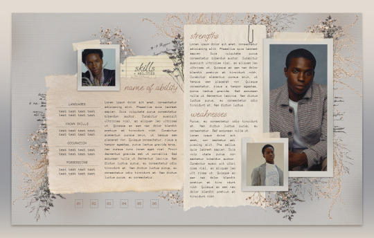
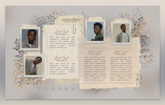
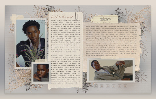

013 . CLEMENTINE — [ 𝚕𝚎𝚖𝚘𝚗 𝚍𝚊𝚢𝚍𝚛𝚎𝚊𝚖 ] ...... DOWNLOAD NOW
Just in time for spring, CLEMENTINE is that sort of melancholic, soft, scrapbook feel. Took forever to place each one of those florals but I know so many of you have wanted something like this for a long time. Edit it in any way, shape, or form just please don’t remove my credit and link to lemondaydream.
These are meant to be only used by one person per purchase. Allowing others to make copies off of your copy is stealing. Please read the instructions on how to prevent this.
how to use
The link on the PDF you receive after purchase will take you directly to your copy when you click "make a copy"
Do not remove the credit from the top and bottom of the template
how to edit
All images on this doc are in "Drawings." To edit "drawings" simply right-click on where the image is, click "select image," and the box that pops up underneath has a button that says "edit." Edit will bring you to a pop-up window that will allow you to change the images by clicking "replace image" at the top right of the toolbar when clicking the picture.
Do not resize or paste any images into the doc, only use the method above.
The pictures on this doc are of Kedar Williams-Stirling, beautiful avatars made by ultra-violences, please go support this fantastic creator. The png images are found on pngtree, pngwing, and marginpar, edited in photoshop.
Changing the fonts may cause tables to shift and resize, be careful in doing this, and remember, ctrl+z is your friend, if something messes up, immediately undo. I do not recommend doing this.
The tables are structured in a way that will move pages and elements if their limit is exceeded, if you need more space, I highly recommend linking to a continuation at the end of that space.
May take a second to load on older pcs or poor wi-fi connections. On mobile, give it a second or close it and reopen it to have it load faster in print layout mode.
Thank you so, so much for your support!
Likes and reblogs are super appreciated always!
#google docs template#google doc template#Google Docs#rp template#rp resources#character template#docs template#rp docs template#rp doc template#rp resource#google#docs#template#character#character sheet#character sheets#OC template#discord rp#discord#gdoc template#discord oc#muse template#discord template#discord rp template#doc template#[ 𝚕𝚍 ] templates
1K notes
·
View notes
Last Seen Blogs

wingsandcoffee
Random Chaos

chhapaakfullmoviedownload
chhapaak full movie download
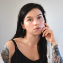
nsk10thdoctor
Таймлорд в Тардис на крыше
cicici03
The Introverted Black Girl