#Packaging & Label Design
Text
Packaging Label Design Strategies: Increasing Brand Loyalty
The Essentials of Effective Packaging Label Design
In the highly competitive marketplace of today, packaging label design transcends mere aesthetics. It serves as the silent ambassador of a brand, communicating values and capturing consumer interest at the point of sale. With brands constantly vying for attention on crowded shelves, the importance of a strategically designed packaging label cannot be overstated. This blog post delves into the essentials of effective packaging label design, exploring how it influences consumer behavior and supports brand identity.

Innovative Branding & Packaging by Saypan - Learn More @ https://saypan.in/our-services/
Understanding Packaging Label Design
Packaging label design refers to the visual and textual presentation of a product’s packaging. It includes the choice of colors, fonts, images, and other graphical elements, as well as information such as the product name, description, and ingredients. An effectively designed packaging label not only attracts attention but also conveys essential information, enhancing the consumer's shopping experience and aiding in the decision-making process.
The Role of Packaging Labels in Marketing
A well-designed label acts as a pivotal marketing tool. It’s one of the first interactions customers have with a product, making it a crucial element in establishing brand recognition and preference. Labels are not just for identification; they evoke emotions and associations that can significantly affect buyer behavior. By aligning the label design with the brand’s identity and values, companies can foster a strong and memorable brand image.

Key Elements of Packaging Label Design
1. Clarity and Simplicity
The most effective labels are both clear and simple. A clean design ensures that the product’s message is conveyed without overwhelming the buyer. Essential information should be easy to find and understand, as this can greatly influence purchasing decisions. Clarity in label design involves a balance of visual elements and text, ensuring that each component is functional and enhances the product’s key messages.
2. Color Psychology
Colors play a crucial role in packaging design. Different colors evoke different feelings and reactions from consumers. For example, blue can convey trust and dependability, while yellow may evoke feelings of happiness and energy. Understanding color psychology can help designers create labels that not only stand out on the shelf but also communicate the right psychological cues to attract the target audience.
3. Typography
Typography is another critical element. The choice of fonts should reflect the brand’s personality while ensuring readability. A well-chosen font enhances the label’s aesthetic appeal and readability. It’s important to select typefaces that are legible at various sizes and that complement the overall design theme.
4. Imagery
Images can communicate much about a product quickly and effectively. High-quality images that reflect the product or the brand’s ethos can create an emotional connection with potential buyers. Whether it’s a photograph or a graphic, the imagery on a label should be relevant and aligned with the brand messaging to reinforce the product’s position in the market.
5. Material and Finish
The tactile aspect of a label can significantly impact consumer perception. The choice of material and finish should reflect the product’s quality and price point. Options include glossy finishes, matte finishes, embossing, or metallic foils, each adding a different dimension to the label’s appearance and feel.
Legal and Ethical Considerations
When designing a packaging label, it’s essential to adhere to the legal requirements relevant to the product and market. This includes the accurate representation of ingredients, nutritional information, and adherence to labeling regulations. Ethical considerations should also guide the design process, ensuring that the labels are not misleading and provide truthful information.

Trends in Packaging Label Design
Staying abreast of current trends is crucial for designers aiming to create impactful and contemporary labels. Some current trends include:
Sustainability: Eco-friendly materials and processes are increasingly important to consumers.
Minimalism: Simple, clean designs that focus on essential elements are gaining popularity.
Personalization: Customizable labels that speak directly to individual consumers are becoming more prevalent.
Digital Engagement: Incorporating elements like QR codes to enhance digital interaction.
Conclusion
Effective packaging label design is a multifaceted discipline that plays a critical role in a product’s success. By combining aesthetics with functionality and adhering to legal standards, designers can create labels that not only captivate consumers but also build brand loyalty. As market dynamics continue to evolve, staying informed and adaptable in label design strategies will remain paramount for brands aiming to thrive in competitive environments.
This holistic approach to label design ensures that each element is strategically employed to support the brand's goals, ultimately making the label an integral part of the product’s appeal and success.
Contact us
Phone : +91 96657 20007, +91 87672 11111
Email : [email protected]
Website: https://saypan.in/
Follow us :
Facebook
Instagram
linkedin
#Packaging Label Design#Label Design#Label Design in Pune#Top Label Design Agency#Top Packaging Design
0 notes
Text

17 notes
·
View notes
Text

#chanel#box#packaging#designer#labels#cc#coco chanel#camelia#flower#ribbon#expensive#luxury#fancy#rich#expensive taste#persona
34 notes
·
View notes
Photo

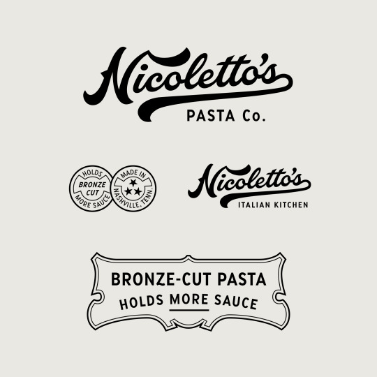
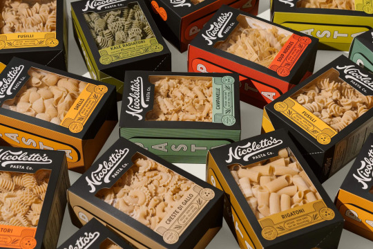
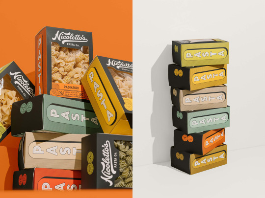
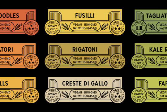

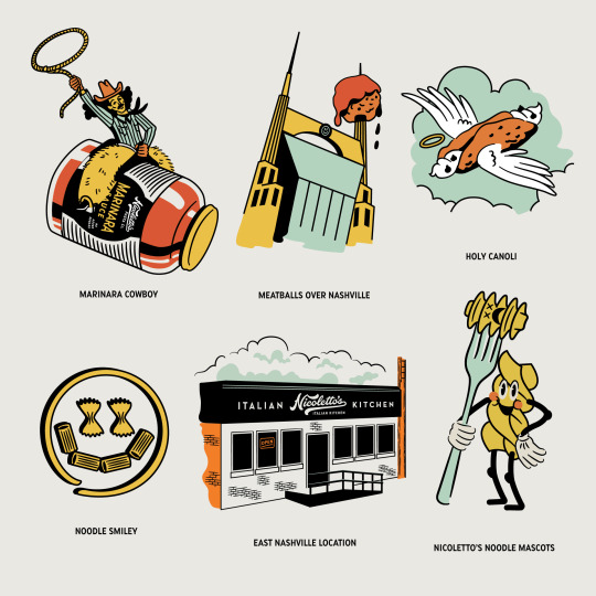
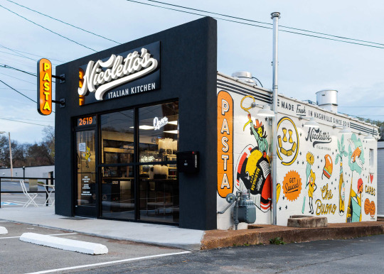
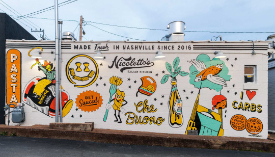
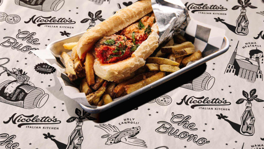
Nicoletto’s by Hoodzpah.
#graphic design#visual inspiration#branding#visual identity#brand design#logo#lettering#typography#print#sign#illustration#doodle#restaurant#food#packaging#label
62 notes
·
View notes
Text

Possum Brand vintage crate label.
#vintage illustration#vintage labels#crate labels#vintage crate labvels#typography#vintage typography#vegetables#fruits#fruits & vegetables#yams#package design#vintage packaging#sweet potatoes
16 notes
·
View notes
Photo

Lustau Fino en Rama
77 notes
·
View notes
Text
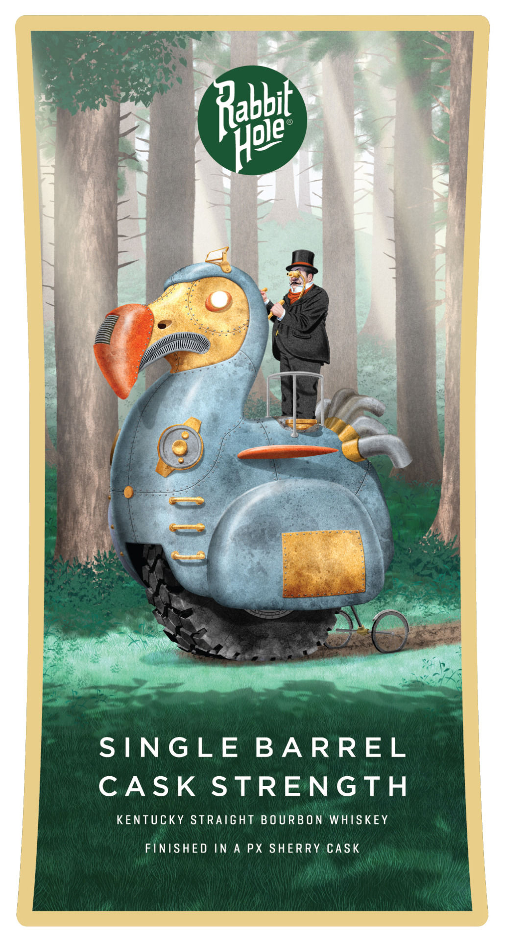
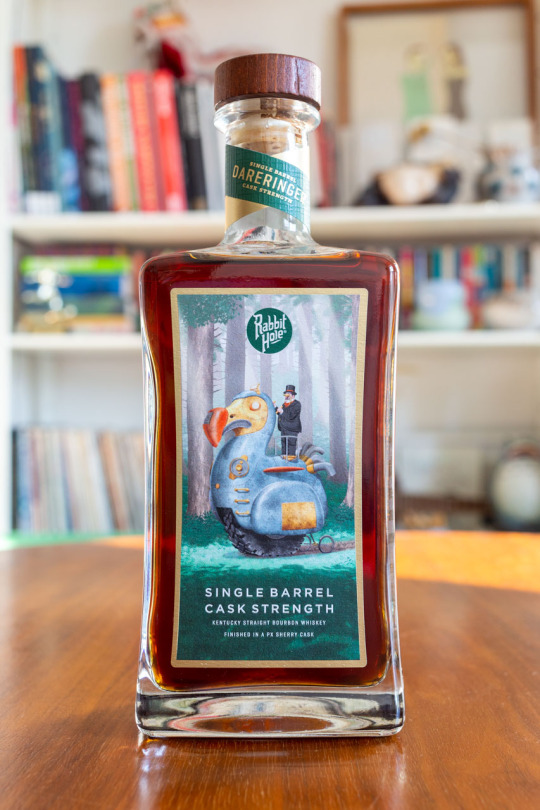

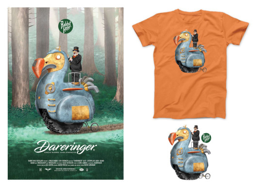
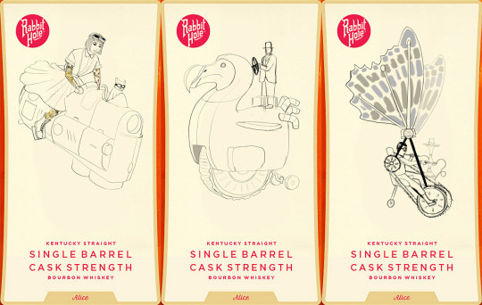
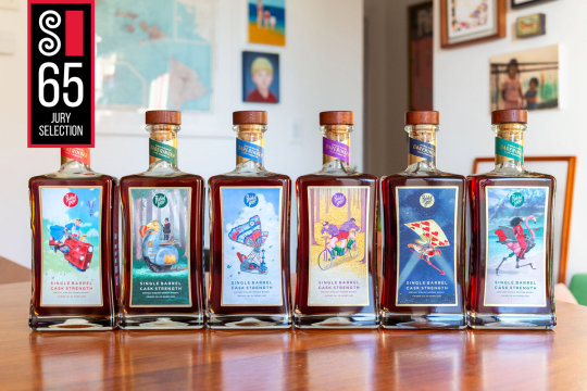
The Dodo for my Limited edition artist series bottles for Rabbit Hole Distillery. I reimagined Lewis Carroll’s Alice in Wonderland characters in a sort of Steam Punk vehicle riding world. Alice is all grown up and tatted with Dinah as co-pilot in the front. The Dodo, (who was a metaphor for politicians) has a Boss Tweed type driver atop his destructive steel behemoth. The Caterpillar has emerged from his cocoon even more twee and affectatious than before and flies away in a puff of hookah smoke. Will Tweedle Dee and Tweedle Dum ever make it out of the forest while working against their own interests? The Queen’s Card Guardsman patrols the night skies. The Queen of Hearts is imposing on her half flamingo-half machine. “Dareringer” is single barrel cask strength Kentucky straight bourbon whiskey finished in Pedro Ximénez sherry casks at 118 proof and luckily is my favorite of all their offerings. Available at select retailers in South Carolina and Texas. Posters, T-shirts, and stickers are also available. This was an incredible amount of work conceptualizing and designing and redesigning these characters and backgrounds. Alice in wonderland is beloved and has been reimagined so many times it took so long to develop something new. We had several half starts and reworks but in the end it was worth it, the bottles are beautifully printed and even have spot gloss embossing on the art. Time for me to go have 2 or 3 (or 4) fingers, Cheers! (also there will be more posts with behind the scenes and details stay tuned). See more of this project on my website
#alice in wonderland#artists on tumblr#Illustration#fyiart#packaging design#packaging illustration#label art#the dodo#steam punk#steampunk#character design#original character#lewis carroll#rabbit hole whiskey#rabbit hole distillery#whiskey#dodo#dodo bird#boss tweed#politician
18 notes
·
View notes
Text


TJ types
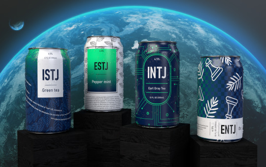
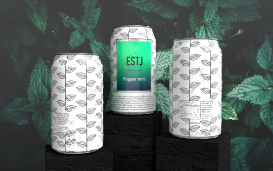
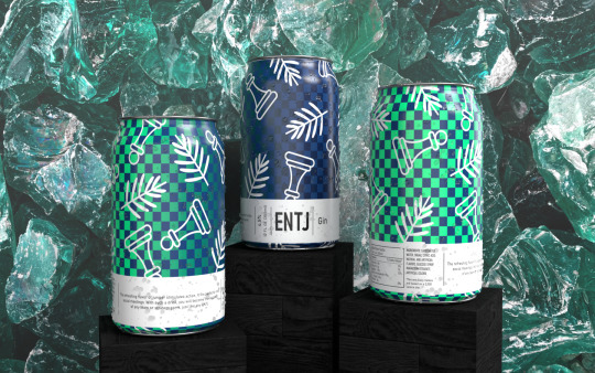
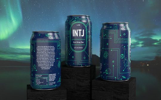
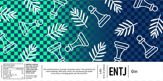
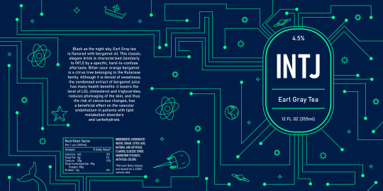
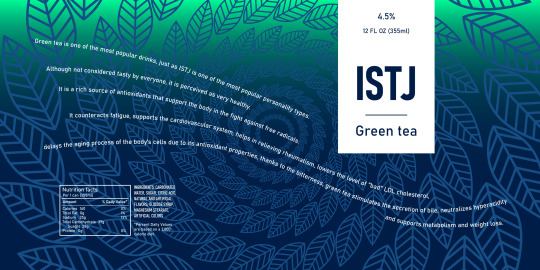
TJ types are disciplined and rational, favoring logic and reason above all else. Ambitious ENTJs make great leaders, analytical and ingenious INTJs can improve everything they meet, focused on details and honorable ISTJs excel in activities that require meticulousness and patience and efficient ESTJs can solve any pragmatic or scientific problem. Although they do not always arouse sympathy among other types, they are the main guardians of order – without them the world would plunge into chaos.
Dark, cold colors are heavy and refreshing at the same time. While cool as the crackling polar frost, the TJ types can also be as beautiful as the Northern Lights. The starry night sky and snow-capped mountain peaks beneath it, snow caps on the trees, foggy forests, vegetation covered with drops of water with its characteristic smell right after the rain, the polar night – this is something that reminds me of TJ types.
Element: earth
#jstawowy#mbti#design#art#psychology#personality#graphic#myers briggs#graphic design#intj#estj#entj#istj#entj aesthetic#mbti personalities#label design#packaging#dark#earth
12 notes
·
View notes
Text
Δημιουργία Ετικέτας Φιάλης Κρασιού | NO IDEA ®
Eτικέτα για μπουκάλι κρασιού. Σχεδιασμός ετικέτας για λευκό οίνο. Οι καλυτερες, μοντέρνες ετικετες κρασιών. Λογότυπο για κρασί. NO IDEA Γραφιστική. Γραφίστας
Δημιουργία ετικετών για φιάλες κρασιού που συνδυάζουν τη λειτουργικότητα με την αισθητική. Σχεδιάσαμε μια μοναδική ετικέτα για λευκό οίνο (Αθήρι), εστιάζοντας στην ανάδειξη της ποιότητας και του χαρακτήρα του προϊόντος.
Η ετικέτα που δημιουργήσαμε αγκαλιάζει τη φιάλη κοντά στη βάση της, προσφέροντας μια περιμετρική κάλυψη που ενισχύει την αίσθηση του πολυτελούς και του εκλεπτυσμένου. Η φιάλη που επιλέχθηκε είναι μια premium επιλογή, η οποία υπογραμμίζει τη μοναδικότητα του κρασιού.
Οι ανάγλυφες λεπτομέρειες στην ετικέτα προσδίδουν βάθος και μια τρισδιάστατη αίσθηση που ενισχύει την οπτική εμπειρία. Η καθαρή τυπογραφία που χρησιμοποιήθηκε εξασφαλίζει ευκρίνεια και κομψότητα, διατηρώντας παράλληλα μια μοντέρνα αισθητική.
Για το δημιουργικό, επιλέξαμε μια γκραβούρα που αντικατοπτρίζει την παράδοση και την ιστορία του κρασιού, συνδυάζοντάς την με ένα λευκό φόντο που αναδεικνύει τα στοιχεία της ετικέτας και προσφέρει έναν διαχρονικό, κλασικό χαρακτήρα.
Μια ετικέτα που δεν είναι απλώς λειτουργική αλλά ενισχύει την αξία του κρασιού, ξεχωρίζοντας στο ράφι και προσελκύοντας τον καταναλωτή.
#noideagraphicdesign#graphic design#logo design#labelling#branding#wine label#wine#labeling#wine labeling#wine package design#wine packaging
2 notes
·
View notes
Text
the return of the matrix buying cosmetics they'll probably never use cuz the packaging is cute.
#we bought nail polish this time#its a cute color and the label has a cute milk carton on it#idk why but milk cartons on designs make me go :D#last time we got a post-shower hydration cream thingy that had hello kitty on the package#we are actually using it after we shower so yay! and it smells nice#we arent big on cosmetics but its almost entirely because we forget to use them. not really a dislike#except makeup makeup is something we genuinely cannot STAAAAAAAAND#every once in a blue moon we do it for a specific look or occasion but the feeling of it is so bad#we take it off as soon as possible i cannot IMAGINE doing that everyday#but other cosmetics like creams and nail polish? mostly bc we forget
3 notes
·
View notes
Text

Working on photographs of these aluminum cans I did for Mammoth Brewing, with prepress by VN Graphics. Translating my earlier full-color illustrations to limited-color versions that could be printed directly on aluminum was an exciting challenge. DM me if you are looking for a graphic designer for your next beverage packaging project! 🍻
12 notes
·
View notes
Text


Here's a brandy packaging project!
#graphic design#brand design#packaging design#label design#packaging#product design#brandy#design#alcohol
3 notes
·
View notes
Text

35 notes
·
View notes
Text
✨VERSAPRESS XL - A Revolucionária Impressora Digital Profissional para Rótulos Sob Demanda! 💡 Saiba mais: https://www.apolo.com.br/VERSAPRESS 📞 WhatsApp (11) 3164-9400 💬 Link: https://www.apolo.com.br/WhatsApp
Prepare-se para o futuro da impressão com o VersaPress XL, uma evolução notável da já consagrada impressora digital profissional VersaPress. A XL redefine os padrões, proporcionando uma solução de BAIXO CUSTO tanto em termos de INVESTIMENTO quanto na utilização de SUBSTRATOS e SUPRIMENTOS. Esta máquina é uma resposta definitiva para as demandas do mercado FLEXOGRÁFICO e de EMBALAGEM.
Imagine trabalhar com autoadesivos comuns, sem tratamento especial, os mesmos utilizados na flexografia convencional, como Filmes PET, PP, PE, e uma variedade de outros materiais ideais para rótulos, etiquetas e embalagens. A VersaPress XL não oferece apenas novidades, mas também uma série de recursos e capacidades inigualáveis. Com uma largura de impressão de até 320 mm e uma capacidade de aceitar bobinas de até 450 mm de diâmetro, ela atende a diversas necessidades de produção.
A tecnologia S-LED de última geração, equipada com 14.592 leds, e a RESOLUÇÃO REAL de 1200x2400 dpi com pontos ultrafinos são apenas o começo. Combine isso com os Toners Secos EA de baixa temperatura de fusão, e você terá uma solução única de baixo custo capaz de reproduzir uma qualidade pouco vista no mercado de impressão digital, e aplicável a uma ampla gama de materiais.
Independentemente do setor em que você atua – seja INDÚSTRIA, CONVERTEDOR ou GRÁFICA – a VersaPress XL é uma resposta para enormes desafios de produção, oferecendo excelente qualidade, eficiência de custos e lucratividade.
Descubra o futuro da impressão com o VersaPress XL, disponível exclusivamente através da Apolo Sistemas Gráficos, líder de mercado há 36 ANOS.
#drupa#drupa2024#design#packaging#printing#packagingdesign#digitalprinting#printingindustry#packagingsolutions#flexiblepackaging#offsetprinting#printingsolutions#flexo#labels#labelprinting#paper#embalagens#inkjetprinting#packagingideas#rfid#thermal#embalagem#prepress#grafica#producao#papel#labeling#packagedesign#customdesign#flexografia
2 notes
·
View notes
Photo
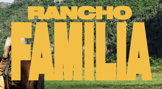

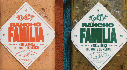


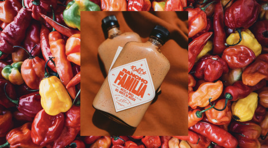
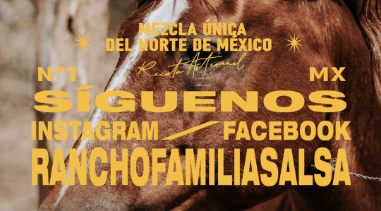

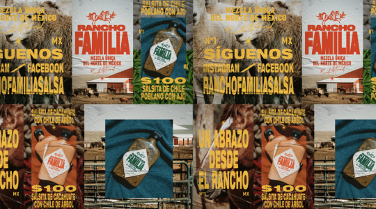
Rancho Familia by Persona Office.
#graphic design#visual inspiration#branding#visual identity#logo#label#typography#photography#packaging
92 notes
·
View notes
Text

Yam Bowl Brand vintage crate label.
#vintage illustration#vintage labels#crate labels#vintage crate labvels#typography#vintage typography#vegetables#fruits#fruits & vegetables#yams#package design#vintage packaging#sweet potatoes
13 notes
·
View notes
Last Seen Blogs

phattone
phatt

uniqueradiance
Unique Radiance

maisonezekiel
ΣzéκieΓ

strangears
Le blog qui réévalue le mauvais goût musical

miraee
매로로 ㅋ