#Writing a post on mobile is a bit frustrating because if like for example you wanted a text to be italicize you select it right?
Note
Can you go into the differences between single child timeline and multiple children timeline involving your connverse kids?
Gladly! 😁
Okay, so
Gold Timeline (multiple kids)
Steven and Connie had Ebony on their early 20's. Although they wanted to be independent, they were mentally unprepared for raising a kid (and had a little complication during Connie's pregnancy), so they moved close to where relatives can easily help them out. They did eventually move away when Ebony got a bit older (around 7 y.o.) , Rohini following soon after. They had twins in their late 20's or early 30's. (Still figuring out the actual age differences of the kids. Lol)
Steven and Connie got wed while Connie is pregnant with Rohini. They had golden wedding rings.
As one might've easily guessed, this household is noisy and rowdy. lol But they (Steven specially) did find peace in their children's chaos.
Part of my headcanon is that the older Steven and Connie had kids, the more gem-related powers the kid had. So Ebony had the least magical abilities, the twins had the most.
Connie is physically more durable than Silver timeline Connie.
Only the twins have pink tinted eyes with a vague diamond marking.
Silver Timeline (single child)
At their 30's, the two had enough time for themselves and figuring they're on a more stable situation, decided to finally have their own kid.
Connie and Steven were wed at ages 25/26. They had silver wedding rings.
Though still having close connections with the Gems and their parents, the couple never had the need to reside physically close to them.
I guess one could say they are relatively a boring family compared to the Gold timeline. Lol. The silver timeline dynamic is more mellow and subdued.
Steven is calmer than the Gold timeline Steven.
Ebony has visible dark diamond eyes.
There aren't that much details though, and I've just enumerated the ones at the top of my head because sometimes the ideas aren't listed down and tend to be forgotten. 😅
Again, I was hoping to have drawn or at least scribbled something for this but I was thinking I can just edit this post and add the scribbles some later time! 🤞
#Writing a post on mobile is a bit frustrating because if like for example you wanted a text to be italicize you select it right?#But the the copy/paste/select all bar covers the font editing menu! 😭#connverse#connverse kid#connverse kids#SU#my shiz#sc answers#ask#cooper-klebba#Yes. Connie's physicality is affected by having many kids.#Gold TL#Silver TL#Yoooo I mentioned in the tags and in a DM about my laptop having issues and now I'm being bombarded with laptop ads. O.O Like... I thought#you'd need to actually search it up for that to happen and I did not look up anything related to laptops recently???
28 notes
·
View notes
Text

(ID: an ask and response posted by the @ wip tumblr. delicatepointofviews asks, "hey, i've been using the alt text function lately, because i want my blog to be accessible, but i have to say alt text on mobile really is a pain to write. the option is hidden in a kebab menu so that i feel like half the people don't even know it exists and still type image descriptions in the captions and the box in which to input text is so small that it's almost impossible to re-view what you've written let alone fix a mistake.
for example when i try to scroll to the beginning of my text, i keep hitting cancel and closing the window which is super frustrating. i also find it annoying that you cannot at once see the image you're describing and the input box. do you have any plans to improve mobile alt text? i think this would be major in improving the accessibility of tumblr :^)"
@ wip answers: "Hello there @ delicatepointofviews! So it would be nice if we could see the image while writing alt text, but that would be a pretty big change, and we just do not have the engineering capacity for that right now. To be transparent with you, we think the hard part would be finding the team to pick it up and if this is more important than the mass of whatever work they're already doing. Personally, we feel that improving this and all accessibility features is no doubt important. And something we want to take a good look at when we have the time, space, and people power. In truth, we need a thorough plan to be able to tackle accessibility issues in the future, but right now, it's going to be a bit difficult to prioritize. That said, there may be some quick fixes we can look at to help some of the issues you've outlined here. Thanks for your question, and leave it with us. We will see what we can do in the short and longer term."
The post is signed: "—April, Caroline, Lara, Cyle, Dave and Eli (Tumblr Engineering)"
the date of the post is January 3rd of this year. end ID)
is anyone else super uncomfortable with this response. like, saying that accessibility isn't more important than the other work the engineers are doing, and that it's "difficult" to prioritize it. cuz it feels very uncomfortable to me
#text#ableism#i also like that they had 6 people respond to this and none of them thought Hey maybe we shouldnt say that accessibility isn't a priority#*for us. like.
155 notes
·
View notes
Note
hey if I were to write out something along the lines of “stop being so insanely time restrictive w ur simblreen stuff ppl have lives” would you mind rb’ing it? I don’t have a huge audience, especially when it comes to sims ppl, but between the fact that I work nights and weekends and the fact that I have multiple (mental and physical) I’m sick of people being such hardasses about time windows and doing that thing where they send the link but tell you like an expiration time that’s 12 hours later and all the BS.
I remember you talking about this (last year? year before??) and was wondering if you’d be willing to boost
tbh i’m a little wary of getting involved in any discussions about remotely controversial stuff because simblr is so on-edge lately lmao but yeah i agree that simblreen is supposed to be fun for everyone, not just fun for the 10% of people who have no real life obligations or time constraints. something i do want to point out is sometimes when links expire, it isn’t the fault of the creator, it’s just an accident. for example:
if you edit a link that you posted privately, it generates a new link and makes the old one unusable, so anyone who got that link first will be unable to access your stuff.
if your item is getting a lot of traffic, some hosting sites will temporarily disable downloads. it’s always best to have alternate download links.
private posts, or new pages on tumblr (example: softpine.tumblr.com/mainmenu – the start of my interactive game), are notorious for breaking for absolutely no reason. not only that, but they are also not visible on mobile unless you open it in a browser.
my point is that a little bit of understanding on both ends is necessary in this situation. simblreen creators can just as easily be overwhelmed and frustrated by this stuff as the people who are trying to download the content. however, in my opinion, there’s no need for anyone to create artificial expiration dates for their simblreen content. it’s meant to be enjoyed, isn’t it? so anyway, i would be happy to reblog something about this, but i wanted to throw my 2 cents in there first!
16 notes
·
View notes
Text
Quick And Easy Ideas For Web Designing
Lots of things go into websites than you may think. From planning the site to getting all the wording just right, it can be a bit overwhelming if you don't know what you're doing. Use the information in this article to help make an easier job of the process.
Make sure your website passes a test by NoScript. You can add this extension to Firefox, and then use it against your website. Some content, such as ordering systems for products, can't work without scripts, but if your site is simply blank with scripts turned off, that's bad news.
Avoid creating user interface (UI) controls that mislead your visitors. These controls include elements, widgets and more that create an interactive experience, such as a link, drop-down list or button. You do not want to make visitors think that clicking on an underlined word or phrase for example, will lead to a new page if it is not actually linked to something else. When your visitors have expectations of something working a certain way and it does not, they are more likely to assume there is something wrong with your site and leave.
Always ensure you are giving meaningful feedback, as this is what creates the communication between a website and its visitors. For example, if an action taken by a visitor results in an error, do not simply display "error occurred."� Instead, provide a message that explains what happened and how the visitor can correct the error by taking a different action. Without this feedback, visitors are more likely to grow frustrated and just give up by leaving your website.
Keep in mind that you shouldn't overuse JavaScript. For some people visiting your site, Java will cause problems instead of providing improved functionality. The major web browsers differ somewhat in functionality, and they are updated frequently. Your goal is to have as many website visitors as possible. Keep in mind that not every users keeps JavaScript enabled while they browse. This means they'll have difficulty viewing your site because of this.
Test your website before it goes live. There's nothing worse then launching your new website and having to take it down right away due to bugs or other issues. Get a group of people together who are using different web browsers and computer platforms, and ask them to use a beta version of your website, writing down any issues they come across.
If you believe your site may be accessed via mobile devices, you will want to keep your designs simple. The use of flash, excessive images, and complicated menus will not translate well to a mobile platform. Keep your page clean and simple, or create a specific mobile site for your users.
To help you design a site that is easy for people to read all the information, make sure the pages are not too wide. If the pages are not too wide then they will fit on most people's computer screens. If the page is too wide, then part of your valuable information could be left off the page.
Learn your subject. Research your subject before posting anything. If you give customers information that's no good you may lose the readers you have. Having a thorough understanding of your subject matter is vital to having a successful website.
Adobe Photoshop is a valuable software program for any dedicated web designer. Using this type of program can assist beginning web designers in creating sites that look professional, extremely quickly. Building a site from scratch can be overwhelming for amateur designers, so take advantage of design tools and programs that can do some of the heavy lifting for you.
If brand radiant have never designed a web page, try using pre-made layouts. These can easily be found online for several blogging web sites like Blogspot or Tumblr. Having an interesting layout will draw attention to content and give the site a professional look. Just make sure your layout is appealing to your target audience!
Make text easy to ready by using colors that contrast or backgrounds that are easy to read text on. When your text is harder to read because the background or text color creates eye strain or portions of text that are unreadable, site visitors are less likely to stick around.
This article provided you with a variety of website basics. Once you start playing around, you will learn more and more. Reflect back on the information you've read if you run into problems.
1 note
·
View note
Text
Why I Don’t Love Web Apps
And a call for help
I absolutely get why companies make web apps instead of native apps. Why juggle tons of platforms and languages if you don’t have to? Furthermore, being on the web makes you free from platform gatekeepers!
It can also benefit users, by giving the same experience everywhere, making more software cross-platform and accessible on more niche platforms, and more.
And if a developer has 100 hours to develop a client for their service, the user experience very well might be better if they spent all of it on a web app, instead of spending 25 hours on four different native clients.
There’s also a bunch of terrible native (or “native”) apps. One example is phone apps that simply are terrible web wrappers that just want to be able to track and notify you more than they can in a web browser. 1
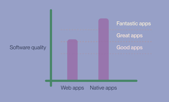
When I say that I prefer native apps, I don’t mean that there are no great web apps (like Figma) or bad native apps. My point is that the ceiling of the latter is higher, and that all the best apps I’ve tried are native.
If you haven’t read Craig Mod’s legendary essay “Fast Software, the Best Software”, I’d recommend you stop reading my piece of crap, and go read that. I also liked the post On Quality Software over at The Jolly Teapot — and I echo this quote:
It was not about convenience or efficiency, really; it was just about the details. Is there something wrong with me? No, I’m just a happy snob, and a proud one.
I’ve written about some of my favourite apps here — and I mostly like to write about stuff I like. But I just have to blow off some steam…
Hi-tech stuff, like right click
A classic example of what you lose on web apps, are right clicks. Maybe because they have to work on mobile, or just because they didn’t bother. But it makes the experience much worse, also because they have to design the UI around this limitation.
And how often have you done something in a text field, then dared to mistakenly go “back” in your browser, and lost all your text?
The app also has to combat the browser’s chrome and hotkeys. (This becomes a bit better if you save it as a “native” app through the browser or something like Unite.)
Speaking of hotkeys…
The real reason I’m writing this post now, is frustration with a specific web app, for working on subtitles. 2 And this was even supposed to be one of the good web apps!
I want to tell a bit about my journey with this app, as it highlights why I always look for native apps first.
What’s a “Mac”?
The app has three main elements:
A video player.
A bunch of text boxes, where you write the different subtitle strings.
A timeline, that shows when the different strings are shown.
How do I start playing the video? I hit space, and it plays and pauses. Nice!
But what about when I am in a text field? Then space has a different function, of course. I check the manual, and it says: Cmd + Space I assume most Mac users know why this is an extremely poor choice… 3
So I have to move Raycast to a different hotkey while working — annoying but OK. I do some editing outside the text boxes, and try to start the playback again — but it doesn’t work. Because, it turns out, Cmd + Space only works if you’re in a text box. If you’re outside it, you have to hit only Space! It’s not that Cmd + Space gets another function or anything — it just stops working. 🤷🏻♂️
The app also has a function for merging subtitles — and this is great for combining short strings. I check the manual for the hotkey, and it says Cmd + M. I press it, and my window minimises. 🤦🏻♂️
Then they made it worse.
After spending many hours with the web app, I actually found a flow that works all right (even though several hotkeys straight up don’t work).
I found out that I can keep my hands on the keyboard, and off the trackpad, by using Tab. When I’m in a subtitle text box, this key takes me to the next one — and it also moves the video playback to the beginning of the subtitle string. Shift + Tab takes me back — so I can do a quick Shift + Tab | Tab to start the same snippet again.
But today, something had changed… 4 Here’s what happened:
I’m in a text box, and start the playback with Cmd + Space. (Raycast turned off, like always.)
The playback passes the end point of the subtitle string I was editing.
I try to hit tab, to go to the next string. But when the playback went past, the focus was no longer in the text box. So now, hitting tab just sent me around the web UI!
My one workflow that wasn’t terrible was broken, and my hatred for web apps refuelled.
I just feel so much friction and paper-cuts while working in most web apps… I know that part of it is because I’m a snob — but can someone please help a snob out? Is there an app (paid is OK) for working with subtitles that doesn’t suck? Please… Even though writing this post in Ulysses has soothed my soul a bit.
No ad-blockers for you! ↩︎
I don’t feel the need to name it, as that’s not the point. ↩︎
Because that launches Spotlight/Raycast/Alfred and other launchers. ↩︎
And it’s the same in WebKit, Chromium and Gecko. ↩︎
0 notes
Text
Quick And Easy Ideas For Web Designing
Lots of things go into websites than you may think. From planning the site to getting all the wording just right, it can be a bit overwhelming if you don't know what you're doing. Use the information in this article to help make an easier job of the process.
Make sure your website passes a test by NoScript. You can add this extension to Firefox, and then use it against your website. Some content, such as ordering systems for products, can't work without scripts, but if your site is simply blank with scripts turned off, that's bad news.
Avoid creating user interface (UI) controls that mislead your visitors. These controls include elements, widgets and more that create an interactive experience, such as a link, drop-down list or button. You do not want to make visitors think that clicking on an underlined word or phrase for example, will lead to a new page if it is not actually linked to something else. When your visitors have expectations of something working a certain way and it does not, they are more likely to assume there is something wrong with your site and leave.
Always ensure you are giving meaningful feedback, as this is what creates the communication between a website and its visitors. For example, if an action taken by a visitor results in an error, do not simply display "error occurred."� Instead, provide a message that explains what happened and how the visitor can correct the error by taking a different action. Without this feedback, visitors are more likely to grow frustrated and just give up by leaving your website.
Keep in mind that you shouldn't overuse JavaScript. For some people visiting your site, Java will cause problems instead of providing improved functionality. The major web browsers differ somewhat in functionality, and they are updated frequently. Your goal is to have as many website visitors as possible. Keep in mind that not every users keeps JavaScript enabled while they browse. This means they'll have difficulty viewing your site because of this.
Test your website before it goes live. There's nothing worse then launching your new website and having to take it down right away due to bugs or other issues. Get a group of people together who are using different web browsers and computer platforms, and ask them to use a beta version of your website, writing down any issues they come across.
If you believe your site may be accessed via mobile devices, you will want to keep your designs simple. The use of flash, excessive images, and complicated menus will not translate well to a mobile platform. Keep your page clean and simple, or create a specific mobile site for your users.
To help you design a site that is easy for people to read all the information, make sure the pages are not too wide. If the pages are not too wide then they will fit on most people's computer screens. If the page is too wide, then part of your valuable information could be left off the page.
Learn your subject. Research your subject before posting anything. If you give customers information that's no good you may lose the readers you have. Having a thorough understanding of your subject matter is vital to having a successful website.
Adobe Photoshop is a valuable software program for any dedicated web designer. Using Clínica de Reabilitação em Ilhéus of program can assist beginning web designers in creating sites that look professional, extremely quickly. Building a site from scratch can be overwhelming for amateur designers, so take advantage of design tools and programs that can do some of the heavy lifting for you.
If you have never designed a web page, try using pre-made layouts. These can easily be found online for several blogging web sites like Blogspot or Tumblr. Having an interesting layout will draw attention to content and give the site a professional look. Just make sure your layout is appealing to your target audience!
Make text easy to ready by using colors that contrast or backgrounds that are easy to read text on. When your text is harder to read because the background or text color creates eye strain or portions of text that are unreadable, site visitors are less likely to stick around.
This article provided you with a variety of website basics. Once you start playing around, you will learn more and more. Reflect back on the information you've read if you run into problems.
1 note
·
View note
Text
Quick And Easy Ideas For Web Designing
Lots of things go into websites than you may think. From planning the site to getting all the wording just right, it can be a bit overwhelming if you don't know what you're doing. Use the information in this article to help make an easier job of the process.
Make sure your website passes a test by NoScript. You can add this extension to Firefox, and then use it against your website. Some content, such as ordering systems for products, can't work without scripts, but if your site is simply blank with scripts turned off, that's bad news.
Avoid creating user interface (UI) controls that mislead your visitors. These controls include elements, widgets and more that create an interactive experience, such as a link, drop-down list or button. You do not want to make visitors think that clicking on an underlined word or phrase for example, will lead to a new page if it is not actually linked to something else. When your visitors have expectations of something working a certain way and it does not, they are more likely to assume there is something wrong with your site and leave.
Always ensure you are giving meaningful feedback, as this is what creates the communication between a website and its visitors. For example, if an action taken by a visitor results in an error, do not simply display "error occurred."� Instead, provide a message that explains what happened and how the visitor can correct the error by taking a different action. Without this feedback, visitors are more likely to grow frustrated and just give up by leaving your website.
Keep in mind that you shouldn't overuse JavaScript. For some people visiting your site, Java will cause problems instead of providing improved functionality. The major web browsers differ somewhat in functionality, and they are updated frequently. Your goal is to have as many website visitors as possible. Keep in mind that not every users keeps JavaScript enabled while they browse. This means they'll have difficulty viewing your site because of this.
Test your website before it goes live. There's nothing worse then launching your new website and having to take it down right away due to bugs or other issues. Get a group of people together who are using different web browsers and computer platforms, and ask them to use a beta version of your website, writing down any issues they come across.
If you believe your site may be accessed via mobile devices, you will want to keep your designs simple. The use of flash, excessive images, and complicated menus will not translate well to a mobile platform. Keep your page clean and simple, or create a specific mobile site for your users.
To help you design a site that is easy for people to read all the information, make sure the pages are not too wide. If the pages are not too wide then they will fit on most people's computer screens. If the page is too wide, then part of your valuable information could be left off the page.
Learn your subject. Research your subject before posting anything. If you give customers information that's no good you may lose the readers you have. Having a thorough understanding of your subject matter is vital to having a successful website.
Adobe Photoshop is a valuable software program for any dedicated web designer. Using this type of program can assist beginning web designers in creating sites that look professional, extremely quickly. Building a site from scratch can be overwhelming for amateur designers, so take advantage of design tools and programs that can do some of the heavy lifting for you.
If you have never designed a web page, try using pre-made layouts. These can easily be found online for several blogging web sites like Blogspot or Tumblr. Having an interesting layout will draw attention to content and give the site a professional look. Just make sure your layout is appealing to your target audience!
Make text easy to ready by using colors that contrast or backgrounds that are easy to read text on. When your text is harder to read because the background or text color creates eye strain or portions of text that are unreadable, site visitors are less likely to stick around.
Smm Panel provided you with a variety of website basics. Once you start playing around, you will learn more and more. Reflect back on the information you've read if you run into problems.
0 notes
Text
Quick And Easy Ideas For Web Designing
Lots of things go into websites than you may think. From planning the site to getting all the wording just right, it can be a bit overwhelming if you don't know what you're doing. Use the information in this article to help make an easier job of the process.
Make sure your website passes a test by NoScript. Smm Panel can add this extension to Firefox, and then use it against your website. Some content, such as ordering systems for products, can't work without scripts, but if your site is simply blank with scripts turned off, that's bad news.
Avoid creating user interface (UI) controls that mislead your visitors. These controls include elements, widgets and more that create an interactive experience, such as a link, drop-down list or button. You do not want to make visitors think that clicking on an underlined word or phrase for example, will lead to a new page if it is not actually linked to something else. When your visitors have expectations of something working a certain way and it does not, they are more likely to assume there is something wrong with your site and leave.
Always ensure you are giving meaningful feedback, as this is what creates the communication between a website and its visitors. For example, if an action taken by a visitor results in an error, do not simply display "error occurred."� Instead, provide a message that explains what happened and how the visitor can correct the error by taking a different action. Without this feedback, visitors are more likely to grow frustrated and just give up by leaving your website.
Keep in mind that you shouldn't overuse JavaScript. For some people visiting your site, Java will cause problems instead of providing improved functionality. The major web browsers differ somewhat in functionality, and they are updated frequently. Your goal is to have as many website visitors as possible. Keep in mind that not every users keeps JavaScript enabled while they browse. This means they'll have difficulty viewing your site because of this.
Test your website before it goes live. There's nothing worse then launching your new website and having to take it down right away due to bugs or other issues. Get a group of people together who are using different web browsers and computer platforms, and ask them to use a beta version of your website, writing down any issues they come across.
If you believe your site may be accessed via mobile devices, you will want to keep your designs simple. The use of flash, excessive images, and complicated menus will not translate well to a mobile platform. Keep your page clean and simple, or create a specific mobile site for your users.
To help you design a site that is easy for people to read all the information, make sure the pages are not too wide. If the pages are not too wide then they will fit on most people's computer screens. If the page is too wide, then part of your valuable information could be left off the page.
Learn your subject. Research your subject before posting anything. If you give customers information that's no good you may lose the readers you have. Having a thorough understanding of your subject matter is vital to having a successful website.
Adobe Photoshop is a valuable software program for any dedicated web designer. Using this type of program can assist beginning web designers in creating sites that look professional, extremely quickly. Building a site from scratch can be overwhelming for amateur designers, so take advantage of design tools and programs that can do some of the heavy lifting for you.
If you have never designed a web page, try using pre-made layouts. These can easily be found online for several blogging web sites like Blogspot or Tumblr. Having an interesting layout will draw attention to content and give the site a professional look. Just make sure your layout is appealing to your target audience!
Make text easy to ready by using colors that contrast or backgrounds that are easy to read text on. When your text is harder to read because the background or text color creates eye strain or portions of text that are unreadable, site visitors are less likely to stick around.
This article provided you with a variety of website basics. Once you start playing around, you will learn more and more. Reflect back on the information you've read if you run into problems.
0 notes
Text
Quick And Easy Ideas For Web Designing
Lots of things go into websites than you may think. From planning the site to getting all the wording just right, it can be a bit overwhelming if you don't know what you're doing. Use the information in this article to help make an easier job of the process.
Make sure your website passes a test by NoScript. You can add this extension to Firefox, and then use it against your website. Some content, such as ordering systems for products, can't work without scripts, but if your site is simply blank with scripts turned off, that's bad news.
Avoid creating user interface (UI) controls that mislead your visitors. These controls include elements, widgets and more that create an interactive experience, such as a link, drop-down list or button. You do not want to make visitors think that clicking on an underlined word or phrase for example, will lead to a new page if it is not actually linked to something else. When your visitors have expectations of something working a certain way and it does not, they are more likely to assume there is something wrong with your site and leave.
Always ensure you are giving meaningful feedback, as this is what creates the communication between a website and its visitors. For example, if an action taken by a visitor results in an error, do not simply display "error occurred."� Instead, provide a message that explains what happened and how the visitor can correct the error by taking a different action. Without this feedback, visitors are more likely to grow frustrated and just give up by leaving your website.
Keep in mind that you shouldn't overuse JavaScript. For some people visiting your site, Java will cause problems instead of providing improved functionality. The major web browsers differ somewhat in functionality, and they are updated frequently. Your goal is to have as many website visitors as possible. Keep in mind that not every users keeps JavaScript enabled while they browse. This means they'll have difficulty viewing your site because of this.
Test your website before it goes live. There's nothing worse then launching your new website and having to take it down right away due to bugs or other issues. Get a group of people together who are using different web browsers and computer platforms, and ask them to use a beta version of your website, writing down any issues they come across.
If you believe your site may be accessed via mobile devices, you will want to keep your designs simple. The use of flash, excessive images, and complicated menus will not translate well to a mobile platform. Keep your page clean and simple, or create a specific mobile site for your users.
To help you design a site that is easy for people to read all the information, make sure the pages are not too wide. If the pages are not too wide then they will fit on most people's computer screens. If the page is too wide, then part of your valuable information could be left off the page.
Learn your subject. Research your subject before posting anything. If you give customers information that's no good you may lose the readers you have. Having https://tudepartamentoweb.es/ of your subject matter is vital to having a successful website.
Adobe Photoshop is a valuable software program for any dedicated web designer. Using this type of program can assist beginning web designers in creating sites that look professional, extremely quickly. Building a site from scratch can be overwhelming for amateur designers, so take advantage of design tools and programs that can do some of the heavy lifting for you.
If you have never designed a web page, try using pre-made layouts. These can easily be found online for several blogging web sites like Blogspot or Tumblr. Having an interesting layout will draw attention to content and give the site a professional look. Just make sure your layout is appealing to your target audience!
Make text easy to ready by using colors that contrast or backgrounds that are easy to read text on. When your text is harder to read because the background or text color creates eye strain or portions of text that are unreadable, site visitors are less likely to stick around.
This article provided you with a variety of website basics. Once you start playing around, you will learn more and more. Reflect back on the information you've read if you run into problems.
1 note
·
View note
Text
Quick And Easy Ideas For Web Designing
Lots of things go into websites than you may think. From planning the site to getting all the wording just right, it can be a bit overwhelming if you don't know what you're doing. Use the information in this article to help make an easier job of the process.
Make sure your website passes a test by NoScript. You can add this extension to Firefox, and then use it against your website. Some content, such as ordering systems for products, can't work without scripts, but if your site is simply blank with scripts turned off, that's bad news.
Avoid creating user interface (UI) controls that mislead your visitors. These controls include elements, widgets and more that create an interactive experience, such as a link, drop-down list or button. You do not want to make visitors think that clicking on an underlined word or phrase for example, will lead to a new page if it is not actually linked to something else. When your visitors have expectations of something working a certain way and it does not, they are more likely to assume there is something wrong with your site and leave.
Always ensure you are giving meaningful feedback, as this is what creates the communication between a website and its visitors. For example, if an action taken by a visitor results in an error, do not simply display "error occurred."� Instead, provide a message that explains what happened and how the visitor can correct the error by taking a different action. Without this feedback, visitors are more likely to grow frustrated and just give up by leaving your website.
Keep in mind that you shouldn't overuse JavaScript. For some people visiting your site, Java will cause problems instead of providing improved functionality. The major web browsers differ somewhat in functionality, and they are updated frequently. Your goal is to have as many website visitors as possible. Keep in mind that not every users keeps JavaScript enabled while they browse. This means they'll have difficulty viewing your site because of this.
Test your website before it goes live. There's nothing worse then launching your new website and having to take it down right away due to bugs or other issues. Get a group of people together who are using different web browsers and computer platforms, and ask them to use a beta version of your website, writing down any issues they come across.
If you believe your site may be accessed via mobile devices, you will want to keep your designs simple. Gudanglagu321.site of flash, excessive images, and complicated menus will not translate well to a mobile platform. Keep your page clean and simple, or create a specific mobile site for your users.
To help you design a site that is easy for people to read all the information, make sure the pages are not too wide. If the pages are not too wide then they will fit on most people's computer screens. If the page is too wide, then part of your valuable information could be left off the page.
Learn your subject. Research your subject before posting anything. If you give customers information that's no good you may lose the readers you have. Having a thorough understanding of your subject matter is vital to having a successful website.
Adobe Photoshop is a valuable software program for any dedicated web designer. Using this type of program can assist beginning web designers in creating sites that look professional, extremely quickly. Building a site from scratch can be overwhelming for amateur designers, so take advantage of design tools and programs that can do some of the heavy lifting for you.
If you have never designed a web page, try using pre-made layouts. These can easily be found online for several blogging web sites like Blogspot or Tumblr. Having an interesting layout will draw attention to content and give the site a professional look. Just make sure your layout is appealing to your target audience!
Make text easy to ready by using colors that contrast or backgrounds that are easy to read text on. When your text is harder to read because the background or text color creates eye strain or portions of text that are unreadable, site visitors are less likely to stick around.
This article provided you with a variety of website basics. Once you start playing around, you will learn more and more. Reflect back on the information you've read if you run into problems.
0 notes
Text
Quick And Easy Ideas For Web Designing
Lots of things go into websites than you may think. From planning the site to getting all the wording just right, it can be a bit overwhelming if you don't know what you're doing. Use the information in this article to help make an easier job of the process.
Make sure your website passes a test by NoScript. You can add this extension to Firefox, and then use it against your website. Some content, such as ordering systems for products, can't work without scripts, but if your site is simply blank with scripts turned off, that's bad news.
Avoid creating user interface (UI) controls that mislead your visitors. These controls include elements, widgets and more that create an interactive experience, such as a link, drop-down list or button. You do not want to make visitors think that clicking on an underlined word or phrase for example, will lead to a new page if it is not actually linked to something else. When your visitors have expectations of something working a certain way and it does not, they are more likely to assume there is something wrong with your site and leave.
Always ensure you are giving meaningful feedback, as this is what creates the communication between a website and its visitors. For example, if an action taken by a visitor results in an error, do not simply display "error occurred."� Instead, provide a message that explains what happened and how the visitor can correct the error by taking a different action. Without this feedback, visitors are more likely to grow frustrated and just give up by leaving your website.
Keep in mind that you shouldn't overuse JavaScript. For some people visiting your site, Java will cause problems instead of providing improved functionality. The major web browsers differ somewhat in functionality, and they are updated frequently. Your goal is to have as many website visitors as possible. Keep in mind that not every users keeps JavaScript enabled while they browse. This means they'll have difficulty viewing your site because of this.
Test your website before it goes live. There's nothing worse then launching your new website and having to take it down right away due to bugs or other issues. Get a group of people together who are using different web browsers and computer platforms, and ask them to use a beta version of your website, writing down any issues they come across.
If you believe your site may be accessed via mobile devices, you will want to keep your designs simple. The use of flash, excessive images, and complicated menus will not translate well to a mobile platform. Keep your page clean and simple, or create a specific mobile site for your users.
To help you design a site that is easy for people to read all the information, make sure the pages are not too wide. If the pages are not too wide then they will fit on most people's computer screens. If the page is too wide, then part of your valuable information could be left off the page.
Learn your subject. Research your subject before posting anything. If you give customers information that's no good you may lose the readers you have. Having a thorough understanding of your subject matter is vital to having a successful website.
Adobe Photoshop is a valuable software program for any dedicated web designer. Using this type of program can assist beginning web designers in creating sites that look professional, extremely quickly. Building a site from scratch can be overwhelming for amateur designers, so take advantage of design tools and programs that can do some of the heavy lifting for you.
If you have never designed a web page, try using pre-made layouts. These can easily be found online for several blogging web sites like Blogspot or Tumblr. Having an interesting layout will draw attention to content and give the site a professional look. Just make sure resep makanan is appealing to your target audience!
Make text easy to ready by using colors that contrast or backgrounds that are easy to read text on. When your text is harder to read because the background or text color creates eye strain or portions of text that are unreadable, site visitors are less likely to stick around.
This article provided you with a variety of website basics. Once you start playing around, you will learn more and more. Reflect back on the information you've read if you run into problems.
1 note
·
View note
Text
Quick And Easy Ideas For Web Designing
Lots of things go into websites than you may think. From planning the site to getting all the wording just right, it can be a bit overwhelming if you don't know what you're doing. Use the information in this article to help make an easier job of the process.
Make sure your website passes a test by NoScript. You can add this extension to Firefox, and then use it against your website. Some content, such as ordering systems for products, can't work without scripts, but if your site is simply blank with scripts turned off, that's bad news.
Avoid creating user interface (UI) controls that mislead your visitors. These controls include elements, widgets and more that create an interactive experience, such as a link, drop-down list or button. You do not want to make visitors think that clicking on an underlined word or phrase for example, will lead to a new page if it is not actually linked to something else. When your visitors have expectations of something working a certain way and it does not, they are more likely to assume there is something wrong with your site and leave.
Always ensure you are giving meaningful feedback, as this is what creates the communication between a website and its visitors. For example, if an action taken by a visitor results in an error, do not simply display "error occurred."� Instead, provide a message that explains what happened and how the visitor can correct the error by taking a different action. Without this feedback, visitors are more likely to grow frustrated and just give up by leaving your website.
Keep in mind that you shouldn't overuse JavaScript. For some people visiting your site, Java will cause problems instead of providing improved functionality. The major web browsers differ somewhat in functionality, and they are updated frequently. Your goal is to have as many website visitors as possible. Keep in mind that not every users keeps JavaScript enabled while they browse. This means they'll have difficulty viewing your site because of this.
Test your website before it goes live. There's nothing worse then launching your new website and having to take it down right away due to bugs or other issues. Get a group of people together who are using different web browsers and computer platforms, and ask them to use a beta version of your website, writing down any issues they come across.
If you believe your site may be accessed via mobile devices, you will want to keep your designs simple. The use of flash, excessive images, and complicated menus will not translate well to a mobile platform. Keep your page clean and simple, or create a specific mobile site for your users.
To help you design a site that is easy for people to read all the information, make sure the pages are not too wide. If the pages are not too wide then they will fit on most people's computer screens. If the page is too wide, then part of your valuable information could be left off the page.
Learn your subject. Research your subject before posting anything. If you give customers information that's no good you may lose the readers you have. Having a thorough understanding of your subject matter is vital to having a successful website.
Adobe Photoshop is a valuable software program for any dedicated web designer. Using this type of program can assist beginning web designers in creating sites that look professional, extremely quickly. Building a site from scratch can be overwhelming for amateur designers, so take advantage of design tools and programs that can do some of the heavy lifting for you.
If you have never designed a web page, try using pre-made layouts. These can easily be found online for several blogging web sites like Blogspot or Tumblr. Having an interesting layout will draw attention to content and give the site a professional look. Just make sure your layout is appealing to your target audience!
Make text easy to ready by using colors that contrast or backgrounds that are easy to read text on. When your text is harder to read because the background or text color creates eye strain or portions of text that are unreadable, site visitors are less likely to stick around.
This article provided you with a variety of website basics. Once you start playing around, you will learn more and more. Reflect back on www longliqicn cn login 've read if you run into problems.
1 note
·
View note
Text
Quick And Easy Ideas For Web Designing
Lots of things go into websites than you may think. From planning the site to getting all the wording just right, it can be a bit overwhelming if you don't know what you're doing. Use the information in this article to help make an easier job of the process.
Make sure your website passes a test by NoScript. You can add this extension to Firefox, and then use it against your website. Some content, such as ordering systems for products, can't work without scripts, but if your site is simply blank with scripts turned off, that's bad news.
Avoid creating user interface (UI) controls that mislead your visitors. These controls include elements, widgets and more that create an interactive experience, such as a link, drop-down list or button. You do not want to make visitors think that clicking on an underlined word or phrase for example, will lead to a new page if it is not actually linked to something else. When your visitors have expectations of something working a certain way and it does not, they are more likely to assume there is something wrong with your site and leave.
Always ensure you are giving meaningful feedback, as this is what creates the communication between a website and its visitors. For example, if an action taken by a visitor results in an error, do not simply display "error occurred."� Instead, provide a message that explains what happened and how the visitor can correct the error by taking a different action. Without this feedback, visitors are more likely to grow frustrated and just give up by leaving your website.
Keep in mind that you shouldn't overuse JavaScript. For some people visiting your site, Java will cause problems instead of providing improved functionality. The major web browsers differ somewhat in functionality, and they are updated frequently. Your goal is to have as many website visitors as possible. Keep in mind that not every users keeps JavaScript enabled while they browse. This means they'll have difficulty viewing your site because of this.
Test your website before it goes live. There's nothing worse then launching your new website and having to take it down right away due to bugs or other issues. Get a group of people together who are using different web browsers and computer platforms, and ask them to use a beta version of your website, writing down any issues they come across.
If you believe your site may be accessed via mobile devices, you will want to keep your designs simple. The use of flash, excessive images, and complicated menus will not translate well to a mobile platform. Keep your page clean and simple, or create a specific mobile site for your users.
To help you design a site that is easy for people to read all the information, make sure the pages are not too wide. If the pages are not too wide then they will fit on most people's computer screens. If the page is too wide, then part of your valuable information could be left off the page.
Learn your subject. 스포츠중계 before posting anything. If you give customers information that's no good you may lose the readers you have. Having a thorough understanding of your subject matter is vital to having a successful website.
Adobe Photoshop is a valuable software program for any dedicated web designer. Using this type of program can assist beginning web designers in creating sites that look professional, extremely quickly. Building a site from scratch can be overwhelming for amateur designers, so take advantage of design tools and programs that can do some of the heavy lifting for you.
If you have never designed a web page, try using pre-made layouts. These can easily be found online for several blogging web sites like Blogspot or Tumblr. Having an interesting layout will draw attention to content and give the site a professional look. Just make sure your layout is appealing to your target audience!
Make text easy to ready by using colors that contrast or backgrounds that are easy to read text on. When your text is harder to read because the background or text color creates eye strain or portions of text that are unreadable, site visitors are less likely to stick around.
This article provided you with a variety of website basics. Once you start playing around, you will learn more and more. Reflect back on the information you've read if you run into problems.
1 note
·
View note
Text
Quick And Easy Ideas For Web Designing
Lots of things go into websites than you may think. From planning the site to getting all the wording just right, it can be a bit overwhelming if you don't know what you're doing. Use the information in this article to help make an easier job of the process.
Make sure your website passes a test by NoScript. You can add this extension to Firefox, and then use it against your website. Some content, such as ordering systems for products, can't work without scripts, but if your site is simply blank with scripts turned off, that's bad news.
Avoid creating user interface (UI) controls that mislead your visitors. These controls include elements, widgets and more that create an interactive experience, such as a link, drop-down list or button. You do not want to make visitors think that clicking on an underlined word or phrase for example, will lead to a new page if it is not actually linked to something else. When your visitors have expectations of something working a certain way and it does not, they are more likely to assume there is something wrong with your site and leave.
Always ensure you are giving meaningful feedback, as this is what creates the communication between a website and its visitors. For example, if an action taken by a visitor results in an error, do not simply display "error occurred."� Instead, provide a message that explains what happened and how the visitor can correct the error by taking a different action. Without this feedback, visitors are more likely to grow frustrated and just give up by leaving your website.
Keep in mind that you shouldn't overuse JavaScript. For some people visiting your site, Java will cause problems instead of providing improved functionality. 무료스포츠중계 differ somewhat in functionality, and they are updated frequently. Your goal is to have as many website visitors as possible. Keep in mind that not every users keeps JavaScript enabled while they browse. This means they'll have difficulty viewing your site because of this.
Test your website before it goes live. There's nothing worse then launching your new website and having to take it down right away due to bugs or other issues. Get a group of people together who are using different web browsers and computer platforms, and ask them to use a beta version of your website, writing down any issues they come across.
If you believe your site may be accessed via mobile devices, you will want to keep your designs simple. The use of flash, excessive images, and complicated menus will not translate well to a mobile platform. Keep your page clean and simple, or create a specific mobile site for your users.
To help you design a site that is easy for people to read all the information, make sure the pages are not too wide. If the pages are not too wide then they will fit on most people's computer screens. If the page is too wide, then part of your valuable information could be left off the page.
Learn your subject. Research your subject before posting anything. If you give customers information that's no good you may lose the readers you have. Having a thorough understanding of your subject matter is vital to having a successful website.
Adobe Photoshop is a valuable software program for any dedicated web designer. Using this type of program can assist beginning web designers in creating sites that look professional, extremely quickly. Building a site from scratch can be overwhelming for amateur designers, so take advantage of design tools and programs that can do some of the heavy lifting for you.
If you have never designed a web page, try using pre-made layouts. These can easily be found online for several blogging web sites like Blogspot or Tumblr. Having an interesting layout will draw attention to content and give the site a professional look. Just make sure your layout is appealing to your target audience!
Make text easy to ready by using colors that contrast or backgrounds that are easy to read text on. When your text is harder to read because the background or text color creates eye strain or portions of text that are unreadable, site visitors are less likely to stick around.
This article provided you with a variety of website basics. Once you start playing around, you will learn more and more. Reflect back on the information you've read if you run into problems.
0 notes
Text
Quick And Easy Ideas For Web Designing
Lots of things go into websites than you may think. From planning the site to getting all the wording just right, it can be a bit overwhelming if you don't know what you're doing. Use the information in this article to help make an easier job of the process.
Make sure your website passes a test by NoScript. You can add this extension to Firefox, and then use it against your website. Some content, such as ordering systems for products, can't work without scripts, but if your site is simply blank with scripts turned off, that's bad news.
Avoid creating user interface (UI) controls that mislead your visitors. These controls include elements, widgets and more that create an interactive experience, such as a link, drop-down list or button. You do not want to make visitors think that clicking on an underlined word or phrase for example, will lead to a new page if it is not actually linked to something else. When your visitors have expectations of something working a certain way and it does not, they are more likely to assume there is something wrong with your site and leave.
Always ensure ss iptv brasil are giving meaningful feedback, as this is what creates the communication between a website and its visitors. For example, if an action taken by a visitor results in an error, do not simply display "error occurred."� Instead, provide a message that explains what happened and how the visitor can correct the error by taking a different action. Without this feedback, visitors are more likely to grow frustrated and just give up by leaving your website.
Keep in mind that you shouldn't overuse JavaScript. For some people visiting your site, Java will cause problems instead of providing improved functionality. The major web browsers differ somewhat in functionality, and they are updated frequently. Your goal is to have as many website visitors as possible. Keep in mind that not every users keeps JavaScript enabled while they browse. This means they'll have difficulty viewing your site because of this.
Test your website before it goes live. There's nothing worse then launching your new website and having to take it down right away due to bugs or other issues. Get a group of people together who are using different web browsers and computer platforms, and ask them to use a beta version of your website, writing down any issues they come across.
If you believe your site may be accessed via mobile devices, you will want to keep your designs simple. The use of flash, excessive images, and complicated menus will not translate well to a mobile platform. Keep your page clean and simple, or create a specific mobile site for your users.
To help you design a site that is easy for people to read all the information, make sure the pages are not too wide. If the pages are not too wide then they will fit on most people's computer screens. If the page is too wide, then part of your valuable information could be left off the page.
Learn your subject. Research your subject before posting anything. If you give customers information that's no good you may lose the readers you have. Having a thorough understanding of your subject matter is vital to having a successful website.
Adobe Photoshop is a valuable software program for any dedicated web designer. Using this type of program can assist beginning web designers in creating sites that look professional, extremely quickly. Building a site from scratch can be overwhelming for amateur designers, so take advantage of design tools and programs that can do some of the heavy lifting for you.
If you have never designed a web page, try using pre-made layouts. These can easily be found online for several blogging web sites like Blogspot or Tumblr. Having an interesting layout will draw attention to content and give the site a professional look. Just make sure your layout is appealing to your target audience!
Make text easy to ready by using colors that contrast or backgrounds that are easy to read text on. When your text is harder to read because the background or text color creates eye strain or portions of text that are unreadable, site visitors are less likely to stick around.
This article provided you with a variety of website basics. Once you start playing around, you will learn more and more. Reflect back on the information you've read if you run into problems.
1 note
·
View note
Text
Writing Toph Beifong, Advice from a Blind Writer
I’m Mimzy, an actual visually impaired writer and blogger who talks a lot about writing blind characters accurately and sensitively. A while back someone sent me an anon asking how to write Toph more accurately and sensitively.
Anonymous asked: Hi there! Your blog has been super-helpful already - I thought I knew a bit about writing with blind characters, but it turns out there was a lot to learn - but this is more specific. I'm writing a The Last Airbender fanfiction, and one of the characters is Toph. I think the fandom has done a fairly good job of respecting her blindness, but what are some things you'd like to see when people write her? I want to represent the character as best as possible; thanks in advance!
It’s taken a while for me to answer because I have a lot of thoughts about it as both a blind writer and someone who has read a lot of atla fanfiction. So here we go:
Before we get started, I want to mention some things:
One: I have an entire series for writing blind characters that continues to grow with time and the most up-to-date version can be found pinned as the top post on my blog. There will be a time-stamp for when the post was last edited and a long series of links to all relevant posts on the subject.
Here’s a quick link to that post, but again, all you have to do is click my blog url and you’ll find it immediately.
Two: I’ve noticed something amazing about the atla fandom and I would like to thank you for it. I’ve noticed a lot of bloggers have taken to writing image descriptions for both the fanart and memes you post in the fandom, whether it’s OP including the description or another blogger adding it themselves. I’m not sure I’ve ever seen a fandom so consistently doing this and that’s incredible. Realizing how many different blogs were picking up this habit has warmed my heart.
I’d like to see writers use her other senses. There’s soooo so much more to her O&M (Orientation and Mobility) than earth sense.
Beyond sight and earth bending, there’s hearing, touch, smell, taste, sense of direction, hot vs cold, sense of pain, sense of where your body parts are in relation to the rest of you, sense of internal well-being, etc. Before Toph had mastery of her earth bending, she had to have mastery of those too.
Toph also must have very strong opinions about certain smells, sounds, tastes, and textures. Toph is opinionated about everything, and when so much of your understanding of the world depends on senses that most people are ignoring in favor of some other sense you don’t have, it gets frustrating. I’m sure that tree looks pretty but the smell is terrible. Who cares if this fabric looks pretty, it’s scratchy, do. not. like. at. all.
But also in positive ways too. Oh, that flower arrangement looks bland and monochromatic? Who cares, it smells sweet and honey-like. Weird dark cavern with high ceiling and no light? The harmonics are awesome.
Every character probably has a certain sight or image they’re particularly fond of: Katara watching snow fall, or Aang enjoying how small the world looks from up on Appa, or Zuko enjoying the sunrise every morning during meditation. In that line, Toph must have some things personal to her that she enjoys.
I imagine she likes the taste of foods familiar to her childhood, the smell of whatever flowers grew around her home, and the texture of certain kinds of dirt Example: loose dirt probably isn’t the best for seeing, but I think she would enjoy how it feels to run her fingers through it or maybe enjoy the way it softens her perception of the world the same way sighted people like to see colorful, bright lights reflecting off puddles in the middle of rain.
If you struggle with this, that’s okay. I recommend taking some time to think about it for yourself, to find what tastes and smells and textures and sounds you enjoy the most, what makes you feel safe and at home, what brings you comfort, and relate that back to Toph.
In a Modern AU, I want to see Toph have a cane. Even in a Modern AU with bending included in the world building, I think Toph would benefit from having a cane.
The cane has a lot more function than bumping into things. A big part is that it signals to others that you are very obviously blind. Which is a big deal because sighted people are really, really bad at spotting the blind person.
(psst, please stop saying ‘the blank look in her eyes’ because I swear to god it’s been killing me inside for years.)
Also, even in an AU with bending, I think Toph would like the advantage of tapping her cane to create a stronger, more distinct vibration than a small shifting of her weight on her feet. It would have more control.
You could give Toph a guide animal, buuuuuuut, um, Toph is not a guide dog person. Like, there are some people who definitely prefer a guide dog, and some people who definitely prefer a cane, and some who definitely prefer no mobility device at all. Toph does not have the vibes of someone who wants to be both responsible and reliant on an animal when she’s so insistent that she can take care of herself on her own. Toph likes animals, but not that much.
Although, yeah, only 10% of the blind community use mobility devices, so cane and guide dog users are the minority of the blind community, but I stand by the vibe that Toph would love the independence of a cane. Also, it’s almost never ever done. Modern AUs never seem to touch much on Toph’s O&M skills with canes or guide dogs.
I wrote a whole post on everything you need to know about canes, what orientation and mobility is, how you learn O&M, what kind of canes exist, how to use them, how to describe the sensory input a cane gives you, and everything I know about guide dogs from past research.
Honestly, you could give Toph (or any blind character) a cane in any AU, because I fully stand by the theory that canes are a piece of technology that has been invented, lost, and reinvented again and again.
I wrote “I found a piece of lost blindness history” a few months ago after a visit to see my grandparents. My grandmother told me how her blind aunt found a way to write letters by hand to send to my grandmother when she was a child. I speculated on how the long cane has probably been invented and then lost and then reinvented over and over again in history, as well as giving a little history on the growing popularity of guide dogs in the 20th century following World War 1.
About the “blank look in her eyes,” I have a theory to the exact cause and nature of Toph’s blindness.
I know it’s common to think that the milky green color of her eyes is why she’s blind, though I’m not sure how many realize that milky green color is caused by severe cataracts. At least, cataracts is what I assume to be the reason for the color of her eyes. However, people with cataracts still have some remaining sense of light and shadow perception.
Only 9% of the blind community is completely blind, seeing absolutely nothing. The rest have some remaining vision, even if that’s only light and shadow perception or the perception of vague movement.
The percentage of people born completely blind is even smaller.
Toph says that she’s never been able to see, which would lead me to guess that the initial cause of her blindness was a defect with the visual processing part of her brain. I also theorize that the cataracts developed slowly over her very formative years and that she likely wasn’t born with them. For that reason, I think it would have taken a few weeks or months for her parents to realize there was something wrong with her eyes.
Here is a post about the developmental years of blind children and how their life would differ from both sighted children and from someone who went blind as an adult.
What is it like to see nothing?
It’s a concept that sighted people struggle with and I completely understand. I myself didn’t understand the concept of “nothing” until someone explained it as this:
“Imagine trying to see out the back of your head.”
Which, genuinely, imagine that. Try that. Because here’s what I found. There’s no part of my body that can help perceive that. I don’t have eyes there, nor do I have a part of my brain that can process that. Because of this, there is no sense of light or dark, no shape or shadow or movement or depth that I can perceive. There is nothing.
And honestly, it gives me a headache trying to think too much about it.
Toph doesn’t see black, doesn’t have a mental image of it. When people talk about light and dark, Toph has nothing to base the concept on. The closest relation she has to that is silence versus sound, or her earth sense when she’s in the air on Appa versus when she’s on solid ground. But it’s not the same.
I would like to examine the way the show tried to describe Toph’s earth sense, that black void with ripples of white stretching from her feet and outwards. Television is a visual medium so of course their explanation of Toph’s earth sense would be visual, but that’s not what it’s actually like in her head. More accurately, it’s like touching the back of your head to something and feeling what’s solid behind it and what has more give. A wall versus a pillow for example. Slamming your hand on a flimsy table and feeling it rattle under your palm. And for someone so adept at using that sense, she feels not just the table surface under her palm, but the individual rattles down the four legs, how uneven those rattles are because the legs are carved decoratively instead of solid planks, and how the foot of each leg bumps against the ground, and how the floor vibrates in response to the impact, which she feels in both her feet and hand.
About Toph’s Relationship with Her Parents
It’s not something I see touched on much. There’s been a lot of focus on Zuko and Azula’s relationship with their parents and the abuse, as well as exploration of Sokka and Katara’s trauma with losing their mother, and Sokka looking up to his warrior father while Katara struggles with her abandonment issues.
Please don’t take this as a critique, because there are a few valid reasons for this and I would like to give you some insight on how to explore Toph’s relationship with her parents.
For starters, the show had a lot more reason to focus on Zuko and Azula’s parents, with Fire Lord Ozai being the primary villain and Zuko’s greatest abuser, and Azula’s dependent worship of her father in response to Ursa’s neglect and favoritism of Zuko, which was likely Ursa’s response to Ozai’s favoritism of Azula. Their parents are huge driving motivators for why Zuko and Azula make the decisions and mistakes they do, why they are at one point in the show the villains themselves. (And why I think Azula should get a redemption arc and some healing.)
Katara’s trauma of losing her mother and blaming herself is a huge factor in both her response to the war, her relationship with her bending, and her motherly nature with her friends. The show has to explore that. Just as it has to explore Sokka’s problems with toxic masculinity in response to being the man of his village, and his desire to be a great warrior and leader like the father he idolizes.
The show needs to explore that to make the plot move forward, and it benefits from these being two sibling sets with different responses to their upbringing and different sibling dynamics, setting them up as foils for each other.
The show also wouldn’t benefit by giving Lao and Poppy Beifong more screen time. Their established character were two nobles who kept as far out of the war as possible and prospered monetarily for it. Poppy was polite and demure and Lao liked to lead the conversation. Unless the gAang decided to return to Toph’s home, those characters had no reason to pop up anywhere in the show. And if they did, they would be a hinder to Toph and her part in the plot as both Aang’s earth bending teacher and as the greatest earth bender in the world, tossing Fire Nation soldiers eight ways to Sunday.
So truly, I understand that there’s not a whole lot of canon material (comparatively) to go off of when developing this, but I will offer some insight on what is there in canon.
Toph’s relationship with her parents is explored in that it maps out why Toph doesn’t want to be mothered by Katara, why she wants to prove how independent she is, but there’s very little on screen interaction between Toph and her parents.
Toph deeply loves her parents. I think that plays into why she doesn’t want Katara mothering her, because she has a wonderful mother at home who she loves and wants to better understand her, but she had no friends growing up and no older sister, which are the roles she needs and wants Katara to fill. If Toph wanted a mother figure, she would have latched onto Katara. Look at how Zuko never sought out another mother figure but did find a father figure in Iroh as he began to heal from his childhood trauma and separate his self image from his father’s acceptance.
Toph is in a complicated situation, she loves her parents but the way they’re raising her is hurting her in the long run. But Toph can see that their actions are because of their immense love for her. She can see how they would do anything for her. While she never had any examples of how other noble children were treated by their parents, who might have been distant or disinterested or always away for their social and work lives, she was remarkably loved by her parents. Her father put careful thought into her tutors and checked in on her progress. Her mother feared for Toph’s emotional state when she was kidnapped (even if she was incorrect about how Toph would respond), showing genuine empathy for her daughter.
I think their over protective nature became the love language Toph best understood them by, and part of her reasoning for not revealing how capable she was, was because she wanted to keep experiencing that love and care for as long as she could. But it’s not a love language she would put up with from anyone else.
I would like to point out Toph’s genuine excitement to see her mom again in the season finale of Book Two, how badly Toph wants her mom to understand and accept her for who she is.
My thoughts on what Toph can’t do: read, swim, see in the sand, fight things mid-air.
For how incredibly powerful the show makes Toph with her earth bending and the O&M she taught herself through it, they do touch on some of her weaknesses when they come up and find a useful way to showcase them.
The Serpent’s Pass was an excellent example of Toph’s vulnerability in water. From her fear of not being able to see on Katara’s ice bridge to not being able to swim and needing Suki to save her, Toph’s weaknesses putting her in danger added to the excitement and “sitting on the edge of your seat” feeling while watching the episode without turning her into someone who was helpless. She was just in a position where her normal defenses were useless.
Just like the earth benders in the metal prison in the ocean, or Katara having little water in the middle of a desert where her friends needed that water to survive more than she needed it to fight, making her vulnerable later in the show when the insect-wasp things attacked. Just like fire benders being weaker at night, or powerless during a solar eclipse, or a sighted person being lost in the dark. Those were just situations in which the tools you were accustomed to relying on could no longer help you or were taken away.
The show was clever in that it didn’t make her inability to read a direct threat to her safety, but rather as a clever plot device for her to be alone when the sand banders attacked and have to choose between fighting them to save Appa, or holding back an entire fricking building by the tiniest spire on its very top from falling into a void leading to the spirit world. It also showed her weakness to not being able to see or fight as well in sand. Which the show later made an effort to show how she’d improved on that problem in Book Three when she was surrounded by nothing but sand at Ember Island.
Like improving her ability to see in the sand, I would like to see a character teach Toph to swim, or at least float, so that she never feels helpless again. If she took the initiative to improve her sand bending so much, I’m sure she would have learn to swim eventually.
And on the note of reading, I’ve seen some speculation on how Toph could learn to read, whether it’s through using ink that has some percentage of earth mixed in, or developing the sensitivity to feel out the different weight, consistency, and texture of ink on paper.
I would like to bring your attention to Louis Braille, the blind Frenchman who invented Braille while studying at the Institut National des Jeunes Aveugles, the world’s very first school for the blind in Paris France (established 1785). Previously Louis was learning to read through a method in which each letter was pressed into the paper to leave an imprint that someone could feel out with just their fingers.
Louis Braille concluded that raised lettering was impractical because-
1. It is difficult to read, the letters had to be printed in huge font to be fully felt out and printed on thick paper.
2. Thick paper means higher quality, more expensive. Larger font means more paper is needed for a single text.
3. This made it inaccessible due to expense and the sheer volume of a text.
4. If today’s Braille books are hard to access and giant compared to traditional books, I can’t imagine how inaccessible those raised letter books really were.
The subject of Braille, the start and controversial near downfall to Institut National des Jeunes Aveugles were discussed in a post about writing a blind character during the Victorian Era.
I’ve heard others complain in the past about fantasy universes in which a sighted person invents a solution to allow the blind to read, when the most effective and longest lived method was invented by a blindman over two hundred years ago and is the standard taught in schools today.
And while I couldn’t easily explain it or how it works because I can neither read Braille nor speak Chinese, I can tell you that Chinese Braille exists and works only slightly differently from the Braille western languages use. So, again, modern AUs especially would benefit from enabling Toph to read Braille and use a computer and phone with screen reader.
But just as easily you could choose not to have her learn to read but rather have sighted people read things aloud to her. Whether it’s in a professional setting as an adult having an assistant who reads and writes for her, or as a cute, fluffy little moment between Toph and another character. Both are just as genuine to the blindness experience.
Blind Jokes
If you ever get around to reading my post about blind jokes, I’d like you to remember that it’s primarily written for people writing original characters and that Toph canonically makes blind jokes, so to take away from that would not be true to her character.
Does Toph’s Earth Sense Negate her Blindness?
It’s a question I’ve seen raised before and discussed by both abled, disabled, and blind people. There are multiple perspectives on it, but my own take on it is that Toph’s earth bending does not negate her blindness, but rather functions very much like the process of learning to use a cane.
She had a tool, a teacher, and she learned to use that tool. Instead of a cane, it was seismic perception and her teacher were blind badger-moles. She spent years learning to earth bend as they do and then continued to take it to new heights as she explored fighting with it on her terms against sighted fighters.
Come to think about it, I would love to see Toph teach another visually impaired or blind earth bender who to see and bend as she does.
Is Toph Good Blindness Representation?
This question was posed to me in the comments of my master post, and my answer was something like this: “Toph is good representation, but she can't be the only type of representation we get. She's the best we had 15 years ago, but there are a million ways to nuance the blindness experiences. Toph's experience being born blind, having very over protective parents, being a small girl in a patriarical and wealth influenced society, having no friends growing up. Those are all great aspects of blindness to show, but there is so much more to explore. As for her blindness and whether or not that's negated, that's also nuanced. She has limits, she's not all-powerful, but she is the best earth bender hands down. More or less, I love Toph, she's a great character, give me like a million more blind characters who are completely different from her.”
I want to see accurate and well-written blind characters become much more common in modern media, and that’s why I started this blog. So if you decide you want to write your own blind character from scratch, feel free to come back and look at some of my other stuff.
End Notes:
I want to thank the anon who sent the original question because it never occurred to me how much the atla fandom would benefit from a post like this.
You should follow my blog. Along with advice about writing blind characters, I write general writing advice and answer questions about writing, college, plot development, character analysis, and living with blindness. I curate writing advice from fellow writeblrs, write my own image descriptions for writing memes, post about mental health and working/living with ADHD, disabilities outside of blindness, and LGBTQA+ topics.
#avatar the last airbender#toph beifong#atla toph#atla#blind character#writing advice#writeblr#fanfiction
2K notes
·
View notes
Last Seen Blogs

914m
scene stealers

dokidobe
yellow.dr.monv

cidzeke
Cid Zeke

mike-t-on
dreams

sarcasticsouthernbookworm
Into the Great Wide Open