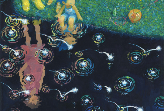
#a lot of the stuff i found was super saturated
Note
Maybe a gender neutral Stardew valley stimboard with paci and deco
Kinda!!
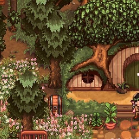

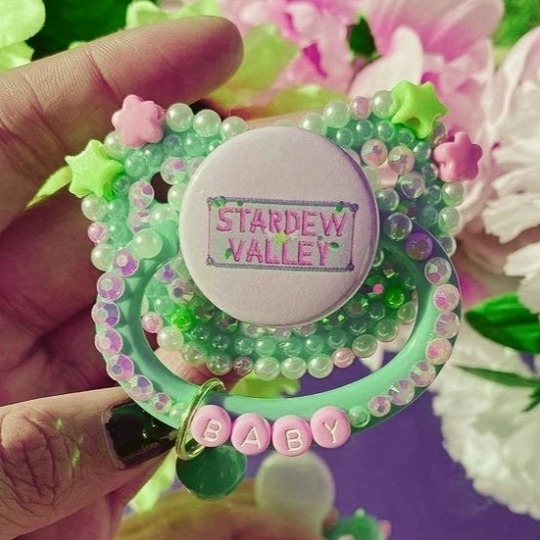
#stardew valley#!!!!!#i love this game#it's so fun!!#i have it on my switch and PC#i wanted the vibes to be calm#a lot of the stuff i found was super saturated#anyway i hope you enjoy!#sfw interaction only#moodboard#sfw agere#age regression#agere#sfw littlespace#agere moodboard#babyre#baby regression#age dreaming#stardew valley moodboard#I still don't do stimboards!!
574 notes
·
View notes
Note
hi, i ireally love your work and i don't know if you've answered this before but, what kinds of studies do you do or how did you learn color theory? i wanna get better at rendering and anatomy but im having trouble TT TT
Hi! Long answer alert. Once a chatterbox, always a chatterbox.
When I started actively learning how to draw about 10 1/2 years ago, I exclusively did graphite studies in sketchbooks. Here's a few examples—I mostly stuck to doing line drawings to drill basic shapes/contours and proportions into my brain. The more rendered sketches helped me practice edge control & basic values, and they were REALLY good for learning the actual 3D structure behind what I was drawing.

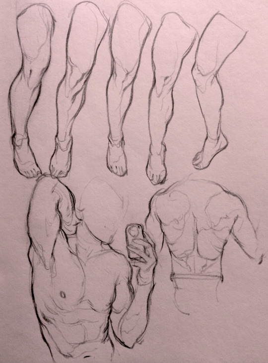

I'd use reference images that I grabbed from fitness forums, Instagram, Tumblr, Pinterest, and some NSFW places, but you could find adequate ref material from figure drawing sites like Line of Action. LoA has refs for people (you can filter by clothed/unclothed, age, & gender), animals, expressions, hands/feet, and a few other useful things as well. Love them.
Learning how to render digitally was a similar story; it helped a lot that I had a pretty strong foundation for value/anatomy going in. I basically didn't touch color at all for ~2 years (except for a few attempts at bad digital or acrylic paint studies), which may not have been the best idea. I learned color from a lot of trial and error, honestly, and I'm pretty sure this process involved a lot of imitation—there were a number of digital/traditional painters whose styles I really wanted to emulate (notably their edge control, color choices, value distributions, and shape design), so I kiiind of did a mixture of that + my own experimentation.
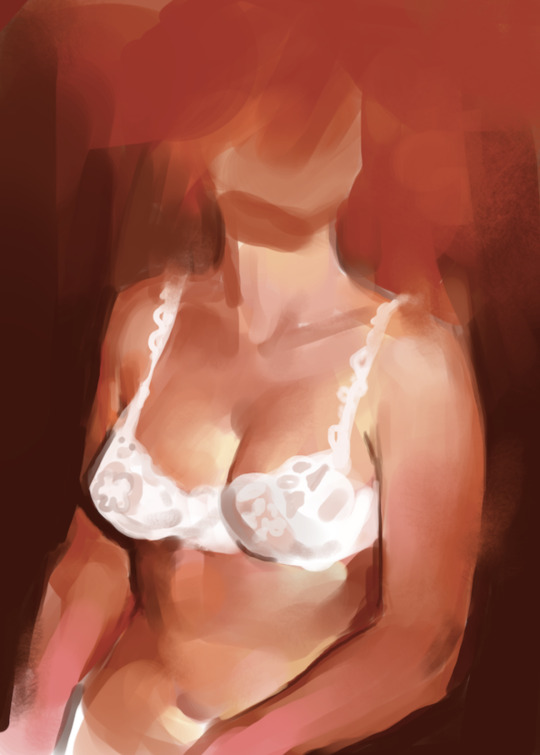
For example, I really found Benjamin Björklund's style appealing, especially his softened/lost edges & vibrant pops of saturated color, so here's a study I did from some photograph that I'm *pretty* sure was painted with him in mind.
Learning how to detail was definitely a slow process, and like all the aforementioned things (anatomy/color/edge control/values/etc.) I'm still figuring it out. Focusing on edge control first (that is, deciding on where to place hard/soft edges for emphasizing/de-emphasizing certain areas of the image) is super useful, because you can honestly fool a viewer into thinking there's more detail in a piece than there actually is if you're very economical about where you place your hard edges.
The most important part, to me, is probably just doing this stuff over and over again. You're likely not going to see improvement in a few weeks or even a few months, so don't fret about not getting the exact results you want and just keep studying + making art. I like to think about learning art as a process where you *need* to fail and make crappy art/studies—there's literally no way around it—so you might as well fail right now. See, by making bad art you're actually moving forward—isn't that a fun prospect!!
It's useful to have a folder with art you admire, especially if you can dissect the pieces and understand why you like them so much. You can study those aspects (like, you can redraw or repaint that person's work) and break down whether this is art that you just like to look at, or if it's the kind of art that you want to *make.* There's a LOT of art out there that I love looking at, probably tens of thousands of styles/mediums, but there's a very narrow range that I want to make myself.
I've mentioned it in some ask reply in the past, but I really do think looking at other artist's work is such a cheat code for improving your own skills—the other artist does the work to filter reality/ideas for you, and this sort of allows you to contact the subject matter more directly. I can think of so many examples where an artist I admired exaggerated, like, the way sunlight rested on a face and created that orange fringe around its edge, or the greys/dull blues in a wheat field, or the bright indigo in a cast shadow, or the red along the outside of a person's eye, and it just clicked for me that this was a very available & observable aspect of reality, which had up until that point gone completely unnoticed! If you're really perceptive about the art you look at, it's shocking how much it can teach you about how to see the world (in this particular case I mean this literally, in that the art I looked at fully changed the way I visually processed the world, but of course it has had a strong effect on my worldviews/relationships/beliefs).
Thanks so much for sending in a question (& for reading, if you got this far)! I read every single ask I receive, including the kind words & compliments, which I genuinely always appreciate. Best of luck with learning, my friend :)
2K notes
·
View notes
Note
hey big fan of your channel and art!! was wondering if for the midnight snap series what kind of sound design you were doing it rlly sounds nice!! (also smth that could be nice with it is maybe a little bit of like tape saturation or something might be able to make the audio sound "warmer" if youre like not already doing something like that already, but you probably know better than me!!) feel free to ignore that, but wanted to say in general its so well done and sounds so good!!! its really cozy and nice!!
hey thank you!!! yeah i'd.... genuinely LOVE to talk about my thinking and approach behind the sound design, i'm actually so happy you asked me this LOL this is the kind of shit i live for.
you might assume that it's just me recording the game audio and talking quietly with my normal stream settings, and that is kinda how it STARTS, but there's actually a bit more i've been doing behind the scenes :) nothing too crazy just yet but a little goes a long way when it comes to sound! i'm hoping to really nail down the soundscape and increase the quality over time and specifically up the soothing vibes by a lot. as well as get a little better about mic etiquette and my style of speech. BUT in terms of what i'm doing in post:
the first piece of the puzzle and definitely one of the most important sauces in the whole mix is the Hard Limiter. it does what you might imagine it does, basically just places a hard barrier and says "any sounds that exceed this volume.... no you don't", sort of like a much more intense compressor. currently i have a Hard Limiter on both my commentary AND the game audio, commentary i have set to peak at around -15 to -12 db, whereas game audio is more around the -23 to -20 range. in my more polished audio from later in the AC episode it's enough difference that one doesn't drown the other out in most cases, but not a wide enough gulf that people are struggling to pay attention to one in particular or have to frequently change volume (preferably they don't have to change it at all!). i took this screenshot of the episode's complete waveform when rendering out the audio-only version of AC part 1 and it was super satisfying cause like.... yeah. this is exactly the kind of waveform read i was going for. just super even and smooth across the board, save for a couple anomalies i'll buff out over time.

the next thing i do to both my own commentary and the game audio is actually just cutting down on harsher, higher frequencies with an EQ and just upping the bassier, warmer tones. i started with something super small in the first couple of episodes, i'm probably gonna go a bit harder on it for future stuff though. i wanna find a balance that doesn't make the game sound unrecognizable or anything but is noticeably easier on the ears and sounds more like a nice rolling wave rather than beep boop pac-man time.
past this i have a couple more things added to the commentary track:
to intensify the previous effect mentioned and cut down on harsh frequencies in my speech, i actually have a dedicated de-esser on my voice as well as my usual warmer EQ. i have the de-esser going pretty hard too, you might hear the difference from my usual stream commentary if you were to listen closely. really just taking those harsh t's and s's in my speech and making them sound more like a nice "shhhh", this one is super important i think
last thing i have to speak on otherwise is actually a plugin i found and bought specifically for this show and ends up being subtle but i think SUUUPER helpful in the long run, and that's this plugin called "spiff". spiff is a plugin by oeksound and i guess it's referred to as like, a transient editor? i'm actually not sure how it works at all on the nitty gritty level BUT the important thing is that they have a very important preset in the software, and that is a preset specifically designed to lessen and/or remove like... mouth sounds. yknow like lip smacks and the like. just kinda the gross smacks and clicks you don't hear as much in normal speech but can come through really intensely on a recording and kinda make ya uncomfortable. it obviously doesn't remove a lot of the more intense stuff, it's not a magic wand in my experience. but listening to the output of what it's removing on its own makes it REALLY clear there's a lot of little things it picks up and just kinda makes speech more soothing to listen to. not something i'm racing to apply to my normal streams, BUT for a sleep aid series where good audio is key????? 100% worth it, i like it a lot.
anyway yeah that's about it for now! a lot of it is pretty simple in and of itself but it's stuff i've been working at and experimenting with since i first started doing tests for the show and it's gonna be real nice to keep honing this stuff in. also cool suggestion with the tape saturation idea, i might look into something like that! once i nail stuff like leveling and frequency tuning for this show, i wanna look into some fancier ways of making the soundscape unique to this show compared to my normal streams so ideas like that are super helpful!
194 notes
·
View notes
Note
I just found this blog and I noticed that a lot of your stuff seems, well, oddly 3D. I don't mean like in a bad way but it feels like rendered but untextured 3D models? I kinda want to ask what your art process is (sorry for mini-rant)
thanks for checking out my blog! and no need to apologize for anything.
hmm, my art process. honestly i have no idea what to say, i dont know how people normally answer this question so i cant base it off anything either. i'm still kinda new to this whole art thing but i'll try and answer, super sorry if i get this completely wrong and this was all a waste of time.
i guess i'll just talk about how i draw things step by step? for the high effort pieces at least.
ok, so for starters like step 0. when it's a high effort piece, i can already see the image in my mind. i see the pose, i see the general lighting, the layout of stuff, but it's a bit blurry. if i cant see this mental image, the drawing usually comes out extremely poorly.
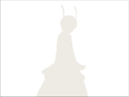
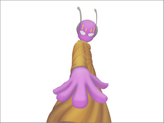
this is kind of an example of what i see in my head? this might be all useless info idk, but this is i guess where i start.
well step 1 is just the sketch and line. i start with just sketching the general shapes, then slowly refining it until it fits close enough to the image in my head. then in the line layer i'll fix any mistakes the sketch had and add more details to it. oh and for brush, it's just a round brush, like default. i dont know how much of a difference using a drawing tablet does, but i dont use one so... yeah.
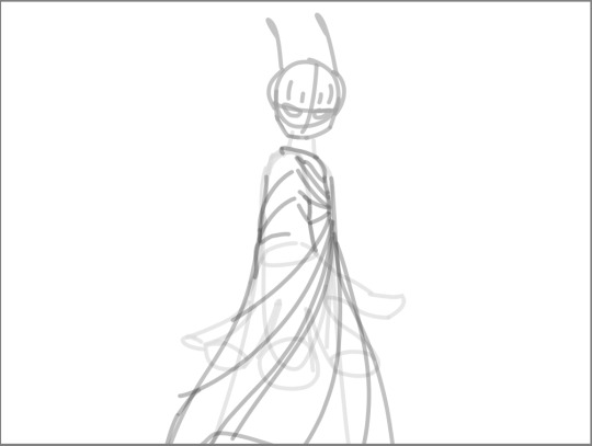
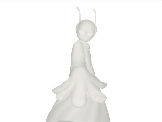
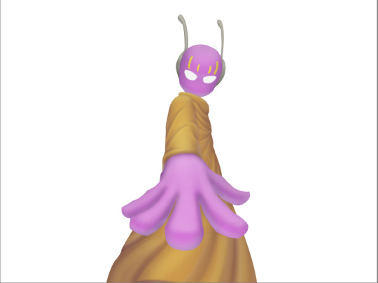
i should've put more effort into the sketch for this drawing, but i did not.
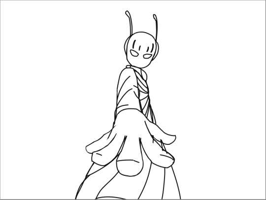
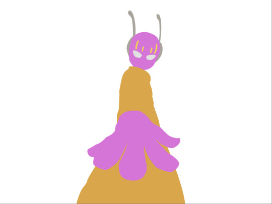
next i do flat colors. pretty simple, i just select the smart select the outside of the line layer, invert the selection and now i can't paint outside the lines. i dont really think about what colors i use, i just use whatever the characters normal colors are.
next i do the shading, but first. i duplicate flat layer and recolor it to like a cream color
like so. for high effort pieces, i was told online to shade in pretty much black and white. now actually onto shading. there's 2 kinda shading i do, 1 from the proper light source, and 1 that's kinda just a shadow because things are close together (like corners and stuff). and i'll shade them on separate layers so i can adjust them individually however i want. oh right, i'll either use a very dark color, pretty much black and the the layer blending mode set to multiply. or i'll use a light kind of gray, tinted slightly yellow or something and set the layer blend mode to difference. then i just use a soft air brush and shade in the ways i described above. shading from regular light source, and the corner stuff thing.
normal lightsource - - - - - corner thing
then toggle both layers on and mess with the opacity of each layer until you get what you want.
then you can toggle the normal flats layer, the one that has color and it should apply the shading decently. you can mess with the opacity again on the shadows.
next i do lighting. i just grab a very light color, usually pretty close to white and set the layer blend mode to overlay. then i use a soft airbrush and "light" it? idk i just do like the opposite of the normal shadows, lighter the closer it is to the light source
mess around with the opacity as usual. then i do pretty much the same thing if there's another light source. in this case there was a blue light kinda coming from underneath, so i did that.
now from here i would go back to the flats layer, make a copy, and mess around with different layer styles and properties and settings. sometimes just messing around is useful. in this case, i felt it was too bright and colorful, so i decreased the brightness and saturation of it.

i think it helped a little bit but who knows.
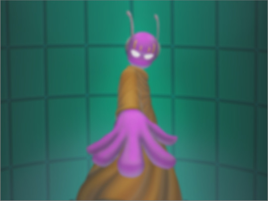
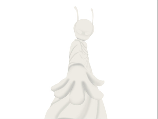
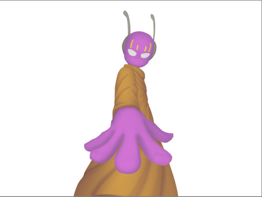
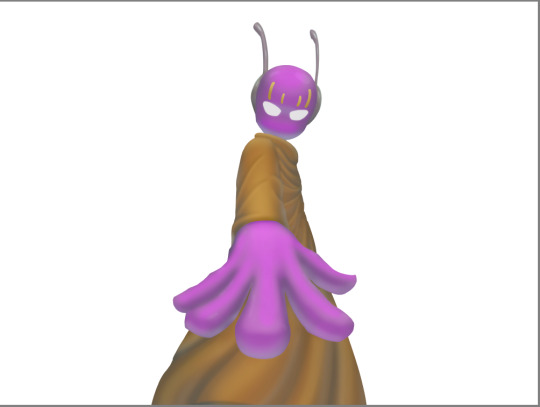
now i do some kinda highlights and details. i grabbed the colors that were in the background and used those. it was a weird pale blue. i had 2 layers for this, 1 of them was specifically for his antenna things at the top, and one was just for his "skin". anyway, the antenna layer was normal, just kinda gave it an outline with the random reflective circles you see normally in pictures, no thoughts behind them. the skin tho had the layer blend mode set to soft light, i thought it looked best this way. it was just more random things to imply it was slightly reflective.
together the layers looked like this. i think it makes him look glossier which is what i was aiming for.
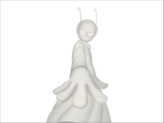
next, and it pretty much the end for pebbles, i got someone to look at it and let me know if they think anything was missing. they said it looked a little unsaturated. which it does. so i made a new layer, set the blend mode to saturation, grabbed the airbrush and made it pretty inline with the lighting layer.
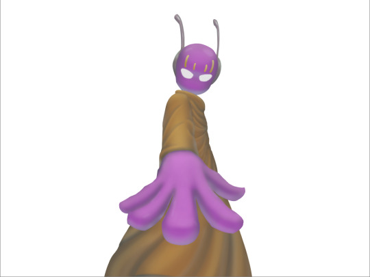
that's kinda it. the background i didnt really care about, just drew and colored it. blurred it a bunch and added a bunch of shadows. i did add some like, "overshadows" is what i call it, i just draw some big shadows down the screen as the top layer.

but yeah thats literally everything i did to draw this. i would like to apologize if this was not at all what you wanted to know, i'm certain i've screwed this up bigtime. super sorry for wasting your time. if there's anything i can do to help, please ask. i owe you a proper answer to your question, i'm just really dumb. sorry for rambling. sorry. and sorry if the drawing i used for example didnt showcase what you wanted to know.
also, i really like your art! please keep up the great work!
#i think i did this all wrong#i'm so sorry#i feel incredibly stupid#:I#rambling :I#now everyone get's to see how little i know about drawing
25 notes
·
View notes
Note
please post a tutorial or walkthrough or even just a longer process video talking about how you draw!! im obsessed with the textures and colors but i cant seem to wrap my head around it!! (i would pay money for a whole mini course tbh if you were interested in uploading one to gumroad or wherever 😵💫)
thank you, i'm flattered :') texture and colour are really important to me so i'm always fine-tuning them to find what works. to be honest i feel like i'm not qualified to teach others since i haven't really even settled on a process, i just kind of mess around until i like what i'm looking at. there are certain things i do much of the time but it's definitely not a linear process!
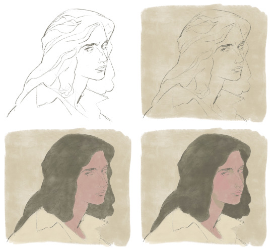
that being said lately i've been experimenting with traditional media and i've found i really enjoy how gouache behaves so i've been trying to replicate the process in digital. i'll try and explain how i've went about it recently using this super boring piece of a random person...
i'm using a basic pencil brush and a default procreate brush called gouache. i picked it for the name when i was looking for something similar to the paints i'd been using but honestly it looks more like a marker to me.

i find trying to do separate inks on top of a sketch distracting so i just erase what i won't need. i'll add a darken layer on top of the sketch and go over it with a single colour as a kind of underpainting. i did the flat colours on a separate darken layer here but generally i'll just work on one layer.
we'll add some colour variation and shading, it looks super subtle here but i'll punch it up later. i think the critical thing with this kind of brush is working with transparent layers so you don't lose the texture and you can play with mixing colours.
i'll often mess with the curve tool a lot but this piece is pretty simple and i ended up only using it once or twice. when i'm happy i'll duplicate the colour layer and see which blending mode i like, testing stuff out at different levels of opacity until i find something cool. i think i went with a transparent overlay layer here.
the lineart is getting buried so i duplicate that layer as well, drag it to the top of the pile and repeat the process of stacking blending modes. something i like to do is add one layer with the lineart blurred to give it a softer look.
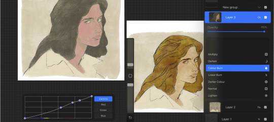
i'll fill a new layer with a dark colour, add about 80% noise scaled up a bit and set the layer to saturation. again you can experiment with the blending mode but i've been using this one recently.
this next part might be pointless but i save the image, open the new file and resize it without actually changing the resolution much, then sharpen it to bring back the detail. maybe it's in my head but i feel like this makes the image look a tiny bit more finished and adds some crunch.

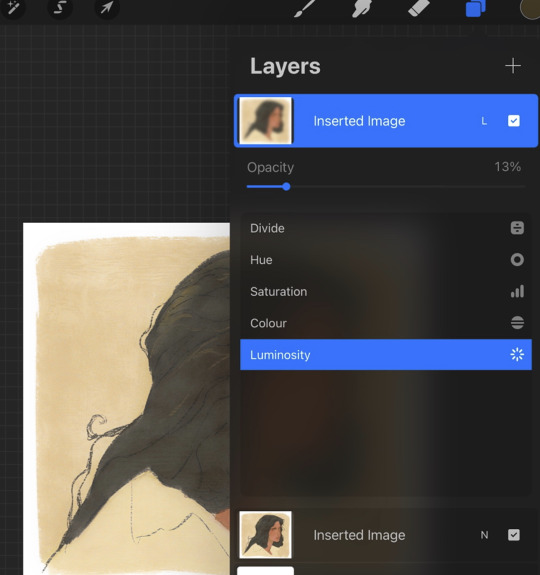
finally i duplicate the whole thing, blur the layer on top and set it to luminosity on low opacity to create a soft glow effect.
final touch-ups and you're done!
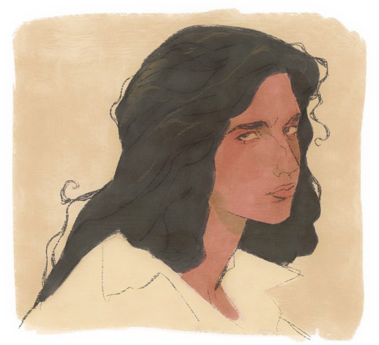
sorry for the convoluted explanation! my process tends to messy, i get distracted and don't often work in distinct steps but i think i managed to describe some of the things i do the majority of the time. i hope it's even a little helpful :)
98 notes
·
View notes
Note
hi!! what watercolors do you use? your paintings are always so vibrant and have such a mystical vibe to them and I’m curious lol
super sorry if you’ve already answered this, tumblrs search function fights me whenever I try using it 😭
Hi! No worries I haven't and I'd love to talk about watercolor :) I use several, in transparent > opaque order:
Schmincke > Holbein cake colors > Nicker poster colors
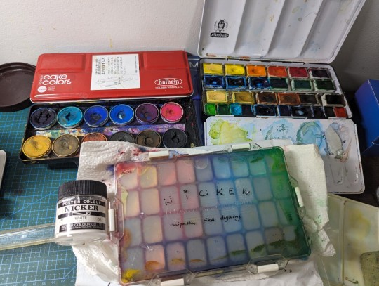
(family pic)
Some notes:
Schmincke: Expensive but really good, vibrant, if on a budget maybe you can get a couple blocks of colors you really like. If you're committed to watercolor I definitely recommend getting a palette. I made my own custom set. Loooove the blues.
Holbein: this is a Japanese brand, so it was actually easier to get in China than the US, I got on Ali Express. It's slightly more opaque but not exactly gouache. It looks like the really cheap kind of cake watercolor palette but a lot more vibrant. It sets on paper with a kinda of sandy texture and I really love it. It's also a bit more dense than traditional transparent watercolor, so you can also layer with it easily.
I think the 24 color set is a lot more worth it than the 12 color set. Problem is I don't think they sell blocks individually, or at least hard to find.
These recent ones I posted are the combination of these two paints above.


Nicker: Again Japanese brand. I heard this is what Ghibli studio use? But it's affordable. I could get individual jars (jars are much better value than the tubes) in China, but in the US I've only found sets on Amazon so far.
It's smooth, and still remains a good saturation when diluted compared to other gouache/poster colors I've used. I don't use this alone as much now, but this is something solely done with Nicker I made a couple years ago 👇 as you can see it has good coverage. So when I did this I didn't layer up I just painted inch by inch.
But I have to say, how a watercolor painting turns out is really up to the paper! In my opinion paper is even more important than the paint, it influences vibrancy and textures more than you would think. So I always encourage my friends to get good paper rather than expensive paint. I use Arches hot press for formal works most often, but for a cheaper option I also love Fabriano (the two lil ones above are on their postcard papers, really good enough). Both are great for layering up.
And last, you can Photoshop them :D
These stuff sure cost a lot in total, but it took me a long time to figure out and collect all these, they don't really run out that fast if you don't do very large paintings. You can definitely try it out bit by bit, and enjoy the excitement of using a new paint on the way!
19 notes
·
View notes
Note
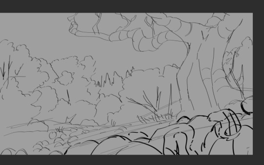
Lovely pumpkin patch fanart! (All of your art is awesome, actually.)
Any advice for someone who struggles with backgrounds? Cause, dang, that's a lot of pumpkins.
firstly thank you so much!!
And secondly-- I can offer a few tips and tricks I use in backgrounds to help? I luckily have some screenshots of the pumpkin piece in the basic stages I made it in- and ill kinda go over my thought process for it??
I always look for at least a few pics for reference, even if all I do is just nab colour from it or an idea for layout- and I lay out this super simple sketch. (If it was architecture or an interior, I might do a box model in Blender or Maya, depending on complexity! Cuz hard edges in perspective make me wanna cry fr)
Most of this layout was from my brain but I definitely needed help with all those pumpkins so I stared at a field of pumpkins and kinda mimicked how they all.. overlapped. Lots of circles that I'm pretty sure kept turning into ovals but I didn't care enough to fix because hey!! Im not going for perfect, Im going for what makes me go "yeah this looks SICK and it WORKS who cares about the small stuff"
For me this is all I need to get begun colouring - it's different when I'm doing flat colour with linework, since that needs more intricacy (for me at least!) - but I go in and block in my basic colours and values with usually only a lasso tool, paint buckets, and maybe a mixy-painty brush or two for adding more variation in colour. (sorry I was taking screenshots in Clip to send to friends FHSJD so they're all wonky)
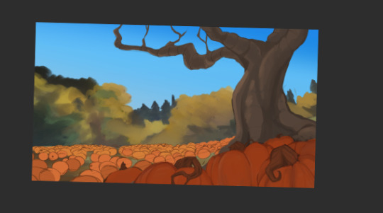
Keep in mind your fore, middle, and backgrounds!! - and how those values will contrast with one another! I marked the far back with the yellow trees, the middle with a more saturated orange, and the foreground with the more 'darkened' pumpkins. That'll help you imply depth in a 2d image.
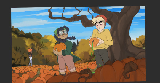
From that point on for me it was all refinement! My cake is there, now it needs the "frosting". I usually add in characters after laying out a scene because I find it easier perspective-wise but it's different for everyone! I go in and fix weird colours that don't work, add things like atmospheric perspective (when things farther away appear "lighter/less saturated" bc of the atmosphere between you and it) and tiny details until,, eventually this happens??
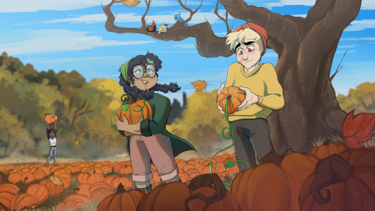
This is just the way I've found I normally go about backgrounds!! I was kinda self taught on environments so maybe my process is wacky but it's mine and it works most of the time!! at least, for what I want to make .
(and with all the pumpkins, if you look closely you notice I barely rendered most of them at all! I just gave them the contour of their sides-- tedious, sure, but I think it only took maybe 20 minutes and was easier than me going in and making each one perfectly rendered because haha! n o )
#this got away from me. I wouldve just gifed the images but Im currently on my phone FHSDJHJSD im like sitting in a cafe between classes#riley talks#long post#riley rambles about art#new tag for when i get art questions bc it baffles me people come to me for this#i love you all!!! but its a baffling experience to have people be like and i probably do but damn!!#i am a deer in the headlights
218 notes
·
View notes
Note
f1sh and chips headcanons?
IVE BEEN PREPARING FOR THIS MOMENT MY WHOLE LIFE
HARMONY:
Nonbinary and kinda indifferent on their gender. Goes by She/They. Doesn't really care if you use other pronouns for them tho.
Aromantic and a lesbian. Is still ok with labeling a relationship as dating even if she doesn't experience romantic love the same way as other people.
Autistic, and doesn't always function super well as an adult on her own. But she's doing her best.
Collects stuffed animals and small toys.
Likes cute things, but some people would label their definition of cute as weird.
Loves bright colors. Crank that saturation up!
Very blunt.
Gets along pretty well with her bandmates. They aren't SUPER close but they are friends.
Knows she is different. Doesn't care. It probably used to bother them more when they were younger, but now she has come to terms with it.
House is very messy.
People are just drawn to her, she doesn't particularly like it.
A lot of people think that because she is blunt and speaks her mind that she doesn't ever lie and take everything she says at face value. He is very capable of lying and will do so for various reasons if needed. Or sometimes just cuz spreading misinformation is funny. Will tell you the sky is bright green with no hesitation and a deadpan expression.
Depressed. Is on medication for it and handles it ok ish...
Video game addict. You can usually find her at home in her pajamas playing some new game surrounded by empty instant ramen cups.
Mostly enjoys creative or cute games like pokemon, animal crossing, or minecraft. Doesn't play them often, but she is the absolute best at fighting games. Could beat anyone blindfolded. Is good at a lot of hard games, but doesn't really like that kind of stuff.
Plays a lot of things as they come out and probably has a blog where she reviews them.
Knows every skip and speedrun strat ever.
Likes platformers, especially 2d ones.
Collects old nintendo consoles/games.
Stims a lot with any object nearby. Likes to play with her bracelets a lot. Will just pick up random things and fidget with them.
Seems to be tired a lot, has bags under her eyes. Stays up late a lot but doesn't mind the lack of energy.
Very clumsy and has poor motor controls for a lot of things. Has to take frequent breaks when playing games or music. Gets hurt a lot bumping into random objects.
Issues with her wrists have been a problem for most of her life due to her hobbies, and she is surprisingly good at taking care of them nowadays. Used to not care but then some serious injuries happened and she realized she couldn't afford to do that.
DEDF1SH:
Bigender! He/She/They probably. Would maybe be open to neos if he found the right ones.
Demiromantic, Bi, and Asexual. Both Acht and Harmony are aspec(not for any reason what no i'm not biased as an aroace person noooo-)
When first getting out of the metro he was VERY malnourished and had a hard time eating food. He has a lot of texture issues and finds most foods unbearable to put in her mouth.
Has since gained her weight back and is looking more healthy.
Is very sensitive to sunlight, and burns very easily even in normal weather with minimal exposure. This is part of the reason she spends so much time alone indoors.
Eyes are also very sensitive to light after being sanitized and living in the deep for so long. This is why he wears sunglasses everywhere.
Is also autistic like harmony. (again, as an autistic person i am in no way biased towards headcanoning characters as autistic ok?) Is sensitive to sounds and wears noise canceling headphones a lot.
Goes nonverbal if overstimulated.
Doesn't talk that much, is more the type to say as few words as possible to get their sentence across.
Likes eating cereal with no milk. It's one of their favorite snacks.
LOVES fruit. They are that meme of the person covered in mango juice.
Just like harmony, his face isn't very expressive. But while harmony always looks like she's daydreaming, Acht often looks angry. This is especially true when she has her glasses on since you can't see her eyes.
Really likes fashion. Likes very femme alternative stuff specifically.
Is already naturally tall, and wears heels everywhere. Towers over most other octolings/inklings.
There are many lasting effects from the sanitization. Including physical and mental symptoms. Acht is slowly recovering tho!
Can play piano, just doesn't. Doesn't remember where they learned to, but it makes them feel slightly sad to play it.
Has amnesia due to the sanitization. Can remember things like skills, but not where they learned them or from who. Doesn't remember much of her past. Doesn't remember much family or friends either. Can picture some blurry faces, but not names or how they knew each other.
Tartar told her about her decision to be sanitized, and she has no choice but to have taken his word for why she decided to due so as she has no memory of it.
Has a hard time adjusting to life on the surface.
Has some trauma surrounding medical equipment, and doesn't like to go to doctors.
I've always Acht having known Marina before coming to the surface, but with Side Order confirming they know each other somehow i will wait to flesh that out until we get more info.
Is confident and somewhat social(especially compared to Harmony) but needs a lot of time to recharge their batteries after being around others.
ParuF1sh:
They both like to make music, and often make silly little songs together. Acht likes to take whatever Harmony hums and turn it into short songs.
Both of them don't sleep much. Harmony doesn't like to because she prefers to spend her time on hobbies n such instead. She also has insomnia, but since she doesn't like sleeping it doesn't really bother her TOO much. Acht on the other hand has issues sleeping due to frequent nightmares. She ends up having terrifying nightmares of her time with tartar or things she can't fully remember from before she was sanitized. Harmony is always there to comfort him when he wakes up sweating and frightened.
Both of them are very picky about food and so their pantries end up being stuffed with lots of their prefered safe foods.
Acht tries to push himself to leave his apartment in splatsville from time to time to avoid being totally disconnected from the world because that's what she did when she first got to the surface and it made her very depressed. On one of those trips Acht ended up visiting Hotlantis because he was just exploring various shops. He really liked the vibes of the shop and the wide variety of items that rotated frequently had him coming back. This is where the two of them first met.
At first Harmony and Acht didn't even notice each other despite Acht becoming a regular to come buy and look at weird little items. But eventually after having to check Acht out so many times she finally started to pay attention to what Acht was buying and noticed they had similar tastes. Then one day Harmony struck up a conversation with Acht and they became friends from there.
I think they are both poly and wouldn't mind if their partner dated someone else. But neither of them have another partner right now.
While they both may struggle with a lot of things they help each other out and manage to get through life ok.
It took a bit for Acht to get back to making music after getting out of the metro.
They like to watch ghibli movies while cuddling for a lot of their dates. They will watch all of them and then just start over with the first one again. I think the movies are comfort media for them. Harmony's favorite movie is Spirited Away and Acht's favorite is Kiki's Delivery Service.
Acht chills with Harmony's fish a lot i think.
Neither of them know how to cook.
Harmony leaves her work spaces very messy, but Acht keeps hers VERY neat.
Acht and Harmony both take surprisingly long to get ready and pick out outfits, but Acht takes much longer than Harmony.
They do a lot of parallel play where they just sit in silence and do their own thing.
Acht hangs out at Hotlantis with Harmony a lot and just keeps their headphones on and chills.
Acht also runs the store when Harmony isn't there.
They both listen to a lot of video game osts and it's probably what Harmony keeps playing in the store as well.
Acht has asked why Harmony doesn't stream playing games, and Harmony just doesn't wanna. She would rather just post reviews.
They swap whos the little spoon depending on the day.
Both of them have terrible sleep schedules.
The first time Acht ever saw a splatfest she was enamored, and now she makes sure to always attend the concerts. Harmony insists on keeping the store open since people are everywhere during splatfests and love to shop. But the floats come through the same streets as the shop, so Acht makes sure to pull her away to watch them at least once. And Harmony loves seeing the music as well.
Neither of them really participate in turf wars. Acht is older than most players and finds it awkward to team up with random teenagers but isn't willing to put together an official team of players her age. But she still likes to take her trusty squiffer out to the practice range to keep her skills sharp. Harmony LOVES to watch her practice.
I was about to go into a whole thing of which team they would pick for each splatfest and why, but i think thats gonna have to be later/if anyone asks for it cuz it may be too long for this post lol
so yeah ill end it there for now. they are my beloveds and i could talk about them forever so feel free to ask questions/send in suggestions/talk about how you view them
here is a goofy doodle i did in 5 mins on my laptop for compensation for reading this far:
18 notes
·
View notes
Text
how i color/render!!!!! (general + metal)
hi i had an actual piece i was going to do this with but decided to just actually draw a process for this!!! before i say anything else though i'm not a professional so this isn't a "how to" it's "how i" thing sdlfkjsdlfkj,, also i draw in paint tool sai, for coloring i just use a flat blocky brush for everything
ok Here We Go. ramble
general things

When it comes to my style of shading, it's almost more of color "texture" rather than sensible shading? I'd say 80% of my shadows are placed believably with respect to a "general" light source but I fudge it a little because sometimes I think it'll look cooler. Oh and I live on the left side of the box. Let's me have the option to place really saturated colors as accents if I ever want to.
Normally in any work I choose the base colors based on what mood I want for it, but for easier explanation this is the pattern I found I do for nearly every color.
Each color tends to get around 3 - 5 shades total. The lightest shade tends to be a smidge more saturated than the base color, but then every shade color after that starts getting less saturated. Kind of based in reality, as shadow is the absence of light, and light is color, so shadows tend to be "grayer" (of course this rule can be broken : 0 and even while that's true light reflects so some color from environment is added back in the shadow asldkfjaskdf I do this if there's an actual background,,). I still darken the color though, so instead of it being linear straight down or just to the left it's a bit curved like a backwards C in the color box thing.
I also hue shift the shades because I think it makes it look more interesting than just messing around with saturation alone. Almost always I shift the hue to the left (towards red or pink), because I like that. I don't actually know the reason for this eye just think it looks good. Even with cool shadows they still end up in reddish hues (but with how desaturated my colors are it's pretty much gray so,,)
As for order of shades - I don't choose these shades beforehand either, I usually just start with a shade close to 2 and after placing those shades down I either go add a lighter shade (1) or continue with darker shades (3, 4) before going back to add 1... it's kind of all over the place and the placement of doritos is hard to explain too so! Example!


I forgot to take a picture of the flat fill, but yeah this is pretty much how they appear. Basically, I start placing biggest shadows first before gradually populating it with 5 billion doritos and lines. As for patterns:

Some of the common patterns I find in my own drawings. Lots of overlapping colors and whatnot, the triangles/ines also tend to hug either the lines or the edges of other triangles. Depending on the material, the patterns might be different. Think this one is a good example of bunch of stuff:
The feathers of the wings have tons of overlapping triangles that bleed into each other, but they still follow each other's edges. That big rock in the picture doesn't have much triangles - it's got more blocky rectangles and lines instead. The grass itself are just fat lines really. The bushes in the background have a mix of odd shapes somewhat overlapping each other... I feel kind of awkward pointing all of these out from my own work so um yeah!! There aren't really any hardset rules it's just whatever in the end!!!!
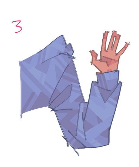
the main request for this whole thing was how I rendered metal .so Moving On lsdkfjsldkfj
how metal
step by step process, a bunch of separate images lskdjfdsf this is a closer look at how I render a specific material. Rare instance of lighting being added in the first place haha,, and I actually did most shades in order kinda so it's not super confusing


There's no particular background or mood for this metal arm here, but I find doing a flat fill really important either way. If I decide to finish and post that commentary of my own drawing thing it'll be more obvious how it affects the drawing there but essentially placing a flat fill first helps establish the mood of the piece while also being really helpful in making sure the colors you choose all work together.
(this is a thing some painters do as well I think? helps all the colors blend nicer together and depending on the color of the fill you can have some nice warm or cool undertones. instead of blending for me it helps with handpicking colors - especially when there's multiple different colors and not just an arm but enough rambling ,sdflsdkjf)
aaaanyways what I wanted for this was warm-ish lights and cool shadows so the fill is a slightly orange gray. When it comes to metal I establish a rather harsh shadow at the beginning - this is because I treat the base and shadow as two separate colors, if that makes any sense. It probably will with pictures,


These steps are grouped together because it just follows the general shading and patterns I described earlier. The lightest shade is a bit more saturated and red (and really subtle,,), yadda yadda the next are less saturated, darker, but still redder - the 3rd shade getting close to pink. At this point the 3rd shade has an almost blue tint (to my eye at least) and it's because of how colors look relative to each other.
When a warm color is placed next to a gray, that gray will appear cooler relative to it. A cooler color next to a gray will make the gray appear warmer. So in this case, because the base is a bit more saturated and orange (warm) than the 3rd shade, the shade appears as a really faint blue relative to the base! Or maybe I'm just crazy I don't know,,, irl wouldn't notice a difference : ( they think I'm weird for moving the color picker by 1 pixel to the right... orz


Now the shadow gets its own 2 darker shades... still following the same rules. Notice there's a bit of a harsh line that goes down the middle of the forearm parts. That's where most of the lighting will be placed against, because metal tends to have a dark shadow right next to the light,, uh not a professional here I'm pretty sure it's the core shadow (darkest shadow of an object, usually next to light).
Here's a picture I stole from the internet where you can see on side of either light there's a noticable darker section before it's mostly back to midtones

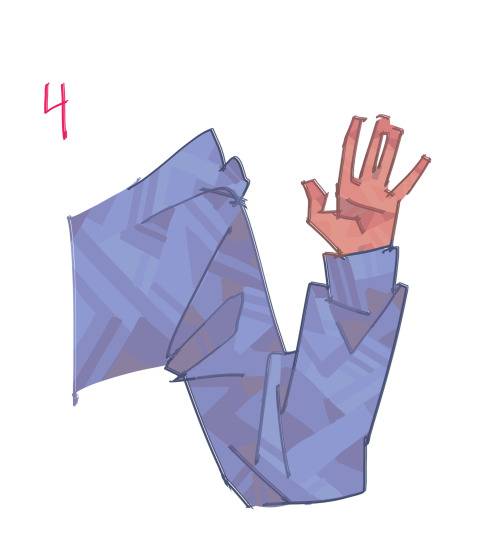
Fun part of metal! Adding the light!!!!!
For me this is a pretty good stopping point because the lighting really sells the metal look. Since I had a cool purple shadow the lights are a warm yellow. I still stylize the light a bit so there's just a few doritos and lines but other than that I'd consider it done... there's some extra stuff you can do though


These are quick things that help place it in an environment or mood. Say, this arm's out in a forest or something so there's green bushes and whatnot... Usually metal will reflect those colors in the environment so adding them really helps in making it fit in with the background.
Quick way to make it glow too is to create a new layer set to overlay and go over the light with a color of your choice and blurring it so. it Shinier!!! I used both of these before too : 0
bit blurry but there are green/yellow doritos reflected from the grass/bushes/leaves and some reddish ones from the tree trunks! and there's a tiny bit of glow on the light! yeah this piece had a lot alsdkjfa
that's basically it. i’ve only rendered metal 4 times total so here is where i say again not really a tutorial but loll maybe this made sense and helped someone laksdjflaksjdflkjsdf
if you scrolled to the end for a tldr; here's one irl did! it’s very concise and 100% accurate

18 notes
·
View notes
Note
You’re Royalty DR sounds so cool!! =0 /gen
What are some of your favorite things about it? What roll in the kingdom do you play (queen, princess, etc.)? Experience with diplomatic relations with other kingdoms and countries? What time does it take place in? Are there other countries that exist outside of your kingdom? if so tell us about them and relationships with them! Do you have any hobbies or skills you don’t have in your CR or just any hobbies or skills over all? Any love interests you scripted to meet or maybe just hoping you’ll meet someone there, if so what do you hope they’re like?
Sorry if this a lot of questions, this just sounds super cool and I’d love to know more, thank you so much and have a lovely day/night! ^^
OMGOMGOMG
Ok so my favorite things about my royalty dr is the fact that my kingdom (Springbrook) is very colorful and one of its main colors that represent it is PINK I LOVE PINK BUT NOT LIKE HOT PINK ITS KINDA LIKE A SLIGHTLY OVER SATURATED PASTEL PINK. Also our kingdom is known for its desserts because I love sweets so much.
For diplomatic relations with other kingdoms there's not much to tell other than the fact that we don't hate each other ig.
My role in my kingdom is a princess and I have 5 siblings, my older siblings, Simon, Mallory, and Jared live at home, while my oldest sisters, Iris and Anita have already left and gotten married.
This dr takes place in a mixture of different times, it's kinda like 1700s-ish with a sprinkle of modern times, but the only modern times stuff is showers and toilets and stuff cause I'm not pooping in a bucket.
As for other kingdoms the only ones I've scripted is Gloomburgh, Sparrowland, and Daisysand. (I think I found these names on pinterest)
Gloomburgh is a very gloomy place, it's almost always rainy, but the atmosphere is gorgeous, it's gloomy in a comforting way. Plus this kingdom has the BEST snowy days.
Daisysand is the very opposite of Gloomburgh, it's almost always sunny and warm, but not too warm. It's one of those places where there's lots of sights to see a places to experience,(not that there's nothing to do in Gloomburgh, it's just that Gloomburgh has more indoor places to visit while Daisysand is an outdoor activity type of kingdom.)
Sparrow land is a very elegant kingdom, its a mixture of a fairy tale kingdom and a realistic kingdom. It's got beautiful architecture and natural landmarks, (such as lakes, mountains, fields, ect.)
And as for a love interest, there is Eleanor, she is one year older than me, and she is Princess of Sparrowland. She is my best friend, and I've scripted a 4-5 year slow burn because I would like to take romance at a slow pace.
I think that's pretty much it
#reality shifting#shifting#desired reality#shiftinconsciousness#reality shift#shifting consciousness#shifter#shifting realities#flora's just yapping#royalty dr#ask flora
17 notes
·
View notes
Text
My initial thoughts on side order
(Written pretty much as soon as I finished it. So don't expect these thoughts to be super coherent and/or accurate)
Putting in a "read more" here because WOW did this thing get long.
Before we start, I have only finished the main story of Side Order so far, because I've been playing it all day. If I tried to get any closer to 100% completion than I currently am, I'll be here all night as well.
It was very fun to play (so fun that I spent all day playing it, as previously mentioned). I think that a part of that is down to how different it is from the three Hero Modes, and from Octo Expansion. Going up the tower was never too frustrating (which may be partly becasue I am primarily a shooter/dualies main, ie the two palettes you get first if I'm not mistaken) but it was difficult at times. Which is good! There weren't too many floors, but there weren't too little either. And I really enjoyed the colour palette system. It was very fun how you just gradually get higher and higher in strength, but you almost don't notice it as you're going because youre almost always only getting one pallette chip at a time. (Also I like being overpowered, which was the case in the bonus levels with chip saturation, which were my favourite levels). I also liked the variety and randomness in the levels a lot, and their gradual difficulty increase. Maybe I should play more roguelites. The danger stages were very fun as well, and the ones with the lights out were genuinly quite creepy. They also added even more variety than the gameplay already had, as you couldn't predict when they'd show up.
I was a massive fan of almost everything about the Jelletons. Primarily the fact that their existance meant NO MORE OCTARIANS. Not that I dont like Octarians, I just think we've been fighting against them for far too long. I also really liked the Jelleton's general apperance and skeleton fish theme, and the jelly part. They looked really cool. The main thing I don't really like that much about them is the lack of explaination about what they actually are. I know we can kind of explain it away with "ohh simulation blah blah blah" but still. It bugs me.
The story is quite a different beast all together. It was pretty good. I l liked the insight we got on things such as Pearl and Marina's relationship (it all but confirmed Pearlina as canon in my eyes). The only problem was that it didnt entirely make sense. What the fuck was order's deal. How did it even get there. I was just. Confused. And my confusion wasn't really helped by the final boss, and the aftermath of said boss, like... is it an octoling of some kind? I just don't know. Maybe it's revealed in the post game somehow. It was cool, dont get me wrong, but... why was it there exactly? Why was it the antagonist, especially when the Telephone is right there. I know it was implied to have died at the end of octo expansion, but we didn't exactly see it die. It just kind of faded out into light, and we never saw it again. It was also on the side of order in the FinalFest of Splatoon 2. Having the Telephone as the antagonist would especially make sense because of the original purpose of the Memverse, that being, to unsanitise the sanitised Octolings (and other creatures). It stands to reason that if the Telephone had found out about it, it would be more than a little bit angry, seeing as it is the one that sanitised all those octolings in the first place. I thought the telephone would make sense as the villain even before I found out about the existance of order (not that much before mind you, it was during the boss fight against marina, because the stuff that was holding her was turquoise and looked a little like sanisised ink, because of the colour). Also, the whole plot to take away the free will of the people of the world using the program that was meant to save them from sanitisation does feel like something the Telephone would do. At least it feels like that to me. Maybe it would just want to resanitise them, I dont know.
The boss fight against Marina and the section leading up to it was my favourite part of Side Order. There were so many unknowns at that point! Like who was doing this, what did they want, what had happened to Marina, etc etc etc. And in the part leading up to the fight against her, those unknowns kind of came to a head, and I was wondering what would happen after the boss fight, because surely this couldn't be the end? It was not the end. I quite like how both of the Splatoon 3 storylines have sort of "false starts" before the story really begins. Hero Mode had it and now Side Order has it too. It's a shame that Splatoon 3 has seemingly exchanged the story making sense for cool openings. At least both Splatoon 3 Hero Mode and Side Order are very fun to play. Also Ahato was there! (Or Acht or Dedf1sh if you'd prefer to call them that, I'm just used to calling them Ahato). They are my favourite character in Splatoon, and have been since I found out they existed, which was in the days of the Octo Expansion.
i was very much a fan of the whole colour thing, with saturated colour v greyscaling. i really liked the visuals of it, and how the saturation of the colour kind of represented power and free will and stuff like that. Just the visuals of the game in general were exellent.
A very minor thing, but I like how Side Order pretty much confirmed that coloured fingertips is a thing that Octolings get with age, since Agent 8 in the Octo Expansion didn't have them, and they do have them now in Side Order.
Thank you very much if you read this far! I hope you enjoyed reading my extremely rambly thoughts. I might make another post if I have more Side Order related thoughts and/or when I finish the post game.
#splatoon 3#side order#splatoon 3 side order#side order spoilers#the tree speaks#THIS GOT SO LONG WOW#it was really fun to write though#i very much enjoy rambling about splatoon 3 :D
3 notes
·
View notes
Text
9 People You Would Like to Get to Know Better.
Was tagged by @shootingstarpilot, ta very much.
Three ships: I'll go with one for each of my current main fandoms, so Jocasta Nu/Plo Koon for Star Wars (I am still here thriving on my pool floaty for that one), Dick Grayson/Wally West for DC, and Danny Fenton/Jason Todd for DCxDanny Phantom (yes that is still DC, no I do not care, there's enough crossover fics that it practically counts as it's own fandom ok.)
First ever ship: Uuuuh. Uuuuh. Y'know. I cannot remember for the life of me? Genuinely it might've been NaruMitsu, aka Miles Edgeworth/Phoenix Wright, from my original re-dive into fandom hell outside of just playing games.
Everything about that is a weird thought. I consider myself to have been in fandom stuff since like 2015, I didn't get into Ace Attorney until like 2018 or so because a friend was streaming their playthrough of it? And it was like another year or two later before I found that first fic (Saturation by TiedyedTrickster on AO3, lovely fic, genuinely wonderful). But I really can't remember anything else I actually actively shipped earlier than that? Like maybe there were a few things but I seem to remember that a lot of that kinda stuff was very much me glancing at a fic and going 'oh hey that chemistry's neat' but not really caring about it outside of that fic. Huh. Anyway.
Last song: Immortalized, Hidden Citizens.
Last movie: soft error sounds so I don't watch movies because my attention span is dogshit. I think the last thing that I actually full-force sat down and watched all the way through without my brain wandering off entirely was Moana, and that was over a year ago?
Man I need to watch more movies. I'm pretty sure I've got a watchlist somewhere.
Currently reading: I'm kinda sorta on a book break at the moment in that there are a lot of books I could be reading, my shelf is super full, but my brain is not currently capable of reading new things and so they're all sitting there glaring at me from a distance. If we're willing to talk fics though I'm rereading Commander by Drich with is a Planetary Annihilation Self Insert and also fucking incredible like everything else they write.
Currently consuming: I have my big jug of water (it's a 1L mason jar that I repurposed for drinking from because it means I actually remember to drink things) and am contemplating having a mooch through my snack box for chocolate.
Currently craving: the inari nigiri and little mochi balls that they have at the Yo! sushi bar thing in my local Tesco. I had to go shopping earlier for some bits and thought about getting some for lunch but didn't cause I have food at home. Jokes on me, I guess, now I really want it but it's currently tipping it down with rain and I'm not going out in that to go get food when I've already eaten.
No pressure tags for @kalicofox, @greentrickster since I mentioned your fic, and @clockwayswrites, and also anyone else who spots this out in the wild and decides they'd like to!
#my life be like#personal#this was really fun to do#mostly because the only thing that was easy for me to answer was the song question lol#like the ships were fairly easy in that they don't have a small goddamn essay to go with them#but the hard part of that was picking the ships#everything else on this list though? lmao guess you got what you wanted in getting to know me better#cause i just infodumped half my life story here
2 notes
·
View notes
Note
How do you come up with super pretty design and fur patterns??
ooo this is such an open ended question theres a lot i could say ill ramble more abt more technical n specific tips under the cut, but honestly my biggest tip would just be to like, look at so much fucking furry art. looking thru other ppls art n character design is both rly fun and literally studying for ur own work. i mean id recommend looking at char design both furry and not furry in general cuz its all useful stuff and rly good to get like a diverse variety of shit to live in ur brain u can take out as insp or little things here n there for ideas for ur own design when its useful. looking at actual animals of all types and species is also useful, lots of cool patterns u can find that way and for some design in particular i will primarily be using markings similar to actual animals ive seen (at least like for example the concept of a darker mask of fur that goes under the eyes a certain way, etc). canines and felines in particular have a very very wide variety of markings u can use as inspiration. other animals too but those tend to be popular w furry art n design n r some favorites for me personally lol
for me its like, a lot of practice to get good at furry art and furry character design specifically, like pretty conscious effort since i was a kid cuz thats what i was interested in and those were the artists i admired and found as big inspiration and wanted to draw like. and ofc i am still trying to improve n learn more myself! so id say to start like.. a lot of practice, ofc looking at actual animal markings cuz u can get a LOT of good ideas that way, and big time: studying other ppls art and character design. u r never looking at other ppls art Too Much u r learning when u r having fun doing that
looking at a wide variety of dif furry styles w furry design in particular is pretty useful, especially when theyre all made for dif purposes; fursuit design vs designs for comics vs furry adoptable designs vs designs created to be animated (’animator friendly’ designs), to name a few, all r serving dif purposes n have dif goals n dif reasons for why they look the way they do.
on a more technical level of How i come up w them/make them, i sat w this one for a bit n here r some ideas i wrote down. i was trying not 2 ramble but u asked the autistic guy who is very interested in and passionate abt furry art n character design so <3 many thoiughtz under the cut so its not massively long
first is that i fuck around a LOT before i settle on smth. slap colors on shit and take colors off. if ur drawing digitally and u have a program w a filter -> color adjustments option like sai 2 u can mess w hues n saturation to get combos u never wouldve thought of without that bonus help. i tend to start working on colors/markings w digital (while i may do preleminary traditional sketches of what the character could look like before colors) cuz its way easier to test smth out and then undo it if u dont like it on digital lol. and even w how i tend to try many dif things i test around before i decide on smth i like, i always keep open the possibility that this design (if im using it as an oc) is open to being changed in the future if i find smth i like more w them
getting attached to pieces of a design and wanting to build around that is great cuz its how u figure out what u like and what is important to u w this design/character, but whats also important is being able to recognize when smth just isnt working (at least the Way ur approaching it, or maybe the character ur trying it with, etc) and u need to try a different track. u can always keep that trait u rly like and want to put on a character and just rework it into a dif design later, i do that all the time! just be content with some designs maybe just taking more time to come together and thats cool too, u need time to stew on ur thoughts n try things in ur brain b4 u test them in actual art sometimes (i mean, for me at least). sometimes u just need to sit on a character design for a while and try a lot of things before smth Clicks. at least for me! sometimes its very easy to design a character and figure out markings n stuff but other times it takes me a lot of attempts and building up a design w new ideas i am getting along the way. maybe i realize this particular design trait is cool but just isnt working on this character/design so i file it away on the backburner to test on a new character later till i find a design (or oc if i RLY like it and want to draw it a lot) who it DOES fit.
i have a pretty big stock of inspiration n ideas i have in my brain bcuz i have been autistically obsessed w furry art and improving at my own since i was a kid so i just have a lot of Interest in this stuff and have a very big like.. amnt of shit to draw from i think? again, padding out what u have to draw from in ur brain in the first place. u could also save character design insp somewhere and look thru it before u start working on a design urself, i do that sometimes! it gets the creative juices flowing for me to look at art i admire and feel inspired by before i work on my own. do stuff to get urself inspired or ur brain working in that direction, whatever way that works for u, u know urself best w it
i often keep notes of little ideas i have or things i want to try so i can try making a character design around it later, i have always loved making characters and character design so i dont rly have problems w lack of ideas or anything, its smth u just work on and if its fun u keep working on it! as a kid id do stuff like, just look thru lists of animals and then just make a bunch of furry designs for those animals, or do stuff like assign colors or plants or elements or whatever animals and then make Furry Versions of those. that was entertaining to me and how i had fun. this kinda stuff is still good practice (emoji randomizers r fun to make character design from, for example).
when im stumped w my own design or looking for new ideas to try that may click better, or when i just need a break cuz i definitely am not drawing all the time, i take a break from drawing and go back to looking at lots of art, aka, STUDYING <3 read comics, watch movies, etc too, whatever ur interested in and inspired by. i think a lot abt my own designs n ocs n stuff i want to draw and ideas i might use or like (or things i dont care for or am that interested in that i think ‘how can i implement that in a way that i DO like in my own design, how can i make this become interesting to me’) while im like, just living my life and seeing outfits and seeing palettes and seeing other ppls work n stuff, not JUST when im drawing. im playing around w ideas in my head before i actually draw, this is smth u probably improve on with just like, time and practice and gaining the ability to gauge if smth is worth trying before u actually draw it. again i cannot stress enough how important looking at a lot of other character design is; both what u like and what u dont like is going to be internalized and is going to be rly useful for making ur own designs. look at a lot of different art styles, look at how other ppl design characters. know that character design is something u can absolutely improve on, its not like, a talent some ppl have and some ppl dont, some ppl just r going to be more passionate abt it and WANT to spend more time on it and improve Because of that.
back to colors! the good thing is palettes (and well everything else abt designs) r super dependant on what u personally enjoy so theres not rly right or wrong ways to do them. liek if someone asked me for tips on how i personally often create palettes for characters Right Now i could think abt it and try to pick up patterns w my own art and then explain my like thought process abt it to ppl, but thats just what i personally like doing right at this moment, and that changes! u have a lot of room to just have fun. rly look at character designs n palettes that r RLY speaking to u and figure out whats working abt it for u or how u can incorporate how much u love how that artist uses colors n palettes n what theyre Doing there to make it work into ur own work. fun studying!
now a more personal one: typically (not as a general rule but often) my oc design is built to be drawn repeatedly and not be overwhelmingly complex to me. the goal is to get smth that looks good and interesting without actually being difficult for me cuz i know myself and know i wont draw a character thats too complicated for me lol whether id get bored or intimidated by the idea of just having to draw a whole complicated fuckin thing when i just want to doodle. for me, this means i tend to pull a lot of character design tips i learned from animation. ‘animator friendly’ kinda stuff, BUT i can typically afford to be a little more complex bcuz im not animating them. im not sure if this is still common but when i was growing up ‘good furry designs’ at least w the artists and other kids i was hanging around were often considered what was the most complex and cool looking over what was actually like, replicatable and feasible to draw consistently without spending a lot of time coloring. stuff that would make having to draw that oc for someone in a commission a complete fucking pain, but sure looks cool as a finished product so u Get why ppl go for those. but personally while i like seeing those designs i know myself and probably wouldnt buy one of those adoptables for that, cuz i know i woldnt draw it enough lol. i enjoy em and can draw some for art fight but as my own oc’s they probably wouldn’t like.. fit my own needs? i may have a much easier time drawing them now bcuz i have drawn furry art and furry character design for a long time so i can figure out what im looking at easier, but it probably wouldve overwhelmed me quite a bit when i got started (been too long for me to remember lol). and thats good to know, its good to be aware of what u want to be drawing and figuring out what kinda stuff YOU like.
adding on from above but that paragraph got long: of course having designs that r rly complex is a lot of fun n stuff im not saying dont do that im saying for ME personally a lot of my oc design tends to be centered around ‘what do i know /i/ will be capable of drawing multiple times without getting either overwhelmed or bored’. so thats a thought for me w my own designs. i also often make designs that i plan on using for like comics or smth later so i do want the design to not be terribly hard to reproduce if im planning on ‘this character is gonna be showing up quite a bit and i dont want to put a ton of work into every panel’
i will also say that like personally while markings r definitely important i DO try to mix design traits thru a more Character Design lense with a Furry Character Design lense. what i mean by that is its good to expand ur Character Design ability in general by paying attention to drawing differing body types and proportions, face shapes and like cheek/chin/etc shapes/fluff, nose and eye shapes, hair style and hair texture, etc. furry adoptables focus on creative and interesting markings on a base to make the character stand out from other wolf guys. which is also very useful to be studying and getting inspiration from for sure! i enjoy those often complex designs for sure. but for me personally i do try to take the approach of diversifying w designs (particularly w my own ocs), cuz its fun and cuz its pretty necessary when ur talking abt like, Character Design. even as someone who often puts a lot of design traits i Know i like onto many of my ocs (mohawks <3 muscles <3 etc) like w character design its important that ur characters would not all look completely the same if they switched clothes or palettes or hairstyles yk? even when putting ‘buff’ onto multiple chars of urs cuz u just like that and drawing muscles theres many ways to make a character muscular on a lot of dif body types and proportions, for example. and while there r parts of the making these characters all look different that may b harder w furry character design (like u got all these wolves and now u gotta figure out how they all look different beyond just colors!!) its definitely still like, Necessary to me personally! i assume u were asking more abt like fur patterns rather than this kinda stuff but i would recommend u think abt that when designing characters as well, its fun and it will definitely improve ur own work in general! and it is rly necessary to practice things like a wide range of body types and hair textures n styles. it will make u a better artist overall.
look at tips from ppl who do professional character design, whether its furry artists or ppl who work with dif types of media (movies, tv, comics, video games, etc). a wider knowledge base never hurts! i have always rly personally valued tips from ppl working in the animation industry so i think thats like one of the primary ‘tutorials’ i paid more attention to and integrating from +as well as my history as a furry artist and what furry artists tend to like and consider ‘good’ character design. it just tkes a lot of fucking around n building up stuff u can draw from. and ur taste will probably change with time and as u improve. theres a place for everything and ur eyes will get better at figuring out what looks good paired together, to u, over time. u can also get great ideas n tips n inspiration from artists of all sorts of skill levels of course!
anyway i hope this helps at all or answers ur question in some capacity, im sure theres stuff i missed but theres a lot of Words here but thats cuz i dont like.. think abt this stuff very consciously so it sounds more complicated when u write it out vs just doing it, which starts feeling more like second nature when u improve at it. i rly appreciate the compliment btw im always flattered to hear ppl like my designs!
#asks#anon#i hope this helps at all! gives u like SOME ideas maybe even if u discard the rest#ocs#furry#since i mentioned my own ocs n stuff here
3 notes
·
View notes
Photo


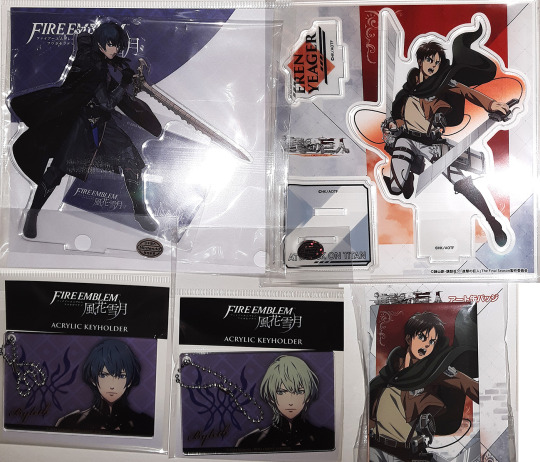

My June 2022 toy haul arrived a few days ago, along with a few figures I purchased quite a long time ago but finally made it to me. The first image is what was released in June, in Japan and just got to me. I might have to make a second post with the other toys that weren’t part of this haul, just to not have a million photos in one post (not like I can add more than ten anyway).
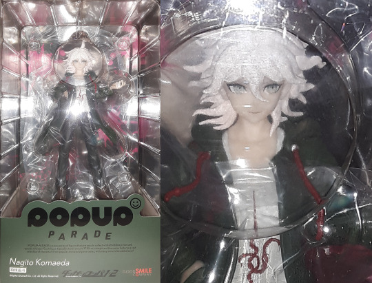
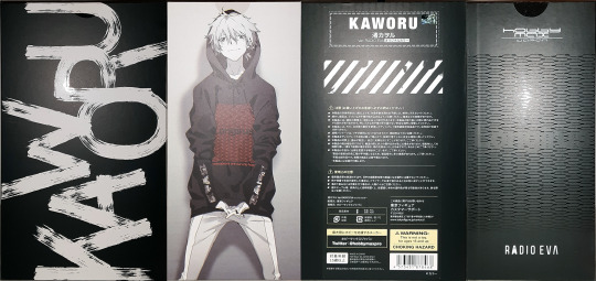
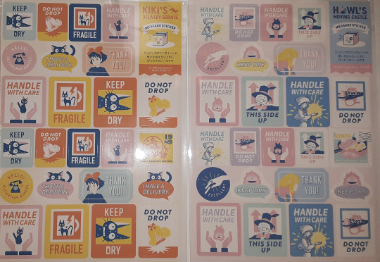
From far left top row to front right bottom row: Square Enix NieR Replicant ver.1.22474487139... Plush [NieR]; BanDai Tamashii Nations S.H.Figuarts Sasuke Uchiha He Who Bears All Hatred "NARUTO Shippuden" Non-scale Action Figure; Good Smile POP UP PARADE Danganronpa 1, 2 Reload Nagito Komaeda Complete (Non-scale) Figure; HobbyMax Evangelion (RADIO EVA) Kaworu Nagisa Ver.RADIO EVA Original Color Complete 1:7 Scale Figure; Intelligent Systems Fire Emblem: Three Houses Acrylic Stand Byleth; Empty Fire Emblem: Three Houses Acrylic Keychain 01. Byleth & 28. Byleth; CRUX Attack on Titan Acrylic Stand Eren Action; CRUX Attack on Titan Art Tin Badge Eren; Movic Kiki's Delivery Service Message Sticker Packing Design; Movic Howl's Moving Castle Message Sticker Packing Design.
I am super happy with my figures this time. I love all the stuff I collect, that’s why I collect it. However, the first two S.H.Figuarts based on Sasuke they released, I found weren’t as accurate to the prototype. Which was a real bummer -- I usually expect known/stablished companies to keep their products accurate to their prototype. I specifically recall their Itachi Battle version of Sasuke having changes on his face, upon release. The proto was more visually appealing to me, but they ended up changing it. I find this release exactly as the prototype, so I am happy. I am a bit upset that the shop I got this from had a limit, other shops didn’t appear to impose. Sadly, all other shops had already been sold out by the time I was able to get him in my cart. T__T;;; I am hoping Amzn won’t oversell these (as they always seem to do, with figures I need and can only get from there), so that I will be able to get a second one from them.
The Nier plush is so freaking cute, I am super happy I decided to get him. I was scared of shipping costs (rightly so, if I do say so myself, I wish Japan had SAL or regular Air mail available right now!). I hope I will be able to get Emil, although I already have the pouch version, these are so flipping adorable (the more gigantic head, is what seals the deal for me). Sadly, shipping costs kept me from adding him to June’s haul. I hope he won’t sell out completely, before I can get him somewhere. This is my first Kaworu Nagisa scaled figure, I got the “original” color version, because I love Kaworu with whiter hair like in the original anime (thusly the “original” color version in the figures name). However, I didn’t pay attention that the eyes are also a lot less saturated than the “regular” color version, and I’m a bit upset since I saw Japanese owner photos of this version. I still love the figure to pieces, but from photos I have seen (I am not unboxing mine), his eyes are not as red as they were in the original anime nor like the “regular” color version. If/when they do a rerelease, I hope I am able to bring the regular color version home as well.
I am of course super happy with Nagito; PUP figures are pretty much exactly as the prototypes. The only thing that seems to vary is the plastic translucency and yellowness. None of the prototypes appear to be yellowy nor semi-translucent, but some of the figures I’ve gotten in the past are either or both. This one however, doesn’t appear to be either, which makes me extra satisfied with this purchase. I got a second one to unbox, but it will take a while before I can ship it, because my wallet still aches, from this shipment’s costs alone without including the costs of the items themselves. DX
#SasukeUchiha#KaworuNagisa#ErenYeager#ErenJaeger#evangelion moodboard#NarutoShippuden#Bandai#FireEmblem#Byleth#ToyHaul#Toy#Collectible#JapaneseFigure#Anime#VideoGame#ToukenRanbu#AcrylicFigure#AcrylicStand#SHFiguarts#ScaleFigure#1:7#1:7Scale#HobbyMax#TamashiiNations#SquareEnix#NieRReplicant#NieR#Plush#GoodSmile#PopUPParade
12 notes
·
View notes
Text
a retrospective of my art of 2022
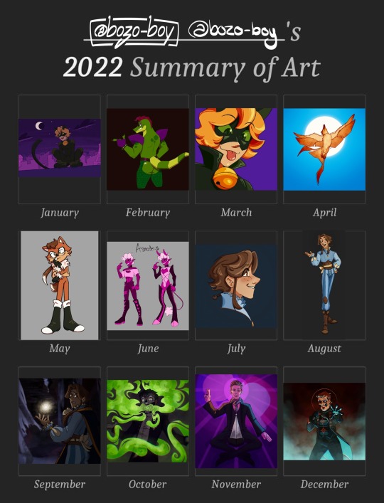
i love that you can tell what i’m hyperfixating on judging by the art. more detailed explanations below the cut!
january
i started off 2022 with a redraw of a piece from april of 2021. for christmas of last year, i got an ipad and apple pencil, so this was largely me exploring procreate and the feel of a new way of drawing. there’s a lot about this one that i still like, particular chat noirs cute lil face, but there’s so much i would do differently now that i’m more comfortable with the medium.
february
i was still finding my footing with this one. i was really into fnaf, and naturally, monty. the shine on the ass was using one of the in-app stamp brushes, which was quite fun to play with. honestly, going back, i would just add more depth and complexity to this one. i stand by the bones of this one.
march
this one was done so i could have a fancy new pfp. to be completely honest, i’m not a fan of this one. it’s a redraw of a screenshot from the show itself, and even at the time i was unsatisfied with how this turned out. in retrospect, i would’ve started the sketch small and then scaled it up so it would look a bit more,, normal. i find my art comes out much better when i start small.
april
this drawing is for a worldbuilding project i like to work on when i’m not obsessed with anything else at the time. in this world, there’s a city with a whole festival for phoenixes, and a legend involving a raven falling in love with the sun, but i won’t get into that right now. if i’m remembering correctly, one of my references for this one was a swallow. i still like the way the sun shines through the feathers and the more painterly style. i still stand by this one 100%.
may
oh boy may. this was when my apple pencil broke, and lined up with me getting into sonic, after watching the movie. one of my friends sent me a picrew, birthing this little nameless character. i’m still quite happy with this one, i think i got the style really good while still making it a little bit my own. my short lived sonic hyperfixation is still visible in the way i draw eyes while sketching, which i think it pretty neat. i wonder if, had my apple pencil not broken, i would’ve gotten more into the franchise.
june
AHHHHHH. sorry, this is from when i got back into a set of my ocs, affectionately dubbed “the sin boyz”. they’re all based on the seven deadly sins, and this is asmodeus, embodiment of lust. he’s definitely the most fun to draw because of him being quite high energy, and i’d love to come back to these characters once again. i don’t have much to say about the drawing itself, other than still liking how cartoony it is.
july
i’m not entirely sure what sparked this, but i got really back into the arcana, a game which i’ve been into for years now. this little fella is my character for the game, named zephyr! this piece is actually based on a sketch from i think a few months earlier. i still like this one, with his cute little face. i adore how his eyes turned out, and i’d love to try returning to that style, even just to experiment.
august
this is actually a reference photo for zephyr, but i wanted to fully render it to try to demonstrate some of the fabric textures. i still adore just about everything about this, aside from how his face turned out. i’ve always struggled a little with placing eyebrows too close to the hairline, dating back to my art from when i was like,, 12, where the eyebrows would actually float above the head. aside from that, i still love this.
september
when i made this, i was actually rereading lucio’s route (i’m obsessed with it in a train-wreck way) and found the imagery of the player investigating his abandoned room super compelling. the background from this is actually from the game itself, which is something i had never done before. i even slightly edited the background the reflect some of his magical light! this one is much less colourful and saturated than my other stuff, and i have mixed feelings about it. still though, i’m proud of it, and i think this style of lighting is reflected in what i make today, even if the colours are out of my comfort zone.
october
this is probably one of my favourite pieces of ghost fanart i’ve made. the lighting is a little unpolished in relation to the smoke, but i couldn’t care less cause i just think it looks so freaking cool. i was directly inspired by mummy dust, both in the vision in my head when he growls “duuuuustl, but also in the green stage lighting when it’s performed on stage. i love how swirly the smoke looks, and even now, i’m obsessed with drawing characters lit from below. it’s one of my favourite things i’ve ever made.
november
so uh,, i was a very passionate voter in the american music awards, and the news of ghosts win was so wonderful. i, like many others, was and still am obsessed with the outfit tobias forge wore, and found it super inspiring. i was really worried about this one, cause i basically never draw real people and really wanted it to actually look like him while still being my art style, and i think i did pretty good. this was also new for me because it has two light sources! this presented a really fun challenge and i’m still so proud of this, aside from the lighting on the glass part of the award itself. also, three.
december
i got a new apple pencil for christmas! i immediately had to make something with it and the wonderful pressure sensitivity. i was mostly just playing around with this one, and doing back i’d change a few things, even if it’s only from a few days ago. nonetheless, i had a lot of fun here and really like the colours.
summary
oh boy i sure did draw this year! i think i’ve improved a lot, specifically in shading and rendering. i went outside of my comfort zone a lot with lighting, like things with multiple light sources and coloured light. next year, i wanna go outside of my comfort zone in different ways, particularly with things like backgrounds and character interactions. if you’ve read this far, i hope you enjoyed my self-analysis, and i hope 2023 brings you joy!
3 notes
·
View notes
Text
as much as im liking the dusk theme prototype i dont want the whole vibe of the website to be gloomy.. maybe i shouldnt be going for a theme at all??
the problem is still that i want the theme to fit the content too.. maybe thats a stupid problem to have since thinking about it i rarely ever thought 'hm this website doesnt align with the content it has'.. specially not neocities one that have actual theming
idk i want to eventually add kelvin in a section of the main page but its gonna look like. sad. bc of the theming. i also like to add a bunch of colorful, *non-gloomy* decorations.. sigh


heres the current prototype and a loosely edited color scheme to only have the orange as a color and not as part of the background.. it looks super weird but also a bit fancy somehow. yet its still less maleable content-wise than the original bc of how its slightly darker but more saturated..
its like, either have a nice site color palette that doesnt mesh well with the contents or have a mostly monochrome website palette that allows the colorful stuff to shine. eugh

found this cute screenshot i have of them.. but to illustrate the point, it looks a lot more out of place in the night palette than it does in the monochrome one. but the monochrome is boring. -_-💢
1 note
·
View note
Last Seen Blogs

macromea
Macromea

genzbanhoa
Sans titre

trbl-will-find-me
If I stay here, trouble will find me.
lavoie-susie
real morgana

automaticcoffeemachine
Automatic Coffee Machine