#all my worlds colliding
Text
Me finding out Amita Suman and James D’Arcy are in the Tiva spinoff:

#THIS CAST#GUYS#amita suman#james d’arcy#all my worlds colliding#ncis tiva#ncis#tony dinozzo#ziva david#tiva
20 notes
·
View notes
Text
the fact that conan grey, daniel ricciardo, Katie McCabe and George Russell were all at the same concert doesn't translate in my brain
#friday’s chaos#andrew's chaos#all my worlds colliding#conan grey#daniel ricciardo#george russell#katie mccabe#tomorrowland
13 notes
·
View notes
Text


CARY ELWES and KYLE MACLACHLAN
SUNDANCE FILM FESTIVAL (2004) Park City, Utah
#just unearthed these. and they are driving me insane. dshghdgsfhgsdhf#u all have to see these NOW!!! I'm so fckn sorry#let's discuss. ted talk#are we so serious..............rn.#when worlds collide for fucking Real#my men ever..................#cary elwes#kyle maclachlan#mine
385 notes
·
View notes
Text
In light of uh... Recent trigun events on twitter, here's a tihylttw and trigun crossover
#yhank you bigolas dickolas Wolfwood for your servise#when worlds collide#thisnis literally thr worst timeline#ao much has happned over the past 12 hours and wathing it fuvking live has been interesting#sometimes twotter is amazing#anyway heres blue as vash and red as wolfwood but with a few character design liberties#i always tske my shitpost srt so damn seriously man#im on a huge trigun server and all we cna tlak abt is this situation i am pissing myself#its so funny and just so... random#like top 10 things i never would have tjought would happen ever#anyway im capitalising off of thr fact trogun is trendeing lol#cursed#my art#trigun#trigun wolfwood#vash trigun#trigun maximum#tihylttw#this is how you lose the time war#trigun fanart#trigun art#blue tihylttw#red tihylttw#books#sapphic books
1K notes
·
View notes
Text
ancient reptilian brain voice: remind yourself that overconfidence is a slow and insidious killer
#disco elysium#darkest dungeon#SORRYYY for taking the deep media guys out of context and putting them in Another context. but the interests are colliding#anyways yeah i couldnt rlly rectify the premises of both games so the DE characters are all just mercs now#only 2 people in the world will like this but at least those 2 people will be happy (through gritted teeth)#my art#wait when heroes in DD1 have heart attacks they go back to like 70 stress right. thatswhat happened to harry#ok cant keep this to myself any longer. out at 7 PM you go
243 notes
·
View notes
Text
You know, I feel like other trans people might get this, but it's honestly kind of refreshing when a cis person has, like, undeniable tboy/tgirl/whatever swag. It's like when you come across somebody who speaks the same language as you and you only find out when they start speaking it, too.
#trans#transgender#lgbt#lgbtq#ftm#mtf#nonbinary#all this to say that we are existing on a rock hurling through space#and this universe is going to collide into another and does it all truly matter in the end?#a lot of this is based on ideas we have about what constitutes certain people and i think it can be a fun observation#so long as you do not inherently ascribe certain traits as being indicative of who somebody Is#it can be amusing when you're SO confident that somebody is a certain way until you realize how Wrong you were#the amusement for me only comes because it's like... 'you tried your best to box somebody and you FAILED lmao'#and in a weird way it's kind of comforting because it reminds me that we all come into this world with bias that Will be challenged...#...so the best thing you can do is recognize those biases and then try to overcome them through great effort...#...so yes maybe i did think that cis dude had tboy swag but. that's not inherently his problem you know?#it probably just means he's confident in his manhood in a way that reminds me of the trans men* i know and love#i noticed that in him and it reminded me of my friends who are trans so i think 'oh! maybe that's why he's giving off those vibes!'#so while i won't treat him any differently before or after finding out i was wrong i'm still going to appreciate the fact that...#...he and i are literally just Vibing on the same planet and we both don't have time for petty arguing about manhood#i'll acknowledge what inspired those thoughts in me but that is Not his problem and that's good and beautiful actually#i don't always mind the tboy/tgirl swag meme just so long as you don't treat it like an Inherent Trans Experience Only Trans People Have#just recognize where those ideas are inspired from and it's fine <3#sometimes you will be Wrong and that's actually fucking neutral <<3#anyway rant over i just think this is /generally/ harmless and fun#like astrology. sometimes you just look up your star sign without ascribing your Entire Life to it <3#i think what i lot of people mean by saying a cis person has tboy/tgirl swag is just that...#...that cis person has an understanding of themself that comes from deep introspection that isn't necessarily expected of cis folk...#...but it is often something trans people do as part of our exploration of gender...#how is this the FIRST POST to reach tag limit... ask me for more thoughts if you want lol!
383 notes
·
View notes
Text
Forever upset with TMNT 2012 that they had Mona Lisa tell Raph she loves him but we never got to see him say it back.
#I guess actions speak louder than words as he slaughtered all of Dregg's army#but at the same time I wish he said it back#I did make a short fanfic of raph telling Mona he loves her after the Dregg ep#but I'm gonna explore it a bit more in my When Worlds Collide rewrite#random thoughts#tmnt 2012#tmnt#teenage mutant ninja turtles#tmnt raphael#tmnt mona lisa#tmnt ramona#raph x mona lisa
35 notes
·
View notes
Note
AU Writing suggestion? (Perhaps) 👀👀
I've been reading a lot of your work, and you do an incredible job at everything, especially slow-burn. From your work, I couldn't help but think you would write an incredible story of Aziraphale and Crowley in an arranged marriage AU. (Enemies to lovers???) (Whatever era you'd prefer) It may not be your cup of tea, but I wanted to share the idea in case it ever intrigued you.
It would also be a very creative one at that, considering how you're always able to put Good Omens references in your stories in subtle ways. (Those references are always enjoyable to see) Love your work. Keep it up!
rotating this idea in my mind like a microwave
#my only problem with writing arranged marriage#is i have no idea how arranged marriage works#i know some cultures do it#and i know nothing abt those cultures ththgthp#another Married At First Sight au? MAFS Australia to collide our worlds??? (mafs aus is fucking ART i swear to god)#good omens/#ask a rat#ratwips#edit: jesus chfikn christ i did it again i answered 1 part of your message and completely ignored all the#AMAZING WONDERFUL THINGS U JUST SAID TO ME#WTF Thabk you that’s so freaking sweet 😭😭😭😭#edit edit: NEATLY ADDING ‘ARRANGED MARRIAGE ENRMIES TO LOVERS’ TO MY REGENCY AU IDEA PILE………
74 notes
·
View notes
Text
I saw this one Jackson meme and I was like..
"Wait isn’t that weird al" YES. yk who is also voiced by him? CHEESE SANDWICH.
And we all know cheese sandwich=michael holden right…?? So that would mean…
JACKSON=MICHAEL??? BUT WAIT!!! THAT ALSO MAKES… MICHAEL JACKSON!!!!!!!!
#and this is crazy bc obsessed with ALL OF THESE THINGS???#Expect weird al..#he creeps me out#anyways#WHEN WORLDS COLLIDE!!!#michael holden#Jackson Jekyll#solitaire alice oseman#monster high#cheese sandwich#my little pony
75 notes
·
View notes
Photo
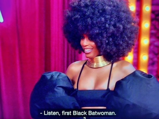
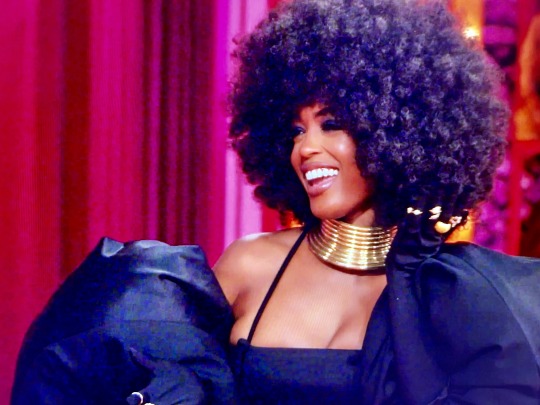
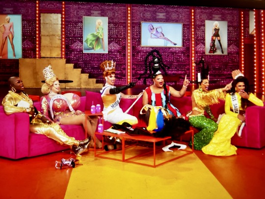
Javicia on Drag Race All Stars omfgggggggg
#javicia leslie#drag race#drag race all stars#rpdr#rupaul's drag race#kandy muse#lala ri#jimbo#alexis michelle#kahanna montrese#jessica wild#batwoman#my worlds are COLLIDING HENNY#my ugly screencaps lmao
156 notes
·
View notes
Text
I might be cooking a competitive pokemon au for the foxes
#*head in hands*#two worlds collide#gotta capture all my special intersts into one boat ig#pokemon#pkmn#aftg#all for the game#tfc#the foxhole court#andriel#andrew minyard#neil josten#pokemon au#competitive pokemon au
23 notes
·
View notes
Text

Huge day for girls who are, well... me.
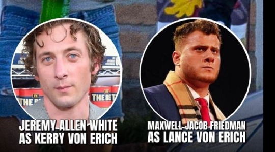
#this is my superbowl#this is my roman empire#this is my 9/11#this is my avengers#like you dont understand my worlds they are colliding#gods if they do any sort of like premier I will literally pass away#aew#all elite wrestling#mjf#maxwell jacob friedman#jeremy allen white#the bear#the iron claw
76 notes
·
View notes
Text
This is my personal crossover event of the century
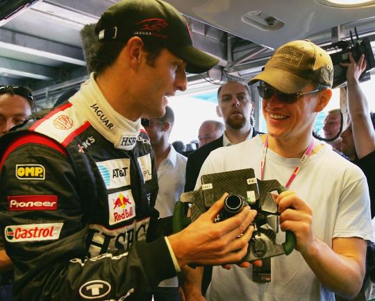
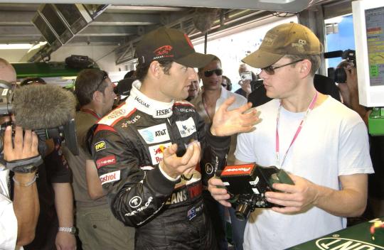
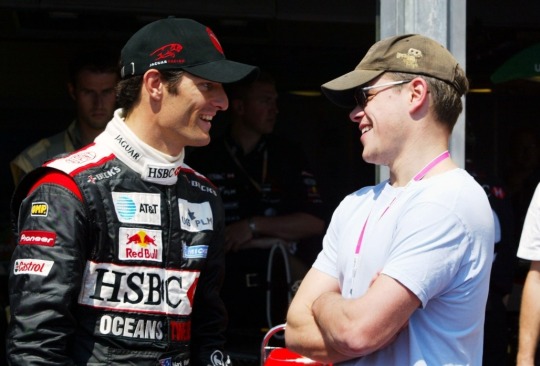
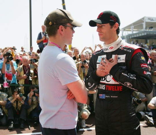
#one of my favorite actors and one of my favorite drivers interacting??? what???#alright whos gonna be the brave soldier and write the matt damon × mark webber rpf fic-#(i read a fic w james bond/seb so imo it really wouldnt be too far off to write Linus Caldwell/Mark LMAO)#ive known abt this event practically since i got into f1 but i feel like my thoughts abt it keep developing every time i look at them again#first time: huh okay wow brad pitt & matt damon taking w mark thats really wild. f1 drivers really do be meeting w high level celebs#after i watched fight club: wow wow!! i cant believe theres pics of brad pitt with mark thats crazy!#after i watched oceans 11: omg wait oh yeah! when mark was in jaguar he was sponsored by oceans 12!!! thats sick!!!#and then recently w my increasing love for Matt Damon: WAIT OH MY GOD MARK HAS INTERACTED WITH MATT!!!! (two worlds colliding feel ig)#but i was watching some interview w matt where they referenced this happening so its relevant in my brain again so i had to post abt it#but of course in the vid the specific pic on screen was him and mark interacting and i died. like seriously i can never escape f1 and mark#mostly im freaking out bcs its truly the crossover event of all time concerning my interests specifically#but the lore behind this is genuinely really really interesting#the fact that theyre promoting a heist movie specifically and then they put a $300k diamond in the nose of the Jaguar#and then the Jaguar crashed during the race and the diamond disappeared?????? cmon literally itself could be the plot to an Oceans movie#RBR/teams sponsored by RB were so much fun back in the day!!#they had several back to back movie promotions which all were pretty fun! just a shame neither team was good back then#it was Oceans 12->SW:ROTS->Superman right? i can't remember if there was another#such a shame that neither mark nor seb were in RBR in 2005 when RBR was promoting ROTS#i think i actually wouldve exploded if there were pics of them w hayden or ewan(my prev fandom haha)#f1#formula 1#formula one#mark webber#matt damon
98 notes
·
View notes
Text
Danny saw Hozier again… 🫠
#how are they real#my worlds are colliding#do you think they all went to the show or#greta van fleet#hozier
26 notes
·
View notes
Text
from a vibes perspective, i totally understand why so many people look at keefe and go ‘this guy would be the male equivalent of a wine aunt when he’s older’.
but. but.
taking lore into consideration, in my heart, he’s terrified of alcohol (even if he tries really hard to hide it). because. like. his first exposure is almost guaranteed to be through cassius, and cassius canonically threw a glass extremely close to him at least once when he was, like, 8. maybe cassius wasn’t always extra nasty when he was drunk, but there’s gotta be a correlation in keefe’s brain between risking getting seriously hurt (emotionally or physically) and alcohol consumption that’s really hard for him to shake.
#tw alcohol#tw child abuse mentions#lmk if there's more trigger warnings i should put#i have a thing for hurt/comfort lmao#kotlc#keeper of the lost cities#this is brought to you by:#that one fic my brain started writing internally where it's sophie's 21st bday and she's like man i#have saved the world so many times we've all lost count. i want a fucking drink#and keefe's internally like OH GOD OH FUCK in a bad way but externally he's like yeah babe whatever you want!!#and then she's like. i don't wanna do anything super stupid though. and drinking alone is super stupid when you've never drank before#will you stay w/ me? please?#and keefe's like. i cannot say no to that face#so he spends the night doing an increasingly bad job of hiding how bad he's freaking out#because sophie is a safe space and alcohol is not safe and he doesn't know how to deal w/ the two colliding#ESPECIALLY since sophie's just getting dorkier and sweeter as her filter goes down instead of throwing insults or objects at him#(i feel like sophie would be the kind of drunk that's very impulsive and says EVERYTHING that comes to the forefront of her mind#and stellarlune was more than enough to prove that she sees keefe and a lot of the time her brain just goes hnnngh soft little tortured#artist. MY soft little tortured artist.)#yeah but even intoxicated sophie can tell something's wrong even before he flinches super obviously at an empty glass falling over w/o#breaking. and so she's like nah man it's hurt/comfort time and he's like BUT YOUR BIRTHDAY and she's like do you really think i'm#gonna just let go of the fact that i know you're stressed? i'm not a dickhead keefe#so yeah it ends in cuddles. because of course it does#keefe sencen#annnnd out of the drafts this goes. post!
109 notes
·
View notes
Text
Today i will rate the skies in the covers of the stuff i have on spotify
Because i am offline while writing this i am naturally restricted by what it will display for me
1. collide with the sky (ptv)

9/10. lighter towards the horizon, great hue shifting, nice fluffy clouds, i love how saturated and blue it all is. one thing i really like is how the field is green and the treeline is so dark because that's just how it is irl for realsies. i guess the only thing that's subpar iis that i feel like for that type of cloud, it would look much more defined? but i guess that's cause the sky can't be distracting too much from the subject. anyways, really nice work.
2. Master of puppets (metallica)

2/10. Just getting some mixed messaging here. Like, the idea of it being all spooky and warm colors like that is cool, but it just…it all muddles into itself a little much. The light on the crosses doesn't look quite right and it's really hard to parse which parts of the sky are glowing or reflecting or clouds or the background or mountains. This album is really good though so i'll add a point for that
3. Danger days: the true lives of the fabulous killjoys (mcr)

10/10. What is there to say? I mean, awesome gradient…great mixture of scrappiness and fullness in the clouds…those colors are just beautiful…i love how the sun rays are radiating out from the spider in the middle…gotta rep the rest of this composition cause it slays. Seriously, great sky.
4. Joke cover of my demolition lovers playlsit (mcr)

4/10. This is very standard and pedestrian but seeing as it's literally just a normal stock photo of a construction worker i can't judge it too harshly
5. Glow (pkch)

9/10. Pukicho is a great photographer and i really appreciate the artistry of this one. My personal preference is for a more crisp and thick cloud but i really like the vagueness and fogginess of these ones. It gives off the impression of a sunset or a sunrise without putting a literal glowing sun or garish colors in, and i like the perspective of the clouds as they approach the horizon seen through how the bands of dark and light get closer and blend into one shade. Just a very beautiful photograph altogether, great colors.
6. Spirit phone (lemon demon)

5/10. Wasn't even sure if this counted as a sky or not, and i eventually decided it takes place outside during the night, but i did have to dock points for barely even being what i'm rating. I love the strange abstractness of it, the smeared perspective lines that have no purpose other than to look weird. Honorary mention goes out to the characters in the foreground that, though ghosts, can be understood as weather phenomena due to the song in this album "soft fuzzy man" (about a sentient storm that wants to date the listener); giving them the dubious honor of the weirdest clouds ever.
7. Embers (beetlebug)

8/10 Another edge case, but i decided the patches were clouds so it counted. As a fellow watercolor artist i'm naturaly drawn to this, but who wouldn't be? It's another one that handles the sunset situation with tact and depth; the white edges aren't just a great painting move- they express light shining onto the edges of clouds. Another very clever composition utilizing the sun. just great.
8. Until the end (beetlebug)

6/10. Less stunning than the last one, but it's charming in an understated way. It feels very simple and childlike, but does have touches of maturity from the nuanced colors and defined clouds. I really appreciate the bold choice to make the sun red, it's unexpected but striking.
9. Ride the lighting (metallica)

3/10. Perhaps this is due to my complete lack of experience with thunderstorms, but i just don't like the black thin scrappy clouds. It feels so noncommittal. I'm guilty about rating it so low because i feel like the album cover, overall, looks great (especially the awesome 80s colors, those get compensation points from me) but every time i zero in on the sky itself, i'm just perplexed.
10. Purrple cat💜 (purrple cat)

1/10. This is just fine. It's a normal sky. It has normal stars and normal planets and normal nebulae. It's so uninteresting. Doesn't attract the eye. Every item evenly spaced out from the other. I don't understand why that planet is glowing but so dark. it just doesn't make sense.
11. Hallows eve masquerade (beetlebug)

10/10. This is basically the epitome of what's good about beetlebug covers- like, there's a kidlike charm to how simple it is, but there's a finesse to the colors and concept. This one just has such an expertly handled warm color pallete. Love the subtle glow and the centered composition.
12. Bee and puppycat- official soundtrack playlist [[star swirling emoji]] (milan records)

10/10. See, THIS is how to do a space sky properly. The glowing things glow and it's not desaturated as all get out. This has a good handle on the subtle pink-and-green nebula glow and it's cohesive with the rest of the palette-- I guess that makes sense, because this show is interested in that retro look where chromatic aberration like that is common.
13. Fly by night (rush)

5/10. Even though i'm not the hugest fan of it, i respect the choice to keep the background elements a solid color. It plain and cohesive, and making everything blue except for the yellow of the eyes is a good idea.
14. ???? (??)

7/10. This is like 20 pixels but it looks very nice. Going into this i wasn't expecting so many of these to use the sun or moon as a focal point of the composition but i guess it makes sense. I like the color shifting to the horizon.
15. Kingdom in blue (kupla)

10/10. AAAAAH!! I love how this is a sunset but much more cool colors than all the rest! You don't see the pink + teal a lot but it looks great. The floating island adds a nice flow to the whole thing and a fantastical edge to the more common lo-fi vibe.
16. Let's cheers to this (sws)

10/10. You know, this would look great if i could SEE it. I'm too miffed to explain why it's good.
17. Dracula reading playlist (elizabeth)

8/10. i feel like this matches the vibe of the playlist and the book very well. i'm not a huge fan of fog as a stated before but in this instance it really works to punch out the silhouette of the castle, which is the main point. I also like how it's just straight up red. evil.
18. Teal album (weezer)

0/10 i'm mad that i thought this was a sky but it's just a teal background
#Humor#meme#rating#music#pierce the veil#collide with the sky#master of puppets#metallica#ride the lighting#my chemical romance#danger days#demolition lovers#lemon demon#spirit phone#beetlebug#bee and puppycat#sleeping with sirens#let's cheers to this#dracula#weezer#spotify#photography#art#did you guys know that i wrote all of this in a google doc without internet then painstakingly repuloaded the images to tumblr#i hate drafting on google docs but theres not a single good place to do it#also speaking of lack of internet having such low res images for these was annoying#but sometimes it added a lot to the humor so i kept it#esp that great big world one that i dont even properly ermember the name or band of😭😭😭
9 notes
·
View notes
Last Seen Blogs

invisible-man60
Untitled

intrinsic-luxuria-worth
Marbray_XXVI

ioanyna
Ioany snaps

matthewgraygublerdaily
newest source for mgg
