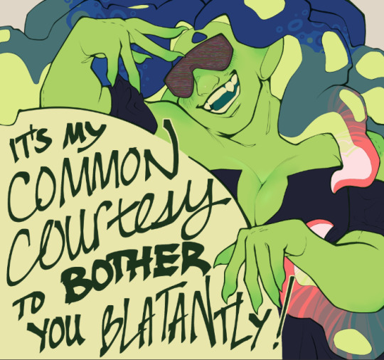
#all the way until i got csp actually
Text
As long as CSP keep their word and don't revoke the license you've already purchased, I'm not jumping ship on the software
However
I decided to give Krita a short spin bc it's the no1 Actually Reasonable Suggestion ppl bring up when it comes to art software
A bit of context: I'm primarily a Linux user and Windows is the bane of my existence. But all my years of drawing digitally I had the p secure knowledge that drawing on Linux just Doesn't Work bc you don't get pressure sensitivity (drivers who) and also the one time I tried Krita years ago it was laggy as shit
But i pulled it up out of curiosity and, knock on wood, it just. works??
Tablet drivers are a thing on Linux now and Krita seems to just Work
Again, I'm not jumping ship on CSP or fully migrating over to Krita, but being able to just. pull it up on Linux to doodle down something I want without having to reboot my entire laptop and wait ages for Windows to wake up?? Astounding. Revolutionary. Life-changing.
I'm very excited
#kata's chatter#again knock on wood bc i couldnt give it a full try of proper drawing#i will in a few days/a week but not now#but theres pressure sensitivity!!! you guys have no idea how amazing that simple fact is to me#way way back when i first started drawing digitally i was using fuckin WINE. later a virtualbox for a v v long time#all the way until i got csp actually#so shits always been clunky#idk if im big brain enough to really learn krita on top of csp but im glad it is indeed an option#sidenote i AM pissed about what csp are doing but this post isnt about that#also turns out i never even uninstalled krita. brain do be like that huh
5 notes
·
View notes
Note
Your VTM comic book covers are simply GORGEOUS, I'm totally in awe! How did you get the super cool halftone/coloured dots effect? It looks super cool and realistic, I love it! Have a lovely day! :)
Thank you so much!
So to get the halftones, I use an old-ass tutorial I got off deviantArt literally....more than a decade ago? (Rosalarian's Golden Age Tutorial). The account appears to be deactivated, but I'll go through the steps here:
For reference, I bounce between Clip Studio Paint and a very old-ass copy of Photoshop, but if you're using other programs that have fun pixelate filters and you can change the color mode, you should be ok.
NOW...
Ink your drawing in straight black on its own layer
Block your colors on another layer (I hunted up some old comic color palettes thanks to madformidcentury dot com/2013/10/mid-century-color-palette-in-comics dot html)
Turn off any and all blackwork (this is INCREDIBLY important), and take your colorwork into Photoshop. (if there are any gaps in your color work, fill a separate layer with white and then merge the layers so it's all solid)
Set the mode to CMYK
Go to Artistic Filters >> Pixelate >> Color Halftone (the only thing I mess around with is the size of the dots; the default for my era of Photoshop is 8 and that's a lil big for my taste--all the VTM covers are between 4-6. It's up to your own best judgement, but I go by how "readable" things look--does the face still look like a face at a reasonable distance or is it just a smudge? If it's not readable, undo and change your dot size)
Add 3 new layers to your document and LABEL THEM: Cyan, Magenta, and Yellow
Then go to your channels panel and click on the Cyan layer to make a selection of it
Back to your Layers panel, make sure you're on your Cyan layer, and SELECT INVERSE
Then FILL the selection with the CMYK cyan that you've picked out
Deselect your selection, move to the next layer (and make sure you've got CMYK magenta in your bucket) and repeat steps 6-8 selecting Magenta and Yellow respectively
NOW you've got the beginnings of retro-feeling halftone. At this point, I import the halftone manipulation back into CSP and turn my blackwork back on.
For the ✨ grunge ✨ effect, I grab an old paper texture (after reducing its saturation and upping the contrast until it's mostly black and white splotchy) and set it to OVERLAY at anywhere from 50-20% (this is a 'let your soul decide' moment) over the whole thing
Then I grab another old paper texture and put underneath the Overlay Texture Layer, on MULTIPLY, at anywhere from 65-25% (again, let your soul decide). Both layers will give you a nice level of funk to go with your halftone shenanigans
A lot of the colorwork is going back and forth and back and forth because what looked ok in flats didn't translate after toning, but it works out eventually!
Some important things to remember:
Cool tones tend to fade back and warm tones tend to move forward if you're gonna use this method on any kind of scene
Keep your shapes SIMPLE; don't get bogged down in tones of gradients and fades and all of that because most of it WILL NOT come across once you start toning! Think of it this way: mass-production doesn't have time for fine detail, that's why comics are a lot of heavy black inks and flat color contrast
Experiment with the colors! You're working in a limited palette (if you're using any of the old Marvel/DC print books especially), and it doesn't have to be photorealistic/absolute. For instance, my Nos isn't actually green, but the tone suited the funky retro vibe so I went with it!
Let yourself fall down the research rabbit hole of pulp covers because they're both hilarious and informative. Same dot energy is an interesting collection website to go through, you can also go through your search engine (remember to add -pinterest -youtube to your search term to filter out that crapola)
HAVE FUN!
💖
24 notes
·
View notes
Note
Hi i follow ur mademoisemuder tumblr account and I really like how smooth your lineart is especially the black & white manga style and regular linework.would you be willing to share your brushes or brush settings? A photo works to. I use clip studio & I’ve been dying to draw smooth lineart like you do! And your knife girl oc, to die for! A friend said she uses a brush size of around 6-7 with no taper and adjusts her pen pressure settings, dunno how she does it, how is your brushes settings like? I’m a iPad person and I recently got a screen moniter but it’s a whole different experience switching from procreate iPad to PC. Please share your ways por favor , -art anon
THANK YOU SO MUCH!!!
I use Clip Studio too! I use it on PC with a tablet (regular, not screen), so idk how well my settings will translate for you but I'm happy to share regardless!!
First of all, and importantly: a lot of it is muscle memory and training that comes naturally as you continuously do lineart. With time, you'll notice that the bigger swoops and long lines/curves that form a smooth line will start to come more naturally to you simply because your hands get used to the motion and you don't have to actively think about it anymore. Hands are cool like that.
(but also sometimes a stroke just takes 15 attempts regardless. Strg+Z is your best friend.)
As for the brushes I use, I'll put them under a readmore (got a bit lengthy)
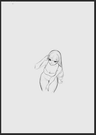
First, for a rough reference/guide regarding the brush sizes, I usually sketch on the base A4 layout with 300 dpi, but I sketch small and not page-filling. Here's a thumbnail so you get a rough feel for their size on an A4 page.
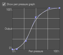
Also I recently adjusted my pen pressure settings a little (under File - Pen Pressure Settings) so it now looks like this, but it used to be the default until a little while ago though!
Onto the actual brushes:
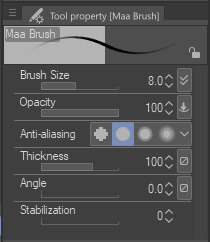
Most of the stuff on KG's blog is drawn with the Maa Brush from the CSP Asset store, so for example this, this and this were all done using the Maa Brush. I use it to sketch and line, usually on size 5-10, these are my settings:
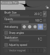
Next, for very thin delicate lineart I like to use the Favorable Pen from the Asset store, which I used here for example. I use around size 20 for it (I don't use a lot of pressure so the line comes out quite thin)
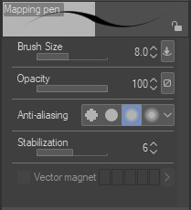
For a lot of my more rendered art I use the basic Mapping Pen in Clip. I used it for example for the recent story-arc update in asksds or for this. I generally use size 6-10.
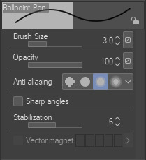
Back when I used SAI I had a brush called the Ballpoint Pen which I THINK I made myself in Clip (I at least couldn't find it again under that name in the asset store but I'm sure there are a dozen brushes like it) which is just a basic brush without pen pressure. I often use that one to get me out of a rut or to force me to focus on simpler shapes since it does kinda need you to be a little controlled to keep everything readable. I used it here and here for example. I use it at size 3 but keep in mind that I draw small.
I guess I could also mention that for most of the regular asks in asksds I use the Simple LineArt pen from the Asset store. There's no significant difference to the Mapping Pen, I just feel like the tips aren't quite as delicate as the Mapping Pen and I prefer that for sds...it might be an illusion though.
And we're done, those are the main brushes I use for lineart! Occasionally I try something different (like a G-Pen for a more textured look) but these ones are my regulars. I hope it helps!! (❁´◡`❁)
4 notes
·
View notes
Text
Hi I'm a nobody asked digital artist, here's my thoughts on all the digital art programs I've tried. These are based entirely off my own memory, and I'm not picking up any of these programs again to test them. Just going off vibes.
Autodesk Sketchbook - Mobile:
This is more or less the definitive Draw You In To Art program. No exaggeration, I think if you asked maybe 50 digital artists in the modern day, most of them would've tried this one at least once. It projects an illusion of polish to distract you from a number of critical missing features, but overall, it's not even remotely bad to start out with. I think if my mobile tablet had a halfway decent degree of pressure sensitivity I could make something okay with it.
A more detailed explanation of my thoughts is hard, but to sum it up, this program bombards you with a million brushes for free, something rarely done by digital art programs, but, it also has extremely limited layer behaviors, you can't change canvas size anymore, and the stablizer is pits. I won't say it's bad. It's not. It's just not good. 5.8 out of 10.
Ibis Paint X - Mobile:
Comedically simple, this is the program you pick up when you're doing digital art a little better, and want to actually have fun. Bread and butter of the mobile digital artist. It has literally everything you need, it's just not fancy in any way. Getting every brush isn't worth paying for, but you'll live. They recently tried to step into AI and got punched in the gut so hard they stopped, which I like.
In general, this program doesn't do anything in particular extremely well, but it also doesn't do anything poorly. It's well rounded. I'd say if you're gonna do digital art on mobile, you'll always find yourself coming back around to this. It's just too solid. 7.8 out of 10.
Medibang Paint - Mobile:
I am biased against this program. I just don't like it. Maybe I was using it wrong, or maybe the mobile version is just worse, but it felt like drawing with mashed potatoes and gravy. Also it seems to be no longer available on my tablet, so fuck it.
In truth, my memory on this program is hazy despite me using it probably the second most out of all of these. No clipping mask, limited layer styles, an extremely limited number of brushes, no way to get more on mobile, anti aliasing made everything pixelated, and I don't think it can change canvas sizes, or if it can, I never figured out how. I just don't like anything about how the program feels. 3 out of 10.
Clip Studio Paint - Desktop:
Goddamn. I wanna recommend it. I really do. But. You have to know things.
First and foremost, the new subscription model for CSP essentially means that after a year, whatever version you have is obsolete, and won't even get updates while you have it. You have to pay a yearly subscription to get the updates for your current version. if you pay for the 3.0 version when it drops in march, it will be 10 dollars extra to get any of the updates to the 3.x version until 4.0 drops, when you can pay 25 dollars to upgrade to that and get all the 3.x updates, plus whatever came in 4.0. On top of that, it can cost anywhere from 25 to 200 dollars depending on which version you get, and if it's on sale.
But goddamn. It's pretty worth it. The brush engine is fluid, works great for making your own, I've never seen the program fail to do something. It has limits, but I've never hit them. 8 out of 10.
Rebelle 5 - Desktop:
Listen to me carefully. This one is extremely specific. You have to WANT a digital art program that replicates IRL media PRECISELY. If you don't care about that, this program is not worth it. I got it on sale for 10 dollars. Can I reccomend it at that price? Heartily. But at the near 200 dollar price point it usually goes for? FUCK NO. Rebelle caters to a specific demographic. Nothing else matters.
That said. When it works, it works well. I do like how rebelle feels and works. But not enough for me to ever tell someone to get it for full price. 4 out of 10, but if you really want to replicate traditional media, 9 out of 10.
Corel Painter - Desktop:
Never before has a program sent me on such an emotional rollercoaster as this one. It's just so much. It's a midpoint between Rebelle and Clip Studio, but for the worst. It's expensive beyond comprehension, you can't make your own brushes, only pay for new ones, it's a yearly format meaning a new, barely distinguishable version goes on sale every year for another 300+ dollars, and I only got it as part of a Humble Bundle for 25 dollars, and I still feel like I wasted my money.
And you know what? I didn't just dick around in this program. No, I made a full drawing in it. Nothing spectactular. Just a simple drawing. And I felt accomplished. and I went to export it, to share. Only to find out you can only email images to the email associated with your account to get a regular image version. Now. This made me irrationally angry, but, I calmed down, and tried it.
It only works with microsoft emails, and I have a gmail account associated with my Corel account.
This program is 300 dollars, and lacks the functionality to simply export a png to your computer. 2 out of 10.
#squidzard.txt#squidzardart#art#artists on tumblr#digital painting#digital art#digital illustration#art programs#rant
3 notes
·
View notes
Note
hi!! i absolutely love the way you color your art, so i was wondering if you had any tips?
hey!! thank you!! i actually have two posts written about this already, here and here
i honestly don’t really have much to add from those posts, but a few extra tips that come to mind are
In clip studio paint, lasso fill is your best friend for filling in flats. Sometimes I use it for cell shading too. I’m sure there’s a way to create the tool yourself in settings but I just got the one I use free in the asset store
Also in CSP, gradient maps are your friend. There are defaults, but you can also download packs from the asset store or create your own new ones. I usually finish my color for a piece and then cycle through all my gradient maps until I find one I feel adds something. Set them to overlay at a low opacity. It can really help unify your color palette. Gradient maps are in PS too I just find they don’t work quite the same way for me.
Consider what color your lighting is, and how that color would mix with the local color of objects. Also consider how strong that light source is, because it will determine how much it will influence objects, ie how much of that color you should “mix” with the local color. I will literally pick colors by imagining what color I would end up with if I were to mix the local color and the lighting color like paint. By local color, I’m referring to the original color of an object, without the influence of the environment around it.
Hope any of that is helpful!
50 notes
·
View notes
Text
⚠TRADE OFFER⚠ Art for Art
I’ve been thinking for a while that a lot of people don’t like inking/flatting, and that I’ve gotten reasonably okay at both those things and find them soothing and therapeutic, and that that might be both a commission niche and a contributing to bringing art into the world niche that I could fill even when my brain refuses to otherwise Be Creative. But everybody has a different process for their art and it’s hard to get a good handle on how well this would work (and if it does, what my pricing range on it should be) if all the practicing I’m doing is on my own stuff, where I know what I want it to look like and don’t have to guess which sketch lines are deliberate and which are stray marks that can be ignored. So! I want to use you, my lovely art mutuals, as guinea pigs... if you’ll let me.
Things I need from you:
a sketch (as refined or as loose as your sketches typically are when you consider yourself “done sketching” and ready to move on to the next step). PNG, JPG, GIF, PSD, or CSP files are all acceptable here, just make sure it’s the size you want the finished lines to be (which may require sending it to me on discord or through a drive or dropbox or something).
OR an existing inked image that you would like flat colours for (same file stipulations as above)
any notes the pic may need if you have specific designs on the end product (e.g. if you have elements you intend to blur or animate so they should be on their own layers or things like that)
permission to put the sketch+ink comparisons on a patron-locked patreon post, with appropriate credit+links (and possibly also use it as an example for real commissions of this type later, but I’ll come ask for permission again if/when that becomes relevant). also said links, if you’ve got a preference on what specifically I link, heh
Things you will get from me:
an inked sketch at your chosen resolution/dimensions to do with what you like, no credit or payment needed (or flats, likewise. or both if I’m feeling spicy!) and with no obligation to actually do something with it either (hey, I’ve been there)
the satisfaction of contributing to Science and also my understanding of my own process and its limitations
time frame unknown; I’d assume a week or less if I was actually taking these as comms but as I’m feeling it out right now and also have no idea how many of y’all will respond to this, it might be longer
This offer’ll be open either until next Monday (February 20th) or until I get overwhelmed with interest, whichever comes first. Mutuals, if you also have a mutual that would be interested in this particular experiment, feel free to send them my way as well. Mutuals once-removed? There’s a lot of brilliant artist friends that my artist friends follow and I don’t because I am a heathen who barely follows anybody (and also get weird about following new people for some reason) (and also I know I have direct art friends who I don’t follow for various reasons), lmao
5 notes
·
View notes
Text
i don’t normally do this type of post, i never have reason to, but i wanted to write down or go relatively in-depth with the process of that last piece so i can hopefully replicate the results (or if anyone was curious). and also because i think the initial sketch is hilarious:

before i put a cut on this monstrosity of a post, these are the lines and flats; there were a few details that got lost under the shading so now you can see the gradients on her tentacles, etc.
now let’s get crack a lackin’
composition-wise i had a vague idea that i wanted both her hands in the shot, a prominent feature of her smile, and the lettering in the bottom left-hand corner; of which the hardest part was placing both her hands until i had the idea of her leaning against her shoulder.
since i swapped to csp from sai, my sketches have gotten looser and simpler in style, which isn’t a bad thing but wasn’t what i wanted out of this pic. i especially wanted to evoke the way i used to draw marlo’s teeth and did my best to replicate the brush i used to sketch in sai, and then i drew the rest of the owl. (and refined the text.)
(on god, there are no layers in-between these two.)
i did not have to line this from here but i wanted to, so i did. i think that took the bulk of the time spent on this... somewhere around 7 to 9 hours?

i wasn’t thinking about line-weight all that much, really, apart from mimicking the heavier and thicker areas of the sketch—normally i would have a light-source in mind already, and thin the lines which would be under direct light and thicken the ones in the shadows, but i really didn’t think i was gonna render this yet. for as long as it takes lineart is the least-complicated step so... that’s that.
for clarity, i won’t include this version in the process, but for all my artfight attacks thus far i’ve duplicated the lineart layer and used some effect to add some soft red rim to it all. in this instance the duplicated layer is a soft vivid red on color burn and blurred a little; the main lineart is on hard light so it can show against the darker colors.

the flats have a few things going on; they’re a mix of my own color choices (for example, her main skin tone is the same color i used to sketch) and eyedropped, which i don’t normally do but you just can’t get better than dolly’s native colors imo. instead, the skin colors from her ref made up the highlights and flush points. i was gonna do the same thing on her tentacles but gave up because i couldn’t figure it out LOL. most everything was magic wand’d for ease of selection, though i like to color by hand.
oooookay, so now we get into shading. i wasn’t planning on doing anything extra beyond nab a few extra points with a rough excuse for ‘fully shaded’, but i started screwing around with layer modes and, well, that was all she wrote.
first step: saturated teal on 100% multiply. (i think it was a color i eyedropped from one of splatoon’s assets for my last zine piece, actually.) i blocked it in chunks and refined it with the g-pen and eraser, celshading everything like i normally do, and then stumbled face-first into blending instead. clip’s default gouache blender for that, at various sizes depending how broad or subtle i wanted the blend. i sort of kept the shadows crisp near where they were cast (i.e. her arm against her tentacle) and faded on wider planes like her arms & chest but mostly i did whatever i liked.
duplicated the layer and set it on top, a bright red on 100% saturation. i use the HSV sliders the most and the red was, itself, 100 saturation. i wanted extra vibrancy without having to literally paint with more saturated colors and this was the best solution i could come up with.

now the light source; a linear burn layer on 23% opacity, a rich gold color (i think one of the ones i’ve used for ness’ ink at some point); cool shadows mean a warm light source. normally i would magic wand the celshading and invert selection, but since i’d already painted everything, i ... did the same and expanded the selection significantly, overlapping with the saturation layer/‘subsurface scattering’, and softened the edges down. not recommended, will make sure to think ahead next time lmao.
now we start to get complicated and i started throwing things to find if they stick. this one’s a soft light layer with pink and blue airbushed on; the pink to add further vibrancy and depth to her skin, accentuate the flush points from above, and create color variation and vibrancy in her tentacles. the blue got used for a rough approximation of bounce light and to create a bit more depth in the shadows. i wasn’t super precise with the placement, but it isn’t obvious either way.
the top is a very pale tan on soft light, there’s not a lot to this; it’s very broad highlights and i just kinda did whatever in terms of the shapes.
the bottom is the addition of another vivid light layer, a similar if not the same pale tan airbrushed over and around the broader gloss. i layered it heavier where that gloss was more pronounced, especially closest to the light source, but bled it out farther to create the illusion of... i don’t know if you would call it refraction or subsurface scattering again, but some extra depth. there’s also a few speckles to dampen the impact of the shine on her nose and lips & accentuate the shine of her teeth.
and that’s all of it! i made this whole thing up as i went along but i am Definitely gonna attempt recreating and refining it. if you read this far, thank you so much, i am handing you a plate of homemade sugar cookies
4 notes
·
View notes
Note
hi hina! i hope you've been well 🩵 for the art asks: 5, 6, 15, 16, 17, 18, 19, 22, 23 🎨🖌️🖼️
Mariam !!! It's so good to hear from you I hope you've been well also <3 <3 <3 this will get long
5. Anything you haven’t drawn yet but want to?
oooooh I've had an idea in my head for an s/e piece inspired by visuals from the blood sweat and tears mv for like 5 years but no matter how hard I throw myself at it I can never get it to look right so i've just been waiting until i manage to catch lightning in a bottle i guess :<
(((I also found a few notes in an old "to draw" folder from like 2 years ago that include but are not limited to: jjk band au with guitarist brothers yuuji+sukuna/bassist megu/drummer nobara; gojo in crocs. ))))
6. Which artists inspire you right now?
HHHHH its the same crowd as usual i am so hides face in hands bc they intimidate me /pos :'))))) vacuumchan, ohprcr, gloomyhome, trickywagon, meru90 to name a few ANYWAY RUNNING HIDING
15. Biggest artist pet peeve?
this is a tough one im such a hater and everything inconveniences me ,,, when the perfect csp brush costs money >:C,, when u cant find reference from this One Specific Angle >:C,, when u dont realize youve merged the wrong layer until you've been working for hours and all of a sudden your folders are out of order and its a mess >:C SPEAKING OF MERGING LAYERS hot take i think that they should invent a way to let u merge layer modes without converting them all to the same type. let me put my multiply with my glow dodge !!! cowards.
16. What’s the most daunting part of your process?
rendering :') so much of it is trusting the process and there are so many ugly phases that make u wonder if u were ever good at art to begin with
17. What inspires you?
hdsj i mean im a fanartist so i think it goes without saying that I'm mainly inspired by the content I like ,, but i also am very inspired by fashion !!!! saw a guy walking the other day with a hoodie that said CASH FOR SOULS | COLD HARD CASH | CA$H4SOULZ.com and i had to take a picture of it like a creep bc tht + Sukuna ??? hello??? anyway yea ive got a pinterest board dedicated to insp-y clothes and a notes folder dedicated to jotting down cute outfits I see in public
18. Do you have any larger projects you’d like to pursue?
I've always wanted to do speedpaints ! but even more than that I want to do something aNYTHING with my ocverse but alas...time.....planning....plot.. so in the meantime they simply live in my head bouncing around like globs of wax in a lava lamp
19. Favourite character(s) to draw?
megumi jjk
gojo jjk
sukuna/yuuji jjk
kotori love live
rina love live
ichigo tokyo mew mew
+ shiro n eden from My Brain
,,, im crying the duality of my fav chars is either feral shounen twink or idol/magical girl and eden is both simultaneously actually
22. When is your prime time to work on your art?
usually mid to late afternoon but it depends on the season because it gets so HOT in my room in the warm months which I dread >:( How it works is if I start in mid-late afternoon then I'm able to hit my stride and draw basically through the entire evening (also because of the aforementioned Heat I vastly prefer drawing in fall/winter because that means I don't have to evacuate my room at 4pm sdfhdgshd)
23. Do you listen to music or watch shows while you work? If so, what’s your favourite?
I have to have music or something on while I'm drawing or the fans in my cintiq will drive me insane . Sometimes i listen to music that matches/drastically contrasts the piece I'm working on but most of the time I can't be bothered and just throw on my youtube mix which consists embarassingly of mainly vocaloid and utau ,, though sometimes if a piece is kicking my ass and I need to just hunker down and get shit done then I'll put the entire discography of an artist I like on shuffle (some favs include 1D/waterparks/former vandal/harumaki gohan) and for some reason the Predictability activates intense productivity mode?? I cant explain it gdsj its like I have music on that I like but it's not jumping around between artists so I don't get too distracted or excited whenever the song changes
1 note
·
View note
Text
I was talking to my American friends and I truly didn’t grasp how fucked up you economy and education was until I mentioned off handedly that I just got approved for my HECS debt and CSP.
Then I had to explain to them what exactly those were. Basically for those who don’t know, a HECS debt is a way to pay off your student loans which is really easy to apply for, and once you pass a certain pay bracket a percentage of your pay goes to the debt. The actual rate of which doesn’t change and is also much lower than a normal bank loan. It’s interest free and in general is much cheaper than banks. You need a CSP (Commonwealth Supported Place) before you can get a CSP. Some universities let you apply for both in the same document while others have you go to the government website.
They were all blown away by this and the conversation went into minimal wage and I yet again shared a little fun fact.
At my old job, my minimum wage was $18.50/h for my age with 1.5x pay Sundays and 2.5x pay public holidays. At one point I was payed almost $450 in a single day just as a casual worker. In retail.
So if your government ever tries telling you a decent minimal wage is unrealistic. No it’s not. They just want to keep you poor.
1 note
·
View note
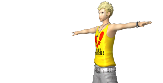
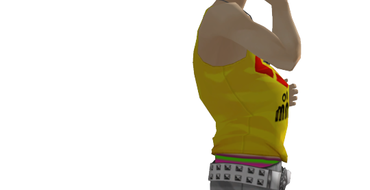
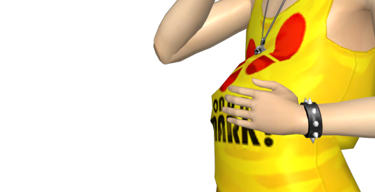
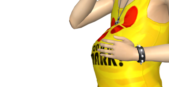
Photo

rendering the same sketch in CSP vs Krita. my OCs Shin and Nox
thoughts:
it may be because I’ve been using CSP for 6 years now, but the UI there is incredibly intuitive and easily navigable, not too many hoops to jump through to find something. there are less commands, but also, easier for me to bind undo as Alt + L because I’m left handed and it’s easier to reach than Ctrl.
Krita’s UI, to me, is. a nightmare. it lowkey reminds me of Autodesk Sketchbook’s, actually. there are a Lot more commands compared to CSP so there’s a ton of key commands you’d never think to use. I can’t bind undo as Alt + L because it pulls up the Layers dropdown instead. my wrist is sore bc I’ve been stretching my finger to the Ctrl key??? also there’s a lot of tools that just aren’t bound in Krita at all. ex: I got used to W for the magic wand tool in CSP, but it’s just there in Krita.
brushwise, I jumped around on Krita until I found a low pressure brush, which led to nice line variety, but I naturally have a light hand so it didn’t happen often. their brushes don’t feel as good to use to me so ymmv. in CSP, I just used the default Real G-Pen, which I used to use often before downloading brushes with abandon. it flows smoothly and accounts for my light hand more.
(I’ve been spoiled by how amazing the paint bucket is in CSP with the way it can fill even with gaps in linework and not overflow)
I understand Krita’s meant for more than just merely drawing/animating (there’s a menu for Python???) but oh man. it’s a little Too Much for me honestly. CSP is simpler and easier to adjust to. a shame they took a bite from the Adobe pie. if version 1 remains stable I’ll keep using it bc by god. I don’t have the patience to keep relearning programs.
some pros for Krita: you can set it to CMYK right on the file, something CSP cannot do at all. (why?????) it has similar adjustment options to Photoshop, like embossing. it’s got a metadata function so when your art gets saved by other people, your information will be in its data. (sidenote: copyright is applied upon creation of the piece no matter what reposters/resellers might spew at you <3)
#kit draws#i guess#theres errors in coloring but the focus is on lining tbh#idc i just wanted to test it#ur gonna have to find someone else to review the animation functions
0 notes
Photo

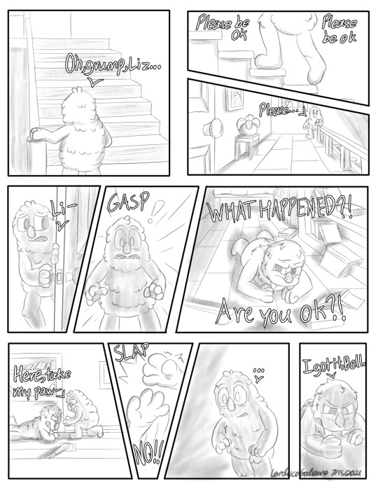
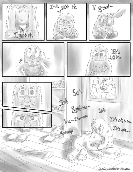
“I Got It”
The road to recovery is a long one, but it’s ok to cry. Everything will be ok.
Yes, I am not immune to Liz/Egg bittersweet angst. This has been something that came to mind as @scooopybanooopy and I were discussing post Snaxtooth Lizbert & Eggabell fluff/angst. The idea of a stubborn Lizbert attempting to push herself to be independent while still in a heavy recovery phase just wouldn’t leave my mind and I couldn’t stop thinking about it. So I drew it out.
This was a difficult one to actually make. The idea was clear in my head, but executing it was a different story. I ended up working on this on and off for about 2 weeks. Figuring out the paneling, structure, and pacing ended up extending this comic over 3 pages. It’s a slower paced one compared to what I’ve made before, but that’s all more the reason to learn and go for it, especially with this idea sitting in my head for a good while. Again, I’m not a comic artist, so I don’t know all the ins and outs of it, but I did try to create a good flow between panels.
Hope you guys enjoyed this one, or at least went on a mini emotional rollercoaster.
Bonus Material down here (Full Page Illustration shots, fun facts)

Fun Facts:
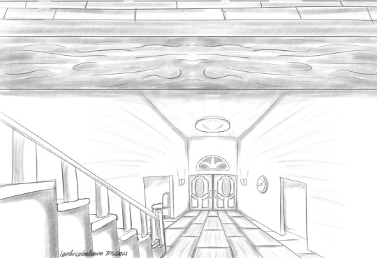
I faked a bunch of the perspective shots. I was trying to get the perspective tool in CSP to cooperate with me, but I couldn’t get it to work the way I wanted it to, so I just winged it. Most I used was the symmetry tools.
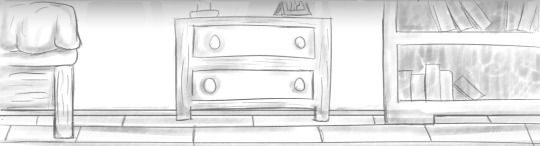
I drew that bookshelf 5 times and there were about 18 books on there. I did not realize how much I hurt myself having to redraw that damn bookshelf over and over again lmao.
I haven’t drawn Eggabell or Lizbert in my current style up until now. So I was drawing them pretty inconsistently as I was figuring them out, specifically Eggabell. It wasn’t until I started working on the final page illustration during the sketching processed where I figured it out. She’s a fluffy Egg now.
Lizbert & Eggabell’s Wedding photo. It’s one of my favorite things I drew in the final page. Buff Walrus Lesbian deserves a wedding dress.
#TheGalleonsNest Art#My Art#Digital Art#Comic#TheGalleonsNest Comic#Bugsnax#Bugsnax Spoilers#Eggabell Batternugget#Lizbert Megafig#lizbert x eggabell#Living in that Liz/Egg angst#They deserve to be happy#They deserve so much#If life haven't gotten in the way#I could have made this in like 3 days#Faking perspective shots was pretty cool#Drawing that bookshelf was laaaame lol
159 notes
·
View notes
Text
#showyourprocess !
From planning to posting, share your process for making creative content!
To continue supporting content makers, this tag game is meant to show the entire process of making creative content: this can be for any creation.
RULES — When your work is tagged, show the process of its creation from planning to posting, then tag up to 5 people with a specific link to one of their creative works you’d like to see the process of. Use the tag #showyourprocess so we can find yours!
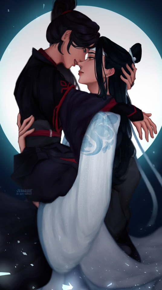
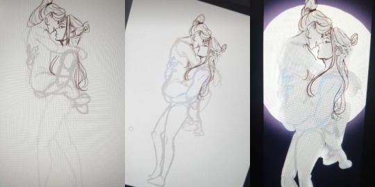
Thank you, @rinielle for tagging me! She chose the piece above (original post), and oh boy this one was a whole ass rollercoaster ride! Unfortunately, I hadn't turned on the timelapse feature for this but I'll try to go through each part of the process as best as I can!
The photos I'm gonna upload are gonna be a mix of screenshots and literal photos of my screen, because I'm taking some of them from my updates to friends, since a lot of the steps got lost in my painting process.
But before that, let me tag some other amazing creators!
@dragonji: this gif art!
@candicewright: this yibo painting!
@wendashanren: this gifset!
@mylastbraincql: this gif!
I haven't been able to keep track of who's been tagged so apologies if you've already done this! Also, no pressure to do it at all if you would rather not! <3
Planning
Sometimes, I get an idea first and find reference photos to go with that idea. But for this one, I sought out a reference photo first, and built an idea on top of it!
After that, I roughly sketch out the base pose. Usually, this looks very messy, but it doesn't really matter as long as I understand which part goes where!

The idea for the background didn't really come until the creation process because I don't think I really planned this to be a full piece.
Creation
Sketching
Honestly, from this point on, it's more of trial and error.
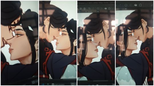
So, I redid the the initial base pose—made it cleaner and a little bit more detailed. See: the added definition in their arm muscles, the rearrangement of Wei Wuxian's legs, and Lan Wangji's hand on Wei Wuxian's back. If you look at the second photo, I also changed the pose a bit midway—I tend to edit as I go sometimes when I change my mind. (For this, I thought, given the Lan arm strength, it would be better to make Lan Wangji look more at ease carrying Wei Wuxian. This gets covered by the robes anyway though, so it didn't matter much in the end.)
I also started adding details to the base! I usually start with the face and then the hair! I usually go for the clothes next, but I dreaded the robes in this piece so I guess that's why I ended up with a basic idea of what I wanted for the background instead LOL I also figured out how I want the final crop to look like, so I blocked out all the other areas with an extra layer!
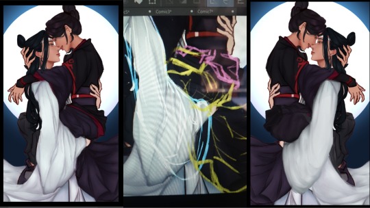
Okay, onto the part that killed me like ten times: the robes. There are a lot of interactions between their robes here given their pose, and not to mention they also have layers upon layers on each of them! So, to maintain my sanity and to keep track of which part is which, I color coded them into the most colorful sketch I've ever made.
Another reason why I filled in each layer of robe with a solid block of color, is so that all the lines underneath gets covered. Without all of the colors, the actual outline actually looks like the one on the right. What a nightmare!
I also ignored the crop again for this part, because it's always better to draw past your borders, in case you decide to rotate or tilt or whatever your piece later on. I didn't do the feet anymore though, because that I was sure wouldn't show in the final piece anymore.
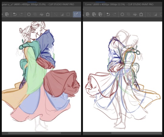
After that, I did the sketch one more time and then started adding the base colors. (I didn't have a screenshot of just the base colors, and the final CSP file is a nightmare so I copy pasted the layers into a new canvas to show you guys :') )
By the way, I drew their robes flowing this way, because I wanted it to frame the lower arch of the moon behind them for the composition. It was a little frustrating that I couldn't get Lan Wangji's robes a little higher because of Wei Wuxian's legs but I later filled in the empty space with his forehead ribbon anyway, so it all worked out in the end!
Painting
Because apparently, I was a masochist back then, I merged the base colors all into one layer and started adding shadows to the robes. (These days, I add shadows first and then, merge. It's much easier this way.)
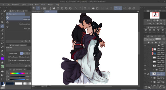
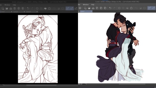
And then, I started painting! Again, I did the face first and then the hair, before finally the robes. This was my first time painting side profiles and honestly it was quite a pain to figure out LOL but !!! I think I did a good job and I'm proud of how it turned out. I again used reference photos for this one but I can't link any because they were just several random Pinterest photos that I didn't save.
Another thing to note is that I use the mesh transform tool a lot, especially on faces. That's largely why Lan Wangji's face looks so different in the latter two!
And then I went with the robes. Somewhere along the way, I realized I didn't like how I planned to do Lan Wangji's sleeves and the flowy part of Wei Wuxian's robes and I... decided, with much dread, to do them over. So I sketched on top of the painted layers and redid the robes, again.
It was at this point that I decided to take a break from this piece because it was honestly very draining! I think it took about three weeks before I decided to open the file again and continue it.
When I did, I just finished painting the rest of the robes and their hands. The blue details on Lan Wangji's outer robes were painted on a separate layer that I put on Multiply. I probably did more adjustments to the face and hair and stuff, because my painting process is honestly a mess :')
Final Adjustments
I added some correction layers on certain areas to fix some of the colors. See: Lan Wangji's sleeve becoming much brighter and paler; Wei Wuxian's legs having less contrast. And then I merged all of the layers (excluding the background) and added a bit of blur. See: Wei Wuxian's ponytail; the entire lower part; the flowing forehead ribbon. My reasoning for this is so that most of the detail (and therefore the flow of the eye) goes to their faces and expressions!
And then, I put a blue Overlay layer on low opacity to make Wangxian blend better with the background, added a bit of shadow on the inside and the lower sections and added the glowing details for the added flair. I initially wanted sparkles and/or stars but they didn't turn out as well as this did. I also upped the contrast by a little for the entire piece!
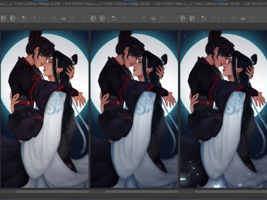
Aaaand, that's it! In truth, I did a bit more color adjustments to the whole piece, but I was a dummy who forgot to turn them back on before posting so ... oh well.
Posting
Before posting, I upload it either on my spare private Twitter account or on a drafted Tumblr post so I can check the colors on my phone. This is because the colors on different devices can look very different, and I would at the very least want all my pieces to look nice on both of my devices!
And then, once I deem it satisfactory, I just try to think of a caption and post! Some artists wait for a certain time where most of their followers are active, but I didn't have a lot of MDZS followers at this point so it didn't really matter to me.
It still doesn't really; I haven't actually been able to figure out when my MDZS followers are awake even now.
#showyourprocess#mine#whew this was so long oops#but this piece took like#maybe 1.5 weeks sans the break i had to take#so !!#LOL#tag game
46 notes
·
View notes
Text
Tutorial: Belly Bloating for XPS
I’ve always believed that it’s better for the kink community when we all have access to the same resources and can give more content to our thirsty pals. :P
A question I’ve been asked multiple times is how I get a characters belly to look so bloated. Soooo, I figured, what the hell? Here’s a quickie tutorial! :)
Taking us along for this journey is the subject of today’s bloat, Ryuji!
So first, we import the model into XPS, and we get this guy:
The very first thing I do is scale up the “lower spine” bone. If the rig is designed to cover the entirety of their lower torso, then I go from there. But in most cases, it’s usually most of the lower stomach, but not all of it. And the end result makes them look like Popeye:

In that case, I do some work around. I still scale up the lower spine, as you can see, but I also scale up the “root hips” bone as well. This is the primary bone of any model; the one that controls their body. Once I scale that up, I scale down the “left thigh” and “right thigh.” This shrinks the legs and causes the pelvis and lower stomach to look bigger than the legs, which initially has a cartoonish look to it. But then, you start making work of the spine bones.
Next, I scale down the “spine upper” bone so the upper body above the stomach shrinks. Which initially gives them a really weird egg-shaped look that’s not at all appealing. So you gotta use the rotate option to rotate the "lower spine” forward to make the stomach stick out more:
From there, you rotate the “upper spine” bone forward and make this poor motherfucker look like he was in a horrific car accident:
Still looks weird, right? Well, you scale down the “upper spine” a little more so the stomach looks more proportionate. Then, you switch from ‘scaling’ to ‘move’, and then you move the “upper spine” bone down enough so that the body looks more reasonably proportions:
And then, to make the back look less horrific, you use the move option to push the “upper spine” bone forward a tad until it looks more even:

You kind of have to play with scale and coordinates to make sure everything looks right to you. There’s no real set numbers you go with, just dick around until you find something that looks right.
And from there, you have a pretty decent belly bloat, but as you’ll notice, some corners still look janky. Ryuji’s got a pretty high poly count, but his model isn’t remotely as high poly as most next-gen models. Which is why his spine looks so mangled and why there’s a slight bit of sharpness to his belly. Now, you can just cheat that, trying to mask it by rendering the image from certain camera angles:

But it will still be noticeable unless you zoom way in.
This is where things get a little more technical, and why I charge extra for more heavily edited panels, because it can get a lil time consuming.
If a model is low-poly or if their attire is too detailed to scale without looking too outta whack, I have to actually just rig a “belly bone” and do the scaling in different software entirely. And that tends to cost a lot more per bone, and more if it’s a more high fidelity model with complex attires that require specific scaling per vertex.
But for the models I tend to use, IF the model isn’t janky, as in, way too low-poly to even get the scaling looking right:

(Sorry Leon), but if the model has more leeway the way Ryuji or most MHA models do, then you can cheat the rest in your graphics software. In my case, I use Clip Studio Paint.
Now, as you can see here, Ryuji’s spine is ALL fucked up:

So what I do instead is I fill in the jagged empty space like I would a regular drawing:
This gets a lil time consuming because you have to match the color and shade of the model, and that’s constantly influx unless you’re dealing with a model that has absolutely no shade attached, which you CAN apply in lighting for XNALara XPS, but that looks too flat to even be appealing.
Same up front, Ryuji’s belly isn’t nearly as pointy or boxy as Leon’s because he’s a next-gen character model and Leon’s poly count is more PS2.5 than anything else:
So, I do two things, and this is a big part of why I use CSP, because in addition to filling the back, I can fix the pointiness using a feature called “mesh editor.” Basically, I get to highlight a part of an image which I can manipulate. And I manipulate it subtly and in multiple directions until I get something that looks smoother:

As you can see, I was able to expand Ryuji’s belly, making it look even bigger and also get rid of the pointy parts of his stomach as best I could. You’ll also notice his fingers are SLIGHTLY longer, but because it was a minimal increase, that’s fine. But you do have to be mindful of that because it isn’t like editing in XPS or other software, the whole area around that image gets impacted, and you have to be careful.
And as you can see, the spine is filled, but looks sloppy compared to the rest of the model. This is something you can resolve with blurring and finger tipping options to smooth out the janky colors I filled out in the spine to give the illusion that it actually gels with the full model:
It ain’t perfect, but that’s as good as you can get.
And that’s about it!
As you can see, there are limitations. Obviously, you can’t make a belly become a medicine ball unless there are VERY specific bones to a model. But this is how I do it since, more realistic bloats are my thing anyway, and the software is most equipped to handle that kinda bloat.
(This is also a pretty time consuming process. So if you’ve ever wondered why I charge more for comics that require additional editing, this is why. Time is money, kids. XD)
ANYWHO, that about wraps things up! Hope you found this the least bit educational, and hope you enjoyed seeing the process of everyone’s favorite “bonehead” getting his fill. :P
#xnalara xps#xnalara comics#ryuji#belly bloat#belly kink#poser#tutorial#xnalara tutorial#making this goddamn tutorial took longer than making a comic would've 'XD#so i better see some xps comics beyond my own out there dammit#oh shit it's HOW late?!#i don't even think i can finish typing this se
49 notes
·
View notes
Text
Since I outed myself with an ask to phoenix about an event I’ll go ahead and post something about my schedule for three wishes here. I won’t put this under read more just for visibility, so sorry ahead of time for clogging your dashes.
As a note ahead of time THESE ARE ALL SUBJECT TO CHANGE, I DO NOT GIVE ANY DATES CAUSE I’M NOT PUTTING MYSELF ON A DEADLINE. I’m doing this for my own enjoyment and hopefully, others as well but please don’t rush me. I’m sharing this just to be open about my plans and what I’m working on, and perhaps for the motivations / reminders it’ll give me - not to give anyone a reason to come at me. Okay? Okay.
Not counting small comics or misc posts of art and info or fics:
First order of business is for me to finish drawing all of Silas’ outfits and Design the Enchantress. I have Silas almost completely done sketch wise, so I’ll work on the sketches of the Enchantress next and then line/color and post those. I might also do some side character designs as I have a few that might show up here and there (but they’ll just be like the ghosts in canon, occasionally there and then you don’t see them for fucking ever). I WOULD do outfit design sheets for EVERY character BUT....that would be a lot of work. I might end up just making polls like ‘who would you like to see outfit references for’ and then work on them at my own pace. That way you guys get what you want first and I still have fun designing everyone’s outfits regardless.
Second order of business is my event I mentioned in the ask to phoenix, BATTLE OF THE BANDS! I accidentally went full game dev on the documentation (because if I’m not gonna use all that documentation homework I did for that game art degree NOW then when am I going to??), but I’m actually pretty far along planning wise since I’ve been working on it when I needed break from art things. Right now I have about half of the main story of the event outlined. My order of doing things is Summary of Story > Outline of items / mini games > Figure out what characters were going to be in the event > Main story outline > Card Story outlines > Finalized story and Card Stories > Art Assets. So it might take awhile before I post any art for it. But if people show interest in me posting some of the in progress things feel free to send me an ask every now and then and I can update you!
Because of the ask and permission given, Evonie from @phoenix-manga ‘s Diamond Crown Academy will make an appearance in the event, as well as Three Wishes OCs made by @tsukikoayanosuke (Bridgette) and @missnekonyan (Donelle) as the clubs their characters are involved with the event overall. I’m really excited I got permission from all of them to be able to reference their characters! They won’t be big rolls but I’m happy to give all of these creators spotlight by adding in their characters.
Third thing, Regular Card Stories and Art for Cards! I am already making documentation to have these noted down, Will probably do them one dorm at a time but I do have a few ideas already. I will say that my R-SSR order of the cards is a bit different from canon. R’s are School Uniforms and PE outfits (will be slightly different depending on which PE course is taken by the student, since there’s three at three wishes), SRs are Dorm Outfits and Fundraising outfits - as Dorm outfits are different per person i didn’t think they were special enough for SSRs but still worth some highlight, and Fundraising / Volunteering is a mandatory class at Three Wishes so that gets another SR spot. Then lastly their SSRs are their Ceremony outfits. These are also different per character but they will all have a matching color scheme so that’s why i wanted these to be the SSRs. I also already have like four future events planned and which characters will be getting cards / what rank the cards will be for those characters! None of these events have any kind of outline yet, only general concepts and characters possibly involved, so the characters may change but I have them written down so I don’t forget and I can add to the event outlines as I find inspiration.
Maybe the fourth thing is actually designing the dang school. I SUCK at environment art, I’m not going to lie. It’s why alot of my comics up until this point has had minimal or no backgrounds at all. But one of the reasons why I’m drawing comics is to maybe get better at backgrounds cause I’m already sick of them not having one so progress I guess. But this is why this is kind of last on my list, as I definitely need the practice. If there’s a dorm or location I have listed that you would like to see art for or just described in better detail, Feel free to send me an ask!
And the thing I’m kind of working on while all of that is going on is of course, the Main Story Outline! I have all the chapter names picked and I have at least the Prologue - Second chapter bullet pointed as a first draft - I already know some places I wanna go back and change things but for now I’m just trying to get the general ideas for each chapter down. As of now there are eight chapters in total - including the prologue and the finale, so six major story chapters over all. I’m still not sure how I want to tell this story in all honestly. Part of me REALLY REALLY REALLY wants to make these full blown comics in all honesty. I’ve been wanting to draw actual comics since I was a kid and I’m closer now than I ever have been to being able to do so. But I also know how much of a time sync that is and know that I haven’t quite grasped all the shading tools in CSP to really give it the effect I want to have - which is one of the reasons I’m working on the mini comic pages here and there so I can slowly improve - but I can’t promise anything. If nothing else, I’m semi confident in my writing skills so I will maybe end up writing it out.
As a treat TM, I’ll list the chapter titles I have down below. THESE ARE SUBJECT TO CHANGE, but I am pretty happy with them right now - they’ll only likely change if I end up changing my entire idea for the chapter or changing the order of chapters. Anyone care to give me some theories on what you think each chapter is about? :thinking:
Prologue: the start of an actor's life
Chapter one, Nightingale: by the stroke of midnight
Chapter two,wondrous: a queen among thieves
Chapter three, diamanttobar: the wishing well
Chapter four, guardian: a dragons curse
Chapter five, lapinhole: tipping the golden scale
Chapter six, servireu: the guest has arrived
Finale: when the last petal falls
If you read this far, thank you so much and I hope you look forward to more three wishes content! <3
Also I ask that this post isn’t reblogged, not gonna come at you if you do but it’s just a to do list really lol idk why anyone would want to reblog it.
#three wishes institute#twst fanschool#twisted wonderland fanschool#twst#twisted wonderland#schedule of project#kind of#just really a long winded to do list lmao
9 notes
·
View notes
Text
god how are there so many things. I got distracted because my computer is being a laggy pile of dicks, but knowing it’s because it’s a shit computer is a little comforting, lol I thought I was just exceptionally hard on computers. ‘12 tabs open in firefox AND spotify? you absolute madlad’ you know? So a decent computer is on the list sometime. I need to restart everything before I start drawing or like my computer goes ‘high resolution with four layers? I think it’s about time for the program to go non-responsive for 30 seconds and scare the shit out of you.’
budget rambling under cut, and then bitching about friend breakup
- Galaxy S6 LITE will cover my need for a portable drawing space so that’s plan one
- New desktop makes for maybe an easier work process. This one’s nebulous in the timeline, depends on when my office gets moved because then I’ll need a desk first.
- I want a long corner desk that like takes up a wall and a half so I can have other projects on the side without it creeping into my drawing space like I do right now. One I’ve been eyeballing at staples is about $400, which I hope I can save up for. Futon to have people over in the office but if it’s still covid for like another year or some bullshit it would be pointless to spend my money making guest spaces.
- I think I want a couple shelves to keep my trinkets and stuff on too ‘cause I got a lot of dumb figures and stuff just to put on my shelf and think ‘I almost have the whole batfamily, just need Jason and Duke.’ though I got a bootleg tim and he’s way way too tall so maybe one day they’ll put out a nice tim figure that’s not like $50.
- couches for the basement ‘cause we’re getting rid of the ones we have. My mom thinks we don’t need to replace them if we have a couple chairs but it’s on the same level of importance as the futon, like why make a guest space when I cannot have guests?
- definitely thinking of upgrading to csp EX if only because it turns out animating is kind of fun and csp PRO has limited frames. I really like csp as a program so I’d like to stick with it. Getting EX on the tablet though might be easier because it’s a monthly subscription rather than a lump sum. Which I know is worse in the long term but sometimes it’s just what’s manageable? I don’t want to go back to adobe, though I can install cs5 if I have to. bought that disk 10 years ago and I’m gonna transfer it through computers until it burns out. but this desktop is shit and would die anyway.
the main thing I gotta get a control on is impulse spending. I can talk til I’m blue in the face about what things I need to spend less money on, but the fact is I have to master that ADHD impulse thing. I think my mom has gotten past her opinion that she needs to take financial control away from me because I’m a financial danger to myself or whatever, it will definitely help if the state of crisis would actually be allowed to dissipate. I’ve been on edge since october 2019 and I just need to figure out some stability. also loved ones need to stop dying and maybe life can start feeling normal. it’s very weaselly of me to blame my spending on high stress, but medication dug me into a hole last year and stress made it worse... I’m not vomiting anymore (knock on wood)
my sister who earns almost $40/hr was talking to my mom like ‘you don’t need to worry about us, you keep all that money for yourself’ and I, on disability living below the poverty line, wanted to scream. I had to talk to my mom about how she and my sister are getting hardcore financial support from their friends and family I am not. And they’re both starting head and shoulders above me, so maybe when the family sends money for the family can I have some. And now I feel like a total heel because my sister so nobly declined. it was absurd enough on christmas when my parents and sister were talking about all the friends that were either mad they couldn’t snowbird, or who went snowbirding despite covid. 90% of my friends make minimum wage, and maybe don’t even know me that well. I thought I was best friends with someone and they turned out to hate me so I have no idea how much anyone cares about me now, you know? But I guess some people can hang out almost every weekend for years and share secrets and stories and memories and vacations and not actually care about the people around them. So who knows. I don’t want to... let that make me care less. Everyone is carrying something and I want to be as kind as I can. But I think I will not be kind to that person unless something monumental happens. there are moments where her actions leave me so scared I want to die, that no one, not even the people I thought were ‘my people’ will love me. I rationalize “I should have realised she stopped responding to me weeks ago, I should have noticed she didn’t want my life updates. I should have noticed that in the time it went from ‘I don’t want to move if my dad’s still in the hospital’ to ‘we’re pretty sure it’s gonna be okay.’ to ‘I don’t know what’s going on and I’m very scared’ to ‘If my dad dies I don’t know if I can move’ to ‘maybe I’m just overreacting it just was really bad for a bit there’ she didn’t say a word of comfort or a question. She didn’t respond to my questions about the house and was resistant to giving me information about the rooms I was going to live in.” but she’s 32. We’re both 32. this isn’t two 14 year-olds who don’t know how to act like people with undeveloped brains and no skills yet in emotional development. A 32 year-old woman who can’t so much as follow up with any of those statements from a close friend is the one in the wrong. If there was a concern there was plenty of time to state it, and when she did finally state it there was no need for it to be ‘if I may be candid no one here wants to put up with your emotional behaviour’
It’s not normal or healthy behaviour to treat people like she treated me. And yeah she’s got her own problems and maybe she’s just emotionally stunted and too much of a coward to actually face consequences, but that doesn’t make what she did okay. She never apologised, rather than try to make things better she multiple times made it worse and then she left me stranded. I’m not a freak here. I’m not a monster. She’s probably unhealthy, but she was in the wrong. there’s no universe where helping your parents move is more difficult to handle than watching your father die of ALS. Even if she outed me as an accident, she did nothing to fix it, nothing to warn me, and nothing in apology afterwards. everyone makes mistakes but if you just let them fester then they stop being accidents and start being willful negligence (speaking of if you’re going to road rage in your school bus you should actually do your safety checks, even if it’s “too cold” I mean you are transporting children and you have been in more accidents in the time I’ve known you than anyone else I have ever known. But I mean it’s not your fault work is so strict with you that you were on your final warning for reckless behaviour. I mean everyone’s struggling, that’s why it’s you especially who keeps ending up in the ditch needing a tow and brag about your aggressive driving habits.)
2 notes
·
View notes
Text
List of programs I use
I had a sudden urge to compile all the stuff I use to make art because I realise I'm a veritable hoarder. xD
Photoshop - My default, only because it's what I've been using for close to 10 years. It's what I use when I want to make something not exactly painterly, and I anticipate a lot of layer modes and powerful transform tools needed. I also import stuff from other programs into here to use the adjustment tools and layer filters. Also ever since the 2018 update I've fallen in love with Kyle's Blender Tool.
Krita - My favourite free art program of all time, Krita is what I use for painterly things. It has HEAPS of great brush presets and I have fun just testing out everything. It also has enough layer modes to keep me happy. :D
Clip Studio Paint - I recently got this in anticipation of making comics. Its extremely robust tools specifically for comic pages is very useful and waaay easier to use for comics than Photoshop.
Autodesk Sketchbook - I don't use this as often as PS or Krita but I do like it when I just want to sketch down concepts. I love the brush tools and the very minimalist menus makes it a good streamlined brainstorming tool. ALSO IT'S FREE!
ToonBoom Storyboard Pro - I only recently got this but I instantly fell in love because I've only been able to use Photoshop for boards until now and AAAAAAAAAAA THE UTILITY!!!!
OpenToonz - I'm kind of a hipster for using this but I've tried TVPaint and Flash in the past and I haven't been able to afford ToonBoom yet, and this is just the one I like the most! I can't explain why, I just like the interface and the way it handles colours makes sense to me... ALSO IT'S FREE
StreamLabs - What I use for recording timelapses, and to me the easiest tool for streaming. You can get all kinds of presets for boarders and can set animations for follows, donations, likes etc.
Olive - A free alternative to Adobe Premiere. It's only in version 0.1 (0.2 on the way soon) so there are plenty of bugs, but the fact it's free makes up for it. It can hande large projects, but it has limited transitions and effects, but I only really need to use it for compiling footage.
Adobe Media Encoder - I'm trying to break free of Adobe, and so far this and Photoshop are the only things from the Cloud I use. I need a lot of files converted to other files, and to downsize videos to something YouTube can actually handle.
You're probably wondering WHY ISN'T PAINT TOOL SAI HERE and LISTEN I LOVE SAI but I lost my old copy of it and seeing as I already have Photoshop and Krita my priorities were set to getting Storyboard and CSP before Sai again >:'D If I have enough to spare I'd get Sai 2 because it has a text tool, but even then I have my sights set on ToonBoom... eh, it depends how it goes.
1 note
·
View note
Last Seen Blogs

anthonycooray
Untitled

herukoku
제목 없음

meathounding
🌌🔭
ca(i)nnibal

calendarprintables
Calendar-Printables
doctorpopee
Popee the PhD