#also i like the texture the default pencil tool has
Text
I can't believe that "Ms paint is bad why would anyone use it willingly" was a popular art opinion for YEARS when ppl have and continue to make amazing stuff in Ms paint
#le talking tag#'you cant do x in paint' YOU CAN YOU JUST HAVEN'T LEARNED HOW. IT IS JUST LIKE ANY OTHER ART PROGRAM#WHERE U HAVE TO FUCK AROUND AND FIND OUT FOR A WHILE#granted i think there's been an ms paint 'resurgence' kinda where ppl have been using it for fun/ out of spite#also i like the texture the default pencil tool has#even the line and curve tools have a certain appeal#yes its a bare bones pre installed art program but its MY bare bones pre installed art program
2 notes
·
View notes
Note
Just wanted to ask, please forgive me if you've already answred this, what program do you use? Your art fucks HARD and like. I was looking at your art of the two moths over the city they die in and I was hit with the wave of "oh that looks really fucking fun actually." Like i know my art program can't do some of those effects and like, I'd love to try fucking about with them.
hi there, thank you! all my art is done in procreate and paint tool sai
because you mentioned that drawing in particular i thought it would be fun to break it down and show ppl what exactly went into each part of it so check this out
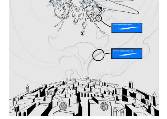
sketch & lineart - the brushes come from georgbrush.club and the urban sketcher is my most commonly used lineart brush, it has a nice irregular shape. the square brush is nice for big blocky sketches.
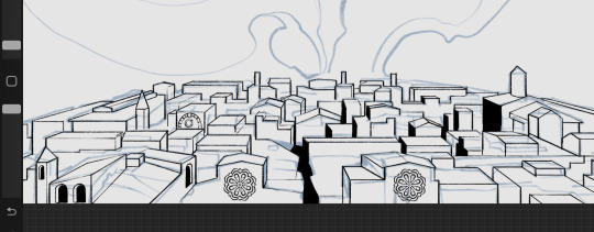
the cityscape was REALLY hard but basically I got a photo of the skyline of florence, traced some basic building shapes, then bullshitted the rest using the vertical symmetry/mirror tool to cut down on the amount of work (so i only had to sketch one half of the city). then for lineart I turned off vertical symmetry, turned on the two-point perspective tool, and got this:
the rose windows were made using the radial symmetry tool.
I didn't like it being so flat, so I used the liquify tool to make a kind of fish-eye effect (limited success tbh). I liked how it looked but the buildings in front needed something to cover them up to make the liquification less obvious...
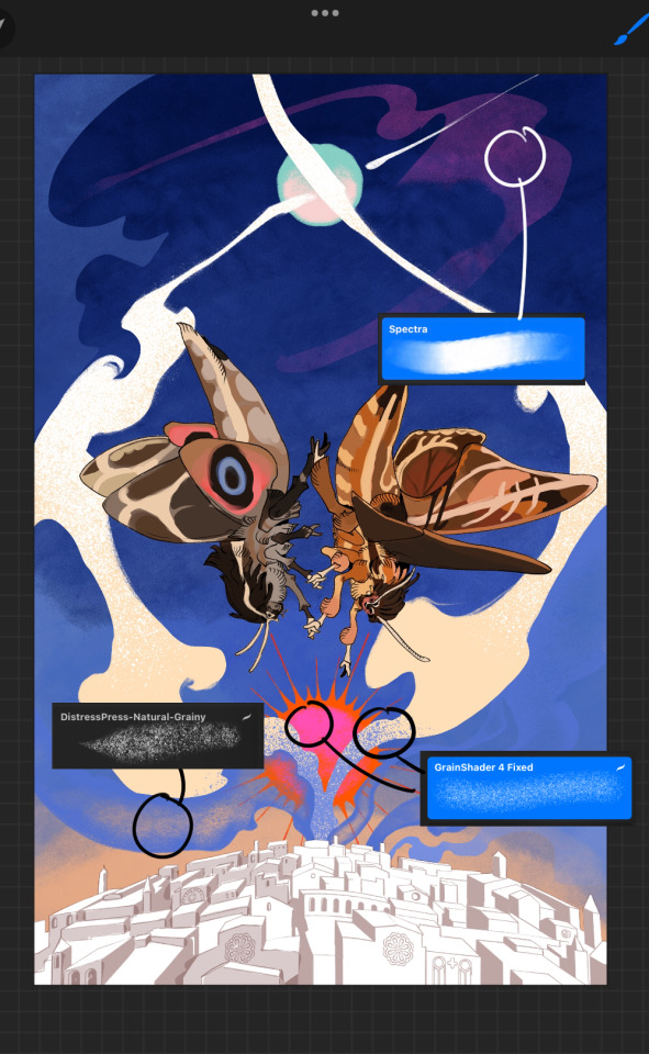
first pass colours. I felt they were very washed out, aside from the sun which i loved. I use the spectra brush (default procreate) for skyscapes a lot, I love the texture. Although the clouds were filled in using the lasso selection tool, I softened the edges using the square pencil again and added texture using true grit sampler grainy brushes. The translucency effect comes from my setting the brush as an eraser. The sun rays come from the radial symmetry tool.
Blocking in the moths' colours was done with the urban sketcher again.
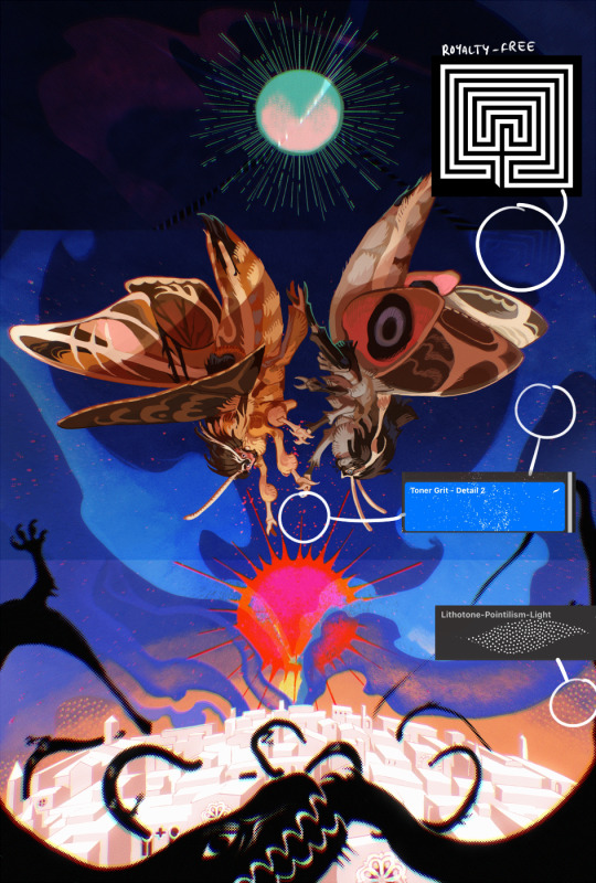
Something people may not have noticed is the labyrinth hidden in the sky! yeah I had a bunch of versions where it was more obvious but I found that it clashed a bit and was too busy, so I made it subtle. But yes. I searched for "royalty free labyrinth" and picked one.
The toner grit brush is one you've seen before if you've looked at any art on tumblr lately (this is such a popular brush) and it's from the true grit fast grit set. The pointillism brush is from the true grit free sampler pack, like my grain brushes.
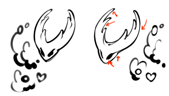
I added shadows to the moths, increased saturation overall, and changed the clouds to a translucent blue (you can even see in the sun where I forgot to block in the sun itself because the clouds over it used to be opaque lol). Moon rays were drawn using the radial symmetry tool but this time with rotational symmetry off. I also moved the moon down closer to the moths because I felt that it was a bit far away, and this served to visually divide the drawing into three equal parts, so I chose to lean into that and divide the sky colours too, to show passing time, or an endless moment - morning, evening, night, etc.
And then the oroborous, I tried a few different effects on it because I wanted it to be very clearly separate from the main scene - I settled on a dot matrix newsprint texture, using procreate's onboard tool, and some heavy chromatic aberration. This is because the oroborous isn't real, it's purely symbolic and the moths' demise started when they became photographers so I liked the print media aspect there as well. The story itself is about grief without closure, cyclical violence, and sunk cost fallacy, while everyone explores an endless labyrinth, so an oroborous fits I think
what makes art fun to me is thinking up ways I can tell a story using just a single image. and sure a lot of it will be lost to an audience who isn't familiar with the characters or backstory but i want to leave enough in there that even complete strangers to my work will be able to construct a narrative about what's happening here, rather than it just being a cool image. that's my goal.
Finally I exported it to sai on my pc to give it a once-over. this is really important because the retina display on an ipad is oversaturated on purpose, to make everything look amazing and vibrant. but what this means is that on other screens, your work might look washed out. it's especially bad at displaying yellows! so i look at it in sai on my pc and i make minor adjustments, in this case I actually added another multiply layer on the moths and an overlay on their non-shadowed parts to increase the contrast there.
finally if you've read this far, I played a little trick with the caption of the drawing. yeah, THEY die... but only one of those moths is a theythem pronoun haver... the other has to survive. he isn't given a choice in the matter.
#fr you will never catch me trying to mystify my process i will explain literally everything#brushes
462 notes
·
View notes
Text
hi everyone!! my wrist is too sore to draw today, so instead i thought i'd share some of my favorite csp assets + how i like to use them! i also linked some procreate brushes at the end of the post!!
lineart brushes:
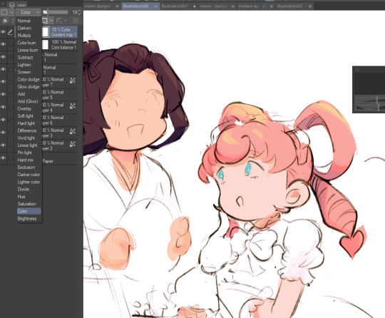
SU-Cream Pencil: i swear by this brush and i use it very often!! if you lower the pen density and use a gradient map over it when coloring your drawing, it has a nice effect. that's what i did in this drawing here! i also use this brush like i would draw on paper, so as a sketching tool. recently i've been enjoying blending it for shading. the pics below are drawn on one layer; left is more manga style while the one on the right is from a WIP of my singer sargent study, so it can be used for more realistic styles pretty well!


Found Pencil: another pencil brush that feels really nice to use, created by @/pigpenandpaper.
PS style brushes: a recreation of photoshop's (i believe) default brush. very versatile and also blends well!
analog wind variant pen: a nice pen that i like to use for lineart that is intended to have a bit of a sketch look.
zakutoro real g-pen: i used it for the lineart of this piece. although, it was drawn before i started using 600dpi in my works, so the lower resolution might make it look a bit unclear.
sets of rough pens: great for manga lineart with a rougher vibe; some of them have varying line weight.
coloring brushes:
zaku brushes: very nice and painterly mixing! i definitely recommend it for those who like to leave their colors a bit unblended.
softie marker: as the name implies, it's very soft! i like to use it for blush in chibi illustrations.
analog watercolor brushes: realistic-looking watercolor brushes. i recommend using it with csp's default paper textures, or those i linked below!
993 coloring pen: it's very soft and watery, though it can be made more solid by adjusting the paint density. i actually think it works very nicely for lineart too.
rock dog pen: another soft marker brush i like, that i once again also use for lineart and doodles.
thick coating brush set: recommended for paintings that show brush strokes.
cartoon cloud: don't let the name narrow your vision!! this has to be one of the BEST brushes for painting in my opinion, and of course it's great for clouds and explosions but so so much more!! and it's FREE try it try it!!
decoration/miscellaneous brushes:
neon pen
paper textures
symmetry move brush
close and fill without gaps
rope brush
sphere fisheye guide
flash balloon
speech bubble set: a lifesaving collection for comic artists!! dimensions and line weight can be adjusted by using the operation tool.
gradient map to use in color mode at 15% and another gradient map to use at 20%: the percentage refers to the opacity of the gradient map layer, but they are just the creator's recommendation and i tend to actually increase it. to use gradient map efficiently, i recommend putting all your colors (and lineart if you want) in a folder. then, right-click the folder, select "new correction layer" and then "gradient map". this allows you to modify the gradient map without worrying about affecting the original colors in case you decide not to use it in the end. to import a gradient map from your downloaded csp assets, click the wrench icon next to the name of the gradient set that's currently in use, then select "add gradient set".


you'll also notice that the creator recommends to use their gradients in "color mode". of course, this is also only a recommendation and i suggest trying as many layer modes as you like! to change a layer's mode, simply highlight the layer and click on "normal" (the default mode) and csp will display the available modes.

fruit ninja gradient map: fun to use if you want really drastic/vibrant colors! the names of the gradients are cute too, as you can see in the above screenshot!
BONUS: jeremy fenske's free photoshop brush pack: these aren't csp brushes per se, but they can be imported into the program! excellent for environments, i recommend watching fenske's video on how he uses the brushes to get a clearer picture since there are so many in this pack!!
BONUS 2: my good friend clem has a few brush packs for procreate that are ideal for painting,decorating drawings, and y2k-inspired illustrations, i definitely recommending checking out her shop!
in conclusion i hope this post can be helpful to you!! i tried to explain how to use the brushes as best as i could, but feel free to let me know if anything is unclear!! i hope you will enjoy using them! :D
#clip studio paint#clip studio paint brushes#csp#csp brushes#procreate#procreate brushes#brushes#tutorial#art tutorial#sort of hehe
53 notes
·
View notes
Note
Hi :) just wanted to drop in to say I really love your art, the way you use lineart and colour are like, insanely beautiful. I'm curious what brushes you use for lineart? Hope you have a nice day!
Hello!
Thank you very much, I'm super happy to have such a positive response to my art ^^💜💜💜
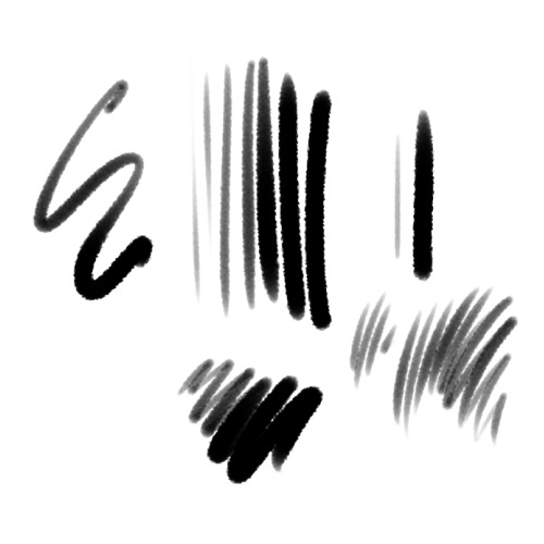
Talking brushes: I mostly use a default pen with a fuzzy texture, the exact type is not that important, it cam be noise or a spray tex. of sort)
Now what I feel has a more profound effect is the exact proportions of pressure, sharpness and density. Here the preferred setting I use in SAI2:

I'll try to break it down a little so it's not just useful for SAI2 users, for I do not know the ins and outs of how other programs approach this.
I set to to have round tip with no sharpness, and both minimal density and density amp set to 0, which results in it corresponding directly to pen pressure. The additional size and density scrollers set quite low too. That, together with high stabilization and low tablet sensitivity (smt you can do in your tablet settings, you can play with them too!) makes the brush rly easy to control for both opacity and thickness. Which is what I personally prefer (it gives a soft pencil feel I think) You'd need to set your density settings higher if you prefer a more opaque lineart brush.
I do advice playing with them yourself to get the feel for it, it's honestly very useful to understand and develop intuition for.
Now another "tool" I absolutely cannot live without is this pesky lil boi:
The "switch to transparent" tool is like, A Beast, and I don't see a lot of talk about it's versatility. I set it to my hot keys and use it more that undo tool :D
To elaborale: I find it helpful to use the negative space (or erase) the lines I draw in a particular way to give them a more unique value that it would have by itself. I'll try to demonstrate:
So, the gist of the technique comes down to subtractive shaping of form, in combination to usual additive approach. Now, this is a specific trick I find rly satisfying to my style of drawing that works well with my brush preferences, which is by no mean universal, but what I would encourage to take away from this if you're not doing it already is to think of erasing as not just a corrective tool, but also an artistic one!
(Note: switching to eraser does similar thing- the only downside is your brush settings and texture would have to match with it, which can be a hustle)
I hope this isn't too elaborate of a response, and hope it is at least somewhat helpful X3!!
Good drawing you Ya'll and first of all: have fun!
Have a nice day~
40 notes
·
View notes
Note
would you consider dropping some tips on how you color? your art always has such a nice feeling to it
Thank you so much, and yes, absolutely!
So... I have been agonizing over how to answer this question for over a week because I tend to make a lot of my major decisions based on what looks and feels good to me in the moment. It’s sort of hard to explain. Then I started getting philosophical with it (“how does one color? How do I explain aesthetic?”), and I started rambling, and had to cut the answer way, way, way down lol.
But here’s what I can help with right now. I think the most important part of how I color is my tools and what they allow me to do. These are currently my favorite brushes to use:

From top to bottom, I use Kyle T’s Gouache for just about everything. A lot of my recent pieces are done entirely in that– I love the chunky texture and how the pressure mimics traditional gouache. It’s great for children’s book illustrations, and filling linework, and realistic portraits. She is my soft wife and I love her.
I practically never use the default hard round. Ignore that.
The roller brush is another one I use for painting. It was my go-to before KT’s gouache, so you’ll find it a lot in my older work (and as a big texture thing in my current works). The “Sampled Tip” below that one I usually use for children’s book styled illustrations. It’s like a really dense, waxy crayon, so it’s fun for textured lines and details.
I always paint in my own shadows and highlights, but I like to use the soft round if I want to blow the shadow or highlight out. It’s for extra large areas.
And finally my pencil. I use it for sketching as well as linework, if I plan on doing a linework-centric piece. I don’t think there’s much of a difference between the two there… one is probably smoother than the other.
______________
The reason why I like textured, pressure-sensitive brushes so much is because they’re important to how I paint. When I blend, I don’t use a blender brush or a smudge tool. What I do is layer two colors– lightly– then use the eyedropper to select the color between them and continue painting with it. That’s probably the key to most of my work. I’ve gotten pretty fast at it, so I’m constantly selecting colors from the painting and reusing it throughout my painting.
I still use the color-wheel to hand-pick what I think will look best, though. This is probably going to be a really frustrating answer, but I choose color palettes based on basic color/lighting theory combined with personal aesthetic preference. It can take some studying (of both theory and other artists’ work). If you’re ever looking for a really great reference on the former subjects, I highly recommend Color and Light by James Gurny. Even if you’re not into watercolor or dinosaurs or realism, the guy is a master at explaining all that different stuff in depth.
Shape and negative space are also pretty important to me, but that's a whole other thing. And as a side-note, I recommend following more children’s book illustrators. Their work may look simple, but a lot of intention goes into how they use color, shape, space, and texture.
Also, on texture, I hand-draw most of mine. I love to add little scratches and drops and splashes when the painting is almost over. It's one of my favorite things to do :')
____
Now, the other most important tip:
Once I’m happy with the sketch/linework, and once I’ve laid down the basic colors of my piece, I do a Really Terrible Thing. I become a graphic designer’s worst nightmare and collapse everything onto one layer.
Then I paint directly on top of it, linework and all.
I do this for a lot of reasons, but mostly because 1) my tiny brain is overwhelmed by the clutter of too many layers, and 2) it forces me to approach a piece as if it was traditional media– a process which I find a lot more comfortable and rewarding. I paint right on top of the base colors, and right on top of the linework, effectively redoing and cleaning up what I already have there. Even if I'm working with a blank background, I'll paint a new blank one on top because it gives the feeling of a more unified piece, if that makes sense.
Basically, I approach my drawings as if I’m using traditional media. I like chunky brushes, utilizing (what I personally think are) interesting color combinations and textures, and smashing everything down onto one page so I can just paint.
Anyway, please let me know if there’s anything specific you’d like me to go into detail on, any pieces of mine you’d like to know how exactly I went about it, etc etc etc. I’m happy to answer ^^
115 notes
·
View notes
Note
Hi! I love your art a lot!
I saw a doodle page you did, and I’m curious how you got your brush to be darker with more pressure applied? (or at least that’s how it looked to me—)
aaa thanks so much!
first of all, i use Paint Tool SAI, so lemme grab a few screenshots of my brush settings. i made these for myself and @invadergrabass to use in order to blend our styles for collabs; theyre based on our combined preferences so they will more than likely require customisation if youre interested in using them. regardless, they will help me explain, since not everything is easy to put into words for me lol

to make my brush respond to pressure the way it does, i first start with a default brush tool as opposed to a pencil. i set the minimum density to a non-zero percentage (usually between 10 and 40) depending on what i want to use it for, and lower the pressure sensitivity to 60. (this may differ for you, since i know i have a heavy hand and ive set my tablet sensitivity to a custom value. but the minimum size is key here.)
heres a demonstration:
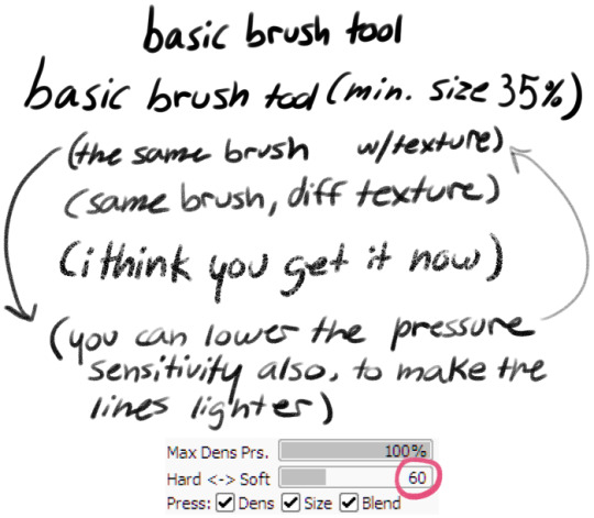
(the brush kinda thickens up when a texture is added, which is part of why i reduce the pressure sensitivity)
i find the brush tool feels a lot like a gel pen when being used for linework. this tool is called Butter Brush because its extremely smooth to work with for my partner and i.
heres a breakdown of each brush and how i tend to use it:
Butter Basic is an all purpose tool, i use it equally often for sketching lining writing and shading. it has a minimum size of around 20%
Butter Sharp is for writing and more bold linework. it has a low minimum size for detail work. i rarely use this tool for sketching but i do sometimes use it in shading, and i prefer it if i have to do a lot of writing on an image. its pressure sensitivity is at 100 so i see less of the texture when using it. (you can see the difference in the two drawn arrows above, where the left is at 100 and the right is at 60.)
Butter Soft is my favourite sketch tool, and predictably the one with the highest minimum size. it is also extremely soft, and cant easily be used for writing. i use it extensively for shading, more often than the tools ive made specifically for shading lmao. i sometimes use it for lining also, since it is the most comfortable for me personally to use.
i hope this helps you or anyone else looking for help with their art!
(note: in an earlier version of this reply i accidentally said "minimum density" instead of "pressure sensitivity" in Butter Sharp's description)
#paint tool sai#brush settings#talking with a ghoste#asked#long post mby i shoulda put it under a readmore...
23 notes
·
View notes
Note
Not sure if this has been asked before, but what brushes / program do you use? If you mind sharing, that is
i usually use procreate! i'll link the brushes and show some examples under the cut
the brush i use most is this copic marker brush – these are all probably 98% copic brush, re-animator one has its sketched lines in procreate's peppermint brush though


and i also use the shale brush from this set a lot – orange one is shale brush lines with copic marker shading, the goofy plate mirror one is the opposite, and the ben 10 one is all shale brush


the default 6B and peppermint pencils i like to use from time to time too :]
halftone hospital has some really great halftones that i use sometimes too!! if you havent checked out halftone hospital before its a super cool (and free!) resource for all types of digital comics tools like brushes, textures, fonts, etc so. highly recommend
i've also got some crumpled paper textures that i made about a year ago that i might upload someplace if anyone's interested ?
39 notes
·
View notes
Note
Hello i was wondering if maybe you could share the brushes you use🥺
Apologies for the late response, I had to hunt down all the sources for my brushes again on 2 different programs... Some of these cost some clippy points on CSP but rn there's a login bonus for them until March 13!
CLIP STUDIO:
Sketching:
ReaganS2 pen. Costs 100cp now, but it's been really helpful in how responsive and layered it is for setting up the rough sketch.
AJ's pencil set. Very useful for warmups and figure studies IMO.
Lining:
Quibbly. It costs 50 cp but it's got the perfect texture and crunch that I love in lining, super responsive as well.
Coloring:
YN Painting Brush Set. I added some color jitter to the settings to make it more vibrant.
MYNQZO brushes. Great texture, I personally use the rougher brush the most.
ETC:
Close and fill tool without gaps. This one's just a lifesaver, very good to immediately get a base layer done. There's also other versions OP for the tool made that you should check out.
Erase to remove only protrude pen and overflow. Set your lineart to reference and it'll only paint/erase along the edges. Incredibly useful (There's also the erase along edge eraser, but I prefer the former.)
PROCREATE:
Lining:
Gesinski Ink from the default ink brushes has been my go to for years, with a touch of scattering to add texture. Lately I've been experimenting with the Ink Bleed brush as well.
Coloring:
This brush pack from roseflarea on twitter has been really good, especially love the pastel brush.
If you're willing to spend some money (like 8.50 USD or so) this ghibli inspired brushset is very good for Nature/Landscape pieces. It also includes video timelapses and tutorials. (Also compatible w PS/CSP)
Cityscape brushset by Devin Elle Kurtz on the other hand is super helpful with more urban backgrounds, it's free and compatible w CSP/PS
Devin Elle Kurtz also has a very nice foliage pack that's free as well and compatible with Procreate/PS/CSP, check it out!
17 notes
·
View notes
Text
Nobody asked me but these are my favorite Procreate brushes and ones that I use pretty much daily when I’m making art 🩷
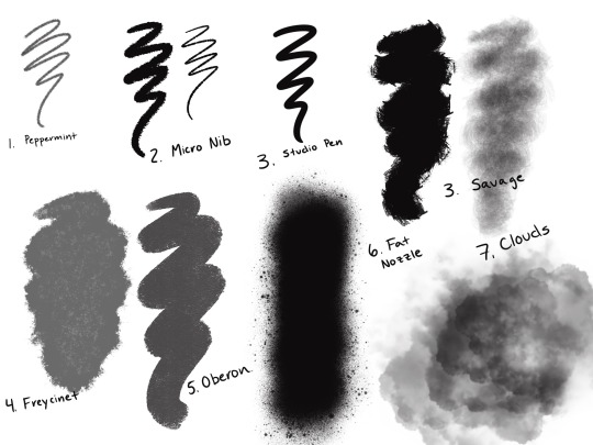
1. Peppermint- comes default on procreate. I like it for sketching because it feels very much like a real pencil and it’s good for making very fine marks as well as big, broad strokes without having to change the size. I also have an irrational tendency to prefer brushes with cute names.
2. Micro Nib- my FAVORITE inking brush. I like nasty, gritty, messy lineart because I don’t particularly like to render and this way it gives my art a lot of texture and personality without having to do all that. I downloaded it from a pack called the Rusty Nib that ordinarily costs a lot of money but my friend sent me her file. I love the way it looks and how easy it is to control. 10/10 amazing. If you like textured lineart but don’t want to download brushes, I used to use ink bleed, which is a default.
3. Studio Pen- comes default on Procreate. I use this brush to fill in colors. I don’t like using the select tool cause it takes forever and I am so bad at accidentally clicking out of it. This is a nice, clean brush that I can outline areas to fill in with the paint bucket. I also like to use it to make word balloons in my comics.
4. Savage- I downloaded this from a free pack called Rough and Raw a really long time ago. This is my go to brush for shading. It works great as a blender brush and I turn the opacity down really low. It blends beautifully and it’s great for shading that looks good without having to spend ages on it. I hate shading and lighting cause I’m not great at it but this makes it easy.
5. Freycinet- comes default on procreate. My newest addition to the collection but I’m quickly becoming obsessed with it. This brush is great for backgrounds and adding some more texture.
6. Oberon- comes default on procreate. I also use this brush for backgrounds. It has a really nice, textured, acrylic paint feeling that I love.
7. Fat Nozzle- comes default on procreate. My FAVORITE brush for backgrounds. It’s a secret weapon. You can create a gradient effect that looks super dope and textured and interesting with zero effort. I feel like the spray paint brushes on procreate are my own little secret.
8. Clouds- comes default on Procreate. My other secret weapon. If you want to create a dope background with zero effort, make a gradient with fat nozzle and throw some clouds on there with a really low opacity. The piece looks dope and that took 3 minutes. You’re welcome.
Once again nobody asked but it’s taken three years to find a process that worked for me in digital art and I’m very pleased with it! Feel free to take this advice or recommend stuff to me
#chloeleau#digital art#digital illustration#procreate#brushes#procreate brushes#Chloe Art#art#artists on tumblr#digital artist
12 notes
·
View notes
Video
undefined
tumblr
Cookie Carnival Reanimated Shot 52 - Finished!
All done! Several hours of work but I crunched through and finished it. I did all the animation in ToonBoom Harmony, and I drew the backgrounds in CLIP Studio Paint. The big changes I made to the scene were redesigning Miss Pineapple, and making the judges look slightly less identical, with different color schemes and by giving the one on the right a mustache. I also went rogue with their facial expressions because I must always do that. Once the finished collab is up I’ll add the link to this post.
A few things I learned on this project, for my own reference:
I finally got the hang of bezier handles, so now I can use the centerline editor tool for brush strokes, and I don’t have to erase and redraw every time I do a wonky stroke. And yes, I didn’t know about the centerline editor at all or else I would have used it ages ago.
In Harmony you can “store” a gradient to preserve its direction for every instance it’s used. That’s what allowed me to have Miss Pineapple’s dress look consistently colored.
The pencil tool is worth taking the time to learn. I didn’t use it here, but I plan to the next time I do clean-up animation. It’s way better than it used to be (me still thinking like it’s 2008 ToonBoom, which had an atrocious pencil tool), and the amount of time it saves down the pipeline, specifically on coloring, is absolutely worth it. You can do textures! I was wondering how Mercury got that look on Hilda, and now I know.
If I had known that I had to toggle on the option to view all four art layers, instead of the two that are visible by default, I would have done that immediately. But I didn’t find out about it until much further into this, so...oh well. ToonBoom still has a bit of a problem with not always making its user interface intuitive. Steep learning curve.
Tracebacks are very useful with volume control. Or, since you’re working with vectors, you can copy and paste the section you want to reuse, and make some minute transformation adjustments to stop it from looking so static. I think Eric Goldberg talks about tracebacks in his book Character Animation Crash Course.
If at all possible, I want to avoid designing a character with an edge, because my god those gingerbread edges drove me nuts. I’m never going to deliberately put myself in that position again, unless I have to draw Spongebob. I’ll make an exception for that.
73 notes
·
View notes
Note
hello!! i was wondering what brushes do you use for sketching and coloring? :) also how do you get so much texture in your pieces?
Hi!
For sketching, Colored Pencil set by Fatima Mandouh is my absolute must-have as a traditional to digital refugee. And it's free!
The coloring brush choice is very chaotic, I just go for everything that already looks dry and textured (default Procreate has a lot of good stuff under Painting and Drawing, also Paint & Chill set expands on it nicely)
Default Tamar is my go-to when I don't particularly care about creating a textured look, but other than that I don't stick to any specific brush. I feel like it can steal some of the dimension if you use the same shape for depth/details/ambience etc.
And finally textures! Free textures online with random overlay settings, textures with mask, textures with gradient and overlay in specific places, textured brushes like dust and cracks used with Smudge tool. This is the most fun part for me because it adds a little destruction that you get to paint on top of, and it breathes some life into the piece. Goes without saying that it has to be one layer too (I usually use backround - middle ground - foreground layers but no more).
Hope it helps! :)
6 notes
·
View notes
Note
What brushes do you use for inking/sketching?
Hoo boy uhh skdks I will be the first to admit that my brushes are a bit eclectic! I also flip between different ones fairly frequently, so fair warning that there’s no smooth answer to this question in my case lol. However all my downloaded brushes are available for free online because I’m disabled and broke so this setup is friendly to all, though I’d recommend buying from any of these brush makers if you can to support them
For sketches I mostly use The ELDER 3.0 or 2.0 (the 3.0 is just a softer version of the 2.0) from this comic ink brush set (pay what you can) I like them cause they’ve got a chisel shape with a soft, grainy pencil texture and really good pressure sensitivity/weight variation, all of which I think compliments my style better than smooth rigid brushes. They work for loose sketches and they clean up really well for soft lines!

For legit line art though? I don’t actually do that too often, most of my recent art has either been sketches or paintings, but I use a modified version of the Mercury brush, which is a Procreate default. I just made a duplicate of the original Mercury and then switched off the burnt edges so it doesn’t layer colors like it did originally. It’s a solid inker with a crunchy, textured edge and plenty of pressure sensitivity, so it retains a sort of sketchy pen and paper look that I’m fond of.


But like I said, I don’t usually line finished pieces much anymore, or I disguise the lines when I do. Mostly I paint cause I like the texture it provides my colors. For that I use Fish’s everything brush & sketchy block (pay what you can) and I blend my soft shadows with the TrueGrit Sampler classic watercolor wash which you can download for free along with a whole host of other amazing brushes by subscribing to their newsletter.


But regardless of my comfort zones, I experiment with new brushes frequently and highly recommended that all artists new and old do the same! It’s less about the brush and more about finding the right brush for you and your style that plays to your technical strengths. I like big blocky shapes and soft round edges and rough textures, so my usual brushes reflect that, but those might not be the brushes that work for everyone. Tool around with new things whenever possible and eventually you’ll stumble across the right combination of qualities for you!
7 notes
·
View notes
Note
Better art ask: What Brushes do you use?
uhhhhh oh fuck
well mostly i use csp and custom brushes from the asset store. for details and jewelry and blood splatters and more i kinda just go ham with a bunch of them. but as for brushes i use all the time unfortunately some arent available anymore :( but sure i'll show them
most lines i actually use this brush:
its more of a pencil but was in fact designed for lines. at a small size and on a large canvas you dont notice the texture that much it just gives it a lil smth smth. outside that i also use what im pretty sure is the default textured pen bc i just like my lines with a bit of texture.
for sketching i will use the standard colored pencil default brush

to get the basic shapes as it is pretty light to start off with and i dont want anything too detailed, before i move into
uhhhh this one i also can't find. i know its kind of a graffiti style marker supposedly (at least based on what i can read of the name tho i am illiterate rn given i am abt to pass out)
onto coloring--i will fill in colors with a standard hard-round/g-pen or the textured pen depending on what im coloring. and as for shading it is almost always

before fully moving to csp despite liking pretty much all of it more i struggled with coloring as i was deeply attached to the watercolor tool in csp. i tried and tried over and over to find a brush that worked the same and finally found one which was close enough. over the years i have tweaked it here and there. but when people say "i love your rendering!" it is almost always this bad boy doing most of the heavy lifting.

bad example but it can do hard or soft edges depending on the pressure. its soft, kinda transparent, and easy to control (for me anyways). you can also drag the colors around when blending which is helpful because i also use this to like. erase and redefine shadows too. i would link you but uhhhh i think i found this brush in. 2018-2019???? and i havent found it or the others mentioned unfortunately. problems that come with people deleting or privating brushes and also dling a bunch of them but i might have also changed it so much its not really the same thing anymore LMAO
also honorary mention for the standard round airbrush for gradients and to get very rough shading and form down. and also i will use the standard default colored pencil brush for highlights sometimes on skin or shiny fabric because i feel like it looks???? more realistic???? cause skin and fabric has texture. yknow.
if you guys find any of these feel free to link them bc i havent had any luck even googling the name or digging around my downloads history
4 notes
·
View notes
Note
Here’s some other digital art tips!
the liquefy tool is good for tweaking your sketches bc it lets you push and pull your lines. However, it also could make the lines themselves blurry and thinner so you shouldn’t use it on line art. You could also use the lasso tool and then the select tool to pick up an area and move it around or change its size. Moving it won’t make it blurry, but rotating it or shrinking it will
For line art, I think finding a brush that works for you is very important. I have procreate and I use the Dry Ink brush which I like because it’s not completely smooth. However!!! I did tweak the settings on it because it’s default is really patchy and I didn’t like how that looked.
Outside of that, the brushes I use are all default ones; round brush for coloring, gel pen for sketching, and the soft brush and flat brush for blending. It’s important not to overblend!!! I always try to keep my darkest colors and my lightest color next to each other on things likes clothes so they pop and if you blend too much, that contrast gets lost
That’s all I can think of! You got this! :)
Ahhhh thank you so much!!
I had no idea how to use the liquefy tool until you mentioned it eheh, my ipad is v new so I'm in the stage of discovering everything :'D
I'm still playing around with brushes as well! Trying to find something that's similar to a pencil for sketching but without the weird patchy textures procreate likes to put into it is interesting lol.
I'll definitely try the ones you mentioned too!
Blending, shading and color stuff is all very new to me and most of my art experience has just been sketching on paper so it's definitely a new experience, but exciting =]
Thank you so much for the long and thought out post <3
1 note
·
View note
Text
Artrage 5 custom brushes download

#Artrage 5 custom brushes download install
#Artrage 5 custom brushes download full
#Artrage 5 custom brushes download for windows 10
#Artrage 5 custom brushes download android
Decorate with gold leaf, silver foil, and other metallic colors. Paint with oils, sketch with pencils, sprinkle glitter, and more. Click the download link for your operating system to download the ArtRage installer. Flame Painter is a unique paint program, drawing software that lets you create original paintings with procedural brushes. Simple, stylish, powerful painting with natural tools in a creative environment. After you complete your purchase of ArtRage from our online store, you should see download links displayed for Windows and OS X. Simple, stylish and powerful painting program. ArtRage is designed to present the most powerful painting technology inside an environment that promotes creativity. It has more file import/export formats, and more new features than you can shake a stick at. Now ArtRage 5 includes powerful masking and ruler tools, with layer transformations, layer goups, precise pencils and smooth blenders. You can paint with thinned oils, use wet or dry markers, soften your pencil and control the hardness of the crayon, and much more. All of the tools can be adjusted to give different effects. Thick paint smears and blends, pencils and chalks smudge, and markers work just like they do in the real world. Each of the tools in ArtRage is designed to work like its real world counterpart (minus the smell of paint thinners, and that piece of glitter you just cant get out of the carpet). Graphics tablet pressure and tilt are supported, as well as multi-monitor systems. Custom color-sets and precise color-pickers are available. For the professional user, ArtRage also offers multiple Layers with Photoshop Blend modes for painting, and layered PSD document import and export so you can easily use it alongside your existing tools. You can rotate the canvas to how it's most comfortable to paint, zoom in to paint detail, zoom out to see your entire masterpiece. The user-interface is easy and inspiring to use, and even gets out of your way while you're working. You can even load in your photos as overlayed Tracing Images or pin them to your canvas as references to help you recreate them as paintings.
#Artrage 5 custom brushes download install
To install simply download the ARPACK file and double click it, follow instructions on screen. A set of Photoshop/Painter style brushes to be used only on ArtRage (3.5.0 or later). I use only Oil Brush in AR most of the time. Decorate with gold leaf, silver foil, and other metallic colors. Photoshop works easier for that purpose and 2. You can paint with thick smeared oils or thinned oil glazes, sketch with pencils, sprinkle glitter, airbrush in soft features, and more. To use this software on your PC, you need to pay $29.90 for the ArtRage Lite plan.ArtRage, the easy to use, stylish painting package that lets you get painting from the moment you open it up.
#Artrage 5 custom brushes download android
This version of the software was created for iOS and Android devices. If you want to create drawing on the go, you can download ArtRage Vitae Mobile for $4.99. Creative Commons Attribution 3.0 License. This trial version allows you to learn more about the functionality of the software without paying a dime.Īdobe often offers various Adobe Creative Cloud discounts, so make sure to visit the official website regularly if you want to purchase this software at an affordable price.ĪrtRage offers two payment options. 6 abstract textures for the Artrage 5 custom brush free for any kind of use. Wolfgang's brushes look very tasty too, I'm off to play with them now.
#Artrage 5 custom brushes download for windows 10
However, you can download Adobe Photoshop free for Windows 10 or Mac. So far it's Boxy (who created half the default brushes in AR5 and is now selling some seriously good texture brushes) and wschweizer (who is specialising in really nice free ink brushes). If you don’t know which software to choose, ArtRage or Photoshop, keep in mind that the former doesn’t have a trial version. Besides, you can purchase the All Apps Plan that allows you to use 20 programs for $52.99 per month. If you opt for the Photography Plan, you will need to pay only $9.99 a month.
#Artrage 5 custom brushes download full
To get the full version, you need to pay $20.99 per month. You can also buy a standalone version of the software. Photoshop uses a subscription-based model, which means that you can use it as a part of Creative Cloud.
1 note
·
View note
Note
Just wanted to pop in and say that your heavy contrast lineart of The Batman’s new suit is really inspiring. I struggle a lot with my heavy lineart so it’s nice to see people use it more often <3
thank you!!! lineart is really fun once you get used to it it’s one of my favorite things to do. my best advice is to try to get comfortable with it, hesitating or lacking confidence in the lines makes it more difficult and you get shakier lines. also if when you remove the lineart layer you get the problem where the sketch looks better, you can duplicate the sketch layer and use the eraser tool + a hard pencil tool to make it stronger and clean it up, that helps a lot. also for texture what I love to do is make a separate layer to just draw a ton of texture and then lower the opacity and use the eraser to make it work with the lineart, I often erase along the edges of things too, like in that drawing id drawn seams and stitches on the leather and erased along that + the edge of the fabric, that usually looks really cool for strong lineart and then you can just color under and it saved you a ton of time doing shading! I know you didn’t ask for advice sorry ❤️ good luck getting comfortable with it it really is a lot of fun!
also I think SAI is better than photoshop for lineart lol I paint and do textures in photoshop, but if I’m doing a drawing that requires lineart 100000% of the time I use SAI instead. the batman drawing was made mostly in SAI but I changed to photoshop for the leather texture (it’s a specific brush I use) and then back to SAI to erase and clean up the texture. SAI is amazing for lineart, it has a great flow and the default brush tools are amazing
16 notes
·
View notes
Last Seen Blogs

fraserkrause
The Journey of Burnett 328

ideasaboutpokemon
Idk Anymore (a randon pokemon blog)

sorryfriendbutilostyourletter
🐓ChickenPostman🐓

beniiiunutma
Külkelebek

zu-botany
ZU