#even the line and curve tools have a certain appeal
Text
I can't believe that "Ms paint is bad why would anyone use it willingly" was a popular art opinion for YEARS when ppl have and continue to make amazing stuff in Ms paint
#le talking tag#'you cant do x in paint' YOU CAN YOU JUST HAVEN'T LEARNED HOW. IT IS JUST LIKE ANY OTHER ART PROGRAM#WHERE U HAVE TO FUCK AROUND AND FIND OUT FOR A WHILE#granted i think there's been an ms paint 'resurgence' kinda where ppl have been using it for fun/ out of spite#also i like the texture the default pencil tool has#even the line and curve tools have a certain appeal#yes its a bare bones pre installed art program but its MY bare bones pre installed art program
2 notes
·
View notes
Note
hello it's me again! Your biggest fan (LMAO) The one who asked for tips on coloring...
Another question has came up on me while I was coloring (finally aughhh). How do you shade hair? Without it looking unnatural?
Thank you for your help before!!! 😊
Hello and welcome back! I'm glad my previous advice helped!
That is a difficult question as I do admit it is a bit challenging to me as well. It is guesswork + studying references, adjusting tid bits until it looks right, my own process relies on a trial and error approach.
Therefore, I suggest you pick some pieces you like where you find the hair gorgeous, and figuring out how the artist does it, or how might they do it, per active learning principles. Try to deduce it. While the following guide can be good for your starting concepts too, it's important to adapt it to your style and preferences. And I even encourage you to go against it, as creativity thrives on experimentation.
That said, I'll guide you through my own thought process, however. (With a quick Ratio sketch, because I really love to shade his hair; fluffy hair is very forgiving.)
Let's start off here (I'll be skipping the black and white part for simplicity's sake from the previous guide. I'll also be using a white environment with a pale overlight):

For highlights, I begin laying down a Glow Dodge layer with a hard brush that doesn't have full opacity, and draw a halo-like shape. After that, I refine the shape by erasing parts of it with a rough eraser to get the desired effect.
Alternative to the Glow Dodge layer, you can use pure white, or other layer types such as Lighten, Screen, Add and Overlay, etc.
In the following pictures, note that I adjust the layer's opacity freely.


Above, I simply blended it a bit to my own liking.
With an airbrush I softly start introducing shadows (Multiply layer, dark purple/blue color).

Then, I start introducing sharper shadows in a separate layer.
You can use a lasso tool for this to map out a jagged like shape which should remind you of mountains. You can blend this out too at certain segments.
(Sidetrack: if you feel like, I suggest reading up on the balance of hard and soft edges in painting, the topic is very interesting and I am still trying to grasp it as well, yet I find it immeasurably useful. This can come in handy upon rendering principles. A very skillful master of it is the artist Yuming Li.)

Furthermore, I add reflections. I've used a Lighten layer with a subtle blue color. As this is subtle, I want to point it out that it appears on the lower parts.

For a final touch, I pick out the skin's color and airbrush, shift the picked color to a more saturated one and apply it near his face/to the bangs, with an airbrush.

For the fundamentals of hair shading I usually wrap it up here and go off to rendering. I use a painterly brush to do this and pay attention to the jagged shape I mentioned earlier. The brush I use is already tilted, so it's easy to manipulate to make such shapes.

Additionally, I experiment with Overlay, Multiply (or any!) layers with either airbrushes or hardbrushes— as I said there isn't a specified way of doing this. Go wild; for such is the nature of hair. Add any shapes or lines you find appealing, introduce new colors from the environment nearby too to make it moredynamic and interesting as well.
EDIT: An addition! On Rendering tips and advice
(apologies on leaving this out initially! I only realized I should include this now )
Including astray curved lines to simulate how hair flows also builds to the hair-like quality. I also prefer to use it closer to the silhouette of my character as it adds further detailing and a fluffier look in the end!
Attempt to render each strand according to this diagram in mind, note the parabole-like(?) shape for the light, and note standard 3d spheric shading for shadows.


#also!! watch speedpaints! slow them down and follow them#do i even tag this with ratio. no i'll spare you ratio fans the art guide#art tips#art guide#thanks for the ask!#asks#art tutorial
81 notes
·
View notes
Text
Understanding Permanent Makeup: Everything You Need to Know
Living a low-maintenance lifestyle when it comes to beauty requires a high-maintenance mentality.
Are you trying to cut back on your regular hair care regimen? The appearance of frizzy, curly hair can be maintained with keratin treatments every three to four months, even when they are air-dried. Lacking the time to get weekly main touches? A chip-free, nearly indestructible manicure that lasts three times as long is what gel nail paint promises.
The possibilities available to you for producing long-lasting cosmetic effects are more varied. The appeal of permanent makeup is undeniably alluring—imagine never having to reapply your winged eyeliner again—but it is not without drawbacks, including a significant commitment, a few hours of discomfort, and, of course, the possibility of some not-so-great hazards.
Read on to learn everything you need to know about permanent makeup, from costs to techniques to the most popular surgeries.
How does permanent makeup in Charlotte NC work?
Permanent makeup in Charlotte NC is just semi-permanent due to fading. The pigment can last for years before it starts to fade, and subsequent touch-ups will probably be needed to keep the desired impression over time. Refreshers are often required every one to three years, while exact timing varies from person to person (depending on elements including pigment kind, tattoo location, client age, lifestyle preferences, and skin type).
However, it's not always a terrible thing. When performing cosmetic treatment on the face, it is preferable to have a pigment that fades.
The most common varieties include freckle tattoos, lip flushing, permanent eyeliner, and lashline improvements. Your choice of permanent makeup will have a significant impact on the methods, results, and fading. Here is all you need to know about each procedure before getting a shot.
Microblading
Microblading is a method for improving eyebrow attractiveness by depositing pigment and creating tiny, hair-like strokes in the skin's top layer. It is common for those looking for a low-maintenance cosmetic regimen, thin, sparse, or irregularly formed brows, or those who have lost eyebrows due to medical illnesses. However, it may not be suitable for certain medical conditions, pregnant or nursing women, those with certain skin conditions, or those undergoing radiation or chemotherapy. The procedure takes around two hours and requires touch-ups every five weeks or three years.
Lip Blushing
Lip blushing is a design technique that adds color to the lips using small dots of pigment. It's ideal for those seeking definition without surgery, improving the lip's curve, and reducing fine lines and wrinkles. Benefits can last between one and a half and three years, depending on skin type, lifestyle, and sun protection. Initial treatment costs around $900, with touch-ups ranging from $200 to $550.
Permanent Eyeliner
Permanent eyeliner is a semi-permanent tattooed eyeliner procedure using a small needle and digital pen to push pigment into the skin. There are various design techniques, including lash-line enhancement, powdered lash-line enhancement, thin eyeliner, winged liner, and dusty winged liner. It is beneficial for clients with sensitive skin and those with loose or baggy eyelids. Results last between one to three years and can range from $400 to $2,000, with a six-week follow-up. Prices vary depending on technique type, location, and technician experience.
Freckle Tattoo
Freckle tattoos are a cosmetic procedure that involves placing small, natural-looking freckles on the skin using a machine or handheld tool. Although less painful, they can cause discoloration, blur, and migration over time. Freckle tattoos can also exclude the client from future laser treatments. Prices range between $200 and $500 per session.
Considerations before Getting Permanent Makeup
Before obtaining any form of permanent makeup, there are a few things you should consider.
Select a Certified, Skilled Technician
Find a qualified, skilled, and licensed technician before receiving semi-permanent cosmetics (or any anytime a needle is going into your skin). Beyond the risk of infection and other concerns, there is also the chance of unhappiness with the design and artwork; while this displeasure is semi-permanent, it might last for years rather than weeks or months.
All of this risk can be avoided (or significantly reduced) by doing some preliminary research on the artist to make sure they are qualified and skilled, and that their work aligns with your personal aesthetic preferences. According to Bray, having detailed communication about your goals and the outcome can also assist in avoiding unfavorable outcomes.
Be Aware of Possible Scarring, Infection Risk, and Other Negative Effects
Permanent makeup carries some hazards, so it's crucial to educate oneself on such drawbacks. Endless Look asserts that risks exist even when sterilized and carefully selected blades and pigments are used.
Infection, allergic reaction, accelerated fading, uneven results, and scarring are examples of potential concerns. As with any cosmetic procedure, these hazards can be greatly reduced by making the above-mentioned careful choice of technician. Following the recommended pre-and post-procedure care is also crucial; we'll talk more about it shortly.
If you have any worries or hesitance concerning side effects, ask your artist to explain them to you and take all essential procedures to assist in reducing the dangers involved.
Observe the aftercare and precautions before the treatment instructions.
#microblading#permanent makeup#eyebrow tinting#permanent makeup near me#microblading brows#eyebrow tint
0 notes
Text
The Best Furniture Styles for Home Interior Design in 2023
Have you been on the hunt for furniture styles for home interior design that would quickly enhance your home's decor? You've come to the right place! It seems sense to get adjusted to home decor over time. However, thinking to change furniture styles for home interior design to enhance house decor and really executing it are two very different things.
Your home's furniture can have a significant impact on the style of your home interior design and the mood in each of your rooms. Therefore, it is essential that you choose your furniture styles for home interior design carefully. What better way to do this than to study the numerous designs discussed in this blog and gain some fresh inspiration for designing or redecorating?
Furniture: Form and Function
An amazing piece of furniture is both visually appealing and useful, much like a room that has been well designed and talks about the furniture styles for home interior design.
When humans first emerged, furniture was built and utilised in a variety of ways, even in the earliest versions of our homes. The simplest definition of furniture is a moveable item created especially for human use. Items may be functional (such as a basic chair for sitting) or designed to enhance the aesthetics of an area. Others are still utilised for storage and display of important items.
The Role of Furniture Styles for Home Interior Design:
So how precisely do furnishings and interior design relate to one another? Furniture is the designer's go-to tool when trying to functionally design a space.
In terms of interior design, there are an almost endless number of furniture styles for home interior design options. Therefore, it is the designer's responsibility to decide precisely which pieces will work best for their client. In order to create the appropriate look and feel for a room, style and purpose must both be taken into account.
The following are the main goals of furniture in home interior design:
It converts a property into a house.
A space's "look" is determined by it.
It has an impact on the room's functioning, focal point, movement flow, and arrangement.
5 furniture styles for home interior design are mentioned here:
1. Contemporary furniture styles for home interior design
The key features of contemporary design are neutral colours, straight lines, solid hues, and a variety of materials, including metal and glass. The style of contemporary design is open spaces and light colours, which enlarge even small spaces. It is simple, straightforward, creative, airy, and light. There is lots of space for movement, and the decor is light and airy.
2. Modern furniture styles for home interior design
These more modern furniture styles for home interior design were designed without consideration for a certain time period. They commonly mix parts of several traditional furniture designs, merging the lines between the elegant and functional. The contemporary furniture style emerged during the modernist movement of the 1900s. It frequently features a monochromatic colour scheme and is made of "contemporary" materials including steel, vinyl, plastic, and leather. The furniture is simple and elegant with clear lines and simplistic forms. Tables are typically composed of straightforward materials like wood or metal, but they can also have glass decorations to give them a glossy appearance.
3. Mid-century modern furniture styles for home interior design for home interior & decor
A movement known as mid-century contemporary furniture styles for home interior design for home interiors started in the United States around 1945 and continued there until 1965. This style covers architecture, graphic design, and furniture. The home's furniture design uses a variety of materials, as well as straight lines and delicate curves. The furniture in this design embraces the minimalist idea and attempts to create a calm yet elegant ambiance. Soft elements like velvety fabric are typically combined with sleek shapes. There are numerous metals used in this house furniture design.
4. Traditional furniture design for home interior
Traditional furniture is influenced by ancient and classical furniture designs for house interiors. These are fashion trends that have endured for a very long time. The Traditional furniture styles for home interior design includes pieces in the Queen Anne, Sheraton, and Chippendale furniture styles. This fashion stands out by its straight lines, tapered legs, and lavish use of gorgeous embellishments. The majority of the furnishings in the traditional design style are revivals of 18th century English, 19th century neoclassical, French rural, and British Colonial styles.
5. Vintage furniture design for home interior
The terms "old," "vintage," and "antique" are identical. In contrast, vintage furniture is more recent than antique furniture. Things between 50 and 100 years old are referred to as vintage. The phrase "retro look" means exactly what it says. The items are from a particular time period. Vintage finds can be found in abundance at flea markets, garage sales, estate sales, salvage yards, and antique shops. On the other hand, antique goods demand particular care and understanding of how to maintain these unique items. The retro look is not limited to antique furniture styles for home interior design or home furnishings. Designers frequently use new elements like lighting fixtures, flooring, or paintings to achieve the overall desired style.
Source Link : https://addindiagroup.com/the-best-furniture-styles-for-home-interior-design-in-2023/?
0 notes
Text
Synchronicity
This is Day 4′s FebuWhump prompt fill for impaling :D I swear the past three fics I wrote have all taken place in a jail cell HAHA :) This fic titled Synchronicity, and I went with gingerpilot for the pairing ;D YAAAAS
See also on my ao3 here. My masterlist archive of bullshit i write can be found linked at the top of the blog or here.
--
“Hey! Hey! Listen to me, he’s gonna die if you don’t let me stop that bleeding... Hey!” Poe was trying to get the attention of their jailer; a reptilian humanoid similar in form to a Trandoshan, though where they had two arms, this one had four.
He didn’t know where he was-- he’d only seen the planet from orbit before some sort of anomaly was recorded, and then he was crashing- and then he’d woken up here in this weird cell on an oddly-warm stone block. He thought he’d been hallucinating when he realized there was someone in the cell next to him- the last person he ever expected to see.
He’d thought at first that he must’ve died in the crash landing-- that he was seeing a ghost in some kind of limbo of his own. He’d had reports that Armitage Hux-- the Starkiller, their spy, villain and antihero in his own right- was killed in action. Apparently the force had other plans for the general, because Hux was definitely lying there and that was definitely the blood of a living man dripping down the side of the slab.
There was no way this could just be a simple coincidence. More like divine providence. Or maybe Poe had hit his head really hard in the crash, because there could be no way that he was getting a second chance to act where he hadn’t before; to save Hux like any of them wanted to be saved.
He’d regretted leaving the man behind ever since he’d done it, and Hux’s death weighed on him with everyone else he felt he’d used as pieces in a battle.
To get a second chance to make things right, though….
Poe had checked his head further for injury just in case, still not uncertain that he wasn’t just hallucinating. But then, he didn’t think he’d hallucinate the ex-First Order general in such mundane clothing… or hallucinate a slow-bleeding wound on an unfamiliar world.
Hux’s chest moved up and down in shallow breath, so he was still alive, but he wouldn’t rouse no matter how loud Poe was in trying to get his attention. He wouldn’t be alive for much longer if his wounds weren’t seen to soon. Hux wasn’t even fully on the wide rectangle of stone, his body at an angle and legs over the side as if he’d been hastily dropped there. Poe didn’t know how badly Hux was injured, or even how long the other man had been there before Poe was brought here too, but it was clear that he needed help.
Poe stuck his whole arm out between the bars that made up their cells, now waving madly. His attention was split between desperately trying to appeal to the guard, and looking at the thin line of red down the side of the stone Hux lay on. “I’m telling you, he needs help! Come on!”
His appeals either hit their mark, or Poe had annoyed the non-human enough to peak his curiosity, because he came down to their cells to peer into Hux’s with scrutiny. The guard’s voice was apathetic. “He’ll regenerate. He’s already hibernating.”
Poe’s mouth opened, but no words came out. He didn’t know anything about this species, but clearly they didn’t receive many human visitors. Or at least, not injured ones.
“Humans don’t work like that,” Poe said with an urgent shake of his head. The guard scoffed. “Look at the blood, man. Bleeding usually stops after so long for any species, right?” Poe was taking a guess as to how long they’d been there, but it had to be a couple of hours at least. Moreover, if the guard thought that Hux should be ‘regenerating’, then the fact that he was actively bleeding should’ve brought that line into question. “He’s hurt really bad if he’s still bleeding. You gotta let me take a look at him. Please.”
The jailer looked between them, scratching the back of his head with one hand, another on his waist, and still another toying with keys at his belt. He pointed at Poe with his last hand, staring him down with ice-blue eyes. “If he dies, you’ll be blamed for it, mammal.”
Poe gave a blink for what he was pretty sure was an insult, but didn’t care. “I don’t want him to die. I want to help. Please.”
There was a long look over Poe, taking him and his strange anatomy into clear consideration of the request. He must’ve decided that a human would be best treating another human, because Poe got his wish.
Poe was made to stand with his back to the four-armed guard, facing the wall with arms on the back of his head while the doors were unlocked and secured. The width of the doors when fully opened spanned the hall, subsequently blocking it off in sections to contain various cells. He then gave Poe instructions to turn, walk directly out, and move directly into the neighboring cell to take up the same stance in Hux’s.
Escape crossed his mind for only a moment, but Hux’s unknown injury, the large, curved-blade on the humanoid’s back, and all four of those arms to take on by himself was enough of a deterrent. He couldn’t escape without the other man either-- Hux was the whole reason the war was won, and he didn’t deserve to die here. Regardless of what anyone else might think.
Poe wouldn’t just leave him to his own chances again.
With the turning of the key in the lock, Poe looked over his shoulder, but he was left in Hux’s cell without much more regard. The guard left in much the same mood of apparent apathy as he’d arrived. Poe didn’t waste time gawking, instead turning to the man the entire galaxy thought was dead.
Hux was wearing some sort of brown robes over long trousers and shirt-- a shock for how utterly normal he looked out of uniform. But there beneath the robe Poe saw it-- a piece of something sharp sticking out of the man’s side staining his shirt and puddling blood beneath him.
Poe could only guess how deep it was in there. It looked like a piece of broken metal-- part of a ship’s console, maybe? Something else?- and it stuck right through the material of his shirt and into his torso. There might not be much Poe could do if he couldn’t remove that. And he shouldn’t-- not without bandages and something to stick in the hole- but without supplies, basic first aid would only go so far.
Poe just about jumped out of his skin as he’d been so focused on being careful with triaging Hux that he didn’t notice that the four-armed guard was back. A small, simple cloth satchel was tossed into the cell behind Poe-- mammal’s medicines, the guard specified- and he was told he better not be lying about medical intent, and to fix him if the man wouldn’t regenerate on his own.
Poe wasn’t going to question his good luck and the surprising decency. Maybe things would work out. He dug into the bag and found the components of a ship’s medkit. There was bacta, bandages, and some other ointments and creams for burns. A trauma kit as well which actually looked like exactly what he needed, but no tools or tweezers of any kind to pull the thing out of him.
He’d have to do this with his hands, then.
Poe opened an alcohol wipe that was graciously present, cleaning his hands and going over his plan once more in his head.
It passed a lot faster in reality than it felt to Poe. Removing the piece of metal impaling Hux’s side, the man twitching in some form of awareness while Poe literally patched him up. Quickly staunching the wound, applying the bacta, waiting.
...Scared it might be too little too late as Hux went further pale from the pain.
Hux’s lashes fluttered several times before he opened them enough to frown with disbelief up into Poe’s face. Poe couldn’t help smiling as he held his hands over Hux’s bacta-laden injury, having followed the instructions on the packet. The wound-sealing medical bio-foam was doing its job, and he stopped counting in his head, certain the seal would now hold on the wound. He just hoped nothing important had suffered too greatly beyond the quick fix that would buy them some time. If any of his organs had been pierced, Hux would still need medical attention.
“You’re not hallucinating. I’m really here,” Poe as their eyes met, thinking Hux was probably wondering the same thing he had upon setting eyes on him. “You’re the last person I expected to see, either, but that’s okay. You’re hurt pretty bad, and I just bandaged the wound. I think you might’ve crashed landed here like I did... ”
Hux bodily shuddered and grimaced as pain flashed through him, eyes shut and skin ashen. “....Dameron…”
“Yeah,” Poe said, worry shooting through him as Hux looked-- frankly- like absolute hell. “Hey, you’ve got a friend here, okay? I’m just trying to help. You hang in there for me, Hugs.”
Hux made a face at the nickname. “...Dameron.” There was a sort of recognition to his tone, as if to say ‘Oh. You.’
Poe just smiled.
If Hux had the energy to be annoyed at him, then he was optimistic that he wasn’t on death’s doorstep. Or at least, he hoped so. Really, Hux needed to be seen by someone with more than just battlefield patches and first-aid kits. It got Poe thinking.
The jailer had cared enough not to let Hux die. Maybe he could get him to help him again.
Hux shivered despite the warmth of the rock slab he was laying on, and Poe removed his jacket to throw over the other man’s chest to try and make him comfortable.
He was going to need real medical attention, and sooner rather than later. Poe had no idea if there were other complications from the metal that had impaled the other man, but Hux was going to live if it was the last thing Poe did.
He wasn’t going to let him down. Not when the universe was clearly giving him another chance to make things right.
Poe stuck his arm through the bars to frantically wave and holler for their four-armed jailer again.
He felt a sprig of hope as the guard once again gave him his attention.
–
my kofi | ao3 main
#poe dameron#armitage hux#gingerpilot#gingerpilot fanfic#damerux#whump#febuwhump 2021#hurt/comfort#impaling#non graphic injury#:) these are fun but damn im slow ahahah#i live for comments if you've got them! :D my ao3 is open to guests :D
17 notes
·
View notes
Text
soaring, carried aloft on the wind…continued 11
A story for Xichen and Mingjue, in another time and another place.
The Beifeng, the mighty empire of the north, invaded more than a year ago, moving inexorably south and east.
In order to buy peace, the chief of the Lan clan has given the Beifeng warlord a gift, his second oldest son in marriage. However, when Xichen finds out he makes a plan.
He, too, can give a gift to the Beifeng warlord, and he will not regret it.
Part 1: 1 / 2 / 3 / 4 / 5 / 6 / 7 / 8 / 9 / 10 / 11 / … HOME
It’s on AO3 here if that’s easier to read.
NOTES: Rated E for Explicit. There are sexy times in this chapter.
For translations of the entirely fictitious Beifeng language, you’ll have to scroll to notes. I’m only going to translate something that’s not clear in the text. Sadly, there’s just not any other good way to do it on Tumblr!

Chapter 11
Xichen wishes he understood better, but whatever the exact words are, it feels like Mingjue means something more, as though he is bookmarking the moment something enormous and irrevocable has changed between them.
Mingjue barely lets Xichen get into the tent before his hands are on him again, caressing his face and neck as he kisses him, and Xichen’s head swims, his thoughts twisting away from him, like minnows darting in a shallow pond. Should it be like this? Should he want this so much? He doesn’t know, but it’s too much effort to argue with himself, so he surrenders to the rhythm of his heartbeat in his ears, which sounds very much like triumph.
The backs of Xichen’s legs hit the bed and Mingjue stops, breathing ragged and harsh. For a moment, Xichen thinks he will leave again, and his hands clench against the leather of Mingjue’s armor. Mingjue brushes Xichen’s hair off of his shoulders and slowly reaches for his soft silk belt, untying it and letting the fabric slither to the floor. He looks back at Xichen for confirmation, and Xichen smiles. Perhaps he won’t need as many words as he thought.
“Ani, ako ereda sinedi,” Xichen answers his silent question haltingly, and Mingjue looks startled before he laughs, sounding surprised and delighted all at once.
Xichen isn’t sure if that means he used the wrong words to give his permission, but then Mingjue is kissing his jaw, his neck, the curl of his ear, and fumbling at his robes with a desperation that makes Xichen think perhaps he didn’t make a mistake. Xichen tugs at Mingjue’s armor and Mingjue frowns. He looks conflicted, so Xichen pulls the leather straps again and starts to untie his own robes, which seems to make the decision easier.
With a grunt, Mingjue pulls the leather pieces off one by one, throwing them on the floor. When he gets to the soft linen undershirt, he pulls that off as well, and despite having seen him without his shirt on, Xichen’s hands halt, no less stunned now than he had been before. Mingjue notices his expression and tips his head with that curious hawk look. Understanding dawns, and he chuckles softly, cupping Xichen’s cheeks and kissing him so tenderly, Xichen is left nearly speechless.
“Et auhata eko,” Xichen breathes, suddenly shy again.
Xichen is not an expert, but he’s certain Mingjue is magnificent, his taut muscles the rich amber color of honey and his face bright with laughter and desire. He catches Xichen in a kiss that makes his bones turn soft and malleable, and Xichen sinks back into the bed, pulling Mingjue with him.
Mingjue kneels over him, breaking away long enough to smile, such a hopeful, adoring smile that Xichen’s hand lifts of its own accord to touch the corner of his mouth where the dimples sit. Mingjue’s grin tilts up mischievously and he bites Xichen’s finger, just hard enough that Xichen gasps, arching instinctively. His erection brushes against Mingjue’s, and Mingjue’s laughter fades with a breathy grunt. Impatiently, he pushes Xichen’s robes aside, eyes roving over Xichen’s body, melting him from the inside out. It isn’t that Xichen is unaware of how he looks—he has been told that his physical appeal is a valuable bargaining tool—but there is something about being seen through someone else’s eyes, desired by someone he desires, that turns the fluttering butterflies in his stomach into an eyrie of eagles.
“Piras,” Mingjue tells him, and he sounds awed, trailing his fingers down the center of Xichen’s chest, the callused tips leaving a trail of flame in their wake. “Teira eta ingos.”
Splaying his hands over Xichen’s ribs, Mingjue kisses his mouth, dragging his lips over Xichen’s chin, his throat, the curve of his collarbone, whispering words Xichen doesn’t recognize, probably couldn’t have comprehended even if they had been in his own language. Xichen is a virgin in every way possible, has rarely even touched himself thanks to constant reminders of the importance of preserving his sexual desire for his spouse, but he wants to touch Mingjue—he aches to touch Mingjue.
Xichen flattens the palm of his hand against the dip of Mingjue’s waist, under his ribs, grazing his hipbone with his thumb. A groan jolts through the man, and emboldened, Xichen shifts his hand lower, below the waist of his pants, curious about the long lines of muscle that feel both thicker and softer than his own. His other hand takes a pleasant journey over Mingjue’s broad shoulders, gliding down the arching ridge of his spine. Xichen understands several things about himself more clearly when he reaches the taut curve of Mingjue’s buttocks and feels them flex under his fingers, chiefly, that he would like to keep his hand there indefinitely.
Slowly, slowly enough for Xichen to get used to his weight, Mingjue lays against him, huffing soft, warm breath into Xichen’s ear and rolling his hips forward. Xichen is suddenly aware of the entirety of Mingjue’s body and the hardness between them. He hadn’t really considered what it would feel like to be so blanketed by another person, surrounded by their scent and heat and desire. It’s still a little terrifying—both the wanting and the doing—but it’s even more intoxicating, and he whimpers every time Mingjue’s hard cock rubs against his, a great, crescendoing need overtaking the fear and filling him all the way into his toes. He wants to help, he wants to reciprocate, he wants to release the wild scream building inside him.
“Please,” Xichen says in his own language, losing all memory of Orera, “I want…” What does he want? He can’t even put words to it. He grasps at Mingjue’s skin and kisses Mingjue where he can reach along his chest, his collarbone, the hollow of his throat. Xichen gives up trying to be articulate. “I want you. Eko epitma auha. That’s all.”
“Xichen ahora,” Mingjue says. “Epa eko auha.”
Mingjue moves away, climbing off of Xichen, off of the bed, and Xichen is bereft and confused until Mingjue slips his fingers under the waistband of Xichen’s pants and takes them off. Being so exposed sends shivers across Xichen’s skin, and he realizes as he has never really done before just how bright the daytime is. He closes his eyes, unwilling to look at himself naked, but the warmth of Mingjue’s hands on his hips reassures him, loosens the anxiety in his stomach. He opens his eyes to see Mingjue kneeling.
“Aitapaho, et auhata eko, ekos anha oridit irumaka,” Mingjue says, smoothing his hands over the tops of Xichen’s legs.
The words Xichen knows—beloved, treasured, beautiful, look—are impossibly seductive. It seems so easy for Mingjue to say words of romance and love, and yet in his adult life, Xichen doesn’t think he’s even told anyone he loved them, his sleeping brother notwithstanding. He has no idea how to say what he feels, and he’s not sure he can make sounds into words at the moment anyway.
Mingjue’s hand is on Xichen’s calf, lips on his knee—a place Xichen has never given any thought to before this moment—and he flicks his tongue against the inside of Xichen’s thigh, dragging his mouth along the smooth skin to the joint of his hip until Xichen is burning with nameless anticipation and willing to beg if he has to. Finally, finally, Mingjue grasps Xichen’s cock and slides his hand down the shaft, and Xichen nearly falls off the bed, crying out and lifting his hips to press himself harder into Mingjue’s palm. It is completely, utterly different from the times he’s touched himself furtively under his blankets, the quick jerking motions more a matter of necessity than enthusiasm. Mingjue is practically worshipful, caressing Xichen’s side, stroking him with long, firm fingers, and watching him, watching every sigh, every groan, and adjusting, giving Xichen everything he can’t ask for.
He slows as the fire inside Xichen threatens to spill over, and Xichen props himself up on his elbows, shamelessly wrapping his legs around Mingjue’s back, about to demand more. Instead, Mingjue grins at him and audaciously licks a circle around the tip of Xichen’s cock before putting his mouth around it. Xichen falls back and writhes helplessly, reaching blindly for Mingjue’s face, his hand, his hair—anything. He doesn’t even know why.
Xichen tries to remember the word for sudden insight, clarity, understanding the true essence of something, but the wet heat of Mingjue’s lips and tongue steal his thoughts and break him down into a creature of flame. It is both a lifetime and a heartbeat before he feels the sweet release of his orgasm wrenching through him, and twinkling lights dance in the corners of his eyes as he struggles to breathe again.
Epiphany, he remembers. The word was epiphany.
The bed sags as Mingjue lays down next to Xichen and pulls his slack body against him, curving around his back and side. He is, Xichen realizes, now naked, and the hard length of his erection fits between them like a question, but Mingjue doesn’t seem to want Xichen to do anything but lay with him. He runs his fingers through Xichen’s hair, down his arm, and he is so clearly trying not to look smug, Xichen wants to laugh. He would if he could move.
It occurs to Xichen that it doesn’t seem fair to be given such an extraordinary gift and not give something back in return.
He turns to face Mingjue and gingerly touches him, his fingers only grazing the tight, unmercifully hot skin of his cock, and Mingjue grows still and watchful.
“Xichen,” he says, a note of inquiry and maybe even a warning in the word, but Xichen is too caught up in his own curiosity to stop now.
Xichen is bold enough to nibble Mingjue’s lower lip as he folds his fingers around his cock, delighting in the way Mingjue’s eyes close, and his mouth opens when he exhales. Xichen knows he’s at an awkward angle, and it isn’t as though he’s had much practice, but Mingjue moans with every stroke, twitching his hips in rhythm with Xichen’s hand.
With a twist of his shoulders, Mingjue rolls, pulling Xichen to sit on top of his legs, bucking against him harder, so Xichen grips him tighter and strokes faster, drawing out soft mewling sounds from Mingjue. Xichen is astonished that he can make this big, powerful man so weak, that Mingjue is willing to let him learn. Experimentally, he rubs his thumb over one of Mingjue’s dark nipples, the ripples and folds that have always seemed so functional suddenly mesmerizing. He pinches the tip, rolling it between his fingers, and the sound Mingjue makes is different, enticingly different, so Xichen leans down to nip it with his teeth instead. Mingjue clamps his hands down over Xichen’s arms and shouts something Xichen is fairly sure is a curse word. His back arches as he climaxes onto his stomach with jerking, shuddering gasps while Xichen holds him. It is more beautiful than anything Xichen could have imagined.
Mingjue lays insensible for a few moments, chest heaving, eyes closed, and Xichen takes the opportunity to admire him, mapping out paths around muscles and scars, some faint, some deep, but all somehow adding to his beauty.
“Et orahim eko,” Mingjue tells him without opening his eyes.
Xichen frowns. You are...what? He doesn’t know that word yet.
“What is orahim?” he muses, and to his surprise, Mingjue answers.
“Amaze. Wonder.”
Mingjue opens his eyes and stretches out his arm in invitation. With a smile, Xichen lays next to him, resting his head on Mingjue’s bicep, and Mingjue curls the arm around Xichen to caress his side.
“So you do speak my language?” Xichen asks, and Mingjue frowns.
“No. Aurakat...hmm...Huaisang says I must learn.” He rolls his eyes and shrugs. “Brothers.”
He smells of cedar and spice, and Xichen kisses his shoulder, touched that he would make this effort. “I appreciate it. Thank you.”
Mingjue’s lopsided grin makes him look young and endearing. He cups Xichen’s cheek and says more firmly, “Ahora'ipa, Xichen, edas ahora, da aiha em auha hetahim aki iro kiduka teko ahora,” before gently kissing him.
Beloved person, I will do anything to...something...your love.
Xichen wishes he understood better, but whatever the exact words are, it feels like Mingjue means something more, as though he is bookmarking the moment something enormous and irrevocable has changed between them.
Translation Notes:
Ani, ako ereda sinedi = Yes, please continue.
Et auhata eko. = You are beautiful.
Piras. Teira eta ingos. = Glorious. Like the morning sun.
Xichen ahora. epa eko auha = Beloved Xichen, you have me.
Aitapaho, et auhata eko, ekos anha oridit irumaka. = Treasured one, you're beautiful, don't look away.
Et orahim eko. = You are amazing.
Ahora'ipa, Xichen, edas ahora, da aiha em auha hetahim aki iro kiduka teko ahora = Beloved husband, I will do anything to earn your love (note: Xichen mistranslates this).
#the untamed#cql#soaring au#the untamed fic#mdzs#nielan#nie mingjue#lan xichen#mo dao zu shi#nie huaisang#luo qingyang#although neither of them are in this chapter#just nielan and sexy times
3 notes
·
View notes
Text
Asemic writing
Today we created our own abstract messages and secret script (asemic writing) by layering wet and dry media and creating opportunities for suggestions of letter forms by weaving slices of writing together. we used our articles to inform what our initial writing would be and researched Pokras Lampas, Simon Williams, Cecil Touchon, Fabio Zanino and Jerry Iverson to take inspiration from and create ideas from their form of asemic writing.
Simon Williams
Simon Williams is a contemporary painter who mainly uses Alkyd oil and acrylic paint to create his abstract painting. He takes inspiration from many things such as childhood comic books, propaganda posters and graffiti art, which personally I think really shines through in his work due to the large sweeping curves and the bold colours shown throughout.
Texture is a very prominent thing within his work as there are many brush strokes where it appears as though the brush didn’t have that much paint on it and therefore the brush has left a scratchy texture. This contrasts with some of the very smooth round shapes created in his work which have an almost 3d look to them due to the way the paint has been applied. I really like the curves and flow of the lines in this piece and that is something I would like to achieve in my own work at some point.
I also like the use of colour in this as Williams has put the majority of the vibrant colours in the background, leaving the foreground to be mainly black and white. This intrigues me as it is something I have never thought about doing in my own work but definitely something I should experiment with. I really like the simplicity of this piece and how the shapes created could suggest letters but it is not obvious from which language or alphabet the are derived from, since they don’t actually exist. This is the exact effect I want to create in my own work.
The piece below is my favourite because of the colours found within it. While the main colours appear to be teal and purple, a small amount of pink and red can also be found within the black which is very interesting to me as it makes me wonder why Williams decided to include such a small amount of a warm colour which contrasts the cool colours throughout the rest of the piece. In my opinion it could be to send the message that a warmth and hope can be found in every cold bleak situation.
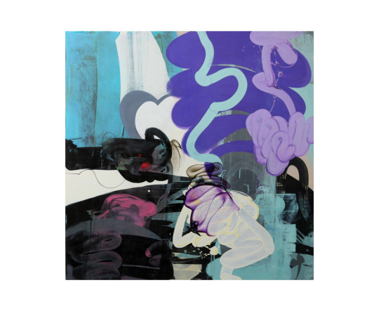
This piece is also different to the previous piece as there is colour in the foreground and the background. There are also much more hues of all the colours used, which is something I would like to do in my own work along with creating textures similar to how Williams does in is work, with very dry brushes containing only a small amount of paint. I would also like to create a general theme with the shapes I create as Williams only uses very round curves and I would like to only use one type of shape in my work, possibly the opposite shape, with many angles and straight lines.
Pokras Lampas
Pokras Lampas is a graffiti artist from Russia who has created many large scale installations and worked with many brands on advertising campaigns due to his eyecatching patterns which resemble letters. His lines have a very calligraphic style to them and usually follow an overall uniform shape for example lines of the asemic writing forming circles in a similar way to a mandala.
I really like the colours within his work and how it is usually a black background with colours over it as I could achieve this effect by inverting some of my own work which is going to be made on white paper. I also really like the large scale and versatility of his work as it works on many different surfaces such as walls, cars and even people in a very detailed and interesting way as by using these different canvases the intricacy isn’t lost.
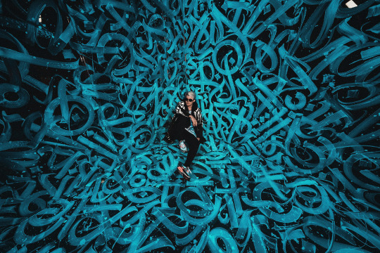
I particularly enjoy the piece above as the brightness if focused surrounding man and the art gradually gets darker and more shadowed towards the edges of the photograph. I also like the way this has been captured as by having him sit in the middle of the art it displays the central focal point and how large the installation really is in a photograph which prior to him sitting there wouldn’t have made clear the scale of the piece.
The campaign and product below are some of the most visually appealing pieces by Lampas that I have seen due to the variety of colours used in the body paint and how vibrant everything is. The way the lighting makes the shadows appear as pink ties the whole photograph together as without the adding neon pink it would’ve appeared rather bland.
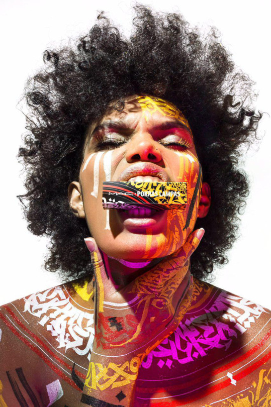
The shapes of the the letters in Lampas’ work remind me a lot of blackletter and therefore if I wanted to display something old and ancient in my own work I could use shapes similar to this o=to do so as Blackletter is the oldest typeface.
I do also like the combination of red and yellow and how the shapes fram the neck and shoulders in a similar way to how clothes do. From looking at Pokras Lampas’ work I have learnt that in my own asemic writing I should think about what shapes my asemic letters are making and whether they form any other shapes such as circles in his work.
Cecil Touchon
Cecil Touchon is an artist who creates abstractions based on typography. The he creates hints at letters and has much depth to it due to the way he makes the rectangles and rounded wedges overlap and interact with eachother. He uses billboard fonts as inspiration for the type of font he is subtly adding into his work and this makes for some big bold shapes and colours that are very striking to catch people’s attention as billboards typically contain adverts and are definitely made to be noticed.
I really like how he has mixed a very natural colour such as tan with a bright periwinkle blue in this piece as I could use this in my own work to portray the messages of my articles as many of them draw parallels between 2 very contradicting subjects, for example nature and technology. The colours also remind me of the sea and a beach and therefore the dark areas could be pollution, or the white and blue could be the sky and the tan could be the ground.
I really like how colours and shapes carry over many of the rectangular shapes and connect them all together, creating very abstract shapes in the process. In my own work I could use this as I could think about how long I want to continue a line for and how much I want the shapes within my work to overlap and affect eachother as by not having them overlap I could end up with a very different outcome than if I did.
The second piece I looked at by Touchon is very different to the first one as it contains no colour and the shapes of the letters are much more similar to letters usually seen in everyday life. We took inspiration from this in our own work as we started our pieces by weaving together some black and white type. This piece reminds me slightly of David Carson’s work as it has the same elements of a glitchy sort of type and scramble up words that his work commonly contains.
This also reminds me of the tomato project due to the black and white and bold lettering which is making shapes in an unnatural way. I think it would be very fun to try and create a piece similar to this in photoshop as I could splice together words and then use the threshold tool to make them very dark and computerised, which would work well for many of my articles, especially the one about robot flies as that is very technological and I think that the outcome could be very technological and futuristic.
Fabio Zanino
Fabio Zanino makes sculptures which are created from objects which he has broken apart and then put back together but only using certain pieces to give the entire object a new identity. He calls this work “Decostruzioni” as he deconstructs things and reassembles them to give them a new purpose and makes them abstract artworks.
I think Zanino’s work is extremely interesting in the way that he will take something which already had a purpose, destroy it and separate it from the original purpose and somehow rebuild it in a way which makes it yet again purposeful. By ridding the objects words and textures of their meaning he can then manipulate them by changing the shape and arrangement of the object and make the textures be interpreted in a completely different way.
Unlike the other artists researched today, Zanino doesn’t necessarily create asemic writing all the time as not all of his pieces contain text, but the way in which he works is similar to that of asemic writing and we took a lot if inspiration in how we worked from him as we disfigured our own writing and our own work and then rearranged it to give it new meaning and new purpose, and I then even went on to rearrange and reweave the asemic pieces I had already created and manipulated them further giving it a third layer of hidden meaning.
Jerry Iverson
Jerry Iverson creates art based on the balance and grace if Asian calligraphy. To do this he uses many layers of paper ink and glue to chop up the words and experiment with how black lines can look like words even if they mean absolutely nothing. I really like this nihilistic approach to asemic writing where the intention is to have it be meaningless as it more or less gives Iverson the freedom to do what he wants without having to think about context. This may have been why there is no colour in this piece as while many of his pieces aren’t colourful some have very subtle colour and this has none to show how it means absolutely nothing.
I really like the texture created by a dry brush and ink in this piece and that is definitely something I could put into my own work and maybe even create something similar using oil pastel or charcoal as they both have a very scratchy texture similar to this.

I also really like how a lighter wash of ink has been used in his work to create a shadow like image behind the harsh black lines that replicates them. The shapes in this piece are something I would like to use in my own work as they are very harsh fine lines with lots of texture which really appeals to me as texture is something I want to include more of in my own work. I also like the way he has copied some of the lines in a lighter wash to add depth as it makes he entire piece more visually appealing in my opinion due to the use of many tones.
The piece below is from the series “Line Bombs”, based on the wars in Iraq and Afghanistan and the disruption they have caused. Iverson has displayed this disruption very successfully by using many layers and textures in a very messy way which is effective for showing an explosion. The ink splatters could represent the corruption and damage that the bombs and wars are doing.
The choice of applying ink in this way could also be to display the aggression and anger associated with war and the way that the ink interacts with the other media on the page could be as a representation to how that anger goes on to affect people unknowingly as you cant plan how ink is going to react to the page you are putting it on.
I really like the use of many shapes and textures and the way that Iverson chooses to layer his work as it makes interesting compositions with lots of depth and many different shades from black to white, I also like how he doesn’t opt to use gradients and instead applies colour in a more jarring way to send the harshness of the messages he is portraying across.
My asemic writing
For my own asemic writing I decided to based all on my article about mammoths being revived, as I haven’t done much work concerning this subject and alspo I thought it could work well for asemic writing due to them being ancient and how I could link them to cave drawings.
For all my pieces I first started off by writing words rather largely on an A4 piece of paper repetitively to then be cut into strips to weave together and hide the message. The words I chose were “mammoth revival extinct animal restoration” as they all link to the chosen article and almost make sense as a phrase. When slicing my words up I decided to do it lengthways down the paper to allow myself longer strips to weave together as I wanted to weave across most of the page and this would be easier to do with longer strips.

I then went on to create the asemic writing and I did this with a biro at first just to extend the lines and shapes created by the sliced up letters and continued the shapes they made, overlapping and connecting some of them in a way which reminds me of Pokras Lampas. I also wanted to replicate something which looks like It could’ve been made in caveman era, but I don’t think I achieved this in my writing very well as it reminds me more of Asian or Russian architecture and the patterns seen on that. I did however make the ends of all my lines very scratchy and not uniform to hopefully replicate some of the textures which could been seen in very old cave drawings.
After continuing the lines I added some oil pastel to create the rocky scratchy texture I was trying to achieve. I think it did a successful job of adding texture and following some of the weaving which was glued down on the page already. Because of the ridges in the paper due to the weave it made very interesting depth as the oil pastel would pick up more in some areas than others. I then also used oil pastel to highlight some of the shapes I created and enlarge them in grey in a similar way Jerry Iverson. I think the grey and the orange look very nice together as it is a warmer grey and therefore more on the brown side than the blue side.
Finally in this piece I added an ink wash of a very pale peachy orange colour which ties the whole thing together as it makes the whole think have a colour overall. I got this idea from looking at Simon Williams work as he using long sweeping strokes and I tried to make my brush not too wet to display some of the brush texture like he does. I also used the ink to further replicate some of the shapes I saw and give the piece a border with shapes that make sense in context to the rest of the piece. Overall I believe this outcome was very successful and other than the writing not looking exactly as I had Hoped I really like how the textures turned out and I believe I achieved my goals regarding texture and composition as it all works in harmony with eachother.

In the second piece I wanted to aim to have the writing be more reminiscent of the textures and shapes seen in caves so I used oil pastel instead of biro to do the original asemic writing and I do think this helped overall give the entire thing more of a rocky texture. I then went on to add some blue oil pastel too as mammoths lived in the ice age and I though it would make sense to use blue as blue is a cold colour associated with ice. I like how the blue oil pastel turned out so I added more blue and this is where it all went wrong.
When adding the blue ink I added too much of it and completely covered the whole piece, overwhelming it, which is not at all what I wanted to do, so I tried to fix this by adding white acrylic paint. I like how the white acrylic looks as it adds a frosty look to the blue but it didn’t many to fix the mistake I made and therefore I don’t like how this outcome ended up. If I was to do this again I would use a small brush for the blue wash or maybe I would choose a different colour than blue altogether or maybe a different shade as it doesn’t look like ice as I hope and instead looks much more bright and possibly happy.
On the other hand I do like how this composition started and how the oil pastels looked when used as the original writing and I do believe that there are many appealing textures within this which the addition of acrylic helped a lot with as it made the piece even more rough and scratchy which is overall the appearance I was aiming for.
For my final piece of asemic writing I wanted to create an overall shape and have all the lines I created be inside of it. To do this, when I was placing the weave I considered how I could frame the page so I decided to put the weaving in 2 corners diagonally from eachother so I could connect them with lines through the middle of the page, I used a black sharpie to do the base writing and I made the lines very thick to develop onto them later. I made them very sketchy as well to create a similar effect to the previous piece but in a different medium. Some of the lines got extended very far across the page to connect both halves together. I really like the way that placing the weaving in this way affects the lines as it makes both corners much more full with lines than the middle and I think this works very effectively in creating a balance across the whole page.
I then used oil pastel on the weaving to dark the corners, causing the middle of the page to be a break of light in the darkness. This also added a lot of depth in areas where I wanted it and worked just as I had hoped it would. From doing all these pieces I have learnt I really enjoy the textures which oil pastels can create and how using them subtly can change the entire theme of the whole piece.
I then added ink washes in the shape of the piece and I think it worked very well to tie the whole shape together and emphasise how the piece shows and follows an overall shape, which is something I started to consider in the first place because I looked at Pokras Lampas.
Finally I added white down the centre of each black line which made the overall piece have lightness where it needed it so it wasn’t tot dull. Overall the outcome of this composition is something I enjoy very much and I think it was very successful in the way that it flows from one side of the page to the other, If i was to fix elements of it I would’ve made the white lines much less jagged and more smooth compared to the way that it is so that they could contrast the jaggedness of the black lines they are surrounded in.

As an additional composition I photocopied my first piece and put it into negative as well as one normal photocopy and I weaved them together as I had been with the rest of the pieces. I really like how this turned out as the contrast between both pieces is very visually appealing to me. If I was to fix any elements of this I would’ve cut the pieces into strips more neatly as they look rather jagged and not in straight lines the way I wished they are. I do really like how I weaved from one side of the page to the other as that is something I think make the page very balance in a simple way.
1 note
·
View note
Text
Betting on Love
Fandom: Roswell, New Mexico
Pairing: Maria DeLuca & Michael Guerin
Inspo: CandyMilkshakes2019
Words: 5K (Yikes!)
A/N: A little late to the party, but it’s … something. A little humble offering to another lovely event. As usual, it’s a freestyle. Enjoy, or not. It’s OK either way. :)
~~~~
It started as a joke.
At least, it was for her. He wasn’t sure if he ever meant it jokingly, or if it was the best way to give voice to a deeper yearning he was afraid to face.
They had a certain vibe – had cultivated it over the years without even thinking about it, so other patrons were bound to take notice.
One-eyed Rick, who ironically had two perfectly good eyes, casually referred to them as an old married couple somewhere between her bitching about the bottle of whiskey he stole and him sweating profusely while fixing the barkeep sink.
He didn’t even remember agreeing to do it. It happened, much like most situations with DeLuca.
“You’re worse than my ol’ man ‘n his lady,” Rick slurred. “Married 35 years 'n,” he hiccuped. “Still won’ stop bickerin’” he drank the last of his shot and slapped his hand on the bar with a raucous laugh. “Won’t stop fuc–”
“It’s been real, Rick,” Maria interrupted him. “Pony up,” she held out the lockbox and waited for him to drop his keys inside.
“Rusty,” she called out to her middle-aged employee with a weathered face. He was hard and scary looking from the outside, and he did a bid, but he was a total Teddy bear. “Round 'em up.”
She didn’t have to say last-call for the stragglers to know it was a wrap. Those too intoxicated to drive, dropped their keys in the dropbox and filed in line outside of Rusty’s clunky old van for dropoff.
“C'mon, what’s one more drink, Ma” He emphasized the endearment knowing it would drive her nuts.
He thought he got away with it when he heard her locking the doors. He should have known better.
He was deep into tampering with a pipe when Maria loomed over him. Her shadow blocked the little light he had, and the point of her cowgirl boot was dangerously close to his boys.
“You about done with that, Pa?” Her voice was syrupy sweet when he ducked his head out to steal a look at her.
She was standing over him. He had the perfect view of her midriff as she looked down on him unimpressed.
She squatted down to get a better look at what he was doing. He thought it was unintentional on her part – her encroaching in on his personal space, her legs brushing against his, foot still planted firmly near his crotch and bust close enough to his face where he could see the pendant he fixed for her peeking from beneath her shirt.
“How long is it going to take?” She asked. His lack of response got her attention. She stared him dead in the eyes. “Focus!”
“I am,” he replied, his tongue slipping out to wet his lips as his eyes darted from her chest to her eyes inconspicuously.
“On the pipe, Guerin,” she was exasperated, but he could tell by the slight upward curve of her lip that she was trying not to smile.
“Oh, I am,” he quipped flashing her a lascivious grin.
“Not that pipe,” she ground out shaking her head. She flashed a light under the sink without him needing to ask.
He would hold his hand out confident that she would press the right tool in his palm, and she always did. Yeah, they bickered, but they also made a hell of a team, and maybe that was what Rick was referring to.
He didn’t realize he slipped into a quiet state until he blinked and realized they were in the town square. They had walked from the Wild Pony through town in silence, and only when he looked at Maria did he notice the furrow between her brow.
“You gonna spit it out, Guerin? Not that I don’t mind when that mouth of yours isn’t moving, but–”
“Oh, you love it when my mouth is moving,” he snapped back. He rocked back on his feet, dazzled by how the moonlight hit her hair. “As I recall, you love it a lot.”
Her eyes flickered to his lips as if she was imagining just what they could do to her. She shook her head discreetly, stared at him with unfocused eyes, and he winked at her.
“Asshole,” she muttered.
“If you’re offering -” he started. Damn, he loved to goad her. She always played along, kept him sharp, and surprised him.
He took off his hat, made a sweeping gesture until she sat down on a bench in front of the fountain, and he plopped down next to her.
He threw his arm along the back of the bench and relished the warmth of her. To his enjoyment, she settled into him, rested her face lightly against his worn leather jacket and sighed.
“I’m still waiting, Guerin,” she prodded, poking him in the side. “You can’t distract me for shit you know?”
Part of him wanted to tease that he knew how to distract her well, but she was tired and despite a false air of indifference, she cared about him.
He never knew what to do with that – how to process someone caring about him when they weren’t required to.
“You ever think about marriage, 'Luc?” He held his breath. Maria was easy to be vulnerable with, easier than he cared for, but it was ingrained in him to be anything but.
He always felt like he was overriding his code, but it was simply the effect she had on him.
She snorted, but one look at his face and she saw past his fake smirk and knew he was serious. She blinked.
“I don’t need marriage,” she replied after a while. She shrugged but tugged at the chain to her necklace deep in thought.
“I didn’t ask if you needed marriage, DeLuca." He leaned in close, holding her eyes with his, watched the way she swallowed unnerved. "I asked if you wanted marriage.”
“Ha,” she blew out. She went for light again. “Whoever bends a knee to me requires a hell of a lot of luck.”
“I never much believed in luck anyway,” he raised his brow suggestively, and she rolled her eyes.
“And what prompted this, Guerin? You thinking about being the ball to someone’s chain?”
He slumped into the bench and rested his head on the back of it. He looked up at the stars, a mystery that eluded him as he continued to try and fail to find his way home, wherever the hell that was.
“I don’t think I’m cut out for marriage,” he sighed. And he didn’t. Marriage meant he belonged to someone, that someone would want to be tied to him – not abandon him.
“I didn’t ask if you were cut out for marriage, Guerin,” she shot back.
He could feel her gaze burning hot into the side of his face, but he wouldn’t succumb to her silently beckoning him.
“The DeLuca women, we don’t really get married. It’s nothing official, no reason behind it that I know of, but it just … is,” her voice was smaller than he was used to, and his eyes darted to her, but she was staring into the fountain fiddling with a coin as an errant distraction.
“I used to think about it when I was a young girl. I can sit here and pretend I was above all that, but everyone wants to be loved and cherished,” she sounded wistful, vulnerable even.
“I’m not going to act like the idea of someone special pledging their love for me in front of people who matter didn’t appeal to me, you know?
"The institution of marriage is a bit antiquated, but it’s a promise. And promises matter…” her voice trailed off. “I used to think about it. Twirling around in Mimi’s favorite dress. Wearing my favorite boots. Throwing a shindig at the Wild Pony, nothing big, but everyone’s welcome…” she shrugged.
“Dancing with Mimi and laughing, some lucky bastard putting up with me, knowing me, loving me out loud – yeah, it has an appeal. Marriage is eternal friendship– it’s family, and family… matters,” she threw her coin into the fountain and searched his face.
He couldn’t speak, not at first. Not when she shared that same sentiment that sometimes left him longing for something he never suspected was in the cards for him.
“Marriage means family,” he agreed. “Never had much of one, so I doubt I could pull off the other,” he stared at her, opting to lighten the mood, but he couldn’t help his mischievous streak from getting the better of him. “But I could pull it off better than you.”
“You!” She laughed so hard she clutched her stomach. If he was being honest with himself, it cut him a bit.
“You say that like you aren’t a commitmentphobe too,” he narrowed his eyes at her daring her to contest. “Do we need to revisit the Chad fiasco?”
“We agreed to never speak of Chad,” she shuddered.
“All I’m saying is if he popped the question, you would have gone running, better yet, you would’ve sent him scampering away with his tail between his legs.
He watched her open her mouth to argue, but deep down she probably knew she couldn’t. "You would bail out of a commitment before I would. That’s just a fact,” she sputtered.
“You’re on, Deluca,” he leaned in close until his lips were touching the shell of her ear. “You’re on.”
The panic across her face thrilled him. But she also wasn’t one to back down from a challenge, even if she didn’t know exactly what the challenge was.
It started as a joke and grew into a bet. He wasn’t used to betting on anything good happening in his life. But there were firsts for everything.
—
When Maria performed, he got lost. It was a sight to behold, and he was convinced some stragglers hung around the Wild Pony long enough to watch her light up the stage.
She performed like it was her calling – the stage her pulpit and music was her religion. He often felt this unspeakable blend of pride, elation, and melancholy.
Because Maria was destined for greater things that weren’t slinging drinks at a grubby pub and hustling racists for cash.
She belonged to the music. And maybe they were both wrong. Maybe she belonged to something after all. Music was the only thing that deserved her.
She jumped off the stage buzzing and still riding high like she performed at Madison Square Garden and not some offbeat path in Roswell.
He only intended to pop in to hear her sing. He swore it to himself since she banned him last week, and he was on a two-week suspension.
He couldn’t escape quick enough though. His hat gave him away, but he was starting to think she was attuned to him. Like her body was wired to pick him out of a crowd like a bad habit. Like she could sense his specific presence the way he could with hers.
“You’re not supposed to be here, Guerin,” she sounded only slightly exasperated, but she probably suspected he would violate the rules at some point.
He was taken by her soft sheen of sweat from the stage lights, the sparkle on her skin from glitter lotion. Her eyeliner made her eyes more alluring than usual, her deep violet lipstick made her full lips more inviting.
He was effectively tongue-tied.
“And miss you performing, DeLuca? It’s cute how you thought that was going to happen.
He bit his lip and she looked away nodded and smiled at the accolades she was showered with. Her eyes shone bright both humbled and proud of the praise she received.
"Yeah, well,” she grabbed the bottle out of his hand, threw it back like the best of him, her throat working in ways that gave him sinful ideas. “No alcohol then.”
He was grateful he hadn’t dosed his drink with acetone yet, but part of him anticipated something like this if she found him. “I was breaking up the riff-raff! If anything, that deserves a drink,” he reasoned.
He loved taking up her time. It was selfish, but the longer they went at it, she was giving him most of her time. Time was valuable for Maria, so he felt valuable when she gave some to him.
He loved the verbal sparring with her. It seemed ridiculous to other people, but he could do it… forever.
“You are the riff-raff,” she countered. He could barely hear a “what am I going to do with you,” muttered under her breath when he opted to put on a show.
“You can forgive me,” he grabbed her hands, fell to his knee and set the bottle down on the floor beside him.
“C'mon darlin’, you can’t be pissed at me for long,” he wiggled his eyebrows at her, and she stared down at him feigning annoyance.
“Guerin, what the fuck are you doing?”
He pulled his hat off his head and held it over his heart. “Practicing,” he teased.
“Fine,” she relented, eyeballing the latest hire overpouring at the bar. “Two drinks tonight including the one I just drank, but you’re still banned until next week. Now,” she went to tug her hands out of his. “I have shit to do.”
He would have left things there, but he was having too much fun.
“One more thing,” he said louder than usual, enough to gain attention from those surrounding them.
“One more thing,” she mimicked. “Wha…” her voice trailed off. “You said 'practice,’” she replayed their conversation. “Guerin …” she warned reading the mischievous twinkle in his eye.
“Maria DeLuca,” he started getting way too pumped by the way her eyes narrowed at him. “Please,” the genuine sincerity came through as he stared at her all beautiful and spirited and got distracted. “Please, let me marry you?”
He ignored the hooting and hollering around them and only focused on the shock on her face. He tilted his head, letting her know the ball was in her court.
Her shock turned into irritation and then challenge.
Yet, he expected a knee to the chest or a verbal smackdown that left him equal parts vulnerable and turned on. He expected a win.
He was not expecting her to lean in close and mutter, “Nice try, Guerin,” against his lips as she kissed him followed by a loud, “Hell yeah!”
“No ring,” she asked innocently.
He was still a bit shell-shocked, and she knew it too based on the way she was smirking at him, but her smirk softened to an amused smile when he pulled out a ring pop.
He got it as a gag to toy with her later. Snatched it out the candy jar used to distract the kids while he worked on cars.
He shoved the little plastic ring on her finger deliberate and slow, then raised her knuckle to his lips and sucked the bulbous confectionery piece. “Sweet and tart just like you.”
She popped it in her mouth and savored the flavor. “Mmm. Watermelon.”
She brushed past him, her lips coming to his ear, breath warm against him and making him shudder. “The ring was a nice touch, even though it’ll only last until the end of the night.”
She nibbled his ear playfully and smacked him on the ass. When she sashayed away only looking back to suck her ring pop and wink at him, all he could do was chuckle. Challenge accepted.
—
“Is there a reason you called me over here,” he could barely hear her over the blowtorch he was using, but he ignored her all the same.
To his bemusement, it gave her the perfect opportunity to check him out when she thought he wasn’t looking.
He could feel her gaze raking across his jeans slung low off of his hips. The dark tank top hugged his torso, she scanned his arms as he went to work on the metal piece he was working on.
When he had enough of giving her a show he flipped his mask up and shut off the blow torch.
She did her best to appear annoyed, but the way her tongue peeked out and she looked flustered, he could tell she was anything but.
“I got your text, babe,” she emphasized. “Is there a reason you called me here? I have errands to run.”
“Maybe I just wanted to see you,” he approached her slowly, stopped, and before thinking about it, he pressed a kiss to her forehead.
He could never figure out what it was about her, the way she pulled him into her orbit and held him there.
She stalled, taken aback by the affectionate gesture, but it made her smile, which in turn made him smile.
“I have something for you,” he said, his voice husky.
He stared down at her, watched as her chest rose and fell and their proximity affected her, but she wasn’t going to be the one to back away and neither was he.
“I’m waiting,” she said breathlessly. When she shook her head and cleared her throat, all he could do was laugh.
He dug into his back pocket and pulled it out. He grabbed her hand, which she snatched away warily until he grabbed it again his brow raised.
When she relented, he slid the ring on her finger. His hands shook, but they both pretended not to notice, and he took a long moment before he could lift his eyes to meet hers.
Bet or not, he put himself out there with the ring he made out of scrap metal, bits of silver and copper twisted into something beautiful, intricate, and strong, just like her.
If she didn’t like it, it would crush him. He realized that the second his shaky hands slid it onto her finger. It was a perfect fit.
“Michael,” she gasped. Her mouth was ajar, eyes wide, and she was speechless. He rendered her speechless.
His first name on her lips sent a jolt through him.
“Guerin,” she corrected, his surname soft on her lips. “You–”
“Made it,” he supplied, swelling with pride.
“For me?” She asked disbelievingly. Her eyes shimmered, but he couldn’t tell if it was the sun or her getting emotional.
“It’s…” she traced the intricate swirls with her finger. “It’s beautiful. She rested on the stone in the center, something unusual to her. "This stone,” she tapped it. “I’ve never seen it before.”
He looked away. “It’s something from home,” he said coyly.
Her forehead creased, but before she could inquire, he gave her his trademark smirk. “My future wife deserved something more permanent than a ring pop, right?”
“You –” she started, but he flipped his mask back down and turned on his blow torch.
“Got work to do,” he called from beneath the mask, smacking her backside as she did to him before. He went back to work, but he couldn’t help but notice her sitting in the truck staring at her ring in surprise. He chuckled to himself.
—
She wore the ring for weeks. It both excited him and surprised him.
She kept it right on the ring finger of her left hand too, like, like it was real for her, and she didn’t mind the world knowing that they were engaged, sort of.
She did the most to. Waltzed into the old junkyard and had folks fixing her car on his dime. She said she got the family discount.
“Were you ever going to tell me you got engaged or was I just supposed to find out from Liz,” Max asked.
He slid into the barstool next to Michael, and his expression was priceless. Maybe he should have told Max when it happened just to see his brother lose his mind. Isobel probably threw a hissy fit.
“She told Liz?” He couldn’t hide his shock, which in turn confused Max.
“That’s what normal people do, yeah,” Max studied him, and he could feel his brother probing for something.
“When have any of us ever been normal?”
“Michael,” Max began, his voice edging towards concern. “If you’re playing Maria–”
“I’m not,” he protested. “It’s not like that, Max. Lay off,” he could count on his hands the number of times they both spent at the Wild Pony together, and he preferred it that way. Max could be a buzzkill.
“I don’t know what’s going on, but if you hurt her, Michael, I swear I’ll–”
“What? Electrocute me?” He shot back.
It shouldn’t have surprised him that Max was under Maria’s spell too. People loved her. She was hard not to–
He took a swig of his drink and watched her pour someone a whiskey.
“I would never hurt her,” he said firmly. The truth was she could destroy him a thousand times over. In some ways, she already had.
“Three weeks, Mikey,” Liz swooped in with a container of fries in her hand.
He levitated one toward him when he felt no one was looking and ignored Max’s scowl and Liz’s frown.
“Three weeks until what?” He took another long pull of his beer.
“You know, honey,” Maria appeared in front of them as if she had been summoned. “Until our wedding,” she smiled sweetly.
He choked on his beer.
“You OK, babe?” She leaned across the counter giving a full view of her cleavage while she whacked him on the back.
“Perfect, darlin’,” he rasped. “Three weeks is too far away."
They stared each other down ignoring their friends’ puzzled expressions.
"This seems like a competition more than an engagement,” Max muttered.
“Or foreplay,” Liz added.
—
Signing the marriage license was a standoff of its own.
They drove to the clerk’s office together. They sat in the parking lot waiting to see if one of them would suddenly back out, but it never happened.
He signed first, and then he stared her down with a grin, but her swirly script joined his chicken-scratch in no time.
“I’m not changing my name,” she said, matter-of-factly.
“Good. Because I like your name,” he tapped the steering wheel and tried to expel his nervous energy. “In fact, I think I’ll take it.”
He kept his eyes on the road, but he could feel hers boring into the side of his face.
“You … want to take my name?” Her voice was even not giving anything away, which made him more nervous.
He didn’t realize the extent of his tapping until her hand – engagement ring too – rested over his stilling him.
He tried to fight it off, but the warm gesture had him spilling his thoughts and internally kicking himself for being so vulnerable.
“I never had a name that mattered,” he sounded guarded even to his own ears. “I never had a choice in it.
"The system named me, and I had the last name of the piece of shit who took me in for the paycheck. He was no one I wanted to be linked to or aspired to be like,” he shrugged.
Maria’s fingers entwined with his, but his eyes never left the road.
“My name never felt mine. Nothing has ever felt like it was m–” he blew his breath. “DeLuca. It means something. Strong. Honest. Brave. Integrity and Compassion. It’s the name of two of the best people I know.”
DeLuca made him think of what home was supposed to feel like.
“It is something to aspire to,” he finished.
Maria was silent for a while, and his mind raced with something to relieve the heaviness and make him feel less exposed.
“Michael Deluca,” Maria said quietly. She squeezed his hand. “I kinda like it.”
—-
“You still got time to bail, asshole.”
It was just like Maria to taunt him moments before the wedding. They spent weeks laying on the pressure and waiting for the other to cave.
Neither of them ever did.
There was still time though, but the thought of Maria backing out this close to the deed would send him spiraling.
He didn’t realize how much until he was standing there in a black dress shirt with Max adjusting his tie. He hated ties.
If he ever doubted the love the community had for Maria, it was put to rest with the display at the Wild Pony.
Fairy lights twinkled everywhere. The two ladies at the boutique did most of the decorating. Arturo provided most of the food. He recognized the man who baked the wedding cake – an elaborate colorful display that was quintessentially Maria – as someone who used to attend Ranchero night years ago.
There were desert flowers and succulents everywhere. And a small gathering of locals, the woman who organized the food market in the square, and the staff at the Pony. Kyle Valenti was handling the music, and to his surprise, Sheriff Valenti was officiating.
Somewhere between taking a hit of acetone and feeling Max’s hand press against his back as he stood at the altar, he realized he wasn’t nervous about marrying Maria. He was nervous about not marrying her.
When the music played, his heart stopped, but when he caught his first glimpse of Maria being led down the aisle, appearing more nervous than he ever saw her before, he thought his heart would beat out of his chest.
He removed his hat as she approached, stunned into silence and not a snarky quip to be made.
She was a vision in an eggshell dress, all lace, and form-fitting, falling to her knees and flaring out. He knew it was Mimi’s the moment he saw it, from the style to how emotional Maria was because she was wearing it.
Her hair was done up and held together by an elaborate hairpiece, and tiny jewels reminiscent of the fairy lights were woven throughout it.
She still wore her trademark pendant. Bangles that belonged to the Ortecho sisters, and a pair of her favorite cowgirl boots.
He was breathless because she was breathtaking. He could distantly hear Max sniffling behind him, but he couldn’t take his eyes off of her.
Mimi hugged her daughter tight and kissed both cheeks and then turned to Michael and enveloped him too.
“You were always such a good boy,” she whispered warmly in his ear. “You’re always home here,” she cupped his face and pulled him down so she could kiss his cheeks.
A tear slipped down his cheek as he sniffled back a dam and turned his attention back to Maria.
He grabbed her face and cupped her neck, resting his forehead against hers. “You’re so fucking beautiful,” he pressed his lips to hers.
She pulled away dazed as Valenti cleared her throat.
“We’re doing this?” Maria breathed. The reality hitting her.
“I guess so,” he grinned. He stared at her lips and eyes, and he smiled wildly.
“It’s a draw, Guer,” her mouth worked to find more words, but she was at a loss. “Neither of us lost.”
“No,” he brushed his hands down her arms. “We certainly didn’t lose.”
“But neither of us won,” she started again.
“I would beg to fucking differ,” he breathed. His eyes welled up again, and he only wished he could blame it solely on Max.
“So what does this mean?” She whispered. “What do we get?”
He stared at her, his eyes searching hers as he leaned in and sucked her lower lip between his. “Each other, Maria. We get each other.”
She was surprised when he announced he had written his vows. It meant he had anticipated declaring them. The napkin he dug out his pocket was damp, and the ink ran.
“Fuck it,” he proclaimed amidst chuckles. He steadied himself, his eyes locked on hers. “There’s something about you that keeps me coming back again,” he started.
He struggled to put his feelings into words. “You chose me. People don’t usually choose me. They get stuck with me, but you always did. You always do. You never walk away,” he said with wonder. “No matter how hard I push, you’re always… there.
"You challenge me, and you call me out on my bullshit, and you make me want to be a better person. You make me feel normal, and comfortable and … home,” he didn’t care if he was in front of other people.
At that moment, all he cared about was being the most honest with Maria he had ever been. He bared his soul like she was the only one in the room, and brushed every tear of hers that threatened to fall as it continued to hit her how real not only their wedding was but his feelings for her.
And then, in a moment he would never forget, she returned the favor in kind. “You always show up for me,” she whispered.
“It’s like you just know, how, when … you take care of me in ways I didn’t think I needed – I didn’t think I was owed.
"And the truth is, I don’t need it. I could do without. I have done without, but I wanted it. It’s okay to want that – this, you. I want you.”
Maria lost it again when he pulled out their wedding bands and she realized he made those out of scrap metal too.
He barely heard the words when Valenti pronounced them as husband and wife, but he did here Mrs. and Mr. DeLuca and thought he would spontaneously combust from joy, from the honor.
He grabbed her face again, kissed her senseless, dipped her back, and kissed her more.
He held her hand as they jumped over an ornate broom.
He felt back pats and handshakes, hugs and kisses, but all he saw was Maria.
Marriage meant family. It meant someone thought he was worthy enough to be tied to them. It meant he belonged to someone – he mattered to someone.
He spent most of life searching for that, and as he watched his new wife laughing, dancing, happier than he had ever seen her – as he was happier than he had ever allowed himself to be before, he realized he finally found it.
~fin~
#candymilkshakes2019#roswell new mexico#roswell new mexico fic#miluca#maria deluca#michael guerin#they really do act like a married couple tbh#*flings fic into the tag and scurries away*
42 notes
·
View notes
Text
How to Keep Your Business Projects Organized
There are a lot of ways to optimize a business. Identifying short-term and long-term goals, improving analytics, gaining partnerships, etc. And one thing that’s often overlooked by businesses is organizing projects. Digging in a little deeper, there are a lot of nuances involved with project management, such as:
Monitoring 2 ends of a business (clients & employees)
Handling multiple projects/resources at once
Resolving internal conflict/delays
Managing team productivity and well-being
All this while working on other important tasks throughout the day. You could call project organization art... with major benefits. After all, statistics have shown that, on average, 12% of company resources are saved when project management is done right.
Use a Project Management Tool
Having software specifically designed to handle business projects and resources is infinitely more convenient than doing it manually with a spreadsheet. While the use of Google Sheets, for example, is a good way to start managing projects, most of the time, it becomes counterproductive. Apart from creating a template from scratch, there’s also an underlying issue with schedule adjustments. It gets tedious pretty fast.
A project management tool can be your best friend when saving time and keeping tasks in order. Smartoo for example, has a drag and drop feature, which practically flattens its learning curve. Much like others in the market, it also has bookings, project phases, and even milestones for when you want to be more rewarding when certain aspects of the project have been completed.
Communicate with Intent
A busy schedule can sometimes be in the way of communicating clearly with your team. This can impact how an employee understands a task and might lead to a different output entirely. Being more specific with your instructions, project details, and schedule adjustments is a surefire way of having a more organized team — ergo, a more organized project.
There are a lot of solutions to unclear messaging. Here are some things you could do for it:
Hold a quick meeting.
Be more specific — Use the step-by-step method if necessary
If your team is more casual, try emojis to lighten the mood
Verbally ask if they understood the prompt
Utilize Project Management Frameworks
There are dozens out there, and none of them are particularly “the best.” However, since these are preferential, there’s definitely one that’s better suited for you or your team. Here are 3 of the most popular you could use today.
1. The Eisenhower Matrix
While technically a time management framework, the Eisenhower Matrix has got to be one of the most popular ways of tackling tasks (projects in your case) head-on. Its structure is mainly described as having 4 boxes lined up to shape like a square. Each square represents tasks that vary in urgency and importance. This may help you and your team organize projects to direct efforts towards more pressing matters.

2. The Kanban Board
A visually appealing management structure segregates projects into “boards” or “cards.” Instead of having projects divided into urgency or importance like the Eisenhower Matrix, this one does so with project phases. While there are a lot of names for each process, they basically have the same concept. The leftmost card is the start of your project, and the rightmost is the end, but some also put an extra (wide) card at the bottom of all the cards. The example below is specifically for project management.

3. Time Blocking
Time blocking is not only great for organizing projects but also for a person’s mindset. To put it simply, time blocking is using “blocks” for tasks to take up specific timeframes of your day. This lets you and your team have a clear and concise plan of action throughout the day. Additionally, it helps in fighting the counterproductive habit of multitasking.
0 notes
Text
Allen Rambles about Cross Tag Battle
So I already did an Under Night In-Birth Rambling a few months, and I don’t feel like retreading that game again for the sake of another half-baked Rambling like the Persona 4 Arena one. No, I’ll talk a bit more about Under Night In-Birth and it’s Light Novel elements another day when I actually have the drive to do so. Instead, I’ll jump straight into talking about about Blazblue Cross Tag Battle, namely, expanding on my initial thoughts of it.
I had a chance to play the beta of the game when it was available, had a lot of fun playing it, and left it feeling confident this game could sell well, but a bit uneasy as well.
But first before I get to explaining that...
The DLC Issue
It wouldn’t be my Rambling unless I got out of the elephants in the room straight away, now would it?
So... that DLC, huh?
I’m not gonna’ bother defending this, but I’ll say this much in its defense. The season pass and the game is about 70 US dollars all together. That’s 50 bucks for the game 1 dollar for every extra character. That’s not a bad deal on paper. Let’s be real here, Dragon Ball FighterZ has more expensive DLC than this and much more expensive season pass combo pack, Blazblue Central Fiction had more expensive DLC than this, and several other fighting games have done worse practices. Dead of Alive has cosmetics that total up to hundred of dollars. From what I’ve seen and played Street Fighter 5 has a handful of costumes can only be purchased with cash rather than the in game fight money, among a few other practices I’m not cool with. And we can probably go on and on about EA’s DLC practices. Worse has been done, and if an extra 20 buck for 20 more characters on an already decent rooster seems bad to you, then... well I think you haven’t been playing fighting games that long to not see this coming.
However, that’s on paper. In context, this is just flat out shady and I’d even say exploitative.
I’m not going to pretend that what Arc System Works is doing is okay. Let’s be real here, a lot of the assets we’re seeing are being ripped and reused from each character’s respective game save for some new animations, the gameplay itself is very simplified, and the fact that they announced such a large amount of DLC before the game was even released is already shady business. I hate it when companies do that, and Arc System Works shouldn’t get a pass for it either.
Not to mention the fact that a portion of their EVO line up is DLC characters. That just kills me a little. I’ll admit that I have a negative opinion of the FGC and competitive fighting game community as a whole, and I’ve already talked about my opinion of EVO in the past, but I really don’t think this game deserves to be in the EVO line up when it only has a little over half its full cast in the game for competitive play, with about a fifth of that cast being DLC. That means you need to shell out at least 6 extra dollars just to have an idea of certain match ups and playstyles, or worse, play your main. That’s no where near fair on a competitive level, that’s a scam and I hope someone more familiar with the competitive side of the fighting game community calls Arc System Works out on it. If your main is locked behind a paywall then you have a right to be angry and even go as far as to boycott this game for this kind of practice.
I’m not happy with the idea of paying to just to play as Orie and Naoto, but as I’ve said, worse has been done in the gaming world. If you aren’t buying this game for the reasons I mentioned, then I respect you’re opinion. However, I’ll also ask you to at least try and get this game on sale otherwise, as there is a good fighting game here, just one that needs to shake off a bad first impression.
Ah, and speaking of the game...
This Game is Simple
Like I said, I took some time to play the Beta, and I have to say this game is a little too simple for my liking. Not that I’m some genius fighting game player that could tell you all the frame data and hitbox nonsense, but I feel like I’m grasping this game’s controls a little too fast for someone of my skill level.
Let me explain.
In the majority of fighting games I play I usually maintain a 10%-20% win rate, so I usually win 1 out of 10 matches. For a casual fighting game player that’s not bad considering I’m usually fighting competitive players, but with Cross Tag Battle I left the beta with a 50% win rate. That’s... quite a jump, but I don’t think that’s due to my skill, but how simple it is for someone that’s familiar with fighting game mechanics to understand the system. Now I’m also keeping in mind that everyone was learning the ins and outs of this game along with me during the beta, but this still.
This simplicity isn’t a bad thing. It works in the game’s favor and makes it much easier to grasp how all these characters works, which is needed for a tag-team style game, but it is something that makes me wonder how long this game will be popular. This game has two auto combos, for every character, and all the characters that aren’t from RWBY have a diluted moveset of their original game. It feels like you know everything about a character in about an hour of practice.
I had similar feelings about Dragonball FighterZ, all the character felt too similar to each other outside of some special moves. Cross Tag isn’t as simple and not all characters feel the same, but one of the big appeals of a fighting game is being about to learn a character for months and still find new techniques and strategies with them. Cross Tag Battle doesn’t feel like a game I’ll be able to do that in.
Again, that’s not a bad thing, but it’s just something that has me wondering about the direction fighting games are taking... or maybe this is just a product of team-based fighters. That simplicity might be needed for the sake of everything meshing well. I mean, if Ragna could do all his rushdown stuff and have an assist to reset combos he’d be a nightmare to fight against. And Nu... don’t get me started on Nu.
But then again, Skullgirls has a good balance of complexity, and the potential for 3-on-3 combat. All their characters feel and play in very unique ways too, so maybe my worries are founded in some ways...
But speaking of...
How Characters Play/Feel
Like I said, this game is very simple. These characters only play slightly like their original games. I've only played with a few people, namely my mains, but Yosuke doesn’t feel like the Yosuke P4A with his 48 mix-up tools, Linne and Hyde feel like themselves, but with less combo options than in their original game. Sadly, none of my Blazblue mains are in the current roster, so I can’t say much about them, but Ragna feels like a watered down version of himself at the very least. I think that goes for most of the cast. They all feel very watered down. This isn’t bad, it’s just different, and I’m not sure how I feel about that yet.
I’m excited to know I’ll have Orie and eventually Izayoi in the game to play with, but I’ve seen gameplay of Orie, and she doesn’t play the way I play her in UNIEST. I get the feeling a lot of people are going to be playing around with the cast for the wrong reasons.
That said though...
The RWBY Characters
The RWBY characters play the best too me, but that should be obvious. They were made with this game in mind from the ground up. As such their combo animations are smoother than the rest of the cast, their sprites are a little nicer, and I can really see a lot of love went into make them feel and play like how they are in the show. The references and callbacks are great as someone that’s a fan of show, and I honestly think their voice acting improved a little in this game... then again, I’ve been hearing their voices for a few years now so I might just be a bit numb to how they’re directed in their series, but I’m surprised how well they mesh with the overall cast. I can see the shipping possibilities and fanfics already. I’m definitely going to have Blake in one of my presets when the game comes out, probably pair her up with Linne or Hyde.
Speaking of voice acting...
The English Dub
Thank God we have a dub again. It’s great to hear Patrick Seitz as Ragna again, and the rest of the cast as well. The Under Night In-Birh cast sounds great too, my favorites being Linne and Gordeau. Seriously, the UNIEST cast sounds great and their voice actors really capture their character well from what I’ve heard so far. It really makes me wish we got a dub for that game so those overlong light novel portions didn’t feel as long.
I did little blurbs about voice actors when Elsword and Persona 5 voice actors were announced, and I’ll definitely do the same kind of blurb for Under Night In-Birth once all the voice actors are known. This game gives me hope that the next Guilty Gear will have a dub and then I can finally care about the story again.
But moving on...
The Roster (AKA Allen Gloats About Being Right)
So we know the full rooster of the game thanks to data miners (the buzzkills), and it looks like I can safely, confidently, and haughtily state that I was right with a few of my calls when I made my speculations. For the sake of maximum gloating I’ll give you all the breakdown from my Rambling on the matter.
Charge Characters
Mitsuru
Kagura
Vatista
Puppet Characters
Carl
Relius
Chaos
Ken
Required By Popularity
Tsubaki
Adachi
Yuzuriha
Required by Tier List
Izanami
Margret/Elizabeth
Seth/Merkava
ArcSys’s Persona OCs
Labrys
Sho
Looking back, I wish I stated Nine instead of Izanami, but Izanamis were kicking my ass by the time I wrote up my speculation and I was very salty about that. I also wish I added Mika into my curve ball list instead of my wishlist, but... well, I can’t predict everything. Speaking of that wishlist, a few people made it like Izayoi, Hakumen, and Akihiko, but that was my personal wishlist and not a speculation, so I won’t count those.
Anyway, I got 5/14 right. I’d consider that pretty good for pure speculation.
My Hopes
I’m just gonna’ list these down, as now we’re getting into my unorganized thoughts.
A simple, fanservice-y story mode. Like I originally said, this game is Arc System Works fanservice incarnate. Frankly, trying to tell a serious story with all these properties, while possible, will just be a giant mess, especially trying to deal with all the quantum mechanical, timeline jumping, dimension hopping nonsense of Blazblue, so I really hope this story will be more like Super Smash Bros. Brawl’s Subspace Emissary where the story is simple and more fanservice for fans of all these series and just see everyone interacting with some fights in between. From what we’ve seen of certain cutscenes CGs being released this just might be the case.
Free DLC. I already bought the Season Pass because I’m a degenerate, but I really hope this game does what Skullgirls did and have all their character packs free on at least the first day of their releases. I have major issues with this kind of business practice and completely understand if you guys don’t buy this game because of it. I’m hoping Arc System Works will realize this and make all the packs be free for at least their day-one release to try and dowse the flames a little. And hey, the first pack and the rest of the RWBY team is free for the first while, so I think that’s exactly what their doing.
...
...
...
I’m gonna’ feel like a chump for waste twenty buck if that’s the case, but hey, I do like the series.
A Good Single Player Experience. I know it’s a fighting game and all, but I hope it’ll have something that’ll make this game fun three years from now when the online community is dead. Something BBCP’s Abyss Mode (because CF’s is garbage) or Persona 4 Arena Ultimax’s Golden Arena Mode. Something like that. I doubt that’ll happen, but it’s a hope for a reason.
Overall, despite my mixed feelings, I hope the best for this game. And as we count down to the final days before release, I hope you all enjoy this game as much as I will.
Unless you roll out with Team UNGA. If you do, then fuck you, fuck your family, fuck your house cat, and everything you stand for.
13 notes
·
View notes
Text
Fitbit Luxe Review: Refined Version of Fitbit Inspire 2
The Fitbit Luxe is just a more refined version of the Fitbit Inspire 2 with a few useful new features (plus more to come soon). Its small display has several drawbacks, yet it is bright, sharp, and appealing.
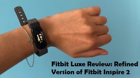
Since this is a fitness tracker rather than a full-fledged smartwatch like the Fitbit Versa 3 or Fitbit Sense, we did not really expect it to have functions like making calls from your wrist or allowing you to make contactless transactions using Fitbit Pay. The Luxe, on the other hand, is all about keeping track of your health and encouraging better habits (both physical and mental), which it accomplishes admirably.
Fitbit Luxe price and release date
The Fitbit Luxe was first unveiled in April 2021, and it will be available for purchase on July 1, 2021. The ordinary variant with a silicone band costs $149.95, while the special edition with the gold-colored Gorjana link bracelet costs $1999.95.
This places it between the Fitbit Inspire 2 (which launched at $99.95) and the Versa 3 smartwatch (which retails for $329). The Luxe also includes a free one-year Fitbit Premium trial, which you can start as soon as you sync the gadget with your phone.
Design
The Luxe is one of Fitbit’s smallest fitness trackers, featuring a thin design that pays homage to the original Fitbit Flex from 2013. It uses the same ‘Biologic Industrial Design Language’ as the Fitbit Inspire 2, Versa 3, and Sense, with ergonomic lines that follow the human body’s curves. In fact, it has a design that is extremely similar to the Inspire 2 — but there are a few key differences.
To begin with, the Luxe uses stainless steel in black, gold, and silver, whereas the Inspire 2 has a plastic shell. This is complemented by a stainless steel buckle, giving the Luxe a more refined appearance.
The Fitbit Luxe’s screen, on the other hand, is its most remarkable feature. The Luxe’s display is a full-color AMOLED with a 206 x 124-pixel resolution, which looks excellent. Most of Fitbit’s smaller fitness trackers (including the Inspire 2 and Charge 4) use a monochrome OLED display. It’s also responsive, which is crucial for a gadget that lacks physical buttons.
The accompanying app allows you to personalize the watch faces, which include a variety of appealing alternatives (including analog and digital designs) that make the most of the watch’s brilliant, vibrant display. All of these provide a quick peek at the time, but some also include other metrics, such as your current heart rate, step count, and calories burned, which you can check without swiping. Fitbit may well introduce additional faces in the coming months, as the range is already outstanding.
The small size of the face has certain drawbacks (you can only see a small amount of info at a time, and graphs aren’t possible), but it’s vibrant and sharp, with smooth transitions and scrolling.
Performance
If you’ve ever used a Fitbit, you’ll be familiar with the general experience; the Fitbit Luxe is easy to use, with an interface that makes tracking your activity and wellbeing as simple as possible. It’s worth taking a few minutes to modify a few parameters before you use it for your first workout.
On the Luxe, there are just six workout options (by default, walk, run, swim, cycle, general workout, and treadmill), and none of them can be changed from the device itself. Instead, via the Fitbit app, you may tailor the available options to your tastes. Swipe left to remove a workout you don’t utilize, then hit the + icon in the top right to add something you do.
Luxe can recognize specific exercise types and start tracking them automatically with SmartTrack, which is especially beneficial for picking up unplanned exercises that you might not think to measure manually.
The ‘noise’ from general movement, especially gripping motions, can always alter heart rate measurements obtained from the wrist, and optical heart rate monitors will never be as accurate or responsive as a chest strap that records electrical signals as your heart contracts.
Apart from those issues, the Luxe performed admirably, producing numbers that were substantially equal to those of a Garmin Vivoactive 4S. There were no unexpected peaks or troughs, and the two devices’ average and maximum heart rates were within 2bpm of each other.
Because of the color screen, the Luxe has a little worse battery life than its Inspire 2 relative. Fitbit claims that it will last five days in normal use before requiring a charge, which we found to be rather true. Thankfully, charging is simple; the Luxe comes with a USB charger that is magnetically attached to the back of the gadget and does not readily shift or disconnect.
After three nights of wearing the Luxe to bed to calibrate it, you’ll start receiving a sleep score each morning based on the time and quality of your sleep.
When the Fitbit Luxe receives its first major upgrade, battery life is expected to suffer even more. The Luxe features a sensor for blood oxygen saturation (SpO2), which the Inspire 2 does not, therefore we expect the Luxe to use more power overnight. This sensor isn’t enabled right now, however, it will be enabled in the future via a firmware upgrade. In the following months, it’s also possible that Luxe will get additional functions. Fitbit has a history of adding new faces and tools to its devices after they’ve been released — and that’s before we consider the app’s frequent updates.
I am extremely passionate about blogging, running websites, and creating content. I have managed to turn my passion into a profession, and blogging has managed to teach me a lot about technology and myself. I write blog posts, instruction manuals, news releases, and technical descriptions, and reviews for many websites such as central.bitdefender.com
Source: Fitbit Luxe Review: Refined Version of Fitbit Inspire 2
0 notes
Text
Analysing Chocolate Spread Packaging Already On The Market
Here, I will now be looking at chocolate spreads which are currently on the market. I tried choosing packaging that I’m actually interested in, but also that are a little different from the usual ones like Nutella and Cadbury. The products I ended up finding are all ones that I have never actually seen before. I think this is a better thing as I can then say my first impressions that comes to mind about each one.
Although the main reason for analysing these is that is will help me when I come to creating packaging for my own products. I did mention in my interim assessment post, that I could either do juts chocolate spread and some other information and posters to with this or I could do a variety of products but I will have les products or just have chocolate spread instead. I am still deciding this, but I thought that either one I choose I could include chocolate spread.

To start, I have found the brand ‘rowse’, where they have created this product with this unusual ingredient of honey. I don't think this is normally added to chocolate spread but I know from seeing this brand before, that they mainly sell honey on its own. This is also quite obvious from the logo as its showing a bee along with the word ‘chocobee’.
Also the thing I noticed when looking at the colours of this product is that they are very similar to one of the products I previously analysed from Pinterest. These two colours are the brown and orange shades. The fact that I have already seen this on two items, is making me think that I don't want to use these two colours together. This is because I wont standout from the rest of the products when on a supermarket shelf.
Nevertheless, I think simplistic of this is very striking to me, as although I was drawn by the colours, the look of a hill with flowers is very effective too. I can see this is silhouette which is in the brown colour. I think this achieves a really appealing effect as you can clearly see this. I can see how the designer has then slightly curved the word ‘chocolate’ which is written in this hill. I feel this small detail accomplishes a greater effect, as if this was just written straight, there would be a randomly bit of negative space. Whereas this way, it has easily been fixed.
The name to which they have called this is ‘chocobee’ is also interestingly written. I can see it has this slight highlights and shadows in certain areas. This is because this has purposefully done to make it have this 3 dimensional look. I feel that this works really well with the font used too, as it now has this overall bubble effect. I think this makes the whole design seem a little playful and fun. Then with the rest of the type, it is a lot less like this. I would say these still work with the bubble text but are a little more professional looking.

This is now a Lindt product, to which, my first impressions were that I didn't think this was as striking as the previous one. My thinking behind this is that the golden foil doesn't really draw me in. I feel that its meant to make it look more luxury, although I’m actually thinking the opposite. Another thing I don't think works is the green colour. For some reason, I just don't think it looks right. This could be because I know the brand, Lindt as I would say this is a little more money that other brands. Additionally, there is nothing that really attracts my eyes. I can see there is an image of the chocolate spread but for me, I know what it looks like and I would rather have some bright colours or patterns instead. This is only my opinion and I would say if you asked others on their thoughts, it would be different.
As well as this, the fonts used are very simple too and I can see everything has been written in capital. The fonts used also doesn't attract me in either, although I would say the only thing that does in the brand name. Even though I have seen this many times before, I think the curled line and angle that its written is more interesting.

Above is another one I found from this healthy eating website. As you can see on the packaging its from the brand Bulk and they create food products which have less calories. I was drawn by this as the neutral colours and layout were quite effective to me. As you can see, there isn't loads of detail and there is quite a lot of negative space too. Although I think this has the right balance. The backdrop colour is a light brown where there has then been two shapes in a slightly darker shade placed in the centre. These shapes are quarters of a circle where there has then been some text placed over the top of this. I can see the designer has done this to draw the viewers in the centre. The name placed at the top of the page is quite simple as its been written in this curved type. Then on the text below, it is in a thinner font. I normally think this type of text doesn't work as it doesn't standout enough. But here it actually is quite appealing.
To the right of this, there has then been this image placed. It is showing a spoon full of their chocolate spread along with some nuts and a square of chocolate too. Unlike the previous image, I think this has a much more cleaner look. This one is an actual image whereas before, it was a drawing that has been done digitally.

My first thoughts of this product above is that the colours work really well in this piece. The designer has used this dark blue shade as the backdrop along with the golden colour on the lettering and lines. I can see this label has been thought through as it works so well with the actual chocolate spread showing around. I feel the overall effect you get from this is an upmarket feel. Even though this has a similar golden look as the Lindt, it is only showing on certain areas this time, whereas before this colour was the main part of it. This dark blue is also a very unusual colour too as I have never seen this on packaging before. I definitely think this is what makes it different from the rest.
When I first saw the lines, straight away I knew how this has been created, as I have create something similar to this before. It has been done using the ‘pencil tool’ in Illustrator, where you can then draw on two wiggly lines. After that, you can use the ‘blend tool’ to bland a certain amount of lines between these two original lines. When the two lines have been drawn on here, the designer has though an=mount the direction in which he is going as the result of this is now having this 3D look.
Then there has been an image which has been placed in the centre of the product. Again, its a very clean and sharp image, which looks very professional too, so now it has been positioned here, it has this eye catching effect.
On the front of this jar, there isn't many words because I can then see that on either sides of the jar, there is quite a lot of long sentences which has been written in white. This has probably been done so that when the product in on the shelf, the customers will juts see the words that are important. So the word ‘dark’ is how strong the chocolate is and ‘Neuhaus’ is the brand name.
Overall, now that I have done some research into how supermarket products create their packaging, I think I will move onto some that I have found on Pinterest. I found them when looking for these items and thought that it could be useful too. I would say these are going to help me more with the jars themselves, rather than the labels that go on them.
0 notes
Quote
Black Belt Magazine Weapons
March 25 | 2013
The Karambit: Why Are These Southeast Asian Combat Knives Still Popular?
Knife expert Ernest Emerson curates your journey through the history of Indonesia’s karambit. Of the many weapons fads that have come and gone, Emerson explores why these knives have stood the test of time!
How many martial arts fads have you seen come and go? Whether it’s weapons, gadgets and tools or entire fighting systems, it’s rare that a fad will catch on and stick around for more than a few years. So when one does, it’s worth taking note. The karambit combat knives from Southeast Asia have the potential to be included in that elite group.
Karambit History
Over the past 4,000 years, mankind has effected thousands of variations in the design of swords, combat knives and impact weapons. The major influences in their evolutionary path are related to three triggers.
One: The most profound trigger has been the discovery of new materials or the ability to process old materials into a more usable form. Human beings progressed from sharp sticks to stones, then to copper, bronze, iron and steel implements. Each discovery caused a major leap in weapon design and tactics.
Two: The next trigger has been the clash of cultures. Every time there was a physical shift of cultures — whether because of famine, natural disaster or invasion — an opportunity to learn from the successes and failures of the enemy ensued. Inevitably, each side would adapt, modify or copy the weapons and applications that appealed to its people.
Three: The last trigger has been invention and innovation. Whenever there was an advance in armor, weapon design or tactics, the development of the key needed to defeat it inevitably followed. Those that didn’t evolve quickly enough faded into obscurity or died off.
Is it, then, safe to say that just because something has been surpassed by modern technology, it’s no longer effective? Far from it.
For instance, the weapon of choice for some German street gangs is the baseball bat — which is nothing more than a club. A citizen can’t even possess one unless he or she is playing baseball or on the way to or from a game. They’re restricted because they’re effective.
Karambit Effectiveness
How does all that relate to the karambit? Well, the aforementioned principles apply here, as well.
Consider: Why has the Japanese sword been around for more than a millennium? Why has the Nepalese kukri, or Gurkha knife, been used since the time of Alexander the Great? Why has the bow and arrow been in existence for 4,000 to 5,000 years?
Because they all boast efficient designs that get the job done.
The karambit is one of the many subjects Burton Richardson covers in Silat for the Street.
The karambit is in the same boat. If the design of the karambit did not have merit, it too would have been relegated to the dustbin of history’s failures.
Bottom line: The karambit was a good knife then — and the karambit is even better now because of 21st-century manufacturing methods.
Karambit Origins
The origin of the karambit is shrouded in mystery and controversy, but it’s fairly certain that these combat knives were devised in Indonesia many centuries ago.
Karambit combat knives have become popular among modern martial artists mainly because of the increasing interest practitioners are showing in the Indonesian fighting arts and the subsequent proliferation of schools that teach them — thus, karambit combat knives have started finding their way into the mainstream.
Karambit Styles
The modern karambit comes in two styles, with numerous variations within each one. The fixed-blade karambit is the traditional version. It has all the features that fixed blades are prized for: strength, rigidity and a lack of moving parts. The folding-blade karambit is the more modern version of the ancient knife. It can be made reasonably strong, but it will never be as solid as a fixed blade.
When you’re ready to cough up your hard-earned bucks for one style or the other, remember that you may train with a fixed blade, but chances are you’ll carry a folder. So if you’re in the market for a self-defense tool, that should weigh heavily on your decision. Of course, if you’re a member of the military or a law-enforcement unit that issues fixed-blade knives as part of its duty gear, you may want to opt for a fixed blade.
Either way, the karambit is lightweight and efficient. Because of its minimal mass, it can be wielded almost as rapidly as you can move your hand. Its inwardly curved blade mimics the claw of a tiger or, if you look further back into history, a velociraptor. The shape of the blade enables even a rank beginner to effectively employ it simply by slapping forward and downward in a pawing motion.
Some say the karambit is a cutting tool, not a stabbing tool. But anyone with any amount of experience with the weapon will attest that it can be driven into a target right up to its hilt with very little effort.
Most karambit knives, but not all, have a hole in the butt of the handle, and it’s by far one of the finest features of the weapon. When you insert a digit—either your index finger or your pinkie, depending on the grip you prefer—you create a durable hold on the knife and make it virtually impossible for an opponent to dislodge it. Furthermore, if you were to lose your balance and splay your fingers to break your fall, the knife would still remain securely under your control.
Karambit Combat
When it comes to combat, the karambit has characteristics that are not found in other knife designs. Cerebral martial artists will forever debate distance and range, but reality is reality. In a real life-or-death struggle, things are up close and personal—and almost always destined to end on the ground. There’s no dueling and no dancing around. And that is where the design of the karambit shines.
Its unique grip and claw-like blade enable you to use it with simple punching motions, and the finger ring permits you to grab an object or an opponent’s limb while still holding the knife. You can also use it to execute a myriad of devastating takedowns that will disable your opponent as he falls, thus opening a new range of combat that might be termed “knife grappling.”
To top it all off, the karambit works perfectly when you attempt to execute virtually any traditional move derived from the Philippine slashing and cutting arts.
One final characteristic makes the karambit unique in the world of bladed weapons: You can spin it around your finger like a tiny buzz saw. Few knife experts would recommend trying any sort of spinning, twirling or extended gripping in a real fight—just as you wouldn’t flip your balisong knife in a street battle. However, just like with the balisong, manipulating the weapon at blurring speed is half the fun of owning one. Just make sure you use a training knife—or at least apply a liberal covering of thick tape to the edge and the point if all you have is the real thing.
Karambit Conclusions
In the end, martial artists like you will decide whether the karambit is a fad or an ultra-efficient tool Americans will embrace for decades to come. For what it’s worth, I’ve evaluated plenty of designs during the almost 25 years I’ve been in the knife-making and knife-design business, and the karambit is the one I carry. It’s also the knife I would use if I had to protect my life or the life of a loved one.
About the author: Ernest Emerson has trained in the martial arts for 32 years. He currently helms Emerson Knives in Torrance, California.
0 notes
Photo

Suspended in Motion by Pameluke | @janoda
Chapters: 1/1 (1584 words)
Relationships: Magnus Bane/Alec Lightwood
Characters: Alec Lightwood, Magnus Bane
Additional Tags: Domestic Fluff, Horny Alec Lightwood, High Warlock of Brooklyn Magnus Bane, Magnus Bane's Suspenders, Alec Loves Magnus' Clothing, Downworlder Dad Magnus Bane, Warlock Mentor Magnus Bane, Making Out, Post-Season/Series 02
Summary:
But that would have to wait until Magnus finished his call, so Alec settled down against the back of the couch and watched his boyfriend move across the loft. He liked this side of Magnus. Dressed to the nines still from their date, talking about goblin spit and sheep guts, while sipping expensive wine.
Or:
Magnus has to interrupt a date to help a young Warlock, and Alec distracts himself with Magnus' everything.
Read on AO3
“I’m just walking in, let me see if I can dig up my copy,” Magnus said into his phone. It had been buzzing with texts for almost their entire walk from the restaurant, so when it rang with their home in sight, Magnus had taken the call apologetically.
“It’s Mariken,” he said to Alec.
“She okay?” Alec asked, holding the door to the lobby open for Magnus. Mariken was one of the young warlocks Magnus mentored. She’d come into her powers at sixteen and had promptly run away from her family. She’d been homeless for almost two years before Magnus took her under his wings. Alec would never mind one of Magnus’ protégées interrupting their date. But he liked Mariken–she was nice, if a little shy–and he wanted her to be okay.
“Let me check,” Magnus lipped at him. “But I think so.” He snapped his fingers to unlock the wards.
“Are your wards up?” Magnus asked Mariken. “That’s always the first step to check after a magical mishap, cucumber.” He sounded soothing rather than worried, so Alec figured it was safe to put away his jacket. No need to end their night with a rescue-mission.
"Drink?" Alec mouthed soundlessly at Magnus, who nodded in agreement and made a beeline for his library.
While Magnus looked through his library, Alec poured them both a glass of red wine. It was a nice evening, they could enjoy the rest of it on the balcony once Magnus had figured out how to help Mariken. Magnus smiled at him when Alec gave him the glass. “Mmmm. So, the moment you added the venom, the potion ate its way through the mortar?”
Alec would offer to take off Magnus' coat while he was calling, but Magnus didn’t stand still long enough to do that, gesturing with the hand holding the glass of wine, moving all around the room. He was wearing Alec’s favorite coat as well, a dark blue one that accentuated the broadness of his shoulders, with golden details on the back, and big golden buttons that were easy to open.
There was nothing to it but to enjoy the view and watch Magnus be in his element, helping young warlocks with their magical education.
“See darling, any potion using vampire venom as one of the key ingredients needs to be mixed in a container made out of either wood or a metal alloy containing at least 24% silver, but no more than 47%. Electrum works particularly well.”
Magnus took a sip while listening to Mariken explain her reasoning for using the apparently subpar mortar. His throat bobbed, Adam's-apple catching the streetlight coming in through the windows. Alec wanted to unbutton his collar and bite his neck a little. He was so beautiful.
But that would have to wait until Magnus finished his call, so Alec settled down against the back of the couch and watched his boyfriend move across the loft. He liked this side of Magnus. Dressed to the nines still from their date, talking about goblin spit and sheep guts, while sipping expensive wine. He was a galaxy of contradictions, spreading stardust and light wherever he went.
“It’s crucial that you clean them yourself, Mariken. It’s the only way to be certain they’re sterile, you can’t trust goblins with that, they consider the earth as part of themselves, so it can never be unclean. It’s a big part of their philosophy.”
Not a day went by when Alec wasn’t amazed by the sheer and seemingly ever-expanding knowledge Magnus’ possessed. Sure, he’d checked the book Mariken had used as a reference, but he hadn’t looked at it once, but instead doled out advice based on his vast experience.
Magnus was a marvel.
And so fucking sexy. Alec would never get enough of looking at him. Every time Magnus made a turn, the suspenders hanging loose on his hips swerved. They kept catching Alec’s eyes, the movement accentuating the fluid movement of Magnus’ hips, the gold lining caressing the musculature of his thighs. Magnus must have figured him out, because he was wearing his favorite pants to go with his favorite coat. They were dark and tight, with a shimmering lining that went all the way down his legs. He’d quietly dubbed them the sex pants, because Magnus was sex on legs in them, and every time he wore them, all Alec could think of was Magnus wrapping his legs around him.
They were distracting on the best days. But the suspenders increased their sex-appeal ten-fold, so Alec’s brain kept short-circuiting.
They were suspenders, they were a tool to hold up pants–although Alec had never noticed Magnus actually wearing them how you were supposed to–they shouldn’t be this sexy.
But maybe this was part of Magnus’ magic, how he made everything he touched a little extraordinary, simply by being Magnus.
Alec licked his lips, took another sip of his wine. Magnus was standing with his back to him, swaying his hips while he explained to Mariken the best way to grind down Copay caterpillars. Alec wanted to grab his hips and grind against him, but that probably wasn’t what Magnus was talking about.
He uncrossed his legs, settled down against the couch a little more comfortable.
Magnus' ass was framed by the suspenders, accentuating every curve Alec wanted to map with his hands. He could go over there, pull Magnus’ ass against his thigh by those beckoning hips, press his mouth against his neck, try to distract him from his phone call. Mariken was young, she would understand that sometimes people were too attractive to resist. He’d make it up to her later, but now Alec just really needed to get his hands-
“You’re staring,” Magnus said, interrupting Alec’s daydreaming.
When he looked up, Magnus was smirking at him, the look in his eyes terribly self-satisfied. His phone was nowhere in sight.
Alec shrugged and waved at Magnus with his wine-glass. “You’re you.” It came out low and a little hoarse.
“Alexander,” he said. “You flatterer.”
“I’ve been told that could get me everywhere.” Alec took another sip from his glass and put it on the table. He waved at Magnus again. “You can’t wear those pants and then expect me not to look. I’m appreciating your effort.”
“I see,” Magnus said. He slowly made his way over to Alec, ditching his empty glass on the way. His suspenders seemed to be dancing.
Alec spread his legs a little in anticipation, but Magnus stopped right out of reach.
“I did promise I’d put in the effort,” Magnus said.
“You always do,” Alec grunted. He looked at Magnus standing there, smiling at him, swaying a little and felt the familiar wave of love and affection crash over him. “Come here so I can kiss you.”
Magnus came one little step closer, but it was enough for Alec to be able to grab those enticing suspenders. He pulled on them a little, but not enough to get Magnus anywhere where he didn’t want to go. An encouragement, an invitation rather than a demand. Alec pulled Magnus closer, one little dancing step at a time.
“Mariken okay?” he asked. Magnus arched his brow at how low and husky his voice was, but Alec didn’t care. Magnus had that effect on him from the beginning.
“She’s fine. Beginners’ mistake. She’s going to start over tomorrow.” Magnus stroked his finger down Alec’s chest, let it trail almost down to his pants, where he couldn’t reach anymore.
Alec pulled softly on the suspenders again, merely flexing his fingers, the fabric ever so slowly gliding through his fingers. “So it’s just us now,” he murmured.
“Just us,” Magnus said, finally stepping into the space between Alec’s legs.
Alec finally really grabbed the suspenders and pulled Magnus close enough to kiss. Magnus’ hands slid over his shoulders, pulling him close in turn, and for a moment the whole world was reduced to the warmth and taste of Magnus’ lips. Then Magnus bit his bottom lip and the world turned sideways for a moment.
Alec groaned and buried his hands into Magnus’ hips, fingers still entwined with the suspenders.
Magnus’ hands were everywhere, in his hair, on his neck, under his shirt sliding up the naked skin of his back. Alec could only hold on for the ride, giving back as good as he could, fingers kneading Magnus’ ass.
Magnus pushed even closer, groin grinding against Alec’s, much like Alec had imagined doing earlier. They were both hard, cocks rubbing against each other through their pants.
When Magnus pulled away, Alec was nearly dizzy with desire.
“I think this calls for far less clothing, and maybe a softer surface.”
Alec groaned again, buried his head against Magnus’ neck. He really, really wanted to get Magnus naked, but he also didn’t want to move, didn’t want this perfect moment to be over.
“I really like these,” he said, voice wrecked, pulling on the suspenders.
“So I noticed,” Magnus said, a little breathless himself. “Imagine how much you’ll like pulling me to our bed.”
Alec bit softly at the hollow under Magnus’ Adam’s apple, pressed an open-mouthed kiss against his throat.
“That I can do,” he said and swiveled them around, hands on Magnus’ hips. He kissed Magnus’ mouth, a little sloppy and wet, and made his way backward to the bedroom, keeping Magnus close by his suspenders.
The beauty of moments like this was that there were always more moments to come.
#malec#malec fic#alec lightwood#magnus bane#otp: shade and glitter#otp: open hearts#shadowhunters#jan writes fic#magnus in suspenders#is my weakness
136 notes
·
View notes
Note
Do you have a specific method for making sigils?
I do, yes. I’ve talked about it before - the old post can be found on @thesigilwitch [here] - but that is over two years old now, so I suppose I can update it, lol.
First, I come up with a statement of intent - a sentence that will dictate what my sigil does. All of my sigils are based off a sentence - I do not draw symbols without an intent or desire in mind, and if I do I don’t consider them sigils.
For an example intent, let’s go with “wellness and positive energy permeates my life.” This was a recent sigil I did, so I can give you examples of my steps.
I write that statement at the top of a piece of paper. I use all uppercase letters, because I think it adds more power, but that is a personal choice.
From there, I break down the statement, make it more abstract, by removing any duplicate letters. I only want one of each letter occurring in the sentence. Some people say to remove the vowels as well, but I like to keep them - it adds more variety to the shapes I can use when making my sigils. Thus, my intent of “wellness and positive energy permeates my life” ends up looking like “welnsadpoitvrgymf.” Try pronouncing that, lol.
The next step, for me at least, is to break down those letters further into their basic shapes. A W becomes \ / \ /, e would be | - - -, and so on. (Again, I always use uppercase letters when doing this.) This gives me more building blocks to create my sigils with, and more variety for their creation. I don’t like my sigils to look like a bunch of letters thrown together - I prefer it to be more abstract, and it is more visually appealing to me that way. When I break down the letters, I tend to only draw one of each shape, instead of all the individual lines and curves. So, doing that, “welnsadpoitvrgymf” becomes | \ / - ~ ) ◯ ( .
At this point, the top of my sigil sheet looks like this:
I often glance at that when I am actually sketching my sigils, to use it as a focus and help reinforce the intent in my mind.
Now that I have that done, I start sketching. Sometimes I use the pieces of the letters, sometimes I use the whole letters, sometimes I use neither and just wing it. There have even been cases where I combine some or all of those techniques for one sigil. It mostly comes down to what I “feel” the sigil needs. In certain cases, that means attempting new creation methods, which tend to be some I have found posted by others here on Tumblr. For the most part, however, I stick to my creation method, if it can even be called that lol.
However I decide to draw the sigil, I do a few sketches of different designs until I get one I like, which means it has to aesthetically appeal to me. Sometimes this happens in one sketch, sometimes it takes two or three (the average). I once filled two sides of a sheet of paper with like 16 sigils for the same intent, which took over an hour, and I still didn’t like any of them. I learned that it was important that the sigil looks good to you, because it connects it to you on a personal level - much the same way I believe it is important to like how a tarot deck looks. That may not be true for all, but it is true to me now.
The sketch page for the sigil “wellness and positive energy permeates my life” looked like this when I was done:

Generally, I don’t keep drawing after I find a design I like. I typically star the one I plan on keeping and using. I didn’t on this page; however, I went over the design a few times to solidify the lines exactly how I wanted them. The final design is the one on the top right, this one:

However, when I drew that particular design, I had the page flipped, so it technically should look like this:

As you can see, there are erase marks from where I tried lines out, but decided I didn’t like in the end. I don’t feel that has any impact on the sigil’s effectiveness.
The one right next to it was the first one I drew, and I almost went with that one as the final design, but I was concerned it looked too much like a very infamous racist symbol, so I passed on it. I was told it didn’t; however, since I had those negative connotations already in my mind and associated with that design, I felt it would be and for me to go with it in the end.
At that point, the sigil is ready to be used. However, I tend to make digital copies of my sigils, because I do post them online for other people’s use. This sigil was actually made for an intent suggested by a friend.
I either scan the page to upload my sigil, or I take a crappy picture with my cell phone and email it to myself. Either way, I get it on my computer and open it with Paint Tool SAI. From there, I redraw the sigil, which also adds another element of aesthetic to it, because I really enjoy how clean and sharp the sigils look when done with the line tool in SAI.
When the sigil is made digital, I tweak some of the lines a bit further to keep them looking exactly as I want, how I intended the design to look in the first place, even though it may not have come across so well on the page. I also like to play around with line thickness.
Mostly the sigils are made transparent, with a white glow around the edges for visibility purposes; sometimes I create simple color backgrounds with the color corresponding to the sigil’s intent. It depends on what I feel like doing with it.
When I post them online, they tend to get watermarks, if I can remember to do it. For a while they didn’t, because you can’t create text layers in SAI, but I have Photoshop back now, so I’ve begun utilizing the watermarks again.
The final version of this sigil ended up like this:

Now that I look at it again, the large curve needs fixing, lol.
And that is how I make my sigils! I dunno if I needed to go so in-depth, but here it is. I hope you made it all the way to the end, and I hope it helps you, or provides inspiration for your own method, or whatever. I don’t really know why you asked me this tbh. But you know, enjoy!
#sigils#sigil magic#sigil magick#witchcraft#witchblr#sigil creation#sigil tw#long post#richtors posts#anonymous#answered ask#ask
328 notes
·
View notes
Text
CT scanning is just awful for diagnosing Covid-19

By LUKE OAKDEN-RAYNER, MBBS
I got asked the other day to comment for Wired on the role of AI in Covid-19 detection, in particular for use with CT scanning. Since I didn’t know exactly what resources they had on the ground in China, I could only make some generic vaguely negative statements. I thought it would be worthwhile to expand on those ideas here, so I am writing two blog posts on the topic, on CT scanning for Covid-19, and on using AI on those CT scans.
As background, the pro-AI argument goes like this:
CT screening detects 97% of Covid-19, viral PCR only detects 70%!
A radiologist takes 5-10 minutes to read a CT chest scan. AI can do it in a second or two.
If you use CT for screening, there will be so many studies that radiologists will be overwhelmed.
In this first post, I will explain why CT, with or without AI, is not worthwhile for Covid-19 screening and diagnosis, and why that 97% sensitivity report is unfounded and unbelievable.
Next post, I will address the use of AI for this task specifically.
I’ve been getting a bit upset
Anyone remember Film Critic Hulk? Someone should definitely do a Research Critic Hulk. PUNY SCIENTIST CLAIMS A P-VALUE OF 0.049 IS CLINICALLY MEANINGFUL? HULK SMASH!
I was initially going to write a single post on AI, but as I started reading the radiology literature around CT use in more depth, I found myself getting more and more frustrated. These articles, published in very good journals, are full of flawed designs and invalid conclusions!*
So I have split this post off, and written an article that isn’t about AI at all.
I still think this is relevant for AI-interested readers though, since this is a great example of how a surface level reading of the literature can be really misleading. As always, consult a domain expert before you start building AI models!
CT in Covid-19 is just awful
I’m going to give two arguments here. The first is an unapologetic appeal to authority, for those of my readers who aren’t interested in a discussion on cohort selection, study design, and how research methods determine what sort of claims you can make. The methodology discussion will be in the next section, but you can skip it (and the rest of this blog post) if you want because the experts are unanimous.
The American College of Radiology says “CT should not be used to screen for or as a first-line test to diagnose Covid-19.”
The Royal College of Radiologists says “there is no current role for CT in the diagnostic assessment of patients with suspected coronavirus infection in the UK.”
The Royal Australian and New Zealand College of Radiology says “CT should not be used for routine screening for Covid-19 disease.”
The Canadian Association of Radiologists “recommend against the use of routine chest CT for screening, diagnosis and surveillance of Covid-19 infection.”
There are many more. Boom, argument done. CT sucks.
Technical problems with the radiology literature
If that is a bit flippant, then below is a short technical discussion to explain why the papers are claiming CT is good, and the experts are saying it is bad.
I see two main problems in the literature that suggests high sensitivity for Covid-19 detection with CT:
severe selection bias, which invalidates all the conclusions
incredibly permissive diagnostic rules, inflating sensitivity ad absurdum
Selection Bias
I’m going to mostly refer to this paper, since this is the major source the 97% detection claims, which concludes that:
“Chest CT has a high sensitivity for diagnosis of COVID-19. Chest CT may be considered as a primary tool for the current COVID-19 detection in epidemic areas.”
Many sources have picked up on this, both in social media and the traditional outlets.


The problem is that this is totally wrong and not justified by what they showed. The reason for this is called “selection bias”.

When the patients you select for your study (orange box) aren’t representative, you have selection bias.
Selection bias is when the subset of cases you have tested (called the cohort) is significantly different than the people you want to apply the results to (the population). In a screening setting, you would like to apply the test to anyone who is suspected of Covid-19 (having a cough, sore throat, contact with infected person etc). In the diagnostic setting, you might do a CT after some other tests (like blood counts or similar) to exclude other things first, but you will still be testing a lot of people.
In the study they analysed a retrospective cohort of 1014 patients from Tongji hospital who had both CT scans and viral PCR tests (the current gold standard). The idea is that we can see which patients with viral PCR positive tests within a few days of the scan also had CT features that would allow us to diagnose the disease. Seems fine, right?
Here is the cohort diagram:
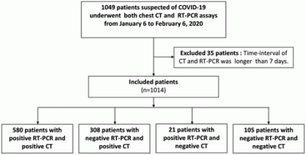
The question you need to ask is “which patients were these? Were they from the general population of patients who might have Covid-19?”
The answer is “no, these are patients in the hospital that got referred for CT scans.”
The cohort is therefore biased because the patients a) had a reason to be at hospital, likely because they were hospitalised, and b) had a reason to get an expensive, time-consuming test (the CT scan).
The authors never comment on how these patients were selected (which isn’t really acceptable IMO), but we can infer that the cohort is biased because the radiology literature and the clinical literature are reporting different things. The radiology studies say that nearly 100% of patients have CT changes, but the clinical reports says that 81% of cases of Covid-19 either have no pneumonia or mild pneumonia. While the use of terms like “mild” and “severe” infection are pretty rubbery, we should recognise that one common definition is that patients with mild infection don’t go to hospital. If that is the definition used here, 4 out of every 5 Covid-19 patients won’t be represented in this cohort at all!
Not only are 80% of all Covid-19 patients potentially not included in the study, but these excluded patients are also specifically those who are less likely to have CT findings. One study suggests that over 50% of patients who have Covid-19 infection will have a negative CT study in the first few days of infection (likely a decent proxy for “mild infection”). Another study showed that only 50% of asymptomatic patients had changes on CT.
Put this all together, and we could imagine an extreme scenario where the study reports a sensitivity of 97%, but the actual sensitivity for screening is below 50% (and possibly as low as 20-30%).
This was so strange that I thought I was missing something as I read these studies, so I asked radiology Twitter for input. The overall position among the TwitterRadis was pretty similar to mine; there was extreme skepticism that these results reflect the true population.
The only thing that is >95% certain is that my tweets will have typos in them. Blame the 5-day old newborn who was keeping me awake
Blinding and misleading metrics
The second problem relates to the metric choice itself. Sensitivity is a great metric, since it tells us “of people with the disease, how many will the test detect?” This is exactly what we care about with Covid-19 screening.
But sensitivity has a seesaw effect with another metric, specificityh m(false positives you get). As sensitivity goes up, specificity goes down. There is a trade-off, and how much you favour one metric or the other will be determined by the clinical setting. In a screening scenario, it can be reasonable to aim for high sensitivity, so you miss as few cases as possible, at the expense of a lower specificity (we can accept a higher level of false positives).
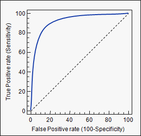
The trade-off between sensitivity and specificity is often plotted as a ROC curve.
What is often not appreciated, however, is that you can turn the dial all the way. It is always possible to achieve 100% sensitivity (top right corner of the curve); you simply say that everyone has the disease.
This is an absurd approach, since a) it means a whole lot of people without the disease are getting treated, and b) it completely invalidates the test. Why even do the test if you don’t need to look at it?
With that in mind, let’s look at another “CT is highly sensitive for Covid-19 detection” paper. This study, in the same high-tier journal, claims that the sensitivity of CT is 98% vs a sensitivity of 70% for viral PCR. They say:
“Our results support the use of chest CT for screening for COVD-19** for patients with clinical and epidemiologic features compatible with COVID-19 infection particularly when RT-PCR testing is negative.”
With a statement as strong as that, surely they are saying that they have evidence that CT can be applied broadly? They even mention patients with epidemiological features of infection … that is to say, folks who have been exposed but don’t have symptoms.
Here is the patient cohort diagram:

We can see we are again looking at only hospitalised patients who underwent CT, so we are likely to be overestimating the sensitivity due to selection bias.
But I noticed something else in this paper too – they show us the images for some cases, and some of the images are a bit weird. The image below, which was reported to contain “atypical features of Covid-19” (specifically “small peripheral linear opacities bilaterally”), was a massive red-flag for me.

Well, they must be small, because that looks like a normal CT chest
Now, maybe that image was unrepresentative or included by error, but they show this one as well, with a handy arrow:
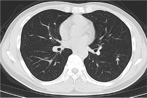
According to this paper, tiny random opacities are now diagnostic of Covid-19.
I’m getting snarky here, this is only 2 images out of the dozen or so in the paper, but would anyone like to guess what percentage of healthy patients have a tiny vague opacity or scattered basal interstitial markings?
Old memes are good memes.
The point here isn’t that this test will have low specificity. It will, but as I said, that can be acceptable for a screening test. Rather, the problem is that the way they have performed the study throws the sensitivity results into doubt. It is trivial to achieve high sensitivity if you call any abnormality on an image a positive result. We could have equally high sensitivity on chest x-rays too, because almost every study ever has some degree of atelectasis (which could, in theory, be a ground glass opacity and therefore Covid-19).
Look at that minor left basal atelectasis. Must be Covid.
This also highlights a major problem with the whole study design. They don’t actually say how they identified the features of disease (again, pretty unacceptable), so I can only assume they had some radiologists look at the images post-hoc (commonly called a “reader study”). If that is the case, then how did this study actually work? Did they say “here are confirmed cases of Covid-19, tell me if you can see any features of the disease”?
In radiology research we always try to blind readers to the actual outcomes, because otherwise they will be biased by the known answer; doctors will be actively trying to find evidence that supports the already proven diagnosis. They aren’t cheating on purpose, this is a known subconscious bias that affects their performance.
Blinding is the incredibly important, because in real life the readers don’t know who has the disease. If you don’t blind, your results will not reflect reality.
Even if they didn’t tell the doctors that these cases all had Covid-19, how long do you think it will take for the doctors to twig that almost every case is diseased? A reader study without negative examples is, effectively, unblinded.
It is worth noting the the first study I discussed (in the section about selection bias) was appropriately blinded and had negative cases, so the blinding issue may or may not be a problem, but at the very least I am concerned that the authors were overly permissive in what criteria they used to define CT-positive results.
Summary
In my opinion, the studies that have reported high sensitivity for CT imaging are fatally flawed. They only report results on highly biased hospital populations, and it is likely that the reporting rules used were too broad to be a fair estimate of the real-world use of the tests.
There have been several studies which showed more plausible results. A large study in NEJM of hospitalised patients (still a biased cohort) in China showed that, in practice, about 18% of CT scans were normal at admission. This is real-world evidence, as they used the radiology reports to determine the CT diagnosis rather than having radiologists read the scans post-hoc.
The cruise ship study I already mentioned is nice as well, since this is a group of exposed people who were all quarantined and comprehensively screened. They found that 50% of asymptomatic Covid-19 positive patients had no CT changes, and (similar to the above NEJM study), around 20% of symptomatic patients were also CT negative.
These results are markedly different from the optimistic early reports in the radiology literature, and the reason for this is clear. They looked at the holistic population rather than a small biased sample in hospitals, and (at least for the NEJM study) they used the actual clinical reports to assess the presence of CT changes, rather than only looking at positive cases without negative controls through the retrospectoscope.
Rather than 97% or 98%, the overall sensitivity of CT for the detection of Covid-19 infection is probably below 50%, and is almost certainly much worse than PCR testing. Thus, as all of the expert panels and committees have said, CT imaging has no role in the screening or primary diagnosis of Covid-19.^
*this is not unique to the radiology literature, but there have been quite a few studies of questionable value in good radiology journals.
**typo in the final line of the conclusion is reproduced from the source. This isn’t a comment on the authors, more a reflection of the reduced editorial oversight that comes with any disaster. I don’t doubt that the need to get papers out (with both good and questionable motivations***) is responsible for some of the problems raised above.
***I’d be remiss to not mention the questionable motivations, although I am not aiming this at the authors of the papers discussed here or the journal editors, some of whom I know. There is a metric crap-ton of terrible research on covid coming out. The writing and publication of rubbish science is heavily motivated by the near infinite citations on offer, the unlimited altmetrics, the slavering media chasing after new and controversial content, and even political agendas. And, next blog post, in AI in particular there are millions of dollars on the table for even vaguely believable claims, as governments want to look like they are doing something rather than nothing, and AI always looks good in a press release.
^that is not to say that CT scanning has no role at all. We do imaging for a wide range of reasons, but that is a different discussion. The papers claim that we can use CT for screening and diagnosis, and that appears unsupported by the evidence.
Luke Oakden-Rayner is a radiologist in South Australia, undertaking a Ph.D in Medicine with the School of Public Health at the University of Adelaide. This post originally appeared on his blog here.
The post CT scanning is just awful for diagnosing Covid-19 appeared first on The Health Care Blog.
CT scanning is just awful for diagnosing Covid-19 published first on https://venabeahan.tumblr.com
0 notes
Last Seen Blogs

toonyscorner
Toonbriel!

emmsrob
The green light

kittinalu
Kittina Lu Steampunk & Cosplay

hildcit
Hi! o/

respectivity-blog-blog
xoxoAhere