#also im so happy with the rendering on this
Note
Hello :D
I have been following you for the last year or so (a few days after I got my Tumblr lmao) and I absolutely love your art!
I have been wanting to study your art style for a while but don't really know where to start,,,
Could you please show me a small portion of your art process, if it isn't too much trouble of course. Thank you and have a nice day!
hello. oh my god. this took forever to find.
im sorry it took 2 WHOLE FUCKING MONTHS for me to respond to this but i wanted to put it off until i felt happy with my art process again, so here it is
my fall 2024 rendering tutorial!
(this will be very very long)

FLATS AND WHATEVER YOU WANNA DO WITH LINES GIRL. then make sure to recolor the lineart to better match your base. trust me it helps, bold dark lines are Not your best friend when rendering. wait for that post-rendering
i start off with a doodle or a sketch, and then filling it in with flats and other details such as blush

FIGURE OUT YOUR LIGHT SOURCE. FIGURE IT OUT GIRL YOU CAN DO IT you can make it as simple as possible, make it as big as possible, dont even THINK about the details.........just make it really fucking big so you at least know where the shadows and the light goes THEN add smaller shading details LISTEN TO ME. LISTEN TO ME OKAY!!!!!!!!
my key point with this is for you to learn lighting fundamentals.
it's SOOO ANNOYING but alas......they are all correct. it helps a lot.
one thing i also really want to point out is that i like creating a big shadow shape first before fixing up the little details (such as folds and whatever) because it helps me focus on the way the lighting actually works instead of tunnel vision-ing into making the shading make sense on the clothing.

contact shadows (i dont remember if thats what theyre called okay) theyre fucking ugly because im not actually thinking sorry 💔
okay so basically:
contact shadows (if that's what they're called) are the spots in shading and lighting where light will NEVER hit.
shadows are still influenced by the colors and lights around it (it's why a blue shadow and a yellow shadow feel completely different, despite both being shadows) so it's not always COMPLETELY dark.
BUT! there are small points in shadows where light never hits, and they're almost always super dark or pitch black.
it's hard to explain shadow and light so briefly for a tutorial, but you'll notice it when watching fundamental studies and when trying it out for yourself


YES i unclipped the multiply layer YES its ugly and terrifying but it makes coloring the multiply layer easier okay
the colors merged w multiply so now it looks cool and has depth
overlaying colors that actually make sense
so basically what i did was color the multiply layer that i used to shade the overall drawing
adding a band of red/orange/yellow around where the light hits, and blue where the shadows get big and wide, gives it a fake ambient occlusion effect in the way that a person would get if they stood under the sun with a clear blue sky
the colors don't have to make sense, especially because i never draw backgrounds, but coloring the shadows really help it give a sense of depth and extra subtle detail and effect that just helps make the painting look nicer
around the end, i also put in colors (in an overlay layer with a low opacity brush) that actually make sense in context of the drawing, which is the lit cigarette and the yellow eyelights
mostly because none of the colors were making sense and i needed to actually make use of the lighting that DOES exist in the drawing lol

adding a muddy golden yellow pin light layer (opacity turned down to like 40-50%) to make the light colors less ugly lol
i SWEAR by the fucking pin light layer style. it's so useful and so so underrated.
i used an almost brown-ish gold color on stop of all the layers, and with the pin light layer, it helped make the bright (almost blue-ish) white colors more warm and more yellow. it just helps make things more warm (something i prefer)
i could probably show what it looks like without adjusting the layer opacity to truly show off what i mean (like in the coming section) but i sadly forgot to do that lol


make a layer on top of your drawing with this color in these ranges YES the drawing is fully merged NO don't be afraid, the base was fucking ugly anyway 💔
make this layer into an exclude/exclusion layer style TRUST
turn down your exclusion layer opacity from a range of 10% to 40% literally until you're happy with the contrast and the way the color over the drawing. use your eyeballs. i know you can do it im so proud of you
this is pretty self-explanatory instruction-wise, so i'll go into why i do this instead
i really like art that seems like it has low contrast, with almost mid-gray shading and lines. i don't personally use dark and bold lines and shading, unless i find it necessary for the tone of the piece, so using this method helps lower the contrast of the art and make it look "pleasantly muddy" in the way that it's easier and softer on the eyes.
the inverted blue color also helps makes things warmer!
the exclusion layer style is still a bit of a mystery to me but i really like the effect it gives, even if i don't completely get how it works lol
if you want an alternative method to this, and if you have access to it (because i primarily use sai and sai only),
i absolutely encourage you to play around and experiment with gradient maps.
there are so many out there you can make yourself or even get from others that just give the painting an extra amount of depth and color variation. they're SO fun.
personally, if sai2 gets a gradient map update, it's over for y'all it will literally be so over no one will be able to stop me


then i merged everything and actually adjusted the contrast back up because it was looking too muddy for me 💔 but the color adjustments are still there so all hope is not lost
here's a comparison of the adjusted contrast in black and white
(adjusted on the left) (newly merged layer without adjusting the contrast on the right)
as you can see, i actually turned the contrast back up (despite talking all about how i liked things with less contrast lol)
i wanted to demonstrate that doing adjustments should be done in moderation, and is why i adjust layer opacity often when making color effects
you are free to play around with colors to help your style, but don't lose your initial idea and colors along the way.
you still need to trust your own colors and intuition!
along with that, i just want to say that it's completely okay to change your mind mid-painting, and it's okay to make somewhat drastic changes.
don't be afraid to change things you don't like or change your mind about certain aspects way later on
that's basically the whole thing of this!!! don't be scared!!!

now im gonna hold your hand when i say this..........but you need to learn how to render by yourself. it seems like i can teach you but i literally can't, because rendering is different on every piece and depending on how clean your base is. i have to render A LOT because of how fucking ugly my sketches are LMAO
to simplify it, think of it as obsessively cleaning up every detail you can see, but with a color picker and a clean, hard edged brush. if you have shit lineart, you don't have to redraw it cleanly over and over, just paint over it. that's basically what rendering is
THIS especially is where you need to be brave and stop being scared.
like i said, i can't teach you how to render, and it's something you have to discover yourself because rendering is something that will always be personal to every single piece you make. the way you render on every piece is different.
on one piece, you will barely need to render, and on another, rendering is more than half of your ENTIRE process.
don't be afraid to paint over your old art.
rendering is a process that's both very perfectionist yet also very careless.
find your balance and just go for it.

and then that's it……..u did it………..now yuo know how to paint and render. it's literally just layering shading and lighting knowledge until you think it makes sense and looks okay lol
additional note: since i render in only one layer (you don't HAVE to do this, but it'll be harder for you…), i also made slight adjustments with the transform (and liquify, if you have it) tool to make things more proportionate. (i drew the head too big lol)

if you compare the finished piece to the final unrendered base, you can see that a LOT changed, including a bit of subtle proportion adjustment.
particularly, the sleeves changed A LOT (because i really didn't like them)
but it's also over all cleaner and more coherent, instead of having haphazard colors and shading just thrown about.
rendering is when you finally use all 100% of your brain to finalize and figure out where the shading should go, where to clean up your lines, where to ERASE or ADD BACK in lines, and make sure all your colors look coherent.
it's not as intimidating as it seems, i only use a hard edged brush with a little bit of color mixing and my color picker.
it's like dragging and dropping colors to cover up mistakes, it's really quite fun when you get used to it
i wish i could explain it clearer but it's hard to describe without visuals!
i hope this helped, and i hope all my yapping isn't annoying (art as a special interest beloved)
have fun studying and trying to render in my art style!
#long post#art tutorial#rendering tutorial#art help#art tips#tutorial#kia doodles shit#artxstic-scr1bbles
92 notes
·
View notes
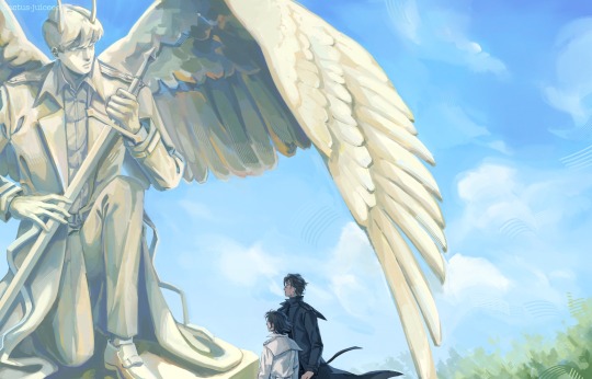
Note
Can you draw Sniper being calm and happy under the sunbeams? Your lightning work is superb and the overall style feels very warm and comforting so I thought this kind of request would turn up the best...

Of course I can, Oblique🤍🤍🤍🤍 anything 4 u ..
He's in for a little spring "preening"... from beloved archimedes 🕊️ I am almost certain he'd be most happy snoozing away in the sun unbothered... this man can doze ANYWHERE im sure of it. Hes like a lizard sunbathing on a hot rock... forgive me for the laziness of this render Im too excited to post it
Also that is SO SWEET of you to say🤭🤭🤭🤭 THANK YOUUU🤍🤍🤍 I'm so so flattered, your work is incredible🤍🤍
#art#tf2#sniper#request#fanart#im so happy guys oblique NOTICES ME...#team fortress fanart#sniper tf2#sketch#render#tf2 archimedes#dove#artists on tumblr
43 notes
·
View notes
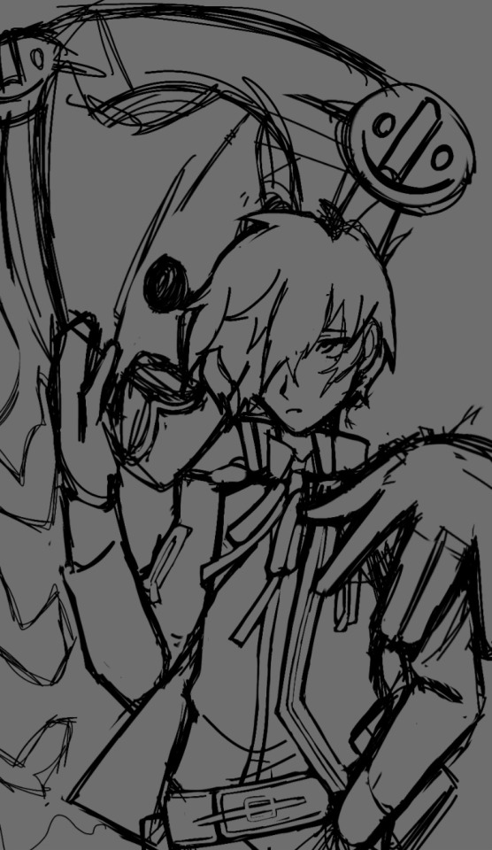
Text
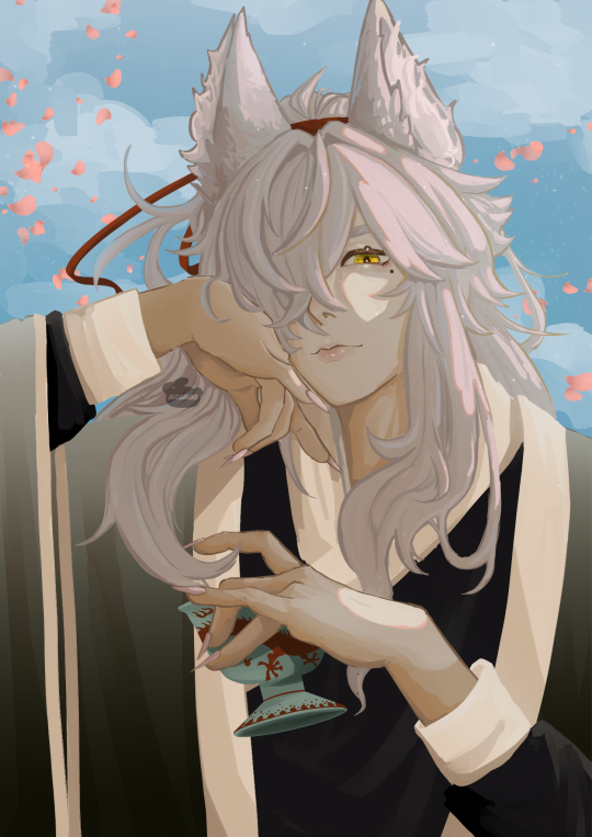
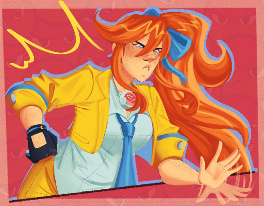
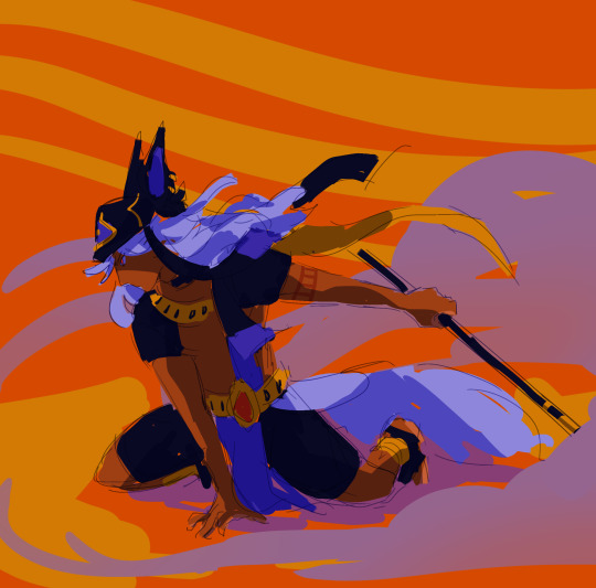
#my foxian beloved#also im so happy with the rendering on this#moomoos doodles#honkai fanart#honkai star rail#honkai star rail fanart#hsr fanart#hsr art#hsr#hsr jing yuan#hsr jingyuan#jingyuan fluff#mihoyo#mihoyo fanart#hoyoverse#hoyoverse fanart
46 notes
·
View notes
Text


bunch of portraits
#my art#jujutsu kaisen#jjk#jjk fanart#jujutsu kaisen fanart#yuji itadori#ryomen sukuna#megumi fushiguro#gojo satoru#nanami kento#choso kamo#nobara kugisaki#yuta okkotsu#fanart#crying im so tired....#busts aren't hard on their own but 8 of them ???#i should have stuck at 6 if i knew what was good fr me#but lucky fr choso n yuuta enjoyers i dont know whats good fr me and tacked on the extra 2 last minute#i did a bust piece waaay back in 2020 early jjk days and it was this crowd minus choso/yuuta so i wanted to like. do a kind of redraw#im happy choso n yuuta made the cut tho they r fun they look as tired as i feel#i've been having a lot of fun w the more semirealistic skin render so i wanted to stretch those muscles a bit more#took the better part of 3 days but u know i'm pretty happy w these i dont think i have a hard least favourite#fun game guess my favourite characters based on how i draw them it is Glaringly obvious 2 me#ik i said i dont have a least favourite but i certainly have A Favourite#uhhhh misc notes i tried rly hard to make sukuna's face look like yuuji's and only rly change the expression#i think i was successful??? i hope?????? like i didnt want to make him look like his own person as bad as that sounds#he is Wearing Yuuji that is Yuuji's Face#also i rly . wish there were more women . but as much as i like maki as a character i fr some reason don't find drawing her very fun ?#so nobara out here pulling her weight fr the girls my goat my queen <333
1K notes
·
View notes
Text
epilogue
#SHES FINALLY OUT OF THE WIP FILES#thank god#hueegh epilogue yhk make me sick.. what do you mean their only happy ending was together and they sacrificed everything for that huh#just realizing I forgot to give han sooyoung glasses which is honestly a crime but#ough oh well#also im so sad I couldn’t do yhk week bc I was busy so think of this as my late contribution#anyway im finally free of rendering hell (has already started 10 billion other pieces that require rendering)#orv#omniscient reader's viewpoint#orv spoilers#yoohankim#kim dokja#han sooyoung#yoo joonghyuk#yhk#cactusjuiceart
3K notes
·
View notes
Text
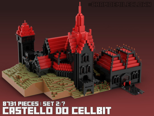
i finally finished it!! big thanks to @atthebell for digging up a bunch of vods for me this wouldn't be possible without them
#like i seriously can't understate that the whole backside would be unfinished without them#i have a few more renders of it from different angles i might post later if anyone is interested#also if you want to know anything about this im very happy to infodump about this#it would be one of the biggest official lego sets if it were real#this thing destroyed my laptop so the render quality is a little lower#qsmp tag#qsmp cellbit#cellbit qsmp#cellbit fanart#cellbit#cellbits castle#qsmp#qsmp fanart
318 notes
·
View notes
Text
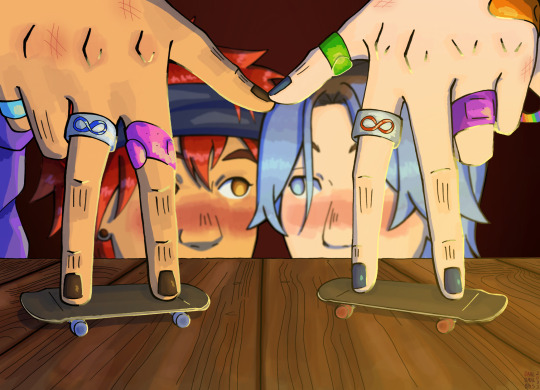
dude what if our tech deck riders held hands 😳
#sk8 the infinity#renga#sk8 the infinity fanart#kyan reki#hasegawa langa#reki kyan#langa hasegawa#dahls art#experimented with how I applied colors on this#Idk how apparent that is tho lol#I hate rendering with a passion so I’m trying to find ways to add some life to pieces without having to go All In#and I kinda tried that here#not entirely happy with what I did BUT I do like how this looks overall if that makes sense#this is also the first time after experimenting where I’ve felt optimistic#im actually excited about coloring again soon ??? bc I feel like im on the brink of something#even tho I didn’t really do anything special here to begin with#but yeah ¯\_(ツ)_/¯#ANYWAY I love reki and i love langa and i love renga#they are so dear to me :’)#pls click tumblr torpedoed the quality wah#also I think it’s extremely funny how langa’s looking at reki as if he can see through his hair ajfhjs
615 notes
·
View notes
Text

#dislyte#dislyte fanart#digital art#art#artists on tumblr#dislyte chu yao#dislyte summer vibes#honestly im struggling real hard w this event cause ion feeling it at all#so here is pretty self indulgent art#of chu yao eating watermelon#im annoying bro when he is enjoying his watermelon#also#his face is cell shaded but his pecs is rendered#priorities#honestly not v happy w this#but like i couldn't care less now haha#i just need smt to draw daily and its been awhile since i draw cy i think
93 notes
·
View notes
Text

At least the anniversary gave me new outfits for them 😔♥️🖤
#tg#ken kaneki#touka kirishima#touken#tokyo ghoul#haku's art#kanetou#i also wanna draw her with kuroneki#but probably more silly#babiessss....#i like how toukas dress turned out#kaneki..... i will always hate deaeing backs#im so happy to have found a way of rendering that works well for me 😭♥️♥️#used to be such a pain... now it just. works. amazing
99 notes
·
View notes
Text

I really wanted to try my hand at drawing thanatos... the mask was hard🥲
#persona#persona 3#p3#p3 thanatos#ryoji mochizuki#techinally#minato arisato#makoto yuki#does this count as ryomina? im gonna tag it anyway#ryomina#i was hoping i could get the ryoji p3re render done but ive been sort of procrastinating 😭#college has jsut started up again and i got a few comms come in and i dont wanna make them wait so long#im gonna get it done tho i also have this redraw of a yearold drawing in mind..#but happy mochizuki monday(igthis counts as an entry)#persona 3 fanart#persona fanart#minnidraws
326 notes
·
View notes
Text


fellas I think we already won...the future is telling me that
also hi tumblr hiiii long time no see B)
#splatoon fanart#splatoon#splatoon deep cut#splatoon frye#splatoon shiver#splatoon big man#grand festival#team future#I havent rendered something in so long so im very happy with this!#seeing the frye and shiver hold had me SO ill that i needed all of deep cut to be holding each other in some way and YEP#also guys apparently its been 2 YEARS since i posted here im so sorry ToT#im like super splatoon pilled right now so get ready for that#sorry if you followed me for deltarune or hermitcraft i swear ill still draw and post them but splatoon got me on lock rn#but glad to be back! hopefully i dont bail again...
60 notes
·
View notes
Text

'Thena for today <3 (plus the "lineart" cause I like the way it came out HJGKH)
timelapse under the cut!
hair DIDN'T take me 50 hours to render thank g o d <333
#ace attorney#athena cykes#indys art#I love her sprites so they're SO good jfgkh#very fun to redraw#Im very happy with how this came out HJGKH#this was very much a loose study of the new aa art we got cause I ADORE how the artist rendered it all#SO SO tastey#this is also based off of a thing I saw in her concept art I just thought it was really cute hgkjhl#anyways enjoy <3
275 notes
·
View notes
Text

dedf1sh!
close ups n stuff under the cut!

more saturated version

unrendered
#splatoon#splatoon fanart#splatoon 3#splatoon 3 side order#splatoon side order#dedf1sh#dedfish#mizuta ahato#ahato mizuta#this drawing took me ages to finish but im so happy with it specially the pose!!#also please ignore the ovious lack of headphones i completely forgot dedf1sh had headphones until i had already rendered n stuff aaaa#ville doodl#dedf1sh fanart
297 notes
·
View notes
Text

finally got around to finishing a sketch from last year 🎉🎉🎉
aug '22 -> mar '23 -> oct '23
#EYAHH HHHHHH im so tired ahahha#:3c im rlly rlly rlly happy w how it turned out 😌 sometimes you gotta take a one year break from a piece ahdghashgdgha#i popped off ngl#genshin impact#cyno#i love cynoooo ooo so much i should play with him more audghfh#my art#yknow what i like you *transes your cyno*#going back to old wips when you dont have any creative juices is a good idea why havent i done this before smh#im rendering another old wip aodfjdhggdk i love rendering so much and i hate it with a burning passion#like its always the thing i look forward to the most but it also fills me with dread.. yknow??
212 notes
·
View notes
Text

playing around w slightly different hair renders
#my art#jujutsu kaisen#jjk#jjk fanart#jujutsu kaisen fanart#jjk art#yuji itadori#megumi fushiguro#itafushi#fushiita#yuuji#megumi#cries megumi fought tooth n nail..... i refused 2 flip the canvas tho >:(#i vastly prefer drawing him facing right bc fr some reason it makes his hair look better silhouette-wise#so having him face left is alr a Challenge#but also having him slightly look down (difficult angle + changes the silhouette) had me bashing my head in2 th TABLE#same thing happened earlier this month w gardening megu middle pose . i did not learn my lesson#but even worse w this one yuuji's head is blocking th main pointy part tht basically carries the entirety of the shape language#u can imagine my distress i am sure#anyway th render made me a lot happier with it thank god. colours hard carry bless <3333#i didn't plan on making it a full sheet but i needed 2 remind myself that im good at drawing megumi#so i threw in solos of each of them n tried slightly different render flavours#idk how Different all of them look visually but th process fr each ws Very different so i am satisfied#fight aside this ws useful i think! got 2 break out some Clunkier chalks n dust off a few of my smoother blended brushes#think i picked up some things i can keep also !! which ws. u kno. the Goal#tbh every time i do art studies i feel like i am kirby#one time i got called an art ditto by one of my fav artist mutuals when i did a style challenge#SUCH high praise from her it lives in my mind i take it out on days when i feel like trash#it doesnt Sound good when u say u r good at copying but real talk it is such a good skill i am very happy 2 have it in my arsenal
2K notes
·
View notes
Text
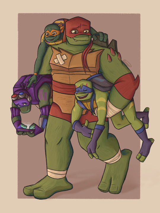
Tortles
In celebration of it having been a year since I watched Rise for the first time (the actual anniversary was in mid October but it’s fine) I redrew the first fanart I posted here! A whole year of ninja turtles brainrot <3
#rise of the teenage mutant ninja turtles#rottmnt#rottmnt fanart#tmnt 2018#rottmnt mikey#rottmnt donnie#rottmnt raph#rottmnt leo#save rise of the tmnt#rottmnt stuff#soep art#i was planning on having this done around the actual anniversary#but life got in the way a bit lol#very happy with the redraw though#it was fun to work on :D#if nothing else it’s an upgrade from the original alskjfkdkg#also i miiight take a break from fully rendered pieces for a bit#since they do take a while#and i think it’d be fun to post some of my sketchier/doodle art#im also having fun experimenting with my art so might have some more experimental drawings coming as well#anywho rambles over goodbye
193 notes
·
View notes
Last Seen Blogs