#also this is my first time using the colorize in csp
Explore tagged Tumblr posts
Visit Tumblr Blog
Explore Tumblr blogs with no restrictions, modern design and the best experience.
Last Seen Tumblr Blogs


Fun Fact
1,644 Tumblr posts in 1 second.
Text

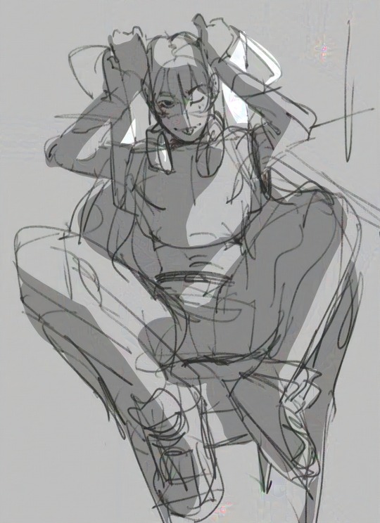
The aforementioned Forgotten Land cutscene redraw, which I ended up overpainting (for the first time in over three years) to make it all nice since I’m using it as my desktop background!
#art#digital#Kirby#fecto elfilis#kirby gijinka#had to do a lot of listening to stuff this weekend so I figured it was as good a time as any to get around to this piece#the painting part was somehow both more and less painful that I expected it to be?#flats took like four hours though lol#could definitely stand to streamline my process but what else is new#also could stand to use csp to make color adjustment and the stars easier but I’m too stubborn as usual#like the Forgo pic I like how the colors/shading turned out on this better than my Magolor stuff because I put the background in first#though admittedly the coloring on this one is not as accurate as it could be because it made me too sad to muddy up the cape
154 notes
·
View notes
Note
Hi Devo! If it's okay to call you that, I just wanted to say I'm a big big fan of your work and you made me fall in love with your silly doodles and masterpieces. First time sending in an ask considering how long I've been following you but I've gathered to courage to write my little love letter to you. I just wanted to ask how you color/render and how you study art? I love how your colors flow seamlessly into one another, and how your art just tickles my brain.
Anyways! Kuuya is so boyfailure and I love him but Asa. OH MY GOD ASA.
I want him so bad it's uncanny. His ears are so cute I just want to bite them. I want to unlock new things inside him. I want to do things to him. Literally all your submissive and breedable ocs will make me drool like a dog. Kuuya was my first love but Asa will be my last. I will kidnap him, carry him bridal style while he's in a wedding dress, and then kiss him silly. He will work at home and will make silly little things for the bedroom /hj.
(我想要对他做一些难以启齿的事情。我希望他属于我,让他崇拜我。我真想揪他的头发,让他发牢骚。他是我可爱的狗。)
Thank you so much for all the kind words...!! here's a wedding dress asa for all your troubles
putting the art questions under the cut!
I've addressed a little bit on giving out advice for coloring here, and tbh im surprised you think my colors flow together well because i pick my colors pretty haphazardly LOL but generally speaking, nowadays my usual line of thinking is “how do i express [a certain shade of color] without using that exact shade of color”. Like if im coloring an apple then im thinking about all the colors except red that i can be using.
as for studying art, sometimes id straight up copy and paste other artists’ work into csp myself and re-trace anatomy/ action lines over it, colorpick it etc etc to really get a feel for their techniques. of course, this is all kept to myself privately. sometimes i also draw things specifically with the goal of emulating said techniques, like “for this piece im going to draw clothing folds like how X artist does it” etc
akjdfjksjsjd i hope all that makes sense / is useful! thank u for likin my stuff 🥺
p.s. i can read chinese and your little passage has not moved me in the slightest /lh
666 notes
·
View notes
Note
Excuse me, I love your au Transformers, I'm wondering what kind of app you're using or tools to make your arts comics? I have been trying on how to make my own au story, but I couldn't find the right place to do it, so do you have any tips to share?
I was thinking of doing a small tutorial for how I do my comics, so I’m taking your ask as an excuse to actually do it hehe


This is my process⬆️
I do everything on procreate, although other drawing programs like CSP are better for comics I find procreate more intuitive and easier to use
And these are the brushes I use ⬇️

The first I found in google, it’s just like a real ballpoint pen and I love its feel, especially when drawing with colors, I use it for lineart. Barskerville is part of the brushes procreate comes with, I just changed the pressure sensitivity and texture a bit to my liking. Basic HRB I use for coloring and shading. I also use the basic soft airbrush paired with the lasso tool when shading sometimes. (These are the brushes I use right now, but I experiment and change them all the time)
I think that’s all, hope this helps anyone out there who’s thinking on making their own comic, good luck :)
205 notes
·
View notes
Text
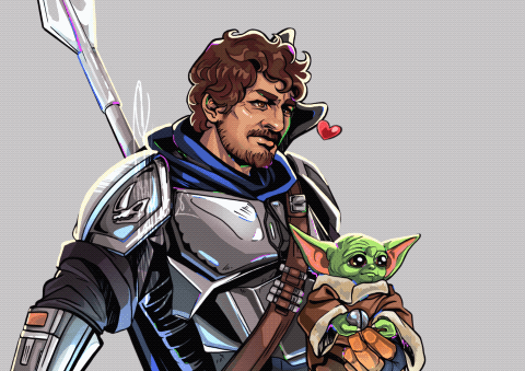
SW Hades AU March-April Update
Some links and previous updates: May - June - July - August - September - October/November - December - January - February - everything else in this AU
I'm here with another two-month joint update because at the end of April I can hardly call it a March update, and truth be told I don't think I did much for this AU in the first month of spring anyway.
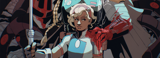
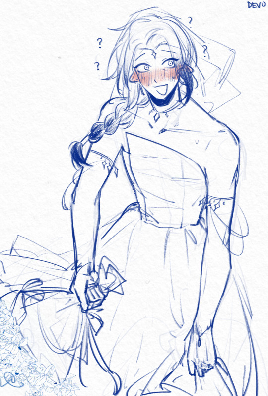
I started playing Hades 2 again, and made some progress with the Omega and Boba redraw of the Warsong update wallpaper :3 The more time that passes between posting and writing this the happier I am with this piece. Who could find all the gear that Omega wears from the Batch? 👀
Which cannot exactly be said about Sabine and Ezra as well, but I finally have something to show for them!!
Next up is Satine (now that I can show a small illustration in my skethcbook for her, it should go easy - I hope), and maybe Fennec or the Armorer. And lining Axe and laying down flat colors for him and Koska as well. I'm trying to get a drawing for all the missing characters and get them to the part where only detailed shading is missing. If my hand doesn't hurt too much at least ^^;
I'm also gearing up to drawing a new Ares!Boba too, but I'm still in denial about that ^^;
I did not have a particulrly good time with these drawings, I will be very honest upfront. I had to redraw Omega two times because I tried to line that piece in CSP and for some reason faces are just not happening for me there; It hadn't go well with Echo either months ago. I don't know what's up. The tilt of my tablet or that I don't have o zoom un until all I can see are pixels?? OTL
...and then the colours fought me something awful too. Between Boba and Omega they had red, yellow, green and blue covered, and all that with Boba's white flightsuit was not fun ^^; I don't know, I just cannot deal with that many colours - so figuring out what and how I should desaturate was quite an experiment in patience for me until they looked somewhat cohesive. Thankfully the added moonlight turned out to be distracting enough that I'm pretty much warming up to it all now.
I'm afraid I will have to use actual Multiply layers for the full shading.
And Sabine. Oh Sabine.
I've struggled here, big time, and I'm still deeply unhappy with her. I experimeted a lot in my sketchbook with her pose, but any time I thought I was finally on to something as soon as I went in to fix some minor anatomy issues digitally and add some details things just fell apart.
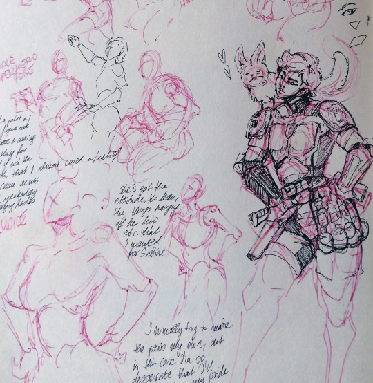
It was the tooka that messed everything up, I'm sure of it D: ^^; I wanted something to visually tie Sabine and Ezra together, and my decision fell on the little white tooka that was in Sabine's mural too at the end of Rebels. But now Sabine's shoulder had to stand in a way that the little critter can perch on and judge from...
Honest to god I almost cried with relief when I came across Eurydice in Asphodel when I switched back to playing Hades for a bit, and realized that she has the lean and attitude in her pose that I was looking for with Sabine. So it was either the coward's way out, or to throw the entire project out the window and become a hermit in the mountains or something.
You can see which option I picked XD
I am deeply, deeply fond of Ezra however Q^Q He was so cooperative after a few initial testing sketches, his hair is perfect, I didn't forget his scars, and I will find it in me to forgive his weird not-really-chainmail shirt, because that one I did to myself XD
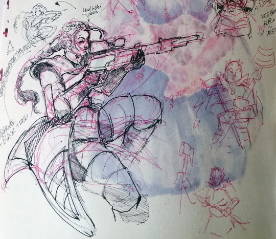
I also finally got around to drawing a quick sketch for Fennec - for a hot minute I was very very tempted to pick for her a pose that's a lot closer to Widowmaker from Overwatch, but the vibes just didn't quite match. That was a very sad realization :'(
(Yes, I took the picture after Satine bled through the page in all her alcohol marker glory, yes, I regret it, and no, I cannot relably draw faces on paper. It is a real tragey. I'm in mourning.)
And just so that I cannot really sigh in relief, Leia is my next struggle. I still don't know how to make her work, and it's been months. Terrible. Horrible. Really really bad. Why am I even trying...TT^TT
So that's it for this month. It's both less and more than how it feels, and I'm also kinda losing a bit of steam - my mind is at re-drawing the entire background section for the House of Hades, so on the backburner i'm trying to cook up various background elements to fill the halls up with. Hades is such a beautifully designed game with such amazing shapes and colours, and Star Wars is such a different style especially when it comes to decorations... So there is a lot of cooking that will have to happen here. But I spent a not insignificant part of my last week (I'd been sick, I could get away with it) watching Drawfee speedpaints (they are so fun and so educational sometimes) and Jacob really popped off in one video creating a pixel art game of some sort? And ever since all I could think about is how and IF I could make my pocket Din move through my version of the Hades AU. Just a section of it. I'm itching to draw the backgrounds, but goddamn I am tired, so I just keep distracting myself from the important character art stuff with these daydreams X"D
I also very badly and incredibly distractingly want to re-draw Boba - I've drawn him so long ago, and it feels deeply unfair that I tried to puzzle out the style on him - and while Din got his upgrades bit by bit Boba just didn't. Also. Ares. Ares looks so good in his character art just sitting around like that - all casual-like - and Boba also has his trademark sprawl and... Look. I'm back to Boba being my most favourite clone, okay? I miss him. I miss drawing him. There.
Okay, rant over. Maybe this way I will be able to concentrate again XD Here's to hoping 🤞 I hope you guys are doing better with your creative projects! ❤️ See you all in May! Hopefully with something a bit more substantive and some proper links, not just wips like these ^^;
Taglist of anyone who wants to be pinged once a month for these updates <3 If you want to be added to the list send me a message, or just reply to this post (a 👀 would do, nothing fancy required ;))
@elwinged @yeehawgeek @velsayshi @lionsaint @hastalavistabyebye
If you want to be taken off the list just message me and I’ll take you off, no hard feelings :)
#hades au#hades au update#march update#april update#my art#my wips#ezra bridger#sabine wren#rebels fanart#satine kryze#star wars fanart#tbb omega#artists on tumblr
105 notes
·
View notes
Note
Your art is a bone and I am KNAWING
Your choice of colours is MWAH chefs kiss I want to know how you do it please
Thank you!
I have no idea how helpful this will be...
To be honest, there isnt really that much thought behind how I pick the colours. At this point, I fully go off vibes since I've been at it for a while. I tend to go for a red-orange and then offset it with an unsaturated blue-ish or grey tone. Greys tend to come across green when with a saturated red so you gotta keep in mind to back off on the green saturation. I gravitate to those because of how fleshy most things I draw are and that's a good combo for that without having to add in others.
The greenish colour in this remnant of filths drawing is really just an unpure grey, and fully relying on the hot pink/red for the green tone.

(I draw on CSP but i was too lazy to open it instead of ms paint. Though I wont lie... I have finished some drawings on ms paint) I try to have one saturated colour and then the rest are just there as support or to help it pop out more by either being a similar value unsaturated colour or unsaturated darker value colour. Saturated colours tend to pop out more when accompanied by greyer colours, and a drawing tends to look more harmonious that way (though like when you know what youre doing you can fully full saturation on all colours. Then it's more a matter of shape and how much of each you use). Oh, and I use a brush in which you input two colours and it auto blends it depending on the pen pressure. If you use CSP, maybe this could help you find where that function is, though note that my settings are in spanish.
I also like using that brush because it makes it easier to incorporate some bounce off from other colours into others or to bleed colours into each other. A lot of drawing is figuring out how to make those colours have a harsh contrast or a soft blended one. Also, I just have colours I like with certain characters (ex: green+pink for arginanas (but watch out because I often use yellows in place of greens - esp greyed yellow when mixed with pink or red- see below:))

But, I do sometimes just use random colour generators where either like values or sat levels appear in multiple colours. Then the gist is really just figuring out how much of each you add and that will really depend on what youre drawing, its mood, how you feel like, etc etc. Colouring is a nightmare so at this point in my life i tend to go through vibes only.

You can grey scale drawings too to see if what you're doing is working. I personally never do because I like being unhelpful to myself. This is the first time I actually see how close the pale blue and hot pink were in value lol.
That's also the other reason why I tend to pick an un sat colour and a sat colour of very visible different values- I use them to blob out the pose and 3d of it directly.
James Gurney's Color and Light: A Guide for the Realist Painter book would be a million times the help I could give in a general ask. He explains a lot of colour concepts and how colours affect each other by just being besides each other way better than I ever could. It's really good and dense packed with information for ambient lighting, optical illusions examples and pretty much everything one would like to know is a thing when colouring.
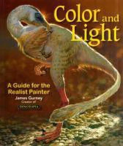
#maru asks#the problem with colouring is that there is so much that goes into it that at one point you just make some choices intuitively and#saying i used vibes is not a very good answer when someone asks me why i picked X colour#btw i do actually have and have read that book im not just throwing out a random art book there
89 notes
·
View notes
Text


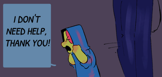
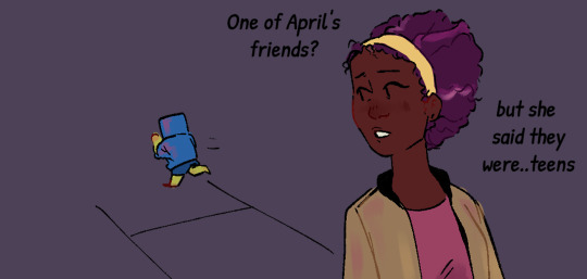


Kid Leo Au: Finding Home
Part 3!!
Shoutout to everyone guessing it was Carol O'Neill!! She was on a late night grocery run :)
her coloring kinda changes between the first two panels and the ones after Leo runs off because CSP decided to delete the palette I LITERALLY JUST MADE FOR HER!! and then I couldn't just eyedrop tool it because I use a gradient map layer over th color layer and coloring these pages was just a mess >:(
ANYWAY!! I really like my design for Carol and I hope everyone else does!! I spent a lot of time researching diferrent hairstyles for her but ended up going with the one that's most like her canon appearance! I also gave her a similar hair color to April ( coloring is messed up a bit in the other two panels cause again, palette issues). I also did a bit of research to get the texture right since I was giving her a slightly different hairstyle than her canon one ( v similar but not exactly the same ) so hopefully it reads well!!
I'll share the sketches I did of her before I finished lining/coloring this in a bit :)
Also hi it is in fact 3 AM im just feeling a bit silly :)))))
Kid Leo Au Masterpost | First | Next
#art#rottmnt#fanart#rottmnt fanart#rottmnt leo#rottmnt comic#rottmnt fanfic#comic#digital art#rottmnt art#rottmnt kid leo au#kid leo au#turtle tots
1K notes
·
View notes
Note
boss what brushes do you use for your things it looks tasty as hell. it makes your creatures look so soft,,,, azriel i love u 4ever
i mainly use this brush set i got off the clip studio asset store!

the ID for this pack is: 2095318
usually for coloring/shading i use this pen

also i use this brush pack sometimes too bc i love the texture and hatching style (can probably tell i like heavily textured pencil brushes lul)

the ID for this pack is 1746145
ive used the latter for stuff like this, most of my recent stuff ive been using the first brushes i mentioned.


i have so many brushes downloaded onto CSP for experimenting and painting whenever i do that (i have some brushes i use specifcally for one layer painting) but these are the ones i gravitate to 95% of the time so i hope this helps (:
62 notes
·
View notes
Text
FINALLY CREATED THE WHOLE YANDERE OCS PICS/REFERENCES 💞💞


achelous and sung-jae are naked underneath too but i put clothes on them so tumblr doesnt blow me up, but for steinar and pollux, i got lazy so that’s where the hearts come in 💀😭 both valerius and levy were drawn with clothes on, nothing underneath 🙇♂️
USING CSP WAS SO FUN, this was really a practice using it for the first time so that’s why they’re all lined different or colored a little differently 😩
achelous, pollux, and steinar are all drawn partially transformed btw (tho it can be argued that steinar constantly looks like that due to him being fully born a werewolf). valerius is in his crazed expression, love doing that the smiley face. sung-jae’s dyed hair usually fades away when he transforms so it’s different every month. levy is just levy LOL ALSO I THINK I MADE HIM TOO ATTRACTIVE LMAO CAUSE W/O THE GLASSES I WAS LIKE DAMN HE A LITTLE CUTE 💀💀💀
anyways, HOPE YALL LIKE EM CAUSE I CERTAINLY DO SM THEYRE SO FINE 🤤
DONT REPOST ON ANY OTHER SITE OR BE A MINOR LIKING MY SHIT OR WE BOTH TURNING INTO SMITHEREENS ‼️‼️😡😡
#yandere#yandere male#yandere males#yandere male oc#yandere male ocs#yandere oc#male yandere#male yandere oc#male yandere ocs#yandere minotaur#yandere priest#yandere werewolf#yandere werewolves#yandere siren#yandere incel#yandere monsters#yandere monster#ambrosial ocs#ambrosial art
92 notes
·
View notes
Text

It's Yeehawgust!! I made "Brushfire" primarily out of one color and one brush,
#281E15 "Oil"
(Also notably was my first time using CSP, hence 1 color 1 brush 💀) (also also here's a little link if you wanna have a little cowboy sticker :) I have a frog one too just click these or visit my link in bio)
#art#drawing#fantasy#aesthetic#sketch#lineart#painting#digital art#yeehaw#yeehawgust#cowboy#cowboys#august#wyyrmwood#aesthetics#oil#fire#spooky#magic#yeehawgust 2024
145 notes
·
View notes
Note
I'm sorry this isn't a commission, but I just have a question about your art. Feel free to ignore this, of course. I was really amazed by your Miku drawing from December 16th. Seeing such a high-level piece, I wanted to achieve something similar, but no matter how much I try, I can't replicate your shading and highlights. I was so genuinely curious that I couldn't sleep. Could you possibly give me any hints or advice?
Hey, sorry for making you wait so much for this answer, i've been finishing some projects and i barely had free time. Anyways i'll try to do my best on explaing my coloring and lighting methos and you also asked me to explain how i create the folings of the clothes. Please take in consideration that 1 i am not native in english so it's a bit difficult for me to explain myself sometimes in this language and i may have some misspelings, sorry about that, and also 2 i am not great at explaing my drawing process bc i kind of turn off my brain when i draw lol, but i can explain the fundamentals that i know and help me create! Last thing i want to let you know is that i've started glazing my art, this is a metho to protect the images for AI images generators and it leaves a kind of pattern /effect on the image that i did not put there during the drawing process.
with all of this said let me start explaining things!
Learn the basics:
This may come as a cliche i guess, but yes my first ever advise to anyone is learn the basic theory on lighting and colors (on anything related to art tbh). You don't really need to spend a lot of money on books and such as there are lots of resources online like videos and documents you can read for free. It's not necesary to be an expert and even the smallest mount of knoledge is enought to inpruve your art a lot! , i find it very interesting to learn the way things work too so don't think you'll get bored of it!
To be frank, i am actually not very good at lighting lol. My lights and shadows are not very correct, but since i do have a lot o control over my colors and i know very well how to used them it kind of compensates and creates a very recognisable (i think) style.
just u know basic shitty advise that everyone is going to give you but it works! if you have free time try watching some videos or reading some documents about color theory shadow and lighting!
Your working space:
So this is something that works FOR ME not everyone likes it, you can try it see if you like it and if you do, cool! if you don't … that's cool too! When drawing on digital i prefer it when my base layer is grey instead of white. It helps with my headaches too but it's more about the fact that starting in a middle tone when coloring (in my opinion) makes the process of briging out both shadows and lights easier, let me give you an example:
Drawing from complete light (white) to compplete darkness (black) may condicion you to actually lose control in the contrast betwen these areas, i prefer staring in a middle place (grey) and that way is i want to show darkness i'll use a darkr color and if i want to show light i'll use a lighter color, but if i start on white i can't use anything lighter. I think i did a HORRIBLE job explaing myself there, but yeah it just helps me control my color valius a bit more lol.
this is the color that i used:

Another inportant thing about your woking space is you brushes, in my case i prefer using textured brushes that mix well, and i prefer using very thick strokes, if it's too think i'll just color pick the transparent color and ease it! I work in CSP i don't know what you use, but just in case i'll give you the setiings of the brushes i use the most with their codes so you can find them


Sculpting with lights and shadows
As i said before, i am not very good with light yet, so this is something that i do to help me with the process. When you think about it, lighting is used in art to give volume to the piece, not in every case bc rules in art are not there to be followed but to asist us when we need to take a creative decision. The way that we can start with our Sculpting is by creating a very easy first guide othe the shadows and lights and to do it with very big block, so that we get the general shape first,we don't neet to get lost in the detailds yet
The actual coloring
When drawing my process is divided in three stages. I first create the doodle/lineart, that doesn't neet to be super neat as i will fix it during the rendering. The basic colors, and the rendering.
During the preparation for the rendering when doing the base colors i recomend that you give special atention to the focal points of your illustration, in this case for example that's her face and the top of the hair, that's why i gave so much more atention for this part in comparation to the shirt, that it's literally not shadowed yet. Then another step that i use normally before rendering and that i can NOT RECOMEND ENOUGHT!!!! GO WILD WITH THE COLOR CURVES!!!! OMG!!!! THAT STUPID LITTLE TOOL IS SO FUCKING COOL!!!!!!!!! like for real, it gives effects that i have not been able to achive in any other way and omggggggg use the fucking color curves pleaaaaaaseeeeee
ok i'm notmal again , lets continue.
For the rendering i usually convine all the layers of the drawing on one layer, then use a textured brush that has low opacity of mixes very well fot the actual work. Tbh here is very i can't really help you a lot, bc i have no idea what i'm doing when i render i just don't know, the only thing i recognise is that i try to esare or clean the lines from the doodle/lineart, and i focus a lot on creating volume in the places that are more important.
Skins
An specific thing that i do a lot when it comes to coloring skin is using an undertone in red (literally) I will put the basi color, use the brush to mark where i want shadows to be in a very vibrant red and then use a blue / green / pruple (depends on the skin) to finish the shadowing. Thios metho is nice for lots of occasions, but take in consideration that it doesnt work for example for very dark scenarios where the character is suppoused to be in the shadows, as that red tone works as a outline for the light. It just depends on the situation.
Clothes foldings:
Ok so here the only thing i can give you an advise with is to remember that the way that clothes fold dependes on gravity and that gravity works in curves most of the time that have two (or more) attachment points that are going to determinate theit trajectory. Example:
And remeber that this creates (again) a volume, that there is an inside part, that it's probably going to be draker, and an outside part, that it's going to be lightter. With this info you can start practicing with images of clothes.

this is as much information as i am able to recolect on my coloring process bc i am horrible explaining , spacially on text and in english, and i am also not very much aware when i draw, i kind of disconect. I still hope this is enough to help you a bit on your learning journy.
I may try doing a video at some point if i ever have the time so i can explain my coloring while i actually do it bc if not in that situation i'm not sure i'll be able to remeber what it is that i did.
My last piece of advise is to watch speedpaints and livestreams of artists you like during their drawing process and maybe even tray to imitate them while they are drawing to see what it is that they do exccly.
hope you have a good day and lot of lucks ! be proud of being able to create and be proud of being an artist!
#my art#art advice#color and light#aaa i'm reading and i have lots of missplesings sorry about that aaaa
228 notes
·
View notes
Note
what’s your process when drawing simplified and/or detailed backgrounds? any tips or tutorials? thanks!
the tiktok art critics are gonna crucify me for this one but genuinely my answer is that i trace. i find a reference photo (emphasis on PHOTO, do not trace other people's work) or take one myself, overlay it in my drawing program, and trace that motherfucker. this is what i do for almost every background. I've been encouraged to do this in art school. because most of what i draw is from video games, I usually either take my own reference photos from the game in question or use an online model resource like noclip to get the precise angles that i need. csp also has a bunch of free 3d models of like classrooms and other common buildings. there is legitimately no reason to kill yourself trying to draw complex backgrounds from scratch, and by tracing you ARE actually intuitively learning about how perspective works and spaces are constructed. in the event that there IS some specific background i need to draw that doesn't already exist somewhere, i find a reference photo with similar vibes/perspective and alter it to fit my needs during the tracing process (i.e. if i need like. a very specifically furnished room that doesn't exist anywhere but my head, i find just a regular room in the perspective i need and then add the right furniture in as i go. i've also gotten very good at frankensteining reference pictures together, which, again is a literal actual skill they teach you in art school if you get an illustration degree.)
the most important thing in terms of backgrounds imo is making it so your characters don't look out of place in your backgrounds. the only foolproof way i know how to do this is to draw the background FIRST, and THEN put the character into it. trying to draw a scene around a character is always going to look a little off, imo, and it will almost always be easier to account for perspective on a character than on a full scene. I also like to color my characters either at the same time as my backgrounds or after the backgrounds, because, again, it's much easier (and makes more sense in terms of how lighting and color work) to adjust a character's color palette to fit a background & lighting situation than it is to do it the other way around.
#and like. i CAN draw backgrounds from scratch btw but realistically im going into a career field which requires very fast turnaround times#so like. if the alternative is me sitting at a light table for 3 hours with a ruler and a protractor trying to get the perspective right#im just going to fucking trace the photo. lmfao#but anyway i think a lot of young artists freak out about backgrounds bc they think they have to do it perfectly on their own. you dont#tools exist for a reason. use them#asks
115 notes
·
View notes
Text
TUT (ASKED BY @nuggetz-w-marz on the Identity V oc community ) ON HOW I DREW MARIUS’ “IN-GAME” MODEL SHEET + IN-GAME APPEARANCE


For starters, I used procreate for this! But you can use any other digital art app (ibis, csp, fresco, etc etc). This is not a 3D model but rather a mock-up of one. It’s not perfect, but it’s pretty good for my first time making something like this!
STEPS START NOW!!
#1 - FIND REFERENCES OF IN-GAME MODELS


this part is super important for getting the style right! I used multiple refs to see how the 3D models are shaded as well as regular character skeletons and how angles looked.
this pose would be how they look in the exhibition showroom— if it’s like an actual model turn around, then look at the poses used for new skins
#2- SKETCH TS OUT

i think the main issue would be making the full turnaround, i just mainly use a reflection of the front pose and a reflection of one of the side poses and edit them from there
once you have the sketch solidified, you could do the lineart if you want to— but it would be completely unnecessary in the long run
#3- FLAT COLORS

i just have a layer underneath the sketch (sketch is on multiply) and put out the flat colors for everything
#4- SHADING AND HIGHLIGHTS


these are like the early stages of my rendering process for the model sheet. One with the blending mode on “multiply” and the other on “normal” to see the colors i used.
there was a lot of airbrushing and layers used. i had like three layers EACH for shading and highlighting. the symmetry tool is also your best friend for the opposite side models and the face. I could make a whole rendering tut too if asked bc THAT needs a whole post for itself. the hair takes the longest, but the one that’s hardest to master is the clothing bc of needing to know how wrinkles work (which i don’t…)
for the skin i mainly used purples and pinks for the shading and orange and yellow for lighting. Clothing was the same but also blues, greys, and greens in the shading as well.

for the hair, i recommend shape out the strand first and then shade them like long tubes
#5 FUN PART: END RENDERING
I loved putting on the last details of the drawing and watching it come together. the rendering I did was only his glasses and his satchel…
#6 EXPORT + IN-GAME EDIT
basically export it as a transparent png for the sheet!! And then what you can do is go into the game and screen record a character’s skin animation and for a split sec it’ll be blank and screenshot it…orrrr you can use the one i have right here!! honestly go nuts.

For the shadow is a low resolution silhouette of the character and offset a bit and i used the color #0d0337 on a multiply layer at 55% opacity. For the character itself, lower the saturation until it fits the character and on another layer, put it to add/screen and use #7f774d for any lighting needed to make them fit the background. If you want to, you can even use the same color from the shadow to add more shadows on the character model
AND THATS IT!!!!
This post took way longer than i wanted it to but that’s okay!! I like helping other artists and esp when asked directly it’s pretty banger!!
30 notes
·
View notes
Note
I love the map you made for broken horizon! I've always wanted to make maps for my own worldbuildling, but Ive never figured out how. Did you draw that by hand, or use some kind of map generator, or some other option? im excited to see what else you have in store :)
Thank you!! And I'm flattered people think its done using a generator but its all done by hand!!
Also, I only recently figured out how to make maps that look decent myself recently so I want to share the techniques that helped me because it made making maps sooo fun fr. So here's kind of a walkthrough?
First off I blocked out the rough shapes of the continents, settled on what kind of biomes more or less would be in the different areas

If you want inspiration, or if you need help placing biomes, THIS SITE is super helpful for this stuff!! It can generate landmasses for you, and give you some misc biome info as well. I drew the continents on it and set parameters to get the types of biomes I liked and used it as an inspiration.
After the first block in, you just have to work hard un-refining the edges, and making them rough. Looking at real maps or at google earth helps for reference :] follow ur heart!!
Here's a screenshot of somewhere with less refined borders, this was me going over all the edges with a rough texture brush and making it look more natural. It just takes a lot of work to go in and refine stuff bit by bit but personally I find it really cathartic -w-

I did all of mine in black over white so I could see the silhouette of the coast easily

If you have any textured brushes that have rly rough edges, this is the time to use them, just make sure you aren't using any transparency!
Something that I found helped me a lot, if you are using a program like clip studio paint (the one I used) is use the edge feature. Maybe if you don't have csp you will have a similar feature on it? What it does is it creates an edge of the color of your choosing around everything on that layer. (This layer setting also negates any transparency that I mentioned earlier)
If you look here you can see it around the whole coast:

Here is how it looks like without the edge:

it's a lot different isnt it? This is up to personal preference but I think the edge helps a lot with the vibe of the map being hand drawn.
If you look close you can see that all of the edges are very jagged and pixelled, I think this helps a lot with realism as well since coasts are usually jagged (and they needed to be especially so for my headworld)
After doing this you just need to color in the biomes (or not! you can always do an old timey map and just write cities and stuff on there)
What's most important is that you go Out There and make maps and have fun!!! If you make any feel free to tag me in them 👍 I hope this helps!
83 notes
·
View notes
Text
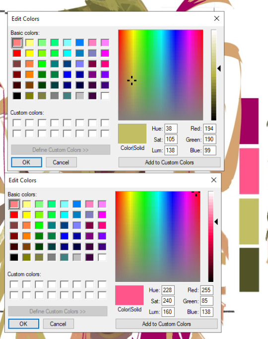
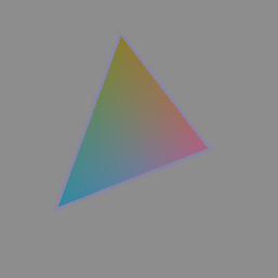
Making a Gamut Mask in CSP
Strap in folks! I'm going to show you how to make a "gamut mask" and palette using nothing but a color wheel and Clip Studio Paint!
*I made this tutorial using CSP Pro 1, but the same principles should apply for any version.
Introduction
First, what's a gamut mask? The term comes from physical painting and printing, where artists only have so many pigments to work with. A 'gamut' is the set of all colors that can be mixed from a certain set of pigments. Painters and printers have been looking for 'wide' gamuts for a long time -- so they can make the widest variety of colors from the fewest number of base pigments or dyes. Some base-color sets you may have heard of are CMYK, RGB, or RYB.
One of the easiest ways of making a painting harmonious is to use color theory to limit the number of colors of your palette. The technique of covering up, or 'masking' your reference color wheel also lets the artist see what intermediate colors can be mixed and still remain part of the cohesive palette. And in the physical world, where more pigments means more tubes of paint you have to spend money on, it's important to know exactly how few pigments you can get away with.
In digital art, painters have access to every possible RGB color right out of the gate, which can sometimes feel overwhelming or make it harder to see relationships between colors. So let's try gamut masking! Using this tutorial, you'll make a general-purpose file you can change and adapt to your liking for future projects!
Part I: The Setup
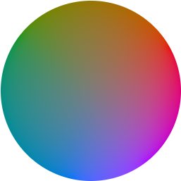
In this tutorial, I'm using a color wheel image obtained from Björn Ottosson's blog, showcasing the OKHSL color space. I like it because the OKHSL space has perceptually constant lightness and saturation per hue. Try out his comparative color picker here. (I also like this image bc it has a transparent background)
You can use whatever color wheel you like! Just one thing is important-- it should gradually become more unsaturated toward the center of the wheel. This saves you some manual color mixing down the road.
Here's our basic layer template. To get started, follow this:
Open your color wheel in Clip Studio Paint. It will be the only layer.
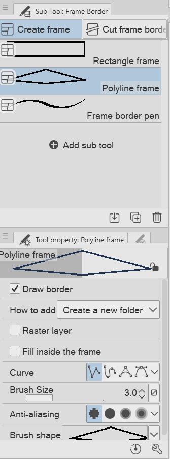
Select the "Frame Border" tool (U), pick the shape or subtool you think is best. I've picked 'polyline' since I'm making a triangle. (HINT: if you want an elliptical/circle shape, click the wrench in the tool properties window, then the "Figure" submenu, then you should see the option to choose an ellipse shape.)
Create the frame shape on the canvas over any section of the wheel. If it's not quite right, choose the "Operation" tool (O) and adjust the rotation, corners, or size of the frame!
You'll now see your frame border shape over the color wheel. Drag the color wheel layer into the Frame folder and it'll be masked!
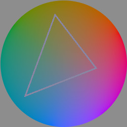
That's the very basics! Here's some extra steps I took to make it extra helpful:
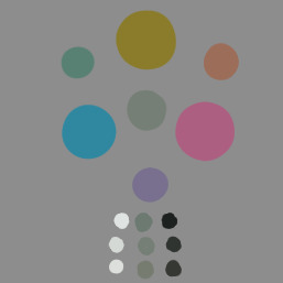
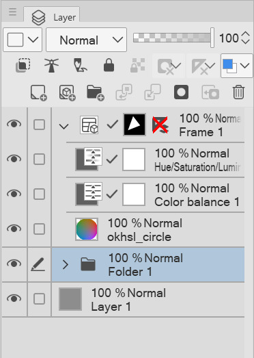
*In the Frame folder, I added two correction layers: a Hue/Luminosity/Saturation and a Color Balance. The first is in case I want to work with darker/lighter tones. The second is if I want to apply a tint to my gamut while preserving the color relationships of the mask! eg: if I want to make a painting that's overall blue, but still want colors that 'feel' red, yellow, etc compared to the strongest blue.
*I've created a uniform neutral grey layer at the very bottom, so I can judge tones and colors without bias.
*("Folder 1" was unused, just some layers not relevant to this tutorial)
With that mask, you technically have everything you need! For each new painting you want to make a palette for, just edit the shape of the Frame Border layer and change the adjustment layers to your liking. Then you can save it as your favorite image type to use for reference!
But let's talk about how you can further use the mask...to be continued!
105 notes
·
View notes
Note
do you have any rendering tips/advice or any speed paints I could watch? I really love your rendering and im doing my best to practice mine since it's one of my weak points
thnankyu 🥺 well it truly does depend on what style im using ! plus im quite bad at explaining my process & i dont like doing timelapses lmao im sorry, but if u struggle w specifically painting a lot then id totes recommend messing w gradients then blending w them or layering them w a low opacity pen and color picker . ive only done this method a few times since i prefer my other ones BUT, nonetheless, it seems good for ppl who havent gotten used to rendering !
i dont know what rendering style of mine ur referring to in specific, im gonna assume u like the type i do on mspaint/aggie w the flat brushes ? well for that my best friends are always "making the canvas way bigger than im used to in comparison to csp" and the default mspaint color pallet . i end up barely using the color wheel since i basically blend them together by stacking colors on top each other to get the specific one i want . for more complex art on mspaint i tend to save some colors by dotting them on the drafts canvas & it ends up looking a real life pallet haha, but usually its not as many as the example here

speaking of this drawing though ! i also like to make little checkpoints for whenever im gonna do smth im a little unsure of will work, so i have some process pics of it


i also have this unfinished rodya


u can certainly notice the way i dont only stick to the marker, but the default (finer details/scratches) and calligraphy (blocking out colors without opacity) aswell !
however, alternatively, if ur referring to the style of my most recent posts theeen well . for that its much more of a manual process where i dont even use opacity 90% of the time to help choose colors
once ive done the base, i just start off w 2 colors for the shading (one is lighter w more saturation, the other is darker), then add a 3rd more contrasting one to the tone of the colors (warmer art gets a colder third shading color, vice verse), then a 4th thats usually a color borrowed from elsewhere on the piece (i love recycling colors a ton, & do it extremely often w my painted aliased art, but with this more recent art ive been kinda lazy abt it), then a 5th thats the base color but slightly more vibrant just to make it all pop better from a distance (in general, seeing ur art from a distance & keeping that distance in mind can be v helpful to combat perfectionism, especially for painting (this specific artstyle isnt painted BUT it is aliased so its basically just as important . okay anyway))

you can also see how often i add little lines to """blend""" them together (its like they r holding hands kinda ....) . what i love to do w these lines usually (especially in a painted piece that uses anti-aliasing instead since i have better personal free range w colors) is make them a 2.5th color thats between the brightness & saturation of the 2 first ones, since it gives the shading more depth . but uhm this drawing was quite honestly a pretty lazy one, so i did not do that for this, bc i was tired ! therefore the more limited colors lol sorry dante
hope this was of any help !
37 notes
·
View notes
Note
hi! not exactly a request but i do wanna ask, whats your process when you're rendering more paint like art? (if that makes sense, English isnt my first language so apologies hdskhsjdbd) i really love how you use the colors and im curious how you do it :0
i’ve been meaning to answer this one for a while so here’s how i painted miku in today’s post (put under the read more because yeah prepare for a long post
i’d also like to preface this by saying that i never follow a set way of doing things, so in terms of what my personal process is like, these are only broad strokes of what i do! sometimes i’ll combine or skip parts entirely, depending on how i feel. also, this is not a tutorial, just how i do things, so please don’t treat it like one :’D this will read like the ‘how to draw an owl’ picture if you do
first, like every artist, i sketch. more specifically, i’m getting an idea of what i want to paint later on. this could be how a scene is set up or in this case, how a character is posed. here i’m not concerned about details or getting everything perfectly, i’m only planning how the thing will be composed. maybe a lot of canvas size changing, or adjusting what miku’s doing (note how busted miku’s right hand looks from all the transforming!) however, i still have to be concerned with how clear the sketch will be to future me, because the sketch won’t be any good if i can’t read what miku’s doing

after that, i lay down a flat gray under the sketch, mainly focusing on giving miku a clear silhouette. this is also a good time to make adjustments to the composition on the fly if i suddenly feel like something can be improved upon, like shortening miku’s left arm from the sketch!
after painting a flat silhouette, i start shading in grayscale, focusing only on lighting. i usually do it in two passes, one for the lightest and darkest tones i’ll use (not black and white) and then a second for midtones to blend them better with the base gray but i forgot to screenshot the result of the first pass 🗿 nevertheless, here is where i can start adding some amount of details. i’m not including any extra accessories yet, just focusing on the base design of the outfit and the character herself (for anyone wanting to draw characters from That Gacha Game, this is how i personally make the process more bearable for myself.) i still use the dark gray to separate where certain details (like the facial features and fingers) begin and end, mainly to make colouring more bearable later.
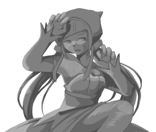
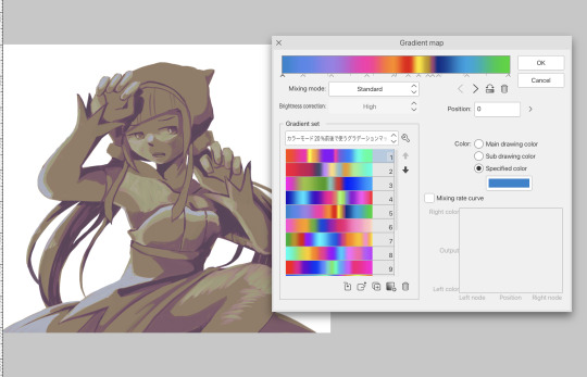
now here’s where i get the Good Colours. it’s a cheat lol. i put a gradient map layer over the grayscale painting so that there’s a little bit of color to start. some gradient maps can be applied as is, some need the layer settings adjusted to make it look good. this one, for example, is a (free) gradient map set from the csp assets store that needs you to set the layer opacity to 20% and to set the blending mode to color to achieve this result. in general, i tend to pick which gradient map i want to use based on vibes, or basically whether i want the work to be warmer or cooler, colour-wise. but this does do quite a bit of lifting for the colors in my stuff.
and then, finally, i add the colours. i add flat base colours in an overlay layer. at this stage, i’ve made the character silhouette clear enough that i don’t need to refer to the sketch anymore for what miku looks like. also, the gradient map layer does its magic by making the shading a bit more vibrant than it would’ve been without it. after that i paint over with a new layer to add details like the lace.
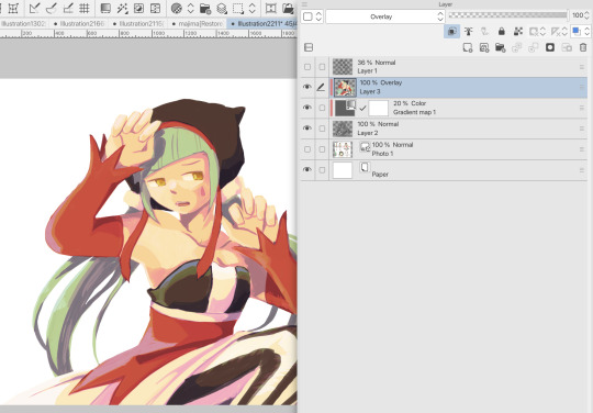
and then i put some extra shading on top. basically this is where the ‘better lighting’ happens. again, this isn’t a tutorial, so i’m not here to say what each part of the lighting is, but i’ve labeled which layers do which job. in other works where the lighting within a scene is more defined (from a window, from a small crack in the walls, etc) the glow dodge layer may be more opaque and sharper, but since this isn’t a work with that, the lighting was applied using an airbrush. the linear burn layer is also there to make the whole thing darker so the glow dodge doesn’t end up oversaturating miku. i also usually match the lights to the vibe i want, and use a complementary color for the shadows. so here you can see i have warm colors on the glow dodge layer, but light purple on both the linear burn and multiply layer.
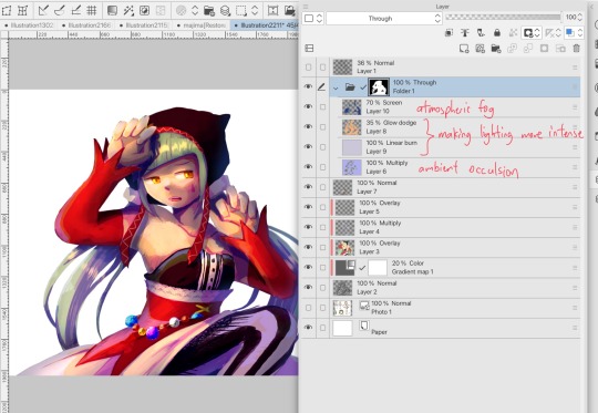
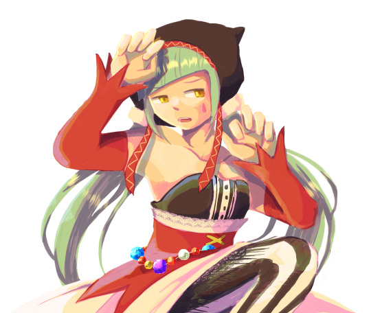
and that’s it for the character—here’s a gif showing how each layer adds to miku! (sorry it’s so toasty)

as for the background, depending on the complexity, it may go through a similar process, or if i can settle with flat image backgrounds, i just go for that. it’s ok to use external image materials. i didn’t have a background in mind for this miku in specific, so i got some default csp materials and threw together something
and that’s about a rough overview of what my process for more finished works looks like! again, art is a fluid process so i never specifically stick to certain steps all the time, and you shouldn’t either. i can probably answer why i’d pick this colour over another in one particular work, but it’s something that kinda has to be learned on a grander scale. i think everyone can already feel what colors work with what atmosphere or what setting, even if they can’t immediately explain why. colors and composition do take some level of experimentation to find what works best!
125 notes
·
View notes