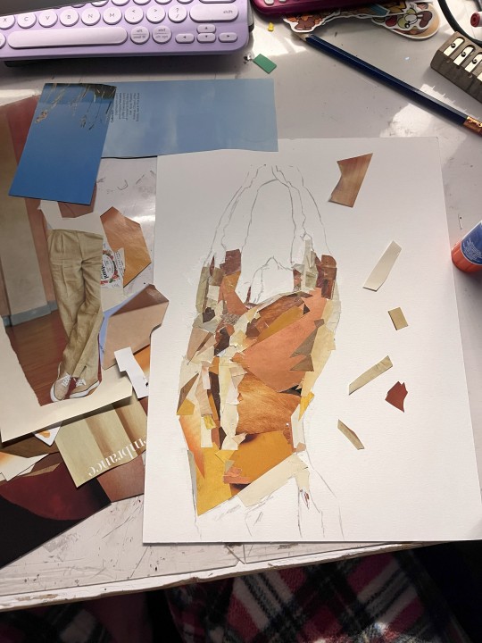
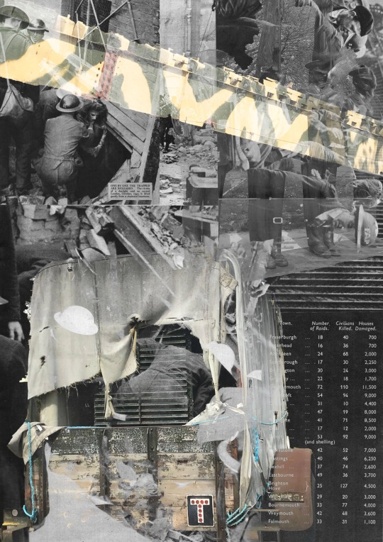
#also we were supposed to do collages on the artwork
Text
I've decided I'm posting this.
I did this for school back in May
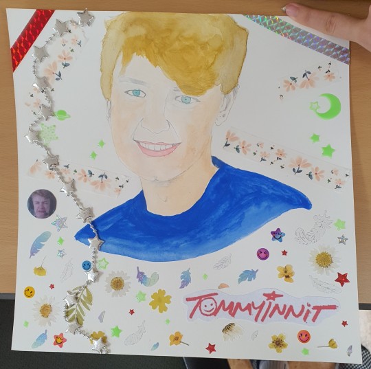
#ignore the finger I'm hiding my (Korean/real?) name#this could be better but I'm mostly satisfied I think. it's better than my usual doodles I guess#I accidentally took my worst paintbrushes to school for this so the colors kept going over the lines#at one point the pink(for the lips) completely bled over onto the chin part. that was a terrifying moment#also we were supposed to do collages on the artwork#apparently stickers and masking tape counts#Lilly draws stuff#wow I haven't used that tag in a while#tommyinnit#tommyinnit fanart
0 notes
Text
Since it's a movie already about a bunch neurodivergents, please bear with me as I go off about micro culture and The Mitchells vs. the Machines.
So a lot of people can already note the memes in the movie are very dated internet humor. I don't think I saw a joke that lived past 2011 in it. But I can't help but to also feel cognitive disconnect at the idea Katie is supposed to be born in 2003 when everything about her and her family makes her a millennial.
Before I get way too deep into it, this is just more observation on teen identity than some shitty which generation is better debate. Sociology is extremely fascinating and it's just fun to pick apart elements in film.
So like I was saying, TMvsTM feels very, early 2010s. Pretty much the only thing taking it out of that element is the wide use of smartphones and mommy blogging but even then, you could push back the time frame to 2011 and still be pretty on the mark. Siri had just come out and iPads the year before which at the time was treated as the most unneeded invention. It's pretty much around this time that the smart tech boom took off and we started to see movies make the "big tech company" story. You know exactly the one: A Steve Jobs character, some joke about a needless technological advance, the main characters wowed by shiny expensive devices, and in the end usually we realize silicon valley are too disconnected from humanity. Honestly though if you've seen the Soylent guy, they might be right. An aspect I wonder about is how LA and SanFran feel about each other. TMvsTM gave the slightest inkling of bitter resentment towards it's northern neighbor and I can't help but to wonder if the constant use of the Steve Jobs storyline is maybe a hint of a general feeling LA has.
Speaking of LA, it's pretty clear that Katie is going to Calarts. One of the reasons I think it's so dated is Animator's tendencies to rely on their own experiences; Alex Hersh making a story about twins when he himself is a twin or JG Quintel literally just making himself the main character in every series he makes. Michael Rianda was born in 1984, and while that puts him on the earlier end of millennials, it isn't hard to believe the late 00s would be a defining era of his life. Many young film and arts students flocked to YouTube in it's early years to share their creations. Again the aforementioned Alex made off the wall, Nathan of Nathan for you's various skits, and so on. And again looking at the memes used, they are specifically the type that would have been created by these film students.
So let's look at Katie's art. It tends to be mixed media collages with a sketchy hand drawn style that makes you think of Napoleon Dynamite, and the movies themselves are reminiscent of campy action hero films. She puts in a lot of dazzle effects, typography tends to have these perspective lines, and the artwork flourishes tend to be stilted and looping almost as if they were gifs on Tumblr. There's a distinct one during a still frame and I swear to God, the jittery movements while flipping it back and forth feels like it has to be a Homestuck reference. Either way, all of this points towards 80s revival, something that was in full force in the 00/early 10s. You could pull a page out of my sophmore notebook and it would easily fit in. Katie distinctly draws like a millennial teenager. This isn't to say that there are zoomers drawing this way but I think No Burnham's 8th Grade shows a nice contrast in art style.

I remember seeing this scene and the old familiarity of seeing younger kid's art in fandom tags. Where late millennials where inspired by early millennials' 80s nostalgia and adventure time adjacent cartoons, early zoomers were in turn influenced by late millennials' new grounds/YouTube flash animations and 'Calarts style' series. We each appropriate and remix our predecessor's works and the general style morphs as we go on.
The mitchells environment is also distinctly 80s. They love in a worn down one story and the interior has a lot of kitsch with it's wooden panelling and furniture, courdory couch, and even a hand knit blanket. Naturally their car is also from the 80s. We can extrapolate in general that the Mitchells are not the richest family. If you pay attention to the furniture; it's pretty clear that most was likely made by Rick. On the other hand, Calarts tuition is 50k and in one of the most expensive cities to live in and that never seems to come up as an issue. However there's one thing I'd like to point out, major property tends to reflect when a kid is born. For instance, growing up my mum drove a 90s ford taurus where my younger cousin's family drove 2000s vehicles. Cars in particular can only make it so far before needing to be replaced and that tends to hit in a 15-20 year period of regular use. Despite being called a 1993 model, the Mitchell's car looks extremely 80s and a listicle even identifies if looking more like a 1988 GM celebrity. We can see how Rick and Linda struggled financially when Katie was born but it's still a surprise they have it in 2021, 33 years and definitely over 200k miles. I also want to point to Boyhood for a moment. A great aspect of this film is we see time as it happens, and we get an honest image of life in the mid 2000s. Prior to the housing bubble, we had a period of middle class affluence where consumerism was at an all time high. The image of suburban living would have been a beige carpeted room, Ikea furniture, and a saggy microsuede couch in front of a theatre system.
5 notes
·
View notes
Text
i dont understand this pro-ai argument that 'originality is not born in vacum' or 'ai-work is the same as a collages that artists make'. i mean, there are a fundamental difference? one thing is created by a code and the other by an actual person. and even tho ai imitates intellect its only. erm. imitates it? humans are not machines? and our psyche is much more complex than a pack of algorythms? so the end result is very different in their nature and value? i dont understand how an art created by a person equated with data-operating pack of digits. how the cultural influences and desicions of a very particular person shaped by their experiences in life and their free will is considered the same processes through wich ai art is born. i mean, i obviously see how complex this discourse it and you can look at these stuff very differently but i still dont get how most of the pro-ai arguments suppose to work?
i understand for an example that argument that ai is not inherently evil and its more about whos getting profit of it and who is in power of it. who chooses how to use it. this one i get ok but i also think a lot about how techologies are designed? and how they bear with them political meaning? like, guns and weaponary are created to kill people. thats in their design to do that. there is an idea of what should be done with. so i would not say that techologies are completely stripped of some stuff that is inside them by design. they are more to them than simply being neutral.
and i still do not like how ai models were trained and find the use of data-samples (non consensual use of artworks) to 'teach' it alarming. and that fact that ai models are extremely biased.. i mean its not neutral in the end, i guess. those generative models are not by mistake are like this, they are not produced in a vacum. for whom they are made for? and by whom? and what was used to create it?
but it just a bunch of thoughts that i have and no coherent opinion. sadly. the only thing that i crearly understand that we cant go back from it. its just gonna be about fighting for the rights of owning and using it. and the winner is a 1%, and the capitalism. not people or artists.
honestly if there is anyone here with who i cant talk about this stuff hit me up because i do not understand oh my god. there are too much sides to this thing
1 note
·
View note
Note
If you remember the Earth-65 Madoka Magica art you did a while back, is there any specific meaning behind the hand gestures above Matt? I remember clearly that detail really grabbing my attention when I first saw it, though the art piece is so packed with detail I feel like I discover something new everything time I see it!
I sure do remember it!
THIS is the artwork in question if anyone hasn't seen it yet.
I assume you are talking about the red comic tone hands flanking Gwen on the floor of the boxing ring/stage? So, stylistically, I was trying to mimic the collage-like nature of the witches' labyrinths in PMMM which is one of the things that really sets the visuals of that anime apart. When I was conceptualizing the composition, I was imagining the hands dancing around like the candy familiars we see in Charlotte's labryinth. The position of the fingers themselves doesn't really mean anything intentional because I was a little limited by what I could find to work with, and I also imagine that they'd be moving around anyway. (Although if I had anime studio money, they'd probably spell things out in sign language or something.)
I guess they'd look something like these guys! Immediately, I knew I wanted to lift some "old timey theater signage" hands (the kind that were all the rage in the hipster renaissance of the 2010's haha) and I suppose the meaning of that is layered. Of course, they are in red because of the Hand ninja clan, but I thought the theater detail was also a good nod to Margaret Murdock's career as an actress (both she and Jack are represented in the staging) as well as Murderdock's penchant for the theatrical. The hands are like his little backup dancers, haha. It is kind of fun to imagine Gwen navigating this labyrinth and the hands pointing her in one direction or another, though!
As for the red silhouette Matt's hands (just in case I misunderstood you) they are just meant to be puppeteering the marionette Matt, since I picture him as the villain in a play of his own devising. There's not really any significance to the way they're posed, though.
Thank you so much for sending me an ask about this drawing! It's one of my favorites but I feel like some of the references are a little esoteric unless the viewer happens to be into the exact same things as me for the exact same reasons, haha. XD
3 notes
·
View notes
Text
Animation Brief 01 - Week 1 - Research
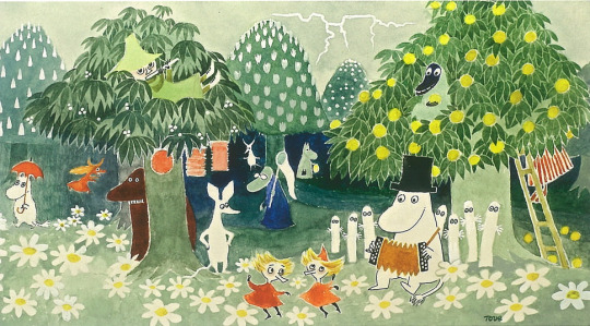
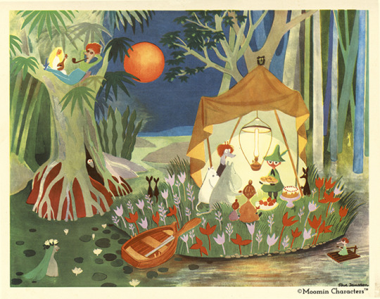
Above: Moomin
After being formally introduced to the animation course and forced coerced to listen to Radiohead, it was time to crack on with the "World Building" brief itself. The first step in plan was a group trip to the Limerick City Library...
...I didn't go.
To be honest I'm still just a wreck of a person and insomnia has been kicking my ass. There are things I can do while sleep deprived but engage in social situations is just not one of them. I felt like I was starting to panic so I just called it a day and went home.
I didn't stop working however, and like any bad maths student I may not follow the correct process to get a given answer, but right or wrong; I'm still getting to that answer. So basically I made my best attempt at following step one of our brief's outline, just alone and tired.

Above: More Moomin art to lighten the mood...
So step one of the brief, and the whole reason we were supposed to go to the library was for research. Our tutor Yvonne Sweeney outlined this for us. The idea was to look through the children's section in particular and find an aesthetic or the inspiration for an aesthetic to emulate for our upcoming work.
Personally I love the aesthetic of children's media like picture books, so this suited me fine. There's something so raw about illustrations made with the idea of engaging little kid brains. I find a lot of the most memorable children's artists had something idiosyncratic about their style, something imperfect or unusual is more captivating than the opposite. You have to keep looking to satisfy the brain's desire for understanding; "what is it about this that makes it look off-kilter"?
So with all that in mind I went looking at children's books for research. There's a lot laying around my house, not just from my own childhood but my siblings as well. It's pretty fascinating to look back and try to examine why the media we consumed back then had the hold on us it did.
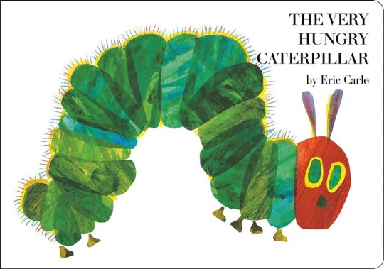
Above: The sin of Gluttony...
When thinking about books I read as a kid for some reason my mind goes immediately to the insatiable insect above. That cover is burned into my subconscious... Although until researching it for this project, I wouldn't have remembered how uncanny the catterpillar's face looks. It's cute in it's own way but also not unlike something you might see in a horror. I'm kinda reminded of the "redeads" from Ocarina of Time.
Above: I don't trust this guy's smile...
If I had to describe the art of Eric Carle in one word it'd probably be texture. Through the use of collage, his work takes on a very three dimensional, tactile quality. This was used to great effect in the Hungry Caterpillar book, with the titular character memorably biting holes out of the books pages.


Above: The flag of California I think
Beyond just what it evokes, on a technical level a lot of Eric Carle's stylistic traits line up well with the medium of animation. An animated scene is assembled, layered from foreground to background. In a simple shot moving these layers at different speeds can create the illusion of depth. This technique employs the parralax effect, having close objects appear to move faster than those further away. Similarly Carle's collage inspired aesthetic is all about layering, and the optical illusion of disparate parts making up a cohesive whole.

Above: The Dumping Ground
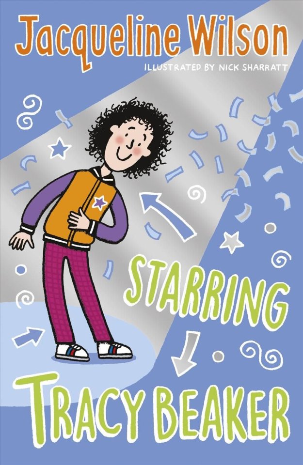
Another artist I wanted to highlight is Nick Sharratt, children's author and illustrator best known for providing the artwork for Jacqueline Wilson's Tracy Beaker books. I actually hadn't heard of Sharratt 'til now, despite having known his art forever. Sharratt employs a simple style with uniform line thickness and flat, vibrant colours. There's a loose, playful kind of energy to his work that I feel really speaks to children.
I was impressed to learn how dedicated Sharratt is to kid's media and education. He's been an ambassador for children's charity Theirworld for years, campaigning for children's right to a fair and equal education, regardless of gender, race or circumstance.


Above: (◕‿◕✿)
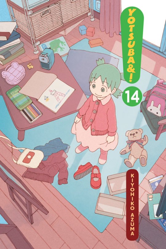
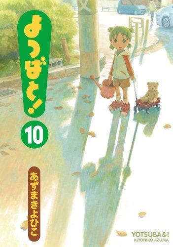
I don't actually know much about Yotsuba&! It's a long running Japanese manga series by Kiyohiko Azuma ostensibly aimed at children. It depicts the everyday adventures of a young girl named Yotsuba as she learns about the world around her, guided by her adoptive father, their neighbors, and their friends. I know a lot of people use it as a resource when learning Japanese because of simple, easy-to-understand nature and limited use of difficult vocabulary and grammar.
The art, like a lot of manga and comics in general, is more character than background focused. That said the covers have a lovely watercolour aesthetic with surprisingly muted colours for a children's series. I appreciate Azuma's emphasis on light and time-of-day in his illustrations. He recreates the world in the warm, optimistic light you'd expect from a child's perspective.
All that said, I'm pretty sure it's a series co-opted by 4chan type incels for whatever reason, so I'm somewhat uncertain about lumping it in here with genuine kids media.


Above: A more trustworthy smile
The last artist I'd like to mention is Tove Jansson, best known for her children's novel series Moomin, of which I've already posted some artwork above. Moomin is another one of those series I had no real contact with as a child. I stumbled across Jansson's work online, often seeing animated clips and illustration's of these bizarre yet deeply charismatic characters.
In some ways her artwork isn't the most suitable for this project, as her illustrations are dominated by the character with the background being there only to frame them. It's exactly because of this though, that I find her backgrounds so appealing. They represent a kind of warped space, where reality contorts itself around her characters.


Above: Less Moomin
Jansson was also prolific, producing many paintings and illustrations outside her domain of children's books. What I find fascinating about her work is that you can see the same elements appear whether she was working in service of children, adults or no one in particular. That in itself may be getting at what made her such a powerful children's artist, she created art in her own single minded vision, unperturbed about what others might think. I feel that philosophy is at the heart of creating authentic children's media.
4 notes
·
View notes
Text
January 7th, 2024
When I was a little kid I used to ridicule my parents for needing to use a headlamp to see their keyboard when using their computer at night, but now, as I write this in bed, I find myself needing the handy little button that makes my keyboard light up. Anyway, I haven't blogged in a few days because all I have done is go to work and watch tv. I haven't taken any pictures with my digital camera recently, and I told myself when I started this blog that I would use the photos from that camera and not photos from my phone. But here we are. Using photos from my phone. Today started a new art project and I went to dinner with my dad. The art is a collage that is supposed to be Jeremy Allen White in his Calvin Klein ad, but you cant really tell that it looks like him unless you see the reference picture. But I am having a lot of fun making it! It is very stress-free because usually I am worried that I will ruin my art if I do something new. Like when I paint I usually worry that any new stroke I add will mess it up, but for this it is all just scraps of paper and I can see how things look without committing to it. As with all of my other artwork I make, it looks a lot better in person than in the photo. In person the placement of the paper kind of looks like it is there on purpose, like I meant to put it there, but in the photo it doesn't really. Sometimes I wonder if I got good enough at art I could sell my work. I wouldn't want to do it as my main job, but it would be nice to earn money from doing things I enjoy.
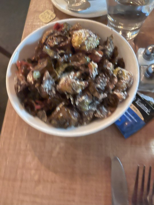
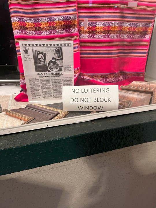
For dinner my dad (does "Dad" have to be capitalized? I think only when I am speaking to him and saying it in place of where a name would go, but as a title it doesn't need to be capitalized? Like I wouldn't capitalize "cousin" unless I was Ricky from "The Bear" and I was saying cousin as a nickname.) and I went to a nice restaurant that had signs in the front advertising that they were considered good by Michelin. They didn't have any stars, but just that they were considered good. I thought they were good, but my dad said that to earn a Michelin star they would need to have much smaller portions (i thought that was funny). My dad is a funny fella. I think the idea that the tire company "Michelin", with the Michelin Man as their mascot, is in charge of the most snooty restaurant rating system in the US (or the world ?) is just silly. I always used to think that the Stay Puft Marshmallow Man from Ghostbusters was the same guy as the Michelin man. I now know they are different. At this restaurant we went to, we got pizza (it was a pizza place) and brussels sprouts. I just found out that brussels sprouts has an "s" on the end of "brussels". I've been pronouncing it "brussel sprouts" my entire life. While we were walking to a bookstore down the street from the restaurant (side note: I have never spelled restaurant correctly I always have to use autocorrect), there was a store with maps in the window, so of course my dad wanted to look at it. I feel like all dads like looking at maps. Its funny how similar people are. Anyway, there was a sign in the window that said "No Loitering" (see last picture), which is so funny because that was exactly what we were doing.
One thing I forgot to say about the restaurant is they gave us bread with olive oil/balsamic vinegar dip. Its funny how something so simple can bring so much joy. Also, earlier today I had Naan and Hummus as a snack. That is also something that is so straightforward, but so delicious. I love that in every culture there is some form of bread and dip/sauce, and they are all the same but all very different.

0 notes
Text
On Saturday, March 4th, we had our first art show in 365 million years!
The Pre-Pre-Show
Let me shock you all by revealing my biggest secret: I have an anxiety disorder (several disembodied violins sting in the distance), and I have traditionally been quite a mess before any and all events. This time I was a CHAMPION. While I lost a day to eCommerce updates and solving point-of-sale (POS). It felt like being abducted by aliens, waking up with my clothes on backward and confused, yet an eCommerce solution emerged from the darkness. I even made my first sale and got to practice the new WIX POS feature that used ApplePay. It’s like magic! I also learned how to cast my iPad to a TV (ANY TV) so I can now PAINT LIVE. It’s Like magic! I am magical!
The Pre-Show
My Prophetic Entry from the Day of the Event:
"This is a pop-up show in Riverwest. At Company Brewing, which used to be Stonefly, and I do not remember what it was before that. I suppose Riverwest is finally beginning to gentrify too…? Hahaha I mean it is like so far from that end goal, but I guess I would have scoffed at Brady street becoming bougie too. So whatever I guess? Riverwest and I have a lot of history! I grew up there, not physically, but artistically. I lived there from college until sobriety! I am anxious about any history I have with this neighborhood, but overall it feels like coming full circle. Fun fact: my mother and I had a celebratory meal at that location when I graduated from college!"
Follow-Up: Riverwest is not at risk of getting too classy too soon. Just to breeze past it real quick once: there was some drama, because #Riverwest but we handled it because #sober. I don’t want to bother with it any longer but alcoholism is a disease.
Three Days Later…
I’m back bitches. OOF I am tired. It was truly a pop-up show, we arrived at 9:50-ish, I was late, but they didn’t let us set up right away so I win technically.
My absolutely unwanted and completely uninteresting event review:
Upon entering I met our event host first, DJ Tory, then I met the sound guy (don’t remember your name so you need to email us). I did not know the set-up of the venue beforehand so we worked together to wing it. I then met the artists of the event:
TDogg is a collage artist and skateboarder. Alan is a figure painter, and his friend Matt is a fellow digital artist. Brandon does psychedelic optical illusions. JBirD is an illustrator and muralist. I also met Luke, his branding preceded him, and he aims to create his own multi-surface paint (doll repaint people will want to pay attention to this). I didn’t meet YetiAlready, but I saw their merchandise, very professional. There was a group of film grads, who showed their debut film, “Mousetrap” It was good! Better than Breen. I tried to tag Jay Bauman but he is too good to be tagged on Instagram (he’s a Twitterling).
The Show
...Was AWESOME! I met new friends and I learned about new artists. There was an independent film, a few DJs, and the five of us artists. The pace of the event was excellent, every time we got bored with one another a new show segment was introduced. I suppose I should be disappointed that there were not many people, and sales were low-- but in all honesty, I was SO RELIEVED. Two or three groups came! It was our first time in public in over 57 years. Secondarily I should be mortified for spilling my delicious *expensive* kombucha all over my own pictures. Doing so was not planned, so I decided to gift the ferment-reeking artworks to the event staff and participants. Seriously a LOVELY bunch of people! I will hopefully link all of them here in various ways. Stand by.
Up Next
I know of specific opportunities coming up in Riverwest* and Bayview*, they are vendor-oriented. We will probably sit this year out because I want to wait until next year in order to build up our 3D object inventory. Kind of need that seed money too, join the Patreon that I am updating again! For now, all I can sell is my art and time. And my farts.
I have made stickers and prints!!! Show prepping exhausted me to the point that I am completely disassociated from my art right now (typical) so I don't feel emotionally excited at all but I intellectually know I should be! Obligatory yay!
I am still also seeking guinea pigs for my experiments, you get a free design or art service from me and I get to practice client relations. If interested in participating please fill out this form.
Guinea Pig Sign-Up
If you have one of my contact cards you can also fill out this form instead.
Contact Information Form
I love you
March: Ostara Celebrations
April: FalconFlea*
May: Hexie Zine #3 (NSFW Content Warning)
June: Bay View Gallery Night*
#art journal#artwork#illustration#artshow#artlover#small artist#art recovery#bookbinding#oc art#art process
0 notes
Note
The Magdeburg Unicorn! Thanks, Sam! 😊💕 You always give us the BEST Rabbit Holes.🐇🐰🕳 Do you know the history of the Wunderkammer collections that culminated in this sort of Cryptid Chimera? Unseen University Library was actually equipped in the best traditions of Natural Philosophy: One Roundworld, under glass. 🌍 😆
Oh yes! There was an exhibit about wunderkammers years ago at the Chicago Cultural Center and I was FASCINATED.
The wunderkammer also always makes me think of the Mutter Museum and of Joseph Cornell's work with shadow boxes, which are often exhibited in tandem with works by Rene Magritte, one of my favorite artists. And in turn that always makes me think of Nick Bantock's wonderful collaged interactive art books, and a bit of the Bone Room we used to visit whenever we were on Solano in California. It's reminiscent of Dark Academia and the edgier parts of Cottagecore.
It's the kind of art I'd love to do, if I had more of a number of things (time, skill, space). I've made wunderkammer style collage art boxes in the past, although those were mostly personal, ephemera from my life, assembled as a method of mapping out a time period, rather than an artwork meant to speak to others. The idea of the wunderkammer definitely influenced my current home decor clutterbitch aesthetic, although mine's a bit more brightly colored.
I suppose, honestly, at this point I do have the time and more or less the space -- granted I couldn't do home taxidermy, but I know people with makerspace access and could purchase some of my own if needed. I ought to consider doing a shadowbox work of some kind, that could be highly entertaining.
35 notes
·
View notes
Text
6 More Alternative Altars for Bored Witches
So, at this point we already know that magic isn’t one-size-fits-all. We know that magic belongs anywhere and everywhere we can give it a home. But what if you’re still searching for that perfect altar?
Through the digital magic that is the internet, I’ve seen so many exciting altars and spoken to the witches behind them, and you never know where you’re going to find your next bit of inspiration. (Well, maybe you’re about to find it here...) Embrace that! Look for magic in unexpected places, and don’t be afraid to personalize your practice.
Vertical Altars

(Vertical altar by calluslestrangers on Instagram.)
You’ve might not think to look up for altar space, but even in more traditional altar setups, using shelves and ledges to create vertical space is essential for having space to work (and store all of those shiny crystals and things we love to collect). But a fully vertical altar is a whole new experience. This could take the form of a shelf on a wall, a DIY mobile altar of sorts, or even (and this is my favorite) an altar hidden in the space behind a canvas print of painting. For these altars, hooks are your friends since you’ll want to hang things, and it has some organizational benefits since you could separate out different vertical spaces for storing/using different things.
Benefits:
Saves and makes space for your altar.
Great if you’re trying to disguise your altar as decor.
Very customizable.
Hanging decor! (Yes, that means plants, too.)
Painted Altars

(Cabinet by Oshuna on DeviantArt.)
For all my artsy witches, painting an altar space is one of the best ways to really connect with your altar. You can paint out an altar layout on a canvas or in a sketchbook or you can use paint to embellish a table or altar setting. When we create things, we put some of ourselves into them, and art is nothing if not ourselves manifested in a new medium. And that, lovelies, is magic.
Benefits:
Put the “craft” in arts and crafts.
Form a connection with your altar through creation.
Adaptable to any kind of altar set up.
So. Many. Possibilities.
Paint Chip Altar

(Image source)
Alright, this is where we dive headfirst into some incredible and adaptable DIYs. Paint chips. You know those plastic and paper paint swatches and color keys you see at hardware stores. You’re supposed to use them to pick colors to match your sofa or your favorite lamp or whatever else, but they are also a fantastic altar building block. You can take paint chips and designate them as the resting places for different tools. They can become a stackable and easy to store altar, or you can use a picture frame to create something a little more permanent. The best part? It’s so easy to use and change color correspondences with these.
Benefits:
Great for witches that focus a lot of effort on color correspondences.
Customizable for storability and style.
Another reason (as if we needed it) to high tail it to the hardware store to grab a stash of paint chips.
Puzzle Altar

(Image Source)
I said we were diving into DIYs, right? Well, this is probably the most complicated altar on this list, but it is also one of the best for closeted witches. When is the last time someone went snooping through your puzzle collection? Probably never. In fact, I doubt you have a puzzle collection. All the more perfect. To create this, all you need is a puzzle (an old one or one from the dollar store will work fine). Paint or collage or whatever suits you over the original artwork to create your altar space, making sure to preserve the puzzle pieces edges so it can be taken apart and put back together. And there you go! Now when you need your altar out of sight, you just take it apart and stash your “puzzle” and any other tools in a closet or some other unassuming puzzle place.
Benefits:
Perfect for closeted witches.
More arts and “crafts”!
Taking apart and putting together gives you an opportunity to reset every time you take it out.
Car Altar

(Sage travel spell by Whimsical Witch Design on Etsy.)
For those of us that are old enough to drive and have cars, your ride from A to B might also be the perfect place to keep an altar. For closeted witches, this is a place you’re probably not having to worry about people snooping, and for those of us that have leaped out of the broom closet, this can be a great place for an on the go altar for a busy witch. Depending on the layout of your car, you can put things in your center console, hang things from the rear view mirror, and more. Just make sure that you don’t do anything that will make it difficult or dangerous to drive! And if you’re going to burn things like herbs or incense, keep the windows down. (Don’t magic and drive, witches. Keep it in park.)
Benefits:
Bring witchcraft into every space!
A busy witches dream.
Great for lunch break magic. (We all need those mid-day cleansings. Trust me.)
Your car will probably smell like incense forever.
Altar Roll Ups

(Brush roll by Punky Pink Cow on Etsy.)
A larger form of travel altar than your standard Altoids tin, a roll up altar is a good altar for closeted witches and witches that like to take their magic on the go. You can use an artist’s brush or pencil roll up or make your own if you’re a bit crafty. Bonus: you can decorate the flat/pocketless outside with symbols and markers, so the roll up itself serves as a portable altar cloth.
Benefits:
Larger than most travel altars.
Neat and tidy.
Good for minimalism (Less spaces mean you might be less inclined to hoard witchy things, but I’m not making any promises.)
Whatever direction you take your altar in, now or in the future, remember that it is yours before it is anyone else’s. Aesthetics and picture perfect spaces will never be as comfortable and rewarding as the ones you create with only yourself in mind.
Looking for more? Check these out: 6 Alternative Altar Inspirations for Witches that are Bored of Altar Tables
#altar inspo#altar inspiration#witchcraft#altar#altars#witchblr#magic#witch#baby witch#closet witch#broom closet#art witch#painting#travel altar#vertical altar#car altar#lostinphases
3K notes
·
View notes
Photo
The Wild Ones: Christian Michael Filardo
11 — 30 Νοεμβρίου 2019
Instagram @kgoldtemporarygallery
Το πρότζεκτ The Wild Ones παρουσιάζει το έργο ανερχόμενων διεθνών φωτογράφων μέσα από τον λογαριασμό της πλατφόρμας στο Instagram (@kgoldtemporarygallery). Η online έκθεση εξετάζει τις αναζητήσεις, τάσεις και τους πειραματισμούς στη σύγχρονη φωτογραφία, με σημείο αφετηρίας τις προκλήσεις της εποχής της εικόνας.
Ο προσωπικός απολογισμός του Christian Michael Filardo (ΗΠΑ/Φιλιππίνες, 1991) εξυμνεί τη νεότητα και την πνευματική δύναμη μέσω μιας αισθητικής παπαράτσι. Έλαβε BFA στην τέχνη της περφόρμανς από το Κρατικό Πανεπιστήμιο της Αριζόνα. Έχει εκθέσει διεθνώς και το έργο του βρίσκεται σε ιδιωτικές συλλογές στις Ηνωμένες Πολιτείες. Γράφει κριτική για το PHROOM και είναι συνιδρυτής του χώρου τέχνης Cherry στο Richmond.
——
Συνέντευξη του Christian Michael Filardo στη Βίκυ Τσίρου
Το γεγονός ότι έχεις διπλή υπηκοότητα σού επέτρεψε να περνάς αρκετό χρόνο μεταξύ της Ασίας, της Ευρώπης και των Ηνωμένων Πολιτειών. Πώς ενσωματώνεις αυτή την εμπειρία του ταξιδιού στο έργο σου;
Η εθνικότητά μου, ως Φιλιππινέζος-Αμερικάνος, είναι πολύ σημαντική για την κατανόηση της προσωπικής μου ιστορίας και της ταυτότητάς μου. Ορίζει τα εμπόδια της καθημερινότητάς μου και οδηγεί σε μία εγγενή πολιτική χειρονομία όταν δημιουργώ μία φωτογραφία ή γράφω ένα ποίημα. Τα ταξίδια με επηρέασαν επίσης ως παρατηρητή. Δημιουργώ έργα από την καθημερινή μου εμπειρία και η συνεχής κίνηση τροφοδοτεί μια πιο πλούσια πρακτική. Είμαι τυχερός που έχω ταξιδέψει τόσο πολύ και ελπίζω να συνεχίσω έτσι.
Δουλεύεις με διάφορα μέσα και τεχνικές, από φωτογραφία και κολάζ έως συγγραφή και μουσική. Πώς τα βλέπεις να αλληλοσυνδέονται;
Νομίζω πως το καλλιτεχνικό έργο ενός ατόμου είναι ο αντικατοπτρισμός του με τον ένα ή τον άλλο τρόπο. Όλα αυτά τα μέσα συνδέονται απλώς λόγω του ότι είμαι εγώ ο δημιουργός. Υποθέτω πως όλα είναι εξίσου επιτελεστικά. Μου αρέσει η ιδέα πως όλη η παραγωγή τέχνης είναι επιτέλεση.
Φαίνεται να απολαμβάνεις τη χρήση του φλας σε όλες σου τις φωτογραφίες…
Όχι σε όλες, αλλά σε αρκετές. Είναι ξεκάθαρα μια στυλιστική επιλογή. Μου αρέσει η υπερέκθεση των κυριότερων σημείων στο φως. Προσθέτει την ιδέα της διασημότητας στο καθημερινό. Μία αμείλικτη αισθητική παπαράτσι. Όλα είναι άξια προσοχής, επομένως χρησιμοποιώ το φλας για να δώσω έμφαση σε ό,τι βλέπω.
Η τελευταία σου σειρά “Γερόντιον” αναφέρεται στο ομώνυμο έργο του T. Σ. Έλιοτ. Ποιοι είναι οι αγαπημένοι σου στίχοι από το ποίημα και γιατί;
Υπάρχουν πολλοί αξιομνημόνευτοι στίχοι για να εντοπίσω μόνο έναν. Μου αρέσει η σκέψη ότι το νέο μου βιβλίο και σώμα έργων που φέρουν το ίδιο όνομα καθρεφτίζουν το πρωτότυπο έργο του Έλιοτ. Στην εκδοχή του, βλέπουμε έναν άνδρα να μαραζώνει, χωρίς ζωή και ελπίδα. Προσπαθεί στο τέλος, να εντοπίσει την πνευματικότητα. Ανακαλύπτει ωστόσο ότι είναι η αντανάκλαση της υστερίας του. Η οργή του είναι προσωπική. Το έργο μου εντοπίζει αυτή την οργή και την μετατρέπει σε πνευματική δύναμη. Χρησιμοποιώντας τον πόνο για να βρεις την αγάπη και κάτι πέρα από τον εαυτό σου. Είναι επίσης ειρωνικό καθώς δεν είμαι ηλικιωμένος. Είμαι ένας νέος άνθρωπος που δεν συμμορφώνεται με τους ρόλους των φύλων και έχω ρομαντική άποψη για τη ζωή και την αγάπη. Με τη σειρά μου, θέτω την ίδια ερώτηση που έθεσε και ο Έλιοτ, αλλά μέσα από μία ανοιχτή και ευάλωτη αποδοχή του εαυτού μου προκειμένου να προχωρήσω πέρα από το “εγώ”. Χρησιμοποιώ τον ίδιο τίτλο για να ενισχύσω το έργο μου μέσα στην ακαδημαϊκή και ποιητική δομή της ανθρωπότητας. Αναγνωρίζοντας και αποτίοντας φόρο τιμής σε ένα από τα αγαπημένα μου ποιήματα, είμαι σε θέση να εξυψώσω τις δικές μου εικόνες και τα κείμενα.
Πώς ήταν η εμπειρία της επιτέλεσης για την κάμερα στο “Ντους”;
Ήταν ένα διασκεδαστικό και χαοτικό έργο. Χρησιμοποίησα μια υποβρύχια μηχανή στο ντους και με φωτογράφισα με ληγμένο φιλμ διαφανειών για περίπου μισό χρόνο. Δημιούργησα έτσι την ακολουθία που βλέπεις στην ιστοσελίδα μου. Τράβηξα τις φωτογραφίες στο απόλυτο σκοτάδι, χωρίς καμία σύνθεση. Ειλικρινά, είχε πολλή πλάκα!
Είσαι ιδιαίτερα ενεργός στα κοινωνικά δίκτυα. Λαμβάνοντας υπόψη ότι δεν είναι πάντοτε ξεκάθαρο ποιές από τις εικόνες σου προέρχονται από την καλλιτεχνική σου πρακτική και ποιες από την καθημερινότητά σου, πώς χρησιμοποιείς αυτές τις πλατφόρμες;
Για μένα τα κοινωνικά δίκτυα αποτελούν μια ευκαιρία για ευάλωτη επικοινωνία. Μου αρέσει να λέω στους ανθρώπους όσο το δυνατόν περισσότερα. Θα αποκάλυπτα τα πάντα για τη ζωή μου σε οποιονδήποτε μου το ζητούσε. Η ζωή μου είναι η καλλιτεχνική μου πρακτική, έτσι χρησιμοποιώ τα μέσα κοινωνικής δικτύωσης για να κατανοήσω καλύτερα την παραγωγή μου σε εικόνα και κείμενο. Με βοηθά να επεξεργάζομαι ιδέες, να γνωρίζω καινούριους ανθρώπους και να κοινωνικοποιούμαι. Επιμελούμαι αυτές τις σελίδες για να τις βλέπουν όλοι.
Τι θυμάσαι από το ταξίδι σου στην Ελλάδα;
Είναι μία από τις αγαπημένες μου χώρες. Έχω περάσει πολύ χρόνο στην Αθήνα και τη Σκόπελο. Πήγαινα σχεδόν κάθε βράδυ για χορό με τη φίλη μου Δέσποινα στην ταράτσα μιας αποθήκης, στο κέντρο της Αθήνας. Στη Σκόπελο μελετούσα χαρακτική και κολάζ. Θυμάμαι ότι το φαγητό ήταν εκπληκτικό, οι άνθρωποι φιλικοί και το τοπίο πανέμορφο. Για έναν ξένο είναι παράδεισος. Ελπίζω να επιστρέψω.
Πες μας τρεις λόγους για τους οποίους θεωρείς τον εαυτό σου “Wild One”.
Είμαι ευάλωτος, είμαι ευαίσθητος, είμαι παρών.
The Wild Ones: Christian Michael Filardo
November 11 — 30, 2019
Instagram @kgoldtemporarygallery
The project The Wild Ones presents the work of emerging international photographers through the Instagram account of the platform (@kgoldtemporarygallery). The online exhibition examines quests, trends and experiments in contemporary photography, starting from diverse challenges brought by the age of the image.
Christian Michael Filardo's (USA/Philippines, 1991) personal history celebrates youth and spiritual power through a paparazzi aesthetic. The photographer received their BFA in Performance Art from Arizona State University. Filardo has exhibited internationally and their work is held in private collections throughout the United States. They write critically for PHROOM and are a co-founder of the Cherry art space in Richmond.
——
Christian Michael Filardo interviewed by Vicky Tsirou
The fact that you have dual nationality has permitted you to spend a lot of time between Asia, Europe and the United States. How do you embody this traveling experience in your work?
My nationality as a Filipino American is very important to me when it comes to comprehending my personal narrative and individual identity. It defines the obstacles of my everyday life and leads toward an inherently political gesture when creating a photograph or writing a poem. My travels have also influenced me as an observer. I make work from my daily experience and physical movement in space lends to a more abundant practice. I’m lucky to have traveled as much as I have and hope I can continue to do so.
You work across various mediums and techniques, from photography and collage to writing and music. How do you see them intertwined?
I think an individual’s artwork is merely a reflection of them in one way or another. All these mediums are bonded simply by the fact that I am the creator. I suppose they are all performative in one way or another too. I like to think that all art making is performance.
It seems you enjoy using the flash in all your photographs…
Not all of them but a lot of them. It’s definitely a stylistic choice. I like to blow out the highlights. For me it adds the idea of the celebrity to the everyday. A relentless paparazzi aesthetic. Everything is worth looking at it, so we are going to really use the flash to emphasize what we are seeing.
Your last series “Gerontion” refers to the homonymous work by T. S. Eliot. Which are your favourite lines of his poem and why?
There are too many memorable lines to locate a favorite one. I like to think my new book and body of work act as a mirror to the original work by Eliot. In his version, we find a man withering away, his life dry and stale; he has no hope. He tries to find spirituality in the end. In turn, he finds it is a reflection of his own hysteria. There will be wrath, but it will be personal. My body of work is about actually locating that wrath and turning it into a spiritual power. Using your pain to find love and something beyond the self. It’s also ironic because I am not an old man. I’m a young person who does not adhere to gender roles and I have a romantic outlook on life and love. So, I pose the same question that Eliot does but through an open vulnerability and acknowledgement of myself in order to move beyond ego. I use the same title in order to give a power to my work within the academic and poetic structure of humanity. By acknowledging one of my favorite poems and paying homage to it, I’m able to elevate my own images and text.
How was performing for the camera for your “Shower”?
This was a fun and chaotic project. I took an underwater camera into the shower and shot expired slide film self-portraits for about half a year. Ι then sequenced them into what you see on the website. These images were taken in complete darkness with no composition. Honestly, very fun to make!
You’re really active on social media. Considering that it’s not always quite clear which of your images derive from your art practice and which from your everyday life, how do you use these platforms?
To me, social media represents an opportunity for vulnerable communication. I like to tell people as much as possible. I’d reveal anything about my life to anyone if they asked. My life is my art practice, and in turn I use social media as a way to further understand my image making and writing. It helps me to process ideas, meet new people, and find community. It is a place curated by me for anyone to see.
What do you remember from your visit to Greece?
Greece is one of my favorite countries. I spent a lot of time in Athens and Skopelos. I’d go out dancing with my friend Despina to this warehouse rooftop in the middle of Athens almost every night. When I was in Skopelos I was studying printmaking and collage. I remember the food being amazing, the people being friendly, and the landscape beautiful. For a foreigner it’s paradise. I hope to go back.
Tell us three reasons why you consider yourself a “Wild One”.
I’m vulnerable, I’m sensitive, I’m present.
2 notes
·
View notes
Text
𝕽𝖊𝖛𝖎𝖊𝖜𝖎𝖓𝖌 𝖆𝖓𝖉 𝖙𝖍𝖊 𝖚𝖓𝖈𝖔𝖓𝖘𝖈𝖎𝖔𝖚𝖘 𝖒𝖎𝖓𝖉 | 23/09/19
During the morning we talked about how it’s important to stay up to date on blogs. It’s where we keep all the knowledge and research, so updating is crucial if you don’t want to fall behind on the content we go through in and outside of class. During the part of the morning, we then went over the things we had gone through and done over the past 3-4 weeks. (since induction day)
- Information
- Knowledge
- Understanding
- Application
This list is a process of how we are going to work when we do research. We have yet to go over it in full detail, but we have already been over the basics of it. Basically, when you do research, you find the relevant and correct information, then you read it through or review it if it’s illustrations or pictures, building your knowledge on it. After that, you then make sure you understand everything you’ve collected during your research so far. This part is vital because if you haven’t understood any of it, then you can’t do the final step; Application. Now that you have everything that you’ve researched and rathered together, you can now apply that to your own personal work. Some examples of this could be;
- Trying to replicate the style of the artwork/artist yourself.
- Write a review or essay based on the information you have gathered.
- Attempting to do a collaborative project with some other artists or friends and then gather together all the results, comparing them to each other and evaluating what is good about it, and what could be done better for next time or the future.
✄┈┈┈┈┈┈┈┈┈┈┈┈┈┈┈┈┈┈┈┈┈┈┈┈┈┈
𝖂𝖊𝖊𝖐 𝖔𝖓𝖊: 𝕰𝖝𝖖𝖚𝖎𝖘𝖎𝖙𝖊 𝕮𝖔𝖗𝖕𝖘𝖊
During the first week, we focused mainly on the game “exquisite corpse”. We did this to build confidence in doing collaborative work together, as well as getting a feel for the general course- But what was the reason to why we did this in the first place? What was it based on and what was the historical context?
Well, it was linked to the topic of surrealism which is what we have been focusing on lately. On the collaborative aspect; the exquisite corpse is a game; meaning there has to be more than one player. The act of playing together is important for an animator and/or illustrator. It’s a way of pushing your imagination while having fun with it and letting go of your self-doubt in what you create. It gives you the opportunity to have an automatic approach when sketching. It’s a game so It promotes the collaborative process, helps with accepting accidents as well as being able to aid one's imagination and spontaneity.
Have we actually used this learning yet to develop our own ideas?
The answer is yes; we have much more to learn experience-wise, but some examples of using what we have been taught (referring to the exquisite corpse) - personally I have found it helpful to talk through and share my ideas with my classmates. It’s nice to get another opinion and set of eyes to go over your work. Constructive criticism can go a long way.
✄┈┈┈┈┈┈┈┈┈┈┈┈┈┈┈┈┈┈┈┈┈┈┈┈┈┈
𝖂𝖊𝖊𝖐 𝖙𝖜𝖔: 𝕮𝖔𝖑𝖑𝖆𝖌𝖊 𝖆𝖘 𝖆 𝖜𝖆𝖞 𝖔𝖋 𝖙𝖍𝖎𝖓𝖐𝖎𝖓𝖌 𝖈𝖗𝖊𝖆𝖙𝖎𝖛𝖊𝖑𝖞
The main focus of this week was learning about the german surrealistic artist Hannah Höch. She was known for her abstract work in the genre of collage. Her style of work was not only ahead of her time but also quite unusual. She was popular during the early 1920′s, which was shortly after world war one. People were left in a state of feeling somewhat depressed and saddened. Surrealistic art was one of the ways of escaping from the harsh and depressing reality of the time.
We tried out replicating Hannah’s style ourselves by doing collages to understand how she worked and to embody her motivations of female empowerment.
What exactly did we get out of doing this?
It created a reference for us to then further develop when we sketched it; continuing the process of its design, whilst following the theme of disfigurement and disproportion.
✄┈┈┈┈┈┈┈┈┈┈┈┈┈┈┈┈┈┈┈┈┈┈┈┈┈┈
𝖂𝖊𝖊𝖐 𝖙𝖍𝖗𝖊𝖊: 𝕻𝖗𝖊𝖈𝖎𝖘𝖎𝖔𝖓 𝖆𝖓𝖉 𝖙𝖍𝖊 𝖚𝖘𝖊 𝖔𝖋 𝖉𝖎𝖌𝖎𝖙𝖆𝖑 𝖆𝖕𝖕𝖗𝖔𝖆𝖈𝖍𝖊𝖘
For this week we focused mainly on the other german artist; Max Ernst. He, like Hannah Höch, was fond of the surrealistic movement and did collages too. But opposite from Höch’s style, his work was always in proportion to reality. It looked much more traditional and realistic, with the occasional weird subject matter blended into each piece. All of his work was done with incredible precision; which was the way that he could create a collage that in the end appeared as if it was all done with a pen rather than cuttings from other artists drawings. So where Hannah Höch’s style was so different that it appeared surreal, his almost looked as if it was plausible. Yet, of course, it wouldn’t be something that could be applied to real life, but it is all in the illusion (tying into animation; the illusion of movement that isn’t real). His way of working is called merging but is also known to some as photo manipulation if you apply it to a more digital and modern way of replicating this style of work. As we did with Hannah, we tried out his style of collage ourselves; though we did this process digitally rather than on paper. Again, the finished piece of artwork we put together would then become the reference for further development through sketching. - This whole practice didn’t only give insight into how you could replicate Max Ernst’s style, but it also supported digital practices.
✄┈┈┈┈┈┈┈┈┈┈┈┈┈┈┈┈┈┈┈┈┈┈┈┈┈┈
𝕶𝖊𝖞 𝖎𝖉𝖊𝖆𝖘 𝖔𝖋 𝖘𝖚𝖗𝖗𝖊𝖆𝖑𝖎𝖘𝖒:
Here are some of the key ideas connected to the theme of surrealism:
Subconscious Allegorical Juxtaposition Considered Organic
Parody Measured Refined Essence Disfigured
Chaotic Reflective Established Incongurant
Mutated Allegorical Angular Fluroecent Surreal
Objective Accidental Automatic
Surrealism can be identified as being something created during a dreamlike state; it’s unconscious, yet it can be controlled to some extent by drawing with your subconscious mind. Another way of describing the term surrealism would be that it’s connected as hyperreality. It’s beyond reality since it’s an artistic reflection on the real world. Another word for this would be super-real.
✄┈┈┈┈┈┈┈┈┈┈┈┈┈┈┈┈┈┈┈┈┈┈┈┈┈┈
𝕬𝖗𝖙𝖎𝖘𝖙𝖘 𝖙𝖔 𝖗𝖊𝖒𝖊𝖒𝖇𝖊𝖗:
During the time of the surrealism art movement, started by Andre Breton in France 1926, there were a handful of important figures leading the wave of the movement. Some of these artists were:
- Salvador Dali
- Max Ernst
- Hannah Höch
- Rene Magritte
- Man Ray
- Joan miró
✄┈┈┈┈┈┈┈┈┈┈┈┈┈┈┈┈┈┈┈┈┈┈┈┈┈┈
𝕯𝖔𝖈𝖚𝖒𝖊𝖓𝖙𝖆𝖗𝖞:
A new task we were handed today was to watch a video about surrealism and write down new information that we may learn from watching it, dates and other information that seems of importance. These are the notes I wrote:
Exploring the surreal
1924, Paris, Andre Breton, Froyd wrote a book, The unconscious mind (not aware of it) - Playful and disturbing. (Juxtaposition) Automatism and dreams. Shapes and objects. Conscious mind was better to Froyd. It’s a way of thinking and a way of transforming existence. Simulating surrealism and he believed that everything was based on sex, though he changed his mind about that later on; Sigmund Froyd. Unconscious to Subconscious to Conscious.
Juxtaposition is key to what we are working on; things that aren't supposed to go together, we put together in a way that creates something new and that works well together.
Embracing improvisation, accidents, and chance
Automatic; Drawing randomly, Unconscious to a conscious transition. It aids fluidity in one's art.
Unconscious mind
Can't control anything, randomness, Freud's psychoanalytic theory of personality.
𝕴𝖓𝖐𝖇𝖑𝖔𝖙 𝖙𝖊𝖘𝖙/𝕽𝖔𝖗𝖘𝖈𝖍𝖆𝖈𝖍 𝖙𝖊𝖘𝖙:
After we had gone through all the work we had done so far, we finished off with doing some art. We briefly went over the history and facts of the “Inkblot test” also known as the “Rorschach test” made by the Swiss psychologist Hermann Rorschach, in the 1960′s. It was made to be able to determine whether or not you were crazy, by looking at a series of different pictures of inkblots and then letting you describe what you see. It doesn't work, or at least there is very little proof that it does. It impulsively conveys thoughts and feelings and it’s completely based on interpretation, so essentially they just assume what’s wrong with you.
The task we were set was based on this, but instead of telling each other that we’re crazy, we would unconsciously make some inkblots on paper and then let someone else interpret each blot as a drawing. These are some of the ones I came up with:


1 note
·
View note
Video
youtube

ADAD1002 Assessment task 2
This animation video focuses on the idea of symbolic animals within the cultural contexts of ancient cultures in history - the cat of ancient Egyptian culture, and the deer of traditional Oriental culture respectively - because both species were regarded as sacred symbols in ancient times, and were worshiped by people in those societies. The animation project looks at the binary between old and new in terms of how we can use new, modern technologies in the area of art & design (such as computer graphics and animation) to investigate into our old, traditional cultures, and how we can provide new perspectives for the traditional aesthetics by presenting the old in new ways.
Final video link: https://youtu.be/wG3DtG8W-S4 (same as the video above)
Concept Statement for Assessment task 2
My final project of assessment task 2 is a short animation video. In way of graphic design, the animation shows 2 parts of different ancient cultures in history - the ancient Egyptian culture and the traditional Oriental culture. In particular, the animation focuses on the idea of symbolic animals within the cultural contexts - which are the cat and the deer respectively - because both species were regarded as sacred symbols in ancient times, and were worshiped by people in those societies. The animation project looks at the topic of the binary between old and new, in terms of how we can use new, modern technologies in the area of art & design (such as computer graphics and animation) to investigate into our old, traditional cultures, and how we can provide new perspectives for the traditional aesthetics by presenting the old in new ways.
When I first started to consider my assessment task 2 project, I intended to take the method of 3D graphics because that is a new design technique. It is also good to use 3D models to present something with modern and futuristic elements. However, my experiment with 3D modeling software failed because I am not super familiar with it, and the outcome didn’t reach my expectations as I only got very limited time. My second experiment was doing collage pictures, because collage itself is a combination of different objects, and I supposed it would be good for “binaries”. I didn’t finish my second experiment because I thought I was going out of the right track, as collage is actually not such a new technique, and the “new” part was not presented very well. My third and final idea was doing this graphic animation, because it is very new and honestly also has conceptual links with my first assessment task which is a graphic poster. Because of the experiments, the time is very limited so I could finish only a proportion of my whole image in mind.
My researches at first looked into the idea of futuristic urban landscapes in the aesthetics of ancient cultures (e.g. a very technological-looking artwork of a city of ancient Egyptian pyramids built in the future, etc.) by means of 3D computer graphics, collages, digital paints and animations. It turned out that combining old and new is not anything that fresh, because there have been already a large number of experiments and artworks on this topic, particularly in the area of science fictions. While researching for collage ideas, I also found out about a lot of collage examples in fashion design that used many ancient traditional patterns as elements in our new fashionable wearable.
My research continued to look into some ancient cultures around the earth, and my initial idea was to create an animation for four different cultures: the ancient Egypt, the Orient, the ancient Greece and the Australian aborigines. (Eventually only the first two came into being due to the time limit.) I researched for a lot of traditional aesthetics, including architectures, animals, botany and climate, etc. Then I put what I found into Adobe After Effects and I drew most of the graphics myself.
First of all, I selected the animals, the cat and the deer. They are the symbols of their old cultures because they are viewed with great significance within the ancient society. I also looked for how ancient people presented their worship for these animals. For instance, the ancient Egyptian people made black cat sculptures, with the cats wearing gold necklaces, hats and rings to emphasize their important identity because they thought cats could predict the destiny. The deer in Oriental cultures were considered as spiritual representatives of nature, which implied the traditional ideology of human-nature harmonic relationships and natural sustainability. I also added the cultural aesthetic elements that I researched into my animation. For the music, I used Adobe Audition to kind of make a remix of some cultural music to show the transition between regions in the middle of my animation. For the transition in the animation, I particularly used cherry blossoms as leading objects, as the cherry blossom represents the beauty of life, and it was highly and deeply loved by people in our eastern Asian countries.
Overall, my animation project looks into how we can view (and present) the old traditional cultures in the new, modern aesthetics, while by doing this we can actually create something fresh and different.
3 notes
·
View notes
Text
first day of new semester | 28.02.2022
Today was pretty good. Got some of my first classes. Mostly informative stuff. Design project seems pretty interesting. I'm thinking about choosing an assignment to designing a hostel. It will be the most challenging one yet but I'm exited. This semester the goal is to not leave everything for a last minute.
My new English teacher seems really great. She's kind but managed to make even first class challenging.
I finished my fist small assignment for design class. We were supposed to make an artwork/write a short text about future of issue connected to the topic of our project. I focused on tourism and how metavers and progress of technology may affect it. I decided to make a simple collage because we didn't have much time to complete it and do a research.
At the end of the day I hang out with my boyfriend and gave him a late valentines day gift. He loved it and we were both very excited to see each other after such a long time.
Tomorrow will be less productive because I have to go to the dentist and probably will be pretty sore after that but I'm hoping to prepare for next design classes and catch up with some work for extra activities. I'm also hoping to make an avatar and proper bg for this blog.
0 notes
Text
Developing Practical Work
We were asked to make work which we developed enough to have five pieces of completed work at the end of the day. I was originally struggling to get my head around this idea. At first I was thinking of making ink drawings mixed with collage and stitch, all different pictures, but I realised they wouldn’t be developments, just productions of the same processes. I think what I struggled to understand was finding something that I was interested in making that was also something I could learn from. Then there was the issue of deciding to do something completely unfamiliar or something that I at least had a grasp of in terms of knowledge. As much as it’s good to try something new and experiment, I didn’t think there was a point in starting something I was completely new to and aiming to make five things in 6 hours we had for a workshop - I’d need an extra 2 to just understand the basics before starting!
After a while I figured out that we were supposed to develop something based on a process or piece we’d made already. I really liked making ink wash pieces earlier in the project so I started with an ink drawing of an old family photograph of mine, as I’d highlighted earlier on the sheet we were given that I was interested in making something with historical context.

I’d brought along multiple photographs but decided on focusing the developments around one instead, to showcase better the developments made to the ink wash drawings as I felt if I used different pictures it would distract from the change in mediums (that, and I didn’t have enough time for it). Originally, I’d wanted all of my developments to start with an ink wash base but I found I didn’t have the time to do these in the workshop, so I made several photocopies of the original instead. I think I made a good choice with doing this since I could spend more time focusing on the actual developments of the first piece.
I did the charcoal and oil pastel developments in the workshop. I wanted to use an array of colours in the oil pastel piece as a contrast to the original picture which is completely black-and-white. However, I did my embroidered pieces at home.
Exploration Into Embroidery
I’d been interested in doing sewing during this course so I used this workshop as a chance to experiment with it. I enjoy the feel of the raised texture of thread on materials like paper or fabric, but I wasn’t particularly appealed by the idea of making garments or actually crafting something out of fabric. I’d rather use sewing as a decorative part of the artwork to enhance parts of it, thus I decided I should try and use stitching to replicate some of my previous developments.
I was excited to try this because it was the first time I’d ever done embroidering. Previously in school, I’d been taught the basic running stitch and backstitch in class but that was it, so I was quite inexperienced. Before I started embroidering my developments I practised several types of stitches so I’d have a variety available to me when I started the developments.

I was surprised at how quickly I picked up some of these stitches. Usually, I struggle with picking up new things, especially when they involve being intricate (some types of sewing actually require a few steps to make just a single stitch!). I was relieved to find that, once I started using a type of stitch for a section of my piece I remained consistent and didn’t forget the stitch halfway through or make any mistakes. The only problem was that I was embroidering on paper, so some stitches were hard to sew because they required you to make holes close together and I was wary of the paper tearing. I glued my photocopies to a sturdier piece of paper before I started in order to stop this. However, while I was embroidering my development meant to replicate the oil pastel, the paper ripped near one of the jacket lapels - thankfully it wasn’t bad enough for me not to be able to continue. This worry of paper tearing is why some of the filled-in sections have gapping.
I didn’t have enough time to stitch the shirt and the rest of the outline around the head like I’d wanted to, but I’m not too upset about it because I managed to finish the tie and jacket so it still looks complete. Out of the two I made I preferred the first one I made, the one with the collage. Originally, when I was starting the developments in the workshop, I hadn’t yet decided on a concept for the project so my collage was going to be made of random images; once I got around to finishing it at home, I realised I could tie the development in to my concept by making a collage of music. I found images of albums that my grandfather listened to throughout his life for the collage because the original picture is of him as a young boy. Also, I wanted to show the significance of music in people’s lives by making it the pattern of his jacket to symbolise how that music is “a part of him”. In order to properly define the parts of the jacket I used stitching so its shape wasn’t lost and - partially - as a tester for the next development which was almost completely embroidered.
If I did this again I would definitely try doing it on fabric instead, the reason I didn’t is because I thought I wouldn’t have enough time to redraw the original picture twice for the developments, nor did I have any fabric with me. I definitely want to continue on using embroidery and sewing in my future work. The process of hand sewing felt very rewarding after finishing a piece of work and I’m pleased that I’ve picked up a new skill.

Took a picture of the back of the embroidery because it looked cool to me how it managed to form the same shapes without there being a drawing to define it, and I liked the added mess of the thread crisscrossing and the knots too. It just looks more organic and in a way a bit spectral since the shape of the head is only hinted at.
0 notes
Text
Evaluation
For my final major project, I chose the flipside words of artificial/natural and originally, I had a concept of looking into the artificial side, the social medias impact on beauty standards, but I felt it was very vague and I wanted to push myself out of my comfort zone researching something I know very little in but find fascinating. This is where I started looking into the topic technology, the futuristic side that had an artificial element like a dystopian world. I read into the book ‘1984’ that has an interesting perspective on a dystopian world controlled by powerful people, this is what sparked the idea of war. I feel like when powerful people have control over people’s thoughts that when people fight back, war starts. You can argue protests are a type of war usually a war that is fought by average people against powerful people, there are many types of this but commonly peaceful protest, or violent protest. Either or people can get hurt.
About my outcomes:
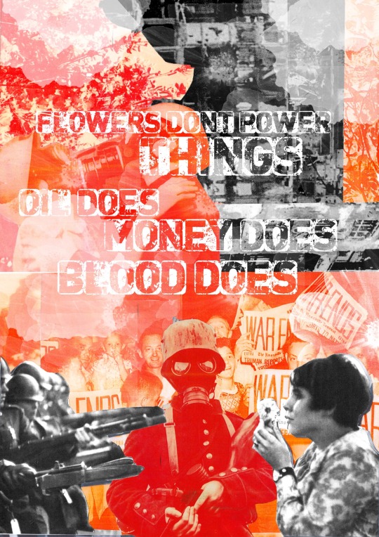
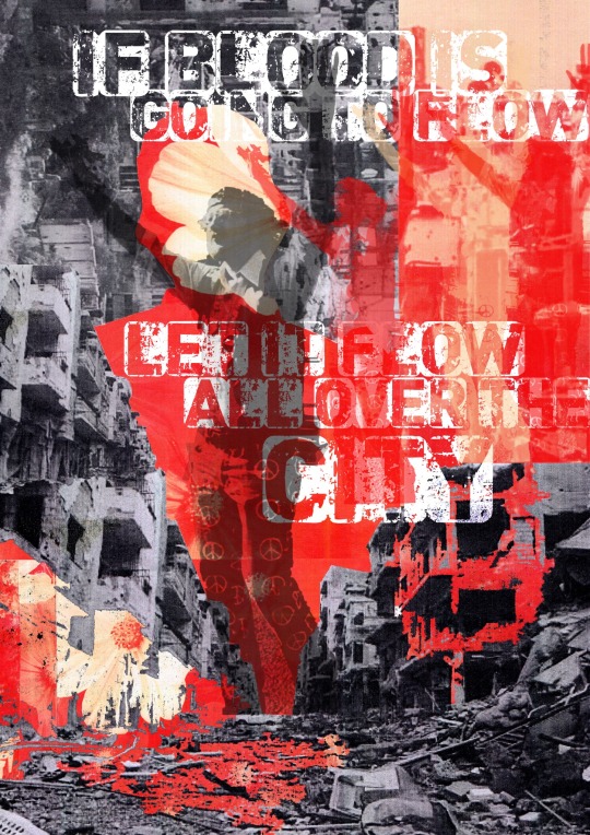
I created five a4 posters and four animations to go with. The official message is to show a combination of love and peace with the protesting against anti war but also a contrast of stress, pain, and conflict that people do not see or history that we do not accept. The quotes on the protest posters were from the film ‘the trail of Chicago 7’ as I felt there is such a big message behind the quotes, that came directly from Abbie Hoffman and Tom Hayden; they hold a big inspiration behind the artwork. For the other three posters I wanted a more simplistic element but impactful with combination of many layers of own photography as well as vintage war photos. To link to the theme natural, I wanted to show the natural components when distress is caused mentally and physically. War has an impact on many things, things we do not think of, even the land ruined, homes destroyed, and poverty created. The protest is a natural movement when the people fight back and try to stop and spread as much awareness about being against something we should have a say over and not be discriminated.
Three artists that have inspired me throughout my project were Robert Rauschenberg, ben Giles and peter Kennard. Reason being at the very start of the project I was very interested in Roberts work as I feel like he has a very strong message that is portrayed a had spoke out about his ideas and thought processes when creating his work that I really took in for consideration. As much as his art pieces are very abstract the meanings and colours expressed say a lot and hold much symbolism, as you look carefully into certain sections. The many layers stand out, this is something I did in my project layering my work covering parts so when you look closely you pay attention to the small detail.
Instantly when looking at Ben Giles’ work is all collage work but has this common theme of flowers that are integrated into all pieces. With my message of showing the violence, destroyed buildings and landscapes, having flowers here and there would symbolise the peace that holds massively when thinking of the death of soldiers, using flowers as a remembrance for the fallen soldiers in the war. Also, in the Vietnam protest they would give out flowers or use flowers as a symbol of peace. With bens work he uses very vintage imagery of people or places, I took this into my own hands to do a similar thing when doing my final outcome collages. I had bought a vintage war book showing all original photographs of the front-line demolishment. There was even small journal diary entry about what they saw with images to support it, this brought out the old imagery that ben uses.
Peter Kennard is a graphic design artist who uses ‘the concept of history’ bodying current political events going on over the 50 years but also linking it to the future and how things have an impact on the future to come. Peter is also someone who uses vintage imagery but a colour pallet of black and white but likes to use the same type of imagery in most art pieces, so his work is easily noticed. The process I feel drawn to the most with Kennard is the importance of linking quote text to his work or a small statistic. This could be a current movement or past information; this is important because it feels informative and gives the artwork context.
Two pieces of wider world research that has helped with my project was watching an insightful film called ‘the trail of Chicago 7’ which shows the flipside of the people fighting for peace but ironically it was supposed to be peaceful, but a few events triggered it to go the wrong way. People argue it was the police enforcement that turned it violent others blamed the 7 men that organised the meet: Abbie Hoffman, Jerry Rubin, Tom Hayden, Rennie Davis, David Dellinger, Lee Weiner, John Froines, and Bobby Seale that prepared the protest ‘Democratic National Convention’ in Chicago. This is one of the sides I wanted to show, a few protest art pieces representing the peace and community coming for anti-war in hope for things to change.
The other side of the wider world research was visiting Duxford imperial war museum which shows the stories behind the people who fought in the war and what they had to go through. Also, there was a showcase of loads of different aircraft and machinery, that I would have never found very interesting until I found out the history behind everything it gave a insightful look into the past and how things were. These are shown in my final outcomes of the old transport and weapons.
For the weeks I was creating final outcomes it consisted of creating collages, experimenting with photoshop, making drawing sketches and finding photography. The main skill I have got out of this project is not only learning about the history of war but found something I really enjoyed is the process of making hand-based collages and creating them digitally. I love this technique as it is a helpful process to use and gets so many ideas flowing. I’m glad that I kept to my project proposal and made the outcomes I wanted to create, hopefully giving the message I wanted expressed by my art pieces.
0 notes
Text
AMA Transcript: Close Your Eyes
Next up, @redphlox & @mrsashketchum stopped by to chat about their Resbang, Close Your Eyes. Here’s some of what went down:
Q: What inspired the concept behind the fic?
redphlox: WELL, I've had the idea to write a left-at-the-altar fic for a while, but I never quite had it envisioned in my mind scene/plot wise. I only had the premise. Then this year I decided to research wedding planning and ask my married friends [about] their wedding planning experience, and after brainstorming/talking it out with @professor-maka I had a solid idea finally. I love writing about emotions, especially coming-of-age/working through difficult situations, but writing this was difficult because I've never been in that situation (being left at the altar) so it was a journey.
Q: Mak, what went into how you chose which scenes to art/gif?
Mak (mrsashketchum): I actually had to work closely with Julie on what scenes to art and for the animatic :D But for the first piece, I really loved the bathtub scene and I thought it was such a unique challenge for me to draw the backgrounds and to bring the scene to life visually :0 If it makes sense?
redphlox: Mak drew the bathtub scene first right after she read the first chapter, like she mentioned, and we worked on picking out the scene for the icon collage together! I had the characters closing their eyes during specific moments and wanted to highlight those, and Mak brought them to life!
Q: Jackie/Soul brotp is a thing that you've created in not only this fic but some of your past ones as well! What inspired that? :D
redphlox: I LOVE Jackie so much, I think it's because I see her as a snarky, quietly sarcastic type that I relate to, so writing her with grumpy ass Soul just makes sense to me. They both are so reticent in canon, it just fits to me to put them together and have them be BFFs :D
Q: Mak, what made you decide to do an animatic?? It was so cool I looooved it.
Mak (mrsashketchum): I enjoy making animatics so much and I've always wanted to be a storyboard artist. I've also been planning to make an animatic anyway for Resbang, but when I saw Julie's fic summary I knew that the animatic was absolutely something I wanted. And I thought a trailer-like thing would go very well with the story? (This is definitely not because of watching so many wedding themed movies before, nope, lol).
Q: For Julie: There were a lot of feelings spread out through the fic, some that nearly brought me to tears. Did you have the same reactions to writing it? What emotions exactly were you trying to bring out in the reader? (because you brought out a lot).
redphlox: Hmmm, well... I wanted to bring out a sense of loss in reference to relationships, and rebuilding, and growing together after the trust is lost or the other person seems to be changing in a way you aren't. I also wanted to touch on Soul and Maka's separate and individual relationships with other people outside of their relationship, if that makes sense? I also aimed to highlight all sorts of love, so it was important to me to talk about everyone's relationships with each other. Friendship, lala, haha. My reaction to writing it was... ahh, frustration, because certain scenes were beyond reasonably difficult to write.
Q: What brought about the Soul and Wes conflict? Because like I was telling you in DMs, that wounded me ahahaha it was way too real.
redphlox: The Soul and Wes conflict was something that came up as I writing. Originally Wes was supposed to be the all-knowing, all supportive and understanding brother, but the more I wrote the more Soul started to resent Wes's blind optimism, and it makes sense - Soul can be a negative person, and it seems like he needs to sulk to process, and Wes just wasn't having it. Their personalities are too different, and showing that was important because it's okay to love someone and not know how to comfort them.
Q: That felt so real julie I loved it. As the owner of many siblings it read as absolutely true. Did your life influence that?
redphlox: Wes and Soul's relationship issues are inspired by some self-reflecting I've been doing, and taking the Love Languages test and comparing it to my loved one's results.
Q: For Mak: What inspired your color palette for the bathroom scene? It was very warm and it brought out as much emotion through visuals as the words themselves did. Was that intentional?
Mak (mrsashketchum): Yes it was definitely intentional! Like I said in my previous answer, I worked so closely with Julie (we fangirled so much over everything honestly), she helped me with colors and their poses and if there were tiny details I missed. She sent me a lot of references too which is very helpful for me since I tend to make use visual references more. It's always helpful to work closely with the author so that the feeling of the artwork doesn't wholly overwhelm the feeling of the writing style? Like I wanted it to match as well :") I'm glad it turned out amazingly.
Q: I was wondering Julie how you came up with the concept of the radio confession. I loved that Jackie's show was commandeered.
redphlox: Well, I was thinking, what's the opposite of having Soul be constipated with his feelings?? Blurting them out in public of course, haha, so that's how I came up with that scene. It's the first scene I had actually, and I plotted the fic for that ending. I also have Jackie as a public figure in many of AU's, she was a blogger in my model au, so the role seems a running gag in my writing.
Mak (mrsashketchum): Constipated was the best way to describe him with his feelings.
Q: So weird question for Julie: There's a movie I remember watching years and years ago, that I was reminded of when reading the radio confession scene, unfortunately for the life of me I can't remember the name of it. Did you draw that scene up from what would have fit into the story, or were you influenced by an outside source, like perhaps that mystery movie?
redphlox: I like to listen to the morning radio and always wonder how people are brave enough to go live on air and talk about their relationships or embarrassing moments etc, so that kind of inspired the radio scene too!
Q: I really enjoyed TsuWes btw, and it's not a ship I've really seen. What made you decide on it?
redphlox: AHHH well, they're both Tall, and I love both of them so.... I made them love each other. Also the ship name WesTsu Bestu got me.
Mak (mrsashketchum): I always thought that Tsu and Wes love to tease Soul and Maka together, so the ship happened like that haha.
Q: Btw Tsubaki owning a flower shop is greaaat was that always the plan?
redphlox: Tsu owning a flower shop was also one of those things that just came about because I needed someone to deliver those "I still love you" flowers, but it fit so perfectly because of how Soul fit into learning flower arranging from her and thus getting him to stay in Death City. It was one of those things that fell into place.
Mak (mrsashketchum): Those stuff in AUs that fall into place are the best accidents, if u can call it that.
Q: Question for Mak; the animatic, that collage, the illustration; how did you manage to capture the fic in its entirety, while still giving each piece made its own personality so to speak? For example; the bathroom scene with your color choices made it warm, melancholy, touching, the watercolor for the collage was deep and soothing at the same time, intense, and the animatic, the monotones give it a blank canvas for each viewer to create their own emotional interpretation. How are you absolutely amazing I guess is my overall question??
redphlox: This is the most important question of this AMA tbh. I love the lighting in that piece akfdsgnfkdfdss. I felt it in my heart.
Mak (mrsashketchum): Oh my god. Thank u for the question!!!! I... actually honestly have no idea haha. I guess it's just that when you love a concept so much and completely have a wonderful connection with your partner that it just flows? I wanted to really make the artworks fit into the theme and the feel of the writing. I made sure that while Julie checked if my artwork had the feel she was going for, I also wanted to make sure that what I was feeling was gonna reflect on it as well. This is for the bathtub scene btw haha. The collage was actually supposed to be monochrome as well but I wanted to give it some color too? Like the fic in its entirety is just blasting with emotions? And yet it's generally so soft to me. The animatic was really supposed to have that gray background because I've seen a lot of animatics drawn that way haha. But I did make it work to my advantage that it wasn't too overwhelmingly dark but it's so that you could see the tears as well? It would be hard if the background was white and the tears were white too, right? :0
Q: By the way I loved the weddings in the fic. Like I wanted to attend them they sounded gorgeous. How did you decide on those elements?
redphlox: I have an aesthetic/personal blog where I reblog a lot of pictures of flowers and I came across one that was a ball room covered in flowers and I thought - yep, Wes and Tsu would be married here. As for Soul and Maka's wedding, I LOVE being out at night, and I love soft lighting and would like a night wedding if I ever get married, so yeah. Aesthetic, haha.
Q: How did you manage to capture a canon-like Soul in an AU?
redphlox: Ahhh I just... plot out the fic centered with feelings first and go from there.
Q: I wanna know more about this fantastic partnership. it sounds like you guys were a great team and worked so well together - any tips on communication for anyone out there who may have felt shy? Also, give us the beta comments >:)
redphlox: Okay I LOVED working with Mak! Even though we're like, what, twelve hrs time difference??? we still managed to be online at the same time and work on our projects together. She'd draw line art and show me and I'd write a scene and show her and we'd keysmash at each other. It was soooo rewarding and fun!
Mak (mrsashketchum): I would like to say that Julie and I are the Angst Twins actually. I love working with Julie too???? Like everything just really worked out.
redphlox: It wasn't even planned tbh, I would see her online and go like :eyes: and she'd be like "im working on the collage!" or vice versa. It really felt like it was OUR resbang and not just MINE y’know? Tip wise, I'd say find a platform you really enjoy being on/are available on the most and communicate through there, that really worked for Mak and I.
redphlox: Since this was a srs fic most beta comments were of surprise and like, offended bc I did something Bad.

Jaded [@jaded-envy] made a lot of silly comments! She is amazing. Like when Maka is at the bookstore and looking up self help books for looooove, jaded titled them after some fics i've written.

Q: Question for both Mak and Julie; your partnership sounded like it flowed like a dream. Did you guys ever feel like you were overpowering one another? I know alot of partnerships struggle with the "am I bugging them too much" or "what if i'm doing it wrong" mindsets, so how did you guys get past that, for anyone who suffered from those feelings.
Mak (mrsashketchum): Oh that's actually an interesting question! I never thought of me overpowering Julie or her overpowering over me? It's more like I want to be able to do as much work as she does? Since we're partners we must work hand-in-hand and not with one of us being the overpowering one? So to speak.
redphlox: SAME what Mak said, I always offered her to give suggestions for the fic and she always asked me for advice on colors and we listened to each other. Basically we were considerate of each other, it was/is amazing :' D
Mak (mrsashketchum): aaaaaaa true ;w; Since it is technically a partnership, we treated it as if it were like something we needed to work on together, and doing stuff at the same time really helped put it into perspective in a way?
Q: Where did the inspo from the bathtub scene came from? Did you draw from a specific experience/influence for that?
redphlox: Hmm... well, no specific experience influenced that, it just like, happened? I thought like, "ok where would Maka be if she were crying?" and it made sense to put her in the bathtub after she spilled the ink on herself, and she prob had no energy to leave, so there she stayed until Soul found her.
Q: Also Julie, I know you suffered from writers block I kicked your butt into gear once, lol. How did you overcome it? When I get to a sentence or idea that I can't exactly word or find a way to explain, I usually drop it for weeks and then come back to it. Can't do that with Resbang to an extent so how'd you get past it within a limited amount of time without rushing the pace, or glossing over an idea that was meant to be incorporated into the fic?
redphlox: ahhhh WELL, I wrote 40kish between Jan 1st and Jan 16th, so a deadline kicks me into high gear. A lot of the block was not knowing what happens in weddings and doing research tbh x) I died a little but it made me stronger.
Q: Okay you broke my heart a number of times, can you explain the thought process of why Maka never texted Soul?
redphlox: Maka was just too shook to think rationally :0 Have you ever been so anxious it feels like you're going to die? That's basically how it was for her, the emotion was too strong. She realizes later she could have done better and coming to terms that she makes mistakes is also a lesson she had to learn.
Q: How long did recording voices for the animatic take? And did you have any silly moments while doing so? haha
Mak (mrsashketchum): I actually had the weirdest time doing every voice, it's crazy. It took half an hour to be honest? It didn't need to be perfect, it just needed to have the right emotion. I had to channel every angsty fiber of my being for crying!Maka.
Q: For Mak: Do you feel like you grew in your art skills through this bang? If so, how?
Mak (mrsashketchum): I actually did grow a lot in my art skills with this bang! I felt that giving myself more challenges in backgrounds helped a lot in dealing with drawing perspective. And also with hair. I learned so much with color as well and how each shade and palette is definitely super important.
Q: What are you most proud of for the piece/pieces you did?
Mak (mrsashketchum): I’m really proud of all my pieces! But if i could only pick one then it would be the bathtub scene for sure! I spent most of my waking hours for it and I even made a 3d model for the perspective just for a reference.
Q: What are you working on next?
Mak (mrsashketchum): I’m definitely working on some more animatics and animations and my Vday art will be super late haha. Also SoMa Week is near and I'm planning really big things!
Q: Favorite/least favorite moment/scene to write?
redphlox: Mmm my fave scene to write was all of them, I felt like I looked forward to all of them now that I look back to it, if that makes sense?
Q: Hardest scene/part to write?
Redphlox: A difficult scene to write was the very end where Soul and Maka finally talk it out bc I felt that I had gotten them in SO MUCH TROUBLE that I was like "how the fffff do I fix this?" But luckily I had the best betas, jaded and proma, there as I wrote it and we were all on the doc at the same time and we were all just, live writing/betaing. I’m v happy to have explored Soul and Maka's friendships and family life. One of my favorite scenes was the scene where Liz talked Maka through some Hard Truths. I love Liz. I think there was a scene I had to delete bc it just wasn’t fitting, it was with Kim and Soul, but I ended up using bits of it later.
Q: Tell us about your writing process.
redphlox: My writing process was basically writing like a turtle at the beginning/struggling to find inspiring music to write to/plotting, and then the last bit was writing 7k daily and going !!!! internally. Lots of keysmashes to my betas.
Q: What are you most proud of this Resbang?
redphlox: Im really proud of writing and finishing this resbang tbh, I had an amazing partner and had fun with my betas, and I pushed my writing speed/abilities because I explored some feelings I hadn't ever experienced before (being left at the altar) I'm happy with the outcome!
Q: Was music important to your process at all, and if so, are there any songs/playlists that were relevant?
redphlox: Yesssss so jaded made a playlist! Lemme get it. https://www.youtube.com/playlist?list=PL7rssdV2CkoNRl4-cPWuqm7ocC-QxP0Vn
Q: What are you working on next?
redphlox: Next, I'm working on plotting this year's Resbang, finishing Siren AU, writing and posting my longfic Sailor Moon AU, and aside from writing I'm working on being a better reviewer/commenter and beta :D
12 notes
·
View notes
Last Seen Blogs

sharon2209
Enjoyme😋😋

automaticdonutsublime
First Step Realtor
hamil-tots
[Hiatus]

polarettiallaciliegia
EXCERPETE VULGO.

itsaradfemsworld
yimi