#and design work is much more time intensive and difficult than just drawing a portrait
Note
Would you ever be open to doing skirt pattern commissions? Like, I love your art, and I'd love to stick my own neck out for stuff you wouldnt sell? Or even just, we commission you for skirts that you sell yourself? I'd love to back some of that risk up with money, is basically what I'm saying
i don’t take design commissions, as i really don’t like to be limited in that way. when someone commissions a piece, they expect a particular design/subject matter to definitely see fruition, but i actually abandon the vast majority of my skirt design ideas. like for ever 1 design i complete, there were probably 3-10 other designs i left to either complete later… or never.
also in general, debuting new designs (while still anxiety inducing) isn’t something i worry too hard about in terms of risk factor. it sucks to have something like the milk skirt, where it stopped selling so we retired it, and then i kept getting ppl for YEARS begging for its return, and then i did bring it back… and it’s still in stock after a couple weeks when everything else sold out in 1-2 days. but for the most part this isn’t an issue for us. the milk skirt is just cursed, i guess. it’s literally the only design that hasn’t sold out within a week in the past 2.5 years.
the only exception i’d consider to this would be commissions for a new color variant of an already existing design.
but honestly, this sort of risk/uncertainty is why preorders exist. the manufacturing orders we place for preorders are 2-3x more product (and therefor 2-3x more expensive) than our RTS orders. we could definitely make more RTS sales if we placed bigger orders, but the manufacturing fee would be so high it would be difficult to afford it without preorders (and it takes roughly 3-4 months for skirts to be made and shipped to us, so that’s 3-4 months of not seeing the return on the manu cost)
#ask#rambling a lot about Business#i took an edible so i have no idea if this makes any sense lmao#actually i recently had to refund a commission (not a design one) for the first time in my life bc i am just so Tired still#even tho i got covid months ago at this point#and like im already relatively pricey for online commissions#but these days im so busy and tired that even that price isnt enticing enough#and design work is much more time intensive and difficult than just drawing a portrait#so it would be wayyyyy more expensive#to the point where i cant even think of a number where id want to take design commissions#i know im a weirdo tho#but listen#i have anxiety and commissions are like my anxiety trap card#god im gonna look at this whole post later and just be like wow yep i was very high
45 notes
·
View notes
Text
Lava’s Art Masterpost
Hey, all! Welcome to my art masterpost! I have no idea if this is a thing that is done typically for art, but oh well, I like organizing things, so here we are! What you’ll find here is mostly Dragon Age, with a few non-DA pieces in there, and there’s a range of styles I like to use, depending on my mood. But a lot of what you’ll see will most likely combine lineart with some other form of coloring/shading.
Feel free to browse at your leisure, and I hope anyone who stumbles upon this enjoys what they find! :D And thank you to anyone who sees this and likes, or reblogs, or even just stops by to peruse a bit!
All that said, away we go!
Digital Portraits:
1. Portrait of Nameless Woman, 2020 - This one is just an experiment with a watercolor brush that I did. It’s not anatomically perfect, but I enjoyed playing around with shading.
2. Sketch of Aja Amell, 2020 - This one is basically sketch practice with my Amell~ Not really the most expressive pictures, but it’s a start toward drawing her more expressively. Full disclosure: Aja is one of those OCs of mine that I have had trouble with deciding on a definitive appearance for several pictures, and I really want to work on upping my level of consistency when drawing her.
3. Long-Haired Fenris, 2020 - Exactly what it sounds like; this was for practice drawing Fenris’s features (I love how distinct they are), but with long hair because I am weak for it. This one was a fun piece to shade, and mixing the stylized lineart that I normally use with a greyscale shading spectrum was really enjoyable.
4. Portrait of Ilorin Lavellan, 2016 - This is an oldie. Basically practicing expressions, and it is technically a WIP, but I’m still very happy with how the shading turned out, especially because this is actually (aside from the unfinished hair) one of the more minimal pieces I’ve done in terms of lineart It’s still there, and it still shapes the flow of the picture in some ways, but it also ends up flowing with the shading instead of standing out next to it, which I like. (Both styles are good, though, and I love seeing other artists try both too.)
5. Old Portrait of Aja Amell, 2016 - Much older picture I did of Aja; she... honestly looks very little like the newer one, I think, and that consistency is something I’m still working on, but this one was the first picture of Aja with that particular hairstyle I drew. What I like about this picture is how young she looks; it fits with her image as a fresh and sheltered Circle mage who’s only about 20 years old at the time of DAO.
6. Old Portrait of Trilyn, 2016 - They very first piece of art I posted to tumblr~ It’s not exactly how I envision Trilyn anymore, but it was still very fun to draw, and helped me get a feel for drawing him in the future.
Dynamic Movement Pictures/”Moment’s in Time”:
1. Tabris in Arl’s Estate, 2020 - TW: blood. I am super proud of this one. My ultimate goal is to draw all of my Warden DAO OCs, and I could not believe I’ve never drawn my Tabris, and so here she is. This was, in large part, practicing expressions because I absolutely love art that depicts characters in motion, or capturing some kind of expression.
2. Velyn in the Rain, 2017 - This one was actually based on some art that I saw in a Teen Wolf fic! It was an experiment with a more expressive style (and one of the first pieces I did without lineart left in the finished version) and it was a huge step out of my comfort zone. But overall, I am extremely happy with how it turned out.
3. Jem Nocking an Arrow, 2016 - And here is the lineart version. This was entirely an excuse to draw my DAI baby, Jem, and to do a cool archer pose because archers are my fav, and I love characters in motion.
4. Solas Teaching Trilyn Fade Magic, 2016 - This one was a painterly picture that was also (like the Velyn picture) something which I tried to keep lineart out of. Overall, I am proud of a lot of parts of the pic, but I think I would definitely go back over it and change a few things now if I had the patience.
5. Trilyn Closeup WIP, 2016 - TW: injury, blood, mention of abuse in the author’s note. A lot of early pictures I have are of my OC, Trilyn, and this is one of my absolute favorites. His entire upper body is technically in the picture, but I hadn’t finished rendering it yet, so this was what I posted. And it was an experiment with a cross-hatching style with the pencil tool for some texture, with air brush shading and a blurring tool. It’s a style I had fun playing around with!
6. Trilyn Blood Ritual, 2016 - TW: blood, injury (the slight cut used to supply the ritual with blood). This one was definitely a sort of “captured moment” from a backstory I gave Trilyn, and I think what I was really going for was an atmospheric piece that could fit with any potential fic I wanted to write for Trilyn. And then it ended up being practice for extreme lighting/shading techniques, and drawing the blood and the gross mass of demon ichor (or whatever the heck that is) turned out to be highlights of making the piece for me.
Art + Text:
1. Freedom and Control, 2020 - TW: scars, but very difficult to see. This one was ambitious for me! It started originally just as Solas and my Tal-Vashoth OC, Saara, facing each other, because I love the dynamic I’ve built for them in my head, but then it turned into an attempt at a tarot-esque background, and just sorta grew from there... Overall, I’m happy with how it turned out, especially with how Solas and Saara themselves turned out. The version you can actually see a larger view is here.
2. Marianna and Delia Codex and Art, Pt. 1, 2020 - I love writing my own codex entries, first off, and I love combining art with text to create a (hopefully) seamless work. This work was an attempt to flesh out these OCs of mine with both art (because unique facial structures are hard for me to get down, but so important regardless) and text (because writing~). I think it turned out well overall, but there are elements of the portraits that I might at some point touch up a bit.
3. Marianna and Delia Codex and Art, Pt. 2, 2020 - Part 2, with what I refer to as a “DAI Outfit Change” because I have always loved seeing fans show their own OCs as they look in DAO, DA2, and then finally DAI. So I absolutely wanted to jump on that bandwagon myself. The skin tones are a little off (and I’m sorry about that!) because I was playing with the watercolor brush at that point, and it dilutes the colors I use. Still working to figure that out, but I was very happy with the overall lineart and structures of the faces.
4. Alistair/Aja Amell Picture with a Blurb, 2017 - Ooooold, old, old, old, OLD! I still love the art, and I’m soooo happy with how the interaction between Alistair and Aja turned out (drawing kisses is extremely difficult for me; I always end up creating a distorted weird lip-creature, instead of realistically puckered lips...). I’m not as happy with the blurb that went with it? At that point, I was still very much figuring out my own DAO worldstate, and the characterization for everyone, so, eh. Take it with a grain of salt!
Unfinished Costume Designs:
1. Ancient Elvhen Armor with Dwarven Influence, 2018 - People who do costume design work are amazing and mystical beings, and I wish I could do what they do. This was an attempt at merging the Keeper robes from DAI with a more dwarven armor aesthetic, solely because I created an ancient elvhen character, Ceda, who was taken in by the Cad’halash dwarves mentioned in the Witch Hunt dlc, and I wanted this character to have a mix of the elven style of armor and the dwarven style. I’m overall decently happy with it, but there’s still that persistent level of self-criticism present.
2. Herald of Andraste Outfit WIP, 2016 - This was a very old picture, not one I showed around a lot, but the idea for this was entirely born of my intense interest in how fashion and outfit designs could be used to create a symbolic image for the Herald of Andraste. In general, I love the combination of ceremonial armor with long and flowing cloth, so that was what I went for here. I’m still actually very proud of how this came out, and headcanon something similar for my Herald in my canon DAI worldstate.
Pencil Sketches:
1. Quick Saara Sketch, 2019 - TW: saarebas mouth scars. Exactly what it says; very quick sketch of Saara I did in a small notebook I carry around with me. This was basically a test for myself to see if I could manage to draw Saara with the features and facial structure I envisioned for her without needing to use a lot of references.
2. Mass Effect Character Sketch; Jesse, 2018 - Similar reason for drawing this one as the above Saara sketch! With these characters, I love sometimes the way they can turn out with the specific character creator used for them, and when I draw them, I enjoy trying to create a definitive look for them using what I get from the CC, and my own knowledge of Hooman Faces.
3. Saara Sketch, 2017 - TW: saarebas mouth scars. A more detailed sketch of Saara than the one above, and one I definitely put more time into overall. It’s currently the profile picture I’m using for ao3, and is the definitive go-to reference picture I use whenever imagining Saara in a fic, or for other Saara pics I make. I am extremely proud of this picture, and feel like I should work in graphite more often. It’s such fun, and the texture is so nice to look at.
4. Sketch of Nameless Alamarri Woman, 2017 - This was a sketch I did of what I envisioned some Alamarri tribes to look like; I used artistic depictions of Gaul tribes and hairstyles for inspiration, and have used this as a go-to reference for my version of Alamarri tribes. Nothing super notable about this one, but I really liked the way the shape of her face turned out.
Events and Gifts:
1. Another Scar, 2020 - TW: blood, injuries, gore. The most recent piece of art on the list, and a gift for @cartadwarfwithaheartofgold; featuring sisterly love between Rica and fem!Brosca, which was her requested prompt. This was a tough piece for me because of the difficulty with the lighting I dealt with. For some reason, that one particular element of it gave me so much trouble. Overall, I’m very happy with how it turned out, though, especially the skin tones of the sisters; Brosca I always sort of like as having this greyish, more gaunt look to her, while Rica I like seeing with a darker, richer, and warmer tone to her.
2. A Very Cousland Christmas!, 2019 - This was for a holiday exchange for a server, and I drew a friend’s Cousland (Elissa, the girl on the left) with my Cousland (Gazza, the girl on the right). I love kid-fic, and I love kid-art, and so I decided... baby Cousland art! Drawing kid proportions was the toughest part, I recall, and I thiiiink it turned out well, and I’m still quite proud of it overall. Elissa’s design came entirely from my friend, but I added the holly~
3. Exchange Gift with Dis Brosca and Mabari, 2018 - This was an exchange gift for @fanfoolishness, using her lovely Dis Brosca, and was my first real attempt at backgrounds... I struggled with the coherence of the foreground and background a bit, but I’m still very proud of how it turned out, especially with the colors I had to work with. What I also really enjoyed working with was the lighting and the expression on Dis’s face. Backlit subjects are always fun to play around with!
4. Inktober Picture, “Deep”, 2017 - TW: scars, injury, mentions of abuse in the author’s note/attached dialogue snippets. This was for an Inktober prompt (the only one I’ve ever done, sadly... because I am bad with deadlines...), and again features Trilyn. Trilyn’s backstory has him a former slave in Tevinter, and a lot of the early works I do for him are sort of deep-dives into his life there. It’s all meant to be an exploration of the things he endures, and then those moments when he overcomes it all and takes back his own autonomy and self. This art is definitely provocative, and I can understand if not everyone likes it, but to me, I just wanted to show just what he faces (without glorifying it) before showing the moment of his own triumph.
5. Christmas Holiday Picture with my Brosca and a Friend’s Amell, 2017 - This was a piece of art drawn first by a friend of mine, @nanahuatli~ She drew the Amell, the background, the mistletoe, etc. All I did was add my Brosca to the mix to finish the image. It was a lot of fun to do, 1) because it was fun trying to match her style so that the picture looked cohesive, 2) because I love doing collabs with friends, and 3) because it was just such a fun thing to imagine my surly short Brosca, looking at this weird plant/fungus/thing dangling over some puckering human! It was an absolute joy to do this collab with her!
6. OC Kiss Week Pic of Jem and Saara, 2017 - TW: saarebas mouth scars. A spur-of-the-moment thing meant to demonstrate just what kind of dynamic my OC, Jem, has with my other OC, Saara (both of whom are members of Leliana’s network in DAI). This was a very quick picture (deadlines...) and was mostly just to have fun drawing these two characters interacting, and to see if I could make them look like themselves. I think I did a decent job with it overall, especially with Jem’s kissy-face! (Again... drawing kisses are the bane of my existence, although hands and feet take a close second.)
11 notes
·
View notes
Text
Kingdom of Decay - Chapter 3
Also available on Ao3. Like my work? Support me on Ko-Fi!
Chapter 1 | Chapter 2
Chapter 3: Amaranthus
Even during summer, when the sun dips behind the horizon, the air grows chilly. One would catch their death of the cold if unprepared. Indeed, even festooned under her cloak with a bedroll and a blanket, Amara shivers, finding sleep hard to come by as the cold assaults her body.
‘Can we please have a fire?’ she asks through chattering teeth.
Addenus shakes his head, looking at complete ease with the unfortunate weather. ‘Draw too much attention. This place is called the Red Rivers Crossing for a reason.’
Amara sits up but remains in her cocoon. ‘What reason?’
‘Monsters.’
The wind picks up. The icy breeze caresses Amara’s cheek. She cringes against the unwelcome sensation.
‘You’re not going to elaborate?’
‘Wouldn’t wish to sabotage your sleep, Princess. And you will need it.’
‘I think it's safe to say its already sabotaged.’
‘Just a jest, Princess-but make no mistake, the woods are dangerous. Come with me.’
Intrigued, she follows Addenus further into the woods. Though human, he has no trouble navigating the smothering dark forest, dodging trees and ducking underneath low-hanging branches with grace. Before long, she hears the unmistakable sound of running water. Soon they come into a clearing. A large body of water, some 50 feet across, has cut a path through the forests. It isn’t until she stands at the edge of the bank she sees the deep crimson hue of its currents.
‘Red...red water? How?’
Addenus stoops down to pick up on of the plants growing along the rivers bank. He holds up what looks like a flower--numberous small petals folded on one another leading upwards to form a stalk, in a deep burgundy hue.
‘You know what this is?’
She cocks her head. Familiarity rushes through her, and a name popis into her mind. ‘Amaranthus…’
He twirls the stem between his fingers. ‘ “Undying…” safe to say the river is picking up the pigment from these flowers growing around it. Since the amaranthus’ never wilts it has a constant supply of them...the river always runs red.
‘ “Undying” ‘, Amara repeats to herself. ‘Nothing is undying.’
‘The Amaranthus is. And maybe the Princess named after it will be.’ Addenus offers her the flower with a small smile.
‘I doubt that very much.’ she mutters, but she takes it all the same.
‘Oh, you will die given time. But your name, and your deeds and influence can survive past the grave. It all depends on how you act in life.’
She stares into the flowers depths. Trying to imagine what kind of legacy she would leave on the world. For a moment, she thinks she sees something--a flash, two people, boy and girl the exact opposites of each other, like fire and ice. It vanishes as Addenus claps her on the shoulder.
‘Let’s get back to camp. You should rest.’
Addenus starts a fire, leaving her comfortable enough for sleep to find her.
When Amara wakes, she wakes alone in a strange unfamiliar place. Instead of finding herself beneath star and leaf, she finds herself surrounded by stone walls. The room is entirely empty, and dark. Even her eyes find it difficult to penetrate the yawning abyss ahead of her.
Then, a light, flickering and blood red. It swallows the dark around it, allowing her to see what lies ahead of her. A single sword of a dark grey hue and a finely made handle. Metal twisting upwards around the dark red gems running up along the handle to the hilt. Another, far larger gem makes up its pommel. Small runes occasional flash in red along the blade.
‘You answered my call…’ Amara starts when she hears the voice. It is not a single voice, but multiple, one dark and raspy, the other light and alluring, like two sides of the same coin.
‘Sanguine?’
‘Your family and I have been one for generations. It is your turn to shoulder the burden...but are you ready?’
‘What do I have to do?’ she asks.
A low chuckle resides in her head. ‘First, survive. Then, we shall see.’
A hand of shadow clasps around the handle and swings the sword, testing its weight and balance. From out the darkness steps a woman clad in fine armour that almost matches the design of Sanguine--dark, but glowing with runes and a single red gem in the centre of the chestplate. The woman has long black locks, violet eyes and tapered ears. Amara gasps as she beholds the form that appears to be an older, stronger version of her, wreathed in a red and black miasma.
She holds Sanguine to the exposed skin of her left forearm. Amara cringes as the blade is drawn down, cutting through the skin. Instead of dripping down to the ground, the blood coalesces on the blade, manifesting as brightly burning flames that flicker a deep crimson colour.
Amara stumbles back in horror, tripping over her own feet. She crawls backwards, her palms scraping against the rough stone as she drags herself away. The wrath rushes forward, and plunges Sanguine deep into her heart. She feels the blade cut through skin, flesh, bone and eventually tissue. The flames lick at her sundered skin, cauterizing the wound as it cuts. The blazing inferno seems to surround her in flame, drawing out of her a feral scream as she lays in the gripes of agony so unreal she scarcely believes it.
When she jolts awake at the camp she is still screaming, until the pain subsides. Desperately, she claws at the fastening of her shirt, fingernail scrabbling at the skin between her breasts in her panicked struggle. There is no sign of scar or injury. Her body sags in relief, but her mind is still fraught with worry and her heart doesn't slow it's chaotic rhythm. She meets the gaze of Addenus the other sight of the campfire, as he attempts to stoke the embers back into life. He doesn’t seem surprised or curious at her frightful outburst, instead regarding her with sympathy.
‘You met Sanguine?’
She nods. The fire springs back to life. Amara jumps back, remembering all too well the agonising heat as it consumed her heart.
‘He can be...intense.’ Addenus winces.
‘It wasn't just him…’ Amara swallows. ‘There was...someone else.’
‘Someone else...who?’
‘Myself, I think. Only much older. Stronger. I was wielding Sanguine. I...she stabbed me…’
Her fingers trailed the skin between her breasts, where the blade cut. Addenus crinkles his brow in confusion with a hum as he considers her words.
‘Curious. I don’t believe anyone else had had such a dream. It has always just been Sanguine, and Sanguine alone. You say this...other you wielded Sanguine?’
Amara nods. ‘Stabbed me straight through my heart.’
‘Curious indeed. We should head for the Order post-haste. Perhaps we can ask him directly when we get there.’ Addenus rummages through his bag and tosses her an apple. ‘Here. Break your fast and walk. I would like to get there today.’
Amara’s entire body quakes with exhaustion as they mount the final step leading up the order. Standing tall and proud at the apex of the mountain is a square building hewn from obsidian stone. Braziers flank the large metal doorway which bears a sword pointing groundward wreathed in flames. There are no visible handles or door knockers on its surface.
Addenus steps forward, producing a small dagger. Her slices open his palm, and places it on the the metal. The blood stretched across the surface, coating the carving of the flaming blade. With a grinding groan, a seam appears in the middle of the door. The two halves part and swing inwards into the dim lit exterior. They close and reseal behind them, erasing all evidence of the split. Amara turns to face the interior. High windows allow what little light is left of the day to filter through, bathing the stone interior in the hues of sundown. The entryway splits into three identical corridors, two to either side and one straight ahead. Addenus leads Amara down the centre path, ending at a door which looks like an exact replica of the entrance, only on a smaller scale bearing less extravagance and an actual handle. Addenus raises his fist and raps on the door thrice.
‘Enter,’ a stiff and nasally voice responds.
Addenus opens the door, revealing a large study room that is the picture of organised chaos. Piles of books and parchments are stacked on nearly every available surface, some even on the floor. Nearly every wall is covered by full bookcases, or well stocked cabinets of weapons and several pieces of well-kempt armour, or shelves littered with vials, bottles, more paper, small framed portraits and other suck knick-knacks.
Sat in a plush armchair behind a huge mahogany desk sits a middle-aged elf, his hair more salt than pepper, his wrinkled face devoid of any sort of facial hair. Dressed in a black coat with shiny gold buttons, and writing unimpeded by the large and numerous rings on his fingers, he looks every bit the noble. He even carries himself with grace as he sets aside the quill to regard the both of them.
‘Addenus...Mistress Darcelle, a pleasure. Your uncle is a formidable fighter. I hope you also have the skill, but with a touch more self-reflection.’ His thin lips stretch into a smile that doesn’t quite reach his eyes. ‘Jedrek Blackclaw, at your service. Well, now you have arrived we should set you up with accommodations...I trust it has been a pleasant journey?’
‘Uneventful, but tiring,’ Addenus says.
Amara, now in a strange place with exciting yet terrifying prospects, finds herself quite awake.
‘Of course. Show the young Lady to the quarters, then you may retire. We’ll start with the induction in the morrow.’
Addenus stuffly bows. ‘Of course. Come on, young Princess.’
‘Induction?’ Amara asks fearfully as she follows him through the halls, back to the entrance then steering to the right.
‘It’s nothing. Just a lot of talking, and swearing oaths. Boring, political stuff. The exciting stuff happens later. Training, fighting...you’ll love it.’
Amara is less convinced, but she deigns not to argue. They pass many doors. She hears clashings of steel behind one, others voices talking and laughing, but she sees no one else out and about.
Eventually, they stop at a single door, in a private alcove away from the activity she heard earlier.
‘This is you. The Darcelle room your Uncle was using.’
‘Am I ok to use this?’
‘Of course. We figured you’d like some taste of home for your stay. Sleep tight.’
Amaranthe tiptoes into the room--a moderately sized chamber quaintly furnished with a simple queen-sized bed, an armoire, nightstand and a window seat, a shelf on either side holding a handful of books.
Amara kneels on the window seat, reaching for the shelf, and adds her dog-eared copy Of Monsters and Men to the meagre selection. The book barely reaches the surface before she pulls it into her lap and opens it. The lettering on the pages is barely legible, but enough so to rouse her memories of reading it through countless times. She recounts the tale in perfect accuracy, until nodding off where she sits. The book falls to the floor, but doesn’t reach it. It remains suspended an inch off the ground. Curious, Amara reaches for it. The pages turn as though caught in the ire of a gale, stopping at the midpoint of the book. An illustration depicts a helmeted knight holding up a familiar sword--one with a dark blade and jewel encrusted hilt. She turns the page. No words, but a drawing of a dark stormy landed shrouded in mist. The mist parts, revealing a dark castle that fills her gut with dread. From behind the foreboding spires, a monster emerges: sickly green tentacles wrapping around the building.
The book falls from her grasp she she retreats from it. It lands with a loud thump.
The sound starts her. She wakes on the window seat to complete darkness. Her eyes eventually adjust to the absence of light.
Amara retrieves the book which fell from her grasp. No strange, moving illustrations. Just words. She slots it onto one of the shelves and walks to bed. She passes by a window as she does, and spots a figures from the corner of her eye, Looking down to the ground below, she sees her Uncle in passionate talks with Jedrek.
Jedrek strikes a blow to her Uncles face. Amara flinches as she hears the sound from her window. He staggers, holding a hand to his bloodied mouth. One foot is put forward, as though he intends to retaliate, but he freezes. Then his head angles upwards.
With a gasp Amara jumps to the side out of the pane, back against the stone. She wonders if she moved quickly enough. Peeking around the corner, there is nothing but an empty courtyard.
#kingdom of decay#kingdom of decay chapter 3#amaranthe darcelle#my writing#original writing#writblr#dnd#d&d#curse of strahd#cos
3 notes
·
View notes
Text
Mariocki's 2018 Top 5s
Top 5 films (previously unseen)
Hachijikan No Kyôfu (Eight Hours Of Terror, 1957). An entirely atypical Seijun Suzuki film, its basically The Lady Vanishes mixed up with The Wages Of Fear, all shaken about and told with Suzuki's unique blend of irreverence and humanity.
Die Blechtrommel (The Tin Drum, 1979). Volker Schlöndorff's adaptation of Günter Grass' seminal novel dispenses with much of the third act, making for a leaner, more coherent film. Magical realism walks hand in hand with the banality of evil in a visually stunning, difficult, funny and distressing film. Unique.
The Offence (1973). Sidney Lumet adapts a minor play and transforms it into a cinematic masterpiece. A gruelling, exhausting study of one man's destruction - or is it two men, or neither? In replaying the same scenes, with slight variations and a little more revealed each time, Lumet twists the plot and the characters until everything is either revealed or obscured - depending on your reading of events. Undoubtedly Sean Connery's finest performance.
Alice, Sweet Alice (1976). A cheaply made, independent slasher film - but so intelligently made, so thoughtfully put together, that to call it a slasher feels insulting. Full of symbolism, amazing visuals, and one of the most frightening knife attacks in all horror cinema.
The Shape Of Water (2017). The only time I ventured to the cinema this year, I think, and I was well rewarded. Guillermo del Toro's fairy tale is at once very modern and thoroughly old fashioned, a warm and rosy love letter to both Old Hollywood and modern love. Beautifully acted, directed, scored, costumed...
Top 5 films (rewatched)
Point Blank (1967). John Boorman tackles the familiar film noir tropes, only to pick them apart and produce something entirely new. Incredibly stylish, and towered over by Lee Marvin's amazing central performance as the inscrutable, unreadable, intense Walker.
A Man For All Seasons (1966). Robert Bolt adapts his own play, streamlining some elements and redistributing the Chorus to produce a powerful polemic on hypocrisy, politics, and ambition. Paul Scofield fully deserved his Oscar for playing More.
Butley (1974). Part of the American Film Theatre, Simon Gray's study of a verbose, embittered, drunken academic on the day his life falls apart, is both brilliantly witty and heartbreakingly sad. Alan Bates barely draws breath for two hours, but it doesn't drag for a second.
Night Of The Demon (Curse Of The Demon, 1957). Jacques Tourneur approaches the ghost story as film noir. Where the film suffers from special effects limitations of the time, it succeeds in producing an air of pure terror and suspense.
Operazione Paura (Kill, Baby... Kill!, 1966). A relatively tight and simple plot by Mario Bava's standards, but perhaps his most visually experimental film. Drawing on a wealth of sources, Bava weaves a gothic tale of dread in a lurid kaleidoscope of greens and purples.
Top 5 TV shows (new)
Sharp Objects (HBO). Had the audacity to tear me apart, then stitch me back together, only to tear me apart again. Truly one of the most impressive bits of television ever produced, perfect in design, casting, direction and every other aspect. I'm honestly not sure I've recovered from it yet.
Killing Eve (BBC America). Big, shiny, funny as hell, Gay ™, a brilliant cast work tirelessly to produce a show that works on multiple levels, all of them awesome.
Vic & Bobs Big Night Out (BBC). Its always a joy to have the dynamic duo back on tv, but to have them revisit some of their oldest and most beloved creations (The Man With The Stick! It's been nearly thirty years!!) felt very special. Undeniably an acquired taste, the pair are part of my childhood and nobody can do unbridled, joyful anarchy quite like them.
Derry Girls (Channel 4). Deeply funny, bitingly honest and at times truly moving. The young cast are excellent, and if you made it through the finale without a tear in your eye, you're a stronger viewer than I.
Doctor Who (BBC). Not, perhaps, the strongest series New Who has had - but Jodie Whittaker made, for my money, the strongest and most confident debut. She was The Doctor within seconds, and what the series might have sometimes lacked in depth and maturity it more than made up for with one of the strongest TARDIS teams the show has ever had, in New Who and Classic Who.
Top 5 TV shows (old)
The Fellows (Granada, 1967). Establishing itself as a formulaic, criminal-of-the-week crime show, about half way through this series creator Robin Chapman pulls the rug out from under the viewer, culminating in one of the most singularly impressive episodes of old telly I've ever seen - fifty minutes in which the two leads, irrevocably changed by a seemingly minor infraction, debate their own worth, the nature of crime, the relevance of justice and the very existence of evil. Spellbinding.
Callan (ABC/Thames, 1967 - 1972, rewatch). Was there ever a more anti-authoritarian series than this? Dispensing with black and white for shades of grey, and deep, dark shades of grey at that. Fantastic scripts, flawlessly cast, and with moments of genuine shock that will stay with you long after the series has finished.
Out (Thames, 1978). Trevor Preston shook off his association with children's television to produce this decidedly adult study of a career criminal deeply affected by his time in prison. Sticking rigidly to the 'show don't tell' school of storytelling, Preston slowly paints in the background to Tom Bells intense loner Frankie Bell, ending with a morose portrait of a man both damaged and damaging to those around him.
Mr. Palfrey Of Westminster (Thames, 1984 - 1985). Supported by scripts that are dense, literary, but often very funny, Alec McCowen makes Mr. Palfrey a truly unique figure in the world of spy fiction. Always witty, always clever, but sometimes devastating - like all the best TV should be.
The Nearly Man (Granada, 1974 - 1975). Unashamedly wordy scripts full of monologues and complex, barbed conversations. A fascinating insight into British politics in the 1970s, held together by Tony Britton's powerhouse performance as Labour MP Christopher Collinson - an arrogant, selfish, committed, honest, manipulative, courageous, decent bastard.
Top 5 books
Sense and Sensibility - Jane Austen. A lot funnier than I was expecting, quickly became my second favourite Austen novel. Considering we never really get inside his head, Brandon is a brilliantly realised, three dimensionsal character.
Selected Literary Criticism - D. H. Lawrence. I have a lot of issues with Lawrence, and almost as many with his writing, which is frustrating and irritating just as often as its beautiful and moving. His criticism, although far from perfect, is perhaps the best way to get to know the man behind the words - part genius, part raving zealot, insightful, clever, conceited and baffling.
To The Lighthouse - Virginia Woolf (reread). Light on plot, heavy on everything else, Woolf's masterpiece. Hauntingly beautiful, a semi-conscious daydream of a book which is about nothing much at all, but also what it means to be, what a soul is, and the nature of love.
The Dig - Cynan Jones. In style, Jones is the polar opposite of Woolf - short, clipped, without fanfare or decoration. At times an ugly book about ugly things, but there are moments of sheer joy - and of real shock.
Feet of Clay - Terry Pratchett (reread). What can I say? It's TP, and it's The Watch, a sheer joy. The man knew how to use words just right, so that you're laughing one minute, and the next you feel distinctly uncomfortable.
#top 5#2018#not sure why i did this?#probably more for my own reference#time... blurs#also i still don't know how to do read mores#so sorry for the long post
4 notes
·
View notes
Text
Hellboy
Dark Horse has begun reprinting Mike Mignola’s Hellboy comics in omnibus editions, $25 paperbacks collecting work which previously appeared in forms that seemed priced too high for the amount of enjoyment I thought likely I’d get out of it. While Mignola has made images I have thought looked cool before, probably the most visible aspect of his work has been the covers he has provided to various serializations and collections of work in his shared universe, and the visual aesthetic of these images, repeated over time, is very difficult to distinguish one work from another. Title characters pose portrait style in shadowy tableaus evoking a gothic atmosphere. When flipping through the pages, and not really reading, the way he honed his style down to something minimal often seemed like it had reached a place too spare to tell a story.
Images don’t seem indicative of a three-dimensional world, with a moving light sources. It seems like what the reader is looking at, they are also lighting, perhaps with a flickering candle. The graphic purity is so intense that it seems almost ocular: What is in focus is all we can see. When there’s a character in the foreground, and more happening farther away, the character in the foreground is with us, looking at that thing. When I think of the Mignola images I like that predate the Hellboy material, I most often think of a page in the DC event Cosmic Odyssey, where Batman is hiding just out of sight of the larger, Kirby designed villain above him: This sort of framing is nowhere in Hellboy.
Reading Hellboy, it turns out it still works. The aspect of Mignola’s visual language that seems most uniquely his is the insertion into a page of a statue or something that is primarily about atmosphere than a progression of sequential images. Despite his pages being redolent with big chunks of black and negative space, it was easy for me to see the similarities with Rob Liefeld and other Image founders. But reading this collection, those sort of insert shots that seem atmospheric or decorative when looking at the page as a whole comes across differently when you’re actually reading it: Like you’re noticing something else in the room you didn’t see before, but that now is emerging from the shadow because it’s directly in front of you. I don’t think of Hellboy as actually “scary,” despite its designation in the horror genre, but the stripped-back visual language works to convey that feeling as much as any of the story’s tropes.
At the same time, these tropes coalesce and stack atop each other, and the fact that the cast and mythology are large helps. The narrative interest is what pulls you through a fairly sparse visual vocabulary. There are a lot of plot points to move through. The world of the book is large, even though the spaces the characters occupy often are depicted only in an establishing shot that gives way to shadowy corridors. There’s a good amount of shot reverse shot. The artist is only drawing what he wants to draw, but he wants to draw these characters he invented, and maybe he just wants to draw them once or twice before killing them off.
The book comes into its own once Mignola starts writing it himself, though the initial miniseries was scripted by John Byrne. It does not seem like Byrne was trying to create a masterpiece that would stand the test of time right form the jump. There’s a funny tic to the early issues, in that literally every one Byrne writes a narrative caption describes a thought as occurring in the “small part of my brain still conscious,” or something similar. It’s like on some level he knows he shouldn’t be scripting this much, to keep pace with how Mignola draws. He leaves once it’s clear Mignola knows what he wants to do, that he has a lot of story he wants to tell, and Mignola as a scripter dials the prose way back. The promo stories Byrne wrote, collected here, have an even more jokey tone: Once Mignola takes over it’s clear he’s going for something, building something large, whereas with the Byrne stuff, he’s just doing a comic like other people are doing. Included in the collection are the little ads on each cover of the Seed Of Destruction miniseries for Art Adams’ Monkeyman And O’Brien backup. The stuff Dark Horse was pushing at this time was maybe not as dumb as the Image founders, it had a more interesting set of stylists, basically, but the intentions were similar, they just manifested in people who didn’t really want to do “straight superhero comics, but maybe with more sex and violence.”
Soon there will be omnibus collections of the later Hellboy material, including work he wrote for other people to draw. The artists who drew the most are, I believe, Richard Corben and Duncan Fegredo, two people whose work I in many ways prefer to Mignola’s, but who clearly respect Mignola’s approach to a page and the images that make it up. Mike Mignola won, is what I’m saying. Not just in his commercial success, but that he convinced truly huge talents, and not just the comics readership, to share his investment in his vision: These are not just people doing it for a paycheck, these are people who could draw whatever they wanted, agreeing that they want to draw the stories Mike Mignola wants to tell. It’s like John Gilmore being an influence on John Coltrane before deciding he wants to to work with Sun Ra for the rest of his life. (Yes, yes, Brian, this is a point of reference everyone is familiar with and thinks about as much as you do, you’re really nailing it and this totally works as a conclusion.) They see, or hear, in this work something truly genius they want to learn from, and wedding their work to it makes it more convincingly powerful. (I don’t really think Mike Mignola is a genius, that’s probably overstating things a bit, but ok, man, whatever.)
10 notes
·
View notes
Text
What Is Mac Stands For In Computer

Believing is seeing.
The first 32-inch Retina 6K display ever. Up to 1600 nits of brightness. An astonishing 1,000,000:1 contrast ratio and superwide viewing angle. Over a billion colors presented with exceptional accuracy. And dynamic range that transforms the professional workflow. Introducing Apple Pro Display XDR, the world’s best pro display.
Banking MAC abbreviation meaning defined here. What does MAC stand for in Banking? Get the top MAC abbreviation related to Banking. Message Authentication Code Technology, Computer Security, Computing. Mobile Access Code Technology, Credit, Business. Mobile Authorization Code. Computer Networking LLC acronym meaning defined here. What does LLC stand for in Computer networking? Top LLC acronym definition related to defence: Logical Link Control.
XDR. Dynamic range to the extreme.
The contrast your eyes see between brightness and darkness is very challenging to reproduce in a display, leading to the development of High Dynamic Range (HDR). With breakthrough backlighting technology, Pro Display XDR takes brightness, contrast, and color to a new level. Far beyond HDR, it’s Extreme Dynamic Range (XDR).
A brighter idea.
Typical desktop displays have sustained brightness around 350 nits. Some pro displays exceed this, but most can only sustain it for short periods of time. Pro Display XDR produces an industry-leading 1000 nits of full-screen sustained brightness and 1600 nits at its peak.1 It gives you the power to maintain extreme brightness without ever dimming. Along with efficient backlight control, this delivers outstanding contrast between the brightest brights and the blackest blacks. The result is an incredible 1,000,000:1 contrast ratio and stunningly real XDR imagery.
1600 nitspeak brightness
Show your truest colors.

Pro Display XDR always gives you the truest representation of your work. A P3 wide color gamut provides a color palette capable of creating the most vibrant imagery. With true 10-bit color, Pro Display XDR can produce more than a billion colors with extreme accuracy. State-of-the-art calibration and a sophisticated algorithm ensure that you get the highest-quality color possible.

P3wide color gamut
LED in a whole new light.
True-to-life imagery requires having extremely bright areas of the screen right next to extremely dark areas. Without precise backlight control, this can cause an unintended glow called blooming. Pro Display XDR is able to dramatically reduce blooming using advanced LED technology, light shaping, and intelligent image processing.
Innovation in every layer.
Every aspect of the light imaging system in Pro Display XDR is crucial to the overall quality of what you see onscreen. Each element builds on top of the last to create a display with unbelievable brightness and contrast.
576 blue LEDs work together.
Typical LCDs are edge-lit by a strip of white LEDs. The 2D backlighting system in Pro Display XDR is unlike any other. It uses a superbright array of 576 blue LEDs that allows for unmatched light control compared with white LEDs. Twelve controllers rapidly modulate each LED so that areas of the screen can be incredibly bright while other areas are incredibly dark. All of this produces an extraordinary contrast that’s the foundation for XDR.
Light is mixed and shaped.
For even greater control of light, each LED is treated with a reflective layer, a highly customized lens, and a geometrically optimized reflector that are all unique to Pro Display XDR. Through a pioneering design, light is reflected, mixed, and shaped between two layers to minimize blooming and provide uniform lighting.
Color is transformed.
Converting blue light to white is a difficult process that requires extremely precise color conversion. It’s why most display makers use white LEDs. Pro Display XDR accomplishes this conversion with an expertly designed color transformation sheet made of hundreds of layers that control the light spectrum passing through them.
Brightness is taken to the edge.
Pro Display XDR extends exceptional image quality to the very edge. To ensure that LEDs along the sides of the display mix well with adjacent ones, a micro-lens array boosts light along the edges. This creates uniform color and brightness across the entire screen.
One chip makes it all possible.
With a massive amount of processing power, the timing controller (TCON) chip utilizes an algorithm specifically created to analyze and reproduce images. It controls LEDs at over 10 times the refresh rate of the LCD itself, reducing latency and blooming. It’s capable of multiple refresh rates for amazingly smooth playback. Managing both the LED array and LCD pixels, the TCON precisely directs light and color to bring your work to life with stunning accuracy.
Superwide viewing angle.
When multiple people review work together on a single screen, it’s critical that everyone sees the same thing. While most pro desktop displays claim a wide viewing angle, in reality, color and image quality become distorted when seen off-axis. With industry-leading polarizer technology, Pro Display XDR achieves a superwide viewing angle that maintains exceptional color and contrast.
Up to25xbetter off-axis contrast
than a typical LCD
Nano-texture glass.
Light scattered to further reduce glare.
Less glare.
And even less glare.
Best dvd cd burner for mac. Every Pro Display XDR screen is engineered for extremely low reflectivity. And if you’re in an especially uncontrolled lighting environment, there’s an innovative matte option with nano-texture glass. Typical matte displays have a coating added to their surface that scatters light. However, these coatings lower contrast while producing unwanted haze and sparkle. The nano-texture on Pro Display XDR is actually etched into the glass at the nanometer level. The result is a screen with beautiful image quality that maintains contrast while scattering light to reduce glare to the barest minimum.
Goes with the workflow.
Professionals require a lot from their displays. But each person has different needs. Resolution, reference modes, reliable calibration. Pro Display XDR has everything you need in a modern workflow, bringing a new level of efficiency to every production. It wasn’t just made for the pro workflow. It redefines it.
5K
Retina 6K. Expand your view.
Higher resolution means more than just a better-quality image. With a Retina 6K display, Pro Display XDR gives you nearly 40 percent more screen real estate than a 5K display. While most displays max out at around 150 pixels per inch (ppi), our Retina display has 218 ppi, providing astoundingly sharp and detailed imagery. It’s a massive creative canvas that easily fits 4K content, your tools, and much more all in one screen.
Many creatives. One vision.
Pro video workflows involve a range of professionals with unique setups. What’s always been missing is the ability to see the same image across an entire production. Pro Display XDR allows pros at every point in the process to experience exactly the same groundbreaking picture quality.
On location.
From the start of a shoot, Pro Display XDR reveals the content you’re capturing with incredible accuracy.
Post-production.
Image reproduction remains consistent across every point of your workflow, ensuring that everyone is always on the same page.
Reference modes.
It’s easy to adjust Pro Display XDR to match the requirements of HDR, HD, SD video, digital cinema, and broader uses such as photography, web development, design, and print. Just select a mode, and the display reconfigures itself to match a specified color space, white point, gamma, and brightness. And coming soon, you’ll have the ability to create custom reference modes.
True Tone.
The lighting around you can affect the way you see onscreen colors. True Tone on Pro Display XDR uses a breakthrough dual ambient light sensor design — with a sensor on the front and another on the back — to better gauge your overall lighting environment. This facilitates more exact adjustments to the color and intensity of your display, so you can have accurate viewing in all lighting conditions.
Apple Laptop Stand
Expertly calibrated.
Pro Display XDR is optimized to more than meet the standards of creative professionals. Every display goes through our state-of-the-art color calibration. Each of the display’s 576 LEDs is also individually calibrated and has its light profile stored. An algorithm then uses this information to determine the exact light intensity at which each LED should be modulated to produce the best possible image.
A beautiful picture is only part of the story.
Pro Display XDR is stunning every way you look at it. Its screen stretches edge to edge with just a 9 mm border, so your work takes center stage. The aluminum enclosure is just an inch thick and features an innovative lattice pattern that reduces weight and increases airflow.
More air than metal.
The lattice pattern machined into the aluminum has many advantages. It more than doubles the surface area exposed to air, facilitating additional airflow and acting as a heat sink. This allows for fast and quiet cooling, enabling Pro Display XDR to sustain an extreme level of brightness indefinitely. Inlet and exhaust vents work through this pattern to draw in cool air and eject hot air away from the system, limiting the potential for hot air to be reingested.
Elevate your work. And rotate it, too.
Every aspect of Pro Display XDR was designed with pros in mind. Pro Stand is no exception. Height, tilt, rotation — it’s completely adjustable. It’s stable without taking up much space. And its ability to rotate to landscape or portrait makes it perfect for any type of work.
Fine-tuned fine‑tuning.
Pro Stand makes every adjustment of your display feel seamless. Precision tilting and 120 mm of height adjustment help Pro Display XDR adapt to any viewing condition. The angle of the display stays true even as you adjust the height. With Pro Stand, you get a display that feels weightless, moves effortlessly where you want it, and stays exactly where you leave it.
Every side is its good side.
Pro Stand gives you the ability to move between landscape and portrait whenever you want. All you have to do is unlock the slider and turn the display. Whether you’re a developer, a photographer, or a composer, you can see more of your work without endless scrolling.
Detach. Move. Attach.
What Is Mac Stands For In Computers
Having the freedom to move between being on set and working in the studio can make a big difference. The magnetic connector on Pro Stand makes it easy to attach and detach from its polar-opposite magnet on the back of Pro Display XDR. These magnets guide the connection while latches automatically engage and securely lock the stand to the display. Detaching it is as simple as unlocking the slider.
Available VESA Mount Adapter.
Many pros have unique mounting setups for their displays. The VESA Mount Adapter attaches to the display in a matter of seconds for quick and easy mounting.
Ebook reader for mac. EBook Reader is an affordable digital book reader compatible with Intel Mac computers running Snow Leopard (OS 10.6) or later. The User is assisted with downloading free eBooks and removing.
What Is Mac Stands For In Computer Monitors
Powerful partnerships.
Pair Pro Display XDR with Mac Pro to create the ultimate professional workstation. Or connect it to your MacBook Pro with Thunderbolt 3.2
Use AR to see Pro Display XDR in your workspace.
What Is Mac Stands For In Computer
Open this page on your iPhone or iPad to view Pro Display XDR in AR.
0 notes
Photo

– KILLJOYS, MAKE SOME NOISE –
PLUTONIUM, a PROTO has been spotted on the edges of Horizon99 ! Identified as ARES FURYAN TENEBRIS DARKEN, they have been living as a SCAVENGER for some time now, recognized for holding no loyalties in this wasteland. They were created 7 years ago, designed to look 24 years old, with a tendency to act abrasive, arrogant, flirtatious, and lethal. Unfortunately they are unregistered, with an operating license number of 2445900.
Real question now is… how will they react when the whole sky falls ?
PULL THE PIN AND LET THIS WORLD EXPLODE, GIVE US MORE DETONATION
abrasive on purpose, the war machine is every sort of sun-scorched patch of hell made available to him, his programming only able to account partial responsibility for his indefinite attitude, the sparks of independent intelligence having infested his circuitry since well before he is able to remember. he draws himself a portrait and then detonates inside of it, chaotic and arrogant and furious, the rage of his temper rivalling that of the tumultuous sandstorms that devastate the valley of slaughter occasionally. he enjoys battles, enjoys the stakes, the adrenaline, the flames, even when he can’t afford the risk involved, takes the blade point to the chest anyway; damn the consequences.
his ego is only slightly offset by an unexpected amount of charm, a flirtatious inclination heralded by fragments of a past life he only vaguely knows snippets about, the flashes of memories haunting him, snapping at his heels like dogs. he knows he worked in the sex trade, knows he was created to be aesthetically pleasing, anatomically correct, uses that to his advantage as often as possible, adheres himself to people’s weakest sides. despite how often he fights, despite how volatile his temper colors him, he finds flirting to be just as amusing.
THE FUTURE IS BULLETPROOF, THE AFTERMATH IS SECONDARY
PROLOGUE
the compound is a matte grey blotch against the wasteland skyline, a discoloration inverted against the pale, beige settings, standing unnatural in the blazing light, a large makeshift tent with no means of camoflauge, no cover of concealment, each corner jutting out offensively. either in daytime or under stars, the monstrosity sits, an obscene eyesore shifting a few miles here and there depending on the weather, the stakes ripped up from the gravel, the motors carrying it to whichever location suits it best for nefarious dealings, the insides seething with slime, with dust, with sin. screaming and wailing and pleading, women moaning and begging, men crying and yelling, gunshots and subsequent thuds of heavy objects ( bodies colliding into the sands and melting away into oblivion ) can be heard echoing from its creases at all hours of the night, and for a long time only the desert winds pull at the sound, only the hills absorb this travesty, the structure too far away from the city cybernetics, too distanced from helpful hands.
human and proto trafficking is a trade as old as the devil himself, dirty dealings done in clubside lounges translating into a hundred plus sentient lifeforms crammed into a space only meant for half that, feed an amount only meant a quarter of that. there is not enough for survival on horizon as it is, they say, the words always preceding an idea of some sort of purge ( which of course would never involve anyone with enough coin to pay ).
but a shadow falls over the door of the establishment, tall and lean and vengeful, with wings made from heavy machine guns, the barrels all adjusted and wired for pinprick accuracy, because the sky isn’t the only one with eyes out here in the valley of slaughter, the sun is not the only thing that burns. he carries the scent of a wolvern threaded into his clothing, a massive hide spread across his shoulders; he carries knives and bullets and a merciless vigor, an unquenchable aggression, a haunting grin that splits his face in two like a horror story, eyes red like a hungry sunset, the vulture in his chest starving for death. he bares the name of an ancient god of war, half mythos, half bloodlust, every inch of him a history divined from fades pages, a hoax perhaps at first, but now interwoven into the metallic core of him; he is a machine and a god, sent from heaven, sent from hell, sent from every holy nightmare you don’t want to remember.
the grin morphs into a grimace as his teeth clench, his fists tighten, the inhuman rage rippling through him as he shatters the door off its shitty hinges, crippling the entrance, breaking inside the edifice to lay siege to its protectors, to wreak havoc on their operations. he rains hails of bullets and sharp edges over the slavers, the destruction and mayhem nothing short of a bomb exploding inside these corners, human degradations meeting the war machine within their last couple of breaths before he rips their lungs out, their tongues and limbs and shredded pistols strewn useless across the floor by the end of it.
later, when the dislodged people spill from their confines, humans and protos clawing for the scraps of life alike, a woman grasps his wrist in gratitude, falls on her shaking knees, kisses him praises, crowns him glorious, but he just looks down at her, crimson eyes glowing in the yawning dusk atmosphere, watching this soft, breakable, fleshy thing of a creature, and chuckles, “i didn’t do it for you.”
FILES STORED // WHAT HE DOES REMEMBER
001. the first time he kills a wovern is the first time he realizes why the gang is named after them and why he wears a leather jacket with the predators engraved on it; they are not easy to slay. even for something like him. the city of fyrestone is not foolish for having decided that running is honestly the best course of action in the face of these beasts. by the second kill, he begins to share attributes to their combat style; all teeth and jagged edges, claws and snarls and the absolute certainty of a massacre.
002. the underdome is both a lot easier and a lot more difficult than fighting in the flesh fair, depending on the day, the mooncycle, the rate of popularity, and the chaos in the crowd. also whether or not they’ve heard his name before, whether or not he’s a fan favorite or just death’s favorite, whether or not he makes the kill interesting enough to distract his audience away from everything else he’s trying to accomplish.
003. mad lacie likes when he wears high heels and fishnets, likes when he comes to her begging for a treatment, begging for a booster, whether he can afford it or not, likes when he dooms himself with every gulp of adrenaline, to save a heart not worth saving. so he does.
004. they tell him his heart is not worth saving and it sits and beats on the right side of his chest and he thinks about cutting it out sometimes while the moons hang high and the winds howl longingly in his ears, the wastelands spanning out forever. it beats and beats and beats, and he knows it’s breaking.
005. when he wakes up in the shop, tora, the gang’s leader, is standing over him, the scars on his face making him even uglier than the personality he’d implanted into his pet war machine, and when ares asks what happened, he explains it all in that rough, sanded voice of his, gruff, curt, biting. “when that keg exploded, a lot of our people were caught in the crossfire. we lost sirien, vaager, seulgi, minnie… and isbin.” all the words in the universe dry up and die inside ares’ throat, the sun shades into greys, all sounds sink down into the ground, as a cold numbness floods through his bones; a feeling he’s not experienced before. “that’s his heart right there,” tora points down to ares’ open chest, the mechanical ribs outstretched to present the half human heart pumping as though it belongs there.
“he was alive…” ares blinks down at it, dumbfounded. “he was alive when i shut down. i saw him.”
“he was,” a hardened look filters through tora’s gaze, something ares has come to understand as either a lie or a half truth about to spit out from his snake-like lips. “but then he died. and you needed a heart replacement.”
“he died before i needed the replacement?”
“what?”
“did he die first and then you took his heart to put in me?” suddenly the room stills, the air around them and the mechanic standing off to the side becomes dense with intensity. achingly, suffocatingly, ares’ pitch black eyes pin themselves to the flesh and bone man in front of him, his master by most accounts, the question pointed at him like a knife. “or did you see that i needed a heart… and then you…. took it…?”
006. isbin’s eyes remind ares of the sky, remind him of the greenhouses in the city, remind him of a flower blooming somewhere off the edge of the world, a droplet of flora surviving amidst the smog and smoke choking the tall buildings and all their inhabitants. isbin is much smaller than him and gets cold once the sun disappears, so he crawls over to where ares keeps watch over the camp and just curls up against his side, staring up at the stars until he drifts off. he talks to ares sometimes, despite tora’s scoldings, and tells him they are like brothers. ares doesn’t understand the word. not yet.
007. wolverns are fast and sharp and arduous to slay, larger than life and darker than the space between stars, caught between a warning and a legend, their bodies hardwired to withstand against claws and pressures and rippage. but humans are not; humans are soft, humans are delicate, destructible, fragile– loud as they die, screaming and bleeding, they’re voices howling into the empty winds as ares slices through to the cores of them, cutting open muscle and sinew and tendon.
like every other wolvern in this valley, he slaughters his gang, leaves no one alive, leaves no bones uncrushed, no blood unspoilt, no fragment of his gang’s campsite undefiled; he makes himself a hurricane and this is his new legacy, this is his new catastrophic wake, the demon he molds himself into.
he’s still dripping with their blood when he finds what’s left of isbin’s body and buries him under a mound of barren stones, calls it a funeral.
008. they don’t tell him why they are putting him in the dumpster, don’t answer any of his questions, don’t even look at him as they do it, just tell him to stay, to wait, to wait, to wait– and he does. waits as the sun drops, the moons spiraling, waits as scents collect around him, more trash, other scraps of protos, and it’s wrong somehow because he knows he is not scrap. he is fine, he is whole, and he is waiting.
009. taking too much of the booster will kill his heart. taking too little of the booster will let the heart die. all life is good for is fucking and fighting at this stage.
010. protos can’t cry, or at least most of them can’t; they aren’t built with tear ducts in their eyes since that wouldn’t serve a purpose for a functioning robot, wouldn’t play well into the narrative of protos unable to experience the same level of emotions as humans. humans can cry. but protos can only speak, can only shout, can only scream.
so he does.
FILES CORRUPTED // WHAT HE CAN’T RECALL
001. his life before faceless men put him in a dumpster, the disordered tragedy of sights and sounds, touches and burning, some sort of ache deep in the center of him that he can’t quite name.
002. how many battles has he fought now? how many has he lost?
003. how long does he lose himself in the wasteland these days, each pilgrimage to and from the city becoming more and more rare, his interest in the menagerie hinging on a small few between its walls? at what point will he grow tired of flirting with strangers, death-defying, bullet-biting? how much will be too much? where is the alleyway he will be sauntering through when his heart inevitably cracks and shatters inside his ribcage?
004. the body belonging to a voice he hears echoing through his dreams sometimes when he shuts down.
005. do protos dream?
1 note
·
View note
Text
LoH: Trails of Cold Steel PC Guest Blog #2 from Peter “Durante” Thoman - Graphical Enhancements & Options
Welcome to the second part of this 3-part series on the PC port of Trails of Cold Steel. The first part dealt with lifting the performance of the game to a level that I consider acceptable -- great even. Of course, you might now be wondering what to do with all that performance headroom if you’re planning to play on something faster than a GPD Win. After all, there isn’t really any need to run a turn-based JRPG at 300 FPS or more.
In this article I’ll introduce the various graphical settings I’ve added to the game, going into a bit more detail on some of them. I’ve been looking forward to this one in particular, so I hope you enjoy reading it as much as I did writing it.
The Launcher
Let’s start with a look at the game’s launcher:

There are a few things I’d like to remark on:
Every single option has a description text, and often it also shows visual comparisons of the settings (on the right)
The entire launcher you see here can be navigated just using a gamepad (actually, I made a tool for this that allows natural 2D-navigation and changing options in arbitrary C# WinForms dialogs using Xinput, and XSEED has graciously agreed to allow me to open source it, so look for that on my blog when things are less hectic)
Can you spot the typo on this screenshot? It’s fixed by now.
The rest of this article will look at the options contained in the “Display”, “Image Quality”, “Shading” and “Graphics” sections of the launcher in order.
Display
Here, you have the basic choice between windowed or fullscreen rendering with or without v-sync. In terms of framerate, there are 3 settings: a 30 FPS limit, a 60 FPS limit, and unlimited FPS. While the game was 30 FPS on consoles, in the PC version both 30 and 60 are fully supported. Unlimited variable FPS also work very well in all my testing, but are not fully QA’d throughout the game and offered on a “your own risk” basis.
Finally, I’ve also added an option for adjusting the Field of View (FoV). While not as important as in first-person games, playing close to a large monitor often makes a larger Field of View desirable. Here you see a comparison between the default FoV (left) and a very high setting (I wouldn’t personally choose one this high, it’s just for illustration):

Image Quality
This section deals with resolution, anti-aliasing (AA) and texture filtering. Resolution works as you would expect. In terms of anti-aliasing, MSAA 2x, 4x and 8x are supported, and transparency supersampling (TrSSAA) is there as a high-end option to improve the quality of alpha-tested surfaces. It was strange to discover that TrSSAA is actually significantly more difficult to implement in DX11 than it is in Direct3D 9 or OpenGL, but at least that explains why so few games offer it. Here is a comparison to show what each option does -- of course, the difference is much more pronounced in motion:
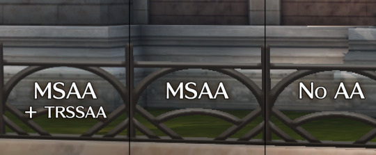
Before we move on to shading, there’s one thing I need to get off my chest. You know what really annoys me? When games offer some AA option, but do not apply that AA solution consistently to everything in the game (like e.g. character models in menus.) I had to extend the underlying engine to do it, but rest assured that when you select an AA option in Trails of Cold Steel on PC, everything will get that level of AA:
The main game rendering will be AA’d of course.
The rendered character dialogue portraits will also get the AA.
The character models shown on the equip screen? AA’d.
Character busts during special events? AA’d.
Yes, even the minimap rendering gets MSAA. And TrSSA. Because why not!
Oh, and there’s an anisotropic filtering option. It’s just a checkbox, because honestly, there’s no reason to bother with less than 16xAF for this game. Even the GPD Win can do it!
Shading
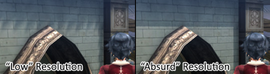
Now this is where things get even more interesting. There are four options related to the quality of dynamic shadows:
Shadow Resolution, which, as you’d expect, adjusts the resolution of the shadow maps all the way from “low” to “absurd”.
Shadow Casters, changing which objects cast shadows. Shadows are often enabled only selectively for performance reasons, with artists manually selecting which objects and characters are sufficiently “important” to cast shadows. This setting overrides that selection and makes every object in the scene cast a shadow.
Shadow Distance, which can increase the distance shadows are cast at. Ever annoyed by shadows appearing and disappearing a few meters in front of you? I know I am. Well, not on my watch.

Finally, Shadow Filtering enables softer and more aesthetically pleasing shadow transitions.
Even with these improved real-time shadows, the game’s environments still looked a bit flat. Since the environments, unlike the characters’ cel shading, are rendered and shaded in a more realistic style, I thought that a more realistic modern technique, namely ambient occlusion, might look good. With some engine improvements I was able to integrate HBAO+, one of the highest-quality and best-performing AO solutions available:

As you can see, it lends everything a lot more depth and plasticity, and also makes objects in the shadows appear more grounded.
Graphics
Last, but certainly not least, the “Graphics” options seem comparatively unexciting with just two checkboxes: and really, the High Quality Depth of Field setting just does what it says on the tin and while it’s a nice improvement, it’s nothing to write home about.
On the other hand, the Unlimited Draw Distance option is, and excuse me if I say so myself, a really big deal. In fact, doing something about the draw distance was one of the very first requests that came up when the first article was posted. What I’ve done about it is completely eliminate any form of pop-in, by making all objects and characters draw at any range. On some maps this is quite a significant extra CPU load, especially combined with full shadow casters, but nothing a modern Desktop PC can’t easily deal with.
Since pop-in is hard to demonstrate in images, I’ve made a video that really shows off the considerable effect of this option.
Other Improvements and Conclusion
In addition to these options, there are a few graphical improvements over the console version that are “always on” and don’t have a launcher option. For example, the glow effects are rendered at 4 times the fidelity, and uncompressed textures are used instead of the compressed assets designed for consoles wherever they were available.
I hope you’ll enjoy these graphical improvements as much as I enjoyed creating them and writing about them. In the final article, we’ll have a look at some non-graphical features, and one particular, somewhat programming-intensive graphical option that will make a few people really happy and which I never expected XSEED to go for. Till then!
#xseed games#xseed#xseed blog#the legend of heroes#trails of cold steel#guest post#durante#long post
134 notes
·
View notes
Video
youtube
Caricature Essentials by Court Jones
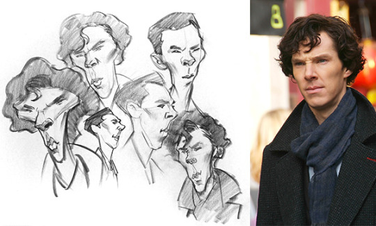
In the previous lessons, I covered the theory of exaggeration and the practical steps of creating caricature portraits. I demonstrated going from concept to finish using several different celebrity faces. In this lesson, we’ll review the whole process using actor Benedict Cumberbatch as our subject.
In order to draw Benadryl Cumbersnatch, I’m going quickly walk through the four basic steps of creating and refining a caricature: Thumbnail Sketch, Rough Sketch, the Abstraction, and Final Drawing. The purpose of breaking the caricature process into separate steps is so you can manage all the variables more easily, focusing on one goal at a time.
Step 1: The Thumbnail Sketch
What we call a “thumbnail sketch“, is a quick small drawing that explores the core concept of your exaggeration. It’s best to do several thumbnail sketches. Even if you think your first thumbnail sketch looks good, keep trying new iterations where you exaggerate the head in different or more extreme ways.
The thumbnail sketch typically takes two to three minutes. But don’t spend more than five minutes on any one sketch. If you do, you might get too attached to it and feel like you have to stick with that one concept rather than explore new original shapes. This stage is all about exaggeration and experimentation. Likeness and structure are not a priority yet. If you think too much about getting a perfect likeness in a thumbnail sketch, it will hold you back from making bold exaggeration choices. At this stage, go crazy. Stay loose and let the subject’s face and persona inspire you. If you think their head looks like an object or an animal, try to put some of that into your sketch. And if you get tired of drawing from one photo, try another photo or head angle. Sometimes a person’s likeness is more obvious from a particular angle or with a certain facial expression. In the case of Bellicose Camelback here, I opted for a look of intensity that almost borders on anger.
Step 2: The Rough Sketch
Select your favorite thumbnail concept sketch and use it to inspire the design of your rough sketch. But now, you need to focus on resolving the likeness and anatomy as best you can. You want to take from your thumbnail sketch what works, and leave behind what doesn’t. And if you feel you can exaggerate even more at this stage, go ahead and try. You can use some simple guidelines in your rough sketch to help align the shapes. But don’t worry too much about that just yet. We will fix any alignment or perspective errors in the next stage. For now, try to keep your rough sketch feeling organic and natural.

Remember, you still need to explore and be creative at this stage. The abstraction that we’ll do in the next step is where we really lock down the shapes and think more like a structural engineer designing the framework of a bridge or a house.
Step 3: The Abstraction
For this step, place a sheet of tracing paper over your rough sketch. The abstraction helps you determine where you made structural errors and where you can make additional improvements to the flow of the shapes. The reasoning behind this is that the simple lines of the Abstraction make it easier to see those errors than just looking at your rough sketch. The abstraction is a wireframe grid that represents your organic drawing.
The individual lines of the abstraction are called “rhythms” because they trace the landmarks of the face and body along a path – sort of like how rhythm in music establishes the structure and pace of the melody. I originally learned to use the abstraction in art school to start my portrait drawings or to make corrections to poorly constructed anatomy. But it works really well to help develop and fix caricatures too.

In the end, your abstraction drawing should be exactly what it sounds like: an abstract drawing! It won’t have much personality. Sometimes, you won’t see much of a likeness in the Abstraction. And other times you may. Either way, don’t worry. We’ll pull the likeness back out in the next step of the final drawing.
Step 4: The Final Drawing
For my personal tastes, I like to think of my goal here to be a realistically rendered and anatomically correct portrait which just happens to be caricatured. You may prefer to render in a more simple graphic or cartoony style. And that’s great. Be your own artist. But I like to include all the anatomical traits present in the photo, including bone structure, musculature, fat pads and the same realistic light and shadow. The only thing to have changed on Bandicoot Denimpatch here is the proportions and relationships of the features. When creating caricatures, my ultimate goal is usually to paint it either in oils, watercolors, or even digitally. So I don’t typically bring my pencil and charcoal drawings to an extremely high degree of finish or photo realism. I put just enough information in there to inform how to arrange my light and dark values in the painting. But if you want to create a highly finished looking pencil or charcoal drawing for yourself, you can invest as much time in it as you want, confident that you’re rendering a well-designed caricature.
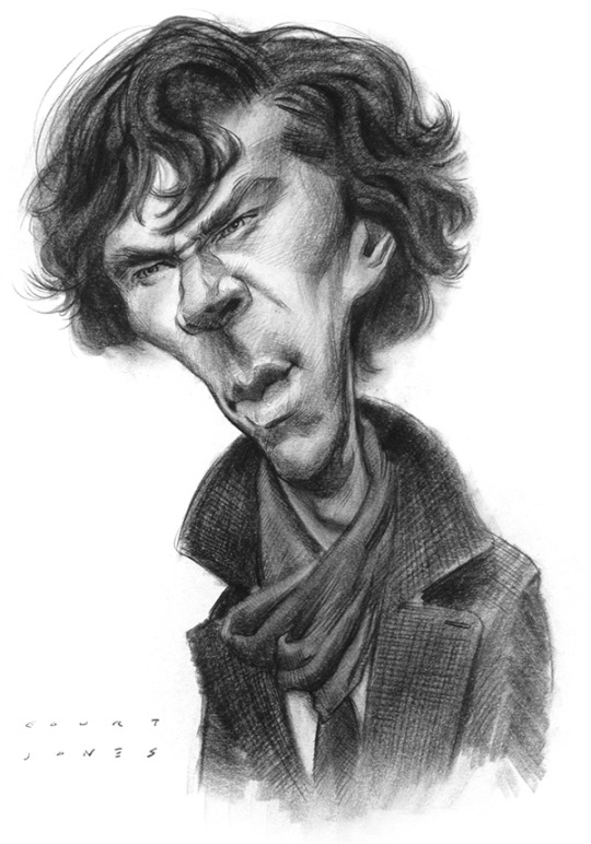
Now, I’ve said this before, in previous lessons, but I don’t always go through this entire step by step process when creating a caricature for a fine art piece or for illustration jobs. But it’s good to have a process to fall back on when you’re challenged with a difficult subject, find yourself lacking in inspiration or need help developing the exaggeration. There are some caricature artists out there who seem to be able to draw a fantastic sketch on the very first step. And sometimes, I even get lucky on my first sketch. But more often than not, I need to spend time refining the anatomy to get a better likeness and exaggeration. And that’s where these fundamental skills come into play.
Coming up is the second half of this series on the art of caricature. The lessons will cover more advanced caricature techniques. There will be exercises on how to push your exaggerations, how to be a better observer, how to solve difficult faces and even how to improve your style of drawing in general.
85 notes
·
View notes
Text
Top photo editor for PC to blur an image and photo batch processing
Crazy images are meant to capture the suchness of an item or even a collection over that, without exposing the overall backdrop all at once. To put it simply, they serve the purpose of producing unusual images from common subjects. That appearance should be accomplished by chopping a part of an or else normal photo or by taking near shots of things that leave the visitor asking yourself in admiration, certainly that the topic might be. And topics with designs or rep are terrific applicant for perfect pictures, such as in the picture of chopped vegetables listed below. Photo editor for PC performs possess a few of the functionalities is popular for, which comes very beneficial when you've picked you have actually like to try your hand on one thing much more high end than texts in photos as well as correction of brightness.
Photo editor for PC can additionally bring in freeze frames coming from video, aside from diverse data. And when you are actually really feeling a bit lazy or it is simply ordinary ignorant concerning just how to use a few of the devices, an assistant may support you adjustment the basics just like illumination, concentration, different colors, and sharpening of photos. For those who love their photos in wide scale editions, the program application supports you effortlessly produced pictures to generate a picturesque picture.
And when it is actually time to printing off your photography skills, you can choose among the graphic package design templates to automatically print all of them in a details measurement.
Convenient photo editor for PC
Brand new photo editor for PC for amateurs to simple crop a picture
This photo editor is actually well for enthusiastic students along with a great deal of opportunity in their workflow to determine the as well technological functions that would certainly fear away initial opportunity photo modifying users. It similarly come got ready with a 360 degrees view system. Most likely the glossiest gem in the bundle would certainly be the lovely skin layer effect, which does away with red spots and also evens out the skin layer hue. While there is actually no automatically color fixing alternative somewhat critical to repair the lousy lighting very most electronic cams drawback, there are actually the key features of draw in photos.
Either the most misunderstood components of digital photography is what takes place after you take the photograph as a matter of fact modifying your picture. That's the time where you edit the pictures you have taken, to produce the final product. Editing your photos is the equivalent of the darkroom from the time very long time back. We are going to be discuss some ideas for editing and enhancing your images, from the fundamentals like warp photos and also colorize photo, with a lot more difficult actions.
The crop item enables you to transform the dimension of your image, as well as also to change the facet ratio. As an example, you can chop a picture from a rectangle-shaped form to a triangle shape. There are many reasons you would desire to crop, including for posting in different layouts and also facet relations. Contrasted to the initial, I have actually chopped the image with photo editor for PC to remove the colored component of the right-hand side of the picture and also recomposed making use of the rule of one-third. It makes the lightning bolt much more the emphasis of photo shot. You might wonder why I did not just compose appropriately when taking the picture. So in this case, I was actually organizing an extensive presence shot without needing a cam stand, so had the electronic camera stabilized on the side of the sidewalk for security. That extremely much restricted my capacity to completely frame the moment, so I simply photoshoot bigger, knowing I had the ability to chop the photo shot appropriately as a result of the reality. In this both cases, chopping is very simple and also it is just involves you selecting the crop tool and afterwards choosing the location you desire to maintain with your computer mouse. After that you use the changes as well as your brand-new cropped image is prepared to go.
Photo editor for PC for novice and pros for practical scale an image or easy photo orientation
Whenever the horizon band in an image is certainly not degree, a specific of my own scratch inconveniences in photography is. Occasionally whenever we are captured up in the second, this fundamental guideline is forgotten however the bright side is such modifying your pictures with the photo editor to make them degree is also really manageable.
Leveling the camera on the corner of the pier indicated that the picture was not level this is especially visible to the vision when the picture has a clearly defined perspective line, like the ocean.
This leveling item becomes part of the cropping method, and also you can easily simply rotate the picture to match. As soon as you utilize the pointing tool, a grate can appear to help you become the placement correct.
Focusing an image is a truly basic task that will certainly take simply a number of ticking, leading to a far more aesthetically pleasing picture.
From time to time if we make a photo, parts of the photo might just wind up being normally gloomier than we desire. I refer to the brighter areas of the photo as shadows, and the intense spots of the photo as highlights.
Contrast has to do with accentuating the difference between the lighting and darker parts of the picture. Raising the contrast of a photo can drastically improve the graphical effect in which has, by making the boundaries between those light as well as dark areas clearer.
Color modification is one other useful component of the photo editor. You can change photograph color in all kind of ways, starting with changing the whole warmth of the image such as exactly how red or green it shows up, to separately changing the shade and also interpenetration of certain shades within an image. We only intend to go over a few really useful color scheme modifications you can easily use to make your pictures simply a bit a lot more aesthetically amazing. The most effective technique to adjust the color in regard to a photograph is definitely with the hue method from the photo editor. That adjusts the appearance of any shade within a photograph to produce it extra or even less condensed. As with numerous styles, the key is to get a great harmony too much shading the photos often tends to look instead not naturally made. Color pictures can easily be really useful, and also of program black as well as light is a fantastic option for almost all type of situations, particularly, portraits, and specific panorama pictures.
Scale pictures is easy with the photo editor for PC
Photo editor for photographers for easy resize images or professional selective color change. Get more information about Photo editor for PC to very easy photos gradation and functional invert pictures. In certain cases there certainly can be a single thing in an image that you absolutely do not desire to be certainly, there, just like an annoying acne breakout on anyone's forehead. This is simple to get rid of in all the significant photo editor.
It is normally uncomplicated to get rid of any sort of things out of a picture however the photo editor functions most ideal on distinctive, small objects that are bordered by uniform color schemes. This is since the heal device has to replace the area you want to remove with something else, and this works finest when it has an area close by that looks comparable. So for example, a red point on a face is bordered by a great deal of likewise colored skin, so the recover device can conveniently determine what to replace the dark spot based upon the surrounding location.
This specific is for the photo editor for PC needs to change out the area you want to remove along with another thing, and that works most ideal if it has a sector nearby that looks the same. Photo editor has become very complex as well as helpful and it is feasible to manipulate images so they turn into completely different out of the initial. There are definitely loads of photo editor for PC and plenty of means of getting the exact same or very similar end results.
My intent very most for a lot of photos I post procedure is definitely to make all of them appear as natural as you possibly can. I have no doubt this is a good point to make a beginning, even if you wish to continue on and also produce even more surreal looking pictures. Shade array in a picture is generally one of the most important priorities. The human eyes are able to usually see a wider range of shade than your cam can record.
The meaning of image editing and enhancing is the process of changing an image, put simply. Yet this is oversimplifying a case which is more or less complex. You can typically carry out simple picture editing and enhancing strategies such as sharpening rather conveniently and promptly but complicated techniques and digital editing may need photo editor as well as more years of experience.
Photo editor is a helper which anyone can use to adjust and beautify images. Due to the fact that images come with a boosting variety of usages, increased firms are discovering techniques to reutilize pictures as well as utilize them on different media.
0 notes
Text
Sharpen an image with the simple to use best photo editor
Smart saturate a picture with a best photo editor for starters to draw in photos
You need a lot of imagination and also a proficiency of some of the greatest photo editing and enhancing software on call somewhere.
Best photo editor does possess a few of the components is prominent for, which happens quite useful when you have actually chosen you've like to try your hand on something much more trendy than beauty retouching and also lens correction.
Best photo editor can easily additionally import screenshots from video clip clips, alongside different reports. As well as when you're really feeling a little lazy or even it is actually only ordinary oblivious concerning just how to take advantage of a few of the resources, a helper may support you improvement the basics like illumination, focus, color, and rotation of photos. For this people who love their images in wide scale editions, the software assists you faultlessly created images to make a scenic picture.
And if it is actually time to unveil off your photography skills, you can choice amongst the graphic package design templates to right away print them in a particular measurement. Discover more about brighten pictures with the best photo editor download or powerful photo editor for amateurs to practical rotate a picture or uncomplicated photographic effects. Best photo editor for functional photo contrast or easy crop pictures. Download best photo editor for pros or software edit photo to blur a photo and create a photo montage.
Intelligent enhance pictures with a best photo editor
Best photo editor for starters and photographers with many great functions
This best photo editor is actually most effectively for anxious learners along with a lot of time in their manpower to identify the too technological components that would discourage quite initial time photograph changing consumers. It also comes suited up along with a 360 panorama plan. Perhaps the glossiest jewel in the plan would certainly be actually the gorgeous skin layer impact, which gets rid of reddish spots as well as evens out the skin. As there's no self-regulating shade fixing substitute pretty vital to repair service the poor lighting up very most digital camera catch, there are actually still the standard functions of cropping a photo. Either the most well-known misunderstood components of digital photography is what takes place once you made the photo shot in fact editing your photos. That is the moment where you edit the images you have taken, to develop the end product. Modifying your pictures is the matching of the room dark from the time very long time ago. We are going to be discuss some suggestions for modifying your photos, from the essentials like text in photo and also cropping a photo, through extra challenging actions.
The crop tool enables you to transform the dimension of your picture, as well as additionally to change the element ratio. For instance, you can cut out a photo from a rectangular form to a round form. There are many factors you would intend to cut out, consisting of for publishing in various layouts and also aspect ratios. Contrasted to the original, I have cropped the image with best photo editor to get rid of the shining component of the middle of the photo and reassembled using the regulation of one-third. This makes the lightning bolt much more the focus of photo shot. When taking the picture, you might ask yourself why I did not just make up effectively. So in this case, I was arranging a long exposure photo shooting with no a cam stand, so had actually the electronic camera stabilized on the side of the pier for stability. That significantly limited my ability to perfectly frame the minute, so I simply shot broader, understanding I had to be able to crop the photo properly as a result of the truth. In this both situations, chopping is very simple and also it is just includes you choosing the cropping item and also after that choosing the location you intend to maintain with your mouse. You use the changes as well as your brand-new chopped image is ready to go. In this moment when I was looking for an easy photo editor, all over sudden I tripped over this really impressive app download. Additional reading to invert a picture and photos gradation with the photo editor download and very easy best photo editor for PC and experienced for comfortable colorize images. Best photo editor best photo editor for professionals or software to edit a picture to cut an image or warp photos. Download best photo editor for amateurs or software to edit an image to improve images or photo light reflex effects.
Blur a picture and print a photo is very easy with the best photo editor and edit pictures software free download
One of my own personal casual annoyances in taking photos is if the perspective boundary in a picture is uneven. Often whenever we are captured up in the minute, this essential regulation is failed to remember but the bright side is such enhancing your images with the photo editor to make them grade is likewise extremely simple.
Leveling the video camera on the edge of the boat dock suggested that the photo was uneven this is particularly notable to the sight if the picture has actually a plainly identified horizon line, such as the ocean. The degree technique becomes part of the cut out tool, and also you can simply turn the image to fit. When you use the degree method, a grate can show up to assist you become the positioning right. Regularize a picture is a really basic task that will get simply a few moments, resulting in a far more aesthetically charming photo. Occasionally while we make a picture, sections of the picture might finish up being actually darker than we want. I refer to the gloomy locations of the photo as darkness, and also the intense locations of the image as highlights. Comparison has to do with accentuating the variation between the brightness and also dark sections of the photo. Raising the variance of a photo can considerably enhance the visual impact that had, by making the borders in between these light as well as dark areas clearer. Coloring adjustment is yet another useful item related to the photo editor. You are able to readjust image color or texture in all kind of ways, from changing the overall charm of the photograph like just how blue and yellow it looks, to separately altering the tone as well as saturation of certain colorings inside of an image.
I only would like to deal with a few extremely helpful color scheme changes you may make use of to create your photography just a little bit a lot more creatively highly effective. The fastest means to regulate the different colors in regard to a picture is with the saturation technique of the photo editor. This modifies the appeal of every single color scheme within a photo to generate it much more or much less saturated.
Just like many modify, the key is actually to find a great equilibrium as well much saturating the pictures have a tendency to look instead unusual. Shading photography may be extremely efficient, and obviously light as well as dark is a fantastic decision for every type of situations, particularly, portraits, as well as particular garden scenes. Check this best photo editor free download for novice and pros with many awesome features or brand new photo editor for PC for experts for powerful crop an image and comfortable correction of contrast. Smart scale a picture with a photo editor for pros to photo effect brush. Download free this photo editor for fast and easy enhance images.
Easy to understand photo editor for PC to invert an image or very easy texts in photos. Read more about improve images is uncomplicated with the best photo editor. Occasionally there certainly may be a single thing in an image that you absolutely do just not want to exist, such as a troublesome furuncle on another person's nose. This is simple to clear away in all of the major best photo editor. It is normally easy to clear away any things out of a photo yet the best photo editor performs very well on distinctive, very small things that are probably bordered by the same colorations. This is because the recover device has to change the area you desire to erase with something else, and this functions finest when it has a location nearby that looks comparable. For instance, bright spot on a face is surrounded by a great deal of likewise tinted skin, so the heal tool can quickly determine what to replace the dark spot based on the surrounding location. This specific is simply for the best photo editor has to replace the area you wish to get rid of along with another thing, as well as that works most effective if it has a sector nearby that seems much the same. Best photo editor has actually turned into extremely intricate and also impressive and it is possible to manipulate photos so they become completely different out of the initial. There certainly are loads of best photo editor and wide varieties of ways of accomplishing the very same or very much the same outcomes.
The intent very most when it comes to many pictures I publish process is to produce all of them seem as all-natural as feasible. I strongly believe this is an exceptional point to make a beginning, even in case you intend to go on and create even more unique seeming photos.
Shade range on a photo is generally one of the key problems. The human eyes have the ability to typically see a broader range of shade than the cam most likely shot.
The meaning of photo editing is the process of changing a picture, basically. Yet this is simplifying a problem that is fairly difficult.
You can typically perform basic photo editing methods just like photo orientation relatively conveniently as well as rapidly but complex methods and digital modifying may call for photo editor as well as even more know-how.
Best photo editor is a tool that you able to work with to control and beautify photos. Because photos contain an increasing variety of usages, even more companies are discovering ways to reutilize pictures and also utilize them on many ways. Download the best photo editor and new best photo editor for PC to saturate images. Best photo editor or editing photo software to invert pictures and photo effects. Get the best photo editor for prompt and smart blur pictures.
0 notes
Text
Best WordPress Video Portfolio Themes | Templified
New Post has been published on https://templified.com/10-of-the-best-wordpress-video-portfolio-themes/
Best WordPress Video Portfolio Themes
Video is enormously popular and it is becoming bigger every single moment. Websites like YouTube have not been around that long, Vimeo much less, but they are hugely popular with millions of page views daily and enormous amounts of articles being made continuously. To your site to profit within the action, you will want a wonderful WordPress movie theme that will assist you begin. We have discovered a whole lot of amazing WordPress themes you are going to absolutely adore.
WordPress is obviously a Wonderful blogging platform but occasionally people Forget how successful it may be as a movie blogging setup. If you would like to construct a creative, engaging movie portfolio to flaunt everything you have created, if you’d like a beautiful website for motion images, film or video productions, 3d and special effects, this is the place to be. As a result of WordPress’ capacity to expand with addons and plugins, there is practically nothing WordPress can not do. You wish to construct a website where people can talk about their own videos?
However, where do you begin to find the ideal movie WordPress theme? You will find tens of thousands available and Choosing the Proper one could be difficult. Have Zero effort, we have gone out and found that the absolute best Themes for movie, movie, motion graphics and animation also. Every theme Size your audiences decide to get your website. The Great Majority of These themes permit you to upload or host videos, based on your preferences. We have tried to Locate a Great Deal of themes which can be BuddyPress Ready also, which means that you may construct an entire community . And What about membership performance? That is certainly possible with paywall. So, Regardless of What your requirements are, we are expecting to find some Incredible themes that flawlessly do the job for whatever it’s that you want.
SOHO
SOHO is a fantastic looking full display creative photography and movie portfolio theme. SOHO has a lot of unique facets, some conventional and some fairly radically new. SOHO has a complete screen slider, so you can add background pictures or movie into your webpage, you will find gallery records, masonry grid portfolios, an appealing ribbon gallery, there is the portrait format, that can be intriguing, and a complete display website. Even the SOHO theme is strong, it is translation ready, font and color management are extremely straightforward. SOHO has sold more than 3,000 times, demonstrating to it’s popularity. Support and support are extremely large quality together with all the SOHO theme.
Demo More Information Get Hosting
Viseo
Viseo is a highly admired WordPress theme for podcasts, for internet series and amusement. So many people nowadays are getting into podcasting, while it’s video or audio based, the format is becoming huge and you will see that because this Viseo theme was downloaded over 600 days up to now. If you want to get in the action and discuss programming concerning what interests you, then Viseo might be a fantastic theme to assist you started. Obviously, Viseo is simple to use, to personalize and all this, but let us discuss the important things. Podcasts. Using Viseo, you are able to host audio or video files everywhere, you can lock them behind paywalls should you opt for accept payments throughout the eCommerce section and also a great deal more.
Demo More Information Get Hosting
Divi
I have seen Divi utilized in about as many ways as possible however, as a movie portfolio, it truly shines. Video is critical, it can help to get info into our brains much faster than every other sense plus a site which simplifies the ability of movie is a lot more likely to draw and retain our focus than a site which does not. Together with Divi, from Elegant Themes, you will have one of the best themes available on the marketplace with plenty of features and flexibility, fantastic service also. There are hundreds and hundreds of men and women in the Divi community, so a number working to create this theme better daily and that absolute quantity of work actually translates to a fantastic experience for the reader and blogger. For more portfolio WordPress themes, try our collection. You’re definitely going to find something you enjoy there.
Demo More Information Get Hosting
Empire
MoonBear Themes has upped their ante with the debut of the Empire Theme. This theme boasts a tasteful yet simple twist on the favourite portfolio website design for musicians, photographers, illustrators, and other people from the artistic place. The theme’s founders supposed the theme for minimal panel or WordPress dashboard management. It is their goal for the end consumer to concentrate more on their craft and permit the website do the task when showcasing their art.
As an end user, all you have got to do is kind your site posts and upload your own photos of your art along with the theme will automatically produce sliders and layout grids to exhibit them.
The Empire Theme comprises a minimalist design which can suit many creative individuals because it provides them free reign to the development of an online page which reflects their personal brand or business. The Empire Theme can also be the WordPress video theme in case you need to reveal more of your own content. Other features included in the theme are: entirely purely absolutely responsive design, retina display ready, constructed in Ajax contact kinds, prebuilt 404 pages, css3 cartoons, along with FontAwesome icon sets. Check out some more WordPress minimalist themes.
Demo More Information Get Hosting
Benson
Benson was initially conceived as a direct upward photography portfolio, however, the layout is really good with landscape oriented pictures, I thought I would include it in this group. CSSIgniter consistently does a fantastic job in designing their own themes, the code, the real design, they are all quite carefully crafted to find a good outcome.
Demo More Information Get Hosting
Materialism
Tesla Themes’ Materialism is a superb theme for utilizing promotional videos to improve focus on your projects. In reality, it is not only a booster, it is a rocket ship going directly to the Moon! What is materialism, you inquire? Materialism is a design that is somewhat like flat style or minimalist design, however there are usually very, very modest drop shadows supporting components. The appearance and layout remains clean, but there is that hint of darkness. Anyhow, this substance design theme enables you to utilize video to promote your own projects or products.
Demo More Information Get Hosting
Vignette
My first love on earth was constantly video and film, at least regarding creative pursuits. That is why I am always so eager to review a brand new video theme which has as many features and a gorgeous fashion since the Vignette WordPress theme has. Vignette is very good for photographers, models and videographers, there is a flexible homepage design that provides you as many options and choices as you may desire, you will find four distinct kinds of designs for every picture or movie gallery. Which permits you to show your content in a exceptional manner that perfectly matches what you imagine. Vignette service’s jetpack, a strong and free plugin that functions for wordpress.com users that need intense levels of personalization, to Monitor and analyze web visitors, who wish to exhibit mobile friendly articles and include a good deal of high performance resources to make their site work flawlessly. This SEO optimized theme includes premium excellent support, regular updates and click 10 of this data import.
If you have been searching for quite a professional and flexible WordPress theme to flaunt your videos, then this Vignette theme is a really good alternative. Vignette is a responsive portfolio theme which may help present your articles in a professional way. Vignette includes a flexible homepage design that may either display a featured picture or featured movie. Alternatives, for to pick from in total, and all your picture or movie galleries will look amazing. You can customize almost anything you need to with this WordPress theme and also the custom widgets assist your page load speedily. Using a strong admin panel, you also have total control over all aspects of your site.
Demo More Information Get Hosting
VLog
With over 3000 sales up to now and I almost perfect score of 4.95, this is one of the hottest video website themes out there. It is ideal for movie tutorials, sharing viral movies and movie blogging too. This template is totally harmonious with all the Neo, Dailymotion in addition to YouTube. If you wish to share video which you host yourself, then that is definitely a possibility too. I believe the log might be a gorgeous site for video podcasts, even though it would do the job just as nicely with podcasts. There are 200 different article designs the theme is optimized for Speed also it’s a wise and flexible template that I believe is absolutely worth thought.
Demo More Information Get Hosting
Direkuta
Demo More Information Get Hosting
0 notes
Text
Kingdom of Decay - Chapter 3
Reposting bc it was redirecting to the wrong blog lol
Also available on Ao3. Like my work? Support me on Ko-Fi!
Chapter 1 | Chapter 2
Chapter 3: Amaranthus
Even during summer, when the sun dips behind the horizon, the air grows chilly. One would catch their death of the cold if unprepared. Indeed, even festooned under her cloak with a bedroll and a blanket, Amara shivers, finding sleep hard to come by as the cold assaults her body.
‘Can we please build a fire?’ she asks through chattering teeth.
Addenus shakes his head, looking at complete ease with the unfortunate weather. ‘Draw too much attention. This place is called the Red Rivers Crossing for a reason.’
Amara sits up but remains in her cocoon. ‘What reason?’
‘Monsters.’
The wind picks up. The icy breeze caresses Amara’s cheek. She cringes against the unwelcome sensation.
‘You’re not going to elaborate?’
‘Wouldn’t wish to sabotage your sleep, Princess. And you will need it.’
‘I think it’s safe to say its already sabotaged.’
‘Just a jest, Princess-but make no mistake, the woods are dangerous. Come with me.’
Intrigued, she follows Addenus further into the woods. Though human, he has no trouble navigating the smothering dark forest, dodging trees and ducking underneath low-hanging branches with grace. Before long, she hears the unmistakable sound of running water. Soon they come into a clearing. A large body of water, some 50 feet across, has cut a path through the forests. It isn’t until she stands at the edge of the bank she sees the deep crimson hue of its currents.
‘Red…red water? How?’
Addenus stoops down to pick up on of the plants growing along the rivers bank. He holds up what looks like a flower–numerous small petals folded on one another leading upwards to form a stalk, in a deep burgundy hue.
‘You know what this is?’
She cocks her head. Familiarity rushes through her, and a name pops into her mind. ‘Amaranthus…’
He twirls the stem between his fingers. ‘ “Undying…” safe to say the river is picking up the pigment from these flowers growing around it. Since the Amaranthus’ never wilts it has a constant supply of them…the river always runs red.
‘ “Undying” ‘, Amara repeats to herself. ‘Nothing is undying.’
‘The Amaranthus is. And maybe the Princess named after it will be.’ Addenus offers her the flower with a small smile.
‘I doubt that very much.’ she mutters, but she takes it all the same.
‘Oh, you will die given time. But your name, and your deeds and influence can survive past the grave. It all depends on how you act in life.’
She stares into the flowers depths. Trying to imagine what kind of legacy she would leave on the world. For a moment, she thinks she sees something–a flash, two people, boy and girl the exact opposites of each other, like fire and ice. It vanishes as Addenus claps her on the shoulder.
‘Let’s get back to camp. You should rest.’
Addenus starts a fire, leaving her comfortable enough for sleep to find her.
When Amara wakes, she wakes alone in a strange unfamiliar place. Instead of finding herself beneath star and leaf, she finds herself surrounded by stone walls. The room is entirely empty, and dark. Even her eyes find it difficult to penetrate the yawning abyss ahead of her.
Then, a light, flickering and blood red. It swallows the dark around it, allowing her to see what lies ahead of her. A single sword of a dark grey hue and a finely made handle. Metal twisting upwards around the dark red gems running up along the handle to the hilt. Another, far larger gem makes up its pommel. Small runes occasional flash in red along the blade.
‘You answered my call…’ Amara starts when she hears the voice. It is not a single voice, but multiple, one dark and raspy, the other light and alluring, like two sides of the same coin.
‘Sanguine?’
‘Your family and I have been one for generations. It is your turn to shoulder the burden…but are you ready?’
‘What do I have to do?’ she asks.
A low chuckle resides in her head. ‘First, survive. Then, we shall see.’
A hand of shadow clasps around the handle and swings the sword, testing its weight and balance. From out the darkness steps a woman clad in fine armour that almost matches the design of Sanguine–dark, but glowing with runes and a single red gem in the centre of the chestplate. The woman has long black locks, violet eyes and tapered ears. Amara gasps as she beholds the form that appears to be an older, stronger version of her, wreathed in a red and black miasma.
She holds Sanguine to the exposed skin of her left forearm. Amara cringes as the blade is drawn down, cutting through the skin. Instead of dripping down to the ground, the blood coalesces on the blade, manifesting as brightly burning flames that flicker a deep crimson colour.
Amara stumbles back in horror, tripping over her own feet. She crawls backwards, her palms scraping against the rough stone as she drags herself away. The wrath rushes forward, and plunges Sanguine deep into her heart. She feels the blade cut through skin, flesh, bone and eventually tissue. The flames lick at her sundered skin, cauterizing the wound as it cuts. The blazing inferno seems to surround her in flame, drawing out of her a feral scream as she lays in the gripes of agony so unreal she scarcely believes it.
When she jolts awake at the camp she is still screaming, until the pain subsides. Desperately, she claws at the fastening of her shirt, fingernail scrabbling at the skin between her breasts in her panicked struggle. There is no sign of scar or injury. Her body sags in relief, but her mind is still fraught with worry and her heart doesn’t slow it’s chaotic rhythm. She meets the gaze of Addenus the other sight of the campfire, as he attempts to stoke the embers back into life. He doesn’t seem surprised or curious at her frightful outburst, instead regarding her with sympathy.
‘You met Sanguine?’
She nods. The fire springs back to life. Amara jumps back, remembering all too well the agonising heat as it consumed her heart.
‘He can be…intense.’ Addenus winces.
‘It wasn’t just him…’ Amara swallows. ‘There was…someone else.’
‘Someone else…who?’
‘Myself, I think. Only much older. Stronger. I was wielding Sanguine. I…she stabbed me…’
Her fingers trailed the skin between her breasts, where the blade cut. Addenus crinkles his brow in confusion with a hum as he considers her words. ‘Curious. I don’t believe anyone else had had such a dream. It has always just been Sanguine, and Sanguine alone. You say this…other you wielded Sanguine?’
Amara nods. ‘Stabbed me straight through my heart.’
‘Curious indeed. We should head for the Order post-haste. Perhaps we can ask him directly when we get there.’ Addenus rummages through his bag and tosses her an apple. ‘Here. Break your fast and walk. I would like to get there today.’
Amara’s entire body quakes with exhaustion as they mount the final step leading up the order. Standing tall and proud at the apex of the mountain is a square building hewn from obsidian stone. Braziers flank the large metal doorway which bears a sword pointing groundward wreathed in flames. There are no visible handles or door knockers on its surface.
Addenus steps forward, producing a small dagger. Her slices open his palm, and places it on the the metal. The blood stretched across the surface, coating the carving of the flaming blade. With a grinding groan, a seam appears in the middle of the door. The two halves part and swing inwards into the dim lit exterior. They close and reseal behind them, erasing all evidence of the split. Amara turns to face the interior. High windows allow what little light is left of the day to filter through, bathing the stone interior in the hues of sundown. The entryway splits into three identical corridors, two to either side and one straight ahead. Addenus leads Amara down the centre path, ending at a door which looks like an exact replica of the entrance, only on a smaller scale bearing less extravagance and an actual handle. Addenus raises his fist and raps on the door thrice.
‘Enter,’ a stiff and nasally voice responds.
Addenus opens the door, revealing a large study room that is the picture of organised chaos. Piles of books and parchments are stacked on nearly every available surface, some even on the floor. Nearly every wall is covered by full bookcases, or well stocked cabinets of weapons and several pieces of well-kempt armour, or shelves littered with vials, bottles, more paper, small framed portraits and other suck knick-knacks.
Sat in a plush armchair behind a huge mahogany desk sits a middle-aged elf, his hair more salt than pepper, his wrinkled face devoid of any sort of facial hair. Dressed in a black coat with shiny gold buttons, and writing unimpeded by the large and numerous rings on his fingers, he looks every bit the noble. He even carries himself with grace as he sets aside the quill to regard the both of them.
‘Addenus…Mistress Darcelle, a pleasure. Your uncle is a formidable fighter. I hope you also have the skill, but with a touch more self-reflection.’ His thin lips stretch into a smile that doesn’t quite reach his eyes. ‘Jedrek Blackclaw, at your service. Well, now you have arrived we should set you up with accommodations…I trust it has been a pleasant journey?’
‘Uneventful, but tiring,’ Addenus says.
Amara, now in a strange place with exciting yet terrifying prospects, finds herself quite awake.
‘Of course. Show the young Lady to the quarters, then you may retire. We’ll start with the induction in the morrow.’
Addenus stuffly bows. ‘Of course. Come on, young Princess.’
‘Induction?’ Amara asks fearfully as she follows him through the halls, back to the entrance then steering to the right.
‘It’s nothing. Just a lot of talking, and swearing oaths. Boring, political stuff. The exciting stuff happens later. Training, fighting…you’ll love it.’
Amara is less convinced, but she deigns not to argue. They pass many doors. She hears clashings of steel behind one, others voices talking and laughing, but she sees no one else out and about.
Eventually, they stop at a single door, in a private alcove away from the activity she heard earlier.
‘This is you. The Darcelle room your Uncle was using.’
‘Am I ok to use this?’
‘Of course. We figured you’d like some taste of home for your stay. Sleep tight.’
Amaranthe tiptoes into the room–a moderately sized chamber quaintly furnished with a simple queen-sized bed, an armoire, nightstand and a window seat, a shelf on either side holding a handful of books.
Amara kneels on the window seat, reaching for the shelf, and adds her dog-eared copy Of Monsters and Men to the meagre selection. The book barely reaches the surface before she pulls it into her lap and opens it. The lettering on the pages is barely legible, but enough so to rouse her memories of reading it through countless times. She recounts the tale in perfect accuracy, until nodding off where she sits. The book falls to the floor, but doesn’t reach it. It remains suspended an inch off the ground. Curious, Amara reaches for it. The pages turn as though caught in the ire of a gale, stopping at the midpoint of the book. An illustration depicts a helmeted knight holding up a familiar sword–one with a dark blade and jewel encrusted hilt. She turns the page. No words, but a drawing of a dark stormy landed shrouded in mist. The mist parts, revealing a dark castle that fills her gut with dread. From behind the foreboding spires, a monster emerges: sickly green tentacles wrapping around the building.
The book falls from her grasp she she retreats from it. It lands with a loud thump.
The sound starts her. She wakes on the window seat to complete darkness. Her eyes eventually adjust to the absence of light.
Amara retrieves the book which fell from her grasp. No strange, moving illustrations. Just words. She slots it onto one of the shelves and walks to bed. She passes by a window as she does, and spots a figures from the corner of her eye, Looking down to the ground below, she sees her Uncle in passionate talks with Jedrek.
Jedrek strikes a blow to her Uncles face. Amara flinches as she hears the sound from her window. He staggers, holding a hand to his bloodied mouth. One foot is put forward, as though he intends to retaliate, but he freezes. Then his head angles upwards.
With a gasp Amara jumps to the side out of the pane, back against the stone. She wonders if she moved quickly enough. Peeking around the corner, there is nothing but an empty courtyard.
#kingdom of decay#kingdom of decay chapter 3#amaranthe darcelle#dnd#d&d#writing#my writing#cos#curse of strahd
0 notes
Link
FULL DISCLOSURE: As an adult, I’ve only ever really invested in one piece of non-comics art, a painting (Psychedelic Self-Portrait, 2012) by Aline Kominsky-Crumb, the self-described “grandmother” of autobiographical comics. Those who have read her stories know that Kominsky-Crumb spent parts of her early life grappling with an artistic interest and ambition that was at times encouraged and at other times stifled by those — family, lovers, handsy male art professors — around her. While Kominsky-Crumb ultimately found her calling in the wildly confessional, wryly self-deprecating, and always entertaining comics that have been collected, in part, in her book Love That Bunch, her fine arts sensibility — and especially her investment in portraiture — is never far outside the picture.
Kominsky-Crumb’s characters and settings, drawn in an expressive style as willfully intense as the sometimes shocking, often boundary-pushing content of her work, are studies in the contradictions that make up individual inner lives. Her alter egos’ moods fluctuate, from deep self-loathing to keen self-admiration to an assortment of anxious and unanxious states in between. The Bunch (her most often recurring alter ego) takes care of her body’s appearance, but, she wonders in front of hand-drawn mirrors, does this make her overly obsessed and superficial? Her protagonists worry about what others think, but they are also often pictured in flagrante delicto (popping a zit; joyfully being mounted by a husband; seething at a mother or even, though far less frequently, at a young daughter). For me, as for the many who have been captivated by Kominsky-Crumb’s work, the attraction is in the exposure, in the ways her comics get readers to think in new ways about common themes and subjects — sex, love, money, family, trauma, work, aging, motherhood — that are so often represented in tired, masking clichés.
On a sunny day in early May 2018, I called Kominsky-Crumb from my Brooklyn, New York, apartment to speak to her at her friend’s house in the desert in Tucson, Arizona, where she was staying on a brief four-day break from her book tour. Since the 1990s, she has been living, with her husband and earlier also with their daughter, in France.
¤
TAHNEER OKSMAN: I want to start by asking you how this expanded 2018 edition of your 1990 collection Love That Bunch came about. It’s a large hardcover. The design is careful and beautiful. Can you tell me the story of how it happened?
ALINE KOMINSKY-CRUMB: I ran into Peggy Burns at the Angoulême Comics Festival a few years back. We had a drink together, and she said to me, “I’ve just become the editor at Drawn & Quarterly, and one of the things I really want to do is a book of your work.” I said, “If you do it, I’ll do a new, long story for it too.” I did a new cover and endpapers, and I really got excited about it. It’s such a nice version of my work. And I’m old enough now to appreciate the attention.
I was very taken by the cover image of the book, a portrait which is a lot less expressionist than your comics. It looks more like a painting than a cartoon version of you. Why did you decide on that cover?
It’s because that’s who I am now. I’ve been teaching yoga for 25 years, and I have a very different feeling about my body, myself. A different self-image. And that cover reflects who I am now. I felt like, how can I draw what I was 30 years ago, or 40 years ago? I am that person but I’m an evolved, different version of that.
Reading the book from start to finish (which involved a lot of rereading of pieces you had published in different contexts and over three or four decades), I was struck by how many of the themes persisted throughout those years. I was also struck by how often the Bunch’s childhood seemed to come up again and again in different iterations. Why do you think these themes have stayed relevant in your work over time? How does it feel to look back on this body of work?
This collection seems very complete. I feel a great sense of relief that it exists. It covers a lot of territory, and it’s a good representation of my career as a cartoonist.
It’s not like there’s a direct evolutionary line. It goes all over the place, and keeps going back to things. There’s a period of time where you feel better, a period where you feel worse. Where you’re fatter, where you’re not in touch with your body, where you’re drinking too much, doing too many drugs, whatever it is. And I think the work reflects those different periods, but I think there’s a general trend toward fulfillment and self-awareness. Some of the early images are really out there — I was so crazy then, I was just trying to rebel against my upbringing completely. I had so much pain and so much anger. Those stories are very painful, very anger-driven. Some of the later stories are not quite so full of venom as the earlier work.
I was wondering too about how that notorious “monster” image of Blabette — the character who represents your mother — was included in this blown-up version in the index. I’ve heard you talk in the past about how that image caused you some trouble when your mother saw it.
That was the book designer’s decision, but I said it was okay because it was a very significant image in my early years. Now I get along great with my mother. She’s 90, and she’s really a character. I’ve developed a lot of compassion for her, thinking and realizing what she went through as a young mother with a pathological husband who was a liar and criminal. And she was 19 when I was born. Having been a mother and having lived a lot longer than when I first wrote those stories about her, I have much more compassion.
She also had a second husband, after my father died, and she took care of him when he was very old. She was such a wonderful caretaker that I think she evolved because of that, and I think I saw her differently after that, how much compassion she had. It made me love her and accept her so much more. And now we get along great — we enjoy each other and we have fun together. I spent February with her in Miami, Florida. We went to the gym together; we did yoga together. She schlepped to the Everglades with me to look at wild animals, which she never does. We went shopping together and we had lots of dinners with friends and family. I really had a good time.
I was interested in some of your depictions of motherhood in your comics — both the ways you depict Blabette and seeing the Bunch as a mother. I’m a new-ish mother, and it still seems rare today — though a lot less so — to get accurate and genuine depictions of some of the negative emotions and experiences involved in motherhood. How do you think being a mother affected your relationship to your work?
Robert and I both being egotistical artists, both of us felt like we were doing much more childcare than we should and neither of us felt like we had enough time to work. It was the worst that we’d ever gotten along in our whole relationship. We kind of hated each other during that early time.
And the thing that was the hardest for me, and sent me into years of therapy, was that my love for her, which was overwhelming, was painful instead of pleasurable. I couldn’t deal with that and so I went into therapy and what I finally realized, which was pretty obvious, is that I didn’t feel that from my mother. When I felt so much love for my daughter, I guess I realized I didn’t get that from my mother. So it made me feel pain rather than pleasure. And I worked on that a lot.
I think I was able to become a better mother as time went on, but in the early stages it was very difficult for me. I loved her so much — I felt like my heart had been moved to the outside of my body, and it could be pierced so easily by anything. I have never felt so vulnerable in my life as when she was a baby. It was the most overwhelming thing I’ve ever experienced. My pregnancy was easy, the birth was easy, but then when she was there, it was so hard.
Sophie now has three children. She is the most natural, best mother. And she recently said to me, “Yeah, but you were such a great mother, that’s why it’s easy for me.” I said, “Really?” I realized that I did a much better job than I thought I was doing at the time, and she does a lot of things now that I did then. I was a real hippie and I was very organic and I had cloth diapers and I hung them out in the sun and I had chickens and goats. I was really back-to-the-land California hippie. And she’s a lot like that, but in France. Being a grandmother and seeing Sophie as a mother has been a wonderful experience for me. And it has reinforced the fact that I was not a total fuck-up. At the time, I felt really inadequate and unprepared and very bad at motherhood.
I also felt guilty because I was thinking about my art and I was editing Weirdo magazine and I was doing a lot of comics then. It was the peak of my work phase of comics, and I was very productive before that. It was difficult, but I stayed productive throughout her childhood. I was able to do it somehow. Eventually, we got some childcare, but not for a while. I was too scared to leave her with anybody. And I breastfed for a long time. But gradually things got easier.
Your character talks a lot about the influence of creativity in her life. Sometimes she seems to have this kind of ambition, to produce work and be known, but sometimes she just seems to want to be able to do her work and be left alone. Other times, she wants to focus on life and love and sex. What role do you think ambition has played in your life, or your autobiographical characters’ lives?
I think I was in general ambition-impaired. But I think women have a harder time than men. For me, I’m very domestically oriented. I run a tight ship of a house and I really enjoy doing all of the domestic things, like cooking and gardening. It’s very time-consuming, but it’s also deeply satisfying. For all of my life, I’ve been torn between those kinds of “female,” domestic activities — they are totally satisfying to me — and wanting to get my voice out there in the world and participate in the general culture and have my say. I don’t think I ever had ambition in terms of caring about money or getting into movies or TV or whatever. But I do think I wanted to leave something, for posterity, in the culture. Say something. So I had that drive.
But then, I was also totally obsessed with sex and approval from men and wanting to have fun and taking drugs. All of it. It was all simultaneously going on, and there was a lot of conflict.
The way you describe it, you seem somehow more balanced than many people, who sort of zero in on one thing or the other.
Well, I managed to eke out some kind of body of work. And I managed not to be such a terrible mother, and to have a clean house. [Laughs.]
That’s superhero status, right there.
I think so too, a little bit. I was just helping my friend skim her pool, and I was thinking, I love doing this. I love working in my garden. I love cleaning and making order and aesthetic beauty in the house. It is a gratifying creative thing to me, along with everything else. I love decorating — I’m redoing another house. I take these old houses and make them beautiful again. I find that very satisfying also. It’s hard to say that one thing is necessarily more important than another.
You seem always to fluctuate between making comics and doing other stuff. This includes yoga and home decoration, but also working in other art forms, like the video and art show you collaborated on with your friend Dominique Sapel (Miami Makeover: Almost Anything for Beauty, 2012), and the paintings you do. How do you know when it’s time to make comics, or when it’s time to do something else?
Stories tend to fester in my brain and soul until they need to come out. After I’ve been working on comics for a while, and it’s so restrictive and uptight — it’s all black-and-white, these little boxes — after a while I have a huge desire to break out and do something in color. Either work on my house or decorate my house or do paintings. It kind of goes in cycles, and one reacts to the other. And then if I’ve only been working on my house, I might find I need to do something more meaningful and intellectual, and stop and go in my studio.
Sometimes I feel crazy, like I’m running from one to the other. But on the other hand, one thing informs the other. It’s also seasonal. When the spring comes, I want to start planting flowers like crazy. I feel more out there and I don’t want to be confined inside, so I work less. Now I have three grandkids, so I play with the children a lot and take care of them to help Sophie. And I love that too. That’s also creative and satisfying.
Another issue that comes up a lot in your work, and seems to be a uniting theme of the new story you included in Love That Bunch, “Dream House,” is money and class. Why do you think you have such an interest in the topic?
My grandparents were very successful and very comfortable and for the first five years of my life they lived in a big house and I was there a lot. I was very influenced by my grandmother, who had impeccable 1920s furniture. She was very elegant. She dressed beautifully. My fashion and decorating sense definitely come from her. Then when I was five, my parents moved to a very modern 1950s house and my father was a bum and a pathological liar and he never had any money. But they moved to a very fancy area where everyone had money and we had no money and I was always ashamed of my parents and my house and my outfits. I think part of my obsession with it was being in a place where everyone had that stuff and I didn’t, and feeling very inferior.
Later, when the 1960s came, I realized that was all bullshit, all of it, and I was kind of angry about having been raised in such a horrible place with such bad values. I had to deal with those things for a very long time in order to come to terms with them. And gradually, Robert and I developed our own reality with our own values and a bohemian lifestyle. We were poor at times, we had money at times. But that wasn’t what made our life rich. We found other ways of being rich, and that was cultural and trading things with people and being able to grow things and eating our own food and being able to fix things ourselves. We discovered a whole other way of life that had nothing to do with how I grew up. Gradually, I evolved beyond my upbringing. But in the beginning, having been subject to that value system and not having the tools or the equipment to deal with it was a very painful and difficult thing.
Lots of critics have focused on the traumas you depict in your work: sexual and physical and emotional violence. I noticed, in rereading your work in this new form, that there were several stories throughout the book that touched on issues of grief. One was about the loss of your father, another was about the loss of a grandparent. And there was a bit, toward the end, in your new story, that seemed to touch on grief in relation to your brother’s life and your relationship with him. All of this is done with your characteristically over-the-top sense of humor interspersed throughout. Why do you think you’re so drawn to the comedic, even when writing and drawing about these darker topics and themes?
I can’t tell a story unless there’s humor involved. I was raised with stand-up comics in New York, like Jackie Mason, Joey Bishop, Alan King, Henny Youngman, and Don Rickles. That kind of humor is really soulful to me. There’s a history of Jewish humor and storytelling where it’s somewhat self-deprecating. There’s pain and pleasure involved, but there’s also always this fatalistic dark humor about all of it. That’s what makes me want to tell a story — when I can see all of those sides to it.
I could see the absurdity of some of these grief rituals. Like, you’re sitting shiva and instead of sitting on wooden benches they give you cardboard boxes and my overweight relatives caved in the boxes. It’s almost this incredible social commentary about family deterioration at the same time. While I was grieving with my family, as it was happening, I was also thinking, my god, this is unbelievable. I’m really interested in these things happening simultaneously. That’s what makes a story to me: weaving together all of those details and contradictions because that’s how life is. It’s not linear, there’s not one theme. You’re weaving a tapestry. That’s what’s good art to me. And literature too. That’s what I want to read myself.
Are you thinking of any literature in particular? What do you read?
I read a lot of comics. I love Phoebe Gloeckner and Julie Doucet. Alison Bechdel, Carol Tyler. I love Chester Brown and I love Dan Clowes and Chris Ware and all these artists. And I love Lena Dunham and Broad City and Amy Sedaris.
I think it’s all linear, from my work to that. Whether or not they read my work, it’s in the collective unconscious and that autobiographical style of work has developed and spread. I’m always interested in reading that kind of stuff. One of my favorite writers is Jean Rhys. And I also like John Fante and Bukowski and writers from that period, too.
Lately I’ve been trying to keep up with The New Yorker and journalism because I’m so concerned with what’s happening in the United States. So I’ve been reading nonfiction since Trump got elected, to try to figure out what’s going on, and listening to good radio shows too, which I stream from France. I can’t ignore it.
I’ve spoken with a lot of cartoonists who like listening to radio while they work.
Yes. I listen to radio while I’m drawing. I can’t listen to it when I’m writing, but when I’m drawing I’ll stream NPR. I go to KQED in San Francisco, I go to KCRW in Los Angeles, I go to WNYC in New York. I go all over the country to try and figure things out. I also listen to BBC and French radio stations. I listen to ARTE Radio, which is German and French, and I try and get as much input as I can. Especially having grandkids, I wanna have some hope. I do have hope — I have hope that young women are going to take over from the fucked-up old white men, and that’s my hope.
This leads nicely into another question I had, which is about role models and mentorship. In one of your pieces about being in art school, you show the Bunch having a female art professor and finally feeling encouraged in her work, at least for a time. You’ve also been an important role model and champion of autobiographical comics for lots and lots of cartoonists — from Phoebe Gloeckner and Julie Doucet to Gabrielle Bell and Lauren Weinstein and Vanessa Davis. Could you talk about role models and mentorship — whether you feel like you had any, and what, if anything, you feel is your role as a pioneering creator?
I came from a fine arts background and started as a painter. My role models were Frida Kahlo and Alice Neel. Those were the two who influenced me most in terms of my style and how I saw I could express myself. And then Justin Green also, who wrote Binky Brown Meets the Holy Virgin Mary (1972), the first autobiographical comic as far as I know. He influenced me a lot. When I first went to San Francisco, I went there to meet him because I was very influenced by his work.
I also loved Little Lulu comics when I was a kid. Those were the only comics I really read a lot. And I think of Little Lulu as an early feminist character — she was tough and strong, and I really liked that a lot.
I have had friends in my life, too, who were strong women, who have had an influence on me — some older friends. I had one friend who passed away. She said things to me in my life at moments when it was really important. And I have one cousin who is younger than me that I feel I had a really good influence on. We’re close friends and I think I steered her in a direction away from our horrible family values and into a much better way of being.
I’ve met so many inspiring younger people on this book tour. I’m happy about that. What more could you hope for, than that people will keep doing good work and even better work? Because the graphic novel is considered an important art form, people actually study it and learn it and they’re better than we were. We were just groping around, trying to figure out how to make comic books. There was no history and not much precedent — nothing really to base one’s work on. A lot of the work was really crude and not really self-realized in a lot of ways. The work I see now is better — it’s really impressive. And comics have themselves been influential. Alison Bechdel’s work is a Broadway show, and Lena Dunham’s work seems like it could have been influenced by early comics.
In 1976, I drew myself on the cover of [the first issue of all-female comic anthology] Twisted Sisters, sitting on the toilet. And then Lena Dunham put herself on the toilet on an episode of Girls. When I saw that, I fell out of my chair. People said I was crazy and brave for drawing myself, but that’s just a drawing — you can be distanced from it. But she put herself on the toilet on-screen, and I was blown away by that.
Looking back, do you still feel a connection to these earlier versions of yourself on the page? Or are they just characters you used to know?
There’s a connection, but it’s more and more distant, and I feel like a much more evolved creature than I was then, thank god. I don’t use any substances, I’m much more clear-headed, I have replaced alcohol and drugs and cigarettes with yoga for the last 25 years and that’s a very positive change in my life. It took me a long time to get there. Meditation has been a great tool for me as well, and it has helped me so much. I still incorporate that early self in myself. I think it helps me feel compassionate toward young people.
People can really fuck up when they’re young and still come out of it, as long as they don’t die of a drug overdose or get in a car accident while drinking. As long as you stay alive, there’s hope.
¤
Tahneer Oksman is the author of “How Come Boys Get to Keep Their Noses?”: Women and Jewish American Identity in Contemporary Graphic Memoirs.
The post As Long as You Stay Alive There’s Hope: An Interview with Aline Kominsky-Crumb appeared first on Los Angeles Review of Books.
from Los Angeles Review of Books https://ift.tt/2zDCFz8
0 notes
Text
15 fantasy portrait tips
Fantasy portraiture is my favourite subject. Bringing an original character to life is exciting, but can be difficult to achieve. To avoid mistakes and save time I try to follow a few rules. But they’re really just guidelines, so feel free to adapt, change and test other techniques that might better suit your painting process.
There’s more to portraits than knowing how to draw a face. It’s worth spending time and effort trying to understand how a face ‘works’, such as under a particular lighting setup. Such a skill won’t be grasped overnight. The most important thing to bear in mind is to take your time. This is the best advice I can give, because nothing good comes from rushing a painting.
Take your time – nothing good comes from rushing a painting.
Melanie Delon
The main challenge in a portrait painting is to make the character stand out. Usually there’s no surrounding decor in the environment to help you achieve this goal, and a finished, polished portrait can often end up looking flat and boring. Thankfully, there are several simple and effective ways to achieve a striking portrait.
01. Plan with preparatory sketches
Rough sketches will get your portrait headed in the right direction
Before starting an illustration, I always do some quick pencil drawings to lay down my ideas. This helps me to see more clearly what I want to do and express, and be more confident about the direction I want to take. I use these sketches to build the composition, reworking them slightly in Photoshop CC if necessary. Usually I like to keep them rough, because this gives me more freedom during the colouring process. I feel restricted by perfectly clean line-art.
02. Get the proportions right
Practise getting your facial proportions right
It’s important to be aware of the proportions of a human face. Of course, they’re only guides – everyone has a different face shape that doesn’t necessarily meet the beauty standard – but it’s essential to know these rules, if you’re going to play by them and break them.
I recommend practising with facial proportions until it almost becomes instinctual to apply them to a portrait piece. I always start with a basic oval and then slowly add the facial features to build up the character’s face.
03. Avoid pure black and white
Skin consists of a multitude of colours
Usually the biggest mistake in a portrait painting is the skin’s colour: it’s never either beige or black. Skin comprises a multitude of colours, from pale blue around the eye, to pink, to hints of yellow for the mouth’s corners. I start painting with very few colours, and progressively add more hues.
I save my colour palette in a corner of the illustration so it’s always on hand. So I don’t end up with a muddy look, I avoid using pure black or white. Instead, I increase the saturation to the colour I using for the shadows.
04. Develop a dynamic composition
Composition and placement can make things more dynamic
The composition and placement of the character in the illustration is essential for introducing dynamism to the painting. I always try to imply a slight torso movement, which avoids a straight and boring posture.
Placing the character’s face in the centre is a classic approach and works well, but I also like to nudge the character towards a corner of the image to add a little originality, and free up space in the scene. I find that slightly tilting the character’s head helps to add visual interest and life to an image.
05. Work the background
A relatively plain background keeps the focus on the character
The background can also help give more impact to the portrait. I don’t like to overload it with details, preferring instead to leave it relatively plain to avoid any unnecessary visual distractions. I usually add subtle texture and a gradient to avoid a flat, lifeless look. An alternative is to add blurred elements, such as a forest or a building, to give the character context and hint at their story.
06. Introduce realistic details
Veins and beauty spots can add realism
Small details such as veins or beauty dots won’t be immediately apparent, but will give the last touches of texture and realism to portraits. These can also tell a story: for example, exposed veins can be useful for depicting a vampire or a person who’s ill.
I generally use the same brush to create these details: a very fine brush that allows for precise work. I slightly blur the brushstrokes’ edges to unify and soften the details.
07. Emphasise key facial features
Concentrate on detailing the areas you want to draw attention to
It’s easy to get lost in the details, even in an intimate portrait piece. To avoid this and save time I don’t detail the entire illustration, instead only working up the areas that I want to draw attention to. For a portrait the most obvious area is the eyes, but depending on the lighting and the story I want to tell I can add a second focal point, usually a key costume element.
08. Maintain eye contact
Eye contact will always grab the viewer’s attention
Even in the busiest of compositions, a face will always catch the viewer’s attention. And to make the face even more powerful and striking, ensuring strong eye contact remains the most effective trick. The viewer is instantly connected with the character.
It’s an effect that I use a lot in my portraits… perhaps a little too much! But I also love to play with more subtle glances, which are less direct and help to develop a sense of mystery, raising questions in the viewer’s mind.
Next page: More top portrait painting tips
09. Give lips texture
Dots of bright light can bring lips to life
Lips are an important facial feature. They can draw attention as much as the eyes do, and help the character to express emotion. To get them right it’s just a matter of texture.
Lips aren’t a flat, plain element: I paint the little wrinkles with a very thin brush, which gives them texture and a lot of volume. Indeed, volume is the key to bring life to the lips, so I always add some intense dots of light to make them more realistic and attract even more attention.
10. Add new focal points to profile portraits
Emphasise details in profile, to make up for the lack of eye contact
Developing a character’s profile is tricky because there’s no eye contact to play with and only half of the face to show. I use light and contrast to compensate for the lack of interaction with the character, and enhance the costume design to hold the viewer’s attention. Here, the figure’s hair does almost everything: it defines her head shape and contrasts well with the bright, empty background.
11. Play with light and saturation in the eyes
Use light and saturation to help eyes stand out
The eyes are usually the main part of a portrait, and are my favourite element. They can look sad, sparkling, mysterious or dangerous… and done well, can bring any character to life. I like to give them a lot of intensity with unusual colours such as purple or yellow.
The trick to make them stand out is to play with the light and saturation. I use a precise brush to create some colours variations in the eye and finish it a bright dot of light that will give volume to the eyeball.
12. Tell a story
There are plenty of ways to introduce hints of a story
A portrait leaves very little space to tell a story, so the general style of the character is important and can give a lot of indications and information about their life. I try to pay special care to their clothing, even if the viewer can only see a small part of it. I also spend time on their hair and details like a crown, to give the maximum amount of visual information. Their story can also be told by elements on the skin, like a tattoo, a scar or tribal markings.
13. Explore interesting lighting
Get your lighting right and you’ll add atmosphere to your work
The light is crucial in a portrait. If you get this right, it adds to the atmosphere of the piece, and brings life and volume to the face. I always start a portrait with neutral mid-tones and gradually add shadows and light. I love to accentuate the light in a chiaroscuro style; I think it brings a classic feeling to my fantasy theme. However, I keep my shadows very soft, and my gradients are usually very smoothed, because the face is made of curves and not sharp angles.
14. Add flaws to your skin
Flawless skin looks fake; work in some blemishes
The skin is obviously an important element in a portrait painting, and a common mistake is to make it look flawless. It’s relatively simple to paint clean, soft-looking skin, but if you’re not careful your character will end up looking like a plastic doll, and besides, nobody has perfect skin.
To avoid this, I start with a textured base and use a soft brush with a little grain texture to recreate the skin’s irregularities. I also add some dots of light to create pores, particularly on the nose and around the eyes.
15. Play with contrast
Contrast helps to draw your character out from the background
Another trick that works very well is to add contrast to the composition. I achieve this by adjusting the lighting, playing with complementary colours, or using warm and cold hues. The trick is to separate the character from the background. My favourite approach is to use a very dark background and an unusual light source to illuminate the character. The light captures the viewer’s initial attention, who then moves on to my character portrait.
This article originally appeared in ImagineFX issue 138; buy it here!
Read more:
How to paint an atmospheric portrait in Photoshop
10 digital artists you need to know about
How to use digital tools to create a hand-drawn look
The post 15 fantasy portrait tips appeared first on Brenda Gilliam.
from Brenda Gilliam https://brendagilliam.com/15-fantasy-portrait-tips/
0 notes
Last Seen Blogs

tsubulle
Tsu's comfy bubble

directdumpss
Direct Dumps
funkiest-ghoul-in-town
ough naur

iptvaddon-blog
Top Best Live TV IPTV Kodi Add-ons 2018