#and it reflecting heavily in her art style and character design
Text
A Message for the RotTMNT Fans
For everyone who is afraid of drawing Rise Raph because of his large body type and proportions, I am here to give you this message: I promise you, I would much rather see you try your best effort and it look a little wonky than for you to exclude him entirely from your art and doodles.
The reason I am able to draw Raph as well as I am right now is because I learned how to draw fat/muscular/chubby body anatomy in my early art career. But it's really never too late to start practicing! I encourage you, I implore you even, to take a few small steps out of your comfort zone for a bit and see where it takes you. If you want to draw him (or any favorite character from a piece of media you love, really) but are intimidated because of their size being abnormal from the thin/skinny, I want you to know that it's okay to be scared. What's not okay is giving up, quitting, or not even trying to attempt their bigger proportions at all. Because then that will bleed over into the rest of your art style/mentality, and there are aspects of your art that you may never improve on because of that. You don't know until you try.
I know it may feel awkward at first, and you may be intimidated by the pressure of getting it right, less anyone make fun of you or you get caught by peers or non-artists and be judged. Trust me, I know. I have been there! It's not a pleasant experience. But if you want to get better as an artist, you need to learn different body types. You need to unlearn the internal fatphobia that society has ingrained into your brain. You need to free yourself and allow yourself to make mistakes as you learn and practice to get better.
Raph is such a wonderful character and he deserves just as much love as all the other brothers, but I've talked to so many artists who all repeat the same thing; "He's so hard to draw." "I can't get his shapes quite right." "I don't draw him that much because I'm intimidated." You are 100% valid for these feelings, I promise. But I think it's for these reasons that you should draw him anyway, and learn his shapes, and learn to draw larger bodies and bigger muscles, because it helps you grow as an artist. And besides that, representation matters. I know there's plenty of fans out there who would love to see more representation like Raph.
So go for it. Even if you're scared. Even if you're unsure. Give yourself a little grace if you wanna draw that big lovable turtle, and do your best. And when it comes down to it, I bet that if he was real and you showed it to him, he'd love it and appreciate the effort no matter what. <3
#rise of the teenage mutant ninja turtles#rise of the tmnt#rottmnt#rottmnt raph#rottmnt raphael#fatphobia#fat positvity#I mean this all in a very positive and encouraging tone#I don't want it to come off like I'm being mean or pointing fingers#but I notice Raph doesn't get as much fanart as the other three#and I understand it might be because of his proportions and body type#so idk I just want the younger artists to know that its okay to experiment and try#also kind of saying this in light of a really popular artist of a popular show recently admitting she is scared of drawing larger body type#and it reflecting heavily in her art style and character design#and if you know then you know
114 notes
·
View notes
Text
A Thorough Analysis of Ai Yazawa's NANA

"The dreams we are chasing and the reality that is chasing us are always parallel; they never meet."
Nana is a Japanese manga series written and illustrated by Ai Yazawa. The story set in Tokyo, revolves around two 20 year-old women with the same given name - "Nana".


Nana Komatsu Nana Osaki
Nana Osaki, an independent, ambitious, and outspoken woman, meets a naive, dependent, and talkative Nana Komatsu (often referred to as Hachi) when she moves to Tokyo after turning twenty. Although they are completely opposite in terms of character and personality, they share a common goal: to discover themselves and the true meaning of love and happiness.
Storytelling and Compelling Characters
At its core, "Nana" encompasses dynamics of human relationships, exploring themes such as identity, sacrifice, and aspirations or dreams. What sets it apart from other shoujo manga or anime is the complexity of each character in the story. As a 13-year-old, I was surprised by the depth of humanity portrayed in the characters. Yazawa presented the audience with a set of characters navigating difficult situations with utmost honesty, avoiding any romanticized portrayal which makes it relatable for young adults going through their own transformations.
Art Style
Aside from the story itself, Ai Yazawa skillfully renders emotions through subtle facial expressions and body language allowing readers to connect with the characters on an emotional basis, adding narrative depth. Her precise linework, expressive character designs, and intricate attention to details makes her work standout and enough reason to be a source of inspiration for others (including myself).
Yazawa seeks inspiration through a variety of sources, including fashion, music and pop culture. She adorns her characters with outfits and hairstyles, reflecting the trends and subcultures of contemporary Japanese society. She draws inspiration from her own life experiences and observations, reflecting her love for music, through depictions of concerts, recording studios and backstage interactions.
Fashion in Nana: Vivienne Westwood

The distinct personalities of Nana Osaki and Nana Komatsu shine through their contrasting clothing styles: one punk and edgy, the other casual and feminine. It is evident that fashion plays an important secondary role in the stylistic choices. Despite dropping out of fashion school, Yazawa draws on her industry knowledge to skillfully convey her characters' emotions through clothing in her work.

Nana Osaki wearing Vivienne Westwood's "Armour Ring"
Nana is heavily influenced by Vivienne Westwood. The logo, also known as The Orb of Vivienne Westwood, is a combination of Saturn's rings and the sovereign orb of the English monarchy, and is one of the brand's most memorable elements. The symbol of Nana Osaki's rebellious nature is evident throughout "Nana," notably in the first episode where she wears the "Armour Ring." This accessory reflects her desire for protection from the challenges of the external world, setting the tone for her character's personality.


Nana Osaki wearing Vivienne Westwood Fall 1994


Nana Osaki wearing Vivienne Westwood's 'Super Elevated Gillie'
Nana Osaki's wardrobe is predominantly filled with pieces from Vivienne Westwood, showcasing her strong connection to the punk community. She often reuses and styles these pieces in various iconic ways, serving as an inspiration for self-expression through fashion choices.
Ren Honjo: An Imitation of Sid from Sex Pistol

Ren Honjo and Nana Osaki

Sid Vicious and Nancy Spungen
Nana Osaki and Ren Honjo are often compared to the infamous couple Sid Vicious from Sex Pistols and Nancy Spungen. Ren's intense love for Nana mirrors Sid's obsession with Nancy. Additionally, Ren's fashion choices, such as his leather jacket and padlock necklaces, are reminiscent of Sid's style, as Vivienne Westwood designed pieces with Sid in mind. Malcolm McLaren, Westwood's partner and Sex Pistols manager, emphasizes this connection even more.


Ren Honjo Sid Vicious
Despite the intensity of Nana Osaki and Ren Honjo's relationship, Yazawa carefully avoids romanticizing their obsession through portraying their love as an unhealthy codependency.
Nana Komatsu: Personality and Style always changing

Nana Komatsu dressed in outfits reflecting the dream/ career she is chasing
Nana Komatsu, known by the nickname Hachi, is a typical Shoujo female character who lives a conventional life and is always looking for validation from her romantic partners. She often wears pastel-tones housewife-inspired dresses, reflecting her femininity and desire for male approval. She lacks ambitions and often changes jobs and wardrobe to become independent. Hachi's fashion sense evolves, reflecting her changing personality. She initially embraces a 70s bohemian art style in art school, then adopts Vivienne Westwood jewelry to fit in with Osaki and her bandmates. Hachi's style draws from Mori and Gyaru subcultures.
Final Thoughts

Whether exploring themes of love, friendship, or personal growth, Ai Yazawa's art serves as a powerful medium for storytelling, capturing the nuances of human emotions and relationships with honesty and authenticity. Yazawa inspires others to create something new and special from their own experiences. She does this with precision and patience.
23 notes
·
View notes
Note
Hiii Andy! I've adore your art for years and your characters. Their designs are so lovely!! And expressive!! I was wondering if you had any tips for a cohesive character design? Or even advice on adding little asymmetrical details or features? And help is greatly appreciated! Thanks! Wishing you all the best!
HELLOO!!! AAAH Thank you so much for such a thoughtful question, this makes me so happy to hear! I'm so sorry it took me so long to get back to you, it turns out I have way too many things to say about this topic AKLSDHFKLSDG
(pls take this readmore<3)
For the starting point in a design, I try to stick to whatever rules apply for the setting the character is in, and their role in that setting.
Basic colour theory is always at the back of my mind, as well. I tend to use analogous and complementary colours when I design my characters and their closets. Analogous colours keep a palette contained and feeling similar to itself without being monotone. And then using colours that are complementary to that elsewhere in the design adds contrast while still maintaining that feeling of cohesion :D
The intended use of the character also heavily affects what can make a design cohesive or not - it's very dependent on art style and medium. (A design for use in animation would be extremely different from semi-realistic TTRPG concept art. The rest of what I've written skews more towards the second option!)
I consider the colours, shapes and materials that make sense for what I want to convey about the world, and how the character would want to be presented in it. The Dogwood characters are my current exercise; Mel's clothes fit him perfectly since he works a labor intensive job on the farm, and his identity is wrapped up in it so he never strays far from heavy cotton, straight cut. Ryan and Park both wear ill-fitting clothes in completely different ways (Ryan, butchly. Park, autistic and transly) - and they each have work uniforms. Ryan's work uniform suits her gnc appearance (welding coveralls/safety gear), while Park's uniform completely transforms him into "Just Some Guy" and that changes how others read him, too (cashier). And they all shop at Local Thrift Store / Farmer's Surplus / The Walmart 1hr Outside of Town. Their styles give them each a distinct silhouette, and their levels of social comfort as well as public expression contribute to body language, colour choices, and shapes that make them stand apart from each other despite living in the same small bubble. COHESION!
Asymmetrical details and features are my FAAAAV THEY ARE SO FUN, I find inspiration for these in people-watching, nature documentaries, architecture, my reflection, my friends.. <333 This part is also fun to tie in to the character's setting! Springboard questions like. Are they prone to injuries? Magical injuries? Do they have like, modern dental procedures available? Do they give a shit about crooked or crowded teeth? Are they missing a tooth, or did they chip one? Do they smile a lot and have crow's feet/other wrinkles? Do they get a lot of sun, and do they have/use sunscreen? (Even finer wrinkles.) Did they have acne as a teen? Do they still? Are they in a combat-heavy setting, with the scars to show it? Even more uniform features like freckles aren't symmetrical.
Clothing is really good to use to play with asymmetry - maybe the character rolls their cuffs but one is coming undone a little. Jewelry of all types is also great for asymmetry since it can go anywhere on the body!! Facial and other physical deformities or injuries are also incredible to see, and should be researched to find out if they impact other parts of a person's overall health and mobility outright. The different skin texture of a birthmark, for example! I noticed in certain photographs, the subject's red birthmark changed the texture of the skin, so I started drawing Orson with one drooping eyelid on the side affected by his birthmark. The more you look, the more you find!
Before I get too carried away. I try to use asymmetrical details and features as a way to boost that "world setting" cohesion, and to bring attention to parts of the character I am personally endeared by or want other people to notice. Mahon's snaggletooth is an eternal fav, which made me draw him smiling more, which made me more prone to drawing lines around his eyes. And since the anchor is in his left hand, and he tries to hide it subconsciously, I put thumb-holes in his left sleeves, which he plucks through as a nervous fidget, and as a result, his clothes pull a little across his entire body :D ITS VERY FUN to find the right jumping-off point that lets specific details click into place. For Mahon especially, since so many of those details are derived from the setting and his role in it!
Asymmetry and symmetry are just tools at ur disposal. Asymmetry tends to be more comfortable and natural. Symmetry gives a sense of stability and can be pushed for a sense of power, a sense of being uncanny, rigid, etc. Asymmetry can also be pushed into uncaniness depending on what it's applied to!! (But as a matter of personal taste, I find asymmetrical details to feel more natural and inviting than perfectly symmetrical ones. Which. Again. Depending on the character's purpose, could equally contribute to a cohesive design!!!)
OMG ok my final thought. Asymmetry can also be used as a balancing tool which yet again lends to a sense of cohesion. Adding a detail on the left while leaving it out on the right, repeated throughout with different details where applicable. Loam's colour spots, archery gear, scars and jewelry are all areas I've played with this idea.
#asks#i hope this helps even a little!#if u want to zero in on specifics pls dont be shy to ask#I HOPE YOU'RE DOING WELL!!!! wishing you the best TOO!
38 notes
·
View notes
Text
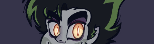
Beetlejuice Coloring Process! 🪲
Since my new artwork is gonna take me some time to complete, I decided that now would be a good time to talk about my coloring process for Beetlejuice's design! Specifically, I want to talk about picking out the palette for his eyes and outfit. It was a confusing process that's nice to look back and reflect upon.
Beetlejuice took me the longest to design... I almost gave up on completing him, but I'm glad I persevered! I really love how he came out in the end!
Since this will be a long post with several images, I will add a "read-more" link in case people wanna keep scrolling.
Otherwise, here's my coloring process!
-
After I finished laying out the colors for his skin tone and hair, I started thinking about how exactly I wanted his eyes to look like. I really like designing eyes in general because I feel it adds a lot more character to a design!
My initial idea was to give Beetlejuice slightly dark scleras with yellow pupils in order to create this eerie, uncanny effect.
The problem with that idea was that it ended up feeling... too eerie.
I felt as if it was leaning a lot more on him being a demon, with not enough leeway to show a more human side of him. As a result, it made it difficult to connect with him as a character... which was not what I wanted.
My next idea was to merge the color palettes from my two artist references - creaturologie and shnikkles.
While I felt like I was moving in a better direction, this made it very clear to me that I needed to find a palette that better suited my art style, because I felt the red here was just... too much? It ended up overpowering the green which was definitely not what I wanted.
Finally, I decided to stick to the original stage production and make his scleras white. This also made it easier for me to balance his eyes with his skin tone.
As for his pupils... I started thinking about amber stones, and how they illuminate in a way that is very subtle and beautiful...
That's when I realized that Beetlejuice's pupils didn't need to be consistently illuminated in order to have that subtle, eerie effect. They just need to create the illusion that they can illuminate wherever he went or however you looked at him.
With this in mind, I created the final version!
I couldn't be any happier with how it came out! I felt as if I finally hit that perfect balance between his human and demon characteristics! You're able to connect with him better, all while he retains the more frightening elements of his character.
That being said... his eyes can very much glow in the dark, if he so chooses.
-
I'd like to quickly touch on the outfit, because I had been going back and forth as to whether I wanted to add some semblance of color to his design or not...
I did try coloring his button-up with a magenta similar to the cartoon version... but I wasn't a huge fan of it. I realized I wanted more of a consistency to Beetlejuice's design.
This brought me to another challenge - how much value did I want to add in each part of Beetlejuice's outfit? I knew right away that I did not want to use pure black and white, but I still wanted to create a distinction of some kind for each outfit piece.
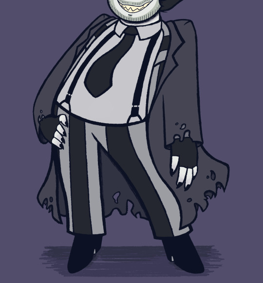
For this, I heavily referenced the musical - I've always loved how Beetlejuice's outfit wasn't a bright white. Rather, it was weathered out to be gray. It gave him a more gothic feel, which I fell in love with. I took it up a notch and gave him just a slight tinge of blue, as an homage to Corpse Bride - one of my favorite Tim Burton movies! I would eventually use a similar palette for Lydia in order for her and Beetlejuice to match.
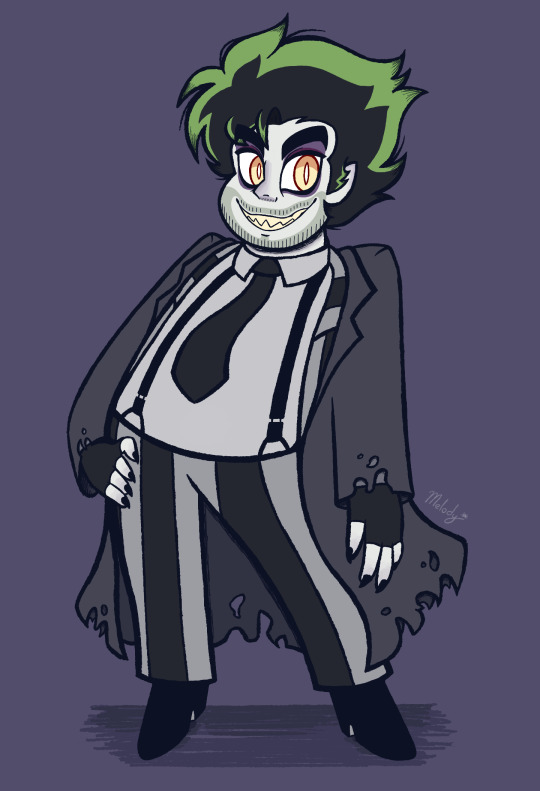
With that, I completed the look of my Beetlejuice design! ✨
14 notes
·
View notes
Text
Let me take you through the journey of me speed running my portfolio, smile
Mostly because I need somewhere to write this and word doc wouldn’t give me feed backs
Note that this will be very wonky because I have not thought of anything but the concept— I have 1 out of 6 characters figured out so imma color code them and call them by alphabet
Concept and inspiration:
What I wrote for my portfolio: Artist’s emotion and upbringing always had been reflected in their art. So what would happen if in a world where that part is intensified for the viewer to see
What actually started this: I want sport anime type of story but with Artists. Also this scene from Ouran host club that inspired Aster don’t question why just take it.

Story:
I’m still debating on what I want to use as the final story, they both are essentially revolve around the relationship of college kids’ relationships from friends to lovers to found family and they’re all in an art club and have specialized methods and styles; graphite portraits/landscape, Abstract expressionism, animation, graphic design, Dada-esque sculpture and then there’s the one guy that can’t draw cause every art clubs always have that one member that only join to not do anything.
Plot option 1: Anne Certayn is a college kid who doesn’t know themself. They know what they’re good at— well good enough to graduate and make money, but there’s no passion in it. Anne were hoping to float through the rest of their school year so to avoid all invitations to join a club they join an art club, what they assumed to be a club they can just sleep though. Sadly, Anne new clubmates’s energy are too much for them.
Note about this plot:
Each character’s relationship with their art, e.g. Aster’s desire to be perfect and uphold his family’s legacy and all of it being reflect in his art. His art had always be something that lean heavily toward realistic in every way, dull color, proportion, reflecting how his passion and desire are tugged away for something more refined. Meanwhile his boyfriend, Carter is someone who contempt with his life and where he is, he have more abstract and colorful art reflecting how he’s putting his true self out for everyone to see, both perfect and imperfect.
Anne’s journey to find their passion for art again after a lifetime of being discouraged from being interested in art by people who told Anne to dial down any of their passion for things they don’t care for.
This is honestly a very slice of life, fluff, maybe comedy story that doesn’t have heavy lore. It just friends being pals
Plot option 2: A love story between members of a college art club.
The couples:
One of the leader (Carter) x his friend (Aster) since high school. They had been dating since first year of college but Aster had always held himself back because his family’s legacy. Their story is going to be revolving around Aster’s struggling to choose between Carter and his family because Carter’s family is not exactly on the same level as Aster’s family
Shezaraya x D no idea what will be their plot yet but D is an animator and concept art who occasionally fight with Anne because she doesn’t like how they joined without any sort of passion for art. She also sometimes fight with E who keeps riling her up by saying “digital art is not real art” without meaning it. Shezaraya is an graphic designer She’s more chill than D but she will still shit talk with her
Debating on giving E a lover(s) or not because she’s very much the agent of chaos. You ask about her love life and it would be like “oh yeah my ex almost framed me for fraud so I ended it” and if you ask her “isn’t your ex the barista down the street?” She’d go “oh not her, the other one— not the one that crashed my car because I broke up with him, the other other one”
Characters:
I have one character designed but I’m write as much as I have. Note that these are like— barely coherent concepts of the characters
Carter Wassily
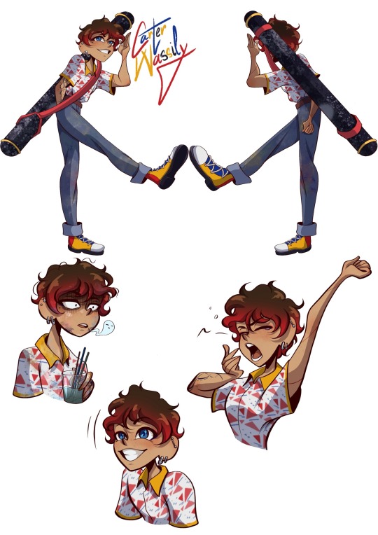
- He’s the leader of the art club.
- His specialty is abstract art, specifically abstract expressionism.
- He major in marketing, minor in communications in his 3rd year.
- His design is inspired by abstract art in history; Constructivism and De Stijl
- He’s fun loving, enthusiastic about anything and everything he love. He does not afraid to put himself out there and be his truest self. He do have tendencies to get too invested in his art to the point he forgets all time and necessity he need.
- He’s dating Aster since first year of college but they know each other since high school
- He somehow didn’t know Aster is rich until last year of high school
Aster Richman (edited)
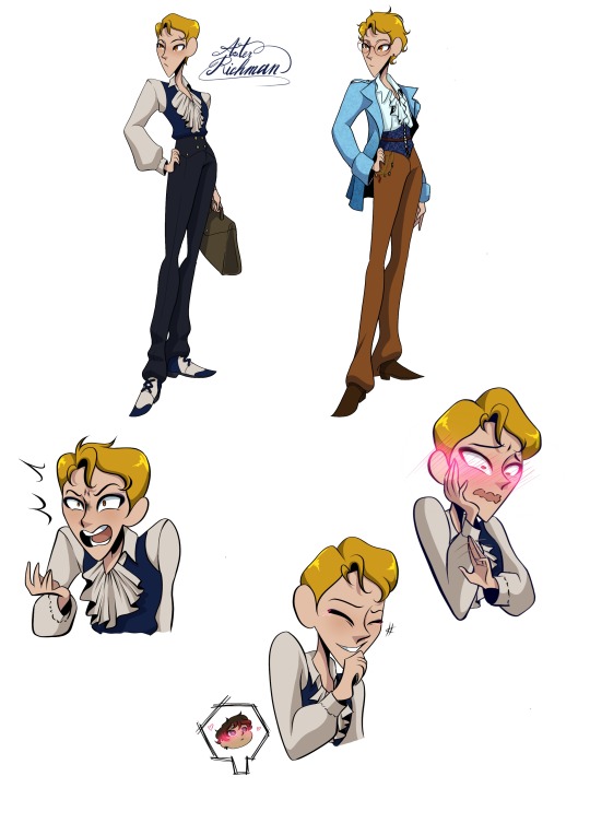
- He’s the vice president of the art club
- He’s majoring in law in his 3rd year.
- He specialized in Realism painting
- His name will be revolved around stars because I want it to come back to Carter’s tattoo
- He also have a red ring, matching Carter’s other tattoo since his family frown on tattoos
- He’s more serious than Carter. He try to be more stoic and calm though he do have his moments where Carter make him flustered or someone make him irritated. He pride himself on being good academically.
- His family is rich. Yes his name is a pun, I’m trying make all of their name a pun
- His designed was inspired by Victorian aesthetic but the palette came from realism period of art where the color is more dull then later he have an Isabella moment where his palette become lighter and less monochrome.
- He also wear glasses after his development because we really need the reverse “took off glasses and become beautiful” trope cause we had that in Cloudy with a chance of meatball and we need more of that
Shezaraya Sunshine

- She major in Music in second year.
- She specializes in Graphic Design with the style similar to Art Nouveau
- She’s dating/going to date D
- She’s the most passionate in her work after Carter
- She dream to make music and create her own album covers
- She’s similar to Carter but she’s a bit of a perfectionist when it come to her work. Other than that she’s one of the most chaotic person in the club
- She’s also very kind and optimistic
Anne Certayn
- They major in Engineer in first year.
- They have 0 artistic skill
- They lost their passion for things they like because when they was younger people tend to dismiss them or make them feel bad for being excited about things they enjoyed
- Weirdly they’re close with E the most
D
- She major in Communication in second year,
- She also have a few Communication classes with Carter
- She specializes in Animation with soft color and visual, reminiscing of Impressionism movement
- She’s passionate, a bit snarky, very spiteful to the people who deserve it
- She was raised to be more like Aster but she rejected that lifestyle
- Funny enough despite having the same world view of “anything can be art” as E they butt head a lot, mostly because E just like messing with her
- She absolutely hate Anne at first because how they joined the club but they bond after a while and she learn to tolerate them
E
- She major in Literature in third year
- She specializes in unconventional take on art, aka Dada. She mostly do mixed media and collage
- She is an agent of chaos. Little gremlin that just here to stir the plot and yet somehow she’s one of the chillest people in this club.
- She believes that anything can be art and that art have no rule but will absolutely throw that away for the sake of chaotic debate with D
- She have ex lovers….no one know how many but she have exes
#probably will fill this out later#original story#original character#concept art#concept story#devilg04
4 notes
·
View notes
Text
Hagio Moto's Les enfants terribles
"Les privilèges de la beauté sont immenses. Elle agit même sur ceux qui ne la constatent pas."
The above quote seems like something out of a 70s shoujo manga, but it's actually from Cocteau's Les enfants terribles! So, can French literature be shoujo? Mais bien sûr!
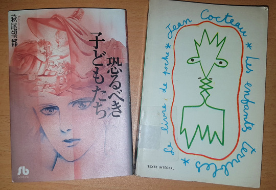
As I was looking through Hagio's works one day to find something to read, I came across 恐るべき子どもたち (Osorubeki Kodomotachi). When I started reading its synopsis, the name "Jean Cocteau" was the first thing that jumped at me, and that's how I found out that Hagio had adapted his novel Les enfants terribles into manga form. I am someone who first read three volumes of Le Comte de Monte-Cristo before watching Gankutsuou, so I knew what I had to do: I was going to read the novel, watch the 1950 movie adaptation, and then read the manga itself for the full experience!
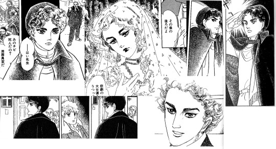
Eyebrows are a game, and Dargelos is winning.
I borrowed the novel from a library because I wanted to read the original, and got the manga in print because this one wasn't digitally available as of time of this writing. Which makes me think: Just how much manga are we missing out on?
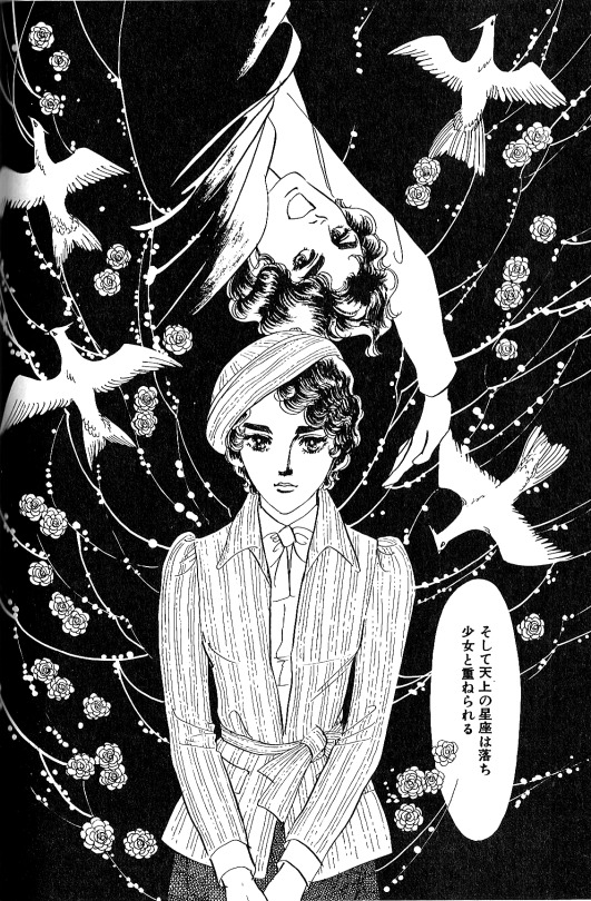
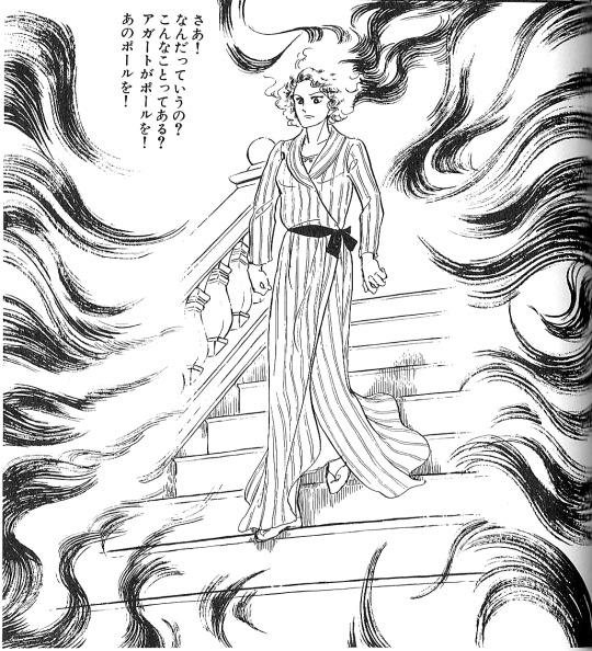
I love Hagio's page compositions like these. And I will forever be weak for her use of pointillism.
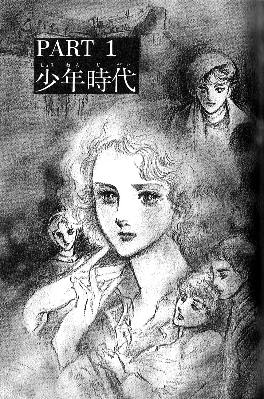
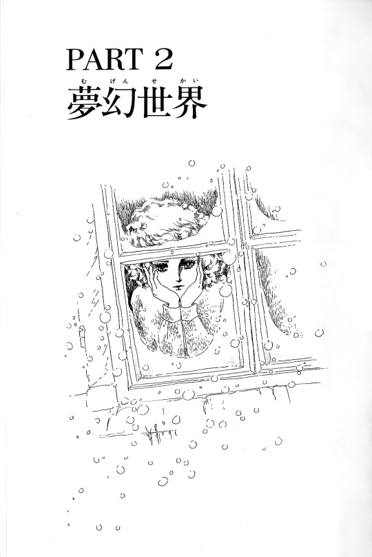
The manga was published in Monthly Seventeen (月刊セブンティーン) between May-August 1979. Although this is mainly a fashion magazine, titles such as Fire!, Orpheus no Mado and Banana Bread no Pudding were published in there. Imagine being a high school girl reading such titles in the magazine you buy to look at cute earrings... Wow... Anyway, the manga has four chapters:
少年時代 (Shounen Jidai - Boyhood)
夢幻世界 (Mugen Sekai - Fantasy World)
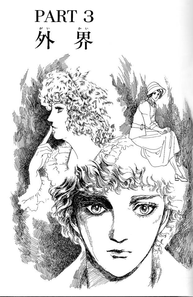
外界 (Gaikai - Outside World)
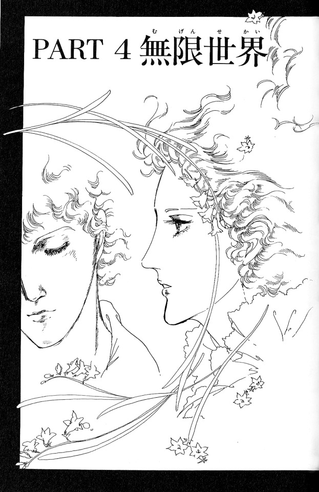
無限世界 (Mugen Sekai - Endless World)
For me, the art style is right between Hagio's signature 70s shoujo style and her kind of updated 1980s style. The character designs are more "realistic" so to speak, and the characters do not look so much like those ideal shoujo teenagers. I'd say Hagio is heavily influenced by Melville and Cocteau's movie adaptation of the novel, as you can recognize many scenes and outfits right from the movie.
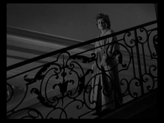

Sure, they adapt the same source material, but the overall mood and paneling and composition really reminds you of the movie, with Hagio's touch.
Maybe it's because I was going throught the same story for the third time, but I must say that Hagio's adaptation was quite well done, and presented the story in a much more accessible way. Despite Cocteau's voiceover narration in the movie, it cannot reflect the characters' inner world as well as the novel. The manga gives the visual support the story needs, and the way it's presented in four chapters makes the story easier to digest. There is something very shoujo in how childish Élisabeth and Paul are, and the manga perfectly captures it. The movie, not so much. I also like how we can see them grow a little bit in the manga. In the earlier chapters, they are literally kids, but by the end, you can see the tortured teenagers/young adults in them.
Love this sibling energy.
I liked this experience of reading the manga adaptation of a novel. I always like it when manga makes me pick up and read some books. I will be a more cultured individual thanks to shoujo manga.
#hagio moto#moto hagio#萩尾望都#year 24 group#24年組#70s manga#70s shoujo#retro manga#vintage shoujo#les enfants terribles#Osorubeki Kodomotachi#恐るべき子どもたち
51 notes
·
View notes
Text
On "heavy inspiration"
First, I'd like to apologize for the contents of this post. I do not wish to be a blog that just complains about matters, but I feel like I need to say this at least once.
If you don't agree with what I say, that's perfectly fine. We can agree to disagree, that is all.
It never fails to anger me when I see any issue related to tracing and "heavy inspiration." These are definitely tools when it comes to learning more about art, but there's definitely a line that dictates whether the use of those methods are acceptable or not.
I will not be naming names, but back then there was a blog which was "heavily inspired" by me. I'm flattered that I inspire people out there, but this case was truly something else.
[NOTE: If you recognize the account I'm referring to, please don't bring them up. I don't want this to escalate, nor do I want to stir up any issues. This is just to discuss what happened.]
There was a time where I've made a character sheet/template for one of my OCs, intending it to be for her specifically; every element about it reflected her as a character in general. A few days later, I see that a certain blog had done the same with their own sheet. The only difference was that it was all mirrored. I commend them for giving me credit, however I was not on board with what they did.


DISCLAIMER #1: Yes, I am aware that I may sound like a whiny baby for being possessive over a character template. It truly sounds absurd, and even now I don't know if what I felt was valid. But my reason for it was that I had specifically designed that sheet for THAT character. It was completely original, as I had made it all from scratch. It took me a while to conceptualize it all. Then someone comes along, taking and running with it without asking me? Can you blame me for being upset?
I didn't want to cause an issue, so I privately settled this issue with them. I made it clear with them that they should've asked me first before doing it, but also added in that they don't have to take the post down. I may be protective of my works, but I'm not a jerk to force someone to take down their own hard work. Plus, I didn't want to cause any drama nor controversy over a character sheet, so I just kept my mouth shut.
Additionally, I made a post as a measure to make sure this incident doesn't repeat.
You'd think this would all stop, but it surprisingly didn't! A few months later, I released a Birthday Union Card for one of my characters. I took some creative liberties with it and added my own twist to things. So, I gave my OC a different kind of bow and nail polish. A few weeks later and what do I see? The same kind of bow and nail polish are on their own birthday card too!!
DISCLAIMER #2: I am aware I don't own these "creative liberties" or certain aspects of design. I would've brushed this off as a coincidence if they hadn't taken "major inspiration" from me before, but this was the second time it all happened. I was beginning to get paranoid; I felt like they were keeping note of everything I do so they could do the same. damn. thing. Plus from what I know, I don't think anyone has done this before? Maybe that's just me...
Don't get me even started with the post formats! I did things a certain way back then, mixing up the font styles, incorporating colors, cringeworthy quotes- you name it. Would you believe me that they got inspired by me to this degree? That they would format posts that contained similar content as me IN A SIMILAR WAY?

DISCLAIMER #3: I am aware that I don't own post formats. My point here is that they were truly coming across as a copycat. I believe they could've changed things up for the sake of originality. But I suppose you can't have everything nice in life.
Every time they post something, the first thing that comes to mind is "what did they copy from me this time?" And it's truly a shame. Any slight resemblance or similarity to what I did stirred panic within me. It wasn't healthy, and I felt like I couldn't do anything about it.
Though, I must admit I'm not entirely in the right for this. Thinking about it, I may have enabled them due to my lack of communication.
FAULT #1: I must acknowledge my fault for not telling them off enough. I really thought they'd just eventually stop and learn from their mistakes. I just didn't have the heart to tell them any more. Being accused of copying is not a great thing, and I didn't really want to be that person. Unfortunately, look where that got me.
FAULT #2: It's also my fault I decided to follow them back despite the first instance and didn't block them. Admittedly, I have a bad habit of wanting to see the good in people. So I assumed that they would change in the long run.
Things only stopped when I finally blocked them and notified them about it. I don't think they're active on here anymore, and sometimes I worry if I was the reason for that. I wished it didn't come to this point.
This is a cautionary tale for fellow artists out there. Please, don't take things without permission. This whole incident took a toll on me for months, and I still fear instances of these. Some artists may be more lenient and wouldn't mind, but there are definitely others who are not okay with "heavy inspiration." Always, ALWAYS ask.
#random rambling#please be civil if you have any comments on this#I do not condone any hate sent to this person despite what they did#I'd also like to apologize for showing their work (which may lead to them being identified)#but I really needed the evidence to back up what I'm saying#I'm calling it heavy inspiration and not copying because I feel like an ass for saying that#sorry if this isn't the usual things you'd want to see#but I really needed this to be brought up#also sorry for the typos and errors I'll fix them later-
10 notes
·
View notes
Text
reading tdrk.
I can see why people like it- the aesthetic is gorgeous and moody, the contrast between the stifling heat and the grey rains is even there.....
but of course, I do have to question it's politics. It tries to both-sides issues to explore them via snapshots of the news anchors and interviews, and....it still comes up as very anti-rehabilitation/recovery; nothing gets better, ever. Batman is still Batman because he's sick in the head, and is treated as having the same issue as Two-Face, basically (which is about the only reason I can figure he's been included in this story.) and also that it's batman's reappearance that caused twoface to return as well. whatever. at least it's kinda gay about it? like yeah "we tumble like lovers in the night" and "four men died" sure. yeah they were fucking at some point in their lives
also it's like "if you call Batman a fascist you don't know about true justice and patriotism" side-by-side with the guy talking about how he wished the criminals he illegally beats up anyway had less rights. Ok. yeah I don't know that you know what you're talking about man it kinda sounds like he wishes the government was more oppressive than it already is.
Jim Gordon shot a teenager and he gets to keep his job at least temporarily. well I guess that's realistic isn't it
also batman has a gun in this scene. broke the number one Batman rule
Carrie Kelley's design fucks SO severely why is she the one thing nobody took from this story????
I do also like that we get to see a big Lana Lang. like, the "grittiness" of the art style means the female characters are actually drawn like people with distinctive features.
I do really like Bruce mistaking Kelly for Dick when he was injured. that's a really cool way to have them meet.
I do also like the weird spiritual obsession Bruce has with genuine honest to god bats. like yeah that adds up
and of course. Fascist for real superman. I knew that was coming lol. it's not good but at least it's given more context (he turned to it after some kind of attack on heroes and vigilantes by the government, he gave in and gave up, and wants Bruce to do the same.) I still don't like it but I was bracing for worse.
I do still just love old lonely fucked up Batman and Carrie Kelley Robin they're cute as fuck. another crazy child adopts you after one abandoned you and you failed the next and gave up on it all.
selinas design is also.....hm. she runs an escort service. kind of hard to believe the character would turn to something she grew up in and hated in many of her origins,* but hey who knows. and then she's heavily implied to be sexually abused by the joker. awesome!!! I do feel that is actually really pretty misogynistic to have your strong female character show up and do nothing but get sexually abused. so. awesommmeeee
(*sex work is fine work irl and if it's something someone chooses to do, I just know that in this characters case she was forced to do it from a young age with many other young girls, it was a bad situation in her context for sure.)
joker calling him "darling" and having no qualms about being obsessed with Batman is alright.
oh, so NOW guns are a cowards weapon? gee. then where'd the rifle come from earlier bats?
okay. super weird that the joker killed himself or whatever. I do like how creepy his face is.
I do really love that this showdown happened in the "tunnel of love" though. this old man is a homosexual
the horses are awesome I will say. do you really need a reason. the horses are cool.
I also enjoy how it's kind of turned on it's head- the people who are supporting Batman, who are emulating him, aren't good. they're causing more meaningless violence. now does that cause Bruce to reflect on himself? Probably not. but it's kind of real bad when the people who wanna be just like you talk about purging the city. it's not going great. or not he just recruited them also? ok.
the nuclear thing is uhm. wow ok. "Nothing we can't handle, folks, we're still america- and I'm still president!" yeah.
well. I guess it's still kind of romantic to want to die together even if you also hate each other. it's dramatic, at minimum. sure whatever.
oh, faking your death. okay the rituals are intricate. I can't take any of this shit seriously the wink. so are you guys still a thing, or....? what is all of that. what is wrong with both of you.
oh that's the end. ok. I see why people like it. it's not bad but it's also not really my speed. I like the artwork more than I liked the story honestly, lots of iconic imagery. Carrie Kelley is awesomeee I want to see her again. uhmmm everything else can kind of stay here. forever.
I now see what Batman v Superman was trying to invoke (and did so very very very terribly) , because while there is a conflict and the government is evil Bruce and Clark are genuinely frenemies here I would say. wasn't as bad as it could've been
I also don't really get why Batman has multiple lines paying lip service to "guns fucking suck" as an ethos, but in reality, we see lots of "cool" shots of him holding a rifle so it's like. okay that feels like cheating and getting by on a technicality. if he has a gun in my book it's gotta be a crazy bat-gun that doesn't shoot regular bullets.
I actually legitimately love Clark getting blown up by a nuclear missile and it looking absolutely fucking horrific. like he ends up being more or less Fine but not before having that moment of grisly terror. it gives a sense of impact to it instead of just being like "oh it blew up and was bad". you SEE it.
overall, it's not bad. I kinda liked it but I don't think it's my kind of story, like it just has too muddled messages (it wants to have antifascist messaging, which I do respect, but the actual events are kind of confusing and weird to me at times, I feel it could've been a little stronger in that if it wasn't so obsessed with its own dark grittiness.)
3 notes
·
View notes
Text
Blog 8 sources and significance
An investigation of color aesthetics and character design Chinese traditional culture in the movie Legend of the Demon Cat (2017)
"The Legend of the Demon Cat" is a work directed by Chen Kaige in 2017. This film tells the story of the poet Bai Juyi and the Japanese monk Kong Hai who, during the reign of Emperor Xuanzong of Tang Dynasty, explore a mysterious case about the demon cat and Yang Guifei, and discover astonishing secrets. The visual positioning of this movie is an epic film with an Eastern fantasy tone. Art designers Tu Nan and Lu Wei draw nourishment from traditional literature, painting, sculpture, and dance, internalizing their research on literati painting and artistic conception into the concept of art design (Yi, 2018). So I will study this movie from a painting perspective.
Green landscape painting style
Firstly, in terms of the overall color scheme of the movie, the imperial palace draws heavily on the color composition of Tang Dynasty paintings, with red and cyan as the main colors. The entire palace is covered in red silk ribbons, while the bright and warm colored lanterns create a grand atmosphere. The director extensively uses red decorations on the set to highlight the majesty and prosperity of the palace. Director Chen Kaige used the style of ancient Chinese blue and green landscape painting to design the scenes inside the imperial palace. It is worth noting that Today's many researchers identify the murals of the Dunhuang Mogao Caves as the original form of Chinese Blue and Green Landscape Painting, and the Mogao Caves' painting style was significantly influenced by Indian Buddhistart (Ju, 2022), while the style of the Mogao Grottoes of Dunhuang absorbed the culture of other countries around China, such as India and Uzbekistan. Therefore, this also shows that the director's use of green landscape painting style is also to reflect the tolerance of the Tang Dynasty culture, but also to bring unique visual experience to the audience.
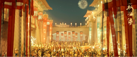
screenshoot from legend of demon cat(2017)
youtube
Legend of the Demon Cat - Official Trailer ,Youtube,(online)(2018). Available at:https://youtu.be/Yba215606Mc?si=pvaRUGi9a4neoivR (Accessed: 16 February 2024)
2.The director refers to the aristocratic life of the Tang Dynasty in the painting of "Beauty with Hairpin Flowers"
Secondly, the main part of this movie is the palace of Emperor Li Longji, and the interior scene design of this palace is mainly to highlight the image of Yang Guifei, as well as the image of the famous poet Li Bai. Director Chen Kaige referred to the most famous ancient painting of the Tang Dynasty, "The Beauty with Hairpins". This painting depicts the high-ranking aristocratic women of the Tang Dynasty mostly dressed in red, so in the movie, Yang Guifei's attire is red to reflect her status and nobility. In addition, the Tang Dynasty's demand for women was not the modern Chinese society's demand for women to be slim and beautiful, but regrad a beautiful woman with a healthy and fat figure,(please see picture below ),which also demonstrates the Tang Dynasty's respect for women. In addition, Yang Guifei and Li Bai pursued a free and poetic life, so the interior design of the palace used a large number of Taoist elements such as clouds, ribbons, and red crowned cranes to describe a free and leisurely life, which also reflected the romantic life of the Tang Dynasty people.
In short, the director of this movie, Chen Kaige, designed the main scenes from painting perspective. In the past, director Chen Kaige mainly studied painting and drew inspiration from the famous Tang Dynasty painting style of "green landscape painting style" to design scenes, bringing a unique experience to the audience.
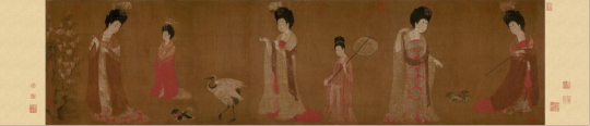
Beauty with Hairpin Flowers (online),Tang dynasty
Reference:
Yi Y. (2018) The Reflection of Form and Spirit in Oriental Fairyland: Talking with Tu Nan and Lu Wei on the Film Art design of The Legend of the Demon Cat. Film Art, 01: 148-153.(Accessed: 16 February 2024)
Ju, W. (2022). The Research on the Origin and Communication of Blue and Green Colors in Chinese Blue and Green Landscape Painting. Journal of Education, Humanities and Social Sciences, 5, 119-125.(Accessed: 16 February 2024)
Legend of the Demon Cat - Official Trailer, Youtube.https://youtu.be/Yba215606Mc?si=JZy9EwOFp6e5mMmT (Accessed: 16 February 2024)
Beauty with Hairpin Flowers (online),Tang dynasty https://www.cnki.net (Accessed: 16 February 2024)
Legend of the Demon Cat - Official Trailer ,Youtube,(online)(2018). Available at:https://youtu.be/Yba215606Mc?si=pvaRUGi9a4neoivR (Accessed: 16 February 2024)
0 notes
Text
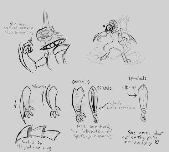
More concept art for Fluorospar
I do actually need to design clothes for her, or, considering her homeworld Hell is a place where you can expect to be in fights pretty often, more accurately, armor.

Pain, why do I keep creating characters who would wear armor as their casual getup. This is the THIRD TIME!
She probably wears gambeson under this too... djhhofjhptjht wheee clothing design,,, I am in PAIN lmao
I do think on the world building end, the demons probably have pretty different clothing culture than humans. for one, they primarily wear things for physical protection. Thermoregulation isn't as much an issue for them outside of Earth, either, since they are all effectively cold-blooded in terms of heat production. Demon biology is more concerned with loosing heat than retaining it, what with ambient temperatures hovering in ranges above 50C and even up to 100+C. They probably don't even really have the same style of nudity taboo most humans have, and instead would probably feel 'naked' even whilst wearing a T-shirt and pants, because it's not armor.
GETTING clothes, considering the sheer diversity of sizes and shapes they come in, is probably a lot more complicated than it is for humans. Most clothing for them is probably tailored/bespoke, and instead of going to a store to buy pre-made clothes, they probably have to hit up a smith or such to commission clothing. As a result they probably tend to own less clothes individually, kinda rotating through a few sets of gambeson/undergarments, MAYBE two sets of plate armor, but most likely just frequently spot cleaning and fully cleaning the main set of armor and immediately putting it back on.
Coming to Earth is probably a little jarring for them on that front (among many others), since humans (who exist in a modern setting) don't really DO armor much anymore. Armor smithes and gambeson tailors that DO come to Earth probably find their skills in very high demand, as a lot of the humans likely do not yet have the same ability to design and produce armor in sufficient quantity.
ALSO, the armor is probably typically enchanted. heavily so if you're rich, but at least mildly so even by default. I'm not sure if the setting should have guns, but if it does, a good way to justify using plate armor amidst such might well be to have enchantments that boost the durability, or perhaps reflect high-speed projectiles.
0 notes
Text
One Hundred and One Dalmatians (1961)
One Hundred and One Dalmatians is a fanciful family film, released in 1961, and holding a Rotten Tomatoes score of 98%. It is based on the 1956 novel The Hundred and One Dalmatians, written by Dodie Smith. This movie is the first thus far to noticeably derive characterization, animation, and additional work from other Walt Disney Animated Feature Films (that are not particularly and intentionally connected to this film).
One Hundred and One Dalmatians was an absolute pleasure to watch. It is a great family film with decent pacing and wonderful energy. The introduction is a bit long, but this is made up for with its upbeat tone and continuous anticipation. The characters are all rather likable and distinct, which is impressive considering the abundance of Dalmatian puppies as the title implies. The musical fanfare, while only having one particular “stand out” piece, also pulls the movie together. Another noticeable aspect of the film is the inclusion of previous character design and animation from Lady and the Tramp. Jock, Peg, Bull, Tramp, and Lady all make cameos, and the bloodhound is clearly designed reminiscent of Trusty. I loved this! Although, I would say my favorite thing about One Hundred and One Dalmatians is the background artwork and the animation style. The background art is reminiscent of a coffee shop painting, consisting of a multitude of sketches and abstract colors that clearly reveal the shape of buildings and scenes, but are not directly attached to realism. Additionally, the characters are animated with an artstyle that heavily emphasizes sketches, bringing them to life while simultaneously emphasizing the work of the artist. This is something I am particularly fond of, and it continues throughout the rest of the Silver Age and into the Bronze Age. My only qualm with this movie is one line that the truck driver says in the second to final scene in which he calls Cruella a “crazy woman driver.” Initially, this comes off as sexist, but considering Cruella’s actions during this scene, I think it is an appropriate description; she follows him around at high speeds while trying to chase him off the road because there are an excessive amount of Dalmatians in the back of the vehicle.
In conclusion, One Hundred and One Dalmatians is a fantastic movie. Overall, One Hundred and One Dalmatians receives 10 out of 10 stars, a perfect score, and the first 100% given with no deductions! This movie has great animation, design, characterization, and storyline with minimal to nearly nonexistent bothersome components. As previously mentioned, the music is appropriately festive and jazzy, and the song “Cruella De Vil” is a definite hit. This movie also passes the Bechdel Test.
Summary of the film under the cut.
One Hundred and One Dalmatians begins with an opening credit sequence composed of a myriad of dots, dogs, and funky animation transitions. Then the movie switches to a narration, which you are initially led to believe is from the perspective of a young musician named Roger. The narrator is actually his dog, Pongo. Pongo is ranting about how he and Roger are both bachelors, and they live a very lonely life because of it. He then tries to find a suitable pair of mates for the two of them, spotting a female Dalmatian and her owner. He tries to persuade Roger to follow them to the park, but Roger does not finish working until five in the afternoon. Pongo messes with the clock to reflect this time, and off they go. Pongo then proceeds to search the entire park for the woman and her Dalmatian. When he finds them he is insistent that she and Roger meet, and twists his leash around the two of them, binding them together and tripping them. They fall into the pond, and the woman is initially mad at Roger and Pongo, but later the two of them laugh about it. The scene then cuts to the woman, Anita, and Roger getting married. Pongo and the other Dalmatian, Perdita, watch on. Later Pongo and Perdita are talking about expecting puppies while Roger is working on a song. Then a friend of Anita’s from school, Cruella de Vil, comes over. She is excited about the arrival of the puppies and talks about how much she loves wearing animal fur. She also insults Roger and Anita’s marriage, thinking Anita can do better. After she leaves, Roger dances with Anita to his new song, the lyrics inspired by Cruella de Vil and how awful she is. After a few weeks, Perdita gives birth to fifteen puppies. One of them almost does not make it, but Roger manages to revive him. Then Cruella storms in insisting that Anita and Roger sell her all fifteen puppies, willing to pay twice of what they are worth. They retort that the puppies are not for sale. Then Cruella looks at one and notices that it is white, with no spots. She proceeds to insult the puppies, calling them ugly white rats. After Anita explains that they will get their spots in about a week or so, Cruella once again tries to convince them to hand over the puppies. However, Roger is more than ever insistent upon keeping them and throws Cruella out of the house. After the puppies have gotten their spots, they are seen watching television with their parents. Pongo and Perdita urge them to go to bed, and then they leave to go on a late night walk with Roger and Anita. Their housekeeper, Nanny, is at home with the puppies. Two men in a car down the block have been watching Roger and Anita. Their names are Jasper and Horace. They approach the house when the couple are gone and insist upon Nanny that they are electricians there to perform a mandatory inspection. They push their way into the house, and Nanny thinks they stole the good silver when they leave. However, they have actually stolen the puppies. This is devastating for everyone in the family, and gets put in multiple papers. Cruella sees this and calls Anita to give her sympathies despite being the main suspect in the case. Pongo and Perdita decide that because Scotland Yard cannot find the puppies, it should be up to them to rescue their puppies. They want to utilize the “Twilight Bark,” an underground dog communications system. The two of them head out with Roger and Anita where Pongo begins barking frantically. Roger tries to stop him, but his message still gets out to a Great Dane. The Great Dane then passes the message throughout London and into the English countryside to a bloodhound named Towser. Towser then howls the message over to a peculiar trio: a horse named Captain, a sheepdog named Colonel, and a cat named Sergeant Tibbs. After discerning the message, they remember that the old DeVil estate currently has a large amount of spotted puppies. Tibbs goes to investigate, and he discovers Jasper and Horace sitting in a room with ninety-nine Dalmatian puppies. One of the puppies tells Tibbs that all of them were purchased from pet stores except for fifteen of them that have collars. The camera pans over to the fifteen missing puppies watching television. Tibbs reports his findings back to Colonel, who then spreads the word once again via the Twilight Bark. Pongo and Perdita hear the news and go searching for their children. Tibbs returns to the estate, and Cruella shows up and demands that Jasper and Horace kill and skin the puppies that night as everyone is becoming rather suspicious of her. Learning about the puppies’ fate, Tibbs instructs them all to escape, but Jasper and Horace notice and chase after the puppies. The one hundred animals run around the house, continuously hiding from Cruella’s henchmen when Pongo and Perdita show up. The two of them fight off Jasper and Horace long enough for the puppies and Tibbs to escape. They make it back to the barn in which Captain, Colonel, and Tibbs live, but the evil duo catch up. The barn residents try to fight them off while Pongo, Perdita, and the puppies escape once again. They continue to travel through the England snow, struggling to stay together and keep warm. Meanwhile, Jasper, Horace, and now Cruella are chasing them throughout the countryside. The Twilight Bark has effectively gotten the word out to all of the dogs, which continuously try to help what is referred to as “the Pongos” on their journey. A Collie offers the Pongos a stay in his barn alongside some of the cows. While staying there, Pongo and Perdita decide to keep and raise all ninety-nine Dalmatian puppies as their own once they return home. Their next stop is in a small town where a black Labrador Retriever has scheduled to transport them home on a truck. However, the Cruella and her henchmen have arrived in the town and have almost caught the Pongos. In order to escape, the one hundred and one Dalmatians disguise themselves as Labradors using soot. They narrowly make it out of the town, but Cruella is onto them. She continuously tries to push the truck driver off the road with her own car, but fails and her attempts are further hindered by Jasper and Horace. The three of them end up crashing, but the truck transporting the dogs arrives safely to London. Roger and Anita reunite with their missing seventeen dogs as well as the new eighty-four.
#disney#disney movies#one hundred and one dalmatians#walt disney world#disney world#disneyland#movies#movie reviews#animation#animated movies#the reviews
0 notes
Text
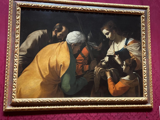
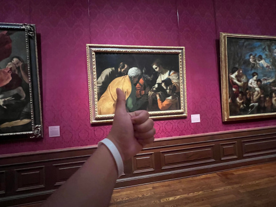
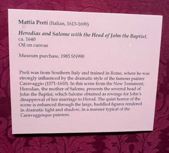
In the middle is a picture of my wristband at The Ringling Museum of Art in front of the painting Herodias and Salone with the Head of John the Baptist.
Title: Herodias and Salone with the Head of John the Baptist
ca. 1640
Artist: Mattia Preti (Italian, 1613-1699)
Medium: Oil on canvas
Dimensions of the image (not including frame): 47 ¼ x 67 ½ (120 x 171.5 cm)
The artwork vividly portrays an iconic New Testament event wherein John the Baptist's decapitated head is displayed by Herodias. The dark backdrop, subdued hues, and the strong shadow play on the faces and clustered figures of the six characters amplify the scene's ghastly nature to the observer. The color palette leans more towards harmony than contrast, incorporating subtle shades of brown, yellow, and orange as the key highlights against the painting's shadows. The figures featured in the scene are Herodias, Salome, King Herod, the executioner, and the beheaded John the Baptist. According to biblical accounts, Herodias sought vengeance against John the Baptist due to his outspoken criticism of her inappropriate marriage to her stepbrother. Herodias' plot of revenge involved persuading her daughter Salome to perform a dance for the king, who consequently promised to fulfill any desire of hers. Salome's wish, influenced by her mother's desires, was to have John the Baptist's head, which was later served on a dish as portrayed in the depicted artwork.
While Salome and Herodias rejoiced at John’s death, the painting highlights the event in a different light: one of darkness. The quiet horror of the scene of John’s head on a platter, although not felt by the subjects themselves, is instead felt by the viewer and painter. The indifferent facial expressions of the characters stand in stark contrast with the painting's macabre theme and shadowy ambiance, thereby intensifying its eerie aura. Upon my initial entry into the room showcasing this work, I found myself doing a double take. The preceding galleries offered uplifting artworks characterized by light hues and moods; however, this room was cloaked in an almost mournful ambiance. Each painting displayed here carried an element of grim surprise, which might not be immediately apparent if not for the predominance of subdued and darkened tones. In regards to the depiction of Herodias and Salome with John the Baptist's head, I had to take a second look. At first glance, the painting was quite ambiguous, as the nearly monochromatic palette of brown and black used for John the Baptist's head made it easy to overlook. Upon closer inspection, I realized the scene was not a portrayal of friends watching a man at rest, but rather a group captivated by the decapitated head in their possession.
The painting Herodias and Salone with the Head of John the Baptist is associated with the Baroque period in Italy (specifically the city of Naples). The dramatic style of the artwork is heavily influenced by the infamous painter Caravaggio who is known for his intense and unsettling realistic religious artwork (fun fact, the painter himself had quite a volatile character which was reflected in his work; for example, Caravaggio was a known criminal and had committed murder). Mattia Preti managed to convey his thoughts on the biblical story of Salome and Herodias as someone who sympathized with John the Baptist instead of the mother and daughter pair. This disapproval of the pair’s actions can be seen in the depressing depiction of their actions. Had Preti thought of the scene as a victorious and impressive revenge plot, the painting would’ve likely been much bright in color with far more contrast, showing the mother-daughter pair in a positive and brave light. Preti succeeds in leading the audience to view the situation through the same lens he does, highlighting John’s martyrdom and the uncaring impassiveness of his murderers.
There is quite a bit of historical context to the creation of this art piece. During the period of its design there was a lot of unrest in Israel and while the common folk held numerous revolutionary movements against the government due to the expectation of the arriving Messiah, the government and the upper class looked upon both Jesus and John the Baptist as dangerous to the livelihood of their government. In the modern world, this view against religious preaching is maintained as more and more citizens in the United States fight against religious morals in hopes of a more secular society and government (such as in the case of abortion and marriage). Hence, it can be inferred that another message of Preti’s was to showcase the dangers an oppressive government can hold to religious believers if not careful. It’s incredible to think that such an old painting’s message still holds relevance in modern society. Overall, the painting is a spectacular example of a religious Baroque art piece in which the characteristics of drama, dynamism, tension, and emotional exuberance are encompassed.
0 notes
Text
Dragon Age development insights and highlights from Bioware: Stories and Secrets from 25 Years of Game Development
Some really tasty factoids here.

Cut for length.
Dragon Age: Origins
The continent of Thedas was at one point going to be named Pelledia, a name initially floated by James Ohlen
“Qunari” was a temporary name that ended up unintentionally sticking, much like “Thedas”
Mary Kirby wrote the Landsmeet. To this day, nobody understands how it works, except possibly her. If she’s “really really drunk” she can explain how it works. There’s as many words in it as Sten’s entire conversations put together
Concept art for Thedosian art - as in in-world art - draws heavily on Renaissance-era portraiture, the Art Nouveau movement, religious styles and media like stained glass, and favorite pieces from the golden age of illustrations in the early 20th century
Andrastianism in-world (art-wise) is depicted in wildly different methods depending on who in-world made the art in question. “One religion, 3 different lenses”. There’s the Chantry take, the Orlesian take and the Fereldan take; each with its own different interpretations, different mediums and different stories
The stained glass images were drawn by Nick Thornborrow for DAI, to decorate religious spaces in that game “and beyond”
irl Viking art influenced Ferelden
Greek and Italian art influenced Orlais
The book also had other insights into and anecdotes from the development of DAO, but I’ve transcribed them recently as they’re essentially the stories DG has recently been relating on the awesome Summerfall Studios DAO playthrough Twitch streams. (On those streams he provides dev commentary while Liam Esler plays through DA. The ones with DG are currently once every two weeks. Check them out! Here’s a calendar where you can check when the next one is) Instead of repeating myself I’ll just provide the link to the first transcript. From there you can navigate to the subsequent parts. Note these streams are ongoing. At this point I will also point you to a related post which is cliff notes of the Dragon Age chapter in Jason Schreier’s book Blood Sweat and Pixels.
Dragon Age II
DAO had the longest development period in BioWare history. In contrast DA2 had the shortest
Initially DA2 was going to be an expansion to DAO. A few months in EA said “Yeah, expansions like these don’t sell very well, so let’s make it a sequel.” So it suddenly became DA2 and they had to make it even bigger, although they still only had 1.5 years of time in which to do this
Production of DA2 officially lasted only 9 months, and at the time the team was still supporting live content for DAO! They finished development that January after the design team crunched all the way through the holiday period that year. Then it went to cert 9 times
The limited time they had is why the story takes place mostly in and around 1 city, and over 7 years (so it was temporal, rather than over physical distance, because a more expansive world would have taken more irl time to make)
They had no time to review even the main plot. Mike Laidlaw pitched the idea of 3 stories taking place at different points in the PC’s life, tied together by Varric’s recollections of events. DG rolled with this and made 1 presentation on the idea. This presentation was then approved and off they went
As they were writing DG realized that there was going to be no oversight and that everything was going to be a ‘first draft’. “Because nobody had time.” He sat down with the writers and said “Look, here’s the conditions we’re working under. A lot of what we’re putting out is gonna be raw. We’re not going to get the editing we need. We’re not going to get the kind of iteration we need. So I’m going to trust you all to do your best work.”
Looking back, DG has mixed feelings on DA2. “A lot of corners were cut. The public perception was that it was smaller than DAO. That’s a sin on its own.”
Despite this he thinks DA2 has some of the best writing in the series, especially character-wise. The DA2 chars are his favorite
The pace with which production progressed may in some ways have helped. “When we do a lot of revision, we often file away [as in buff off] some of the good writing as well. Somehow DA2′s whirlwind process resulted in some really good writing”
The pace meant chars landed on the writers in various stages of completion. For example Isabela was fairly defined due to appearing in DAO. In contrast Varric at the start was just that single piece of widely-shown concept art
Varric was conceived as a storyteller not a fighter. His skills are talking and bullshitting. Hence the question became, so what does this guy do in combat? The direction was to make him as different as possible to Oghren, so not a warrior. He couldn’t be a dual-wielding rogue in order to differentiate him from Bela. But you can’t really picture this guy with a bow. “For a dwarf, it would probably be a crossbow. We didn’t have crossbows, or we only had crossbows for the darkspawn. And they were part of the models. We didn’t have a separate crossbow that was equip-able by the chars. They had to like, crop one off a darkspawn and remodel it. And that became Bianca” (quote: Mary Kirby)
“Dwarven mages are exceedingly rare.” [???]
If DAO was a classic fantasy painting, DA2 was a screenshot from a Kurosawa film or a northern Renaissance painting. (Here Matt Rhodes was commenting on art style)
John Epler: “In any one of our games, there’s a 95% chance that if you turn the camera away from what it’s looking at, you’ll see all kinds of janky stuff. The moment we know the camera is no longer facing someone, we no longer care what happens to them. We will teleport people around. We will jump people around. We will literally have someone walk off screen and then we will shift them 1000 meters down, because we’re fixing some bug.” John also talked about this camera stuff in a recent charity Twitch stream for Gamers For Groceries. There’s a writeup of that stream here
Designing Kirkwall pushed concept artists to the limits of visual storytelling, because it has a long history that they wanted to be present. It was once the hub of Tevinter’s slave empire, so it needed to look brutal and harsh, but it also then needed to feel reclaimed, evolved, and with elements of contemporary Free Marches culture
The initial plan was for DA titles to be distinguished by subtitles not numbers, so that each experience could stand on its own rather than feel like a sequel or continuation. (My note: New PCs in each entry make sense then when you consider this and other factoids we know like how DA is the story of the world not of any one PC). Later, DA2′s name was made DA2 in a bid to more clearly connect the game to its predecessor. For DAI they returned to the original naming convention. (My note: so I’d reckon they’d be continuing the subtitle naming convention for DA4)
DA2 was initially code-named “Nug Storm”, strictly internally
The Cancelled DA2 Expansion - Exalted March
This was a precursor to DAI
It was meant to bridge the gap between DA2 and DAI
It focused on the fallout from Kirkwall’s explosion, with Cory serving as the villain
Meredith’s red lyrium statue was basically going to infest Kirkwall and it would end up [with what would end up] the red templars taking over Kirkwall and essentially being Cory’s army
To stop him Hawke would have recruited various factions, including Bela’s Felicisima Armada and the Qunari at Estwatch, forcing Hawke to split loyalties and risk relationships in the process
It was meant to bring DA2′s story to an end and end in Varric’s death. DG was very happy with this because all of DA2 is Varric’s tale. The expansion was supposed to start at the moment Cassandra’s interrogation of him ended in the present. “And we finished off the story with Varric having this heroic death.” It tied things up and would have broken many fan hearts, something BioWare writers notoriously enjoy. But between a transition to the new Frostbite engine and the scope of DAI, the decision was made to cancel EM, work any hard-to-lose concepts into DAI, and in the process save Varric’s life. DG has talked about the Varric dying thing before
Concept art for EM explored new areas previously not depicted in the DA universe, with costumes that reflected next steps for familiar chars. Varric was going to war, what would he have worn? With Anders, if he survived DA2, the plan was to present a redeemed Warden
A char that vaguely resembled Sera in DAI was first concepted for EM. This fact was mentioned near this concept art (see the female elf) and this concept art of Bethany with the blond bob
The writers sketched out plans to end it with Hawke having the option to marry their LI. This included alternate ceremonies for party members like Bethany and Sebastian if the player opted not to wed. There was even a wedding dress made for Hawke. This asset made it into DAI (Sera and Cullen’s weddings in Trespasser). The dress can also be seen in DAI during an ambient NPC wedding after completing a chain of war table missions
The destruction of a Chantry was explored in concept art as it might have happened in EM. This idea ended up carrying over to the beginning of DAI. (My note: Lol, the idea that DA2 could have had 2 Chantries being destroyed in it 😆)
World of Thedas
Sheryl Chee and Mary Kirby started with “a disgusting little dish called fluffy mackerel pudding”. In the middle of DAO’s busy dev period one of them (they can’t remember who) found a recipe online for this, scanned in from a 70s cookbook. “I don’t understand why it was fluffy. Why would you want fluffy mackerel pudding?” MK says. “We loved it so much we included it in a DAO codex.”
This led them to create more food for Thedas, full recipes included, like a Fereldan turnip and barley stew from MK and SC’s Starkhaven fish and egg pie. The fish pie became Sebastian’s favorite. “To me it made sense for it to be fish pie because a lot of the Free Marches are on the coast”, SC says, “It was something that was popular in medieval times, so I thought, let’s make a fish pie! I looked at medieval recipes and I concocted a fish pie which I fed to my partner, and he was like ‘This is not terrible’”
For WoT the whole studio was asked to contribute family recipes which might have a place in Thedas. SC adapted these to fit in one Thedosian culture or another, including a beloved banana bread that localization producer Melanie Fleming would regularly bake to keep the DA team motivated. “Melanie’s banana bread got us through Inquisition”
DAI
It says part of DAI takes place in or near the border with Nevarra [???]
This game was aimed to be bigger than DA2 and even DAO in every conceivable way
The first hour had to do a lot of heavy lifting, tying together the events of DAO and DA2 while introducing a new PC, new followers etc in the aftermath of the big attack. DG rewrote it 7 times then Lukas Kristjanson did 2 more passes
DG: “Our problem is always that our endings are so important, but we leave them to last, when we have no time. I kept pushing on DAI: ‘Can we work on the ending now? Can we work on the ending now? Can we do it early on?’ Because I knew exactly what it was going to be. But despite the fact that it kept getting scheduled, whenever the schedule started falling behind, it kept getting pushed back... so, of course, it got left til last again.”
“The reveal of the story’s real antagonist, Solas, a follower until the end, when he betrayed the player”. “Solas’ story remains a main thread in Inquisition’s long-awaited follow-up” [these aren’t DG quotes, just bits of general text]
Over the course of development they had 8 full-time writers and 4 editors working on it. Other writers joined later to help wrangle what ended up being close to 1 million words of dialogue and unspoken text. While many teams moved to a more open concept style of work for DAI, the writers remained tucked away in their own room, a choice DG says was necessary, given how much they talked. All the talking had a purpose ofc as if someone hit a bump or wall in their writing they would open the problem up to the room
As writing on a project like DAI progresses, the writers grow punchier and weirder things make it into the game. This is especially the case towards the end of a project (they get tired, burned out)
Banter and codexes require less ‘buy-in’ (DG has talked about this concept a few times on the Twitch streams) from other designers. DG liked to leave banter for last as a reward because it was fun. Banter begins as lists of topics for 2 followers to discuss. These may progress over time or be one off exchanges. One banter script can balloon to well over 10k words. “The banter was always huge because we were always like, laughing, and really at that point, our fields of fucks were rather barren, so we would just do whatever”
The bog unicorn happened pretty much by accident. It was designed by Matt Rhodes and was one of his fav things to design. They needed horse variations and he had already designed an undead variant which was a bog mummy [bog body]. irl these are preserved in a much different way to traditional mummies. When someone dies in a bog their skin turns black and raisin-like. The examples we know of tend to have bright red hair for whatever reason. It’s a very striking look and MR wanted to do a horse version of this as he thought it’d be neat. 5 mins before the review meeting for it he had a big ‘Aha!’ moment, quickly looked up a rusty old Viking sword, and photoshopped it through its skull like that was how it died. “And I was like, ‘I just made a unicorn. Alright, in it goes!’” It got approved. “So we built the thing. It fit. It told a little story”
With the irl Inquisition longsword, one of the objects they tested its cleaving ability on was a plush version of Leliana’s nug Schmooples
The concept art team explored a wide variety of visuals for the Inquisitor’s signature mark. It needed to look powerful and raw but couldn’t look like a horrific wound. In some cases, as cool as the idea looked on paper, they just weren’t technically feasible, especially as they had to be able to fit on any number of different bodies
Bug report: “Endlessly spawning mounts! At one point during development, Inquisitors could summon a new horse every time they whistled, allowing them to amass a near infinite number of eager steeds that faithfully followed them across Thedas. “You could go charging across levels and they’d all gallop behind you,” Jen Cheverie says, “It was beautiful.” Trotting into town became an epic horse siege as a tidal wave of mounts enveloped the streets. Jen called it her Army of Ponies”
The giants came from DA Week, an internal period when devs can pursue different individual creative projects that in some way benefit DA. They also had a board game from one of these that they were going to put in but they didn’t have time. It’s referenced though. It was dwarven chess
Josie’s outfit is made of gold silk and patterned velvet, with leather at her waist. She carries “an ornate ledger” and she has “an ornamented collar sitting around her neck, finished by a brilliant red ruby, like a drop of Antivan wine in a sunbeam”
Iron Bull’s armor is leather. His loose pantaloons and leather boots give him agility to charge
On DAI in particular, concept artists took special care to make sure costumes would be realistic, at least in a practical ‘this obeys the laws of physics and textiles’ sense. “While on Inquisition, we thought about cosplay from a concept art perspective. Given how incredible a lot of [cosplays] are, I now am not worried about them. In fact in some cases in the future I want to throw them curveballs like, ‘All right, you clever bastards. Let’s see if you can do this!’”
2 geese that nested on the office building and had chicks were named Ganders and Arishonk (it wasn’t known who was the mom or the dad). Other possible names were Carver Honke, Bethany Honke, Urdnot Pecks, Quackwall, Cassandra Pentagoose, the Iron Bill, Shepbird, Garroose, Admiral Quackett, Scout Honking, HChick-47 and Darth Malgoose
Bug report: “The surprising adventures of Ser Noodles!” DAI was the first time the series had a mount feature, meaning this had a lot of bugs. A lot of the teams’ favorite bugs were to do with the mounts. There was a period of time where the Inquisitor’s horse seemed to lose all bone and muscle in its legs. They had a week or so where all quadruped legs were broken. It was a bit noticeable in things like nugs and other small beasties but the horse was insanely obvious. “The first time we summoned the horse [for this] and started running around, the entire QA exploration room just exploded with laughter.” Its legs flapped around like cooked fettucine, leading testers to lovingly nickname it Ser Noodles. At galloping speeds the legs almost looked like helicopter blades, especially when footage was set to classic pieces such as Wagner’s Flight of the Valkyries
For DAI the artists were asked questions like “What would Morrigan wear to a formal ball? Can Cassandra pull off a jaunty hat?”
On DAI storyboarding became the norm. John Epler: “Cinematic design for the longest time was the Wild West. It was ‘here’s a bunch of content, now do it however you want’, which resulted in some successes and some failures.” Storyboarding gave designers a consistent visual blueprint based on ideas from designers, writers and concept artists
Quote from a storyboard by Nick Thornborrow (the Inquisitor going into the party at the end of basegame sequence): “Until Corypheus revealed himself they could not see the single hand behind the chaos. A magister and a darkspawn combined. The ultimate evil. So evil. Eviler than puppy-killers and egg farts combined.”
A general note on concept art:
In the early stages of any project, before the concept artists are aware of any writing, they like to just draw what they think cool story moments could be. It’s not unusual for the team to then be inspired by these and fold them into the game as the project progresses
– From Bioware: Stories and Secrets from 25 Years of Game Development
#dragon age 4#the dread wolf rises#dragon age#bioware#video games#the da4 tags are due to a few references to da4#cassandra pentaghast#my lady paladin#lul#feels#solas#mass effect#garrus vakarian#best boy#morrigan#queen of my heart#fenris#the Fenaissance#Bioware: Stories and Secrets from 25 Years of Game Development spoilers#Bioware: Stories and Secrets from 25 Years of Game Development spoiler#Bioware: Stories and Secrets from 25 Years of Game Development#spoilers#spoiler#mj best of
3K notes
·
View notes
Note
Do you happen to have any character design tips or tricks? I have a folder full of model sheets and scans from funny animal comics and cartoons that I look at for inspiration, but I fear that might be making my designs too derivative. I'm starting to think there might be only so many ways to draw a toon wolf haha.
WELL… your method is the exact same as mine LMAO. so the first thing i’d say is don’t worry about being too derivative or not derivative enough! it’s GREAT to be conscious about the decisions in your designs, and very important too! but it can get stifling if it’s all you focus on. be derivative—you have time to change things later if you’d like!
i’m like you, i hoard anything i take inspiration in (and sometimes don’t look at it ever again because i get so caught up in the hoarding over applying HAHA), and that’s a great start. your mind is a bank—the more you store, the more you have to use from. expand from your horizons and search in corners you may not think to look, because you may find something you want to incorporate!
it’s no secret i don’t draw much original art, which is something i aim to fix this year. it’s not on purpose, i just have so much that i want to draw and not enough time to do it that i try to prioritize what i want to see the most, and my own characters aren’t the highest on that list

(but it’s growing… the reason i’ve been relatively quiet on here outside of work is because i reset my Animal Crossing island and plan to put my characters in it so i have motivation to keep the island HAHA so i’ve been preoccupied with that. Bluebear says hi)
IN ANY CASE, i think the importance of shape language does get a little too much exposure; i don’t like sticking to the formula of men are stocky strong squares women are futile hourglass figures etc etc etc, i strongly encourage breaking those old stereotypes and drawing the way you want, BUT with my own designs i do like to incorporate the importance of shapes.
to self advertise i’ll use my character Tyson as an example since she came from Me Own Brain and has been with me for awhile. below is Ye Old Evolution, from 2016-2021:

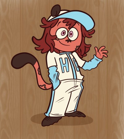
almost all of these designs are VERY derivative in some form, and her current design is purposefully derivative! the second and third were heavily inspired by Camp Lazlo, Ren and Stimpy, SpongeBob, and Chowder, and it shows (i just straight up stole Chowder’s nose and Ren’s eye colors)—the fourth was post-LT, where my own style was coming into play. slightly more constructed and less stylized/flat

the last two are purposefully “generic”, so to speak—i referenced drawings by Otto Messmer and Jim Tyer and tried to incorporate what i liked about them in her design. i aim to make a webcomic with her and the rest of the characters, and my goal is to make it look as close to an actual comic book from 70-80 years ago as much as i can.
as a result, i borrowed a lot of design clues; i simplified her leopard spots to be generic, opaque circles, matching with the “funny animal” style of leopards, but also to make people instantly say “okay, that’s a leopard”. same with the cat ears—she looks much more like a kitten than a leopard, which is also slightly intentional. i felt the triangular ears also gave her a bit more energy as opposed to the soft, circular ears—diagonal angles convey energy and movement, but i rounded them out to still make her seem young and “soft”.
Tyson’s current design is very purposeful. leopards are quiet, elusive, good at blending in with their surroundings. i wanted Tyson to be the total opposite—she’s a brash, hyperactive overly optimistic kid who has a big heart but loves to get into trouble. she tries to make friends with everyone she meets and is undoubtedly annoying. so, to reflect her antithetical nature, i made her bright red, social, and loud, purposefully contradicting everything leopards are not. she’s the odd one out and isn’t ashamed of it for a second.
i made her uniform baggy and dirty to make her seem a little naïve, inexperienced, out of place while unafraid of getting down and dirty. she’s the only character on the team without shoes to make her seem more “wild”. it’s hard to see with the raised cheeks, but (for now) i have her eyes slightly angled off, with round tops but a flat, squared off bottom, like a tall half circle shape. i feel it gives her more rigidity and energy, and taps into certain design trends of yesteryear
THIS IS SO LONG AND I AM SO SORRY. here i am dumping about my characters when it’s the last thing you asked. the truth is—i’m not exactly sure! because you’re method is mine as well. but taking inspiration and keeping a vast reference of things you enjoy will help you wonderfully, and you can always change your designs however you see fit. while i think shapes shouldn’t purely dictate the personality of the characters (seeing as it can lead to certain tropes or stereotypes), i do like to do it in little doses as an “easter egg” of sorts. i don’t expect people to point out everything i just said when i show my designs, but it’s something i CAN mention when discussing them, and it’s certainly something i will mention when introducing my other characters.
in my case, having an end goal certainly helped—i purposefully want to mimic the look of funny animal comics and draw inspiration from them constantly, so that’s an easier situation for me when i’m purposefully trying to be derivative, but i also try to make them my own. take it from me personally—your style will develop naturally. you ask yourself how and how and how and why and it’s not developing and this is stupid the internet lies to me, and all of a sudden you have a style. you can change it anytime you like. sticking to one style of drawing is very limiting and suffocating. but it WILL happen and you will find a method that works for you.
if at all possible, try to enjoy the process more than focusing on if you’re doing something right or wrong! the more you draw and more you surround yourself in things that inspire you, the clearer things will be.
#i know this is very long and i hope i don’t sound too pompous for babbling about how i designed my character but hopefully explaining certai#n methods as to how i designed my own characters will help to inspire even if it’s not the most innovative#even now my character Clyde (the coach) is A. named Clyde Sedale. Clydesdale. B. exists purely because Scoutmaster Lumpus from Camp Lazlo#was originally gonna be a horse. i just ripped that off completely (and he’s grown into his own beast). C. first inspired by Mr Horse from#Ren and Stimpy back in 2018 and now is slightly inspired by Bob Clampett’s Charlie Horse#D. some other third thing#but don’t be afraid to borrow and be derivative. mix and match! and i don’t agree with this in a number of cases (particularly if it’s#harmful) but some certain design tropes do exist for a reason#obviously i don’t mean that in regards to anything harmful or offensive and you should feel welcome to bend these conventions but like…#there’s a reason why cartoon dogs are usually loyal and lovable or foxes are sneaky and cunning y’know? certain mannerisms do track!#or in my case with Tyson they completely contradict#anonymous#long post
40 notes
·
View notes
Note
helloooooo!!! i love your art and wanted to ask for the ask meme: 6. Which artists inspire you right now? 11. Favorite comment you've ever recieved on your work? 21. Weirdest thing you've ever drawn? youre awesome thank you :D
Ohhh hello!! Thank you for the ask!
6. Which artists inspire you right now?
I'm sure this comes as a surprise to exactly zero of you considering the stuff I've been posting lately, but... Yellow Tanabe is my biggest inspiration right now!
I really like her character designs and I absolutely love the pacing of her manga and all the panel compositions are just *chef's kiss!!

I also really like how she visualizes abstract powers and concepts.
This sequence of four middle-schoolers forcing a guy to order three milkshakes is INCREDIBLE
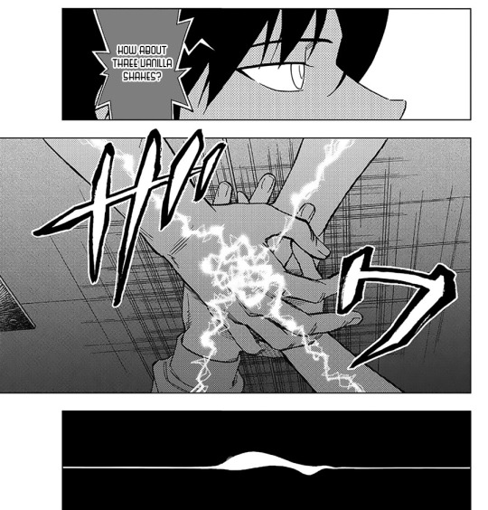


anyways I'm currently obsessing over Kekkaishi and Birdmen and I heavily encourage everyone following my blog to read them because I suspect that's going to be a lot of what I'm going to be posting about in the coming months!! Genuinely her stuff is incredibly well-constructed!! I could talk for hours about her stuff!
11. Favorite comment you've ever received on your work?
There are nice comments, and comments that are so far off the wall (not even necessarily in a good way) that it starts living rent-free in my head.
I can't choose, so here are the top two contenders for the latter category!
This comment on my DCMK You Can't Stay Here comic:
I've seen fandoms kind of hijack regular posts but I've rarely seen... I can't even tell if this is a regular post or a fandom post to be honest. I thought it was a normal comment (still weird considering the person knew nothing about DCMK) all the way up until the point it said "narratively obligated to marry your rival" and I was like what?? Do you guys live your lives based on what the narrative dictates??? what is going on. who is bolli. who is kjartan
This set of two comments on the same DCMK comic:
When I got that first reply on the tumblr post, I genuinely couldn't tell if this person liked the comic. it hurts a lot... but it's objectively well done? Are you saying this begrudgingly? What does this mean???
Then, the next day, I got a comment on the same post, but on Pixiv this time, from the same person, and I was like "Ah!! So you do like it!!! It hurt but you enjoyed what I did!! Wow!!!" This interaction still lives in my mind rent free.
As for genuinely good comments that made me shake in my boots, here's my absolute favorite comment, on my 98-page Kaishin doujin, Breaking Stasis!
Oh wow. I feel like I have no words to express how good this is. This is just so pretty? It feels like reading an actual manga, with the style and the really nice way the panels are laid out and everything really. This must have taken so much time and I am in awe of this dedication. There are so many moments that I just paused to admire the art or composition (Kudo's face as he first wonders what is going on, the way Kudo thinks about his memories like with Ran, the reflection when talking about how the night can't fall, the reflection as the glider moves up, so many just so nice)
I admit I was confused the first time, but wow on my first reread it was so nice. The emotional beats just feel like they are hit masterfully. Kudo's confusion as the loops occur. (Ran changing into Aoko and back and forth was so interesting.) Kuroba being desperate. The action scene as they fell? So intense. And then the ending felt really meaningful. I really like how positive Kudo is, which can make sense with how much support he has compared to Kuroba. His line when he tells Kuroba to keep going (and eventually maybe forgive himself) was just so nice and heroic almost, something I can see him saying. It's a really nice message, to keep on moving forward and having an actual effect on people even if it's hard. (And it was also fun to see their interactions, with Kuroba being bothersome haha during the card trick earlier, with Kudo being exasperated and then pleasantly surprised, and then Kudo hiding the earlier shouting when Kuroba asked about what happened in the illusion. I really like the way you wrote their dynamic! And I thought the jokes were amusing!) And then I reread this again just to look it at all once more.
I'm glad I also saw on Tumblr that you might print this? You should put the interest check link in the notes here as well! I'm going to need to figure out how to keep my eye on any possible updates haha. I think this was a really amazing comic and will probably be thinking about this! Thanks for writing, drawing, and sharing!
Honestly, part of me still suspects that it's one of my irl friends anonymously leaving me comments or something. There's no way someone who doesn't even know me would leave such a detailed comment, right? (I'm working on accepting the fact that yes, people do like my things, completely independent of my charming personality and visage. It's tough going.)
21. Weirdest thing you've ever drawn?
I'm not done with this, and I don't know if I'll ever pick this up again, but here's a sequence of fake recipe infographics by a vampire teaching you how to make vampire-safe popping boba
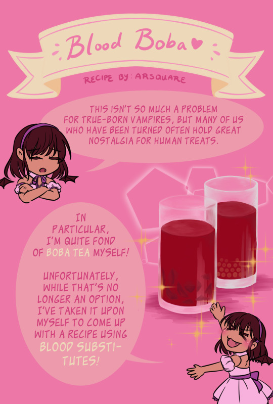
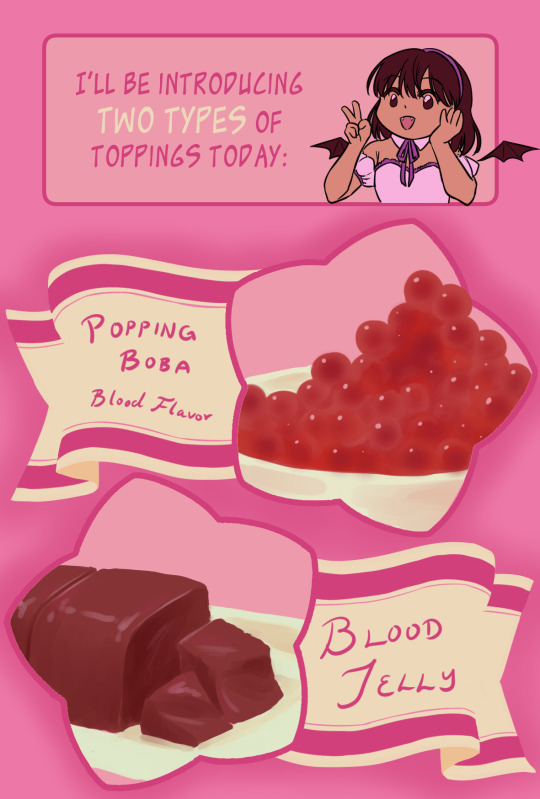


I thought it would be super funny and then I realized I hated graphic design </3 Drawing cute things is also really difficult for me LMAO
Objectively I could finish this and post this but I don't even know who would like this sort of post. I'd just have to finish this part about blood jelly (which is a real thing; I based it off of pig's blood and duck's blood, which is used fairly frequently in Chinese cuisine) and have a cute wrap-up picture and then that's it. But I think I'm too obsessed with Kekkaishi right now to do this. Oops! ! !
#asks#khunfounded#ahhh thank you for the ask!!#I can't believe how many people from tower of god still follow me#I'm sorry for leaving you guys#like I didn't even go to greener pastures or anything I went out back to the old forgotten warehouse#and now I'm sitting around a desolate campfire with two other people
11 notes
·
View notes
Note
Speaking terrible fashion in Omniverse.
Of all of Argit's criminal history, that outfit in Omniverse has got to be the biggest crime he's ever committed
Argit's jumpsuit is bad. Like really fucking bad in my opinion lmao
It's ugly, doesnt fit Argit's character at all, and worst of all there's too much fucking Orange!
(Sorry but Orange is my least favorite color by far. It's so fucking bright and I hate it)
Yes I know Argit wore an Orange jacket in UAF but that was at least counterbalanced by the Black T-shirt and dark Blue Jeans he wore. It felt balanced out instead of one big splotch of Orange.
And considering that Argit literally goes around stealing things, that would require him to be very steathy.
How the fuck can anyone be steathy wearing a jumpsuit that looks as bright as the mother fucking SUN?
Guess Argit's been taking his advice from Naruto it seems lmao .
Omniverse pick up a damn fashion book challenge! 😤
Yeah omniverse really did just increase the saturation, decrease mens’ hips, add random square patches everywhere, eat hot chip, and lie. Garment construction? Never heard of it!
Seriously what’s with the random squares everywhere- especially with argits clothes. He doesn’t have an ounce of square shape language in his blood! He’ll bend over backwards for just pennies a day! So what’s with all the square elements??? Typically little elements in a design are used to bring an intended shape to a character who’s body is not naturally shaped like that shape. For example, a skinny anime girl won’t have many natural circles on her body, so circular patches and jewelry will be used to convey those circle connotations. So why does angular edgy Argit need to wear so many square decals??? When has he ever been sturdy and reliable and strong???
Now I don’t personally mind orange, it reminds me of construction work which I like, but I do despise bright cyan. The only context I would have been okay with the color on Gwen’s stupid omniverse shirt would be if it was paired with a vivid crimson- such as the color of her uaf hair! But they didn’t! They made her hair orange, which is not how aging works btw. Plus cyan and crimson, especially if the cyan was a bit deeper, looks really good together in a grey setting- think of a colonial style house up in cloudy Maine. Red brick, blue shutters and trim, white paneling and grey skies… that could have made her look so nice in friedkin, so she could stand out like a cozy New England house in the fog rather than whatever the fuck was going on in omniverse. (Sorry I keep going back to Gwen, I’ll talk about Argit now)
Something I really like with uaf generally is the use of what I consider analogous saturations and values- rather than hues- and you can really see this in argits jacket and pants color combo, as well as his fur and hair colors. The fur and hair have the analogous/monochrome saturation but different values, and his coat and pants have complementary colors but equal saturation and analogous values. (This is getting admittedly nebulous and theoretical but bear with me lol) I think these muted colors all balance really well with each other and don’t tip the scales any one way- this lets him blend in with the backgrounds like you said anon.
In animation, I know that there is often a separate person assigned to the color, but the art director, djw, would have okayed the colors they chose, and he could have vetoed the ugly colors they chose!
I’ll be honest I do really love warm colors and hate cool colors, so I always prefer when bright colors are heavily saturated and cool colors are dulled down with grey, so I’ll admit I kind of like a bold slap in the face with orange. It reminds me of a fun weird haute couture runway look, and it reflects really well on dark brown skin- but Argit isn’t a runway model, he’s a sneaky little criminal man and it doesn’t make sense for him to wear bright orange unless he’s secretly trying to get peoples’ attention??
Overall you’re totally right anon
20 notes
·
View notes
Last Seen Blogs

marxistworkersparty-blog
Marxist Workers Party of America
slytherinsarentevil
s t i l l l o s t ?

seokanori
SEO KANORI
sorry-i-ship-drarry
Drarry Drabbles
trip2jannah-blog
Trip2Jannah