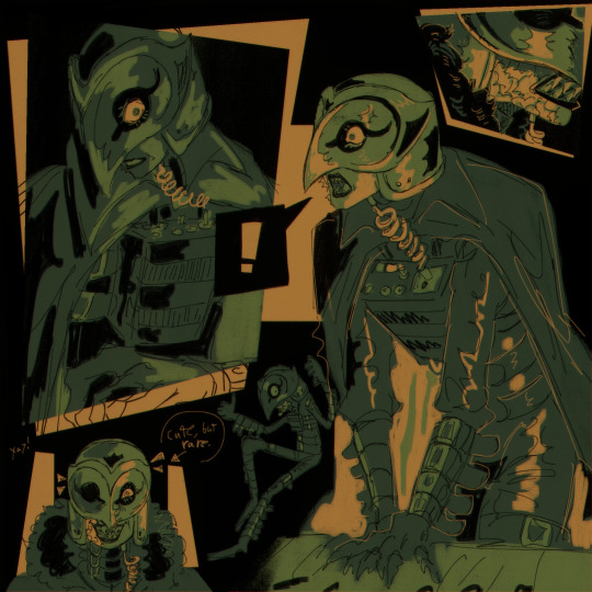
#and redesigned him >:)
Text
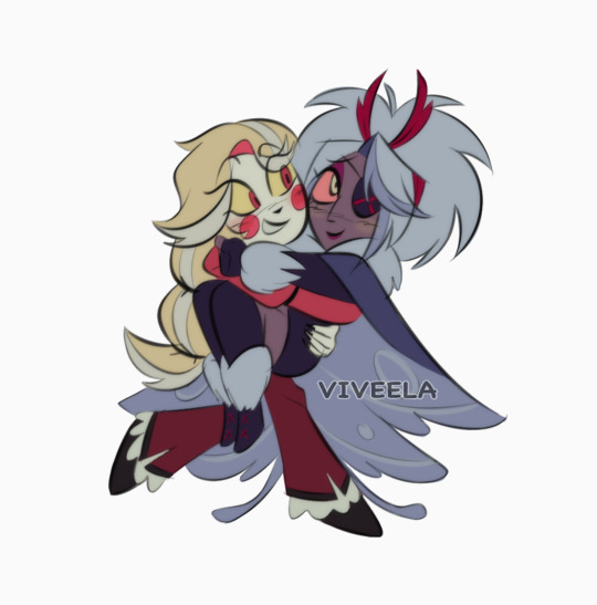

Some ship arts using my redesigns they're so tiny
#veearts#hazbin hotel#charlie morningstar#vadelina motha#vaddie#aka#vaggie#angel dust#husk#alastor#lucifer morningstar#chaggie#huskerdust#radioapple#<- qpr flavor only#him being aroace matters to me especially with how I see em#hazbin hotel redesign#redesign#charlie x vaggie#angel dust x husk#alastor x lucifer#fan art#theyre so cutesys look at em#enjoyed drawing this sm I might make these into stickers
5K notes
·
View notes
Text
lalalalalalallala swap simons…….
#the spikes on golb simons cheeks r meant to look like his hair yaaay#gave him a teeeeensy redesign#but barely#lel#my art#crownswap#simon petrikov#golb#adventure time#Fionna and cake#swap au
13K notes
·
View notes
Text
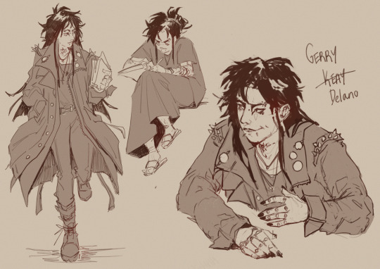
Gerry art??? In the year of our lord 2024????? HUHHHH???? you can blame it on @mangozic and their amazing tma art
#aghgafhsg I needed to redesign him so badly ywy I think the last time I properly drew him was like 2020???#which feels so wrong on so many levels but oh well#anyways I think he would tease his hair#tma#my art#the magnus archives#magpod#rusty quill#tma fanart#tma podcast#fan art#gerry keay#tma gerry#gerry delano#character design
4K notes
·
View notes
Text

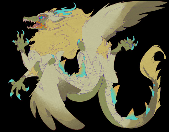
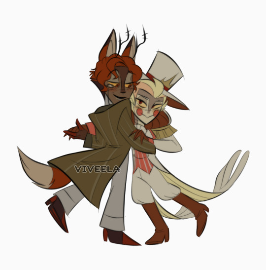
(draconifies your zelink) oh whoops lol
+ an extra pic of em hanging out together :]
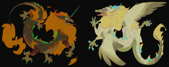
btw, you can find these guys on inprnt! both as a pair, or apart :] You Choose.
#(the weakest pitiful coughs youve ever heard) yay#modelled off those ancient scythian deer tattoos..... i like how theyre posed and thought itd be fun. also feat slight ld redesign#makes em look like how they'd might appear on a mural together. ish. LOL i get too impatient to try stylising that much#light dragon#loz#totk#dragon link#totk spoilers#link#zelda#princess zelda#totk au#loz au#tloz#artists on tumblr#sighs. is this enough tags. i hope so#this is very much for Me though bcus i have too many thoughts abt botw/totk dragons. its silly#i was glad to draw my boy again though. i have more ideas for him that ill get around to in like. uhhh. Who Knows.#my art#zelink#you know what. ill add it here too in like the loosest most tragic sense possible#what if we were trapped in mindless eternity forever....... together <3#dragon link au
3K notes
·
View notes
Text

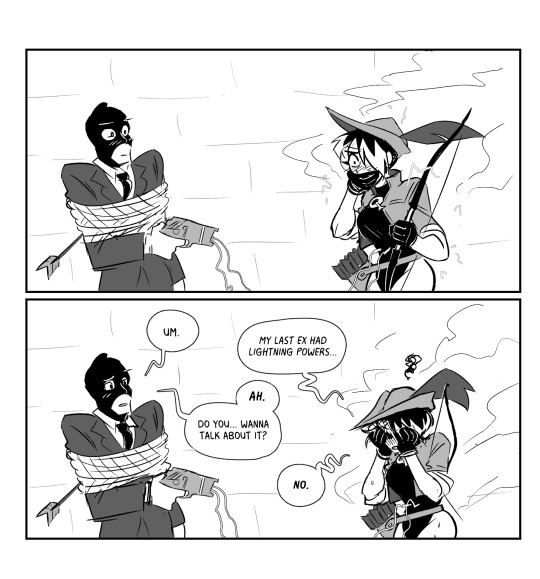
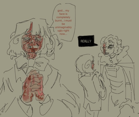
Stun Gun.
The last comic may have inaccurately painted Quiver as having her shit together.
I can assure you this is not the case.
At least she got the right arrow this time.
6K notes
·
View notes
Text

i blacked out and suddenly theres 4 edgeworths on the canvas
bonus design notes edition

#i actually think its so fun to indicate age through subtle changes#and i love drawing edgeworth. as you migh guess#im also really happy w how the suit redesign turned out?? its not major but i think it fits better.#i like his timeskip canon design in concept but not in execution#also aa1 era edgeworth is soggy wet cat and you CANNOT convince me otherwise#like dl6 resurfacing and then kater everything w 1-5 surely took a massive toll on him#miles edgeworth#ace attorney#fanart#art
3K notes
·
View notes
Text
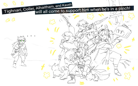
"If we must fight, Sethos... I shall defeat you with the power of my friend group of employed adults who miraculously have regularly scheduled meet-ups, and also my daughter!"
[redesigns]

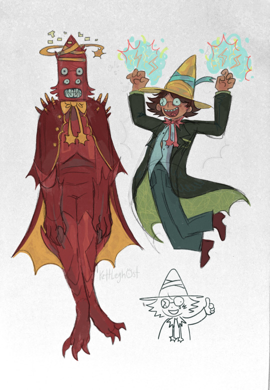
#YAAAAAY#YAAAAY WE'RE SO BACK#sethos does not have a redesign for now because he is 3 hours old and I am also revelling in the fact his concept art got revised thank god#my son with toxic waste eyes who looks like claude von something and leona from twst fused#but I also asked my friend about him and she just reiterated that people nicknaming al-Haitham Al was the funniest thing ever#so sethos's design can stay. for now#ANYWAY YAAAAAYYY CYNO SQ2#THIS VERSION IS FOR FAMILY!!!!#genshin impact#cyno#sethos#collei#tighnari#kaveh#al-haitham#my art#faruzan is there but tiny#so is hermanubis#although technically would every image of cyno also have hermanubis in it??? much to think about#WE'RE SO BACK
4K notes
·
View notes
Text
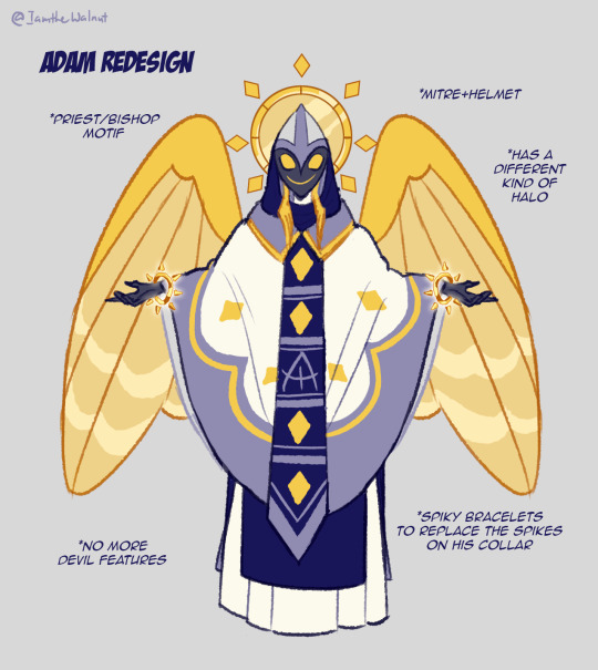
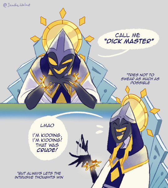
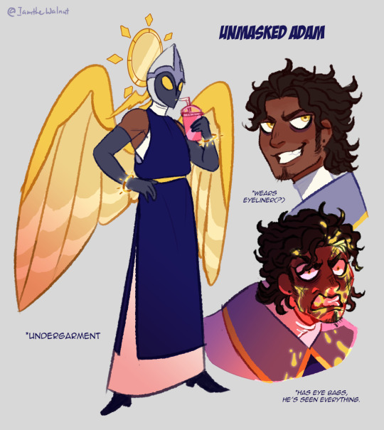
Adam redesign from Hazbin Hotel for fun. I hated this guy in the first episode but he rlly grew on me over time and became my 2nd favorite character. I wish he had more screentime, he had so much story potential, from his lore with being the first man and the his relationships with other characters. We could have had it all 😔 Hazbin hotel is good...but the pacing is rlly my main issue
I made a redesign cuz I wasn't rlly vibing with the fact that he looks like a demon and swears alot even tho he's suppose to be an angel. I think you can be more subtle with the idea that "heaven or angels are hypocrites" rather than making them act exactly like the demons🤷♀️ So in my reimagining, yeah he doesn't look like a demon but a priest/bishop vibe, he's still a misogynistic asshole and can either be upfront or backhanded with it depending on his mood. He doesn't swear but rather uses other more family friendly words to replace swear words but when he's pissed he won't care about censoring himself anymore.
I'm gonna do Lute next but that's it.
#iamthe-walnut fanart#hazbin hotel#hazbin hotel adam#hazbin hotel fanart#hazbin hotel redesign#Adam is the original DILF#pls let him come back as a sinner PLEASE#im more of a casual viewer than a fan#just for clarification#whenever he says something out of pocket or rude he would back track and say that hes joking#but he actually means it
3K notes
·
View notes
Text
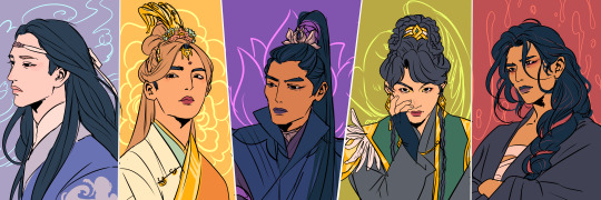
The new generation leaders
#mdzs#wei wuxian#lan wangji#jiang cheng#jin zixuan#nie huaisang#mo dao zu shi#the untamed#my art#i redesigned them a bit again what gives!!#i always said i wasn't too fond of my jzx and nhs but i think i like these versions!#i really like nhs with shorter hair or hairdos#and jzx with straighter hair and these kind of jewleries look both rich but also humble which is exactly what i wanted to hit#jiang cheng would pop out more in full body ver but he's always kinda same-ish he just works#messy yllz wwx is the goat and i will not have him any other way thank you#also lwj being as simple and elegant and flowy as possible...yes please
7K notes
·
View notes
Text
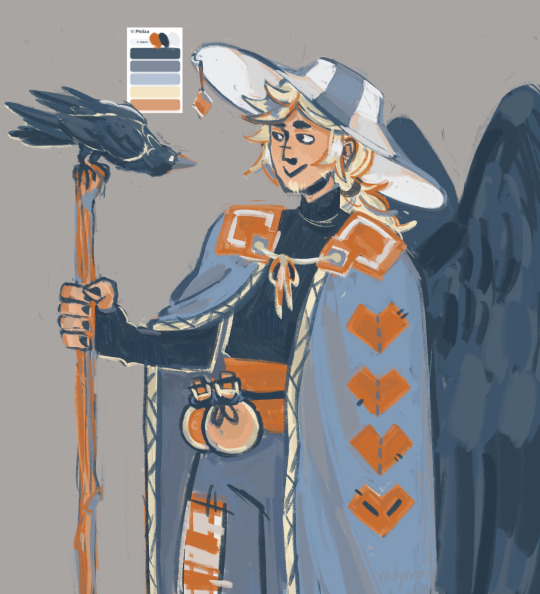
phil but from a colour generator thingy i found
#his cloak is really annoying to draw m thinking about redesigning him#philza#philza fanart#philza hardcore#my art#idk if i should even tag it hc but this is my hc design as opposed to toehr designs so#i guess yes?
2K notes
·
View notes
Text
sorry guys they finally showed me peak fiction . Its called “phantom of the paradise”
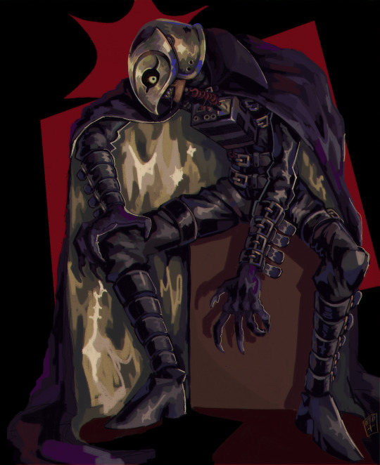
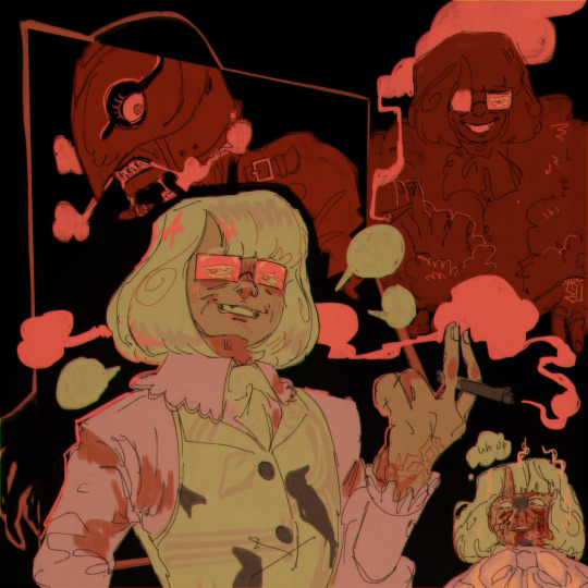
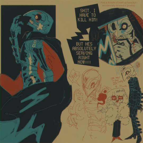
#phantom of the paradise#potp#winslow leach#swan potp#nightmaretheater#these were all done on the same canvas and i spent over 20 hours on it. Its just that good you know#Sorry this movie is making me VICIOUSLY IRREGULAR. its just that good. You have to watch it Now#i hope you dont mind the billion belts i have gifted winslow. she deserves them#lalalalal i love redesigning characters a little teeny weeny bit#Honestly. I want to draw swan more. I hate him so much but hes like really interesting. Im going to put him in situations#I miiight have changed a few details . giggle#…:i just had to give him a cool mark & blonde eyelashes Giggles#anyways i love ur shiny metal teeth winslow *thinks about the metaphorical implications and dehumanization for 10 hours*#So hard to draw her helmet sometimes… But i will willingly struggle . It is Okay!#anyways. Watch this movie now or suffer my curse
2K notes
·
View notes
Text

My brain literally would not let me rest until I got this out of my system, so here we are.
Okay, so - Future Donnie's canon design sure is a thing.
I actually love the concept, mechanic aesthetic is great for Don, but I'm not crazy about the all-black waders/overalls they're just...they're a choice. Definitely a choice.
So I figured it was time to update those old Future Donnie designs I made awhile back (which, surprisingly, weren't too far-off? I got the pants pockets right at least, lol)
Here are some of my own takes on the new look.
I challenged myself to try and stay as close to the canon design's over-all (haha) vibe as I could, so they don't differ too drastically. Just a few alternative ways to do basically the same concept. For funsies.
***Zero disrespect intended towards Andy, for the record. He's giving us the content we've all been craving and he's the realest one for that!
(Also, the overalls aren't that bad, tbh? I think it's just the all-black inking that makes them look kinda off in the preview image.) Still super excited for the full comic to finally be released AAAAAAAA!!
#And yes I will always draw future Donnie with the chin spot you can pry that headcanon out of my cold dead hands. It suits him.#Also wow - comparing these to the old ones it's very apparent how much more comfortable I am drawing in the Rise style now. Neat!#rottmnt#rottmnt donnie#rise donnie#donatello hamato#future donnie#rottmnt future donnie#rise future donnie#rise of the tmnt#rise of the teenage mutant ninja turtles#fanart#character redesign#concept art#chiscribbs
2K notes
·
View notes
Note
What's the back design of Danny's jacket in your Half normie au look like?
I think in the past ive doodled the portal with a figure gettin toasted in it but ive decided against it.
Instead you get lil motifs of his death in other ways :)
#one fun way to tell if im drawing half normie au or not is whether hes got the green undercut or not#i only really draw that for hnau#ask#ive gotten this type of ask a couple times but i was always busy before so#decided i'd post it now#half normie au#danny phantom#fun fact: clawdeen helped him redesign his outfit
1K notes
·
View notes
Text
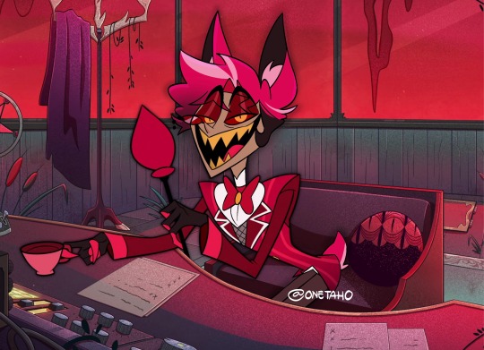
forgot to post earlier, but here’s a (scuffed) screencap redraw with my alastor redesign!!
#onetaho's art#hazbin hotel#hazbin hotel fanart#alastor#radio demon#hazbin hotel redesign#his head is more flat in the official show compared to how i draw him HELP#i love this deer bastard sm#i will probably draw a charlie redesign next hehe
2K notes
·
View notes
Text
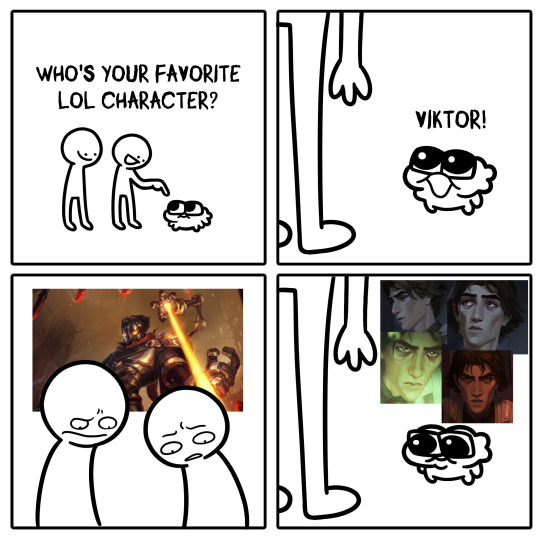
#viktor#viktor arcane#arcane#vitya arcane#I have to tell you that I respect his original design#But I also never paid much attention to him before Arcane#I definitely think he needs a redesign
2K notes
·
View notes
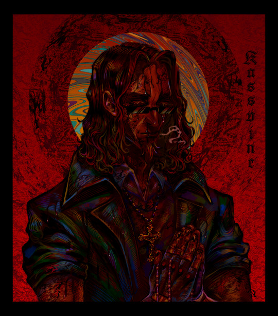
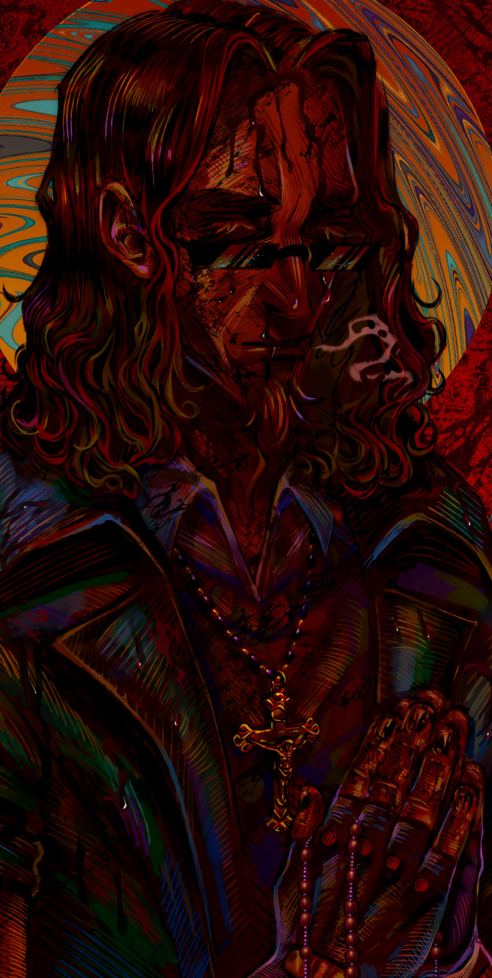
Text
Pray to your God.
#postal 1997#postal redux#postal dude#postal fanart#postal#postal 1#my art#yea I preferred to redesign him a lil
1K notes
·
View notes
Last Seen Blogs
sydneekomspacekru
Moved, Check ⬇️

askreaper-dusknoir
Ask Reaper!

innr
FIXTURE ON.

ajsofthaechanstan-blog
ajsoftstan

victoryblade
Bonds Of People Is The True Power