#but! may do mini comics of different scenes i think would look good drawn
Text
Thinking about the hockey au...
Wally trying to get better and better, spending all his time at the downtown skating rink trying in vain to improve (he's already the best, he tells himself... Barnaby is just slightly better).
Barnaby wondering why his best friend is pulling away, no longer spending time with the team (Did Barnaby do something? He doesn't know, and the thought hurts more than he's willing to admit.. Wally is his best friend, after all).
Just... thinking about the hockey au
#my thoughts#hockey player! au#welcome home au#welcome home#there are so many things about this au i want to ramble about#and no i dont really see myself writing a set 'timeline' or anything#I think its better told as a lot of loose scenes#but! may do mini comics of different scenes i think would look good drawn#i dunno though#ive personally always preferred keeping my characters and au's without a set 'end' if that makes sense?#making an 'end' for my stories feels... wrong#because what if i have more ideas?#what if i want to add little scenes or characters?#theres nothing wrong with making an ending!#i just choose not to#:)
2 notes
·
View notes
Photo
For the entire run of Charles Soule’s Poe Dameron comic book series, readers have gotten the chance to experience the wit, bravery, and unselfish nature of the best pilot in the Resistance. We also have been introduced to Black Squadron, a muscular Hutt, and a compelling new villain. With a new storyline coming this May, StarWars.com e-mailed with Soule about what makes Poe Dameron unique, his Black Squadron copilots, and why Agent Terex is the perfect foil for the titular character.
StarWars.com: Ever since fans were introduced to the characters in The Force Awakens, people have been drawn to Poe Dameron. What is it about the character that you find so compelling, and how do you channel that into the Poe Dameron series?
Charles Soule: I won’t lie — writing a swashbuckling expert pilot with charisma for miles won’t ever be a drag. Poe the character brings an energy to his scenes that’s pretty undeniable, like a feedback loop of fun and focus. Now, I know I’m writing about a fictional character as if he’s a real person, making me just the scribe jotting down his adventures as they happen, but sometimes it feels like that. Poe is sort of a force of nature.
StarWars.com: While Han Solo and Poe Dameron are a type of foil for one another, and both use unconventional methods at times, they are more dissimilar than they are alike. Compare and contrast the two pilots and what makes them tick.
Charles Soule: I’m tempted to do this in terms of Dungeons & Dragons alignments, but I don’t want to mash together too many fictional worlds here, so I’ll stick to Star Wars. Han is just a darker guy in general than Poe. You can rely on him, if he decides you’re worth his time and energy, but that’s not a foregone conclusion. I don’t think you’re ever quite sure where you stand with Han Solo, which is part of what makes him a great character. Poe is a more selfless character, just in general. I don’t see him ever trying to cut and run as long as there’s still someone he might be able to help. That said, Poe’s rampant idealism and self-confidence absolutely gets him into trouble, much the way Han’s sense of self-interest causes problems for him, as well. They’re both pretty awesome, though!
StarWars.com: Let’s look at your incredible run on this series so far. The series is initially set before the events of The Force Awakens and has taken Poe on a number of adventures. What stands out to you from your run so far, and what have been some of your biggest challenges as a storyteller?
Charles Soule: I’ve been really happy with the new characters we’ve introduced to the Star Wars universe, especially Poe’s nemesis Agent Terex, former Imperial stormtrooper and sometime officer in the First Order Security Bureau. He’s always a blast to write, almost a negative-image of Poe himself. Suralinda Javos and Oddy Muva are standouts as well, but even fleshing out characters from the films like Snap Wexley and Jess Pava has been fun, too. As far as challenges… I’d say the biggest thing was creating a compelling, strong adventure for Poe and Black Squadron that fit within what’s really a pretty small window in the Star Wars timeline — directly before The Force Awakens. We knew where the story ends, to a degree, so finding drama in the journey to get there was a tricky proposition. However, as is often the case in writing, solving the challenges was not just a great time, but resulted in a better story.
StarWars.com: Agent Terex is not the traditional “bad guy” in a First Order uniform and is much more than an archetypal villain. And, despite Captain Phasma’s best efforts, he seems to have an iron will. How much fun is this character to write, and what can you tell us about his character arc?
Charles Soule: Right — Terex! As I mentioned, he was an Imperial stormtrooper, even present at the Battle of Jakku. He became a galactic crime boss in the intervening decades, a truly ruthless man, but he was always pining away for the lost Empire, which he thought was a pretty cool institution. So, when he heard rumors of this thing called the First Order, he signed up, offering his immense network of contacts and favors owed to them. For a while, that was fine, until he began to tangle with Poe, as they both searched the galaxy for the missing explorer Lor San Tekka, in the hopes he could lead them to Luke Skywalker. Poe can be a frustrating opponent, and we’ve seen all sorts of things happen to Terex on his journey in the series. Personally, though, I think he ends in a really good place, and I’d love to see him pop up elsewhere. We’ll see!
StarWars.com: Through this series, we have also gotten to know the elite pilots of Black Squadron. What makes them such a perfect complement to Poe, and how do they keep one another “grounded,” especially considering how gifted they are at what they do?
Charles Soule: Black Squadron has evolved a bit over the course of the series, as any cast of characters should. We began with Poe, Temmin “Snap” Wexley, Jessika Pava, Karé Kun, L’ulo L’ampar, and their loyal(ish) ground tech and aspiring pilot Oddy Muva. We lost both L’ulo and Oddy, as well as more than a few astromechs assigned to Jess, but a new member joined — the one-time journalist and New Republic Navy veteran Suralinda Javos. Snap and Karé got married at the end of #25, too, which was a storyline I built for a long time in the series. I think they all love each other, and would do anything for each other, but these are fighter pilots. They’re competitive. Still, they usually manage to channel those tendencies into the fight against the First Order, where it should go.
StarWars.com: We also meet Ivee, the incredibly brave astromech (see Poe Dameron #25) that has a rather strong bond with BB-8. What inspired this storyline, and what has the response been like?
Charles Soule: It’s been so fun! Ivee and BB-8 clicked immediately, becoming extremely fast friends, connected in a deep way that organic beings probably can’t completely understand. I thought it might just be fun to give BB-8 sort of a… well, I don’t know if you can call it a romance, exactly, but certainly a very close friendship with another droid. The response has been strongly positive. It’s sort of amazing to me what you can do in comics, and storytelling in general, to imbue a hunk of metal, plastic, and wires with what really feels like “humanity” — whatever that means in a universe filled with all sorts of non-human sentients.
StarWars.com: You clearly have a talent for finding the voice of so many iconic Star Wars characters, and nowhere is it more apparent than when you write Leia Organa. It’s a tribute to your writing prowess that you are able to add to her wonderful legacy. How do you maintain the nuance of this character and keep her so fresh and engaging?
Charles Soule: Leia’s awesome, and really, writing her is not that different from writing any of the characters in any of my Star Wars projects. I just do my best to put myself in their position and let them talk. Leia is a master politician, incredibly empathetic, but also wry and funny. She’s faced with the re-emergence of an evil force she thought she’d defeated decades before, and now she’s doing everything she can to prevent it from taking over the galaxy. She’s under enormous stress, but she handles it with charm and grace. She also takes zero crap from anyone — that’s a big part of writing her, too.
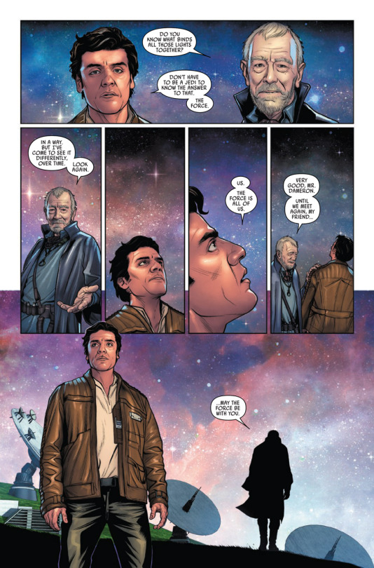
StarWars.com: The “Legend Found” arc features a poignant conversation between Poe and Lor San Tekka in which they discuss the nature of the Force. It’s a great way to see the Force from the perspective of non-Jedi characters, but also teaches us a bit more about this mystical energy field. What do we learn from this conversation?
Charles Soule: The biggest thing, I think, is the way a character like Lor San Tekka who’s been studying the Force his whole life views the “hero Force-wielders.” Jedi and Sith, essentially. Lor understands why they get all the attention, as agents of the Cosmic Force, but he knows they’re just a small part of the immense whole that is the Living Force. For Lor, and for the vast majority of beings in the galaxy, it’s all about the Living Force. I hadn’t seen The Last Jedi yet when I wrote that sequence, but now that I have, I think it’s pretty fair to say that Luke Skywalker would probably agree with Lor San Tekka’s point of view, at least in part.
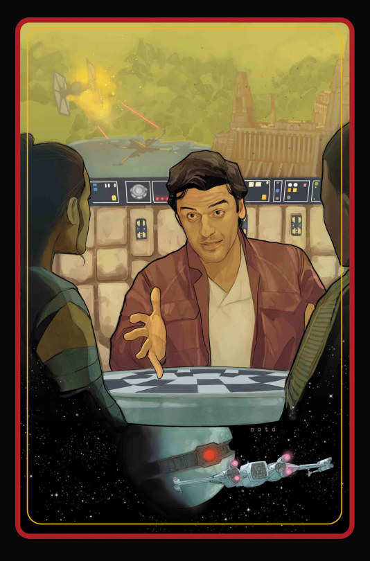
The cover of Poe Dameron #27, coming May 16.
StarWars.com: In May, you have a new arc in store for readers. What can you tell us about it?
Charles Soule: The bookends of Poe Dameron issues 26-31 are set moments after the events of The Last Jedi. I don’t want to suggest that it’s a direct mini-sequel or anything like that; the story is told as a flashback in a conversation following the Battle of Crait. It just gives fans a taste of where things are after the film wraps up. It also takes a look at both The Force Awakens and The Last Jedi from the point of view of characters we didn’t necessarily see in the movies, and will catch us up on what Black Squadron was up to during Episode VIII in particular. I can’t wait for these issues to begin coming out — they were so much fun to write!
###
#oscar isaac#poe dameron#star wars#charles soule#the last jedi#the force awakens#poe dameron comics#marvel#comics
111 notes
·
View notes
Text
REPUTATION LYRIC INSPIRED TOUR OUTFITS AND POSTERS PART 2
A lot of these posters are pictured in either giant bubble letters, rep font or in calligraphy. Can’t do any of these? Download the rep font or font you wish to use, type up what you want in a big enough font size, print, cut, and trace, or glue them down up to you! Of course, write these however you wish!
Hello all! Thanks for waiting so patiently for this list! Because of how long it is and how very excited you all have been waiting for this we have decided to post it into 2 parts to keep the excitement going. Part 1 is linked below! Please enjoy all the ideas we listed below, feel free to send us others you may have and want to share with the swiftie world. We apologize if the formatting on this looks bad on mobile, we are trying to actively make it easily accessible and readable across all platforms!
And lastly, enjoy and tag us in these recreations! We want to see them! We want to help them get seen by Taylor!
Find the Reputation Part 1 list here.
Find the 1989 idea list here and here.
Find the Red idea list here.
Find more costume and poster ideas and tips here.
lovelovelove,
- Reputation Costumes.
GORGEOUS:
1. “Gorgeous” – Few options:
→ Draw/or print the baby emoji onto a poster with a speech bubble saying the word gorgeous.
→ Poster spelling out gorgeous between you and your friends.
→ One poster with the word gorgeous on it. This song really sounds very bubblegum-y pop so pink and glitter and fluff and flowers can be associated with this. Keep that in mind when designing your poster.
→ Create your own gorgeous inspired Taylor merch. Get an idea based on how her current merch looks and design a shirt similar but instead of saying like “rep” everywhere it’ll say gorgeous.
2. “Made fun of the way you talk” – Poster with a multiple taymojis of Taylor with speech bubbles including all the extra hashtags, replies, reblogs Taylor’s ever used or said. This includes (find more on tumblr or I’m sure there are screenshots of these all somewhere since she like cleared her tumblr):
→ Mom-croon
→ Bae
→ Emojis
→ “I think for me, um…”
→ Pop Tart Squad 4 Lyfe
→ Can’t find my chill ever
→ Shifty Swifty Strikes Again
→ No it’s Becky
→ Brb going to buy more cats now
→ Merstare
→ I stalk because I care
→ They see me lurkin…They hatin…
→ Welcome to moo York
3. “Magnetic field being a little too strong” – Glue magnets onto a shirt and create a poster cut into the shape of a giant U-shaped magnet with that lyric written in it.
4. “Whiskey on ice” – Poster of a tumbler filled with whiskey and ice. The lyrics can be written into the ice cubes.
5. “Sunset and Vine” – Few options:
→ One person dresses up as a sunset, see the idea above for the “grey days clear” lyric in So It Goes…
→ Another person dresses up similar to Poison Ivy from DC Comics or one of the other poison/vine related looks listed above for Don’t Blame Me.
→ Poster with a map street view with a pin at the intersections of Sunset and Vine.
→ Dress like you’re favorite vine!
→ Poster cut out to look like a vine video post, you can take pictures with it as if you’re in the vine. Have the caption of the vine video be a cute lyric from the rep album!
6. “You’re so gorgeous, I can’t say anything to your face” – 2 options:
→ Wear a morph suit or shirt consisting of only Taylor’s face over and over—can be where she’s making a funny/weird face or can be just a normal shot of her face. Have a poster saying “you’re so gorgeous” to go along with this.
→ You and a friend can have two posters, one that says, “You’re so gorgeous, I can’t say anything to your” and have an arrow pointing over to your friend. Their poster will be a giant cut out of Taylor’s head.
7. “Cause you’re so gorgeous it actually hurts” – Poster saying Taylors so gorgeous it actually hurts. Can have a friend hold one that says “(Honey, it hurts)” or you can write that underneath the main lyric in the ( ).
8. “Ocean blue eyes looking in mine” – Poster of eyes, draw them big enough where you could draw waves of water where you’d shade it blue for eye color.
9. “There’s nothing I hate more than what I can’t have” – Typically we don’t recommend this simply because it canget fans overlooked, however it’s funny and cute so here it is: Write this lyric with “(t-party, club red, loft 89)” underneath in a small font, cross them out like that too since we won’t know the name of the after party show!
10. “Guess I’ll just stumble on home to my cats” – Buy 2 cheap plush cats, maybe at a local dollar store, glue the heads of it onto a poster (or cut holes into the poster and stick the stuffies through, make sure they’ll stay all night though) and write the lyrics. Draw paw prints along the poster. Could pair with cat shirts and cat accessories. Could also glue multiple mini plush cats to an outfit and pair with a poster cut into the shape of a paw print. @taylortreasures has created an outfit similar to this!
GETAWAY CAR:
1. “Best of times, worst of crimes” – Set of posters for you and a friend to match with.
→ Times poster could consist of multiple watches/clocks drawn throughout the words
→ While crimes poster could have things like handcuffs, stolen money bags, cars all drawn throughout it. Turn these poster ideas into two unique outfits!
2. “Struck a match and blew your mind” – Set of posters:
→ Poster in the same of a match with a flame.
→ Poster drawing out the words “mind blown” in pink. See link to get a good idea, don’t draw the bitmoji.
3. “Ties were black, lies were white” – Dress up fancy for this! Think Blank Space video but before the outfits get torn up! Poster can read, one a white poster board, “lies were” and then leaving the rest blank. Could write “white” in glow in the dark paint/tape that would only show after the lights go off.
4. “X marks the spot where we fell apart” – 2 options:
→ Treasure map idea, see End Game “bury hatchets” idea!
→ Write out your stadium(s) name and draw a giant red X over it and write “where we fell apart” underneath.
5. “From the first Old Fashioned” – 2 options:
→ Dress old fashioned—so like pick a decade and go with it! May we recommend the 80s ;)
→ Poster in the shape of a tumbler that appears to be filled with an “old fashioned”, be sure to include the small details like a lemon rime/wedge and a cherry!
6. “Never had a shot gun shot in the dark” – Poster of the night sky with cutout bullet holes in it. Write the lyric out in mini glow in the dark stars to stand out!
7. “Drivin’ the getaway car” – Few options:
→ Poster in the shape of a car. Think of a 1969 Camaro or another vintage car that’s often seen in movies involving getaway cars. The lyrics from the chorus can look like its spray painted on the side of the car or front depending on how you face it in the poster.
→ Poster of the front of a car that’s cutout so you can wear it to look like you’re sitting in the car. Could have fake money hanging off the edges to make it look like money is flying out.
→ Poster with any of the chorus lyrics with a little drawing of a car speeding away with money flying out or drawing of tire tracks on the ground. Perfect for the “we were flyin’ but we never get far”
8. “Don’t pretend it’s such a mystery” – Few options:
→ Poster of the side of the Scooby doo van with the lyrics above the word Mystery that’s painted onto the van (omit words “the” and “machine”)
→ Make a Clue game board involving Taylor scenes from videos/tour pics etc and you can even include Olivia in a little detective outfit and a magnifying glass. Have a few game cards flipped over on the board with the lyrics being written across them.
9. “Think about the place where you first met me” – Met Taylor before? Or even some of her band members, dancers, parents, team? Make a poster with any pictures of these events and the lyrics!
10. “Sirens in the beat of your heart” – Draw a heartbeat line emitting from a police car or the red and white lights attached to the top of them (think the portable round ones’ undercover cops would attach to their cars). Put this idea onto a poster. Could even cut out the shape of the red and white siren lights and the heartbeat line and use glow in the dark tape/paint to make it stand out.
11. “The great escape, the prison break” – Dress up as runaway prisoners or thieves on the run! You can make posters in the shape of giant money sacks.
12. “A circus ain’t a love story” – Few options:
→ WANEGBT tour outfits from Red tour worn by Taylor and dancers!
→ This includes ring leader, clowns, acrobats, etc
→ Traditional circus outfits
→ Love Story, a classic Taylor song! Dress like the music video or past performances of this song.
→ Romeo + Juliet
13. “Hit you like a shot gun shot to the heart” – Same concept as above, however instead of a night sky poster, have a large cut out heart with bullet holes in it.
14. “We were jet-set, Bonnie and Clyde” – Dress as the infamous Bonnie and Clyde!
15. “Put the money in a bag and I stole the keys” – Bank robber with a money sack poster. Reference the poster to either show it’s a friend’s (or Taylor’s) money and have novelty keys hanging off the tie of the bag.
16. “I was ridin’/cryin’/dyin’ in a getaway car” – Few options:
→ Poster using a car emoji, the crying emoji and the skull emoji in the lyrics.
→ “I was crying to getaway car” pun on you enjoying the song poster
→ “I was dying to hear getaway car” poster
KING OF MY HEART:
17. “I made up my mind, I’m better of bein’ alone” – Poster saying you’re better off being a swiftie.
18. “We met a few weeks ago.” – Tribute to if you’ve met Taylor/her team/parents/band/dancers/etc on a poster or shirt.
19. “Callin’ me baby like tryin’ on clothes” – Poster board that’s interactive! Make a cut out Taylor (using the IKP outfit from 1989 tour will be the best option to start) and attach multiple tour outfits or appearance outfits she’s worn with double sided tape or some other adhesive and allow fans to try different outfits on Taylor!
20. “Salute to me, I’m your American Queen” – Few options:
→ Dress up as a Queen/royalty
→ America/4thof July inspired outfits
→ Crown and sash/Pageantry. Sash can say “Miss American Queen” You could even have a fake acceptance speech written out on a poster board that says like “And I want to thank Taylor…”
→ Poster cut out into the shape of a crown.
→ “you traded your baseball cap for a crown” relate KOMH to Long Live.
→ Poster saying this lyric and have American Queen colored in red, white and blue.
21. “You move to me like I’m a Motown beat” – Motown beats originated in gospel music but also in the 1970s music industry, use these two to inspire decade looks! The 70s were big on disco.
22. “With their range rovers and their jaguars” – 2 options:
→ Poster in the shape of the range rover or jaguar emblem.
→ Wear or make merch that looks dawns these brands emblems.
23. “You are the one I have been waiting for” – Poster ideas:
→ Typically, we don’t recommend this simply because it can get fans overlooked, however it’s fun and cute so here it is: Write this lyric with “(t-party, club red, loft 89)” underneath in a small font, cross them out like that too since we won’t know the name of the after-party show!
→ Taylor’s the one I have been waiting for on a poster.
24. “King of my heart” – Few ideas:
→ Giant heart shaped poster with a king’s crown and mini robe attached to it.
→ Poster using the crown emoji and the heart emoji.
→ Going with a significant other? Have them dress up as a King (or Queen) and have them hold a fake heart (think the vampire diaries but less gore ha) or hold a cutout heart poster. You can wear heart shaped sunglasses (think heart eyes motherf*cker vine) and shirt with these lyrics and an arrow pointing to your significant other.
→ Going alone but like the above idea? You can say you have Taylor’s heart or she has yours instead.
25. “I’ve been waiting” – Poster including how many days you counted down for your tour date(s).
26. “Late in the night, the city’s asleep” – Poster using the visual opening for WTNY that showed the landscape of the city at night. Use glow in the dark stars over the skyline and hole punch the lettering when writing out the lyric.
27. “Your love is a secret I’m hoping, dreaming, dying to keep” – 2 ideas:
→ Make a poster using this lyric and draw out the emotions of hoping, dreaming and dying. Think of the see no evil, hear no evil, speak no evil sort of imaging.
→ “Taylor’s love is a secret I’m hoping, dreaming, dying to keep”
28. “With a school girl crush” – Dress up as if you’re trying to impress your crush on the first day of school! Have a poster that consist of those passing note questions you’d send your crush but have them addressed to Taylor. (ex. Do you like me? Circle one. Etc)
29. “Drinking beer out of plastic cups” – Red solo cup poster.
30. “Say you fancy me, not fancy stuff” – First fancy in the lyric draw heart and draws in the sentence and the second fancy draw diamond rings, luxury items etc. with a large red X through them.
DANCING WITH OUR HANDS TIED:
1. “Oh twenty-five years old” – Poster with your age in replace of the 25 lyric.
2. “My love had been frozen” – Few options:
→ Poster in the shape of a heart that is frosted over and turning blue.
→ Poster with these lyrics but the word frozen is drawn like the movie poster font for the Disney film.
→ Winter wonderland type of outfit or poster. Think Snow Queen.
→ Dress as Elsa, Anna or Olaf.
3. “Deep blue, but you painted me golden” Few options:
→ Two matching posters saying Deep Blue and Golden painted in the prospective colors.
→ Matching outfits made from the prospective colors.
→ “Deep Blue” think the deep sea.
→ Dress up as a painter.
4. “Picture of your face in an invisible locket” – Make a poster cut out in the shape of a locket, have it folded to open up like an actual locket and have a picture of Taylor in it.
5. “But we were dancing” – Poster with these lyrics, have the dancer emoji drawn on it.
6. “Dancing with our hands tied” – 2 options:
→ Poster in the shape of a pair of hands tied together.
→ Poster with these lyrics. Have it split up if you’re going with a group of friends.
7. “Yeah, we were dancing, like it was the first time” – First Taylor show? Make this poster dedicated to seeing Taylor for the first time!
8. “Through an avalanche” – Poster in the shape of a mountain top with the words of the lyrics to appear to be snowballing down the side of mountain.
9. “I’m a mess, but I’m the mess that you wanted” – 2 options:
→ Dress up like you’re a mess and have a poster to match with the lyrics.
→ Poster that says you’re the mess Taylor wanted.
→ You’re a mess because of Taylor poster.
9. “Cause its gravity, oh keeping you with me” – Poster with these lyrics but have them begin to fall down and off the poster. Have cut out letters dangle off the poster.
10. “I’d kiss you as the lights went out” - few options:
→ Poster in the shape of lips painted red. Use red reflective tape to make it stand out.
→ Poster adorned with miniature red lips all over it. Use glow in the dark tape/paint on the words “lights went out” so it stands out.
→ Make a cut out poster of the lyrics “lights went out” and fill the letters with glitter, as much as you can. Do a matte finish or laminate it so you can shake it up and have the glitter move around.
11. “If I could dance with you again” – Print out the photo of Taylor performing Holy Ground on the Red Tour, print it large enough that you can make a cutout silhouette of her dancing as a poster. Don’t have the resources to print it big enough? Try your best to sketch the outline! Incorporate the lyrics either into the silhouette or have it as a sort of a halo written around the entire silhouette of her!
DRESS:
1. “Our secret moments in a crowded room” – Poster with the words secret moments being suffocated by a multitude of things such as confetti, glitter, charcoal etc. Have the words pop out of whatever you chose to relate to the sense of a crowded room.
2. “There is an indentation in the shape of you” – Poster cut out into the shape of the indent of a person lying in bed.
3. “Made your mark on me, a golden tattoo.” – 2 options:
→ Wear those gold jewelry type tattoos people wear to music festivals!
→ Poster asking Taylor to make her mark on you with her signature.
4. “All this silence and patience, pining and anticipation/pining and desperately waiting” – Few options:
→ Poster of these 4 adjectives for you and your friends to hold!
→ Desperately waiting for rep room.
5. “Say my name and everything just stops” – 2 options:
→ Say my name, Beyonce/Destiny’s Child connection.
→ Say Taylor’s name and everything just stops.
6. “Only bought this dress so you could take it off” – 2 options:
→ Poster in the shape of a dress, possibly little black dress since Taylor has referenced those forever.
→ Make an outfit that you can transform from dress to whatever else you want! Think tear away tour outfit!
7. “Carve your name into my bedpost” – Poster of a headboard with Taylor’s name or initials into it, make it look carved in. Could even carve out lyrics or the word reputation.
8. “And if I get burned, at least we were electrified” – 2 ideas:
→ Two posters of the words Burned and Electrified. Have burned be made or engulfed in flames and have electrified have lightning bolts striking off of it.
→ Make the poster idea above into an outfit. Use reflective tape and cut out pieces into the shape of flames or lightning bolts and attach them to the outfits.
9. “I’m spilling wine in the bathtub” – Poster in the shape of a wine glass. Cut it so it’ll be on an angle and have red or rose wine sloshing out of the rim.
10. “Flashback when you met me” – Met Taylor/her team/parents/dancers/band? Make this a tribute to them!
11. “Even in my worst times, you could see the best of me” – Make a poster using headlines about Taylor and have them slashed up and covered with positive memories and headlines and all her success. Have reputation written in the middle of it.
12. “My one and only, my lifeline” – Poster made of these lyrics. Could also say Taylor’s my one and only, my lifeline.
THIS IS WHY WE CAN’T HAVE NICE THINGS:
1. “It was so nice throwing big parties” – Posters made to look like balloons, party favors, etc. Think Gatsby and vintage since this is a popular theme in this song.
2. “Everyone swimming in a champagne sea” – Make a poster in the shape of a giant champagne bottle and have confetti looking like its pouring out of it.
3. “Feeling so Gatsby for that whole year” – 2 options:
→ Dress vintage and 1920s Gatsby like.
→ Use the Great Gatsby font and make a poster using these lyrics.
4. “So why’d you have to rain on my parade” – Make an outfit that looks like you’re a part of a parade celebration and hold a poster in the shape of a rain cloud with raindrops dangling from it. Use reflective or glow in the dark tape for the rain drops to stand out.
5. “This is why we can’t have nice things” – Poster of these lyrics but instead of the word nice, replace with drawn items or emojis of things like rings, money, designer brand labels.
6. “But you stabbed me in the back while shaking my hand” – 2 options:
→ Related to back to Bad Blood, check out our 1989 costumes post to get some ideas.
→ Where a fake knife attached to the back of your shirt, you can find these sort of props at a Halloween/gag store or at like Party City.
7. “Get you on the phone and mind-twist you” – Cut out of an old fashion rotary phone and have a speech bubble coming out of the speaker portion of the phone to make it look like the person on the other line is saying “mind-twist you”
8. “So I took and axe to a mended fence” – 2 options:
→ Could recreate a blank space music video or tour look
→ Poster in the shape of an axe.
9. “If only you weren’t so shady” – Poster in the shape of sunglasses with these lyrics reflected into the frames.
10. “Here’s a toast to my real friends” – 2 options:
→ Poster with these lyrics and champagne glasses clinking drawn throughout
→ Poster in the shape of a champagne glass clinking with another, could even make two (or more) separate ones for you and your friends to match.
11. “He-said-she-said” – few options:
→ He said she said is typically hearsay/rumors, so you could dress up as a news reporter.
→ Using the NYT’s font aka reputation font as a background/filter for the lyrics in a poster. Think of how it looks on the right ride (Taylor’s left) on the album cover.
→ Poster of a fake headline regarding Taylor. Could recreate the back of the reputation magazine covers. Have the headline be the lyric.
12. “Here’s to my baby” – Poster idea. Do what you think works best with this as it’s a very simple line.
13. “Here’s to my momma” – Poster dedicated to Mama Swift.
14. “Had to listen to all this drama” – Drama poster, it’d be a cool idea if you bought all those crappy tabloids and sort of papier-mâché the word out of all the headlines revolving around drama.
15. “Because you break them” – 2 options:
→ Poster cutout of a broken fancy item. Could be a broken award, broken watch, etc anything fancy that you deem making.
→ Make an outfit out of the idea above, wear broke items glued to you.
CALL IT WHAT YOU WANT:
1. “My castle crumbled overnight” – Poster in the shape of a castle, could have pieces hanging off or broken to represent it crumbling. You could also dress up as a princess/prince.
2. “I bought a knifer to a gunfight” – 2 options:
→ Foam knife/sword accessory
→ Poster of the knife emoji
3. “They took the crown” – Crown shaped poster or plastic crown to wear!
4. “My baby’s fit like a daydream” – Few options:
→ Fit is British slang for attractive or good looking. Make a pun of the word fit and have a poster that looks like a guys six-pack abs.
→ Poster in the shape of a thought bubble with the lyrics “my baby’s fit” could even use all or some emojis in replace of the words.
→ Could dress up as a sort of fairy/daydream-y/soft type of persona. So wings, pastel colors, definitely having jewels glued around your eyes and such! Have fun with this look, for makeup lookup festival looks or mermaid looks to get an idea.
5. “I’m the one he’s walking to” – Poster replacing the lyric “he’s” for “Taylor’s. Could have foot tracks painted around the lyrics or even use high heel cutouts from magazines and catalogs rather than painting foot tracks.
6. “Call it what you want” – Paint this in a pretty pastel color in a calligraphy font. Have the background of the poster have a soft feel to it, like cloud and starry like. Could even make a 3D type poster and have plush either as the background or as the letting.
7. “My baby’s fly like a jet stream” Few options:
→ Poster in the shape of a plane/jet with these lyrics behind the plane in a loop. Think of how planes on maps so dashes to track their paths.
→ “Taylor’s fly like a jet stream”
→ Couples costume of a pilot and attendant.
8. “High above the whole scene” – 2 options:
→ Poster of a skyline. Can be whatever city skyline you’d like, maybe even emphasis in the building windows/lights which city; it’d be cool to reference your tour stop! Have the poster cut out to mimic the buildings rather than drawing in a sky.
→ Could make a poster of a bird since they fly above the scene, as well as planes like referenced above. Could relate this back to 1989!
9. “Loves me like I’m brand new” – Few options:
→ Not necessarily tour outfit related but don’t want to dress up? Simply buy a nice outfit and only where it the day of the show! It’s brand new. Could even be Taylor merch.
→ Poster of a giant price tag that has Love written as the amount. The product into written on the tag could say like Taylor Swift. Size: Reputation Stadium Tour
→ Taylor loves me like I’m brand new.
→ Poster of a new package or wrapped gift with the tag saying “love you – (name or xoxo)”
10. “All my flowers grew back as thorns” – 2 options:
→ 3D poster of like a thorn-bush or vine type thorn with only a few flowers still left on it. Have the lyrics written or painted out in a deep green cursive font, intertwining with the thorns.
→ Buy or make a skirt and attach fake flowers to the entire skirt so it is covered. Buy or make a top and attach plastic “thorns” or vines around the top and have them hang off of it so it looks like they are slowly taking over the flowers. Have the top be very dull and lackluster in color but have what is remaining on the skirt be full of color.
11. “Windows boarded up after the storm” – Poster of a broken windowsill with boards covering up the cracked window. You could even make the boards openable like a book so that when you appeared into the window you could see the fire that is referenced in the next line. Have caution tape covering the planks but have the lyrics written repeatedly over the caution tape.
12. “He built a fire just to keep me warm” - See idea above OR make a poster in the shape of the flame emoji or a log campfire.
13. “All the drama queens taking swings” – Dress up as a baseball or softball player and have your team name be Drama Queens. Make a baseball bat poster with the word reputation on it.
14. “All the jokers dressing up as kings” – Dress up as a joker/clown/fool but masquerade as a king so also were a crown and possible a cape. Make a sign that says “King of Reputation” or that displays the lyric.
15. “They fade to nothing when I look at him” – 2 options:
→ Poster with these lyrics where it looks like the words are fading off the poster. Use glow in the dark paint/tape to have it still show after the lights go down.
→ They fade to nothing when I look at Taylor.
16. “I did one thing right” – Poster that says Swiftie or Proud swiftie, meant to represent you made the right choice in being a fan of Taylor.
17. “I’m laughing with my lover, makin’ forts under covers” - Make a poster that is drawn like a bed fort, so multitude of different blanket patterns etc and attach a speech bubble to the top of the poster to show either “hahahaha” or “* giggling *”“* laughing *” to make it look like there’s laughing underneath the sheets.
18. “Starry eyes sparkin’ up my darkest night” – few options:
→ Dress up in a costume that is galaxy themed. So tons of stars, especially glow in the dark ones, have glitter, moons, a tutu and have it all be in a navy blue. Your matching poster can be in the shape of a shooting star with the lyrics “Sparkin’ up my darkest night.” Use reflective tape or glow in the dark paint to stand out!
→ Poster cut out of eyes and have the galaxy drawn in them rather than simply coloring in a regular eye color.
→ Could have a lit match or sparkler shaped poster.
19. “I want to wear his initial on a chain round my neck” – Make a poster of Taylor’s initial’s and wear them like a necklace. Think back to when flavor flav wore a giant watch.
20. “Late November” – Poster of this exact lyric but have it big enough where you can decorate inside the words and have it fall themed.
21. “Would you run away with me? (Yes)” – Make a poster asking Taylor if she’d run away with you. Have it set up like a check yes or no question and have a paw print or 13 stamped in the yes box.
NEW YEAR’S DAY:
1. “There’s glitter on the on the floor after the party” – Few options:
→ Glitter, glitter glitter! Wear sparkly outfits (think NYE) and have body glitter all over you. Have fun and extra glittery makeup looks and have a poster of these lyrics written out in glittery puffy paint.
→ Have a poster made that looks like you’re staring down at hardwood floor and have a spilled glitter container open, glitter all over the bottom of the floor with the lyrics written out (think written out as if someone took their finger and just wrote it out in the pile).
→ “After the party” – reference the end of your show with this, rep room.
→ “There’s swifties on the floor after the party(concert)”
2. “Girls carrying their shoes down in the lobby” – Poster cut out and drawn to look like you’re carrying a pair of high heels. Look at some of the heels Taylor’s worn for previous tours and outfits and recreate them on a poster.
3. “Candle wax and polaroids on the hardwood floor” – Few options:
→ Burning candle poster, could be a simple candle, could be in a jar like the ones she uses frequently, or it could be decorated with things that remind you of Taylor and Reputation.
→ Polaroid poster (1989).
→ Poster of burned out candles and dried wax on the floor (look up the candles Taylor loves to have in her home and create the logo for the posters) and polaroids scattered on a hardwood floor (reference the opening lyric idea to get how to picture this.) Have the polaroids be pictures from the reputation magazine.
4. “Don’t read the last page” – Poster of the opening/dedication page of a book with this lyric written in it. Either make it look like the author purposely wrote it, OR have all the prewritten info from said book be information about Taylor and the reputation tour and use her handwriting from 1989 and have it look like she handwrote “don’t read the last page” as a note to the next reader. Make it look three dimensional by having the page look like it’s about to be turned to the next.
5. “But I stay” – Make a poster of these lyrics but make it big enough that you are able to write inside of each individual letter. Write the speech Taylor gave about how she felt her hands were tied behind her back but swifties always defended her (it’s a clean speech). Could even write long live lyrics.
6. “I want your midnights” – 2 options:
→ An analog clock striking midnight
→ Or a digital clock (think the old digital though where the numbers physically flipped rather than it being just animated) and have the numbers look like they’re changing from 11:59PM to 12:00AM.
7. “But I’ll be cleaning up bottles with you” – Poster of a recycling bin that is piling up with empty champagne and wine bottles. Have all the labels on the bottles be song titles or lyrics!
8. “New Year’s Day” – Few options:
→ Dress up like its NYE/NYD. This means glitter, 2018 hats and glasses, champagne, confetti and streamers, dresses or skirts and crop tops. It also means holidays, so you could reference a few other things as well with this.
→ Poster drawn out of the NYE ball dropping. On the countdown screen you could either write the lyric (full or just NYD) or you can write how long you waited for your show.
→ Simply just sketching out the words New Year’s Day however you may want.
→ Midnight kiss, so a poster of lips.
→ “Ring” in the new year. Could be a poster of a bell or a ring.
9. “in the back of the taxi” – Dress up like a taxi or make a poster of the backside of a taxi with the silhouette of two people sitting in it. Have the license plate reference reputation or swifties. Be sure it’s a NY plate.
10. “I’ll be there if you’re the toast of the town, babe” – Few options:
→ Could do a large poster that looks like a champagne glass with a tag/ribbon hanging off the stem (think like seating cards) that says Toast of the Town.
→ An award poster (like an Oscar or such) but instead of it saying Best Picture etc it’ll say “Toast of the Town: (name)” You can either write your name or Taylor’s name or even Joe’s.
→ Poster of a cut out magazine cover you can take photos in (or make it look like an Instagram post) and have the little blurb on the “cover” say this lyric. Make the magazine a reference to the rep mags.
11. “If you strike out and you’re crawling home” – Baseball or softball player costume with a poster in the shape of a bat. Could even have two posters for you and a matching friend where the bat is broken in half and you’re each holding a split end.
12. “Hold on to the memories, they will hold on to you” – Few options:
→ Reference long live. Whether it’s by poster or you want to recreate the long live tour outfit!
→ Poster of the word memories but have it being spelled out by photos from previous tours, Taylor with fans, from previous album booklets. Tumblr likes/posts, etc.
→ Met Taylor/her team/band/dancers/parents/etc? Wear an outfit or make a poster using pictures and memories from that moment.
→ Poster of the word memories being hugged/squeezed. Don’t have to draw the entire body, just arms wrapping around the word.
→ Have a poster in the shape of a jar and have it labeled Memories and then fill it with your favorite Taylor memories. So love the Speak Now album? Write the words Speak Now in big block/bubble letters in the jar. Keep doing this with words of memories you like. Don’t have the words overlap, simply cut off a word if it doesn’t fit. Make it seem full but not unreadable.
13. “And I will hold on to you” – Poster of this lyric just as is. Maybe make it written on a music sheet or on piano keys. Could also write Taylor will hold on to you or I will hold on to Taylor.
14. “Please don’t ever become a stranger” – Poster dedicated to her 6 albums.
15. “Whose laugh I could recognize anywhere” – Poster collage of all the photos of Taylor laughing.
16. “You and me forevermore” – Poster of the word forevermore. When I hear this line, I think of a clear night sky, glitter, love, passion so incorporate that into this creation. Maybe have it made out of stars or hearts, or have it made out of flowers. Whatever you envision when you hear this.
THEMES OR GENERAL IDEAS:
1. Make poster that looks like the popup stage in the reputation VIP tour box, make it out of papier-mâché newspapers.
2. Snake poster.
3. Use the dialogue from the LWYMMD end scene as funny posters.
4. Meredith and Olivia posters.
5. Reputation/REP poster cut out using the rep font.
6. “There will be no further explanation. There will be just reputation”
7. Lots of gold and metallic colors, glitter.
8. TS/TAS Initial Poster
WHY SHE DISAPPEARED POEM:
1. “Pavement she once decorated as a child with sidewalk cross” – Poster that looks like a sidewalk drawing.
2. “Her skin was spattered with ink” – Use body paint to spatter ink on your arms and clothes. Make a poster using the same idea. Maybe use the word snake in some of the spatters.
3. “She rose slowly” – Poster of a flower slowly blooming.
4. “Avoiding old haunts and sidestepping shiny pennies” – 2 options:
→ Poster of a ghost (think emoji)
→ Poster of a penny or writing out this piece of the poem using pennies (or drawing them if you don’t want to waste the money)
5. “Way of phone calls and promises” – Relate this back to All Too Well or LWYMMD. Have a phone poster with a speech bubble writing this line.
6. “Waded out into the dark, wild ocean up to her neck” – The ocean is almost all unexplored so have fun with this line. You could do mythical mermaids or sirens. Or you could make an outfit out of seashells and seaweed. Your poster could be a cutout of a wave.
7. “And in the death of her reputation, she felt truly alive” – This is a GREAT quote for a poster and to really sum up the entire reputation era.
IF YOU’RE ANYTHING LIKE ME POEM:
1. “Cross your fingers” - Poster of crossed fingers.
2. “Wish on lucky numbers” – Poster of a number cutout related to Taylor. (13, 22, 1989)
3. “Rest in Peace, to your naïve bravado” – 2 options:
→ Poster of a gravestone addressed to your naïve bravado.
→ Dress up as a zombie (zombie Taylor) and where a tombstone or have written on shirt “Here Lies my Naïve Bravado”
4. “Secret garden gate” – Poster of a flower garden. Have it three dimensional so use craft flowers.
5. “Each new enemy turns to steel” – This line reminds me so much of Yellow Flicker Beat by Lorde in the line “I’m locking up everyone who ever laid a finger on me” Maybe make a poster combining these two ideas.
6. “You’ve grown to hate your pride and to love your thighs”
7. “But Darling, it’s going to be okay”
#reputationcostumes#reputation costumes#rep costumes#repcostumes#reputation tour#reputation stadium tour#reputationstadiumtour#reputationtour#reputation world tour#reputationworldtour#reputation posters#reputation signs#fans#fan#costumes#costume ideas#poster ideas#poster tips#costume tips#reputation#taylor swift#Costume Idea
93 notes
·
View notes
Text
Quick Hits
It’s been a minute since I posted any original content but not to worry loyal readers, all is well. I may have been gone but I read a bunch of stuff, new(er) and older! So let’s do some quick hits!

Action Comics #1021
Published by DC Comics
Written by Brian Michael Bendis
Art by John Romita, Jr & Klaus Janson
This is the last part of the Year of the Villain crossover tie-in story which saw “Apex” Lex Luthor and his amped up Legion of Doom team up with Leviathan and invade Metropolis. I’m glad this arc is over because I found it to be a bit middling. As I have said, and will say again, I’m not reading the current Justice League run so I don’t have a real investment in the outcome of this story other than which pieces get moved forward in Action Comics. Young Justice and the Justice League guest star, and the whole thing feels a little talk-y for what should be a big slugfest. Leviathan shows what a badass he is and reminds you that his organization is a real threat to the DCU, and that you should check out the upcoming sequel mini-series. It was fun to see Conner Kent ( the 90’s clone Superboy) interact with Superman. John Romita, Jr’s art is “meh” this issue as it has been throughout this story. His depictions of Gorilla Grodd (Gorilla Man?) and Cheetah are almost painful to look at. I’m a big John Romita, Jr fan (and defender if need be). I love his run on Amazing Spider-Man with JMS, his work on Daredevil and I think he killed it on the DKR: The Last Crusade one shot that came out a few years back, but it feels like he is not dialed in on these last few issues of Action. There is one panel where the Red Cloud has Superman on his knees and is choking him out that is a homerun. Next issue the series is going to catch up with the Superman title timeline-wise and Supes will have to deal with the repercussions of going public with his secret ID. Bendis does a good job hooking you in to come back for more with the cliffhanger between the Red Cloud and the leader of the whisper mafia.
6 out of 10.
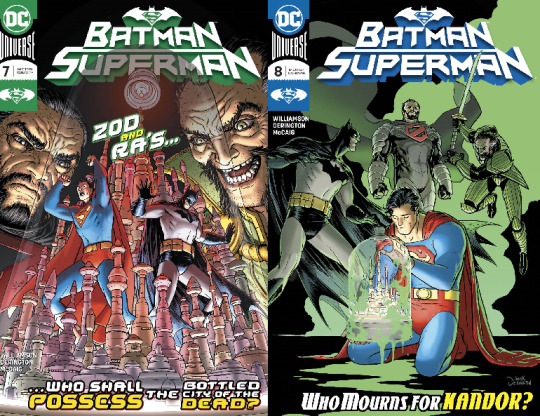
Batman Superman #7 & 8
Published by DC Comics
Written by Joshua Williamson
Art by Nick Derington
I have not read the previous six issues of this series where Batman and Superman face off against the Batman Who Laughs’ Infected heroes. I read the preview of the first issue that ran in the back of most DC comics and thought that was a strong preview with a good hook, but still I did not pull the trigger on the series. Nick Derington’s art as guest artist for these two issues, is what did it for me.I enjoy his artwork and said to myself “What the hey, it’s only two issues, right?” Well, turns out that was a problem because at the end of the second issue I wanted more of this story. I feel like it wrapped up a bit too quickly. Perhaps I’ve become too conditioned to the six issue story arc format? In this story Superman, Batman and Ra’s Al Ghul team up to stop General Zod from resurrecting the citizens of the bottle city of Kandor using a Lazarus pit. Joshua Williamson does a good job with the characterization of Ra’s Al Ghul. The plot moves along briskly, at almost a pulp serial pace, with new locations and fight scenes abounding. Even though I have not read the previous 6 issues and certain issues of other series referenced here I never felt lost or like I was missing out. Nick Derington killed it. Clear action and storytelling done in his signature style. Anyone wanting to see more of his work should check out the Batman Universe mini-series or the first volume of the Gerard Way Doom Patrol series. If Derington returns to this series, I’ll be back as well.
8 out of 10.

Black Panther and the Agents of Wakanda # 6 & 7
Published by Marvel Comics
Written by Jim Zub
Art by Scot Eaton (#6) & Lan Medina (#7)
Black Panther and the Agents of Wakanda is a fun little series for those of you who may have been thinking about picking it up, but haven’t. The stories are told quickly, with each being only two issues long so far, and the team changing up each arc. I feel like this makes this title perpetually new reader friendly-ish, as long as you have a passing familiarity with the characters and the events of their respective titles, mainly Avengers. I’m not reading Avengers and reading this series is not a problem for me. The premise here is that when smaller problems pop up that aren’t “Avengers worthy” current Avengers chairman, the Black Panther, calls on the Agents of Wakanda to save the day. Gorilla Man, Broo, Mockingbird, Kazar, the Wasp, Man-Wolf and Okoye from the Dora Milaje are a few of the characters who have popped up so far. Issue #6 was wrapping up a two parter where the Agents of Wakanda reluctantly worked with Deadpool to stop some rogue SHIELD LMDs, including the Livewires! This was the first story arc in the series that I thought was a bit of a drag, even though some prior issues were a bit predictable. I blame this on the presence of Deadpool. A character who can become annoying quickly if not handled properly. Over all issue #6 was a nice capper on the story and sent me out on a quest to track down the Livewires’ mini series from 2005. Issue #7 is the start of a new story arc that finds the Agents on hand at Avengers Mountain dealing with attacking Fin Fang Fooms! How cool is that? It was a so-so issue but had a great cliffhanger, promising a cool follow up issue. Despite my being ho-hum on these specific issues, this series is a lot of fun. It features a lot of cool underused characters, solid stories and artwork. Jim Zub and team deliver a great meat and potatoes comic book that is deserving of a wider audience.
7 out of 10.
Butcher of Paris #3 & 4
Published by Dark Horse Comics
Written by Stephanie Phillips
Art by Dean Kotz
In case you couldn’t tell, I took the pause provided by the quarantine to pull some comics I wanted to read and organize them alphabetically. This is another series I’ve been enjoying and am disappointed that the last issue won’t be released for who knows how long. For those interested this is the story of the hunt for a serial killer in Nazi occupied Paris. Previous issues had focused on the hunt for the killer while French authorties struggle to work under their Nazi inavders. Now that the occupation is over, new twists are introduced. The Nazi’s are being taken to task and our hero detective is accused of having aided the Germans! Meanwhile the killer is still at large. I feel like this comic is well researched both art and storywise. Strong plotting, smart dialogue and stylish art propel things along. The art is drawn with a slashy brush line, leaving open lines in the art and is colored with a limited palette making this book visually stand apart from your standard superhero comic. Everything about this comic, beyond the settings and characters obviously, feels very European to me, like it was previously published in album format overseas before being broken into standard comic size chunks for release in America. I mean this as a big compliment. If you’re enjoying any of the Hill House line of comics, a Euro comics fan, or looking for something without a member of the capes and tight brigade in it, allow me to recommend this to you. It’s a great mystery and I can’t wait to find out how things wrap up and the fates of our characters.
9 out of 10.
That’s the last of the new comics, on to the older stuff!
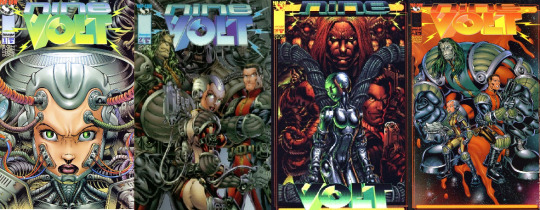
Nine Volt #1-4
Published by Marvel Comics
Written by Cliff Son and Anthony Chun
Art by Anthony Chun
Released in 1997 by the Top Cow branch of Image Comics, Nine Volt is the tale of a girl robot, an alien invader and a government agent working together to stop an alien invasion by a different race of aliens than the one on our team of heroes!
Back in the 90’s (like the Bojack Horseman credits song) I purchased the first issue of the series and that was it. More recently, I said to myself, you need more comic books, so I tracked this series down. I’m glad I did.
This was a fun time.
Re-reading the first issue of the series I can see why my younger self wouldn’t seek out the rest of the series. It’s basically all set up with not a lot of action, jumping from scene to scene with little explanation of who, what or why. A lot of the story is rooted in the reader having an understanding of the book’s influences and references, which I will say that I did not have at my disposal at the time. A lifetime of nerdery later, I’m better prepared for the world of Nine Volt.
First, the art by Anthony Chun is good, a little raw, but good. Definitely has an Arthur Adams element to it as well as a good dose of general 90’s comic book-y ness. It brings to mind the art of Dan Fraga on Kid Supreme ( a book I was obsessed with for some reason). A quick Google turns up that Anthony went on to work in animation, including stints on shows like Bob’s Burgers and Rick and Morty!
By issue #2 things are up and running. The good alien is being confronted by our girl robot character, Digit, an Impulse type character (young, raised in VR, a bit impetuous), and two governmental agencies are arguing over jurisdiction. All the FBI agents look the same, fun! After a brief dust up the alien, Ragnor, is soon working with Digit and the good guys. Meanwhile the bad aliens are taking control of a young, grunge-y looking preacher and his flock. The team assembles, led by a real Dirk Squarejaw type, Frank Holden from Defsci (Defensive Science? I dunno). A love story is started, it’s revealed that Digit is the daughter of the crazy professor that made her, Ragnor reveals the story of how the evil aliens decimated his home world. There’s a battle against the bad aliens where Digit, may or may not have heroically sacrificed herself . It’s a bit anticlimactic and some stof the plot lines mentioned advance a bit too quickly/tritely. That being typed, the creators pull this off nicely. It was very entertaining, if a little light.
If there was more to this series I would read it and it’s a shame there’s not more.
I’m ready for the Kickstarter reboot!
This, as stated earlier, was a lot of fun. It’s got an X-Files/Independence Day vibe to it, with all the aliens and secret government agency stuff. Plus a good dose of 90’s Image goodness. Despite Digit being prominently featured on the cover, she pretty much equally shares page time with all the other characters and is not treated as a cheesecake pin-up. The art, although raw and Image-y, doesn’t push style over storytelling.
It all adds up to a good read. A back issue bin gem!
7 out of 10! Recommended!
I read more but I can’t remember what, so that should say something about the quality of those books.
Until next time!
#comics#comic books#marvel#marvel comics#mcu#black panther#avengers#deadpool#action comics#batman#superman#dc comics#dcu#dc universe#butcher of paris#dark horse comics#nine volt#top cow#top cow productions#image comics#90s comics#back issues#comic art#comic book cover art#review#reviews#comics n such#john romita jr.#brian michael bendis#joshua williamson
0 notes
Text
Review- Star Wars Comics (September)
As it turns out between fire, family drama, and health issues I get distracted and forget to post my thoughts on comics based on an old movie franchise. Honestly, if you think this review is late I finished Thrawn back in May and haven’t written word one on that book. Not because it’s bad, but because life kept getting in the way. Anyhow, enjoy my reviews and if you have the chance try to find me at LA Comic Con later this month.
THE REVIEWS:
Captain Phasma #1: The ‘journey to The Last Jedi’ has its comic book tie-in with a series following a character with no personality who only lasted five minutes in her premiere movie. This comic would be an uphill battled for a seasoned vet in the comic world and in this case it might be a hill that is a little too steep for Kelly Thompson. The story is told in flashback as Phasma recounts the events after she is dumped in the trash compactor. The framing device is her making a log of events to hide her involvement with taking down the shield. This results in her trying to track down Sol Rivas, a soldier who has learned that Phasma took down the shield. This was a rather dry story, but it does set the stage for the rest of this mini-series so things may pick up once we can move forward with the plot. The major saving grace of this comic is the art. While it is far from perfect it does have some great moments that are visually appealing. However, there are some sections were the art is cluttered or disputed by the sound effects. This isn’t a bad comic per se, it is just weak, but readable. If you wanted to know more about Phasma then begin with the book, but after that give this comic a read.
Captain Phasma #2: This is a much better issue than the first. This time we follow Phasma and her Pilot as they continue the search for the ‘traitor’ Rivas. This leads them to a nearly barren planet where they battle monsters and meet the locals. One of the more interesting parts of this story is that Phasma and the Pilot change out of their armor to attempt to blend in with the locals. While Phasma does not show her face, the Pilot (now called ‘Pilot’) was revealed to be quite the attractive woman. The writing is well done with several visual pages to augment the stoic nature of the characters. Add to that, the beautiful art and this is turning around to become one of the better mini-series. The hunt for Rivas continues in the next issue and the fate of Pilot will have some fans on the edge of their seats.
Poe Dameron #19: Yet another mixed bag issue of this series, par for the course. This time we wrap up the ‘War Stories’ arc with Poe breaking out of prison and the other half of the team breaking out of their capture. It has a big fight scene at the end and the preview for the next issue implies that we will be making it back to the main plot (and conclusion) of this series. The writing is stale at best and insulting at worst. Some character decisions are mind boggling and feel really out of character. Especially a minor face-turn for Terex which is completely out of character considering the events of the earlier issues in the series. On the good side the art has improved with faces showing proper emotions and the action looking exciting. This wasn’t the worst issue of this series by far, but it is more than obvious that ideas are running out and this series has gone on far longer than it should have.
Star Wars 36: Finally, we return to the loose plot thread about the fate of C-3PO. This is paced out like one of the droid focused episodes of Clone Wars, but isn’t quite as fun. R2 seems to be a little overpowered as he takes down several Stormtroopers and breaks C-3PO out of a star destroyer. prison It isn’t bad, but it just doesn’t feel ‘right’. There isn’t much dialogue to speak of as the protagonist can’t speak, but there is a monologue that likely comes from the user’s manual for R2-D2 and the fumbling of various Imperial soldiers. The art contrasts the story by being excellent with good facial designs and energy in the action scenes. The comic ends with a tease for another Scar Squadron mission that will hopefully lead into a new story arc rather than these stand alone (and very boring) stories.
Star Wars Annual #3: While the annuals in this series have been mixed this was a refreshing and fun filler adventure. This time Han and Leia are trapped on a barren world as they battle monsters and bounty hunters. There is a nice ending that fills in a little bit more on Han reasons for sticking with the rebellion as well. The dialogue is well done with some good one-liners and the characters behaving in a manner that represents their attitudes in the movies. The art is well done and the coloring has a throwback, newsprint, style. It might not appeal to everyone, but it is a nice change from the more common hyper realistic or cartoony style that is featured in most comic in this franchise. This isn’t an imperative comic to read, but it is an enjoyable adventure and somehow much more fun than the previous filler stories from the main series.
Mace Windu #2: This bad arc of the Clone Wars TV series continues. This time Windu’s team stumbles across bad guys and fights them. The writing is terrible with no characters having any personality, the battle dialogue is bland, and the Separatist’s plan makes little sense. Add to that the murky art, bad facial expressions, and lethargic fight scenes. There is little chance of this mini-series improving so skip this unless you need to read everything Star Wars or you are reviewing it for the internet.
Darth Vader #5: The arc comes to an end with Vader taking the final steps toward forging his lightsaber. This is a rather simple comic that is mostly told with visual storytelling rather than clunky dialogue or endless internal monologue. The visuals paint a strong narrative that makes this a very intense ride. Vaderr’s body language works well to show his struggle and the contrast of colors makes key moments stand out. The little dialogue in this book is fine and works well with the often silent Vader. This book is starting to live up to the previous volume, but if this comic sticks to the visual style it might actually be able to achieve that goal. The preview for the next issue is intriguing and now we know how Vader got his new lightsaber. Overall, this was a good first arc despite the weak beginning. The best issues are those with little dialogue that use the art to tell the story. If you are a fan of the character or have an interest in the early days of the Empire this would be a great series to pick up.
Rogue One #6: The final chapter of the story concludes the battle on Scarif and ends the story of Rogue One. This is one of the few issues of this comic that is out shined by the movie. The action works so much better with moving pictures rather than still images, no matter how well drawn. The major positive about this issue is that there is a little extra dialogue among the team before they die and the final page adds a nice capstone to the story. The art is still really good with the characters showing more emotion than they do in the movie and the action looks really good. This is a fast read and it was an enjoyable retelling of the movie. It doesn’t add enough to be a ‘must have’, but it is worth a read if you want to see some of the little things that were omitted from the movie. If you love the movie then you will enjoy this comic. If you didn’t like the movie this comic might give you a different opinion on the story. Overall, I really enjoyed this comic and I hope that all future adaptations are up to this standard of quality. More importantly, I’d like all Star Wars comics to be up to the standards of this adaption because that would make many of the comics in the EU much more enjoyable.
Doctor Aphra 12: This is easily the best current ongoing Star Wars comic, if not the best of all Star Wars comics thus far. This issue combines horror, action, comedy, and suspense in a way that should make it a primer to those who want to know how to write and draw a comic book. The story follows the madness that happens when the Empire arrives at the criminal auction as Aphra tries to find a way to escape. There are some nice twits that come up in this issue that should not be spoiled, but they are building this series into my favorite of the current timeline. The art is also great with the action looking intense, backgrounds looking creepy, and even the droids somehow have emotion in this unmoving faces. If you have not jumped into this series, do so, it cannot be stated enough that this is a great book that keeps getting better.
#star wars#comics#starwars#doctor aphra#darth vader#poe dameron#rogue one#story#captain phasma#the last jeid#tie-in#book#review#reviews#comic review#star wars review#star wars comic review#september#late#late review#good comics#mace windu#bad comics#everything star wars
0 notes
Text
ANALYSIS -- PETER PARKER: SPIDER-MAN, VOL.2, #13 (January 2000)

SCRIPT: Howard Mackie
PENCILS: Lee Weeks
INKS: Robert Campanella
COLORS: Gregory Wright
LETTERS: Troy Peteri for RS & Comicraft
EDITORIAL: Ralph Macchio, Bob Harris (EIC)
PETER PARKER: SPIDER-MAN #13 is an interesting parallel to last week’s BATMAN: GOTHAM ADVENTURES #17. It was made at roughly the same time, and occupies a similar place in its series run (the series’ second years, after the look and feel of both books had been established). This leaves both issues to preform similar duties — not to open up new ground or bring everything to a close, but to keep the ongoing macronarrative afloat with exciting, well-made, meat and potatoes storytelling. Both series are secondary titles, rather that the AMAZING SPIDER-MAN or BATMAN books that serve as the flagship titles of their respective lines, and therefore they have a certain latitude to explore different stories those main books don’t or can’t. And like Scott Peterson, Tim Levins and Terry Beatty, Howard Mackie, Lee Weeks and Robert Campanella are lean, dynamic storytellers with intimate, hard-earned understanding of the technology of comics.
The differences are few, but significant. GOTHAM ADVENTURES is a publication explicitly targeted at younger readers, while PETER PARKER is aimed at the slightly older mainstream Marvel audience — its storytelling is meant to be denser and more interconnected to ongoing story threads. GOTHAM ADVENTURES is drawn from animation-informed character models, while PETER PARKER is drawn in the more illustrative Marvel house style. Which brings us to a final, somewhat abstract but sometimes very important, difference; GOTHAM ADVENTURES is a DC Comic, where PETER PARKER is very much a Marvel Comic.
With that, let’s get into 2000’s PETER PARKER: SPIDER-MAN #13 — “LIVING IN OBLIVION!”
And please, feel free to check me on any mistakes I might have made, add your own commentary, or share similar examples of good comics done well.
PETER PARKER: SPIDER-MAN #13 and all characters contained therein are property of Marvel Comics, reproduced here solely for educational purposes.
COVER
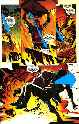
This cover is not only powerfully simple, it also sets us up for a gutpunch visual at the end of the issue. Note the great anatomy on the crumpled Spider-Man at the bottom, apparent even with half of his costume reduced to matte black. The sketchy black in the Carnage face is a little messy for my tastes, but the face would’ve been too insubstantial without it. Maybe if the Face had been expanded to huge, nightmarish Jack O’Lantern proportions, it could have stood better on its own.
PAGE ONE
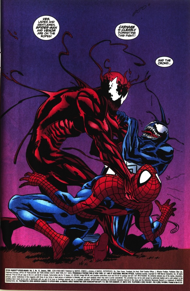
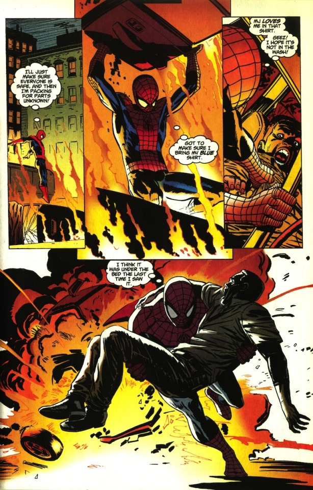
This opening splash is great. The dialogue clearly introduces all three characters by name, and the staging immediately shows how powerful Carnage is. The absence of background is compelling — we want to know who’s saying these things, and to see how Spider-Men gets out of this mess. The barely hinted-at grass they’re kneeling in give the scene just enough of a sense of place to make the it feel real.
PAGE TWO-THREE

POW! What a followup splash! Only it isn’t actually a splash, is it — it’s a five-panel page, expanded to twice its normal size by stretching it across the real estate of a double page splash. Such a power move... you can only pull this kind of thing off every once in a while before it gets gimmicky, and they decided to come out the gate swinging with it. The way this forces you to physically rotate the book even ads impact to Carnages laterally sweeping blow, which your eye immediately goes to, since it’s aligned with the fold of the page. Weeks made sure the blow wan’t QUITE centered on the page, however, since that would make it disappear into the fold, defeating the whole point. With one move, Carnage knocks Venom away from us while sending Spider-Man sprawling towards us, making him seem even stronger. The double-sized page also allows the scene-setting panels one and five, which would come across as tiny on a normal page, to seem wide and immersive. We also get our first close-up of the issue in panel two — Carnage, establishing this as HIS show.
The one weakness of the double-page format is actually evidenced in my scattered commentary above — because your eye is drawn immediately to the center of it, you end up reading the page in pieces rather than the top to bottom, left to right manner pages are drawn to facilitate. Fortunately, the action on this page is really less sequential than it is scene-setting, so nothing is really lost. This time.
PAGE FOUR
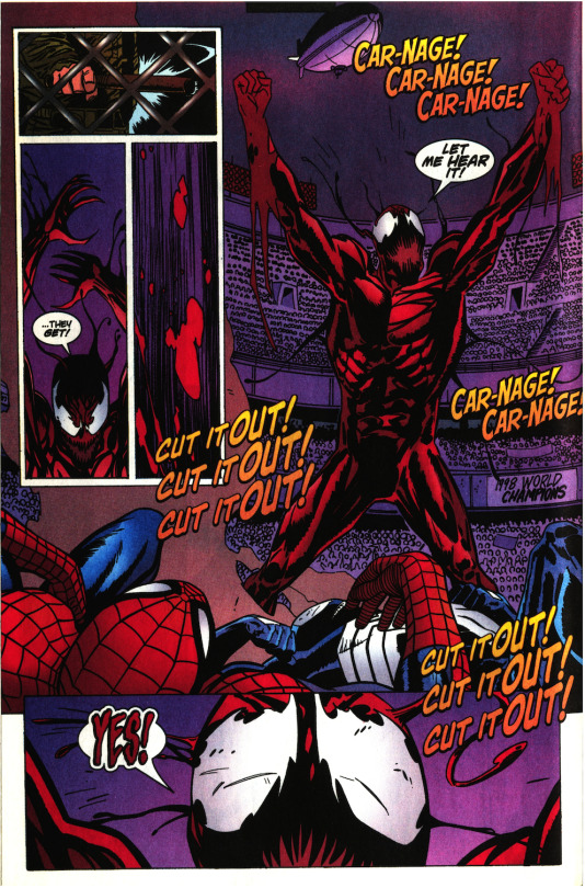
I love the little circuit of panels one though three. Introducing the incongruous element of the baton hitting the fence in panel one sticks in your reading flow, twisting your understanding of the space and adding to the weird atmosphere of the scene. More glamour shots and close-ops of Carnage — we start getting the inkling that this might not be his show so much as his fantasy.
PAGE FIVE

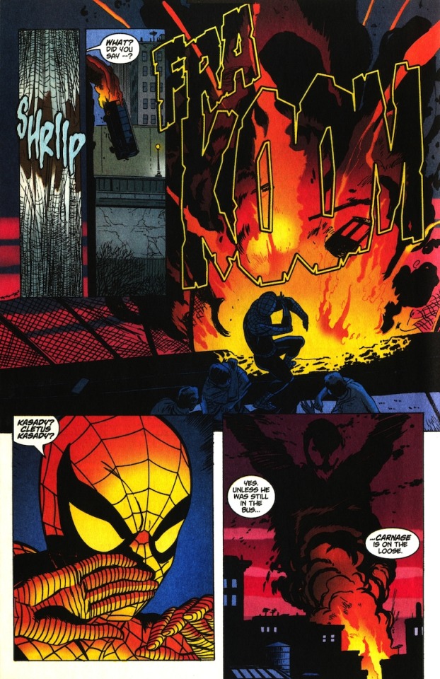
Panel one repeats the pose of the close-up in the last panel of the previous page, indicating the shift from fantasy to reality. We now see the face was Carnage’s — aka Cletus Kasady’s — weird tech-inflected jail cell. Weeks consistently stages Cletus in the background, making him smaller (and implicitly weaker) than the guard at all times. This does a couple of things for us; 1) it shows us the cruelty of the guard in charge of Cletus, giving us a nice mini-boss for his part of the story. 2) It catches us up on why Cletus doesn’t have his alien costume anymore (and if you didn’t know what that was when you picked up the comic, you can intuit everything you need to know from what you saw in his fantasy). 3) It establishes an enmity between Carnage and Venom, which may come into play later. And finally, 4) even without his costume, Cletus Kasasy is clearly dangerous, unhinged, and patient.
PAGE SIX

This page is… muddy. Weeks and Campanella do a good job of setting up the geography of May’s apartment, but Wright’s colors make it difficult to delineate between middle and background. The BING of the elevator is way too dark, disappearing into a tangent with the ceiling. Jill and Arthur aren’t well established until we see them in panel five, which makes Jill’s crying seem even more sudden and forced, and the phone-drop in panel six is really over the top. It’s possible the script for this page was re-worked after the art came in for some reason or another, but the end result is just not that great. Totally kills the momentum from the previous pages.
Now, you shouldn’t point out a problem if you don’t have a solution, so here’s an easy, non-structural fix for at least some of this: put the phone in May’s hand in panel two, and then move May’s first two lines from panel three to panel two. In script form, it might look like this:
PANEL TWO — MAY answers the phone, glancing over at the door as she hears the elevator bing.
MAY: Hello! Parker Residence. May Parker Speaking.
MAY: Oh my… someone’s coming up in the elevator, too!
MAY: Could you hold on for one moment, please?
PANEL THREE — JILL and ARTHUR STACY enter the apartment. MAY looks over at them as they enter, covering the mouthpiece of the phone.
MAY: JILL and Arthur STACY! What a pleasant surprise. I’ll be with you in a second. I just answered the phone and—
I think this is more natural, and gives the vaguely useless panel two some activity. It also makes the whole point of panel three “Jill and Arthur enter the room,” which does a better job of introducing them.
PAGE SEVEN

Weeks employs one of my favorite tricks here — conveying the physical freedom of a character by having them slightly overlap the panel boarders. You can see it in Spider-Man’s figures in panel two and four. Four is especially effective — having Spidey partially outside the panel helps give us the feeling that he’s dropping into a scene in progress. Note also how Weeks slowly brings Spidey closer to us throughout panels one and three, ending in a nice juicy close-up. We’re nearly a third of the way through the issue and this is the first time we’ve actually met our hero, so this is a good way to get acquainted with him this late in the game. Some nice relatable internal thought also helps us get on the same page as the titular Peter Parker; imagine this scene without any lettering and see how cold and remote our faceless hero becomes.
PAGE EIGHT
Mackie give us a fun superhero take on the “daydreaming about your vacation at work” shtick. Weeks maintains a nice rightwards line of motion from Spidey’s dive in panel one, tearing off the door in panel two, the look over the shoulder and down the right-reaching arm in panel three, and then changing course by having Spidey run towards us in panel four, away from the rightward trajectory towards danger in the first three panels. An annotated version of the page to demonstrate what I’m talking about, just in case I’m describing it clumsily:
Spidey’s lean in the last panel is dynamic as hell.
PAGE NINE

The large black expanse of the bridge might seem like a waste of space at first, but it’s actually a way for Weeks and Campanella to stage the teetering bus high up in the panel and page, helping to sell the precarious verticality of the soon-to-fall vehicle. It’s kind of a static panel, which makes me think there might have been some more rubble and activity in the pencils that got lost in the inks. The ‘Department of Corrections’ label in panel four is a nice, natural way to establish the prisoner transport element of the scene without relying solely on the expository dialogue in panel five. It sets us up for the revelations of the rest of the scene and keeps the plot moving — another way in which this sequence is playing catch-up for being so relatively late in the issue. It’d be nice if Wright had used different colors between the uniforms of prisoners and the guards (established in the Kasady scene as grey and green, respectively).
PAGE TEN
The bus falling and exploding is a cool, kinetic way to put a button on this scene. I’ve been criticizing Wright’s colors so far, but he does dynamite work on this page. I love the blue figures in front of the brilliant blaze in panel three, as well as the glowing reverse angle on Spider-Man in panel four. Some heavy, but not too heavy, symbolism in panel five — the looming presence of Carnage hovering over a sleepy, unsuspecting city.
PAGE ELEVEN

This page is a fairly flat “people in a room talking in cliches” scene, but Weeks keeps it alive by changing up his camera angles, going from wide shots to close ups, and employing another favorite trick of mine by dropping out the background and panel borders in the panel three group shot. Note the use of the spiky houseplants as the visual shorthand for May’s apartment.
PAGE TWELVE
Weeks and Campanella dwarf Spidey with flaming wreckage in panel one, selling the pressure and anxiety he feels at the prospect of Kasady’s escape. We cut to a relatively close shot of Spidey in panel two to smooth the transition to an extreme close up of Kas(s)ady’s empty prison uniform and cuffs in panel three. Dropping out the background and panel boarder in panel four emphasizes the immensity of the danger Spider-Man, and New York by extension, now faces.
(Trivia: Jack the Ripper’s bodycount is generally accepted to be a horrible -- yet ultimately modest in the grand scope of comic book super villains -- five.)
PAGE THIRTEEN

The close-in anatomy shots across the first four panels builds to a good full-body reveal in panel five. I’m not sure who the uniformed guys on the ground are supposed to be; I guess they’re cops? I can’t see a hardware store having armed security on hand. It’s just weird to use dead cops solely as serial-killer-escape potpourri. It makes the scene feel fake. They don’t even need to be there — the fact that the knife blade is the only part of Kasady that isn’t red indicates he’s covered entirely in paint, not blood, and it’s not like he couldn’t just be ranting to himself. Personal peev, and anyway, it’s very well drawn. I can’t find any one person “J.P. Bradford” might be. Who knows? Maybe it’s Lee Week’s brother-in-law.
PAGE FOURTEEN

Man, maybe I’m missing some context from other Spider-Man comics of the time, but these Aunt May scenes sure feel like a whole lot of nothing. Waiting by the phone in a well-lit apartment is just about the least dynamic thing you can put on a page. She’s literally napping in this scene. That said, panel three is really well drawn, and Weeks nicely ratchets up the intimacy in the last two panels by sacrificing some real estate on either side.
(These Aunt May scenes are the exact reason for Wally Wood’s 22 Panels That Always Work.)
PAGE FIFTEEN

Weeks easily indicates that the vehicle Kasady jumps on in panel two is a limousine just by including those vertical ornaments in between the windows. Wright leaves the blue in his eyes, reminding us he’s just a crazy guy in paint right now, and not the alien death monster he’s still claiming to be. See also: the hair in his face, the wrinkles on his forehead, his toenails.
PAGE SIXTEEN
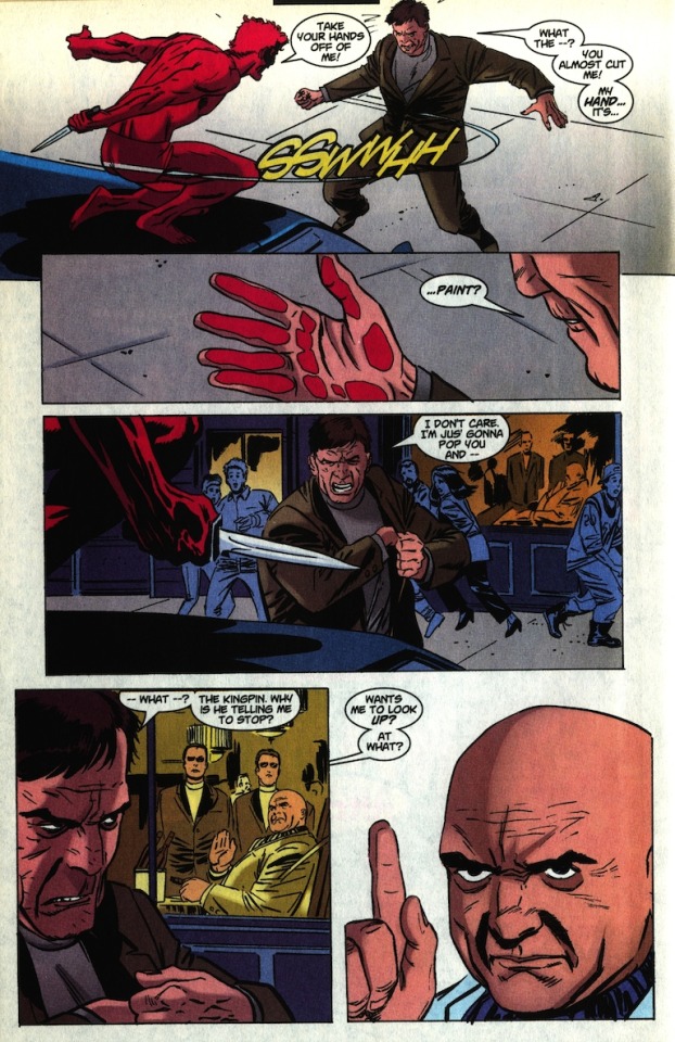
Probably just a coincidence, but Kasady’s slash in panel one follows the same motion as Carnage’s sweep on the page two-three double page. Very well-drawn Kingpin here, his intelligence indicated with subtle hand motions as opposed to Kasady and turtleneck goon’s broad pantomime.
PAGE SEVENTEEN
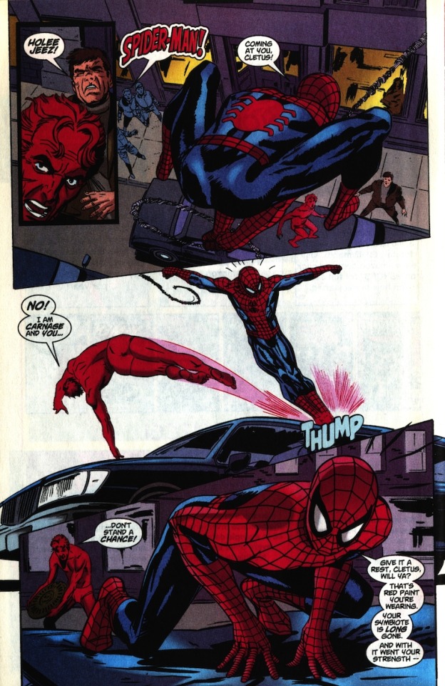
Panel two gives us another good look at the environment, making the following action feel more grounded and understandable. It’s generally a good idea to cut to a wide shot at the start of an action scene. Meanwhile, Weeks continues to be a stellar anatomist.
PAGE EIGHTEEN

Including some onlookers in panel one helps sell the moment of Spidey getting blindsided by Kasady. Bit odd that Spidey couldn’t evade a manhole cover when he usually dodges bullets, but that’s a nitpick. The creative team keeps the fight personal by cutting to the closeup in panel two — this sequence is closing out Kasady’s story from the opening of the issue, and this closeup helps keep it his story. For this page, at least.
PAGE NINETEEN

Now the tide turns against Kasady, as it must, and we switch back to Spider-Man’s internal thoughts. Spidey goes from a prop in Kasady’s story to Kasady becoming a prop in his.
I gotta say, Cletus’ short-lived reign of terror leaves me pretty cold. Despite the work done to establish his captivity and his enmity with the blonde guard on page five, we never get any real payoff on it. His escape happens in between pages, and the guard is never seen again (it’s possible he’s supposed to be the guard Spider-man talks to on page nine, but even that’s some poor followup). For all the great buildup of Cletus Kasady as an enemy to make Spider-Man quake in his webs, the confrontation we ultimately get fails to live up to it. It’s shame, because as far as the Carnage stuff went, up to page twelve we were really cooking.
The page ends with this gorgeous montage panel — Venom huge (and possibly even diegetic) in the foreground, while the Kingpin looms in the sky (definitely non-diegetic) like a malevolent blue moon. Spidey’s tiny form shows his childish declaration of independence to be just that; there’s larger forces in play than the desires of Peter Parker.
PAGE TWENTY

Speaking of Peter Parker, here he is at last. It may even be intentional that Peter’s been spending the whole issue as Spider-Man, unable to even end his thoughts without a crisis coming up. Weeks indicates Peter’s feeling of independence of personal empowerment by steadily increasing his size throughout the three panels, culminating in him literally clenching the Spider-Man mask in his hand, symbolically getting a hold of his life. Or so he thinks.
PAGE TWENTY ONE

Lot going on with this page, all of it good. Peter’s graceful, playful jump into the stairwell shows us his frame of mind as he heads into this heavy scene — knowing he’s in a good place will make his imminent descent into a bad place all the more crushing. As Peter enters the apartment, Wright does a good job of drawing our eye to Aunt May in the background with a warm yet menacing gold-orange light. Since we more or less know what Peter’s heading into, Weeks helps us feel the tension of his uncertainly by keeping us close to him in panel five. Great use of black negative space in panel six. Note that the action in the last three panels happens along the same axis, helping to build the tension further.
PAGE TWENTY TWO
Huge, empty splash page; they’re in shock, in pain, all alone, with only each other to hold onto. Like I said at the beginning, I think the cover thematically connects to this final splash page — the dark and bloody Spider-Man moment setting us up for the eventual sucker punch of the big empty Peter Parker moment.
Overall: A very well-drawn comic that suffers from a script that maybe relies a little too much on genre conventions and ultimately fails to pay off on its imaginative first half, as well as a few missed coloring opportunities. A lot to like from all parties involved, though.
At the end of all this, I’d be remiss if I didn’t include the back cover, which is a stone cold comic book classic:
Unimpeachable.
0 notes
Last Seen Blogs

myinnerdelusioncollectorus
Untitled

funcuckcouple98
Just Living Life

mother3blog
Mother 3 Fan Blog

wielandtransporte
Wieland Transporte - Umzugsfirma in St. Gallen

nadori
la forêt sombre