#but i dont really care tbh
Text
Cheeteh z, answer honestly, do you hate women
#if cheeteh z ever found my blog i would be destroyed#but i dont really care tbh#do i actually think cheeteh z hates women? no#do i think its odd how important women are never featured in his maps? yes#wheres leopardfoot. mothwing. actual tawnypelt. snowfur. mistyfoot. stonefur(honorary woman)#where are they cheeteh z#also what cycle of abuse??? pinestar did nothing. literally all you showes was him leaving#*showed#this map sucks#that list of women was just for tigernoir too. i could go on#if someone actually found my blog...? eh i wouldnt care#i dont care if i get anon hate. i dont care if i get blacklisted from his projects#im just glad to know that im not the only one who thinks his maps are weird#and confusing and useless alot of times#its like an animation studio but you dont get paid. these maps arent for fun anymore#maybe i should make a ramble tag..
17 notes
·
View notes
Text
atp i genuinely doooon’t care if the old guard two is the worst thing put to film i just want to see the best character of all time (andromache the scythian) and her loser henchmen and everyone’s favorite girl nile freeman again
#its not even funny anymore WHERE IS ANDY AND NORIKO!!!!!!!!!!! it was supposed to be the year of dyke drama 😞😞😞😞😞😞#like given the way they structured the first movie the second would have to be almost wholly original and differ a lot from the comic#like andy cant go thru the shit noriko puts her thru so im guessing the script would switch her out with nile getting tossed in the ocean#but that doesnt really work with norikos comic characterization (trying to get andy to see her point by making her go thru what noriko did#isnt something quynh will gaf about if andy isnt one of the immortals. andys become thr ‘vermin’ noriko hates!!!)#and given the end of the movie everyones chill with copley so joe and nickys whole subplot cant exist anymore…. idk maybe theyll switch out#copley with moose?? idc as long as we get their stupid car conversation tbh makes me laugh#honestly given the changes that would have to be made they probably just made a stupid movie and don’t want to release it. but I DONT CAREEE#its not exactly like the first one was that good i still mute it in preparation for every cringe needle drop like its a lame movie but its#genuineeeeee fun like i seriously do not care netflix give me my movie!!!#the old guard
379 notes
·
View notes
Text
On the topic of “reblogs>likes”, I find that I don’t reblog art with these “out of spite and hatred in my heart” or whatever the fuck, I’m just kind of sad that this is a phenomenon in the first place. Like, as an artist, I absolutely understand that reblogs do count, especially depending on who reblogs it. But also as someone who used to obsess over the numbers on notes and get frustrated about something that I put effort into not getting attention, you kind of have to learn to realize that a) it’s not healthy to seek validation all the time from people on the internet and b) post what you like to post, and you will attract people that will reblog your posts eventually. Sometimes a post will just get happen to get seen by a popular blogger and reblog it, sometimes not, and you are not “owed” their reblog because they’re popular, which is another argument I’ve seen where people think they’re obligated to reblog their art. Sometimes it just depends on the content or the fandom and you have no control over it and that’s Fine. Some art I like enough to reblog, some art I’ll just leave a like, and that’s not a measure of how “good” the art is. And everybody operates their blog differently and nobody should be obligated to do one thing or another. And before anyone brings up “relying on social media for business” I absolutely do understand as someone who does business online, but you’re going to be getting attention primarily from people who already like and follow your art, and from my experience and seeing other people, lamenting on why your posts don’t get notes and if your art is good enough for attention is just going to drive people away. Sorry for being blunt. Have confidence in your art. Idk I wish there was more nuance about this topic but most talk about it annoys me anyways post over
#al speaks#like I don’t really think its assholish to not reblog a post . like its not that deep#I feel like the moment you try coercing someone into doing something it’s just going to be annoying but thats my personal opinion#and tbh I dont really care about ‘inflicting it on followers’ thats not something I particularly worry about#it’s just how I run my blog personally
1K notes
·
View notes
Text
alright, here it is: ZENO'S COLOR GUIDE 3.0 !
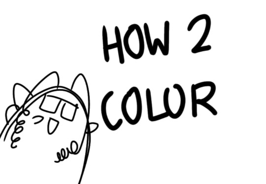
here, i'll have three "chapters" regarding color:
CH1: how i color in illustrations
CH2: color and character design (in zeno's case)
CH3: how zeno makes his colors cooler
CH1: HOW I COLOR IN ILLUSTRATIONS
it must be noted that, as of lately, i heavily use halftones in my art and the way i use them for gradients effects my color choices. of course you don't need to use halftones if you don't want to, as it's just my personal choice, but anything regarding halftones here could (probably) also apply to regular gradients!
when choosing colors in an illustration, i usually have three things in mind: mood, character, and contrast. we'll be using "gloomy bunny naptime" as an example here.
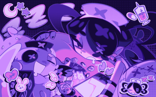
MOOD: what's the vibe of the piece? for example, here in "gloomy bunny naptime", wanted a mellow, sleepy vibe, so purples and pinks seemed like the best choice. these colors also have a dreamy effect due to being common in real-life early mornings/summer nights - basically, i tend to use associative colors in illustrations.
i usually only use a pallete of 3-7 colors, though of course more characters calls for more colors. for multi-character pieces, i would actually make a "rainbow" of colors based on the mood of the piece - essentially, a bank of colors to use for your colorful casts based on the actual rainbow. you can alter this based on the saturation levels you want! hope that makes sense. i'm not the best at this though, so i would heavily recommend looking for guides from artists who are more skilled in that department.
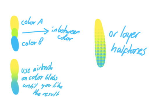
CHARACTER: velvet is the focus of the piece, and as a character her palette is made up of many purples and pinks. of course, it's easier because she and ribbon both have similar designs, but i would still recommend using colors based on/complementary to the focus character's pallete, though this is a rule that can and should be broken if needed. gradients can be used to provide a smooth transition from color-to-color and add depth to the piece, as well as showcase velvet's pallete. when making any gradient, you probably want to have a vibrant middle color. this is difficult to achieve in most art programs, so i'd do it like this:
you can use gradients in lots of cool ways to make stuff pop! (i think this collage shows i use too much purple and pink though.)

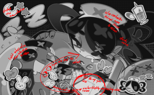
CONTRAST: the context of the piece also aids the color through contrast. (that's a lot of Cs!)- we see that velvet is just waking up, and the light from her switch is glowing brightly. i wanted to convey something like her switch suddenly turning on in the middle of the night, waking her up - so the console emits "light" in the form of illuminating the contrasting color of pink against the purples. it might seem specific to this piece, but what i'm trying to say is that contrasting colors can lead the eye to the focal point of the piece, that being velvet herself. because a great deal of the rest of the piece is dark, we look at the contrasting switch screen - the brightest thing in frame - and our eyes move around and up to take in the focal point character. at least that's how i wanted it to be ;w; i guess you could convey it as something like this?
CH2: COLOR AND CHARACTER DESIGN (IN ZENO'S CASE)
this is where i start to get annoying, so stand back! when deciding on colors for a cast of characters, there are many factors: time period, variety, personality, and more that i can't think of.
TIME PERIOD: this one is simple. for example, a futuristic time period (such as that in x-calibur) calls for colder colors, such as greens and blues. for characters involved in futuristic professions such as space exploration, this works incredibly well. for modern time periods, less focus can be on colors and more on the shapes of the clothes, but this is not a shapes tutorial! i don't have any ancient times oc stories, but i'd probably use earthy and warm tones.
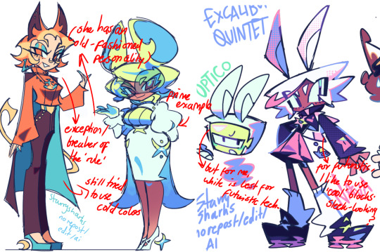
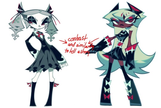
VARIETY: this is also rather simple. i try to be aware of the palletes that i used, and the similarities they might have with other characters. i try to use similar colors for characters who belong to certain organisations or have a uniform, but of course, it's not like catholic school students adhere their entire look to their uniform, so this is a rule that can be broken yet again. art is all about learning things and breaking them, remember that!!!
color can also be used for symbolism. my absolute fav example for this is vivica and octavia - the amount of red in their designs is supposed to represent the amount of freedom/passion/anger/confidence they have or are allowed to express under their different circumstances. as vivica belongs to a strict organisation, she has far less red in her design, showing her emotions are stifled - meanwhile octavia has it as her main complementary color because of her freedom to express her emotions, though those emotions may be destructive because of her circumstances.
PERSONALITY: what colors are associated with your character's personality? i actually usually refer to magical girl groups to see what's commonly associated with different colors. here's the main trend:
red: hot-headed, passionate, firey
orange/yellow: bright, happy-go-lucky, sunshine personality
green: wise, mellow, kind
blue: serene, graceful, elegant
purple: magical, regal, fancy
pink: usually the main character (though this because magical girl anime tends to be marketed towards young girls), sweet, relatable, determined
of course these are only stereotypes from one genre of anime, and different colors have tons of different meanings. color theory is the best way to learn this! these colors can also express different moods, which ties into ch1. i myself constantly ignore these rules - v-con, a bombastic hyper DJ, is purple (though he does have yellow accents) for example. basically, i just take them as a general rule and try to have them in mind while drawing.
CH3: HOW ZENO MAKES HIS COLORS COOLER
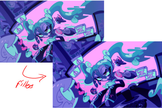
this might be the most important part of this guide. once again, there are a few things to consider here: filters, hue, overlays, and more!
FILTERS: for ibispaint, you can use an adjustment layer on your whole piece to use a filter. i usually only use brightness/contrast here - upping the brightness (or darkening it based on the mood of the piece) and upping the contrast. this helps to better express values and intensify the colors if that's what you want. i often use it in all my pieces to some extent.
hue/saturation/lightness is also helpful in moderation. you can alter the hue - though it usually only helps if you bring it back or forward by just a few points, or the entire pallete will change. saturation is what it sounds like, and slightly over/desaturating the piece can help with atmosphere. lightness is what it sounds like - lightens the colors in the piece. i don't use it at all.
posterize and sharpen mask are some that i've used recently. posterize can add some crazy effects to your art, but i'd probably need to edit it slightly after using it because it can mess with certain colors.
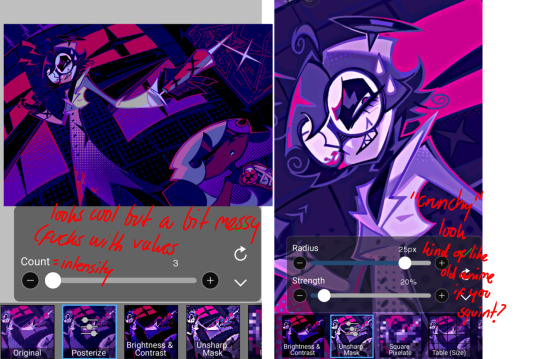
HUE: it's a layer type that can change the overall hue of the piece. i usually use it at a low percentage for atmosphere. kind of like a gradient map but nothing like it? idk
and OVERLAYS: i just use a very saturated blue/purple color over the entire piece at a very low percentage, around 5-10%. it can wash out the piece at too high a percentage.
and that's basically it! sorry it kind of derailed at the end i spent like 2 hours on this and got super tired. goodnight i'm going to sleep please also look at other artists etc etc. bye.
#zeno's art#long post#color tutorial#liar by korn is actually a really catchy song yea the lyrics are weird but its so good tbh#peak drums and bass and guitar and vocals and then the lyrics are hot booty. this is what nu metal's all about people#ask questions if you want#about nu metal or art i dont care
312 notes
·
View notes
Text
okay fantasy high fans choose your fighter
#i know a lot of people seemingly were really betrayed by oisin#but some people (me) accidentally really care about buddy#a lot of people are partial to lucy!#not me tbh i dont know her enough to care that much#but buddy really struck a chord with me idk why#anyway#fantasy high#d20#dimension 20#fhjy
101 notes
·
View notes
Text


Frisk and their last resort shithead dad
#Best and worst ideas I've ever had is to force a child into ink's care every chance I get. he needs it methinks lol#I call ink frisk's dad but I dont really see their relationship as a 'child and father' one tbh. it's just funny to say#being a dad is a big no no to ink cuz that would mean he would have to be responsible#and frisk just doesn't want to call ink their dad cuz they don't think that highly of him lolz (they still like him a whole lot)#u can say that their relationship is like weird estranged siblings that only recently got into contact or something#ink sans#core frisk#sans au#undertale au#art#myart
125 notes
·
View notes
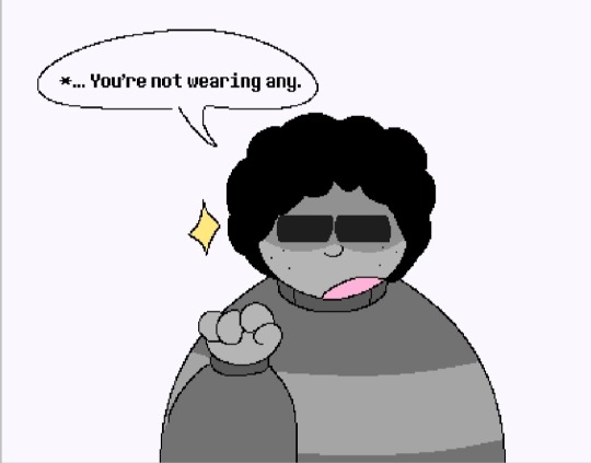
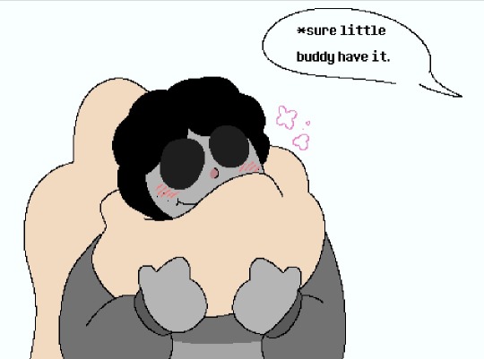
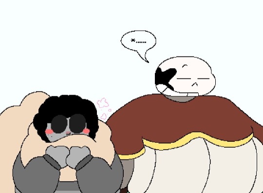
Photo
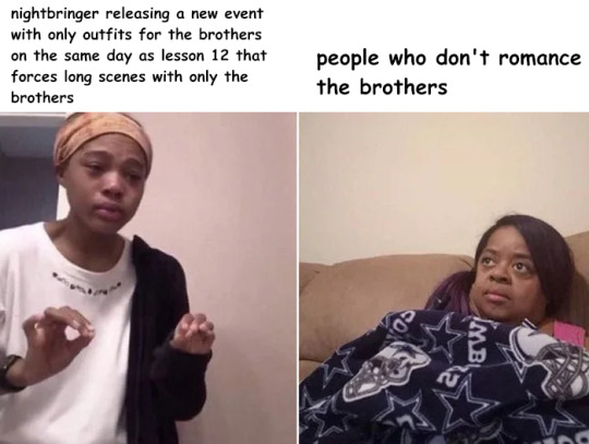
some of us are suffering barbussy drought and they dont even care smh
#im DYING. please i dont care <3#also really... another cliffhanger?#obey me nightbringer spoilers#obey me#obey me nightbringer#i need barbatos to be nightbringer just so he gets ANY screen time apparently#simeon's even worse off right now. i have zero trust tbh
477 notes
·
View notes
Text
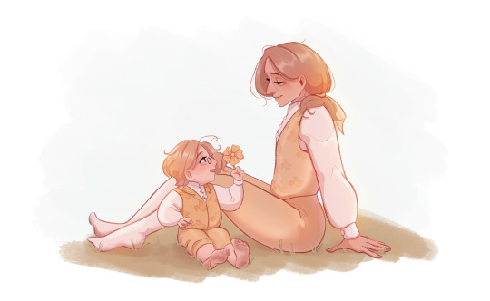
☀️🌼
#just thinking of them running in the grass together and then sitting under a tree without a care in the world 🥺💖#i dont really see them as father and son tbh#more like big brother dynamic#or whatever those gilmore girls had going on#only really in a human fruk au do i see fran and arthur as parents#anyway#francis bonnefoy#matthew williams#hws canada#hws france#aph france#aph canada#my art
478 notes
·
View notes
Text
Women, so pretty, so shaped, i am so lesbian,,,
#im also incredibly dysphoric tonight#but i was told by my coworker im incredibly feminine by her earlier#and i mean yeah#.....#i am a tall weird internet woman who likes to draw#so funny how i thought i was bi#I'm just really into women...#my ex is a trans guy and he told me he thinks im lesbian and i had a “holy fuck this explains so much moment”#we broke up but we still have a weird queer relationship outside of social heteronormative norms that is hard to explain and only we#can really understand#im not into men because you know#im a lesbian#had a weird period in my life when i was dating a guy and said im a lesbian and i felt sooooo scared#turns out when youre on meds and your brain is working right you just stop caring about such things#i went on a parade wearing big lesbian flag and girls loved it :)#i dont really know if i ever want to date anyone again#but i think if you look at my art you can really tell my sexuality quite easily lolol#funny how love can be so complicated sometimes#i mean it was kind of inevitable we break up cause we're kind of incompatible but tbh#it was better for us#hehe
199 notes
·
View notes
Text
missing them, how they looked pre-time skip..

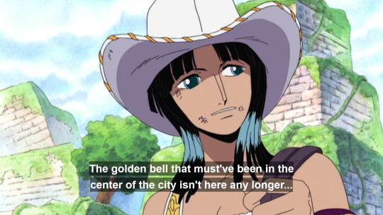


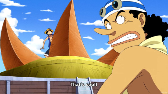


why did egghead (and since wano especially it's more visible) go back so much on their skintones... they feel like almost different characters, post time skip
fishman island was worse for robin, but at least left some color in zoro and usopp, same for punk hazard / dressrosa


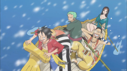


wano seemed okay for zoro and give to luffy a bit

but take away from usopp and robin a lot

and then there's beginning of egghead:
there are these two interesting episodes, that are continuing with similar scene, but are already so different as it shifts into egghead style
1088:


vs.1089 (new egghead opening starts here as well):

and then the egghead arc itself starts (the animation is great and everything, just the skintone choices..like making robin even a shade lighter than sanji)
ep 1094
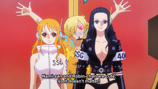


i think the end of episode 1092 made me facepalm the most (just like robin here), the comparison from robin in water 7, and the new robin beside here are just... sad. so sad.. and they put it on screen together.

#tbh im reading the manga most. so i dont really care for the anime. but then when i watch some eps and it seems getting worse and worse#just needed to rant about this#and to put these beside each other how it all went downhill since post timeskip ://#nico robin#usopp#roronoa zoro#monkey d. luffy#sanji#nami#straw hat crew#one piece#one piece spoilers#egghead spoilers#mine#gif:op anime#gif:op other#smth weird robin's forehead and zoro's haircut in egghead. looking back at like skypiea and water 7 is almost incomparable#long post
68 notes
·
View notes
Text
telling myself i can't start another tdwt rewrite but dear god do i want to write one focusing on alejandro and courtney in this weird situationship thats a lot more nuanced than just alejandro manipulating courtney and her falling for it. like theyre best friends they dont trust each other theyre the same person they dont know anything about the other one theres a mutual attraction theyre pining for other people theyre codependent they dont care about each other theyre platonic soulmates like i just want to do a deep dive into how messy that relationship couldve been building off of their friendship that exists in my head except the line between romantic and platonic is so fucking blurred they have no idea what they are to the other person
#they live rent free in my head as you can tell#ive been writing some intense moments for them in amicus curiae and im having a lot of Feelings about platonic alecourtney#tbh the whole concept of them replacing the best friends has been a great avenue for me to do a deep dive into their friendship#aughhhh i just. love them so much#and i do want to explore them in a situation where there is relationship potential even if that relationship never actually happens#because everything between them during tdwt could be so MESSY!!#like alejandro says he's just manipulating courtney but he's also doing it to make heather jealous but he's also genuinely worried about he#after the duncan thing but this is the only way he knows how to express that concern without making himself look weak#meanwhile courtney is falling for the act but she also knows its an act and is going with it for the emotional support it provides and shes#just doing it to make duncan/gwen jealous but she also is starting to see the real alejandro underneath it all because he does care even#though he doesn't want to and they do feel a strong connection that they dont know whether its platonic or romantic because romance is bein#shoved down their throats on this show and theyre both in complicated romantic dynamics with other people that theyre the easier option for#one another but they dont really want to be with one another like it just doesnt feel right#okay okay i legit have to stop and go to bed but just. them. im thinking so hard about them#platonic alecourtney
84 notes
·
View notes
Text
I keep writing posts trying to pin down what my problems are with e/so, but I think it really boils down to the fact that I don't like mmos but I feel an autistic obligation to play this one specifically
#like im playing for elder scrolls reasons but it doesnt really feel like the game or user base really gives a shit about that#mine#sorry for the light negativity on its birthday but tbh i dont really care#twit thinks that me liking t/es related things means that all i want to see is e/so stuff and it makes me kinda jaded
37 notes
·
View notes
Text

Demyx (my beloved)
#kingdom hearts#demyx#honestly is there an organization member i dont like? not really tbh#ok i lied maybe one but even then i find him fascinating so even he gets a pass#demyx being such a good boy who doesnt actually care for fighting then having the whole kh3 thing#where he has the yellow eyes but still just helps the good team vaguely then dips out of the entire game#where did he go and why .... what secrets do you hold young man#i should replay kh3 cause there are things i think i remember but idk for sure#like wasnt there actually a scene where hes just... been benched for being bad at being bad or smth#i really remember a scene where either he says or someone else is like oh yeah he got benched lol#like why does he have to be so funny yet get so little screen time im dying squirtle#though for the record him just handing a mannequin to even and saying peace out for the rest of the game WAS hilarious#this is me living the best time line where not only does demyx just dip and never get mentioned from anyone#but also in an otome i played theres a route where my fave guy just also dips early on#and then in the very end some other LI asks another LI what happened to him btw like where did he go#and the another LI was like oh my god i forgot about him idk man#my favorites just making an appearance and leaving is really funny to me#these tags got super long bc im very stressed and now devoting brain power to vgs in order to not cry
139 notes
·
View notes
Text
im kinda glad i was a tiny child when windwaker came out and i only played it years later without having internet access for the longest time bc i would have NOT survived the hatred i know ww got when it first came out bc it wasnt what most people expected (ww is my fav zelda)
loving botw but not liking totk and seeing the vast majority praise the latter like its the holy grail while alot also discrediting and needlessly hating on botw for it is already making it hard to stay calm about :U
#ganondoodles talks#special interest go brrrr#sucks when you care so much about a piece of media thats out of your control and it does something you hate#i do not control the hyperfixation#it wouldnt be so bad if people wouldnt keep hating on botw just to praise totk more tbh#and before people say but arent YOU doing the same thing in reverse???#welll ... its suppposedly a sequel yes?#direct sequels should build on the first title and totk does the opposite doesnt it?#again one of my biggest problems is that it was advertised and called a direct sequel qhen it really isnt#like at all#how some characters also made a weird turn in their personality it really does feel like it did a majoras mask thing without admitting to i#like majoras is GOOD#it was weird and kinda nonsensical but ultimately worked#can you imagine if totk just went with the whole other dimension thing properly and really went ham with it-#.... i am coming up with even more ideas for totk rewritten arent it..#anyway i dont think im gonna get a collectors edition ever again given the risk of me not liking what its for#regret spending that kind of money on it after i calmed down my fears and in the end they turned out to be mostly right#;__;
104 notes
·
View notes
Text

did a redraw of the season 1 poster too,,,,enjoy haha
#hetalia#being an artist is fun because you can make stuff that caters directly to you#aph lithuania#aph poland#hws lithuania#hws poland#tbh their personalities really don’t match simon and daphne#but I DONT CARE I wanted to draw them#wanted to do amebela for this first but I didn’t wanna draw alfred lol#challenging everyone else to redraw their favourite shows but with ships they like haha
381 notes
·
View notes
Text
this is the video of Swen saying no bg4 btw! I haven't seen anyone post his actual words.
#people in the comments were acting like he announced he's going to personally kill their moms lmao#like yeah it's wotc's ip larian can't just decide to make more#also all he said was they were passing the torch and moving away from dnd in the context of continuing the bg franchise as a next step#what he didn't say is Larian will never ever do another dnd title#and even if he did who cares tbh i think another game with this cast of characters would not go over well in practice#i think leaving baldurs gate a trilogy is for the best and this decision is in the best interest of fans and the studio#not to mention there was obviously behind the scenes issues with how wotc treated people#i wouldn't be jumping to work with them either#ALSO if they can write characters like the wormskulls i dont really give a fuck if they're in faerun or some larian-invented fantasy world#larian#bg4
30 notes
·
View notes
Last Seen Blogs

lucassecario
São Paulo

hannahup21
Hannah:)

womenofcolor15
womenofcolor15

dlnj
My ABDL Page

lizywhothefunk
Lizzywhothefunkc