#but the latest thing is that it seems there's some shipping issues with the stickers‚ keychains‚ and pins i need. for my Job
Text
.
#ough i am. stressing for Many Reasons right now#and with some of those reasons being Medical Related (I'm fine. probably) it's REALLY not good to be adding MORE stress to this#but#as it happens#more stress has arrived#and I'm feeling Really Fucking Shitty about it right now#so. yay#I've been having a lot of stressful stuff pile up recently but that's all personal so i won't get into it right now#but the latest thing is that it seems there's some shipping issues with the stickers‚ keychains‚ and pins i need. for my Job#that i need for my Job A Lot#it's not like i haven't worked with these guys before! this is where I've always gotten merch production worked on!#i don't know why I'm having issues with them the minute i need them by a certain time!#ughghhhhghhhh i don't think it's anyone's fault specifically and I'm gonna try to get it sorted out amicably#but it's just really really frustrating to have this piled on top of all the other shit I'm going through right now#why does life seem to have it out for me This Week Specifically? what did i do to deserve everything crashing down all at once?#it'll be fine eventually. i know#just need some food and a doctor's appointment and a good night's rest and I'll feel better#it's just kinda taking a lot out of me right now
2 notes
·
View notes
Note
I just read Tim’s Robin miniseries (the one with King Snake) and I really think it’s one of my favourite comic stories. You really get the sense that Tim’s still a kid, pretty sheltered, who just wants to help wherever he can. He’s pretty heroic and even though he does have a bit of a temper/vengeful side (eg that part with Lynx at the end), ultimately tries to do his best to stick to his morals. He’s a boy who wants to do what‘s right. I liked his skill with the sling, wish it was used more. 1/
Also the flute-staff was pretty cool. I liked Clyde and I wish he wasn’t killed cause he could have been developed as a stronger foil to Bruce. The seeds are there, with his emphasis on vengeance for his deceased loved ones and his and Tim’s first meeting beginning with Tim trying to protect him. The parts where Tim tries to act as Clyde’s doctor was pretty cute. While hacking into Clyde’s files was an invasion of privacy, I get the feeling Bruce would have done the same, with less regrets. 2/
I liked the dynamic between Clyde, Tim and Shiva, with Clyde as the reluctant but protective dad, Tim as the tiny eager hacker child and Shiva as... the no-nonsense, scary aunt? (Idk really) Anyways I wish we could’ve had more. I think this is one of Tim’s stronger stories because it defines him as a character: clever, brave, persevering and taking the initiative to save others. He’s young, but he holds himself to a very high standard of responsibility and that’s what I love about him. 3/
Thanks for listening to me rant about Tim! I hope you feel better soon and things improve. You’re one of the few blogs I follow and trust. I understand if you need to take some time off tumblr. Please treat yourself well and remember that you are important and people care about you <3 Stay safe! 4/4
I honestly think it’s a near perfect miniseries. Because Tim just feels like the perfect protagonist when you can understand him. He has understandable motives, strengths and flaws that you can admire, relate too, or at the least understand. They make him someone you wanna follow on the journey because they made him such an interesting perspective for the story.
Like it’s the story that helped made Tim a solo star because it was able to make him such a good character on his own that he didn’t always need Batman always right beside him to be interesting.
Something about Tim just elevates the story so much compared if they just had Dick interact with the same characters or Batman himself. Like it’s a Tim story, that had to have Tim in it for it to be a good story. It’s his character, as himself, that makes it great.
The part were Tim looks like he’s about to smack Lynx to me I think kind of solifides Tim, because he ends up just having this moment of a click, where he just realizes being like that is no good. Like his first adventure stressed him out so much during the whole thing, doing his best to be Mister Mature, when he’s just this small, insecure, kid, but in the end he still chooses to do the right thing.
Cause Tim always had good morals, but I don’t know, it’s that moment specifically that cements Tim in his lessons he learned about the story. Vengeance won’t solve anything. Which goes alongside the Clyde story being the same thing. Which is a nice, surprisingly mature moral for a story about a small kid.
Everything just comes together in the end for that moral, and it’s unexpected for what it starts as, but it works really well, and I think it’s the perfect one for Tim’s first story.
Clyde, as much as he wants to protect the kid, is still wanting vengeance.
Tim’s still so young and naïve, has no street smarts like he openly admits, he’s very sheltered, he still thinks in this black and white good and bad way.
Lady Shiva wants Tim to go dark and join her in her ways, but Tim says no, and even when he gets close he still backs away because it all sets in what he learned.
It’s a story that feels like he has so much more weight then most stories, because they all put together in a natural way. It isn’t forced together. It’s the natural result of the characters coming together with the plot at hand. Which is how great stories happen. And it just came together.
Tim’s a full character in the story. Like it builds the base for a lot of great stuff to come. I think his current writers need to remember how Tim is wired, or else he’s never going to have a great story again. People act like their ship coming true will change everything, but it will fucking not. It’s Tim as a character, and writers not understanding him causing the problems.
The best stories come from an actually good understanding of the character.
The reason why Tynion’s stories failed so much to me, is because it seemed like he did know a lot about the character, could tell you a lot about his past, but he just couldn’t actually replicate for himself what worked for Tim. He just put stickers on him that resembled the past, but wasn’t actually Tim himself.
And it causes all the difference in the world with his stories.
Tim’s first solo story, is light hearted for the most part, but also so mature despite it’s young, immature, sheltered main character. The side characters also just make it so much more. Every part of the machine makes the story better and better. Nothing feels lacking besides King Snake being pretty cheesy and not very complex. But besides that. it just stands very tall to me.
I can reread it all the time and still really love it.


The final issue was heart wrenchingly grim. There’s no sweet ending for Tim. There’s no happy happy. It doesn’t even end on a happy final page. They could’ve made Tim a total joke like so many other child or teen super heroes. So many lack any real complexities and have to stand on tropes done so many times before. But they made Tim’s first story so mature. Which I think really helped him. He could go from taking down Barney the Dinosaur knock-off robbers, or going to Ninja Camp, to carrying the dead bodies of his latest friends on his back despite his own busted rib, or dealing with the sorrow of having a kid die on him before he could get him treated.
He’s complex enough to make both work without a blink. And it’s another thing that makes him wonderful. It doesn’t break his character to do both. Both work without having to suddenly change him.
It makes Tim great. And I think this story is a lot to thank for it. It solidified that for him.
It made him a success, before they stopped knowing what made him work.
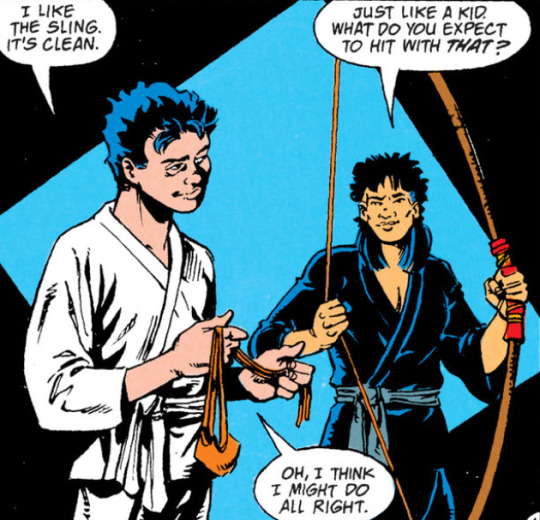
The sling was really cool to me too.
39 notes
·
View notes
Text
The Hiatus is over
I have had a Tumblr for what seems like forever! I was very active in the beginning and slowly over time I quit posting and quit visiting the website altogether. I just cleaned up my blog a little bit to make it look “neater” so-to-speak, and I’ve decided to become more active. I won’t be on here all the time, but definitely more than I had been. I don’t have too many followers, but if you ever regularly watched my posts, here’s a life update.
First of all, I’m mainly back on Tumblr to help promote my very small business - so expect to see quite a bit of posts about my latest Etsy uploads or custom orders I’ve completed. You can find the links to my Etsy and Ebay on my page below my description! I mainly make shirts, signs, stickers, decals, and buttons. I am always accepting custom orders and I try my best to be able to make everything I am requested. I was inspired to try to promote my small business more because honestly my real job has me super exhausted and some days I feel ready to just walk out.
Otherwise, I am also back because I enjoy looking at cute and inspiring pictures and posts. I also enjoy writing posts sometimes to simply express how I’m feeling. You may also see some posts from me preaching about keeping your health in check because ever since my dad was officially diagnosed with cancer, even more so now than ever I realize it’s so, so important to take care of yourself and go for routine check-ups because *some* permanent damage could be prevented if you just practice routine health check-ups.
Over the past few years here is what’s new:
I left a toxic relationship - which was one of the hardest things I feel like I’ve had to do but it NEEDED to be done and I am doing a lot better now as a result of that. A lot of unnecessary stress, anxiety, and depression has been relieved from this change. But don’t get me wrong - I still deal with stress, anxiety, and depression - but it’s not the same, and not nearly as bad.
Now, I’m in a very happy and healthy relationship of almost 2 years and I’m so lucky to have him in my life! Last August we took in a pug so our other dog (also a pug) could have a little playmate. They are about a year apart and are half sisters! A lady reached out to me while I was searching for another dog, and stated she was going to be unable to keep her pug - Sushi and wanted to make sure she went to a good home and we’re so happy to have an extra bundle of joy around.
As mentioned previously.. last August, actually a day before we got Sushi - we found out that the health issues my dad was experiencing was most likely due to progressive colon cancer. That was one of the worst days.. when the doctor came in to tell us.. all of the heat escaped my body and I just felt so helpless. In about October he was officially diagnosed with stage four colon cancer. It felt like every little bit of news that unraveled was another stab.. It has been a lot to take in, and I’ve been handling it pretty well I think all things considered. He is doing much better now that he is on treatments.. about 14 rounds in and he will get another CT scan soon and I’m very nervous to hear about the results but I’m hoping for the best. So far his tumor has shrunk, and some lesions in the chest have died off, and other than that things have stayed stable. So far nothing has worsened and for that I am very thankful. My dad is my best friend and well, I’m not ready to lose him, but the truth is, that I don’t think I’ll ever be ready to lose him. I am his caregiver and being exposed to so much information and being at different medical facilities has fascinated me in a way that I would have never imagined. Right now the world is crazy and hopefully someday soon we can go back to “normal” and when life can become a little more “normal” I think I will look into becoming a nurse, or doing something pertaining to the medical field.
So how about that coronavirus, huh? The only good thing (for me) that has came out of it was being temporarily laid off from work. I know that shouldn’t be considered a good thing, but the amount of stress I was going through - I really felt like I needed the break. During quarantine I spent lots of time resting, relaxing, exercising, and playing LOTS of Animal Crossing New Horizons - and now that I’m back to work I’m sad that I have very little time to play it. I haven’t even logged in for a while. My villagers are going to leave my town! :(
That’s pretty much the major key points summed up. I hope everyone else is doing well & staying safe! [P.S. if happen to look at my Etsy and see some things you may be interested in.. I currently have a sale with this coupon only: INSTA10 to get 10% off your entire order of $15+ - All orders will get FREE shipping within the US.]
#hiatus#etsy#ebay#shop#smallbusiness#tumblr#stress#anxiety#depression#jobs#work#inspiring#inspirational#Cancer#coloncancer#dogs#pugs#dad#father#nurse#medical#boyfriend#life#life events#coronavirus#covid19#animal crossing#animal crossing new horizons#ACNH#nintendo switch
1 note
·
View note
Text

Roswell, New Mexico is The CW’s latest entry into the reboot and revival craze that’s brought back so many old TV shows, whether they should have been resurrected or not. As a fan of the original Roswell series, I had mixed feelings going into this version. After watching the pilot, I think that if viewers can focus on this version and leave behind expectations based on the original series, it’s an enjoyable show. Roswell, New Mexico has the potential to live up to some of the early promise that the original showed, before it turned into a charming mess.
We (Metamaiden and Metacrone) loved the original Roswell fiercely. We own the DVDs and have watched the entire 60 plus episode series ‘I don’t know how many’ times. Actually, we should probably write a Quick Review of the series and recommend essential episodes. Keep an eye out for that review.
We also own the original Roswell High Series of 10 books by Melinda Metz. The original TV series was commissioned based on the first book, so the two series don’t have much in common beyond the basic premise.
What we’re trying to say here is twofold: This is a major fandom for us, and Roswell has always been a story with multiple versions. The novels and the original series were written at the same time. So which is the real cannon? Neither. The story works best if you’re open-minded about many things, from “mixed relationships” to different versions of stories about aliens to reinterpretations of beloved characters.
Stories stay alive and vital because they are periodically reinterpreted. The Roswell story has been around since 1947, but stories about alien invaders have been around for even longer. Jason Katims and Melinda Metz didn’t invent the basics of this story. They wanted to make a modern-day Romeo and Juliet, based on Shakespeare (who is no stranger to reinterpretation) and settled on an alien story, as a distinction that would still pose issues between two people who are in love.
Let’s give executive producer Julie Plec, the creative force behind the wildly successful Vampire Diaries franchise, and Carina Adly MacKenzie, Plec’s young protegé and the showrunner for Roswell, New Mexico, a chance to take their shot at this timeless story of strangers in a strange land and true love that must beat impossible odds. And let’s applaud The CW for continuing to support female showrunners, and giving young women a chance to prove themselves.
Recap
The Pilot’s opening is narrated by Liz Ortecho, who introduces us to her hometown of Roswell, NM, site of the infamous alien spaceship crash which took place on June 14, 1947. The ship’s crash landing, which happened on Foster Ranch, in the desert outside of town, is summarized in images, while Liz discusses its impact on the town. We’re shown a meteor-like green glow which has a high-speed collision with the ground. The glow turns out to be an alien spaceship. It breaks into glowing pieces which are investigated by local and military authorities.
Liz tells us that the crash has drawn in tourists and seekers ever since, searching for answers to their existential loneliness. While growing up, Liz was searching for something in Roswell, too, until she realized that it’s really just a mundane small town, full of small-minded people, living small, petty lives. She couldn’t wait to leave, and never looked back.
Switch to the present day, and the action happening in real-time.
Liz is alone in her car, driving back to Roswell, late at night, when she is stopped at a police checkpoint. She assumes she’s being stopped because she’s a Latina. Max will deny this, but I’ve seen it happening at checkpoints in southern New Mexico, and that was before the immigration issue got crazy.
If you want to move illegals around without getting stopped, ask a middle-aged Anglo friend for help. Youngsters are always suspicious in a state with drug issues.
The cars are supposed to drive slowly through the checkpoint, so the police can look at their license plates, registration stickers, the people inside, and anything else that catches their eye. But this is a made for TV moment. Only the Feds check immigration status in New Mexico. Other branches of the justice system leave the Feds to their business.
Liz rolls down her window, already making a speech about her rights as a citizen and the call she’ll be making to the ACLU, as she pulls out her passport. She stops cold when she sees that it’s Max, and flashes to a high school memory. They realize that it’s been 10 years since they’ve seen each other. Max has stayed in town. Liz seems surprised. Max seems happy that she’s back.
Sheriff Valenti, who is the mom of Liz’s ex-boyfriend, Kyle, interrupts them. She assumes Liz is in town for the ten year high school reunion, and is the same good girl that she always was. She lets Liz go without further ado.
Liz goes straight to her family’s restaurant, none other than the Crashdown Cafe, where the food has an alien aroma to it and the waitresses have little green antennae. An alien conspiracy theorist is podcasting from a booth in the diner as we speak. Sometimes it’s hard to tell which kind of illegal aliens he’s referring to.
“I know you think you’re safe, but you’re not. Aliens have already ruined your life. Aliens are the illuminati. They’re conditioning us. You ever tangle with a Beyoncé fan on Twitter? Relentless. They’re brainwashed by subliminal messaging in the music. And soon, the war for the soul of America will be on. This is the Gravity of It All Podcast. Now a word from our sponsor, Alpha Testosterator gelcaps.”
Liz enters the diner just as the podcaster finishes. They strike up a conversation. When he asks if she’s a believer, she tells him that her great-grandfather was abducted and impregnated by an alien in 1947. Ever since, only the men in the family have been able to carry children.
Liz’s father, Arturo, catches her teasing the customers again and can’t believe his daughter is such a miscreant, after he carried her for 14 months before giving birth. 😉
They have a warm reunion, then Arturo goes back to work. Liz tells him she went through an ICE checkpoint (ICE= Immigration and Customs Enforcement) and suggests, again, that they move to a sanctuary city where his immigration status wouldn’t be such an issue. Arturo doesn’t want to leave his home and his super cool business, which he obviously couldn’t transfer anywhere else. Liz just wants to sleep at night knowing he won’t get deported.
Not going to happen for the next few years.
Arturo asks how the drive was, and Liz sarcastically says it was awesome, since there’s so little to look at between Denver and Roswell.
The New Mexico and Colorado natives always think this. There are actually spectacular mountain and desert views, plus you go by Colorado Springs, Santa Fe, other small cities and a couple of casinos.
Liz gravitates to a bulletin board on the kitchen wall, where a funeral notice for her sister is still hanging. It says, “In loving memory of Rosa Ortecho, January 17, 1989- June 1, 2008.”
Liz sends her father to bed, promising to finish the shift for him and close up. After a bit of negotiating, she wears the antennae that go with the waitress uniform. Once everyone is gone, she puts her favorite song, Mrs Potter’s Lullaby by Counting Crows, on the jukebox and dances to unwind.
youtube
Max slowly makes his way in, watching her dance and clean up the dining room, but not wanting to be too creepy. After a minute, he coughs a little to let her know he’s there. The music fades, because they only have eyes for each other. It may not be a teen romance, but they’re still soulmates who’ve been separated for ten years.
I’m holding back on those crying emojis, ok? Imagine original Max and Liz being separated at the height of season 1, supposedly for their own safety, and her mind being wiped by Isobel or Tess. Then they meet up again 10 years later. That’s roughly the situation we have here.
This reboot moves beyond Romeo and Juliet, to give us Persuasion, my favorite Jane Austin novel. It’s so much more meaningful when grown ups who’ve suffered find love than when it’s teenagers who don’t know what they’re doing. I have nothing against teen romance, but grown up love is so much more complex, and a love that’s been lost and rediscovered has so many obstacles to overcome, but also has so much depth.
Nathan Parsons is really nailing that whole soulful staring at Liz thing that made Jason Behr a heartthrob. I could cry just watching that.
Remember when I said this was a major fandom for me? I may be happier to see it return than even I realized. But I will attempt to be a professional, if unpaid, recapper from here on out.
Max explains that he came by to tell her that one of her running lights on her car is out. That’s why he stopped her at the checkpoint, but she didn’t give him a chance to mention it. He wants her to know that he’s not one of the bad guys. He makes to leave, but she’s been doing her own soulful staring, and doesn’t want to let him go. Just as he’s on his way out the door, she asks him if he wants a milkshake.
Liz makes him something green and offers to put a couple of shots of bourbon in, to make up for the way she treated him earlier. He tells her not to worry about it. Immigration has been pestering them, but he didn’t join the force to tear families apart. Liz asks why he did join. He wanted to protect people. It helps him sleep at night. Liz remembers that he wanted to be a writer.
Max notices the song playing on the jukebox. Liz explains that it’s her favorite song, the song that picks her up when nothing else can. It was her sister Rosa’s song, too, and Liz always copied her big sister.
Max asks where she’s been lately. She tells him she’s been in Denver, working on an experimental regenerative medicine study. They were onto something special, but their funding was redirected to building an unnecessary border wall, and she lost her job. So she came home, and now she’s sharing a milkshake with her high school lab partner.
Just as Max starts to get serious, several shots are fired through the front window of the diner. Max pushes Liz down to the floor to protect her, but he’s a few seconds too late. She’s already been hit in the chest, on the left side, and is bleeding out quickly. He puts his hand on the wound and heals her, but she’s mortally wounded, so it requires an immense amount of power. Max draws power from the environment around him to supplement his own. Apparently that includes the power grid, since lights explode and the power goes out, but there also looks to be a small earthquake.
As Liz starts to regain consciousness, Max breaks open a bottle of ketchup and pours it over the wounded area to disguise the blood. He makes sure she’s alright, then races out of the cafe to pursue the shooter. Liz tries to understand what happened to her, and discovers the bullet hole in her dress.
The Roswell, New Mexico title card comes up.


There were definitely sparks when they began their relationship. And blood. And ketchup. There must be some significance to that combination.
At least he’s not a vampire.
There’s a lone gunman, on foot, but Max is too depleted from healing Liz to keep up with him. Max follows the perp into an alley, then collapses to the pavement. He uses his special alien psychic communication powers to let his sister, Isobel, know he’s in trouble.
Isobel is having a date night in with her husband, Noah, and trying something new. Noah is tied to the bed and wearing a red eye mask, while Isobel has on a black Teddy and stockings. Noah has agreed to obey her all night long. When she tells him she has to leave for a while, she also says that it’s part of the thing, possibly called “hoverboarding” (she’ll have to check the book), and he’s not allowed to question her. She puts on her coat and rushes out to find Max.
After the noise and excitement, Arturo has woken up, and is cleaning up the dining room. Liz asks why he stays in a town where people hate them for no good reason. He disagrees, pointing out that they have a reason. Rosa did drugs and drove, got in an accident, and killed two innocent girls, along with herself. The ten year anniversary is coming up, which is bringing up memories for everyone, and putting people on edge.
Sheriff Valenti arrives at the diner to make sure everyone is okay. Liz goes on the attack, wondering why no one is protecting her father and his business.
Isobel finds Max in the alley, still on the ground, and hurries to bring him a bottle of nail polish remover. He drinks it as fast as he can. As he does, the power comes back on, so he must have still been pulling whatever energy was available from the grid.
But what’s the deal with the nail polish remover? And how did they, as tiny kid aliens, figure out they needed to drink an otherwise poisonous substance, then convince their parents to buy it for them? Did it smell good to them? I hope it tastes good. Shouldn’t Max keep a flask of it on him for emergencies, like you’d keep an epipen for a serious allergy? So many questions about this development.
As Liz gets ready for bed, she notices a red mark on her shoulder where the bullet entered. She goes to see her ex-boyfriend, Kyle Valenti, who is now a surgeon, at the local hospital to ask him to examine her and do some scans. She remembers getting shot, but obviously she didn’t, so maybe she has a concussion or she’s going crazy. Kyle suggests she’s suffering from trauma because of the gunfire and orders the scans.
At dawn, when Max is done with the night shift, he checks in with Sheriff Valenti, who tells him Liz seemed okay after the shooting, though just as mouthy as ever. She orders him to write up his report, then go to bed. And shave. He replies that he knows how she feels about patriarchal dress and grooming standards, and he’s just supporting her feminist agenda. She’s amused, but not fooled. And, by the way, there’s a surprise for him in the drunk tank.
It’s not that much of a surprise, since Max’s alien brother, Michael Guerin, is a regular and a ne’er do well. He’s also in the process of using telekinesis to steal the keys to his cage so he can escape. Max grabs the keys and reminds Michael of the cameras. Michael has insider knowledge that the cameras are all malfunctioning, darn the luck. Max still mildly suggests that Michael follow procedure for getting out of his cell.
Michael wonders what’s up with Max, since he would usually get a lecture along the lines of: “Why you got to cause a scene, Michael? Why don’t you drive the speed limit, Michael? Why don’t you spend your nights like I do, crying and masturbating to Russian moralistic literature, Michael?” It almost sounds like a song, doesn’t it?
Isobel joins the party, looking for an explanation about the night before. She tells Max he has 30 seconds to start talking, or she’ll melt his brain. Michael, who is a total gossip, is all in on the conversation, and dying to hear what Max did. When Max is done explaining about healing Liz, both Isobel and Michael have fits at him. Isobel can’t believe he risked their secret after 20 years, especially for Rosa Ortecho’s sister. Michael blasts his way out of the cell and blames Max for putting heroics over protecting his family. He blasts Max across the room and walks out.
Isobel remembers the cameras in the room, but Max tells her not to worry about them. She goes into a vicious rant: “Don’t worry? I have been worried my entire life that someone would find out about us. That we would end up dissected, imprisoned. I am married to someone who can’t ever know who I am, and that kills me. But I keep this secret, because you, me and Michael swore that we would. And now in one moment, you’ve thrown that all away, on some girl you had a thing for in high school. I hope she was worth it, Max.”
So, call me crazy, but don’t all of those burdens she just listed apply to Max and Michael as well? Isn’t Isobel, in fact, the only one who isn’t alone? And that last part was just mean and cold. The narcissist red flag is rising on this one.
Michael goes home, which is an airstream trailer on Foster Ranch, the same ranch where the alien ship crashed. His landlord and some military men are waiting for him outside the trailer. The landlord tells him that the Air Force has acquired the land, so Michael needs to move and take his trailer with him.
Michael sees another man peeking in his windows and goes to pull him away. When he does, he discovers that it’s Alex Manes, just back from a tour of duty in Baghdad. He came back minus a leg and is working with his father, Master Sargeant Jesse Manes, who is nearby collecting samples.
Michael’s too caught up in seeing Alex again to think about the implications of the Air Force acquiring the crash site and collecting samples. I’m thinking it’s not a coincidence.
Alex asks what Michael is doing in the trailer. Michael baits Alex by telling him he’s doing weed and casual sex. Plus, “Covert plans to violently overthrow the government. Quick, Alex, run and tell your daddy.” It sounds like there’s some history there. Michael goes inside. He has spaceship plans all over the walls, and some sort of sparkling, rainbow colored solution in a plastic bag.
Liz drives out to the site of Rosa’s car crash, where there’s a small memorial set up. Before she gets out of the car, she remembers telling Rosa about Max, just before she graduated from high school. Liz realized she cared deeply for Max and didn’t want to leave him behind when she left town. Rosa tried to convince Liz that she was already gone and shouldn’t weigh herself down with any baggage from Roswell.
There are three small wooden crosses at the site, with the names of the three victims on them. They all have flowers and rosary beads, but Rosa’s has been pulled up out of the ground and tossed aside. Liz puts the cross upright in the ground again, noticing that there are friendship bracelets on the arm of the cross.
youtube
Liz goes back into town and brings Max a milkshake. She waits for him outside of the police station, while Michael watches her from his truck. When Max comes outside, Liz tells him the shake is to make up for the one that got interrupted the night before and to thank him. He insists he didn’t do anything special.
Liz tells Max that her mother and her sister both had mental health issues, and she’s worried that she’s developing them, too. She was hallucinating, and thought she was shot. She even went to see Kyle at the hospital, and had him check to make sure there wasn’t a bullet still in her body. But there wasn’t, so she must be going insane.
Liz turns and starts to walk away. Max calls her back, but before he can say anything, Michael blows out all of the windows in a nearby car. There’s a woman in the car, so Max has to make sure she’s okay. Max knows this was Michael’s doing. Liz puts a plastic bag over the milkshake straw to protect the DNA in Max’s saliva, and hurries away.
Liz visits her high school best friend, Maria, who now works as a bartender at the local townie bar, The Wild Pony. Maria does fortune-telling, and is just finishing a palm reading for Hank, who makes a nasty, racist comment about Liz when she walks in the door. Maria calls him on it and sends him on his way. Then she tries to send Liz to the town’s tourist bar. Liz thanks Maria for leaving something at Rosa’s memorial. They drink a toast to Rosa.
When Max gets home, he finds Isobel waiting for him. She needs a photo of the three of them from high school for the reunion. She coos at the photo Max gives her, then goes straight to a cutting remark about Max and Liz. Max tells her that he’s going to tell Liz the truth. At this point, it will be less dangerous than leaving Liz in the dark. Isobel loudly insists that he can’t bring a stranger in on their secret. Max yells back that he’s not asking permission.
He immediately apologizes, having surprised them both. Isobel asks, half jokingly, if he’s in love with her. Max says that he hasn’t seen her in ten years. Isobel reminds him that there are too many secrets that Liz, in particular, can’t know. Being with her would just be too complicated. He needs to find someone, anyone else. Max sadly tells her that it’s been ten years. If he were going to move on, he would have done it by now. Several emotions cross Isobel’s face. Remorse, and the awful realization that she might have ruined his life for good, are in there somewhere.
Maria thinks it’s romantic that Max and Liz went through a shooting together. Liz notes that Max doesn’t seem to have any romantic interest in her. Maria tells her that the cure for rejection is sex with a rando. Liz has had a few shots by now, and decides that’s her cue to leave, before one of the townies in the bar starts looking good.
She goes outside to call an Uber and runs into Kyle. He asks if she wants to spend the evening together and forget about whatever’s bothering her. She takes him up on the offer, which turns into car sex, though he was up for whatever she wanted to do. I guess she’s a cheap date.
He tries to stop things at one point, thinking that using each other for random sex is a bad idea, but Liz wants to keep going. A minute later, he sees the telltale glowing, rainbow alien handprint where Max healed Liz. When he asks what it is, Liz cuts the date short.
Great job playing it cool, Liz.
The podcaster is back at the Crashdown Cafe, sure that the blackout was caused by aliens who are out to takeover the town by raping, murdering, and stealing their jobs.
Liz looks at Max’s cells under a microscope and discovers that they aren’t human. She goes looking for him, but finds him looking for her. She shows him the handprint. He asks her to take a drive with him.
Kyle calls Jesse Manes, because, before he died, his dad drilled into him the mantra, “If you see the handprint, go to Manes.”
Max and Liz go out into the desert, where he takes her into a boarded up cave. She fusses the whole way there, sure that he’s actually a stranger who’s going to serial kill her and lumping him in with the way she feels about the rest of the town. Max reminds her that he’s not a stranger, he’s a decent guy who stays in Roswell because he likes it there and the people have been decent to him, even though he knows people treated her badly after Rosa died.
Inside the cave, Max shows her three glowing pods that are floating, save for a spot where they’re tethered to the ground. They think the pods are the reason they survived the 1947 crash. They woke up 50 years later, in 1997, looking like 7 year old children, and wandered out into the desert. They were found by a trucker, then Max and Isobel were adopted and Michael went into foster care.
Liz is actually relieved to find out the truth, because it’s better thinking she’s going crazy. She’s already proven to herself that his DNA isn’t human, now he’s just confirming it. Max explains that keeping their secret has always been the most important thing to him, until he realized she was dying. Liz promises to keep the secret, too.
Jesse Manes also takes Kyle for a drive so that he can explain some things. He tells Kyle that after the 1947 crash, the Valentis and the Manes started an organization together that’s dedicated to keeping the town, the country, and the planet safe. He uses a digital palmprint reader to open what looks like old, metal storm doors on a derelict old building. Inside, it’s a huge underground facility, which Manes calls Project Shepherd.
At the high school reunion, Isobel and Michael are plotting the best way to ruin Max’s life, for the second time. Michael wants to make sure that Isobel is prepared to use her mind-wipe powers on Liz to take away her memories of Max, should Liz betray them. Just like Isobel did ten years ago, when they made her leave town without Max.
Liz has lots of questions about aliens for Max, but he doesn’t have answers. He’s just a guy from Roswell who happens to have powers. He did consider leaving town once, ten years ago. If it wasn’t for Michael and Isobel, he would have followed her- followed in her footsteps that is.
He has to leave to go to the reunion, because it’s important to Isobel. Liz decides to go with. She asks about the other times he’s saved people, but he never uses his powers to save anyone. Liz realizes that he did it because it was her. She asks why.
He responds by asking if she remembers the first time they met. She doesn’t but he does. He offers to show her by connecting through the mark, but he has to touch it. She tells him to do whatever he wants. He’s a gentleman, so he just steps forward and touches the handprint.
Through a montage, he shows her images from their childhood and teen years. They were close friends who spent a lot of time together. She often shared her music with him by giving him one earbud while she kept the other.
When it’s done, she looks at him and says, “After high school, you would have followed me.” He replies, “Yeah. Anywhere.”
She tries to kiss him, and he wants to, but he stops her. He explains that the handprint is part of a psychic bond that the healing creates between them. It allowed him to show her his memories. What she’s feeling right now are his own feelings, coming through the bond. Until the handprint and the bond fade, he won’t get involved with her. It would be taking advantage.
It will take a few days to a week for the handprint and the bond to fade. Liz decides that she’ll wait and kiss him then, when she can prove her feelings are real.
youtube
Back in the bunker, Jesse is about to initiate Kyle into the family conspiracy business. He and Kyle’s dad were close friends, and everything he shares with Kyle in this room is fact.
The Facts, as Jesse knows them: The 1947 crash was real, and what crashed was a ship full of monsters. Most of the monsters died the night of the crash (he doesn’t specify if they died in the crash or if humans killed them afterward). But at least one survived. If Kyle saw a handprint, the violence isn’t over.
What I love about the way Jesse talks about the aliens is that it’s clear that the humans were and are the perpetrators of the bulk of the violence.
At the high school reunion, Alex confronts Michael about his trailer. The Air Force chemical engineers found high levels of phenyl-2-propanone around the trailer, which would be present if Michael were cooking meth. Michael stands up, and says that it’s not P2P, but it’s something similar. Alex gets right up in his space. As Michael tries to brush past him to walk away, Alex grabs his hand. Michael asks if Alex is trying to hold his hand. Alex asks if he ever gets tired of doing his macho cowboy thing. Michael asks the question right back and walks away. Alex watches him until he leaves the room.
Their lips were about two inches apart during that exchange, in case the actual conversation wasn’t enough to convince you they were hate-flirting. Michael is a cat, or a Klingon, and all romantic endeavors must begin with a heated, possibly violent, argument.
When Liz and Max get to the reunion, people stare at her and make rude comments. She and Max are ready to leave, but then Maria proves she’s a truly great friend by getting the band to play Liz’s favorite song and dancing in the middle of the floor. Liz knows she has to join in.
Max remembers watching Liz dance to the song in high school with her sister and friends. She was inside the diner, while he stood outside. As has happened several times throughout the episode, words and lines from windows and reflections cover his face and mouth, a reminder that he’s trapped by circumstances he can’t control, and things he can’t say.
Alex adjusts his prosthetic in a room off to the side of the reunion. Michael finds him there. Alex says that he thought sure Michael would have left town by the time he got back. Michael asks if Alex wants him to leave. Alex thinks that what he wants doesn’t matter, since he’s not a kid anymore.
As they’ve been talking, Michael has been slowly walking toward Alex. Alex sort of gravitates closer to Michael, and they finally smash themselves together, kissing like they’ve been starving without each other.
Isobel finds Max, who’s watching Liz dance with Maria. She guesses that he told Liz. He admits that he did, and explains how well it went. He’s sure they can trust Liz. Isobel scoffs at him.
When the trust breaks down, as it inevitably will, it’ll be Isobel’s fault.
Jesse, still talking to a rapt Kyle: “They are a violent race. They despise compassion. They despise freedom, love and they thrive on our tragedy. They are at their very core, killers.”
Michael and Alex are just existing in each other’s space and letting it bring them back to life for a few minutes.
Isobel asks if Max told Liz about the other thing, and he cuts her off before she can finish. Liz can never know the truth about what happened to Rosa.
Liz touches the handprint, which is close to her heart. Then she pulls Max out onto the dance floor with her.

youtube
This slideshow requires JavaScript.
Commentary
The Alien Diaries* Roswell, New Mexico has a 13 episode season, of which 5 are directed by women. The pilot and one other episode are directed by Julie Plec. Shiri Appelby, who played Liz Parker in the original series, directs episode 9. Paul Wesley, from The Vampire Diaries, also directs an episode. There are female writers credited on 8 of the episodes.
The regular cast includes Jeanine Mason as Liz Ortecho, Nathan Dean Parsons as Max Evans, Lily Cowles as Isobel Evans-Bracken, Michael Vlamis as Michael Guerin, Michael Trevino as Kyle Valenti, Tyler Blackburn as Alex Manes, Heather Hemmens as Maria DeLuca, Trevor St. John as Jesse Manes and Karan Oberoi as Noah Bracken.
Recurring characters include Rosa Arredondo as Sheriff Valenti, Carlos Compean as Arturo Ortecho, Riley Voelkel as Jenna Cameron, Amber Midthunder as Rosa Ortecho, Sherri Saum as Mimi DeLuca, Claudia Black as Ann Evans, and Dylan McTee as Wyatt Long.
I’m looking forward to seeing Claudia Black as Max and Isobel’s mother. Amber Midthunder plays Kerry Loudermilk on Legion. Though she’ll only be seen in flashback, since her character passed away 10 years ago, it’ll be fun to see her in a new role. Michael Trevino appears to be playing another character that I just can’t bring myself to like. I’m sure he’s a lovely person in real life, but the werewolf and now the jealous snitch both get on my nerves.
They left out Liz’s childhood cupcake dress, which is in both the books and the original series. That was a chance to show a little levity and put their own twist on a beloved image, while providing continuity with the other versions.
Themes in this episode: Dangerous secrets; What helps you sleep at night; Protecting people; The varying ways hands touch people- with good or bad intentions; The positives and negatives of loyalty; The meaning of home and how much it’s worth sacrificing to stay in one’s home.
Personally, I might draw the line at dating someone who smelled like nail polish remover. Too many chemical fumes. I’ll still fight for their equal human rights, obviously. But my chemical sensitivities probably preclude a relationship. However, I do miss the addiction to hot pepper sauce that the original trio had. It made sense for New Mexico, the chili pepper capital.
Mysteries and Potential Storylines
What really happened to Rosa? We saw her trying to convince Liz that Max wasn’t worth getting fussed over. Did Isobel control Rosa’s mind and force her to say that? Is that why Rosa thought she was crazy? Did Isobel and Michael drive Rosa to her death, then Max helped cover it up, and let Liz go to keep peace in the family? What about Rosa and Liz’s mother? Did an alien also cause her to think she was insane? Do interactions with aliens run in the Ortecho family, instead of mental illness?
It looks like it’s the Manes and Valenti families who have issues with hereditary mental illnesses, especially illnesses involving obsession, delusions, extreme paranoia and anxiety. Those guys have been feeding their hate and fear off of ancient history for decades. Neither Jesse nor Kyle’s father would have ever even seen an alien.
Now Jesse’s initiating Kyle into their cult, and it looks ike Kyle is buying into the lies. Of course he is. He told us earlier in the episode that he doesn’t feel like he’s good enough, despite his good looks and accomplishments. Joining a secret warrior cult puts him a step higher than everyone else, making him feel important and special. Giving him a specific target for his free-floating hatred and anxieties let’s him release those feelings against a real world target, which is very satisfying in the short-term. In the long-term, a cult that’s devoted to hatred can eat away at your core until nothing good is left, just an angry shell that follows cult leaders’ orders.
Whatever Isobel and Michael did to Liz and Rosa, they didn’t understand how serious Max and Liz were about each other. Whatever the other reasons for wiping Liz and killing Rosa, part of it was to keep Max for themselves and put something between him and Liz that could never be overcome. Now, ten years later, Isobel, at least, realizes the seriousness of their actions, and how badly they screwed up. But Isobel is a defensive person who doesn’t admit when she’s wrong and doesn’t like to share Max with anyone but Michael. Realizing her mistake may cause her to treat Max and Liz worse instead of better.
It’s ironic that Max and Isobel are so worried about Liz, and apparently always have been worried about the Ortecho sisters and Max’s connections to people in general, but don’t give a moment’s thought to Michael’s connection to Alex. Michael saw Alex looking into his windows and Alex told him there are military chemical engineers investigating him. But Michael thinks he’s too smart for anyone to figure out what he’s up to.
Meanwhile, his ex-boyfriend distracts him from the nefarious alien hunting and investigation activities of the Air Force and Project Shepherd. It doesn’t seem like Alex knows about Project Shepherd, but he could be using Michael. Or, Jesse could be pushing an innocent Alex toward Michael for the purposes of distraction and incidental information gathering. Jesse doesn’t seem like the kind of guy who’d be okay with a gay son or a handicapped one, neither being manly enough for him, so using his son wouldn’t be a problem for him. He wants Kyle, the straight, able-bodied hero-doctor, as his replacement son.
Roswell, NM kept each character’s specialized powers from the original show, which wasn’t in the books. In the books they all have the same powers. In the old show, their powers are related to their previous positions as royalty on their planet. The way that they are doing each character’s personality feels like they might be planning to do something with that aspect of the storyline, even though it was part of the messed up plotlines that didn’t really go anywhere. There are many directions you could take a story about exiled alien royalty. I wouldn’t mind seeing where it could go, if done well. The Roswell novels that followed the series did follow up on that storyline in a more gratifying way.
I would bet good money that the experimental regenerative medicine study that Liz was working on was based on alien DNA from the aliens captured in the ’47 crash. That thread will be picked up again, sooner or later. And the scientists will want fresh DNA to work with. Could they have hired Liz because she’s from Roswell, then have laid her off hoping she’d go home and lead them to an alien?
Roswell vs Roswell, NM
The original Roswell pilot was one of the best pilots I’ve ever seen. I still go back and watch it sometimes. Its climax is at the Crash Festival, where all of the story elements come together. The visuals are amazing, speaking to questions of identity and the nature of what makes us human. The Dave Matthews song “Crash into Me” is used as a centerpiece, highlighting the tragedy that befell the aliens’ parents, which is now celebrated as a tourist attraction, but has left them alone and hunted.
So far, Roswell, NM doesn’t have the visual pizazz that the original had. In the new pilot, the high school reunion replaced the festival, and it’s visual and musical styles were workman-like, using a cover of a song when we’d already heard the original and a space that was indistinct and industrial, like every other poorly lit space on TV this year.
Roswell, New Mexico is obviously trying to forge its own way and not copy the original’s big moments, which is both a good idea, and frustrating. There are some iconic elements that they didn’t change, like Liz getting shot in the diner and Max healing her, but they changed much of what surrounded the moment. My guess is that scene plays fine, if you aren’t comparing it to the original, which had a song playing over Max healing Liz that became iconic, and witnesses who became a big part of the story. But “fine” isn’t the same as creating new iconic moments of their own.
They seem to be focusing on making Roswell into a drab little town, so the cinematography also comes off as drab. Maybe that will change as Max and Liz get closer and the aliens explore their powers. A world that feels more magical should look more magical, and there were touches of that in this episode, in the pods, the handprint, the sparks outside the Crashdown Cafe, and Max and Liz alone in the diner.
They did use several big songs at key moments, and the showrunner has said that her dedication to the soundtrack is her homage to the original, which also had a great soundtrack. But if the show is going to work, they also have to be able to do what I asked viewers to do in the beginning of the recap: Put aside the original, and let this show be something all its own. If it makes sense to highlight a moment, do it, even if it was also an iconic moment in the original. If the show is worth watching, it will develop its own audience, who won’t care about the moments from a 20 year old show.
In the original pilot, the scene where Max reveals to Liz that he’s an alien is unforgettable. Even Mr Metawitches was looking for those iconic lines. I didn’t mind that they were changed, but I did mind that the scene was played down to the point where Liz decided that it was no big deal that Max is an alien. She’s a scientist. She should feel some excitement and wonder looking at those pods and hearing what Max has to say. Her reaction shouldn’t be emotionless interrogation of a man she cares about and has known all of her life.
Max and Liz have a sweet, passionate chemistry. Michael and Adam have intense chemistry. The actors who play Liz, Michael, Alex and Max all work as the characters they’re playing. Michael Trevino seems like he’ll work out as Kyle, especially if he remains conflicted or turns against the aliens. We didn’t see enough of Maria for me to form an opinion of Heather Hemmens. Rosa is an intriguing character and I love Amber Midthunder, so if there’s any way to bring her back to life, I vote we go for it.
Isobel is a bit of a problem, since the actress and character come off as petty and selfish. She’s married, but Max can’t be with Liz, who she’s already driven out of town once? She seems like the type who pulls out her claws every time a woman comes near her brother, with the excuse that they have to keep their secret, and he can’t be trusted. That’s a soap opera-level downgrade of the high-strung but generous and intelligent character Katherine Heigl originated. I hope this Isobel will grow into a better person, fast.
The adults who we met in the pilot seemed well-cast. I like the switch up of making Sheriff Valenti a reasonable Latina woman, and bringing in military man Jesse Manes to play the evil alien hunter that Valenti was in the books.
Project Shepherd and the underground facility are straight out of books (though Project Shepherd has a different name), so that may be the biggest way that Roswell, NM intends to differentiate itself from the original series. There’s a wealth of material in the books, that the original series didn’t touch on, for the new series to mine for inspiration. I’m excited at the prospect of Roswell, NM going in that direction.
Original Roswell’s giant failings were its plot and consistency. Showrunner Carina Adly MacKenzie says that she has a detailed 5 year plan already laid out for Roswell, NM. A showrunner with experience in making a supernatural/scifi show, with a plan and a show bible, and a network that’s on board with that plan, is much more than the original show had at any point in its run.
This show knows what it is and where it’s going, which should help it avoid accidentally reinventing itself every season and contradicting what’s come before. And help keep Roswell, NM from succumbing to plain old silliness, though sometimes that’s too much to ask for on any show based on speculative fiction.
Still, if Roswell, New Mexico is going to compete with original Roswell, it needs to go big or go home. It’s off to a good, but not great, start. Hopefully, with a little time to find its own rhythm, it will grow into something amazing.
Carina Adly MacKenzie did an amazing interview with Collider.com in conjunction with the series premiere in which she addresses all of the typical viewer concerns. As far as I can tell, we couldn’t be in safer hands.
Related items from Amazon.com:


*Couldn’t resist!
Images courtesy of The CW.
Roswell, New Mexico Season 1 Episode 1: Pilot Recap Roswell, New Mexico is The CW's latest entry into the reboot and revival craze that's brought back so many old TV shows, whether they should have been resurrected or not.
#aliens#Carina Adly MacKenzie#Jeanine Mason#Julie Plec#metacrone#Nathan Dean Parsons#Pilot#recaps#review#romance#Roswell New Mexico#science fiction
1 note
·
View note
Text
This $200 Laptop Is Like a Chromebook You Can Hack
A version of this post originally appeared on Tedium, a twice-weekly newsletter that hunts for the end of the long tail.
For some reason, despite the fact that our devices can seemingly do anything with an impressive level of polish, there are folks who want to learn from the tech they use.
They want a challenge—and an adventure. I think I’ve learned over the last year or two that I’m one of those people. I primarily like using Hackintoshes despite the fact that the machines are intended for Windows, and I will mess with old pieces of computing history just to see if they uncover new ways of thinking about things.
So when I heard about the Pinebook Pro, I was in. Here was a laptop built on the same ARM architecture primarily used for smartphones and internet-of-things devices, and designed to run Linux. Is it for everyone?
Maybe not. But, if you love an adventure, you should be excited about what it represents.
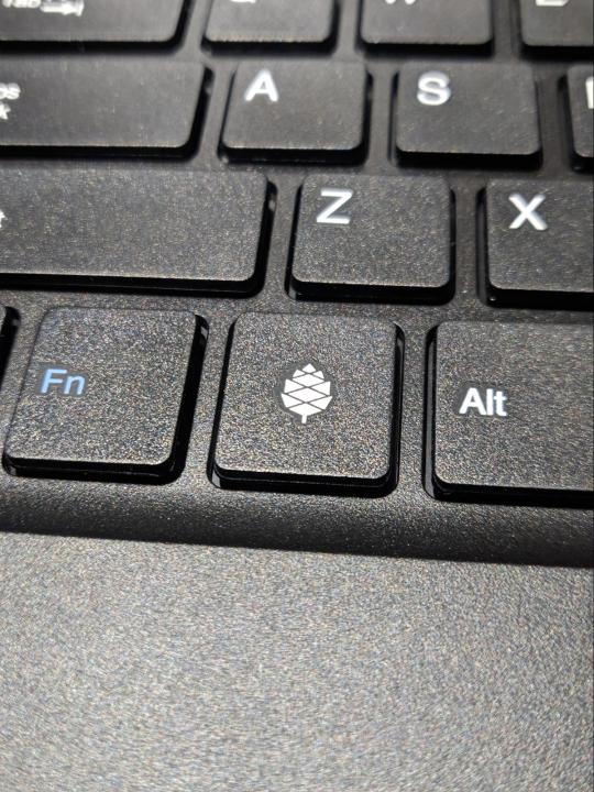
The only logo you’ll find on this entire device. Image: Ernie Smith
The Pinebook Pro’s hardware does the right things right—and cuts corners thoughtfully
Most companies want to scream out their brand name at you everywhere. Not Pine64, the community-focused maker of single-board computers that has done a lot of branching out in the past year or so.
On its latest laptop, literally nothing on the outside signifies that Pine64 was responsible for building this machine, minus a small pinecone logo on the key where most manufacturers might put a Windows logo.
If there’s a reason for that, it’s rooted in the community around this machine that drives the Pine64 project forward. In an interview from a couple of months ago, Pine64 community manager Lukasz Erecinski told me that the while certain hardware decisions were driven by developers in the space and people in the community.
“We listened and took note of the features the community truly wants, such as privacy switches for the camera, microphone and radios; modern IO interfaces; no excessive branding; end-user repairability, and we tried to deliver the best laptop we can,” he explained.
The delivery part is admittedly not easy for something like this. It took me about two months to get the device directly from Hong Kong, and the Wuhan coronavirus could cause delays for future units. Mine was one of the first units Pine64 produced that had a U.S.-centric ANSI keyboard; all of the devices released before the one I received this month used an Eurocentric ISO keyboard. The manufacturing process here is small, bespoke. Erecinski and the firm’s other main figures are moving carefully as they put these devices into the world.
You’re not buying this machine because you’re looking for something simple and cheap—it’s not like the original Pinebook, a $99 device that is basically a proof of concept that a community-built laptop is an actual thing that could exist. (Linus Tech Tips reviewed it last year, though again, it’s a proof of concept.) You could hit up eBay or your local Target for a cheap Chromebook if you wanted that, and skip out on the wait.
Rather, it’s a weekend-warrior machine, a product for people who think ARM is awesome, who think Linux is awesome, and who like the idea of developing on native hardware, or who want an actual keyboard, rather than a cheap tablet. (Side note: Pine64 is also working on a Linux-based tablet now. And a smartphone. And a smartwatch. Like I said, they’ve been busy.)
There’s a general understanding that, even if this device is only $200 plus shipping, people are doing to get more than $200 of use from it. From that front, I think they did a great job making the device feel nicer than the price point might suggest. The case, with its magnesium trims and plastic top case, wears its budget status thoughtfully. The decision to put metal on the outside, sandwiching a plastic interior, feels inspired, as it’s usually the opposite of what many Chromebook-makers do. It’s a great example of stretching a tight budget in a thoughtful way.
And that’s a common theme of the device, whose creators invested in things users would want (a relatively-beefy-for-budget ARM device, a 1080p matte screen, a useable keyboard, a USB-C port). Sure, corners were cut, but they were cut in places where it makes sense to trim, where the price tag makes them easy to explain away. A few examples:

The trackpad is tiny and plasticky, but perfectly usable. (Suggestion: Don’t click; tap.)
The outer case is a fingerprint magnet in a way most laptops are not, to the point where you wish they gave it an extra layer of coating. Fortunately, it’s also quite good for stickers, which I recommend you use for covering this thing.
And the speakers are cheap, in a bad way—but the Bluetooth works, as does the headphone jack. You don’t buy a device like this for the speakers.
You’re willing to forgive a lot because of the fact that this is a team of experimenters that was willing to put their necks out for a group of people that find a non-Intel-based laptop an awesome proposition. I mean, I certainly did.
It doesn’t come with much in the way of warranty—just a month—which is almost freeing in a way. You can break it, but you can also break it, if you get my drift. It’s not like you spent $2,500 on it.
And even amid the compromises, the device has a huge advantage over your average Chromebook in one important place: The ease of repair and modification. You can open this machine up and replace things. The default eMMC storage can be upgraded; you can get an adapter to install an NVMe SSD blade; and because the device has single-board computer roots, it’s not outside of the realm of imagination that you might be able to put another board inside of this machine in the future, while reusing most of the other parts. This is a $200 laptop with an upgrade path, and that’s a rare thing in 2020—especially for a low-stakes device like this.

There didn’t appear to be anywhere to screw in the NVMe adapter, so I just held it in place with that big yellow sticker. I’ll eventually switch to double-sided tape.
As a part of my research into this, I got a hold of an NVMe adapter (sold separately, delivered much quicker than the computer itself) and tried installing a drive myself. The results weren’t perfect: The adapter doesn’t seem to naturally fit anywhere, and a sticker, announcing changes to the device’s internal design, blocked the spot for the ribbon adapter. When I removed that sticker, I got the ribbon cable in, only to find that there is seemingly no easy way to fit in the adapter, which partly goes under the trackpad. It was just hanging out. Fortunately, I had the sticker to go where screws couldn’t. (I joked on Twitter that it’s a load-bearing sticker.)
There are things that one could quibble about with this design—the hinge could stand to go back a little bit further, for example, and backlit keys would definitely be useful—but I think that they pulled off a lot in an extremely tight budget.
The battery life on this is insane—8 to 10 hours easily. And because it doesn’t use a ton of power, it can charge off a cell phone’s power brick, as long as it uses USB-C (though a barrel plug charger is included). If you were backpacking across a continent and wanted the most lightweight and battery-packed device possible, the Pinebook Pro would be a contender.
There were some areas where the device buckled a bit in my testing. For example, while the device is technically capable of 4K video, plugging it into a USB-C adapter on my 4K monitor was a strugglefest. I’m sure that, if I keep tinkering or find a different cable, I can get it to work. Just like a lot of other things here.
Because honestly, that’s the point of this device.
“Our end-users are very well informed, usually technical and specifically want an ARM laptop.”
— Lukasz Erecinski, discussing the user base for Pine64 devices, which is often very community driven and in the open-source spirit.
Software considerations: Get ready to tinker
The first time you boot into your Pinebook Pro, you’re greeted with a red intro screen, complete with Pine64 logo (the same one on the keyboard), that says, “Open Sesame.”
That description feels pretty accurate. This is a device intended in many ways for discovery of the Linux ecosystem, its benefits and quirks, and what might or might not work out of the box. You don’t buy this because you want to save money that you’d otherwise use for a Chromebook; you buy it because you want to be able to screw around a bit.
By choosing an ARM-based device over x86, you’re cutting down your options for both operating systems and software, but there’s still plenty of stuff there. Most of the major browsers have ARM variants, most notably Chromium and Firefox, and I found the ARM version of Vivaldi quite nice. YouTube playback was perfectly serviceable, and I ran into very few situations where I couldn’t install an app because it had not been designed for ARM-based Linux. There’s reason to expect that situation to improve in the coming years, thanks to the rise of hobbyist computers like this.
So, what about the operating systems? I think this is where my viewpoint gets a little mixed. The default Debian-based build included, with a MATE-based graphical interface, is simple and spartan—not as polished as some of the x86-based alternatives, but still offering plenty to work with. It does the job. If you’re just looking for the machine to work, this is probably the default you’ll want to stick with.
Fortunately for those wanting more than that, trying other operating systems is very doable—with the included MicroSD slot, I was able to throw in different cards and try out numerous community builds that supported this device. With the exception of the Android build, I was able to get every one I tried to work with varying levels of stability.
Chromium OS worked decently for surfing the web, but the offered community build had some stability issues and didn’t allow for easily installation of the software’s pretty-good Linux capabilities. As it’s not a pure Linux build it’s likely not getting as much attention as some of the others, but I hope that changes, as it’s a fairly decent way to surf the web on the cheap and it has some great stretch capabilities.
The Manjaro build (which uses a KDE Plasma desktop interface) was nice, though not my personal cup of tea, as I tend to be more comfortable in Debian/Ubuntu terminals. Probably my favorite of the bunch, though, was the Ubuntu MATE community build, which is more customizable than the default Debian MATE build—although, like Chromium OS, it had some quirks, most notably some compatibility issues with the NVMe drive that prevented the laptop from going to sleep.
If you’re looking for a Linux experience with training wheels, this probably isn’t it, and you’ll be happier setting up an old x86 laptop to try the more diverse ecosystem of Linux variants—among them System76’s simple and thoughtful Pop OS Ubuntu variant, the Mac-like Elementary OS, the switcher-targeted Zorin OS, and the highly polished Chinese-made Deepin.
But I don’t think that’s necessarily a knock on the Pinebook Pro. You should get it because you know you’re going to spend weekends messing around with random settings, or programming. And when you do get things where you like them, you get a device with a nice keyboard, a long battery life, and a fully repairable interior.
This ecosystem is still fairly young, and young ecosystems grow older and more diverse over time. This comes with good sides and bad sides. While you can tinker to your heart’s content with a device like this, it also means that you’re at the mercy of fellow tinkerers when something doesn’t work quite right. That might just lead you to a solution, but because it’s relatively early days in the world of ARM-based laptops, you’re stuck if something doesn’t work.
In a year, the operating system situation is likely to look a lot different because there’s a community pushing it forward. If you buy this, you’re buying into the community as much as the device—and Pine64 has a really interesting community right now, one that will become fundamental to its future growth.
And with that in mind, you can see the potential down the line. In our interview, Erecinski noted that there is room for system-on-a-chip (SoC) gadgets to eventually become useful to more than just the tinkerers that will buy this.
“I feel that we are getting very close to ARM Linux desktop computers being viable as a choice for non-technical end-users,” he said. “We aren’t there just yet, but many ARM SoCs are (at least in theory) perfectly capable of running full desktop environments and software for these SoCs is getting better by the day.”
Just as the original Pinebook was a necessary step to stake out the market, the Pinebook Pro helps set the stage for an eventual maturity. For people that buy this, living through the growing pains is basically the fun part.
“When I see Raspberry Pi-shaped things or slightly bigger, or even smaller, I think to myself, ‘Well, we’re just where the PC was in 1985’—you know, way cheaper than the expensive stuff. People make fun of it, but it’s going to get better faster than the older technologies of stuff. People are going to try things out just to try them, and maybe they’ll succeed.”
— Ed Vielmetti , an employee of the cloud firm Packet and a former journalist, discussing the current shape of the market for ARM-based devices, which he has helped to evangelize through his role with Works on Arm, a collaboration between Packet and Arm that aims to make the case for ARM in data centers.
The interesting thing about the Pinebook Pro is not that it exists and works effectively, but that it paints an image of a future where ARM chips could genuinely prove a better use case on the go. The fact that these chips have found a home in our smartphones and connected devices makes one wonder about the long-term potential of a device that took those skills back to more traditional computing form factors.

The board at the center of the Pinebook Pro.
It would be a fascinating homecoming of sorts for a chipset that gained momentum in low-power use cases, but whose roots are actually in desktop computers produced by the British firm Acorn.
Certainly, there have been efforts to bring ARM to the laptop realm—most notably the Microsoft Surface Pro X, released last year, that featured impressive hardware, although reviewers were less impressed with the compromised software. Ed Vielmetti, a former journalist who has helped ARM’s reach in the data center through his employer Packet, has tried some of the Windows-based ARM machines, which he notes often have impressive battery life and connectivity compared to equivalent Intel devices.
But Vielmetti, who first gained a professional interest in ARM through exposure to the Raspberry Pi when working on a solar energy project, noted that in many ways, the play for the ARM chipset in more traditional computing form factors is in the long term—rather than right now.
“If it’s like this quarter, something has to be on for some of us this quarter, then you probably want to be, you know, parked very close to what your customers use,” he told me in an interview last summer. “But if you’re looking a little bit out or even further out, and you’re looking at the landscape of changes in the chip industry, and you want to target your software at the people who have the hardware that’s the best, then I think you have to be looking at ARM.”
And there has been growing interest in this specific proposition. Last year, for example, Linus Torvalds noted in an online discussion that there was a growing need for ARM developer boxes if ARM is to have a shot in the world of servers. “Without a development platform, ARM in the server space is never going to make it,” he noted. (The Pinebook Pro is a good start.)
And then there’s the general consumer level, which has seen some exposure to ARM-based laptops running Chrome OS. The wildcard, of course, is Apple, which has long been rumored to be working on an ARM-based Mac. Both Vielmetti and Erecinski noted it was well-positioned to push things forward.
“They have extensive experience with ARM from their phones and their kernel, and presumably also much of the stack already runs on the architecture,” Erecinski said. “Perhaps more importantly, Apple has very loyal customers who would buy an ARM laptop with little or no reservation.”
There are a lot of ways this could end up looking, and Pine64’s image of an ARM-based future may not be the one that wins in the market, although it makes an intriguing present. Another potential path forward involves a recent Kickstarter success story called the NexDock 2, which effectively is a laptop-like shell for ARM-based smartphones with built-in desktop support. It makes sense—after all, many Android phones are already more powerful than desktop computers.
Maybe the future of ARM computing looks like the Pinebook Pro; maybe it looks like the NexDock 2; maybe it even looks like whatever Apple is rumored to be working on. But we may be on the cusp of a future where a chipset famously used in smartphones starts appearing in more traditional computing forms—and the Pinebook Pro shows that the tinkerers are out front here.
Pine64, by building this device and others, is for now at the vanguard of ARM-based computing, but its goals are more modest than most. Speaking about its efforts to support a Linux-based phone ecosystem—another area where Pine64 is at the vanguard—Erecinski underlined the firm’s simple, open-source roots.
“We are not out to sell a million units, dethrone Android and iOS, or build a PINE64 empire,” Erecinski explained. “This project will never be a financial success because we make no money off it—we donate all revenue to our partner projects building the OSes. But that is besides the point.”
This $200 Laptop Is Like a Chromebook You Can Hack syndicated from https://triviaqaweb.wordpress.com/feed/
0 notes
Text
Ledger Nano X Review: A Beautiful Piece of Kit
It feels like a long time since CES in January when Ledger unveiled its latest hardware wallet, the Nano X. I was lucky enough to receive a review device and have been dutifully putting it through its paces since then. With the first units shipping next week, its high time to get excited all over again with a full review.
Getting Started
Let’s get this out of the way first — the Ledger Nano X is a beautiful piece of kit. It comes nicely packaged with Apple-level attention to detail.
In the box, you get the device itself, a keychain attachment, and tough-looking braided USB cable — plus instruction sheet, recovery cards, and Ledger stickers — if you’re into that kind of thing.
The device looks very similar to the Nano S, although the buttons have moved to be either side of the larger and flush screen. The two buttons scroll through menu options while pressing both simultaneously selects the highlighted option.
The set-up is a simple affair, although I would recommend doing it in one session. In my excitement, I started up the device whilst still in Vegas, then realized I should be taking notes… and of course, Vegas doesn’t allow notes. It took a bit of fiddling to get back to the set-up process once I was back home, but it wouldn’t have been a problem if I’d just waited.
Bizarrely, I managed to change the device name on my device, but Ledger Live still sees it as the default name. Now, I can’t seem to alter it at all — but it’s not a huge deal.
Ledger Live
Most of your interaction with the Nano X will occur via the Ledger Live app, for Android and iOS. I mean, you could use it through the desktop version, but there’s no reason why you would – and, in fact, one good reason why you wouldn’t… but more on that later.
The device connects to the mobile app via Bluetooth, which has sparked security concerns from some quarters. However, private keys remain safely stored in the secure chip on the device, which has been updated and has a higher rating than that of the Nano S.
The Nano X supports all 1100+ cryptocurrencies of the earlier model, but you can install 100 different token accounts on a single Nano X — compared to 18 on the S. Installing accounts is a breeze, although there is no way to change the default account name until after you have created it. Again, not a massive problem, but I don’t see why this shouldn’t be possible.
More of an issue is the fact that, if you do at any point decide to use the desktop version of the software, you have to manually add all the accounts again… and the accounts again take the default name. Why it doesn’t sync accounts (or at least account names) with the device/mobile app is a mystery. To be honest, though, the desktop app has no extra functionality, so you might as well just stick to the mobile app.
This works just like any software wallet, allowing you to send and receive tokens, monitor your portfolio, and even buy tokens through selected partner exchanges. Every transaction is confirmed through Nano X, and this is its strength.
The Bottom Line
The combination of hardware-wallet security with the mobility and ease-of-use of a software wallet makes this a pretty compelling purchase. Niggles aside, what’s not to like about that?
The Ledger Nano X costs $119, with free shipping, and orders placed today should be shipped in early April.
What do you think of the Ledger Nano X? Will you upgrade from the Ledger Nano S? Let us know your thoughts in the comments below!
The post Ledger Nano X Review: A Beautiful Piece of Kit appeared first on Bitcoinist.com.
from Cryptocracken Tumblr https://ift.tt/2TGWuyl
via IFTTT
0 notes
Text
As previously indicated
Once the planting begins, I'll install the deer fencing. Ok, don't laugh, but I'm doing my best to live with these woodland creatures. They really are pretty and also destructive.. The one MAJOR disappointment here is that ridiculous warning sticker nfl jerseys. This absolutely should have been placed on the bottom of the box, instead of marring the leather. It is extremely difficult to remove and pulls the leather to distortion.
cheap nfl jerseys There are many great tumblrs and even subreddits about judaism and jewish life! that way you can start to figure out how you feel about your roots and how you could incorporate them in your daily life!have you ever gotten in touch with your local rabbi? i promise you, your journey won sound ridiculous to them. Maybe you can find a way together that make you feel more comfortable with the situation?i wish you all the best anon! you and your jewish identity are valid! :)12:50 Feb 63 notes(Part 2) such as the foods we ate or the slight beliefs we had. The reason I hadn been shared this information sooner was because my grandmother was always ashamed of being Jewish, which was hard for me to understand until I realized the time period she grown up in and the people she been around. cheap nfl jerseys
cheap nfl jerseys The national governing body in the USA is the USAG, or the United States of America Gymnastics. The USAG has established 10 Junior Olympic levels, according to the World of Gymnastics. Beyond the tenth level, a gymnast competes in elite gymnastics. 25 year old Polizzi released her first fragrance in 2011 and has been very successful with it and her other ventures that she has taken on so far https://www.cheapjerseysitems.com. The lawsuit actually has a page dedicated to Snooki's accomplishments. The suit states: "Polizzi has achieved considerable commercial success in her career by, among other things, maintaining strict control over the projects and commercials endorsements with which she is associated.". cheap nfl jerseys
wholesale jerseys That sounds like an incredible amount, but think about it this way: According to the CIA, there were 316,668,567 Americans alive that month [source: CIA]. If you took all the cash and divided it up equally, each person should have about $3,800 in cash on them (or stuffed under the mattress). Dollars is held overseas [source: Federal Reserve].. wholesale jerseys
Each board is responsible for managing and implementing the procedures relating to that particular area of medical practice. The 12 boards are categorized according to medical field and are as follows:1) Dental Therapy and Oral Hygiene12) Radiography and Clinical TechnologyThe HPCSA follows a regulatory framework that includes the founding Health Professions Act 56 of 1974. The framework defines the scope of each profession and outlines the procedures to be followed by the HPCSA in monitoring the activities of healthcare practitioners.Registration with the HPCSA is required to legally practice in any of the 12 fields of specialization. wholesale jerseys from china
Cheap Jerseys free shipping Five Valley businesswomen are being honored by the San Fernando Valley Child Guidance Clinic for their community involvement and professional accomplishments. "These women have contributed much to their communities through both their work and their volunteering," said Lori Kent, assistant director for the clinic's office of development. "Most of the women are involved in more than one organization and it's important we honor their efforts."It's Back to School for Reunion Goers. Cheap Jerseys free shipping
Cheap Jerseys from china "I think he knows we all have Jets jerseys on at heart. But the big issue is he's not from here, he's from southern Ontario. When he decides he wants to bring the Coyotes to (Hamilton), he's giving back to the people who have given him opportunities. Cheap Jerseys from china
Cheap Jerseys free shipping GEAR DVD 7.03 is another contribution to the realm of software created to help you burn or copy DVDs. There are many competitors manufacturing software in this arena with complete turnkey solutions https://www.cheapjerseysaleusa.com. With that being said, I was disappointed by GEAR's limited offerings in its DVD 7 package.GEAR's sales pitch is "it couldn't be easier to create, copy, and burn DVD movies and music CDs," but while it's not the most complicated work I've ever seen, it certainly doesn't demonstrate simplicity either. Cheap Jerseys free shipping
wholesale jerseys from china With its new threads, Rutgers is latest team to jump into the race to modernize its look. The past few years have seen Under Armour, Nike and Adidas trot out everything from neon green and yellow at the University of Oregon to mashups of the state flag on the University of Maryland helmets. If that not enough, the designers are even working overtime on the players socks and shoelaces.. wholesale jerseys from china
Cheap Jerseys china It was tough, uncompromising test rugby. Some real key performances stood out for me. T (skipper Tana Umaga) played really well the whole series, and I still remember DC (Dan Carter) in Wellington. Colombia's squad couldn't wake up and the Chileans ran circles around our 11 yellow jerseys. In a few minutes came the second and third goals, for Chile. When the halftime whistle blew the stadium seem anesthetized. Cheap Jerseys china
wholesale jerseys As previously indicated, one of the most popular ways to determine the prevailing wage has been to use the OES. The PERM Regulations state that the employer may add any "guaranteed" bonuses or commissions to the salary to meet the prevailing wage. If the bonus or commission is not "guaranteed", it cannot be added to the specified wage wholesale jerseys.
0 notes
Text
2018 - 2019 Toyota Camry Change, Performance, And Review
In the beginning released since a several-doorway version regarding your Celica with 1979, a Camry grew to be a good remain-alone nameplate with '80. Since that time, it offers become one particular of the particular most reliable in addition to well-known sedans concerning your marketplace, specifically in the U.S.,., where Toyota has shipped extra than 200,000 models your year given that "88 and then in excess from 350,000 illustrations since 1996. Currently the finest-selling person car during North America, the Camry forced into any new generation intended for the particular '19 model twelve months. Seen tests about open public roadways given that earlier 2016, any 8th creation sedan was redesigned out of the ground together. With course, that isn’t surprising as all new-generation automobiles receive upgrade each inside and out, nevertheless the new Camry is definitely some sort of huge departure from its predecessor. Not merely given a fresh look, it is likewise sleeker, sportier, and much more fashionable than its forerunner. It appears as if the actual unique Camry was made to bridge this space between a dull Toyota cars together with any premium Lexus choices.
And also that is in no way a good poor idea. As normal, the particular re-designed outside will be jointed by way of a refurbished interior along with brand-new design and updated technology. Toyota in addition had taken treatment in the actual drivetrain division as a result of adding a few new engines, including a hybrid. The Camry is certainly, without your doubt, the almost all captivating mid-size sedan we’ve ever created,” stated Carter, Toyota older v . p . involving automotive functions. It offers about every thing Camry owners came to anticipate from America best-offering car, and even contributes to that, jaw-decreasing design, more complex technology, reducing-edge security techniques, and mixing performance that raises the item for an unparalleled stage with excitement.” Those are usually powerful large phrases originating from Mr. Carter, which means that you’re possibly requesting yourself "will be all the new Camry the fact that good or is without a doubt Toyota driving on top of PR speak?" Well, let’s discover your response to this huge issue in the actual review listed below, click here.
While I personally initially saw spy pictures of your hidden Camry model, I'm certain that your sedan will receive a evolutionary design according to a extroverted truck not to mention combined with design cues noticed upon the smaller Corolla. I cannot say I became completely wrong about the "evolutionary" part, but apart from a number of similarities with any previous product, typically the new Camry contains plenty involving latest design characteristics to talk with regards to. What is a lot more, it advantages from a new slightly different strategy that mixes the sportier position utilizing upmarket style.Although the new outside is sportier, fancier, yet evolutionary, the cabin is a enormous departure from the earlier design. Meanwhile, the passenger gets a diverse atmosphere, featured by a sense of openness and the smooth-touch surfaces and the veneer in the dashboard.
Even though it was initially thought that Toyota will stage out and about the 3.5-liter V-6 and also go for a good turbocharged 4-tube instead, this midsize vehicle continues to use a naturally aspirated 6-cylinder. The actual 2.5-liter 4-cylinder was maintained, as seemed to be any hybrid based on the very same 4-container device. Nonetheless, all three drivetrain have already been remodeled with a big focus concerning improving fuel economy. Despite the fact that certain numbers are not but accessible, Toyota says that the particular brand new 2.5-liter engine delivers much more power and also twisting compared to its precursor, all of although returning reduced fuel intake.
Prices information is actually not even readily available, and yet any Camry sticker label need to increase along with the update. With a extroverted model listed from $23,070, all the next generation vehicle can start off from around $24,000. A adjusted raise fender and even smoke-tinted taillights spotlight the alterations during a rear.
0 notes
Text
4 under-the-radar UX flaws that are killing your conversion rate
As all business owners who operate an ecommerce website know, it can take a while to hit full stride in terms of conversion rate.
When results are underwhelming, the first instinct might be to make big changes across the board.
What a lot companies fail to realize is that a great deal of buying decisions take place subconsciously. Design errors can seem minuscule, but have a huge impact on the bottom line.
It’s very possible there are a number of UX flaws in your layout that are turning visitors off at first glance. Here are a few things you may have overlooked in your approach.
1. Lack of visual hierarchy
Web design is about so much more than just making a platform look pretty and appealing. The bulk of the process is about adhering to goal-based functionality. Using visual elements such as color, positioning, contrast, shape, size, etc. you can strategically organize the page so users get a strong impression of how important certain components are. Basically, it’s about where you want your customers’ eyes to be drawn to.
Here is MailChimp’s homepage:
Where is the first place your eyes went? Chances are, they went to the CTA in the center of the page. The button they’ve use is slightly offset from the rest of the color scheme and the message sticks out very prominently.
Based on the goals of your landing page, the desired action should be properly conveyed on the visual hierarchy scale and jump out to the visitor.
TechWyse did a case study on how certain landing pages attract attention. Here is the original landing page they used in the experiment:
Now, here is the landing page with a heat map of where visitors’ eyes were being drawn to:
You’ll notice that the place with the highest engagement was the vivid red “NO FEES” sticker. The problem with this is that it draws eyes, but has no click action or conversion related goal. Therefore, visitors are being diverted from the more important parts of the page.
A tool such as Zarget will help you identify the reading and scanning patterns of visitors to your site. It can also track browser interaction with moving and dynamic elements, as opposed to heat maps based on just snapshots (like the ones Crazy Egg gives you).
When you are designing landing pages, keep in mind your overarching objective for conversion. Is it to gain sign-ups? Promote a deal? Whichever you decide, be sure your visual hierarchy invokes the desired action and navigates users to a conversion.
2. Unclear value proposition
Keep in mind, not everyone wants to be sold to immediately. Showcasing your unique selling proposition right off the bat is a good way to entice visitors to see what you have to offer.
Your value proposition is what tells customers why they should choose you as opposed to the competitors. Regardless of what you sell, this needs to be apparent almost instantly. The widespread usage of Amazon makes this concept extremely vital to the setup of ecommerce websites. Why should a customer buy from you instead of the convenient retail giants?
The harsh truth of the matter is that a lot of online businesses struggle with clearly communicating their value proposition. Follow these steps when crafting yours:
Identify the need – The most important thing to convey is that you understand the customer’s primary need. The value proposition should start by recapping it.
Present the solution – This is where you need to highlight the main benefits of your service.
Show differentiation – This part requires a bit of finesse. Simply bashing a competitor is not the solution here. Instead, subtly address the common objections customers have within the industry and your unique way of solving them.
Provide proof – Lastly, it’s safe to assume that most customers will be skeptical of your brand messaging. With this in mind, it is always a smart move to validate your claims with proven recognition. Testimonials, case studies, and success stories are a great place to start.
Here is a great example from Less Accounting:
Their entire homepage is devoted to expressing their value proposition. They take a common issue of the industry and spell out how they work to solve the problem. Below the fold, they show a video success story as well as the big name companies their platform is compatible with for validation.
A series of case studies conducted by Invesp found that a well-crafted value proposition can increase your conversion rates by 90 percent! In the vastly overpopulated ecommerce landscape, customers have no problem moving on to the next brand if your value proposition is murky.
3. Subpar checkout process
The checkout process is perhaps the most crucial piece of the ecommerce puzzle. Given that the average cart abandonment rate was 76.8 percent last year, it can be a very complicated design element to master. There is a plethora of reasons why people choose to abandon their carts:
Basically, your goal should be to eliminate as many hoops as possible that the customer has to jump through in order to buy. Each step means another chance to reconsider. Simplicity is very important here.
Now, having 1-click checkout options like Amazon may not be viable for all ecommerce platforms. But, there are many little design tweaks you can make and elements to add that will make the process easier.
First of all, there should always be a function where the customer has the option to checkout as a guest. Most people know that registering for a website means they will be bombarded with spam.
Also, be sure it’s very obvious what is in the shopping cart, as well as the total cost with all fees included. Here is an example of a cart from Asos:
They clearly show the total cost of the items and provide options for shipping so the user will not be hit with any unexpected extras.
Another great component to include is a progress indicator:
Adding this to your design will make the process seem more organized with a clear funnel to a conversion.
Everything you add to your ecommerce website ultimately leads to the checkout. If this section is poorly crafted, your conversion rate will suffer. Your choice of ecommerce platform will make all the difference – a customizable one like Shopify will ensure your shopping cart has the requisite functionality, without which the best design is meaningless.
So while you put the best shopping cart systems in place, implement all that advice out there on how to improve your checkout process, and keep an eye on your analytics all the time to see if you’re meeting your conversion goals, how much of those 76.8% abandoned carts can you actually expect to recover?
Neil Patel, co-founder of Crazy Egg, Hello Bar, and KISSmetrics, estimated the recovery rate at 10-30% in an article for Forbes. “The amount of sales that you can recover with rates like that really adds up,” he wrote.
4. Obsolete website theme
First impressions are everything in ecommerce. What is your first thought when you see this one?
If your website looks like it was designed back in the 90’s, consumers can easily jump to conclusions like a) you’re no longer in business, and b) your website won’t keep their valuable information secure. Both will cost you credibility and turn potential buyers away in droves.
Additionally, outdated websites do not typically fare well in the search rankings. Google updates their search algorithms hundreds of times a year, and values user experience over most other ranking factors. Rohan Ayyar, my fellow Search Engine Watch columnist and SEO guru, has this to say:
“It’s common knowledge that Google conducts frequent usability studies and scores of experiments to improve their own products. That’s how serious they are about UX. Your website will sink rapidly down the SERPs if you continue to ignore usability.”
Fixing your web design with a UX-first approach will require a bit of market research. Take a look at your competitor’s websites to get an impression of what is par for the course. Also, be sure you are keeping up with the latest trends in web design.
For example, simplistic homepages that do away with text heavy content are being used more often these days to serve as a powerful introduction to a website. Here is Vera Wang’s homepage:
The main focus of the landing page is a captivating video used for the first impression, rather than a wall of text leading to product listings.
Ultimately, if your website appears outdated, you are leaving money on the table. No matter how great your content is, visitors will be turned off at first glance. However, using conventional web design standards and practices doesn’t mean you have to conform to the latest design trends or adapt your layout to it.
Jeffrey Eisenberg, CEO of BuyerLegends.com, summed it up best when he advised webmasters to make their sites focus on “persuasion” instead of “conversion”:
“The ability to achieve truly dramatic improvements in conversion rates still requires a shift in conventional thinking. Design teams need to understand that while the goal may be conversion, the practice must be persuasion.”
This implies designers, developers, content creators and marketers will soon wind up on the same page in the not-too-distant future. In fact, the tools to help them do that are already here.
For instance, UXPin helps business owners and marketers collaborate with their design teams to rapidly create wireframes and prototypes, from which the designers and developers can work towards a finished website that meets all the required functionality.
Over to you
Designing a website is not rocket science. However, finding the perfect balance of elements that result in a healthy conversion rate will likely take some experimentation. The key is to always be testing and optimizing.
Each ecommerce platform will require different formulas for conversions. Don’t fall prey to these common blunders.
4 under-the-radar UX flaws that are killing your conversion rate syndicated from http://ift.tt/2maPRjm
0 notes
Text
4 under-the-radar UX flaws that are killing your conversion rate
As all business owners who operate an ecommerce website know, it can take a while to hit full stride in terms of conversion rate.
When results are underwhelming, the first instinct might be to make big changes across the board.
What a lot companies fail to realize is that a great deal of buying decisions take place subconsciously. Design errors can seem minuscule, but have a huge impact on the bottom line.
It’s very possible there are a number of UX flaws in your layout that are turning visitors off at first glance. Here are a few things you may have overlooked in your approach.
1. Lack of visual hierarchy
Web design is about so much more than just making a platform look pretty and appealing. The bulk of the process is about adhering to goal-based functionality. Using visual elements such as color, positioning, contrast, shape, size, etc. you can strategically organize the page so users get a strong impression of how important certain components are. Basically, it’s about where you want your customers’ eyes to be drawn to.
Here is MailChimp’s homepage:
Where is the first place your eyes went? Chances are, they went to the CTA in the center of the page. The button they’ve use is slightly offset from the rest of the color scheme and the message sticks out very prominently.
Based on the goals of your landing page, the desired action should be properly conveyed on the visual hierarchy scale and jump out to the visitor.
TechWyse did a case study on how certain landing pages attract attention. Here is the original landing page they used in the experiment:
Now, here is the landing page with a heat map of where visitors’ eyes were being drawn to:
You’ll notice that the place with the highest engagement was the vivid red “NO FEES” sticker. The problem with this is that it draws eyes, but has no click action or conversion related goal. Therefore, visitors are being diverted from the more important parts of the page.
A tool such as Zarget will help you identify the reading and scanning patterns of visitors to your site. It can also track browser interaction with moving and dynamic elements, as opposed to heat maps based on just snapshots (like the ones Crazy Egg gives you).
When you are designing landing pages, keep in mind your overarching objective for conversion. Is it to gain sign-ups? Promote a deal? Whichever you decide, be sure your visual hierarchy invokes the desired action and navigates users to a conversion.
2. Unclear value proposition
Keep in mind, not everyone wants to be sold to immediately. Showcasing your unique selling proposition right off the bat is a good way to entice visitors to see what you have to offer.
Your value proposition is what tells customers why they should choose you as opposed to the competitors. Regardless of what you sell, this needs to be apparent almost instantly. The widespread usage of Amazon makes this concept extremely vital to the setup of ecommerce websites. Why should a customer buy from you instead of the convenient retail giants?
The harsh truth of the matter is that a lot of online businesses struggle with clearly communicating their value proposition. Follow these steps when crafting yours:
Identify the need – The most important thing to convey is that you understand the customer’s primary need. The value proposition should start by recapping it.
Present the solution – This is where you need to highlight the main benefits of your service.
Show differentiation – This part requires a bit of finesse. Simply bashing a competitor is not the solution here. Instead, subtly address the common objections customers have within the industry and your unique way of solving them.
Provide proof – Lastly, it’s safe to assume that most customers will be skeptical of your brand messaging. With this in mind, it is always a smart move to validate your claims with proven recognition. Testimonials, case studies, and success stories are a great place to start.
Here is a great example from Less Accounting:
Their entire homepage is devoted to expressing their value proposition. They take a common issue of the industry and spell out how they work to solve the problem. Below the fold, they show a video success story as well as the big name companies their platform is compatible with for validation.
A series of case studies conducted by Invesp found that a well-crafted value proposition can increase your conversion rates by 90 percent! In the vastly overpopulated ecommerce landscape, customers have no problem moving on to the next brand if your value proposition is murky.
3. Subpar checkout process
The checkout process is perhaps the most crucial piece of the ecommerce puzzle. Given that the average cart abandonment rate was 76.8 percent last year, it can be a very complicated design element to master. There is a plethora of reasons why people choose to abandon their carts:
Basically, your goal should be to eliminate as many hoops as possible that the customer has to jump through in order to buy. Each step means another chance to reconsider. Simplicity is very important here.
Now, having 1-click checkout options like Amazon may not be viable for all ecommerce platforms. But, there are many little design tweaks you can make and elements to add that will make the process easier.
First of all, there should always be a function where the customer has the option to checkout as a guest. Most people know that registering for a website means they will be bombarded with spam.
Also, be sure it’s very obvious what is in the shopping cart, as well as the total cost with all fees included. Here is an example of a cart from Asos:
They clearly show the total cost of the items and provide options for shipping so the user will not be hit with any unexpected extras.
Another great component to include is a progress indicator:
Adding this to your design will make the process seem more organized with a clear funnel to a conversion.
Everything you add to your ecommerce website ultimately leads to the checkout. If this section is poorly crafted, your conversion rate will suffer. Your choice of ecommerce platform will make all the difference – a customizable one like Shopify will ensure your shopping cart has the requisite functionality, without which the best design is meaningless.
So while you put the best shopping cart systems in place, implement all that advice out there on how to improve your checkout process, and keep an eye on your analytics all the time to see if you’re meeting your conversion goals, how much of those 76.8% abandoned carts can you actually expect to recover?
Neil Patel, co-founder of Crazy Egg, Hello Bar, and KISSmetrics, estimated the recovery rate at 10-30% in an article for Forbes. “The amount of sales that you can recover with rates like that really adds up,” he wrote.
4. Obsolete website theme
First impressions are everything in ecommerce. What is your first thought when you see this one?
If your website looks like it was designed back in the 90’s, consumers can easily jump to conclusions like a) you’re no longer in business, and b) your website won’t keep their valuable information secure. Both will cost you credibility and turn potential buyers away in droves.
Additionally, outdated websites do not typically fare well in the search rankings. Google updates their search algorithms hundreds of times a year, and values user experience over most other ranking factors. Rohan Ayyar, my fellow Search Engine Watch columnist and SEO guru, has this to say:
“It’s common knowledge that Google conducts frequent usability studies and scores of experiments to improve their own products. That’s how serious they are about UX. Your website will sink rapidly down the SERPs if you continue to ignore usability.”
Fixing your web design with a UX-first approach will require a bit of market research. Take a look at your competitor’s websites to get an impression of what is par for the course. Also, be sure you are keeping up with the latest trends in web design.
For example, simplistic homepages that do away with text heavy content are being used more often these days to serve as a powerful introduction to a website. Here is Vera Wang’s homepage:
The main focus of the landing page is a captivating video used for the first impression, rather than a wall of text leading to product listings.
Ultimately, if your website appears outdated, you are leaving money on the table. No matter how great your content is, visitors will be turned off at first glance. However, using conventional web design standards and practices doesn’t mean you have to conform to the latest design trends or adapt your layout to it.
Jeffrey Eisenberg, CEO of BuyerLegends.com, summed it up best when he advised webmasters to make their sites focus on “persuasion” instead of “conversion”:
“The ability to achieve truly dramatic improvements in conversion rates still requires a shift in conventional thinking. Design teams need to understand that while the goal may be conversion, the practice must be persuasion.”
This implies designers, developers, content creators and marketers will soon wind up on the same page in the not-too-distant future. In fact, the tools to help them do that are already here.
For instance, UXPin helps business owners and marketers collaborate with their design teams to rapidly create wireframes and prototypes, from which the designers and developers can work towards a finished website that meets all the required functionality.
Over to you
Designing a website is not rocket science. However, finding the perfect balance of elements that result in a healthy conversion rate will likely take some experimentation. The key is to always be testing and optimizing.
Each ecommerce platform will require different formulas for conversions. Don’t fall prey to these common blunders.
from IM Tips And Tricks https://searchenginewatch.com/2017/07/04/4-under-the-radar-ux-flaws-that-are-killing-your-conversion-rate/
from Rising Phoenix SEO https://risingphxseo.tumblr.com/post/162589749400
0 notes
Text
4 under-the-radar UX flaws that are killing your conversion rate
As all business owners who operate an ecommerce website know, it can take a while to hit full stride in terms of conversion rate.
When results are underwhelming, the first instinct might be to make big changes across the board.
What a lot companies fail to realize is that a great deal of buying decisions take place subconsciously. Design errors can seem minuscule, but have a huge impact on the bottom line.
It’s very possible there are a number of UX flaws in your layout that are turning visitors off at first glance. Here are a few things you may have overlooked in your approach.
1. Lack of visual hierarchy
Web design is about so much more than just making a platform look pretty and appealing. The bulk of the process is about adhering to goal-based functionality. Using visual elements such as color, positioning, contrast, shape, size, etc. you can strategically organize the page so users get a strong impression of how important certain components are. Basically, it’s about where you want your customers’ eyes to be drawn to.
Here is MailChimp’s homepage:
Where is the first place your eyes went? Chances are, they went to the CTA in the center of the page. The button they’ve use is slightly offset from the rest of the color scheme and the message sticks out very prominently.
Based on the goals of your landing page, the desired action should be properly conveyed on the visual hierarchy scale and jump out to the visitor.
TechWyse did a case study on how certain landing pages attract attention. Here is the original landing page they used in the experiment:
Now, here is the landing page with a heat map of where visitors’ eyes were being drawn to:
You’ll notice that the place with the highest engagement was the vivid red “NO FEES” sticker. The problem with this is that it draws eyes, but has no click action or conversion related goal. Therefore, visitors are being diverted from the more important parts of the page.
A tool such as Zarget will help you identify the reading and scanning patterns of visitors to your site. It can also track browser interaction with moving and dynamic elements, as opposed to heat maps based on just snapshots (like the ones Crazy Egg gives you).
When you are designing landing pages, keep in mind your overarching objective for conversion. Is it to gain sign-ups? Promote a deal? Whichever you decide, be sure your visual hierarchy invokes the desired action and navigates users to a conversion.
2. Unclear value proposition
Keep in mind, not everyone wants to be sold to immediately. Showcasing your unique selling proposition right off the bat is a good way to entice visitors to see what you have to offer.
Your value proposition is what tells customers why they should choose you as opposed to the competitors. Regardless of what you sell, this needs to be apparent almost instantly. The widespread usage of Amazon makes this concept extremely vital to the setup of ecommerce websites. Why should a customer buy from you instead of the convenient retail giants?
The harsh truth of the matter is that a lot of online businesses struggle with clearly communicating their value proposition. Follow these steps when crafting yours:
Identify the need – The most important thing to convey is that you understand the customer’s primary need. The value proposition should start by recapping it.
Present the solution – This is where you need to highlight the main benefits of your service.
Show differentiation – This part requires a bit of finesse. Simply bashing a competitor is not the solution here. Instead, subtly address the common objections customers have within the industry and your unique way of solving them.
Provide proof – Lastly, it’s safe to assume that most customers will be skeptical of your brand messaging. With this in mind, it is always a smart move to validate your claims with proven recognition. Testimonials, case studies, and success stories are a great place to start.
Here is a great example from Less Accounting:
Their entire homepage is devoted to expressing their value proposition. They take a common issue of the industry and spell out how they work to solve the problem. Below the fold, they show a video success story as well as the big name companies their platform is compatible with for validation.
A series of case studies conducted by Invesp found that a well-crafted value proposition can increase your conversion rates by 90 percent! In the vastly overpopulated ecommerce landscape, customers have no problem moving on to the next brand if your value proposition is murky.
3. Subpar checkout process
The checkout process is perhaps the most crucial piece of the ecommerce puzzle. Given that the average cart abandonment rate was 76.8 percent last year, it can be a very complicated design element to master. There is a plethora of reasons why people choose to abandon their carts:
Basically, your goal should be to eliminate as many hoops as possible that the customer has to jump through in order to buy. Each step means another chance to reconsider. Simplicity is very important here.
Now, having 1-click checkout options like Amazon may not be viable for all ecommerce platforms. But, there are many little design tweaks you can make and elements to add that will make the process easier.
First of all, there should always be a function where the customer has the option to checkout as a guest. Most people know that registering for a website means they will be bombarded with spam.
Also, be sure it’s very obvious what is in the shopping cart, as well as the total cost with all fees included. Here is an example of a cart from Asos:
They clearly show the total cost of the items and provide options for shipping so the user will not be hit with any unexpected extras.
Another great component to include is a progress indicator:
Adding this to your design will make the process seem more organized with a clear funnel to a conversion.
Everything you add to your ecommerce website ultimately leads to the checkout. If this section is poorly crafted, your conversion rate will suffer. Your choice of ecommerce platform will make all the difference – a customizable one like Shopify will ensure your shopping cart has the requisite functionality, without which the best design is meaningless.
So while you put the best shopping cart systems in place, implement all that advice out there on how to improve your checkout process, and keep an eye on your analytics all the time to see if you’re meeting your conversion goals, how much of those 76.8% abandoned carts can you actually expect to recover?
Neil Patel, co-founder of Crazy Egg, Hello Bar, and KISSmetrics, estimated the recovery rate at 10-30% in an article for Forbes. “The amount of sales that you can recover with rates like that really adds up,” he wrote.
4. Obsolete website theme
First impressions are everything in ecommerce. What is your first thought when you see this one?
If your website looks like it was designed back in the 90’s, consumers can easily jump to conclusions like a) you’re no longer in business, and b) your website won’t keep their valuable information secure. Both will cost you credibility and turn potential buyers away in droves.
Additionally, outdated websites do not typically fare well in the search rankings. Google updates their search algorithms hundreds of times a year, and values user experience over most other ranking factors. Rohan Ayyar, my fellow Search Engine Watch columnist and SEO guru, has this to say:
“It’s common knowledge that Google conducts frequent usability studies and scores of experiments to improve their own products. That’s how serious they are about UX. Your website will sink rapidly down the SERPs if you continue to ignore usability.”
Fixing your web design with a UX-first approach will require a bit of market research. Take a look at your competitor’s websites to get an impression of what is par for the course. Also, be sure you are keeping up with the latest trends in web design.
For example, simplistic homepages that do away with text heavy content are being used more often these days to serve as a powerful introduction to a website. Here is Vera Wang’s homepage:
The main focus of the landing page is a captivating video used for the first impression, rather than a wall of text leading to product listings.
Ultimately, if your website appears outdated, you are leaving money on the table. No matter how great your content is, visitors will be turned off at first glance. However, using conventional web design standards and practices doesn’t mean you have to conform to the latest design trends or adapt your layout to it.
Jeffrey Eisenberg, CEO of BuyerLegends.com, summed it up best when he advised webmasters to make their sites focus on “persuasion” instead of “conversion”:
“The ability to achieve truly dramatic improvements in conversion rates still requires a shift in conventional thinking. Design teams need to understand that while the goal may be conversion, the practice must be persuasion.”
This implies designers, developers, content creators and marketers will soon wind up on the same page in the not-too-distant future. In fact, the tools to help them do that are already here.
For instance, UXPin helps business owners and marketers collaborate with their design teams to rapidly create wireframes and prototypes, from which the designers and developers can work towards a finished website that meets all the required functionality.
Over to you
Designing a website is not rocket science. However, finding the perfect balance of elements that result in a healthy conversion rate will likely take some experimentation. The key is to always be testing and optimizing.
Each ecommerce platform will require different formulas for conversions. Don’t fall prey to these common blunders.
source https://searchenginewatch.com/2017/07/04/4-under-the-radar-ux-flaws-that-are-killing-your-conversion-rate/
from Rising Phoenix SEO http://risingphoenixseo.blogspot.com/2017/07/4-under-radar-ux-flaws-that-are-killing.html
0 notes
Text
4 under-the-radar UX flaws that are killing your conversion rate
As all business owners who operate an ecommerce website know, it can take a while to hit full stride in terms of conversion rate.
When results are underwhelming, the first instinct might be to make big changes across the board.
What a lot companies fail to realize is that a great deal of buying decisions take place subconsciously. Design errors can seem minuscule, but have a huge impact on the bottom line.
It’s very possible there are a number of UX flaws in your layout that are turning visitors off at first glance. Here are a few things you may have overlooked in your approach.
1. Lack of visual hierarchy
Web design is about so much more than just making a platform look pretty and appealing. The bulk of the process is about adhering to goal-based functionality. Using visual elements such as color, positioning, contrast, shape, size, etc. you can strategically organize the page so users get a strong impression of how important certain components are. Basically, it’s about where you want your customers’ eyes to be drawn to.
Here is MailChimp’s homepage:
Where is the first place your eyes went? Chances are, they went to the CTA in the center of the page. The button they’ve use is slightly offset from the rest of the color scheme and the message sticks out very prominently.
Based on the goals of your landing page, the desired action should be properly conveyed on the visual hierarchy scale and jump out to the visitor.
TechWyse did a case study on how certain landing pages attract attention. Here is the original landing page they used in the experiment:
Now, here is the landing page with a heat map of where visitors’ eyes were being drawn to:
You’ll notice that the place with the highest engagement was the vivid red “NO FEES” sticker. The problem with this is that it draws eyes, but has no click action or conversion related goal. Therefore, visitors are being diverted from the more important parts of the page.
A tool such as Zarget will help you identify the reading and scanning patterns of visitors to your site. It can also track browser interaction with moving and dynamic elements, as opposed to heat maps based on just snapshots (like the ones Crazy Egg gives you).
When you are designing landing pages, keep in mind your overarching objective for conversion. Is it to gain sign-ups? Promote a deal? Whichever you decide, be sure your visual hierarchy invokes the desired action and navigates users to a conversion.
2. Unclear value proposition
Keep in mind, not everyone wants to be sold to immediately. Showcasing your unique selling proposition right off the bat is a good way to entice visitors to see what you have to offer.
Your value proposition is what tells customers why they should choose you as opposed to the competitors. Regardless of what you sell, this needs to be apparent almost instantly. The widespread usage of Amazon makes this concept extremely vital to the setup of ecommerce websites. Why should a customer buy from you instead of the convenient retail giants?
The harsh truth of the matter is that a lot of online businesses struggle with clearly communicating their value proposition. Follow these steps when crafting yours:
Identify the need – The most important thing to convey is that you understand the customer’s primary need. The value proposition should start by recapping it.
Present the solution – This is where you need to highlight the main benefits of your service.
Show differentiation – This part requires a bit of finesse. Simply bashing a competitor is not the solution here. Instead, subtly address the common objections customers have within the industry and your unique way of solving them.
Provide proof – Lastly, it’s safe to assume that most customers will be skeptical of your brand messaging. With this in mind, it is always a smart move to validate your claims with proven recognition. Testimonials, case studies, and success stories are a great place to start.
Here is a great example from Less Accounting:
Their entire homepage is devoted to expressing their value proposition. They take a common issue of the industry and spell out how they work to solve the problem. Below the fold, they show a video success story as well as the big name companies their platform is compatible with for validation.
A series of case studies conducted by Invesp found that a well-crafted value proposition can increase your conversion rates by 90 percent! In the vastly overpopulated ecommerce landscape, customers have no problem moving on to the next brand if your value proposition is murky.
3. Subpar checkout process
The checkout process is perhaps the most crucial piece of the ecommerce puzzle. Given that the average cart abandonment rate was 76.8 percent last year, it can be a very complicated design element to master. There is a plethora of reasons why people choose to abandon their carts:
Basically, your goal should be to eliminate as many hoops as possible that the customer has to jump through in order to buy. Each step means another chance to reconsider. Simplicity is very important here.
Now, having 1-click checkout options like Amazon may not be viable for all ecommerce platforms. But, there are many little design tweaks you can make and elements to add that will make the process easier.
First of all, there should always be a function where the customer has the option to checkout as a guest. Most people know that registering for a website means they will be bombarded with spam.
Also, be sure it’s very obvious what is in the shopping cart, as well as the total cost with all fees included. Here is an example of a cart from Asos:
They clearly show the total cost of the items and provide options for shipping so the user will not be hit with any unexpected extras.
Another great component to include is a progress indicator:
Adding this to your design will make the process seem more organized with a clear funnel to a conversion.
Everything you add to your ecommerce website ultimately leads to the checkout. If this section is poorly crafted, your conversion rate will suffer. Your choice of ecommerce platform will make all the difference – a customizable one like Shopify will ensure your shopping cart has the requisite functionality, without which the best design is meaningless.
So while you put the best shopping cart systems in place, implement all that advice out there on how to improve your checkout process, and keep an eye on your analytics all the time to see if you’re meeting your conversion goals, how much of those 76.8% abandoned carts can you actually expect to recover?
Neil Patel, co-founder of Crazy Egg, Hello Bar, and KISSmetrics, estimated the recovery rate at 10-30% in an article for Forbes. “The amount of sales that you can recover with rates like that really adds up,” he wrote.
4. Obsolete website theme
First impressions are everything in ecommerce. What is your first thought when you see this one?
If your website looks like it was designed back in the 90’s, consumers can easily jump to conclusions like a) you’re no longer in business, and b) your website won’t keep their valuable information secure. Both will cost you credibility and turn potential buyers away in droves.
Additionally, outdated websites do not typically fare well in the search rankings. Google updates their search algorithms hundreds of times a year, and values user experience over most other ranking factors. Rohan Ayyar, my fellow Search Engine Watch columnist and SEO guru, has this to say:
“It’s common knowledge that Google conducts frequent usability studies and scores of experiments to improve their own products. That’s how serious they are about UX. Your website will sink rapidly down the SERPs if you continue to ignore usability.”
Fixing your web design with a UX-first approach will require a bit of market research. Take a look at your competitor’s websites to get an impression of what is par for the course. Also, be sure you are keeping up with the latest trends in web design.
For example, simplistic homepages that do away with text heavy content are being used more often these days to serve as a powerful introduction to a website. Here is Vera Wang’s homepage:
The main focus of the landing page is a captivating video used for the first impression, rather than a wall of text leading to product listings.
Ultimately, if your website appears outdated, you are leaving money on the table. No matter how great your content is, visitors will be turned off at first glance. However, using conventional web design standards and practices doesn’t mean you have to conform to the latest design trends or adapt your layout to it.
Jeffrey Eisenberg, CEO of BuyerLegends.com, summed it up best when he advised webmasters to make their sites focus on “persuasion” instead of “conversion”:
“The ability to achieve truly dramatic improvements in conversion rates still requires a shift in conventional thinking. Design teams need to understand that while the goal may be conversion, the practice must be persuasion.”
This implies designers, developers, content creators and marketers will soon wind up on the same page in the not-too-distant future. In fact, the tools to help them do that are already here.
For instance, UXPin helps business owners and marketers collaborate with their design teams to rapidly create wireframes and prototypes, from which the designers and developers can work towards a finished website that meets all the required functionality.
Over to you
Designing a website is not rocket science. However, finding the perfect balance of elements that result in a healthy conversion rate will likely take some experimentation. The key is to always be testing and optimizing.
Each ecommerce platform will require different formulas for conversions. Don’t fall prey to these common blunders.
from Search Engine Watch https://searchenginewatch.com/2017/07/04/4-under-the-radar-ux-flaws-that-are-killing-your-conversion-rate/
0 notes
Last Seen Blogs

benjixromano
𝘭𝘪𝘷𝘦 𝘵𝘩𝘦 𝘧𝘢𝘴𝘵 𝘭𝘪𝘧𝘦

twooutofseven
alovehatetragedy

nicotinesdream
beldam

nicotbnico
nico's★diner

podlec
ETO PODLEC