#caniuse
Text
0 notes
Text
Caniwebview.com – Like Caniuse but for Webviews
https://caniwebview.com/
0 notes
Text
Writing down the result of a bit of research:
MacOS 10.11 (~2008 Macs): Firefox 78; Chrome 103
MacOS 10.12 (2009-2010): Firefox 115; Chrome 103
MacOS 10.13 (2009-2010): Firefox 115; Chrome 116
MacOS 10.14 (2012-2015): Firefox 115; Chrome 116
MacOS 10.15 (2012-2015 minus Mac Pro): No current restrictions
Windows Vista: please don't. (firefox 52; chrome 49)
Windows 7/8: Firefox 115; Chrome 109
Windows 10: No current restrictions
Thus, with some maneuvering around caniuse (which does not seem particularly comprehensive, but whatever):
Chrome 109 + Firefox 115 gives you every Windows 7+ computer and all but the 2008-2009 Macs. That includes :is(), optional chaining, top level await, array.at, module workers... pretty much anything you want. It locks you out of :has() (obviously), as well as CSS nesting, :nth-child(n of S) and CSS color space support. Chrome 103 gains you those extra few Macs and drops < signs in media queries (and :has() on the Chrome side, but you couldn't use that in Firefox anyway).
Going down to Firefox 78 to not force those users to use Chrome loses you top-level await, module workers, nullish coalescing assignment, promise.any, multiple selectors in :not(), <link rel="preload">... it's kind of a weird grab bag, honestly.
Ignoring the users that choose to run outdated and likely-insecure software on purpose when they don't have to (Waterfox Classic, Pale Moon, whatever), I conclude that one is not significantly limiting the hardware their web code can run on by natively using most modern syntax that works in both browser engines today (but not :has(), module service workers, etc). CSS nesting looks like a big feature that will have to be avoided in the future if one wants to support Windows 7. Yay, preprocessors.
All of this is ignoring Safari for Mac (which I don't really care about; you can install something else) and Safari for iOS (which I do care about, unfortunately, and will probably have to do a follow up to make this at all comprehensive—I guess you may have to avoid regex lookbehind and polyfill requestidlecallback?).
0 notes
Text
6 excellent CSS features that are unknown and not used much
::selection Pseudo-element
Thanks to the pseudo-element ::selection, you can format the text you are passing through with the cursor with different css properties.
Example:
.ornek-1::selection {
background-color: #000;
color: red;
}
.ornek-2::selection {
background: transparent;
text-shadow: 1px 0 4px red;
}
2. caret-color
With the caret-color property, you can change the color of the cursor when the input is focused.
Example:
input {
caret-color: red;
}
3. Smooth Scrolling
One of the little-known features of CSS, the scroll-behavior is a great feature that expresses how scrolling in the browser should be done. The scroll-behavior is "auto" by default. When this feature is "smoothed", page scrolls will occur in a soft animated way.
NOTE: This feature is not yet supported in Safari and Opera browsers. (You can find out which browsers support a feature and which are not supported by caniuse.)
Example:
html {
scroll-behavior: smooth;
}
4. Custom scrollbar
You can customize this helpful tool, which is used to move up or down websites by using the scrollbar, which is usually called scrollbar, using css features and appearing in slightly different ways in different browsers.
The process of changing many properties of the scrollbar such as color, background color, corners, width can be done with the following codes. Thanks to these codes, a customized scroll bar will appear everywhere a scrollbar appears on the site.
For those who do not want to deal with these codes and want to use ready-made plugins, I can recommend the jquery-based Malihu Custom Scrollbar plugin.
5. Truncate Text
You can use the -webkit-line-clamp property to display text up to any number of lines. It will show the text by adding an ellipsis to the end of the last line.
6. Custom cursor
You can show pictures or even emoji instead of your default pointer.
Example:
.emoji-cursor {
background: purple;
cursor: url("data:image/svg+xml;utf8,🐥"), auto;
}
.image-cursor {
background: yellowgreen;
cursor: url(https://picsum.photos/60), auto;
}
1 note
·
View note
Text
css grid cheat sheet PC LJK+
💾 ►►► DOWNLOAD FILE 🔥🔥🔥🔥🔥
Our comprehensive guide to CSS grid, focusing on all the settings both for the grid parent container and the grid child elements. Today we're going to learn CSS Grid properties so that you can make your own responsive websites. I'll explain how each of Grid's properties. Grid Template Columns. To specify the number of columns of the grid and the widths of each column, the CSS property grid-template-. Hi dev friends! I made this CSS Grid Cheat Sheet that fits on one page. I hope this will help you Tagged with webdev, css, beginners. 9 Check out caniuse. A row track is created for each value specified for grid-template-rows. Because only 2 row tracks were defined, heights of items 3 and 4 are defined by the contents of each. Like rows, a column track is created for each value specified for grid-template-columns. Items 4, 5 and 6 were placed on a new row track because only 3 column track sizes were defined; and because they were placed in column tracks 1, 2 and 3, their column sizes are equal to items 1, 2 and 3. Grid items 1, 2 and 3 have fixed widths of 90px , 50px and px respectively. The fr unit helps create flexible grid tracks. In this example, items 1 and 2 take up the first two of four sections while item 3 takes up the last two. The minmax function accepts 2 arguments: the first is the minimum size of the track and the second the maximum size. In this example, the first row track is set to have a minimum height of px , but its maximum size of auto will allow the row track to grow it the content is taller than px. The repeat notation accepts 2 arguments: the first represents the number of times the defined tracks should repeat, and the second is the track definition. In this example, the first and last column tracks have widths of 30px , and the 3 column tracks in between, created by repeat , have widths of 1fr each. If two values are specified, the first represents grid-row-gap and the second grid-column-gap. This 2-column by 3-row grid results in 3 column lines and 4 row lines. Item 1 was repositioned by row and column line numbers. If four values are specified, the first corresponds to grid-row-start , the second grid-column-start , the third grid-row-end and the fourth grid-column-end. Set a grid item to span more than one column track by setting grid-column-end to a column line number that is more than one column away from grid-column-start. Grid items can also span across multiple row tracks by setting grid-row-end to more than one row track away. Shorthand properties grid-row and grid-column can also be used to position and span grid items more than one row or column. Assign names to grid lines when defining your grid with the grid-template-rows and grid-template-columns properties. In line names, avoid keywords that appear in the specification e. Assigned line names must be wrapped in square brackets [name-of-line] and placed relative to the grid tracks. Multiple names can be assigned to grid lines by adding names within square brackets and separating each with a whitespace. Each line name can then be referenced when positioning grid items by line names. Line name assignments can also be included within the repeat function. This results in multiple grid lines with the same names. Sets of names should be surrounded in single or double quotes, and each name separated by a whitespace. Grid area names can be referenced by the same properties to position grid items: grid-row-start , grid-row-end , grid-column-start , and grid-column-end. The grid-row and grid-column shorthand properties can also reference grid area names. A second row track was auto-created to make room for items 3 and 4. Column tracks are auto-created in the implicit grid to make room for items 3, 4 and 5; and track sizes are defined by grid-auto-columns. Named grid areas will implicitly name the grid lines along the edges of the area. Those grid lines will be named based on the area name and suffixed with -start or -end. Both items are positioned by grid line numbers. Item 1 is set to start at column line 1, and item 2 at column line 2, which results in both items overlapping in the center column track. In this example, a grid item is positioned and layered on top using implicit grid line names from the defined grid-template-areas. Individual items can be self-aligned with the align-self and justify-self properties. These properties support the following valuse:. The remaining space of the grid container is distributed and applied to the start and end of each column track. The remaining space is distributed where the space between the columns are equal to the space at the start and end of the row track. The remaining space of the grid container is distributed and applied to the start and end of each row track. The remaining space is distributed where the space between the rows are equal to the space at the start and end of the column track. If you see a typo or a mistake, please reach out to me on Twitter or via email. These properties support the following valuse: auto normal start end center stretch baseline first baseline last baseline.
1 note
·
View note
Text

Inset property
The inset property is a shortcut to define top, bottom, right and left position of an element.
Its value works like margin and padding so you can use it like so :
inset: 15px 30px
= top/bottom:15px; right/left: 30px
or
inset: 15px 30px 10px 40px
= top: 15px; right: 30px; bottom: 10px; left: 40px
Documentation (en)
Documentation (fr)
Compatibility (caniuse)
141 notes
·
View notes
Text
Let's talk about the .webp format.
Webp for animations
We will hereby examine the various ways to turn the above clip from Princess Tutu, which I'm uploading as a 600 pixels tall 967,000 byte mp4, into a GIF-style looping animation. The easiest way is obviously to turn each frame into an image and make people page through them. Let's do that, and, to keep things simple, we'll use the Microsoft Paint BMP format, which uses no image compression:
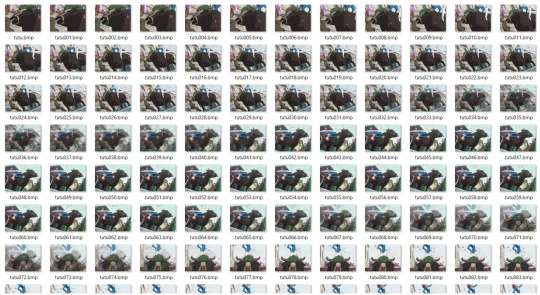
Job done 😌 we now have 187 BMP files that i should be able to share with all of my friends over the internet. Except, wait,

Our clip has gone from 967,000 bytes to 387,773,298 bytes. This is 400 times bigger. If I start a social network where people can share clips and they do it by sending hundreds of BMPs back and forth, I will use up a lot of storage space and bandwidth, and the user experience will probably be somewhat slow. Maybe a less simplistic approach is in order.
I have also created a nice GIF version of the scene. It is not pictured, because it is 3 times Tumblr's maximum GIF size limit:

This saves a lot of hard drive space over the "hundreds of BMPs" approach, but it still yields a fairly large file. The GIF format was created in 1987 and last updated in 1989; it was intended to display simple clip art on computers that looked like this:
One way this makes itself evident is through the limited color palette that each GIF uses. If you don't want to use weird tricks that explode the file size, a GIF can only use 256 distinct colors per file. Here some of them are, plainly visible in a detail shot of my new GIF:

Artful blending of these colors can hide the limited palette a lot of the time, but it seems like a dumb sacrifice to have to make when using such a large file. Anyway: if we want a Tumblrable GIF, we need to put more work in. Let's try shrinking the GIF to 300 pixels tall, cutting the frame rate to 15 per second, and reducing the quality using the gifsicle utility's "lossy" option:

It's here 🥺
It's 6,010,622 bytes (6mb), so it's about 6 times bigger than the original mp4, and looks much worse.
"What was wrong with the original mp4, anyway?" Nothing, except that browsers and image viewers know to play GIFs automatically and loop them, and Tumblr lets you arrange them into a grid. If everyone were to listen to me, I could simply say, "if you rename a .mp4 file to end with .mp4loop instead, it needs to be autoplayed and looped, and can't have sound" and we could just use those instead. But no one listens to me.
Let's continue to try to find technical solutions to this dumb standardization problem. Weren't we supposed to talk about Webp files?
A 6mb Webp file can store the clip at its original resolution and framerate. Evidence
If we reduce the Webp to 300 pixels tall and 15 frames per second like we did with the GIF, it's now 1,902,920 bytes, which is roughly a third of the size that the GIF was. Evidence
So it's obvious that using Webp files allows for much higher quality and/or much smaller files, which is extremely desirable if you're running a website, or if you're a website user that wants things to load quickly. Everyone should want this thing. You may have noticed, though, that I had to link to those Webp files instead of uploading them directly. This is because Tumblr doesn't support uploading them (probably because they don't think you'll have any Webps you'll want to upload from your computer.) Neither do browsers support them particularly well: Despite the fact that the format has been out for 10 years and growing in prominence the whole time, only recent versions of Safari on Apple computers and phones can display Webp files; the browser watchdog website CanIUse estimates that they're available to about 93% of devices. If you're running a social media site, you probably don't want to block 7% of people from seeing animated content. Also, if I try to download them, I soon find out that the Photos app on my Windows 10 laptop has no idea what these files are.
So, websites are strongly incentivized to use the Webp format instead of the GIF format and users are not necessarily going to like it when they do, probably because developers of software like browsers and image viewers don't realize how inefficient GIFs are from website creators' point of view and how they should be replaced. Great job, guys. Are there any other places where Webp images could be used?
Webp for still images
Although Google claims that Webp files are 30% smaller than JPGs, they are actually usually not smaller than JPGs that are created with an advanced encoder like Mozilla's MozJPEG. However, Webps are 26% smaller on average than equivalent PNGs no matter what, which means that they're the naturally preferred format for images with transparency, which means you might as well just use them for everything instead of having both PNGs and JPGs (which are smaller than PNGs but don't support transparency at all), assuming people upgrade their browsers.
The Conclusion
Websites use Webp files so they don't have to distribute larger, lower-quality GIF files (and just plain larger PNGs) to you. One alternate way people have tried to replace the GIF format is: those things labeled "GIF" on Twitter are actually just normal mp4 video files that they try to force browsers to autoplay and loop. Attentive readers will note that this is very similar to the ".mp4loop" replacement for the GIF format that I proposed. However, Twitter's solution only works on Twitter, because if you download one of these "GIFs" you'll get a non-looping video that looks like it should have sound and doesn't, which makes them harder and more confusing to play and share around. But people continue to not listen to me. If you're annoyed at Webp files now, wait until you start seeing the new AVIF, APNG, animated SVG, and HEIF formats. The fact that the term GIF at this point refers not just to a type of binary file but, effectively, to a genre of highly shareable media is fascinating to me; the goal people should have is to create a file type that removes the GIF format's technical limitations while preserving its social capabilities. A coordinated solution to this goal is only difficult because of the need for coordination.
7 notes
·
View notes
Text
One of the most annoying things about JavaScript specs is trying to figure out when things changed.
If you're lucky, third party websites like MDN and caniuse carefully cultivate lists of browser versions where the feature was implemented.
If you're not lucky, it's some obscure detail that only matters if you're the kind of nerd who cares about trite little details like whether your code will behave correctly on a user's browser.
Like when was it standardized and implemented that a `for...of` loop will close generators? for...of existed before generators, but generators existed before generators had the `return` method, so was the return method exposing internal closing functionality that already existed and was used internally by for...of, or was the return method added at the same time that they made for...of loops capable of closing generators?
2 notes
·
View notes
Text
[SOLVED] Checking for UC Browser compatibility
Being from India and considering the use of the UC browser is so widespread, I was looking for compatibility of certain CSS properties with the UC browser. While canIuse is my goto for other browsers, they do not readily display UC browser on the list.
Solution
If you’re designing a website for India, make sure you activate the UC browser option on canIuse. You will find it under settings near the CanIuse search bar

0 notes
Photo

7 CSS Units You Might Not Know About
Learn CSS: The Complete Guide
We've built a complete guide to help you learn CSS, whether you're just getting started with the basics or you want to explore more advanced CSS.
New CSS Techniques
It’s easy to get stuck working with the CSS techniques we know well, but doing so puts us at a disadvantage when new problems surface.
As the web continues to grow, the demand for new solutions will also continue to grow. Therefore, as web designers and front end developers, we have no choice but to know our toolset, and know it well.
That means knowing even the specialty tools - the ones that aren’t used as often, but when they are needed, are exactly the right tool for the job.
Today, I'm going to introduce you to some CSS tools you might not have known about before. These tools are each units of measurement, like pixels or ems, but it’s quite possible that you’ve never heard of them! Let’s dive in.
rem
We’ll start with something that’s similar to something you are probably already familiar with. The em unit is defined as the current font-size. So, for instance, if you set a font size on the body element, the em value of any child element within the body will be equal to that font size.
<body> <div class="test">Test</div> </body>
body { font-size: 14px; } div { font-size: 1.2em; // calculated at 14px * 1.2, or 16.8px }
Here, we’ve said that the div will have a font-size of 1.2em. That’s 1.2 times whatever the font-size it has inherited, in this case 14px. The result is 16.8px.
However, what happens when you cascade em-defined font sizes inside each other? In the following snippet we apply exactly the same CSS as above. Each div inherits its font-size from its parent, giving us gradually increasing font-sizes.
<body> <div> Test <!-- 14 * 1.2 = 16.8px --> <div> Test <!-- 16.8 * 1.2 = 20.16px --> <div> Test <!-- 20.16 * 1.2 = 24.192px --> </div> </div> </div> </body>
While this may be desired in some cases, often you might want to simply rely on a single metric to scale against. In this case, you should use rem. The “r” in rem stands for “root”; this is equal to the font-size set at the root element; in most cases that being the html element.
html { font-size: 14px; } div { font-size: 1.2rem; }
In all three of the nested divs in the previous example, the font would evaluate to 16.8px.
Good for Grids
Rems aren’t only useful for font sizing. For example, you could base an entire grid system or UI style library on the root HTML font-size using rem, and utilize scaling of em in specific places. This would give you more predictable font sizing and scaling.
.container { width: 70rem; // 70 * 14px = 980px }
Conceptually, the idea behind a strategy like this is to allow your interface to scale with the size of your content. However, it may not necessarily make the most sense for every case.
Can I use it?
Feature: rem (root em) units on caniuse.com
vh and vw
Responsive web design techniques rely heavily on percentage rules. However, CSS percentage isn’t always the best solution for every problem. CSS width is relative to the nearest containing parent element. What if you wanted to use the width or height of the viewport instead of the width of the parent element? That’s exactly what the vh and vw units provide.
The vh element is equal to 1/100 of the height of the viewport. For example, if the browser’s height is 900px, 1vh would evaluate to 9px. Similarly, if the viewport width is 750px, 1vw would evaluate to 7.5px.
There are seemingly endless uses for these rules. For example, a very simple way of doing full-height or near full-height slides can be achieved with a single line of CSS:
.slide { height: 100vh; }
Imagine you wanted a headline that was set to fill the width of the screen. To accomplish this, you would set a font-size in vw. That size will scale with the browser’s width.
Can I use it?
Feature: Viewport units: vw, vh on caniuse.com
vmin and vmax
While vh and vm are always related to the viewport height and width, respectively, vmin and vmax are related to the maximum or minimum of those widths and heights, depending on which is smaller and larger. For example, if the browser was set to 1100px wide and the 700px tall, 1vmin would be 7px and 1vmax would be 11px. However, if the width was set to 800px and the height set to 1080px, vmin would be equal to 8px while vmax would be set to 10.8px.
So, when might you use these values?
Imagine you need an element that is always visible on screen. Using a height and width set to a vmin value below 100 would enable this. For example, a square element that always touches at least two sides of the screen might be defined like this:
.box { height: 100vmin; width: 100vmin; }
If you needed a square box that always covers the visible viewport (touching all four sides of the screen at all times), use the same rules except with vmax.
.box { height: 100vmax; width: 100vmax; }
Combinations of these rules provide a very flexible way of utilizing the size of your viewport in new and exciting ways.
Can I use it?
Feature: Viewport units: vmin, vmax on caniuse.com
ex and ch
The units ex and ch, similar to em and rem, rely on the current font and font size. However, unlike em and rem, these units also rely on the font-family, as they are determined based on font-specific measures.
The ch unit, or the character unit is defined as being the “advanced measure” of the width of the zero character, 0. Some very interesting discussion about what this means can be found on Eric Meyers's blog, but the basic concept is that, given a monospace font, a box with a width of N character units, such as width: 40ch;, can always contain a string with 40 characters in that particular font. While conventional uses of this particular rule relate to laying out braille, the possibilities for creativity here certainly extend beyond these simple applications.
The ex unit is defined as the “x-height of the current font OR one-half of one em”. Thex-height of a given font is the height of the lower-case x of that font. Often times, this is about at the middle mark of the font.
x-height; the height of the lower case x (read more about The Anatomy of Web Typography)
There are many uses for this kind of unit, most of them being for typographic micro-adjustments. For example, the sup element, which stands for superscript, can be pushed up in the line using position relative and a bottom value of 1ex. Similarly, you can pull a subscript element down. The browser defaults for these utilize superscript- and subscript-specific vertical-align rules, but if you wanted more granular control, you could handle the type more explicitly like this:
sup { position: relative; bottom: 1ex; } sub { position: relative; bottom: -1ex; }
Can I Use it?
The ex unit has been around since CSS1, though you won’t find such solid support for the ch unit. For specifics on support, check out CSS units and values on quirksmode.org.
Conclusion
Keeping an eye on the continued development and expansion of CSS is incredibly important so that you know all of the tools in your toolset. Perhaps you will encounter a particular problem that requires an unexpected solution utilizing one of these more obscure measurement units. Take time to read over new specifications. Sign up for news updates from great resources like cssweekly. And don’t forget, sign up now for weekly updates, courses, free tutorials and resources like this one from Web Design on Tuts+!
Further Reading
More CSS unit goodness.
Taking the “Erm..” Out of Ems
Taking Ems Even Further
Caniuse Viewport units
by Jonathan Cutrell via Envato Tuts+ Code https://ift.tt/2JnKfjV
1 note
·
View note
Text
Different Approaches for Creating a Staggered Animation
Animating elements, at its most basic, is fairly straightforward. Define the keyframes. Name the animation. Call it on an element.
But sometimes we need something a little more complex to get the right “feel" for the way things move. For example, a sound equalizer might use the same animation on each bar, but they are staggered to give the illusion of being animated independently.
See the Pen
Apple Music Sound Equilizer in SVG by Geoff Graham (@geoffgraham)
on CodePen.
I was recently building a dashboard and wanted the items in one of the widgets to flow into view with a staggered animation.
Just like the sound equalizer above, I started going down the :nth-child route. I used the unordered list (<ul>) as the parent container, gave it a class and employed the :nth-child pseudo selector to offset each list item with animaton-delay.
.my-list li { animation: my-animation 300ms ease-out; } .my-list li:nth-child(1) { animation-delay: 100ms; } .my-list li:nth-child(2) { animation-delay: 200ms; } .my-list li:nth-child(3) { animation-delay: 300ms; } /* and so on */
This technique does indeed stagger items well, particularly if you know how many items are going to be in the list at any given time. Where things fall apart, however, is when the number of items is unpredictable, which was the case for the widget I was building for the dashboard. I really didn’t want to come back to this piece of code every time the number of items in the list changed, so I knocked out a quick Sass loop that accounts for up to 50 items and increments the animation delay with each item:
.my-list { li { animation: my-animation 300ms ease-out; @for $i from 1 through 50 { &:nth-child(#{$i}) { animation-delay: 100ms * $i; } } } }
That should do it! Yet, it feels way too hacky. Sure, it doesn’t add that much weight to the file, but you know the compiled CSS will include a bunch of unused selectors, like nth-child(45).
There must be a better way. This is where I would normally reach for JavaScript to find all of the items and add a delay but… this time I spent a little time exploring to see if there is a way to do it with CSS alone.
How about CSS counters?
The first thing I thought of was using a CSS counter in combination with the calc() function:
.my-list { counter-reset: my-counter; } .my-list li { counter-increment: my-counter; animation-delay: calc(counter(my-counter) * 100ms); }
Unfortunately, that won’t work because the spec says counters cannot be used in calc()):
Components of a calc() expression can be literal values or attr() or calc() expressions.
Turns out a few people like this idea, but it hasn’t gone further than the draft stage.
How about a data attribute?
Having read that excerpt from the spec, I learned that calc() can use attr(). And, according to the CSS Values and Units specification):
In CSS3, the attr() expression can return many different types
This made me think; perhaps a data attribute could do the trick.
<ul class="my-list"> <li data-count="1"></li> <li data-count="2"></li> <li data-count="3"></li> <li data-count="4"></li> </ul>
.my-list li { animation-delay: calc(attr(data-count) * 150ms); }
But my hopes were dashed as the browser support for this is diabolical!
This browser support data is from Caniuse, which has more detail. A number indicates that browser supports the feature at that version and up.
Desktop
ChromeOperaFirefoxIEEdgeSafariNoNoNoNoNoNo
Mobile / Tablet
iOS SafariOpera MobileOpera MiniAndroidAndroid ChromeAndroid FirefoxNoNoNoNoNoNo
So, back to the drawing board.
How about custom properties?
The next idea I had was using CSS custom properties. It’s not pretty, but it worked 🙂
See the Pen
CSS variables animation order by Dan Benmore (@dbenmore)
on CodePen.
Turns out it’s pretty flexible too. For example, the animation can be reversed:
See the Pen
CSS variables reverse animation order by Dan Benmore (@dbenmore)
on CodePen.
It can also do something completely random and animate elements at the same time:
See the Pen
CSS variables random animation order by Dan Benmore (@dbenmore)
on CodePen.
We can even push it a bit further and do a diagonal swoosh:
See the Pen
Set animation stagger with CSS properties / variables by Dan Benmore (@dbenmore)
on CodePen.
The browser support isn’t all that bad (pokes stick at Internet Explorer).
This browser support data is from Caniuse, which has more detail. A number indicates that browser supports the feature at that version and up.
Desktop
ChromeOperaFirefoxIEEdgeSafari493631No169.1
Mobile / Tablet
iOS SafariOpera MobileOpera MiniAndroidAndroid ChromeAndroid Firefox9.346No677567
One of the great features of CSS is that it will ignore things it doesn’t understand, thanks to the cascade. That means everything will animate in into view together. If that’s not your bag, you can add a feature query to override a default animation:
.my-list li { animation: fallback-animation; } @supports (--variables) { .my-list li { animation: fancy-animation; animation-delay: calc(var(--animation-order) * 100ms); } }
Vanilla CSS FTW
The more I stop and ask myself whether I need JavaScript, the more I’m amazed what CSS can do on its own. Sure, it would be nice if CSS counters could be used in a calc() function and it would be a pretty elegant solution. But for now, inline custom properties provide both a powerful and flexible way to solve this problem.
The post Different Approaches for Creating a Staggered Animation appeared first on CSS-Tricks.
😉SiliconWebX | 🌐CSS-Tricks
1 note
·
View note
Text
Caniemail.com (like caniuse but for email content)
https://www.caniemail.com/
0 notes
Text
okay so:
a) in browser versions that support :is/:where (firefox 84+; chromium 88+), you can use multiple simple selectors in a :not, e.g. :not(.some-class, [title="some title"]). there is never a need to use :not(:is()). this is official css4 and listed on caniuse.
this is just convenient semantic shorthand—nothing too exciting, but it's nice to know about if you can assume updated browsers.
b) in the same set of browser versions, you can query parents using complex (nested) selectors in :is/:where and :not, e.g. :not(.evil-parent-class *) or :not(.evil-parent-class > *). this is also official css4 (a "selector list" includes complex selectors) even though it is in none of the documented examples, and is therefore listed on caniuse (again without a clear example).
I was not certain before I looked this up and tested about whether this worked in both browser engines, and if you told me it definitely did work now I would have incorrectly guessed it was added after :is, rather than at the same time!
this is mostly useful for :not in order to exclude a parent from a query without specifying the exact DOM structure of the parent; complex :is/:where statements are usually just equivalent to a regular descendant selector.
c) only in chromium 105+ and [some future version of firefox >115], you can query children using complex selectors in :has, e.g. :has(> .good-child-class) or :not(:has(> .evil-child-class)). you can nest one :has and one :not in either order and both of them can have complex selector lists; I just tested.
this, if I understand the way CSS works, gives you the power to quite easily make style rules that perform really badly compared to the relative extremely high performance of CSS these days, so while it's pretty slick I would avoid it in most cases. (my understanding is that performance is why firefox has not launched :has yet.)
bonus: did you know that you can use :scope in a query inside a querySelector/querySelectorAll/closest call to refer to the queried element, e.g. querySelectorAll(':scope > *') to look for direct children of the element?
0 notes
Note
hey! i just found your blog and your work is just incredible!!!! as someone who is trying to teach themselves how to code, i was hoping to get some advice from you. how did you learn to code so well? i'm sorry if you answered this question somewhere but i couldn't find anything. do you have any resources you would recommend? (also you said somewhere that you did math to move your tumblr controls. would you mind explaining that?) i'm sorry if this is too much of a bother, have a great day! :))
hello! thank you!!!
here’s a lil “anna’s coding journey” timeline:
2012: learned html/css from codecademy2013: learned jquery from codecademy2015: completed the general assembly tumblr theme tutorial2018: completed codecademy’s javascript course; took a c++ class at the local college — i will admit, taking that c++ class probably helped me improve the most, especially with javascript, but i know that such classes are not accessible to everyone.
but here’s the most important part that you can’t find on any timeline: practice. play around with code. see something you like? try it out yourself. find something interesting? see if you can recreate it! i made like 10 different themes and pages between 2015 and 2017 (that i’ve never published anywhere).
additionally, don’t be afraid to ask for help! i think one of my biggeset regrets regarding my learning-to-code is not asking questions, either when i got stuck or when i saw something cool and was curious. while figuring out everything myself definitely helped me learn code, it also slowed my improvement in ways. as a learner, i was afraid of being bothersome; as a theme maker, it brings me great delight helping someone figure something out. heck, i still ask questions.
the last piece of advice i can give is to reach out and talk to other coders and tag them in things! most theme makers i’ve encountered are open to messages and discussion, and tagging them in your codes helps them gain exposure. if you’d like, you can message or tag me, i track #annasthms.
here’s a non-exhaustive list of resources that i use:
official tumblr docs – while not the easiest to comprehend, it lists out and explains all most of tumblr’s variables
bychloethemes’s tumblr undocs – lists out the tumblr variables for unnested captions, and other goodies that the official docs don’t cover
w3schools/mozilla docs – gives explanations and examples about pretty much everything you would ever need to know about html/css/javascript etc.
stackoverflow – a coding forum where you can get your coding-related questions answered; make sure you’re not asking an already-asked question though, as people are taking time out of their day to answer questions and don’t appreciate repeated questions.
codrops/codepen – tutorials and coding playgrounds where people share their ideas; very useful to discover cool stuff to incorporate into your codes
caniuse – a website that tells you what browsers support [insert html/css element]
google fonts – a large collection of web fonts hosted by google
atom/brackets – free coding environments that you can download if you disagree with the tumblr editor
google – ask and you shall receive (an answer); a coder’s best friend
(x) (x) (x) – i’ve also got these three answers to similar questions bookmarked
oh! for that math, i simply calculated how far down the bottom of the sidebar was (sidebar offset + height) and moved the tumblr controls down that far. nothing complicated.
best of luck on your coding journey!
#this got really long oops#i love giving out advice and talking a lot can u tell#i hope this helps!#and is what you were looking for#if not ask again#coding help#ask#anna.txt#walldust
208 notes
·
View notes
Note
Both caniuses and ursas
Thank you Anon!
Canis Major - Do you like writing character-driven stories or plot-driven stories?
I honestly don’t know. I suppose I lean more towards character-driven, but after really working on a story I do like to make sure the plot itself is at least interesting on its own right.
Canis Minor - Share an excerpt of old writing and new writing to see how far you’ve come!
Oh no.
This got long so I’m putting it under the cut.
Colin released his grip, sliding onto the floorand landing on his feet, straightening up and backing away so as not to givethe man any advantage over him. "You were hurting her, I couldn't just let you do that! You're an evil person if you think you canabuse people like that!" He pointed at the man, who had turned around toglare at the teenager.
"And who are you to tell me that?" Theman questioned him, looking down on the brunet with a stern gaze.
"I grew up with a sickly mother, who diedearly on, and a strick father. I figuredout quite easily that parents don't always know best. For example, why did Mom trust Dad when hesaid he would make her healthy again? She was poor, sick, and without help. The sad thing is, she caught her disease when he and his brothers firstmoved close to her. Sure, he loved her,but he didn't know best, and neither did she. They were both optimistic, both earning a troubled life in someway. What I'm trying to say is, itdoesn't matter if I don't know you, it doesn't matter if I'm way younger thanyou. I know that many adults are full ofthemselves, thinking they are right, but you're not. I told my dad to loosen up, to be kinder, butMom's death caused problems in his behavior. He believed love would never last for me, that I should give up onwants, because they will never come true. You take that to a whole new level, mister." Colin stopped, realizing that all eyes wereon him now. His arm lowered slightly,but he still kept his gaze. "Youcan't rule the world, people like you who make me sick."
^ Old writing. Gosh, this is bad. This was in the first chapter, and was our first introduction to Colin as a person. What, you don’t randomly give your life story to a stranger? This is clearly Top Notch Exposition.
"Nothing willhappen." His promise did nothing but make Eske throw him a fierce glare,aura almost too dark to understand.
"That's whatFather said."
And Bohjin couldunderstand the darker haze following Eske when he stormed away, black robesfluttering behind him. Bohjin read the anger and fear in thosecolors. He wanted to call out, to plead with Eske to give them a chance, but asick feeling in his gut clamped those desires shut.
A feeling that soundedlike the terrified screams of a boy of eight, of seventeen, of twenty-three.
I couldn’t decide what to pick for my current writing, so I chose this from Chapter five of Legacy of the Remembered. In the context, I like implying something that happened with that last sentence. I don’t know. I just like it.
Ursa Major - What scene are you looking forward to writing?
I’m really looking forward to writing Eske and Itheir’s present-day meeting, but that won’t happen for like at least a book. Itheir’s presence in Legacy isn’t that strong, but it’ll grow. They’ve met before under not-so-favorable circumstances, so it’ll be fun to write them again.
Ursa Minor - What’s the setting?
Legacy of the Remembered has a medieval-inspired setting. The main focus is in the kingdoms of Ehvera and Fumari, with Panjuun and Tsunizar taking up off-screen stuff. I’ve gone in-depth about them on my many legacy locations posts, but I don’t know if linking them will make my post less visible so if you’re interested, that’s the tag.
Wew. Thanks for the questions!
#my writing#legacy wip#oc eske#my characters#ask game#featuring terrible writing from when I was much younger#Anonymous#arynneva responds
1 note
·
View note


Last Seen Blogs

cantbepurpose
Say: I'm not goin' anywhere

pine-trees-and-butterflies
Sky's kin blog

ardaharl
I am Untitled

alzven
weird artist

voa-international-edition-blog
International Edition