#clear autumn
Text
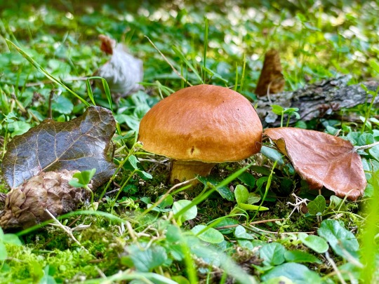
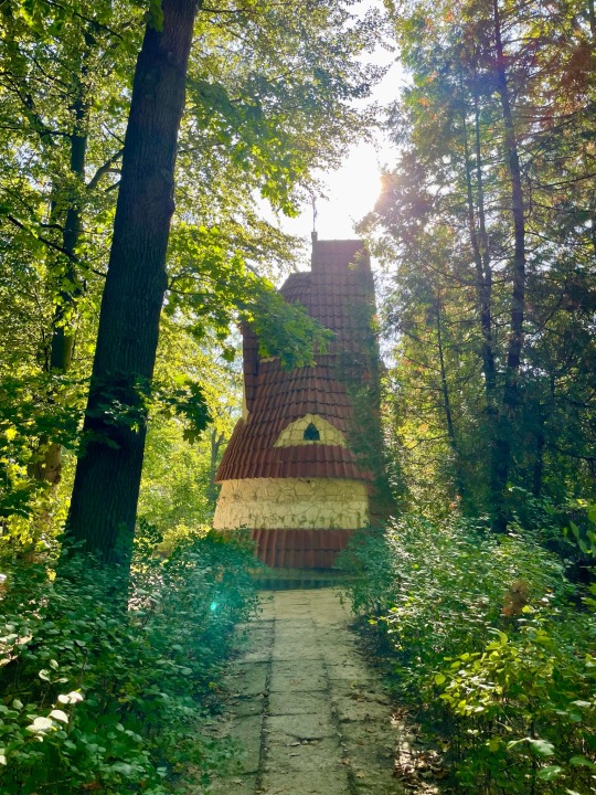

On a clear autumn day
19 notes
·
View notes
Text
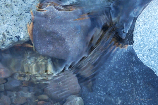
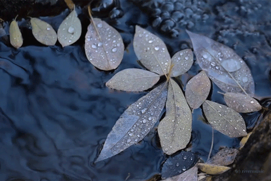
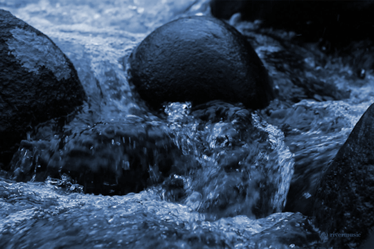
Those Cool Autumn Blues
(c) gifs by riverwindphotography, September 2023
10K notes
·
View notes
Text
Ron Stampler has a pair of boxers that say "Women want me, Fish fear me" on the ass, send tweet
#clearing out my drafts rn i dont even remember typing this out#dndads#dndads s1#dndaddies#dungeons and daddies#dungeons & daddies#ron stampler#ron f stampler#dndads odyssey#autumn rambles#🍁
107 notes
·
View notes
Text
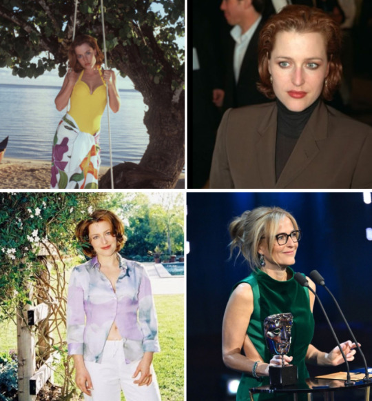
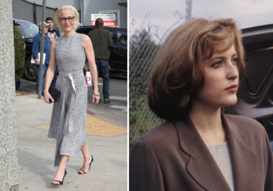
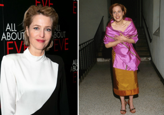
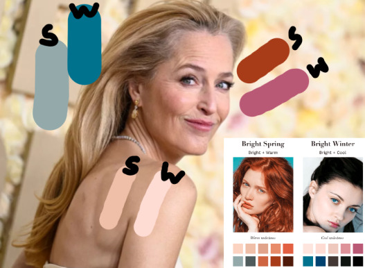
Seasonal Color Analysis: David Duchovny and Gillian Anderson
Going into this, I knew David didn’t have a… good fashion sense (even his sister would concur); but it’s always enlightening to see just how bad his fashion sense is. It’s charming, really.
Meanwhile, Gillian (or her stylist) pinpointed which were her worst colors or worst looks and went crazy with the rest-- an excellent example of knowing the rules in order to break them.
I will be referencing all the information compiled in this Seasonal Color Analysis post to determine their undertone: Hue, or the coloration of their skin; Value, or the lightness and darkness of their saturation; and Chroma, or the bright and low value of their undertone.
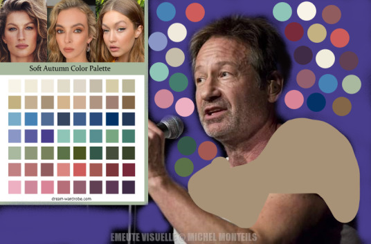
TLDR: David is a Soft Autumn, and Gillian is a Clear Winter.
The Trickiness of This Technique
True pigmentation is often disguised or distorted under differing light sources--examples provided by the edits below--
thanks to @dd-is-my-guiltypleasure, post here--
and thanks to @gillyscloset, post here--
but, though I don't have DD or GA in person, I do have a wide sampling of all types of lighting (natural, direct, artificial.) With my bases pretty much covered, I venture forth into the unknown and take whoever along with me~.
HUE
Step One to determining one's seasonal palette: analyzing the levels of warmth or coolness in an undertone.
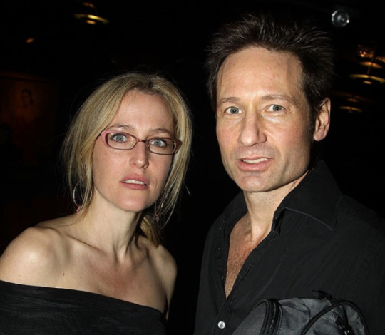
David and Gillian have one aspect (of two) in common: a red undertone. And, while it would be true and incredibly easy to say his red leans more apricot or cinnamon-- a Warm Hue indicator-- and hers leans more pink or blush-- a Cool Hue indicator-- that might not be the best vehicle to broadly determine undertone.

So, here we go on the long route.
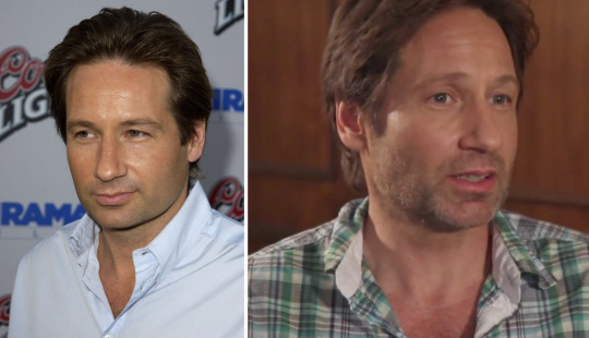
-David-
First, we must calculate the balance of yellow (warm) and blue (cool) in his undertone.
The top left shirt is cool and vibrant, the top right shirt is cool and muted, the bottom left shirt is warm and vibrant, and the bottom right outfit is warm and muted.
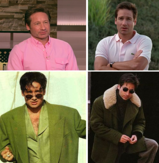
The first thing I notice about David's skin is how red it is, even without a tan (top right photo.) The second thing I notice is how red it is in the top left photo, meaning the color is clashing with, not blending into, his undertone. The third thing I notice is how "overpowered" David is by the pink shirt (it wears him instead of him wearing it.) The fourth thing I notice is that the vibrancy of the bottom left warm outfit overpowers him, too, especially compared to its counterpart on the right. The fifth thing I notice is that this principle holds firm with the top right shirt, as well.
This leads me to a few conclusions: David's undertone is red, which becomes more uneven with bright, cool colors. Moreover, vibrancy in general does not suit him, drowning him out in its potency.
Overall, David has a Warm Hue with muted undertones. His worst colors would be Cool Hues with bright undertones.
-Gillian-
Let us calculate the yellow and blue value in her undertones.
The top left bathing suit is warm and vibrant, the top left suit is warm and muted, the bottom left outfit is cool and vibrant, and the bottom right dress is cool and muted.
Again, the first thing I notice about Gillian's skin is how red it is, even if the only picture sporting a tan is the top left. The second thing I notice is how pale and washed out it is in the top right, the muted warmth of the suit visibly dragging her down. The third thing I notice is that principle applies to the bottom right dress compared to the bottom left outfit. The fourth thing I notice is how alive Gillian looks in both the top left and bottom left photos-- the vibrancy of the yellow and blue compliment the vibrancy of her skin perfectly. The fifth thing I noticed is how the cool, vibrant blue melts beautifully with her skin while the warm, vibrant yellow brings out more uneven redness.
This leads me to these conclusions: Gillian's undertone is red, which becomes quickly desaturated with muted, warm colors. Moreover, its vibrancy is elevated by both warm and cool colors; but the Warm Hues bring out more uneven pigmentation compared to both the vibrant and muted Cool Hues.
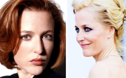
These conclusions also apply to The X-Files's (bad) wig she disliked: the undertone was warm compared to the cooler undertones of her 90s dye.

Overall, Gillian has a Cool Hue with vibrant undertones. Her worst colors would be Warm Hues with muted undertones.
VALUE
To quote my previous post (because I'm lazy):
Higher Values usually have lighter or more "translucent" hair, allowing light to pass through it, as well as finer or sparser brows. Golden, grey, strawberry, or silver hair would all suit Higher Values, whereas they would overwhelm the Lower ones. High Value tones look great in lighter colors such as cool pure white, warm ivory white, and other lighter colors. Deep colors near the face tend to drag down and dominant the "presence" of the outfit, making it appear as if the clothes were wearing the person rather than the other way around.
Lower Values usually have darker or more "opaque" hair when in direct lighting, as well as darker or bushier brows. Medium or low value hair colors such as auburn, brown, or black would suit and enhance Lower Values, whereas they would dull or drag down the Higher ones. Low Value tones look great in darker colors such as navy blue, pure black and deep brown. Light colors near the face gives them an exaggerated pale, tired appearance.
Medium Value tones are an exception to the rule. Medium values look too overwhelmed in both very High Value (light) and very Low Value (dark) outfits; and look great in "medium" colors such as grays, lighter browns, and camel colors.
(Sidenote: If a person falls into the Medium Value range, they have exponentially lightened-- heh-- their workload by cutting out unnecessary guess work. David's Seasonal Subtype section will show off this handy dandy little trick later~.)
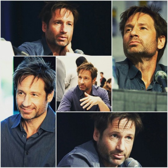
-David-
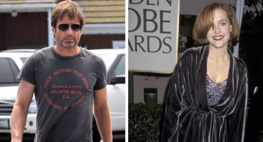
Now, we compare and contrast David in different values, Cool Hues to the left and Warm Hues to the right.
Light Value
Light Value doesn't blend with David, washing out his skin tone (in spite of the presence of darker stubble in the second picture.)
Medium Value
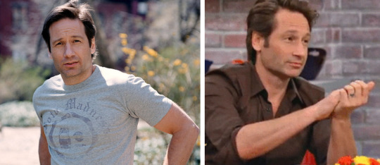
Medium Value makes David seem most at home, blending seamlessly in with his mid-tone hair (and even emphasizing his brows and lighter stubble in the first picture, despite the glaring sun directly overhead.)
Dark Value
Dark Value is the most uncomplimentary to David, making him appear dragged down, overly tired, and older than his years (even with the enhanced darkened and cool filter on the first picture.)
David, we see, is a Medium Value.
-Gillian-
Now, we compare and contrast Gillian in different values, Cool Hues to the left and Warm Hues to the right.
Light Value

Gillian is incredibly suited to the Light Value, her vibrant skin coming alive under the dewy, fresh, "natural" makeup style and lighter colored hair and outfits.
Medium Value
Gillian isn't really suited to Medium Value, appearing separate and more muted by its lack of vibrancy.
Dark Value

And Gillian really isn't suited to Dark Values, appearing "overdone", fatigued, and older than her years.
Gillian, we see, is a Light Value.
The Difference in Black and White (and Gray)
And now, we compare and contrast David's and Gillian's Values against each other.
Black
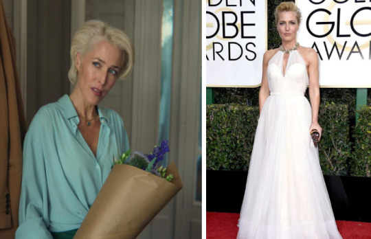
Flash photography rarely makes anyone look pretty, but here it at least amplifies Gillian's "translucent" Light Value and David's middle-of-the-road, Medium Value. The lines and shadows of both their faces are unfairly pronounced; and, in short, they both look like wax figures.
Yet GA has an unexpected exception: because of the vibrancy of her tone (to be further discussed in the Chroma section~), she is able to pull off black if, and only if, she sticks to Light Value hair and makeup. DD stays doomed-- doubly so, because he gravitates to black for his day-to-day wear.
Gray
Gillian rarely wears gray or middle-of-the-road browns-- astute of her or her stylist, as it is the hardest of the three Values for her vibrancy to pull off with any degree of success-- appearing waxy and sickly compared to David-- at home in his own skin-- on the left.
White
David is, again, not looking his best-- not as tired or shadowy as the black shirt, but more pale and washed out compared to the gray-- and, again, his shirt seems to be wearing him. Gillian, on the other hand, shines in this (almost) white shirt, her Light Value complimented by her blonde hair and very light background.
Chroma
Chroma measures the brightness and clearness or softness of a Hue.
Again, I shall quote my other post:
High Chromas have a brighter, clearer appearance-- with very little brown or gray pigmentation in their skin tone-- and a "dewy" or bright skin texture. Their darker brows usually have a deeper coloration; and their irises are usually "richer" and clearer with defined "edges" next to the whites of the eyes. Supposedly, this gives Higher Chromas an "alert and eye-catching expression. "
Low Chromas have a desaturated or muted appearance-- with a prominent gray or "ashy" pigmentation-- and a "matte" or softer skin texture. Their finer brows usually have a "sparser" appearance; and their irises have a softer, blurred "edge" next to the whites of the eyes. Supposedly, this gives Lower Chromas a "softer gaze" and more "delicate charm."
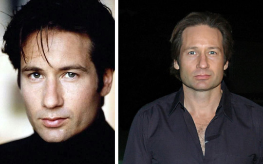
-David-
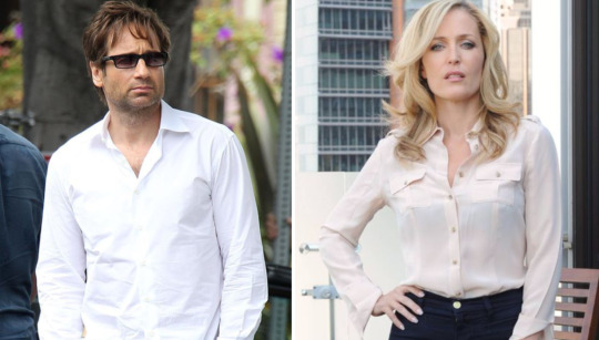
Now, we must assess the chroma level of David's skin, Cool Hues on the left and Warm Hues on the right.
High Chroma

He does not blend cohesively with High Chroma, becoming lost in the vivacity and punch of the pink and black (left) and yellow (right.)
Low Chroma

But he does blend cohesively with Low Chroma, equaling the chroma's scale and becoming whole with his overall look.
Gillian
Now, we must assess the chroma level of Gillian's skin, Cool Hues on the left and Warm Hues on the right.
High Chroma
She blends cohesively with High Chroma, her lit-from-within glow coming alive in the white and black (left) and pink (right.)
Low Chroma

But she does not blend cohesively with Low Chroma, either contrasting against it quite starkly (muddying her distinct features, left) or warring with it and ultimately appearing more "mousy" (right.)
Makeup: Values and Chromas
How does one balance or play with their Values and Chroma using hair, makeup, accessories, or other articles of fashion?
Gillian Anderson has High Value: meaning she will look amazing in lighter makeup-- which creates a natural, refreshing, and airy appearance-- preferably in purplish pink, pink, coral, light berry, peach, and nude shades. Because of the natural prominence in her face, darker makeup would muddy the clarity and create disharmony by having "too much" on her face. Of course, she can wear whatever she wants; but knowing this information clarifies why she and her stylists likely keep her makeup minimal.
Gillian also has High Chroma: meaning, she will look amazing in captivating, bold, and energetic looks meant to draw the eyes toward her, preferably in hot pinks, rosy reds, warm reds, and rich reds. Glossy, dewy, pearlescent, shiny, or very reflective finishes draw attention to the vivacity of her appearance; and anything too matte or satin detracts from that energy significantly. Hence, there was a balancing act for her character Dana Scully: even amidst the rage of the matte 90s, GA still had a glossy lip or a sheen to her cheeks in conjunction with her more matte or skin-like foundations.
Combining both, GA can pull off High Chroma makeup if done in more reflective, dewy finishes-- deep red or hot pink lip gloss, for instance. The balancing act she strikes between both aspects will give her an individual, unique "style" all her own.
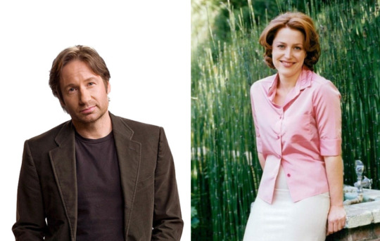
(Sidenote: Although David Duchovny does not wear makeup, one of his characters did. If you search up Denise Bryson, you'll see the makeup artists gave David a Medium Value makeup look: the lipstick gave a Dark Value punch, and the Light Value cheeks and eyelids provided perfect counterbalance to the overall look.)
SEASONAL COLOR ANALYSIS: Putting It All Together

The Seasonal Color system takes all three qualities of undertone-- Hue, Value, and Chroma-- to determine what Seasonal subtype a person is. One will be most dominant, taking the primary position; the second will obviously be secondary; and the least impactful aspect of the three will take up tertiary position (and, therefore, can be set to the side when determining one's subtype.)
Again, I recommend trottin' on over to this post to learn more about primary, secondary, and tertiary qualities; however, if that's not your speed, keep reading.
Testing the Options
We're going to do something a little different.
Usually this post starts out with David each section. However, Gillian's Season subtype is a bit trickier to figure out than his.
-Gillian-
First up: Gillian.
We've discovered she's a Cool Hue, High Value, and High Chroma'd individual... but which of the three is primary, and so on?
There are only six seasons with Cool Hue; and of those six, only half combine with either High Value or High Chroma: Light Summer (High Value primary, Cool Hue secondary); Cool Winter (Cool Hue primary, High Chroma secondary); and Clear Winter (High Chroma primary, Cool Hue secondary.)
Since I'm far from an expert, it's time to fire up the editing app and start (badly) swatching comparison colors!
Light Summer
Summer and Winter, both Cool seasons, are differentiated by their saturation: Summer takes Winter's palettes and mixes it with gray, appearing more muted or "desaturated" compared to its twin.
So: does a "grayed down" palette suit Gillian?

...Not really, no. It's not bad, and she can probably borrow a few of these colors; but they seem to drag down her High Value (like the Medium Value grays colors did.)
And because neither Cool nor Clear Winter look good with "murky" or muted colors, that's another point in Winter's favor.
Cool or Clear Winter
As you can see, GA is dolled up in Cool Winter colors on the left and Clear Winter colors on the right.
What's the difference between the two?
Cool Winter is primarily Cool Hue and secondarily High Chroma-- meaning, it is filled with exclusively cool colors.
Clear Winter is primarily High Chroma and secondarily Cool Hue-- meaning, it is filled with primarily high chroma colors with leniency towards warmer colors.
If Gillian is Cool Winter, she will always look out of place in warmer hues; if she is Clear Winter, warmer colors aren't as damaging as hues with Low Chroma.
At a glance, I prefer Clear Winter (on the right.) Put to the test:

Notice how GA still looks pretty good with the warm, High Chroma red on the left but becomes grayer and more "shadowy" with the cool, Low Chroma blue on the right?
That proves Gillian is primarily High Chroma and secondarily Cool Hue-- able to pull off cool or warm colors as long as the primary feature (Chroma) is kept intact.
Thus, Gillian Anderson is (I think) Clear Winter.
-David-
And last but not least: David.
He's a Warm Hue, Low Value, Low Chroma kinda guy... but, again, which of the three is primary, secondary, and tertiary?
There are only six seasons with Warm Hue, and only three that combine with his Low Value and Low Chroma. And all three roads lead to one destination: Autumn-- Soft Autumn, True/Warm Autumn, and Deep Autumn.
Soft Autumn is primarily Low Chroma and secondarily Warm Hue.
True/Warm Autumn is primarily Warm Hue and secondarily Low Chroma.
Deep Autumn is primarily Low Value and secondarily Warm Hue.
But guess what? A surprise jumps out from the woodwork: because David has Medium Value, it cancels out Deep Autumn as a consideration (very handy in these situations.)
So, only two choices left:
Soft or Warm Autumn?
Can David pull off Warm and Cool Hues as long as they have Low Chroma (Soft Autumn), or can he pull off Low and High Chromas as long as they have Warm Hues (True/Warm Autumn)?
It's time to bring in some "worsts" and see which looks the least jarring.
Observe the disparateness of chromas on his skin: the Cool, Bright Chroma pink shirt (left) is the first thing you notice from a distance, rivalling and overpowering David's skin tone. Compare his pink to Gillian's in the above section and you'll notice the striking difference: that she is equal to the intensity of bright pink, but he is erased by it. Meanwhile, the Cool, Low Chroma blue shirt (right) is not as "separate" nor as glaringly obvious-- in fact, because it borders on Medium Value, DD can almost pull it off better than some others.

This means that David is primarily Low Chroma and secondarily Warm Hue-- able to pull off warm or cool colors as long as his primary feature (Chroma) is kept intact.
Thus David Duchovny is (I think) a Soft Autumn.
(Sidenote: This is two-folds hilarious because 1. DD never picks "his colors", which proves his sister right; and 2. DD's infamous pumpkin shirt has been axed from his "Best Dressed" list. Ahhhh, don't ever change, Mr. Duchovny.)
CONCLUSION
David and Gillian can play around with their colors and values as long as their chromas remain the same (the pic included, for example.) Also, Gillian scoped out her worst colors ("gray" or "murky" tones) and avoids them fairly well while David only ever picks the worst colors for himself and wears them with pride. And would we, the people, have it any other way?
What does this mean in the long run?
Well, I got to sharpen my color analysis skills; hopefully you enjoyed the journey with me; and we have some answers to the infinite number of unanswerable questions in this universe. That's good progress, I'd say.
Thank you for reading~
Enjoy!
#randomfashiontiger#fashion#Seasonal Color Analysis#analysis#mine#thoughts#DD#GA#xfiles#x-files#the x files#but not#dear peachie#seasons#Clear Winter#Soft Autumn
45 notes
·
View notes
Text
Tis the season 🥰

#pumpkin spice#okay but i did laugh#funny#tate talks#doritos#humor#stoner humor#munchies#chips#to be clear i would never this sounds nasty af#autumn aesthetic#fall aesthetic
60 notes
·
View notes
Text
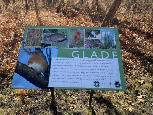
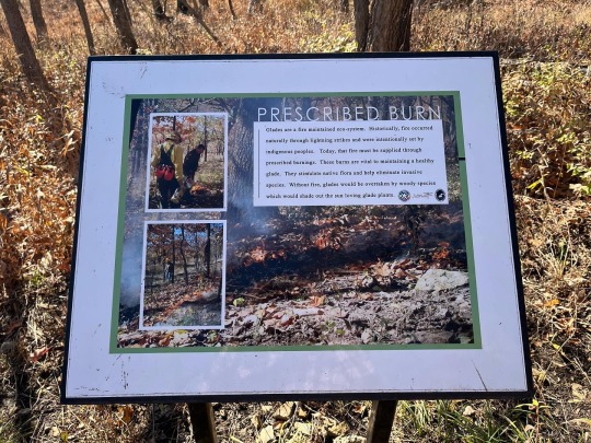


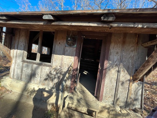


Limestone Glade Trail
(1/3)
(November 11, 2022)
#2022#Afternoon#Autumn#Blue Skies#Blue Sky#Branch#Branches#Clear Sky#Day#Daytime#Fall#Fall 2022#Hike#Hiking#Hiking Photo#Hiking Photography#Hiking Trail#Hiking Trails#My Photography#My Photos#My Pics#My Pictures#November#November 2022#Photography#Photos#Pics#Pictures#Tree#Trees
29 notes
·
View notes
Text
idk idk idk I just don’t get why some fans took this album as a personal attack!! Even in the songs where she alludes to people judging her in general I really took it as “wow she must trust us so much to share this with us.” And if you took it personally then you either need to take a step back or maybe you should actually take it personally and maybe realize why your invasion into Taylor’s personal relationships can actually cause harm to her.
#like trust me I didn’t like her matty but I went about my day normally and didn’t bitch and complain about him all day#yeah matty sucks as a person but I was worried about Taylor I wasn’t mad that she was in a relationship I could no longer project onto#anymore#autumn rambles#i definitely did have an ‘oh shit this play is about us’ moment when I heard that one song (I can’t remember the title) but then i#followed up that thought with she’s allowed to say what she thinks and feels the same way I was allowed to express what I thought#so it’s only fair that she would share and mention that on the album when it was clear that people’s disdain for them together actually#pushed them closer rather than further apart like she said on the album
17 notes
·
View notes
Text

modern au got me in my fuckin feels
42 notes
·
View notes
Text

— What is truth, but a survivor's story?
Self-indulgent Silco moodboard for a chilly day.
Sources: i / ii / iii / iv / v / vi / vii / viii / ix
#arcane#arcane moodboard#character aesthetic#silco#silco arcane#it's always fun trying to put images to his character#i feel like i have such a clear vision in my head of what he *could* manifest as#but it always surprises me that these end up more warm instead of cool-toned teals/greens etc.#warm in the way autumn decay is warm from a distance - but frigid and knifing as soon as you step into it
40 notes
·
View notes
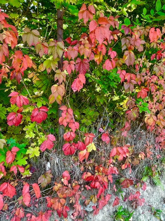
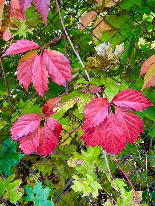
Photo
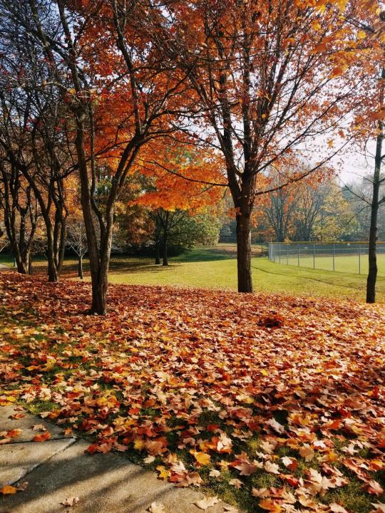
Autumn in Southeast Michigan wraps the ground in a vibrant carpet of fallen leaves, a true feast for the eyes. There's something so peaceful about the clear skies and the gentle dance of nature preparing for winter.
#autumn#Southeast Michigan#fall leaves#nature#vibrant colors#peaceful#clear skies#autumnal beauty#seasonal change#leaf carpet#nature photography#fall season#tranquil#nature’s dance#preparing for winter
13 notes
·
View notes
Text
Okay so if you haven’t seen, but I’m like a big fan of how so many Danmei characters have like animals that can like represent them (I just imagine them all in like some kind animal crossing world and it just makes me happy!)
So I wanted to put out a list of the ones that I’m pretty confident on, but I’d also love to hear any other opinions! I am going to put the list below the cut! I also wanted to pose two questions.
Question one: Okay so I have begun Clear and Muddy loss of water (what can I say, I’m a hopeless sapphic, it was basically a requirement at this point) and I’m not far enough in yet to come up with any animal match ups for them! I would love to hear from anyone about your opinions, what animals would you associate with Qiyan and Jingnu? I’d love to hear in the comments or feel free to message me in either tumblr messaging or from my ask box! I need to know others opinions!
Question 2: Is there other Danmei / Baihe novels that you all recommend or any poll ideas you want to see? I am all ears! Like above, reach out in the comments, messaging, or askbox! I look forward to hearing from people!
Onto my list! I am currently sticking to the official couples, though I would love peoples opinions on some of the other ships and characters!
So for Wei Wuxian and Lan Zhan, I feel like there are 2 common ones. One of course is the ever popular and official on the special edition book cover bunnies, which I love! I have also seen them as a fox and dragon though, which I am not opposed to!
Hua Cheng is a fox and I have seen that Xie Lian Is a ferret/weasel, though my friend brought up that they say someone say he was really a stoat, which I personally love and agree, cute and stuff, but can also take down a bunny twice it’s size with ease, I feel like it is Xie Lian Vibes!
Shen Qingqui is a cat, and Luo Binghe is a fluffy dog, nuff said!
Mobei Jun was pretty unanimously a snow leopard, and Shang Qinghua is very much a Hamster!
Mo ran is a husky and chu wanning is a white cat ( the title totally didn’t give anything away…)
Shen Qiao is a deer is what I’ve seen most often and Yan Wushi is a wolf (GAHHH I LOVE THOSE TWO!!)
When I solidify more of the animal match ups of different characters (including the non canon ships) I will reblog the post and add them on!
#I just like getting to crochet cute little animals thatatch with my hyperfixations!#mxtx#tgcf#svsss#mdzs#2ha#erha#thousand autumns#clear and muddy loss of love#wei wuxian#lan zhan#hua cheng#xie lan#shen qingqiu#luo binghe#mobei jun#shang qinghua#mo ran#chu wanning#shen qiao#yan wushi#qiyan agula#nangong jingnu
38 notes
·
View notes
Text

High Country Colors
(c) gif by riverwindphotography, September 2023
4K notes
·
View notes
Text
hitting the entire close family with the transgender beam
#clearing out my drafts dont mind me#dndads#dndads s1#dndads s2#dndaddies#dungeons and daddies#dungeons & daddies#the close family#glenn close dndads#dndads glenn close#nicky foster#nicky close#nicky close foster#nicholas close#nicholas foster#morgan freeman dndads#dndads morgan freeman#dndads taylor swift#taylor swift dndads#cassandra swift#autumn rambling#🍁
46 notes
·
View notes
Text
Seasonal Color Analysis: David Duchovny, Gillian Anderson, and Their Colors
If anyone wants to see more in-depth about David and Gillian and their colors, click to read more; but if you're okay without the extra details, no worries! We'll catch up on the next X-Files meta post.
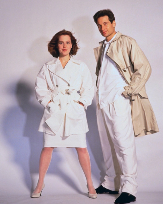
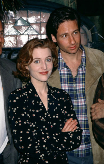
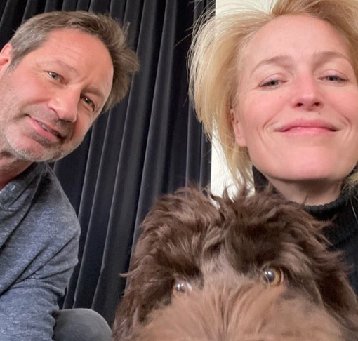
Quick Summary of my first post: GA and DD both have red undertones (as seen in the above picture); but the red does not overtake the yellow in DD's skin (giving him a Warm Hue undertone) while the red tips over the scale into pink for GA (giving her a Cool Hue undertone.) GA is a Clear Winter, meaning her chroma (High) is first consideration when it comes to colors compared to their Hues (warm or cool); David is a Soft Autumn, meaning his chroma (Low) is also first consideration when it comes to Hues (again, warm or cool.) Because undertone does not change or fade with age, the same application for their younger selves applies still in their 50s and 60s.
TLDR: Explaining myself a little further with DD and GA's colors photoshopped near their face-- providing receipts, if you will~.
Saw a few posts (reblogged on my timeline if you're curious) and wanted to clarify some points I made on my color analysis post here:
David, Gillian, and Jewellry
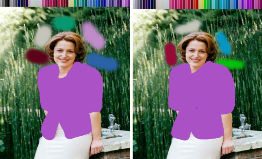
David still has his warm and red undertone-- which doesn't change with age-- and can pull off cool colors as well as his predominant warm ones because he is Soft Autumn (meaning: if the chroma of whatever color remains muted, he can pretty much swing it.) He is encouraged to wear bronze, silver, pewter, rose gold, and other metals that err on the muted side.
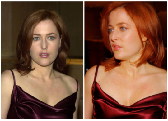
Gillian is encouraged to wear White and Platinum jewelry over silver because of those metal's bright, cool undertone because she is a Bright/Clear Winter (if she were a Summer instead of a winter, silver would be advised for its muted, cool undertone.) She can also pull off gold because of her Bright Chroma (present in the warm yellows of her Bright Winter Palette, shown below.) Gillian is going to look great in some Springs instead of some Winters because of the Chroma consideration of her skin: if the color, cool or warm, is muted, she doesn't look as fantastic as she would with brighter colors, cool or warm. It's hard to tell with her modern appearances because of the frequent use of body tan, but her skin is naturally quite pale and cool and porcelain. If her outfits verge too warm, then her hair becomes brassier, and her skin takes on an orange tinge.
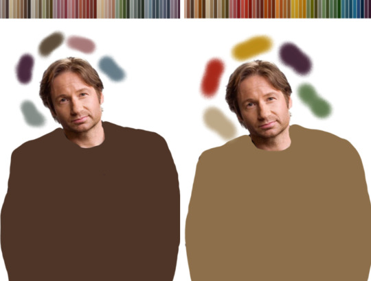
DAVID IN HIS COLORS
Here is the Soft Autumn palette below:

And here are my (bad) editing attempts of David in said colors:

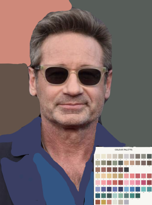
The greens below even bring out more olive in his skin (compared to the very warm red usually present):

When David is swatched with Winter and Autumn colors, the differences really show up, I think:

The Winter swatches are vastly cooler than his skin, giving it a muddied, grayed out appearance; the Autumns, however, inject a level of warmth back into it, complimenting his undertone no matter what lighting he's in.
Lastly, here's David in a Winter muted Hue (left) and a Autumn muted Hue (right) to demonstrate the swatches a bit better.
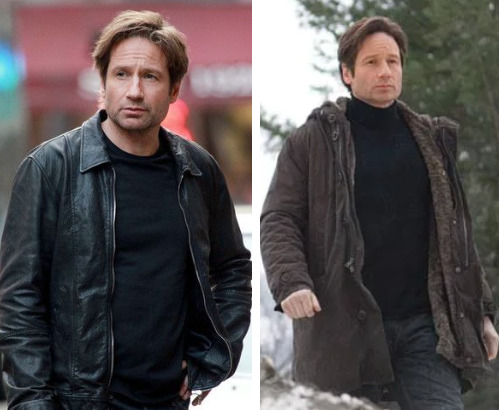
Although he likely had very little sleep when filming either scene, David looks washed out, drained, and tired in the black; and significantly less tired and washed out in the brown.
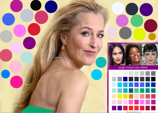
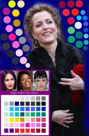
GILLIAN IN HER COLORS
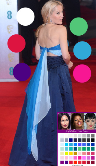
Here is the Bright/Clear Winter Palette below:

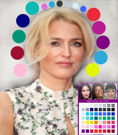
When GA is swatched with Spring and Clear Winter colors, the difference becomes more pronounced, I think:
As you can see, spring colors aren't bad; but the winter colors bring out a delicate, healthy pink to her skin (and hair.) Specifically: the nude shade on the left is warmer peach compared to her skin, whereas the nude shade on the right blends into her cool pink undertone quite naturally.
And lastly, here's Gillian in a Spring bright Hue (left) and a Winter bright Hue (right) to demonstrate the swatches a bit better.
There's a "GA vs. the shirt" quality the blue Spring has that the white Winter does not.
Masculine v. Feminine Aesthetic Footnote
I think I covered everything in my beautiful first post here and the follow-up response here. Have at!
CONCLUSION
I hope my facts are all in order, and that I haven't forgotten to present anything that might lead to more confusion, etc.
If we don't agree, all well and good.
Thanks for reading~
Enjoy!
**Disclaimers**: All resources taken from dear peachie, The Concept Wardrobe, The Dream Wardrobe, and other free source sites.
#Seasonal Color Analysis#Part III#David Duchovny Gillian Anderson and Their Colors#dear peachie#randomfashiontiger#fashion#DD#GA#Soft Autumn#Clear Winter#Spring#Winter#Autumn#Summer#analysis#mine#thoughts#meta
21 notes
·
View notes
Text
23 notes
·
View notes
Last Seen Blogs

mybaethefae
hmmm
wanderingflier
owl's wanderings
bowlofwater56
bowlofwater56
plulp
Bad Game Enthusiast

vacationsoup
Vacation Soup