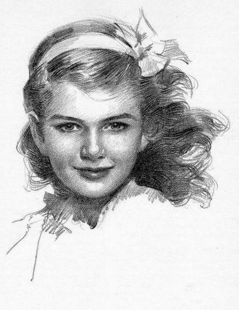
#color concept and composition is one of my favorite parts of being a background artist and it just. im so happy
Text
dudE DUDE dude I am. I am so giddy over bdubs episode from today OH YM GOD like just. Everything about the terrain, from the color work and the composition tickles such a particular itch in my stupid little artist brain Im so Freakin impressed aaaAAAA I LOVE IT
LIKE THE GRASS TRICK OMH YMG GOD. THE GHIBLI GRASS THING BLUER SHADOWS YELLOWER HIGHLIGHT AS A POP OF WARM TONE IS MY LIFEBLOOD AS A LANDSCAPE PAINTER IT MAKES ME SO HAPPY TO HEAR IT BEING USED IN MINECRAFT AAAAAA he mentioned it wnd i was like!!! HOLY MOLEY
#i am happy stimming so much rn n when i was watching it makes me so happy i#i love his videos his building technqiues so much i am learning so much its so#its so like done from an artists perspective i can tELL this man can draw#(ive seen his artwork of his builds and AAAA 💖💖‼️💖❤️💖💖)#color concept and composition is one of my favorite parts of being a background artist and it just. im so happy#sorry for ramblingn so much but. one of top episides for me hands down i needed to get my emotions out before i exploded#hermitcraft#hermitcraft season 10#bdoubleo100#ramblings from the heartsgone#lafakiwi talks
28 notes
·
View notes
Text
Everything I Watched This Year
I have watched the most movies this year of my life, which is still so few that I can fit them all into one tumblr post, so here they are in approximately chronological order (along with TV shows). I almost exclusively watch visual media with other people, and they're often the ones picking. Favorites get an asterisk (*), and this does not include rewatches.
*Fallen Angels (Wong Kar-Wai): Five loosely connected lonely people chase imagined versions of each other around the Hong Kong nightscape. I didn't go into a plotless arthouse film expecting it to be extremely funny, but it is. He Zhiwu (my new tumblr icon!) deserves to be up there among the deranged autistic blorbos of all time.
What We Do in the Shadows (Showrun by Paul Simms and Stefani Robinson) [First half of S4]: If you're on tumblr you probably know the premise already. I was disappointed that after S3, which felt like a build to huge shifts in the characters and status quo, S4 felt like a walkback. Don't remember much else about it other than crying laughing at the sequence where they try to get baby Colin Robinson into private school.
Brokeback Mountain (Ang Lee): Everyone knows what this movie is already. It's well-made and solid, but it wasn't anything that exciting for me. I expected it to be more striking. Love the 70s home production design in that one scene though, and that kiss truly is good.
*Velvet Goldmine (Todd Haynes): A reporter tracks down the truth of a rock star gay affair that sparked his own queer coming of age. Dreamy, gorgeous, and I could not describe the plot scene to scene if you paid me. Just a really lovely film to experience for me, someone who had latent and unnamed transgay feelings as a teenager about the concept of "emo boys kissing."
Phantom of the Paradise (Brian De Palma): Phantom of the Opera-inspired drama about a songwriter getting revenge on the predatory producer that ruined his life. Total delight of a campy melodrama.
Kamikaze Girls (Tetsuya Nakashima): A delinquent and fashion-obsessed scam artist strike up a lesbian-tinged unlikely friendship. This movie is bananas. Way more stylistically experimental than I'd expected--there's a sequence of the protagonist's birth, people just float offscreen sometimes, the townspeople constantly turn to the camera and advertise for the megamart they buy all their clothes from, etc. A really really surprisingly fun watch.
*Mobile Suit Gundam: The Witch from Mercury (Hiroshi Kobayashi and Ryō Andō) [First 6 episodes only]: Optimistic young pilot of a war machine that she may have an illegal psionic connection with goes to space high school and is promptly drawn into political plotting via accidentally getting gay engaged to a corporate heiress. Highly enjoyed the parts of it I saw - great action sequences, fun character drama, and just enough political substance. Not as weird as Utena, which it's inspired by, but can be brutal where necessary. I should watch more!
*In the Mood for Love (Wong Kar Wai): Two Shanghainese emigrants in Hong Kong discover their spouses are cheating and embark on a tragic affair of their own. God, this movie deserves every bit of praise it gets. I gasped out loud multiple times at the gorgeousness of shot compositions. Top notch acting, gorgeous colors. This tends to be a movie pitched as being about a repressed love affair, but it's also a movie about the positionality about being middle class colonial subjects and the relationships they have with the world. This gave me so much to chew on after I watched it.
Happy Together (Wong Kar-Wai): Two Hong Kong expats living in Argentina have a toxic gay relationship trapped in a tiny apartment. This one felt very opaque to me, and it is allegedly an allegory for Hong Kong being returned to Chinese rule after British colonialism, which I absolutely do not have enough background to really get. Wong is a great director though, and I constantly think about the sequence of the main character seeing the abusive ex walk into the club, beat while he finishes his drink, and then he breaks his bottle off and goes in to screams.
Bound (The Wachowskis): A lesbian handyman falls for a woman married to an abusive mobster that they plot to rob. The first 45 minutes were very enjoyable as a lesbian heist film. Unfortunately, once the gunshots started the torture scenes became so stressful for me to watch that I sweated through my shirt. (I also had Covid).
14 notes
·
View notes
Note
Your art has such a moebius like quality that i always struggle to replicate. Do you have any tips you could share?
Hey thanks for the question! I’m a complete amateur and Moebius is, in my estimation, one of the most skilled visual artists of the last century so please take everything I have to say with a grain of salt while I answer your question. This all comes from my own experience and I am still learning.
First of all my main piece of advice for anybody drawing anything: if you want to get good, assume that you know nothing, start from the beginning, practice fundamentals, and draw every day, even if it’s just for like 15 minutes. No amount of art advice is worth anything if you don’t draw.
Now to address your question about how to replicate a ‘Moebius-like Quality,’ I would say what you need to do is study him very carefully.
When I first started drawing seriously and getting super into Moebius and all that I made the mistake of thinking “Okay, this is just simple lines and bright, mostly flat colors underneath. Not too hard to replicate.” Which couldn’t be further from the truth. Moebius’ art has this thing about it where it can often appear really simple but you try to recreate it and you find yourself hitting a wall. Let’s look at an example:
This looks like what I said, right? Clean lines, striking color palette. But there’s more to that. First of all, the fact that the gigantic flat black shape at the bottom of the piece conveys simultaneously the impression of the girl on the left leaning against the chest of the central figure and the boy on right fading into the back of composition while not containing any detail itself should clue you in to how much of a master good o’l Gir is and how much thought and knowledge had to go into designing this piece. There’s more.

If we zoom in on the head we can learn a bit. This is the focal point of the piece and, as such, this is where all the detail is. Where lines are used sparingly throughout the rest of the comp, here they provide an abundance of detail for the central figure’s elaborate headdress with contour lines defining the shape of the yellow crest and other lines throughout intimating textile patterns. The colors are striking but they’re not just random bright colors.

There’s the light blue of the background, a smattering of desaturated purple/red colors in the headdress, and the yellow of the crest. Let’s look at a color wheel:
You should notice that yellow is on the opposite side of the wheel from the entire blue-purple section. Yellow contrasts with blues and purples. Thus, just that tiny bit of yellow is enough to make it totally pop out from the rest of the more desaturated blues and purples in the piece. So, not just some random bright colors, but some carefully thought out areas of low and high color contrast.
Let’s look at another example:
A small piece but so effective. Notice how in the top, the horizontal lines begin super tightly packed and spread to create a gradient from pack to white. Notice how the line weight increases between the shadowed and light sides of the mushroom cloud to brilliantly indicate a core shadow. Notice how the horse and rider are mostly just black shapes- but they’re composed in such a way that your mind knows exactly what they represent. Notice how the hatching that creates the ground texture also points towards the cowboy’s head as a focal point.
Another one:

Look at the linework on this. The way he varies the lineweights to indicate changes in value. The way each line describes the form of the figure and his clothes. How the lines create texture. No line here was put down by chance- each one has a purpose and Moebius knew the purpose of every mark he put on a paper.
So, I guess part one of my answer is you gotta really put the work into being a good artist and use Moebius as your guide. Get good with pens, be able to vary your lineweights, be confident with all different kinds of hatching styles, etc. Read up on color theory and see how Giraud applied it. Every new thing you learn, take that knowledge and use it to study your favorite artists and see how they applied it. That’s how you learn.
There’s a little more though and this applies to the content of Moebius’ art.
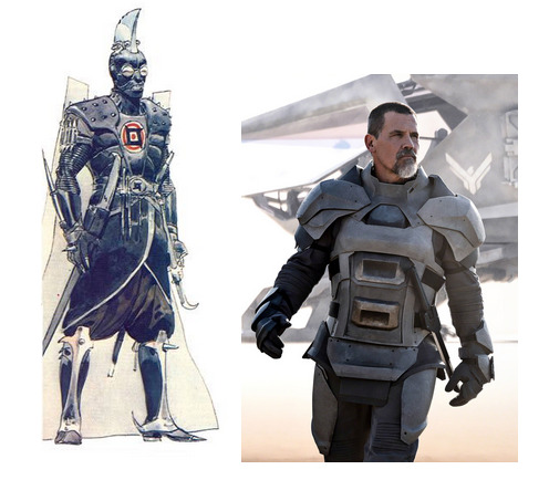
Here’s a side-by-side comparison of the Moebius’ concept art for the unmade 1970’s Dune movie with a screenshot from the new Dune movie. What makes them different? As bizarre as the Moebius design is, it feels a hundred times more real to me than the armor pictured on the right. There’s a specificity to it. Where the Moebius design feels like the result of generations of tradition and culture resulting in an outfit as elaborate, unconventional, and distinctive as that of an Ottoman Janissary, a Landsknecht, or a Samurai, the image on the right looks like a generic assemblage of armor plates with no history behind them.
As fantastic as Moebius’ work is, it definitely has a basis in the real world. I mean, he spent years illustrating a gritty, down-to-earth cowboy comic. All his designs feel distinct and specific and I would venture to say that a lot of that comes from taking an interest in real world cultures and traditions.


I think this is true of all real good science fiction and fantasy artists. They know how to take something from the real world and twist it to their own ends.
I hope this answers your question and helps you find joy in creating art. That’s what it’s all about.
For more reading, here’s a William Stout article on the subject: https://www.williamstout.com/news/journal/?p=3806
As a postscript, I’ll include some other artists that I think anyone who is a fan of Moebius should check out.
Sergio Toppi:

Katsuya Terada:

Katsuhiro Otomo:

Mark Schultz:

325 notes
·
View notes
Text
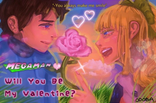
2021 Megaman Valentine’s Day Contest Results
Among the many things this past year or so has tested us with is delays, and I apologize that this year’s Valentine’s Day contest results are included in that. I certainly did not plan on this taking until March to get completed, and I am sincerely sorry to have kept you all waiting. But hopefully it is all worth the wait!!
Thanks once again to every single one of you who participated! I will be contacting the winners soon enough. Work will probably keep me from replying to everyone immediately, but I will send a message about prizes hopefully within 24 hours.
Also, my thanks to @subzeroiceskater for helping out with judging this year. Not to mention the promo pic above and other assorted bonuses that always bring me a big smile.
I might say this seemingly every year, but you all made judging this VERY hard. It might have something to do with the themes as well, but I think both of us flipped and rearranged our rankings repeatedly, and even then, it was hard to decide on who would place. XD Each one of you did an amazing job!
After the break, you’ll see the winners for both categories, along with all of the entries. Raffle prize winners will be noted below by their alias, as well.
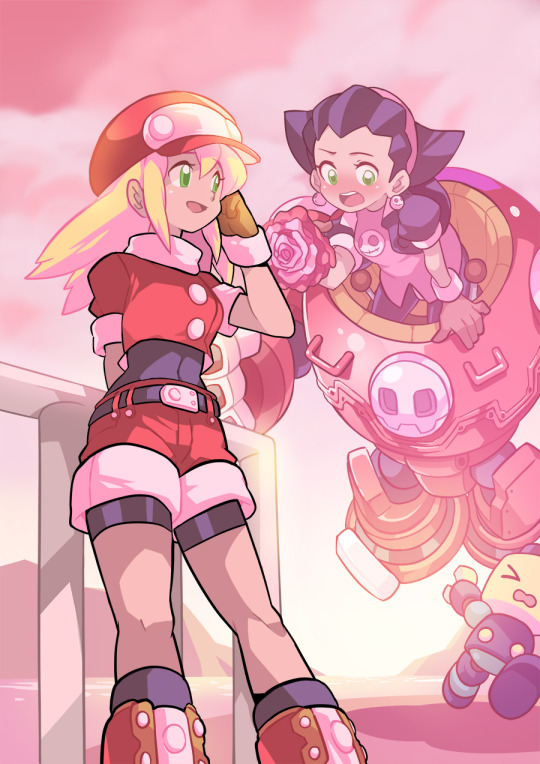
Category 1: Kiss From a Rosered (Talent)
For our talent category this year, the theme focused on your favorite Megaman characters giving roses to their special someone, along with incorporating the symbolism of specific rose colors within the piece. That rose color was also to be the predominant color within the piece, to the best of your ability.
A grand total of 9 entries were submitted for this category. You can see the full gallery of all entries at full-size [HERE]. Each entrant’s name will also link to their individual pieces at full-size.
1.) Sapphire: *$100 prize*
Subzeroiceskater said:
Oooooh, this is so cute and pink! Piiink~ Ehem. I love the depth, angle, and color grading of these—notice how Roll’s black linework is at the forefront of the pic but colors mixes with the lights and colors from the sun further along the pic. There’s a lot to admire about how everything easy to read with so many competing elements like the similar hues and bright lighting.
Pink roses usually mean a gentler sort of love but did you know that different shades of pink could signify different things as well? A darker shade may mean gratitude; medium shade could be about a first love or congratulations while a light shade may mean admiration. Tron holding a singular pink rose with varying shades of pink while literally tripping over herself and a Servbot could only mean—that this is hilarious.
Miyabi said:
From a technical standpoint, I think your piece clearly felt the most polished, crisp and virtually professional of the bunch. But more than that, I felt it also best gave off the vibe of the rose color dominating the piece, but in very subtle, beautiful ways. Where as the pink sunset causes many of the normally white areas, like Roll’s collar/sleeves, parts of Gustaff, and more, to ooze that pink lighting. Even with her klutziness, you still also portrayed the feeling of sweetness, admiration and appreciation that a pink rose conveys. Just so pretty, calming, and joyful to look at!
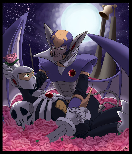
2.) Forceway: *$75 prize*
Subzeroiceskater said:
There is a sort of gentle irony with how Skull Man and Shade Man are both robots modeled after horror symbols—skulls and vampires—but are here surrounded by a soft sea of pink roses. The dark night is often depicted as a primal fear because it hides our deepest fears but here—illuminated by the bright shining moon—the night is transformed into a scene of love—perhaps devotion, with how Shade is gently cradling Skull, as well with the church bell in the background. This is a very tender piece mixing the shadows and the sweet.
Miyabi said:
I know most digital art programs have the brushes and shortcuts to make detailing things like roses a lot easier, but your bed of roses certainly look all done by hand on your own, and that alone impressed me a ton! Based off of the Ariga Megamix tale of Skull Man not feeling appreciated or having a family after Cossack stored him away, I felt the pink roses and Shade showing him that he is actually appreciated here was a fantastic conceptual choice. Purples in the sky and Shade’s body split the canvas and contrast with the pink well, including how you used the pink for some of the stars in the sky. Beautiful job!
3.) DigitallyFanged: *$50 prize*
Subzeroiceskater said:
Yellow is a bright color, often evoking the sun, warmth, light, joy and hope. With roses, its positive connotations continue with possible meanings of friendship, care and remembrance. Tabby’s piece seems to evoke the last one the strongest—with Zero, broken and forgotten in a lab—but, not entirely, because of a bond that is stronger than apparent death lives on—even if in this moment, it’s only a memory. Even the roses are not real—just projections of what was once alive. This is fantastic use contrast with the dark, moody blues against the vivid, almost defiant yellows; and the repeated little motifs such as X crying and the water drops falling all over Zero. It stands out from the rest of happy entries with how sad it is but it still manages to be hopeful.
Miyabi said:
Zero’s blonde locks certainly are an iconic part of his design, so playing off of that and focusing on yellow as your rose color fit perfectly. You definitely made this a very emotive piece considering technically, neither of these two are even alive and moving here! As mentioned above, the little details like the water droplets balancing against Cyber Elf X’s tears, the digital lines to make it appear like X has created the cyber-roses for Zero, and Zero’s battle damage caught my eye immediately. You certainly captured the yellow rose symbolism of remembrance and friendly affection beautifully!!
And the rest of the wonderful entries, in alphabetical order by alias:
AbilityField: [Page 1] [Page 2] [Page 3] [Page 4]
*Raffle Prize Winner* Captain N Mega Man Cel


Subzeroiceskater said:
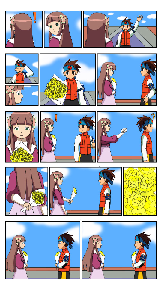
It’s so poetic about how this contest theme is about how the language of flowers is used to communicate feelings beyond just using words; and so, the comic is completely silent, relying on actions to convey its meaning. Yellow roses could mean friendship, care and affection; and it’s shown wonderfully with how Iris and Lan are so thoughtful with one another. It’s so cute how Iris missed Lan only because he was already out buying roses for her.
Given how hard comics are to make and how this is fully colored, I really wanted to give this first place—however I felt the color usage of yellow could have been stronger, especially with the last page, where it would have had the most impact. I had to squint and zoom out to even see if the lighting had changed. Still, it’s such a very warm and lovely work.
Miyabi said:
I always appreciate the effort people put into making multiple-page comics for these contests, and this is no exception! Even without dialogue, you did a great job at conveying your story through your art in each panel and it was easily understandable. Another utilizing the yellow rose, I certainly felt the friendship and warmth in your tale. As Subzero mentioned, the only thing keeping it from placing was that the yellow colors weren’t as dominant in other areas of the pic, besides the panel by Sal. Still, your coloring was very crisp and vibrant throughout each page, and it was an awesome submission!
aw-colorcat:
Subzeroiceskater said:
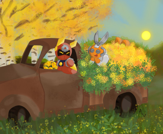
With the red for Metal Man, orange for Cut Man and the explosion of yellow flowers, that’s the trifecta of warm colors. Yellow roses could mean delight and this pic is delightful in all ways. Cut looks so cute practically swimming in the sea of flowers and greenery, as does Metal’s adorable expression—which is a feat since he only shows his eyes. I also really like the juxtaposition and balance of this piece from: the rust-brown car against green-yellow nature running wild, and Metal holding a bouquet meanwhile Cut’s covered with plants. It makes me want to get some fresh air myself!
Miyabi said:
Cut Man looks grateful for being able to ride in that pickup bed of flowers, and I have a feeling the two of them had a wonderful time just snipping and sawing away at all the stems to gather them all. XD Love how the yellow and oranges play off of both character’s color schemes nicely. The subtlety of the yellow flowers in the foreground, along with the sun and tree in the background all play off each other well, too! Just an absolutely cute pic!
Dark-Dullahan:
Subzeroiceskater said:
What a fantastic composition. Dark-Dullahan does away with most color, leaving the colors of the mixed-bouquet roses as the main focal point. Classic red for romance, a gentler pink for affection, mixed yellow roses to signify caring and probably so much more—seems like Nana can’t contain her feelings for Massimo. I love how the close up of the bouquet doesn’t just form a kind of heart at the top but serves as the divider between the two, like a diptych. With such a wonderful offering, Massimo would surely accept her feelings.
Miyabi said:
As you brought to my attention, your mixed bouquet had a few different meanings, such as the dark pink representing thanks to Massimo for saving Nana from Silver Horn, and the red tips on the yellow roses to symbolize falling in love. Certainly got those vibes from her shy demeanor, as she sheepishly tries to hand them to him. Also agree with Subzero that the line from the bouquet nicely works as a way to separate them uniquely with the background. Sorry you weren’t able to complete it as fully as you had hoped, but the concept behind it certainly was strong!
Donnie:
Donnie also sent in an alternate version made during the creative process, in a different artistic style, that I still feel needs to be shared, as well. Fun to see the contrast, yet still have the same feeling and mood to the piece.
Subzeroiceskater said:
Oh, I adore this one. It reminds me of a movie poster with the tagline. I love the extra PINK flourishes of the letterings like with the Mega Man logo color change and cute pixelated font and heart. Both Rock and Roll’s expressions are so cute, too—with his more subdued smile contrasted with her exuberant grin. Much like how the pink rose could mean many things like thoughtfulness, cheer or as a show of appreciation, this piece is positively sparkling with affection, hearts and all. It’s clever how the sunset is giving the picture an overall pinkish-red hue while having the yellow light as an outline. A darling piece.
Miyabi said:
With pink roses again, I truly liked the additional hue adjustments where you can feel the warmth and see the lighter pink mixed into their skintone, or areas normally of white - from eyes to teeth to the Megaman logo - that have taken on the pink in it’s place. With the painterly watercolor style you used, it all blends in nicely. Even in your earlier version, I feel you brought a strong game with the hues, but toned down the red from that version to make it feel much stronger towards pink, with a tighter crop of your canvas. It was fun to see how it evolved, and strengthened your piece in doing so! Fabulous job!
DragonMarquise:

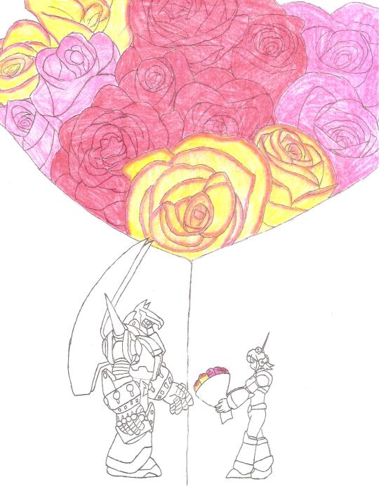
Subzeroiceskater said:
No better way to show how madly in love you are than a bouquet of roses that run the gamut of—I can’t call these warm colors because these passions are running hot. Orange seems to be the dominant color here—which in roses could symbolize a love that’s passionate, fierce and deep. It’s also expressed nicely with the two lovers embracing, engaged in mid kiss, their bodies also forming a subtle heart shape, to emphasize the flurry of hearts around them. The bouquet is not just orange roses, however, but a mixed bouquet of the classic romantic red and the more affectionate pink—it’s a piece that’s bursting with all degrees of love.
Miyabi said:
You also certainly mastered the limited color pallette challenge as you tackled this piece! Orange, the color of passion, is certainly felt in their deep kiss and embrace. I too caught the heart shape their heads essentially form, which is then further enforced with the heart of hearts behind them. I thought that concept was pulled off very well. Perfect for the fiery intensity of Match, this turned out to be a very hot pic!
Mattasaurs:
Subzeroiceskater said:
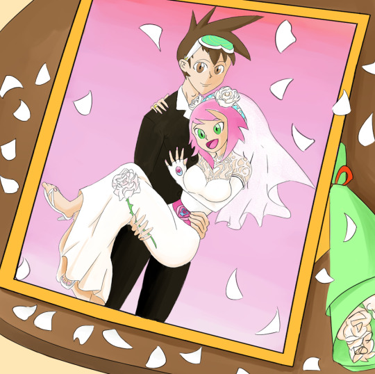
This one has a very clever framing (eh? EH?). The color white is often associated with purity, innocence and hope, and with white roses—weddings and marriage. Sonia dons the classic white wedding dress which has a très élégante design—and the little Lyra on her belt is very cute. The pink background is also very romantic and a nice way to tie in with her theme colors. I dig the lovey-dovey feel of Geo doing the classic bridal carry while clasping a single white rose...but seeing the thorns, I think he better watch his hand!
Miyabi said:
For a theme emphasizing color within the pic, I salute you for taking the biggest challenge in choosing white. In many ways, it could have been the hardest to keep as a predominant color, but still make the pic interesting and visually appealing. Choosing to have the petals all around the frame, with the bouquet nearby was a clever touch. With white often used for weddings and new beginnings, I think the concept of your piece worked just right, where it was subtle, but still incorporated enough other color to give the piece some life.
Category 2: Kawaii-rimi (Humor)
For our humor category this year, the theme focused on your favorite Megaman character gifting the plush form of another Megaman character to their crush, instantly created by a ninja-like character, to play off of the Kawarimi concept from the EXE series.
With just 3 entries in our humor category this time around, every entrant placed. You can see the full gallery of all entries at full-size [HERE]. Each entrant’s name will also link to their individual pieces at full-size.
1.) Mattasaurs: *$100 prize*
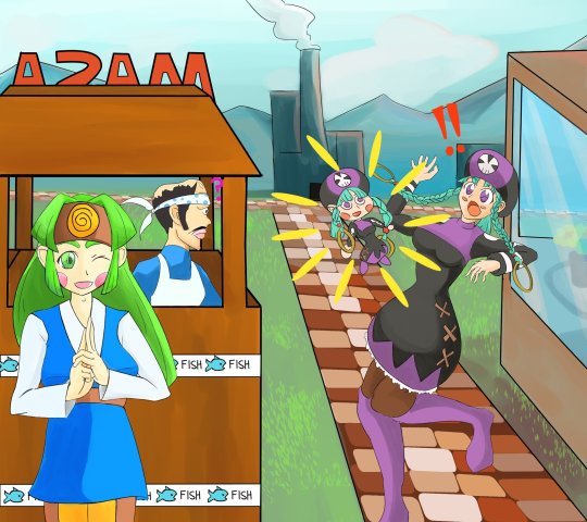
Subzeroiceskater said:
Y’know how blocks of wood are sometimes used by ninjas when they do that whole body switching thing? I think it’s clever how this pic has Sal—Woodman.exe’s operator—conjuring the doll. Everything about the pic is so fun and colorful: from Sal’s mischievous grin of accomplishment, Miyu being completely shocked by her chibi doppelganger (check out that body language!) and Masa’s confused expression.
Miyabi said:
Yes, while to some, Sal might not be the first one they think of when they think ninja in the Megaman Universe, but I certainly thought she still fits the bill in her design. Usually we don’t see this much emotion or shock out of Miyu, so seeing her torque her body, taken aback at a doll of herself, is amusing in it’s own right. Meanwhile, nothing fazes Masa. And a bit of randomness: oh man, seeing Masa’s head in profile, with his bandana...wow, I never realized how much his head shape with the bandana looks like a fish’s. I can’t unsee it now. Anyways, I also agree that the color, polish, and fun vibe made this a worthy winner!
2.) ColeManX: *$75 prize*
*Raffle Prize Winner* Captain N Cutsman Cel
Subzeroiceskater said:
E-Eyes? What did you mean by that, Mr. RT-55J? Although judging from the sparkle on those booblights… I understand, Cinnamon—if that happened to me, I’d be making asides to the camera, like I was in “The Office”, too. Cinnamon’s enthusiastic smile with this whole bizarre scene really sells it for me but shoutout to Marino’s smug satisfaction in the background.
Miyabi said:
🎵 I kind of liked it your way
How you shyly placed your eyes on me
Did you ever know
That I had mine on you?🎵
RT says it only has eyes for Cinny right now, but it’s also known to be a little grabby hands, so I don’t know if I’d fully trust it...but good thing this is just a plush version. Time for the tables to be turned, and Cinnamon to get her claws and paws on it, instead. Very cute, although after the DiVE V-Day event, we all know this is a ruse and your pal boobeyes only belongs to the Ferham Fanclub. XD
3.) Ronin-Apprentice: *$50 prize*

Subzeroiceskater said:
This whole comic is so sweet and fluffy, nya! ~(=^‥^)ノ☆ It’s adorable how Proto brings up his gift first and the surprise is how Shadow handmade his gift. The little cat-eared Blues design is so darling--almost as cute as him fussing how totally NOT a cat he is. “Did you steal my cat.” had me snorting. Now I’m wondering where Tango went off to…
Miyabi said:
FU-SION-HA!
Aside from getting his own Super Adaptor, this is probably the closest we’ve got to seeing Tango and Blues merged as one. LOL I’m sure that plush would have a ton of fans wishing it actually existed. The panels where Blues embarrassingly hides behind his scarf and gets pet like a cat had me laughing! Very cute and adorable comic, that certainly had the most depth in terms of the theme of this category!
28 notes
·
View notes
Photo
[Original Art by me]
‘Kurama-Hime’ - A wedding portrait of Mito Uzumaki, inspired by the Ukiyo-e school of Japanese art. More info & Original color version under the cut.
Ukiyo-e is a school of Japanese art that aims to capture the pleasures and wealth experienced by those of the upper-class in Japan. A major component of this art style lies within the clothing of the figures in the paintings or prints - often women who were seen as beautiful, Kabuki(performers such as Geisha), and famous actors, actresses, or courtesans. So, people seen as beautiful or stylish.
Ukiyo-e represents the final phase in the long evolution of Japanese genre painting. Drawing on earlier developments that had focused on human figures, ukiyo-e painters focused on enjoyable activities in landscape settings, shown close-up, with special attention to contemporary affairs and fashions. As artists chose subjects increasingly engaged in the delights of city life, their interest shifted to indoor activities. Article
So, this in combination with the style’s composition and the fact that, aesthetically, Ukiyo-e is one of my favorite art schools, I decided to try and emulate aspects of that concept when I created this piece.
Obviously the muse here is Mito Uzumaki, the wife of Hashirama Senju in the animated series Naruto. My reason for drawing her is not profound, it simply stemmed from my desire to paint a Japanese-style portrait arising in conjunction with my writing the scene of Hashirama Senju and Mito Uzumaki’s wedding for a fan-fiction work I’ve created. Yep.
This is not a traditional wedding portrait - as I said, all of these things are influences, which means that my actual painting is more a collage of styles than any one in particular. The most amount of detail went into her clothing and hair accessories. In the painting, Mito is dressed in a traditional wedding-style Furisode Kimono, distinguishable by its extremely long sleeves. In accordance with Shinto wedding tradition, rather than being a brightly-patterned kimono like what people tend to imagine, the Furisode is instead a white/pale base-color lined in a vibrant red hue. The defining, stand-out piece in the ensemble is a Maru Obi, the most formal and expensive type of Obi worn in traditional dress, which was popular for weddings during the Edo-period and Sengoku period; which corresponds to the periods at the time of and during her life before Mito Uzumaki married Hashirama Senju, respectively.
Additionally, her hair is superfluously ornamented with various flowers and Kanzashi hair pins - they are highly detailed(the painting was drawn on a 300ppi template) and you can zoom in to see the effort I put in. The hair pieces alone took me three days of work, while the entire body, kimono, and background took around two. This is in large part due to me not using a drawing pad; I suck at them, and am too impatient to learn, so I draw everything with a mouse and keyboard. I drew each of the flowers and pins individually, using real-world stock-image counterparts as references.
Other notable imagery in the background is of course the nine tails sprouting from behind Mito - she was the first Jinchuuriki of the Nine Tailed Demon-fox, Kurama in the Naruto series. Being an Uzumaki - whose clan ensignia can be seen in all of the red swirls scattered about, such as on the fan, and the fan-shaped Kanzashi - she has the two abilities that she uses to suppress and control Kurama: adamantine chakra-chains, which can be seen in the foreground and extend into the background, to ‘wrap around’ Mito and the Fox, thus linking them together; and the five elements seal, a fuinjutsu technique used to seal the demon inside of someone. This seal is the weird symbols that surround her head, in front of the moon.
The Uzumaki clan hails from the Land of Whirlpools, and resides in a village on a small grouping of islands surrounded by ferocious seas. This is, obviously, characterized by all of the wave patterns, namely the one on her Obi that can be seen covering the visible back-portion of the Kimono. In my story, this Obi belonged to her late mother, a respected healer within the clan who died in service during a war. The two prominent camellia flowers - hot pink, sitting at the top center of the other flowers - are a pair of Kanzashi pins that belonged to her mother as well. The camellia flower is said to represent different things in accordance to the color of the plant:
White camellias symbolize adoration and are given to someone who is well-liked.
Pink camellias symbolize a longing for someone and are given to someone who is missed.
Red camellias symbolize love, passion, and deep desire.
Since these particular pins represent both her mother, who is missed, and the new love she found prior to and within her union, I made them…red and pink. I also just like the gradient between red and pink, so it all works out. Last but not least, in the top-left background near the Kanji spelling of ‘Uzumaki Mito’, I drew a Double-crested Cormorant, which are representative of Nobility and Indulgence; in the manga (and in my story) her betrothed - Hashirama Senju - is the head of the Senju clan, one of the two most powerful in the land, as well as the first Hokage or village leader of Konohagakure.
Thus concludes the ‘major’ influences in this work of fan-art that I spent five days on after being inspired by my own fanfiction.
Here is the original color version:

#art#fanfiction#Naruto Shippuden#naruto fanart#mito uzumaki#uzumaki clan#hashimito#hashirama senju#senju clan#japanese art#my post#my artwork#fan art#shinto#kurama#ukiyoe#ukiyo_e#traditional art#japan#edo period#sengoku era#furisode#maru obi
79 notes
·
View notes
Note
who are some artists u take inspiration from / are some of ur inspirations? love ur art btw :)
Wow I’m so sorry it took me awhile to get back to you anon! This was a hard one. I haven’t thought of my inspirations lately since they have changed a bit. I tried to keep these relevant more to my anime art since that’s what I’m more known for, but some are influences on more of my original art that I hope someday I’ll feel brave enough to share with you all.
From left to right, top to bottom.
CLAMP (Magic Knight Rayearth) - they were the reason I started drawing manga/anime artwork at all back in early 2000′s for me. The only “shoujo” artists on this list, I was really taken by the eyes they drew at the time and it still can be seen a little bit today, though I’ve really tried to steer myself away from the large pointed eyes with thick lashes and elongated bodies that plagued my art for a long time. I’ll always love their compositions, use of color and just how they use marker.
Yusuke Murata (Street Fighter fan art) - known for Eyeshield21 and One Punch-Man. This man can draw anything. His sense of anatomy, foreshortening and movement is breathtaking. I love the lighting and rendering as well. He also has a knack for creating really original faces and he doesn’t have the “same-face” syndrome problem. Just top-notch. I don’t aim to be as shonen in style as him, but I hope to start being able to add more dynamic poses into my work.
Kyohiko Azuma (Yotsubato!) - known for Azumanga Daioh and Yotsubato! I really love the comedy and slice of life genres lately. I love softer styles and I really adore the more simplistic approach he has to his character design that really allows the slice of life genre to shine through his art. Despite the simplicity, it still is very anatomically technical. It’s simple, but warm and effective and very soft. His skill in backgrounds as well is phenomenal. I think it’s a whole atmosphere he creates and the story he tells in his illustrations that I would love to apply to my own work if I can. I also related a lot to an interview where he stated he struggles blending little Yotsuba into the world he created because she’s so different stylistically from all the characters, so it’s a lot of fun and helpful to see how he accomplishes this throughout the manga and the panels.
Masashi Kishimoto (Naruto) - of course one of my biggest influences due to all the SasuSaku I draw. I think his style is very effective. It’s also I think more on the simpler side actually (if you compare it to CLAMP and Murata’s). But it’s so dynamic and full of strong composition and memorable character designs. I really appreciate how by his influence, I never really stopped drawing thanks to the characters, Sasuke and Sakura, that he created that had such an impact on me.
Xia Da (Song of the Long March AKA Choukakou) - This one is a manhua artist. Her inking and watercolor artwork is absolutely phenomenal. Definitely someone I look up to when I’m inking my own pieces, I would love to be at her level of skill someday. Primarily an inspo for inking.
Kamome Shirahama (Atelier of Witch Hat) - another artist with phenomenal inking skills that I really admire. She’s also really good at drawing children! But I definitely believe she can draw anything, the fact that she has crossed the barrier to illustrate comic covers for both DC and Marvel is just incredible to me and a testament to how much skill she possesses. Primarily an inspo for inking.
Kozue Amano (Aria) - Known for Aqua, Aria, and Amanchu (lots of A’s!). Her ability to design precious soft characters, gorgeous scenery, and write a beautiful and gentle slice of life fantasy tale has always made her one of my absolute favorites. I absolutely love how she colors her works.
Adachitoka (Noragami) - this is a team who does characters and background art. It’s not a secret that I love watercolor. I also love the movement and action and fighting scenes from this manga. The fact that this team is female and broke through with a popular shonen series is simply amazing. I hope to be as good as they are in drawing figures and in watercolor someday.
James Gurney (Dinotopia) - the master of creating fantasy worlds and making it look like it EXISTS with his painting skills. His “Color and Light” book is an absolute staple (I have it always ready as reference) and it’s a must if you want to give your lighting that more realistic feel. I think my love of lighting really came from growing up with the Dinotopia series. He is always constantly sharing his wisdom as well on his website and twitter and just an amazing and inspiring person for generations of artists.
Makoto Shinkai (Kimi no Na Wa) - This movie’s aesthetics (especially the lush backgrounds), surrealism, and existentialism really spoke to me. I adore the starry skies and heavens and clouds. Screencaps of his movies fill my phone as a quick reference whenever I’m rendering some complex lighting or trying to create some sort of composition with the sky.
Studio Ghibli/Hayao Miyazaki (Kiki’s Delivery Service) - nothing really needs to be said especially given my love for the details in all the movies, the fantastic scenes involving flying in the sky, the gorgeous backgrounds, and the delicious food. Always a good choice to use as a reference for anything with nature or even cluttered cozy houses and rooms and greenhouses. It’s still a desire to delve more into world building for me and I’ll be using these movies for reference. I also keep tons of their artwork in my phone as reference.
Satoru Takizawa (Legend of Zelda, Breath of the Wild) - Known for his work with Twilight Princess and Breath of the wild. You know where I’m going with this - he is the MASTER of ambient lighting. I love his rough and loose painting style that I wish I could achieve someday, but I still have a tendency to over-render. A great resource for learning how to world-build and for concept art.
Andrew Loomis - anatomy and figure drawing master. At the end of this list, but not the least important by a long shot. His book I think is not the most beginner friendly in terms of seeing basic shapes and breaking down the form (I think his construction is still more on the complex side), but it’s a good place to start and keep grinding until it “makes sense.” It took me years, but once it started clicking, I have him to thank for it because my anatomy was an absolute mess because of my background of starting from CLAMP’s art style. Buy his book and make it your bible. Attend figure drawing classes. If you want to illustrate people no matter how simple, you must make studying anatomy a part of your process.
Lastly - some original artists to check out who I like the inking, watercolor skills, and concepts of that closely align with my interests for my own original art.
meyoco - twitter, instagram
maruti_bitamin - twitter, instagram, tumblr
Qinniart - twitter, instagram
Some mangaka honorable mentions -
Takeshi Obata (Death Note, Bakuman)
Kaoru Mori (Emma, Otoyomegatari)
Satsuki Yoshino (Barakamon)
This was super long, I apologize, but it’s something I’m passionate about. I love art to pieces. I think a lot of what I admire is very technical - anatomy and lighting. I think my influences also reflect my aim to be more proficient at watercolor and inking. And lastly, world-building, fantasy/cosmos, and background art. I think a lot of what I really love though, is color and lighting and that’s found within any of these artists. :)
Thanks for the question anon! You allowed me to geek out on art for about an hour while I wrote this out.
17 notes
·
View notes
Text
February 12th-February 18th, 2020 Reader Favorites Archive
The archive for the Reader Favorites chat that occurred from February 12th, 2020 to February 18th, 2020. The chat focused on the following question:
When applicable, what about a creator’s art might convince you to check out their comic?
carcarchu
I like a wide range of art styles so it's hard to pinpoint specifics but if an artist is able to draw very attractive looking characters (recognizable character designs, outfits that don't look like they came out of 2004 gap catalogue, characters that can still be recognized even when they change their hair style) then i find that very appealing. beyond that how well an artist can integrate the characters with the actual space they exist in is something i find very important as well. a bunch of floating heads can only carry a series so far. if the artist can make the characters feel like they properly exist in the space i think it can really elevate the series although in practice this is something very difficult to do.
Deo101 [Millennium]
For me, honestly some art styles are very inspiring to me and that will sometimes get me to read just because I want to see the art more and learn from it. Things like textures, colors, character design... It can draw me in just by exciting me as a learning opportunity
chalcara
For me art‘s the hook and story the line. Come for the art, stay for the story, you know?
Funnily I‘m looking less for pretty art and more for good visual story telling. I want the art to show whats going on without having to rely on dialogue.
Cronaj (Whispers of the Past)
I'm honestly very picky about art styles when it comes to comics, and that's a personal issue It has some to do with art styles being attractive to me, but honestly, the most important aspects of a creator's style to me are (1) consistency of style and anatomy, (2) level of completion, and (3) clear communication of what's happening. When it comes to whether or not I check out the comic initially, the main things that come into play with the promotional materials, covers, and/or thumbnails are contrast of the image and cleanness of the rendering. Of course, obviously, my personal tastes play into it. (I tend to like semi-realistic styles, sort of anime-ish but with a twist, or painted styles that may resemble concept art.) But honestly, probably more important than grabbing me initially to begin reading is readership retention. And that's where the 3 qualities I look for come into play: (1) Consistency of style and anatomy: This is probably the most important part for me as a reader. If I can't tell who is who because the characters change appearance from panel to panel, I'm ducking out, because that affects the clarity of storytelling. I also cringe everytime I see a particularly egregious anatomy error. I know what people look like. I see them every day. If I feel pain from looking at an artist's work, I'm not sticking around. (To be fair, everyone makes some kind of anatomy mistakes, but really it's if the anatomy mistakes are really awful to me and aren't as a result of a deliberate style CHOICE. Keyword, C H O I C E.) (2) Level of completion: This really just means that if it looks like the artist rushed through the panels or they were being lazy, I feel like their comic isn't worth my time. I mean, if an artist themselves doesn't care about their work, why should I?(edited)
. (3) Clear communication of what's happening: Once again clarity of storytelling is absolutely essential. If the composition of a large portion of the panels don't clearly show the actions of the characters, I can't follow the story. Aaaaaand as a bonus: Please, please, for the love of all powers that be, please, make your fonts legible. If I can't read the comic without squinting because your text is too tiny or hard to read, I'm not going to try. I have bad eyesight as it is. Take pity on your readers. I'm not going to suffer for your work. I have dropped far too many comics to count because the creator didn't care enough to make sure that the font was legible. And this applies to both desktop view, mobile view, scrolling format, and page to page format. Just.... Make your fonts big and clear.(edited)
sssfrs (JOE IS DEAD)
That's interesting to think about how recognizable characters are when their hair style changes. I might try to use that as a character building exercise
Deo101 [Millennium]
Solid excercise: can you tell them all apart when they're bald and naked?
Cronaj (Whispers of the Past)
OoooooooOOOOOOOOOOHHHH
I
Might partake that challenge
Deo101 [Millennium]
Also it's really fun to draw characters in all sorts of hair and clothes so idk what id do if I couldn't tell them apart when doing that!!! That's like 40% of my art!
Cronaj (Whispers of the Past)
This just convinces me more and more to do AU art
Deo101 [Millennium]
Yeah aus are another 20% of what i draw LOL
Look im drawing the comic most of the time so I wish to partake in non canon things the rest
carcarchu
@sssfrs (JOE IS DEAD) i've read series before where the character gets a hair cut / dyes it and i'm like WHO ARE YOU? IS THIS A NEW CHARACTER?
Deo101 [Millennium]
Oh another good excercise is drawing your Characters in many different styles and seeing if they remain unique when not in yours.
Cronaj (Whispers of the Past)
I want to do all of this
This is stuff I hardly ever have time for
So I am extra attracted to it
Also, there IS a time later in the comic where a certain character's hair gets partially burned off
And then he cuts it pretty short to get rid of the singed edges
And I feel like his hair is like 80% of his character design
So I'm just a little scared about that
Deo101 [Millennium]
Also, @Cronaj (Whispers of the Past) , I am unsure what you mean by "readership retention" with something that makes you interested in a comic, could you explain?(edited)
Cronaj (Whispers of the Past)
By readership retention, I mean aspects of the art that decide whether I'll continue reading past the first few pages
(obviously story comes into play as well, but I won't pretend that the art in the first few pages of a comic don't contribute)
Deo101 [Millennium]
Oh okay, I thought you meant like how many readers have unfollowed or something
Cronaj (Whispers of the Past)
Nah
More like, "oh cool! Your cover and blurb seem interesting. Lemme check out the comic!"
And then after reading the first few pages/chapter:
"ah... Not for me." Or "Nice, I'll keep reading!"
Deo101 [Millennium]
Gotcha
Capitania do Azar
Ohh I don't feel like dissing particular artsyle choices, but I know a few aren't for me. I'm no big fan of ultra realistic, hyper detailed stuff you usually see in super hero comics (other genres pick that style too sometimes and I still don't really appreciate). I particularly like artstyles that are distinct and recognizable, I have a hard time with stuff from different authors that just looks... Like a carbon copy (sometimes, the style being referenced is waaay too obvious and that is always a big no for me) Good use of color is key. Give me some good values too. I want colors to make sense and I am very tired of pink. I also appreciate consistency. If you give me artwork with a more paintery style but then the comic is cellshaded, that might tip me off. But not necessarily (tho I appreciate inner consistency inside the comic itself). Rushed stuff, like mentioned above, is also not a good look, but only insofar as it distracts me from what's happening in the story. Consistency is a very important word here, because I love seeing a common line that is able to take in all the differences that are necessary in character design and backgrounds, but also make me believe that they all could live in the same world.
Oh! And also: if the artstyle involves using lineart, I am really fond of sharp, clear lines with weight variation
sagaholmgaard
I'm curious about what you guys mean with consistency- do you guys not like if an artist's art style changes over the several years it might take to make a finished webcomic? Is it that it peeves you when the backgrounds are done in, say, a painterly style while the characters are done with lineart? Is it when the artists makes ordinary illustration work in a completely different style from their comic pages? (This is genuine curiosity I hope no one's feeling attacked rn ^^)
carcarchu
i personally really like seeing an artist's skills improve and evolve over the many years it takes to draw a series
even at the expense of a more "consistent" final product
sagaholmgaard
Yeah me too, it's one thing i really like about webcomics
chalcara
Can‘t talk about the others, but I get thrown off when one page is sprite comic, the next painterly, third cell-shaded without having a in-story-reasons for those style changes, like flashbacks or pov-changes. But more commonly, the issue’s the classic „comic‘s usually coloured, but oops, this time you only get the pencils because I had no time to update“. If that happens too often and/or doesn‘t get fixed for the archive I just lose investment in the comic.
Art evolution is natural, both in webcomic and published work with a dedicated artist.
Ah, that‘s another source of inconsistency - people switching colourists or even artists around. Once in a while is fine, but if it happens every month or so, I tend to get annoyed by it. It‘s actually why I killed my first webcomic twenty years ago; it was a collaberation and life kept getting in the way forcing me to switch colourists every five pages or so.
carcarchu
oh actually i have read a webcomic where they changed artist's 18 chapters in. i really fell in love with the magical and dark tone of the original artist and was engrossed in the world that they set up. they had a painterly style and it really set the atmosphere of the entire series but then the new artist had a super clean and cutesy art style and the sudden tonal shift really threw me off. in the long run the new artist was actually extremely consistent and better at actually releasing long chapters and very good quality chapters and the writing actually improved too because of it but it was never able to recapture what it was that i really loved about the original art style. also the new artist changed the character designs a little so the heroine was no longer even recognizable as the same person
since it was relatively early in the series i definitely would have preferred if they just got the new artist to actually redraw the first 18 chapters in the new style just so the change wouldnt be so incredibly jarring
chalcara
Any harsh breaks like that will cause some people to break away from the comic, I found. I dumped one of my favourite-for-years comic because the creator got bored by their main character and completely sidelined her in favour of a group of minor characters I had absolutely no interest in.
Didn‘t mean the comic got worse - by all accounts its still beloved by quite a sizable audience - it just wasn‘t for me anymore.
sagaholmgaard
Ahh that I can relate to. I get super attached to the main character and usually have a hard time getting into any spinoffs with the rest of the cast, even if I want to (and im a hypocrite because i also want to make spinoffs for ever side character in my own comic LOL) i guess if the style changed a LOT from page to page that would throw me off too. that feels like the artist is trying to experiment, maybe making sort comedic comic strips would be more acceptable then? Every style would at least be contained to one strip at least
DanitheCarutor
That's... actually a really good question. I don't really go for a specific aesthetic. Sometimes what's going on in the thumbnail attracts me, or it could be the use of color, the style, a character design. I'll check out a comic with just about any art style. I guess maybe if I have an idea of what the creator is going for with their art? Like, the art may have a lot of kinks, but maybe being able to tell what style they're trying to go for makes me want to check out their work? Honestly, I don't have a really strong art bias, as long as the comic is readable I'll go for almost anything. Maybe I won't check something out if the style looks extremely uninspired... like if it were the most generic, based off Japanese cartoons, style ever then I might give it a pass. But even then I do sometimes check it out anyway, so I really don't know! This question is surprisingly hard to answer! To give my last quip about last week's topic, since I don't want to derail the current one. I feel the creator's personal life is no one's business. I understand if they're a legit bad person, but digging into a creator's life to see if they qualify to be supported is... I dunno. This mindset makes me feel that if someone who liked my work ever tried to get to know me, they would be doing it solely to see if I'm good enough for them, which feels really invasive and predatory. I fully understand most people can't just enjoy something, that's how the world is, it just kinda sucks sometimes. The world kind sucks sometimes. Alright! I'm doing with giving my final thoughts on that subject.(edited)
Deo101 [Millennium]
The question is specifically about what draws you to art, rather than what turns you away so if you don't want to rag on any art styles that's not what it was asking for I think! Though yes it's very closely related (and it's not bad to say what you don't like)
Eilidh (Lady Changeling)
I definitely am more likely to read a comic that has a distinctive style - no particular style preferences, really. Interesting use of colour/value is definitely a bonus. But as long as it's engaging and the composition is good/readable, I don't really mind whether the art is "good" or not.
DanitheCarutor
@Deo101 [Millennium] I wasn't trying to rag on anything. I couldn't specify what about someone's art would draw me to their comic, it was easier to the one thing that might not, but I still said that I may be drawn in regardless. Sorry if I came off like a douchebag, totally not my intention. <_<'
Deo101 [Millennium]
No I know, someone earlier said "I don't feel like dissi g particular styles" I'll be honest I was typing my post as you were and so I didn't even read yours til after I said something(edited)
Just kind of a general thing! Feels like it went to what turns us away instead of what draws us in so just kinda a reminder of the op
sagaholmgaard
Readability is definitely important for me to want to continue following a comic, but what about the art that makes me want to read something...? I definitely have a preference toward cartoony styles overall. A solid character design will make me wanna check out a comic. If the main character has a recognizable silhouette and interesting shape language. I also love really bold lineart, especially if it's used to create shadow and contrast. Interesting color schemes too. I think how the background is drawn can really make me want to read something as well. I know BGs aren't people's favorite thing to draw but to me if the setting looks very well though out and designed, that definitely motivates me to check something out. And awe-inspiring sceneries are always hella cool! I read a lot of things outside of my artistic preferences though, but I think these are the things that might make me pick something up based only on the art itself.
keii4ii
I think I tend to find more appeal in certain compositions, which is a more subtle aspect of style. I am a major sucker for evocative use of backshots/ not-showing-the-(whole)-face, for one thing. Compositions that make full use of the three dimensional space around the figure(s) is another (this doesn't necessarily mean putting a lot of stuff around the character; you can have a mostly empty space and still make it feel very 3D).
(I hope both of those things show in my own works... I just love those things soooo much )
Deo101 [Millennium]
Oh I LOVE when a panel like... Cuts a face. Something about it makes me lose my mind every time
DanitheCarutor
@Deo101 [Millennium] Ooh! Lol sorry about that! I was so caught up with off computer stuff that I didn't notice anything else typing while I was. I haven't read the whole conversation yet, but I can see how it would turn to that. "What draws you in" is a hard topic to stay on. At least I imagine it would be since it's hard for me to talk about.
Ah! I admit I really like shots focused on scale, specifically ones were you can feel how tiny the MC is compared to what the camera is focused on. Does that make sense? Like the panel shows this ginormous thing, and it has the MC in it to show how massive it really is. That's awesome when done right.
Deo101 [Millennium]
Tiny little person. Yes. Very good
DanitheCarutor
Tiny people in giant worlds are the best!
keii4ii
I love those too!
DanitheCarutor
Oh, also this isn't a webcomic, but I've been interested in reading Vinland Saga after seeing this page on Twitter.(edited)
Something about extremely hideous expressions on semi-realistic faces jives with me.
FeatherNotes(Krispy)
What draws me in easiest is the design aspect of characters, environment and the webcomic title! It's a bit of a turn off when the title doesn't look polished. That's one of the main draws for me is an intriguingly designed logo with a catchy name that follows through their chosen aesthetic. I've seen many comics that stand apart from the title image they chose and it's a bit jarring to see! Great examples of wonderful execution of these aesthetics are BlackOut City, O'Sarilho, Sink Your HookTeeth and Shadrunners(obvs there are many more) I have to agree with @sagaholmgaard about backgrounds! There are quite a few creators who avoid them and stick to simple colours and gradients that just dont keep me in the comic- though my fave genres include a lot of world building, so BGs in a romance may not be emphasized as much. Lastly, dynamic character design!! I love a wonderfully crafted cast that allows me to read the characters easily no matter what setting or outfit they're in. Also it's really random but i do love an artist who can draw really good shoes?? That is always a draw in for me (edited)
Capitania do Azar
Oh I meant it in the way that if you spend a lot of time experimenting with different styles and techniques, you'll never be good at any of them. Style and approach changing over time is, imo, inevitable and good :) @sagaholmgaard(edited)
@@FeatherNotes(Krispy) I constantly think my logo looks like crap next to other webcomics', so thank you (edited)
DanitheCarutor
Oh god, @FeatherNotes(Krispy). Titles and logos are legit my weakest point, that part of the comic creation process is the worst! I have this cosmic-horror/fantasy comic I've been developing since 2005, and it took me till just last year to come up with a decent title. It'll probably take another 14 years to come up with a passable logo. Lmao!
FeatherNotes(Krispy)
It is really hard! Because that image/logo and name represents the body of work so firmly, its also got to stand strong with what it's representing and stand up to other titles too! Basically, i like to think of something that will help generate top results when i search on google for the title, which to me helps it stand on its own on the web, and sound catchy enough for pitches in person! I don't want to steer the convo away too much from the prompt, but there is definitely more to discuss about titles and their chosen aesthetics
varethane
@DanitheCarutor have you read Golden Kamuy? If you love hilariously hideous expressions in manga, it seems like it may be your jam lol
(it's also set in a specific historical period and contains a lot of really interesting material about the time/place it takes place in)
Also I feel like I have never, even one time in my life, come up with a good title for anything-- both Chirault and Wychwood are placeholder titles that I used just to kinda name the story for myself, which I initially intended to change when something better came along, and then nothing ever did
LadyLazuli (Phantomarine)
I know I'm generally drawn into a comic if it's just... generally a visual feast? And it doesn't even have to be a beautiful feast - just... a feast! A super intriguing artstyle, beautiful or not, is something for my brain to pick apart and enjoy. Detailed backgrounds, intricate costumes, fascinating presentation/layout... all the way to crazy expressions and fun asides, and even some gory or scary bits to make me go EEK. Basically, if I'm reading it, and my hand is twitching with the prospect of drawing fan art, then I'm in for good.
DanitheCarutor
@FeatherNotes(Krispy) Urg that is such a nightmare! And there are only so many different styles you can do for a logo, and so many variations of words, it's like how there aren't any truly original stories anymore. I got lucky with the title for my current comic, it's the most generic thing ever, but fits in a tongue-in-cheek way. @varethane I've never heard of it, but the face compilations I'm seeing are intriguing! Man, I love stupid facial expressions.
Capitania do Azar
@varethane golden kamuy, I see you are a fellow of taste as well
varethane
(I love it so much)
Capitania do Azar
@DanitheCarutor oh idk about the "only so many things you can do with logos", I've seen amazing things in this world, if there's a limit I'm not seeing it
varethane
(I can always tell exactly when I was binging it because there's a big chunk of my phone's photo gallery that's all screencaps of Asirpa making dumb faces)
Capitania do Azar
@varethane guys shooting each other in the woods? I'm always in for that
DanitheCarutor
@Capitania do Azar Lol I guess? I can't see how you can have an infinite number of designs for writing, while still trying to keep it vaguely readable. But I really don't like lettering, so my imagination is hardcore lacking in that department.
Capitania do Azar
Lettering and logo design are their own fields of expertise, it's ok
meek
Hmm I'm similar to a lot of previous responses where I can't pinpoint a specific style or trend of art work that draws me in because the styles of comics I read differ incredibly. That being said, there are some things that I do look for to keep me coming back: 1) Consistency of style/anatomy: unless there's a specific reason for the general art style to change (not including semi-deformed or chibi versions of characters), I appreciate characters staying proportionate or just otherwise consistent throughout the comic. And art evolution isn't something that's at odds with consistency, it can actually help that by making characters more distinct and easier to distinguish from each other. 2) Potential for art evolution: Almost the opposite of the previous point lmao but if I find a new comic and I see the latest page is of a much higher skill level than the first page, I'm immediately hooked. I want to see the journey. And I want to see how far that journey goes, even past the point where the art "gets good". There's at least one comic that I can think of where once it hit the style that it wanted to, the art has stayed consistent for the past several years but so much so it's almost plateaued and become stagnant. It's still good art, by all means! But I want to see it grow and evolve more. 3) Good panel/speech layout: Okay it's not quite art in the same sense but someone else mentioned this above and I think it's important too? There are so many comics I can think of that I couldn't read or I dropped off at a point because reading was a chore, either because of giant or unsightly speech bubbles, tiny or ill-fitting font, a combination of the two, etc. Sure, graphic design and layout is a skillset completely different from pure illustration, but it's one worth knowing because otherwise you could do a disservice to your art and your story.
Cronaj (Whispers of the Past)
@meek Seriously, the text is so important to me, and I consider it a large part of page layout and design
meek
Agreed!! It's something that bothers me with printed comics all the time. I've tried to read so many "classic" graphic novels and I just.. I can't get past the giant text boxes with small font with miniscule kerning and ESPECIALLY if they then add color to it. Please, keep in mind your readers with reading difficulties But to turn this into a positive One of my favorite things that also helps make a comic feel more personal is when the creator turns their handwriting into a font or otherwise have FUN with the speech bubbles
Cronaj (Whispers of the Past)
YES. As someone with bad eyesight, typography is one of my favorite aspects of finishing a comic page.
Deo101 [Millennium]
It also is super important for me with ADHD, reading is hard enough as is! so bubble layout and clarity can really bring the whole thing together and elevate a comic
Eightfish (Puppeteer)
I tried that but got the feedback that my text is hard to read and the way i format my speech bubbles is distracting (: But some people have said they really like it so ¯\_(ツ)_/¯ Though I do think I could have done better with the font. I have good eyesight and bad handwriting do I think i have a much easier time reading weird text than many. Since you guys care so much about text, would you mind taking a quick glance at my comic and telling me how readable it is? It'd be nice getting feedback from random people as opposed to only my readers who felt strongly enough to leave a comment unprompted
meek
Oh man I have this specific panel in mind from some early 2006 Avengers comic of like.. what not to do Basically it was a bright yellow text box with this white/light blue font. It was just. It was a nightmare to read Oh sure!! Definitely send me a link
Cronaj (Whispers of the Past)
Yep! Send me a link too! I'd love to help you out
I also have a good typography book to recommend if you're interested. I can drop it into #art_resources(edited)
Eightfish (Puppeteer)
Here is link: https://www.webtoons.comen/challenge/puppeteer/list?title_no=290620
Thanks for taking the time to give me critique!
Cronaj (Whispers of the Past)
The link's not working, but I can probably find it on Webtoon
Eightfish (Puppeteer)
And I think i dould find a typography book interesting, so yes please do send the link
Sorry, i think the link is missing a slash
Did we both delete the link
Deo101 [Millennium]
did we both delete a
yah
i got it
Eightfish (Puppeteer)
Lol
Deo101 [Millennium]
https://www.webtoons.com/en/challenge/puppeteer/list?title_no=290620
Eightfish (Puppeteer)
Thanks
Cronaj (Whispers of the Past)
I found it
(The font is a bit small on mobile, but the font is fine?)
Eightfish (Puppeteer)
Wait can we move to shop talk?
FeatherNotes(Krispy)
(maybe we can have this discussion on shop talk channel? )
Cronaj (Whispers of the Past)
Sure
FeatherNotes(Krispy)
OH LOL
DanitheCarutor
@Capitania do Azar Oh god, they so are! I envy anyone who enjoys that craft, I'm a lot better than I was, but lettering is still so hard. ;v; At least the fancy stuff is hard, regular speechbubble lettering is easy as long as my hand cooperates.
Cronaj (Whispers of the Past)
There's a book I had to read for a web design course I took, and it is seriously a life saver
It put text in a whole new perspective
DanitheCarutor
I do all my lettering traditionally, but maybe that book would be helpful, I legit hate doing it no matter what medium I use. (sorry for continuing to derail the channel.)
Capitania do Azar
@DanitheCarutor i used a website that converts handwriting to fonts + font forge for tweaks to get personalised fonts
DanitheCarutor
I used to type bubbles out, and I've thought about it for my current comic but I mix up words and letters really bad, and I forget to add words entirely while typing. It wouldn't be so bad if my brain saw the mistakes while rereading everything, although sometimes it takes a couple days or another set of eyes for me to actually see them. When I write the bubbles in with a pen I make a lot less mistakes since it takes more effort to write out each letter, also my brain can keep better track of the ones I do make. I feel like that's an excuse that makes no sense.
Deo101 [Millennium]
no it totally makes sense
snuffysam (Super Galaxy Knights)
I can't say I'm ever especially drawn in by art? Besides the sense of "it looks like a lighthearted action story and I like lighthearted action stories", not much catches my eye. Though, I will drop a comic if I'm put off by the art. Like I can forgive if some things look janky at the start of the comic, but if that jankiness doesn't improve over time, I'll drop the comic. I'll also drop the comic if the character designs are bad (i.e. indistinguishable from each other, or in rare cases just too gross to look at). But again, I can't exactly say "good character designs draw me into the comic" because a lot of comic banners/thumbnails don't really show off full character designs.
chalcara
Varied bodytypes are catnip for me. And I like comics with expressive characters over comics that limit expressiveness to keep the characters pretty.
Eightfish (Puppeteer)
Oh, definitely agree with that second part. Comics where it looks like everyone has had a ton of Botox is a huge pet peeve of mine
Like, eyebrows are not the only part of the face that can move.
Do more
renieplayerone
Yeah i agree with the janky art thought. I think it helps me follow through the jank if i see that the later pages, the artist has shown growth, and i dont want to force anyone into a "gotta redraw it" loop if thats not something they want (of course everyone has their reasons and theyre also valid af) Ill tend to be more forgiving about the jank if i know its someones first webcomic or first comic in general, because you cant learn how to make comics without actually sitting down and making the dang thing. So yeah, the jank can be a double edged sword(edited)
What super draws me in is comics with a great sense of color. While i love anything vibrant, if the softer watercolors are done well, they're chefs kiss. Prime example of that is Stand Still Stay Silent
mariah (rainy day dreams)
I've been thinking about this question all week and I think I finally boiled my answer down to something short, sweet, and to the point. It's gotta be some kind of spooky and some kind of cute I have a pretty broad range of art styles I like and I definitely also read stuff that doesn't fall under those categories, but I think my favorite stories or artists are some blend of those two things. I don't really have a preference between color and greyscale. Like I definitely love a good color feast comic, but if you know how to use your grey tones or even just black and white well it's just as good for me. Maybe that's also just me trying to justify being mostly a greyscale artist to myself TuT
FeatherNotes(Krispy)
@mariah (rainy day dreams) devils candy would def be up your alley then!
mariah (rainy day dreams)
Devil's candy v good
renieplayerone
Devils Candy is amazing
mariah (rainy day dreams)
I love to combination of cute monsters and action also.
DanitheCarutor
@renieplayerone I'm not sure if it fits totally with your preference, but if you're looking for watercolor Lost Honey is gorgeous! https://www.losthoney.com/
mariah (rainy day dreams)
Lost Honey is another great comic great to look at, really interesting world
DanitheCarutor
It's one of my faves! ;v; There is another comic that was half watercolor half digital that I used to love reading (if I remember right pages set in the current time were digital, and backstory stuff was in watercolor.), but it has been discontinued for years now. It was called Toilet Genie/D00R, a comic about a genie who was locked in a public toilet and was awakened by a pug that got thrown out by her owners. It was so pretty, with such an interesting style!
mariah (rainy day dreams)
Oh wow I haven't thought about that comic in 5 years! X'D I didn't read much of it, because I don't think there was much of it available at the time, but yeah, that one was also very pretty (edited)
renieplayerone
Oh those colors are really pretty!!
DanitheCarutor
Right? Lost Honey is total eye candy. @mariah (rainy day dreams) Yeah, it's sad the creator never got to finish it. I think about it every so often since it's one of the extremely rare (semi)watercolor webcomics out there.
Also I'm extra attached to traditional mediums since I work in a traditional medium myself.
mariah (rainy day dreams)
Same. Got that ink wash/watercolor bias.
Eilidh (Lady Changeling)
My current comic is marker shaded but I so want to do something with ink wash after this one...
DanitheCarutor
Yeah, right now I'm working with color pencils since they're cheap but I want to give gouache or acrylic a try for my next project, depending on which story I do.
Kabocha
Hm, the question is... a lil' challenging to answer. I think in a lot of cases, the art isn't necessarily what gets me, but when it does -- Sometimes it's when someone uses a resource I like/made and I can go "OOOH! I know that thing you used!" Screentones are another one that gets my attention pretty quick. Sparkles... And probably effective spot color use. As much as I enjoy many full color webcomics, there are many that get tiring to try to read for one reason or another (usually it's either a font or a saturation issue - too many similarly saturated colors near one another gets tiring to read). Also, soft coloring. Oooh, just... when the art feels like it ought to be printed on those soft-touch covers... Yeah, that gets my attention. ...and watercolor/inkwash, too. ... okay that's a lot of things that grab my attention, but tl;dr: oh hey look at all that cool stuff that people can do!
mariah (rainy day dreams)
That was part of what was so hard for me thinking about this question cuz really, a lot of things get my attention X') and the more I thought about it the more I was like "I like when a comic is like X, but oh also Y is great and I do really enjoy Z as well!" I just ... like so many things. But I think that's better than being really picky. I've meet some folks that are super picky about art and basically only like one style and I'm just like... you're missing out on so many amazing things!
Kabocha
Right? And heck, even in some comics where the style would normally be unappealing (to me), there's just something about the art and the aesthetic that clicks to make it all work together for that project.(edited)
I do think, though, that there's always going to be a special place in my heart for greyscale or screentoned comics. There's just something about art that knows how to effectively make use of shading and contrast to make their work... well, work for me.
kayotics
Art is probably the first thing that draws me in to read a comic. The top, top tier thing that gets me to pay attention to a comic is really strong inks. I love inking, and unusual inking styles. To those who know me, that's probably incredibly unsurprising. I also love really angular styles. Some other stuff I gravitate towards: cartoony styles, expressive faces, and kind of ugly characters. I enjoy seeing characters that might be described as plain or are drawn in a bit of an ugly way. The last thing that draws me in? Hands. If an art style pays attention to hands, then I'm all for it.
mariah (rainy day dreams)
Does a comic have characters with big, crooked, toothy grins? I'm down for the count X'D https://media.tenor.com/images/618576ebcc4f6d2a12438624be77c54f/tenor.gif
varethane
oh hey, did someone mention webcomics done in ink wash/marker?
Chirault was that!
1367 pages of..... ink with greyscale marker..........
FeatherNotes(Krispy)
honestly blows me away that you toned it traditionally like, all of GJS is inked trad, but to ink AND tone in marker is just.....damn
sssfrs (JOE IS DEAD)
I love ugly characters
RebelVampire
When it comes to art, I'd say there are about four factors that will draw me in.
First, readability. Can I visually follow wtf is going on in the comic? I have no interest in the visuals if I can't understand what action characters are taking. So the first point is always for if that is true.
Second, character distinguishability. Can I tell one character from another? I am notoriously bad even in real life at being able to tell people apart, so when reading for fun, it's super important to me that I don't have to put a lot of effort into telling characters apart (exceptions for identical twins, of course). Third, personal appeal. Do I think the art is pretty or cute? Like, obviously this is subjective so I can't really put into words why I'd find one style appealing and the other not. But ya know, I like stuff I think is pretty to look at. Fourth, backgrounds. If a creator puts a lot of effort into their background scenery, I'm very sold on it. I love beautiful backgrounds, and the effort put into them give me an overall better impression of the comic as a whole. Since it takes some real passion to take care with backgrounds. All this being said, I'm not much of a stickler for art. If a comic is well-written enough, they can fail all these points and I'll still read it. This is just a list of what aspects have to be in the art for it to draw me in.
Eightfish (Puppeteer)
My points are pretty much the same as Rebel's, with the addition of a few things: I adore comics with dramatic facial expressions and consistently excellent anatomy. Also, if the art style is unique? If I feel like I've never seen someone draw that way before? That's ++. So good. I've read comics where I thought the art was good but the story was mediocre, but I've never read a comic where the art met all my points (and Rebel's), where it made me go, "holy fuck," audibly, and then had the story disappoint. Comics where the art made me go "holy fuck" audibly: Excecutioner's Academy: The art is so pointy and colorful and detailed and weird. It's full of personality and life and so are the characters. Warning: hiatus comic ): https://tapas.io/series/Ex-Ac Ava's Demon: You guys know about Ava's Demon, right? With original music and animations ending every chapter, this might be the most effortful comic I've ever seen. https://www.avasdemon.com/pages.php#2611 Sfeer Theory: Everyone looks so different from each other, it's fantastic. Some characters are not conventionally beautiful, yet they're still so appealing. And backgrounds! And a thought-out and unique magic system! https://sfeertheory.com/comic/01-00/ Electric Bones: Backgrounds! Banter! http://electricbonescomic.com/index.php/comic/page-001/ I also loved Prague Race, but unfortunately it was cancelled ):
If anyone else has recommendations for comics with amazing art, I'd love to hear them!
Cap’n Lee (Flowerlark Studios)
For me, it just has to be an art style I like to attract my attention. I generally like realistic art, stylised art, or pretty much any style that hasn’t been done to death (like generic anime art; much as I love manga, I’m really tired of the over-saturation of bland and soulless anime-inspired art). Pretty much anything unique and well executed will grab my attention. I especially like greyscale and limited palettes.(edited)
And just to clarify, I do like anime-style art when it has expression and/or skill behind it; just not when it looks generic and manufactured. Overall, though, it’s the writing that’s ultimately the most important thing to me in a comic, so I’ll enjoy comics for their writing even if I’m not a fan of the art.
#ctparchive#comics#webcomics#indie comics#comic chat#comic discussion#comic tea party#ctp#reader favorites
1 note
·
View note
Text

Double Exposure is a collaborative series that features the work of an admired artist.
LightLeaks second featured artist is Eva Mecham–a Vegas-based photographer who strives to represent women in an industry dominated by men. While the struggle to find respect always seems like a challenge, she continues her quest to become a respected photographer by practicing and perfecting her craft.
In this segment of Double Exposure, our aim is to support women, not just in photography but in every field where women are not represented fairly, respected or even paid enough in comparison to our male counterparts.
Eva and I interviewed each other to learn more about our love for photography, how our interest for photography originated, our influences and more.
EVA JACQUELINE MECHAM
Age: 23
DOB: 06/03/1994 Gemini
Background: Portuguese/Lao/German/French
Born: Las Vegas, NV
Raised: East Side Las Vegas
Insta Handles:
@spottiottieva was the first personal instagram I ever had but it became more technical to show ALL my work through.
…so I created the other two pages to serve as multiple outlets of exposure exuding different variable factors.
Humans AND Environment. Lol.
@sweetleaf_phto is female energy only and conceptual portraits/groupshots.
@jacqueline_images is my art and street photo page.
Why/how did get into photography?
My grandfather. He documented just about everything. He passed away in 2011 but his legacy lives on. He lived a life beyond what photos could show. His family traveled from Spain to America during the 1920’s. His determination, discipline, will, focus, and attention to detail rooted in me and allowed me to open my mind to the idea of collecting and acquiring but with tangibility and substance.
Past my grandfather stimulating my lifestyle choices I felt that spark after I developed my first roll of film. Being able to hold a photo in your hands is truly magic in the simplest form. Photos have influenced me my entire life. Keeps me constantly reverting back to instances and wishing I could save moments to time travel to. Just like music or a scent, a photo can greatly alter your perception or mood.
Last, a major reason I ever pushed my photography skills beyond documentation was skateboarding. I was at a young age when I fell more and more in love with every skate mag or video I ever watched. Naturally I began sourcing all my inspiration and tones through how the skateboarding industry plastered my brain. It’s common to have these wild kids throw themselves off staircases with ease and dive into 12ft deep drops every day. Whether it was filmed with thousand dollar equipment or the cheapest vx setup, A-1 quality images and content has always been around. It wasn’t until I learned real anticipation taking a pre meditated flick of a skater in motion performing a trick repeatedly without near success till maybe the 20th try in, that I understood the feeling of that equation. That 21st key shot is a high. All that focus.
What does your photos mainly consist /focus on? Why?
My photo collection is a mix of portraits of friends I’ve built connections or bridges with while the other half is a handful of my travels, daily life, and streets I walk through. I have to mention I LOVE ART of ANY kind. Art embodied within all forms. Especially if it doesn’t belong somewhere or a rule was broken to make or keep it there. I believe in the idea that the world truly is ours so exercising the freedom to express ourselves is common law to me. Almost like a personal passion project. On the other hand my favorite subject to photograph are literal human hands. I’m fascinated by hands. Our hands are such beautiful blessings that we often take for granted. With our hands we can touch, create, hurt, destroy, clean, whatever it be. Our hands are multifaceted and a huge relatable connection between us all as humans. No one hand is the same. Like our eyes, I feel they are also portals to the soul.
You are all about empowering women. How do you convey this in your work?
Confidence can be instilled in many ways but I have never seen more confidence instilled within a female more than when she enjoys a photo of herself. Living in this overly extroverted world, it’s common to find that most women compare themselves to everyone. Even men. I know this to be true because I can testify myself. I’ve grown up riddled with anxieties I’ve whispered to my inner conscience for so many years, without even realizing it. A photo can translate emotions and feelings you didn’t know you had. A virtual avenue. A portable capsule of what existed at that time. There is growth in a photo. People glorify in the beauty of a butterfly but fail to remember the stages of growth it took to become that butterfly we see. So for me to be able to capture the growth of is something one of a kind to me. Anyone or anything can have it’s photo taken. But it’s all about the subject. I stress to validate the women in my photos through our shared experience and what they represent passionately. Who are these women and how can I uniquely translate what they have made me feel through a mere photo for the world to perceive.
Talk about your experience collaborating on this project.
Norma! I’m extremely flattered you would have asked me to be a part of this project as it is so pure and beautiful. I love to share my thoughts and feelings and often feel I am overlooked and underestimated. Every once and awhile I meet someone who makes me feel human and included at the same time. I look up to you Norma as you are an incredibly vivid photographer with natural ability only acquired through patience, growth, focus, determination, and skill. I often wish we had met sooner. But there is a reason for everything and the influence you have provided has guided me quite a bit. I truly love Jelly and KNOW without a doubt that dog has a great soul. I’m lucky to have friends who aspire to create, as this will be so enjoyable in my older years to look back on and cherish as I fade.
Who is your fav photographer?
This is probably the hardest question you put on here but I’d have to say my grandfather.
Whose work has influenced your work the most?
I honestly wouldn’t be able to narrow it down but i enjoy and source my inspiration from lots of the lasting images of these timeless talents below….
Keegan Gibbs (so fucking fire)-
Atiba Jefferson (skateboarding essentials)
Mike O’Meally (classic skateboarding essentials)
Henry Chalfant (innumerable amounts of graffiti documentation)
Tobin Yelland (filmy skateboard shots)
Duran Levinson (insane portrait photographer)
Craig Stecyk (Z-town documenter/skateboarding essentials)
JR (graffiti/wheatpastephotographer)
Martha Cooper (80’s legend in street art journalism)
Alex Fakso (skate & graffiti essentials)
Ruedi One (for those wet blk&wht artsy street nights)
Ed Templeton (almost forgot this legend)
Nan Goldin (female legend)
Haris Nukem (vivid portrait photographer)
Ruth Orkin (female legend)
Who are you currently listening to, music-wise?
I have this private playlist I made myself I play every morning after I get up to get ready for the day. I’m revealing the first 3 songs but the rest is secret.
Rebel without a pause-Public Enemy.
Leaving Babylon-Sublime.
If 6 was 9-Jimi Hendrix.
Besides the essentials I‘ve been playing a lot of lo-fi hip hop beats/scratches/mixups while I work or create lately.
I usually have either an Alchemist or Madlib CD in my car stereo. I use a lot of CD’s and cassettes lol. Let’s just say my auxiliary option is variably unreliable so CD’s are solid lol.
What is your favorite photo you’ve taken and why?
I thought for so long on how to answer this. Haha. I have to say that every photo is my favorite. Not to feed the ego or anything but maybe in other words I’m a hoarder. Any and all photos I take fall into my collection and that to me is something that holds my life’s work and ultimate value. My archive. The best way to put this answer into perspective is the idea that I’m not done yet. I’m still constantly & avidly pursuing higher dimensions through photography, through life, through myself. For me to choose a favorite photo would be for me to say that I’ve reached some finished point. Don’t get me wrong I have favorited shots over others but like I said I love every photo I take because I love life.
Digital or film? Why?
Film is permanent. Technology isn’t built to last forever. You don’t need technology shooting film. Art in a post apocalyptic world is a priority. Creating something tangible is far more lasting to me. Especially one with an element of surprise.
A fixed restriction makes you think twice, I’m sure. Film is exactly that. Knowing you have that limited amount of shots, each one seems to count more. Film is a spectrum balance between a premeditated photo or a foggy moment in time. I’m a fast paced shooter but with shooting film I catch myself staring at nothing till I see something. Essentially, it’s something that actually slows me down and I need that.
Movie you’d recommend an aspiring photographer to watch for inspo.
Recommendation for inspo for an aspiring photographer hmmmm!
I’d say watch any Tim Burton film. That’s a given. I’m a major fan ofTim Burton’s movies and stories.
Then I’d say, Across the Universe and Inherent Vice. And after that watch some of Quentin Tarantino’s films. Those are all classic.
FEMALE POWUR PLAYLIST
https://open.spotify.com/user/normal_genes/playlist/351NQKgAj4lfzEnuamHKAm?si=V4TwoqWoQgWXME8Rzlzh1A
EVA PHOTO GALLERY
S E T 1
S E T 2
S E T 3
FILM SET

NORMA JEAN ORTEGA aka NJ
Sign: Gemini
Background: Filipino American
Born: Las Vegas, NV
Being self-taught, how do you educate yourself on new ideas and techniques to take better pictures?
I can’t say I was self-taught because my dad was photographer. So I essentially grew up with the concept of photography. One of my first jobs was at this photo studio at Meadows Mall. I learned the basics in color balance, posing models and composition. College is where I got my formal training in photography. I learned how to shoot strictly in manuel when I took 3 years of black & white film photography and I became obsessed to say the least. Practicing photography in this manner gave me a sense of meaning behind the photos I took. I loved the idea of building a concept for the photos I had taken and embraced the idea of suspension and surprise.
But to answer your question, I learn new techniques by trail and error. Stick to one camera for a long period of time until I feel like I’ve mastered it then move on to the next. YouTube is also a thing. LOL.
What is it that you want to say with your photographs, and how do you channel your work to illustrate that? Why?
My personal photography documents moments and captures feelings that I like to look back on. A photo diary for the most part.
The subjects I touch on in my more serious work, aims to unpack what it means to be an Asian American female—of course from my own person experience. I express distressing feelings from my childhood, my feelings towards Asian stereotypes and dissect the standards of beauty in Asian culture.
When packing photo gear for a trip, what all do you take with you and why?
My olympus stylus, fujifilm 400/800.
A majority of the photos I take on a trip mimic the documentary style that I grew up with, however instead of focusing on people I try to focus on a moment and gut feeling that I am drawn to capture.
What motivates you to continue taking photos, whether it be socially, economically, politically, intellectually or emotionally?
Everything is cathartic for me. It is a way to release a thought or feeling that I wouldn’t otherwise know how to express. Writing was my source of releasing this energy but through photography, I love how subjective it is to everyone else. You can share your work and get a complete different reaction or thought for what it was intended. But for me, when I look at my images, I know exactly how I felt and what I was struggling with at moment. It is somewhat of a reminder.
Within the aspect of women and social culture, what would you say is the difference between capturing beauty vs. vulgarity?
I think that what is considered vulgar for women is a popular theme in art, where artists are trying to breakdown that social norm for women. What was expected of women is being shattered by the “vulgar” images expressed by various female artists and photographers. It is essential, necessary and about fuckin’ time. To be lady-like was a standard put together by men and women are fully capable of conducting themselves however they see fit.
How did you develop an interest in photography and at what age were you?
Grew up around photography because of my dad. So I guess I always had an interest in photography. I grew up with a camera in my face and albums of albums of every major holiday and moment in my life. One of my first jobs was working in a photo studio called Photomania. Kids would go there to take their high school photos and basically trade them to each other like Pokemon cards. Hahah!
But working there was dope! I got to learn how to print from an old school printing machine. Had to clean that beast of a machine and take it apart every night. But I never took photography seriously until college. It’s when I finally learned about the greats (like Ansel Adams, Robert Frank, Cindy Sherman, and Weegee) that I completely got turned on to it.
Whose work has influenced you most, any favorites?
Francesca Goodman, Nan Goldin, Ren Hang, Petra Collins, Carrie Mae Weems, Stanley Kubrick, Catherine Angel and Kimber Beck
When you are out shooting, how much of it is instinctual vs planned?
Half and half. And some times it’s completely spontaneous which is the best because when you feel that it’s the right moment, you just gotta go for it and pray that the photo comes out the way you wanted it to.
How has social media played a role in your photography?
It’s influenced me in the ways of curating my posts. Before, I just use to post whatever. But I think moving along the years of Instagram, I’ve seen how streamlined people can get with their style and feel of their photos. I also have my job to thank for that too.
While, I do curated my post, the work os still all mine. So I still see my Instagram as a photo journal but broken down into different segments.
What advice can you dish for any entry level photographers?
By a cheap camera and master it. Don’t buy into getting high quality gear until you find your style. Also, hang out with the local photographers you admire. You want to surround yourself with people who will push you to do better. A good piece of advice I learned from my cousin, Ez. Thanks cuh!
and of course i almost forgot….Talk about your experience collaborating on this project.
From our initial meeting at 6th & Franklin, I knew you we’re a go-getter! Actually, I hadn’t even met you yet but people we’re talking you up so hard that I was honestly intimidated. But real talk, I admire your constant drive to create work and your strive to improve your skills as a photographer. You are a walking and talking think-tank!
Doing this project was another project that I felt drawn to do, just like with my first Doublexposure guest, Andi. Everything I pursue in terms of interviews is purely for the need to connect with people who I admire. I am proud for what you stand for as an artist and I will support you every step of the way. Love ya girl 😘
NORMA JEAN PHOTO GALLERY
SET 1
SET 2
SET 3
FILM SET
Double Exposure: Featuring Eva Mecham Double Exposure is a collaborative series that features the work of an admired artist. LightLeaks second featured artist is…
#art#artists#blog#blogger#blogging#empowering women#equality#femalephotographers#feminism#film#film photography#friends#photography#women photographers#women supporting women#womens history month
5 notes
·
View notes
Text
Star Wars Art from a Modern Point of View
Since the late eighteen-hundreds film has brought creativity and adventure to society. It has allowed audiences to escape their troubles for a brief time and live the adventures of other characters. During the Great Depression, film was one of the few successful industries because of its ability to depict new perspectives through imagination. “Movies not only can tell us something of how the cultures from which they arise understand themselves, but they equally creatively engage with the way their audience come to understand themselves and thus shape what and how they see” (Brode & Deyneka, 2012, p. 65). More specifically during the seventies, society struggled with the war in Vietnam, Watergate, and an unstable economy. Thus, America needed hope, enter Star Wars Episode IV: A New Hope (Brode & Deyneka, 2012). In 1977, writer and director, George Lucas introduced the world to Star Wars; one of the greatest inspirational stories of the cinematic world. He created new and imaginative worlds with influential characters that illustrated real life issues through classic motifs; such as good versus evil, faith, power, and destiny. Legendary mythologist, writer, and mentor to Lucas, Joseph Campbell stated, “It has always been the prime function of mythology to supply the symbols that carry the human spirit forward, in counteraction to those other constant human fantasies that tend to tie it back” (Brode & Deyneka, 2012, p. 36).
There has been endless inspiration through the themes created in Star Wars. Many artists have been encouraged and inspired to interpret these themes and create something in their own understanding. One of these inspired artists is Scott Harben. Five years ago, I was introduced to the world of comic cons, I have traveled the United States and have had amazing opportunities to meet countless celebrities and artists, and make lifetime friends. In my travels, I had the honor of meeting Star Wars artist, Scott Harben. He captures the dramatic and realistic emotions and adventures of many favorite characters from Star Wars. I have collected many of his art pieces and have had the privilege to spend time with Scott to better understand why he paints what he does and what inspires him.
Before I emerge into my interview with Scott Harben, I would like to give you a better understanding into the creative process of George Lucas and his hope for what Star Wars would influence in inspiring artists. In many cultures to date, Star Wars has been interpreted as overwhelmingly religious. However, Lucas had a different agenda for its significance. He collected the common issues represented through religion, and echoes them in a modern concept to aid people in understanding that there is a greater mystery out there. Since the very first movie, Star Wars Episode IV: A New Hope, released in 1977 the famous quote “May the Force be with You” demonstrates one of the stories’ most important theme of spiritual belief. “The Force is a conglomeration of beliefs that viewers of any religious background can associate with, a faith in a higher purpose or energy that cuts across dogma by incorporating Western and Eastern spirituality” (Brode & Deyneka, 2012, p. 39). In the ways of The Force, Star Wars has been used in many cultures as an example to better explain their own religion. In retrospect, Lucas believed all religions as the same; it’s just they are being viewed in different perspectives. He describes religion as a vessel for faith. It helps keep us together, as a society, in maintain stability, or balance (The Mythology of Star Wars with George Lucas and Bill Moyers, 1999). The correlation of faith and its aid in keeping society balanced relates the struggle between the two sides of The Force. Lucas was inspired by a plethora of cultures and beliefs, which brought life to characters like Darth Vader and Luke Skywalker. Through these characters, he illustrates an antagonistic balance between Jedi and Sith and their faith in a correlation of beliefs known as The Force. He created “The Force” to awaken a certain spirituality in his young viewers. He wanted them to interpret it more as a god than a specific religion (The Mythology of Star Wars with George Lucas and Bill Moyers, 1999). There are two sides of practicing The Force; those who follow the Jedi Creed, the light side, and those who choose the way of the Sith, the dark side. Lucas designs the light side and the dark side through the emotions of compassion and greed; although they offset one another, the goal is to balance them out. In Star Wars, Obi-Wan Kenobi defines The Force as “… an energy field created by all living things. It surrounds us and penetrates us. It binds the galaxy together” (Star Wars Episode IV: A New Hope, 1977). To better understand the significance of each side, it is important to further dissect each code of belief. Jedi follow the code of “There is no emotion, there is peace. There is no ignorance, there is knowledge. There is no passion, there is serenity. There is no chaos, there is harmony. There is no death, there is the force” (Wallace, 2012, p. 5-6). Jedi are viewed as peacekeepers or negotiators who follow a certain moral code that can be aesthetically pleasing in accordance with the “good guys”. They are known to help discover hidden agendas in any dispute. In Star Wars Episode IV: A New Hope (1977), Yoda, the wisest Jedi of them all, is teaching Luke Skywalker the ways of The Force and states, “A Jedi uses the force for knowledge and defense, never for attack”. This demonstrates how Jedi believe in clearing ones’ mind of aggression and anger and using harmonious understandings to protect. Continuing his teachings to Luke Skywalker, Yoda quotes, “…my ally is the force. And a powerful ally it is. Life creates it. Makes it grow. Its energy surrounds us and binds us. Luminous beings are we…” (Star Wars Episode IV: A New Hope, 1977). George Lucas illustrates Jedi as civilized spiritual beings, or angels, that are there to protect the innocent.
Opposite the Jedi is the Sith Empire who follow the creed “Peace is a lie. There is only passion. Through passion, I gain strength. Through strength, I gain power. Through power, I gain victory. Through victory, my chains are broken. The force shall free me” (Wallace, 2016, p. 47). The Sith are conquerors who have a deviant nature that make them appear as the “bad guys”. The two most famous Sith characters in Star Wars are Darth Vader and Darth Maul. Even though both are interpreted as “evil”, Lucas had very different connotations for both characters. He created the image of the Sith, Darth Maul through representations of evil that were found in various religions; such as Christianity, Hindu, and Greek Mythology. Part of his inspiration for the character was taken from elements in the world renown, Dante’s Inferno. In accordance to his findings, Lucas discovered most representations of evil, or Satan, were depicted with horns; thus, Darth Maul has red/black skin and horns (The Mythology of Star Wars with George Lucas and Bill Moyers, 1999). Darth Maul was created as an alien but could be viewed as human, unlike the composite of a man, Darth Vader. Lucas wanted Darth Maul to be more human, so the audience could identify him as the evil within each of us. However, Lucas wanted a different emotion for Darth Vader, a half man and half machine. Although Darth Vader represents evil, Lucas created him to stand for power. In the Sith creed, power is one of the most significant elements. “… Through power I gain victory. Through victory, my chains are broken…” In the father-son struggle between Darth Vader and Luke Skywalker the essence of power is characterized through redemption. Darth Vader sought redemption from his son, Luke Skywalker. Experiencing the adventure through this relationship, some might favor Luke because of his “good guy” persona. Nevertheless, in the end, Darth Vader is the ultimate father figure, the all-powerful (The Mythology of Star Wars with George Lucas and Bill Moyers, 1999). In understanding the different undertones for two significant Sith characters, one can conclude that Sith use their passion and hatred to gain power by whatever means necessary. These antagonistic sides depict a certain good versus evil theme that relate to one common denominator, The Force. George Lucas wanted to demonstrate to his viewers that everything surroundings us, light and dark; good and evil are all necessary in comprehending that there is a greater mystery out there and they all need to coexist to have balance.
George Lucas incorporated specific color schemes throughout Star Wars. Red is a color known to represent aggression, passion, victory, and power. These are typical characteristics of the Sith. Blue is known to represent peace, harmony, serenity, and trust; typical characteristics of the Jedi. These colors are even illustrated by lightsabers, weapons used by Sith and Jedi. In the society of Star Wars lightsabers were considered a weapon of elegance and stature while blasters used by other significant characters, like Han Solo, were considered random and clumsy (Brode & Deyneka, 2012). The history of lightsabers begins with kyber crystals, an element that is considered a living life force. In Jedi lightsabers, the natural color of the kyber crystals is blue or green. The crystals act as the heart of the lightsaber which focuses the force from the Jedi. They assemble for “The Gathering” where young Jedi students overcome their weakest characteristic; like fear or selflessness, to collect their kyber crystal which creates their lightsaber (Star Wars: The Clone Wars, 2012). As for the Sith, their process in collecting the crystals for their lightsabers consisted of pouring their anger into the kyber crystal causing it to bleed, creating a red color which symbolizes passion, hatred, and aggression (Soule, 2017).
In the video The Mythology of Star Wars with George Lucas and Bill Moyers, (1999) Bill Moyers asks George Lucas what he feels different cultures will take from Star Wars. Lucas replies, “One of the main things in the film is having organisms realize that they must live together. And they must live together for mutual advantage. Not just humans, but all living things and everything in the galaxy is part of a greater whole”. Both Jedi and Sith alike demonstrate opposite sides of good versus evil through the light and dark side of the force however, subliminally balancing each other out.
Now that you have a better understanding of George Lucas’ inspiration of the world phenomenon of Star Wars, you can better interpret the inspiration it has on artists worldwide today. In all my Scott Harben collections, each painting has its own story and I have had the privilege of spending time with Scott to better understand where he draws his inspiration from and how he is influenced from the creativity of George Lucas’ Star Wars universe. I began our interview by relaying that George Lucas highlights several themes in Star Wars like evil versus good, power, and destiny.
Do you relate to those themes when you are creating your Star Wars art pieces? In addition, if you are inspired by these themes, do you incorporate your own interpretations into your work?
Thematically I lean to the darker moods. I feel the tension of that imagery is something I am attached to. Dark characters of darker moments in the life of the heroes is far more interesting and it draws the audience into the journey. I have always enjoyed creating work with Darth Vader and Darth Maul as they were the most interesting characters. A good bad guy believes he is in the right and that their motivations are just.
George Lucas illustrates different color schemes for different characters and settings. For example, red is used to characterize evil such as Darth Vader and Darth Maul; when blue and green are used to symbolize good characters like Luke Skywalker and Yoda. Do you take these schemes into consideration when creating a Star Wars piece? If so, why? Do you ever change it up with your own interpretation?
Absolutely. These are basic illustrative tools. You can look at old master paintings and see this. Pixar uses this heavily in all their films. My work has though, a small amount of color, I only use about 4 colors in each. This keeps the tone and feel focused on the action and or character.
Do your past experiences reflect in your artwork?
To some extent. Influentially speaking. Artists who have influenced my work I pay homage to. Frank Frazetta for example was my influence for my Cyborg Maul.
What is your creative process when drawing or painting?
I study the character or moment that I want to depict. I then look for the most interesting way to create tension. The characters should always look like they are about to snap or that they are in the midst of action. I either do a series of thumbnails or a photoshoot of figure reference. I then do a digital mockup if it’s going to be a traditional painting or if digital it begins the painting process. I create a palette of color based on my feeling about the piece then start the main work. Always do the characters first then the background last.
All your Star Wars pieces are designed around the Fibonacci sequence. Is there a reason behind the inspiration? Is there any other artistic element incorporated within your work?
I feel one of the traditional methods of composition, the rule of thirds, is too predictable. The Fibonacci is organic. It is a mathematical constant however it allows for a more natural flow of the viewers eye over the image. I adhere to what I teach, Cinematic Storytelling. It reasons that once you know what the human eye looks for when viewing and image, whether still or motion, it becomes far easier to tell a story.
I really enjoyed talking with Scott about Star Wars and how it influences his work. While you see various works of art through different mediums, seldom do you get to hear insight from the artist themselves. In each of his art pieces he incorporates the Fibonacci sequence to help draw attention to certain aspects of the characters he has created. I found it interesting that he enjoys drawing dark characters and moments from the films and that he states, “a good bad guy believes he is in the right and that their motivations are just.” This relates to George Lucas perspective of balance between good and evil. When each side is really dissected in its own understanding; neither one is evil nor good, its just a different perspective of belief. Jedi and Sith both have their own outlook on how to achieve success in the same way that various artists can draw the same themes from different points of view. This enables a multitude of interpretations based on the same character and thus gives us the freedom of enjoying something from different aspects whether it be from colors, lighting, or feelings.
References
Brode, D., & Deyneka, L. (Eds.). (2012). Myth, Media, and Culture in Star Wars: An Anthology. Retrieved from https://ebookcentral.proquest.com
Kurtz, G (Producer), & Kershner, I. (Director). (1980). Star Wars Episode V: The Empire Strikes Back [Motion picture]. United States: Lucas Film
Kurtz, G. (Producer), & Lucas, G. (Director). (1977). Star Wars Episode IV: A New Hope [Motion picture]. United States: Lucas Film.
McCallum, R. (Producer), & Lucas, G. (Director). (1999). Star Wars Episode I: The Phantom Menace [Motion picture]. United States: Lucas Film.
Moeller, H. (2012). The Philosophy of the Daodejing. Retrieved from https://ebookcentral.proquest.com
The Mythology of Star Wars with George Lucas and Bill Moyers [Video file]. (1999). Retrieved November 30, 2017, from https://fod.infobase.com/PortalPlaylists.aspx?wID=106247&xtid=9102
Sayre, Henry M., (2016). A World of Art. Retrieved from https://daveschool.instructure.com/courses/537/external_tools/222
Soule, C. (2017). Star Wars: Darth Vader [Cartoon]. New York City, NY: Marvel Comics
Taylor, C. (Writer), & Dunlevy, K. (Director). (2012). The Gathering [Television series episode]. Star Wars: The Clone Wars. Burbank, CA: Cartoon Network.
Wallace, D. (2012). Book of Sith: Secrets from the Dark Side. San Francisco, CA: Chronicle Books LLC.
Wallace, D. (2012). The Jedi Path: A Manual for Students of the Force. San Francisco, CA: Chronicle Books LLC.
All the photos posted are done by Scott Harben, please visit his webpage for incredibly aesthetic artwork.
http://www.harbenpictures.com/concept-art/bg4ncuqu38cfnolxtx3n8gat43zdqq


1 note
·
View note
Text
Peach Tree Rascals’ “Mariposa” Is as Colorful & Wholesome as the Band [Q&A]

With Mexican, Filipino, and Palestinian roots that run deep, Peach Tree Rascals is one of the most hardworking music collectives we’ve had the honor of introducing you to. The masterminds behind Peach Tree Rascals (Dominic Pizano, Issac Pech, Tarrek Abdel-Khaliq, Joseph Barros, and Jorge Olazaba) produce cheerful tunes that have eclectic elements of alt-jazz, funk, hip hop, and R&B that are all too good to pass up. Now, Peach Tree Rascals is proud to present their wholesome new single that’s taking them to new heights: “Mariposa.”
A direct translation of “butterfly” in Spanish, “Mariposa” is inspired by Barros’ love of guitar playing that led to the song’s basic framework being nearly completed in one day. Paying homage to the concept of metamorphosis, “Mariposa” is about letting your true colors shine by stripping yourself of your insecurities and exposing your flaws at their core.
Directed and created by Olazaba, the accompanying music video for “Mariposa” presents a captivating explosion of colors and hues that paint the prettiest picture. The eye-catching visual was shot in Yosemite, which is home to Mariposa Grove, the place that inspired the song title. Whether they be during dusk or dawn, the composite shots are so aesthetically pleasing that you’ll want to rewatch the music video at least five more times.
On “Mariposa,” Peach Tree Rascals explained,
“Mariposa' literally means butterfly, and represents improving and growing as a human. Butterflies grow into themselves and their beauty, regardless of any flaws that come up along the way. Yosemite plays a big role in our creative muse. We often do trips up there to write and think of video concepts. The name originally came from Mariposa Grove in Yosemite. Seemed like a no brainer to name the song after one of our favorite places on the planet.”
Join Peach Tree Rascals’ world of color with the “Mariposa” video below:
youtube
To celebrate their new music, we recently chatted with Issac, Tarrek, and Joseph of Peach Tree Rascals about the Backstreet Boys, bandages, and of course, “Mariposa.”
OTW: How’s your day going?
Issac: Good! These guys just woke up. I’ve been awake for several hours. It was like 9:40 a.m. and we were trying to get Joseph awake and now we’re here.
OTW: Okay, cool. First off, I need to ask… How did you come up with the name “Peach Tree Rascals?”
Issac: We were working on music for about a year without releasing anything. Just hundreds and hundreds of songs. Once we came up with about five to seven songs that we thought were presentable and able to be released, we chose our first release. After that, we had to come up with a name. It was basically spitballing ideas. Jorge, who’s our visuals man, threw out the name “Peach Tree Village.” “Peach Tree” sounded nice, but “Village” sounded terrible. So I came in with the “Rascals idea” and we morphed the two into “Peach Tree Rascals.” It was super last minute, like two weeks before the song came out.
Tarrek: The name just came to us. We needed a name and we were spitting names left and right. When we came up with “Peach Tree Rascals,” and everyone just looked at each other and were like, “That’s the one.”
OTW: I really dig that. For those who aren’t familiar, can you describe your music in only five words?
Issac: Indescribable, soulful, charismatic, honest, and… Give me about five seconds to think of one more. Pure.
Tarrek: We want to be the next Backstreet Boys. We hate the Backstreet Boys.
Issac & Joseph: No, we don’t.
OTW: Or do you? The world may never know…
Everyone: Hahaha.
youtube
OTW: So of the nine singles you’ve released so far, which is your favorite and why?
Issac: I think our best one, as of right now, is “Someday.” But my favorite is “Cranberry” because it has the lowest amount of views of any single. I think it deserves more and I love that song.
OTW: Hopefully when people read this, they’ll go listen to it.
Tarrek: My favorite is “Rush” because the feeling you get from “Rush” isn’t anything close to the songs you hear from us. And it has very few views too.
OTW: I love how we’re all cheering for the under dogs here.
Tarrek: Yeah, the under dogs are the ones we’re rooting for.
OTW: What is the message behind “Mariposa?”
Joseph: The story behind the song is about a girl that’s with a guy who treats her like shit. I guess he caught feelings for her. It directed me to let her know that I’m always there for her.
Issac: For my part of the song, it’s more so having a companion whose love was once stronger than it currently is. Even though you know that the fire is kind of gone, you’re still wishing in the back of your mind that the phone call comes through.
Tarrek: For my part of the song, it’s being scared of feeling something. Feeling weird emotions for someone. Just being numb to that feeling for a while. When it happens, you don’t really know what to do.
youtube
OTW: I actually already watched the music video and something that I noticed is that it’s super colorful. There’s so many shades, tones, and colors--is there any meaning behind this aesthetic?
Isaac: Jorge would be the most equipped to answer this question, but since he’s not here I’ll just answer for him. When there’s a bunch of colors in the video, there’s a bunch of contrast between the colors. For example, the second verse is more colorful with the field and butterfly wings. And then it breaks into Joseph’s third verse, where it comes into nighttime with stars. It becomes darker in a way, but not necessarily dark. The colors shift the mood. Jorge uses a lot of color as a tool to set the mood of whatever’s going on in the song at the moment. He’s a genius.
OTW: Why’s Joseph wearing a bandage in the video?
Everyone: Ooooh....
OTW: Give me the details on that!
Joseph: The story isn’t really that crazy. One day, Tarrek, Jorge, and I were hanging out and there was a scooter laying around. And there was a staircase and I was like, “Should I do it? Should I jump with the scooter?” And Tarrek was like, “Don’t do it. You’re going to fall and hit your face.” And I was like, “No, I’m not.” So when I did it, I kind of landed it and then I lost my footing. So the scooter flipped around and hit my face.
OTW: Oh my god.
Joseph: We have a whole photoshoot and a video of it too. Jorge took it on his phone.
youtube
OTW: Do you guys have any plans to release an EP/album soon?
Tarrek: That information is confidential.
OTW: That means yes.
Tarrek: It actually means probably not. We’re going with the wind. We want our first project to be amazing so we’re not going to rush it. We have a lot of stuff that we want to release on their own before we release a whole project. We just want to make as much music as possible.
OTW: Sounds good. Is it true you guys haven’t played a live show yet?
Everyone: True. Fact.
OTW: If you were to sell out a show at any venue in the world, where would you want to play?
Joseph: Probably The Gorge. It’s in Washington.
OTW: Any specific reason?
Joseph: The background is a river and it’s a beautiful place. Or Red Rocks.
OTW: A lot of people say Red Rocks. That’s dope.
Issac: One of mine would be the Shoreline Amphitheatre. It’s like, 15 minutes away from where we live. So it’d be some hometown shit.
Tarrek: I really want to play in Jordan, in the Middle East. There’s a venue with old Roman ruins that’s made into a stadium.
OTW: Who’s performed there?
Tarrek: A lot of Arab artists perform over there. It’s more Arab artists so I thought it’d be super cool to be that successful to play there.
OTW: One day.
Tarrek: One day.
youtube
OTW: Who are your Ones To Watch?
Issac: I love Rico Nasty. I love Tierra Whack. I think Anderson .Paak is one of the greatest to ever do it. Of course, Frank Ocean and Kanye West. All of those that are automatic. That’s about it for me.
Joseph: As of right now, I’ve been a really big fan of Clairo. I love her.
Tarrek: I don’t really know. I really fuck with Peach Tree Rascals. Those guys are pretty cool.
OTW: Yes, love it! Shameless self promo.
Tarrek: Yeah, they’re amazing.
OTW: Is there anything else you’d like to share with our readers?
Issac: We love them a lot and we promise to make them proud.
0 notes
Link
This Nonlocal Forecast Mix Offers Smooth Jazz Fit for Tears and Bong Rips
The Chicago-based artist best known as Fire-Toolz shares a mix of sounds from the world of her proggy computer jazz record ‘Bubble Universe!’
The Weather Channel isn’t really designed to be watched actively. It was part of the fabric of my Florida upbringing, a constant presence amid the stressful storm prep that accompanied hurricane season every year. As cyclones inched closer to our part of the state, my sisters and I would play board games with it on in the background. Some poor man in a poncho holding a microphone would be getting blown down the street in Boca Raton as our parents mulled whether or not this was a natural disaster worth fleeing the Tampa suburbs over.
That went for their musical direction as well. During their local weather segments, the station programmed these beautifully chintzy jazz tracks, borderline muzak so distinctive to the station that they began selling compilations of it. Those compilations don’t really hold up all that well, but there’s this memory in my head of emotionally layered and unrelentingly uplifting music that accompanied these segments. It’s probably some construction of nostalgia for simpler times, when even something as grave as a natural disaster was part of the background noise of childhood. But I feel an affection for the spirit of music like this nevertheless, all these years later.
A tape released earlier this year by Angel Marcloid—a Chicago-based musician who’s best known under the moniker Fire-Toolz—proves I’m not alone. The name she chose for the project, Nonlocal Forecast, is telling of its sonic motivations. In an interview with The Wire this week, she said that she too grew up with The Weather Channel as part of the background of her home environment, which developed into a genuine love of these sorts of sounds—emotional, swooning, and dramatic as they are. “I didn’t really end up finding out the names and faces until years later when the classic Weather Channel website popped up and nostalgic fans would upload recordings of old forecasts,” she told The Wire. “I remember back in maybe 2011-2012 scouring that website and writing down every single name.”
Bubble Universe!, the tape that resulted from her years of appreciating these sax-laden mood-setters, is a fair bit stranger than Weather Channel jazz compilations. Marcloid, who grew up a drummer, consciously evokes proggy rhythmic contortions and computer music editing trickier to create a surreal version of the sounds that one might hear on Local on the 8s. It’s sort of like when a digital TV broadcast glitches out and blurs things up a bit. You can still tell there’s a meteorologist on screen, but the colors are a little more vivid—the boundaries a little more jagged and twisted.
It’s a wonderfully strange record, and today, she’s offering another peek into her love for this music with a mix of fusion-y new age sounds. It’s beautiful, sweeping stuff, that Marcloid says should be fitting for just about any pleasant activity you can imagine doing, including, but not limited to: staring out of a window, crying, and taking bong rips. Listen below alongside an interview with Marcloid about the project.
NOISEY: How are we meant to enjoy the mix? What’s the perfect setting?
Nonlocal Forecast: Although this mix is generally uplifting, it’s an emotional roller coaster for me. For some reason the first song makes me cry every time I hear it so I can’t listen to it at work. But then other songs are pretty adventurous. Track 2 makes me see lightning. In my world, it’s the perfect accompaniment to whatever you love doing the most. Sitting by yourself and listening to a light rain shower beating against your window. A windy chilly walk through a meadow where the sun is warming your skin. Driving through the desert. Floating in space. Sucking down bongs in your room with a nice pair of headphones on and a cat in your lap.
Was there any specific concept to the mix?
I have a lot of music, and I acquire a lot at once. I throw it all on shuffle. Songs will stick out like sore thumbs, so I drag them to a folder. This process leads to getting lost in full albums of course, but this folder of songs just becomes so fucking charged. I took songs from that folder.
Do you have a favorite moment on this mix?
Perhaps the violin solo build-up in Jerry Goodman’s “I Hate You.” My least favorite moment however, is when Goodman chose a name for the song.
Is synesthesia a real thing? If so, what color is this mix?
My experience is that I see shapes, textures, colors and shades, emotional qualities, sentiments and values, recollections of past experiences, all sort of molded together in one matrix. It’s quite a rainbow of things if I look at the mix linearly. As a whole, it’s warm, glowing, glassy, full of green growth, completely safe, watery and flowing, cushy and fluffy, soft but refined. Blankets, rivers, lens flares, stuffed animals, wide open night skies, cats purring, maybe a little facing traumas with LSD as an aid.
When we chatted about the last Fire-Toolz release we talked about the function the more peaceful moments served on that record. What does it mean to you to do a record like Bubble Universe! that’s more consistently focused on that sort of headspace?
That album flowed out of me so quickly and easily. I felt an effortless flow and peace putting it together. The drive to create was because I had just finished my next Fire-Toolz album and felt a strong momentum to keep going. Writing Bubble Universe! I felt no need to be hyper-focused on the compositional detail I put into Fire-Toolz productions. I guess to some people Fire-Toolz sounds like a mess while Nonlocal Forecast might sound meticulous and intricate in comparison. Screenshots of the programs I use would convince you otherwise. I felt like I made no conscious decision in composing this record besides deciding what preset to start with. Play a chord, next preset, play a chord, next preset. Next thing you know I had a full length. No second thoughts, no months of going back and forth and tweaking like I do with any given Fire-Toolz track.
I know I’ve seen you post tracks on Twitter before that are kind of like this mix and sound a bit like the stuff you’ve done on the Nonlocal Forecast record. Do you, as your name implies, have specific memories about hearing this stuff on the Weather Channel?
The name Nonlocal Forecast has a double meaning. It is a reference to classic Weather Channel vibes, but it is also (and mostly) a reference to the phenomenon of Quantum Nonlocality, and viewing it through the lenses of both ancient spiritual wisdom and cutting edge physics.
I didn’t have this idea to make a record that intentionally ~channels~ the sounds of 80s and 90s new age, jazz fusion, and easy listening. Nor did I have the idea to adopt a Weather Channel theme. I just wanted to make some music and this is what came out organically and naturally. Probably because I haven’t listened to much of any other genres in the past several years.
As a listener, what specifically catches your ear in songs like these?
There are melodies or chord progressions that will emerge out of these songs that stop me dead in my tracks. It’s what makes me drag them to my favorites folder. I really love the saxophone as a melody instrument, but somehow a lot of guitars and violins wound up on this mix to fill that role. Sonically, it’s all about the spaciousness, that unapologetically saccharine lead, and the timbre of popular 80s digital synthesizers and MIDI instruments. Put them all together with some jazzy chords and I’m drooling or crying.
Ninety-nine percent of the synth sounds on the Nonlocal album come from VST’s of the Korg M1 and Wavestation, and those instruments are scattered throughout the mix and staples of 80s music in general. I was definitely able to translate vastness, oneness, peace, vivid color, observing the beauty of weather patterns, inner-eye gazing into natural micro/macroscopic marvels, experiencing humanity as a single being. However I am nowhere near the jazz geniuses some of these artists are, and I couldn’t possibly have come up with their melodies and progressions if I tried. I’m coming at jazz fusion from a terribly unseasoned perspective. I’ve no legit jazz background. The Weather Channel raised me, but I was playing metal, punk, emo, noise. I rejected Tony Williams and Buddy Rich and embraced Chad Sexton and Mike Portnoy instead. Yes, Chad Sexton, and that gorgeous-sounding snare drum of his.
New age music sits at this interesting boundary between being functional music (whether for meditation or commerce) and like vaguely spiritual practice. Does any of this inform the way you listen or approach making music like this? What aspects of the packaging—for lack of a better word—of this stuff do you feel resonates with your approach?
For some artists making new age music, spiritual or nature-themed track titles and artwork was a marketing trend. But for many others, they felt personally drawn to nature, relaxation, simple beauties and pleasures, presence and awareness, love and devotion. Often this music would be specifically presented as an assistant to a spiritual practice from a mystical and contemplative tradition. I think things like nature, relaxation, and spirituality are tight as hell. So naturally this music meshes well with my interests and passions. However my love for the music came long before I uncovered an unquenchable thirst for understanding the nature of reality and experiencing higher vibrations.
It’s all extremely functional music to me. It doesn’t blend into the background. It’s not shallow or plastic. It has a significant personality and value. Even the most bland, directionless sax solo over the most generic 80s electro-pop tune has an emotional depth and safe harbor to it that I could never finagle language to describe.
So this being a pretty focused genre-exercise, do you have any more projects like this kicking around your head? Are there other new directions you want to pursue outside of the Fire-Toolz stuff?
I didn’t even want to do a new project at first. I felt completely fulfilled with Fire-Toolz and MindSpring Memories because I can do anything I want with Fire-Toolz and it still sounds like Fire-Toolz, and I can use songs I already love as my toolkit with MindSpring Memories. Nonlocal Forecast happened because that emotionally intuitive creative stream was flowing, and I was whining to Max from Hausu Mountain about how annoying it is trying not to get too backed up with new Fire-Toolz material. At the time I wouldn’t have a new LP out for another year and I was in raging MIDI mode, ready to translate insights into rectangles on a grid. I sent him some songs I was working on that were originally intended to be a new direction for Fire-Toolz. He told me to just pick a different moniker, forget the vocals as to separate it further from Fire-Toolz, and they’d release an album of it. Two months later Bubble Universe! was fully produced and mixed. I felt like I had just taken a big pee. All over Max.
There are a lot of sounds that I haven’t explored enough. New age ambient ska with death vocals and mixer feedback maybe? No new monikers, though. Exploring new things is what Fire-Toolz albums are for.
Tracklist:
0:00:00 Fowler & Branca - Etched In Stone (Etched In Stone, Silver Wave Records, 1993)
0:04:40 Brian Bromberg - Sedona (Brian Bromberg, Nova Records, 1993)
0:11:00 Jerry Goodman - I Hate You (It’s Alive, Private Music, 1987)
0:15:54 Tom Grant - Journey Within (The View From Here, Polygram, 1993)
0:21:04 Doug Cameron - Vertigo (Passion Suite, Spindletop, 1987)
0:24:32 Tom Scott - Water Colors (Flashpoint, GRP, 1988)
0:29:47 Checkfield - Live At Five (Through The Lens, American Gramaphone, 1988)
0:34:34 Christophe Franke - Black Garden View (Pacific Coast Highway, Virgin, 1991)
0:39:13 Trammel Starks - Old Town (Gentle Storms, Intersound, 1995)
0:43:48 Victor Biglione - Za-Tum (Baleia Azul, WEA, 1987)
0:49:00 Dancing Fantasy - Happy Harry (California Grooves, Innovative Communication, 1991)
0:53:16 Allan Holdsworth - Dodgy Boat (Wardenclyffe Tower, Restless, 1992)
0:58:42 Maxxess - Castle On The Mountain (Landscapes [1990-1995], Klangdesign, 2011)
0 notes
Text
✪ Commission status: OPEN ✪
➼ Queue:
OPEN
OPEN
OPEN
OPEN
OPEN
➼ About my Product:
I am a professional graphic designer living and working in Grand Rapids, Michigan. I am employed by a large company who contracts my services out to newspapers and companies all over the US to build and create ads and branding elements (logos / social media stuff / ect.) as well as advertising campaigns. I love to design, but my real passion is illustration. I went to Kendall College of Art and Design to specialize in it, and I have been drawing anthros and furries since I was little.
What I offer to my customers is a unique blend of graphic design and illustration. I can draw and sketch, as well as make a composition work from a designer’s perspective.
I draw SFW and NSFW, anthro and non-anthro. I will try to draw just about anything, and don’t have any set limits on what I can attempt.
➼ Contact:
The best way to contact me for a prompt response is via email at [email protected]
I am also on Twitter (@kittencayenne) and Instagram (@kittycayenne), but as far as social media goes I’m most active here on Tumblr.
When contacting me for a commission, please refer to my price guide so that you have an idea of what you might want. Please also have reference sheets or character descriptions on hand.
➼ Pricing:
I have a really handy price guide on my Commission Sheet, but here is a more detailed breakdown of my services and prices. Please check my Art Tag for examples
1. Composition (Base Prices. Includes Cleaned Lines):
Headshot: Above the neck $10 (sketch lines: $5)
Bust: Groin up $15 (sketch lines: $10)
Full Body: $25 (sketch lines: $15)
2. Shading:
Flats: Flat color, unshaded. Comes standard at no additional cost
Shaded: +$20. This fee is for my standard shading style, which is nice but admittedly not that complex. If you would like a more realistically rendered piece, please send me a message and we can discuss.
3. Background:
Simple BG: A cute, usually 2 color maximum, shape or gradient that compliments your piece. Comes standard at no additional cost.
Complex BG: +$25. This fee is for a more detailed, complex background that conveys a mood and adds to the composition. No crazy cityscapes or world building, however, it can be negotiated for an additional cost.
Other things I can do (please ask for prices):
Avatars & Icons: Drawn and optimized for whatever social media you plan on using them for.
Character Design: My specialty and absolute favorite thing to draw. Can design based on a concept that you give to me, or can come up with something completely unique.
Badges: Can be mounted, laminated and sent to you for free upon request.
Telegram Stickers: I offer discounts when they are bought in packs!
Reference Sheets: For existing characters, fursuit concepts, or anything else.
Graphic Design: I can offer my more professional expertise as well as my furry illustration expertise. I can design you a logo, a commission sheet, social media advertisements-- You name it!
Additional info:
Complex features (tattoos, heavy armor, mechanical parts, feathered wings…) may result in additional fees.
You are given one (1) minor edit upon receiving the finished product. Additional edits are $5 each.
Commissions must be paid for with PayPal invoices.
➼ Terms :
When you pay me for a commission, you will be agreeing to these terms:
Client must be 18 years of age or older when paying for a commission with adult themes.
Client must have payment ready once sketch is approved. I will not go further with the commission until I receive payment.
Iterations: Client may request a maximum of 2 major iteration or 1 complete do-over at the sketch stage. Client may not request any major iterations after the sketch stage, only error fixes and smaller adjustments. Fees apply beyond these limits.
Rights: Artist retains the right to all commissioned artwork and may use it for personal promotions and donation incentives on sites like Patreon. Client may re-upload the web-size versions of art featuring their own character(s) to their blogs or galleries, but may not use commissioned art for commercial purposes.
Time frame: Client acknowledges that Artist does not guarantee the artwork with be finished within any particular time frame without explicit prior agreement, and that unexpected delays may occur.
Refunds: Artist will not grant refunds once the sketch has been approved by Client. Before this, full refunds may be given on request. Client may request a full or partial refund if Artist has shown no progress for 60 days after sketch was approved. A full refund will be given by Artist if work on the artwork has to be cancelled (by Artist) before completion.
Client risks being put on a personal blacklist if they request refunds more than once without good reason, or are unpleasant or difficult to work with.
#commission#furry#anthro#fursona#furry art#artists on tumblr#furry commission#furry badge#telegram#telegram stickers
4 notes
·
View notes
Text
Journal - The Art of Rendering: Duy Phan on Creating Powerful Architectural Visualizations
Byron Cai is the lead editor at Archi Hacks, a platform dedicated to architecture visualization, portfolio, and design tips and tricks for students and professionals.
Duy Phan is the winner of the Ronen Beckerman TMRW 2020 Challenge and his project “Orchard Jenga” was honored to win two out of ten best-commended entries from One Rendering Challenge by Architizer.
I first came across Duy Phan’s work while browsing through the finalist gallery of Architizer’s One Rendering Challenge. His images immediately stood out to me for their bold expression of color and uniquely crafted narratives.
I would describe his style of visualization as ‘hyperrealism’; the prefix “hyper” being defined as above-and-beyond or ‘enhancing reality’. Robin Eley, Nathan Walsh, and Emanuele Dascanio are excellent examples of hyperrealist artists.
The ARM at Hudson Yards; design and visualization by Duy Phan
I think it is important to mention that hyperrealism, even though it is often mistaken as a term to be synonymous with photorealism, is not the same as photorealism. Rather, hyperrealism is the clever synthesis of color, composition and atmosphere with a hint of the avant-garde that ultimately invokes a heightened sense of emotion and mood. Duy Phan’s work does it all, and its exemplified in his winning entry for the Ronen Beckerman TMRW Challenge 2020.
I had a chance to reach out to Duy Phan and ask him about his work, methodology, and any insights he may have about ArchViz.
Byron Cai: How did you initially become interested in the field of architectural visualization? What made you decide to pursue architectural visualization or even architecture to begin with? Did you have a background in traditional art or digital art?
Duy Phan: Things started back in my high-school days when I got too addicted to drawing imaginary comic scenes and my Mom discovered that I designed and drew the little buildings I put in my images so she encouraged me to apply and study architecture. It is not that architectural design bored me, but on the contrast, having to portray and represent my ideas glued me so tight to the chair.
It made me as the question — how do I convince the project viewer to explore my work further by showing powerful images just like all the legendary architects and visual artists do? Genuinely speaking, the more I refined my project images, the more it helped me to realize my path as an ArchViz illustrator in the future.
The ARM at Hudson Yards; design and visualization by Duy Phan
Your renderings often invoke a unique sense of mood. Is photorealism the goal, or are you striving for something more?
I believe Photorealism is more of a tool rather than a goal in order to chase the outcome. Understanding and using physics in visualizing images could help the shot be more convincing, but the most realistic image might not be the most interesting. Since we observe our world with all its lights and materials daily, things become curious if those realities are stretched a bit to promote certain ideas. I have to keep reminding myself about the message I would like to convey in the image to help me collect the ingredients, and photorealism usually plays a main part here.
Urban Farm Temple; design and visualization by Duy Phan
What I find interesting about your work is that each image has its own unique quality. Where do you get your inspiration from? Does it differ from image to image?
I’m really glad that you found my works differ from one to another, as I love to try and bring something fresh to the table each time. Besides following and studying visual images from profound studios, I love to spend a bit of time everyday exploring photography sites such as Flickr and Unsplash, training my eyes to see how all physical elements attach together in a beautiful shot. At the same time, I note interesting moods that are present in some adventurous photographers’ work.
I keep these random inspirational images in a cloud drive, where I can access and note any ideas I have during my free time. Later on, when touching base with a specific image, this resource helps remind me of some concepts, and I explore whether it could fit the project brief and is worth developing further.
The ARM at Hudson Yards; design and visualization by Duy Phan
One thing that stands out immediately are the beautifully selected color palettes for each render. How do you decide which colors to use?
Color in an image is like the alphabet of our language. Letters and words are picked and organized to help us demonstrate our thoughts. In the case of visualization, considering which color to go with sis dictated by what feeling the painters would like their viewer to have. Studying the color palette and how it connects to the narrative of the image concept is key. Collecting reference images by both photographers and other rendering artists can help pre-production go in the right direction.
What is your favorite rendering that you have done so far?
Orchard Jenga is my most memorable image, which happened to be a career guide for me when I was finalizing my thesis project in university recently.
Orchard Jenga image development; design and visualization by Duy Phan
What kind of software do you use? How did your choice of digital mediums change between your school education and the ArchViz industry? Vray or Corona? Something else?
At the moment I mostly use Sketchup, 3ds Max, Corona and Photoshop. I found it was quicker for me to build my concept and preview it quickly in Sketchup, playing around with it by adjusting the Style tab features before moving on to 3ds Max. Corona got me hooked straight away when I first tried it after using Vray for a while. It’s more of personal preference when comparing these two; we can barely distinguish between them when looking at high-end renders by the masters in this industry.
Though I continually learn new techniques in 3D software, the more images I have a chance to work on, the more I lean toward 2D resources to get the result pictured in my head. Hence, the digital mediums might not change, but the proportion of time I spend on each step is changing in my workflow.
Orchard Jenga image development; design and visualization by Duy Phan
You obviously have your own creative approach to an image. Your work-in-progress images can look very different from the final result. Can you describe the process you go through for an image?
In the brainstorming process, if I didn’t model the design myself, I simplify the 3D file and then import it to Sketchup. Personally, I have found the user interface in Sketchup helps me explore and invoke more potential concepts by playing with basic light and shadow, lines weight and fog. With some images, I could go straight to Photoshop from a shot I captured here and matte paint the rest, but usually the next stage is moving to 3ds max for rendering.
From the sketched concept, I replicate the angle similar to what I had in Sketchup using Corona cam, and start with sun, lights and materials. I always keep all the lights separated in Corona Lightmix so that I can quickly find a potential mood by messing around with the light setting. As an example, two versions of the Orchard Jenga both came out of a single rendering, but differ by custom lightmix. I try to balance the time I spend in 3D and 2D; if I can solve a problem using Photoshop, I will not invest too much time in the CPU burning process.
The ARM at Hudson Yards (gallery view); design and visualization by Duy Phan
Can you describe the influence of matte painting and how you use it in the visualization process?
In my case, I think matte painting is more about eye-training rather than hand-training, just like in the old days when painters had to mess up the palette to find out which color is most similar to nature. Attaching and gluing all the pieces together to create a beautiful image is a time consuming process, and requires knowledge about any brush or montage we choose to put in.
Fully relying on 3d software sometimes gets us to forget how reality works and makes us hesitant to pursue the original concept because there is a limitation of technology, or we simply can not find the right 3d model.
The ARM at Hudson Yards (matte painting); design and visualization by Duy Phan
Are there different visual approaches that you use depending on the kind of architecture you are portraying?
Yes there are a few ways to approach a specific image in my case. A good example for this is with a birds-eye view, I would spend more time studying the surrounding context, if not in person then by google map and local images. This sometimes results in capturing good images for a photomontage, or otherwise provides me heaps of information to build the context from scratch, either in 3D or using matte painting.
Then there are interior images, where I spend more time on looking or making the right materials which happen to be exposed within the scenes, again things could be purely done from the render engine but I found it always needs a quite decent of touches when moving onto post-production process.
Interchange Oasis image development; design by Xpace, visualization by Duy Phan
Tatiana Bilbao controversially said that renderings are “dangerous and damaging” in a recent Dezeen article. Do you agree with her reasoning?
I partly agree with Tatiana about holding ideas from further development after seeing a realistic render. As I understand, from a design concept to built reality, it has been and will always be a constantly communicating process, back and forth, between designers and decision makers. Realistic renderings, collages, physical models, technical drawings or any other presentation mediums are considered as a method to convey the message from one mind to another.
Choosing to use any of these mediums is dependent on an architecture studio’s culture of demonstrating their thoughts, and this should be uniquely tailored to that studio’s type of project and their clients. Hence, in Bilbao’s studio, with a very interesting story about an old client and their potential clients, it makes sense that they found a new way to express their process.
From the viewpoint of architects, using renderings is just one of the tools to achieve their goal for a specific client or public community. When a project suits the need of making compelling images that communicate ideas, that is where ArchViz artists can help.
Where do you see the future of ArchViz going?
The more developed technology is, the easier it is to produce renderings for architectural designers. For illustrators, this should be a more positive thing rather than a competitive thing. There are always good, very good and super good images. Those who recognize the differences between them tend to value the manual work and effort put in to portray the unbuilt.
Nonetheless, this raises the bar higher for the industry. Better tools help artists unveil their potential skill set and discover more hidden inspiration in the corners of their imaginations. As a result, we will see more and more stunning work that will define new boundaries.
The post The Art of Rendering: Duy Phan on Creating Powerful Architectural Visualizations appeared first on Journal.
from Journal https://architizer.com/blog/practice/tools/the-art-of-rendering-duy-phan/
Originally published on ARCHITIZER
RSS Feed: https://architizer.com/blog
#Journal#architect#architecture#architects#architectural#design#designer#designers#building#buildings
0 notes
Text
Mastery Journal Timeline Reflections
By Ana Caban
Final Project
Instructor Bill Thompson
I was thinking about the one-year time frame I have spent at Full Sail learning and experiencing the objectives and goals that pertain to the Entertainment Business Program. The following twelve courses have taught me a great deal of confidence which was greatly improved and developed thanks to the quality of instructors I was lucky to receive feedback from. I will describe my learning experience and journey for each class as follows:
1.Mastery Personal Development and Leadership
I will never forget professor John Reneski who was my first graduate instructor placing a great deal of emphasis on the subject of avoiding plagiarism. Although I did not receive a satisfactory grade on my first APA paper assignment, I was thankful that he did not come to the conclusion that I would be a disaster for the rest of the upcoming writing assignments. The professor was forgiving and allowed me a second chance to re-submit the final APA paper in an attempt to rescue me from a low grade. During the given second chance, I did not do better either. However, I did learn the importance of paying close attention to the notes under the Turnitin website which I did not know how to interpret. I had been out of college since back in 1998, and since then I was not aware that a lot of technology has been adapted for college requirements.
2.Executive Leadership
Professor Steve Adkin’s class helped me define the characteristics of a great leader using two of the most interesting textbooks I have ever read. Defining the characteristics of an influential leader is something which I was not able define on my own since I came from a performance background in music in which I was taught that a great leader only has great technical skill. Dr. Adkin’s also pointed out to me during a group Keynote presentation to be careful with historical facts about historical leaders, as this can been seen as a sign of poor research methods.
Another good skill learned during his class is how to animate Keynote presentations and he also made us memorize the most important of the 48 Laws of Power by Robert Green. Instructor showed us the 3D and 2D pie charts and how to modify the legend for live presentations. In general, this class was able to clarify my writing and oral presentation standards requirements for the rest of the program.
3.Project and Team Management
Taught by Lester Frederick, this class made me aware of the importance of having or obtaining social skills for out in the real world. After this class I realized that without a team my business plan ideas for any set type of project will not move forward effectively. Before this class I had heard of Adobe software but never used it and I got to understand my type of leadership personality better thanks to the personality assessments.
I learned how to compress and zip a file and also to draw a mind map which puts into organizations the ideas and objectives for a desired particular project. During my live presentation of my project I also remember Mr. Frederick correcting the colors of my pie chart and learned a valuable lesson about not going over the 10-minute pitch explanation of the project idea.
4.Business Storytelling and Brand Development
Professor Kenneth DeGilio was easy to understand on his lectures. I miss understood one of his assignments in which I was to do a company brand audit. Somehow, I was under the impression that it was to be presented live in class so with that experience it was clarified to me that I must be careful and read assignments instructions before submitting. Regardless, the rest of the assignments went well and taught me the importance of doing a SWOT analysis in order to understand my audience better before introducing a new product idea into the market.
Another important class activity which was interesting to me is how we researched our presence and reputation profile using a general SEO google search. Before this class I was not aware that there were surveys that analyzed our networking skills on social media. I was made aware that this is an area that I need to pay attention to if I want to set up my personal brand.
5.Entertainment Business Finance
Taught by Christopher Woodward this was a course in which little comments or questions came from myself. It was half of the time afraid of the math in the course. Valuable formulas were explained to me and so happy I got the textbook to look back at them. My favorite formula which made me realize the importance of hiring or paying close attention to an accountant’s advice is the formula for Return on Investment.
Professor Woodward was very patient with us all and gave good realistic real-world examples of how we could calculate weather or not an investment decision is worth our troubles. I still do not have the formulas memorized off the top of my head, however thanks to the textbook I can go back and make good use of them. Thanks to this course, in the near future I will not be taken advantage of by a fraudulent investment agent looking only to fill up his own wallet. Adding up the startup cost in this foundation class for a new business helped me prepare for the Business Plan course. It helped me do a better lay out of the more complex spreadsheet we did towards the end of the program.
6.Digital Marketing
Mr. Woodward continued his lectures for this next class in which I understood the principles of social media marketing. Before this class I knew how to do online searches but did not have the vocabulary to describe the tools I was using. I realize now what kind of information is needed to do a social marketing campaign since social media posts are measured by the number of clicks, likes and watched videos done by visitors.
During my final presentation I also learned how to record my voice and time myself to a Keynote presentation, something which I had started experimenting with during my first class but had not yet mastered.
7.Negotiation and Deal Making
Professor Eric Miles taught this class and found that he was a great lecturer. I agreed that this class should be taught by someone well familiar with the courtroom and taught us some great strategies on how to avoid going there as well. Mediation and arbitration are better forms of negotiation solutions which can in turn help remedy a dispute.
I must work on the part about listening to the other party while negotiating a deal since I tend to be an anxious person to get my point across the room. There were a lot of team assignments which I did not feel comfortable doing with the other classmates but sooner or later I must learn to deal with situations in which I have few things in common with the other party. This is another social skill I realize I must continue to develop if I want to start my own business.
8.Product and Artist Management
I had a great experience with professor Thomas Jenkins. His experience as a hip-hop artist made me realize how important is for musicians of different genres to get along. I made a couple of presentations in front of the class using the classical music theme for artist and products and he was very welcoming in his response.
My favorite presentation which I learned a lot from is how to prepare a presentation for products to be sold at a live concert. This project assignment gave me a better understanding of what type of marketing strategies are required for myself in order to be taken seriously for a desired symphony orchestra job. After this class, I feel like I have more clerical managing skills other than just begin a performing musician to a professional organization. I learned the basics for marketing interesting products which will add revenue to live events as well as what an artist management does and does not.
9.Advanced Entertainment Law
Cassandra Willard’s class made me realize that I need to be careful with copyright law. For my Business Plan idea thankfully, I ask for an entertainment lawyer. Considering all of the humor and plagiarism done in today’s modernly electives society, it is difficult to avoid being a copycat. Must people do it to survive competition.
I ended up quitting my job as a private music instructor so that I could focus on passing her class. The assessments were relevant to the lectures, but a lot of new law terminology was presented to me which I have yet to look up. During this class I also realized that I must be careful with the APA references page since sometimes articles do not clearly state their title. I am glad that she went back to impose the Turnitin website to help us avoid plagiarism. Instructor emphasized the importance of explaining concepts and ideas from other authors in our own words rather than just quoting exactly as written.
10.Entertainment Media Publishing and Distribution
Kimberly Craft was one of my favorite lecturers maybe because she also has a classical musician background like myself and because she published a successful historical book on Amazon. Using her experience, she showed us how to write an effective query letter to pitch our own compositional works to publishers. The press kit and final pitch proposal assignments taught me a great deal about how publishers think in a competitive world where only the most original ideas survive.
Indeed, Miss Craft merits her teacher of the year award and many more lifetime prestigious awards to come along her career. She allowed me to do to a live presentation during class about the subject of musician royalties, a subject which I did not feel comfortable explaining during Eric Miles’ class Deal Making and Negotiating course.
11.Business Plan Development
This class was taught by Seven Burhoe with his extensive lifetime knowledge on how to write a successful business plan. He made us aware that not all Business Plan ideas come thru successfully and made us add a pitch to each section of the plan. Before the class, all I had was a vague idea of financials but thanks to the new spreadsheet I had a better view of startup calculations and what other expenses to consider in the math.
I am aware that I must pay close attention to paying my employees benefits but that is something that I cannot afford until my new business idea company expands.
12.Final Project: Business Plan
The submission of the Business Plan and final pitch presentation was the highlight of the EBMS program. I was nervous towards the end and not totally satisfied with the final eight-minute pitch score. Nevertheless, I must not be so hard to evaluate myself. After all, it was a good learning experience for me and also my first time doing the pitch. I was thankful that professor Steve Burhoe made me think about researching more into the subscription website which I selected called Wild Apricot before presenting to investors. Also, I must remember to clarify to investors weather their investment should be set as a grant or a loan. This I probably did not clarify well because that was the part of the class, I did not feel comfortable explaining since I am not an expert in the financing field.
Professor Bill Thompson is a good history expert on the financing field, if I ever go back to Full Sail, I will make sure to enroll in any financing classes he may offer. Meanwhile thanks to this class I have been made aware of the need I have to do more research into more financing options which the world of entrepreneur has to offer.
0 notes
Text
Hello friends, I am Saswati Chakraborty, currently living in Detroit, Michigan. I was born in a Bengali family in Kolkata, India and grew up in an environment where education and art are of paramount importance. You can follow me on Facebook, Instagram, Twitter and Pinterest to see more of my watercolour painting and art tutorials at the links found below.
Background and Inspiration
From my childhood, I always felt an irresistible attraction towards brushes and, with time, I realized my love of watercolour painting. I mainly work in pure watercolours. I focus primarily on photorealistic, detailed, nature paintings.
Figure 1. Lost In Dark Woods. (Photo Reference: Jacobs ATV)
In my childhood days, I was introduced to the world of colors in terms of school projects where I had opportunity to paint with pastel colors and learn a few basics about primary and secondary colors.
Figure 2. Title: The Colourful Poppy (Photo Reference Wendy Sinclair)
In high school, I had explored sketching, lino, acrylics and, of course, watercolour painting. However, for my career, I followed the traditional path of education and pursued a Masters in Microbiology and Business Administration. The desire of chasing my dream to become an artist somehow took a back seat, and I got lost in academics and my career. It took a few more years for me to fully dedicate myself to following my destiny.
When I started painting after 15 years, I found that the basic process is still the same. However, the means of painting and medium have expanded a lot. For the first year, I struggled a lot to find my genre, hopping from one subject to another, not being able to find my own style. Eventually, I started focusing on the process and learning afresh.
Alwin Toffler rightly remarked; “To educate yourself you have to learn, unlearn, and relearn”.
Why Watercolour Painting?
Watercolour is the most simple and spontaneous medium to work with. I found it is a versatile and magical medium. There are many disheartening myths regarding watercolour painting and its challenges. However, once mastered with proper knowledge, techniques, planning and research, combined with patience, it can produce surprising results!
Why Photorealistic Paintings?
Figure 3. Zinnia Detailing with Winsor and Newton Kolinsky Sable Minitaure Brushes (Photo Reference: Morgue File)
In photorealistic paintings, the artist strives to paint the intricate details observed in a photograph in his paintings. He also tries to give the light and shadow effects exactly as shown in the photo. I love taking up challenges and paint intricate subjects like macro details of a flower or the detailed foliage in a landscape. I have seen excellent photorealistic paintings in watercolours, which highly inspired me to focus on the same.
My Approach
Talent is God-gifted, but it’s the perseverance that makes one stand out. Talent, aided with relevant knowledge, creative thinking and a systematic approach – that’s all it takes to create magic. It’s not so difficult after all, as long as you have hunger to learn and improve. When it is accompanied with a knack for perfection, anybody can create a masterpiece!
Figure 4. Title: Wild Flowers of Farmington (Photo Reference-Own Photo)
Over the years, I learnt, one needs to have a right plan to bring the image in mind onto a canvas. Generally, I follow a three-phase approach for my projects.
Planning – It is often essential to create good compositions and plan the color schemes.
Research At Each Stage – This enriches me with the knowledge of the right techniques and tricks to handle difficult stages of my painting.
Execution – The above two stages being conducted appropriately, gives me enough confidence to enjoy the watercolour painting process.
Learning Stages
I am self-taught and I am constantly learning new methods of improvement. To make photorealistic paintings, one needs to have the right knowledge of light and shadow, colour theories, basic knowledge of sketching, and techniques to produce the detailing on paper or canvas. I discovered the huge realm of You Tube online instructional videos and demonstrations.
Figure 5. Title: Sunkissed Irises (Photo Reference: Self)
Gradually, I learnt new processes, brush strokes, and was more attracted to realistic paintings with detailing. I will be happy to share with you a few significant factors, which helped me to increase my knowledge base and improve my watercolour painting style.
Watercolor Painting Tips
Understanding of Color Theories and their Properties
Use of Good Art Supplies (For e.g. Light-Fast Pigments, Good Brushes, professional quality watercolours)
Use of Good Watercolour Paper (Professional Grade)
Finding the right subject or Genre for painting
Using the right photo reference (if painting from a reference photo)
Knowledge of techniques like Glazing, Wet on Wet, Wet on Dry, Lifting.
Concept of Light and Shadow
Open to feedback or criticisms
Figure 6. Title: Pink Plumerias (Photo Reference: Wendy Sinclair)
At First, I was shy in sharing my art as I thought it was amateurish. Then I realized that in order to progress further, feedback (positive or negative) is mandatory. The feedback essentially helped me to develop my skills and to produce professional quality paintings.
Figure 7. Title: Dahlia Painting (Challenge Entry)(Photo Reference: LiveDan330.com)
The final breakthrough came when I joined social media groups and actively started taking part in the monthly art challenges. I was not sure whether I was prepared for it, but I started planning for them right from the beginning. They gave me the momentum and confidence, which I needed at that moment. After this, I did not have to look back and started my own official page on Facebook. I am grateful to the master artists, who endowed me with the skills and knowledge of watercolour painting techniques and for whom, today, I am capable of offering my own tutorials and demos.
Materials Used
I love to experiment with materials but my favorite professional brand of pigments are Daniel Smith Professional Watercolours, Winsor & Newton Professional Watercolours and Kokuyu Camlin Watercolours. I tend to use a limited palette technique.
Figure 8. Title: Blooming Holly Hocks in Watercolours and Watercolour Brush Pens (Photo Refernce: Self)
My palette ranges from warm to cool shades with a few earth colors, which I use very rarely (mostly for landscapes). I love to derive my colors and mix my colors mostly on paper rather than on a palette.
Watercolour Paper
I prefer St. Cuthbert’s Mill (Cold Pressed/Not) 140lbs mold-free papers when I am painting some photo-realistic works, which involve multiple washes and use of masking fluid. For Botanical works, I prefer Arches (Hot Pressed) 140 lbs papers. I also love Fabriano Artistico (Rough) 140lbs paper for landscapes.
Figure 9. A Botanical Study of Grape Leaf in Arches Hot Pressed Paper (140 lbs)Photo Reference (Self)
Brushes & Palettes
I love to continuously experiment with new watercolour brushes. I mostly do my Botanical works with pure kolinsky sable brushes for their flexibility and water holding capacity. For large washes, I love the hake brush and squirrel mop brush. I also use the Black Silver brushes or Grumbacher semi-synthetic brushes for practice washes.
Figure 10. Begonia Painting in Detail. Reference: Self Study
I use a ceramic palette with a large mixing well, and also love the Winsor & Newton travel size half–pan set which are good for a few botanical works. I’m a huge fan of masking fluid and masking tapes. As I do photorealistic paintings, I apply these in quantitative amounts to my paintings. I use a 0.5 mechanical pencil for my initial sketch in most of my works, and a kneaded putty rubber eraser, which helps to remove the extra graphite marks efficiently.
Figure 11. Light Initial Sketch of Protea Flower
Figure 12. Title: The Green and The Wood (Photo Reference: Self)
My Watercolour Painting Techniques
People often complain that their “Painting look Amateurish”! The right knowledge and the right technique can transform a painting from an ordinary one to an extraordinary one.
As I often demonstrate in my tutorials, I follow a few basic, simple techniques: (As shown through the steps of a Sunflower Painting)
1. Stretching of Paper
I always stretch my paper prior to painting, when I am working with 140lbs papers, and where the painting involves multiple washes and layering.
2. Sketching
I often draw from reference photos, where I take my reference image from groups like Photos for Artists on Facebook, or Paint my Photos, or my own Photos. If I am taking reference from photos of other artists, I never forget to give due attributions. I make a light sketch in the main watercolour paper initially
3. Finding Value Ranges
I often find it very helpful to study the value ranges (value sketch) of the elements in my painting. This helps me to decide the darkest darks and the lightest lights and decide the light and shadow sources properly.
Figure 14. Layering and Painting the Darkest Darks and Lightest Lights according to Value Ranges
4. Using the Colour Wheel and Shadows
This helps me to decide the shades for the shadows and the complementary colors. This is particularly helpful in cases, where I am making up a composition. I try to compare the values of each shade to get the reference color range for each subject, thus choosing my colors for them. I use a rough strip of paper where I make swatches and test my colors before I finally paint with them.
Figure 15. Colour Swatch of Green for Foliage
5. Painting in Layers (Wet on Wet Washes) and , Dry Brushing, and Stippling
I paint in layers and allow each layer to dry properly before painting the next layer. This is essential for wet on wet techniques. For botanical works, I tend to use the dry brushing technique a lot with stippling and hatching too.
Figure 16. The Final Layering of the Painting
6. Lifting and Glazing
I do not use white and black colour in my paintings and tend to derive my black colors, if required. For whites or highlights, I prefer saving the whites of the paper and for that, I use masking fluid for my highlights. I also use tissue papers for lifting out certain areas as needed. Sometimes in order to give a smooth feel, I do glazing at the final stage after the initial layers has completely dried out.
Figure 17. Finished Painting after Glazing (Photo Reference: Myoho Dane from Indulgy.com)
In this Sunflower watercolour painting, I used very basic colors from Daniel Smith professional watercolours. I used the Primatek set and the Basic Set colors where my greens have been mostly derived by mixing blues and yellows. I like to use transparent and light fast pigments and avoid fugitive colors like Alizarin Crimson. In this example, I did not use black color but for the dark center, I mixed French Ultramarine blue with Raw Umber mixed with dash of neutral tint to get the dark tone. To see more about my watercolour painting process, follow me on my official Facebook page.
My Final Words
“The purpose of life is to discover your gift. The work of life is to develop it. The meaning of life is to give your gift away. “ – David Viscott
Figure 18. (Photo Reference: Self)
Life is fun, when we do things that we are good at. To create good art, patience is the most important factor. The next most significant contributors are perseverance, dedication, and sincerity. As explained above, if properly planned, no painting is a difficult task.
6 Steps Towards A Great Watercolour Painting
Planning the work ahead and doing proper research for the painting.
Making a thumbnail painting and creating your own composition.
Finding the value ranges and making the colour swatches.
Mixing the colours according to the colour wheel.
Paint every day. Analyze it by standing at a distance, which helps to locate the flaws. Correct your mistakes with a fresh eye.
Complete the painting by adding the final touches.
Six years ago, I never imagined that I would reach this stage finally. However, I had the passion of creativity and reaching out to people through my work. Maybe that has pushed me to pursue my career in my favorite subject. I would like to say that if you have a dream or passion, live it, because you have just one life and life is short!!
In the end, I would like to thank Charlie O’Shields, who is kind enough to give me the opportunity to share my works and my processes with all of you out there!! I would also like to thank the photographers, especially Wendy Sinclair, for providing such beautiful reference images for my paintings.
Cheers! Happy Painting!
Saswati Chakraborty Misra
Facebook
Twitter
Instagram
Pinterest
Doodlewash
#Doodlewash GUEST ARTIST: "The Dynamic World of Watercolours..." by Saswati Chakraborty Hello friends, I am Saswati Chakraborty, currently living in Detroit, Michigan. I was born in a Bengali family in Kolkata, India and grew up in an environment where education and art are of paramount importance.
#watercolour painting#Dry brushing#featured#glazing#lifting#photorealistic#stippling#stretching paper#watercolour techniques#wet on wet
1 note
·
View note
Text
Melyssa and the Mouse: Summer Adventures at the Museum with Joe Rohde
Recently I was able to enjoy a night at the Orlando Museum of Art and hear one of the most energetic and prolific Imagineers of our time- Mr. Joe Rohde. The museum offered an amazing spread of not only food from Animal Kingdom, including many small versions of things that could be found in Satu'li Canteen, but also music from the park, including the soundtrack of Avatar, as well as the harpist who typically plays in Discovery Island across from Flame Tree BBQ. There was a small exhibit where images from Joe's own sketchbooks were displayed, along with some artwork from around Animal Kingdom. Take a look below for some of the pictures from the exhibit.
But the real heart of the night lay in hearing Joe speak about Pandora and Animal Kingdom. He had mentioned in a tweet that this would be an art history lecture, and let me tell you, that's exactly what this was. Now, being an art history nerd (I mean I spent a month in Florence, Italy just taking 1 art history class for no credit) I can tell you this excited me- not only would I get to hear an art history lecture, it would relate to my favorite park in Walt Disney World and it was to be presented by the man for whom I have the utmost respect and admiration. I will attempt to convey what his lecture was about and how it tied into the place that we know as Animal Kingdom!
So, to jump right into it as Joe did himself, we discuss the fact that the way a theme park is planned and constructed is intentional and has numerous influences in the past, so that most of what has been constructed is not anything new, per se, but perhaps only done in a new way to suit a new purpose.
First- we look at composition and how the layout of an area or scene plays an essential part in artwork. The artists playing a key role here are landscape architects, which draw some of their inspiration from artist Claude Lorrain. Lorrain shows the gently rolling hills and broadness of the landscape- landscape as more than just background-something with purpose. How does this tie into the park- just look at Kilimanjaro Safari and you can see that each slope and rock is placed in such a way as to be appealing to the eye whilst on a moving vehicle, but also functions in a way that ensures both animal and guest safety without obvious lines of viewer/viewee. Often during the ride, vehicles are not seen by the one behind, or at least you may only see the 1 or 2 ahead of you- particularly if you are out on the savanna. But again, the construction of the landscape has been shaped in such a way that the bend of the road helps hide the entire progress of the vehicles in front of yours.
And each aspect of this constructed landscape must be placed in such a way that it looks good not only to the vehicle that passes it on the left, but also the one that is passing it on the right and the entire way around. This is where Charles Bridgman takes his part. He made the Stowe Garden- an English landscape garden where the hills, valleys, and even the very trees were placed in such a way as to be appropriate to the design. Creating places also means creating spaces, which leads to architecture, which has been called the highest form of art as it incorporates a multitude of different art forms into one- sculpture, color, design, movement in space- all come together to create something that is functional yet beautiful at the same time.
When landscape artists build, particularly in Animal Kingdom, and create something out of nothing, we can look at no better beauty that Mt. Everest- home of Expedition Everest. However, for many years, the mountain was a place that inspired fear and reverence. It wasn't until the 1780's and Caspar David Friedrich where we begin having the mountain seen as a mountain of aspiration- representing an idea- a positive symbol of what we aspire to. Everest is very much this invented idea, a crafted idea which stems from the Romantic era, the Picturesque era where the mountain can do more than just invoke terror of the unknown.
If we leave the mountain and start to look at the world around us, we see that currently there is much going on- which is no better time for artists to do what they do best- create! We find this if we wonder into Africa in Animal Kingdom, as many of the fabricated artwork here is influenced by someone in particular who showed how to turn what some would consider junk into art. The idea of things happening in a world of economic pressure, where the focus is on conservation, and where the Imagineers have filtered this world through a lens of brightness and deliberate design- this is Africa in Animal Kingdom and the filter is Robert Rauschenberg. His work of combining elements of refuse and making art out of these elements inspired many corners of Africa, from the posters hanging on the walls to the bicycle wheels that adorn the light posts. Take a look in Tiffins and you will see a Rauschenberg inspired piece hanging on the wall- while it may seem odd to have this canvas covered in wires hanging in a signature restaraunt, it demonstrates the influence of this artist on an entire land in the park.
Another influencer in the upcycling of materials into art is that of El Anatsui. We may love the new lion marquee outside of the Lion King theater, but we would not have this without El Anatsui's influence. Here, in Harambe, we see that trash can become more valuable than trash and there is a culture- both fabricated in the park and reflective of real life- where the useless becomes useful and art can be made from anything.
Now, while we discuss how trash and useless things can be turned into new things, we must also acknowledge that the park is replete with many things that look old. And, while it's a very cool aesthetic to have old things in the park, sometimes ruins and broken objects can seem very depressing and sad. Where does one turn to and find that ruination can be crafted to not be depressing and just crumbling facades? Hubert Robert painted many ruins where the feeling of broken but beautiful is clearly demonstrated in the crumbling buildings in his paintings. The imagineers then bring in this idea and show that there is the power of nature absorbing human effort, but still remaining beautiful and giving us a documentarian look at what has happened but through an aesthetic filter.
Now we go into the story behind the things we view- the story that every object that is placed has to tell the viewer if one only looks carefully. This allows the imagineer to make art by following the rules of art, yet provide just a touch more for those who will view this art while waiting on line to experience an attraction or sitting to eat a meal. We look to William Gilpin to see that things can be edifying to look at- that they are not just objects- that they are purposeful, beautiful, and intentional. We also turn to Thomas Cole to see that landscape can be meant to say things- to speak to the viewer. Cole's work offers landscapes that are imbued with spiritual messages- conveyed by light- and are meant to truly mean things. And finally we look to Fredric Edwin Church to show us the vastness of a painting and what experiencing this size and scale can do to a viewer. Church's paintings were often displayed in a theater and were typically shown one at a time as they were so large- thus awing the audience with both size and detail all at once. The message culminates to: Slow down, take your time, and you will be rewarded with the details in inspection. This leads us to Pandora.
Our lead imagineer, the one who spent 6 years from concept to opening day, told us that Pandora is the most artificial and profoundly plastic landscape. While this gave everyone a good chuckle, it's also very accurate. There is little on Pandora (from the film) that would be recognizable to a human. So how do you take this insanely mythical place and create a space for people to walk around and truly feel as if they have been transported to such a space without alienating them with all fake objects surrounding them? The first thing that they did was find an object to instill awe into the viewer and create a space where vastness and small detail play hand in hand. The center of this space is the floating mountains.
The floating mountains were constructed out of steel and concrete, two materials that do not exactly exude the feel of weightlessness and airiness. How does one achieve such feelings from such heavy and weighty materials? We don't need to look anywhere but to the Italian sculptor Gian Lorenzo Bernini. He created my favorite David and, as you can see from the images, turned marble into cloth and imbued the muscles with movement and poise.
The additional inspiration for the floating mountains can be found in places where one is meant to look up and draw inspiration from the beauty- churches- in particular the Gothic style of church. The Gothic style celebrates light and bringing in the "light of God" into a physical space but drawing the eye up towards the heavens by use of columns. In order to draw the eye up, ribbed columns were implemented, which are lighter and thinner than the heaviness of the Romanesque bulky columns as the flying buttresses on the outside of the churches alleviated the need for the internal columns to be weight bearing and could now achieve that light, airy feel. Additionally, these churches let in as much light as possible via stained glass windows and even an oculus near the altar of the church.
The play of light and shadow is also a key element when your "church" is outside. Here, the mountains are influenced by Giovanni Battista Gaulli, who showed that the eye can be tricked to see what it believes is there and not necessarily what is actually there. Also, Piranesi has a heavy influence in the combination of light and shadow and the details going on even to the most remote corner of the piece. So we see through the combination of light and shadow, as well as leading the eye towards the heavens, the floating mountains are sublime- instilling awe and a safe fear in the viewer.
Another place where these themes come together, where the guest is able to have a moment of epiphany, celebration, where everything turns good, is during the Flight of Passage attraction. If you have not been on this attraction, I will not spoil it but will try to be as specific and vague as possible. There is one moment during the thrill of the attraction where the pace is slowed and the viewer is able to breathe and have this moment of amaze. And the influence for the design of this space is clearly the Gothic style church. Now, I do not have the exact name of the church that influenced the attraction (Joe's picture was spot on) but here is a type of Gothic church where you can how the influence was translated into the attraction. The columns are a very similar design to the area in the attraction where there is the pause. So, just as patrons back in the High and Late Middle Ages were invited into the church to pause at the beauty of the Lord, so is the guest invited to pause and absorb the beauty around them during this portion of the attraction.
Before heading out of Flight of Passage, we need to take a look at the queue for this attraction- easily one of the most magnificent and memorable queues in quite some time for Walt Disney World. Here, when guests enter the floating mountains, they are surrounded by a most primitive form of art- cave paintings. Now, the influence here is clear if you open most art history books (and look at the pictures below) but the imagineers were able to do what the men of the caves could not- they were able to ensure that the layout of the cave rock provided the shape they needed so they could, oh I don't know, say paint a huge banshee to encompass 3/4 of a wall.
It should also be noted how the braided sculptures seen throughout the land were not fabricated on what was seen, but actually made by people adept at this weaving tradition. The Javi textile artists (I'm unsure of the spelling but this is how he pronounced it) were the ones who actually wove the pieces you see throughout Pandora. As Joe said, why should they recreate the wheel when these artists have been doing it for so long? Just take a look at the detail in the pictures and you can see, there is just no comparison to true artistry at work.
We cannot mention Pandora without considering how this place takes the ideas of conservation and nature and presenting them to the viewer in a softened way. Again, we see the decay of the "great works of man" and the reclaiming of these objects by the force that is nature; however, we are not depressed by this reclaiming. In Pandora, the artists have filtered this process which could be depressing under the lens of Hubert Robert and Theodore Rousseau and romanticism, as discussed above, and are now showing that the "fantastically aggressive works of man" are succumbing to the forces of nature.
And finally, we cannot leave Pandora without talking about the nighttime spectacular that is the bioluminescence and the influence for some of these plants. We see the influence of Dale Chihuly in his glass sculpture in the giant plants that grace the night.
To close the lecture, Joe discussed how John Ruskin, in his book The Stones of Venice (1851), indicated how it was inevitable that we, as people, pursue our future to living in cities. We have seen that this migration towards cities has been the trend since Ruskin's time. Now, we must look at how these cities are developed and maintained as, particularly for older cities, they were not developed with the idea of beauty and meaning. While cities must tackle the difficulty of containing the density of the population, they could also be places of narrative, meaning, beauty, symbolism, and safety. The ideas that have been placed in the theme parks, where they are both a functioning place for a massive audience, as well as a place that offers beauty and form, must be now utilized to make our outside world just as pleasant a place to be as the theme parks we come to in order to escape real life are. And on that note, my friends, is where Joe ended, and so shall I.
0 notes
Last Seen Blogs
the-saltiest-saltine
[insert keyboard smash here]

anewswire
ANEWSWIRE
daisymylove
"One must always be careful of books"

beware-of-spiderclowns
Beware of SpiderClowns