#costume ratings
Text
BATMAN COSTUME RATINGS
First I critiqued Captain Britain's closet of costumes, then Hank Pym's unending undertaking of unique uniforms, but now i'm bagging the biggest bass on the boat: BATMAN. And on Batman Day no less!!! While I’m hard-pressed to think of a major Batman design that is outright bad, but how do they stack up against each other? Also for simplicity’s sake we’ll be looking at Bruce Wayne’s different costumes, as i could make an entire separate post about the other Batmen and their costumes. Now, without further ado:

1939 Original: 6/10
A striking silhoutte brought on by the ears and cowl, a menacing visage with piercing eyes, and ever-charming purple gloves! Batman’s characterization as a merciless crimefighter didnt last beyond the year of his debut, but those initial appearances laid the impression of someone who fiercely combats evildoers by striking fear into their hearts. The problem is that these early appearances lacked consistency, a consequence of them still figuring stuff out. Sure whenever we reference back to Original Batman nowadays it’s excellent pulpy noir fun, just look at the upcoming Caped Crusader, but if you actually read the original comics Batman can sometimes look kinda…stupid. Particularly in his very first story, not being able to see his ears in profile shots is just WRONG. But still, those unforgettable vibes win out in the end, and are what carry on from this take on the character to this day!

40s/50s Batman: 6/10
The turn of the decade brought big changes for Batman, now he was colorful, barrel chested, and smiles aplenty! Presumably this change was made to appeal to younger readers (alongside the debut of Robin soon after) in a way that the scarier original Batman look didnt manage to. More emphasis was put on Batman’s status as a daring adventurer, a resourceful super sleuth, and fatherly figure to the kids at home and his ward Dick Grayson. Naturally this is reflected in his costume! The shortened ears and more expressive eyes exchange the creepiness of the original design for a sleeker look with friendlier features. The cape has become slightly shorter as well, and is more often used as a cape than a cloak so as not to conceal Batman’s muscular figure. But the biggest innovations by far are the new gloves with the iconic forearm blades, and a friend that’ll be with Batman for decades to come: the color blue!!! Just a fun look for all the giant typewriters, Zur En Arrh, cavaliers, and boners.

60s Yellow Oval: 8/10
As the Silver Age chugged along so did Batman stories, and it was a mixed bag for the guy. While the more stern and serious demeanor that became more prevalent with him (despite remaining approachable and kind) led to what i feel is one of the quintessential characterizations of the character, the routine in the comics began to wear a little thin at this point. This was compounded by some of the sorriest supervillains with the lamest gimmicks you’d ever see, with even the ones that would see eventual promise like Poison Ivy not achieving their full potential for decades to come. However at the same time Batman was now a TV star thanks to the 1966 show, and experienced a surge of popularity as a result, at least for the few years it was airing. It was an interesting time for Batman, but not so much his costume as it pretty much remained the same with one exception: the iconic yellow oval. And while that isnt much i sure do love it for the color balance, it really brings a little extra something during this blue period for the Batsuit.

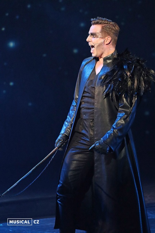
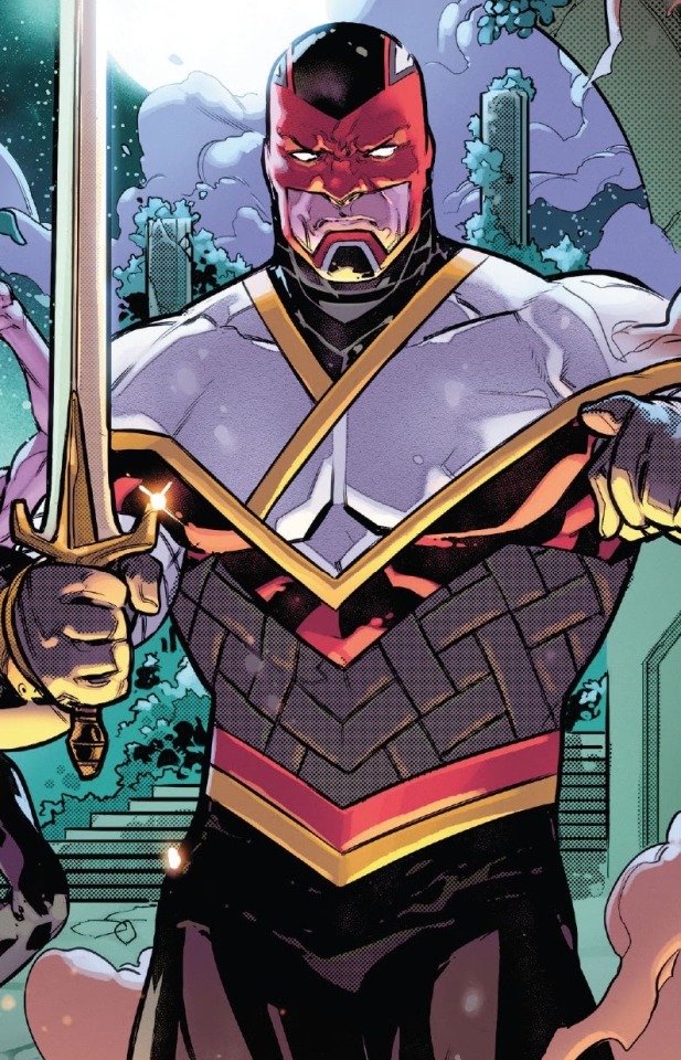
Bronze Age: 10/10
Now THIS is some good shit right here. The 70s marked a shift back to Batman’s gothic roots thanks in large to Denny O’Neil’s time with the character and the art of industry greats like Neal Adams, Jim Aparo, Gil Kane, and Dick Giordano reflected that. And this suit….GOD. While largely the same as his 60s design as that was still his most recognizable look thanks to the TV show, the taller ears and MUCH longer cape gave Batman a more dramatic and cool air than ever before. Not as scary as he was originally yet not as campy as he had since become, a happy medium! At the same time, this is the bluest Batman ever was, which i’ve always found interesting. I always took it as Batman not shedding the most important things he gained over the previous 30 years, the warmth and compassion he was capable of alongside being the Dark Knight Detective. It incorporates all of the best choices about Batman designs into one ultimate look. I can’t think of much that tops it, and maybe DC couldnt either given that it was still being used well into the early 90s, well after much darker looks had been shown in blockbusters like DKR, Batman Year One, and The Killing Joke. It’s just that good!

Troika: 6/10
I ADORE this suit. The all-black look of the 1989 movie is so striking to see in comic form…at least in theory. You see I call it the Troika suit because that’s the name of the arc that first featured it, but the image i use comes from much later when it was refined to look more…well, like Batman. The eponymous storyline had him looking like a feverdream with foot-tall ears and a cape so huge it was as if he was wrapped in goth bedsheets. Idk if they were influenced by Todd McFarlane’s Batman art and later successes with Spawn but i am not a fan. It’s just peak 90s excess, but in a much uglier way than Azrael’s batsuit ever was imo. Though i must stress, in a less exaggerated artstyle this suit is perfectly solid, even great, and i love seeing it in Chuck Dixon’s later 90s Bat books. So i give it a decent rating regardless.

No Man’s Land: 7/10
Speaking of late 90s: this suit technically appeared before the aforementioned arc, I personally associate it more with JLA, but No Man’s Land is definitely the most significant thing that happened during its tenure. It’s basically just the Troika suit with a dark grey bodysuit. Not much more to it than that, really. And while i actually prefer the Troika suit to it, this one is much less often a nightmare for me to look at, so it wins out ever so slightly. Only other thing to mention is that it sometimes includes pointy shoulders that I’m mostly neutral towards.

Hush: 9/10
Once again this suit was actually seen previously in the Officer Down storyline, but it was the artwork of Jim Lee in the Hush arc that cemented it as the definitive modern take on Batman’s costume. Much like with the Bronze Age suit we have a design drawing from the strengths previous ones: a long flowing cape, a huger bat symbol than ever before, and an overall darker color scheme evoking all the blockbuster Batman stories from the 80s, the Animated Series, and various movies. It’s easy to see why it’s lasted so long, even after Bruce would go on to change and update his look he’ll still be wearing this in crossover events, non-continuity books, or even main continuity ones where he had a different outfit at the time but nobody gave a fuck. It’s sleek, it’s relatively easy to draw, and it’s striking in team lineups, a perfectly functional good-looking design. Despite the fact that i associate it with a depiction of Batman i’ve long grown weary of, the fact is that this suit is a classic and deserves the use it gets…though it isn’t a favorite. In my opinion it’s just a little too quintessential, in a vacuum it’s the perfect look but next to some of these other looks from over the years it’s lacking a certain something to push it to the top.

Batman Inc: 8/10
In retrospect I think it was a poor choice to make Dick Grayson’s Batman suit basically identical to Bruce’s then-current one before he suffered a bad case of being dead (but not really). DC let Dick keep being Batman so as not to seem like they were demoting him (got over that pretty quick), and thus when Bruce returned to life he had to be given a different suit to differentiate the two. If anything Dick should’ve had the more distinct look, because they could’ve or would’ve gone farther with it than what they did with ol Bruceman. As a result half of the time you can only tell them apart based on musculature. That’s my ONE criticism with this suit, it isn’t much of a change at all from his modern-classic appearance. Don’t get me wrong, I appreciated the return of the yellow oval for as long as it lasted, but just about everything else added (the speed lines, utility belt, loss of the black undies) I’m kinda neutral on. It’s an amazing suit and I have super fond memories of it but I just don’t have much to say beyond that.

New 52: 5/10
Im not gonna beat a dead horse when it comes to the New 52, especially with Batman, because he actually fared better than just about anyone else. The more edgy, less colorful aesthetics a lot of the reboot books were pushing fit him pretty well given we were between Dark Knight movies and he mostly wears black and grey anyway. But this suit design....damn. I get what they're going for but it comes out so damn busy, and for no real reason. I was neutral on the speed lines from the Batman Inc suit but this is just too much! And how about the bat symbol peels off? Why? It's just a choice I can't fathom, even the hyper grounded Batman movies don't have stuff like that going on with the suits. This coupled with it being the least colorful Batsuit by a significant margin, even compared to the Hush suit and even when not in the dour muted lighting FCO Plascencia used during darkest arcs on the main Batman book. But critically, I have to say that even among the lame redesigns of the reboot, this suit always strikes me as dull. Partially because, once again, it's playing it safe with Batman's overall look. It makes all the changes they did make feel like obligations, like they're admitting there was nothing wrong with Batman but everyone else was getting huge updates so he needed some greeble thrown on. And I think this is a large part of why a lot about this design steadily got ignored by artists. Or at least toned down, I think overtime it mostly came out looking like his Batman Inc look without the yellow oval. The one thing I will say I genuinely love about the New 52 suit is the armor detailing on the gloves and boots. I don't think it's entirely necessary for a Batsuit, but it's really cool nonetheless. A nice innovation from a suit I consider passable at best.

Rebirth: 10/10
To preface: this is maybe my favorite Batman look ever. After three years of what is basically the same suit this feels like a breath of fresh air. And that's crazy because it's by no means a huge departure from what came before. But what it brings to the table is SO cool and slick in all the ways i love a Batman suit to be with JUST the right amount of color. And that color is purple, with this lovely new cape lining! Coupled with a lovely complimentary yellow lining on the now-black utility belt and a border on the bat symbol that makes it pop! I love that latter choice, it's a perfect compromise between the classic and yellow-oval varieties of the bat symbol. Just a nice color palette in general, I wonder if Snyder and Capullo got attached to the color scheme of the original Batman costume when they referenced it in Zero Year. It's like Batman coming full circle in terms of design, a neat little note to end on for the history of his various looks.....
Conclusion
....Or it would be, but Batman has reverted to the Hush suit as I'm fairly certain he always will at this point. And it's a shame, though unavoidable given the status of Batman as DC's big cash cow. That said I'm not going to end this post harping on the woes of brand homogeneity, we're here to talk about Batman! The epic highs and lows of his pointy eared silhouette, the cape that trails his crusade against evil, and the symbol that he wears proudly to signify his undying dedication to that endeavor. Batman will forever be one of the most striking superheroes of all time on looks alone, and a compelling figure in the realm of comics. But what do you think? What's your favorite Batman costume? Is it one of the minor ones I didn't list?
12 notes
·
View notes
Text
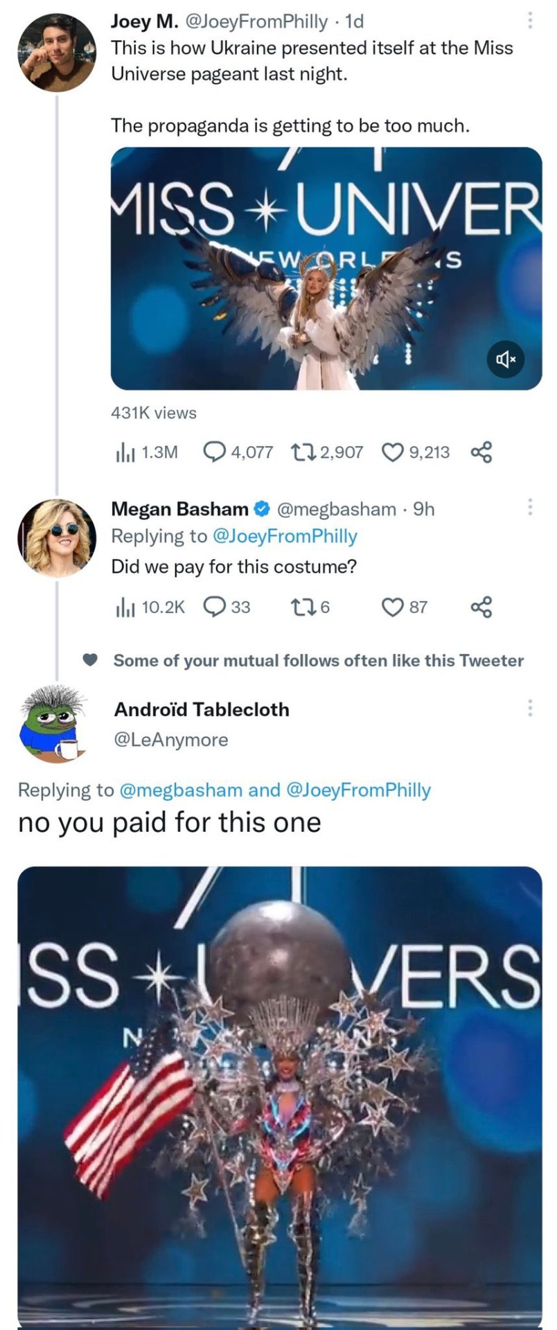
#lol#russian invasion of ukraine#as an american#that costume is making my health insurance rates go up#every time i look at it#i go slightly more blind#or at least wish i was#shut up vatnikz
10K notes
·
View notes
Text

He's a magician
#how does eiden keep doing that#that. naked magic. tablecloth sweep but suddenly it's rated oops for selective nudity#this is the 2nd time i've drawn eiden motion blur swiping yaku's clothes off. will this become a pattern?#yes i am still thinking about aegis r2. naked apron forever#i know there was probably an interlude. a moment between R1 and R2 [R1.5]#where eiden said TAKE OFF YOUR CLOTHES ok now put the apron back on#and yakumo's all ??? JUST the apron? ?? ??#then we go into R2 and it starts with yakumo questioning eiden's costume direction#but i wouldn't put it past eiden's mystical part time abilities#to be able to selectively nakify his clan members#haHA! behold! the art of misdirection! NOW WITH SEXY CONSEQUENCES!!#at some point in the future eiden will show off his tablecloth swoosh trick (the legitimate one. that actually uses the tablecloth)#and yakumo will be mildly wary the entire time. hands hovering near his crotch area as he was lucky to do the FIRST time#anyway eiden performs the trick successfully. no one's clothes slide off. the tablecloth is swooshed. the dishes are intact.#now we can either leave it at that or go the route of Violence#like the dramatic samurai strike. there's a moment of nothing . THEN EVERYONE IN THE ROOM LOSES THEIR CLOTHES IN A GUST OF WIND#EIDEN'S ULTIMATE ATTACK!!!!! PENULTIMA NAKED FLAME RENDING SHREDDINATOR RISING TORNADO!!!!!!!#nu carnival#yakuei#nu carnival eiden#nu carnival yakumo
758 notes
·
View notes
Text
my opinion on the Blake lively situation
#okay so I never HATED Blake lively#but I did have a feeling about her#so I’d always like purposely not interact or view any interview or anything of hers that came up on my feed#I DON’T like Ryan Reynolds and never have#I just find him a try hard and annoying#and I did not like the couple of Blake and Ryan#they just seemed soooo pick me#so yeah I tried to just ignore the whole downfall of Blake lively that’s been happening#bc sometimes I just don’t care to comment or learn about celeb drama#BUTTTT ofc i got sucked into it#and not Blake tryna have a Margot Robbie in Barbie moment 😂😂#‘bring your girlfriends and wear florals!1!1’ GIRL MARGOT NEVER TOLD ANYONE TO WEAR PINK TO BARBIE IT WAS A NATURAL THING#not to mention I didn’t even realise this movie was about domestic violence as I’ve never read the book#and it was NOT being marketed as one thanks to Blake and Ryan#also why did Ryan have to get involve#ALSO this morning I saw the interview from 2016 where Blake is being rude to the interview#and oh my god it’s awful like SHE FIRSTLY FAT SHAMES HER OFF THE BAT NO HESITATION#then proceeds to ignore the poor interviewer#like doesn’t give her eye contact AT ALL#which I felt so bad for the interview bc I’ve BEEN THERE#this is why I’d hate to be a celeb interview bc imagine getting treated like a third rate individual by these big headed LOSERS who think#they’re better than you just bc they’re famous#I could NOT#anyways also Blake tried to have a whole feminist moment when the interviewer asked her about the clothes she wears in the movie#‘would anyone ask the men about the clothes’#UM BITCH YES??? COSTUMES??? IN FILM?? IS A THING ???#also can I just say Blake has always had the worst hair ever and the fact she has a hair care line is insane bc SHE IS KNOWN TO HAVE BAD HAI#and I never thought her fashion was good like even when people were simping over her met gala outfits I NEVER EVER SAW THE VISION#anyways yeah lol#the interviewer thing triggered me lowkey like HOW RUDEEEE
30 notes
·
View notes
Text
Rating Star Trek TOS costumes because why not! (part 3)
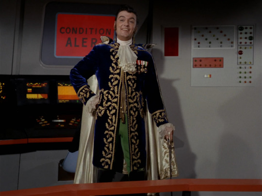
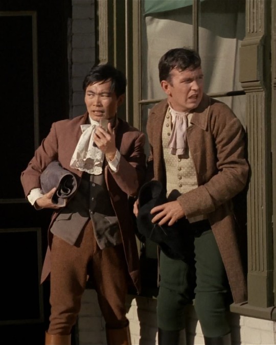
The Squire of Gothos (1x17). I wish I had half as much fun doing anything as this dandy did fucking with the crew of the Enterprise. The costume is fun and very cheap-looking but that goes without saying when it comes to TOS. Sure wish they'd given him pants that matched though, 7/10.
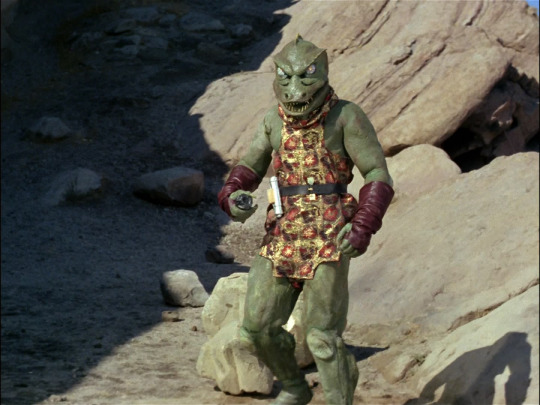
Arena (1x18). If you don't like this costume then chances are you take TOS too seriously. Just look at it! This is camp, mama. His stiff plastic face, his lifeless eyes, his gratuitously buff body, that shiny little dress and fingerless leather gloves. Whoever they had wearing that thing in the blaring California sun was braver than any US marine. I love him, 100/10.
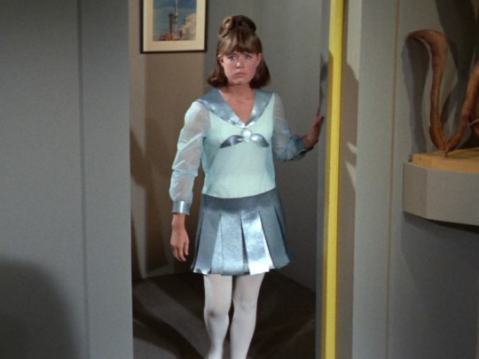
Court Martial (1x20) I'm into the 23rd century schoolgirl vibe of it all but this costume looks cheap even by TOS standards and something about the cut is very awkward. 4/10.

Also from Court Martial and man the costuming department was letting these ladies down. Areel is a classy broad but this dress is not it; it just kind of looks like a giant handkerchief. 5/10.
The Return of the Archons (1x21). Silly little outfit brigade reporting for duty! They look like they're in a school play 😭😭 Adorable with just a hint of dashing, 8/10.

A Taste of Armageddon (1x23). Someone needs to tell this man he's wearing a potato sack, though judging by his expression he already knows. 1/10.

These costumes are incredibly goofy but my favorite part is the background actors desperately clinging to their dignity, a battle that was lost the minute they put those hats on. 7/10.
#star trek#star trek tos#rating star trek#you bet your ass i'm doing more of these!#i skipped over khan's episode bc i wasn't comfortable with the brownface of it all#but otherwise i'm trying to cover all the interesting costumes
171 notes
·
View notes
Note
Obviously, I have to pick trick!
Well well well, you pick naughty, hmm?
Very Horror Potter Show
“Isn’t this a little too—” Draco bit his bottom lip, tried for a word that wouldn’t make him want to vanish in embarrassment. “Tight?” was the terrible option he landed on.
“Hmm? No, you’re fine.” Potter was barely even looking at him. In his fishnets and the—ah—garters, and with the eyeliner Pansy was cruel enough to give him, he looked… Draco, dry-mouthed, truly lacked the vocabulary.
“It’s only,” he tried still, idiot, idiot, all flushed cheeked and sweaty with his torso on display and covered in, ugh, glitter, “it’s only—I don’t see why it has to be so short.”
Potter’s eyebrow rose. Did Draco mention the lipstick? He was wearing lipstick, and everything in the world was sticky and terribly hot. “You watched the film, yeah?”
“Of course I did. Pans and I sang along to every—but that’s not the point at all. It’s, Potter, it’s terribly skimpy!”
Rolling his eyes, mumbling something. When Draco begged his pardon, Potter repeated, a little too loud: “I said if anything it’s not short enough!” then, realising, and his pretty face going darker: “Er. I mean—I mean. You should wear gold more often.”
“Wha—” Draco’s cheeks were scorching hot. Also Potter was. Also, ah, he forgot where this was going. “Potter, you’re—very close.” And coming closer. This look in his eyes, a smouldering-predator type of thing, with the slightest of curves to his lips and the vest nearly bursting on his stupidly-buff chest. The pearls added something else to it that Draco had no name for, that made swallowing hard.
Hard, everything was—Potter smirked, and his hand was, ah, so shockingly close that Draco did the only reasonable thing and grabbed it for a huge lick. He didn’t notice he was sucking on Potter’s middle finger before he heard the gasp, and then, ah, quite, ah, surprised himself, he popped it out of his mouth and took the index one.
“What,” Potter said, gaping and beautiful, “are you doing?”
Draco shrugged. In the golden ‘shorts’ (read: bikini bottoms) he felt hardly like himself and very, very hard-ly. “Getting in character?” he tried through the mouthful.
Potter laughed, a hearty thing, and rolled his eyes in a strangely fond way. “It’s just a Halloween party,” but he cupped Draco’s cheek anyway, and he smelled like leather and sweat and cheap makeup, and he was everything Draco could see.
The costume was extremely short and obscenely tight. In it Draco barely felt like himself, barely felt anything but for this—heat. Probably less the swim trunk’s fault and more Potter, the horror, the wanker, the… wonderful fiend who was busy marking his way down Draco’s neck. They might be late to the party, and Draco wholly, completely and utterly didn’t care.

#Robin's trick or treat#465 words#rated M#rocky horror picture show costumes#draco's a big fan#of... the whole thing#rockingrobin69
63 notes
·
View notes
Text
HANK PYM COSTUME RATINGS
At long last, here are my thoughts on the many looks and identities of Marvel’s own Hank Pym!!! Being a fan of this guy is a real rollercoaster, but his costumes are always so great and interesting, ive wanted to talk about them for ages!!! As some of his looks kinda blend together Ive tried to stick with the bare essentials (barring ones i especially like) but you can generally assume that i rate most of the suits of a given identity the same unless i specifically state otherwise. So here we go!!!!!
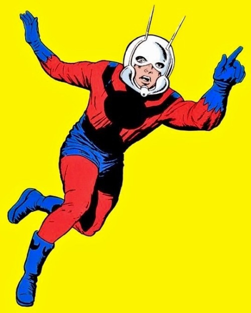
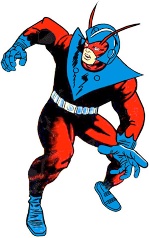
Ant-Man 10/10
What can i say? You can’t make an ant themed character much cooler than this. The irresistible 60s scifi charm of his big chrome helmet, the red, black, and blue color scheme with patterns that say “i am a super scientist” but gloves that say “im attemptint to look visually interesting.” Naturally Hank forgets he’s wearing some of the coolest headgear in comics. Ant-Man has had some good looks and updates but the charm of this one is pretty undeniable.
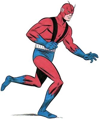
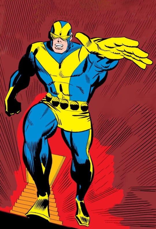
Giant Man 8/10
I think we can all agree that Giant Man kinda sucks, but damn if he didnt look cool! I guess he kept the antennae to keep some Ant-Man functionality, but you rarely see him using it. That’s fine though, it gives him a cool and distinct silhouette. It’s strange, if this were a new look for him as Ant Man, id call it a more considerable downgrade, yet Hank becoming Giant Man is a downgrade in just about every sense of the word. And even so, i LOVE Giant Man! It’s a conundrum!
Giant Man Redux: 6/10
I think they were trying to recapture the scifi tech charm of Ant-Man with this one, and it does kinda work! I think my main issue with this one is that it doesnt stick around long enough to really win me over. There are far more minor and insignificant variations of Hank’s suits that stick around way longer than this one. And id say this suit’s pretty damn significant, he left the Avengers for the the first time wearing this shit! I wish they’d played around with it some more.
Goliath: 8/10
Goliath is extremely solid. I have to wonder if Marvel was conscious of Giant Man being a loser that they felt the need to rebrand him like this, there’s little significant changeover from his previous identity other than color scheme and name besides him being stuck at 10 ft tall for a bit. I LOVE the addition of the goggles btw, one of my earliest exposures to that design trope i love so much.
The weird thing with Goliath is that they make him look more and more like Giant Man while refusing to change his name. Like again i know the guy got his ass best plenty of times but when you add antennae and red to his costume….that’s just Giant Man! But whatever the case, i give Goliath and all of his iterations a solid thumbs up.
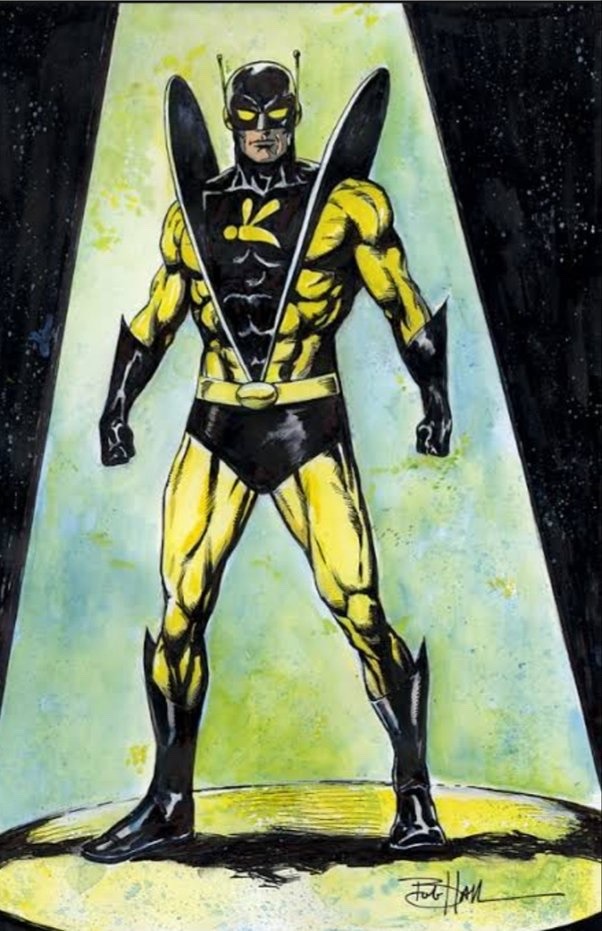
Yellowjacket: 10/10
The PINNACLE as far as im concerned. What if you took Ant-Man and refined his charming but clunky scifi elements into something sleek, aerodynamic, and downright badass, while still having bright colors? You get Yellowjacket! I can’t stress how much i loved this suit as a kid. Do you know how rare it is to have a primarily yellow superhero who looks cool? It’s mostly just Wolverine, and he didn’t even exist at this point! I also like how it sorta resembles Wasp’s original outfit, though you probably wouldn’t get a chance to compare given Jan’s ever shifting wardrobe. It’s really a shame how maligned the Yellowjacket identity is because id love to see this design again, but its lasting association with the worst shit ever done with Hank pretty much made sure that’ll never happen.
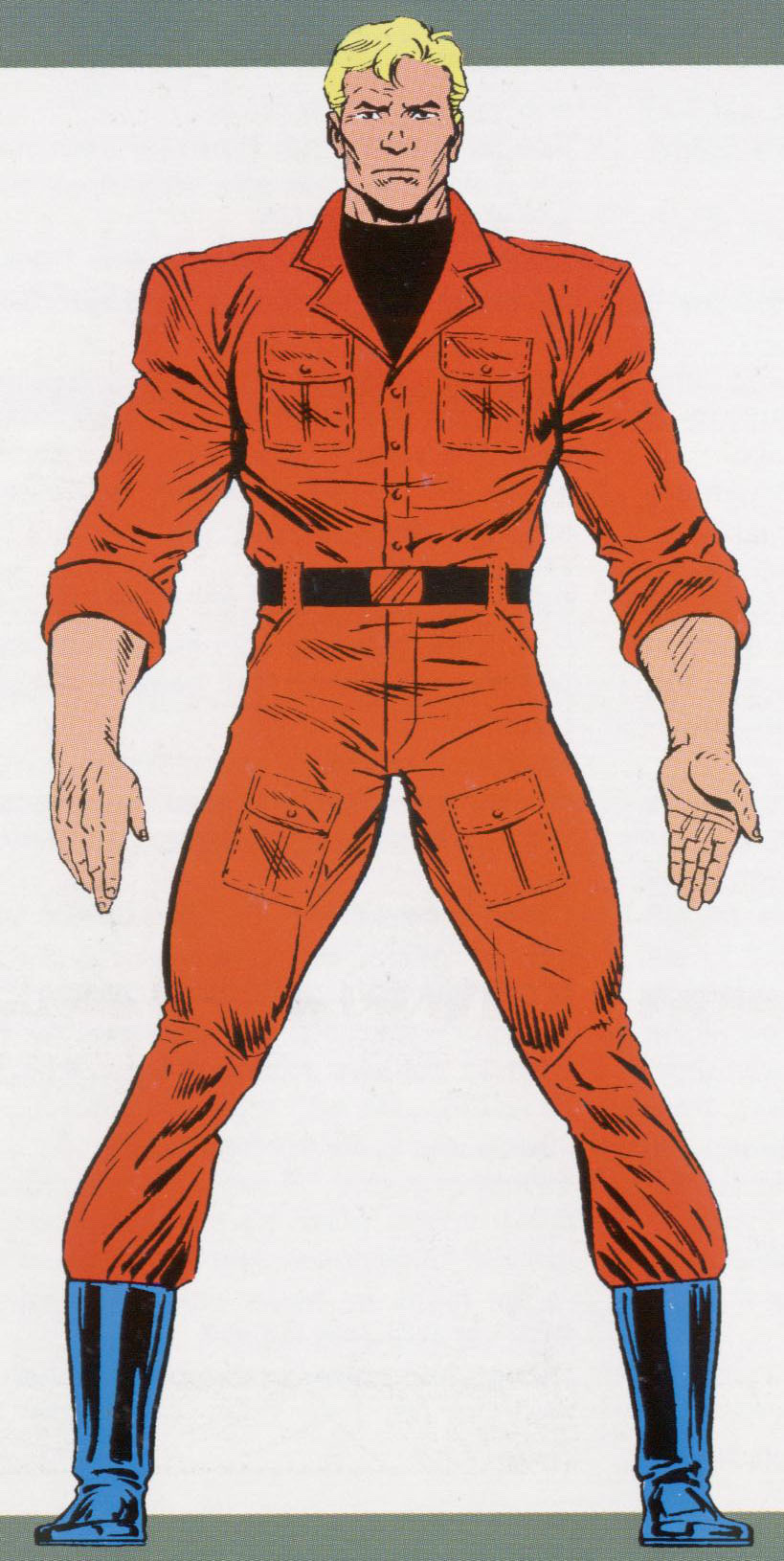
West Coast Avengers: -/10
It’s funny that what is arguably the height of Hank’s superhero career comes from when he’s vehemently not a superhero anymore. Thus, in terms of costumes…well this isnt a costume! But for what it is, it’s great. A nice practical super science getup. But i have trouble rating it on the same scale as the rest. Just know that I love it!
90s Hank: 5/10
I was ready to rip this thing a new one, but tbh it isnt bad. The only thing that keeps it from being truly good is the stupid pouches, but i cant outright call it bad when it’s basically a worse version of Atlas from Thunderbolts’ costume without them. It’s passable.
Giant Man???: 10/10
Yeah, I know. Confusing, isnt it? Well listen, regardless of names and costumes and what have you, this is by far my favorite variation on the original Goliath look. The red goggles just do it for me! I love primary color schemes and i prefer a touch of red to a touch of yellow, yknow?
Goliath??????: 8/10
So NOW he can be Goliath. That makes perfect sense. Yeesh. This suit is cool though i like it. It’s based on a Goliath suit Jan designed for Hank, but by then he’d had become Yellowjacket, so Hawkeye became Goliath for a while instead. It’s a nice callback, and while I don’t actually care for that Goliath look, there’s no way a redesign by George Perez at the height of his career and abilities is gonna be anything less than great.
Wasp: 7/10
Was Mighty Avengers good? I read a couple of issues and remembered enjoying it, but that was when i hated every other Avengers book do idk if that means it was actually good, yknow? Anyway while losing Jan as the Wasp and gaining Hank is about as big a net loss as i can think of, this is NOT a bad look. There are only a few gripes i feel: I get what they were going for with the design on his chest but it makes him look like he’s The Stickbug and not The Wasp. Secondly, i think the goggles are kinda lame compared to some of his other eye/headwear he’s sported throughout the years. That’s about it! Not bad for the worst Wasp in the main continuity!
14 notes
·
View notes
Text
I WAS ONLY ABLE TO FIND OUT NOW THAT MY FAVORITE GHOST HUNTER FOUND FAMILY BOOK SERIES JUST GOT ADAPTED?? It was utter perfection. It felt like I was reading the books. The utter domesticity. George was adorable. Locklyle was perfect. The casual hand holding and forehead touches and cradling of faces. It manages to be heartbreaking at times how much they have such married couple energy not because of how they bicker but because the world they’re in has aged them prematurely and it’s like they’ve already had their silver years and golden years together. Him just casually buttering her toast for her?? Tenderly treating her wound?? He was outright looking at her lips in that scene! We always knew he was do-or-die for Lucy but seeing this series outside of Lucy’s POV makes it adorably apparent how besotted with her he is, and that struggle of wanting to let her in clashing with his suicidal tendencies was portrayed with so much angst. Netflix may have its problems, but it has also brought my favorite YA novels wonderful adaptations. I already got Six of Crows and Lockwood & Co., so here’s to hoping for A Darker Shade of Magic too. To add, as long as I’m wishing, I’m hoping The Raven Cycle gets one too.
#lockwood and co#lockwood & co.#locklyle#lucy carlyle#anthony lockwood#george karim#george cubbins#books#tv#I mean they can actually get away with a higher rating for A Darker Shade of Magic#and man the costumes and set design would be gorgeous#I am keeping my fingers crossed that we at least reach The Hollow Boy#flirty domestic husband lockwood is great#but I demand angsty and desperate just dumped by lucy lockwood#he was so much like an ex in denial#great now I have to reread the books#TRC also has those vibes#that would be perfect for a netflix series#stranger things with ley lines and arthurian mythology#bluesy is another wonderful locklyle type dynamic#the tarot cards? the three fates? mirrors? ravens? deers? it would be such a visually arresting series
185 notes
·
View notes
Text

So you’ll give me both of these on my first try, but you won’t give me Red Panna Cotta’s costume?
#at this rate maybe I should just buy it#I have more than enough stars#though at the same time I kind of want Cream Soda’s costume too#I don’t know#but I didn’t particularly want Black Sugar Swan’s costume#(not that it’s bad it just didn’t pique my interest as much as RPC’s)#I just wanted Whipped Cream’s#and then I get it immediately#cookie run#cookie run ovenbreak#costumes#random stuff
18 notes
·
View notes
Text
Rating/roasting Death costumes from Elisabeth das musical
So, this, ladies and gentlemen, is somewhat of my small magnum opus. I'm rating the costumes based on how well I think they're constructed, how much I think the design fits Death as a character and personal preference. What entitles me to undertake this task is me being a student of costume design at uni and being a crazy fan of this show
Disclaimer: I'm only rating costumes from the European productions of Elisabeth das musical, because this post would be way too long if I were to get into all the Japanese and Korean productions costumes.
Original (Vienna, 1992-1996)
Love the iridecsence and shimmer the fabric has, love how flowy it is, altough I wish I could see more contrast between the separate fabrics. The right amount of androgyny with the jacket skirt and the super fluffy hair to set the bar really high for future productions. But, it could have been tailored a bit more in some parts and the execution could have been a teensy bit better. A believable unearthly being. 9/10

German productions (2001-2008)
Not totally on board with making the entire costume black, since it can look a tad too plain in pictures, but that shimmery velvet is so pretty. Not sure if I like all of the seams finished by bias tape, leaning more towards no, since it's giving the costume more of a pyjama appearance rather than some luxurious fantastical coat. I love the cut they gave the jacket, because long jackets with trains are awesome, but with the amount of stories of Deaths tripping on it, I don't think a train is a wise choice for this role. The idea was there, but it wasn't thought through too well. 7/10
Budapest production (1996-2005, 2007-)
I love how goddamn shimmery this Death is! Like, it's balancing the line between being too much and just enough, but I love all the glitter going on. This Death looks like some otherworldly alien and for the most part, I am digging it. I love the decoration going on on the top part of the jacket, but I'm not sure if I like how baggy the coat's silhouette is. And I think the trousers could have benefited from some decorations, because they look like they belong to some other costume. Also, some Deaths wear a waistcoat with this costume and for that piece, I feel like the waistcoats are a bit too long. 8/10
1st revival (Vienna, 2003-2005)
Kept the basic essence of the original design, but upgraded it with a cleaner execution and super sharp tailoring. It could have used some decoration, but I am not too upset about that. We lost a fair bit of the androgyny, but I like their decision to go for an empire style cut for the jacket. And the color contrasts between the black and that bright saturated ultramarine are so good. This design is simple, but hits hard and it's iconic for a good reason. 9/10

Finnish production (Turku, 2005-2006)
This feels very similar to the German tour design to me with the long coat, but with more decorations. I like the choice of the braided cording (perhaps as a nod to Elisabeth's love of Hungary by including elements similar to a hussar uniform). And I like the poofy shirt he seems to have underneath along with the fingerless gloves. But I'm not sure if gold was exactly the best color to use for the deco for Death (I think silver would have looked much better). So, poins off for that and for the trip hazard of the coat. 7.5/10

Flemish production (Antwerp, 2009)
An omen of the bland designs to come. Completely destroyed the color storytelling and made Der Tod look plain as heck. At least the tailoring seems decently good. The only saving factor other than that was the glitter on the black costume. 3/10

2nd revival (Vienna, 2012-)
No. Just... no. This is literally the most plain, most boring costume they could have given him. I get that they wanted to go for a more "masculine" look for Der Tod, but even if I was a fan of this approach, the execution is so boring. Like, the tailoring is good, but it's just bland overall as a costume (and you know you've got a bland costume at hand when the most interesting detail on it are two patches of quilted/couched pleather). It's missing everything that makes a Der Tod costume good in my book. This Tod isn't an otherworldly being, he's just... a dude in pleather. If I were Elisabeth, I would in no way be enchanted with this man and his untucked shirt. 2/10
Kecskemet production (Kecskemet, 2021-2022)
A bit unusual, I'm unsure if I like or dislike it. Like, he is very nicely dressed, which I like, the tailoring looks good, but he kinda looks like a pimp (I do like the cane, tho). With skunk hair, which I don't know if I'm a fan of. Also, I'm not really fond Death being in white through the whole show. And those white contact lenses this Death wears are kinda scary. 5/10
Czech production (Plzeň, 2019-2023)
I didn't think I'd like this costume this much, but this is like what the 2nd revival designers wanted to do with Der Tod, but were too afraid to do. In my opinion, this is how you do a Death costume out of pleather. Despite the material, the coat is flowy and has just the right amount of length to not be a hazard. All the little details you notice once you take a good look at this costume, despite it looking very simple at first glance, are so great! This is a Death, who doesn't quite understand the concept of how a human dresses and all those little details hint at that. I like the choice of making this Death styled after a crow/raven, down to that epic feather shoulderpiece. And thumbs up for them not being afraid to really go in with the makeup. 8/10
Bruxellons production (Brussels, 2022)
This Death costume is so simple, but I commend the designer for going for something new and fresh. The tailoring is crisp, I love the shade of blue they gave Death and the choice of a mesh shirt isn't something I would think I'd like, but I do like it. And I like that this Death has some accessories to complement the simplicity of the base costume. And I love the matching painted nails! It's very much something outside of the box of how we usually see Death designed and it's refreshing. 8/10
#elisabeth das musical#costume analysis#costume rating#der tod#this post was a month in the making#if you want to tag along reblog with your ratings
164 notes
·
View notes
Text
i just read THIS LITTLE (RED RIDING HOOD! STILES) BEAUTY and it was *chef's kiss*
#a perfect tease#stiles in a little red riding costume#my beloved <3#sterek#college au#mature rating#sterek fic#one shot#*chef's kiss*#fic rec#setek fic rec#other pack member's words
22 notes
·
View notes
Text
Rating Star Trek TOS costumes because why not! (part 2)

Mudd's Women (1x06). Delightfully tacky and I love the audacity of wrapping the third one in a sparkly blanket while the other two get full pageant gowns. The green dress is my favorite, that cut-out is to die for. 8/10.
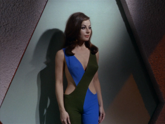
What Are Little Girls Made Of? (1x07). I'm sorry but that jumpsuit goes so hard. This is the peak of 60s retro futurism, both impractical as hell and also weirdly utilitarian in design. I don't care that it would 100% give you camel toe, I need two. 9/10.
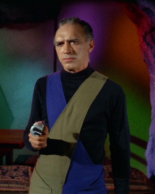
The men this episode get similar outfits but 10x worse. Dr. Brown actually might be wearing the same jumpsuit as Andrea but the shirt underneath ruins it. Kirk's jumpsuit is boring af but I think we can all agree I needed to include that picture. 3/10.


The Conscience of the King (1x13). Lenore wears six different outfits this episode and they are all terrible. I know she kills like a dozen people but her crimes against fashion might be the worst of all.The fur mini-dress with the shiny tights takes the cake, absolutely unforgivable. 2/10.

Balance of Terror (1x14). Our first look at the Romulans and they're wearing what seem to be carpets. I do like the color-blocking moment (very Next Gen) and the silly helmets absolutely delight me, so all in all not as bad as it could be. 5/10.
Shore Leave (1x15). I remembered Ruth's dress as being very conservative but looking at it again it's really not. I can't even tell what I'm looking at, it's like a see-through caftan over a bodysuit maybe? The hair looks great, though. 6/10.

Also from Shore Leave, these are the most baffling costume choices in maybe all of TOS. They look like furry creamsicles. They look like they skinned and dyed a bunch of tribbles. They look like they're from the red light district of Sesame Street and also it's Easter. Note the matching bellybutton jewelry, perhaps the most inexplicable design detail of all. 10/10, I can't help but stan.
#star trek#star trek tos#rating star trek#i will be making more of these yes#exactly one (1) person asked so i delivered#if you can think of any costumes i should include in future installments please let me know
64 notes
·
View notes
Text
babe, wake up, new meme format just dropped
#“recreating iconic meme outfits but vintage style”#she's an icon she's a legend and she is the moment#karolina zebrowska#this was a good one#her “rating shrek movies costumes on historical accuracy” video is still my favourite though#youtube#drake#meme
21 notes
·
View notes
Text
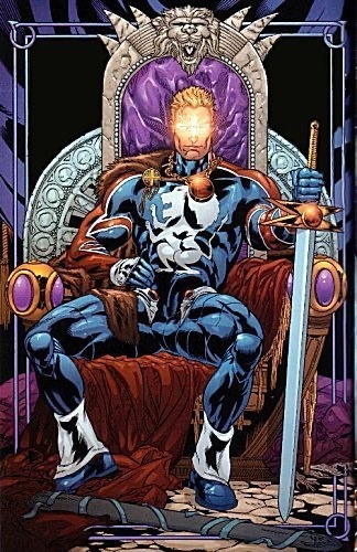
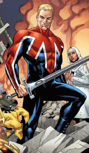
CAPTAIN BRITAIN COSTUME RATINGS
Totally impromtu and totally subective to my tastes! Focusing on Brian because his are the costumes i have the strongest feelings towards. Here we goooo!!!!
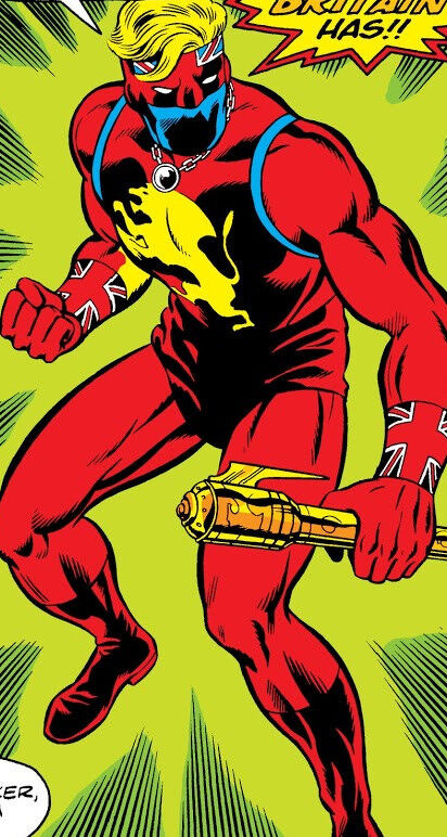
Original: 6/10
This one is a-okay and ive seen it look really cool in the hands of some artists, but it’s not a fave. The mask is cool, i like the big lion, and the Union Jack armbands are pretty neat, but it just doesnt really come together to me. Also i think Lionheart wore it better, but nobody gives a damn about her 😔
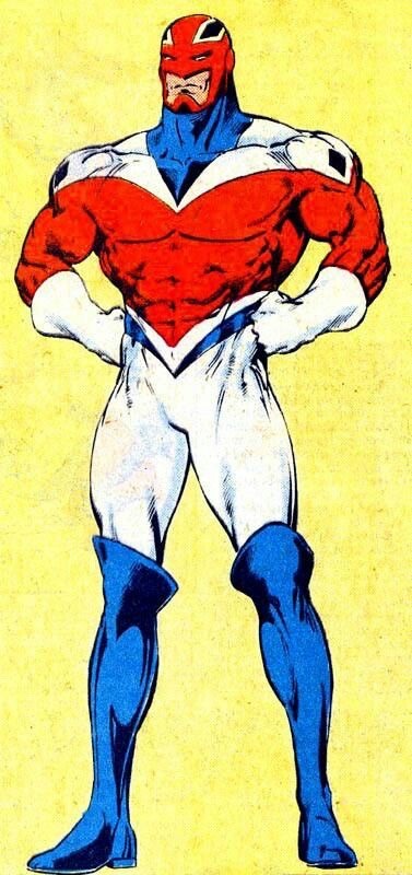
Alan Davis design: 10/10
PLEASE look at this suit, the simple iconic design, the color placements, the boots, the COOL helmet with the chin guard, i love it so much. I used to be confused by the huge X his costume makes but it does fit with how much he associates with X-Men characters. This will always be one of my favorite Alan Davis designs, and now that I’ve seen the other potential costumes he drew when brainstorming i can say we hit the fucking jackpot here.
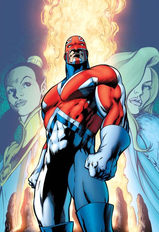
Alan Davis Redux: 9/10
I dont like this one as much as Davis’ original design, but it’s still really good. The color balance is more or less the same, and as as a person who has drawn the previous Captain Britain suit i do appreciate the simplification. Plus, the biggest thing I appreciate Davis bringing to Captain Britain’s design is his beefy physique, and that has yet to change. So what’s to complain about?
Britannic: 2/10
In terms of 90s redesigns this is about as inoffensive as you can get, but it’s so damn boring. This looks like something Brian would wear for some one-off Excalibur mission, but it’s just his regular suit. Hell it looks like an undersuit that’s missing some kinda armor! Literally only thing worse than this costume to me is the name “Britannic.” Like are you kidding me. The only reason he isnt 1/10 is this is some of the best hair Brian has ever had. Literally a helmetless version of any of his costumes with this flowing hair would be SICK.
King of Otherworld: 3/10
Really don’t give a fuck about this one tbh. It’s not all bad, it’s clearly drawing from his original costume with some of the iconography and i can certainly see that working, but without the mask??? The best part of his original costume??? Or maybe some variation on helmets? Also, again, Lionheart basically wore a version of this suit that was better in every way.
New Excalibur: 8/10
Okay now we’re talking!!! A nice update of the classic design that makes a few interesting changes. I always thought the black sleeves were kinda neat, as is the helmet resembling a more traditional superhero mask. The modern detailings, however, i’m completely indifferent toward. You could tell me this was Ultimate Captain Britain and id believe you (which is funny as some of the Ultimate designs resemble the classic suit way more than this one does). Still, not bad at all!
M.I. 13: 4/10
Im gonna be real, this is probably my least favorite one, but i don’t think it’s the worst. It’s just so bland. It’s not like a helmetless look couldnt work, Brian and Betsy rock that look quite a bit, and Ultimate Jamie Braddock KILLS with it. But like the overly simplistic design, thinner build, lame haircut, he’s just missing so many vital qualities.
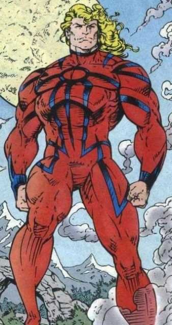
Sword of Might: 7/10
This design is very cool and i love how it combines his og and classic looks in a more armored appearance. If he had blue covering his mouth this would be my favorite upgrade of his original design. However i ultimately don’t think this is a design id wanna see regularly because i just don’t like his original suit that much. But still, so cool to see!
Captain Avalon: 6/10
I greatly appreciate the return of the BEEF but i find this suit kinda mid. It’s just a Captain Britain reskin, like he’s Thunderstrike or the Scarlet Spider. But that’s perfectly okay. Frankly my biggest problem with it is that I don’t get why it exists. Like okay Brian is retired and he seems fine with that but there’s a million Captain Britains. There are LITERALLY retired Captain Britains hanging out in Otherworld all the time! Did they get new costumes too? Who knows. On the other hand, this is the least connected to Britain he’s ever been in terms of name and design, so in a way that makes it a secret 10/10!!! Wow!!!
4 notes
·
View notes
Text

I felt like this picture of the Untamed juniors cast needed an in-character drawing
Timelapse:
#i rate this experience a 'I'm certain now I don't want to study costume design'/10#the untamed#mdzs#mo dao zu shi#cql#chen qing ling#lan sizhui#the untamed lan sizhui#sizhui#the untamed sizhui#mdsz lan sizhui#mo dao zu shi lan sizhui#lan jingyi#the untamed lan jingyi#mdzs lan jingyi#mo dao zu shi lan jingy#jin ling#the untamed jin ling#jin rulan#mdzs jin ling#mo dao zu shi jin ling#the untamed juniors#mdzs juniors#mo dao zu shi juniors#the untamed fanart#cql fanart#chen qing lin fanart#mo dao zu shi fanart#the untamed meme#art
48 notes
·
View notes
Text
Happy Munday! Just a few quick things, plus some cosplay photos from a recent convention (under the cut, in order not to clutter the dash with OOC content).
I am still accepting starters for this starter call! I'll close the call on Saturday, November 18. Until then, I will not have a cap on starters beyond writing one per mun/blog. This will likely be my last starter call from now until the beginning of 2024, so if you'd like me to write you a starter that isn't attached to a meme, this is your chance! I will still share memes when I have the time in my schedule to start new threads, but for those of you who don't like memes and prefer starter calls, this is the best way to interact with me through the holiday season.
I'll be a little quiet around here from today until Friday: I've got two long days in the office and then I'm celebrating my wedding anniversary on Thursday after work (with a considerable amount of food and champagne), so my writing and chatting time will be limited this week.
That said, I've finally had some time to look at my cell phone photos of my costumes from my last anime convention. I'm still waiting on photos from my private photoshoots, but in the meantime, I'll share a costume I haven't posted here yet. I predict some of you may recognize her (hi Bubblez!).

Did you know that I've either played or watched my husband play both AI: The Somnium Files games (because watching me try to play through the somniums is a stressful experience for everyone involved)? Now you do!
Actually, I've had my Boss costume for about a year now and I haven't been in a happy place with it until last month. Admittedly, my dress is a bit oversized after I lost weight and I need to take it in in a few places before wearing it again. That's the only thing that has stopped me from doing a private photoshoot with Boss.
In any case, she was my favorite out of the games and one of the very few (maybe only?) character I cosplay as who is older than me. How is this woman in her forties? I thought I had amazing skincare and genetics but Boss is on another level.

The jacket and gloves are both leather, with the dress made of a cotton/poly spandex and the boots being custom pieces that I ended up repainting to be a closer match to my jacket. The Ai-balls are from Lemon Penguin, who loves Uchikoshi games and produces a few Uchikoshi-related items to vend at conventions (and they conveniently end up at the cons I attend!).
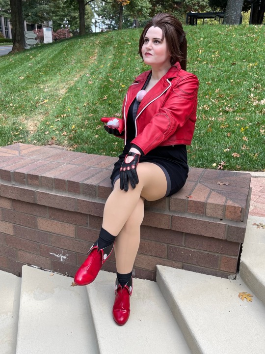
But let me say: I love this wig so much. It was a custom piece after I was hating my own styling attempts, and comes with her 'hair donut' ponytail holder, her slicked back tendrils, and a stubbed ponytail that keeps the weight of the tail and wig lighter on my head. When I get a professional shoot of this done, I definitely want more shots of this incredible wig from the back.
And finally, the AiTSF cosplayers I've met at conventions have all been so friendly and kind! I had to miss the photoshoot this time around but I participated at one at a previous convention: we were a small group but we were mighty. Even if we either weren't recognized or called by some other character name (I get Misato Katsuragi in this one quite a lot. Ironic, as I also have a Misato costume).
#more-than-a-princess musings#(I can't believe I've been married a year already)#(also can't believe I'm narrowing down my 2024 costume list but that starts earlier each year at this rate)
7 notes
·
View notes
Last Seen Blogs

saiyumichoi
Saiyumi Choi

designersharmin
DesignerSharmin

o-nekosan
Nya!

priteekadam1
Untitled

lirymee
Liry-Fae